
World Inflation Waves, Squeeze of Economic Activity by Carry Trades Induced by Zero Interest Rates, United States Industrial Production, Unresolved US Balance of Payments Deficits and Fiscal Imbalance Threatening Risk Premium on Treasury Securities, World Cyclical Slow Growth and Global Recession Risk
Carlos M. Pelaez
© Carlos M. Pelaez, 2009, 2010, 2011, 2012, 2013, 2014
I World Inflation Waves
IA Appendix: Transmission of Unconventional Monetary Policy
IB1 Theory
IB2 Policy
IB3 Evidence
IB4 Unwinding Strategy
IC United States Inflation
IC Long-term US Inflation
ID Current US Inflation
IE Theory and Reality of Economic History, Cyclical Slow Growth Not Secular Stagnation and Monetary Policy Based on Fear of Deflation
IIA Unresolved US Balance of Payments Deficits and Fiscal Imbalance Threatening Risk Premium on Treasury Securities
IIB United States Industrial Production
III World Financial Turbulence
IIIA Financial Risks
IIIE Appendix Euro Zone Survival Risk
IIIF Appendix on Sovereign Bond Valuation
IV Global Inflation
V World Economic Slowdown
VA United States
VB Japan
VC China
VD Euro Area
VE Germany
VF France
VG Italy
VH United Kingdom
VI Valuation of Risk Financial Assets
VII Economic Indicators
VIII Interest Rates
IX Conclusion
References
Appendixes
Appendix I The Great Inflation
IIIB Appendix on Safe Haven Currencies
IIIC Appendix on Fiscal Compact
IIID Appendix on European Central Bank Large Scale Lender of Last Resort
IIIG Appendix on Deficit Financing of Growth and the Debt Crisis
IIIGA Monetary Policy with Deficit Financing of Economic Growth
IIIGB Adjustment during the Debt Crisis of the 1980s
IE Theory and Reality of Economic History, Cyclical Slow Growth Not Secular Stagnation and Monetary Policy Based on Fear of Deflation. Fear of deflation as had occurred during the Great Depression and in Japan was used as an argument for the first round of unconventional monetary policy with 1 percent interest rates from Jun 2003 to Jun 2004 and quantitative easing in the form of withdrawal of supply of 30-year securities by suspension of the auction of 30-year Treasury bonds with the intention of reducing mortgage rates (for fear of deflation see Pelaez and Pelaez, International Financial Architecture (2005), 18-28, and Pelaez and Pelaez, The Global Recession Risk (2007), 83-95). The financial crisis and global recession were caused by interest rate and housing subsidies and affordability policies that encouraged high leverage and risks, low liquidity and unsound credit (Pelaez and Pelaez, Financial Regulation after the Global Recession (2009a), 157-66, Regulation of Banks and Finance (2009b), 217-27, International Financial Architecture (2005), 15-18, The Global Recession Risk (2007), 221-5, Globalization and the State Vol. II (2008b), 197-213, Government Intervention in Globalization (2008c), 182-4). Several past comments of this blog elaborate on these arguments, among which: http://cmpassocregulationblog.blogspot.com/2011/07/causes-of-2007-creditdollar-crisis.html http://cmpassocregulationblog.blogspot.com/2011/01/professor-mckinnons-bubble-economy.html http://cmpassocregulationblog.blogspot.com/2011/01/world-inflation-quantitative-easing.html http://cmpassocregulationblog.blogspot.com/2011/01/treasury-yields-valuation-of-risk.html http://cmpassocregulationblog.blogspot.com/2010/11/quantitative-easing-theory-evidence-and.html http://cmpassocregulationblog.blogspot.com/2010/12/is-fed-printing-money-what-are.html
If the forecast of the central bank is of recession and low inflation with controlled inflationary expectations, monetary policy should consist of lowering the short-term policy rate of the central bank, which in the US is the fed funds rate. The intended effect is to lower the real rate of interest (Svensson 2003LT, 146-7). The real rate of interest, r, is defined as the nominal rate, i, adjusted by expectations of inflation, π*, with all variables defined as proportions: (1+r) = (1+i)/(1+π*) (Fisher 1930). If i, the fed funds rate, is lowered by the Fed, the numerator of the right-hand side is lower such that if inflationary expectations, π*, remain unchanged, the left-hand (1+r) decreases, that is, the real rate of interest, r, declines. Expectations of lowering short-term real rates of interest by policy of the Federal Open Market Committee (FOMC) fixing a lower fed funds rate would lower long-term real rates of interest, inducing with a lag investment and consumption, or aggregate demand, that can lift the economy out of recession. Inflation also increases with a lag by higher aggregate demand and inflation expectations (Fisher 1933). This reasoning explains why the FOMC lowered the fed funds rate in Dec 2008 to 0 to 0.25 percent and left it unchanged.
The fear of the Fed is expected deflation or negative π*. In that case, (1+ π*) < 1, and (1+r) would increase because the right-hand side of the equation would be divided by a fraction. A simple numerical example explains the effect of deflation on the real rate of interest. Suppose that the nominal rate of interest or fed funds rate, i, is 0.25 percent, or in proportion 0.25/100 = 0.0025, such that (1+i) = 1.0025. Assume now that economic agents believe that inflation will remain at 1 percent for a long period, which means that π* = 1 percent, or in proportion 1/100 =0.01. The real rate of interest, using the equation, is (1+0.0025)/(1+0.01) = (1+r) = 0.99257, such that r = 0.99257 - 1 = -0.00743, which is a proportion equivalent to –(0.00743)100 = -0.743 percent. That is, Fed policy has created a negative real rate of interest of 0.743 percent with the objective of inducing aggregate demand by higher investment and consumption. This is true if expected inflation, π*, remains at 1 percent. Suppose now that expectations of deflation become generalized such that π* becomes -1 percent, that is, the public believes prices will fall at the rate of 1 percent in the foreseeable future. Then the real rate of interest becomes (1+0.0025) divided by (1-0.01) equal to (1.0025)/(0.99) = (1+r) = 1.01263, or r = (1.01263-1) = 0.01263, which results in positive real rate of interest of (0.01263)100 = 1.263 percent.
Irving Fisher also identified the impact of deflation on debts as an important cause of deepening contraction of income and employment during the Great Depression illustrated by an actual example (Fisher 1933, 346):
“By March, 1933, liquidation had reduced the debts about 20 percent, but had increased the dollar about 75 percent, so that the real debt, that is the debt measured in terms of commodities, was increased about 40 percent [100%-20%)X(100%+75%) =140%]. Unless some counteracting cause comes along to prevent the fall in the price level, such a depression as that of 1929-1933 (namely when the more the debtors pay the more they owe) tends to continue, going deeper, in a vicious spiral, for many years. There is then no tendency of the boat to stop tipping until it has capsized”
The nominal rate of interest must always be nonnegative, that is, i ≥ 0 (Hicks 1937, 154-5):
“If the costs of holding money can be neglected, it will always be profitable to hold money rather than lend it out, if the rate of interest is not greater than zero. Consequently the rate of interest must always be positive. In an extreme case, the shortest short-term rate may perhaps be nearly zero. But if so, the long-term rate must lie above it, for the long rate has to allow for the risk that the short rate may rise during the currency of the loan, and it should be observed that the short rate can only rise, it cannot fall”
The interpretation by Hicks of the General Theory of Keynes is the special case in which at interest rates close to zero liquidity preference is infinitely or perfectly elastic, that is, the public holds infinitely large cash balances at that near zero interest rate because there is no opportunity cost of foregone interest. Increases in the money supply by the central bank would not decrease interest rates below their near zero level, which is called the liquidity trap. The only alternative public policy would consist of fiscal policy that would act similarly to an increase in investment, increasing employment without raising the interest rate.
An influential view on the policy required to steer the economy away from the liquidity trap is provided by Paul Krugman (1998). Suppose the central bank faces an increase in inflation. An important ingredient of the control of inflation is the central bank communicating to the public that it will maintain a sustained effort by all available policy measures and required doses until inflation is subdued and price stability is attained. If the public believes that the central bank will control inflation only until it declines to a more benign level but not sufficiently low level, current expectations will develop that inflation will be higher once the central bank abandons harsh measures. During deflation and recession the central bank has to convince the public that it will maintain zero interest rates and other required measures until the rate of inflation returns convincingly to a level consistent with expansion of the economy and stable prices. Krugman (1998, 161) summarizes the argument as:
“The ineffectuality of monetary policy in a liquidity trap is really the result of a looking-glass version of the standard credibility problem: monetary policy does not work because the public expects that whatever the central bank may do now, given the chance, it will revert to type and stabilize prices near their current level. If the central bank can credibly promise to be irresponsible—that is, convince the market that it will in fact allow prices to rise sufficiently—it can bootstrap the economy out of the trap”
This view is consistent with results of research by Christina Romer that “the rapid rates of growth of real output in the mid- and late 1930s were largely due to conventional aggregate demand stimulus, primarily in the form of monetary expansion. My calculations suggest that in the absence of these stimuli the economy would have remained depressed far longer and far more deeply than it actually did” (Romer 1992, 757-8, cited in Pelaez and Pelaez, Regulation of Banks and Finance (2009b), 210-2). The average growth rate of the money supply in 1933-1937 was 10 percent per year and increased in the early 1940s. Romer calculates that GDP would have been much lower without this monetary expansion. The growth of “the money supply was primarily due to a gold inflow, which was in turn due to the devaluation in 1933 and to capital flight from Europe because of political instability after 1934” (Romer 1992, 759). Gold inflow coincided with the decline in real interest rates in 1933 that remained negative through the latter part of the 1930s, suggesting that they could have caused increases in spending that was sensitive to declines in interest rates. Bernanke finds dollar devaluation against gold to have been important in preventing further deflation in the 1930s (Bernanke 2002):
“There have been times when exchange rate policy has been an effective weapon against deflation. A striking example from US history is Franklin Roosevelt’s 40 percent devaluation of the dollar against gold in 1933-34, enforced by a program of gold purchases and domestic money creation. The devaluation and the rapid increase in money supply it permitted ended the US deflation remarkably quickly. Indeed, consumer price inflation in the United States, year on year, went from -10.3 percent in 1932 to -5.1 percent in 1933 to 3.4 percent in 1934. The economy grew strongly, and by the way, 1934 was one of the best years of the century for the stock market”
Fed policy is seeking what Irving Fisher proposed “that great depressions are curable and preventable through reflation and stabilization” (Fisher 1933, 350).
The President of the Federal Reserve Bank of Chicago argues that (Charles Evans 2010):
“I believe the US economy is best described as being in a bona fide liquidity trap. Highly plausible projections are 1 percent for core Personal Consumption Expenditures (PCE) inflation at the end of 2012 and 8 percent for the unemployment rate. For me, the Fed’s dual mandate misses are too large to shrug off, and there is currently no policy conflict between improving employment and inflation outcomes”
There are two types of monetary policies that could be used in this situation. First, the Fed could announce a price-level target to be attained within a reasonable time frame (Evans 2010):
“For example, if the slope of the price path is 2 percent and inflation has been underunning the path for some time, monetary policy would strive to catch up to the path. Inflation would be higher than 2 percent for a time until the path was reattained”
Optimum monetary policy with interest rates near zero could consist of “bringing the price level back up to a level even higher than would have prevailed had the disturbance never occurred” (Gauti Eggertsson and Michael Woodford 2003, 207). Bernanke (2003JPY) explains as follows:
“Failure by the central bank to meet its target in a given period leads to expectations of (and public demands for) increased effort in subsequent periods—greater quantities of assets purchased on the open market for example. So even if the central bank is reluctant to provide a time frame for meetings its objective, the structure of the price-level objective provides a means for the bank to commit to increasing its anti-deflationary efforts when its earlier efforts prove unsuccessful. As Eggertsson and Woodford show, the expectations that an increasing price level gap will give rise to intensified effort by the central bank should lead the public to believe that ultimately inflation will replace deflation, a belief that supports the central bank’s own objectives by lowering the current real rate of interest”
Second, the Fed could use its balance sheet to increase purchases of long-term securities together with credible commitment to maintain the policy until the dual mandates of maximum employment and price stability are attained.
In the restatement of the liquidity trap and large-scale policies of monetary/fiscal stimulus, Krugman (1998, 162) finds:
“In the traditional open economy IS-LM model developed by Robert Mundell [1963] and Marcus Fleming [1962], and also in large-scale econometric models, monetary expansion unambiguously leads to currency depreciation. But there are two offsetting effects on the current account balance. On one side, the currency depreciation tends to increase net exports; on the other side, the expansion of the domestic economy tends to increase imports. For what it is worth, policy experiments on such models seem to suggest that these effects very nearly cancel each other out.
Krugman (1998) uses a different dynamic model with expectations that leads to similar conclusions.
The central bank could also be pursuing competitive devaluation of the national currency in the belief that it could increase inflation to a higher level and promote domestic growth and employment at the expense of growth and unemployment in the rest of the world. An essay by Chairman Bernanke in 1999 on Japanese monetary policy received attention in the press, stating that (Bernanke 2000, 165):
“Roosevelt’s specific policy actions were, I think, less important than his willingness to be aggressive and experiment—in short, to do whatever it took to get the country moving again. Many of his policies did not work as intended, but in the end FDR deserves great credit for having the courage to abandon failed paradigms and to do what needed to be done”
Quantitative easing has never been proposed by Chairman Bernanke or other economists as certain science without adverse effects. What has not been mentioned in the press is another suggestion to the Bank of Japan (BOJ) by Chairman Bernanke in the same essay that is very relevant to current events and the contentious issue of ongoing devaluation wars (Bernanke 2000, 161):
“Because the BOJ has a legal mandate to pursue price stability, it certainly could make a good argument that, with interest rates at zero, depreciation of the yen is the best available tool for achieving its mandated objective. The economic validity of the beggar-thy-neighbor thesis is doubtful, as depreciation creates trade—by raising home country income—as well as diverting it. Perhaps not all those who cite the beggar-thy-neighbor thesis are aware that it had its origins in the Great Depression, when it was used as an argument against the very devaluations that ultimately proved crucial to world economic recovery. A yen trading at 100 to the dollar is in no one’s interest”
Chairman Bernanke is referring to the argument by Joan Robinson based on the experience of the Great Depression that: “in times of general unemployment a game of beggar-my-neighbour is played between the nations, each one endeavouring to throw a larger share of the burden upon the others” (Robinson 1947, 156). Devaluation is one of the tools used in these policies (Robinson 1947, 157). Banking crises dominated the experience of the United States, but countries that recovered were those devaluing early such that competitive devaluations rescued many countries from a recession as strong as that in the US (see references to Ehsan Choudhri, Levis Kochin and Barry Eichengreen in Pelaez and Pelaez, Regulation of Banks and Finance (2009b), 205-9; for the case of Brazil that devalued early in the Great Depression recovering with an increasing trade balance see Pelaez, 1968, 1968b, 1972; Brazil devalued and abandoned the gold standard during crises in the historical period as shown by Pelaez 1976, Pelaez and Suzigan 1981). Beggar-my-neighbor policies did work for individual countries but the criticism of Joan Robinson was that it was not optimal for the world as a whole.
Chairman Bernanke (2013Mar 25) reinterprets devaluation and recovery from the Great Depression:
“The uncoordinated abandonment of the gold standard in the early 1930s gave rise to the idea of "beggar-thy-neighbor" policies. According to this analysis, as put forth by important contemporary economists like Joan Robinson, exchange rate depreciations helped the economy whose currency had weakened by making the country more competitive internationally. Indeed, the decline in the value of the pound after 1931 was associated with a relatively early recovery from the Depression by the United Kingdom, in part because of some rebound in exports. However, according to this view, the gains to the depreciating country were equaled or exceeded by the losses to its trading partners, which became less internationally competitive--hence, ‘beggar thy neighbor.’ Economists still agree that Smoot-Hawley and the ensuing tariff wars were highly counterproductive and contributed to the depth and length of the global Depression. However, modern research on the Depression, beginning with the seminal 1985 paper by Barry Eichengreen and Jeffrey Sachs, has changed our view of the effects of the abandonment of the gold standard. Although it is true that leaving the gold standard and the resulting currency depreciation conferred a temporary competitive advantage in some cases, modern research shows that the primary benefit of leaving gold was that it freed countries to use appropriately expansionary monetary policies. By 1935 or 1936, when essentially all major countries had left the gold standard and exchange rates were market-determined, the net trade effects of the changes in currency values were certainly small. Yet the global economy as a whole was much stronger than it had been in 1931. The reason was that, in shedding the strait jacket of the gold standard, each country became free to use monetary policy in a way that was more commensurate with achieving full employment at home.”
Nurkse (1944) raised concern on the contraction of trade by competitive devaluations during the 1930s. Haberler (1937) dwelled on the issue of flexible exchange rates. Bordo and James (2001) provide perceptive exegesis of the views of Haberler (1937) and Nurkse (1944) together with the evolution of thought by Haberler. Policy coordination among sovereigns may be quite difficult in practice even if there were sufficient knowledge and sound forecasts. Friedman (1953) provided strong case in favor of a system of flexible exchange rates.
Eichengreen and Sachs (1985) argue theoretically with measurements using a two-sector model that it is possible for series of devaluations to improve the welfare of all countries. There were adverse effects of depreciation on other countries but depreciation by many countries could be beneficial for all. The important counterfactual is if depreciations by many countries would have promoted faster recovery from the Great Depression. Depreciation in the model of Eichengreen and Sachs (1985) affected domestic and foreign economies through real wages, profitability, international competitiveness and world interest rates. Depreciation causes increase in the money supply that lowers world interest rates, promoting growth of world output. Lower world interest rates could compensate contraction of output from the shift of demand away from home goods originating in neighbor’s exchange depreciation. Eichengreen and Sachs (1985, 946) conclude:
“This much, however, is clear. We do not present a blanket endorsement of the competitive devaluations of the 1930s. Though it is indisputable that currency depreciation conferred macroeconomic benefits on the initiating country, because of accompanying policies the depreciations of the 1930s had beggar-thy-neighbor effects. Though it is likely that currency depreciation (had it been even more widely adopted) would have worked to the benefit of the world as a whole, the sporadic and uncoordinated approach taken to exchange-rate policy in the 1930s tended, other things being equal, to reduce the magnitude of the benefits.”
There could major difference in the current world economy. The initiating impulse for depreciation originates in zero interest rates on the fed funds rate. The dollar is the world’s reserve currency. Risk aversion intermittently channels capital flight to the safe haven of the dollar and US Treasury securities. In the absence of risk aversion, zero interest rates induce carry trades of short positions in dollars and US debt (borrowing) together with long leveraged exposures in risk financial assets such as stocks, emerging stocks, commodities and high-yield bonds. Without risk aversion, the dollar depreciates against every currency in the world. The dollar depreciated against the euro by 39.3 percent from USD 1.1423/EUR con Jun 26, 2003 to USD 1.5914/EUR on Jun 14, 2008 during unconventional monetary policy before the global recession (Table VI-1). Unconventional monetary policy causes devaluation of the dollar relative to other currencies, which can increases net exports of the US that increase aggregate economic activity (Yellen 2011AS). The country issuing the world’s reserve currency appropriates the advantage from initiating devaluation that in policy intends to generate net exports that increase domestic output.
Pelaez and Pelaez (Regulation of Banks and Finance (2009b), 208-209) summarize the experience of Brazil as follows:
“During 1927–9, Brazil accumulated £30 million of foreign exchange of which £20 million were deposited at its stabilization fund (Pelaez 1968, 43–4). After the decline in coffee prices and the first impact of the Great Depression in Brazil a hot money movement wiped out foreign exchange reserves. In addition, capital inflows stopped entirely. The deterioration of the terms of trade further complicated matters, as the value of exports in foreign currency declined abruptly. Because of this exchange crisis, the service of the foreign debt of Brazil became impossible. In August 1931, the federal government was forced to cancel the payment of principal on certain foreign loans. The balance of trade in 1931 was expected to yield £20 million whereas the service of the foreign debt alone amounted to £22.6 million. Part of the solution given to these problems was typical of the 1930s. In September 1931, the government of Brazil required that all foreign transactions were to be conducted through the Bank of Brazil. This monopoly of foreign exchange was exercised by the Bank of Brazil for the following three years. Export permits were granted only after the exchange derived from sales abroad was officially sold to the Bank, which in turn allocated it in accordance with the needs of the economy. An active black market in foreign exchange developed. Brazil was in the first group of countries that abandoned early the gold standard, in 1931, and suffered comparatively less from the Great Depression. The Brazilian federal government, advised by the BOE, increased taxes and reduced expenditures in 1931 to compensate a decline in custom receipts (Pelaez 1968, 40). Expenditures caused by a revolution in 1932 in the state of Sao Paulo and a drought in the northeast explain the deficit. During 1932–6, the federal government engaged in strong efforts to stabilize the budget. Apart from the deliberate efforts to balance the budget during the 1930s, the recovery in economic activity itself may have induced a large part of the reduction of the deficit (Ibid, 41). Brazil’s experience is similar to that of the United States in that fiscal policy did not promote recovery from the Great Depression.”
Is depreciation of the dollar the best available tool currently for achieving the dual mandate of higher inflation and lower unemployment? Bernanke (2002) finds dollar devaluation against gold to have been important in preventing further deflation in the 1930s (http://www.federalreserve.gov/boarddocs/speeches/2002/20021121/default.htm):
“Although a policy of intervening to affect the exchange value of the dollar is nowhere on the horizon today, it's worth noting that there have been times when exchange rate policy has been an effective weapon against deflation. A striking example from U.S. history is Franklin Roosevelt's 40 percent devaluation of the dollar against gold in 1933-34, enforced by a program of gold purchases and domestic money creation. The devaluation and the rapid increase in money supply it permitted ended the U.S. deflation remarkably quickly. Indeed, consumer price inflation in the United States, year on year, went from -10.3 percent in 1932 to -5.1 percent in 1933 to 3.4 percent in 1934.17 The economy grew strongly, and by the way, 1934 was one of the best years of the century for the stock market. If nothing else, the episode illustrates that monetary actions can have powerful effects on the economy, even when the nominal interest rate is at or near zero, as was the case at the time of Roosevelt's devaluation.”
Should the US devalue following Roosevelt? Alternatively, has monetary policy intended devaluation? Fed policy is seeking, deliberately or as a side effect, what Irving Fisher proposed “that great depressions are curable and preventable through reflation and stabilization” (Fisher, 1933, 350). The Fed has created not only high volatility of assets but also what many countries are regarding as a competitive devaluation similar to those criticized by Nurkse (1944). Yellen (2011AS, 6) admits that Fed monetary policy results in dollar devaluation with the objective of increasing net exports, which was the policy that Joan Robinson (1947) labeled as “beggar-my-neighbor” remedies for unemployment.
Unconventional monetary policy of zero interest rates and large-scale purchases of long-term securities for the balance sheet of the central bank is proposed to prevent deflation. The data of CPI inflation of all goods and CPI inflation excluding food and energy for the past six decades does not show even one negative change, as shown in Table CPIEX.
Table CPIEX, Annual Percentage Changes of the CPI All Items Excluding Food and Energy
| Year | Annual ∆% |
| 1958 | 2.4 |
| 1959 | 2.0 |
| 1960 | 1.3 |
| 1961 | 1.3 |
| 1962 | 1.3 |
| 1963 | 1.3 |
| 1964 | 1.6 |
| 1965 | 1.2 |
| 1966 | 2.4 |
| 1967 | 3.6 |
| 1968 | 4.6 |
| 1969 | 5.8 |
| 1970 | 6.3 |
| 1971 | 4.7 |
| 1972 | 3.0 |
| 1973 | 3.6 |
| 1974 | 8.3 |
| 1975 | 9.1 |
| 1976 | 6.5 |
| 1977 | 6.3 |
| 1978 | 7.4 |
| 1979 | 9.8 |
| 1980 | 12.4 |
| 1981 | 10.4 |
| 1982 | 7.4 |
| 1983 | 4.0 |
| 1984 | 5.0 |
| 1985 | 4.3 |
| 1986 | 4.0 |
| 1987 | 4.1 |
| 1988 | 4.4 |
| 1989 | 4.5 |
| 1990 | 5.0 |
| 1991 | 4.9 |
| 1992 | 3.7 |
| 1993 | 3.3 |
| 1994 | 2.8 |
| 1995 | 3.0 |
| 1996 | 2.7 |
| 1997 | 2.4 |
| 1998 | 2.3 |
| 1999 | 2.1 |
| 2000 | 2.4 |
| 2001 | 2.6 |
| 2002 | 2.4 |
| 2003 | 1.4 |
| 2004 | 1.8 |
| 2005 | 2.2 |
| 2006 | 2.5 |
| 2007 | 2.3 |
| 2008 | 2.3 |
| 2009 | 1.7 |
| 2010 | 1.0 |
| 2011 | 1.7 |
| 2012 | 2.1 |
| 2013 | 1.8 |
Source: Bureau of Labor Statistics
The history of producer price inflation in the past five decades does not provide evidence of deflation. The finished core PPI does not register even one single year of decline, as shown in Table PPIEX.
Table PPIEX, Annual Percentage Changes of the PPI Finished Goods Excluding Food and Energy
| Year | Annual |
| 1974 | 11.4 |
| 1975 | 11.4 |
| 1976 | 5.7 |
| 1977 | 6.0 |
| 1978 | 7.5 |
| 1979 | 8.9 |
| 1980 | 11.2 |
| 1981 | 8.6 |
| 1982 | 5.7 |
| 1983 | 3.0 |
| 1984 | 2.4 |
| 1985 | 2.5 |
| 1986 | 2.3 |
| 1987 | 2.4 |
| 1988 | 3.3 |
| 1989 | 4.4 |
| 1990 | 3.7 |
| 1991 | 3.6 |
| 1992 | 2.4 |
| 1993 | 1.2 |
| 1994 | 1.0 |
| 1995 | 2.1 |
| 1996 | 1.4 |
| 1997 | 0.3 |
| 1998 | 0.9 |
| 1999 | 1.7 |
| 2000 | 1.3 |
| 2001 | 1.4 |
| 2002 | 0.1 |
| 2003 | 0.2 |
| 2004 | 1.5 |
| 2005 | 2.4 |
| 2006 | 1.5 |
| 2007 | 1.9 |
| 2008 | 3.4 |
| 2009 | 2.6 |
| 2010 | 1.2 |
| 2011 | 2.4 |
| 2012 | 2.6 |
| 2013 | 1.5 |
Source: Bureau of Labor Statistics
The producer price index of the US from 1947 to 2014 in Chart I-6 shows various periods of more rapid or less rapid inflation but no bumps. The major event is the decline in 2008 when risk aversion because of the global recession caused the collapse of oil prices from $148/barrel to less than $80/barrel with most other commodity prices also collapsing. The event had nothing in common with explanations of deflation but rather with the concentration of risk exposures in commodities after the decline of stock market indexes. Eventually, there was a flight to government securities because of the fears of insolvency of banks caused by statements supporting proposals for withdrawal of toxic assets from bank balance sheets in the Troubled Asset Relief Program (TARP), as explained by Cochrane and Zingales (2009). The bump in 2008 with decline in 2009 is consistent with the view that zero interest rates with subdued risk aversion induce carry trades into commodity futures.

Chart I-6, US, Producer Price Index, Finished Goods, NSA, 1947-2014
Source: US Bureau of Labor Statistics
Chart I-7 provides 12-month percentage changes of the producer price index from 1948 to 2014. The distinguishing event in Chart I-7 is the Great Inflation of the 1970s. The shape of the two-hump Bactrian camel of the 1970s resembles the double hump from 2007 to 2014.

Chart I-7, US, Producer Price Index, Finished Goods, 12-Month Percentage Change, NSA, 1948-2014
Source: US Bureau of Labor Statistics
Annual percentage changes of the producer price index from 1948 to 2013 are shown in Table I-1A. The producer price index fell 2.8 percent in 1949 following the adjustment to World War II and fell 0.6 percent in 1952 and 1.0 percent in 1953 around the Korean War. There are two other mild decline of 0.3 percent in 1959 and 0.3 percent in 1963. There are only few subsequent and isolated declines of the producer price index of 1.4 percent in 1986, 0.8 percent in 1998, 1.3 percent in 2002 and 2.6 percent in 2009. The decline of 2009 was caused by unwinding of carry trades in 2008 that had lifted oil prices to $140/barrel during deep global recession because of the panic of probable toxic assets in banks that would be removed with the Troubled Asset Relief Program (TARP) (Cochrane and Zingales 2009). There is no evidence in this history of 65 years of the US producer price index suggesting that there is frequent and persistent deflation shock requiring aggressive unconventional monetary policy. The design of such anti-deflation policy could provoke price and financial instability because of lags in effect of monetary policy, model errors, inaccurate forecasts and misleading analysis of current economic conditions.
Table I-1A, US, Annual PPI Inflation ∆% 1948-2013
| Year | Annual ∆% |
| 1948 | 8.0 |
| 1949 | -2.8 |
| 1950 | 1.8 |
| 1951 | 9.2 |
| 1952 | -0.6 |
| 1953 | -1.0 |
| 1954 | 0.3 |
| 1955 | 0.3 |
| 1956 | 2.6 |
| 1957 | 3.8 |
| 1958 | 2.2 |
| 1959 | -0.3 |
| 1960 | 0.9 |
| 1961 | 0.0 |
| 1962 | 0.3 |
| 1963 | -0.3 |
| 1964 | 0.3 |
| 1965 | 1.8 |
| 1966 | 3.2 |
| 1967 | 1.1 |
| 1968 | 2.8 |
| 1969 | 3.8 |
| 1970 | 3.4 |
| 1971 | 3.1 |
| 1972 | 3.2 |
| 1973 | 9.1 |
| 1974 | 15.4 |
| 1975 | 10.6 |
| 1976 | 4.5 |
| 1977 | 6.4 |
| 1978 | 7.9 |
| 1979 | 11.2 |
| 1980 | 13.4 |
| 1981 | 9.2 |
| 1982 | 4.1 |
| 1983 | 1.6 |
| 1984 | 2.1 |
| 1985 | 1.0 |
| 1986 | -1.4 |
| 1987 | 2.1 |
| 1988 | 2.5 |
| 1989 | 5.2 |
| 1990 | 4.9 |
| 1991 | 2.1 |
| 1992 | 1.2 |
| 1993 | 1.2 |
| 1994 | 0.6 |
| 1995 | 1.9 |
| 1996 | 2.7 |
| 1997 | 0.4 |
| 1998 | -0.8 |
| 1999 | 1.8 |
| 2000 | 3.8 |
| 2001 | 2.0 |
| 2002 | -1.3 |
| 2003 | 3.2 |
| 2004 | 3.6 |
| 2005 | 4.8 |
| 2006 | 3.0 |
| 2007 | 3.9 |
| 2008 | 6.3 |
| 2009 | -2.6 |
| 2010 | 4.2 |
| 2011 | 6.0 |
| 2012 | 1.9 |
| 2013 | 1.2 |
Source: US Bureau of Labor Statistics
Chart I-12 provides the consumer price index NSA from 1915 to 2014. The dominating characteristic is the increase in slope during the Great Inflation from the middle of the 1960s through the 1970s. There is long-term inflation in the US and no evidence of deflation risks.

Chart I-12, US, Consumer Price Index, NSA, 1915-2014
Source: US Bureau of Labor Statistics http://www.bls.gov/cpi/data.htm
Chart I-13 provides 12-month percentage changes of the consumer price index from 1915 to 2014. The only episode of deflation after 1950 is in 2009, which is explained by the reversal of speculative commodity futures carry trades that were induced by interest rates driven to zero in a shock of monetary policy in 2008. The only persistent case of deflation is from 1930 to 1933, which has little if any relevance to the contemporary United States economy. There are actually three waves of inflation in the second half of the 1960s, in the mid-1970s and again in the late 1970s. Inflation rates then stabilized in a range with only two episodes above 5 percent.

Chart I-13, US, Consumer Price Index, All Items, 12- Month Percentage Change 1915-2014
Source: US Bureau of Labor Statistics http://www.bls.gov/cpi/data.htm
Table I-2 provides annual percentage changes of United States consumer price inflation from 1914 to 2013. There have been only cases of annual declines of the CPI after wars: (1)
- World War I minus 10.5 percent in 1921 and minus 6.1 percent in 1922 following cumulative increases of 83.5 percent in four years from 1917 to 1920 at the average of 16.4 percent per year
- World War II: minus 1.2 percent in 1949 following cumulative 33.9 percent in three years from 1946 to 1948 at average 10.2 percent per year
- Minus 0.4 percent in 1955 two years after the end of the Korean War
- Minus 0.4 percent in 2009.
- The decline of 0.4 percent in 2009 followed increase of 3.8 percent in 2008 and is explained by the reversal of speculative carry trades into commodity futures that were created in 2008 as monetary policy rates were driven to zero. The reversal occurred after misleading statement on toxic assets in banks in the proposal for TARP (Cochrane and Zingales 2009).
There were declines of 1.7 percent in both 1927 and 1928 during the episode of revival of rules of the gold standard. The only persistent deflationary period since 1914 was during the Great Depression in the years from 1930 to 1933 and again in 1938-1939. Fear of deflation on the basis of that experience does not justify unconventional monetary policy of zero interest rates that has failed to stop deflation in Japan. Financial repression causes far more adverse effects on allocation of resources by distorting the calculus of risk/returns than alleged employment-creating effects or there would not be current recovery without jobs and hiring after zero interest rates since Dec 2008 and intended now forever in a self-imposed forecast growth and employment mandate of monetary policy. Unconventional monetary policy drives wide swings in allocations of positions into risk financial assets that generate instability instead of intended pursuit of prosperity without inflation. There is insufficient knowledge and imperfect tools to maintain the gap of actual relative to potential output constantly at zero while restraining inflation in an open interval of (1.99, 2.0). Symmetric targets appear to have been abandoned in favor of a self-imposed single jobs mandate of easing monetary policy even with the economy growing at or close to potential output that is actually a target of growth forecast. The impact on the overall economy and the financial system of errors of policy are magnified by large-scale policy doses of trillions of dollars of quantitative easing and zero interest rates. The US economy has been experiencing financial repression as a result of negative real rates of interest during nearly a decade and programmed in monetary policy statements until 2015 or, for practical purposes, forever. The essential calculus of risk/return in capital budgeting and financial allocations has been distorted. If economic perspectives are doomed until 2015 such as to warrant zero interest rates and open-ended bond-buying by “printing” digital bank reserves (http://cmpassocregulationblog.blogspot.com/2010/12/is-fed-printing-money-what-are.html; see Shultz et al 2012), rational investors and consumers will not invest and consume until just before interest rates are likely to increase. Monetary policy statements on intentions of zero interest rates for another three years or now virtually forever discourage investment and consumption or aggregate demand that can increase economic growth and generate more hiring and opportunities to increase wages and salaries. The doom scenario used to justify monetary policy accentuates adverse expectations on discounted future cash flows of potential economic projects that can revive the economy and create jobs. If it were possible to project the future with the central tendency of the monetary policy scenario and monetary policy tools do exist to reverse this adversity, why the tools have not worked before and even prevented the financial crisis? If there is such thing as “monetary policy science”, why it has such poor record and current inability to reverse production and employment adversity? There is no excuse of arguing that additional fiscal measures are needed because they were deployed simultaneously with similar ineffectiveness. Jon Hilsenrath, writing on “New view into Fed’s response to crisis,” on Feb 21, 2014, published in the Wall Street Journal (http://online.wsj.com/news/articles/SB10001424052702303775504579396803024281322?mod=WSJ_hp_LEFTWhatsNewsCollection), analyzes 1865 pages of transcripts of eight formal and six emergency policy meetings at the Fed in 2008 (http://www.federalreserve.gov/monetarypolicy/fomchistorical2008.htm). If there were an infallible science of central banking, models and forecasts would provide accurate information to policymakers on the future course of the economy in advance. Such forewarning is essential to central bank science because of the long lag between the actual impulse of monetary policy and the actual full effects on income and prices many months and even years ahead (Romer and Romer 2004, Friedman 1961, 1953, Culbertson 1960, 1961, Batini and Nelson 2002). The transcripts of the Fed meetings in 2008 (http://www.federalreserve.gov/monetarypolicy/fomchistorical2008.htm) analyzed by Jon Hilsenrath demonstrate that Fed policymakers frequently did not understand the current state of the US economy in 2008 and much less the direction of income and prices. The conclusion of Friedman (1953) that monetary impulses increase financial and economic instability because of lags in anticipating needs of policy, taking policy decisions and effects of decisions. This a fortiori true when untested unconventional monetary policy in gargantuan doses shocks the economy and financial markets.
Table I-2, US, Annual CPI Inflation ∆% 1914-2013
| Year | Annual ∆% |
| 1914 | 1.0 |
| 1915 | 1.0 |
| 1916 | 7.9 |
| 1917 | 17.4 |
| 1918 | 18.0 |
| 1919 | 14.6 |
| 1920 | 15.6 |
| 1921 | -10.5 |
| 1922 | -6.1 |
| 1923 | 1.8 |
| 1924 | 0.0 |
| 1925 | 2.3 |
| 1926 | 1.1 |
| 1927 | -1.7 |
| 1928 | -1.7 |
| 1929 | 0.0 |
| 1930 | -2.3 |
| 1931 | -9.0 |
| 1932 | -9.9 |
| 1933 | -5.1 |
| 1934 | 3.1 |
| 1935 | 2.2 |
| 1936 | 1.5 |
| 1937 | 3.6 |
| 1938 | -2.1 |
| 1939 | -1.4 |
| 1940 | 0.7 |
| 1941 | 5.0 |
| 1942 | 10.9 |
| 1943 | 6.1 |
| 1944 | 1.7 |
| 1945 | 2.3 |
| 1946 | 8.3 |
| 1947 | 14.4 |
| 1948 | 8.1 |
| 1949 | -1.2 |
| 1950 | 1.3 |
| 1951 | 7.9 |
| 1952 | 1.9 |
| 1953 | 0.8 |
| 1954 | 0.7 |
| 1955 | -0.4 |
| 1956 | 1.5 |
| 1957 | 3.3 |
| 1958 | 2.8 |
| 1959 | 0.7 |
| 1960 | 1.7 |
| 1961 | 1.0 |
| 1962 | 1.0 |
| 1963 | 1.3 |
| 1964 | 1.3 |
| 1965 | 1.6 |
| 1966 | 2.9 |
| 1967 | 3.1 |
| 1968 | 4.2 |
| 1969 | 5.5 |
| 1970 | 5.7 |
| 1971 | 4.4 |
| 1972 | 3.2 |
| 1973 | 6.2 |
| 1974 | 11.0 |
| 1975 | 9.1 |
| 1976 | 5.8 |
| 1977 | 6.5 |
| 1978 | 7.6 |
| 1979 | 11.3 |
| 1980 | 13.5 |
| 1981 | 10.3 |
| 1982 | 6.2 |
| 1983 | 3.2 |
| 1984 | 4.3 |
| 1985 | 3.6 |
| 1986 | 1.9 |
| 1987 | 3.6 |
| 1988 | 4.1 |
| 1989 | 4.8 |
| 1990 | 5.4 |
| 1991 | 4.2 |
| 1992 | 3.0 |
| 1993 | 3.0 |
| 1994 | 2.6 |
| 1995 | 2.8 |
| 1996 | 3.0 |
| 1997 | 2.3 |
| 1998 | 1.6 |
| 1999 | 2.2 |
| 2000 | 3.4 |
| 2001 | 2.8 |
| 2002 | 1.6 |
| 2003 | 2.3 |
| 2004 | 2.7 |
| 2005 | 3.4 |
| 2006 | 3.2 |
| 2007 | 2.8 |
| 2008 | 3.8 |
| 2009 | -0.4 |
| 2010 | 1.6 |
| 2011 | 3.2 |
| 2012 | 2.1 |
| 2013 | 1.5 |
Source: US Bureau of Labor Statistics http://www.bls.gov/cpi/data.htm
Friedman (1969) finds that the optimal rule for the quantity of money is deflation at a rate that results in a zero nominal interest rate (see Ireland 2003 and Cole and Kocherlakota 1998). Atkeson and Kehoe (2004) argue that central bankers are not inclined to implement policies that could result in deflation because of the interpretation of the Great Depression as closely related to deflation. They use panel data on inflation and growth of real output for 17 countries over more than 100 years. The time-series data for each individual country are broken into five-year events with deflation measured as average negative inflation and depression as average negative growth rate of real output. Atkeson and Kehoe (2004) find that the Great Depression from 1929 to 1934 is the only case of association between deflation and depression without any evidence whatsoever of such relation in any other period. Their conclusion is (Atkeson and Kehoe 2004, 99): “Our finding thus suggests that policymakers’ fear of anticipated policy-induced deflation that would result from following, say, the Friedman rule is greatly overblown.” Their conclusion on the experience of Japan is (Atkeson and Kehoe 2004, 99):
“Since 1960, Japan’s average growth rates have basically fallen monotonically, and since 1970, its average inflation rates have too. Attributing this 40-year slowdown to monetary forces is a stretch. More reasonable, we think, is that much of the slowdown is the natural pattern for a country that was far behind the world leaders and had begun to catch up.”
In the sample of Atkeson and Kehoe (2004), there are only eight five-year periods besides the Great Depression with both inflation and depression. Deflation and depression is shown in 65 cases with 21 of depression without deflation. There is no depression in 65 of 73 five-year periods and there is no deflation in 29 episodes of depression. There is a remarkable result of no depression in 90 percent of deflation episodes. Excluding the Great Depression, there is virtually no relation of deflation and depression. Atkeson and Kehoe (2004, 102) find that the average growth rate of Japan of 1.41 percent in the 1990s is “dismal” when compared with 3.20 percent in the United States but is not “dismal” when compared with 1.61 percent for Italy and 1.84 percent for France, which are also catch-up countries in modern economic growth (see Atkeson and Kehoe 1998). The conclusion of Atkeson and Kehoe (2004), without use of controls, is that there is no association of deflation and depression in their dataset.
Benhabib and Spiegel (2009) use a dataset similar to that of Atkeson and Kehoe (2004) but allowing for nonlinearity and inflation volatility. They conclude that in cases of low and negative inflation an increase of average inflation of 1 percent is associated with an increase of 0.31 percent of average annual growth. The analysis of Benhabib and Spiegel (2009) leads to the significantly different conclusion that inflation and economic performance are strongly associated for low and negative inflation. There is no claim of causality by Atkeson and Kehoe (2004) and Benhabib and Spiegel (2009).
Delfim Netto (1959) partly reprinted in Pelaez (1973) conducted two classical nonparametric tests (Mann 1945, Wallis and Moore 1941; see Kendall and Stuart 1968) with coffee-price data in the period of free markets from 1857 to 1906 with the following conclusions (Pelaez, 1976a, 280):
“First, the null hypothesis of no trend was accepted with high confidence; secondly, the null hypothesis of no oscillation was rejected also with high confidence. Consequently, in the nineteenth century international prices of coffee fluctuated but without long-run trend. This statistical fact refutes the extreme argument of structural weakness of the coffee trade.”
In his classic work on the theory of international trade, Jacob Viner (1937, 563) analyzed the “index of total gains from trade,” or “amount of gain per unit of trade,” denoted as T:
T= (∆Pe/∆Pi)∆Q
Where ∆Pe is the change in export prices, ∆Pi is the change in import prices and ∆Q is the change in export volume. Dorrance (1948, 52) restates “Viner’s index of total gain from trade” as:
“What should be done is to calculate an index of the value (quantity multiplied by price) of exports and the price of imports for any country whose foreign accounts are to be analysed. Then the export value index should be divided by the import price index. The result would be an index which would reflect, for the country concerned, changes in the volume of imports obtainable from its export income (i.e. changes in its "real" export income, measured in import terms). The present writer would suggest that this index be referred to as the ‘income terms of trade’ index to differentiate it from the other indexes at present used by economists.”
What really matters for an export activity especially during modernization is the purchasing value of goods that it exports in terms of prices of imports. For a primary producing country, the purchasing power of exports in acquiring new technology from the country providing imports is the critical measurement. The barter terms of trade of Brazil improved from 1857 to 1906 because international coffee prices oscillated without trend (Delfim Netto 1959) while import prices from the United Kingdom declined at the rate of 0.5 percent per year (Imlah 1958). The accurate measurement of the opportunity afforded by the coffee exporting economy was incomparably greater when considering the purchasing power in British prices of the value of coffee exports, or Dorrance’s (1948) income terms of trade.
The conventional theory that the terms of trade of Brazil deteriorated over the long term is without reality (Pelaez 1976a, 280-281):
“Moreover, physical exports of coffee by Brazil increased at the high average rate of 3.5 per cent per year. Brazil's exchange receipts from coffee-exporting in sterling increased at the average rate of 3.5 per cent per year and receipts in domestic currency at 4.5 per cent per year. Great Britain supplied nearly all the imports of the coffee economy. In the period of the free coffee market, British export prices declined at the rate of 0.5 per cent per year. Thus, the income terms of trade of the coffee economy improved at the relatively satisfactory average rate of 4.0 per cent per year. This is only a lower bound of the rate of improvement of the terms of trade. While the quality of coffee remained relatively constant, the quality of manufactured products improved significantly during the fifty-year period considered. The trade data and the non-parametric tests refute conclusively the long-run hypothesis. The valid historical fact is that the tropical export economy of Brazil experienced an opportunity of absorbing rapidly increasing quantities of manufactures from the "workshop" countries. Therefore, the coffee trade constituted a golden opportunity for modernization in nineteenth-century Brazil.”
Imlah (1958) provides decline of British export prices at 0.5 percent in the nineteenth century and there were no lost decades, depressions or unconventional monetary policies in the highly dynamic economy of England that drove the world’s growth impulse. Inflation in the United Kingdom between 1857 and 1906 is measured by the composite price index of O’Donoghue and Goulding (2004) at minus 7.0 percent or average rate of decline of 0.2 percent per year.
Simon Kuznets (1971) analyzes modern economic growth in his Lecture in Memory of Alfred Nobel:
“The major breakthroughs in the advance of human knowledge, those that constituted dominant sources of sustained growth over long periods and spread to a substantial part of the world, may be termed epochal innovations. And the changing course of economic history can perhaps be subdivided into economic epochs, each identified by the epochal innovation with the distinctive characteristics of growth that it generated. Without considering the feasibility of identifying and dating such economic epochs, we may proceed on the working assumption that modern economic growth represents such a distinct epoch - growth dating back to the late eighteenth century and limited (except in significant partial effects) to economically developed countries. These countries, so classified because they have managed to take adequate advantage of the potential of modern technology, include most of Europe, the overseas offshoots of Western Europe, and Japan—barely one quarter of world population.”
Cameron (1961) analyzes the mechanism by which the Industrial Revolution in Great Britain spread throughout Europe and Cameron (1967) analyzes the financing by banks of the Industrial Revolution in Great Britain. O’Donoghue and Goulding (2004) provide consumer price inflation in England since 1750 and MacFarlane and Mortimer-Lee (1994) analyze inflation in England over 300 years. Lucas (2004) estimates world population and production since the year 1000 with sustained growth of per capita incomes beginning to accelerate for the first time in English-speaking countries and in particular in the Industrial Revolution in Great Britain. The conventional theory is unequal distribution of the gains from trade and technical progress between the industrialized countries and developing economies (Singer 1950, 478):
“Dismissing, then, changes in productivity as a governing factor in changing terms of trade, the following explanation presents itself: the fruits of technical progress may be distributed either to producers (in the form of rising incomes) or to consumers (in the form of lower prices). In the case of manufactured commodities produced in more developed countries, the former method, i.e., distribution to producers through higher incomes, was much more important relatively to the second method, while the second method prevailed more in the case of food and raw material production in the underdeveloped countries. Generalizing, we may say -that technical progress in manufacturing industries showed in a rise in incomes while technical progress in the production of food and raw materials in underdeveloped countries showed in a fall in prices”
Temin (1997, 79) uses a Ricardian trade model to discriminate between two views on the Industrial Revolution with an older view arguing broad-based increases in productivity and a new view concentration of productivity gains in cotton manufactures and iron:
“Productivity advances in British manufacturing should have lowered their prices relative to imports. They did. Albert Imlah [1958] correctly recognized this ‘severe deterioration’ in the net barter terms of trade as a signal of British success, not distress. It is no surprise that the price of cotton manufactures fell rapidly in response to productivity growth. But even the price of woolen manufactures, which were declining as a share of British exports, fell almost as rapidly as the price of exports as a whole. It follows, therefore, that the traditional ‘old-hat’ view of the Industrial Revolution is more accurate than the new, restricted image. Other British manufactures were not inefficient and stagnant, or at least, they were not all so backward. The spirit that motivated cotton manufactures extended also to activities as varied as hardware and haberdashery, arms, and apparel.”
Phyllis Deane (1968, 96) estimates growth of United Kingdom gross national product (GNP) at around 2 percent per year for several decades in the nineteenth century. The facts that the terms of trade of Great Britain deteriorated during the period of epochal innovation and high rates of economic growth while the income terms of trade of the coffee economy of nineteenth-century Brazil improved at the average yearly rate of 4.0 percent from 1857 to 1906 disprove the hypothesis of weakness of trade as an explanation of relatively lower income and wealth. As Temin (1997) concludes, Britain did pass on lower prices and higher quality the benefits of technical innovation. Explanation of late modernization must focus on laborious historical research on institutions and economic regimes together with economic theory, data gathering and measurement instead of grand generalizations of weakness of trade and alleged neocolonial dependence (Stein and Stein 1970, 134-5):
“Great Britain, technologically and industrially advanced, became as important to the Latin American economy as to the cotton-exporting southern United States. [After Independence in the nineteenth century] Latin America fell back upon traditional export activities, utilizing the cheapest available factor of production, the land, and the dependent labor force.”
The experience of the United Kingdom with deflation and economic growth is relevant and rich. Table IE-1 uses yearly percentage changes of the composite index of prices of the United Kingdom of O’Donoghue and Goulding (2004). There are 73 declines of inflation in the 145 years from 1751 to 1896. Prices declined in 50.3 percent of 145 years. Some price declines were quite sharp and many occurred over several years. Table IE-1 also provides yearly percentage changes of the UK composite price index of O’Donoghue and Goulding (2004) from 1929 to 1934. Deflation was much sharper in continuous years in earlier periods than during the Great Depression. The United Kingdom could not have led the world in modern economic growth if there were meaningful causality from deflation to depression.
Table IE-1, United Kingdom, Negative Percentage Changes of Composite Price Index, 1751-1896, 1929-1934, Yearly ∆%
| Year | ∆% | Year | ∆% | Year | ∆% | Year | ∆% |
| 1751 | -2.7 | 1797 | -10.0 | 1834 | -7.8 | 1877 | -0.7 |
| 1753 | -2.7 | 1798 | -2.2 | 1841 | -2.3 | 1878 | -2.2 |
| 1755 | -6.0 | 1802 | -23.0 | 1842 | -7.6 | 1879 | -4.4 |
| 1758 | -0.3 | 1803 | -5.9 | 1843 | -11.3 | 1881 | -1.1 |
| 1759 | -7.9 | 1806 | -4.4 | 1844 | -0.1 | 1883 | -0.5 |
| 1760 | -4.5 | 1807 | -1.9 | 1848 | -12.1 | 1884 | -2.7 |
| 1761 | -4.5 | 1811 | -2.9 | 1849 | -6.3 | 1885 | -3.0 |
| 1768 | -1.1 | 1814 | -12.7 | 1850 | -6.4 | 1886 | -1.6 |
| 1769 | -8.2 | 1815 | -10.7 | 1851 | -3.0 | 1887 | -0.5 |
| 1770 | -0.4 | 1816 | -8.4 | 1857 | -5.6 | 1893 | -0.7 |
| 1773 | -0.3 | 1819 | -2.5 | 1858 | -8.4 | 1894 | -2.0 |
| 1775 | -5.6 | 1820 | -9.3 | 1859 | -1.8 | 1895 | -1.0 |
| 1776 | -2.2 | 1821 | -12.0 | 1862 | -2.6 | 1896 | -0.3 |
| 1777 | -0.4 | 1822 | -13.5 | 1863 | -3.6 | 1929 | -0.9 |
| 1779 | -8.5 | 1826 | -5.5 | 1864 | -0.9 | 1930 | -2.8 |
| 1780 | -3.4 | 1827 | -6.5 | 1868 | -1.7 | 1931 | -4.3 |
| 1785 | -4.0 | 1828 | -2.9 | 1869 | -5.0 | 1932 | -2.6 |
| 1787 | -0.6 | 1830 | -6.1 | 1874 | -3.3 | 1933 | -2.1 |
| 1789 | -1.3 | 1832 | -7.4 | 1875 | -1.9 | 1934 | 0.0 |
| 1791 | -0.1 | 1833 | -6.1 | 1876 | -0.3 |
Source:
O’Donoghue, Jim and Louise Goulding, 2004. Consumer Price Inflation since 1750. UK Office for National Statistics Economic Trends 604, Mar 2004, 38-46.
There is current interest in past theories of “secular stagnation.” Alvin H. Hansen (1939, 4, 7; see Hansen 1938, 1941; for an early critique see Simons 1942) argues:
“Not until the problem of full employment of our productive resources from the long-run, secular standpoint was upon us, were we compelled to give serious consideration to those factors and forces in our economy which tend to make business recoveries weak and anaemic (sic) and which tend to prolong and deepen the course of depressions. This is the essence of secular stagnation-sick recoveries which die in their infancy and depressions which feed on themselves and leave a hard and seemingly immovable core of unemployment. Now the rate of population growth must necessarily play an important role in determining the character of the output; in other words, the composition of the flow of final goods. Thus a rapidly growing population will demand a much larger per capita volume of new residential building construction than will a stationary population. A stationary population with its larger proportion of old people may perhaps demand more personal services; and the composition of consumer demand will have an important influence on the quantity of capital required. The demand for housing calls for large capital outlays, while the demand for personal services can be met without making large investment expenditures. It is therefore not unlikely that a shift from a rapidly growing population to a stationary or declining one may so alter the composition of the final flow of consumption goods that the ratio of capital to output as a whole will tend to decline.”
In the analysis of Hansen (1939, 3) of secular stagnation, economic progress consists of growth of real income per person driven by growth of productivity. The “constituent elements” of economic progress are “(a) inventions, (b) the discovery and development of new territory and new resources, and (c) the growth of population” (Hansen 1939, 3). Secular stagnation originates in decline of population growth and discouragement of inventions. According to Hansen (1939, 2), US population grew by 16 million in the 1920s but grew by one half or about 8 million in the 1930s with forecasts at the time of Hansen’s writing in 1938 of growth of around 5.3 million in the 1940s. Hansen (1939, 2) characterized demography in the US as “a drastic decline in the rate of population growth. Hansen’s plea was to adapt economic policy to stagnation of population in ensuring full employment. In the analysis of Hansen (1939, 8), population caused half of the growth of US GDP per year. Growth of output per person in the US and Europe was caused by “changes in techniques and to the exploitation of new natural resources.” In this analysis, population caused 60 percent of the growth of capital formation in the US. Declining population growth would reduce growth of capital formation. Residential construction provided an important share of growth of capital formation. Hansen (1939, 12) argues that market power of imperfect competition discourages innovation with prolonged use of obsolete capital equipment. Trade unions would oppose labor-savings innovations. The combination of stagnating and aging population with reduced innovation caused secular stagnation. Hansen (1939, 12) concludes that there is role for public investments to compensate for lack of dynamism of private investment but with tough tax/debt issues.
Table SE1 provides contributions to growth of GDP in the 1930s. These data were not available until much more recently. Residential investment (RSI) contributed 1.03 percentage points to growth of GDP of 8.0 percent in 1939, which is a high percentage of the contribution of gross private domestic investment of 2.39 percentage points. Residential investment contributed 0.42 percentage points to GDP growth of 8.8 percent in 1940 with gross private domestic investment contributing 3.99 percentage points.
Table SE1, US, Contributions to Growth of GDP
| GDP ∆% | PCE PP | GDI PP | NRI PP | RSI PP | Net Trade PP | GOVT | |
| 1930 | -8.5 | -3.96 | -5.18 | -1.84 | -1.50 | -0.31 | 0.94 |
| 1931 | -6.4 | -2.37 | -4.28 | -3.32 | -0.40 | -0.22 | 0.48 |
| 1932 | -12.9 | -7.00 | -5.28 | -2.78 | -1.02 | -0.20 | -0.42 |
| 1933 | -1.3 | -1.79 | 1.16 | -0.44 | -0.24 | -0.11 | -0.52 |
| 1934 | 10.8 | 5.71 | 2.83 | 1.31 | 0.38 | 0.33 | 1.91 |
| 1935 | 8.9 | 4.69 | 4.54 | 1.41 | 0.56 | -0.83 | 0.50 |
| 1936 | 12.9 | 7.68 | 2.58 | 2.10 | 0.47 | 0.24 | 2.44 |
| 1937 | 5.1 | 2.72 | 2.57 | 1.42 | 0.17 | 0.45 | -0.64 |
| 1938 | -3.3 | -1.15 | -4.13 | -2.13 | 0.01 | 0.88 | 1.09 |
| 1939 | 8.0 | 4.11 | 2.39 | 0.71 | 1.03 | 0.07 | 1.41 |
| 1940 | 8.8 | 3.72 | 3.99 | 1.60 | 0.42 | 0.52 | 0.57 |
GDP ∆%: Annual Growth of GDP; PCE PP: Percentage Points Contributed by Personal Consumption Expenditures (PCE); GDI PP: Percentage Points Contributed by Gross Private Domestic Investment (GDI); NRI PP: Percentage Points Contributed by Nonresidential Investment (NRI); RSI: Percentage Points Contributed by Residential Investment; Net Trade PP: Percentage Points Contributed by Net Exports less Imports of Goods and Services; GOVT PP: Percentage Points Contributed by Government Consumption and Gross Investment
Source: Bureau of Economic Analysis
http://www.bea.gov/iTable/index_nipa.cfm
Table ES2 provides percentage shares of GDP in 1929, 1939, 1940, 2006 and 2013. The share of residential investment was 3.9 percent in 1929, 3.4 percent in 1939 and 6.0 percent in 2006 at the peak of the real estate boom. The share of residential investment in GDP has not been very high historically.
Table ES2, Percentage Shares in GDP
| 1929 | 1939 | 1940 | 2006 | 2013 | |
| GDP | 100.00 | 100.00 | 100.00 | 100.00 | 100.00 |
| PCE | 74.0 | 71.9 | 69.2 | 67.1 | 68.5 |
| GDI | 16.4 | 10.9 | 14.2 | 19.3 | 15.9 |
| NRI | 11.1 | 7.3 | 8.3 | 12.8 | 12.2 |
| RSI | 3.9 | 3.4 | 3.5 | 6.0 | 3.1 |
| Net Trade | 0.4 | 0.9 | 1.4 | -5.5 | -3.0 |
| GOVT | 9.2 | 16.3 | 15.2 | 19.1 | 18.6 |
PCE: Personal Consumption Expenditures; GDI: Gross Domestic Investment; NRI: Nonresidential Investment; RSI: Residential Investment; Net Trade: Net Exports less Imports of Goods and Services; GOVT: Government Consumption and Gross Investment
Source: Bureau of Economic Analysis
PCE: Personal Consumption Expenditures; GDI: Gross Private Domestic Investment; NRI: Nonresidential Investment; RSI: Residential Investment; Net Trade: Net Exports less Imports of Goods and Services; GOVT: Government Consumption and Gross Investment
Source: Bureau of Economic Analysis
http://www.bea.gov/iTable/index_nipa.cfm
An interpretation of the New Deal is that fiscal stimulus must be massive in recovering growth and employment and that it should not be withdrawn prematurely to avoid a sharp second contraction as it occurred in 1937 (Christina Romer 2009). Proposals for another higher dose of stimulus explain the current weakness by insufficient fiscal expansion and warn that failure to spend more can cause another contraction as in 1937. According to a different interpretation, private hours worked declined by 25 percent by 1939 compared with the level in 1929, suggesting that the economy fell to a lower path of expansion than in 1929 (works by Harold Cole and Lee Ohanian (1999) (cited in Pelaez and Pelaez, Regulation of Banks and Finance, 215-7). Major real variables of output and employment were below trend by 1939: -26.8 percent for GNP, -25.4 percent for consumption, -51 percent for investment and -25.6 percent for hours worked. Surprisingly, total factor productivity increased by 3.1 percent and real wages by 21.8 percent (Cole and Ohanian 1999). The policies of the Roosevelt administration encouraged increasing unionization to maintain high wages with lower hours worked and high prices by lax enforcement of antitrust law to encourage cartels or collusive agreements among producers. The encouragement by the government of labor bargaining by unions and higher prices by collusion depressed output and employment throughout the 1930s until Roosevelt abandoned the policies during World War II after which the economy recovered full employment (Cole and Ohanian 1999). The fortunate ones who worked during the New Deal received higher real wages at the expense of many who never worked again. In a way, the administration behaved like the father of the unionized workers and the uncle of the collusive rich, neglecting the majority in the middle. Inflation-adjusted GDP increased by 10.8 percent in 1934, 8.9 percent in 1935, 12.9 percent in 1936 but only 5.1 percent in 1937, contracting by -3.3 percent in 1938 (US Bureau of Economic Analysis cited in Pelaez and Pelaez, Financial Regulation after the Global Recession, 151, Globalization and the State, Vol. II, 206). The competing explanation is that the economy did not decline from 1937 to 1938 because of lower government spending in 1937 but rather because of the expansion of unions promoted by the New Deal and increases in tax rates (Thomas Cooley and Lee Ohanian 2010). Government spending adjusted for inflation fell only 0.7 percent in 1936 and 1937 and could not explain the decline of GDP by 3.4 percent in 1938. In 1936, the administration imposed a tax on retained profits not distributed to shareholders according to a sliding scale of 7 percent for retaining 1 percent of total net income up to 27 percent for retaining 70 percent of total net income, increasing costs of investment that were mostly financed in that period with retained earnings (Cooley and Ohanian 2010). The tax rate on dividends jumped from 10.1 percent in 1929 to 15.9 percent in 1932 and doubled by 1936. A recent study finds that “tax rates on dividends rose dramatically during the 1930s and imply significant declines in investment and equity values and nontrivial declines in GDP and hours of work” (Ellen McGrattan 2010), explaining a significant part of the decline of 26 percent in business fixed investment in 1937-1938. The National Labor Relations Act of 1935 caused an increase in union membership from 12 percent in 1934 to 25 percent in 1938. The alternative lesson from the 1930s is that capital income taxes and higher unionization caused increases in business costs that perpetuated job losses of the recession with current risks of repeating the 1930s (Cooley and Ohanian 1999).
In the analysis of Hansen (1939, 3) of secular stagnation, economic progress consists of growth of real income per person driven by growth of productivity. The “constituent elements” of economic progress are “(a) inventions, (b) the discovery and development of new territory and new resources, and (c) the growth of population” (Hansen 1939, 3). Secular stagnation originates in decline of population growth and discouragement of inventions. According to Hansen (1939, 2), US population grew by 16 million in the 1920s but grew by one half or about 8 million in the 1930s with forecasts at the time of Hansen’s writing in 1938 of growth of around 5.3 million in the 1940s. Hansen (1939, 2) characterized demography in the US as “a drastic decline in the rate of population growth. Hansen’s plea was to adapt economic policy to stagnation of population in ensuring full employment. In the analysis of Hansen (1939, 8), population caused half of the growth of US GDP per year. Growth of output per person in the US and Europe was caused by “changes in techniques and to the exploitation of new natural resources.” In this analysis, population caused 60 percent of the growth of capital formation in the US. Declining population growth would reduce growth of capital formation. Residential construction provided an important share of growth of capital formation. Hansen (1939, 12) argues that market power of imperfect competition discourages innovation with prolonged use of obsolete capital equipment. Trade unions would oppose labor-savings innovations. The combination of stagnating and aging population with reduced innovation caused secular stagnation. Hansen (1939, 12) concludes that there is role for public investments to compensate for lack of dynamism of private investment but with tough tax/debt issues.
The current application of Hansen’s (1938, 1939, 1941) proposition argues that secular stagnation occurs because full employment equilibrium can be attained only with negative real interest rates between minus 2 and minus 3 percent. Professor Lawrence H. Summers (2013Nov8) finds that “a set of older ideas that went under the phrase secular stagnation are not profoundly important in understanding Japan’s experience in the 1990s and may not be without relevance to America’s experience today” (emphasis added). Summers (2013Nov8) argues there could be an explanation in “that the short-term real interest rate that was consistent with full employment had fallen to -2% or -3% sometime in the middle of the last decade. Then, even with artificial stimulus to demand coming from all this financial imprudence, you wouldn’t see any excess demand. And even with a relative resumption of normal credit conditions, you’d have a lot of difficulty getting back to full employment.” The US economy could be in a situation where negative real rates of interest with fed funds rates close to zero as determined by the Federal Open Market Committee (FOMC) do not move the economy to full employment or full utilization of productive resources. Summers (2013Oct8) finds need of new thinking on “how we manage an economy in which the zero nominal interest rates is a chronic and systemic inhibitor of economy activity holding our economies back to their potential.”
Former US Treasury Secretary Robert Rubin (2014Jan8) finds three major risks in prolonged unconventional monetary policy of zero interest rates and quantitative easing: (1) incentive of delaying action by political leaders; (2) “financial moral hazard” in inducing excessive exposures pursuing higher yields of risker credit classes; and (3) major risks in exiting unconventional policy. Rubin (2014Jan8) proposes reduction of deficits by structural reforms that could promote recovery by improving confidence of business attained with sound fiscal discipline.
Professor John B. Taylor (2014Jan01, 2014Jan3) provides clear thought on the lack of relevance of Hansen’s contention of secular stagnation to current economic conditions. The application of secular stagnation argues that the economy of the US has attained full-employment equilibrium since around 2000 only with negative real rates of interest of minus 2 to minus 3 percent. At low levels of inflation, the so-called full-employment equilibrium of negative interest rates of minus 2 to minus 3 percent cannot be attained and the economy stagnates. Taylor (2014Jan01) analyzes multiple contradictions with current reality in this application of the theory of secular stagnation:
- Secular stagnation would predict idle capacity, in particular in residential investment when fed fund rates were fixed at 1 percent from Jun 2003 to Jun 2004. Taylor (2014Jan01) finds unemployment at 4.4 percent with house prices jumping 7 percent from 2002 to 2003 and 14 percent from 2004 to 2005 before dropping from 2006 to 2007. GDP prices doubled from 1.7 percent to 3.4 percent when interest rates were low from 2003 to 2005.
- Taylor (2014Jan01, 2014Jan3) finds another contradiction in the application of secular stagnation based on low interest rates because of savings glut and lack of investment opportunities. Taylor (2009) shows that there was no savings glut. The savings rate of the US in the past decade is significantly lower than in the 1980s.
- Taylor (2014Jan01, 2014Jan3) finds another contradiction in the low ratio of investment to GDP currently and reduced investment and hiring by US business firms.
- Taylor (2014Jan01, 2014Jan3) argues that the financial crisis and global recession were caused by weak implementation of existing regulation and departure from rules-based policies.
- Taylor (2014Jan01, 2014Jan3) argues that the recovery from the global recession was constrained by a change in the regime of regulation and fiscal/monetary policies.
In revealing research, Edward P. Lazear and James R. Spletzer (2012JHJul22) use the wealth of data in the valuable database and resources of the Bureau of Labor Statistics (http://www.bls.gov/data/) in providing clear thought on the nature of the current labor market of the United States. The critical issue of analysis and policy currently is whether unemployment is structural or cyclical. Structural unemployment could occur because of (1) industrial and demographic shifts and (2) mismatches of skills and job vacancies in industries and locations. Consider the aggregate unemployment rate, Y, expressed in terms of share si of a demographic group in an industry i and unemployment rate yi of that demographic group (Lazear and Spletzer 2012JHJul22, 5-6):
Y = ∑isiyi (1)
This equation can be decomposed for analysis as (Lazear and Spletzer 2012JHJul22, 6):
∆Y = ∑i∆siy*i + ∑i∆yis*i (2)
The first term in (2) captures changes in the demographic and industrial composition of the economy ∆si multiplied by the average rate of unemployment y*i , or structural factors. The second term in (2) captures changes in the unemployment rate specific to a group, or ∆yi, multiplied by the average share of the group s*i, or cyclical factors. There are also mismatches in skills and locations relative to available job vacancies. A simple observation by Lazear and Spletzer (2012JHJul22) casts intuitive doubt on structural factors: the rate of unemployment jumped from 4.4 percent in the spring of 2007 to 10 percent in October 2009. By nature, structural factors should be permanent or occur over relative long periods. The revealing result of the exhaustive research of Lazear and Spletzer (2012JHJul22) is:
“The analysis in this paper and in others that we review do not provide any compelling evidence that there have been changes in the structure of the labor market that are capable of explaining the pattern of persistently high unemployment rates. The evidence points to primarily cyclic factors.”
Table I-4b and Chart I-12-b provide the US labor force participation rate or percentage of the labor force in population. It is not likely that simple demographic trends caused the sharp decline during the global recession and failure to recover earlier levels. The civilian labor force participation rate dropped from the peak of 66.9 percent in Jul 2006 to 62.6 percent in Dec 2013 and 63.0 percent in Aug 2014. The civilian labor force participation rate was 63.7 percent on an annual basis in 1979 and 63.4 percent in Dec 1980 and Dec 1981, reaching even 62.9 percent in both Apr and May 1979. The civilian labor force participation rate jumped with the recovery to 64.8 percent on an annual basis in 1985 and 65.9 percent in Jul 1985. Structural factors cannot explain these sudden changes vividly shown visually in the final segment of Chart I-12b. Seniors would like to delay their retiring especially because of the adversities of financial repression on their savings. Labor force statistics are capturing the disillusion of potential workers with their chances in finding a job in what Lazear and Spletzer (2012JHJul22) characterize as accentuated cyclical factors. The argument that anemic population growth causes “secular stagnation” in the US (Hansen 1938, 1939, 1941) is as misplaced currently as in the late 1930s (for early dissent see Simons 1942). There is currently population growth in the ages of 16 to 24 years but not enough job creation and discouragement of job searches for all ages (http://cmpassocregulationblog.blogspot.com/2014/08/weakening-world-economic-growth.html). “Secular stagnation” would be a process over many years and not from one year to another. This is merely another case of theory without reality with dubious policy proposals.
Table I-4b, US, Labor Force Participation Rate, Percent of Labor Force in Population, NSA, 1979-2014
| Year | Jan | Feb | Mar | Apr | May | Jun | Jul | Aug | Dec | Annual |
| 1979 | 62.9 | 63.0 | 63.2 | 62.9 | 62.9 | 64.5 | 64.9 | 64.5 | 63.8 | 63.7 |
| 1980 | 63.3 | 63.2 | 63.2 | 63.2 | 63.5 | 64.6 | 65.1 | 64.5 | 63.4 | 63.8 |
| 1981 | 63.2 | 63.2 | 63.5 | 63.6 | 63.9 | 64.6 | 65.0 | 64.6 | 63.4 | 63.9 |
| 1982 | 63.0 | 63.2 | 63.4 | 63.3 | 63.9 | 64.8 | 65.3 | 64.9 | 63.8 | 64.0 |
| 1983 | 63.3 | 63.2 | 63.3 | 63.2 | 63.4 | 65.1 | 65.4 | 65.1 | 63.8 | 64.0 |
| 1984 | 63.3 | 63.4 | 63.6 | 63.7 | 64.3 | 65.5 | 65.9 | 65.2 | 64.3 | 64.4 |
| 1985 | 64.0 | 64.0 | 64.4 | 64.3 | 64.6 | 65.5 | 65.9 | 65.4 | 64.6 | 64.8 |
| 1986 | 64.2 | 64.4 | 64.6 | 64.6 | 65.0 | 66.3 | 66.6 | 66.1 | 65.0 | 65.3 |
| 1987 | 64.7 | 64.8 | 65.0 | 64.9 | 65.6 | 66.3 | 66.8 | 66.5 | 65.5 | 65.6 |
| 1988 | 65.1 | 65.2 | 65.2 | 65.3 | 65.5 | 66.7 | 67.1 | 66.8 | 65.9 | 65.9 |
| 1989 | 65.8 | 65.6 | 65.7 | 65.9 | 66.2 | 67.4 | 67.7 | 67.2 | 66.3 | 66.5 |
| 1990 | 66.0 | 66.0 | 66.2 | 66.1 | 66.5 | 67.4 | 67.7 | 67.1 | 66.1 | 66.5 |
| 1991 | 65.5 | 65.7 | 65.9 | 66.0 | 66.0 | 67.2 | 67.3 | 66.6 | 65.8 | 66.2 |
| 1992 | 65.7 | 65.8 | 66.0 | 66.0 | 66.4 | 67.6 | 67.9 | 67.2 | 66.1 | 66.4 |
| 1993 | 65.6 | 65.8 | 65.8 | 65.6 | 66.3 | 67.3 | 67.5 | 67.0 | 66.2 | 66.3 |
| 1994 | 66.0 | 66.2 | 66.1 | 66.0 | 66.5 | 67.2 | 67.5 | 67.2 | 66.5 | 66.6 |
| 1995 | 66.1 | 66.2 | 66.4 | 66.4 | 66.4 | 67.2 | 67.7 | 67.1 | 66.2 | 66.6 |
| 1996 | 65.8 | 66.1 | 66.4 | 66.2 | 66.7 | 67.4 | 67.9 | 67.2 | 66.7 | 66.8 |
| 1997 | 66.4 | 66.5 | 66.9 | 66.7 | 67.0 | 67.8 | 68.1 | 67.6 | 67.0 | 67.1 |
| 1998 | 66.6 | 66.7 | 67.0 | 66.6 | 67.0 | 67.7 | 67.9 | 67.3 | 67.0 | 67.1 |
| 1999 | 66.7 | 66.8 | 66.9 | 66.7 | 67.0 | 67.7 | 67.9 | 67.3 | 67.0 | 67.1 |
| 2000 | 66.8 | 67.0 | 67.1 | 67.0 | 67.0 | 67.7 | 67.6 | 67.2 | 67.0 | 67.1 |
| 2001 | 66.8 | 66.8 | 67.0 | 66.7 | 66.6 | 67.2 | 67.4 | 66.8 | 66.6 | 66.8 |
| 2002 | 66.2 | 66.6 | 66.6 | 66.4 | 66.5 | 67.1 | 67.2 | 66.8 | 66.2 | 66.6 |
| 2003 | 66.1 | 66.2 | 66.2 | 66.2 | 66.2 | 67.0 | 66.8 | 66.3 | 65.8 | 66.2 |
| 2004 | 65.7 | 65.7 | 65.8 | 65.7 | 65.8 | 66.5 | 66.8 | 66.2 | 65.8 | 66.0 |
| 2005 | 65.4 | 65.6 | 65.6 | 65.8 | 66.0 | 66.5 | 66.8 | 66.5 | 65.9 | 66.0 |
| 2006 | 65.5 | 65.7 | 65.8 | 65.8 | 66.0 | 66.7 | 66.9 | 66.5 | 66.3 | 66.2 |
| 2007 | 65.9 | 65.8 | 65.9 | 65.7 | 65.8 | 66.6 | 66.8 | 66.1 | 65.9 | 66.0 |
| 2008 | 65.7 | 65.5 | 65.7 | 65.7 | 66.0 | 66.6 | 66.8 | 66.4 | 65.7 | 66.0 |
| 2009 | 65.4 | 65.5 | 65.4 | 65.4 | 65.5 | 66.2 | 66.2 | 65.6 | 64.4 | 65.4 |
| 2010 | 64.6 | 64.6 | 64.8 | 64.9 | 64.8 | 65.1 | 65.3 | 65.0 | 64.1 | 64.7 |
| 2011 | 63.9 | 63.9 | 64.0 | 63.9 | 64.1 | 64.5 | 64.6 | 64.3 | 63.8 | 64.1 |
| 2012 | 63.4 | 63.6 | 63.6 | 63.4 | 63.8 | 64.3 | 64.3 | 63.7 | 63.4 | 63.7 |
| 2013 | 63.3 | 63.2 | 63.1 | 63.1 | 63.5 | 64.0 | 64.0 | 63.4 | 62.6 | 63.2 |
| 2014 | 62.5 | 62.7 | 62.9 | 62.6 | 62.9 | 63.4 | 63.5 | 63.0 |
Source: US Bureau of Labor Statistics

Chart I-12b, US, Labor Force Participation Rate, Percent of Labor Force in Population, NSA, 1979-2014
Source: Bureau of Labor Statistics
Broader perspective is provided by Chart I-12c of the US Bureau of Labor Statistics. The United States civilian noninstitutional population has increased along a consistent trend since 1948 that continued through earlier recessions and the global recession from IVQ2007 to IIQ2009 and the cyclical expansion after IIIQ2009.

Chart I-12c, US, Civilian Noninstitutional Population, Thousands, NSA, 1948-2014
Sources: US Bureau of Labor Statistics
The labor force of the United States in Chart I-12d has increased along a trend similar to that of the civilian noninstitutional population in Chart I-12c. There is an evident stagnation of the civilian labor force in the final segment of Chart I-12d during the current economic cycle. This stagnation is explained by cyclical factors similar to those analyzed by Lazear and Spletzer (2012JHJul22) that motivated an increasing population to drop out of the labor force instead of structural factors. Large segments of the potential labor force are not observed, constituting unobserved unemployment and of more permanent nature because those afflicted have been seriously discouraged from working by the lack of opportunities.

Chart I-12d, US, Labor Force, Thousands, NSA, 1948-2014
Sources: US Bureau of Labor Statistics
The rate of labor force participation of the US is in Chart I-12E from 1948 to 2014. There is sudden decline during the global recession after 2007 without recovery explained by cyclic factors (Lazear and Spletzer 2012JHJul22) as many potential workers stopped their job searches disillusioned that there could be an opportunity for them in sharply contracted labor markets

Chart I-12E, US, Labor Force Participation Rate, Percent of Labor Force in Population, NSA, 1948-2014
Sources: US Bureau of Labor Statistics
Table EMP provides the comparison between the labor market in the current whole cycle from 2007 to 2013 and the whole cycle from 1979 to 1986. In the entire cycle from 2007 to 2013, the number employed fell 2.118 million, full-time employed fell 4.777 million, part-time for economic reasons increased 3.534 and population increased 13.812 million. The number employed fell 1.5 percent, full-time employed fell 3.9 percent, part-time for economic reasons increased 80.3 percent and population increased 6.0 percent. There is sharp contrast with the contractions of the 1980s and with most economic history of the United States. In the whole cycle from 1979 to 1986, the number employed increased 10.773 million, full-time employed increased 7.875 million, part-time for economic reasons 2.011 million and population 15.724 million. In the entire cycle from 1979 to 1986, the number employed increased 10.9 percent, full-time employed 9.5 percent, part-time for economic reasons 56.2 percent and population 9.5 million. The difference between the 1980s and the current cycle after 2007 is in the high rate of growth after the contraction that maintained trend growth around 3.0 percent for the entire cycle and per capital growth at 2.0 percent. The evident fact is that current weakness in labor markets originates in cyclical slow growth and not in imaginary secular stagnation.
Table EMP, US, Annual Level of Employed, Full-Time Employed, Employed Part-Time for Economic Reasons and Noninstitutional Civilian Population, Millions
| Employed | Full-Time Employed | Part Time Economic Reasons | Noninstitutional Civilian Population | |
| 2000s | ||||
| 2000 | 136.891 | 113.846 | 3.227 | 212.577 |
| 2001 | 136.933 | 113.573 | 3.715 | 215.092 |
| 2002 | 136.485 | 112.700 | 4.213 | 217.570 |
| 2003 | 137.736 | 113.324 | 4.701 | 221.168 |
| 2004 | 139.252 | 114.518 | 4.567 | 223.357 |
| 2005 | 141.730 | 117.016 | 4.350 | 226.082 |
| 2006 | 144.427 | 119.688 | 4.162 | 228.815 |
| 2007 | 146.047 | 121.091 | 4.401 | 231.867 |
| 2008 | 145.362 | 120.030 | 5.875 | 233.788 |
| 2009 | 139.877 | 112.634 | 8.913 | 235.801 |
| 2010 | 139.064 | 111.714 | 8.874 | 237.830 |
| 2011 | 139.869 | 112.556 | 8.560 | 239.618 |
| 2012 | 142.469 | 114.809 | 8.122 | 243.284 |
| 2013 | 143.929 | 116.314 | 7.935 | 245.679 |
| ∆2007-2013 | -2.118 | -4.777 | 3.534 | 13.812 |
| ∆% 2007-2013 | -1.5 | -3.9 | 80.3 | 6.0 |
| 1980s | ||||
| 1979 | 98.824 | 82.654 | 3.577 | 164.863 |
| 1980 | 99.303 | 82.562 | 4.321 | 167.745 |
| 1981 | 100.397 | 83.243 | 4.768 | 170.130 |
| 1982 | 99.526 | 81.421 | 6.170 | 172.271 |
| 1983 | 100.834 | 82.322 | 6.266 | 174.215 |
| 1984 | 105.005 | 86.544 | 5.744 | 176.383 |
| 1985 | 107.150 | 88.534 | 5.590 | 178.206 |
| 1986 | 109.597 | 90.529 | 5.588 | 180.587 |
| 1987 | 112.440 | 92.957 | 5.401 | 182.753 |
| 1988 | 114.968 | 95.214 | 5.206 | 184.613 |
| 1989 | 117.342 | 97.369 | 4.894 | 186.393 |
| ∆1979-1986 | 10.773 | 7.875 | 2.011 | 15.724 |
| ∆% 1979-86 | 10.9 | 9.5 | 56.2 | 9.5 |
Source: Bureau of Labor Statistics
There is current interest in past theories of “secular stagnation.” Alvin H. Hansen (1939, 4, 7; see Hansen 1938, 1941; for an early critique see Simons 1942) argues:
“Not until the problem of full employment of our productive resources from the long-run, secular standpoint was upon us, were we compelled to give serious consideration to those factors and forces in our economy which tend to make business recoveries weak and anaemic (sic) and which tend to prolong and deepen the course of depressions. This is the essence of secular stagnation-sick recoveries which die in their infancy and depressions which feed on them-selves and leave a hard and seemingly immovable core of unemployment. Now the rate of population growth must necessarily play an important role in determining the character of the output; in other words, the com-position of the flow of final goods. Thus a rapidly growing population will demand a much larger per capita volume of new residential building construction than will a stationary population. A stationary population with its larger proportion of old people may perhaps demand more personal services; and the composition of consumer demand will have an important influence on the quantity of capital required. The demand for housing calls for large capital outlays, while the demand for personal services can be met without making large investment expenditures. It is therefore not unlikely that a shift from a rapidly growing population to a stationary or declining one may so alter the composition of the final flow of consumption goods that the ratio of capital to output as a whole will tend to decline.”
The argument that anemic population growth causes “secular stagnation” in the US (Hansen 1938, 1939, 1941) is as misplaced currently as in the late 1930s (for early dissent see Simons 1942). Youth workers would obtain employment at a premium in an economy with declining population. In fact, there is currently population growth in the ages of 16 to 24 years but not enough job creation and discouragement of job searches for all ages. This is merely another case of theory without reality with dubious policy proposals. Inferior performance of the US economy and labor markets is the critical current issue of analysis and policy design.
In revealing research, Edward P. Lazear and James R. Spletzer (2012JHJul22) use the wealth of data in the valuable database and resources of the Bureau of Labor Statistics (http://www.bls.gov/data/) in providing clear thought on the nature of the current labor market of the United States. The critical issue of analysis and policy currently is whether unemployment is structural or cyclical. Structural unemployment could occur because of (1) industrial and demographic shifts and (2) mismatches of skills and job vacancies in industries and locations. Consider the aggregate unemployment rate, Y, expressed in terms of share si of a demographic group in an industry i and unemployment rate yi of that demographic group (Lazear and Spletzer 2012JHJul22, 5-6):
Y = ∑isiyi (1)
This equation can be decomposed for analysis as (Lazear and Spletzer 2012JHJul22, 6):
∆Y = ∑i∆siy*i + ∑i∆yis*i (2)
The first term in (2) captures changes in the demographic and industrial composition of the economy ∆si multiplied by the average rate of unemployment y*i , or structural factors. The second term in (2) captures changes in the unemployment rate specific to a group, or ∆yi, multiplied by the average share of the group s*i, or cyclical factors. There are also mismatches in skills and locations relative to available job vacancies. A simple observation by Lazear and Spletzer (2012JHJul22) casts intuitive doubt on structural factors: the rate of unemployment jumped from 4.4 percent in the spring of 2007 to 10 percent in October 2009. By nature, structural factors should be permanent or occur over relative long periods. The revealing result of the exhaustive research of Lazear and Spletzer (2012JHJul22) is:
“The analysis in this paper and in others that we review do not provide any compelling evidence that there have been changes in the structure of the labor market that are capable of explaining the pattern of persistently high unemployment rates. The evidence points to primarily cyclic factors.”
The theory of secular stagnation cannot explain sudden collapse of the US economy and labor markets. There are accentuated cyclic factors for both the entire population and the young population of ages 16 to 24 years. Table Summary provides the total noninstitutional population (ICP) of the US, full-time employment level (FTE), employment level (EMP), civilian labor force (CLF), civilian labor force participation rate (CLFP), employment/population ratio (EPOP) and unemployment level (UNE). Secular stagnation would spread over long periods instead of immediately. All indicators of the labor market weakened sharply during the contraction and did not recover. Population continued to grow but all other variables collapsed and did not recover. The theory of secular stagnation departs from an aggregate production function in which output grows with the use of labor, capital and technology (see Pelaez and Pelaez, Globalization and the State, Vol. I (2008a), 11-6). Hansen (1938, 1939) finds secular stagnation in lower growth of an aging population. In the current US economy, Table Summary shows that population is dynamic while the labor market is fractured. There is key explanation in the behavior of the civilian labor force participation rate (CLFP) and the employment population ratio (EPOP) that collapsed during the global recession with inadequate recovery. Abandoning job searches are difficult to capture in labor statistics but likely explain the decline in the participation of the population in the labor force. Allowing for abandoning job searches, the total number of people unemployed or underemployed is 26.9 million or 16.4 percent of the effective labor force (http://cmpassocregulationblog.blogspot.com/2014/09/competitive-monetary-policy-and.html).
Table Summary Total, US, Total Noninstitutional Civilian Population, Full-time Employment, Employment, Civilian Labor Force, Civilian Labor Force Participation Rate, Employment Population Ratio, Unemployment, NSA, Millions and Percent
| ICP | FTE | EMP | CLF | CLFP | EPOP | UNE | |
| 2006 | 228.8 | 119.7 | 144.4 | 151.4 | 66.2 | 63.1 | 7.0 |
| 2009 | 235.8 | 112.6 | 139.9 | 154.1 | 65.4 | 59.3 | 14.3 |
| 2012 | 243.3 | 114.8 | 142.5 | 155.0 | 63.7 | 58.6 | 12.5 |
| 2013 | 245.7 | 116.3 | 143.9 | 155.4 | 63.2 | 58.6 | 11.5 |
| 12/07 | 233.2 | 121.0 | 146.3 | 153.7 | 65.9 | 62.8 | 7.4 |
| 9/09 | 236.3 | 112.0 | 139.1 | 153.6 | 65.0 | 58.9 | 14.5 |
| 8/14 | 248.2 | 120.0 | 146.6 | 156.4 | 63.0 | 59.1 | 9.8 |
ICP: Total Noninstitutional Civilian Population; FT: Full-time Employment Level, EMP: Total Employment Level; CLF: Civilian Labor Force; CLFP: Civilian Labor Force Participation Rate; EPOP: Employment Population Ratio; UNE: Unemployment
Source: Bureau of Labor Statistics
The same situation is present in the labor market for young people in ages 16 to 24 years with data in Table Summary Youth. The youth noninstitutional civilian population (ICP) continued to increase during and after the global recession. There is the same disastrous labor market with decline for young people in employment (EMP), civilian labor force (CLF), civilian labor force participation rate (CLFP) and employment population ratio (EPOP). There are only increases for unemployment of young people (UNE) and youth unemployment rate (UNER). If aging were a factor of secular stagnation, growth of population of young people would attract a premium in remuneration in labor markets. The sad fact is that young people are also facing tough labor markets. The application of the theory of secular stagnation to the US economy and labor markets is void of reality in the form of key facts, which are best explained by accentuated cyclic factors analyzed by Lazear and Spletzer (2012JHJul22).
Table Summary Youth, US, Youth, Ages 16 to 24 Years, Noninstitutional Civilian Population, Full-time Employment, Employment, Civilian Labor Force, Civilian Labor Force Participation Rate, Employment Population Ratio, Unemployment, NSA, Millions and Percent
| ICP | EMP | CLF | CLFP | EPOP | UNE | UNER | |
| 2006 | 36.9 | 20.0 | 22.4 | 60.6 | 54.2 | 2.4 | 10.5 |
| 2009 | 37.6 | 17.6 | 21.4 | 56.9 | 46.9 | 3.8 | 17.6 |
| 2012 | 38.7 | 17.8 | 21.3 | 54.9 | 46.0 | 3.5 | 16.2 |
| 2013 | 38.8 | 18.1 | 21.4 | 55.0 | 46.5 | 3.3 | 15.5 |
| 12/07 | 37.5 | 19.4 | 21.7 | 57.8 | 51.6 | 2.3 | 10.7 |
| 9/09 | 37.6 | 17.0 | 20.7 | 55.2 | 45.1 | 3.8 | 18.2 |
| 8/14 | 38.7 | 19.0 | 21.8 | 56.4 | 49.0 | 2.8 | 13.0 |
ICP: Youth Noninstitutional Civilian Population; EMP: Youth Employment Level; CLF: Youth Civilian Labor Force; CLFP: Youth Civilian Labor Force Participation Rate; EPOP: Youth Employment Population Ratio; UNE: Unemployment; UNER: Youth Unemployment Rate
Source: Bureau of Labor Statistics
The eminent economist and historian Professor Rondo E. Cameron (1989, 3) searches for the answer of “why are some nations rich and others poor?” by analyzing economic history since Paleolithic times. Cameron (1989, 4) argues that:
“Policymakers and their staffs of experts, faced with the responsibility of proposing and implementing policies for development, frequently shrug off the potential contributions of historical analysis to the solution of their problems with the observation that the contemporary situation is unique and therefore history is irrelevant to their concerns. Such an attitude contains a double fallacy. In the first place, those who are ignorant of the past are not qualified to generalize about it. Second, it implicitly denies the uniformity of nature, including human behavior and the behavior of social institutions—an assumption on which all scientific inquiry is founded. Such attitudes reveal how easy it is, without historical perspective, to mistake the symptoms of a problem for its causes.”
Scholars detached from practical issues of economic policy are more likely to discover sound knowledge (Cohen and Nagel 1934). There is troublesome sacrifice of rigorous scientific objectivity in cutting the economic past by a procrustean bed fitting favored current economic policies.
Nicholas Georgescu-Rogen (1960, 1) reprinted in Pelaez (1973) argues that “the agrarian economy has to this day remained a reality without theory.” The economic history of Latin America shares with the relation of deflation and unconventional monetary policy and secular stagnation when the event is cyclical slow growth a more frustrating intellectual misfortune: theory without reality. MacFarlane and Mortimer-Lee (1994, 159) quote in a different context a phrase by Thomas Henry Huxley in the President’s Address to the British Association for the Advancement of Science on Sep 14, 1870 that is appropriate to these issues: “The great tragedy of science—the slaying of a beautiful hypothesis by an ugly fact.” There may be current relevance in another quote from Thomas Henry Huxley: “The deepest sin against the human mind is to believe things without evidence.”
IIA Unresolved US Balance of Payments Deficits and Fiscal Imbalance Threatening Risk Premium on Treasury Securities. Table IIA1-1 of the CBO (2012NovMBR, 2013BEOFeb5, 2013HBDFFeb5, 2013MEFFeb5, 2013Aug12, CBO, Feb 2014, CBO, Apr 2014) shows the significant worsening of United States fiscal affairs from 2007-2008 to 2009-2012 with marginal improvement in 2013 but with much higher debt relative to GDP. The deficit of $1.1 trillion in fiscal year 2012 was the fourth consecutive federal deficit exceeding one trillion dollars. All four deficits are the highest in share of GDP since 1946 (CBO 2012MBR, 2013HBDFeb5, 2013Aug12, 2013AugHBD).
Table IAI-1, US, Budget Fiscal Year Totals, Billions of Dollars and % GDP
| 2007 | 2008 | 2009 | 2010 | 2011 | 2012 | 2013 | |
| Receipts | 2568 | 2524 | 2105 | 2163 | 2304 | 2450 | 2775 |
| Outlays | 2729 | 2983 | 3518 | 3457 | 3603 | 3537 | 3455 |
| Deficit | -161 | -459 | 1413 | 1294 | 1300 | 1087 | 680 |
| % GDP | -1.1 | -3.1 | -9.8 | -8.8 | -8.4 | -6.8 | -4.1 |
Source: CBO (2012NovMBR), CBO (2013BEOFeb5), CBO (2013HBDFeb5), CBO (2013Aug12). CBO, Historical Budget Data—February 2014, Washington, DC, Congressional Budget Office, Feb. CBO, Historical Budget Data—April 2014, Washington DC, Congressional Budget Office, Apr 14.
Table VA-6 provides additional information required for understanding the deficit/debt situation of the United States. The table is divided into four parts: Treasury budget in the 2014 fiscal year beginning on Oct 1, 2013 and ending on Sep 30, 2014; federal fiscal data for the years from 2009 to 2013; federal fiscal data for the years from 2005 to 2008; and Treasury debt held by the public from 2005 to 2013. Receipts increased 7.7 percent in the cumulative fiscal year 2014 ending in Aug 2014 relative to the cumulative in fiscal year 2013. Individual income taxes increased 4.9 percent relative to the same fiscal period a year earlier. Outlays increased 0.8 percent relative to a year earlier. There are also receipts, outlays, deficit and debt for fiscal year 2013. Total revenues of the US from 2009 to 2012 accumulate to $9021 billion, or $9.0 trillion, while expenditures or outlays accumulate to $14,109 billion, or $14.1 trillion, with the deficit accumulating to $5090 billion, or $5.1 trillion. Revenues decreased 6.5 percent from $9653 billion in the four years from 2005 to 2008 to $9021 billion in the years from 2009 to 2012. Decreasing revenues were caused by the global recession from IVQ2007 (Dec) to IIQ2009 (Jun) and also by growth of only 2.2 percent on average in the cyclical expansion from IIIQ2009 to IIQ2014. In contrast, the expansion from IQ1983 to IIIQ1987 was at the average annual growth rate of 4.9 percent and at 7.8 percent from IQ1983 to IVQ1983 (http://cmpassocregulationblog.blogspot.com/2014/09/geopolitical-and-financial-risks.html). Because of mediocre GDP growth, there are 26.9 million unemployed or underemployed in the United States for an effective unemployment rate of 16.4 percent (http://cmpassocregulationblog.blogspot.com/2014/09/competitive-monetary-policy-and.html). Weakness of growth and employment creation is analyzed in II Collapse of United States Dynamism of Income Growth and Employment Creation (http://cmpassocregulationblog.blogspot.com/2014/08/monetary-policy-world-inflation-waves.html). In contrast with the decline of revenue, outlays or expenditures increased 30.2 percent from $10,839 billion, or $10.8 trillion, in the four years from 2005 to 2008, to $14,109 billion, or $14.1 trillion, in the four years from 2009 to 2012. Increase in expenditures by 30.2 percent while revenue declined by 6.5 percent caused the increase in the federal deficit from $1186 billion in 2005-2008 to $5090 billion in 2009-2012. Federal revenue was 14.9 percent of GDP on average in the years from 2009 to 2012, which is well below 17.4 percent of GDP on average from 1973 to 2012. Federal outlays were 23.3 percent of GDP on average from 2009 to 2012, which is well above 20.4 percent of GDP on average from 1973 to 2012. The lower part of Table VA-6 shows that debt held by the public swelled from $5803 billion in 2008 to $11,982 billion in 2013, by $5478 billion or 106.5 percent. Debt held by the public as percent of GDP or economic activity jumped from 39.3 percent in 2008 to 72.1 percent in 2013, which is well above the average of 38.0 percent from 1973 to 2012. The United States faces tough adjustment because growth is unlikely to recover, creating limits on what can be obtained by increasing revenues, while continuing stress of social programs restricts what can be obtained by reducing expenditures.
Table VA-6, US, Treasury Budget in Fiscal Year to Date Million Dollars
| Aug 2014 | Fiscal Year 2014 | Fiscal Year 2013 | ∆% |
| Receipts | 2,663,426 | 2,472,542 | 7.7 |
| Outlays | 3,252,611 | 3,227,877 | 0.8 |
| Deficit | -589,185 | -755,334 | |
| Individual Income Tax | 1,233,274 | 1,175,536 | 4.9 |
| Corporation Income Tax | 247,200 | 216,360 | 14.3 |
| Social Insurance | 674,338 | 614,010 | 9.8 |
| Receipts | Outlays | Deficit (-), Surplus (+) | |
| $ Billions | |||
| Fiscal Year 2013 | 2,775 | 3,455 | -680 |
| % GDP | 16.7 | 20.8 | -4.1 |
| Fiscal Year 2012 | 2,450 | 3,537 | -1,087 |
| % GDP | 15.2 | 22.0 | -6.8 |
| Fiscal Year 2011 | 2,304 | 3,603 | -1,300 |
| % GDP | 15.0 | 23.4 | -8.4 |
| Fiscal Year 2010 | 2,163 | 3,457 | -1,294 |
| % GDP | 14.6 | 23.4 | -8.8 |
| Fiscal Year 2009 | 2,105 | 3,518 | -1,413 |
| % GDP | 14.6 | 24.4 | -9.8 |
| Total 2009-2012 | 9,021 | 14,109 | -5,090 |
| Average % GDP 2009-2012 | 14.9 | 23.3 | -8.4 |
| Fiscal Year 2008 | 2,524 | 2,983 | -459 |
| % GDP | 17.1 | 20.2 | -3.1 |
| Fiscal Year 2007 | 2,568 | 2,729 | -161 |
| % GDP | 17.9 | 19.0 | -1.1 |
| Fiscal Year 2006 | 2,407 | 2,655 | -248 |
| % GDP | 17.6 | 19.4 | -1.8 |
| Fiscal Year 2005 | 2,154 | 2,472 | -318 |
| % GDP | 16.7 | 19.2 | -2.5 |
| Total 2005-2008 | 9,653 | 10,839 | -1,186 |
| Average % GDP 2005-2008 | 17.3 | 19.5 | -2.1 |
| Debt Held by the Public | Billions of Dollars | Percent of GDP | |
| 2005 | 4,592 | 35.6 | |
| 2006 | 4,829 | 35.3 | |
| 2007 | 5,035 | 35.1 | |
| 2008 | 5,803 | 39.3 | |
| 2009 | 7,545 | 52.3 | |
| 2010 | 9,019 | 61.0 | |
| 2011 | 10,128 | 65.8 | |
| 2012 | 11,281 | 70.1 | |
| 2013 | 11,982 | 72.0 |
Source: http://www.fms.treas.gov/mts/index.html CBO (2012NovMBR). CBO (2011AugBEO); Office of Management and Budget 2011. Historical Tables. Budget of the US Government Fiscal Year 2011. Washington, DC: OMB; CBO. 2011JanBEO. Budget and Economic Outlook. Washington, DC, Jan. CBO. 2012AugBEO. Budget and Economic Outlook. Washington, DC, Aug 22. CBO. 2012Jan31. Historical budget data. Washington, DC, Jan 31. CBO. 2012NovCDR. Choices for deficit reduction. Washington, DC. Nov. CBO. 2013HBDFeb5. Historical budget data—February 2013 baseline projections. Washington, DC, Congressional Budget Office, Feb 5. CBO. 2013HBDFeb5. Historical budget data—February 2013 baseline projections. Washington, DC, Congressional Budget Office, Feb 5. CBO (2013Aug12). 2013AugHBD. Historical budget data—August 2013. Washington, DC, Congressional Budget Office, Aug. CBO, Historical Budget Data—February 2014, Washington, DC, Congressional Budget Office, Feb. CBO, Historical budget data—April 2014 release. Washington, DC, Congressional Budget Office, Apr. Congressional Budget Office, August 2014 baseline: an update to the budget and economic outlook: 2014 to 2024. Washington, DC, CBO, Aug 27, 2014.
Table IIAI-3 provides total United States federal receipts from 2010 to 2013. Individual income taxes of $1132 billion, or $1.1 trillion, increased 25.9 percent from 2010 to 2012 and account for 46.2 percent of US total receipts in 2012. Individual income taxes increased 16.3 percent from $1132 billion in 2012 to $1316 billion in 2013, contributing 47.4 percent of total receipts. Total receipts stood at 15.2 percent of GDP in 2012, which is lower than 17.4 percent in the past 40 years (CBO 2013Aug12Av). Total receipts increased to 16.7 percent of GDP in 2013.
Table IIA1-3, United States, Total Receipts, Billions of Dollars and ∆%
| Major Source | 2010 | 2011 | 2012 | 2013 | ∆% 2012-2013 |
| Individual Income Taxes | 899 | 1092 | 1132 | 1316 | 16.3 |
| Corporate Income Taxes | 191 | 181 | 242 | 274 | 13.2 |
| Social Insurance | 865 | 819 | 845 | 948 | 12.2 |
| Other | 208 | 212 | 231 | 236 | 10.0 |
| Total | 2163 | 2304 | 2450 | 2775 | 13.3 |
| % of GDP | 14.6 | 15.0 | 15.2 | 16.7 | NA |
Source: CBO (2012NovMBR), CBO (2013BEOFeb5), CBO 2013HBDFeb5), CBO (2013Aug12). CBO, Historical Budget Data—February 2014, Washington, DC, Congressional Budget Office, Feb. CBO, Historical budget data—April 2014 release. Washington, DC, Congressional Budget Office, Apr.
Total outlays of the federal government of the United States have grown to extremely high levels. Table IIA1-4 of the CBO (2014Feb, Apr 2014) provides total outlays in 2006 and 2013. Total outlays of $3454.6 billion in 2013, or $3.5 trillion, are higher by $799.5 billion, or $0.8 trillion, relative to $2655.1 billion in 2006, or $2.7 trillion. Outlays have grown from 19.4 percent of GDP in 2007 to 20.8 percent of GDP in 2013. Outlays as percent of GDP were on average 20.4 percent from 1973 to 2012 and receipts as percent of GDP were on average 17.4 percent of GDP. It has proved extremely difficult to increase receipts above 19 percent of GDP. Mandatory outlays increased from $1411.8 billion in 2006 to $2031.8 billion in 2013, by $620 billion. The first to the final row shows that the total of social security, Medicare, Medicaid, Income Security, net interest and defense absorbs 82.3 percent of US total outlays, which is equal to 17.1 percent of GDP. There has been no meaningful constraint of spending, which is quite difficult because of the rigid structure of social programs.
Table IIA1-4, US, Central Government Total Revenue and Outlays, Billions of Dollars and Percent
| 2006 | % Total | 2013 | % Total | |
| I TOTAL REVENUE $B | 2406.9 | 100.0 | 2775 | 100.0 |
| % GDP | 17.6 | 16.7 | ||
| Individual Income Taxes $B | 1043.9 | 1316.4 | ||
| % GDP | 7.6 | 7.9 | ||
| Corporate Income Taxes $B | 353.9 | 273.5 | ||
| % GDP | 2.6 | 5.7 | ||
| Social Insurance Taxes | 837.8 | 947.8 | ||
| % GDP | 6.1 | 1.6 | ||
| II TOTAL OUTLAYS | 2655.1 | 3454.6 | ||
| % GDP | 19.4 | 20.8 | ||
| Discretionary | 1016.6 | 1202.2 | ||
| % GDP | 7.4 | 7.2 | ||
| Defense | 520.0 | 625.8 | ||
| % GDP | 3.8 | 3.8 | ||
| Nondefense | 496.7 | 576.4 | ||
| % GDP | 3.6 | 3.5 | ||
| Mandatory | 1411.8 | 2031.8 | ||
| % GDP | 10.3 | 12.2 | ||
| Social Security | 543.9 | 807.8 | ||
| % GDP | 4.0 | 4.9 | ||
| Medicare | 376.8 | 585.2 | ||
| % GDP | 2.8 | 3.5 | ||
| Medicaid | 180.6 | 265.4 | ||
| % GDP | 1.3 | 1.6 | ||
| Income Security | 200.0 | 339.5 | ||
| % GDP | 1.5 | 2.0 | ||
| Offsetting Receipts | -144.3 | -304.8 | ||
| % GDP | -1.1 | -1.8 | ||
| Net Interest | 226.6 | 220.9 | ||
| % GDP | 1.7 | 1.3 | ||
| Defense +Medicare | 2047.9 | 77.1* | 2844.6 | 82.3* |
| % GDP | 15.1 | 17.1 |
*Percent of Total Outlays
Source: CBO (2013Aug12). 2013AugHBD. Historical budget data—August 2013. Washington, DC, Congressional Budget Office, Aug. CBO, Historical Budget Data—February 2014, Washington, DC, Congressional Budget Office, Feb. CBO, Historical budget data—April 2014 release. Washington, DC, Congressional Budget Office, Apr.
The US is facing a major fiscal challenge. Table IIA1-5 provides federal revenues, expenditures, deficit and debt as percent of GDP and the yearly change in GDP in the more than eight decades from 1930 to 2013. The most recent period of debt exceeding 90 percent of GDP based on yearly observations in Table IIA1-5 is between 1944 and 1948. The data in Table IIA-15 use the earlier GDP estimates of the Bureau of Economic Analysis (BEA) until 1972 for the ratios to GDP of revenue, expenditures, deficit and debt and the revised CBO (2013Aug12) after 1973 that incorporate the new BEA GDP estimates (http://www.bea.gov/iTable/index_nipa.cfm). The percentage change of GDP is based on the new BEA estimates for all years. The debt/GDP ratio actually rose to 106.2 percent of GDP in 1945 and to 108.7 percent of GDP in 1946. GDP fell revised 11.6 percent in 1946, which is only matched in Table I-5 by the decline of revised 12.9 percent in 1932. Part of the decline is explained by the bloated US economy during World War II, growing at revised 17.7 percent in 1941, 18.9 percent in 1942 and 17.0 percent in 1943. Expenditures as a share of GDP rose to their highest in the series: 43.6 percent in 1943, 43.6 percent in 1944 and 41.9 percent in 1945. The repetition of 43.6 percent in 1943 and 1944 is in the original source of Table IIA1-5. During the Truman administration from Apr 1945 to Jan 1953, the federal debt held by the public fell systematically from the peak of 108.7 percent of GDP in 1946 to 61.6 percent of GDP in 1952. During the Eisenhower administration from Jan 1953 to Jan 1961, the federal debt held by the public fell from 58.6 percent of GDP in 1953 to 45.6 percent of GDP in 1960. The Truman and Eisenhower debt reductions were facilitated by diverse factors such as low interest rates, lower expenditure/GDP ratios that could be attained again after lowering war outlays and less rigid structure of mandatory expenditures than currently. There is no subsequent jump of debt as the one from revised 39.3 percent of GDP in 2008 to 65.8 percent of GDP in 2011, 70.1 percent in 2012 and 72.0 percent in 2013.
Table IIA1-5, United States Central Government Revenue, Expenditure, Deficit, Debt and GDP Growth 1930-2011
| Rev | Exp | Deficit | Debt | GDP | |
| 1930 | 4.2 | 3.4 | 0.8 | -8.5 | |
| 1931 | 3.7 | 4.3 | -0.6 | -6.4 | |
| 1932 | 2.8 | 6.9 | -4.0 | -12.9 | |
| 1933 | 3.5 | 8.0 | -4.5 | -1.3 | |
| 1934 | 4.8 | 10.7 | -5.9 | 10.8 | |
| 1935 | 5.2 | 9.2 | -4.0 | 8.9 | |
| 1936 | 5.0 | 10.5 | -5.5 | 12.9 | |
| 1937 | 6.1 | 8.6 | -2.5 | 5.1 | |
| 1938 | 7.6 | 7.7 | -0.1 | -3.3 | |
| 1939 | 7.1 | 10.3 | -3.2 | 8.0 | |
| 1940s | |||||
| 1940 | 6.8 | 9.8 | -3.0 | 44.2 | 8.8 |
| 1941 | 7.6 | 12.0 | -4.3 | 42.3 | 17.7 |
| 1942 | 10.1 | 24.3 | -14.2 | 47.0 | 18.9 |
| 1943 | 13.3 | 43.6 | -30.3 | 70.9 | 17.0 |
| 1944 | 20.9 | 43.6 | -22.7 | 88.3 | 8.0 |
| 1945 | 20.4 | 41.9 | -21.5 | 106.2 | -1.0 |
| 1946 | 17.7 | 24.8 | -7.2 | 108.7 | -11.6 |
| 1947 | 16.5 | 14.8 | 1.7 | 96.2 | -1.1 |
| 1948 | 16.2 | 11.6 | 4.6 | 84.3 | 4.1 |
| 1949 | 14.5 | 14.3 | 0.2 | 79.0 | -0.5 |
| 1950s | |||||
| 1950 | 14.4 | 15.6 | -1.1 | 80.2 | 8.7 |
| 1951 | 16.1 | 14.2 | 1.9 | 66.9 | 8.1 |
| 1952 | 19.0 | 19.4 | -0.4 | 61.6 | 4.1 |
| 1953 | 18.7 | 20.4 | -1.7 | 58.6 | 4.7 |
| 1954 | 18.5 | 18.8 | -0.3 | 59.5 | -0.6 |
| 1955 | 16.5 | 17.3 | -0.8 | 57.2 | 7.1 |
| 1956 | 17.5 | 16.5 | 0.9 | 52.0 | 2.1 |
| 1957 | 17.7 | 17.0 | 0.8 | 48.6 | 2.1 |
| 1958 | 17.3 | 17.9 | -0.6 | 49.2 | -0.7 |
| 1959 | 16.2 | 18.8 | -2.6 | 47.9 | 6.9 |
| 1960s | |||||
| 1960 | 17.8 | 17.8 | 0.1 | 45.6 | 2.6 |
| 1961 | 17.8 | 18.4 | -0.6 | 45.0 | 2.6 |
| 1962 | 17.6 | 18.8 | -1.3 | 43.7 | 6.1 |
| 1963 | 17.8 | 18.6 | -0.8 | 42.4 | 4.4 |
| 1964 | 17.6 | 18.5 | -0.9 | 40.0 | 5.8 |
| 1965 | 17.0 | 17.2 | -0.2 | 37.9 | 6.5 |
| 1966 | 17.3 | 17.8 | -0.5 | 34.9 | 6.6 |
| 1967 | 18.4 | 19.4 | -1.1 | 32.9 | 2.7 |
| 1968 | 17.6 | 20.5 | -2.9 | 33.9 | 4.9 |
| 1969 | 19.7 | 19.4 | 0.3 | 29.3 | 3.1 |
| 1970s | |||||
| 1970 | 19.0 | 19.3 | -0.3 | 28.0 | 0.2 |
| 1971 | 17.3 | 19.5 | -2.1 | 28.1 | 3.3 |
| 1972 | 17.6 | 19.6 | -2.0 | 27.4 | 5.2 |
| 1973 | 17.0 | 18.1 | -1.1 | 25.1 | 5.6 |
| 1974 | 17.7 | 18.1 | -0.4 | 23.1 | -0.5 |
| 1975 | 17.3 | 20.6 | -3.3 | 24.5 | -0.2 |
| 1976 | 16.6 | 20.8 | -4.1 | 26.7 | 5.4 |
| 1977 | 17.5 | 20.2 | -2.6 | 27.1 | 4.6 |
| 1978 | 17.5 | 20.1 | -2.6 | 26.6 | 5.6 |
| 1979 | 18.0 | 19.6 | -1.6 | 24.9 | 3.2 |
| 1980s | |||||
| 1980 | 18.5 | 21.1 | -2.6 | 25.5 | -0.2 |
| 1981 | 19.1 | 21.6 | -2.5 | 25.2 | 2.6 |
| 1982 | 18.6 | 22.5 | -3.9 | 27.9 | -1.9 |
| 1983 | 17.0 | 22.8 | -5.9 | 32.1 | 4.6 |
| 1984 | 16.9 | 21.5 | -4.7 | 33.1 | 7.3 |
| 1985 | 17.2 | 22.2 | -5.0 | 35.3 | 4.2 |
| 1986 | 17.0 | 21.8 | -4.9 | 38.4 | 3.5 |
| 1987 | 17.9 | 21.0 | -3.1 | 39.5 | 3.5 |
| 1988 | 17.6 | 20.6 | -3.0 | 39.8 | 4.2 |
| 1989 | 17.8 | 20.5 | -2.7 | 39.3 | 3.7 |
| 1990s | |||||
| 1990 | 17.4 | 21.2 | -3.7 | 40.8 | 1.9 |
| 1991 | 17.3 | 21.7 | -4.4 | 44.0 | -0.1 |
| 1992 | 17.0 | 21.5 | -4.5 | 46.6 | 3.6 |
| 1993 | 17.0 | 20.7 | -3.8 | 47.8 | 2.7 |
| 1994 | 17.5 | 20.3 | -2.8 | 47.7 | 4.0 |
| 1995 | 17.8 | 20.0 | -2.2 | 47.5 | 2.7 |
| 1996 | 18.2 | 19.6 | -1.3 | 46.8 | 3.8 |
| 1997 | 18.6 | 18.9 | -0.3 | 44.5 | 4.5 |
| 1998 | 19.2 | 18.5 | 0.8 | 41.6 | 4.4 |
| 1999 | 19.2 | 17.9 | 1.3 | 38.2 | 4.8 |
| 2000s | |||||
| 2000 | 19.9 | 17.6 | 2.3 | 33.6 | 4.1 |
| 2001 | 18.8 | 17.6 | 1.2 | 31.4 | 1.0 |
| 2002 | 17.0 | 18.5 | -1.5 | 32.5 | 1.8 |
| 2003 | 15.7 | 19.1 | -3.3 | 34.5 | 2.8 |
| 2004 | 15.6 | 19.0 | -3.4 | 35.5 | 3.8 |
| 2005 | 16.7 | 19.2 | -2.5 | 35.6 | 3.4 |
| 2006 | 17.6 | 19.4 | -1.8 | 35.3 | 2.7 |
| 2007 | 17.9 | 19.0 | -1.1 | 35.1 | 1.8 |
| 2008 | 17.1 | 20.2 | -3.1 | 39.3 | -0.3 |
| 2009 | 14.6 | 24.4 | -9.8 | 52.3 | -2.8 |
| 2010s | |||||
| 2010 | 14.6 | 23.4 | -8.8 | 61.0 | 2.5 |
| 2011 | 15.0 | 23.4 | -8.4 | 65.8 | 1.8 |
| 2012 | 15.2 | 22.0 | -6.8 | 70.1 | 2.8 |
| 2013 | 16.7 | 20.8 | -4.1 | 72.0 | 1.9 |
Sources:
Office of Management and Budget. 2011. Historical Tables. Budget of the US Government Fiscal Year 2011. Washington, DC: OMB. CBO (2012JanBEO). CBO (2012Jan31). CBO (2012AugBEO). CBO (2013BEOFeb5). CBO2013HBDFeb5), CBO (2013Aug12). CBO, Historical Budget Data—February 2014, Washington, DC, Congressional Budget Office, Feb. CBO, Historical budget data—April 2014 release. Washington, DC, Congressional Budget Office, Apr 14, 2014. Congressional Budget Office, August 2014 baseline: an update to the budget and economic outlook: 2014 to 2024. Washington, DC, CBO, Aug 27, 2014.
Table IIA1-6 provides 40-year average ratios of fiscal variables to GDP before and after the revision by the Bureau of Economic Analysis (BEA) in Aug 2013 (http://www.bea.gov/iTable/index_nipa.cfm). The ratios are equal or slightly higher because of the addition of intellectual property to GDP estimates. There are no major changes.
Table IIA1-6, US, Congressional Budget Office, 40-Year Averages of Revenues and Outlays Before and After Update of the US National Income Accounts by the Bureau of Economic Analysis, % of GDP
| Before Update | After Update | |
| Revenues | ||
| Individual Income Taxes | 8.2 | 7.9 |
| Social Insurance Taxes | 6.2 | 6.0 |
| Corporate Income Taxes | 1.9 | 1.9 |
| Other | 1.6 | 1.6 |
| Total Revenues | 17.9 | 17.4 |
| Outlays | ||
| Mandatory | 10.2 | 9.9 |
| Discretionary | 8.6 | 8.4 |
| Net Interest | 2.2 | 2.2 |
| Total Outlays | 21.0 | 20.4 |
| Deficit | -3.1 | -3.0 |
| Debt Held by the Public | 39.2 | 38.0 |
Source: CBO (2013Aug12Av). Kim Kowaleski and Amber Marcellino.
Table IIA1-7 provides the latest exercise by the CBO (2013BEOFeb5, 2012AugBEO, CBO2012NovCDR, 2013Sep11, CBO Feb2014, CBO Apr2014, CBOAug2014) of projecting the fiscal accounts of the US. Table IIA1-7 extends data back to 1995 with the projections of the CBO from 2014 to 2024, using the new estimates of the Bureau of Economic Analysis of US GDP (http://www.bea.gov/iTable/index_nipa.cfm). Budget analysis in the US uses a ten-year horizon. The significant event in the data before 2011 is the budget surpluses from 1998 to 2001, from 0.8 percent of GDP in 1998 to 2.3 percent of GDP in 2000 and 1.2 percent of GDP in 2001. Debt held by the public fell from 47.5 percent of GDP in 1995 to 31.4 percent of GDP in 2001.
Table IIA1-7, US, CBO Baseline Budget Outlook 2014-2024
| Out | Out | Deficit | Deficit | Debt | Debt | |
| 1995 | 1,516 | 20.0 | -164 | -2.2 | 3,604 | 47.5 |
| 1996 | 1,560 | 19.6 | -107 | -1.3 | 3,734 | 46.8 |
| 1997 | 1,601 | 18.9 | -22 | -0.3 | 3,772 | 44.5 |
| 1998 | 1,652 | 18.5 | +69 | +0.8 | 3,721 | 41.6 |
| 1999 | 1,702 | 17.9 | +126 | +1.3 | 3,632 | 38.2 |
| 2000 | 1,789 | 17.6 | +236 | +2.3 | 3,410 | 33.6 |
| 2001 | 1,863 | 17.6 | +128 | +1.2 | 3,320 | 31.4 |
| 2002 | 2,011 | 18.5 | -158 | -1.5 | 3,540 | 32.5 |
| 2003 | 2,159 | 19.1 | -378 | -3.3 | 3,913 | 34.5 |
| 2004 | 2,293 | 19.0 | -413 | -3.4 | 4,295 | 35.5 |
| 2005 | 2,472 | 19.2 | -318 | -2.5 | 4,592 | 35.6 |
| 2006 | 2,655 | 19.4 | -248 | -1.8 | 4,829 | 35.3 |
| 2007 | 2,729 | 19.0 | -161 | -1.1 | 5,035 | 35.1 |
| 2008 | 2,983 | 20.2 | -459 | -3.1 | 5,803 | 39.3 |
| 2009 | 3,518 | 24.4 | -1,413 | -9.8 | 7,545 | 52.3 |
| 2010 | 3,457 | 23.4 | -1,294 | -8.7 | 9,019 | 61.0 |
| 2011 | 3,603 | 23.4 | -1,300 | -8.4 | 10,128 | 65.8 |
| 2012 | 3,537 | 22.0 | -1,087 | -6.8 | 11,281 | 70.1 |
| 2013 | 3,455 | 20.8 | -680 | -4.1 | 11,983 | 72.0 |
| 2014 | 3,512 | 20.4 | -506 | -2.9 | 12,797 | 74.4 |
| 2015 | 3,750 | 20.9 | -469 | -2.6 | 13,305 | 74.0 |
| 2016 | 3,979 | 21.0 | -556 | -2.9 | 13,927 | 73.6 |
| 2017 | 4,135 | 20.8 | -530 | -2.7 | 14,521 | 73.0 |
| 2018 | 4,308 | 20.7 | -560 | -2.7 | 15,135 | 72.8 |
| 2019 | 4,569 | 21.1 | -661 | -3.0 | 15,850 | 73.1 |
| 2020 | 4,820 | 21.3 | -737 | -3.3 | 16,642 | 73.6 |
| 2021 | 5,076 | 21.5 | -820 | -3.5 | 17,518 | 74.3 |
| 2022 | 5,391 | 21.9 | -946 | -3.8 | 18,520 | 75.4 |
| 2023 | 5,601 | 21.9 | -957 | -3.7 | 19,534 | 76.4 |
| 2024 | 5,810 | 21.8 | -960 | -3.6 | 20,554 | 77.2 |
| 2015 to 2019 | 20,741 | 20.9 | -2,777 | -2.8 | NA | NA |
| 2015 | 47,439 | 21.3 | -7,196 | -3.2 | NA | NA |
Note: Out = outlays
Sources: CBO (2011AugBEO); Office of Management and Budget. 2011. Historical Tables. Budget of the US Government Fiscal Year 2011. Washington, DC: OMB; CBO. 2011JanBEO. Budget and Economic Outlook. Washington, DC, Jan. CBO. 2012AugBEO. Budget and Economic Outlook. Washington, DC, Aug 22. CBO. 2012Jan31. Historical budget data. Washington, DC, Jan 31. CBO. 2012NovCDR. Choices for deficit reduction. Washington, DC. Nov. CBO. 2013HBDFeb5. Historical budget data—February 2013 baseline projections. Washington, DC, Congressional Budget Office, Feb 5. CBO. 2013HBDFeb5. Historical budget data—February 2013 baseline projections. Washington, DC, Congressional Budget Office, Feb 5. CBO (2013Sep11). CBO, Historical Budget Data—February 2014, Washington, DC, Congressional Budget Office, Feb. CBO, The Budget and Economic Outlook 2014 to 2024. Washington, DC, Congressional Budget Office, Feb 2014. CBO, Historical budget data—April 2014 release. Washington, DC, Congressional Budget Office, Apr 14, 2014. CBO, Updated Budget Projections: 2014 to 2024. Washington, DC, Congressional Budget Office, Apr 14, 2014.
Congressional Budget Office, August 2014 baseline: an update to the budget and economic outlook: 2014 to 2024. Washington, DC, CBO, Aug 27, 2014.
Chart IIA1-1 of the Congressional Budget Office (CBO) provides the deficits of the US as percent of GDP from 1974 to 2013 followed on the right with the projections of the CBO in Feb 2014. Large deficits from 2009 to 2013, all above the average from 1974 to 2013, doubled the debt held by the public. Fiscal adjustment is now more challenging with rigidities in revenues and expenditures. The projections of the CBO in Apr 2014 for the years from 2014 to 2024 show lower deficits in proportion of GDP in the initial years that eventually become larger than the average in the second half of the ten-year window.

Chart IIA1-1, US, Total Federal Deficits and Surpluses
Source: Congressional Budget Office
CBO, Updated Budget Projections: 2014 to 2024. Washington, DC, Congressional Budget Office, Apr 14, 2014. http://www.cbo.gov/publication/45229
The Budget and Economic Outlook 2014 to 2024. Washington, DC, Congressional Budget Office, Feb 2014.
http://www.cbo.gov/publication/45073
Table IIA1-8 provides baseline CBO projections of federal revenues, outlays, deficit and debt as percent of GDP. The adjustment depends on increasing revenues from 15.0 percent of GDP in 2011 and 16.7 percent in 2013 to 18.2 percent of GDP in 2024, which is above the 40-year average of 17.4 percent of GDP. Outlays fall from 23.4 percent of GDP in 2011 and 20.8 percent of GDP in 2013 to 21.8 percent of GDP in 2024. The last row of Table IIA1-8 provides the CBO estimates of averages for 1973 to 2012 of 17.4 percent for revenues/GDP, 20.4 percent for outlays/GDP and 38.0 percent for debt/GDP. The debt/GDP ratio increases to 77.2 percent of GDP in 2014. The United States faces tough adjustment of its fiscal accounts. There is an additional source of pressure on financing the current account deficit of the balance of payments.
Table IIA1-8, US, Baseline CBO Projections of Federal Government Revenues, Outlays, Deficit and Debt as Percent of GDP
| Revenues | Outlays | Deficit | Debt | |
| 2011 | 15.0 | 23.4 | -8.4 | 65.8 |
| 2012 | 15.2 | 22.0 | -6.8 | 70.1 |
| 2013 | 16.7 | 20.8 | -4.1 | 72.0 |
| 2014 | 17.5 | 20.4 | -2.9 | 74.4 |
| 2015 | 18.3 | 20.9 | -2.6 | 74.0 |
| 2016 | 18.1 | 21.0 | -2.9 | 73.6 |
| 2017 | 18.1 | 20.8 | -2.7 | 73.0 |
| 2018 | 18.0 | 20.7 | -2.7 | 72.8 |
| 2019 | 18.0 | 21.1 | -3.0 | 73.1 |
| 2020 | 18.1 | 21.3 | -3.3 | 73.6 |
| 2021 | 18.1 | 21.5 | -3.5 | 74.3 |
| 2022 | 18.1 | 21.9 | -3.8 | 75.4 |
| 2023 | 18.2 | 21.9 | -3.7 | 76.4 |
| 2024 | 18.2 | 21.8 | -3.6 | 77.2 |
| Total 2015-2019 | 18.1 | 20.9 | -2.8 | NA |
| Total 2015-2024 | 18.1 | 21.3 | -3.2 | NA |
| Average | 17.4 | 20.4 | -3.0 | 38.0 |
Source: CBO (2012AugBEO). CBO (2012NovCDR). CBO (2013BEOFeb5). CBO 2013HBDFeb5), CBO (2013Sep11), CBO (2013Aug12Av). Kim Kowaleski and Amber Marcellino. CBO, Historical Budget Data—February 2014, Washington, DC, Congressional Budget Office, Feb. CBO, The Budget and Economic Outlook 2014 to 2024. Washington, DC, Congressional Budget Office, Feb 2014. CBO, Historical budget data—April 2014 release. Washington, DC, Congressional Budget Office, Apr 14, 2014. CBO, Updated Budget Projections: 2014 to 2024. Washington, DC, Congressional Budget Office, Apr 14, 2014.
Chart IIA1-2 of the Congressional Budget Office (CBO) provides the actual federal debt as percent of GDP from 1940 to 2013 and the projected path by the CBO from 2014 to 2024. The federal debt exceeded 100 percent of GDP because of the war effort during World War II. Adjustment was swift and continuous during rapid economic growth in large part because of less rigid structures of expenditures and revenues. The jump of the federal debt from 35.1 percent of GDP in 2007 to 72.0 percent of GDP in 2013 with CBO projection of 77.2 percent of GDP in 2024 poses a major challenge of fiscal adjustment.

Chart IIA1-2, US, Federal Debt Held by the Public
Source: Congressional Budget Office
Congressional Budget Office, August 2014 baseline: an update to the budget and economic outlook: 2014 to 2024. Washington, DC, CBO, Aug 27, 2014.
http://www.cbo.gov/publication/45653
Table IIA1-9 provides the long-term budget outlook of the CBO for 2014, 2024 and 2039. Revenues increase from 17.6 percent of GDP in 2014 to 19.4 percent in 2038. The growing stock of debt raises net interest spending from 1.3 percent of GDP in 2014 to 3.3 percent in 2024 and 4.7 percent 2039. Total spending increases from 20.4 percent of GDP in 2014 to 25.9 percent in 2039. Federal debt held by the public rises to 106.0 percent of GDP in 2039. US fiscal affairs are in an unsustainable path with tough rigidities in spending and revenues.
Table IIA1-9, Congressional Budget Office, Long-term Budget Outlook, % of GDP
| 2014 | 2024 | 2039 | |
| Revenues | 17.6 | 18.3 | 19.4 |
| Total Noninterest Spending | 19.1 | 18.8 | 21.2 |
| Social Security | 4.9 | 5.6 | 6.3 |
| Medicare | 3.0 | 3.2 | 4.6 |
| Medicaid, CHIP and Exchange Subsidies | 1.9 | 2.7 | 3.4 |
| Other | 9.3 | 7.3 | 6.8 |
| Net Interest | 1.3 | 3.3 | 4.7 |
| Total Spending | 20.4 | 22.1 | 25.9 |
| Revenues Minus Total Noninterest Spending | -1.5 | -0.5 | -1.7 |
| Revenues Minus Total Spending | -2.8 | -3.7 | -6.4 |
| Federal Debt Held by the Public | 74.0 | 78.0 | 106.0 |
Source: CBO (2014Jul25). The 2014 long-term budget outlook. Washington, DC, Congressional Budget Office, Jul 25.
Chart IIA1-3 provides actual federal debt held by the public as percent of GDP from 1790 to 2012 and projected by the CBO (2013Sep17) from 2013 to 2038. The ratio of debt to GDP climbed from 42.3 percent in 1941 to a peak of 108.7 percent in 1946 because of the Second World War. The ratio of debt to GDP declined to 80.2 percent in 1950 and 66.9 percent in 1951 because of unwinding war effort, economy growing to capacity and less rigid mandatory expenditures. The ratio of debt to GDP of 70.1 percent in 2012 is the highest in the United States since 1950. The CBO (2013BEOJul25) projects the ratio of debt of GDP of the United States to reach 106.0 percent in 2039, which will be more than double the average ratio of 38.0 percent in 1973-2012. The misleading debate on the so-called “fiscal cliff” has disguised the unsustainable path of United States fiscal affairs.

Chart IIA1-3, Congressional Budget Office, Federal Debt Held by the Public, Extended Baseline Projection, % of GDP
Source: CBO. 2013Sep17. The 2013 long-term budget outlook. Washington, DC, Congressional Budget Office, Sep 17.
Chart IIIA1-4 of the Congressional Budget Office provides actual and extended baseline projections of federal debt held by the public, spending and revenues. The excess of spending over revenues increases from 2.8 percent in 2014 to 3.7 percent in 2024 and 6.4 percent in 2039. Federal debt held by the public rises from 74.0 percent of GDP in 2014 to 78.0 percent of GDP in 2024 and 106 percent of GDP in 2039.

Chart IIA1-4, Congressional Budget Office, Federal Debt Held by the Public, % of GDP
Source: CBO (2014Jul25). The 2014 long-term budget outlook. Washington, DC, Congressional Budget Office, Jul 25.
Chart IIA1-5 of the Congressional Budget Office provides actual and baseline projections of components of federal spending, illustrating the rigidity of US federal government spending. The combined spending in social security, Medicare and Medicaid increases from 9.8 percent of GDP in 2014 to 14.3 percent of GDP in 2039. Interest spending on a rising federal debt increases from 1.3 percent of GDP in 2014 to 4.7 percent of GDP in 2039.

Chart IIA1-5, Congressional Budget Office, Actual and Extended Baseline Projections of Components of Total Spending, % of GDP
Source: CBO (2014Jul25). The 2014 long-term budget outlook. Washington, DC, Congressional Budget Office, Jul 25.
Chart IIA1-6 of the Congressional Budget Office provides similar rigidity in the components of federal revenues. Individual income taxes increase from 8.0 percent of GDP in 2014 to 10.5 percent of GDP in 2039. Corporate income taxes decrease from 2.0 percent of GDP in 2014 to 1.8 percent of GDP in 2039. Payroll (social insurance) taxes decrease from 6.0 percent of GDP in 2014 to 5.7 percent of GDP in 2039. Other revenue sources decrease from 1.5 percent of GDP in 2014 to 1.4 percent of GDP in 2039. There is limited space for reduction of expenditures and increases of revenue.

Chart IIA1-6, Congressional Budget Office, Actual and Extended Baseline Projections of Components of Total Revenue, % of GDP
Source: CBO (2014Jul25). The 2014 long-term budget outlook. Washington, DC, Congressional Budget Office, Jul 25.
IIA2 Unresolved US Balance of Payments Deficits. The current account of the US balance of payments is provided in Table IIA2-1 for IIQ2013 and IIQ2014. The US has a large deficit in goods or exports less imports of goods but it has a surplus in services that helps to reduce the trade account deficit or exports less imports of goods and services. The current account deficit of the US not seasonally adjusted decreased from $113.1 billion in IIQ2013 to $103.5 billion in IIQ2014. The current account deficit seasonally adjusted at annual rate fell from 2.5 percent of GDP in IIQ2013 to 2.4 percent of GDP in IQ2014, decreasing to 2.3 percent of GDP in IIQ2014. The ratio of the current account deficit to GDP has stabilized below 3 percent of GDP compared with much higher percentages before the recession but is combined now with much higher imbalance in the Treasury budget (see Pelaez and Pelaez, The Global Recession Risk (2007), Globalization and the State, Vol. II (2008b), 183-94, Government Intervention in Globalization (2008c), 167-71).
Table IIA2-1, US, Balance of Payments, Millions of Dollars NSA
| IIQ2013 | IIQ2014 | Difference | |
| Goods Balance | -178,438 | -190,161 | -11,723 |
| X Goods | 386,924 | 396,135 | 2.4 ∆% |
| M Goods | -543,846 | -554,881 | 2.0 ∆% |
| Services Balance | 48,895 | 52,165 | 3,270 |
| X Services | 166,192 | 170,588 | 2.6 ∆% |
| M Services | -107,632 | -113,023 | 5.0 ∆% |
| Balance Goods and Services | -129,543 | -137,996 | -8,453 |
| Exports of Goods and Services and Income Receipts | 788,600 | 831,942 | |
| Imports of Goods and Services and Income Payments | -901,693 | -935,413 | |
| Current Account Balance | -113,093 | -103,470 | -9,623 |
| % GDP | IIQ2013 | IIQ2014 | IQ2014 |
| 2.5 | 2.3 | 2.4 |
X: exports; M: imports
Balance on Current Account = Exports of Goods and Services – Imports of Goods and Services and Income Payments
Source: Bureau of Economic Analysis
http://www.bea.gov/international/index.htm#bop
In their classic work on “unpleasant monetarist arithmetic,” Sargent and Wallace (1981, 2) consider a regime of domination of monetary policy by fiscal policy (emphasis added):
“Imagine that fiscal policy dominates monetary policy. The fiscal authority independently sets its budgets, announcing all current and future deficits and surpluses and thus determining the amount of revenue that must be raised through bond sales and seignorage. Under this second coordination scheme, the monetary authority faces the constraints imposed by the demand for government bonds, for it must try to finance with seignorage any discrepancy between the revenue demanded by the fiscal authority and the amount of bonds that can be sold to the public. Suppose that the demand for government bonds implies an interest rate on bonds greater than the economy’s rate of growth. Then if the fiscal authority runs deficits, the monetary authority is unable to control either the growth rate of the monetary base or inflation forever. If the principal and interest due on these additional bonds are raised by selling still more bonds, so as to continue to hold down the growth of base money, then, because the interest rate on bonds is greater than the economy’s growth rate, the real stock of bonds will growth faster than the size of the economy. This cannot go on forever, since the demand for bonds places an upper limit on the stock of bonds relative to the size of the economy. Once that limit is reached, the principal and interest due on the bonds already sold to fight inflation must be financed, at least in part, by seignorage, requiring the creation of additional base money.”
The alternative fiscal scenario of the CBO (2012NovCDR, 2013Sep17) resembles an economic world in which eventually the placement of debt reaches a limit of what is proportionately desired of US debt in investment portfolios. This unpleasant environment is occurring in various European countries.
The current real value of government debt plus monetary liabilities depends on the expected discounted values of future primary surpluses or difference between tax revenue and government expenditure excluding interest payments (Cochrane 2011Jan, 27, equation (16)). There is a point when adverse expectations about the capacity of the government to generate primary surpluses to honor its obligations can result in increases in interest rates on government debt.
First, Unpleasant Monetarist Arithmetic. Fiscal policy is described by Sargent and Wallace (1981, 3, equation 1) as a time sequence of D(t), t = 1, 2,…t, …, where D is real government expenditures, excluding interest on government debt, less real tax receipts. D(t) is the real deficit excluding real interest payments measured in real time t goods. Monetary policy is described by a time sequence of H(t), t=1,2,…t, …, with H(t) being the stock of base money at time t. In order to simplify analysis, all government debt is considered as being only for one time period, in the form of a one-period bond B(t), issued at time t-1 and maturing at time t. Denote by R(t-1) the real rate of interest on the one-period bond B(t) between t-1 and t. The measurement of B(t-1) is in terms of t-1 goods and [1+R(t-1)] “is measured in time t goods per unit of time t-1 goods” (Sargent and Wallace 1981, 3). Thus, B(t-1)[1+R(t-1)] brings B(t-1) to maturing time t. B(t) represents borrowing by the government from the private sector from t to t+1 in terms of time t goods. The price level at t is denoted by p(t). The budget constraint of Sargent and Wallace (1981, 3, equation 1) is:
D(t) = {[H(t) – H(t-1)]/p(t)} + {B(t) – B(t-1)[1 + R(t-1)]} (1)
Equation (1) states that the government finances its real deficits into two portions. The first portion, {[H(t) – H(t-1)]/p(t)}, is seigniorage, or “printing money.” The second part,
{B(t) – B(t-1)[1 + R(t-1)]}, is borrowing from the public by issue of interest-bearing securities. Denote population at time t by N(t) and growing by assumption at the constant rate of n, such that:
N(t+1) = (1+n)N(t), n>-1 (2)
The per capita form of the budget constraint is obtained by dividing (1) by N(t) and rearranging:
B(t)/N(t) = {[1+R(t-1)]/(1+n)}x[B(t-1)/N(t-1)]+[D(t)/N(t)] – {[H(t)-H(t-1)]/[N(t)p(t)]} (3)
On the basis of the assumptions of equal constant rate of growth of population and real income, n, constant real rate of return on government securities exceeding growth of economic activity and quantity theory equation of demand for base money, Sargent and Wallace (1981) find that “tighter current monetary policy implies higher future inflation” under fiscal policy dominance of monetary policy. That is, the monetary authority does not permanently influence inflation, lowering inflation now with tighter policy but experiencing higher inflation in the future.
Second, Unpleasant Fiscal Arithmetic. The tool of analysis of Cochrane (2011Jan, 27, equation (16)) is the government debt valuation equation:
(Mt + Bt)/Pt = Et∫(1/Rt, t+τ)st+τdτ (4)
Equation (4) expresses the monetary, Mt, and debt, Bt, liabilities of the government, divided by the price level, Pt, in terms of the expected value discounted by the ex-post rate on government debt, Rt, t+τ, of the future primary surpluses st+τ, which are equal to Tt+τ – Gt+τ or difference between taxes, T, and government expenditures, G. Cochrane (2010A) provides the link to a web appendix demonstrating that it is possible to discount by the ex post Rt, t+τ. The second equation of Cochrane (2011Jan, 5) is:
MtV(it, ·) = PtYt (5)
Conventional analysis of monetary policy contends that fiscal authorities simply adjust primary surpluses, s, to sanction the price level determined by the monetary authority through equation (5), which deprives the debt valuation equation (4) of any role in price level determination. The simple explanation is (Cochrane 2011Jan, 5):
“We are here to think about what happens when [4] exerts more force on the price level. This change may happen by force, when debt, deficits and distorting taxes become large so the Treasury is unable or refuses to follow. Then [4] determines the price level; monetary policy must follow the fiscal lead and ‘passively’ adjust M to satisfy [5]. This change may also happen by choice; monetary policies may be deliberately passive, in which case there is nothing for the Treasury to follow and [4] determines the price level.”
An intuitive interpretation by Cochrane (2011Jan 4) is that when the current real value of government debt exceeds expected future surpluses, economic agents unload government debt to purchase private assets and goods, resulting in inflation. If the risk premium on government debt declines, government debt becomes more valuable, causing a deflationary effect. If the risk premium on government debt increases, government debt becomes less valuable, causing an inflationary effect.
There are multiple conclusions by Cochrane (2011Jan) on the debt/dollar crisis and Global recession, among which the following three:
(1) The flight to quality that magnified the recession was not from goods into money but from private-sector securities into government debt because of the risk premium on private-sector securities; monetary policy consisted of providing liquidity in private-sector markets suffering stress
(2) Increases in liquidity by open-market operations with short-term securities have no impact; quantitative easing can affect the timing but not the rate of inflation; and purchase of private debt can reverse part of the flight to quality
(3) The debt valuation equation has a similar role as the expectation shifting the Phillips curve such that a fiscal inflation can generate stagflation effects similar to those occurring from a loss of anchoring expectations.
This analysis suggests that there may be a point of saturation of demand for United States financial liabilities without an increase in interest rates on Treasury securities. A risk premium may develop on US debt. Such premium is not apparent currently because of distressed conditions in the world economy and international financial system. Risk premiums are observed in the spread of bonds of highly indebted countries in Europe relative to bonds of the government of Germany.
The issue of global imbalances centered on the possibility of a disorderly correction (Pelaez and Pelaez, The Global Recession Risk (2007), Globalization and the State Vol. II (2008b) 183-94, Government Intervention in Globalization (2008c), 167-71). Such a correction has not occurred historically but there is no argument proving that it could not occur. The need for a correction would originate in unsustainable large and growing United States current account deficits (CAD) and net international investment position (NIIP) or excess of financial liabilities of the US held by foreigners net relative to financial liabilities of foreigners held by US residents. The IMF estimated that the US could maintain a CAD of two to three percent of GDP without major problems (Rajan 2004). The threat of disorderly correction is summarized by Pelaez and Pelaez, The Global Recession Risk (2007), 15):
“It is possible that foreigners may be unwilling to increase their positions in US financial assets at prevailing interest rates. An exit out of the dollar could cause major devaluation of the dollar. The depreciation of the dollar would cause inflation in the US, leading to increases in American interest rates. There would be an increase in mortgage rates followed by deterioration of real estate values. The IMF has simulated that such an adjustment would cause a decline in the rate of growth of US GDP to 0.5 percent over several years. The decline of demand in the US by four percentage points over several years would result in a world recession because the weakness in Europe and Japan could not compensate for the collapse of American demand. The probability of occurrence of an abrupt adjustment is unknown. However, the adverse effects are quite high, at least hypothetically, to warrant concern.”
The United States could be moving toward a situation typical of heavily indebted countries, requiring fiscal adjustment and increases in productivity to become more competitive internationally. The CAD and NIIP of the United States are not observed in full deterioration because the economy is well below trend. There are two complications in the current environment relative to the concern with disorderly correction in the first half of the past decade. In the release of Jun 14, 2013, the Bureau of Economic Analysis (http://www.bea.gov/newsreleases/international/transactions/2013/pdf/trans113.pdf) informs of revisions of US data on US international transactions since 1999:
“The statistics of the U.S. international transactions accounts released today have been revised for the first quarter of 1999 to the fourth quarter of 2012 to incorporate newly available and revised source data, updated seasonal adjustments, changes in definitions and classifications, and improved estimating methodologies.”
The BEA introduced new concepts and methods (http://www.bea.gov/international/concepts_methods.htm) in comprehensive restructuring on Jun 18, 2014 (http://www.bea.gov/international/modern.htm):
“BEA introduced a new presentation of the International Transactions Accounts on June 18, 2014 and will introduce a new presentation of the International Investment Position on June 30, 2014. These new presentations reflect a comprehensive restructuring of the international accounts that enhances the quality and usefulness of the accounts for customers and bring the accounts into closer alignment with international guidelines.”
Table IIA2-3 provides data on the US fiscal and balance of payments imbalances incorporating all revisions and methods. In 2007, the federal deficit of the US was $161 billion corresponding to 1.1 percent of GDP while the Congressional Budget Office estimates the federal deficit in 2012 at $1087 billion or 6.8 percent of GDP. The estimate of the deficit for 2013 is $680 billion or 4.1 percent of GDP. The combined record federal deficits of the US from 2009 to 2012 are $5090 billion or 31.6 percent of the estimate of GDP for fiscal year 2012 implicit in the CBO (CBO 2013Sep11) estimate of debt/GDP. The deficits from 2009 to 2012 exceed one trillion dollars per year, adding to $5.090 trillion in four years, using the fiscal year deficit of $1087 billion for fiscal year 2012, which is the worst fiscal performance since World War II. Federal debt in 2007 was $5035 billion, less than the combined deficits from 2009 to 2012 of $5090 billion. Federal debt in 2012 was 70.1 percent of GDP (CBO 2013Sep11) and 72.1 percent of GDP in 2013 (http://www.cbo.gov/). This situation may worsen in the future (CBO 2013Sep17):
“Between 2009 and 2012, the federal government recorded the largest budget deficits relative to the size of the economy since 1946, causing federal debt to soar. Federal debt held by the public is now about 73 percent of the economy’s annual output, or gross domestic product (GDP). That percentage is higher than at any point in U.S. history except a brief period around World War II, and it is twice the percentage at the end of 2007. If current laws generally remained in place, federal debt held by the public would decline slightly relative to GDP over the next several years, CBO projects. After that, however, growing deficits would ultimately push debt back above its current high level. CBO projects that federal debt held by the public would reach 100 percent of GDP in 2038, 25 years from now, even without accounting for the harmful effects that growing debt would have on the economy. Moreover, debt would be on an upward path relative to the size of the economy, a trend that could not be sustained indefinitely.
The gap between federal spending and revenues would widen steadily after 2015 under the assumptions of the extended baseline, CBO projects. By 2038, the deficit would be 6½ percent of GDP, larger than in any year between 1947 and 2008, and federal debt held by the public would reach 100 percent of GDP, more than in any year except 1945 and 1946. With such large deficits, federal debt would be growing faster than GDP, a path that would ultimately be unsustainable.
Incorporating the economic effects of the federal policies that underlie the extended baseline worsens the long-term budget outlook. The increase in debt relative to the size of the economy, combined with an increase in marginal tax rates (the rates that would apply to an additional dollar of income), would reduce output and raise interest rates relative to the benchmark economic projections that CBO used in producing the extended baseline. Those economic differences would lead to lower federal revenues and higher interest payments. With those effects included, debt under the extended baseline would rise to 108 percent of GDP in 2038.”
Table IIA2-3, US, Current Account, NIIP, Fiscal Balance, Nominal GDP, Federal Debt and Direct Investment, Dollar Billions and %
| 2007 | 2008 | 2009 | 2010 | 2011 | 2012 | 2013 | |
| Goods & | -705 | -709 | -384 | -495 | -549 | -538 | -476 |
| Primary Income | 101 | 146 | 124 | 178 | 221 | 203 | 200 |
| Secondary Income | -114 | -124 | -121 | -127 | -132 | -126 | -124 |
| Current Account | -719 | -687 | -381 | -444 | -459 | -461 | -400 |
| NGDP | 14478 | 14719 | 14419 | 14964 | 15518 | 16163 | 16768 |
| Current Account % GDP | -5.0 | -4.7 | -2.6 | -3.0 | -3.0 | -2.9 | -2.4 |
| NIIP | -1279 | -3995 | -2628 | -2512 | -4455 | -4578 | -5383 |
| US Owned Assets Abroad | 20705 | 19423 | 19426 | 21768 | 22209 | 22520 | 23710 |
| Foreign Owned Assets in US | 21984 | 23418 | 22054 | 24280 | 26664 | 27098 | 29093 |
| NIIP % GDP | -8.8 | -27.1 | -18.2 | -16.8 | -28.7 | -28.3 | -32.1 |
| Exports | 2569 | 2751 | 2286 | 2631 | 2988 | 3085 | 3179 |
| NIIP % | -50 | -145 | -115 | -95 | -149 | -148 | -169 |
| DIA MV | 5858 | 3707 | 4945 | 5486 | 5215 | 5938 | 7080 |
| DIUS MV | 4134 | 3091 | 3619 | 4099 | 4199 | 4671 | 5791 |
| Fiscal Balance | -161 | -459 | -1413 | -1294 | -1300 | -1087 | -680 |
| Fiscal Balance % GDP | -1.1 | -3.1 | -9.8 | -8.7 | -8.4 | -6.8 | -4.1 |
| Federal Debt | 5035 | 5803 | 7545 | 9019 | 10128 | 11281 | 11983 |
| Federal Debt % GDP | 35.1 | 39.3 | 52.3 | 61.0 | 65.8 | 70.1 | 72.0 |
| Federal Outlays | 2729 | 2983 | 3518 | 3457 | 3603 | 3537 | 3455 |
| ∆% | 2.8 | 9.3 | 17.9 | -1.7 | 4.2 | -1.8 | -2.3 |
| % GDP | 19.0 | 20.2 | 24.4 | 23.4 | 23.4 | 22.0 | 20.8 |
| Federal Revenue | 2568 | 2524 | 2105 | 2163 | 2304 | 2450 | 2775 |
| ∆% | 6.7 | -1.7 | -16.6 | 2.7 | 6.5 | 6.3 | 13.3 |
| % GDP | 17.9 | 17.1 | 14.6 | 14.6 | 15.0 | 15.2 | 16.7 |
Sources:
Notes: NGDP: nominal GDP or in current dollars; NIIP: Net International Investment Position; DIA MV: US Direct Investment Abroad at Market Value; DIUS MV: Direct Investment in the US at Market Value. There are minor discrepancies in the decimal point of percentages of GDP between the balance of payments data and federal debt, outlays, revenue and deficits in which the original number of the CBO source is maintained. See Bureau of Economic Analysis, US International Economic Accounts: Concepts and Methods. 2014. Washington, DC: BEA, Department of Commerce, Jun 2014 http://www.bea.gov/international/concepts_methods.htm These discrepancies do not alter conclusions. Budget http://www.cbo.gov/ Balance of Payments and NIIP http://www.bea.gov/international/index.htm#bop Gross Domestic Product, Bureau of Economic Analysis (BEA) http://www.bea.gov/iTable/index_nipa.cfm
Table IIA2-3 provides quarterly estimates NSA of the external imbalance of the United States. The current account deficit seasonally adjusted falls from 2.6 percent of GDP in IQ2013 to 2.5 percent in IIQ2013, 2.4 percent of GDP in IIIQ2013 and 2.0 percent of GDP in IVQ2013. The deficit increase to 2.4 percent of GDP in IQ2014. The net international investment position increases from $5.1 trillion in IQ2013 to $5.5 trillion in IIQ2013, decreasing to $5.0 trillion in IIIQ2013. The net international investment position increases to $5.4 trillion in IVQ2013 and increases to $5.5 trillion in IQ2014.
Table IIA2-3, US, Current Account, NIIP, Fiscal Balance, Nominal GDP, Federal Debt and Direct Investment, Dollar Billions and % NSA
| IQ2013 | IIQ2013 | IIIQ2013 | IVQ2013 | IQ2014 | |
| Goods & | -98 | -130 | -137 | -111 | -101 |
| Primary Income | 48 | 47 | 51 | 53 | 47 |
| Secondary Income | -31 | -30 | -33 | -29 | -32 |
| Current Account | -81 | -113 | -119 | -87 | -86 |
| Current Account % GDP | -2.6 | -2.5 | -2.4 | -2.0 | -2.4 |
| NIIP | -5111 | -5524 | -4995 | -5383 | -5539 |
| US Owned Assets Abroad | 22650 | 21904 | 22954 | 23710 | 23601 |
| Foreign Owned Assets in US | -27761 | -27428 | -27949 | -29093 | -29141 |
| DIA MV | 6185 | 6147 | 6690 | 7080 | 7143 |
| DIA MV Equity | 5237 | 5162 | 5699 | 6070 | 6135 |
| DIUS MV | 5019 | 5132 | 5342 | 5791 | 5698 |
| DIUS MV Equity | 3753 | 3845 | 4041 | 4462 | 4393 |
Notes: NIIP: Net International Investment Position; DIA MV: US Direct Investment Abroad at Market Value; DIUS MV: Direct Investment in the US at Market Value. See Bureau of Economic Analysis, US International Economic Accounts: Concepts and Methods. 2014. Washington, DC: BEA, Department of Commerce, Jun 2014 http://www.bea.gov/international/concepts_methods.htm
Chart VI-10 of the Board of Governors of the Federal Reserve System provides the overnight Fed funds rate on business days from Jul 1, 1954 at 1.13 percent through Jan 10, 1979, at 9.91 percent per year, to Sep 18, 2014, at 0.09 percent per year. US recessions are in shaded areas according to the reference dates of the NBER (http://www.nber.org/cycles.html). In the Fed effort to control the “Great Inflation” of the 1930s (see http://cmpassocregulationblog.blogspot.com/2011/05/slowing-growth-global-inflation-great.html http://cmpassocregulationblog.blogspot.com/2011/04/new-economics-of-rose-garden-turned.html http://cmpassocregulationblog.blogspot.com/2011/03/is-there-second-act-of-us-great.html and Appendix I The Great Inflation; see Taylor 1993, 1997, 1998LB, 1999, 2012FP, 2012Mar27, 2012Mar28, 2012JMCB and http://cmpassocregulationblog.blogspot.com/2012/06/rules-versus-discretionary-authorities.html), the fed funds rate increased from 8.34 percent on Jan 3, 1979 to a high in Chart VI-10 of 22.36 percent per year on Jul 22, 1981 with collateral adverse effects in the form of impaired savings and loans associations in the United States, emerging market debt and money-center banks (see Pelaez and Pelaez, Regulation of Banks and Finance (2009b), 72-7; Pelaez 1986, 1987). Another episode in Chart VI-10 is the increase in the fed funds rate from 3.15 percent on Jan 3, 1994, to 6.56 percent on Dec 21, 1994, which also had collateral effects in impairing emerging market debt in Mexico and Argentina and bank balance sheets in a world bust of fixed income markets during pursuit by central banks of non-existing inflation (Pelaez and Pelaez, International Financial Architecture (2005), 113-5). Another interesting policy impulse is the reduction of the fed funds rate from 7.03 percent on Jul 3, 2000, to 1.00 percent on Jun 22, 2004, in pursuit of equally non-existing deflation (Pelaez and Pelaez, International Financial Architecture (2005), 18-28, The Global Recession Risk (2007), 83-85), followed by increments of 25 basis points from Jun 2004 to Jun 2006, raising the fed funds rate to 5.25 percent on Jul 3, 2006 in Chart VI-10. Central bank commitment to maintain the fed funds rate at 1.00 percent induced adjustable-rate mortgages (ARMS) linked to the fed funds rate. Lowering the interest rate near the zero bound in 2003-2004 caused the illusion of permanent increases in wealth or net worth in the balance sheets of borrowers and also of lending institutions, securitized banking and every financial institution and investor in the world. The discipline of calculating risks and returns was seriously impaired. The objective of monetary policy was to encourage borrowing, consumption and investment but the exaggerated stimulus resulted in a financial crisis of major proportions as the securitization that had worked for a long period was shocked with policy-induced excessive risk, imprudent credit, high leverage and low liquidity by the incentive to finance everything overnight at interest rates close to zero, from adjustable rate mortgages (ARMS) to asset-backed commercial paper of structured investment vehicles (SIV).
The consequences of inflating liquidity and net worth of borrowers were a global hunt for yields to protect own investments and money under management from the zero interest rates and unattractive long-term yields of Treasuries and other securities. Monetary policy distorted the calculations of risks and returns by households, business and government by providing central bank cheap money. Short-term zero interest rates encourage financing of everything with short-dated funds, explaining the SIVs created off-balance sheet to issue short-term commercial paper with the objective of purchasing default-prone mortgages that were financed in overnight or short-dated sale and repurchase agreements (Pelaez and Pelaez, Financial Regulation after the Global Recession, 50-1, Regulation of Banks and Finance, 59-60, Globalization and the State Vol. I, 89-92, Globalization and the State Vol. II, 198-9, Government Intervention in Globalization, 62-3, International Financial Architecture, 144-9). ARMS were created to lower monthly mortgage payments by benefitting from lower short-dated reference rates. Financial institutions economized in liquidity that was penalized with near zero interest rates. There was no perception of risk because the monetary authority guaranteed a minimum or floor price of all assets by maintaining low interest rates forever or equivalent to writing an illusory put option on wealth. Subprime mortgages were part of the put on wealth by an illusory put on house prices. The housing subsidy of $221 billion per year created the impression of ever-increasing house prices. The suspension of auctions of 30-year Treasuries was designed to increase demand for mortgage-backed securities, lowering their yield, which was equivalent to lowering the costs of housing finance and refinancing. Fannie and Freddie purchased or guaranteed $1.6 trillion of nonprime mortgages and worked with leverage of 75:1 under Congress-provided charters and lax oversight. The combination of these policies resulted in high risks because of the put option on wealth by near zero interest rates, excessive leverage because of cheap rates, low liquidity because of the penalty in the form of low interest rates and unsound credit decisions because the put option on wealth by monetary policy created the illusion that nothing could ever go wrong, causing the credit/dollar crisis and global recession (Pelaez and Pelaez, Financial Regulation after the Global Recession, 157-66, Regulation of Banks, and Finance, 217-27, International Financial Architecture, 15-18, The Global Recession Risk, 221-5, Globalization and the State Vol. II, 197-213, Government Intervention in Globalization, 182-4). A final episode in Chart VI-10 is the reduction of the fed funds rate from 5.41 percent on Aug 9, 2007, to 2.97 percent on October 7, 2008, to 0.12 percent on Dec 5, 2008 and close to zero throughout a long period with the final point at 0.09 percent on Sep 18, 2014. Evidently, this behavior of policy would not have occurred had there been theory, measurements and forecasts to avoid these violent oscillations that are clearly detrimental to economic growth and prosperity without inflation. Current policy consists of forecast mandate of maintaining policy accommodation until the forecast of the rate of unemployment reaches 6.5 percent and the rate of personal consumption expenditures excluding food and energy reaches 2.5 percent (http://www.federalreserve.gov/newsevents/press/monetary/20121212a.htm). The FOMC dropped the numbers but affirmed guidance (http://www.federalreserve.gov/newsevents/press/monetary/20140319a.htm): “With the unemployment rate nearing 6-1/2 percent, the Committee has updated its forward guidance. The change in the Committee's guidance does not indicate any change in the Committee's policy intentions as set forth in its recent statements.” It is a forecast mandate because of the lags in effect of monetary policy impulses on income and prices (Romer and Romer 2004). The intention is to reduce unemployment close to the “natural rate” (Friedman 1968, Phelps 1968) of around 5 percent and inflation at or below 2.0 percent. If forecasts were reasonably accurate, there would not be policy errors. A commonly analyzed risk of zero interest rates is the occurrence of unintended inflation that could precipitate an increase in interest rates similar to the Himalayan rise of the fed funds rate from 9.91 percent on Jan 10, 1979, at the beginning in Chart VI-10, to 22.36 percent on Jul 22, 1981. There is a less commonly analyzed risk of the development of a risk premium on Treasury securities because of the unsustainable Treasury deficit/debt of the United States (http://cmpassocregulationblog.blogspot.com/2014/02/theory-and-reality-of-cyclical-slow.html and earlier (http://cmpassocregulationblog.blogspot.com/2013/02/united-states-unsustainable-fiscal.html). There is not a fiscal cliff or debt limit issue ahead but rather free fall into a fiscal abyss. The combination of the fiscal abyss with zero interest rates could trigger the risk premium on Treasury debt or Himalayan hike in interest rates.

Chart VI-10, US, Fed Funds Rate, Business Days, Jul 1, 1954 to Sep 18, 2014, Percent per Year
Source: Board of Governors of the Federal Reserve System
http://www.federalreserve.gov/releases/h15/update/
Chart VI-14 provides the overnight fed funds rate, the yield of the 10-year Treasury constant maturity bond, the yield of the 30-year constant maturity bond and the conventional mortgage rate from Jan 1991 to Dec 1996. In Jan 1991, the fed funds rate was 6.91 percent, the 10-year Treasury yield 8.09 percent, the 30-year Treasury yield 8.27 percent and the conventional mortgage rate 9.64 percent. Before monetary policy tightening in Oct 1993, the rates and yields were 2.99 percent for the fed funds, 5.33 percent for the 10-year Treasury, 5.94 for the 30-year Treasury and 6.83 percent for the conventional mortgage rate. After tightening in Nov 1994, the rates and yields were 5.29 percent for the fed funds rate, 7.96 percent for the 10-year Treasury, 8.08 percent for the 30-year Treasury and 9.17 percent for the conventional mortgage rate.

Chart VI-14, US, Overnight Fed Funds Rate, 10-Year Treasury Constant Maturity, 30-Year Treasury Constant Maturity and Conventional Mortgage Rate, Monthly, Jan 1991 to Dec 1996
Source: Board of Governors of the Federal Reserve System
http://www.federalreserve.gov/releases/h15/update/
Chart VI-15 of the Bureau of Labor Statistics provides the all items consumer price index from Jan 1991 to Dec 1996. There does not appear acceleration of consumer prices requiring aggressive tightening.

Chart VI-15, US, Consumer Price Index All Items, Jan 1991 to Dec 1996
Source: Bureau of Labor Statistics
http://www.bls.gov/cpi/data.htm
Chart IV-16 of the Bureau of Labor Statistics provides 12-month percentage changes of the all items consumer price index from Jan 1991 to Dec 1996. Inflation collapsed during the recession from Jul 1990 (III) and Mar 1991 (I) and the end of the Kuwait War on Feb 25, 1991 that stabilized world oil markets. CPI inflation remained almost the same and there is no valid counterfactual that inflation would have been higher without monetary policy tightening because of the long lag in effect of monetary policy on inflation (see Culbertson 1960, 1961, Friedman 1961, Batini and Nelson 2002, Romer and Romer 2004). Policy tightening had adverse collateral effects in the form of emerging market crises in Mexico and Argentina and fixed income markets worldwide.

Chart VI-16, US, Consumer Price Index All Items, Twelve-Month Percentage Change, Jan 1991 to Dec 1996
Source: Bureau of Labor Statistics
http://www.bls.gov/cpi/data.htm
The Congressional Budget Office (CBO 2014BEOFeb4) estimates potential GDP, potential labor force and potential labor productivity provided in Table IB-3. The CBO estimates average rate of growth of potential GDP from 1950 to 2012 at 3.3 percent per year. The projected path is significantly lower at 2.1 percent per year from 2013 to 2024. The legacy of the economic cycle expansion from IIIQ2009 to IIQ2014 at 2.2 percent on average is in contrast with 5.0 percent on average in the expansion from IQ1983 to IIQ1987 (http://cmpassocregulationblog.blogspot.com/2014/09/geopolitical-and-financial-risks.html). Subpar economic growth may perpetuate unemployment and underemployment estimated at 26.9 million or 16.4 percent of the effective labor force in Aug 2014 (http://cmpassocregulationblog.blogspot.com/2014/09/competitive-monetary-policy-and.html) with much lower hiring than in the period before the current cycle (http://cmpassocregulationblog.blogspot.com/2014/09/geopolitics-monetary-policy-and.html).
Table IB-3, US, Congressional Budget Office History and Projections of Potential GDP of US Overall Economy, ∆%
| Potential GDP | Potential Labor Force | Potential Labor Productivity* | |
| Average Annual ∆% | |||
| 1950-1973 | 3.9 | 1.6 | 2.3 |
| 1974-1981 | 3.2 | 2.5 | 0.8 |
| 1982-1990 | 3.2 | 1.6 | 1.6 |
| 1991-2001 | 3.2 | 1.3 | 1.9 |
| 2002-2012 | 2.2 | 0.8 | 1.4 |
| 2007-2012 | 1.7 | 0.6 | 1.1 |
| Total 1950-2012 | 3.3 | 1.5 | 1.8 |
| Projected Average Annual ∆% | |||
| 2013-2018 | 2.1 | 0.6 | 1.5 |
| 2019-2024 | 2.1 | 0.5 | 1.6 |
| 2013-2024 | 2.1 | 0.5 | 1.6 |
*Ratio of potential GDP to potential labor force
Source: CBO (2014BEOFeb4), CBO, Key assumptions in projecting potential GDP—February 2014 baseline. Washington, DC, Congressional Budget Office, Feb 4, 2014.
Chart IB-1 of the Congressional Budget Office (CBO 2013BEOFeb5) provides actual and potential GDP of the United States from 2000 to 2011 and projected to 2024. Lucas (2011May) estimates trend of United States real GDP of 3.0 percent from 1870 to 2010 and 2.2 percent for per capita GDP. The United States successfully returned to trend growth of GDP by higher rates of growth during cyclical expansion as analyzed by Bordo (2012Sep27, 2012Oct21) and Bordo and Haubrich (2012DR). Growth in expansions following deeper contractions and financial crises was much higher in agreement with the plucking model of Friedman (1964, 1988). The unusual weakness of growth at 2.2 percent on average from IIIQ2009 to IIQ2014 during the current economic expansion in contrast with 5.0 percent on average in the cyclical expansion from IQ1983 to IQ1987 (http://cmpassocregulationblog.blogspot.com/2014/09/geopolitical-and-financial-risks.html) cannot be explained by the contraction of 4.3 percent of GDP from IVQ2007 to IIQ2009 and the financial crisis. Weakness of growth in the expansion is perpetuating unemployment and underemployment of 26.9 million or 16.4 percent of the labor force as estimated for Aug 2014 (http://cmpassocregulationblog.blogspot.com/2014/09/competitive-monetary-policy-and.html). There is no exit from unemployment/underemployment and stagnating real wages because of the collapse of hiring (http://cmpassocregulationblog.blogspot.com/2014/09/geopolitics-monetary-policy-and.html). The US economy and labor markets collapsed without recovery. Abrupt collapse of economic conditions can be explained only with cyclic factors (Lazear and Spletzer 2012Jul22) and not by secular stagnation (Hansen 1938, 1939, 1941 with early dissent by Simons 1942).

Chart IB-1, US, Congressional Budget Office, Actual and Projections of Potential GDP, 2000-2024, Trillions of Dollars
Source: Congressional Budget Office, CBO (2013BEOFeb5). The last year in common in both projections is 2017. The revision lowers potential output in 2017 by 7.3 percent relative to the projection in 2007.
Chart IB-2 provides differences in the projections of potential output by the CBO in 2007 and more recently on Feb 4, 2014, which the CBO explains in CBO (2014Feb28).

Chart IB-2, Congressional Budget Office, Revisions of Potential GDP
Source: Congressional Budget Office, 2014Feb 28. Revisions to CBO’s Projection of Potential Output since 2007. Washington, DC, CBO, Feb 28, 2014.
Chart IB-3 provides actual and projected potential GDP from 2000 to 2024. The gap between actual and potential GDP disappears at the end of 2017 (CBO2014Feb4). GDP increases in the projection at 2.5 percent per year.

Chart IB-3, Congressional Budget Office, GDP and Potential GDP
Source: CBO (2013BEOFeb5), CBO, Key assumptions in projecting potential GDP—February 2014 baseline. Washington, DC, Congressional Budget Office, Feb 4, 2014.
Chart IIA2-3 of the Bureau of Economic Analysis of the Department of Commerce shows on the lower negative panel the sharp increase in the deficit in goods and the deficits in goods and services from 1960 to 2012. The upper panel shows the increase in the surplus in services that was insufficient to contain the increase of the deficit in goods and services. The adjustment during the global recession has been in the form of contraction of economic activity that reduced demand for goods.

Chart IIA2-3, US, Balance of Goods, Balance on Services and Balance on Goods and Services, 1960-2013, Millions of Dollars
Source: Bureau of Economic Analysis http://www.bea.gov/iTable/index_ita.cfm
Chart IIA2-4 of the Bureau of Economic Analysis shows exports and imports of goods and services from 1960 to 2012. Exports of goods and services in the upper positive panel have been quite dynamic but have not compensated for the sharp increase in imports of goods. The US economy apparently has become less competitive in goods than in services.

Chart IIA2-4, US, Exports and Imports of Goods and Services, 1960-2013, Millions of Dollars
Source: Bureau of Economic Analysis http://www.bea.gov/iTable/index_ita.cfm
Chart IIA2-5 of the Bureau of Economic Analysis shows the US balance on current account from 1960 to 2012. The sharp devaluation of the dollar resulting from unconventional monetary policy of zero interest rates and elimination of auctions of 30-year Treasury bonds did not adjust the US balance of payments. Adjustment only occurred after the contraction of economic activity during the global recession.

Chart IIA2-5, US, Balance on Current Account, 1960-2013, Millions of Dollars
Source: Bureau of Economic Analysis http://www.bea.gov/iTable/index_ita.cfm
Chart IIA2-6 of the Bureau of Economic Analysis provides real GDP in the US from 1960 to 2012. The contraction of economic activity during the global recession was a major factor in the reduction of the current account deficit as percent of GDP.

Chart IIA2-6, US, Real GDP, 1960-2013, Billions of Chained 2009 Dollars
Source: Bureau of Economic Analysis
http://www.bea.gov/iTable/index_nipa.cfm
Chart IIA-7 provides the US current account deficit on a quarterly basis from 1980 to IQ1983. The deficit is at a lower level because of growth below potential not only in the US but worldwide. The combination of high government debt and deficit with external imbalance restricts potential prosperity in the US.

Chart IIA-7, US, Balance on Current Account, Quarterly, 1980-2013
Source: Bureau of Economic Analysis
http://www.bea.gov/iTable/index_nipa.cfm
Risk aversion channels funds toward US long-term and short-term securities that finance the US balance of payments and fiscal deficits benefitting from risk flight to US dollar denominated assets. There are now temporary interruptions because of fear of rising interest rates that erode prices of US government securities because of mixed signals on monetary policy and exit from the Fed balance sheet of four trillion dollars of securities held outright. Net foreign purchases of US long-term securities (row C in Table VA-8) increased from $18.7 billion in Jun 2014 to minus $18.6 billion in Jul 2014. Foreign (residents) purchases minus sales of US long-term securities (row A in Table VA-8) in Jun 2014 of minus $18.4 billion increased to minus $3.9 billion in Jul 2014. Net US (residents) purchases of long-term foreign securities (row B in Table VA-4) decreased from minus $0.4 billion in Jun 2014 to minus $14.7 billion in Jul 2014. In Jul 2014,
C = A + B = -$3.9 billion - $14.7 billion = $18.6 billion
There are minor rounding errors. There is strengthening demand in Table VA-4 in Jun in A1 private purchases by residents overseas of US long-term securities of $1.9 billion of which improvement in A11 Treasury securities of $5.2 billion, improvement in A12 of $7.2 billion in agency securities, deterioration of minus $8.5 billion of corporate bonds and deterioration of $2.0 billion in equities. Worldwide risk aversion causes flight into US Treasury obligations with significant oscillations. Official purchases of securities in row A2 decreased $5.8 billion with decrease of Treasury securities of $6.0 billion in Jul 2014. Official purchases of agency securities increased $0.3 billion in Jul. Row D shows decrease in Jul 2014 of $6.0 billion in purchases of short-term dollar denominated obligations. Foreign private holdings of US Treasury bills increased $6.0 billion (row D11) with foreign official holdings decreasing $8.3 billion while the category “other” increased $0.9 billion. Foreign private holdings of US Treasury bills increased $1.5 billion in what could be arbitrage of duration exposures. Risk aversion of default losses in foreign securities dominates decisions to accept zero interest rates in Treasury securities with no perception of principal losses. In the case of long-term securities, investors prefer to sacrifice inflation and possible duration risk to avoid principal losses with significant oscillations in risk perceptions.
Table VA-8, Net Cross-Borders Flows of US Long-Term Securities, Billion Dollars, NSA
| Jun 2013 12 Months | Jun 2014 12 Months | Jun 2014 | Jul 2014 | |
| A Foreign Purchases less Sales of | 294.3 | 152.7 | -18.4 | -3.9 |
| A1 Private | 123.3 | 113.2 | -44.6 | 1.9 |
| A11 Treasury | 8.3 | 139.5 | -40.8 | 5.2 |
| A12 Agency | 55.2 | 7.5 | -1.6 | 7.2 |
| A13 Corporate Bonds | 8.4 | -31.7 | -3.3 | -8.5 |
| A14 Equities | 51.4 | -2.2 | 1.1 | -2.0 |
| A2 Official | 171.0 | 39.5 | 26.3 | -5.8 |
| A21 Treasury | 62.3 | 27.0 | 20.0 | -6.0 |
| A22 Agency | 81.7 | 21.3 | 5.0 | 0.3 |
| A23 Corporate Bonds | 18.9 | 8.1 | -0.3 | 1.4 |
| A24 Equities | 8.1 | -16.8 | 1.5 | -1.5 |
| B Net US Purchases of LT Foreign Securities | -169.5 | -194.1 | -0.4 | -14.7 |
| B1 Foreign Bonds | -43.7 | -28.3 | -13.2 | -6.1 |
| B2 Foreign Equities | -125.8 | -165.8 | 12.8 | -8.6 |
| C Net Foreign Purchases of US LT Securities | 124.8 | -41.4 | -18.7 | -18.6 |
| D Increase in Foreign Holdings of Dollar Denominated Short-term | 37.5 | -23.7 | -5.7 | -6.0 |
| D1 US Treasury Bills | 35.6 | -33.9 | -15.9 | -6.8 |
| D11 Private | 29.5 | -3.7 | 4.3 | 1.5 |
| D12 Official | 6.1 | -30.2 | -20.2 | -8.3 |
| D2 Other | 1.9 | 10.2 | 10.2 | 0.9 |
C = A + B;
A = A1 + A2
A1 = A11 + A12 + A13 + A14
A2 = A21 + A22 + A23 + A24
B = B1 + B2
D = D1 + D2
Sources: United States Treasury
http://www.treasury.gov/resource-center/data-chart-center/tic/Pages/ticpress.aspx
http://www.treasury.gov/press-center/press-releases/Pages/jl2609.aspx
Table VA-5 provides major foreign holders of US Treasury securities. China is the largest holder with $1264.9 billion in Jul 2014, decreasing 0.9 percent from $1279.3 billion in Jul 2013 while decreasing $3.5 billion from Jun 2014 or 0.3 percent. The United States Treasury estimates US government debt held by private investors at $9800 billion in Mar 2014. China’s holding of US Treasury securities represent 12.9 percent of US government marketable interest-bearing debt held by private investors (http://www.fms.treas.gov/bulletin/index.html). Min Zeng, writing on “China plays a big role as US Treasury yields fall,” on Jul 16, 2004, published in the Wall Street Journal (http://online.wsj.com/articles/china-plays-a-big-role-as-u-s-treasury-yields-fall-1405545034?tesla=y&mg=reno64-wsj), finds that acceleration in purchases of US Treasury securities by China has been an important factor in the decline of Treasury yields in 2014. Japan increased its holdings from $1135.4 billion in Jul 2013 to $1219.0 billion in Jul 2014 or 7.4 percent. The combined holdings of China and Japan in Jul 2014 add to $2484 billion, which is equivalent to 25.3 percent of US government marketable interest-bearing securities held by investors of $9800 billion in Mar 2014 (http://www.fms.treas.gov/bulletin/index.html). Total foreign holdings of Treasury securities rose from $5592.8 billion in Jul 2013 to $5997.2 billion in Jul 2014, or 7.2 percent. The US continues to finance its fiscal and balance of payments deficits with foreign savings (see Pelaez and Pelaez, The Global Recession Risk (2007)). A point of saturation of holdings of US Treasury debt may be reached as foreign holders evaluate the threat of reduction of principal by dollar devaluation and reduction of prices by increases in yield, including possibly risk premium. Shultz et al (2012) find that the Fed financed three-quarters of the US deficit in fiscal year 2011, with foreign governments financing significant part of the remainder of the US deficit while the Fed owns one in six dollars of US national debt. Concentrations of debt in few holders are perilous because of sudden exodus in fear of devaluation and yield increases and the limit of refinancing old debt and placing new debt. In their classic work on “unpleasant monetarist arithmetic,” Sargent and Wallace (1981, 2) consider a regime of domination of monetary policy by fiscal policy (emphasis added):
“Imagine that fiscal policy dominates monetary policy. The fiscal authority independently sets its budgets, announcing all current and future deficits and surpluses and thus determining the amount of revenue that must be raised through bond sales and seignorage. Under this second coordination scheme, the monetary authority faces the constraints imposed by the demand for government bonds, for it must try to finance with seignorage any discrepancy between the revenue demanded by the fiscal authority and the amount of bonds that can be sold to the public. Suppose that the demand for government bonds implies an interest rate on bonds greater than the economy’s rate of growth. Then if the fiscal authority runs deficits, the monetary authority is unable to control either the growth rate of the monetary base or inflation forever. If the principal and interest due on these additional bonds are raised by selling still more bonds, so as to continue to hold down the growth of base money, then, because the interest rate on bonds is greater than the economy’s growth rate, the real stock of bonds will growth faster than the size of the economy. This cannot go on forever, since the demand for bonds places an upper limit on the stock of bonds relative to the size of the economy. Once that limit is reached, the principal and interest due on the bonds already sold to fight inflation must be financed, at least in part, by seignorage, requiring the creation of additional base money.”
Table VA-9, US, Major Foreign Holders of Treasury Securities $ Billions at End of Period
| Jul 2014 | Jun 2014 | Jul 2013 | |
| Total | 5997.2 | 6013.2 | 5592.8 |
| China | 1264.9 | 1268.4 | 1279.3 |
| Japan | 1219.0 | 1219.5 | 1135.4 |
| Belgium | 352.6 | 364.1 | 167.7 |
| Caribbean Banking Centers | 313.5 | 308.3 | 286.6 |
| Oil Exporters | 261.3 | 262.1 | 257.7 |
| Brazil | 258.6 | 253.7 | 256.4 |
| Switzerland | 184.3 | 175.9 | 178.2 |
| Taiwan | 175.4 | 179.4 | 185.8 |
| United Kingdom | 173.1 | 173.7 | 157.0 |
| Hong Kong | 158.1 | 158.2 | 120.0 |
| Luxembourg | 145.6 | 146.2 | 146.8 |
| Russia | 114.5 | 113.9 | 131.6 |
| Ireland | 106.0 | 113.0 | 117.9 |
| Foreign Official Holdings | 4111.7 | 4108.2 | 3996.1 |
| A. Treasury Bills | 332.7 | 341.0 | 363.0 |
| B. Treasury Bonds and Notes | 3779.0 | 3767.2 | 3633.2 |
Source: United States Treasury
http://www.treasury.gov/resource-center/data-chart-center/tic/Pages/ticpress.aspx
II United States Industrial Production. There is socio-economic stress in the combination of adverse events and cyclical performance:
- Mediocre economic growth below potential and long-term trend, resulting in idle productive resources with GDP two trillion dollars below trend (http://cmpassocregulationblog.blogspot.com/2014/09/geopolitical-and-financial-risks.html and earlier http://cmpassocregulationblog.blogspot.com/2014/08/fluctuating-financial-valuations.html). US GDP grew at the average rate of 3.3 percent per year from 1929 to 2013 with similar performance in whole cycles of contractions and expansions but only at 0.9 percent per year on average from 2007 to 2013. GDP in IIQ2014 is 12.6 percent than what it would have been had it grown at trend of 3.0 percent
- Private fixed investment changing 0.0 percent in the entire cycle from IVQ2007 to IIQ2014 (http://cmpassocregulationblog.blogspot.com/2014/09/geopolitical-and-financial-risks.html and earlier http://cmpassocregulationblog.blogspot.com/2014/08/fluctuating-financial-valuations.html)
- Twenty seven million or 16.4 percent of the effective labor force unemployed or underemployed in involuntary part-time jobs with stagnating or declining real wages (http://cmpassocregulationblog.blogspot.com/2014/09/competitive-monetary-policy-and.html and earlier http://cmpassocregulationblog.blogspot.com/2014/08/fluctuating-financial-valuations.html and earlier http://cmpassocregulationblog.blogspot.com/2014/07/financial-valuations-twenty-seven.html)
- Stagnating real disposable income per person or income per person after inflation and taxes (http://cmpassocregulationblog.blogspot.com/2014/09/geopolitical-and-financial-risks.html and earlier http://cmpassocregulationblog.blogspot.com/2014/08/fluctuating-financial-valuations.html)
- Depressed hiring that does not afford an opportunity for reducing unemployment/underemployment and moving to better-paid jobs (http://cmpassocregulationblog.blogspot.com/2014/09/geopolitics-monetary-policy-and.html)
- Productivity growth fell from 2.2 percent per year on average from 1947 to 2013 to 1.6 percent per year on average from 2007 to 2013 deteriorating future growth and prosperity (http://cmpassocregulationblog.blogspot.com/2014/08/volatility-of-valuations-of-risk_10.html and earlier http://cmpassocregulationblog.blogspot.com/2014/06/financial-risks-rules-discretionary.html)
- Output of manufacturing in Aug at 17.6 percent below long-term trend since 1919 and at 13.8 percent below trend since 1986 (Section II and earlier http://cmpassocregulationblog.blogspot.com/2014/08/weakening-world-economic-growth.html)
- Unsustainable government deficit/debt and balance of payments deficit (Section II and earlier http://cmpassocregulationblog.blogspot.com/2014/08/weakening-world-economic-growth.html http://cmpassocregulationblog.blogspot.com/2014/06/valuation-risks-world-inflation-waves.html http://cmpassocregulationblog.blogspot.com/2014/02/theory-and-reality-of-cyclical-slow.html http://cmpassocregulationblog.blogspot.com/2014/03/interest-rate-risks-world-inflation.html http://cmpassocregulationblog.blogspot.com/2013/12/tapering-quantitative-easing-mediocre.html and earlier http://cmpassocregulationblog.blogspot.com/2013/09/duration-dumping-and-peaking-valuations.html)
- Worldwide waves of inflation (Section I and earlier http://cmpassocregulationblog.blogspot.com/2014/08/monetary-policy-world-inflation-waves.html)
- Deteriorating terms of trade and net revenue margins of production across countries in squeeze of economic activity by carry trades induced by zero interest rates (ES and earlier http://cmpassocregulationblog.blogspot.com/2014/08/monetary-policy-world-inflation-waves.html (http://cmpassocregulationblog.blogspot.com/2014/07/financial-irrational-exuberance.html and earlier http://cmpassocregulationblog.blogspot.com/2014/06/valuation-risks-world-inflation-waves.html)
- Financial repression of interest rates and credit affecting the most people without means and access to sophisticated financial investments with likely adverse effects on income distribution and wealth disparity (http://cmpassocregulationblog.blogspot.com/2014/09/geopolitical-and-financial-risks.html and earlier http://cmpassocregulationblog.blogspot.com/2014/08/fluctuating-financial-valuations.html)
- 47 million in poverty and 48 million without health insurance with family income adjusted for inflation regressing to 1995 levels (http://cmpassocregulationblog.blogspot.com/2013/09/duration-dumping-and-peaking-valuations.html
- Net worth of households and nonprofits organizations increasing by 7.1 percent after adjusting for inflation in the entire cycle from IVQ2007 to IQ2014 when it would have been over 22.0 percent at trend of 3.1 percent per year in real terms from 1945 to 2013 (http://cmpassocregulationblog.blogspot.com/2014/06/financial-indecision-mediocre-cyclical.html and earlier http://cmpassocregulationblog.blogspot.com/2014/03/global-financial-risks-recovery-without.html and earlier http://cmpassocregulationblog.blogspot.com/2013/12/collapse-of-united-states-dynamism-of.html). Financial assets increased $13.2 trillion while nonfinancial assets increased $120.8 billion with likely concentration of wealth in those with access to sophisticated financial investments. Real estate assets adjusted for inflation fell 13.3 percent from 2007 to IQ2014
Industrial production decreased 0.1 percent in Aug 2014 after increasing 0.2 percent in Jul 2014 and increasing 0.3 percent in Jun 2014, as shown in Table I-1, with all data seasonally adjusted. The Federal Reserve completed its annual revision of industrial production and capacity utilization on Mar 28, 2014 (http://www.federalreserve.gov/releases/g17/revisions/Current/DefaultRev.htm). The report of the Board of Governors of the Federal Reserve System states (http://www.federalreserve.gov/releases/g17/Current/default.htm):
“The index of industrial production edged down 0.1 percent in August, and the index for manufacturing output decreased 0.4 percent; the declines were the first for each since January. The gains in July for both indexes were revised down. The declines in total industrial production and in manufacturing output in August reflected a decrease of 7.6 percent in the production of motor vehicles and parts, which had jumped more than 9 percent in July. Excluding motor vehicles and parts, factory output rose 0.1 percent in both July and August. The production at mines moved up 0.5 percent in August, and the output of utilities rose 1.0 percent. At 104.1 percent of its 2007 average, total industrial production in August was 4.1 percent above its year-earlier level. Capacity utilization for total industry decreased 0.3 percentage point in August to 78.8 percent, a rate 1.0 percentage point above its level of a year earlier and 1.3 percentage points below its long-run (1972–2013) average.”
In the six months ending in Aug 2014, United States national industrial production accumulated increase of 1.8 percent at the annual equivalent rate of 3.7 percent, which is lower than growth of 4.1 percent in the 12 months ending in Aug 2014. Excluding growth of 0.8 percent in Mar 2014, growth in the remaining five months from Apr to Aug 2014 accumulated to 1.0 percent or 2.4 percent annual equivalent. Industrial production declined in one of the past six months. Industrial production expanded at annual equivalent 1.6 percent in the most recent quarter from Jun to Aug 2014 and at 5.7 percent in the prior quarter Mar-May 2014. Business equipment accumulated growth of 3.0 percent in the six months from Mar to Aug 2014 at the annual equivalent rate of 6.2 percent, which is higher than growth of 5.7 percent in the 12 months ending in Aug 2014. The Fed analyzes capacity utilization of total industry in its report (http://www.federalreserve.gov/releases/g17/Current/default.htm): “Capacity utilization for total industry decreased 0.3 percentage point in August to 78.8 percent, a rate 1.0 percentage point above its level of a year earlier and 1.3 percentage points below its long-run (1972–2013) average.” United States industry apparently decelerated to a lower growth rate with possible acceleration in past months.
Table I-1, US, Industrial Production and Capacity Utilization, SA, ∆%
| 2014 | Aug 14 | Jul 14 | Jun 14 | May 14 | Apr 14 | Mar 14 | Aug 14/ Aug |
| Total | -0.1 | 0.2 | 0.3 | 0.5 | 0.1 | 0.8 | 4.1 |
| Market | |||||||
| Final Products | -0.6 | 0.8 | -0.2 | -0.1 | -0.2 | 0.8 | 3.5 |
| Consumer Goods | -0.8 | 0.7 | -0.2 | -0.4 | -0.6 | 0.7 | 2.8 |
| Business Equipment | 0.0 | 1.2 | -0.3 | 0.8 | 0.4 | 0.9 | 5.7 |
| Non | 0.4 | 0.2 | 0.0 | 0.7 | -0.4 | 0.1 | 3.2 |
| Construction | 0.1 | 1.3 | 0.6 | 1.3 | -0.8 | 0.7 | 5.4 |
| Materials | 0.1 | -0.3 | 0.9 | 0.8 | 0.4 | 1.1 | 4.9 |
| Industry Groups | |||||||
| Manufacturing | -0.4 | 0.7 | 0.3 | 0.4 | 0.3 | 0.8 | 3.6 |
| Mining | 0.5 | -0.3 | 1.6 | 0.9 | 2.0 | 1.7 | 8.7 |
| Utilities | 1.0 | -2.7 | -2.0 | 0.2 | -5.1 | -0.5 | 0.0 |
| Capacity | 78.8 | 79.1 | 79.1 | 79.1 | 78.9 | 79.1 | 2.8 |
Sources: Board of Governors of the Federal Reserve System
http://www.federalreserve.gov/releases/g17/Current/default.htm
Manufacturing decreased 0.4 percent in Aug 2014 after increasing 0.7 percent in Jul 2014 and increasing 0.3 percent in Jun 2014 seasonally adjusted, increasing 3.5 percent not seasonally adjusted in the 12 months ending in Aug 2014, as shown in Table I-2. Manufacturing grew cumulatively 2.1 percent in the six months ending in Aug 2014 or at the annual equivalent rate of 4.3 percent. Excluding the increase of 0.8 percent in Mar 2014, manufacturing accumulated growth of 1.3 percent from Apr 2013 to Aug 2014 or at the annual equivalent rate of 3.2 percent. Table I-2 provides a longer perspective of manufacturing in the US. There has been evident deceleration of manufacturing growth in the US from 2010 and the first three months of 2011 into more recent months as shown by 12 months rates of growth. Growth rates appeared to be increasing again closer to 5 percent in Apr-Jun 2012 but deteriorated. The rates of decline of manufacturing in 2009 are quite high with a drop of 18.2 percent in the 12 months ending in Apr 2009. Manufacturing recovered from this decline and led the recovery from the recession. Rates of growth appeared to be returning to the levels at 3 percent or higher in the annual rates before the recession but the pace of manufacturing fell steadily in the past six months with some strength at the margin. The Board of Governors of the Federal Reserve System conducted the annual revision of industrial production released on Mar 28, 2014 (http://www.federalreserve.gov/releases/g17/revisions/Current/DefaultRev.htm):
“The Federal Reserve has revised its index of industrial production (IP) and the related measures of capacity and capacity utilization. The annual revision for 2014 was more limited than in recent years because the source data required to extend the annual benchmark indexes of production into 2012 were mostly unavailable. Consequently, the IP indexes published with this revision are very little changed from previous estimates. Measured from fourth quarter to fourth quarter, total IP is now reported to have increased about 3 1/3 percent in each year from 2011 to 2013. Relative to the rates of change for total IP published earlier, the new rates are 1/2 percentage point higher in 2012 and little changed in any other year. Total IP still shows a peak-to-trough decline of about 17 percent for the most recent recession, and it still returned to its pre-recession peak in the fourth quarter of 2013.”
The bottom part of Table I-2 shows decline of manufacturing by 21.9 from the peak in Jun 2007 to the trough in Apr 2009 and increase by 19.9 percent from the trough in Apr 2009 to Dec 2013. Manufacturing grew 26.2 percent from the trough in Apr 2009 to Aug 2014. Manufacturing output in Aug 2014 is 1.5 percent below the peak in Jun 2007. Growth at trend in the entire cycle from IVQ2007 to IIQ2014 would have accumulated to 22.1 percent. GDP in IIQ2014 would be $18,305.0 billion (in constant dollars of 2009) if the US had grown at trend, which is higher by $2,310.7 billion than actual $15,994.3 billion. There are about two trillion dollars of GDP less than at trend, explaining the 26.9 million unemployed or underemployed equivalent to actual unemployment of 16.4 percent of the effective labor force (http://cmpassocregulationblog.blogspot.com/2014/09/competitive-monetary-policy-and.html and earlier http://cmpassocregulationblog.blogspot.com/2014/08/fluctuating-financial-valuations.html and earlier http://cmpassocregulationblog.blogspot.com/2014/07/financial-valuations-twenty-seven.html). US GDP in IIQ2014 is 12.6 percent lower than at trend. US GDP grew from $14,991.8 billion in IVQ2007 in constant dollars to $15,994.3 billion in IIQ2014 or 6.7 percent at the average annual equivalent rate of 1.0 percent. Cochrane (2014Jul2) estimates US GDP at more than 10 percent below trend. The US missed the opportunity to grow at higher rates during the expansion and it is difficult to catch up because growth rates in the final periods of expansions tend to decline. The US missed the opportunity for recovery of output and employment always afforded in the first four quarters of expansion from recessions. Zero interest rates and quantitative easing were not required or present in successful cyclical expansions and in secular economic growth at 3.0 percent per year and 2.0 percent per capita as measured by Lucas (2011May). There is cyclical uncommonly slow growth in the US instead of allegations of secular stagnation. There is similar behavior in manufacturing. The long-term trend is growth at average 3.3 percent per year from Jan 1919 to Jul 2014. Growth at 3.3 percent per year would raise the NSA index of manufacturing output from 99.2392 in Dec 2007 to 123.2212 in Aug 2014. The actual index NSA in Aug 2014 is 101.5145, which is 17.6 percent below trend. Manufacturing output grew at average 2.3 percent between Dec 1986 and Dec 2013, raising the index at trend to 117.7603 in Aug 2014. The output of manufacturing at 101.5145 in Aug 2014 is 13.8 percent below trend under this alternative calculation.
Table I-2, US, Monthly and 12-Month Rates of Growth of Manufacturing ∆%
| Month SA ∆% | 12-Month NSA ∆% | |
| Aug 2014 | -0.4 | 3.5 |
| Jul | 0.7 | 4.1 |
| Jun | 0.3 | 3.5 |
| May | 0.4 | 3.6 |
| Apr | 0.3 | 3.0 |
| Mar | 0.8 | 3.4 |
| Feb | 1.3 | 2.4 |
| Jan | -1.0 | 1.4 |
| Dec 2013 | 0.2 | 2.2 |
| Nov | 0.3 | 2.8 |
| Oct | 0.4 | 3.7 |
| Sep | 0.3 | 2.8 |
| Aug | 0.7 | 2.9 |
| Jul | -0.4 | 1.7 |
| Jun | 0.3 | 2.3 |
| May | 0.3 | 2.4 |
| Apr | -0.2 | 2.7 |
| Mar | 0.1 | 2.6 |
| Feb | 0.6 | 2.5 |
| Jan | -0.2 | 2.9 |
| Dec 2012 | 0.7 | 3.8 |
| Nov | 1.3 | 3.8 |
| Oct | -0.4 | 2.6 |
| Sep | 0.2 | 3.5 |
| Aug | -0.5 | 3.8 |
| Jul | 0.4 | 4.3 |
| Jun | 0.4 | 5.0 |
| May | -0.2 | 4.9 |
| Apr | 0.8 | 5.1 |
| Mar | -0.3 | 3.8 |
| Feb | 0.6 | 5.1 |
| Jan | 1.0 | 4.0 |
| Dec 2011 | 0.7 | 3.5 |
| Nov | -0.1 | 2.9 |
| Oct | 0.5 | 3.0 |
| Sep | 0.4 | 2.9 |
| Aug | 0.3 | 2.3 |
| Jul | 0.8 | 2.6 |
| Jun | 0.1 | 2.1 |
| May | 0.2 | 1.9 |
| Apr | -0.6 | 3.2 |
| Mar | 0.7 | 4.9 |
| Feb | 0.0 | 5.4 |
| Jan | 0.2 | 5.7 |
| Dec 2010 | 0.4 | 6.3 |
| Nov | 0.2 | 5.4 |
| Oct | 0.1 | 6.6 |
| Sep | 0.1 | 6.9 |
| Aug | 0.1 | 7.4 |
| Jul | 0.8 | 7.8 |
| Jun | 0.0 | 9.3 |
| May | 1.5 | 8.8 |
| Apr | 0.9 | 7.0 |
| Mar | 1.3 | 4.8 |
| Feb | -0.1 | 1.3 |
| Jan | 1.1 | 1.2 |
| Dec 2009 | -0.1 | -3.1 |
| Nov | 1.0 | -6.0 |
| Oct | 0.2 | -9.1 |
| Sep | 0.8 | -10.6 |
| Aug | 1.0 | -13.6 |
| Jul | 1.4 | -15.2 |
| Jun | -0.3 | -17.7 |
| May | -1.1 | -17.6 |
| Apr | -0.7 | -18.2 |
| Mar | -1.8 | -17.3 |
| Feb | -0.3 | -16.1 |
| Jan | -2.9 | -16.4 |
| Dec 2008 | -3.4 | -13.9 |
| Nov | -2.4 | -11.3 |
| Oct | -0.6 | -8.9 |
| Sep | -3.4 | -8.5 |
| Aug | -1.2 | -5.0 |
| Jul | -1.1 | -3.5 |
| Jun | -0.6 | -3.1 |
| May | -0.5 | -2.4 |
| Apr | -1.1 | -1.1 |
| Mar | -0.3 | -0.6 |
| Feb | -0.6 | 0.9 |
| Jan | -0.4 | 2.2 |
| Dec 2007 | 0.1 | 1.9 |
| Nov | 0.5 | 3.3 |
| Oct | -0.4 | 2.8 |
| Sep | 0.5 | 2.9 |
| Aug | -0.4 | 2.6 |
| Jul | 0.2 | 3.5 |
| Jun | 0.3 | 3.0 |
| May | -0.1 | 3.1 |
| Apr | 0.7 | 3.6 |
| Mar | 0.8 | 2.5 |
| Feb | 0.4 | 1.6 |
| Jan | -0.5 | 1.3 |
| Dec 2006 | 2.7 | |
| Dec 2005 | 3.5 | |
| Dec 2004 | 3.8 | |
| Dec 2003 | 2.0 | |
| Dec 2002 | 2.4 | |
| Dec 2001 | -5.7 | |
| Dec 2000 | 0.7 | |
| Dec 1999 | 5.3 | |
| Average ∆% Dec 1986-Dec 2013 | 2.3 | |
| Average ∆% Dec 1986-Dec 2012 | 2.3 | |
| Average ∆% Dec 1986-Dec 1999 | 4.2 | |
| Average ∆% Dec 1999-Dec 2006 | 1.3 | |
| Average ∆% Dec 1999-Dec 2013 | 0.6 | |
| ∆% Peak 103.0351 in 06/2007 to 96.4739 in 12/2013 | -6.4 | |
| ∆% Peak 103.0351 in 06/2007 to Trough 80.4551 in 4/2009 | -21.9 | |
| ∆% Trough 80.4551 in 04/2009 to 96.4739 in 12/2013 | 19.9 | |
| ∆% Trough 80.4551 in 04/2009 to 101.5145 in 8/2014 | 26.2 | |
| ∆% Peak 103.0351 on 06/2007 to 101.5145 in 8/2014 | -1.5 |
Source: Board of Governors of the Federal Reserve System
http://www.federalreserve.gov/releases/g17/Current/default.htm
Chart I-1 of the Board of Governors of the Federal Reserve System provides industrial production, manufacturing and capacity since the 1970s. There was acceleration of growth of industrial production, manufacturing and capacity in the 1990s because of rapid growth of productivity in the US (Cobet and Wilson (2002); see Pelaez and Pelaez, The Global Recession Risk (2007), 135-44). The slopes of the curves flatten in the 2000s. Production and capacity have not recovered sufficiently above levels before the global recession, remaining like GDP below historical trend.

Chart I-1, US, Industrial Production, Capacity and Utilization
Source: Board of Governors of the Federal Reserve System
http://www.federalreserve.gov/releases/g17/Current/ipg1.gif
The modern industrial revolution of Jensen (1993) is captured in Chart I-2 of the Board of Governors of the Federal Reserve System (for the literature on M&A and corporate control see Pelaez and Pelaez, Regulation of Banks and Finance (2009a), 143-56, Globalization and the State, Vol. I (2008a), 49-59, Government Intervention in Globalization (2008c), 46-49). The slope of the curve of total industrial production accelerates in the 1990s to a much higher rate of growth than the curve excluding high-technology industries. Growth rates decelerate into the 2000s and output and capacity utilization have not recovered fully from the strong impact of the global recession. Growth in the current cyclical expansion has been more subdued than in the prior comparably deep contractions in the 1970s and 1980s. Chart II-2 shows that the past recessions after World War II are the relevant ones for comparison with the recession after 2007 instead of common comparisons with the Great Depression (http://cmpassocregulationblog.blogspot.com/2014/09/geopolitical-and-financial-risks.html). The bottom left-hand part of Chart II-2 shows the strong growth of output of communication equipment, computers and semiconductor that continued from the 1990s into the 2000s. Output of semiconductors has already surpassed the level before the global recession.

Chart I-2, US, Industrial Production, Capacity and Utilization of High Technology Industries
Source: Board of Governors of the Federal Reserve System
http://www.federalreserve.gov/releases/g17/Current/ipg3.gif
Additional detail on industrial production and capacity utilization is provided in Chart I-3 of the Board of Governors of the Federal Reserve System. Production of consumer durable goods fell sharply during the global recession by more than 30 percent and is still around the level before the contraction. Output of nondurable consumer goods fell around 10 percent and is some 5 percent below the level before the contraction. Output of business equipment fell sharply during the contraction of 2001 but began rapid growth again after 2004. An important characteristic is rapid growth of output of business equipment in the cyclical expansion after sharp contraction in the global recession. Output of defense and space only suffered reduction in the rate of growth during the global recession and surged ahead of the level before the contraction. Output of construction supplies collapsed during the global recession and is well below the level before the contraction. Output of energy materials was stagnant before the contraction but has recovered sharply above the level before the contraction.

Chart I-3, US, Industrial Production and Capacity Utilization
Source: Board of Governors of the Federal Reserve System
http://www.federalreserve.gov/releases/g17/Current/ipg2.gif
United States manufacturing output from 1919 to 2014 on a monthly basis is in Chart I-4 of the Board of Governors of the Federal Reserve System. The second industrial revolution of Jensen (1993) is quite evident in the acceleration of the rate of growth of output given by the sharper slope in the 1980s and 1990s. Growth was robust after the shallow recession of 2001 but dropped sharply during the global recession after IVQ2007. Manufacturing output recovered sharply but has not reached earlier levels and is losing momentum at the margin. Current output is well below the extrapolation of a long-term trend. The long-term trend is growth at average 3.3 percent per year from Jan 1919 to Jul 2014. Growth at 3.3 percent per year would raise the NSA index of manufacturing output from 99.2392 in Dec 2007 to 123.2212 in Aug 2014. The actual index NSA in Aug 2014 is 101.5145, which is 17.6 percent below trend. Manufacturing output grew at average 2.3 percent between Dec 1986 and Dec 2013, raising the index at trend to 117.7603 in Aug 2014. The output of manufacturing at 101.5145 in Aug 2014 is 13.8 percent below trend under this alternative calculation.

Chart I-4, US, Manufacturing Output, 1919-2014
Source: Board of Governors of the Federal Reserve System
http://www.federalreserve.gov/releases/g17/Current/default.htm
Manufacturing jobs not seasonally adjusted increased 166,000 from Aug 2013 to
Aug 2014 or at the average monthly rate of 13,833. There are effects of the weaker economy and international trade together with the yearly adjustment of labor statistics. Industrial production decreased 0.1 percent in Aug 2014 after increasing 0.2 percent in Jul 2014 and increasing 0.3 percent in Jun 2014, with all data seasonally adjusted. The Federal Reserve completed its annual revision of industrial production and capacity utilization on Mar 28, 2014 (http://www.federalreserve.gov/releases/g17/revisions/Current/DefaultRev.htm). The report of the Board of Governors of the Federal Reserve System states (http://www.federalreserve.gov/releases/g17/Current/default.htm):
“The index of industrial production edged down 0.1 percent in August, and the index for manufacturing output decreased 0.4 percent; the declines were the first for each since January. The gains in July for both indexes were revised down. The declines in total industrial production and in manufacturing output in August reflected a decrease of 7.6 percent in the production of motor vehicles and parts, which had jumped more than 9 percent in July. Excluding motor vehicles and parts, factory output rose 0.1 percent in both July and August. The production at mines moved up 0.5 percent in August, and the output of utilities rose 1.0 percent. At 104.1 percent of its 2007 average, total industrial production in August was 4.1 percent above its year-earlier level. Capacity utilization for total industry decreased 0.3 percentage point in August to 78.8 percent, a rate 1.0 percentage point above its level of a year earlier and 1.3 percentage points below its long-run (1972–2013) average.”
In the six months ending in Jul 2014, United States national industrial production accumulated increase of 1.8 percent at the annual equivalent rate of 3.7 percent, which is lower than growth of 4.1 percent in the 12 months ending in Aug 2014. Excluding growth of 0.8 percent in Mar 2014, growth in the remaining five months from Apr to Aug 2014 accumulated to 1.0 percent or 2.4 percent annual equivalent. Industrial production declined in one of the past six months. Industrial production expanded at annual equivalent 1.6 percent in the most recent quarter from Jun to Aug 2014 and at 5.7 percent in the prior quarter Mar-May 2014. Business equipment accumulated growth of 3.0 percent in the six months from Mar to Aug 2014 at the annual equivalent rate of 6.2 percent, which is higher than growth of 5.7 percent in the 12 months ending in Aug 2014. The Fed analyzes capacity utilization of total industry in its report (http://www.federalreserve.gov/releases/g17/Current/default.htm): “Capacity utilization for total industry decreased 0.3 percentage point in August to 78.8 percent, a rate 1.0 percentage point above its level of a year earlier and 1.3 percentage points below its long-run (1972–2013) average.” United States industry apparently decelerated to a lower growth rate with possible acceleration in past months.
Manufacturing fell 21.9 from the peak in Jun 2007 to the trough in Apr 2009 and increased by 19.9 percent from the trough in Apr 2009 to Dec 2013. Manufacturing grew 26.2 percent from the trough in Apr 2009 to Aug 2014. Manufacturing output in Aug 2014 is 1.5 percent below the peak in Jun 2007. Growth at trend in the entire cycle from IVQ2007 to IIQ2014 would have accumulated to 22.1 percent. GDP in IIQ2014 would be $18,305.0 billion (in constant dollars of 2009) if the US had grown at trend, which is higher by $2,310.7 billion than actual $15,994.3 billion. There are about two trillion dollars of GDP less than at trend, explaining the 26.9 million unemployed or underemployed equivalent to actual unemployment of 16.4 percent of the effective labor force (http://cmpassocregulationblog.blogspot.com/2014/09/competitive-monetary-policy-and.html and earlier http://cmpassocregulationblog.blogspot.com/2014/08/fluctuating-financial-valuations.html and earlier http://cmpassocregulationblog.blogspot.com/2014/07/financial-valuations-twenty-seven.html). US GDP in IIQ2014 is 12.6 percent lower than at trend. US GDP grew from $14,991.8 billion in IVQ2007 in constant dollars to $15,994.3 billion in IIQ2014 or 6.7 percent at the average annual equivalent rate of 1.0 percent. Cochrane (2014Jul2) estimates US GDP at more than 10 percent below trend. The US missed the opportunity to grow at higher rates during the expansion and it is difficult to catch up because growth rates in the final periods of expansions tend to decline. The US missed the opportunity for recovery of output and employment always afforded in the first four quarters of expansion from recessions. Zero interest rates and quantitative easing were not required or present in successful cyclical expansions and in secular economic growth at 3.0 percent per year and 2.0 percent per capita as measured by Lucas (2011May). There is cyclical uncommonly slow growth in the US instead of allegations of secular stagnation. There is similar behavior in manufacturing. The long-term trend is growth at average 3.3 percent per year from Jan 1919 to Jul 2014. Growth at 3.3 percent per year would raise the NSA index of manufacturing output from 99.2392 in Dec 2007 to 123.2212 in Aug 2014. The actual index NSA in Aug 2014 is 101.5145, which is 17.6 percent below trend. Manufacturing output grew at average 2.3 percent between Dec 1986 and Dec 2013, raising the index at trend to 117.7603 in Aug 2014. The output of manufacturing at 101.5145 in Aug 2014 is 13.8 percent below trend under this alternative calculation.
Table I-13 provides national income by industry without capital consumption adjustment (WCCA). “Private industries” or economic activities have share of 87.1 percent in IQ2014. Most of US national income is in the form of services. In Aug 2014, there were 138,989 million nonfarm jobs NSA in the US, according to estimates of the establishment survey of the Bureau of Labor Statistics (BLS) (http://www.bls.gov/news.release/empsit.nr0.htm Table B-1). Total private jobs of 118.179 million NSA in Aug 2014 accounted for 85.0 percent of total nonfarm jobs of 138.989 million, of which 12.254 million, or 10.4 percent of total private jobs and 8.8 percent of total nonfarm jobs, were in manufacturing. Private service-producing jobs were 98.637 million NSA in Aug 2014, or 71.0 percent of total nonfarm jobs and 83.5 percent of total private-sector jobs. Manufacturing has share of 11.0 percent in US national income in IQ2014 and durable goods 6.3 percent, as shown in Table I-13. Most income in the US originates in services. Subsidies and similar measures designed to increase manufacturing jobs will not increase economic growth and employment and may actually reduce growth by diverting resources away from currently employment-creating activities because of the drain of taxation.
Table I-13, US, National Income without Capital Consumption Adjustment by Industry, Seasonally Adjusted Annual Rates, Billions of Dollars, % of Total
| SAAR IQ2014 | % Total | SAAR | % Total | |
| National Income WCCA | 14,982.0 | 100.0 | 15,262.2 | 100.0 |
| Domestic Industries | 14,771.0 | 98.6 | 15,041.2 | 98.6 |
| Private Industries | 13,055.8 | 87.1 | 13,320.0 | 87.3 |
| Agriculture | 161.0 | 1.1 | ||
| Mining | 273.1 | 1.8 | ||
| Utilities | 209.1 | 1.4 | ||
| Construction | 660.3 | 4.4 | ||
| Manufacturing | 1642.5 | 11.0 | ||
| Durable Goods | 950.2 | 6.3 | ||
| Nondurable Goods | 692.3 | 4.6 | ||
| Wholesale Trade | 908.7 | 6.1 | ||
| Retail Trade | 1029.8 | 6.9 | ||
| Transportation & WH | 465.6 | 3.1 | ||
| Information | 560.5 | 3.7 | ||
| Finance, Insurance, RE | 2638.0 | 17.6 | ||
| Professional & Business Services | 2026.8 | 13.5 | ||
| Education, Health Care | 1461.8 | 9.8 | ||
| Arts, Entertainment | 593.9 | 4.0 | ||
| Other Services | 424.7 | 2.8 | ||
| Government | 1715.1 | 11.5 | 1721.2 | 11.3 |
| Rest of the World | 211.0 | 1.4 | 221.0 | 1.4 |
Notes: SSAR: Seasonally-Adjusted Annual Rate; WCCA: Without Capital Consumption Adjustment by Industry; WH: Warehousing; RE, includes rental and leasing: Real Estate; Art, Entertainment includes recreation, accommodation and food services; BS: business services
Source: US Bureau of Economic Analysis
http://www.bea.gov/iTable/index_nipa.cfm
Motor vehicle sales and production in the US have been in long-term structural change. Table VA-1 provides the data on new motor vehicle sales and domestic car production in the US from 1990 to 2010. New motor vehicle sales grew from 14,137 thousand in 1990 to the peak of 17,806 thousand in 2000 or 29.5 percent. In that same period, domestic car production fell from 6,231 thousand in 1990 to 5,542 thousand in 2000 or -11.1 percent. New motor vehicle sales fell from 17,445 thousand in 2005 to 11,772 in 2010 or 32.5 percent while domestic car production fell from 4,321 thousand in 2005 to 2,840 thousand in 2010 or 34.3 percent. In Aug 2014, light vehicle sales accumulated to 11,185,299, which is higher by 5.1 percent relative to 10,647,486 a year earlier (http://motorintelligence.com/m_frameset.html). The seasonally adjusted annual rate of light vehicle sales in the US reached 17.53 million in Aug 2014, higher than 16.48 million in Jun 2014 and higher than 15.94 million in Aug 2013 (http://motorintelligence.com/m_frameset.html).
Table VA-1, US, New Motor Vehicle Sales and Car Production, Thousand Units
| New Motor Vehicle Sales | New Car Sales and Leases | New Truck Sales and Leases | Domestic Car Production | |
| 1990 | 14,137 | 9,300 | 4,837 | 6,231 |
| 1991 | 12,725 | 8,589 | 4,136 | 5,454 |
| 1992 | 13,093 | 8,215 | 4,878 | 5,979 |
| 1993 | 14,172 | 8,518 | 5,654 | 5,979 |
| 1994 | 15,397 | 8,990 | 6,407 | 6,614 |
| 1995 | 15,106 | 8,536 | 6,470 | 6,340 |
| 1996 | 15,449 | 8,527 | 6,922 | 6,081 |
| 1997 | 15,490 | 8,273 | 7,218 | 5,934 |
| 1998 | 15,958 | 8,142 | 7,816 | 5,554 |
| 1999 | 17,401 | 8,697 | 8,704 | 5,638 |
| 2000 | 17,806 | 8,852 | 8,954 | 5,542 |
| 2001 | 17,468 | 8,422 | 9,046 | 4,878 |
| 2002 | 17,144 | 8,109 | 9,036 | 5,019 |
| 2003 | 16,968 | 7,611 | 9,357 | 4,510 |
| 2004 | 17,298 | 7,545 | 9,753 | 4,230 |
| 2005 | 17,445 | 7,720 | 9,725 | 4,321 |
| 2006 | 17,049 | 7,821 | 9,228 | 4,367 |
| 2007 | 16,460 | 7,618 | 8,683 | 3,924 |
| 2008 | 13,494 | 6,814 | 6.680 | 3,777 |
| 2009 | 10,601 | 5,456 | 5,154 | 2,247 |
| 2010 | 11,772 | 5,729 | 6,044 | 2,840 |
Source: US Census Bureau
http://www.census.gov/compendia/statab/cats/wholesale_retail_trade/motor_vehicle_sales.html
Chart II-5 of the Board of Governors of the Federal Reserve provides output of motor vehicles and parts in the United States from 1972 to 2014. Output virtually stagnated since the late 1990s.

Chart II-5, US, Motor Vehicles and Parts Output, 1972-2014
Source: Board of Governors of the Federal Reserve System
http://www.federalreserve.gov/releases/g17/Current/default.htm
Chart I-6 of the Board of Governors of the Federal Reserve System provides output of computers and electronic products in the United States from 1972 to 2014. Output accelerated sharply in the 1990s and 2000s and has surpassed the level before the global recession beginning in IVQ2007.

Chart I-6, US, Output of Computers and Electronic Products, 1972-2014
Source: Board of Governors of the Federal Reserve System
http://www.federalreserve.gov/releases/g17/Current/default.htm
Chart I-7 of the Board of Governors of the Federal Reserve System shows that output of durable manufacturing accelerated in the 1980s and 1990s with slower growth in the 2000s perhaps because processes matured. Growth was robust after the major drop during the global recession but appears to vacillate in the final segment.

Chart I-7, US, Output of Durable Manufacturing, 1972-2014
Source: Board of Governors of the Federal Reserve System
http://www.federalreserve.gov/releases/g17/Current/default.htm
Chart I-8 of the Board of Governors of the Federal Reserve System provides output of aerospace and miscellaneous transportation equipment from 1972 to 2014. There is long-term upward trend with oscillations around the trend and cycles of large amplitude.

Chart I-8, US, Output of Aerospace and Miscellaneous Transportation Equipment, 1972-2014
Source: Board of Governors of the Federal Reserve System
http://www.federalreserve.gov/releases/g17/Current/default.htm
The Empire State Manufacturing Survey Index in Table VA-1 provides continuing deterioration that started in Jun 2012 well before Hurricane Sandy in Oct 2012. The current general index has been in negative contraction territory from minus 3.86 in Aug 2012 to minus 7.93 in Jan 2013 and 0.27 in May 2013. The current general index improved to 27.54 in Sep 2014. The index of current orders has also been in negative contraction territory from minus 3.24 in Aug 2012 to minus 8.48 in Jan 2013 and minus 4.32 in Jun 2013. The index of current new orders increased to 16.86 in Sep 2014. Number of workers and hours worked have registered negative or declining readings since Sep 2012 with weakness to 3.26 for number of workers in Sep 2014 and also 3.26 for average workweek. There is improvement in the general index for the next six months at 46.72 in Sep 2014 and strengthening new orders at 45.66.
Table VA-1, US, New York Federal Reserve Bank Empire State Manufacturing Survey Index SA
| General Index | New Orders | Shipments | Number of Workers | Average Workweek | |
| Sep-11 | -4.55 | -4.13 | -5.6 | -5.43 | -2.17 |
| Oct-11 | -6.07 | 0.64 | 1.48 | 3.37 | -4.49 |
| Nov-11 | 4.09 | 0.66 | 13.22 | -3.66 | 2.44 |
| Dec-11 | 10.7 | 8.03 | 22.09 | 2.33 | -2.33 |
| Jan-12 | 11.63 | 10.42 | 19.7 | 12.09 | 6.59 |
| Feb-12 | 16.36 | 5.28 | 17.16 | 11.76 | 7.06 |
| Mar-12 | 15.97 | 4.67 | 13.76 | 13.58 | 18.52 |
| Apr-12 | 5.92 | 4.21 | 4.24 | 19.28 | 6.02 |
| May-12 | 15.85 | 9.29 | 22.95 | 20.48 | 12.05 |
| Jun-12 | 3.48 | 4.75 | 11.39 | 12.37 | 3.09 |
| Jul-12 | 6.64 | -2.2 | 11 | 18.52 | 0 |
| Aug-12 | -3.86 | -3.24 | 8.41 | 16.47 | 3.53 |
| Sep-12 | -7.41 | -10.41 | 6.4 | 4.26 | -1.06 |
| Oct-12 | -4.91 | -8.25 | -7.44 | -1.08 | -4.3 |
| Nov-12 | -1.8 | 5.02 | 17.01 | -14.61 | -7.87 |
| Dec-12 | -6.35 | -1.9 | 10.04 | -9.68 | -10.75 |
| Jan-13 | -7.93 | -8.48 | -2.13 | -4.3 | -5.38 |
| Feb-13 | 7.25 | 9.84 | 9.72 | 8.08 | -4.04 |
| Mar-13 | 6.45 | 5.8 | 5.39 | 3.23 | 0 |
| Apr-13 | 2.46 | 1.4 | 0.51 | 6.82 | 5.68 |
| May-13 | 0.27 | -0.67 | -0.36 | 5.68 | -1.14 |
| Jun-13 | 7.09 | -4.32 | -6.3 | 0 | -11.29 |
| Jul-13 | 8.88 | 3.99 | 8.26 | 3.26 | -7.61 |
| Aug-13 | 8.3 | 1.88 | 4 | 10.84 | 4.82 |
| Sep-13 | 6.78 | 2.62 | 15.69 | 7.53 | 1.08 |
| Oct-13 | 3.24 | 6.6 | 12.98 | 3.61 | 3.61 |
| Nov-13 | 0.83 | -3.46 | 1.46 | 0 | -5.26 |
| Dec-13 | 2.22 | -1.69 | 4.69 | 0 | -10.84 |
| Jan-14 | 12.51 | 10.98 | 15.52 | 12.2 | 1.22 |
| Feb-14 | 4.48 | -0.21 | 2.13 | 11.25 | 3.75 |
| Mar-14 | 5.61 | 3.13 | 3.97 | 5.88 | 4.71 |
| Apr-14 | 1.29 | -2.77 | 3.15 | 8.16 | 2.04 |
| May-14 | 19.01 | 10.44 | 17.44 | 20.88 | 2.2 |
| Jun-14 | 19.28 | 18.36 | 14.15 | 10.75 | 9.68 |
| Jul-14 | 25.6 | 18.77 | 23.64 | 17.05 | 2.27 |
| Aug-14 | 14.69 | 14.14 | 24.59 | 13.64 | 7.95 |
| Sep-14 | 27.54 | 16.86 | 27.08 | 3.26 | 3.26 |
| Future | General Index | New Orders | Shipments | Number of Workers | Average Workweek |
| Sep-11 | 22.77 | 23.38 | 22.66 | 0 | -6.52 |
| Oct-11 | 14.41 | 18.95 | 23.42 | 6.74 | -2.25 |
| Nov-11 | 35.91 | 30.35 | 32.7 | 14.63 | 8.54 |
| Dec-11 | 46.81 | 45.01 | 41.56 | 24.42 | 22.09 |
| Jan-12 | 51.83 | 45.4 | 44.3 | 28.57 | 17.58 |
| Feb-12 | 45.6 | 38.41 | 41.41 | 29.41 | 18.82 |
| Mar-12 | 42.56 | 37.16 | 39.87 | 32.1 | 20.99 |
| Apr-12 | 40.21 | 36.97 | 38.62 | 27.71 | 10.84 |
| May-12 | 33.49 | 30.86 | 25.03 | 12.05 | 8.43 |
| Jun-12 | 26.78 | 28.74 | 23.59 | 16.49 | 2.06 |
| Jul-12 | 22.79 | 20.36 | 21.46 | 6.17 | -4.94 |
| Aug-12 | 20.15 | 15.26 | 22.39 | 3.53 | -8.24 |
| Sep-12 | 27.17 | 27.74 | 23.17 | 8.51 | 2.13 |
| Oct-12 | 20.23 | 22.03 | 18.34 | 0 | -11.83 |
| Nov-12 | 18.53 | 15.49 | 25.5 | -1.12 | 0 |
| Dec-12 | 21.18 | 21.43 | 23.86 | 10.75 | 5.38 |
| Jan-13 | 22.54 | 24.4 | 24.1 | 7.53 | 3.23 |
| Feb-13 | 30.39 | 28.04 | 27.94 | 15.15 | 11.11 |
| Mar-13 | 33.2 | 32.59 | 39.59 | 19.35 | 2.15 |
| Apr-13 | 30.42 | 34.02 | 37 | 25 | 7.95 |
| May-13 | 27.3 | 28.85 | 24.72 | 11.36 | 1.14 |
| Jun-13 | 26.85 | 22.9 | 22.13 | 1.61 | -9.68 |
| Jul-13 | 32.59 | 31.53 | 33.97 | 1.09 | -1.09 |
| Aug-13 | 37 | 31.33 | 31.71 | 8.43 | -6.02 |
| Sep-13 | 40.39 | 37.71 | 37.66 | 4.3 | -2.15 |
| Oct-13 | 40.86 | 36.94 | 33.74 | 7.23 | 2.41 |
| Nov-13 | 38.32 | 39.31 | 37.09 | 22.37 | -3.95 |
| Dec-13 | 38.96 | 30.15 | 33.31 | 9.64 | 1.2 |
| Jan-14 | 37.51 | 39.1 | 30.58 | 20.73 | 9.76 |
| Feb-14 | 38.99 | 45.31 | 43.33 | 25 | 7.5 |
| Mar-14 | 33.21 | 36.02 | 35.17 | 17.65 | 9.41 |
| Apr-14 | 38.23 | 32.69 | 38.83 | 22.45 | 1.02 |
| May-14 | 43.96 | 36.71 | 33.8 | 17.58 | -3.3 |
| Jun-14 | 39.84 | 44.52 | 45.15 | 20.43 | 0 |
| Jul-14 | 28.47 | 25.57 | 24.59 | 17.05 | -4.55 |
| Aug-14 | 46.76 | 50.44 | 54.48 | 22.73 | 0 |
| Sep-14 | 46.72 | 45.56 | 47.46 | 14.13 | 5.43 |
Source: Federal Reserve Bank of New York
http://www.newyorkfed.org/survey/empire/empiresurvey_overview.html
Chart VA-1 of the Federal Reserve Bank of New York provides indexes of current and expected economic activity. There were multiple contractions in current activity after the global recession shown in shade. Current activity is weakening relative to strong recovery in the initial expansion in 2010 and 2011.

Chart VA-1, US, US, Federal Reserve Bank of New York, Diffusion Index of Current and Expected Activity, Seasonally Adjusted
Source: Federal Reserve Bank of New York
http://www.newyorkfed.org/survey/empire/empiresurvey_overview.html
The Business Outlook Survey Diffusion Index of the Federal Reserve Bank of Philadelphia in Table VA-1 also shows improvement after prior deterioration followed by current improvement. The general index moved out of contraction at 1.7 in May 2013 to 22.5 in Sep 2014 together with 15.5 for new orders. Expectations for the next six months are brighter with the general index at 56.0 in Sep 2014 and the index of new orders at 51.7.
Table VA-1, FRB of Philadelphia Business Outlook Survey Diffusion Index
| Current General Index | Current New Orders | Current Ship- | Future General Index | Future New Orders | Future Ship- | |
| 11-Jan | 15.3 | 19.1 | 10.9 | 42.9 | 35.1 | 36.8 |
| 11-Feb | 27 | 15.8 | 22.3 | 41.1 | 37.4 | 42.4 |
| 11-Mar | 34.7 | 32.4 | 27.5 | 54.7 | 52.8 | 52.6 |
| 11-Apr | 13.7 | 13.2 | 20.9 | 30.5 | 28 | 34.5 |
| 11-May | 5.5 | 7.6 | 8 | 24.8 | 24.1 | 27.4 |
| 11-Jun | -0.6 | -1.7 | 7.6 | 8.3 | 10.3 | 9.7 |
| 11-Jul | 8.2 | 5.2 | 9.4 | 29.7 | 33.4 | 29.3 |
| 11-Aug | -17.1 | -17.5 | -2.4 | 14.6 | 28.9 | 25.9 |
| 11-Sep | -11.9 | -4.7 | -8 | 23.2 | 22.8 | 24.9 |
| 11-Oct | 7.7 | 7 | 10 | 27.6 | 29.6 | 30.5 |
| 11-Nov | 6.6 | 4.3 | 7.9 | 39.1 | 37.5 | 34.8 |
| 11-Dec | 3.8 | 5 | 6 | 35.5 | 39 | 32.2 |
| 12-Jan | 4.9 | 8.8 | 3.8 | 42.6 | 42.3 | 41.6 |
| 12-Feb | 6.4 | 5.7 | 6 | 28.7 | 30.1 | 25.7 |
| 12-Mar | 6.2 | -2.3 | -1.4 | 26.8 | 33.2 | 27.9 |
| 12-Apr | 6.3 | -0.3 | -3.3 | 31.8 | 37.2 | 31.2 |
| 12-May | -2.1 | 0.6 | 6.4 | 22 | 32.8 | 28.3 |
| 12-Jun | -12 | -13.3 | -10.9 | 25.5 | 36.6 | 38.1 |
| 12-Jul | -10.7 | -1.3 | -7.2 | 23.8 | 28.2 | 22.6 |
| 12-Aug | 1.1 | 1.7 | -2.3 | 23.6 | 29.6 | 21.9 |
| 12-Sep | -0.9 | 2.1 | -10.7 | 38.2 | 47.2 | 39.5 |
| 12-Oct | 1 | -3.5 | -5.6 | 19.4 | 22.2 | 21.9 |
| 12-Nov | -6.9 | -3.2 | -4.4 | 21.2 | 25.1 | 26.1 |
| 12-Dec | 4.4 | 3.6 | 13.9 | 25.3 | 29.8 | 28.9 |
| 13-Jan | -5.6 | -4.5 | -0.2 | 26.2 | 30.1 | 33.3 |
| 13-Feb | -11.9 | -7.7 | -1.4 | 29.2 | 35.6 | 29.3 |
| 13-Mar | -1.4 | -1.9 | 1.4 | 30.1 | 32.7 | 30 |
| 13-Apr | 1 | -0.8 | 4 | 19.9 | 27.1 | 28.2 |
| 13-May | -1.7 | -6.6 | -3.9 | 35.1 | 37.9 | 35 |
| 13-Jun | 14.4 | 17.3 | 8.2 | 37.2 | 43 | 40.4 |
| 13-Jul | 18 | 11.3 | 14.5 | 45 | 56 | 49.1 |
| 13-Aug | 13.1 | 8.9 | 3.9 | 44.1 | 44.8 | 46 |
| 13-Sep | 20 | 20.8 | 21.9 | 57 | 57.2 | 54.4 |
| 13-Oct | 15.6 | 23.8 | 17.3 | 58.3 | 63.4 | 52.6 |
| 13-Nov | 9.2 | 14 | 7.8 | 48.1 | 49.3 | 43.5 |
| 13-Dec | 6.4 | 12.9 | 11.9 | 44.8 | 45.7 | 42 |
| 14-Jan | 9.4 | 5.1 | 12.1 | 34.4 | 38.4 | 33.2 |
| 14-Feb | -6.3 | -5.2 | -9.9 | 40.2 | 35.4 | 36 |
| 14-Mar | 9 | 5.7 | 5.7 | 35.4 | 32.2 | 41.1 |
| 14-Apr | 16.6 | 14.8 | 22.7 | 26.6 | 29.7 | 32.8 |
| 14-May | 15.4 | 10.5 | 14.2 | 37.4 | 36.5 | 38.7 |
| 14-Jun | 17.8 | 16.8 | 15.5 | 52 | 57.8 | 48 |
| 14-Jul | 23.9 | 34.2 | 34.2 | 58.1 | 53.5 | 57.9 |
| 14-Aug | 28 | 14.7 | 16.5 | 66.4 | 58.9 | 67.4 |
| 14-Sep | 22.5 | 15.5 | 21.6 | 56 | 51.7 | 58.8 |
Source: Federal Reserve Bank of Philadelphia
http://www.philadelphiafed.org/index.cfm
Chart VA-1 of the Federal Reserve Bank of Philadelphia is very useful, providing current and future general activity indexes from Jan 1995 to Jul 2014. The shaded areas are the recession cycle dates of the National Bureau of Economic Research (NBER) (http://www.nber.org/cycles.html). The Philadelphia Fed index dropped during the initial period of recession and then led the recovery, as industry overall. There was a second decline of the index into 2011 followed now by what hopefully appeared as renewed strength from late 2011 into Jan 2012. There is decline to negative territory of the current activity index in Nov 2012 and return to positive territory in Dec 2012 with decline of current conditions into contraction in Jan-Feb 2013 and rebound to mild expansion in Mar-Apr 2013. The index of current activity moved into expansion in Jun-Oct 2013 with weakness in Nov-Dec 2013, improving in Jan 2014. There is renewed deterioration in Feb 2014 with rebound in Apr-Sep 2014.

Chart VA-1, Federal Reserve Bank of Philadelphia Business Outlook Survey, Current and Future Activity Indexes
Source: Federal Reserve Bank of Philadelphia
http://www.philadelphiafed.org/index.cfm
The index of current new orders of the Business Outlook Survey of the Federal Reserve Bank of Philadelphia in Chart VA-2 illustrates the weakness of the cyclical expansion. The index weakened in 2006 and 2007 and then fell sharply into contraction during the global recession. There have been twelve readings into contraction from Jan 2012 to May 2013 and generally weak readings with some exceptions. The index of new orders moved into expansion in Jun-Oct 2013 with moderation in Nov-Dec 2013 and into Jan 2014. The index fell into contraction in Feb 2014, recovering in Mar-Apr 2014 but weaker reading in May 2014. There is marked improvement in Jun-Jul 2014 with slowing in Aug-Sep 2014.

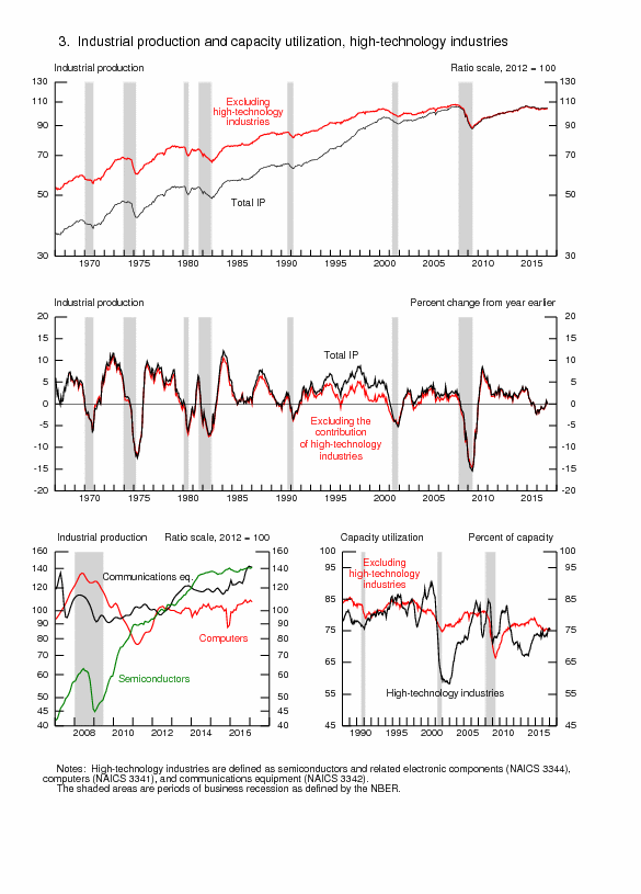
Chart VA-2, Federal Reserve Bank of Philadelphia Business Outlook Survey, Current New Orders Diffusion Index SA
Source: Federal Reserve Bank of Philadelphia
http://www.philadelphiafed.org/index.cfm
© Carlos M. Pelaez, 2009, 2010, 2011, 2012, 2013, 2014.
No comments:
Post a Comment