
Interest Rate Risks, World Inflation Waves, Squeeze of Economic Activity by Carry Trades Induced by Zero Interest Rates, Collapse of United States Dynamism of Income Growth and Employment Creation, Unresolved US Balance of Payments Deficits and Fiscal Imbalance Threatening Risk Premium on Treasury Securities, United States Industrial Production, World Cyclical Slow Growth and Global Recession Risk
Carlos M. Pelaez
© Carlos M. Pelaez, 2009, 2010, 2011, 2012, 2013, 2014
Executive Summary
I World Inflation Waves
IA Appendix: Transmission of Unconventional Monetary Policy
IB1 Theory
IB2 Policy
IB3 Evidence
IB4 Unwinding Strategy
IB United States Inflation
IC Long-term US Inflation
ID Current US Inflation
IE Theory and Reality of Economic History, Cyclical Slow Growth Not Secular Stagnation and Monetary Policy Based on Fear of Deflation
IB Collapse of United States Dynamism of Income Growth and Employment Creation
IIA Unresolved US Balance of Payments Deficits and Fiscal Imbalance Threatening Risk
Premium on Treasury Securities
IIA1 United States Unsustainable Deficit/Debt
IIA2 Unresolved US Balance of Payments Deficits
IIB United States Industrial Production
III World Financial Turbulence
IIIA Financial Risks
IIIE Appendix Euro Zone Survival Risk
IIIF Appendix on Sovereign Bond Valuation
IV Global Inflation
V World Economic Slowdown
VA United States
VB Japan
VC China
VD Euro Area
VE Germany
VF France
VG Italy
VH United Kingdom
VI Valuation of Risk Financial Assets
VII Economic Indicators
VIII Interest Rates
IX Conclusion
References
Appendixes
Appendix I The Great Inflation
IIIB Appendix on Safe Haven Currencies
IIIC Appendix on Fiscal Compact
IIID Appendix on European Central Bank Large Scale Lender of Last Resort
IIIG Appendix on Deficit Financing of Growth and the Debt Crisis
IIIGA Monetary Policy with Deficit Financing of Economic Growth
IIIGB Adjustment during the Debt Crisis of the 1980s
IB Collapse of United States Dynamism of Income Growth and Employment Creation. There are four major approaches to the analysis of the depth of the financial crisis and global recession from IVQ2007 (Dec) to IIQ2009 (Jun) and the subpar recovery from IIIQ2009 (Jul) to the present:
(1) Deeper contraction and slower recovery in recessions with financial crises
(2) Counterfactual of avoiding deeper contraction by fiscal and monetary policies
(3) Theory and Reality ofSecular Stagnation
(4) Counterfactual that the financial crises and global recession would have been avoided had economic policies been different
(5) Evidence that growth rates are higher after deeper recessions with financial crises.
A counterfactual consists of theory and measurements of what would have occurred otherwise if economic policies or institutional arrangements had been different. This task is quite difficult because economic data are observed with all effects as they actually occurred while the counterfactual attempts to evaluate how data would differ had policies and institutional arrangements been different (see Pelaez and Pelaez, Globalization and the State, Vol. I (2008b), 125, 136; Pelaez 1979, 26-8). Counterfactual data are unobserved and must be calculated using theory and measurement methods. The measurement of costs and benefits of projects or applied welfare economics (Harberger 1971, 1997) specifies and attempts to measure projects such as what would be economic welfare with or without a bridge or whether markets would be more or less competitive in the absence of antitrust and regulation laws (Winston 2006). The “new economic history” of the United States used counterfactuals to measure the economy with or without railroads (Fishlow 1965, Fogel 1964) and in analyzing slavery (Fogel and Engerman 1974). A critical counterfactual in economic history is how Britain surged ahead of France (North and Weingast 1989). These four approaches are discussed below in turn followed with comparison of the two recessions of the 1980s from IQ1980 (Jan) to IIIQ1980 (Jul) and from IIIQ1981 (Jul) to IVQ1982 (Nov) with the recession from IVQ2007 (Dec) to IIQ2009 (Jun) as dated by the National Bureau of Economic Research (NBER http://www.nber.org/cycles.html). These comparisons are not idle exercises, defining the interpretation of history and even possibly critical policies and institutional arrangements. There is active debate on these issues (Bordo 2012Oct 21 http://www.bloomberg.com/news/2012-10-21/why-this-u-s-recovery-is-weaker.html Reinhart and Rogoff, 2012Oct14 http://www.economics.harvard.edu/faculty/rogoff/files/Is_US_Different_RR_3.pdf Taylor 2012Oct 25 http://www.johnbtaylorsblog.blogspot.co.uk/2012/10/an-unusually-weak-recovery-as-usually.html, Wolf 2012Oct23 http://www.ft.com/intl/cms/s/0/791fc13a-1c57-11e2-a63b-00144feabdc0.html#axzz2AotsUk1q).
(1) Lower Growth Rates in Recoveries from Recessions with Financial Crises. A monumental effort of data gathering, calculation and analysis by Professors Carmen M. Reinhart and Kenneth Rogoff at Harvard University is highly relevant to banking crises, financial crash, debt crises and economic growth (Reinhart 2010CB; Reinhart and Rogoff 2011AF, 2011Jul14, 2011EJ, 2011CEPR, 2010FCDC, 2010GTD, 2009TD, 2009AFC, 2008TDPV; see also Reinhart and Reinhart 2011Feb, 2010AF and Reinhart and Sbrancia 2011). See http://cmpassocregulationblog.blogspot.com/2011/07/debt-and-financial-risk-aversion-and.html. The dataset of Reinhart and Rogoff (2010GTD, 1) is quite unique in breadth of countries and over time periods:
“Our results incorporate data on 44 countries spanning about 200 years. Taken together, the data incorporate over 3,700 annual observations covering a wide range of political systems, institutions, exchange rate and monetary arrangements and historic circumstances. We also employ more recent data on external debt, including debt owed by government and by private entities.”
Reinhart and Rogoff (2010GTD, 2011CEPR) classify the dataset of 2317 observations into 20 advanced economies and 24 emerging market economies. In each of the advanced and emerging categories, the data for countries is divided into buckets according to the ratio of gross central government debt to GDP: below 30, 30 to 60, 60 to 90 and higher than 90 (Reinhart and Rogoff 2010GTD, Table 1, 4). Median and average yearly percentage growth rates of GDP are calculated for each of the buckets for advanced economies. There does not appear to be any relation for debt/GDP ratios below 90. The highest growth rates are for debt/GDP ratios below 30: 3.7 percent for the average and 3.9 percent for the median. Growth is significantly lower for debt/GDP ratios above 90: 1.7 percent for the average and 1.9 percent for the median. GDP growth rates for the intermediate buckets are in a range around 3 percent: the highest 3.4 percent average is for the bucket 60 to 90 and 3.1 percent median for 30 to 60. There is even sharper contrast for the United States: 4.0 percent growth for debt/GDP ratio below 30; 3.4 percent growth for debt/GDP ratio of 30 to 60; 3.3 percent growth for debt/GDP ratio of 60 to 90; and minus 1.8 percent, contraction, of GDP for debt/GDP ratio above 90.
For the five countries with systemic financial crises—Iceland, Ireland, UK, Spain and the US—real average debt levels have increased by 75 percent between 2007 and 2009 (Reinhart and Rogoff 2010GTD, Figure 1). The cumulative increase in public debt in the three years after systemic banking crisis in a group of episodes after World War II is 86 percent (Reinhart and Rogoff 2011CEPR, Figure 2, 10).
An important concept is “this time is different syndrome,” which “is rooted in the firmly-held belief that financial crises are something that happens to other people in other countries at other times; crises do not happen here and now to us” (Reinhart and Rogoff 2010FCDC, 9). There is both an arrogance and ignorance in “this time is different” syndrome, as explained by Reinhart and Rogoff (2010FCDC, 34):
“The ignorance, of course, stems from the belief that financial crises happen to other people at other time in other places. Outside a small number of experts, few people fully appreciate the universality of financial crises. The arrogance is of those who believe they have figured out how to do things better and smarter so that the boom can long continue without a crisis.”
There is sober warning by Reinhart and Rogoff (2011CEPR, 42) based on the momentous effort of their scholarly data gathering, calculation and analysis:
“Despite considerable deleveraging by the private financial sector, total debt remains near its historic high in 2008. Total public sector debt during the first quarter of 2010 is 117 percent of GDP. It has only been higher during a one-year stint at 119 percent in 1945. Perhaps soaring US debt levels will not prove to be a drag on growth in the decades to come. However, if history is any guide, that is a risky proposition and over-reliance on US exceptionalism may only be one more example of the ‘This Time is Different’ syndrome.”
As both sides of the Atlantic economy maneuver around defaults, the experience on debt and growth deserves significant emphasis in research and policy. The world economy is slowing with high levels of unemployment in advanced economies. Countries do not grow themselves out of unsustainable debts but rather through de facto defaults by means of financial repression and in some cases through inflation. The conclusion is that this time is not different.
Professor Alan M. Taylor (2012) at the University of Virginia analyzes own and collaborative research on 140 years of history with data from 14 advanced economies in the effort to elucidate experience preceding, during and after financial crises. The conclusion is (Allan M. Taylor 2012, 8):
“Recessions might be painful, but they tend to be even more painful when combined with financial crises or (worse) global crises, and we already know that post-2008 experience will not overturn this conclusion. The impact on credit is also very strong: financial crises lead to strong setbacks in the rate of growth of loans as compared to what happens in normal recessions, and this effect is strong for global crises. Finally, inflation generally falls in recessions, but the downdraft is stronger in financial crisis times.”
Alan M. Taylor (2012) also finds that advanced economies entered the global recession with the largest financial sector in history. There was doubling after 1980 of the ratio of loans to GDP and tripling of the size of bank balance sheets. In contrast, in the period from 1950 to 1970 there was high investment, savings and growth in advanced economies with firm regulation of finance and controls of foreign capital flows.
(2) Counterfactual of the Global Recession. There is a difficult decision on when to withdraw the fiscal stimulus that could have adverse consequences on current growth and employment analyzed by Krugman (2011Jun18). CBO (2011JunLTBO, Chapter 2) considers the timing of withdrawal as well as the equally tough problems that result from not taking prompt action to prevent a possible debt crisis in the future. Krugman (2011Jun18) refers to Eggertsson and Krugman (2010) on the possible contractive effects of debt. The world does not become poorer as a result of debt because an individual’s asset is another’s liability. Past levels of credit may become unacceptable by credit tightening, such as during a financial crisis. Debtors are forced into deleveraging, which results in expenditure reduction, but there may not be compensatory effects by creditors who may not be in need of increasing expenditures. The economy could be pushed toward the lower bound of zero interest rates, or liquidity trap, remaining in that threshold of deflation and high unemployment.
Analysis of debt can lead to the solution of the timing of when to cease stimulus by fiscal spending (Krugman 2011Jun18). Excessive debt caused the financial crisis and global recession and it is difficult to understand how more debt can recover the economy. Krugman (2011Jun18) argues that the level of debt is not important because one individual’s asset is another individual’s liability. The distribution of debt is important when economic agents with high debt levels are encountering different constraints than economic agents with low debt levels. The opportunity for recovery may exist in borrowing by some agents that can adjust the adverse effects of past excessive borrowing by other agents. As Krugman (2011Jun18, 20) states:
“Suppose, in particular, that the government can borrow for a while, using the borrowed money to buy useful things like infrastructure. The true social cost of these things will be very low, because the spending will be putting resources that would otherwise be unemployed to work. And government spending will also make it easier for highly indebted players to pay down their debt; if the spending is sufficiently sustained, it can bring the debtors to the point where they’re no longer so severely balance-sheet constrained, and further deficit spending is no longer required to achieve full employment. Yes, private debt will in part have been replaced by public debt – but the point is that debt will have been shifted away from severely balance-sheet-constrained players, so that the economy’s problems will have been reduced even if the overall level of debt hasn’t fallen. The bottom line, then, is that the plausible-sounding argument that debt can’t cure debt is just wrong. On the contrary, it can – and the alternative is a prolonged period of economic weakness that actually makes the debt problem harder to resolve.”
Besides operational issues, the consideration of this argument would require specifying and measuring two types of gains and losses from this policy: (1) the benefits in terms of growth and employment currently; and (2) the costs of postponing the adjustment such as in the exercise by CBO (2011JunLTO, 28-31) in Table 11. It may be easier to analyze the costs and benefits than actual measurement.
An analytical and empirical approach is followed by Blinder and Zandi (2010), using the Moody’s Analytics model of the US economy with four different scenarios: (1) baseline with all policies used; (2) counterfactual including all fiscal stimulus policies but excluding financial stimulus policies; (3) counterfactual including all financial stimulus policies but excluding fiscal stimulus; and (4) a scenario excluding all policies. The scenario excluding all policies is an important reference or the counterfactual of what would have happened if the government had been entirely inactive. A salient feature of the work by Blinder and Zandi (2010) is the consideration of both fiscal and financial policies. There was probably more activity with financial policies than with fiscal policies. Financial policies included the Fed balance sheet, 11 facilities of direct credit to illiquid segments of financial markets, interest rate policy, the Financial Stability Plan including stress tests of banks, the Troubled Asset Relief Program (TARP) and others (see Pelaez and Pelaez, Financial Regulation after the Global Recession (2009b), 157-67; Regulation of Banks and Finance (2009a), 224-7).
Blinder and Zandi (2010, 4) find that:
“In the scenario that excludes all the extraordinary policies, the downturn continues into 2011. Real GDP falls a stunning 7.4% in 2009 and another 3.7% in 2010 (see Table 3). The peak-to-trough decline in GDP is therefore close to 12%, compared to an actual decline of about 4%. By the time employment hits bottom, some 16.6 million jobs are lost in this scenario—about twice as many as actually were lost. The unemployment rate peaks at 16.5%, and although not determined in this analysis, it would not be surprising if the underemployment rate approached one-fourth of the labor force. The federal budget deficit surges to over $2 trillion in fiscal year 2010, $2.6 trillion in fiscal year 2011, and $2.25 trillion in FY 2012. Remember, this is with no policy response. With outright deflation in prices and wages in 2009-2011, this dark scenario constitutes a 1930s-like depression.”
The conclusion by Blinder and Zandi (2010) is that if the US had not taken massive fiscal and financial measures the economy could have suffered far more during a prolonged period. There are still a multitude of questions that cloud understanding of the impact of the recession and what would have happened without massive policy impulses. Some effects are quite difficult to measure. An important argument by Blinder and Zandi (2010) is that this evaluation of counterfactuals is relevant to the need of stimulus if economic conditions worsened again.
(3) Theory and Reality of Cyclical Stagnation Not Secular Stagnation. There is current interest in past theories of “secular stagnation.” Alvin H. Hansen (1939, 4, 7; see Hansen 1938, 1941; for an early critique see Simons 1942) argues:
“Not until the problem of full employment of our productive resources from the long-run, secular standpoint was upon us, were we compelled to give serious consideration to those factors and forces in our economy which tend to make business recoveries weak and anaemic (sic) and which tend to prolong and deepen the course of depressions. This is the essence of secular stagnation-sick recoveries which die in their infancy and depressions which feed on themselves and leave a hard and seemingly immovable core of unemployment. Now the rate of population growth must necessarily play an important role in determining the character of the output; in other words, the composition of the flow of final goods. Thus a rapidly growing population will demand a much larger per capita volume of new residential building construction than will a stationary population. A stationary population with its larger proportion of old people may perhaps demand more personal services; and the composition of consumer demand will have an important influence on the quantity of capital required. The demand for housing calls for large capital outlays, while the demand for personal services can be met without making large investment expenditures. It is therefore not unlikely that a shift from a rapidly growing population to a stationary or declining one may so alter the composition of the final flow of consumption goods that the ratio of capital to output as a whole will tend to decline.”
In the analysis of Hansen (1939, 3) of secular stagnation, economic progress consists of growth of real income per person driven by growth of productivity. The “constituent elements” of economic progress are “(a) inventions, (b) the discovery and development of new territory and new resources, and (c) the growth of population” (Hansen 1939, 3). Secular stagnation originates in decline of population growth and discouragement of inventions. According to Hansen (1939, 2), US population grew by 16 million in the 1920s but grew by one half or about 8 million in the 1930s with forecasts at the time of Hansen’s writing in 1938 of growth of around 5.3 million in the 1940s. Hansen (1939, 2) characterized demography in the US as “a drastic decline in the rate of population growth. Hansen’s plea was to adapt economic policy to stagnation of population in ensuring full employment. In the analysis of Hansen (1939, 8), population caused half of the growth of US GDP per year. Growth of output per person in the US and Europe was caused by “changes in techniques and to the exploitation of new natural resources.” In this analysis, population caused 60 percent of the growth of capital formation in the US. Declining population growth would reduce growth of capital formation. Residential construction provided an important share of growth of capital formation. Hansen (1939, 12) argues that market power of imperfect competition discourages innovation with prolonged use of obsolete capital equipment. Trade unions would oppose labor-savings innovations. The combination of stagnating and aging population with reduced innovation caused secular stagnation. Hansen (1939, 12) concludes that there is role for public investments to compensate for lack of dynamism of private investment but with tough tax/debt issues.
Table SE1 provides contributions to growth of GDP in the 1930s. These data were not available until much more recently. Residential investment (RSI) contributed 1.03 percentage points to growth of GDP of 8.0 percent in 1939, which is a high percentage of the contribution of gross private domestic investment of 2.39 percentage points. Residential investment contributed 0.42 percentage points to GDP growth of 8.8 percent in 1940 with gross private domestic investment contributing 3.99 percentage points.
Table SE1, US, Contributions to Growth of GDP
| GDP ∆% | PCE PP | GDI PP | NRI PP | RSI PP | Net Trade PP | GOVT | |
| 1930 | -8.5 | -3.96 | -5.18 | -1.84 | -1.50 | -0.31 | 0.94 |
| 1931 | -6.4 | -2.37 | -4.28 | -3.32 | -0.40 | -0.22 | 0.48 |
| 1932 | -12.9 | -7.00 | -5.28 | -2.78 | -1.02 | -0.20 | -0.42 |
| 1933 | -1.3 | -1.79 | 1.16 | -0.44 | -0.24 | -0.11 | -0.52 |
| 1934 | 10.8 | 5.71 | 2.83 | 1.31 | 0.38 | 0.33 | 1.91 |
| 1935 | 8.9 | 4.69 | 4.54 | 1.41 | 0.56 | -0.83 | 0.50 |
| 1936 | 12.9 | 7.68 | 2.58 | 2.10 | 0.47 | 0.24 | 2.44 |
| 1937 | 5.1 | 2.72 | 2.57 | 1.42 | 0.17 | 0.45 | -0.64 |
| 1938 | -3.3 | -1.15 | -4.13 | -2.13 | 0.01 | 0.88 | 1.09 |
| 1939 | 8.0 | 4.11 | 2.39 | 0.71 | 1.03 | 0.07 | 1.41 |
| 1940 | 8.8 | 3.72 | 3.99 | 1.60 | 0.42 | 0.52 | 0.57 |
GDP ∆%: Annual Growth of GDP; PCE PP: Percentage Points Contributed by Personal Consumption Expenditures (PCE); GDI PP: Percentage Points Contributed by Gross Private Domestic Investment (GDI); NRI PP: Percentage Points Contributed by Nonresidential Investment (NRI); RSI: Percentage Points Contributed by Residential Investment; Net Trade PP: Percentage Points Contributed by Net Exports less Imports of Goods and Services; GOVT PP: Percentage Points Contributed by Government Consumption and Gross Investment
Source: Bureau of Economic Analysis
http://www.bea.gov/iTable/index_nipa.cfm
Table ES2 provides percentage shares of GDP in 1929, 1939, 1940, 2006 and 2013. The share of residential investment was 3.9 percent in 1929, 3.4 percent in 1939 and 6.0 percent in 2006 at the peak of the real estate boom. The share of residential investment in GDP has not been very high historically.
Table ES2, Percentage Shares in GDP
| 1929 | 1939 | 1940 | 2006 | 2013 | |
| GDP | 100.00 | 100.00 | 100.00 | 100.00 | 100.00 |
| PCE | 74.0 | 71.9 | 69.2 | 67.1 | 68.4 |
| GDI | 16.4 | 10.9 | 14.2 | 19.3 | 15.9 |
| NRI | 11.1 | 7.3 | 8.3 | 12.8 | 12.2 |
| RSI | 3.9 | 3.4 | 3.5 | 6.0 | 3.1 |
| Net Trade | 0.4 | 0.9 | 1.4 | -5.5 | -3.0 |
| GOVT | 9.2 | 16.3 | 15.2 | 19.1 | 18.6 |
PCE: Personal Consumption Expenditures; GDI: Gross Domestic Investment; NRI: Nonresidential Investment; RSI: Residential Investment; Net Trade: Net Exports less Imports of Goods and Services; GOVT: Government Consumption and Gross Investment
Source: Bureau of Economic Analysis
PCE: Personal Consumption Expenditures; GDI: Gross Private Domestic Investment; NRI: Nonresidential Investment; RSI: Residential Investment; Net Trade: Net Exports less Imports of Goods and Services; GOVT: Government Consumption and Gross Investment
Source: Bureau of Economic Analysis
http://www.bea.gov/iTable/index_nipa.cfm
An interpretation of the New Deal is that fiscal stimulus must be massive in recovering growth and employment and that it should not be withdrawn prematurely to avoid a sharp second contraction as it occurred in 1937 (Christina Romer 2009). Proposals for another higher dose of stimulus explain the current weakness by insufficient fiscal expansion and warn that failure to spend more can cause another contraction as in 1937. According to a different interpretation, private hours worked declined by 25 percent by 1939 compared with the level in 1929, suggesting that the economy fell to a lower path of expansion than in 1929 (works by Harold Cole and Lee Ohanian (1999) (cited in Pelaez and Pelaez, Regulation of Banks and Finance, 215-7). Major real variables of output and employment were below trend by 1939: -26.8 percent for GNP, -25.4 percent for consumption, -51 percent for investment and -25.6 percent for hours worked. Surprisingly, total factor productivity increased by 3.1 percent and real wages by 21.8 percent (Cole and Ohanian 1999). The policies of the Roosevelt administration encouraged increasing unionization to maintain high wages with lower hours worked and high prices by lax enforcement of antitrust law to encourage cartels or collusive agreements among producers. The encouragement by the government of labor bargaining by unions and higher prices by collusion depressed output and employment throughout the 1930s until Roosevelt abandoned the policies during World War II after which the economy recovered full employment (Cole and Ohanian 1999). The fortunate ones who worked during the New Deal received higher real wages at the expense of many who never worked again. In a way, the administration behaved like the father of the unionized workers and the uncle of the collusive rich, neglecting the majority in the middle. Inflation-adjusted GDP increased by 10.8 percent in 1934, 8.9 percent in 1935, 12.9 percent in 1936 but only 5.1 percent in 1937, contracting by -3.3 percent in 1938 (US Bureau of Economic Analysis cited in Pelaez and Pelaez, Financial Regulation after the Global Recession, 151, Globalization and the State, Vol. II, 206). The competing explanation is that the economy did not decline from 1937 to 1938 because of lower government spending in 1937 but rather because of the expansion of unions promoted by the New Deal and increases in tax rates (Thomas Cooley and Lee Ohanian 2010). Government spending adjusted for inflation fell only 0.7 percent in 1936 and 1937 and could not explain the decline of GDP by 3.4 percent in 1938. In 1936, the administration imposed a tax on retained profits not distributed to shareholders according to a sliding scale of 7 percent for retaining 1 percent of total net income up to 27 percent for retaining 70 percent of total net income, increasing costs of investment that were mostly financed in that period with retained earnings (Cooley and Ohanian 2010). The tax rate on dividends jumped from 10.1 percent in 1929 to 15.9 percent in 1932 and doubled by 1936. A recent study finds that “tax rates on dividends rose dramatically during the 1930s and imply significant declines in investment and equity values and nontrivial declines in GDP and hours of work” (Ellen McGrattan 2010), explaining a significant part of the decline of 26 percent in business fixed investment in 1937-1938. The National Labor Relations Act of 1935 caused an increase in union membership from 12 percent in 1934 to 25 percent in 1938. The alternative lesson from the 1930s is that capital income taxes and higher unionization caused increases in business costs that perpetuated job losses of the recession with current risks of repeating the 1930s (Cooley and Ohanian 1999).
The current application of Hansen’s (1938, 1939, 1941) proposition argues that secular stagnation occurs because full employment equilibrium can be attained only with negative real interest rates between minus 2 and minus 3 percent. Professor Lawrence H. Summers (2013Nov8) finds that “a set of older ideas that went under the phrase secular stagnation are not profoundly important in understanding Japan’s experience in the 1990s and may not be without relevance to America’s experience today” (emphasis added). Summers (2013Nov8) argues there could be an explanation in “that the short-term real interest rate that was consistent with full employment had fallen to -2% or -3% sometime in the middle of the last decade. Then, even with artificial stimulus to demand coming from all this financial imprudence, you wouldn’t see any excess demand. And even with a relative resumption of normal credit conditions, you’d have a lot of difficulty getting back to full employment.” The US economy could be in a situation where negative real rates of interest with fed funds rates close to zero as determined by the Federal Open Market Committee (FOMC) do not move the economy to full employment or full utilization of productive resources. Summers (2013Oct8) finds need of new thinking on “how we manage an economy in which the zero nominal interest rates is a chronic and systemic inhibitor of economy activity holding our economies back to their potential.”
Former US Treasury Secretary Robert Rubin (2014Jan8) finds three major risks in prolonged unconventional monetary policy of zero interest rates and quantitative easing: (1) incentive of delaying action by political leaders; (2) “financial moral hazard” in inducing excessive exposures pursuing higher yields of risker credit classes; and (3) major risks in exiting unconventional policy. Rubin (2014Jan8) proposes reduction of deficits by structural reforms that could promote recovery by improving confidence of business attained with sound fiscal discipline.
Professor John B. Taylor (2014Jan01, 2014Jan3) provides clear thought on the lack of relevance of Hansen’s contention of secular stagnation to current economic conditions. The application of secular stagnation argues that the economy of the US has attained full-employment equilibrium since around 2000 only with negative real rates of interest of minus 2 to minus 3 percent. At low levels of inflation, the so-called full-employment equilibrium of negative interest rates of minus 2 to minus 3 percent cannot be attained and the economy stagnates. Taylor (2014Jan01) analyzes multiple contradictions with current reality in this application of the theory of secular stagnation:
- Secular stagnation would predict idle capacity, in particular in residential investment when fed fund rates were fixed at 1 percent from Jun 2003 to Jun 2004. Taylor (2014Jan01) finds unemployment at 4.4 percent with house prices jumping 7 percent from 2002 to 2003 and 14 percent from 2004 to 2005 before dropping from 2006 to 2007. GDP prices doubled from 1.7 percent to 3.4 percent when interest rates were low from 2003 to 2005.
- Taylor (2014Jan01, 2014Jan3) finds another contradiction in the application of secular stagnation based on low interest rates because of savings glut and lack of investment opportunities. Taylor (2009) shows that there was no savings glut. The savings rate of the US in the past decade is significantly lower than in the 1980s.
- Taylor (2014Jan01, 2014Jan3) finds another contradiction in the low ratio of investment to GDP currently and reduced investment and hiring by US business firms.
- Taylor (2014Jan01, 2014Jan3) argues that the financial crisis and global recession were caused by weak implementation of existing regulation and departure from rules-based policies.
- Taylor (2014Jan01, 2014Jan3) argues that the recovery from the global recession was constrained by a change in the regime of regulation and fiscal/monetary policies.
The argument that anemic population growth causes “secular stagnation” in the US (Hansen 1938, 1939, 1941) is as misplaced currently as in the late 1930s (for early dissent see Simons 1942). The reality is not secular stagnation but current cyclical slow growth. Youth workers would obtain employment at a premium in an economy with declining population. In fact, there is currently population growth in the ages of 16 to 24 years but not enough job creation and discouragement of job searches for all ages. This is merely another case of theory without reality with dubious policy proposals. Inferior performance of the US economy and labor markets is the critical current issue of analysis and policy design.
In revealing research, Edward P. Lazear and James R. Spletzer (2012JHJul22) use the wealth of data in the valuable database and resources of the Bureau of Labor Statistics (http://www.bls.gov/data/) in providing clear thought on the nature of the current labor market of the United States. The critical issue of analysis and policy currently is whether unemployment is structural or cyclical. Structural unemployment could occur because of (1) industrial and demographic shifts and (2) mismatches of skills and job vacancies in industries and locations. Consider the aggregate unemployment rate, Y, expressed in terms of share si of a demographic group in an industry i and unemployment rate yi of that demographic group (Lazear and Spletzer 2012JHJul22, 5-6):
Y = ∑isiyi (1)
This equation can be decomposed for analysis as (Lazear and Spletzer 2012JHJul22, 6):
∆Y = ∑i∆siy*i + ∑i∆yis*i (2)
The first term in (2) captures changes in the demographic and industrial composition of the economy ∆si multiplied by the average rate of unemployment y*i , or structural factors. The second term in (2) captures changes in the unemployment rate specific to a group, or ∆yi, multiplied by the average share of the group s*i, or cyclical factors. There are also mismatches in skills and locations relative to available job vacancies. A simple observation by Lazear and Spletzer (2012JHJul22) casts intuitive doubt on structural factors: the rate of unemployment jumped from 4.4 percent in the spring of 2007 to 10 percent in October 2009. By nature, structural factors should be permanent or occur over relative long periods. The revealing result of the exhaustive research of Lazear and Spletzer (2012JHJul22) is:
“The analysis in this paper and in others that we review do not provide any compelling evidence that there have been changes in the structure of the labor market that are capable of explaining the pattern of persistently high unemployment rates. The evidence points to primarily cyclic factors.”
Table I-4b and Chart I-12-b provide the US labor force participation rate or percentage of the labor force in population. It is not likely that simple demographic trends caused the sharp decline during the global recession and failure to recover earlier levels. The civilian labor force participation rate dropped from the peak of 66.9 percent in Jul 2006 to 62.6 percent in Dec 2013 and 62.7 percent in Feb 2014. The civilian labor force participation rate was 63.7 percent on an annual basis in 1979 and 63.4 percent in Dec 1980 and Dec 1981, reaching even 62.9 percent in both Apr and May 1979. The civilian labor force participation rate jumped with the recovery to 64.8 percent on an annual basis in 1985 and 65.9 percent in Jul 1985. Structural factors cannot explain these sudden changes vividly shown visually in the final segment of Chart I-12b. Seniors would like to delay their retiring especially because of the adversities of financial repression on their savings. Labor force statistics are capturing the disillusion of potential workers with their chances in finding a job in what Lazear and Spletzer (2012JHJul22) characterize as accentuated cyclical factors. The argument that anemic population growth causes “secular stagnation” in the US (Hansen 1938, 1939, 1941) is as misplaced currently as in the late 1930s (for early dissent see Simons 1942). There is currently population growth in the ages of 16 to 24 years but not enough job creation and discouragement of job searches for all ages (http://cmpassocregulationblog.blogspot.com/2014/02/theory-and-reality-of-cyclical-slow.html). “Secular stagnation” would be a process over many years and not from one year to another. This is merely another case of theory without reality with dubious policy proposals.
Table I-4b, US, Labor Force Participation Rate, Percent of Labor Force in Population, NSA, 1979-2014
| Year | Jan | Feb | Jul | Aug | Sep | Oct | Nov | Dec | Annual |
| 1979 | 62.9 | 63.0 | 64.9 | 64.5 | 63.8 | 64.0 | 63.8 | 63.8 | 63.7 |
| 1980 | 63.3 | 63.2 | 65.1 | 64.5 | 63.6 | 63.9 | 63.7 | 63.4 | 63.8 |
| 1981 | 63.2 | 63.2 | 65.0 | 64.6 | 63.5 | 64.0 | 63.8 | 63.4 | 63.9 |
| 1982 | 63.0 | 63.2 | 65.3 | 64.9 | 64.0 | 64.1 | 64.1 | 63.8 | 64.0 |
| 1983 | 63.3 | 63.2 | 65.4 | 65.1 | 64.3 | 64.1 | 64.1 | 63.8 | 64.0 |
| 1984 | 63.3 | 63.4 | 65.9 | 65.2 | 64.4 | 64.6 | 64.4 | 64.3 | 64.4 |
| 1985 | 64.0 | 64.0 | 65.9 | 65.4 | 64.9 | 65.1 | 64.9 | 64.6 | 64.8 |
| 1986 | 64.2 | 64.4 | 66.6 | 66.1 | 65.3 | 65.5 | 65.4 | 65.0 | 65.3 |
| 1987 | 64.7 | 64.8 | 66.8 | 66.5 | 65.5 | 65.9 | 65.7 | 65.5 | 65.6 |
| 1988 | 65.1 | 65.2 | 67.1 | 66.8 | 65.9 | 66.1 | 66.2 | 65.9 | 65.9 |
| 1989 | 65.8 | 65.6 | 67.7 | 67.2 | 66.3 | 66.6 | 66.7 | 66.3 | 66.5 |
| 1990 | 66.0 | 66.0 | 67.7 | 67.1 | 66.4 | 66.5 | 66.3 | 66.1 | 66.5 |
| 1991 | 65.5 | 65.7 | 67.3 | 66.6 | 66.1 | 66.1 | 66.0 | 65.8 | 66.2 |
| 1992 | 65.7 | 65.8 | 67.9 | 67.2 | 66.3 | 66.2 | 66.2 | 66.1 | 66.4 |
| 1993 | 65.6 | 65.8 | 67.5 | 67.0 | 66.1 | 66.4 | 66.3 | 66.2 | 66.3 |
| 1994 | 66.0 | 66.2 | 67.5 | 67.2 | 66.5 | 66.8 | 66.7 | 66.5 | 66.6 |
| 1995 | 66.1 | 66.2 | 67.7 | 67.1 | 66.5 | 66.7 | 66.5 | 66.2 | 66.6 |
| 1996 | 65.8 | 66.1 | 67.9 | 67.2 | 66.8 | 67.1 | 67.0 | 66.7 | 66.8 |
| 1997 | 66.4 | 66.5 | 68.1 | 67.6 | 67.0 | 67.1 | 67.1 | 67.0 | 67.1 |
| 1998 | 66.6 | 66.7 | 67.9 | 67.3 | 67.0 | 67.1 | 67.1 | 67.0 | 67.1 |
| 1999 | 66.7 | 66.8 | 67.9 | 67.3 | 66.8 | 67.0 | 67.0 | 67.0 | 67.1 |
| 2000 | 66.8 | 67.0 | 67.6 | 67.2 | 66.7 | 66.9 | 66.9 | 67.0 | 67.1 |
| 2001 | 66.8 | 66.8 | 67.4 | 66.8 | 66.6 | 66.7 | 66.6 | 66.6 | 66.8 |
| 2002 | 66.2 | 66.6 | 67.2 | 66.8 | 66.6 | 66.6 | 66.3 | 66.2 | 66.6 |
| 2003 | 66.1 | 66.2 | 66.8 | 66.3 | 65.9 | 66.1 | 66.1 | 65.8 | 66.2 |
| 2004 | 65.7 | 65.7 | 66.8 | 66.2 | 65.7 | 66.0 | 66.1 | 65.8 | 66.0 |
| 2005 | 65.4 | 65.6 | 66.8 | 66.5 | 66.1 | 66.2 | 66.1 | 65.9 | 66.0 |
| 2006 | 65.5 | 65.7 | 66.9 | 66.5 | 66.1 | 66.4 | 66.4 | 66.3 | 66.2 |
| 2007 | 65.9 | 65.8 | 66.8 | 66.1 | 66.0 | 66.0 | 66.1 | 65.9 | 66.0 |
| 2008 | 65.7 | 65.5 | 66.8 | 66.4 | 65.9 | 66.1 | 65.8 | 65.7 | 66.0 |
| 2009 | 65.4 | 65.5 | 66.2 | 65.6 | 65.0 | 64.9 | 64.9 | 64.4 | 65.4 |
| 2010 | 64.6 | 64.6 | 65.3 | 65.0 | 64.6 | 64.4 | 64.4 | 64.1 | 64.7 |
| 2011 | 63.9 | 63.9 | 64.6 | 64.3 | 64.2 | 64.1 | 63.9 | 63.8 | 64.1 |
| 2012 | 63.4 | 63.6 | 64.3 | 63.7 | 63.6 | 63.8 | 63.5 | 63.4 | 63.7 |
| 2013 | 63.3 | 63.2 | 64.0 | 63.4 | 63.2 | 62.9 | 62.9 | 62.6 | 63.2 |
| 2014 | 62.5 | 62.7 |
Source: US Bureau of Labor Statistics

Chart I-12b, US, Labor Force Participation Rate, Percent of Labor Force in Population, NSA, 1979-2014
Source: Bureau of Labor Statistics
Broader perspective is provided by Chart I-12c of the US Bureau of Labor Statistics. The United States civilian noninstitutional population has increased along a consistent trend since 1948 that continued through earlier recessions and the global recession from IVQ2007 to IIQ2009 and the cyclical expansion after IIIQ2009.

Chart I-12c, US, Civilian Noninstitutional Population, Thousands, NSA, 1948-2014
Sources: US Bureau of Labor Statistics
The labor force of the United States in Chart I-12d has increased along a trend similar to that of the civilian noninstitutional population in Chart I-12c. There is an evident stagnation of the civilian labor force in the final segment of Chart I-12d during the current economic cycle. This stagnation is explained by cyclical factors similar to those analyzed by Lazear and Spletzer (2012JHJul22) that motivated an increasing population to drop out of the labor force instead of structural factors. Large segments of the potential labor force are not observed, constituting unobserved unemployment and of more permanent nature because those afflicted have been seriously discouraged from working by the lack of opportunities.

Chart I-12d, US, Labor Force, Thousands, NSA, 1948-2014
Sources: US Bureau of Labor Statistics
Table EMP provides the comparison between the labor market in the current whole cycle from 2007 to 2013 and the whole cycle from 1979 to 1986. In the entire cycle from 2007 to 2013, the number employed fell 2.118 million, full-time employed fell 4.777 million, part-time for economic reasons increased 3.534 and population increased 13.812 million. The number employed fell 1.5 percent, full-time employed fell 3.9 percent, part-time for economic reasons increased 80.3 percent and population increased 6.0 percent. There is sharp contrast with the contractions of the 1980s and with most economic history of the United States. In the whole cycle from 1979 to 1986, the number employed increased 10.773 million, full-time employed increased 7.875 million, part-time for economic reasons 2.011 million and population 15.724 million. In the entire cycle from 1979 to 1986, the number employed increased 10.9 percent, full-time employed 9.5 percent, part-time for economic reasons 56.2 percent and population 9.5 million. The difference between the 1980s and the current cycle after 2007 is in the high rate of growth after the contraction that maintained trend growth around 3.0 percent for the entire cycle and per capital growth at 2.0 percent. The evident fact is that current weakness in labor markets originates in cyclical slow growth and not in imaginary secular stagnation.
Table EMP, US, Annual Level of Employed, Full-Time Employed, Employed Part-Time for Economic Reasons and Noninstitutional Civilian Population, Millions
| Employed | Full-Time Employed | Part Time Economic Reasons | Noninstitutional Civilian Population | |
| 2000s | ||||
| 2000 | 136.891 | 113.846 | 3.227 | 212.577 |
| 2001 | 136.933 | 113.573 | 3.715 | 215.092 |
| 2002 | 136.485 | 112.700 | 4.213 | 217.570 |
| 2003 | 137.736 | 113.324 | 4.701 | 221.168 |
| 2004 | 139.252 | 114.518 | 4.567 | 223.357 |
| 2005 | 141.730 | 117.016 | 4.350 | 226.082 |
| 2006 | 144.427 | 119.688 | 4.162 | 228.815 |
| 2007 | 146.047 | 121.091 | 4.401 | 231.867 |
| 2008 | 145.362 | 120.030 | 5.875 | 233.788 |
| 2009 | 139.877 | 112.634 | 8.913 | 235.801 |
| 2010 | 139.064 | 111.714 | 8.874 | 237.830 |
| 2011 | 139.869 | 112.556 | 8.560 | 239.618 |
| 2012 | 142.469 | 114.809 | 8.122 | 243.284 |
| 2013 | 143.929 | 116.314 | 7.935 | 245.679 |
| ∆2007-2013 | -2.118 | -4.777 | 3.534 | 13.812 |
| ∆% 2007-2013 | -1.5 | -3.9 | 80.3 | 6.0 |
| 1980s | ||||
| 1979 | 98.824 | 82.654 | 3.577 | 164.863 |
| 1980 | 99.303 | 82.562 | 4.321 | 167.745 |
| 1981 | 100.397 | 83.243 | 4.768 | 170.130 |
| 1982 | 99.526 | 81.421 | 6.170 | 172.271 |
| 1983 | 100.834 | 82.322 | 6.266 | 174.215 |
| 1984 | 105.005 | 86.544 | 5.744 | 176.383 |
| 1985 | 107.150 | 88.534 | 5.590 | 178.206 |
| 1986 | 109.597 | 90.529 | 5.588 | 180.587 |
| 1987 | 112.440 | 92.957 | 5.401 | 182.753 |
| 1988 | 114.968 | 95.214 | 5.206 | 184.613 |
| 1989 | 117.342 | 97.369 | 4.894 | 186.393 |
| ∆1979-1986 | 10.773 | 7.875 | 2.011 | 15.724 |
| ∆% 1979-86 | 10.9 | 9.5 | 56.2 | 9.5 |
Source: Bureau of Labor Statistics
There is current interest in past theories of “secular stagnation.” Alvin H. Hansen (1939, 4, 7; see Hansen 1938, 1941; for an early critique see Simons 1942) argues:
“Not until the problem of full employment of our productive resources from the long-run, secular standpoint was upon us, were we compelled to give serious consideration to those factors and forces in our economy which tend to make business recoveries weak and anaemic (sic) and which tend to prolong and deepen the course of depressions. This is the essence of secular stagnation-sick recoveries which die in their infancy and depressions which feed on them-selves and leave a hard and seemingly immovable core of unemployment. Now the rate of population growth must necessarily play an important role in determining the character of the output; in other words, the com-position of the flow of final goods. Thus a rapidly growing population will demand a much larger per capita volume of new residential building construction than will a stationary population. A stationary population with its larger proportion of old people may perhaps demand more personal services; and the composition of consumer demand will have an important influence on the quantity of capital required. The demand for housing calls for large capital outlays, while the demand for personal services can be met without making large investment expenditures. It is therefore not unlikely that a shift from a rapidly growing population to a stationary or declining one may so alter the composition of the final flow of consumption goods that the ratio of capital to output as a whole will tend to decline.”
The argument that anemic population growth causes “secular stagnation” in the US (Hansen 1938, 1939, 1941) is as misplaced currently as in the late 1930s (for early dissent see Simons 1942). Youth workers would obtain employment at a premium in an economy with declining population. In fact, there is currently population growth in the ages of 16 to 24 years but not enough job creation and discouragement of job searches for all ages. This is merely another case of theory without reality with dubious policy proposals. Inferior performance of the US economy and labor markets is the critical current issue of analysis and policy design.
In revealing research, Edward P. Lazear and James R. Spletzer (2012JHJul22) use the wealth of data in the valuable database and resources of the Bureau of Labor Statistics (http://www.bls.gov/data/) in providing clear thought on the nature of the current labor market of the United States. The critical issue of analysis and policy currently is whether unemployment is structural or cyclical. Structural unemployment could occur because of (1) industrial and demographic shifts and (2) mismatches of skills and job vacancies in industries and locations. Consider the aggregate unemployment rate, Y, expressed in terms of share si of a demographic group in an industry i and unemployment rate yi of that demographic group (Lazear and Spletzer 2012JHJul22, 5-6):
Y = ∑isiyi (1)
This equation can be decomposed for analysis as (Lazear and Spletzer 2012JHJul22, 6):
∆Y = ∑i∆siy*i + ∑i∆yis*i (2)
The first term in (2) captures changes in the demographic and industrial composition of the economy ∆si multiplied by the average rate of unemployment y*i , or structural factors. The second term in (2) captures changes in the unemployment rate specific to a group, or ∆yi, multiplied by the average share of the group s*i, or cyclical factors. There are also mismatches in skills and locations relative to available job vacancies. A simple observation by Lazear and Spletzer (2012JHJul22) casts intuitive doubt on structural factors: the rate of unemployment jumped from 4.4 percent in the spring of 2007 to 10 percent in October 2009. By nature, structural factors should be permanent or occur over relative long periods. The revealing result of the exhaustive research of Lazear and Spletzer (2012JHJul22) is:
“The analysis in this paper and in others that we review do not provide any compelling evidence that there have been changes in the structure of the labor market that are capable of explaining the pattern of persistently high unemployment rates. The evidence points to primarily cyclic factors.”
The theory of secular stagnation cannot explain sudden collapse of the US economy and labor markets. There are accentuated cyclic factors for both the entire population and the young population of ages 16 to 24 years. Table Summary provides the total noninstitutional population (ICP) of the US, full-time employment level (FTE), employment (EMP), civilian labor force (CLF), civilian labor force participation rate (CLFP), employment/population ratio (EPOP) and unemployment level (UNE). Secular stagnation would not be secular but immediate. All indicators of the labor market weakened sharply during the contraction and did not recover. Population continued to grow but all other variables collapsed and did not recover. The theory of secular stagnation departs from an aggregate production function in which output grows with the use of labor, capital and technology (see Pelaez and Pelaez, Globalization and the State, Vol. I (2008a), 11-6). Hansen (1938, 1939) finds secular stagnation in lower growth of an aging population. In the current US economy, Table Summary shows that population is dynamic while the labor market is fractured. There is key explanation in the behavior of the civilian labor force participation rate (CLFP) and the employment population ratio (EPOP) that collapsed during the global recession with inadequate recovery. Abandoning job searches are difficult to capture in labor statistics but likely explain the decline in the participation of the population in the labor force. Allowing for abandoning job searches, the total number of people unemployed or underemployed is 29.1 million or 17.8 percent of the effective labor force (http://cmpassocregulationblog.blogspot.com/2014/03/rules-discretionary-authorities-and.html).
Table Summary Total, US, Total Noninstitutional Civilian Population, Full-time Employment, Employment, Civilian Labor Force, Civilian Labor Force Participation Rate, Employment Population Ratio, Unemployment, NSA, Thousands and Percent
| ICP | FTE | EMP | CLF | CLFP | EPOP | UNE | |
| 2006 | 228.8 | 119.7 | 144.4 | 151.4 | 66.2 | 63.1 | 7.0 |
| 2009 | 235.8 | 112.6 | 139.9 | 154.1 | 65.4 | 59.3 | 14.3 |
| 2012 | 243.3 | 114.8 | 142.5 | 155.0 | 63.7 | 58.6 | 12.5 |
| 2013 | 245.7 | 116.3 | 143.9 | 155.4 | 63.2 | 58.6 | 11.5 |
| 12/07 | 233.2 | 121.0 | 146.3 | 153.7 | 65.9 | 62.8 | 7.4 |
| 9/09 | 236.3 | 112.0 | 139.1 | 153.6 | 65.0 | 58.9 | 14.5 |
| 1/14 | 247.1 | 116.3 | 144.1 | 155.0 | 62.7 | 58.3 | 10.9 |
ICP: Total Noninstitutional Civilian Population; FT: Full-time Employment Level, EMP: Total Employment Level; CLF: Civilian Labor Force; CLFP: Civilian Labor Force Participation Rate; EPOP: Employment Population Ratio; UNE: Unemployment
Source: Bureau of Labor Statistics
The same situation is present in the labor market for young people in ages 16 to 24 years with data in Table Summary Youth. The youth noninstitutional civilian population (ICP) continued to increase during and after the global recession. There is the same disastrous labor market with decline for young people in employment (EMP), civilian labor force (CLF), civilian labor force participation rate (CLFP) and employment population ratio (EPOP). There are only increases for unemployment of young people (UNE) and youth unemployment rate (UNER). If aging were a factor of secular stagnation, growth of population of young people would attract a premium in remuneration in labor markets. The sad fact is that young people are also facing tough labor markets. The application of the theory of secular stagnation to the US economy and labor markets is void of reality in the form of key facts.
Table Summary Youth, US, Youth, Ages 16 to 24 Years, Noninstitutional Civilian Population, Full-time Employment, Employment, Civilian Labor Force, Civilian Labor Force Participation Rate, Employment Population Ratio, Unemployment, NSA, Thousands and Percent
| ICP | EMP | CLF | CLFP | EPOP | UNE | UNER | |
| 2006 | 36.9 | 20.0 | 22.4 | 60.6 | 54.2 | 2.4 | 10.5 |
| 2009 | 37.6 | 17.6 | 21.4 | 56.9 | 46.9 | 3.8 | 17.6 |
| 2012 | 38.7 | 17.8 | 21.3 | 54.9 | 46.0 | 3.5 | 16.2 |
| 2013 | 38.8 | 18.1 | 21.4 | 55.0 | 46.5 | 3.3 | 15.5 |
| 12/07 | 37.5 | 19.4 | 21.7 | 57.8 | 51.6 | 2.3 | 10.7 |
| 9/09 | 37.6 | 17.0 | 20.7 | 55.2 | 45.1 | 3.8 | 18.2 |
| 2/14 | 38.8 | 17.4 | 20.4 | 52.6 | 44.8 | 3.0 | 14.9 |
ICP: Youth Noninstitutional Civilian Population; EMP: Youth Employment Level; CLF: Youth Civilian Labor Force; CLFP: Youth Civilian Labor Force Participation Rate; EPOP: Youth Employment Population Ratio; UNE: Unemployment; UNER: Youth Unemployment Rate
Source: Bureau of Labor Statistics
The United States is experiencing high youth unemployment as in European economies. Table I-10 provides the employment level for ages 16 to 24 years of age estimated by the Bureau of Labor Statistics. On an annual basis, youth employment fell from 20.041 million in 2006 to 17.362 million in 2011 or 2.679 million fewer youth jobs and to 17.834 million in 2012 or 2.207 million fewer jobs. Youth employment fell from 20.041 million in 2006 to 18.057 million in 2013 or 1.984 million fewer jobs. During the seasonal peak months of youth employment in the summer from Jun to Aug, youth employment has fallen by more than two million jobs relative to 21.914 million in Jul 2006 with 19.684 million in Jul 2013 for 2.230 million fewer youth jobs. The number of jobs ages 16 to 24 years fell from 21.167 million in Aug 2006 to 18.636 million in Aug 2013 or by 2.531 million. The number of youth jobs fell from 19.604 million in Sep 2006 to 18.043 million in Sep 2013 or 1.561 million fewer youth jobs. The number of youth jobs fell from 20.129 million in Dec 2006 to 18.106 million in Dec 2013 or 2.023 million fewer jobs. The number of youth jobs fell from 19.415 million in Feb 2007 to 17.357 million in Feb 2014 or 2.058 million fewer youth jobs. The civilian noninstitutional population ages 16 to 24 years increased from 37.443 million in Jul 2007 to 38.861 million in Jul 2013 or by 1.418 million while the number of jobs for ages 16 to 24 years fell by 2.230 million from 21.914 million in Jul 2006 to 19.684 million in Jul 2013. The civilian noninstitutional population for ages 16 to 24 years increased from 37.455 million in Aug 2007 to 38.841 million in Aug 2013 or by 1.386 million while the number of youth jobs fell by 1.777 million. The civilian noninstitutional population increased from 37.467 million in Sep 2007 to 38.822 million in Sep 2013 or by 1.355 million while the number of youth jobs fell by 1.455 million. The civilian noninstitutional population increased from 37.480 million in Oct 2007 to 38.804 million in Oct 2013 or by 1.324 million while the number of youth jobs decreased 1.877 million from Oct 2006 to Oct 2013. The civilian noninstitutional population increased from 37.076 million in Nov 2006 to 38.798 million in Nov 2013 or by 1.722 million while the number of youth jobs fell 1.799 million. The civilian noninstitutional population increased from 37.518 million in Dec 2007 to 38.790 million in Dec 2013 or by 1.272 million while the number of youth jobs fell 2.023 million from Dec 2006 to Dec 2013. The youth civilian noninstitutional population increased 1.488 million from 37.282 million in Jan 2007 to 38.770 million in Jan 2014 while the number of youth jobs fell 2.035 million. The youth civilian noninstitutional population increased 1.464 million from 37.302 in Feb 2007 to 38.766 million in Feb 2014 while the number of youth jobs decreased 2.058 million. The hardship does not originate in low growth of population but in underperformance of the economy in the expansion from the business cycle. There are two hardships behind these data. First, young people cannot find employment after finishing high school and college, reducing prospects for achievement in older age. Second, students with more modest means cannot find employment to keep them in college.
Table I-10, US, Employment Level 16-24 Years, Thousands, NSA
| Year | Jan | Feb | Sep | Oct | Nov | Dec |
| 2001 | 19678 | 19745 | 19706 | 19694 | 19675 | 19547 |
| 2002 | 18653 | 19074 | 19466 | 19542 | 19397 | 19394 |
| 2003 | 18811 | 18880 | 18909 | 19139 | 19163 | 19136 |
| 2004 | 18852 | 18841 | 19158 | 19609 | 19615 | 19619 |
| 2005 | 18858 | 18670 | 19503 | 19794 | 19750 | 19733 |
| 2006 | 19003 | 19182 | 19604 | 19853 | 19903 | 20129 |
| 2007 | 19407 | 19415 | 19498 | 19564 | 19660 | 19361 |
| 2008 | 18724 | 18546 | 18818 | 18757 | 18454 | 18378 |
| 2009 | 17467 | 17606 | 16972 | 16671 | 16689 | 16615 |
| 2010 | 16166 | 16412 | 16874 | 16867 | 16946 | 16727 |
| 2011 | 16512 | 16638 | 17238 | 17532 | 17402 | 17234 |
| 2012 | 16944 | 17150 | 17687 | 17842 | 17877 | 17604 |
| 2013 | 17183 | 17257 | 18043 | 17976 | 18104 | 18106 |
| 2014 | 17372 | 17357 |
Source: Bureau of Labor Statistics
Chart I-21 provides US employment level ages 16 to 24 years from 2002 to 2014. Employment level is sharply lower in Feb 2014 relative to the peak in 2007.

Chart I-21, US, Employment Level 16-24 Years, Thousands SA, 2001-2014
Source: US Bureau of Labor Statistics http://www.bls.gov/data/
Chart I-21A provides the US civilian noninstitutional population ages 16 to 24 years not seasonally adjusted from 2001 to 2014. The civilian noninstitutional population ages 16 to 24 years increased from 37.443 million in Jul 2007 to 38.861 million in Jul 2013 or by 1.418 million while the number of jobs for ages 16 to 24 years fell by 2.230 million from 21.914 million in Jul 2006 to 19.684 million in Jul 2013. The civilian noninstitutional population for ages 16 to 24 years increased from 37.455 million in Aug 2007 to 38.841 million in Aug 2013 or by 1.386 million while the number of youth jobs fell by 1.777 million. The civilian noninstitutional population increased from 37.467 million in Sep 2007 to 38.822 million in Sep 2013 or by 1.355 million while the number of youth jobs fell by 1.455 million. The civilian noninstitutional population increased from 37.480 million in Oct 2007 to 38.804 million in Oct 2013 or by 1.324 million while the number of youth jobs decreased 1.877 million from Oct 2006 to Oct 2013. The civilian noninstitutional population increased from 37.076 million in Nov 2006 to 38.798 million in Nov 2013 or by 1.722 million while the number of youth jobs fell 1.799 million. The civilian noninstitutional population increased from 37.518 million in Dec 2007 to 38.790 million in Dec 2013 or by 1.272 million while the number of youth jobs fell 2.023 million from Dec 2006 to Dec 2013. The youth civilian noninstitutional population increased 1.488 million from 37.282 million in Jan 2007 to 38.770 million in Jan 2014 while the number of youth jobs fell 2.035 million. The youth civilian noninstitutional population increased 1.464 million from 37.302 in Feb 2007 to 38.766 million in Feb 2014 while the number of youth jobs decreased 2.058 million.

Chart I-21A, US, Civilian Noninstitutional Population Ages 16 to 24 Years, Thousands NSA, 2001-2014
Source: US Bureau of Labor Statistics http://www.bls.gov/data/
Chart I-21B provides the civilian labor force of the US ages 16 to 24 years NSA from 2001 to 2014. The US civilian labor force ages 16 to 24 years fell from 24.339 million in Jul 2007 to 23.506 million in Jul 2013, by 0.833 million or decline of 3.4 percent, while the civilian noninstitutional population NSA increased from 37.443 million in Jul 2007 to 38.861 million in Jul 2013, by 1.418 million or 3.8 percent. The US civilian labor force ages 16 to 24 fell from 22.801 million in Aug 2007 to 22.089 million in Aug 2013, by 0.712 million or 3.1 percent, while the noninstitutional population for ages 16 to 24 years increased from 37.455 million in Aug 2007 to 38.841 million in Aug 2013, by 1.386 million or 3.7 percent. The US civilian labor force ages 16 to 24 years fell from 21.917 million in Sep 2007 to 21.183 million in Sep 2013, by 0.734 million or 3.3 percent while the civilian noninstitutional youth population increased from 37.467 million in Sep 2007 to 38.822 million in Sep 2013 by 1.355 million or 3.6 percent. The US civilian labor force fell from 21.821 million in Oct 2007 to 21.003 million in Oct 2013, by 0.818 million or 3.7 percent while the noninstitutional youth population increased from 37.480 million in Oct 2007 to 38.804 million in Oct 2013, by 1.324 million or 3.5 percent. The US youth civilian labor force fell from 21.909 million in Nov 2007 to 20.825 million in Nov 2013, by 1.084 million or 4.9 percent while the civilian noninstitutional youth population increased from 37.076 million in Nov 2006 to 38.798 million in Nov 2013 or by 1.722 million. The US youth civilian labor force fell from 21.684 million in Dec 2007 to 20.642 million in Dec 2013, by 1.042 million or 4.8 percent, while the civilian noninstitutional population increased from 37.518 million in Dec 2007 to 38.790 million in Dec 2013, by 1.272 million or 3.4 percent. The youth civilian labor force of the US fell from 21.770 million in Jan 2007 to 20.423 million in Jan2014, by 1.347 million or 6.2 percent while the youth civilian noninstitutional population increased 37.282 million in Jan 2007 to 38.770 million in Jan 2014, by 1.488 million or 4.0 percent. The youth civilian labor force of the US fell 1.255 million from 21.645 million in Feb 2007 to 20.390 million in Feb 2014 while the youth civilian noninstitutional population increased 1.464 million from 37.302 million in Feb 2007 to 38.766 million in Feb 2014. Youth in the US abandoned their participation in the labor force because of the frustration that there are no jobs available for them.

Chart I-21B, US, Civilian Labor Force Ages 16 to 24 Years, Thousands NSA, 2001-2014
Source: US Bureau of Labor Statistics http://www.bls.gov/data/
Chart I-21C provides the ratio of labor force to noninstitutional population or labor force participation of ages 16 to 24 years not seasonally adjusted. The US labor force participation rates for ages 16 to 24 years fell from 66.7 in Jul 2006 to 60.5 in Jul 2013 because of the frustration of young people who believe there may not be jobs available for them. The US labor force participation rate of young people fell from 63.9 in Aug 2006 to 56.9 in Aug 2013. The US labor force participation rate of young people fell from 59.1 percent in Sep 2006 to 54.6 percent in Sep 2013. The US labor force participation rate of young people fell from 59.7 percent in Oct 2006 to 54.1 in Oct 2013. The US labor force participation rate of young people fell from 59.7 percent in Nov 2006 to 53.7 percent in Nov 2013. The US labor force participation rate fell from 57.8 in Dec 2007 to 53.2 in Dec 2013. The youth labor force participation rate fell from 58.4 in Jan 2007 to 52.7 in Jan 2014. The US youth labor force participation rate fell from 58.0 percent in Feb 2007 to 53.3 percent in Feb 2013. Many young people abandoned searches for employment, dropping from the labor force.

Chart I-21C, US, Labor Force Participation Rate Ages 16 to 24 Years, NSA, 2001-2014
Source: US Bureau of Labor Statistics http://www.bls.gov/data/
An important measure of the job market is the number of people with jobs relative to population available for work or civilian noninstitutional population or employment/population ratio. Chart I-21D provides the employment population ratio for ages 16 to 24 years. The US employment/population ratio NSA for ages 16 to 24 years collapsed from 59.2 in Jul 2006 to 50.7 in Jul 2013. The employment population ratio for ages 16 to 24 years dropped from 57.2 in Aug 2006 to 48.0 in Aug 2013. The employment population ratio for ages to 16 to 24 years declined from 52.9 in Sep 2006 to 46.5 in Sep 2013. The employment population ratio for ages 16 to 24 years fell from 53.6 in Oct 2006 to 46.3 in Oct 2013. The employment population ratio for ages 16 to 24 years fell from 53.7 in Nov 2007 to 46.7 in Nov 2013. The US employment population ratio for ages 16 to 24 years fell from 51.6 in Dec 2007 to 46.7 in Dec 2013. The US employment population ratio fell from 52.1 in Jan 2007 to 44.8 in Jan 2014. The US employment population ratio for ages 16 to 24 fell from 52.0 in Jan 2007 to 44.8 in Jan 2-14. Chart I-21D shows vertical drop during the global recession without recovery.

Chart I-21D, US, Employment Population Ratio Ages 16 to 24 Years, Thousands NSA, 2001-2014
Source: US Bureau of Labor Statistics http://www.bls.gov/data/
Table I-11 provides US unemployment level ages 16 to 24 years. The number unemployed ages 16 to 24 years increased from 2342 thousand in 2007 to 3634 thousand in 2011 or by 1.292 million and 3451 thousand in 2012 or by 1.109 million. The unemployment level ages 16 to 23 years increased from 2342 in 2007 to 3324 thousand in 2013 or by 0.982 million. The unemployment level ages 16 to 24 years rose from 2.230 million in Feb 2007 to 3.033 million in Feb 2014 or by 0.803million. This situation may persist for many years.
Table I-11, US, Unemployment Level 16-24 Years, NSA, Thousands
| Year | Jan | Feb | Sep | Oct | Nov | Dec | Annual |
| 2001 | 2250 | 2258 | 2301 | 2424 | 2470 | 2412 | 2371 |
| 2002 | 2754 | 2731 | 2506 | 2468 | 2570 | 2374 | 2683 |
| 2003 | 2748 | 2740 | 2698 | 2522 | 2522 | 2248 | 2746 |
| 2004 | 2767 | 2631 | 2493 | 2572 | 2448 | 2294 | 2638 |
| 2005 | 2661 | 2787 | 2339 | 2285 | 2369 | 2055 | 2521 |
| 2006 | 2366 | 2433 | 2297 | 2252 | 2242 | 2007 | 2353 |
| 2007 | 2363 | 2230 | 2419 | 2258 | 2250 | 2323 | 2342 |
| 2008 | 2633 | 2480 | 2904 | 2842 | 2833 | 2928 | 2830 |
| 2009 | 3278 | 3457 | 3774 | 3789 | 3699 | 3532 | 3760 |
| 2010 | 3983 | 3888 | 3604 | 3731 | 3561 | 3352 | 3857 |
| 2011 | 3851 | 3696 | 3541 | 3386 | 3287 | 3161 | 3634 |
| 2012 | 3416 | 3507 | 3174 | 3285 | 3102 | 3153 | 3451 |
| 2013 | 3674 | 3449 | 3139 | 3028 | 2721 | 2536 | 3324 |
| 2014 | 3051 | 3033 |
Source: US Bureau of Labor Statistics http://www.bls.gov/data/
Chart I-22 provides the unemployment level for ages 16 to 24 from 2001 to 2014. The level rose sharply from 2007 to 2010 with tepid improvement into 2012 and deterioration into 2013-2014 with recent marginal improvement alternating with deterioration.

Chart I-22, US, Unemployment Level 16-24 Years, Thousands SA, 2001-2014
Source: US Bureau of Labor Statistics http://www.bls.gov/data/
Table I-12 provides the rate of unemployment of young peoples in ages 16 to 24 years. The annual rate jumped from 10.5 percent in 2007 to 18.4 percent in 2010, 17.3 percent in 2011 and 16.2 percent in 2012. The rate of youth unemployment fell marginally to 15.5 percent in 2013. During the seasonal peak in Jul, the rate of youth unemployed was 18.1 percent in Jul 2011, 17.1 percent in Jul 2012 and 16.3 percent in Jul 2013 compared with 10.8 percent in Jul 2007. The rate of youth unemployment rose from 11.2 in Jul 2006 to 16.3 percent in Jul 2013 and likely higher if adding those who ceased searching for a job in frustration none may be available. The rate of youth unemployment increased from 9.1 percent in Dec 2006 to 12.3 percent in Dec 2013. The rate of youth unemployment increased from 10.9 percent in Jan 2007 to 14.9 percent in Jan and Feb 2014. The actual rate is higher because of the difficulty in counting those dropping from the labor force because they believe there are no jobs available for them.
Table I-12, US, Unemployment Rate 16-24 Years, Thousands, NSA
| Year | Jan | Feb | Mar | Jul | Aug | Sep | Oct | Nov | Dec | Annual |
| 2001 | 10.3 | 10.3 | 10.2 | 10.5 | 10.7 | 10.5 | 11.0 | 11.2 | 11.0 | 10.6 |
| 2002 | 12.9 | 12.5 | 12.9 | 12.4 | 11.5 | 11.4 | 11.2 | 11.7 | 10.9 | 12.0 |
| 2003 | 12.7 | 12.7 | 12.2 | 13.3 | 11.9 | 12.5 | 11.6 | 11.6 | 10.5 | 12.4 |
| 2004 | 12.8 | 12.3 | 12.1 | 12.3 | 11.1 | 11.5 | 11.6 | 11.1 | 10.5 | 11.8 |
| 2005 | 12.4 | 13.0 | 11.7 | 11.0 | 10.8 | 10.7 | 10.3 | 10.7 | 9.4 | 11.3 |
| 2006 | 11.1 | 11.3 | 10.3 | 11.2 | 10.4 | 10.5 | 10.2 | 10.1 | 9.1 | 10.5 |
| 2007 | 10.9 | 10.3 | 9.7 | 10.8 | 10.5 | 11.0 | 10.3 | 10.3 | 10.7 | 10.5 |
| 2008 | 12.3 | 11.8 | 11.1 | 14.0 | 13.0 | 13.4 | 13.2 | 13.3 | 13.7 | 12.8 |
| 2009 | 15.8 | 16.4 | 16.1 | 18.5 | 18.0 | 18.2 | 18.5 | 18.1 | 17.5 | 17.6 |
| 2010 | 19.8 | 19.2 | 18.4 | 19.1 | 17.8 | 17.6 | 18.1 | 17.4 | 16.7 | 18.4 |
| 2011 | 18.9 | 18.2 | 17.2 | 18.1 | 17.5 | 17.0 | 16.2 | 15.9 | 15.5 | 17.3 |
| 2012 | 16.8 | 17.0 | 16.0 | 17.1 | 16.8 | 15.2 | 15.5 | 14.8 | 15.2 | 16.2 |
| 2013 | 17.6 | 16.7 | 15.9 | 16.3 | 15.6 | 14.8 | 14.4 | 13.1 | 12.3 | 15.5 |
| 2014 | 14.9 | 14.9 |
Source: US Bureau of Labor Statistics http://www.bls.gov/data/
Chart I-23 provides the BLS estimate of the not-seasonally-adjusted rate of youth unemployment for ages 16 to 24 years from 2001 to 2014. The rate of youth unemployment increased sharply during the global recession of 2008 and 2009 but has failed to drop to earlier lower levels because of low growth of GDP. Long-term economic performance in the United States consisted of trend growth of GDP at 3 percent per year and of per capita GDP at 2 percent per year as measured for 1870 to 2010 by Robert E Lucas (2011May). The economy returned to trend growth after adverse events such as wars and recessions. The key characteristic of adversities such as recessions was much higher rates of growth in expansion periods that permitted the economy to recover output, income and employment losses that occurred during the contractions. Over the business cycle, the economy compensated the losses of contractions with higher growth in expansions to maintain trend growth of GDP of 3 percent and of GDP per capita of 2 percent.

Chart I-23, US, Unemployment Rate 16-24 Years, Percent, NSA, 2001-2014
Source: US Bureau of Labor Statistics http://www.bls.gov/data/
Chart I-24 provides longer perspective with the rate of youth unemployment in ages 16 to 24 years from 1948 to 2014. The rate of youth unemployment rose to 20 percent during the contractions of the early 1980s and also during the contraction of the global recession in 2008 and 2009. The data illustrate again the argument in this blog that the contractions of the early 1980s are the valid framework for comparison with the global recession of 2008 and 2009 instead of misleading comparisons with the 1930s. During the initial phase of recovery, the rate of youth unemployment 16 to 24 years NSA fell from 18.9 percent in Jun 1983 to 14.5 percent in Jun 1984. In contrast, the rate of youth unemployment 16 to 24 years was nearly the same during the expansion after IIIQ2009: 17.5 percent in Dec 2009, 16.7 percent in Dec 2010, 15.5 percent in Dec 2011, 15.2 percent in Dec 2012, 17.6 percent in Jan 2013, 16.7 percent in Feb 2013, 15.9 percent in Mar 2013, 15.1 percent in Apr 2013. The rate of youth unemployment was 16.4 percent in May 2013, 18.0 percent in Jun 2013, 16.3 percent in Jul 2013 and 15.6 percent in Aug 2013. In Sep 2006, the rate of youth unemployment was 10.5 percent, increasing to 14.8 percent in Sep 2013. The rate of youth unemployment was 10.3 in Oct 2007, increasing to 14.4 percent in Oct 2013. The rate of youth unemployment was 10.3 percent in Nov 2007, increasing to 13.1 percent in Nov 2013. The rate of youth unemployment was 10.7 percent in Dec 2013, increasing to 12.3 percent in Dec 2013. The rate of youth unemployment was 10.9 percent in Jan 2007, increasing to 14.9 percent in Jan 2014. The rate of youth unemployment was 10.3 percent in Feb 2007, increasing to 14.9 percent in Feb 2014. The difference originates in the vigorous seasonally-adjusted annual equivalent average rate of GDP growth of 5.7 percent during the recovery from IQ1983 to IVQ1985 and 5.2 percent from IQ1983 to IIIQ1986 compared with 2.3 percent on average during the first seventeen quarters of expansion from IIIQ2009 to IVQ2013 (http://cmpassocregulationblog.blogspot.com/2014/03/financial-risks-slow-cyclical-united.html). US economic growth has been at only 2.3 percent on average in the cyclical expansion in the 18 quarters from IVQ2009 to IVQ2013. Boskin (2010Sep) measures that the US economy grew at 6.2 percent in the first four quarters and 4.5 percent in the first 12 quarters after the trough in the second quarter of 1975; and at 7.7 percent in the first four quarters and 5.8 percent in the first 12 quarters after the trough in the first quarter of 1983 (Professor Michael J. Boskin, Summer of Discontent, Wall Street Journal, Sep 2, 2010 http://professional.wsj.com/article/SB10001424052748703882304575465462926649950.html). There are new calculations using the revision of US GDP and personal income data since 1929 by the Bureau of Economic Analysis (BEA) (http://bea.gov/iTable/index_nipa.cfm) and the second estimate of GDP for IVQ2013 (http://www.bea.gov/newsreleases/national/gdp/2014/pdf/gdp4q13_2nd.pdf). The average of 7.7 percent in the first four quarters of major cyclical expansions is in contrast with the rate of growth in the first four quarters of the expansion from IIIQ2009 to IIQ2010 of only 2.7 percent obtained by diving GDP of $14,738.0 billion in IIQ2010 by GDP of $14,356.9 billion in IIQ2009 {[$14,738.0/$14,356.9 -1]100 = 2.7%], or accumulating the quarter on quarter growth rates (http://cmpassocregulationblog.blogspot.com/2014/03/financial-risks-slow-cyclical-united.html and earlier http://cmpassocregulationblog.blogspot.com/2014/02/mediocre-cyclical-united-states.html). The expansion from IQ1983 to IVQ1985 was at the average annual growth rate of 5.9 percent, 5.4 percent from IQ1983 to IIIQ1986, 5.2 percent from IQ1983 to IVQ1986, 5.0 percent from IQ1983 to IQ1987, 5.0 percent from IQ1983 to IIQ1987 and at 7.8 percent from IQ1983 to IVQ1983 (http://cmpassocregulationblog.blogspot.com/2014/03/financial-risks-slow-cyclical-united.html and earlier http://cmpassocregulationblog.blogspot.com/2014/02/mediocre-cyclical-united-states.html). The US maintained growth at 3.0 percent on average over entire cycles with expansions at higher rates compensating for contractions. Growth on trend in the entire cycle from IVQ2007 to IV2013 would have accumulated to 20.3 percent. GDP in IVQ2013 would be $18,040.3 billion if the US had grown at trend, which is higher by $2,107.4 billion than actual $15,932.9 billion. There are about two trillion dollars of GDP less than on trend, explaining the 29.1 million unemployed or underemployed equivalent to actual unemployment of 17.8 percent of the effective labor force (http://cmpassocregulationblog.blogspot.com/2014/03/rules-discretionary-authorities-and.html and earlier http://cmpassocregulationblog.blogspot.com/2014/02/financial-instability-rules.html). US GDP grew from $14,996.1 billion in IVQ2007 in constant dollars to $15,932.9 billion in IVQ2013 or 6.2 percent at the average annual equivalent rate of 1.0 percent. The US missed the opportunity to grow at higher rates during the expansion and it is difficult to catch up because rates in the final periods of expansions tend to decline. The US missed the opportunity for recovery of output and employment always afforded in the first four quarters of expansion from recessions. Zero interest rates and quantitative easing were not required or present in successful cyclical expansions and in secular economic growth at 3.0 percent per year and 2.0 percent per capita as measured by Lucas (2011May). There is cyclical uncommonly slow growth in the US instead of allegations of secular stagnation.

Chart I-24, US, Unemployment Rate 16-24 Years, Percent NSA, 1948-2014
Source: US Bureau of Labor Statistics http://www.bls.gov/data/
It is more difficult to move to other jobs after a certain age because of fewer available opportunities for mature individuals than for new entrants into the labor force. Middle-aged unemployed are less likely to find another job. Table I-13 provides the unemployment level ages 45 years and over. The number unemployed ages 45 years and over rose from 1.607 million in Oct 2006 to 4.576 million in Oct 2010 or by 184.8 percent. The number of unemployed ages 45 years and over declined to 3.800 million in Oct 2012 that is still higher by 136.5 percent than in Oct 2006. The number unemployed age 45 and over increased from 1.704 million in Nov 2006 to 3.861 million in Nov 2012, or 126.6 percent. The number unemployed age 45 and over is still higher by 98.5 percent at 3.383 million in Nov 2013 than 1.704 million in Nov 2006. The number unemployed age 45 and over jumped from 1.794 million in Dec 2006 to 4.762 million in Dec 2010 or 165.4 percent. At 3.927 million in Dec 2012, mature unemployment is higher by 2.133 million or 118.9 percent higher than 1.794 million in Dec 2006. The level of unemployment of those aged 45 year or more of 3.632 million in Oct 2013 is higher by 2.025 million than 1.607 million in Sep 2006 or higher by 126.0 percent. The number of unemployed 45 years and over increased from 1.794 million in Dec 2006 to 3.378 million in Nov 2013 or 88.3 percent. The annual number of unemployed 45 years and over increased from 1.848 million 2006 to 3.719 million in 2013 or 101.2 percent. The number of unemployed 45 years and over increased from 2.126 million in Jan 2006 to 4.394 million in Jan 2013, by 2.618 million or 106.7 percent. The number of unemployed 45 years and over rose from 2.126 million in Jan 2006 to 3.508 million in Jan 2014, by 1.382 million or 65.0 percent. The level of unemployed 45 years or older increased 2.051 million or 99.8 percent from 2.056 million in Feb 2006 to 4.107 million in Feb 2013 and at 3.490 million in Feb 2014 is higher by 69.7 percent than in Feb 2006. The actual number unemployed is likely much higher because many are not accounted who abandoned job searches in frustration there may not be a job for them. Recent improvements may be illusory.
Table I-13, US, Unemployment Level 45 Years and Over, Thousands NSA
| Year | Jan | Feb | Sep | Oct | Nov | Dec | Annual |
| 2000 | 1498 | 1392 | 1254 | 1202 | 1242 | 1217 | 1249 |
| 2001 | 1572 | 1587 | 1586 | 1722 | 1786 | 1901 | 1576 |
| 2002 | 2235 | 2280 | 1966 | 1945 | 2013 | 2210 | 2114 |
| 2003 | 2495 | 2415 | 2157 | 2032 | 2132 | 2130 | 2253 |
| 2004 | 2453 | 2397 | 1951 | 1931 | 2053 | 2086 | 2149 |
| 2005 | 2286 | 2286 | 1992 | 1875 | 1920 | 1963 | 2009 |
| 2006 | 2126 | 2056 | 1710 | 1607 | 1704 | 1794 | 1848 |
| 2007 | 2155 | 2138 | 1854 | 1885 | 1925 | 2120 | 1966 |
| 2008 | 2336 | 2336 | 2595 | 2728 | 3078 | 3485 | 2540 |
| 2009 | 4138 | 4380 | 4560 | 4492 | 4655 | 4960 | 4500 |
| 2010 | 5314 | 5307 | 4640 | 4576 | 4909 | 4762 | 4879 |
| 2011 | 5027 | 4837 | 4426 | 4375 | 4195 | 4182 | 4537 |
| 2012 | 4458 | 4472 | 3899 | 3800 | 3861 | 3927 | 4133 |
| 2013 | 4394 | 4107 | 3535 | 3632 | 3383 | 3378 | 3719 |
| 2014 | 3508 | 3490 |
Source: US Bureau of Labor Statistics http://www.bls.gov/data/
Chart I-25 provides the level unemployed ages 45 years and over. There was an increase in the recessions of the 1980s, 1991 and 2001 followed by declines to earlier levels. The current expansion of the economy after IIIQ2009 has not been sufficiently vigorous to reduce significantly middle-age unemployment. Recent improvements could be illusory because many abandoned job searches in frustration that there may not be jobs for them and are not counted as unemployed.

Chart I-25, US, Unemployment Level Ages 45 Years and Over, Thousands, NSA, 1976-2014
Source: US Bureau of Labor Statistics http://www.bls.gov/data/
The analysis by Kydland (http://www.nobelprize.org/nobel_prizes/economic-sciences/laureates/2004/kydland-bio.html) and Prescott (http://www.nobelprize.org/nobel_prizes/economic-sciences/laureates/2004/prescott-bio.html) (1977, 447-80, equation 5) uses the “expectation augmented” Phillips curve with the natural rate of unemployment of Friedman (1968) and Phelps (1968), which in the notation of Barro and Gordon (1983, 592, equation 1) is:
Ut = Unt – α(πt – πe) α > 0 (1)
Where Ut is the rate of unemployment at current time t, Unt is the natural rate of unemployment, πt is the current rate of inflation and πe is the expected rate of inflation by economic agents based on current information. Equation (1) expresses unemployment net of the natural rate of unemployment as a decreasing function of the gap between actual and expected rates of inflation. The system is completed by a social objective function, W, depending on inflation, π, and unemployment, U:
W = W(πt, Ut) (2)
The policymaker maximizes the preferences of the public, (2), subject to the constraint of the tradeoff of inflation and unemployment, (1). The total differential of W set equal to zero provides an indifference map in the Cartesian plane with ordered pairs (πt, Ut - Un) such that the consistent equilibrium is found at the tangency of an indifference curve and the Phillips curve in (1). The indifference curves are concave to the origin. The consistent policy is not optimal. Policymakers without discretionary powers following a rule of price stability would attain equilibrium with unemployment not higher than with the consistent policy. The optimal outcome is obtained by the rule of price stability, or zero inflation, and no more unemployment than under the consistent policy with nonzero inflation and the same unemployment. Taylor (1998LB) attributes the sustained boom of the US economy after the stagflation of the 1970s to following a monetary policy rule instead of discretion (see Taylor 1993, 1999). It is not uncommon for effects of regulation differing from those intended by policy. Professors Edward C. Prescott and Lee E. Ohanian (2014Feb), writing on “US productivity growth has taken a dive,” on Feb 3, 2014, published in the Wall Street Journal (http://online.wsj.com/news/articles/SB10001424052702303942404579362462611843696?KEYWORDS=Prescott), argue that impressive productivity growth over the long-term constructed US prosperity and wellbeing. Prescott and Ohanian (2014Feb) measure US productivity growth at 2.5 percent per year since 1948. Average US productivity growth has been only 1.1 percent on average since 2011. Prescott and Ohanian (2014Feb) argue that living standards in the US increased at 28 percent in a decade but with current slow growth of productivity will only increase 12 percent by 2024. There may be collateral effects on productivity growth from policy design similar to those in Kydland and Prescott (1977). The Bureau of Labor Statistics important report on productivity and costs released on Mar 6, 2014 (http://www.bls.gov/lpc/) supports the argument of decline of productivity in the US analyzed by Prescott and Ohanian (2014Feb). Table II-2 provides the annual percentage changes of productivity, real hourly compensation and unit labor costs for the entire economic cycle from 2007 to 2013. The data confirm the argument of Prescott and Ohanian (2014Feb): productivity increased cumulatively 2.5 percent from 2011 to 2013 at the average annual rate of 0.8 percent. The situation is direr by excluding growth of 1.5 percent in 2013, which leaves an average of 0.5 percent for 2011 and 2013. Average productivity growth for the entire economic cycle from 2007 to 2013 is only 1.6 percent. The argument by Prescott and Ohanian (2014Feb) is proper in choosing the tail of the business cycle because the increase in productivity in 2009 of 3.1 percent and 3.3 percent in 2013 consisted on reducing labor hours.
Table II-2, US, Revised Nonfarm Business Sector Productivity and Costs Annual Average, ∆% Annual Average
| 2013 ∆% | 2012 ∆% | 2011 ∆% | 2010 ∆% | 2009 ∆% | 2008 ∆% | 2007 ∆% | |
| Productivity | 0.5 | 1.5 | 0.5 | 3.3 | 3.1 | 0.8 | 1.6 |
| Real Hourly Compensation | 0.1 | 0.5 | -0.7 | 0.4 | 1.5 | -1.1 | 1.4 |
| Unit Labor Costs | 1.1 | 1.2 | 2.0 | -1.2 | -2.0 | 2.0 | 2.6 |
Source: US Bureau of Labor Statistics
In the analysis of Hansen (1939, 3) of secular stagnation, economic progress consists of growth of real income per person driven by growth of productivity. The “constituent elements” of economic progress are “(a) inventions, (b) the discovery and development of new territory and new resources, and (c) the growth of population” (Hansen 1939, 3). Secular stagnation originates in decline of population growth and discouragement of inventions. According to Hansen (1939, 2), US population grew by 16 million in the 1920s but grew by one half or about 8 million in the 1930s with forecasts at the time of Hansen’s writing in 1938 of growth of around 5.3 million in the 1940s. Hansen (1939, 2) characterized demography in the US as “a drastic decline in the rate of population growth.” Hansen’s plea was to adapt economic policy to stagnation of population in ensuring full employment. In the analysis of Hansen (1939, 8), population caused half of the growth of US GDP per year. Growth of output per person in the US and Europe was caused by “changes in techniques and to the exploitation of new natural resources.” In this analysis, population caused 60 percent of the growth of capital formation in the US. Declining population growth would reduce growth of capital formation. Residential construction provided an important share of growth of capital formation. Hansen (1939, 12) argues that market power of imperfect competition discourages innovation with prolonged use of obsolete capital equipment. Trade unions would oppose labor-savings innovations. The combination of stagnating and aging population with reduced innovation caused secular stagnation. Hansen (1939, 12) concludes that there is role for public investments to compensate for lack of dynamism of private investment but with tough tax/debt issues.
The current application of Hansen’s (1938, 1939, 1941) proposition argues that secular stagnation occurs because full employment equilibrium can be attained only with negative real interest rates between minus 2 and minus 3 percent. Professor Lawrence H. Summers (2013Nov8) finds that “a set of older ideas that went under the phrase secular stagnation are not profoundly important in understanding Japan’s experience in the 1990s and may not be without relevance to America’s experience today” (emphasis added). Summers (2013Nov8) argues there could be an explanation in “that the short-term real interest rate that was consistent with full employment had fallen to -2% or -3% sometime in the middle of the last decade. Then, even with artificial stimulus to demand coming from all this financial imprudence, you wouldn’t see any excess demand. And even with a relative resumption of normal credit conditions, you’d have a lot of difficulty getting back to full employment.” The US economy could be in a situation where negative real rates of interest with fed funds rates close to zero as determined by the Federal Open Market Committee (FOMC) do not move the economy to full employment or full utilization of productive resources. Summers (2013Oct8) finds need of new thinking on “how we manage an economy in which the zero nominal interest rates is a chronic and systemic inhibitor of economy activity holding our economies back to their potential.”
Former US Treasury Secretary Robert Rubin (2014Jan8) finds three major risks in prolonged unconventional monetary policy of zero interest rates and quantitative easing: (1) incentive of delaying action by political leaders; (2) “financial moral hazard” in inducing excessive exposures pursuing higher yields of risker credit classes; and (3) major risks in exiting unconventional policy. Rubin (2014Jan8) proposes reduction of deficits by structural reforms that could promote recovery by improving confidence of business attained with sound fiscal discipline.
Professor John B. Taylor (2014Jan01, 2014Jan3) provides clear thought on the lack of relevance of Hansen’s contention of secular stagnation to current economic conditions. The application of secular stagnation argues that the economy of the US has attained full-employment equilibrium since around 2000 only with negative real rates of interest of minus 2 to minus 3 percent. At low levels of inflation, the so-called full-employment equilibrium of negative interest rates of minus 2 to minus 3 percent cannot be attained and the economy stagnates. Taylor (2014Jan01) analyzes multiple contradictions with current reality in this application of the theory of secular stagnation:
- Secular stagnation would predict idle capacity, in particular in residential investment when fed fund rates were fixed at 1 percent from Jun 2003 to Jun 2004. Taylor (2014Jan01) finds unemployment at 4.4 percent with house prices jumping 7 percent from 2002 to 2003 and 14 percent from 2004 to 2005 before dropping from 2006 to 2007. GDP prices doubled from 1.7 percent to 3.4 percent when interest rates were low from 2003 to 2005.
- Taylor (2014Jan01, 2014Jan3) finds another contradiction in the application of secular stagnation based on low interest rates because of savings glut and lack of investment opportunities. Taylor (2009) shows that there was no savings glut. The savings rate of the US in the past decade is significantly lower than in the 1980s.
- Taylor (2014Jan01, 2014Jan3) finds another contradiction in the low ratio of investment to GDP currently and reduced investment and hiring by US business firms.
- Taylor (2014Jan01, 2014Jan3) argues that the financial crisis and global recession were caused by weak implementation of existing regulation and departure from rules-based policies.
- Taylor (2014Jan01, 2014Jan3) argues that the recovery from the global recession was constrained by a change in the regime of regulation and fiscal/monetary policies.
The analysis by Kydland (http://www.nobelprize.org/nobel_prizes/economic-sciences/laureates/2004/kydland-bio.html) and Prescott (http://www.nobelprize.org/nobel_prizes/economic-sciences/laureates/2004/prescott-bio.html) (1977, 447-80, equation 5) uses the “expectation augmented” Phillips curve with the natural rate of unemployment of Friedman (1968) and Phelps (1968), which in the notation of Barro and Gordon (1983, 592, equation 1) is:
Ut = Unt – α(πt – πe) α > 0 (1)
Where Ut is the rate of unemployment at current time t, Unt is the natural rate of unemployment, πt is the current rate of inflation and πe is the expected rate of inflation by economic agents based on current information. Equation (1) expresses unemployment net of the natural rate of unemployment as a decreasing function of the gap between actual and expected rates of inflation. The system is completed by a social objective function, W, depending on inflation, π, and unemployment, U:
W = W(πt, Ut) (2)
The policymaker maximizes the preferences of the public, (2), subject to the constraint of the tradeoff of inflation and unemployment, (1). The total differential of W set equal to zero provides an indifference map in the Cartesian plane with ordered pairs (πt, Ut - Un) such that the consistent equilibrium is found at the tangency of an indifference curve and the Phillips curve in (1). The indifference curves are concave to the origin. The consistent policy is not optimal. Policymakers without discretionary powers following a rule of price stability would attain equilibrium with unemployment not higher than with the consistent policy. The optimal outcome is obtained by the rule of price stability, or zero inflation, and no more unemployment than under the consistent policy with nonzero inflation and the same unemployment. Taylor (1998LB) attributes the sustained boom of the US economy after the stagflation of the 1970s to following a monetary policy rule instead of discretion (see Taylor 1993, 1999). It is not uncommon for effects of regulation differing from those intended by policy. Professors Edward C. Prescott and Lee E. Ohanian (2014Feb), writing on “US productivity growth has taken a dive,” on Feb 3, 2014, published in the Wall Street Journal (http://online.wsj.com/news/articles/SB10001424052702303942404579362462611843696?KEYWORDS=Prescott), argue that impressive productivity growth over the long-term constructed US prosperity and wellbeing. Prescott and Ohanian (2014Feb) measure US productivity growth at 2.5 percent per year since 1948. Average US productivity growth has been only 1.1 since 2011. Prescott and Ohanian (2014Feb) argue that living standards in the US increased at 28 percent in a decade but with current slow growth of productivity will only increase 12 percent by 2024. There may be collateral effects on productivity growth from policy design similar to those in Kydland and Prescott (1977). The Bureau of Labor Statistics important report on productivity and costs released on Mar 6, 2014 (http://www.bls.gov/lpc/) supports the argument of decline of productivity in the US analyzed by Prescott and Ohanian (2014Feb). Table II-2 provides the annual percentage changes of productivity, real hourly compensation and unit labor costs for the entire economic cycle from 2007 to 2013. The data confirm the argument of Prescott and Ohanian (2014Feb): productivity increased cumulatively 2.5 percent from 2011 to 2013 at the average annual rate of 0.8 percent. The situation is direr by excluding growth of 1.5 percent in 2013, which leaves an average of 0.5 percent for 2011 and 2013. Average productivity growth for the entire economic cycle from 2007 to 2013 is only 1.6 percent. The argument by Prescott and Ohanian (2014Feb) is proper in choosing the tail of the business cycle because the increase in productivity in 2009 of 3.1 percent and 3.3 percent in 2013 consisted on reducing labor hours.
In revealing research, Edward P. Lazear and James R. Spletzer (2012JHJul22) use the wealth of data in the valuable database and resources of the Bureau of Labor Statistics (http://www.bls.gov/data/) in providing clear thought on the nature of the current labor market of the United States. The critical issue of analysis and policy currently is whether unemployment is structural or cyclical. Structural unemployment could occur because of (1) industrial and demographic shifts and (2) mismatches of skills and job vacancies in industries and locations. Consider the aggregate unemployment rate, Y, expressed in terms of share si of a demographic group in an industry i and unemployment rate yi of that demographic group (Lazear and Spletzer 2012JHJul22, 5-6):
Y = ∑isiyi (1)
This equation can be decomposed for analysis as (Lazear and Spletzer 2012JHJul22, 6):
∆Y = ∑i∆siy*i + ∑i∆yis*i (2)
The first term in (2) captures changes in the demographic and industrial composition of the economy ∆si multiplied by the average rate of unemployment y*i , or structural factors. The second term in (2) captures changes in the unemployment rate specific to a group, or ∆yi, multiplied by the average share of the group s*i, or cyclical factors. There are also mismatches in skills and locations relative to available job vacancies. A simple observation by Lazear and Spletzer (2012JHJul22) casts intuitive doubt on structural factors: the rate of unemployment jumped from 4.4 percent in the spring of 2007 to 10 percent in October 2009. By nature, structural factors should be permanent or occur over relative long periods. The revealing result of the exhaustive research of Lazear and Spletzer (2012JHJul22) is:
“The analysis in this paper and in others that we review do not provide any compelling evidence that there have been changes in the structure of the labor market that are capable of explaining the pattern of persistently high unemployment rates. The evidence points to primarily cyclic factors.”
The theory of secular stagnation cannot explain sudden collapse of the US economy and labor markets. The theory of secular stagnation departs from an aggregate production function in which output grows with the use of labor, capital and technology (see Pelaez and Pelaez, Globalization and the State, Vol. I (2008a), 11-6). Simon Kuznets (1971) analyzes modern economic growth in his Lecture in Memory of Alfred Nobel:
“The major breakthroughs in the advance of human knowledge, those that constituted dominant sources of sustained growth over long periods and spread to a substantial part of the world, may be termed epochal innovations. And the changing course of economic history can perhaps be subdivided into economic epochs, each identified by the epochal innovation with the distinctive characteristics of growth that it generated. Without considering the feasibility of identifying and dating such economic epochs, we may proceed on the working assumption that modern economic growth represents such a distinct epoch - growth dating back to the late eighteenth century and limited (except in significant partial effects) to economically developed countries. These countries, so classified because they have managed to take adequate advantage of the potential of modern technology, include most of Europe, the overseas offshoots of Western Europe, and Japan—barely one quarter of world population.”
Chart II-7 provides nonfarm-business labor productivity, measured by output per hour, from 1947 to 2013. The rate of productivity increase continued in the early part of the 2000s but then softened and fell during the global recession. The interruption of productivity increases occurred exclusively in the current business cycle. Lazear and Spletzer (2012JHJul22) find “primarily cyclic” factors in explaining the frustration of currently depressed labor markets in the United States. Stagnation of productivity is another cyclic event and not secular trend. The theory and application of secular stagnation to current US economic conditions is void of reality.

Chart II-7, US, Nonfarm Business Labor Productivity, Output per Hour, 1947-2013, Index 2005=100
Source: US Bureau of Labor Statistics http://www.bls.gov/lpc/
Table II-6 expands Table II-2 providing more complete measurements of the Productivity and Cost research of the Bureau of Labor Statistics. The proper emphasis of Prescott and Ohanian (2014Feb) is on the low productivity increases from 2011 to 2013. Labor productivity increased 3.3 percent in 2010 and 3.1 percent in 2009. There is much stronger yet not sustained performance in 2010 with productivity growing 3.3 percent because of growth of output of 3.2 percent with decline of hours worked of 0.1 percent. Productivity growth of 3.1 percent in 2009 consists of decline of output by 4.3 percent while hours worked collapsed 7.2 percent, which is not a desirable route to progress. The expansion phase of the economic cycle concentrated in one year, 2010, with underperformance in the remainder of the expansion from 2011 to 2013 of productivity growth at average 0.8 percent per year.
Table II-6, US, Productivity and Costs, Annual Percentage Changes 2007-2013
| 2013 | 2012 | 2011 | 2010 | 2009 | 2008 | 2007 | |
| Productivity | 0.5 | 1.5 | 0.5 | 3.3 | 3.1 | 0.8 | 1.6 |
| Output | 2.2 | 3.7 | 2.5 | 3.2 | -4.3 | -1.3 | 2.3 |
| Hours Worked | 1.7 | 2.2 | 2.0 | -0.1 | -7.2 | -2.0 | 0.7 |
| Employment | 1.8 | 2.0 | 1.5 | -1.2 | -5.7 | -1.5 | 0.9 |
| Average Weekly Hours Worked | -0.1 | 0.2 | 0.5 | 1.1 | -1.6 | -0.6 | -0.2 |
| Hourly Compensation | 1.6 | 2.6 | 2.5 | 2.1 | 1.1 | 2.7 | 4.3 |
| Consumer Price Inflation | 1.5 | 2.1 | 3.2 | 1.6 | -0.4 | 3.8 | 2.8 |
| Real Hourly Compensation | 0.1 | 0.5 | -0.7 | 0.4 | 1.5 | -1.1 | 1.4 |
| Non-labor Payments | 3.7 | 6.5 | 4.0 | 7.3 | -0.1 | -0.4 | 3.4 |
| Output per Job | 0.3 | 1.7 | 1.0 | 4.4 | 1.5 | 0.2 | 1.4 |
Source: US Bureau of Labor Statistics http://www.bls.gov/lpc/
Productivity growth can bring about prosperity while productivity regression can jeopardize progress. Cobet and Wilson (2002) provide estimates of output per hour and unit labor costs in national currency and US dollars for the US, Japan and Germany from 1950 to 2000 (see Pelaez and Pelaez, The Global Recession Risk (2007), 137-44). The average yearly rate of productivity change from 1950 to 2000 was 2.9 percent in the US, 6.3 percent for Japan and 4.7 percent for Germany while unit labor costs in USD increased at 2.6 percent in the US, 4.7 percent in Japan and 4.3 percent in Germany. From 1995 to 2000, output per hour increased at the average yearly rate of 4.6 percent in the US, 3.9 percent in Japan and 2.6 percent in Germany while unit labor costs in USD fell at minus 0.7 percent in the US, 4.3 percent in Japan and 7.5 percent in Germany. There was increase in productivity growth in Japan and France within the G7 in the second half of the 1990s but significantly lower than the acceleration of 1.3 percentage points per year in the US. Table II-7 provides average growth rates of indicators in the research of productivity and growth of the US Bureau of Labor Statistics. There is dramatic decline of productivity growth in the whole cycle from 2.2 percent per year on average from 1947 to 2013 to 1.6 percent per year on average from 2007 to 2013. There is profound drop in the average rate of output growth from 3.4 percent on average from 1947 to 2013 to 1.0 percent from 2007 to 2013. The US maintained growth at 3.0 percent on average over entire cycles with expansions at higher rates compensating for contractions. Growth on trend in the entire cycle from IVQ2007 to IV2013 would have accumulated to 20.3 percent. GDP in IVQ2013 would be $18,040.3 billion if the US had grown at trend, which is higher by $2,107.4 billion than actual $15,932.9 billion. There are about two trillion dollars of GDP less than on trend, explaining the 29.1 million unemployed or underemployed equivalent to actual unemployment of 17.8 percent of the effective labor force (Section I and earlier http://cmpassocregulationblog.blogspot.com/2014/02/financial-instability-rules.html). US GDP grew from $14,996.1 billion in IVQ2007 in constant dollars to $15,932.9 billion in IVQ2013 or 6.2 percent at the average annual equivalent rate of 1.0 percent. The US missed the opportunity to grow at higher rates during the expansion and it is difficult to catch up because rates in the final periods of expansions tend to decline. The US missed the opportunity for recovery of output and employment always afforded in the first four quarters of expansion from recessions. Zero interest rates and quantitative easing were not required or present in successful cyclical expansions and in secular economic growth at 3.0 percent per year and 2.0 percent per capita as measured by Lucas (2011May). There is cyclical uncommonly slow growth in the US instead of allegations of secular stagnation. Real hourly compensation collapsed from average 1.6 percent per year from 1947 to 2013 to 0.3 percent per year from 2007 to 2013. The antithesis of secular stagnation is cyclical slow growth. The policy design deserves consideration of Kydland and Prescott (1977) and Prescott and Ohanian (2014Feb) to induce productivity growth for future progress. Hourly compensation increased at the average yearly rate of 5.1 percent from 1947 to 2013 and consumer price inflation at 3.6 percent with real hourly compensation increasing at the average yearly rate of 1.6 percent. Hourly compensation increased at the average yearly rate of 2.1 percent from 2007 to 2013 while consumer price inflation increased at 2.0 percent with real hourly compensation changing at the average yearly rate of 0.0 percent. While hours worked increased at the average yearly rate of 1.2 percent from 1947 to 2013, hours worked fell 3.7 percent from 2007 to 2013. While employment increased at the average yearly rate of 1.4 percent from 1947 to 2013, employment fell 3.3 percent from 2007 to 2013.
Table II-7, US, Productivity and Costs, Average Annual Percentage Changes 2007-2013 and 1947-2013
| Average Annual Percentage Rate 2007-2013 | Average Annual Percentage Rate 1947-2013 | |
| Productivity | 1.6 | 2.2 |
| Output | 1.0 | 3.4 |
| Hours | -3.7* | 1.2 |
| Employment | -3.3* | 1.4 |
| Average Weekly Hours | -0.5* | -15.0* |
| Hourly Compensation | 2.1 | 5.1 |
| Consumer Price Inflation | 2.0 | 3.6 |
| Real Hourly Compensation | 0.0 | 1.6 |
| Unit Non-labor Payments | 2.5 | 3.4 |
| Output per Job | 1.5 | 2.0 |
* Percentage Change
Source: US Bureau of Labor Statistics http://www.bls.gov/lpc/
Unit labor costs increased sharply during the Great Inflation from the late 1960s to 1981 as shown by sharper slope in Chart II-8. Unit labor costs continued to increase but at a lower rate because of cyclic factors and not because of imaginary secular stagnation.

Chart II-8, US, Nonfarm Business, Unit Labor Costs, 1947-2013, Index 2005=100
Source: US Bureau of Labor Statistics http://www.bls.gov/lpc/
Real hourly compensation increased at relatively high rates after 1947 to the early 1970s but reached a plateau that lasted until the early 1990s, as shown in Chart VA-22. There were rapid increases until the global recession. Cyclic factors and not alleged secular stagnation explain the interruption of increases in real hourly compensation.

Chart II-9, US, Nonfarm Business, Real Hourly Compensation, 1947-2013, Index 2005=100
Source: US Bureau of Labor Statistics http://www.bls.gov/lpc/
There is a strong case on the collateral effects of unconventional monetary policy. Chart VIII-1 of the Board of Governors of the Federal Reserve System provides the rate on the overnight fed funds rate and the yields of the 10-year constant maturity Treasury and the Baa seasoned corporate bond. Table VIII-3 provides the data for selected points in Chart VIII-1. There are two important economic and financial events, illustrating the ease of inducing carry trade with extremely low interest rates and the resulting financial crash and recession of abandoning extremely low interest rates.
- The Federal Open Market Committee (FOMC) lowered the target of the fed funds rate from 7.03 percent on Jul 3, 2000, to 1.00 percent on Jun 22, 2004, in pursuit of non-existing deflation (Pelaez and Pelaez, International Financial Architecture (2005), 18-28, The Global Recession Risk (2007), 83-85). Central bank commitment to maintain the fed funds rate at 1.00 percent induced adjustable-rate mortgages (ARMS) linked to the fed funds rate. Lowering the interest rate near the zero bound in 2003-2004 caused the illusion of permanent increases in wealth or net worth in the balance sheets of borrowers and also of lending institutions, securitized banking and every financial institution and investor in the world. The discipline of calculating risks and returns was seriously impaired. The objective of monetary policy was to encourage borrowing, consumption and investment. The exaggerated stimulus resulted in a financial crisis of major proportions as the securitization that had worked for a long period was shocked with policy-induced excessive risk, imprudent credit, high leverage and low liquidity by the incentive to finance everything overnight at interest rates close to zero, from adjustable rate mortgages (ARMS) to asset-backed commercial paper of structured investment vehicles (SIV). The consequences of inflating liquidity and net worth of borrowers were a global hunt for yields to protect own investments and money under management from the zero interest rates and unattractive long-term yields of Treasuries and other securities. Monetary policy distorted the calculations of risks and returns by households, business and government by providing central bank cheap money. Short-term zero interest rates encourage financing of everything with short-dated funds, explaining the SIVs created off-balance sheet to issue short-term commercial paper with the objective of purchasing default-prone mortgages that were financed in overnight or short-dated sale and repurchase agreements (Pelaez and Pelaez, Financial Regulation after the Global Recession, 50-1, Regulation of Banks and Finance, 59-60, Globalization and the State Vol. I, 89-92, Globalization and the State Vol. II, 198-9, Government Intervention in Globalization, 62-3, International Financial Architecture, 144-9). ARMS were created to lower monthly mortgage payments by benefitting from lower short-dated reference rates. Financial institutions economized in liquidity that was penalized with near zero interest rates. There was no perception of risk because the monetary authority guaranteed a minimum or floor price of all assets by maintaining low interest rates forever or equivalent to writing an illusory put option on wealth. Subprime mortgages were part of the put on wealth by an illusory put on house prices. The housing subsidy of $221 billion per year created the impression of ever-increasing house prices. The suspension of auctions of 30-year Treasuries was designed to increase demand for mortgage-backed securities, lowering their yield, which was equivalent to lowering the costs of housing finance and refinancing. Fannie and Freddie purchased or guaranteed $1.6 trillion of nonprime mortgages and worked with leverage of 75:1 under Congress-provided charters and lax oversight. The combination of these policies resulted in high risks because of the put option on wealth by near zero interest rates, excessive leverage because of cheap rates, low liquidity by the penalty in the form of low interest rates and unsound credit decisions. The put option on wealth by monetary policy created the illusion that nothing could ever go wrong, causing the credit/dollar crisis and global recession (Pelaez and Pelaez, Financial Regulation after the Global Recession, 157-66, Regulation of Banks, and Finance, 217-27, International Financial Architecture, 15-18, The Global Recession Risk, 221-5, Globalization and the State Vol. II, 197-213, Government Intervention in Globalization, 182-4). The FOMC implemented increments of 25 basis points of the fed funds target from Jun 2004 to Jun 2006, raising the fed funds rate to 5.25 percent on Jul 3, 2006, as shown in Chart VIII-1. The gradual exit from the first round of unconventional monetary policy from 1.00 percent in Jun 2004 (http://www.federalreserve.gov/boarddocs/press/monetary/2004/20040630/default.htm) to 5.25 percent in Jun 2006 (http://www.federalreserve.gov/newsevents/press/monetary/20060629a.htm) caused the financial crisis and global recession.
- On Dec 16, 2008, the policy determining committee of the Fed decided (http://www.federalreserve.gov/newsevents/press/monetary/20081216b.htm): “The Federal Open Market Committee decided today to establish a target range for the federal funds rate of 0 to 1/4 percent.” Policymakers emphasize frequently that there are tools to exit unconventional monetary policy at the right time. At the confirmation hearing on nomination for Chair of the Board of Governors of the Federal Reserve System, Vice Chair Yellen (2013Nov14 http://www.federalreserve.gov/newsevents/testimony/yellen20131114a.htm), states that: “The Federal Reserve is using its monetary policy tools to promote a more robust recovery. A strong recovery will ultimately enable the Fed to reduce its monetary accommodation and reliance on unconventional policy tools such as asset purchases. I believe that supporting the recovery today is the surest path to returning to a more normal approach to monetary policy.” Perception of withdrawal of $2614 billion, or $2.6 trillion, of bank reserves (http://www.federalreserve.gov/releases/h41/current/h41.htm#h41tab1), would cause Himalayan increase in interest rates that would provoke another recession. There is no painless gradual or sudden exit from zero interest rates because reversal of exposures created on the commitment of zero interest rates forever.
In his classic restatement of the Keynesian demand function in terms of “liquidity preference as behavior toward risk,” James Tobin (http://www.nobelprize.org/nobel_prizes/economic-sciences/laureates/1981/tobin-bio.html) identifies the risks of low interest rates in terms of portfolio allocation (Tobin 1958, 86):
“The assumption that investors expect on balance no change in the rate of interest has been adopted for the theoretical reasons explained in section 2.6 rather than for reasons of realism. Clearly investors do form expectations of changes in interest rates and differ from each other in their expectations. For the purposes of dynamic theory and of analysis of specific market situations, the theories of sections 2 and 3 are complementary rather than competitive. The formal apparatus of section 3 will serve just as well for a non-zero expected capital gain or loss as for a zero expected value of g. Stickiness of interest rate expectations would mean that the expected value of g is a function of the rate of interest r, going down when r goes down and rising when r goes up. In addition to the rotation of the opportunity locus due to a change in r itself, there would be a further rotation in the same direction due to the accompanying change in the expected capital gain or loss. At low interest rates expectation of capital loss may push the opportunity locus into the negative quadrant, so that the optimal position is clearly no consols, all cash. At the other extreme, expectation of capital gain at high interest rates would increase sharply the slope of the opportunity locus and the frequency of no cash, all consols positions, like that of Figure 3.3. The stickier the investor's expectations, the more sensitive his demand for cash will be to changes in the rate of interest (emphasis added).”
Tobin (1969) provides more elegant, complete analysis of portfolio allocation in a general equilibrium model. The major point is equally clear in a portfolio consisting of only cash balances and a perpetuity or consol. Let g be the capital gain, r the rate of interest on the consol and re the expected rate of interest. The rates are expressed as proportions. The price of the consol is the inverse of the interest rate, (1+re). Thus, g = [(r/re) – 1]. The critical analysis of Tobin is that at extremely low interest rates there is only expectation of interest rate increases, that is, dre>0, such that there is expectation of capital losses on the consol, dg<0. Investors move into positions combining only cash and no consols. Valuations of risk financial assets would collapse in reversal of long positions in carry trades with short exposures in a flight to cash. There is no exit from a central bank created liquidity trap without risks of financial crash and another global recession. The net worth of the economy depends on interest rates. In theory, “income is generally defined as the amount a consumer unit could consume (or believe that it could) while maintaining its wealth intact” (Friedman 1957, 10). Income, Y, is a flow that is obtained by applying a rate of return, r, to a stock of wealth, W, or Y = rW (Friedman 1957). According to a subsequent statement: “The basic idea is simply that individuals live for many years and that therefore the appropriate constraint for consumption is the long-run expected yield from wealth r*W. This yield was named permanent income: Y* = r*W” (Darby 1974, 229), where * denotes permanent. The simplified relation of income and wealth can be restated as:
W = Y/r (1)
Equation (1) shows that as r goes to zero, r→0, W grows without bound, W→∞. Unconventional monetary policy lowers interest rates to increase the present value of cash flows derived from projects of firms, creating the impression of long-term increase in net worth. An attempt to reverse unconventional monetary policy necessarily causes increases in interest rates, creating the opposite perception of declining net worth. As r→∞, W = Y/r →0. There is no exit from unconventional monetary policy without increasing interest rates with resulting pain of financial crisis and adverse effects on production, investment and employment.

Chart VIII-1, Fed Funds Rate and Yields of Ten-year Treasury Constant Maturity and Baa Seasoned Corporate Bond, Jan 2, 2001 to Mar 20, 2014
Source: Board of Governors of the Federal Reserve System
http://www.federalreserve.gov/releases/h15/
Table VIII-3, Selected Data Points in Chart VIII-1, % per Year
| Fed Funds Overnight Rate | 10-Year Treasury Constant Maturity | Seasoned Baa Corporate Bond | |
| 1/2/2001 | 6.67 | 4.92 | 7.91 |
| 10/1/2002 | 1.85 | 3.72 | 7.46 |
| 7/3/2003 | 0.96 | 3.67 | 6.39 |
| 6/22/2004 | 1.00 | 4.72 | 6.77 |
| 6/28/2006 | 5.06 | 5.25 | 6.94 |
| 9/17/2008 | 2.80 | 3.41 | 7.25 |
| 10/26/2008 | 0.09 | 2.16 | 8.00 |
| 10/31/2008 | 0.22 | 4.01 | 9.54 |
| 4/6/2009 | 0.14 | 2.95 | 8.63 |
| 4/5/2010 | 0.20 | 4.01 | 6.44 |
| 2/4/2011 | 0.17 | 3.68 | 6.25 |
| 7/25/2012 | 0.15 | 1.43 | 4.73 |
| 5/1/13 | 0.14 | 1.66 | 4.48 |
| 9/5/13 | 0.08 | 2.98 | 5.53 |
| 11/21/2013 | 0.09 | 2.79 | 5.44 |
| 11/26/13 | 0.09 | 2.74 | 5.34 (11/26/13) |
| 12/5/13 | 0.09 | 2.88 | 5.47 |
| 12/11/13 | 0.09 | 2.89 | 5.42 |
| 12/18/13 | 0.09 | 2.94 | 5.36 |
| 12/26/13 | 0.08 | 3.00 | 5.37 |
| 1/1/2014 | 0.08 | 3.00 | 5.34 |
| 1/8/2014 | 0.07 | 2.97 | 5.28 |
| 1/15/2014 | 0.07 | 2.86 | 5.18 |
| 1/22/2014 | 0.07 | 2.79 | 5.11 |
| 1/30/2014 | 0.07 | 2.72 | 5.08 |
| 2/6/2014 | 0.07 | 2.73 | 5.13 |
| 2/13/2014 | 0.06 | 2.73 | 5.12 |
| 2/20/14 | 0.07 | 2.76 | 5.15 |
| 2/27/14 | 0.07 | 2.65 | 5.01 |
| 3/6/14 | 0.08 | 2.74 | 5.11 |
| 3/13/14 | 0.08 | 2.66 | 5.05 |
| 3/20/14 | 0.08 | 2.79 | 5.13 |
Source: Board of Governors of the Federal Reserve System
http://www.federalreserve.gov/releases/h15/
(4) Counterfactual of Policies Causing the Financial Crisis and Global Recession. The counterfactual of avoidance of deeper and more prolonged contraction by fiscal and monetary policies is not the critical issue. As Professor John B. Taylor (2012Oct25) argues, the critically important counterfactual is that the financial crisis and global recession would have not occurred in the first place if different economic policies had been followed. The counterfactual intends to verify that a combination of housing policies and discretionary monetary policies instead of rules (Taylor 1993) caused, deepened and prolonged the financial crisis (Taylor 2007, 2008Nov, 2009, 2012FP, 2012Mar27, 2012Mar28, 2012JMCB; see http://cmpassocregulationblog.blogspot.com/2012/06/rules-versus-discretionary-authorities.html) and that the experience resembles that of the Great Inflation of the 1960s and 1970s with stop-and-go growth/inflation that coined the term stagflation (http://cmpassocregulationblog.blogspot.com/2012/06/rules-versus-discretionary-authorities.html http://cmpassocregulationblog.blogspot.com/2011/05/slowing-growth-global-inflation-great.html http://cmpassocregulationblog.blogspot.com/2011/04/new-economics-of-rose-garden-turned.html http://cmpassocregulationblog.blogspot.com/2011/03/is-there-second-act-of-us-great.html and Appendix I).
The explanation of the sharp contraction of United States housing can probably be found in the origins of the financial crisis and global recession. Let V(T) represent the value of the firm’s equity at time T and B stand for the promised debt of the firm to bondholders and assume that corporate management, elected by equity owners, is acting on the interests of equity owners. Robert C. Merton (1974, 453) states:
“On the maturity date T, the firm must either pay the promised payment of B to the debtholders or else the current equity will be valueless. Clearly, if at time T, V(T) > B, the firm should pay the bondholders because the value of equity will be V(T) – B > 0 whereas if they do not, the value of equity would be zero. If V(T) ≤ B, then the firm will not make the payment and default the firm to the bondholders because otherwise the equity holders would have to pay in additional money and the (formal) value of equity prior to such payments would be (V(T)- B) < 0.”
Pelaez and Pelaez (The Global Recession Risk (2007), 208-9) apply this analysis to the US housing market in 2005-2006 concluding:
“The house market [in 2006] is probably operating with low historical levels of individual equity. There is an application of structural models [Duffie and Singleton 2003] to the individual decisions on whether or not to continue paying a mortgage. The costs of sale would include realtor and legal fees. There could be a point where the expected net sale value of the real estate may be just lower than the value of the mortgage. At that point, there would be an incentive to default. The default vulnerability of securitization is unknown.”
There are multiple important determinants of the interest rate: “aggregate wealth, the distribution of wealth among investors, expected rate of return on physical investment, taxes, government policy and inflation” (Ingersoll 1987, 405). Aggregate wealth is a major driver of interest rates (Ingersoll 1987, 406). Unconventional monetary policy, with zero fed funds rates and flattening of long-term yields by quantitative easing, causes uncontrollable effects on risk taking that can have profound undesirable effects on financial stability. Excessively aggressive and exotic monetary policy is the main culprit and not the inadequacy of financial management and risk controls.
The net worth of the economy depends on interest rates. In theory, “income is generally defined as the amount a consumer unit could consume (or believe that it could) while maintaining its wealth intact” (Friedman 1957, 10). Income, Y, is a flow that is obtained by applying a rate of return, r, to a stock of wealth, W, or Y = rW (Ibid). According to a subsequent restatement: “The basic idea is simply that individuals live for many years and that therefore the appropriate constraint for consumption decisions is the long-run expected yield from wealth r*W. This yield was named permanent income: Y* = r*W” (Darby 1974, 229), where * denotes permanent. The simplified relation of income and wealth can be restated as:
W = Y/r (1)
Equation (1) shows that as r goes to zero, r →0, W grows without bound, W→∞.
Lowering the interest rate near the zero bound in 2003-2004 caused the illusion of permanent increases in wealth or net worth in the balance sheets of borrowers and also of lending institutions, securitized banking and every financial institution and investor in the world. The discipline of calculating risks and returns was seriously impaired. The objective of monetary policy was to encourage borrowing, consumption and investment but the exaggerated stimulus resulted in a financial crisis of major proportions as the securitization that had worked for a long period was shocked with policy-induced excessive risk, imprudent credit, high leverage and low liquidity by the incentive to finance everything overnight at close to zero interest rates, from adjustable rate mortgages (ARMS) to asset-backed commercial paper of structured investment vehicles (SIV).
The consequences of inflating liquidity and net worth of borrowers were a global hunt for yields to protect own investments and money under management from the zero interest rates and unattractive long-term yields of Treasuries and other securities. Monetary policy distorted the calculations of risks and returns by households, business and government by providing central bank cheap money. Short-term zero interest rates encourage financing of everything with short-dated funds, explaining the SIVs created off-balance sheet to issue short-term commercial paper used in purchasing default-prone mortgages that were financed in overnight or short-dated sale and repurchase agreements (Pelaez and Pelaez, Financial Regulation after the Global Recession, 50-1, Regulation of Banks and Finance, 59-60, Globalization and the State Vol. I, 89-92, Globalization and the State Vol. II, 198-9, Government Intervention in Globalization, 62-3, International Financial Architecture, 144-9). ARMS were created to lower monthly mortgage payments by benefitting from lower short-dated reference rates. Financial institutions economized in liquidity that was penalized with near zero interest rates. There was no perception of risk because the monetary authority guaranteed a minimum or floor price of all assets by maintaining low interest rates forever or equivalent to writing an illusory put option on wealth. Subprime mortgages were part of the put on wealth by an illusory put on house prices. The housing subsidy of $221 billion per year created the impression of ever-increasing house prices. The suspension of auctions of 30-year Treasuries intended to increase demand for mortgage-backed securities, lowering their yield, which was equivalent to lowering the costs of housing finance and refinancing. Fannie and Freddie purchased or guaranteed $1.6 trillion of nonprime mortgages and worked with leverage of 75:1 under Congress-provided charters and lax oversight. The combination of these policies resulted in high risks because of the put option on wealth by near zero interest rates, excessive leverage because of cheap rates, low liquidity because of the penalty in the form of low interest rates and unsound credit decisions because the put option on wealth by monetary policy created the illusion that nothing could ever go wrong, causing the credit/dollar crisis and global recession (Pelaez and Pelaez, Financial Regulation after the Global Recession, 157-66, Regulation of Banks, and Finance, 217-27, International Financial Architecture, 15-18, The Global Recession Risk, 221-5, Globalization and the State Vol. II, 197-213, Government Intervention in Globalization, 182-4).
There are significant elements of the theory of bank financial fragility of Diamond and Dybvig (1983) and Diamond and Rajan (2000, 2001a, 2001b) that help to explain the financial fragility of banks during the credit/dollar crisis (see also Diamond 2007). The theory of Diamond and Dybvig (1983) as exposed by Diamond (2007) is that banks funding with demand deposits have a mismatch of liquidity (see Pelaez and Pelaez, Regulation of Banks and Finance (2009b), 58-66). A run occurs when too many depositors attempt to withdraw cash at the same time. All that is needed is an expectation of failure of the bank. Three important functions of banks are providing evaluation, monitoring and liquidity transformation. Banks invest in human capital to evaluate projects of borrowers in deciding if they merit credit. The evaluation function reduces adverse selection or financing projects with low present value. Banks also provide important monitoring services of following the implementation of projects, avoiding moral hazard that funds be used for, say, real estate speculation instead of the original project of factory construction. The transformation function of banks involves both assets and liabilities of bank balance sheets. Banks convert an illiquid asset or loan for a project with cash flows in the distant future into a liquid liability in the form of demand deposits that can be withdrawn immediately.
In the theory of banking of Diamond and Rajan (2000, 2001a, 2001b), the bank creates liquidity by tying human assets to capital. The collection of skills of the relationship banker converts an illiquid project of an entrepreneur into liquid demand deposits that are immediately available for withdrawal. The deposit/capital structure is fragile because of the threat of bank runs. In these days of online banking, the run on Washington Mutual was through withdrawals online. A bank run can be triggered by the decline of the value of bank assets below the value of demand deposits.
Pelaez and Pelaez (Regulation of Banks and Finance 2009b, 60, 64-5) find immediate application of the theories of banking of Diamond, Dybvig and Rajan to the credit/dollar crisis after 2007. It is a credit crisis because the main issue was the deterioration of the credit portfolios of securitized banks caused by default of subprime mortgages. It is a dollar crisis because of the weakening dollar resulting from relatively low interest rate policies of the US. It caused systemic effects that converted into a global recession not only because of the huge weight of the US economy in the world economy but also because the credit crisis transferred to the UK and Europe. Management skills or human capital of banks are illustrated by financial engineering of complex products. The increasing importance of human relative to inanimate capital (Rajan and Zingales 2000) is revolutionizing the theory of the firm (Zingales 2000) and corporate governance (Rajan and Zingales 2001). Finance is one of the most important examples of this transformation. Bank charters were the source of profits in the original banking institution. Pricing and structuring financial instruments was revolutionized with option pricing formulas developed by Black and Scholes (1973) and Merton (1973, 1974, 1998) that permitted the development of complex products with fair pricing. The successful financial company must attract and retain finance professionals who have invested in human capital, which is a sunk cost to them and not of the institution where they work.
The complex financial products created for securitized banking with high investments in human capital are based on houses, which are as illiquid as the projects of entrepreneurs in the theory of banking. The liquidity fragility of the securitized bank is equivalent to that of the commercial bank in the theory of banking (Pelaez and Pelaez, Regulation of Banks and Finance (2009b), 65). Banks created off-balance sheet structured investment vehicles (SIV) that issued commercial paper receiving AAA rating because of letters of liquidity guarantee by the banks. The commercial paper was converted into liquidity by its use as collateral in SRPs at the lowest rates and minimal haircuts because of the AAA rating of the guarantor bank. In the theory of banking, default can be triggered when the value of assets is perceived as lower than the value of the deposits. Commercial paper issued by SIVs, securitized mortgages and derivatives all obtained SRP liquidity based on illiquid home mortgage loans at the bottom of the pyramid. The run on the securitized bank had a clear origin (Pelaez and Pelaez, Regulation of Banks and Finance (2009b), 65):
“The increasing default of mortgages resulted in an increase in counterparty risk. Banks were hit by the liquidity demands of their counterparties. The liquidity shock extended to many segments of the financial markets—interbank loans, asset-backed commercial paper (ABCP), high-yield bonds and many others—when counterparties preferred lower returns of highly liquid safe havens, such as Treasury securities, than the risk of having to sell the collateral in SRPs at deep discounts or holding an illiquid asset. The price of an illiquid asset is near zero.”
Gorton and Metrick (2010H, 507) provide a revealing quote to the work in 1908 of Edwin R. A. Seligman, professor of political economy at Columbia University, founding member of the American Economic Association and one of its presidents and successful advocate of progressive income taxation. The intention of the quote is to bring forth the important argument that financial crises are explained in terms of “confidence” but as Professor Seligman states in reference to historical banking crises in the US, the important task is to explain what caused the lack of confidence. It is instructive to repeat the more extended quote of Seligman (1908, xi) on the explanations of banking crises:
“The current explanations may be divided into two categories. Of these the first includes what might be termed the superficial theories. Thus it is commonly stated that the outbreak of a crisis is due to lack of confidence,--as if the lack of confidence was not in itself the very thing which needs to be explained. Of still slighter value is the attempt to associate a crisis with some particular governmental policy, or with some action of a country’s executive. Such puerile interpretations have commonly been confined to countries like the United States, where the political passions of democracy have had the fullest way. Thus the crisis of 1893 was ascribed by the Republicans to the impending Democratic tariff of 1894; and the crisis of 1907 has by some been termed the ‘[Theodore] Roosevelt panic,” utterly oblivious of the fact that from the time of President Jackson, who was held responsible for the troubles of 1837, every successive crisis had had its presidential scapegoat, and has been followed by a political revulsion. Opposed to these popular, but wholly unfounded interpretations, is the second class of explanations, which seek to burrow beneath the surface and to discover the more occult and fundamental causes of the periodicity of crises.”
Scholars ignore superficial explanations in the effort to seek good and truth. The problem of economic analysis of the credit/dollar crisis is the lack of a structural model with which to attempt empirical determination of causes (Gorton and Metrick 2010SB). There would still be doubts even with a well-specified structural model because samples of economic events do not typically permit separating causes and effects. There is also confusion is separating the why of the crisis and how it started and propagated, all of which are extremely important.
In true heritage of the principles of Seligman (1908), Gorton (2009EFM) discovers a prime causal driver of the credit/dollar crisis. The objective of subprime and Alt-A mortgages was to facilitate loans to populations with modest means so that they could acquire a home. These borrowers would not receive credit because of (1) lack of funds for down payments; (2) low credit rating and information; (3) lack of information on income; and (4) errors or lack of other information. Subprime mortgage “engineering” was based on the belief that both lender and borrower could benefit from increases in house prices over the short run. The initial mortgage would be refinanced in two or three years depending on the increase of the price of the house. According to Gorton (2009EFM, 13, 16):
“The outstanding amounts of Subprime and Alt-A [mortgages] combined amounted to about one quarter of the $6 trillion mortgage market in 2004-2007Q1. Over the period 2000-2007, the outstanding amount of agency mortgages doubled, but subprime grew 800%! Issuance in 2005 and 2006 of Subprime and Alt-A mortgages was almost 30% of the mortgage market. Since 2000 the Subprime and Alt-A segments of the market grew at the expense of the Agency (i.e., the government sponsored entities of Fannie Mae and Freddie Mac) share, which fell from almost 80% (by outstanding or issuance) to about half by issuance and 67% by outstanding amount. The lender’s option to rollover the mortgage after an initial period is implicit in the subprime mortgage. The key design features of a subprime mortgage are: (1) it is short term, making refinancing important; (2) there is a step-up mortgage rate that applies at the end of the first period, creating a strong incentive to refinance; and (3) there is a prepayment penalty, creating an incentive not to refinance early.”
The prime objective of successive administrations in the US during the past 20 years and actually since the times of Roosevelt in the 1930s has been to provide “affordable” financing for the “American dream” of home ownership. The US housing finance system is mixed with public, public/private and purely private entities. Congress established the Federal Home Loan Bank (FHLB) system in 1932 that also created the Federal Housing Administration in 1934 with the objective of insuring homes against default. In 1938, the government created the Federal National Mortgage Association, or Fannie Mae, to foster a market for FHA-insured mortgages. Government-insured mortgages were transferred from Fannie Mae to the Government National Mortgage Association, or Ginnie Mae, to permit Fannie Mae to become a publicly owned company. Securitization of mortgages began in 1970 with the government charter to the Federal Home Loan Mortgage Corporation, or Freddie Mac, with the objective of bundling mortgages created by thrift institutions that would be marketed as bonds with guarantees by Freddie Mac (see Pelaez and Pelaez, Financial Regulation after the Global Recession (2009a), 42-8). In the third quarter of 2008, total mortgages in the US were $12,057 billion of which 43.5 percent, or $5423 billion, were retained or guaranteed by Fannie Mae and Freddie Mac (Pelaez and Pelaez, Financial Regulation after the Global Recession (2009a), 45). In 1990, Fannie Mae and Freddie Mac had a share of only 25.4 percent of total mortgages in the US. Mortgages in the US increased from $6922 billion in 2002 to $12,088 billion in 2007, or by 74.6 percent, while the retained or guaranteed portfolio of Fannie and Freddie rose from $3180 billion in 2002 to $4934 billion in 2007, or by 55.2 percent.
According to Pinto (2008) in testimony to Congress:
“There are approximately 25 million subprime and Alt-A loans outstanding, with an unpaid principal amount of over $4.5 trillion, about half of them held or guaranteed by Fannie and Freddie. Their high risk activities were allowed to operate at 75:1 leverage ratio. While they may deny it, there can be no doubt that Fannie and Freddie now own or guarantee $1.6 trillion in subprime, Alt-A and other default prone loans and securities. This comprises over 1/3 of their risk portfolios and amounts to 34% of all the subprime loans and 60% of all Alt-A loans outstanding. These 10.5 million unsustainable, nonprime loans are experiencing a default rate 8 times the level of the GSEs’ 20 million traditional quality loans. The GSEs will be responsible for a large percentage of an estimated 8.8 million foreclosures expected over the next 4 years, accounting for the failure of about 1 in 6 home mortgages. Fannie and Freddie have subprimed America.”
In perceptive analysis of growth and macroeconomics in the past six decades, Rajan (2012FA) argues that “the West can’t borrow and spend its way to recovery.” The Keynesian paradigm is not applicable in current conditions. Advanced economies in the West could be divided into those that reformed regulatory structures to encourage productivity and others that retained older structures. In the period from 1950 to 2000, Cobet and Wilson (2002) find that US productivity, measured as output/hour, grew at the average yearly rate of 2.9 percent while Japan grew at 6.3 percent and Germany at 4.7 percent (see Pelaez and Pelaez, The Global Recession Risk (2007), 135-44). In the period from 1995 to 2000, output/hour grew at the average yearly rate of 4.6 percent in the US but at lower rates of 3.9 percent in Japan and 2.6 percent in Germany. Rajan (2012FA) argues that the differential in productivity growth was accomplished by deregulation in the US at the end of the 1970s and during the 1980s. In contrast, Europe did not engage in reform with the exception of Germany in the early 2000s that empowered the German economy with significant productivity advantage. At the same time, technology and globalization increased relative remunerations in highly skilled, educated workers relative to those without skills for the new economy. It was then politically appealing to improve the fortunes of those left behind by the technological revolution by means of increasing cheap credit. As Rajan (2012FA) argues:
“In 1992, Congress passed the Federal Housing Enterprises Financial Safety and Soundness Act, partly to gain more control over Fannie Mae and Freddie Mac, the giant private mortgage agencies, and partly to promote affordable homeownership for low-income groups. Such policies helped money flow to lower-middle-class households and raised their spending—so much so that consumption inequality rose much less than income inequality in the years before the crisis. These policies were also politically popular. Unlike when it came to an expansion in government welfare transfers, few groups opposed expanding credit to the lower-middle class—not the politicians who wanted more growth and happy constituents, not the bankers and brokers who profited from the mortgage fees, not the borrowers who could now buy their dream houses with virtually no money down, and not the laissez-faire bank regulators who thought they could pick up the pieces if the housing market collapsed. The Federal Reserve abetted these shortsighted policies. In 2001, in response to the dot-com bust, the Fed cut short-term interest rates to the bone. Even though the overstretched corporations that were meant to be stimulated were not interested in investing, artificially low interest rates acted as a tremendous subsidy to the parts of the economy that relied on debt, such as housing and finance. This led to an expansion in housing construction (and related services, such as real estate brokerage and mortgage lending), which created jobs, especially for the unskilled. Progressive economists applauded this process, arguing that the housing boom would lift the economy out of the doldrums. But the Fed-supported bubble proved unsustainable. Many construction workers have lost their jobs and are now in deeper trouble than before, having also borrowed to buy unaffordable houses. Bankers obviously deserve a large share of the blame for the crisis. Some of the financial sector’s activities were clearly predatory, if not outright criminal. But the role that the politically induced expansion of credit played cannot be ignored; it is the main reason the usual checks and balances on financial risk taking broke down.”
In fact, Raghuram G. Rajan (2005) anticipated low liquidity in financial markets resulting from low interest rates before the financial crisis that caused distortions of risk/return decisions provoking the credit/dollar crisis and global recession from IVQ2007 to IIQ2009. Near zero interest rates of unconventional monetary policy induced excessive risks and low liquidity in financial decisions that were critical as a cause of the credit/dollar crisis after 2007. Rajan (2012FA) argues that it is not feasible to return to the employment and income levels before the credit/dollar crisis because of the bloated construction sector, financial system and government budgets.
(5) Historically Sharper Recoveries from Deeper Contractions and Financial Crises. Professor Michael D. Bordo (2012Sep27), at Rutgers University, is providing clear thought on the correct comparison of the current business cycles in the United States with those in United States history. There are two issues raised by Professor Bordo: (1) lumping together countries with different institutions, economic policies and financial systems; and (2) the conclusion that growth is mediocre after financial crises and deep recessions, which is repeated daily in the media, but that Bordo and Haubrich (2012DR) persuasively demonstrate to be inconsistent with United States experience.
Depriving economic history of institutions is perilous as is illustrated by the economic history of Brazil. Douglass C. North (1994) emphasized the key role of institutions in explaining economic history. Rondo E. Cameron (1961, 1967, 1972) applied institutional analysis to banking history. Friedman and Schwartz (1963) analyzed the relation of money, income and prices in the business cycle and related the monetary policy of an important institution, the Federal Reserve System, to the Great Depression. Bordo, Choudhri and Schwartz (1995) analyze the counterfactual of what would have been economic performance if the Fed had used during the Great Depression the Friedman (1960) monetary policy rule of constant growth of money (for analysis of the Great Depression see Pelaez and Pelaez, Regulation of Banks and Finance (2009b), 198-217). Alan Meltzer (2004, 2010a,b) analyzed the Federal Reserve System over its history. The reader would be intrigued by Figure 5 in Reinhart and Rogoff (2010FCDC, 15) in which Brazil is classified in external default for seven years between 1828 and 1834 but not again until 64 years later in 1989, above the 50 years of incidence for “serial default”. William R. Summerhill, Jr. (2007SC, 2007IR) has filled this void in scholarly research on nineteenth-century Brazil. There are important conclusions by Summerhill on the exceptional sample of institutional change or actually lack of change, public finance and financial repression in Brazil between 1822 and 1899, combining tools of economics, political science and history. During seven continuous decades, Brazil did not miss a single interest payment with government borrowing without repudiation of debt or default. What is surprising is that Brazil borrowed by means of long-term bonds and, even more surprising, interest rates fell over time. The external debt of Brazil in 1870 was ₤41,275,961 and the domestic debt in the internal market was ₤25,708,711, or 62.3 percent of the total (Summerhill 2007IR, 73).
The experience of Brazil differed from that of Latin America (Summerhill 2007IR). During the six decades when Brazil borrowed without difficulty, Latin American countries becoming independent after 1820 engaged in total defaults, suffering hardship in borrowing abroad. The countries that borrowed again fell again in default during the nineteenth century. Venezuela defaulted in four occasions. Mexico defaulted in 1827, rescheduling its debt eight different times and servicing the debt sporadically. About 44 percent of Latin America’s sovereign debt was in default in 1855 and approximately 86 percent of total government loans defaulted in London originated in Spanish American borrowing countries.
External economies of commitment to secure private rights in sovereign credit would encourage development of private financial institutions, as postulated in classic work by North and Weingast (1989), Summerhill (2007IR, 22). This is how banking institutions critical to the Industrial Revolution were developed in England (Cameron 1967). The obstacle in Brazil found by Summerhill (2007IR) is that sovereign debt credibility was combined with financial repression. There was a break in Brazil of the chain of effects from protecting public borrowing, as in North and Weingast (1989), to development of private financial institutions.
Nicia Vilela Luz and Carlos Manuel Peláez (1972, 276) find that:
“The lack of interest on historical moments by economists may explain their emphasis on secular trends in their research on the past instead of changes in the historical process. This may be the origin of why they fill gaps in documentation with their extrapolations.”
Vilela Luz (1960) provides classic research on the struggle for industrialization of Brazil from 1808 to 1930. According to Pelaez 1976, 283) following Cameron:
“The banking law of 1860 placed severe restrictions on two basic modern economic institutions—the corporation and the commercial bank. The growth of the volume of bank credit was one of the most significant factors of financial intermediation and economic growth in the major trading countries of the gold standard group. But Brazil placed strong restrictions on the development of banking and intermediation functions, preventing the channeling of coffee savings into domestic industry at an earlier date.”
Brazil actually abandoned the gold standard during multiple financial crises in the nineteenth century, as it should have to protect domestic economic activity. Pelaez (1975, 447) finds similar experience in the first half of nineteenth-century Brazil:
“Brazil’s experience is particularly interesting in that in the period 1808-1851 there were three types of monetary systems. Between 1808 and 1829, there was only one government-related Bank of Brazil, enjoying a perfect monopoly of banking services. No new banks were established in the 1830s after the liquidation of the Bank of Brazil in 1829. During the coffee boom in the late 1830s and 1840s, a system of banks of issue, patterned after similar institutions in the industrial countries [Cameron 1967], supplied the financial services required in the first stage of modernization of the export economy.”
Financial crises in the advanced economies transmitted to nineteenth-century Brazil by the arrival of a ship (Pelaez and Suzigan 1981). The explanation of those crises and the economy of Brazil requires knowledge and roles of institutions, economic policies and the financial system chosen by Brazil, in agreement with Bordo (2012Sep27).
The departing theoretical framework of Bordo and Haubrich (2012DR) is the plucking model of Friedman (1964, 1988). Friedman (1988, 1) recalls “I was led to the model in the course of investigating the direction of influence between money and income. Did the common cyclical fluctuation in money and income reflect primarily the influence of money on income or of income on money?” Friedman (1964, 1988) finds useful for this purpose to analyze the relation between expansions and contractions. Analyzing the business cycle in the United States between 1870 and 1961, Friedman (1964, 15) found that “a large contraction in output tends to be followed on the average by a large business expansion; a mild contraction, by a mild expansion.” The depth of the contraction opens up more room in the movement toward full employment (Friedman 1964, 17):
“Output is viewed as bumping along the ceiling of maximum feasible output except that every now and then it is plucked down by a cyclical contraction. Given institutional rigidities and prices, the contraction takes in considerable measure the form of a decline in output. Since there is no physical limit to the decline short of zero output, the size of the decline in output can vary widely. When subsequent recovery sets in, it tends to return output to the ceiling; it cannot go beyond, so there is an upper limit to output and the amplitude of the expansion tends to be correlated with the amplitude of the contraction.”
Kim and Nelson (1999) test the asymmetric plucking model of Friedman (1964, 1988) relative to a symmetric model using reference cycles of the NBER and find evidence supporting the Friedman model. Bordo and Haubrich (2012DR) analyze 27 cycles beginning in 1872, using various measures of financial crises while considering different regulatory and monetary regimes. The revealing conclusion of Bordo and Haubrich (2012DR, 2) is that:
“Our analysis of the data shows that steep expansions tend to follow deep contractions, though this depends heavily on when the recovery is measured. In contrast to much conventional wisdom, the stylized fact that deep contractions breed strong recoveries is particularly true when there is a financial crisis. In fact, on average, it is cycles without a financial crisis that show the weakest relation between contraction depth and recovery strength. For many configurations, the evidence for a robust bounce-back is stronger for cycles with financial crises than those without.”
The average rate of growth of real GDP in expansions after recessions with financial crises was 8 percent but only 6.9 percent on average for recessions without financial crises (Bordo 2012Sep27). Real GDP declined 12 percent in the Panic of 1907 and increased 13 percent in the recovery, consistent with the plucking model of Friedman (Bordo 2012Sep27). Bordo (2012Sep27) finds two probable explanations for the weak recovery during the current economic cycle: (1) collapse of United States housing; and (2) uncertainty originating in fiscal policy, regulation and structural changes. There are serious doubts if monetary policy is adequate to recover the economy under these conditions.
Lucas (2011May) estimates US economic growth in the long-term at 3 percent per year and about 2 percent per year in per capita terms. There are displacements from this trend caused by events such as wars and recessions but the economy grows much faster during the expansion, compensating for the contraction and maintaining trend growth over the entire cycle. Historical US GDP data exhibit remarkable growth: Lucas (2011May) estimates an increase of US real income per person by a factor of 12 in the period from 1870 to 2010. The explanation by Lucas (2011May) of this remarkable growth experience is that government provided stability and education while elements of “free-market capitalism” were an important driver of long-term growth and prosperity. Lucas sharpens this analysis by comparison with the long-term growth experience of G7 countries (US, UK, France, Germany, Canada, Italy and Japan) and Spain from 1870 to 2010. Countries benefitted from “common civilization” and “technology” to “catch up” with the early growth leaders of the US and UK, eventually growing at a faster rate. Significant part of this catch up occurred after World War II. Lucas (2011May) finds that the catch up stalled in the 1970s. The analysis of Lucas (2011May) is that the 20-40 percent gap that developed originated in differences in relative taxation and regulation that discouraged savings and work incentives in comparison with the US. A larger welfare and regulatory state, according to Lucas (2011May), could be the cause of the 20-40 percent gap. Cobet and Wilson (2002) provide estimates of output per hour and unit labor costs in national currency and US dollars for the US, Japan and Germany from 1950 to 2000 (see Pelaez and Pelaez, The Global Recession Risk (2007), 137-44). The average yearly rate of productivity change from 1950 to 2000 was 2.9 percent in the US, 6.3 percent for Japan and 4.7 percent for Germany while unit labor costs in USD increased at 2.6 percent in the US, 4.7 percent in Japan and 4.3 percent in Germany. From 1995 to 2000, output per hour increased at the average yearly rate of 4.6 percent in the US, 3.9 percent in Japan and 2.6 percent in Germany while unit labor costs in USD fell at minus 0.7 percent in the US, 4.3 percent in Japan and 7.5 percent in Germany. There was increase in productivity growth in Japan and France within the G7 in the second half of the 1990s but significantly lower than the acceleration of 1.3 percentage points per year in the US. The key indicator of growth of real income per capita, which is what a person earns after inflation, measures long-term economic growth and prosperity. A refined concept would include real disposable income per capita, which is what a person earns after inflation and taxes.
Table IB-1 provides the data required for broader comparison of long-term and cyclical performance of the United States economy. Revisions and enhancements of United States GDP and personal income accounts by the Bureau of Economic Analysis (BEA) (http://bea.gov/iTable/index_nipa.cfm) provide important information on long-term growth and cyclical behavior. First, Long-term performance. Using annual data, US GDP grew at the average rate of 3.3 percent per year from 1929 to 2013 and at 3.2 percent per year from 1947 to 2013. Real disposable income grew at the average yearly rate of 3.2 percent from 1929 to 2013 and at 3.7 percent from 1947 to 1999. Real disposable income per capita grew at the average yearly rate of 2.0 percent from 1929 to 2013 and at 2.3 percent from 1947 to 1999. US economic growth was much faster during expansions, compensating contractions in maintaining trend growth for whole cycles. Using annual data, US real disposable income grew at the average yearly rate of 3.5 percent from 1980 to 1989 and real disposable income per capita at 2.6 percent. The US economy has lost its dynamism in the current cycle: real disposable income grew at the yearly average rate of 1.3 percent from 2006 to 2013 and real disposable income per capita at 0.5 percent. Real disposable income grew at the average rate of 1.2 percent from 2007 to 2013 and real disposable income per capita at 0.4 percent. Table IB-1 illustrates the contradiction of long-term growth with the proposition of secular stagnation (Hansen 1938, 1938, 1941 with early critique by Simons (1942). Secular stagnation would occur over long periods. Table IB-1 also provides the corresponding rates of population growth that is only marginally lower at 0.8 to 0.9 percent recently from 1.1 percent over the long-term. GDP growth fell abruptly from 2.6 percent on average from 2000 to 2006 to 1.1 percent from 2006 to 2013 and 1.0 percent from 2007 to 2013 and real disposable income growth fell from 2.9 percent on average from 2000 to 2006 to 1.3 percent from 2006 to 2013. The decline of real per capita disposable income is even sharper from average 2.0 percent from 2000 to 2006 to 0.5 percent from 2006 to 2013 and 0.4 percent from 2007 to 2013 while population growth was 0.8 percent on average. Lazear and Spletzer (2012JHJul122) provide theory and measurements showing that cyclic factors explain currently depressed labor markets. This is also the case of the overall economy. Second, first four quarters of expansion. Growth in the first four quarters of expansion is critical in recovering loss of output and employment occurring during the contraction. In the first four quarters of expansion from IQ1983 to IVQ1983: GDP increased 7.8 percent, real disposable personal income 5.3 percent and real disposable income per capita 4.4 percent. In the first four quarters of expansion from IIIQ2009 to IIQ2010: GDP increased 2.7 percent, real disposable personal income 0.3 percent and real disposable income per capita decreased 0.5 percent. Third, first 18 quarters of expansion. In the expansion from IQ1983 to IIQ1987: GDP grew 24.5 percent at the annual equivalent rate of 5.0 percent; real disposable income grew 18.3 percent at the annual equivalent rate of 3.8 percent; and real disposable income per capita grew 13.7 percent at the annual equivalent rate of 2.9 percent. In the expansion from IIIQ2009 to IVQ2013: GDP grew 11.0 percent at the annual equivalent rate of 2.3 percent; real disposable income grew 6.4 percent at the annual equivalent rate of 1.4 percent; and real disposable personal income per capita grew 2.9 percent at the annual equivalent rate of 0.6 percent. Fourth, entire quarterly cycle. In the entire cycle combining contraction and expansion from IQ1980 to IIQ1987: GDP grew 24.3 percent at the annual equivalent rate of 2.8 percent; real disposable personal income 25.2 percent at the annual equivalent rate of 2.9 percent; and real disposable personal income per capita 16.7 percent at the annual equivalent rate of 2.0 percent. In the entire cycle combining contraction and expansion from IVQ2007 to IVQ2013: GDP grew 6.2 percent at the annual equivalent rate of 1.0 percent; real disposable personal income 8.1 percent at the annual equivalent rate of 1.3 percent; and real disposable personal income per capita 3.1 percent at the annual equivalent rate of 0.5 percent. The United States grew during its history at high rates of per capita income that made its economy the largest in the world. That dynamism is disappearing. Bordo (2012 Sep27) and Bordo and Haubrich (2012DR) provide strong evidence that recoveries have been faster after deeper recessions and recessions with financial crises, casting serious doubts on the conventional explanation of weak growth during the current expansion allegedly because of the depth of the contraction of 4.3 percent from IVQ2007 to IIQ2009 and the financial crisis. The proposition of secular stagnation should explain a long-term process of decay and not the actual abrupt collapse of the economy and labor markets currently.
Table IB-1, US, GDP, Real Disposable Personal Income, Real Disposable Income per Capita and Population in 1983-85 and 2007-2013, %
| Long-term Average ∆% per Year | GDP | Population | |
| 1929-2013 | 3.3 | 1.1 | |
| 1947-2013 | 3.2 | 1.2 | |
| 1947-1999 | 3.6 | 1.3 | |
| 2000-2013 | 1.8 | 0.9 | |
| 2000-2006 | 2.6 | 0.9 | |
| 2006-2013 | 1.1 | 0.8 | |
| 2007-2013 | 1.0 | 0.8 | |
| Long-term Average ∆% per Year | Real Disposable Income | Real Disposable Income per Capita | Population |
| 1929-2013 | 3.2 | 2.0 | 1.1 |
| 1947-1999 | 3.7 | 2.3 | 1.3 |
| 2000-2013 | 2.1 | 1.2 | 0.9 |
| 2000-2006 | 2.9 | 2.0 | 0.9 |
| 2006-2013 | 1.3 | 0.5 | 0.8 |
| 2007-2013 | 1.2 | 0.4 | 0.8 |
| Whole Cycles Average ∆% per Year | |||
| 1980-1989 | 3.5 | 2.6 | 0.9 |
| 2006-2013 | 1.3 | 0.5 | 0.8 |
| 2007-2013 | 1.2 | 0.4 | 0.8 |
| Comparison of Cycles | # Quarters | ∆% | ∆% Annual Equivalent |
| GDP | |||
| I83 to IV83 IQ83 to IQ87 IQ83 to IIQ87 | 4 17 18 | ||
| I83 to IV83 I83 to IQ87 I83 to II87 | 4 17 18 | 7.8 23.1 24.5 | 7.8 5.0 5.0 |
| RDPI | |||
| I83 to IV83 I83 to I87 I83 to II87 | 4 17 18 | 5.3 19.5 18.3 | 5.3 4.3 3.8 |
| RDPI Per Capita | |||
| I83 to IV83 I83 to I87 I83 to II87 | 4 17 18 | 4.4 15.1 13.7 | 4.4 3.4 2.9 |
| Whole Cycle IQ1980 to IIQ1987 | |||
| GDP | 31 | 24.3 | 2.8 |
| RDPI | 31 | 25.2 | 2.9 |
| RDPI per Capita | 31 | 16.7 | 2.0 |
| Population | 31 | 7.3 | 0.9 |
| GDP | |||
| III09 to II10 III09 to IV13 | 4 18 | 2.7 11.0 | 2.7 2.3 |
| RDPI | |||
| III09 to II10 III09 to IV13 | 4 18 | 0.3 6.4 | 0.3 1.4 |
| RDPI per Capita | |||
| III09 to II10 II09 to IVQ13 | 4 18 | -0.5 2.9 | -0.5 0.6 |
| Population | |||
| II09 to II010 II09 to IV13 | 4 18 | 0.8 3.4 | 0.8 0.8 |
| IVQ2007 to IVQ2013 | 25 | ||
| GDP | 25 | 6.2 | 1.0 |
| RDPI | 25 | 8.1 | 1.3 |
| RDPI per Capita | 25 | 3.1 | 0.5 |
| Population | 25 | 4.8 | 0.8 |
RDPI: Real Disposable Personal Income
Source: US Bureau of Economic Analysis http://www.bea.gov/iTable/index_nipa.cfm
There are seven basic facts illustrating the current economic disaster of the United States:
- GDP maintained trend growth in the entire business cycle from IQ1980 to IIQ1987, including contractions and expansions. GDP is well below trend in the entire business cycle from IVQ2007 to IVQ2013, including contractions and expansions
- Per capita real disposable income exceeded trend growth in the 1980s but is substantially below trend in IVQ2013
- Level of employed persons increased in the 1980s but declined into IVQ2013
- Level of full-time employed persons increased in the 1980s but declined into IVQ2013
- Level unemployed, unemployment rate and employed part-time for economic reasons fell in the recovery from the recessions in the 1980s but not substantially in the recovery since IIIQ2009
- Wealth of households and nonprofit organizations soared in the 1980s but stagnated in real terms into IVQ2013
- Gross private domestic investment increased sharply from IQ1980 to IIQ1987 but gross private domestic investment stagnated and private fixed investment fell from IVQ2007 into IVQ2013
There is a critical issue of the United States economy will be able in the future to attain again the level of activity and prosperity of projected trend growth. Growth at trend during the entire business cycles built the largest economy in the world but there may be an adverse, permanent weakness in United States economic performance and prosperity. Table IB-2 provides data for analysis of these seven basic facts. The seven blocks of Table IB-2 are separated initially after individual discussion of each one followed by the full Table IB-2.
1. Trend Growth.
i. As shown in Table IB-2, actual GDP grew cumulatively 23.9 percent from IQ1980 to IIQ1987, which is relatively close to what trend growth would have been at 25.7 percent. Real GDP grew 24.3 percent from IVQ1979 to IIQ1987. Rapid growth at the average annual rate of 5.0 percent per quarter during the expansion from IQ1983 to IIQ1987 erased the loss of GDP of 4.6 percent during the contraction and maintained trend growth at 2.8 percent for GDP and 2.9 percent for real disposable personal income over the entire cycle.
ii. In contrast, cumulative growth from IVQ2007 to IVQ2013 was 6.2 percent while trend growth would have been 20.3 percent. GDP in IVQ2013 at seasonally adjusted annual rate is $15,932.9 billion as estimated by the Bureau of Economic Analysis (BEA) (http://www.bea.gov/iTable/index_nipa.cfm) and would have been $18,040.3 billion, or $2107.4 billion higher, had the economy grown at trend over the entire business cycle as it happened during the 1980s and throughout most of US history. There is $2.1 trillion of foregone GDP that the economy would have created as it occurred during past cyclical expansions, which explains why employment net of population growth has not rebounded to even higher than before. There would not be recovery of full employment even with growth of 3 percent per year beginning immediately because the opportunity was lost to grow faster during the expansion from IIIQ2009 to IVQ2013 after the recession from IVQ2007 to IIQ2009. The United States has acquired a heavy social burden of unemployment and underemployment of 29.1 million people or 17.8 percent of the effective labor force (http://cmpassocregulationblog.blogspot.com/2014/03/rules-discretionary-authorities-and.html) that will not diminish significantly even with return to growth of GDP of 3 percent per year because of growth of the labor force by new entrants. The ratio of the labor force of 154.871 million in Jul 2007 to the noninstitutional population of 231.958 million in Jul 2007 was 66.8 percent while the ratio of the labor force of 155.027 million in Feb 2014 to the noninstitutional population of 247.085 million in Feb 2014 was 62.7 percent. The labor force of the US in Feb 2014 corresponding to 66.8 percent of participation in the population would be 165.053 million (0.668 x 247.085). The difference between the measured labor force in Feb 2014 of 155.027 million and the labor force in Feb 2014 with participation rate of 66.8 percent (as in Jul 2007) of 165.053 million is 10.026 million. The level of the labor force in the US has stagnated and is 10.026 million lower than what it would have been had the same participation rate been maintained. Millions of people have abandoned their search for employment because they believe there are no jobs available for them. The key issue is whether the decline in participation of the population in the labor force is the result of people giving up on finding another job. Millions of people have abandoned their search for employment because they believe there are no jobs available for them (http://cmpassocregulationblog.blogspot.com/2014/03/rules-discretionary-authorities-and.html). Structural change in demography occurs over relatively long periods and not suddenly as shown by Edward P. Lazear and James R. Spletzer (2012JHJul22). There is an abrupt cyclical event and no evidence for secular stagnation and similar propositions.
| Period IQ1980 to IIQ1987 | |
| GDP SAAR USD Billions | |
| IQ1980 | 6,517.9 |
| IIQ1987 | 8,076.1 |
| ∆% IQ1980 to IIQ1987 (24.3 percent from IVQ1979 $6496.8 billion) | 23.9 |
| ∆% Trend Growth IQ1980 to IIQ1987 | 25.7 |
| Period IVQ2007 to IVQ2013 | |
| GDP SAAR USD Billions | |
| IVQ2007 | 14,996.1 |
| IVQ2013 | 15,932.9 |
| ∆% IVQ2007 to IVQ2013 Actual | 6.2 |
| ∆% IVQ2007 to IVQ2013 Trend | 20.3 |
2. Stagnating Per Capita Real Disposable Income
i. In the entire business cycle from IQ1980 to IIQ1987, as shown in Table IB-2, growth of per capita real disposable income, or what is left per person after inflation and taxes, grew cumulatively 16.6 percent, which is close to what would have been trend growth of 16.6 percent.
ii. In contrast, in the entire business cycle from IVQ2007 to IVQ2013, per capita real disposable income increased 3.1 percent while trend growth would have been 13.2 percent. Income available after inflation and taxes is about the same or lower as before the contraction after 18 consecutive quarters of GDP growth at mediocre rates relative to those prevailing during historical cyclical expansions. In IVQ2012, nominal disposable personal income grew at the SAAR of 10.7 percent and real disposable personal income at 9.0 percent http://www.bea.gov/newsreleases/national/pi/2014/pdf/pi0114.pdf Table 6), which the BEA explains as: “Personal income in November and December was boosted by accelerated and special dividend payments to persons and by accelerated bonus payments and other irregular pay in private wages and salaries in anticipation of changes in individual income tax rates. Personal income in December was also boosted by lump-sum social security benefit payments” (page 2 at http://www.bea.gov/newsreleases/national/pi/2013/pdf/pi1212.pdf pages 1-2 at http://www.bea.gov/newsreleases/national/pi/2013/pdf/pi0113.pdf). The Bureau of Economic Analysis explains as (http://www.bea.gov/newsreleases/national/pi/2013/pdf/pi0213.pdf 2-3): “The January estimate of employee contributions for government social insurance reflected the expiration of the “payroll tax holiday,” that increased the social security contribution rate for employees and self-employed workers by 2.0 percentage points, or $114.1 billion at an annual rate. For additional information, see FAQ on “How did the expiration of the payroll tax holiday affect personal income for January 2013?” at www.bea.gov. The January estimate of employee contributions for government social insurance also reflected an increase in the monthly premiums paid by participants in the supplementary medical insurance program, in the hospital insurance provisions of the Patient Protection and Affordable Care Act, and in the social security taxable wage base.”
The increase was provided in the “fiscal cliff” law H.R. 8 American Taxpayer Relief Act of 2012 (http://www.gpo.gov/fdsys/pkg/BILLS-112hr8eas/pdf/BILLS-112hr8eas.pdf).
In IQ2013, personal income fell at the SAAR of minus 4.1 percent; real personal income excluding current transfer receipts at minus 7.2 percent; and real disposable personal income at minus 7.9 percent (Table 6 at http://www.bea.gov/newsreleases/national/pi/2014/pdf/pi0114.pdf). The BEA explains as follows (page 3 at http://www.bea.gov/newsreleases/national/pi/2013/pdf/pi0313.pdf):
“The February and January changes in disposable personal income (DPI) mainly reflected the effect of special factors in January, such as the expiration of the “payroll tax holiday” and the acceleration of bonuses and personal dividends to November and to December in anticipation of changes in individual tax rates.”
In IIQ2013, personal income grew at 4.7 percent, real personal income excluding current transfer receipts at 5.6 percent and real disposable income at 4.1 percent (http://www.bea.gov/newsreleases/national/pi/2014/pdf/pi0114.pdf). In IIIQ2013, personal income grew at 4.0 percent, real personal income excluding current transfers at 1.9 percent and real disposable income at 3.0 percent (Table 6 athttp://www.bea.gov/newsreleases/national/pi/2014/pdf/pi0114.pdf). In IVQ2013, personal income grew at 2.2 percent and real disposable income at 0.7 percent.
| Period IQ1980 to IIQ1987 |
| Real Disposable Personal Income per Capita IQ1980 Chained 2009 USD | 20,242 |
| Real Disposable Personal Income per Capita IIQ1987 Chained 2009 USD | 23,609 |
| ∆% IQ1980 to IIQ1987 (16.7 percent from IVQ1982 $20,230) | 16.6 |
| ∆% Trend Growth | 16.6 |
| Period IVQ2007 to IVQ2013 |
| Real Disposable Personal Income per Capita IVQ2007 Chained 2009 USD | 35,823 |
| Real Disposable Personal Income per Capita IVQ2013 Chained 2009 USD | 36,941 |
| ∆% IVQ2007 to IVQ2013 | 3.1 |
| ∆% Trend Growth | 13.2 |
3. Number of Employed Persons
i. As shown in Table IB-2, the number of employed persons increased over the entire business cycle from 98.527 million not seasonally adjusted (NSA) in IQ1980 to 113.498 million NSA in IIQ1987 or by 15.2 percent.
ii. In contrast, during the entire business cycle the number employed fell from 146.334 million in IVQ2007 to 144,423 million in IVQ2013 or by 1.3 percent. There are 29.1 million persons unemployed or underemployed, which is 17.8 percent of the effective labor force (http://cmpassocregulationblog.blogspot.com/2014/03/rules-discretionary-authorities-and.html).
| Period IQ1980 to IIQ1987 |
| Employed Millions IQ1980 NSA End of Quarter | 98.527 |
| Employed Millions IIQ1987 NSA End of Quarter | 113.498 |
| ∆% Employed IQ1980 to IIQ1987 | 15.2 |
| Period IVQ2007 to IVQ2013 |
| Employed Millions IVQ2007 NSA End of Quarter | 146.334 |
| Employed Millions IVQ2013 NSA End of Quarter | 144.423 |
| ∆% Employed IVQ2007 to IVQ2013 | -1.3 |
4. Number of Full-Time Employed Persons
i. As shown in Table IB-2, during the entire business cycle in the 1980s, including contractions and expansion, the number of employed full-time rose from 81.280 million NSA in IQ1980 to 95.548 million NSA in IIQ1987 or 17.6 percent.
ii. In contrast, during the entire current business cycle, including contraction and expansion, the number of persons employed full-time fell from 121.042 million in IVQ2007 to 116.661 million in IVQ2013 or by minus 3.6 percent.
4. Number of Full-time Employed Persons
| Period IQ1980 to IIQ1987 |
| Employed Full-time Millions IQ1980 NSA End of Quarter | 81.280 |
| Employed Full-time Millions IIQ1987 NSA End of Quarter | 95.548 |
| ∆% Full-time Employed IQ1980 to IIQ1987 | 17.6 |
| Period IVQ2007 to IVQ2013 |
| Employed Full-time Millions IVQ2007 NSA End of Quarter | 121.042 |
| Employed Full-time Millions IVQ2013 NSA End of Quarter | 116.661 |
| ∆% Full-time Employed IVQ2007 to IVQ2013 | -3.6 |
5. Unemployed, Unemployment Rate and Employed Part-time for Economic Reasons.
i. As shown in Table IB-2 and in the following block, in the cycle from IQ1980 to IQ1987: (a) The rate of unemployment was slightly lower at 6.3 percent in IIQ1987 relative to 6.6 percent in IQ1980. (b) The number unemployed increased from 6.983 million in IQ1980 to 7.655 million in IIQ1987 or 9.6 percent. (c) The number employed part-time for economic reasons increased 57.9 percent from 3.624 million in IQ1980 to 5.723 million in IIQ1987.
ii. In contrast, in the economic cycle from IVQ2007 to IIIQ2013: (a) The rate of unemployment increased from 4.8 percent in IVQ2007 to 6.5 percent in IVQ2013. (b) The number unemployed increased 35.4 percent from 7.371 million in IVQ2007 to 9.984 million in IVQ2013. (c) The number employed part-time for economic reasons because they could not find any other job increased 68.2 percent from 4.750 million in IVQ2007 to 7.990 million in IVQ2013. (d) U6 Total Unemployed plus all marginally attached workers plus total employed part time for economic reasons as percent of all civilian labor force plus all marginally attached workers NSA increased from 8.7 percent in IVQ2007 to 13.0 percent in IVQ2013.
| Period IQ1980 to IIQ1987 |
| Unemployment Rate IQ1980 NSA End of Quarter | 6.6 |
| Unemployment Rate IIQ1987 NSA End of Quarter | 6.3 |
| Unemployed IQ1980 Millions End of Quarter | 6.983 |
| Unemployed IIQ1987 Millions End of Quarter | 7.655 |
| ∆% | 9.6 |
| Employed Part-time Economic Reasons Millions IQ1980 End of Quarter | 3.624 |
| Employed Part-time Economic Reasons Millions IIQ1987 End of Quarter | 5.723 |
| ∆% | 57.9 |
| Period IVQ2007 to IVQ2013 |
| Unemployment Rate IVQ2007 NSA End of Quarter | 4.8 |
| Unemployment Rate IVQ2013 NSA End of Quarter | 6.5 |
| Unemployed IVQ2007 Millions End of Quarter | 7.371 |
| Unemployed IVQ2013 Millions End of Quarter | 9.984 |
| ∆% | 35.4 |
| Employed Part-time Economic Reasons IVQ2007 Millions End of Quarter | 4.750 |
| Employed Part-time Economic Reasons Millions IVQ2013 End of Quarter | 7.990 |
| ∆% | 68.2 |
| U6 Total Unemployed plus all marginally attached workers plus total employed part time for economic reasons as percent of all civilian labor force plus all marginally attached workers NSA | |
| IVQ2007 | 8.7 |
| IVQ2013 | 13.0 |
6. Wealth of Households and Nonprofit Organizations.
The comparison of net worth of households and nonprofit organizations in the entire economic cycle from IQ1980 (and from IVQ1979) to IQ1987 and from IVQ2007 to IIIQ2012 is provided in Table IIA-5. The data reveal the following facts for the cycles in the 1980s:
- IVQ1979 to IIQ1987. Net worth increased 96.8 percent from IVQ1979 to IIQ1987, the all items CPI index increased 47.9 percent from 76.7 in Dec 1979 to 113.5 in Jun 1987 and real net worth increased 33.1 percent.
- IQ1980 to IVQ1985. Net worth increased 65.4 percent, the all items CPI index increased 36.5 percent from 80.1 in Mar 1980 to 109.3 in Dec 1985 and real net worth increased 21.2 percent.
- IVQ1979 to IVQ1985. Net worth increased 69.1 percent, the all items CPI index increased 42.5 percent from 76.7 in Dec 1979 to 109.3 in Dec 1985 and real net worth increased 18.7 percent.
- IQ1980 to IIQ1987. Net worth increased 92.6 percent, the all items CPI index increased 41.7 percent from 80.1 in Mar 1980 to 113.5 in Jun 1987 and real net worth increased 35.9 percent.
There is disastrous performance in the current economic cycle:
- IVQ2007 to IVQ2013. Net worth increased 19.1 percent, the all items CPI increased 11.0 percent from 210.036 in Dec 2007 to 233.049 in Dec 2013 and real or inflation adjusted net worth increased 7.3 percent.
The explanation is partly in the sharp decline of wealth of households and nonprofit organizations and partly in the mediocre growth rates of the cyclical expansion beginning in IIIQ2009. 3.0 percent per year and 2.0 percent per capita as measured by Lucas (2011May). US economic growth has been at only 2.3 percent on average in the cyclical expansion in the 18 quarters from IVQ2009 to IVQ2013. Boskin (2010Sep) measures that the US economy grew at 6.2 percent in the first four quarters and 4.5 percent in the first 12 quarters after the trough in the second quarter of 1975; and at 7.7 percent in the first four quarters and 5.8 percent in the first 12 quarters after the trough in the first quarter of 1983 (Professor Michael J. Boskin, Summer of Discontent, Wall Street Journal, Sep 2, 2010 http://professional.wsj.com/article/SB10001424052748703882304575465462926649950.html). There are new calculations using the revision of US GDP and personal income data since 1929 by the Bureau of Economic Analysis (BEA) (http://bea.gov/iTable/index_nipa.cfm) and the second estimate of GDP for IVQ2013 (http://www.bea.gov/newsreleases/national/gdp/2014/pdf/gdp4q13_2nd.pdf). The average of 7.7 percent in the first four quarters of major cyclical expansions is in contrast with the rate of growth in the first four quarters of the expansion from IIIQ2009 to IIQ2010 of only 2.7 percent obtained by diving GDP of $14,738.0 billion in IIQ2010 by GDP of $14,356.9 billion in IIQ2009 {[$14,738.0/$14,356.9 -1]100 = 2.7%], or accumulating the quarter on quarter growth rates (http://cmpassocregulationblog.blogspot.com/2014/03/financial-risks-slow-cyclical-united.html and earlier http://cmpassocregulationblog.blogspot.com/2014/02/mediocre-cyclical-united-states.html). The expansion from IQ1983 to IVQ1985 was at the average annual growth rate of 5.9 percent, 5.4 percent from IQ1983 to IIIQ1986, 5.2 percent from IQ1983 to IVQ1986, 5.0 percent from IQ1983 to IQ1987, 5.0 percent from IQ1983 to IIQ1987 and at 7.8 percent from IQ1983 to IVQ1983 (http://cmpassocregulationblog.blogspot.com/2014/03/financial-risks-slow-cyclical-united.html and earlier http://cmpassocregulationblog.blogspot.com/2014/02/mediocre-cyclical-united-states.html). The US maintained growth at 3.0 percent on average over entire cycles with expansions at higher rates compensating for contractions. Growth on trend in the entire cycle from IVQ2007 to IV2013 would have accumulated to 20.3 percent. GDP in IVQ2013 would be $18,040.3 billion if the US had grown at trend, which is higher by $2,107.4 billion than actual $15,932.9 billion. There are about two trillion dollars of GDP less than on trend, explaining the 29.1 million unemployed or underemployed equivalent to actual unemployment of 17.8 percent of the effective labor force (http://cmpassocregulationblog.blogspot.com/2014/03/rules-discretionary-authorities-and.html and earlier http://cmpassocregulationblog.blogspot.com/2014/02/financial-instability-rules.html). US GDP grew from $14,996.1 billion in IVQ2007 in constant dollars to $15,932.9 billion in IVQ2013 or 6.2 percent at the average annual equivalent rate of 1.0 percent. The US missed the opportunity to grow at higher rates during the expansion and it is difficult to catch up because rates in the final periods of expansions tend to decline. The US missed the opportunity for recovery of output and employment always afforded in the first four quarters of expansion from recessions. Zero interest rates and quantitative easing were not required or present in successful cyclical expansions and in secular economic growth at 3.0 percent per year and 2.0 percent per capita as measured by Lucas (2011May). There is cyclical uncommonly slow growth in the US instead of allegations of secular stagnation.
| Period IQ1980 to IVQ1985 | |
| Net Worth of Households and Nonprofit Organizations USD Millions | |
| IVQ1979 IQ1980 | 9,041.9 9,240.6 |
| IVQ1985 IIIQ1986 IVQ1986 IQ1987 IIQ1987 | 15,285.4 16,295.1 16,846.5 17,509.9 17,795.9 |
| ∆ USD Billions IVQ1985 IIQ1987 IQ1980-IVQ1985 IQ1980-IIIQ1986 IQ1980-IVQ1986 IQ1980-IQ1987 IQ1980-IIQ1987 | +6,243.5 ∆%69.1 R∆%18.7 +8,754.0 ∆%96.8 R∆%33.1 +6,044.8 ∆%65.4 R∆%21.2 +7,054.5 ∆%76.3 R∆%28.2 +7,605.9 ∆%82.3 R∆%32.2 +8,269.3 ∆%89.5 R∆%35.4 +8,555.3 ∆%92.6 R∆%35.9 |
| Period IVQ2007 to IQ2013 | |
| Net Worth of Households and Nonprofit Organizations USD Millions | |
| IVQ2007 | 67,752.8 |
| IVQ2013 | 80,663.7 |
| ∆ USD Billions | +12,910.9 ∆%19.1 R∆%7.3 |
Net Worth = Assets – Liabilities. R∆% real percentage change or adjusted for CPI percentage change.
Source: Board of Governors of the Federal Reserve System. 2014. Flow of funds, balance sheets and integrated macroeconomic accounts: fourth quarter 2013. Washington, DC, Federal Reserve System, Mar 6. http://www.federalreserve.gov/releases/z1/Current/
7. Gross Private Domestic Investment.
i. The comparison of gross private domestic investment in the entire economic cycles from IQ1980 to IIQ1987 and from IVQ2007 to IVQ2013 is in the following block and in Table IB-2. Gross private domestic investment increased from $951.6 billion in IQ1980 to $1,174.4 billion in IIQ1987 or by 23.4 percent.
ii In the current cycle, gross private domestic investment increased from $2,605.2 billion in IVQ2007 to $2,656.2 billion in IVQ2013, or 2.0 percent. Private fixed investment fell from $2,586.3 billion in IVQ2007 to $2,517.5 billion in IVQ2013, or decline by 2.7 percent.
| Period IQ1980 to IIQ1987 | |
| Gross Private Domestic Investment USD 2009 Billions | |
| IQ1980 | 951.6 |
| IIQ1987 | 1,174.4 |
| ∆% | 23.4 |
| Period IVQ2007 to IVQ2013 | |
| Gross Private Domestic Investment USD Billions | |
| IVQ2007 | 2,605.2 |
| IVQ2013 | 2,656.4 |
| ∆% | 2.0 |
| Private Fixed Investment USD 2009 Billions | |
| IVQ2007 | 2,586.3 |
| IVQ2013 | 2,517.5 |
| ∆% | -2.7 |
Table IB-2, US, GDP and Real Disposable Personal Income per Capita Actual and Trend Growth and Employment, 1980-1985 and 2007-2012, SAAR USD Billions, Millions of Persons and ∆%
| Period IQ1980 to IQ1987 | |
| GDP SAAR USD Billions | |
| IQ1980 | 6,517.9 |
| IIQ1987 | 8,076.1 |
| ∆% IQ1980 to IIQ1987 (24.3 percent from IVQ1979 $6496.8 billion) | 23.9 |
| ∆% Trend Growth IQ1980 to IIQ1987 | 25.7 |
| Real Disposable Personal Income per Capita IQ1980 Chained 2009 USD | 20,242 |
| Real Disposable Personal Income per Capita IIQ1987 Chained 2009 USD | 23,609 |
| ∆% IQ1980 to IIQ1987 (16.7 percent from IVQ1979 $20,230 billion) | 16.6 |
| ∆% Trend Growth | 16.6 |
| Employed Millions IQ1980 NSA End of Quarter | 98.527 |
| Employed Millions IIQ1987 NSA End of Quarter | 113.498 |
| ∆% Employed IQ1980 to IIQ1987 | 15.2 |
| Employed Full-time Millions IQ1980 NSA End of Quarter | 81.280 |
| Employed Full-time Millions IIQ1987 NSA End of Quarter | 95.548 |
| ∆% Full-time Employed IQ1980 to IQ1987 | 17.6 |
| Unemployment Rate IQ1980 NSA End of Quarter | 6.6 |
| Unemployment Rate IIQ1987 NSA End of Quarter | 6.3 |
| Unemployed IQ1980 Millions NSA End of Quarter | 6.983 |
| Unemployed IIQ1987 Millions NSA End of Quarter | 7.655 |
| ∆% | 9.6 |
| Employed Part-time Economic Reasons IQ1980 Millions NSA End of Quarter | 3.624 |
| Employed Part-time Economic Reasons Millions IIQ1987 NSA End of Quarter | 5.723 |
| ∆% | 57.9 |
| Net Worth of Households and Nonprofit Organizations USD Billions | |
| IVQ1979 | 9,041.9 |
| IIQ1987 | 17,795.9 |
| ∆ USD Billions | +8,754.0 |
| ∆% CPI Adjusted | 33.1 |
| Gross Private Domestic Investment USD 2009 Billions | |
| IQ1980 | 951.6 |
| IIQ1987 | 1174.4 |
| ∆% | 23.4 |
| Period IVQ2007 to IVQ2013 | |
| GDP SAAR USD Billions | |
| IVQ2007 | 14,996.1 |
| IVQ2013 | 15,932.9 |
| ∆% IVQ2007 to IVQ2013 | 6.2 |
| ∆% IVQ2007 to IVQ2013 Trend Growth | 20.3 |
| Real Disposable Personal Income per Capita IVQ2007 Chained 2009 USD | 35,823 |
| Real Disposable Personal Income per Capita IVQ2013 Chained 2009 USD | 36,941 |
| ∆% IVQ2007 to IVQ2013 | 3.1 |
| ∆% Trend Growth | 13.2 |
| Employed Millions IVQ2007 NSA End of Quarter | 146.334 |
| Employed Millions IVQ2013 NSA End of Quarter | 144.423 |
| ∆% Employed IVQ2007 to IVQ2013 | -1.3 |
| Employed Full-time Millions IVQ2007 NSA End of Quarter | 121.042 |
| Employed Full-time Millions IVQ2013 NSA End of Quarter | 116.661 |
| ∆% Full-time Employed IVQ2007 to IVQ2013 | -3.6 |
| Unemployment Rate IVQ2007 NSA End of Quarter | 4.8 |
| Unemployment Rate IVQ2013 NSA End of Quarter | 6.5 |
| Unemployed IVQ2007 Millions NSA End of Quarter | 7.371 |
| Unemployed IVQ2013 Millions NSA End of Quarter | 9.984 |
| ∆% | 35.4 |
| Employed Part-time Economic Reasons IVQ2007 Millions NSA End of Quarter | 4.750 |
| Employed Part-time Economic Reasons Millions IVQ2013 NSA End of Quarter | 7.990 |
| ∆% | 68.2 |
| U6 Total Unemployed plus all marginally attached workers plus total employed part time for economic reasons as percent of all civilian labor force plus all marginally attached workers NSA | |
| IVQ2007 | 8.7 |
| IIIQ2013 | 13.0 |
| Net Worth of Households and Nonprofit Organizations USD Billions | |
| IVQ2007 | 67,752.8 |
| IBQ2013 | 80.663.7 |
| ∆ USD Billions | 12,910.9 ∆%19.1 R∆%7.3 |
| Gross Private Domestic Investment USD Billions | |
| IVQ2007 | 2,605.2 |
| IVQ2013 | 2,656.2 |
| ∆% | 2.0 |
| Private Fixed Investment USD 2005 Billions | |
| IVQ2007 | 2,586.3 |
| IVQ2013 | 2,517.5 |
| ∆% | -2.7 |
Note: GDP trend growth used is 3.0 percent per year and GDP per capita is 2.0 percent per year as estimated by Lucas (2011May) on data from 1870 to 2010.
Source: US Bureau of Economic Analysis http://www.bea.gov/iTable/index_nipa.cfm US Bureau of Labor Statistics http://www.bls.gov/data/. Board of Governors of the Federal Reserve System. 2014. Flow of funds, balance sheets and integrated macroeconomic accounts: fourth quarter 2013. Washington, DC, Federal Reserve System, Mar 6. http://www.federalreserve.gov/releases/z1/Current/
The Congressional Budget Office (CBO 2014BEOFeb4) estimates potential GDP, potential labor force and potential labor productivity provided in Table IB-3. The CBO estimates average rate of growth of potential GDP from 1950 to 2012 at 3.3 percent per year. The projected path is significantly lower at 2.1 percent per year from 2013 to 2024. The legacy of the economic cycle expansion from IIIQ2009 to IVQ2013 at 2.3 percent on average is in contrast with 5.0 percent on average in the expansion from IQ1983 to IIQ1987 (http://cmpassocregulationblog.blogspot.com/2014/03/financial-risks-slow-cyclical-united.html). Subpar economic growth may perpetuate unemployment and underemployment estimated at 29.1 million or 17.8 percent of the effective labor force in Feb 2014 (http://cmpassocregulationblog.blogspot.com/2014/03/rules-discretionary-authorities-and.html) with much lower hiring than in the period before the current cycle (http://cmpassocregulationblog.blogspot.com/2014/03/global-financial-risks-recovery-without.html).
Table IB-3, US, Congressional Budget Office History and Projections of Potential GDP of US Overall Economy, ∆%
| Potential GDP | Potential Labor Force | Potential Labor Productivity* | |
| Average Annual ∆% | |||
| 1950-1973 | 3.9 | 1.6 | 2.3 |
| 1974-1981 | 3.2 | 2.5 | 0.8 |
| 1982-1990 | 3.2 | 1.6 | 1.6 |
| 1991-2001 | 3.2 | 1.3 | 1.9 |
| 2002-2012 | 2.2 | 0.8 | 1.4 |
| 2007-2012 | 1.7 | 0.6 | 1.1 |
| Total 1950-2012 | 3.3 | 1.5 | 1.8 |
| Projected Average Annual ∆% | |||
| 2013-2018 | 2.1 | 0.6 | 1.5 |
| 2019-2024 | 2.1 | 0.5 | 1.6 |
| 2013-2024 | 2.1 | 0.5 | 1.6 |
*Ratio of potential GDP to potential labor force
Source: CBO (2014BEOFeb4), CBO, Key assumptions in projecting potential GDP—February 2014 baseline. Washington, DC, Congressional Budget Office, Feb 4, 2014.
Chart IB-1 of the Congressional Budget Office (CBO 2013BEOFeb5) provides actual and potential GDP of the United States from 2000 to 2011 and projected to 2024. Lucas (2011May) estimates trend of United States real GDP of 3.0 percent from 1870 to 2010 and 2.2 percent for per capita GDP. The United States successfully returned to trend growth of GDP by higher rates of growth during cyclical expansion as analyzed by Bordo (2012Sep27, 2012Oct21) and Bordo and Haubrich (2012DR). Growth in expansions following deeper contractions and financial crises was much higher in agreement with the plucking model of Friedman (1964, 1988). The unusual weakness of growth at 2.3 percent on average from IIIQ2009 to IVQ2013 during the current economic expansion in contrast with 5.0 percent on average in the cyclical expansion from IQ1983 to IQ1987 (http://cmpassocregulationblog.blogspot.com/2014/03/financial-risks-slow-cyclical-united.html) cannot be explained by the contraction of 4.3 percent of GDP from IVQ2007 to IIQ2009 and the financial crisis. Weakness of growth in the expansion is perpetuating unemployment and underemployment of 29.1 million or 17.8 percent of the labor force as estimated for Feb 2014 (http://cmpassocregulationblog.blogspot.com/2014/03/rules-discretionary-authorities-and.html). There is no exit from unemployment/underemployment and stagnating real wages because of the collapse of hiring (http://cmpassocregulationblog.blogspot.com/2014/03/global-financial-risks-recovery-without.html). The US economy and labor markets collapsed without recovery. Abrupt collapse of economic conditions can be explained only with cyclic factors (Lazear and Spletzer 2012Jul22) and not by secular stagnation (Hansen 1938, 1939, 1941 with early dissent by Simons 1942).

Chart IB-1, US, Congressional Budget Office, Actual and Projections of Potential GDP, 2000-2024, Trillions of Dollars
Source: Congressional Budget Office, CBO (2013BEOFeb5). The last year in common in both projections is 2017. The revision lowers potential output in 2017 by 7.3 percent relative to the projection in 2007.
Chart IB-2 provides differences in the projections of potential output by the CBO in 2007 and more recently on Feb 4, 2014, which the CBO explains in CBO (2014Feb28).

Chart IB-2, Congressional Budget Office, Revisions of Potential GDP
Source: Congressional Budget Office, 2014Feb 28. Revisions to CBO’s Projection of Potential Output since 2007. Washington, DC, CBO, Feb 28, 2014.
Chart IB-3 provides actual and projected potential GDP from 2000 to 2024. The gap between actual and potential GDP disappears at the end of 2017 (CBO2014Feb4). GDP increases in the projection at 2.5 percent per year.

Chart IB-3, Congressional Budget Office, GDP and Potential GDP
Source: CBO (2013BEOFeb5), CBO, Key assumptions in projecting potential GDP—February 2014 baseline. Washington, DC, Congressional Budget Office, Feb 4, 2014.
IIA Unresolved US Balance of Payments Deficits and Fiscal Imbalance Threatening Risk Premium on Treasury Securities. There are two subsection: IIA1 United States Unsustainable Deficit/debt and IIA2 Unresolved US Balance of Payments Deficits.
IIA1 United States Unsustainable Fiscal Deficit/Debt. Table IIA1-1 of the CBO (2012NovMBR, 2013BEOFeb5, 2013HBDFFeb5, 2013MEFFeb5, 2013Aug12, CBO, Feb 2014) shows the significant worsening of United States fiscal affairs from 2007-2008 to 2009-2012 with marginal improvement in 2013 but with much higher debt relative to GDP. The deficit of $1.1 trillion in fiscal year 2012 was the fourth consecutive federal deficit exceeding one trillion dollars. All four deficits are the highest in share of GDP since 1946 (CBO 2012MBR, 2013HBDFeb5, 2013Aug12, 2013AugHBD).
Table IAI-1, US, Budget Fiscal Year Totals, Billions of Dollars and % GDP
| 2007 | 2008 | 2009 | 2010 | 2011 | 2012 | 2013 | |
| Receipts | 2568 | 2524 | 2105 | 2163 | 2304 | 2450 | 2774 |
| Outlays | 2729 | 2983 | 3518 | 3457 | 3603 | 3537 | 3454 |
| Deficit | -161 | -459 | 1413 | 1294 | 1300 | 1087 | 680 |
| % GDP | -1.1 | -3.1 | -9.8 | -8.8 | -8.4 | -6.8 | -4.1 |
Source: CBO (2012NovMBR), CBO (2013BEOFeb5), CBO (2013HBDFeb5), CBO (2013Aug12). CBO, Historical Budget Data—February 2014, Washington, DC, Congressional Budget Office, Feb.
Table IIA1-2 provides additional information required for understanding the deficit/debt situation of the United States. The table is divided into three parts: federal fiscal data for the years from 2009 to 2012; federal fiscal data for the years from 2005 to 2008; and Treasury debt held by the public from 2005 to 2012. There are also receipts, outlays, deficit and debt for fiscal year 2013. Total revenues of the US from 2009 to 2012 accumulate to $9021 billion, or $9.0 trillion, while expenditures or outlays accumulate to $14,109 billion, or $14.1 trillion, with the deficit accumulating to $5090 billion, or $5.1 trillion. Revenues decreased 6.5 percent from $9653 billion in the four years from 2005 to 2008 to $9021 billion in the years from 2009 to 2012. Decreasing revenues were caused by the global recession from IVQ2007 (Dec) to IIQ2009 (Jun) and also by growth of only 2.3 percent on average in the cyclical expansion from IIIQ2009 to IVQ2013. In contrast, the expansion from IQ1983 to IVQ1985 was at the average annual growth rate of 5.7 percent and at 7.8 percent from IQ1983 to IVQ1983 (http://cmpassocregulationblog.blogspot.com/2014/03/financial-risks-slow-cyclical-united.html
). Because of mediocre GDP growth, there are 29.1 million unemployed or underemployed in the United States for an effective unemployment rate of 17.8 percent (http://cmpassocregulationblog.blogspot.com/2014/03/rules-discretionary-authorities-and.html). Weakness of growth and employment creation is analyzed in IB Collapse of United States Dynamism of Income Growth and Employment Creation (and earlier http://cmpassocregulationblog.blogspot.com/2014/02/squeeze-of-economic-activity-by-carry.html). In contrast with the decline of revenue, outlays or expenditures increased 30.2 percent from $10,839 billion, or $10.8 trillion, in the four years from 2005 to 2008, to $14,109 billion, or $14.1 trillion, in the four years from 2009 to 2012. Increase in expenditures by 30.2 percent while revenue declined by 6.5 percent caused the increase in the federal deficit from $1186 billion in 2005-2008 to $5090 billion in 2009-2012. Federal revenue was 14.9 percent of GDP on average in the years from 2009 to 2012, which is well below 17.4 percent of GDP on average from 1973 to 2012. Federal outlays were 23.3 percent of GDP on average from 2009 to 2012, which is well above 20.4 percent of GDP on average from 1973 to 2012. The lower part of Table I-2 shows that debt held by the public swelled from $5803 billion in 2008 to $11,982 billion in 2013, by $5478 billion or 106.5 percent. Debt held by the public as percent of GDP or economic activity jumped from 39.3 percent in 2008 to 72.1 percent in 2013, which is well above the average of 38.0 percent from 1973 to 2012. The United States faces tough adjustment because growth is unlikely to recover, creating limits on what can be obtained by increasing revenues, while continuing stress of social programs restricts what can be obtained by reducing expenditures.
Table IIA1-2, US, Treasury Budget and Debt Held by the Public, Billions of Dollars and Percent of GDP
| Receipts | Outlays | Deficit (-), Surplus (+) | |
| $ Billions | |||
| Fiscal Year 2013 | 2,774 | 3,454 | -680 |
| % GDP | 16.7 | 20.8 | -4.1 |
| Fiscal Year 2012 | 2,450 | 3,537 | -1,087 |
| % GDP | 15.2 | 22.0 | -6.8 |
| Fiscal Year 2011 | 2,304 | 3,603 | -1,300 |
| % GDP | 15.0 | 23.4 | -8.4 |
| Fiscal Year 2010 | 2,163 | 3,457 | -1,294 |
| % GDP | 14.6 | 23.4 | -8.8 |
| Fiscal Year 2009 | 2,105 | 3,518 | -1,413 |
| % GDP | 14.6 | 24.4 | -9.8 |
| Total 2009-2012 | 9,021 | 14,109 | -5,090 |
| Average % GDP 2009-2012 | 14.9 | 23.3 | -8.4 |
| Fiscal Year 2008 | 2,524 | 2,983 | -459 |
| % GDP | 17.1 | 20.2 | -3.1 |
| Fiscal Year 2007 | 2,568 | 2,729 | -161 |
| % GDP | 17.9 | 19.0 | -1.1 |
| Fiscal Year 2006 | 2,407 | 2,655 | -248 |
| % GDP | 17.6 | 19.4 | -1.8 |
| Fiscal Year 2005 | 2,154 | 2,472 | -318 |
| % GDP | 16.7 | 19.2 | -2.5 |
| Total 2005-2008 | 9,653 | 10,839 | -1,186 |
| Average % GDP 2005-2008 | 17.3 | 19.5 | -2.1 |
| Debt Held by the Public | Billions of Dollars | Percent of GDP | |
| 2005 | 4,592 | 35.6 | |
| 2006 | 4,829 | 35.3 | |
| 2007 | 5,035 | 35.1 | |
| 2008 | 5,803 | 39.3 | |
| 2009 | 7,545 | 52.3 | |
| 2010 | 9,019 | 61.0 | |
| 2011 | 10,128 | 65.8 | |
| 2012 | 11,281 | 70.1 | |
| 2013 | 11,982 | 72.1 |
Source: http://www.fms.treas.gov/mts/index.html CBO (2012NovMBR). CBO (2011AugBEO); Office of Management and Budget 2011. Historical Tables. Budget of the US Government Fiscal Year 2011. Washington, DC: OMB; CBO. 2011JanBEO. Budget and Economic Outlook. Washington, DC, Jan. CBO. 2012AugBEO. Budget and Economic Outlook. Washington, DC, Aug 22. CBO. 2012Jan31. Historical budget data. Washington, DC, Jan 31. CBO. 2012NovCDR. Choices for deficit reduction. Washington, DC. Nov. CBO. 2013HBDFeb5. Historical budget data—February 2013 baseline projections. Washington, DC, Congressional Budget Office, Feb 5. CBO. 2013HBDFeb5. Historical budget data—February 2013 baseline projections. Washington, DC, Congressional Budget Office, Feb 5. CBO (2013Aug12). 2013AugHBD. Historical budget data—August 2013. Washington, DC, Congressional Budget Office, Aug. CBO, Historical Budget Data—February 2014, Washington, DC, Congressional Budget Office, Feb.
Unusually low economic growth of average 2.3 percent of GDP in the current expansion from IIIQ2009 to IVQ2013 and 2.7 percent in the first four quarters from IIIQ2009 to IIQ2010 (http://cmpassocregulationblog.blogspot.com/2014/03/financial-risks-slow-cyclical-united.html) has had adverse impact on revenue generation. The expansion from IQ1983 to IVQ1985 was at the average annual growth rate of 5.7 percent and at 7.8 percent in the first four quarters from IQ1983 to IVQ1983 (http://cmpassocregulationblog.blogspot.com/2014/03/financial-risks-slow-cyclical-united.html). Because of mediocre GDP growth, there are 29.1 million unemployed or underemployed in the United States for an effective unemployment rate of 17.8 percent (http://cmpassocregulationblog.blogspot.com/2014/03/rules-discretionary-authorities-and.html). The impact of low growth on employment creation and labor market hiring is discussed in Subsection IB Collapse of United States Dynamism of Income Growth and Employment (and earlier http://cmpassocregulationblog.blogspot.com/2014/02/squeeze-of-economic-activity-by-carry.html). Table IIAI-3 provides total United States federal receipts from 2010 to 2013. Individual income taxes of $1132 billion, or $1.1 trillion, increased 25.9 percent from 2010 to 2012 and account for 46.2 percent of US total receipts in 2012. Individual income taxes increased 16.3 percent from $1132 billion in 2012 to $1316 billion in 2013, contributing 47.4 percent of total receipts. Total receipts stood at 15.2 percent of GDP in 2012, which is lower than 17.4 percent in the past 40 years (CBO 2013Aug12Av). Total receipts increased to 16.7 percent of GDP in 2013.
Table IIA1-3, United States, Total Receipts, Billions of Dollars and ∆%
| Major Source | 2010 | 2011 | 2012 | 2013 | ∆% 2012-2013 |
| Individual Income Taxes | 899 | 1092 | 1132 | 1316 | 16.3 |
| Corporate Income Taxes | 191 | 181 | 242 | 274 | 13.2 |
| Social Insurance | 865 | 819 | 845 | 948 | 12.2 |
| Other | 208 | 212 | 231 | 236 | 10.0 |
| Total | 2163 | 2304 | 2450 | 2774 | 13.2 |
| % of GDP | 14.6 | 15.0 | 15.2 | 16.7 | NA |
Source: CBO (2012NovMBR), CBO (2013BEOFeb5), CBO 2013HBDFeb5), CBO (2013Aug12). CBO, Historical Budget Data—February 2014, Washington, DC, Congressional Budget Office, Feb.
Total outlays of the federal government of the United States have grown to extremely high levels. Table IIA1-4 of the CBO (2014Feb) provides total outlays in 2006 and 2013. Total outlays of $3454.3 billion in 2013, or $3.5 trillion, are higher by $799.2 billion, or $0.8 trillion, relative to $2655.1 billion in 2006, or $2.7 trillion. Outlays have grown from 19.4 percent of GDP in 2007 to 20.8 percent of GDP in 2013. Outlays as percent of GDP were on average 20.4 percent from 1973 to 2012 and receipts as percent of GDP were on average 17.4 percent of GDP. It has proved extremely difficult to increase receipts above 19 percent of GDP. Mandatory outlays increased from $1411.8 billion in 2006 to $2031.8 billion in 2013, by $620 billion. The first to the final row shows that the total of social security, Medicare, Medicaid, Income Security, net interest and defense absorbs 82.4 percent of US total outlays, which is equal to 17.1 percent of GDP. There has been no meaningful constraint of spending, which is quite difficult because of the rigid structure of social programs.
Table IIA1-4, US, Central Government Total Revenue and Outlays, Billions of Dollars and Percent
| 2006 | % Total | 2013 | % Total | |
| I TOTAL REVENUE $B | 2406.9 | 100.0 | 2774 | 100.0 |
| % GDP | 17.6 | 16.7 | ||
| Individual Income Taxes $B | 1043.9 | 1316.4 | ||
| % GDP | 7.6 | 7.9 | ||
| Corporate Income Taxes $B | 353.9 | 273.5 | ||
| % GDP | 2.6 | 5.7 | ||
| Social Insurance Taxes | 837.8 | 947.5 | ||
| % GDP | 6.1 | 1.6 | ||
| II TOTAL OUTLAYS | 2655.1 | 3454.3 | ||
| % GDP | 19.4 | 20.8 | ||
| Discretionary | 1016.6 | 1201.2 | ||
| % GDP | 7.4 | 7.2 | ||
| Defense | 520.0 | 624.9 | ||
| % GDP | 3.8 | 3.8 | ||
| Nondefense | 496.7 | 576.3 | ||
| % GDP | 3.6 | 3.5 | ||
| Mandatory | 1411.8 | 2031.8 | ||
| % GDP | 10.3 | 12.2 | ||
| Social Security | 543.9 | 807.8 | ||
| % GDP | 4.0 | 4.9 | ||
| Medicare | 376.8 | 585.3 | ||
| % GDP | 2.8 | 3.5 | ||
| Medicaid | 180.6 | 265.4 | ||
| % GDP | 1.3 | 1.6 | ||
| Income Security | 200.0 | 339.9 | ||
| % GDP | 1.5 | 2.0 | ||
| Offsetting Receipts | -144.3 | -306.1 | ||
| % GDP | -1.1 | -1.8 | ||
| Net Interest | 226.6 | 221.3 | ||
| % GDP | 1.7 | 1.3 | ||
| Defense +Medicare | 2048.0 | 77.1* | 2844.6 | 82.4* |
| % GDP | 15.1 | 17.1 |
*Percent of Total Outlays
Source: CBO (2013Aug12). 2013AugHBD. Historical budget data—August 2013. Washington, DC, Congressional Budget Office, Aug. CBO, Historical Budget Data—February 2014, Washington, DC, Congressional Budget Office, Feb.
The US is facing a major fiscal challenge. Table IIA1-5 provides federal revenues, expenditures, deficit and debt as percent of GDP and the yearly change in GDP in the more than eight decades from 1930 to 2013. The most recent period of debt exceeding 90 percent of GDP based on yearly observations in Table IIA1-5 is between 1944 and 1948. The data in Table IIA-15 use the earlier GDP estimates of the Bureau of Economic Analysis (BEA) until 1972 for the ratios to GDP of revenue, expenditures, deficit and debt and the revised CBO (2013Aug12) after 1973 that incorporate the new BEA GDP estimates (http://www.bea.gov/iTable/index_nipa.cfm). The percentage change of GDP is based on the new BEA estimates for all years. The debt/GDP ratio actually rose to 106.2 percent of GDP in 1945 and to 108.7 percent of GDP in 1946. GDP fell revised 11.6 percent in 1946, which is only matched in Table I-5 by the decline of revised 12.9 percent in 1932. Part of the decline is explained by the bloated US economy during World War II, growing at revised 17.7 percent in 1941, 18.9 percent in 1942 and 17.0 percent in 1943. Expenditures as a share of GDP rose to their highest in the series: 43.6 percent in 1943, 43.6 percent in 1944 and 41.9 percent in 1945. The repetition of 43.6 percent in 1943 and 1944 is in the original source of Table IIA1-5. During the Truman administration from Apr 1945 to Jan 1953, the federal debt held by the public fell systematically from the peak of 108.7 percent of GDP in 1946 to 61.6 percent of GDP in 1952. During the Eisenhower administration from Jan 1953 to Jan 1961, the federal debt held by the public fell from 58.6 percent of GDP in 1953 to 45.6 percent of GDP in 1960. The Truman and Eisenhower debt reductions were facilitated by diverse factors such as low interest rates, lower expenditure/GDP ratios that could be attained again after lowering war outlays and less rigid structure of mandatory expenditures than currently. There is no subsequent jump of debt as the one from revised 39.3 percent of GDP in 2008 to 65.8 percent of GDP in 2011, 70.1 percent in 2012 and 72.1 percent in 2013.
Table IIA1-5, United States Central Government Revenue, Expenditure, Deficit, Debt and GDP Growth 1930-2011
| Rev | Exp | Deficit | Debt | GDP | |
| 1930 | 4.2 | 3.4 | 0.8 | -8.5 | |
| 1931 | 3.7 | 4.3 | -0.6 | -6.4 | |
| 1932 | 2.8 | 6.9 | -4.0 | -12.9 | |
| 1933 | 3.5 | 8.0 | -4.5 | -1.3 | |
| 1934 | 4.8 | 10.7 | -5.9 | 10.8 | |
| 1935 | 5.2 | 9.2 | -4.0 | 8.9 | |
| 1936 | 5.0 | 10.5 | -5.5 | 12.9 | |
| 1937 | 6.1 | 8.6 | -2.5 | 5.1 | |
| 1938 | 7.6 | 7.7 | -0.1 | -3.3 | |
| 1939 | 7.1 | 10.3 | -3.2 | 8.0 | |
| 1940s | |||||
| 1940 | 6.8 | 9.8 | -3.0 | 44.2 | 8.8 |
| 1941 | 7.6 | 12.0 | -4.3 | 42.3 | 17.7 |
| 1942 | 10.1 | 24.3 | -14.2 | 47.0 | 18.9 |
| 1943 | 13.3 | 43.6 | -30.3 | 70.9 | 17.0 |
| 1944 | 20.9 | 43.6 | -22.7 | 88.3 | 8.0 |
| 1945 | 20.4 | 41.9 | -21.5 | 106.2 | -1.0 |
| 1946 | 17.7 | 24.8 | -7.2 | 108.7 | -11.6 |
| 1947 | 16.5 | 14.8 | 1.7 | 96.2 | -1.1 |
| 1948 | 16.2 | 11.6 | 4.6 | 84.3 | 4.1 |
| 1949 | 14.5 | 14.3 | 0.2 | 79.0 | -0.5 |
| 1950s | |||||
| 1950 | 14.4 | 15.6 | -1.1 | 80.2 | 8.7 |
| 1951 | 16.1 | 14.2 | 1.9 | 66.9 | 8.1 |
| 1952 | 19.0 | 19.4 | -0.4 | 61.6 | 4.1 |
| 1953 | 18.7 | 20.4 | -1.7 | 58.6 | 4.7 |
| 1954 | 18.5 | 18.8 | -0.3 | 59.5 | -0.6 |
| 1955 | 16.5 | 17.3 | -0.8 | 57.2 | 7.1 |
| 1956 | 17.5 | 16.5 | 0.9 | 52.0 | 2.1 |
| 1957 | 17.7 | 17.0 | 0.8 | 48.6 | 2.1 |
| 1958 | 17.3 | 17.9 | -0.6 | 49.2 | -0.7 |
| 1959 | 16.2 | 18.8 | -2.6 | 47.9 | 6.9 |
| 1960s | |||||
| 1960 | 17.8 | 17.8 | 0.1 | 45.6 | 2.6 |
| 1961 | 17.8 | 18.4 | -0.6 | 45.0 | 2.6 |
| 1962 | 17.6 | 18.8 | -1.3 | 43.7 | 6.1 |
| 1963 | 17.8 | 18.6 | -0.8 | 42.4 | 4.4 |
| 1964 | 17.6 | 18.5 | -0.9 | 40.0 | 5.8 |
| 1965 | 17.0 | 17.2 | -0.2 | 37.9 | 6.5 |
| 1966 | 17.3 | 17.8 | -0.5 | 34.9 | 6.6 |
| 1967 | 18.4 | 19.4 | -1.1 | 32.9 | 2.7 |
| 1968 | 17.6 | 20.5 | -2.9 | 33.9 | 4.9 |
| 1969 | 19.7 | 19.4 | 0.3 | 29.3 | 3.1 |
| 1970s | |||||
| 1970 | 19.0 | 19.3 | -0.3 | 28.0 | 0.2 |
| 1971 | 17.3 | 19.5 | -2.1 | 28.1 | 3.3 |
| 1972 | 17.6 | 19.6 | -2.0 | 27.4 | 5.2 |
| 1973 | 17.0 | 18.1 | -1.1 | 25.1 | 5.6 |
| 1974 | 17.7 | 18.1 | -0.4 | 23.1 | -0.5 |
| 1975 | 17.3 | 20.6 | -3.3 | 24.5 | -0.2 |
| 1976 | 16.6 | 20.8 | -4.1 | 26.7 | 5.4 |
| 1977 | 17.5 | 20.2 | -2.6 | 27.1 | 4.6 |
| 1978 | 17.5 | 20.1 | -2.6 | 26.6 | 5.6 |
| 1979 | 18.0 | 19.6 | -1.6 | 24.9 | 3.2 |
| 1980s | |||||
| 1980 | 18.5 | 21.1 | -2.6 | 25.5 | -0.2 |
| 1981 | 19.1 | 21.6 | -2.5 | 25.2 | 2.6 |
| 1982 | 18.6 | 22.5 | -3.9 | 27.9 | -1.9 |
| 1983 | 17.0 | 22.8 | -5.9 | 32.1 | 4.6 |
| 1984 | 16.9 | 21.5 | -4.7 | 33.1 | 7.3 |
| 1985 | 17.2 | 22.2 | -5.0 | 35.3 | 4.2 |
| 1986 | 17.0 | 21.8 | -4.9 | 38.4 | 3.5 |
| 1987 | 17.9 | 21.0 | -3.1 | 39.5 | 3.5 |
| 1988 | 17.6 | 20.6 | -3.0 | 39.8 | 4.2 |
| 1989 | 17.8 | 20.5 | -2.7 | 39.3 | 3.7 |
| 1990s | |||||
| 1990 | 17.4 | 21.2 | -3.7 | 40.8 | 1.9 |
| 1991 | 17.3 | 21.7 | -4.4 | 44.0 | -0.1 |
| 1992 | 17.0 | 21.5 | -4.5 | 46.6 | 3.6 |
| 1993 | 17.0 | 20.7 | -3.8 | 47.8 | 2.7 |
| 1994 | 17.5 | 20.3 | -2.8 | 47.7 | 4.0 |
| 1995 | 17.8 | 20.0 | -2.2 | 47.5 | 2.7 |
| 1996 | 18.2 | 19.6 | -1.3 | 46.8 | 3.8 |
| 1997 | 18.6 | 18.9 | -0.3 | 44.5 | 4.5 |
| 1998 | 19.2 | 18.5 | 0.8 | 41.6 | 4.4 |
| 1999 | 19.2 | 17.9 | 1.3 | 38.2 | 4.8 |
| 2000s | |||||
| 2000 | 19.9 | 17.6 | 2.3 | 33.6 | 4.1 |
| 2001 | 18.8 | 17.6 | 1.2 | 31.4 | 1.0 |
| 2002 | 17.0 | 18.5 | -1.5 | 32.5 | 1.8 |
| 2003 | 15.7 | 19.1 | -3.3 | 34.5 | 2.8 |
| 2004 | 15.6 | 19.0 | -3.4 | 35.5 | 3.8 |
| 2005 | 16.7 | 19.2 | -2.5 | 35.6 | 3.4 |
| 2006 | 17.6 | 19.4 | -1.8 | 35.3 | 2.7 |
| 2007 | 17.9 | 19.0 | -1.1 | 35.1 | 1.8 |
| 2008 | 17.1 | 20.2 | -3.1 | 39.3 | -0.3 |
| 2009 | 14.6 | 24.4 | -9.8 | 52.3 | -2.8 |
| 2010s | |||||
| 2010 | 14.6 | 23.4 | -8.8 | 61.0 | 2.5 |
| 2011 | 15.0 | 23.4 | -8.4 | 65.8 | 1.8 |
| 2012 | 15.2 | 22.0 | -6.8 | 70.1 | 2.8 |
| 2013 | 16.7 | 20.8 | -4.1 | 72.1 | 1.9 |
Sources:
Office of Management and Budget. 2011. Historical Tables. Budget of the US Government Fiscal Year 2011. Washington, DC: OMB. CBO (2012JanBEO). CBO (2012Jan31). CBO (2012AugBEO). CBO (2013BEOFeb5). CBO2013HBDFeb5), CBO (2013Aug12). CBO, Historical Budget Data—February 2014, Washington, DC, Congressional Budget Office, Feb.
Table IIA1-6 provides 40-year average ratios of fiscal variables to GDP before and after the revision by the Bureau of Economic Analysis (BEA) in Aug 2013 (http://www.bea.gov/iTable/index_nipa.cfm). The ratios are equal or slightly higher because of the addition of intellectual property to GDP estimates. There are no major changes.
Table IIA1-6, US, Congressional Budget Office, 40-Year Averages of Revenues and Outlays Before and After Update of the US National Income Accounts by the Bureau of Economic Analysis, % of GDP
| Before Update | After Update | |
| Revenues | ||
| Individual Income Taxes | 8.2 | 7.9 |
| Social Insurance Taxes | 6.2 | 6.0 |
| Corporate Income Taxes | 1.9 | 1.9 |
| Other | 1.6 | 1.6 |
| Total Revenues | 17.9 | 17.4 |
| Outlays | ||
| Mandatory | 10.2 | 9.9 |
| Discretionary | 8.6 | 8.4 |
| Net Interest | 2.2 | 2.2 |
| Total Outlays | 21.0 | 20.4 |
| Deficit | -3.1 | -3.0 |
| Debt Held by the Public | 39.2 | 38.0 |
Source: CBO (2013Aug12Av). Kim Kowaleski and Amber Marcellino.
The capital budgeting decision of business requires the calculation of present value of projects. This calculation consists of a projection toward the horizon of planning of revenues net of costs, which are discounted to present value by the weighted average cost of capital. Business invests in the projects with highest net present value. The nonpartisan Congressional Budget Office (CBO) provides a similar service. Congress and the administration send budget proposals and legislation for evaluation by the CBO of their effects on federal government revenues, expenditures, deficit or surpluses and debt. The CBO does not provide its own policy proposals but analyzes alternative policies. The CBO uses state of the art knowledge but significant uncertainty remains because of the hurdle of projecting financial and economic variables to the future.
Table IIA1-7 provides the latest exercise by the CBO (2013BEOFeb5, 2012AugBEO, CBO2012NovCDR, 2013Sep11, CBO Feb2014) of projecting the fiscal accounts of the US. Table IIA1-7 extends data back to 1995 with the projections of the CBO from 2014 to 2024, using the new estimates of the Bureau of Economic Analysis of US GDP (http://www.bea.gov/iTable/index_nipa.cfm). Budget analysis in the US uses a ten-year horizon. The significant event in the data before 2011 is the budget surpluses from 1998 to 2001, from 0.8 percent of GDP in 1998 to 2.3 percent of GDP in 2000 and 1.2 percent of GDP in 2001. Debt held by the public fell from 47.5 percent of GDP in 1995 to 31.4 percent of GDP in 2001.
Table IIA1-7, US, CBO Baseline Budget Outlook 2014-2024
| Out | Out | Deficit | Deficit | Debt | Debt | |
| 1995 | 1,516 | 20.0 | -164 | -2.2 | 3,604 | 47.5 |
| 1996 | 1,560 | 19.6 | -107 | -1.3 | 3,734 | 46.8 |
| 1997 | 1,601 | 18.9 | -22 | -0.3 | 3,772 | 44.5 |
| 1998 | 1,652 | 18.5 | +69 | +0.8 | 3,721 | 41.6 |
| 1999 | 1,702 | 17.9 | +126 | +1.3 | 3,632 | 38.2 |
| 2000 | 1,789 | 17.6 | +236 | +2.3 | 3,410 | 33.6 |
| 2001 | 1,863 | 17.6 | +128 | +1.2 | 3,320 | 31.4 |
| 2002 | 2,011 | 18.5 | -158 | -1.5 | 3,540 | 32.5 |
| 2003 | 2,159 | 19.1 | -378 | -3.3 | 3,913 | 34.5 |
| 2004 | 2,293 | 19.0 | -413 | -3.4 | 4,295 | 35.5 |
| 2005 | 2,472 | 19.2 | -318 | -2.5 | 4,592 | 35.6 |
| 2006 | 2,655 | 19.4 | -248 | -1.8 | 4,829 | 35.3 |
| 2007 | 2,729 | 19.0 | -161 | -1.1 | 5,035 | 35.1 |
| 2008 | 2,983 | 20.2 | -459 | -3.1 | 5,803 | 39.3 |
| 2009 | 3,518 | 24.4 | -1,413 | -9.8 | 7,545 | 52.3 |
| 2010 | 3,457 | 23.4 | -1,294 | -8.7 | 9,019 | 61.0 |
| 2011 | 3,603 | 23.4 | -1,300 | -8.4 | 10,128 | 65.8 |
| 2012 | 3,537 | 22.0 | -1,087 | -6.8 | 11,281 | 70.1 |
| 2013 | 3,454 | 20.8 | -680 | -4.1 | 11,982 | 72.1 |
| 2014 | 3,543 | 20.5 | -514 | -3.0 | 12,717 | 73.6 |
| 2015 | 3,783 | 20.9 | -478 | -2.6 | 13,263 | 73.2 |
| 2016 | 4,020 | 21.1 | -539 | -2.8 | 13,861 | 72.6 |
| 2017 | 4,212 | 21.0 | -581 | -2.9 | 14,507 | 72.3 |
| 2018 | 4,425 | 21.1 | -655 | -3.1 | 15,218 | 72.6 |
| 2019 | 4,684 | 21.4 | -752 | -3.4 | 16,028 | 73.3 |
| 2020 | 4,939 | 21.7 | -836 | -3.7 | 16,925 | 74.2 |
| 2021 | 5,200 | 21.9 | -912 | -3.8 | 17,899 | 75.3 |
| 2022 | 5,522 | 22.3 | -1,031 | -4.2 | 19,001 | 76.8 |
| 2023 | 5,749 | 22.3 | -1,047 | -4.1 | 20,115 | 78.0 |
| 2024 | 6,000 | 22.4 | -1,074 | -4.0 | 21,260 | 79.2 |
| 2015 to 2019 | 21,124 | 21.1 | -3,005 | -3.0 | NA | NA |
| 2014 | 48,534 | 21.7 | -7,904 | -3.5 | NA | NA |
Note: Out = outlays
Sources: CBO (2011AugBEO); Office of Management and Budget. 2011. Historical Tables. Budget of the US Government Fiscal Year 2011. Washington, DC: OMB; CBO. 2011JanBEO. Budget and Economic Outlook. Washington, DC, Jan. CBO. 2012AugBEO. Budget and Economic Outlook. Washington, DC, Aug 22. CBO. 2012Jan31. Historical budget data. Washington, DC, Jan 31. CBO. 2012NovCDR. Choices for deficit reduction. Washington, DC. Nov. CBO. 2013HBDFeb5. Historical budget data—February 2013 baseline projections. Washington, DC, Congressional Budget Office, Feb 5. CBO. 2013HBDFeb5. Historical budget data—February 2013 baseline projections. Washington, DC, Congressional Budget Office, Feb 5. CBO (2013Sep11). CBO, Historical Budget Data—February 2014, Washington, DC, Congressional Budget Office, Feb. CBO, The Budget and Economic Outlook 2014 to 2024. Washington, DC, Congressional Budget Office, Feb 2014.
Chart IIA1-1 of the Congressional Budget Office (CBO) provides the deficits of the US as percent of GDP from 1974 to 2013 followed on the right with the projections of the CBO in Feb 2014. Large deficits from 2009 to 2013, all above the average from 1974 to 2013, doubled the debt held by the public. Fiscal adjustment is now more challenging with rigidities in revenues and expenditures. The projections of the CBO in Feb 2014 for the years from 2014 to 2024 show lower deficits in proportion of GDP in the initial years that eventually become larger than the average in the second half of the ten-year window.

Chart IIA1-1, US, Total Federal Deficits and Surpluses
Source: Congressional Budget Office
The Budget and Economic Outlook 2014 to 2024. Washington, DC, Congressional Budget Office, Feb 2014.
http://www.cbo.gov/publication/45073
Table IIA1-8 provides baseline CBO projections of federal revenues, outlays, deficit and debt as percent of GDP. The adjustment depends on increasing revenues from 15.0 percent of GDP in 2011 and 16.7 percent in 2013 to 18.4 percent of GDP in 2024, which is above the 40-year average of 17.4 percent of GDP. Outlays fall from 23.4 percent of GDP in 2011 and 20.8 percent of GDP in 2013 to 22.4 percent of GDP in 2024. The last row of Table IIA1-8 provides the CBO estimates of averages for 1973 to 2012 of 17.4 percent for revenues/GDP, 20.4 percent for outlays/GDP and 38.0 percent for debt/GDP. The debt/GDP ratio increases to 79.2 percent of GDP. The United States faces tough adjustment of its fiscal accounts. There is an additional source of pressure on financing the current account deficit of the balance of payments (http://cmpassocregulationblog.blogspot.com/2013/12/tapering-quantitative-easing-mediocre.html).
Table IIA1-8, US, Baseline CBO Projections of Federal Government Revenues, Outlays, Deficit and Debt as Percent of GDP
| Revenues | Outlays | Deficit | Debt | |
| 2011 | 15.0 | 23.4 | -8.4 | 65.8 |
| 2012 | 15.2 | 22.0 | -6.8 | 70.1 |
| 2013 | 16.7 | 20.8 | -4.1 | 72.1 |
| 2014 | 17.5 | 20.5 | -3.0 | 73.6 |
| 2015 | 18.2 | 20.9 | -2.6 | 73.2 |
| 2016 | 18.2 | 21.1 | -2.8 | 72.6 |
| 2017 | 18.1 | 21.0 | -2.9 | 72.3 |
| 2018 | 18.0 | 21.1 | -3.1 | 72.6 |
| 2019 | 18.0 | 21.4 | -3.4 | 73.3 |
| 2020 | 18.0 | 21.7 | -3.7 | 74.2 |
| 2021 | 18.1 | 21.9 | -3.8 | 75.3 |
| 2022 | 18.1 | 22.3 | -4.2 | 76.8 |
| 2023 | 18.2 | 22.3 | -4.1 | 78.0 |
| 2024 | 18.4 | 22.4 | -4.0 | 79.2 |
| Total 2015-2019 | 18.1 | 21.1 | -3.0 | NA |
| Total 2015-2024 | 18.1 | 21.7 | -3.5 | NA |
| Average | 17.4 | 20.4 | -3.0 | 38.0 |
Source: CBO (2012AugBEO). CBO (2012NovCDR). CBO (2013BEOFeb5). CBO 2013HBDFeb5), CBO (2013Sep11), CBO (2013Aug12Av). Kim Kowaleski and Amber Marcellino. CBO, Historical Budget Data—February 2014, Washington, DC, Congressional Budget Office, Feb. CBO, The Budget and Economic Outlook 2014 to 2024. Washington, DC, Congressional Budget Office, Feb 2014.
Chart IIA1-2 of the Congressional Budget Office (CBO) provides the actual federal debt as percent of GDP from 1940 to 2013 and the projected path by the CBO from 2014 to 2024. The federal debt exceeded 100 percent of GDP because of the war effort during World War II. Adjustment was swift and continuous during rapid economic growth in large part because of less rigid structures of expenditures and revenues. The jump of the federal debt from 35.1 percent of GDP in 2007 to 72.1 percent of GDP in 2013 with CBO projection of 79.2 percent of GDP in 2024 poses a major challenge of fiscal adjustment.

Chart IIA1-2, US, Federal Debt Held by the Public
Source: Congressional Budget Office
The Budget and Economic Outlook 2014 to 2024. Washington, DC, Congressional Budget Office, Feb 2014.
http://www.cbo.gov/publication/45073
Table IIA1-9 provides the long-term budget outlook of the CBO for 2013, 2023 and 2038. Revenues increase from 17.0 percent of GDP in 2013 to 19.7 percent in 2038. The growing stock of debt raises net interest spending from 1.3 percent of GDP in 2013 to 3.1 percent in 2023 and 4.9 percent 2038. Total spending increases from 20.8 percent of GDP in 2013 to 26.2 percent in 2038. Federal debt held by the public rises to 100.0 percent of GDP in 2038. US fiscal affairs are in an unsustainable path with tough rigidities in spending and revenues.
Table IIA1-9, Congressional Budget Office, Long-term Budget Outlook, % of GDP
| 2013 | 2023 | 2038 | |
| Revenues | 17.0 | 18.5 | 19.7 |
| Total Noninterest Spending | 19.5 | 18.8 | 21.3 |
| Social Security | 4.9 | 5.3 | 6.2 |
| Medicare | 3.0 | 3.3 | 4.9 |
| Medicaid, CHIP and Exchange Subsidies | 1.7 | 2.6 | 3.2 |
| Other | 10.0 | 7.6 | 7.1 |
| Net Interest | 1.3 | 3.1 | 4.9 |
| Total Spending | 20.8 | 21.8 | 26.2 |
| Revenues Minus Total Noninterest Spending | -2.5 | -0.3 | -1.6 |
| Revenues Minus Total Spending | -3.9 | -3.3 | -6.4 |
| Federal Debt Held by the Public | 73.0 | 71.0 | 100.0 |
Source: CBO (2013Sep17). The 2013 long-term budget outlook. Washington, DC, Congressional Budget Office, Sep 17.
Chart IIA1-3 provides actual federal debt held by the public as percent of GDP from 1790 to 2012 and projected by the CBO (2013Sep17) from 2013 to 2038. The ratio of debt to GDP climbed from 42.3 percent in 1941 to a peak of 108.7 percent in 1946 because of the Second World War. The ratio of debt to GDP declined to 80.2 percent in 1950 and 66.9 percent in 1951 because of unwinding war effort, economy growing to capacity and less rigid mandatory expenditures. The ratio of debt to GDP of 70.1 percent in 2012 is the highest in the United States since 1950. The CBO (2013BEOFeb5) projects the ratio of debt of GDP of the United States to reach 100.0 percent in 2038, which will be more than double the average ratio of 38.0 percent in 1973-2012. The misleading debate on the so-called “fiscal cliff” has disguised the unsustainable path of United States fiscal affairs.

Chart IIA1-3, Congressional Budget Office, Federal Debt Held by the Public, Extended Baseline Projection, % of GDP
Source: CBO. 2013Sep17. The 2013 long-term budget outlook. Washington, DC, Congressional Budget Office, Sep 17.
IIA2 Unresolved US Balance of Payments Deficits. The current account of the US balance of payments is provided in Table IIA2-1 for IVQ2012 and IFQ2013. The US has a large deficit in goods or exports less imports of goods but it has a surplus in services that helps to reduce the trade account deficit or exports less imports of goods and services. The current account deficit of the US not seasonally adjusted decreased from $99.2 billion in IVQ2012 to $83.7 billion in IVQ2013. The current account deficit seasonally adjusted at annual rate fell from 2.5 percent of GDP in IVQ2012 to 2.3 percent of GDP in IIIQ2013 and 1.9 percent of GDP in IVQ2013. The ratio of the current account deficit to GDP has stabilized below 3 percent of GDP compared with much higher percentages before the recession but is combined now with much higher imbalance in the Treasury budget (see Pelaez and Pelaez, The Global Recession Risk (2007), Globalization and the State, Vol. II (2008b), 183-94, Government Intervention in Globalization (2008c), 167-71).
Table IIA2-1, US, Balance of Payments, Millions of Dollars NSA
| IVQ2012 | IVQ2013 | Difference | |
| Goods Balance | -178,547 | -170,150 | -8,397 |
| X Goods | 398,156 | 412,235 | 3.5 ∆% |
| M Goods | -576,703 | -582,384 | 1.0 ∆% |
| Services Balance | 56,151 | 58,171 | 2,020 |
| X Services | 165,425 | 172,451 | 4.2 ∆% |
| M Services | -109,274 | -114,280 | 4.6 ∆% |
| Balance Goods and Services | -122,396 | -111,979 | 10,417 |
| Balance Income | 54,839 | 59,918 | 5,079 |
| Unilateral Transfers | -31,621 | -31,679 | -58 |
| Current Account Balance | -99,178 | -83,739 | 15,439 |
| % GDP | IVQ2012 | IVQ2013 | IIIQ2013 |
| 2.5 | 1.9 | 2.3 |
X: exports; M: imports
Balance on Current Account = Balance on Goods and Services + Balance on Income + Unilateral Transfers
Source: Bureau of Economic Analysis
http://www.bea.gov/international/index.htm#bop
In their classic work on “unpleasant monetarist arithmetic,” Sargent and Wallace (1981, 2) consider a regime of domination of monetary policy by fiscal policy (emphasis added):
“Imagine that fiscal policy dominates monetary policy. The fiscal authority independently sets its budgets, announcing all current and future deficits and surpluses and thus determining the amount of revenue that must be raised through bond sales and seignorage. Under this second coordination scheme, the monetary authority faces the constraints imposed by the demand for government bonds, for it must try to finance with seignorage any discrepancy between the revenue demanded by the fiscal authority and the amount of bonds that can be sold to the public. Suppose that the demand for government bonds implies an interest rate on bonds greater than the economy’s rate of growth. Then if the fiscal authority runs deficits, the monetary authority is unable to control either the growth rate of the monetary base or inflation forever. If the principal and interest due on these additional bonds are raised by selling still more bonds, so as to continue to hold down the growth of base money, then, because the interest rate on bonds is greater than the economy’s growth rate, the real stock of bonds will growth faster than the size of the economy. This cannot go on forever, since the demand for bonds places an upper limit on the stock of bonds relative to the size of the economy. Once that limit is reached, the principal and interest due on the bonds already sold to fight inflation must be financed, at least in part, by seignorage, requiring the creation of additional base money.”
The alternative fiscal scenario of the CBO (2012NovCDR, 2013Sep17) resembles an economic world in which eventually the placement of debt reaches a limit of what is proportionately desired of US debt in investment portfolios. This unpleasant environment is occurring in various European countries.
The current real value of government debt plus monetary liabilities depends on the expected discounted values of future primary surpluses or difference between tax revenue and government expenditure excluding interest payments (Cochrane 2011Jan, 27, equation (16)). There is a point when adverse expectations about the capacity of the government to generate primary surpluses to honor its obligations can result in increases in interest rates on government debt.
This analysis suggests that there may be a point of saturation of demand for United States financial liabilities without an increase in interest rates on Treasury securities. A risk premium may develop on US debt. Such premium is not apparent currently because of distressed conditions in the world economy and international financial system. Risk premiums are observed in the spread of bonds of highly indebted countries in Europe relative to bonds of the government of Germany.
The issue of global imbalances centered on the possibility of a disorderly correction (Pelaez and Pelaez, The Global Recession Risk (2007), Globalization and the State Vol. II (2008b) 183-94, Government Intervention in Globalization (2008c), 167-71). Such a correction has not occurred historically but there is no argument proving that it could not occur. The need for a correction would originate in unsustainable large and growing United States current account deficits (CAD) and net international investment position (NIIP) or excess of financial liabilities of the US held by foreigners net relative to financial liabilities of foreigners held by US residents. The IMF estimated that the US could maintain a CAD of two to three percent of GDP without major problems (Rajan 2004). The threat of disorderly correction is summarized by Pelaez and Pelaez, The Global Recession Risk (2007), 15):
“It is possible that foreigners may be unwilling to increase their positions in US financial assets at prevailing interest rates. An exit out of the dollar could cause major devaluation of the dollar. The depreciation of the dollar would cause inflation in the US, leading to increases in American interest rates. There would be an increase in mortgage rates followed by deterioration of real estate values. The IMF has simulated that such an adjustment would cause a decline in the rate of growth of US GDP to 0.5 percent over several years. The decline of demand in the US by four percentage points over several years would result in a world recession because the weakness in Europe and Japan could not compensate for the collapse of American demand. The probability of occurrence of an abrupt adjustment is unknown. However, the adverse effects are quite high, at least hypothetically, to warrant concern.”
The United States could be moving toward a situation typical of heavily indebted countries, requiring fiscal adjustment and increases in productivity to become more competitive internationally. The CAD and NIIP of the United States are not observed in full deterioration because the economy is well below trend. There are two complications in the current environment relative to the concern with disorderly correction in the first half of the past decade. In the release of Jun 14, 2013, the Bureau of Economic Analysis (http://www.bea.gov/newsreleases/international/transactions/2013/pdf/trans113.pdf) informs of revisions of US data on US international transactions since 1999:
“The statistics of the U.S. international transactions accounts released today have been revised for the first quarter of 1999 to the fourth quarter of 2012 to incorporate newly available and revised source data, updated seasonal adjustments, changes in definitions and classifications, and improved estimating methodologies.”
Table IIA2-2 provides data on the US fiscal and balance of payments imbalances. In 2007, the federal deficit of the US was $161 billion corresponding to 1.1 percent of GDP while the Congressional Budget Office (CBO 2013Sep11) estimates the federal deficit in 2012 at $1087 billion or 6.8 percent of GDP. The combined record federal deficits of the US from 2009 to 2012 are $5090 billion or 31.6 percent of the estimate of GDP for fiscal year 2012 implicit in the CBO (CBO 2013Sep11) estimate of debt/GDP. The deficits from 2009 to 2012 exceed one trillion dollars per year, adding to $5.090 trillion in four years, using the fiscal year deficit of $1087 billion for fiscal year 2012, which is the worst fiscal performance since World War II. Federal debt in 2007 was $5035 billion, less than the combined deficits from 2009 to 2012 of $5090 billion. Federal debt in 2012 was 70.1 percent of GDP (CBO 2013Sep11). This situation may worsen in the future (CBO 2013Sep17):
“Between 2009 and 2012, the federal government recorded the largest budget deficits relative to the size of the economy since 1946, causing federal debt to soar. Federal debt held by the public is now about 73 percent of the economy’s annual output, or gross domestic product (GDP). That percentage is higher than at any point in U.S. history except a brief period around World War II, and it is twice the percentage at the end of 2007. If current laws generally remained in place, federal debt held by the public would decline slightly relative to GDP over the next several years, CBO projects. After that, however, growing deficits would ultimately push debt back above its current high level. CBO projects that federal debt held by the public would reach 100 percent of GDP in 2038, 25 years from now, even without accounting for the harmful effects that growing debt would have on the economy. Moreover, debt would be on an upward path relative to the size of the economy, a trend that could not be sustained indefinitely.
The gap between federal spending and revenues would widen steadily after 2015 under the assumptions of the extended baseline, CBO projects. By 2038, the deficit would be 6½ percent of GDP, larger than in any year between 1947 and 2008, and federal debt held by the public would reach 100 percent of GDP, more than in any year except 1945 and 1946. With such large deficits, federal debt would be growing faster than GDP, a path that would ultimately be unsustainable.
Incorporating the economic effects of the federal policies that underlie the extended baseline worsens the long-term budget outlook. The increase in debt relative to the size of the economy, combined with an increase in marginal tax rates (the rates that would apply to an additional dollar of income), would reduce output and raise interest rates relative to the benchmark economic projections that CBO used in producing the extended baseline. Those economic differences would lead to lower federal revenues and higher interest payments. With those effects included, debt under the extended baseline would rise to 108 percent of GDP in 2038.”
Table IIA2-2, US, Current Account, NIIP, Fiscal Balance, Nominal GDP, Federal Debt and Direct Investment, Dollar Billions and %
| 2007 | 2008 | 2009 | 2010 | 2011 | 2012 | |
| Goods & | -699 | -702 | -384 | -499 | -557 | -535 |
| Income | 101 | 146 | 124 | 178 | 233 | 224 |
| UT | -115 | -125 | -122 | -128 | -134 | -130 |
| Current Account | -713 | -681 | -382 | -449 | -458 | -440 |
| NGDP | 14480 | 14720 | 14418 | 14958 | 15534 | 16245 |
| Current Account % GDP | -4.9 | -4.6 | -2.6 | -3.0 | -2.9 | -2.7 |
| NIIP | -1796 | -3260 | -2275 | -2250 | -3730 | -3863 |
| US Owned Assets Abroad | 18400 | 19464 | 18558 | 20555 | 21636 | 21638 |
| Foreign Owned Assets in US | 20196 | 22724 | 20833 | 22805 | 25366 | 25501 |
| NIIP % GDP | -12.4 | -22.1 | -15.8 | -15.0 | -24.0 | -23.8 |
| Exports | 2487 | 2654 | 2185 | 2523 | 2874 | 2987 |
| NIIP % | -72 | -123 | -104 | -89 | -130 | -129 |
| DIA MV | 5274 | 3102 | 4322 | 4809 | 4514 | 5249 |
| DIUS MV | 3551 | 2486 | 2995 | 3422 | 3510 | 3924 |
| Fiscal Balance | -161 | -459 | -1413 | -1294 | -1296 | -1087 |
| Fiscal Balance % GDP | -1.1 | -3.1 | -9.8 | -8.8 | -8.4 | -6.8 |
| Federal Debt | 5035 | 5803 | 7545 | 9019 | 10128 | 11281 |
| Federal Debt % GDP | 35.1 | 39.3 | 52.3 | 61.0 | 65.8 | 70.1 |
| Federal Outlays | 2729 | 2983 | 3518 | 3457 | 3603 | 3537 |
| ∆% | 2.8 | 9.3 | 17.9 | -1.7 | 4.2 | -1.8 |
| % GDP | 19.0 | 20.2 | 24.4 | 23.4 | 23.4 | 22.0 |
| Federal Revenue | 2568 | 2524 | 2105 | 2163 | 2304 | 2450 |
| ∆% | 6.7 | -1.7 | -16.6 | 2.7 | 6.5 | 6.4 |
| % GDP | 17.9 | 17.1 | 14.6 | 14.6 | 15.0 | 15.2 |
Sources:
Notes: UT: unilateral transfers; NGDP: nominal GDP or in current dollars; NIIP: Net International Investment Position; DIA MV: US Direct Investment Abroad at Market Value; DIUS MV: Direct Investment in the US at Market Value. There are minor discrepancies in the decimal point of percentages of GDP between the balance of payments data and federal debt, outlays, revenue and deficits in which the original number of the CBO source is maintained. These discrepancies do not alter conclusions. Budget http://www.cbo.gov/ Balance of Payments and NIIP http://www.bea.gov/international/index.htm#bop Gross Domestic Product, Bureau of Economic Analysis (BEA) http://www.bea.gov/iTable/index_nipa.cfm
Table IIA2-3 provides quarterly estimates NSA of the external imbalance of the United States. The current account deficit seasonally adjusted falls from 2.6 percent of GDP in IIIQ2012 to 2.5 percent in IQ2013 and 2.3 percent of GDP in IIIQ2013. The net international investment position increases from $3.9 trillion in IVQ2012 to $4.2 trillion in IQ2013 and $4.6 trillion in IIQ2013, decreasing to $4.2 trillion in IIIQ2013.
Table IIA2-3, US, Current Account, NIIP, Fiscal Balance, Nominal GDP, Federal Debt and Direct Investment, Dollar Billions and % NSA
| IIIQ2012 | IVQ2012 | IQ2013 | IIQ2013 | IIIQ2013 | |
| Goods & | -145 | -122 | -100 | -126 | -137 |
| Income | 55 | 55 | 52 | 57 | 60 |
| UT | -33 | -32 | -34 | -33 | -35 |
| Current Account | -123 | -99 | -82 | -102 | -111 |
| Current Account % GDP | -2.6 | -2.5 | -2.5 | -2.3 | -2.3 |
| NIIP | -4109 | -3863 | -4236 | -4555 | -4166 |
| US Owned Assets Abroad | 21551 | 21638 | 21590 | 20969 | 21591 |
| Foreign Owned Assets in US | -25660 | -25501 | -25826 | -25424 | -25756 |
| DIA MV | 5059 | 5249 | 5501 | 5435 | 5980 |
| DIUS MV | 3962 | 3924 | 4251 | 4333 | 4524 |
Notes: UT: unilateral transfers; NIIP: Net International Investment Position; DIA MV: US Direct Investment Abroad at Market Value; DIUS MV: Direct Investment in the US at Market Value..
Sources: US Bureau of Economic Analysis
Notes: UT: unilateral transfers; NIIP: Net International Investment Position; DIA MV: US Direct Investment Abroad at Market Value; DIUS MV: Direct Investment in the US at Market Value.
Sources: US Bureau of Economic Analysis http://www.bea.gov/international/index.htm#bop
Chart IIA2-1 of the Board of Governors of the Federal Reserve System provides the overnight Fed funds rate on business days from Jul 1, 1954 at 1.13 percent through Jan 10, 1979, at 9.91 percent per year, to Mar 20, 2014, at 0.08 percent per year. US recessions are in shaded areas according to the reference dates of the NBER (http://www.nber.org/cycles.html). In the Fed effort to control the “Great Inflation” of the 1930s (see http://cmpassocregulationblog.blogspot.com/2011/05/slowing-growth-global-inflation-great.html http://cmpassocregulationblog.blogspot.com/2011/04/new-economics-of-rose-garden-turned.html http://cmpassocregulationblog.blogspot.com/2011/03/is-there-second-act-of-us-great.html and Appendix I The Great Inflation; see Taylor 1993, 1997, 1998LB, 1999, 2012FP, 2012Mar27, 2012Mar28, 2012JMCB and http://cmpassocregulationblog.blogspot.com/2012/06/rules-versus-discretionary-authorities.html), the fed funds rate increased from 8.34 percent on Jan 3, 1979 to a high in Chart VI-10 of 22.36 percent per year on Jul 22, 1981 with collateral adverse effects in the form of impaired savings and loans associations in the United States, emerging market debt and money-center banks (see Pelaez and Pelaez, Regulation of Banks and Finance (2009b), 72-7; Pelaez 1986, 1987). Another episode in Chart IIA2-1 is the increase in the fed funds rate from 3.15 percent on Jan 3, 1994, to 6.56 percent on Dec 21, 1994, which also had collateral effects in impairing emerging market debt in Mexico and Argentina and bank balance sheets in a world bust of fixed income markets during pursuit by central banks of non-existing inflation (Pelaez and Pelaez, International Financial Architecture (2005), 113-5). Another interesting policy impulse is the reduction of the fed funds rate from 7.03 percent on Jul 3, 2000, to 1.00 percent on Jun 22, 2004, in pursuit of equally non-existing deflation (Pelaez and Pelaez, International Financial Architecture (2005), 18-28, The Global Recession Risk (2007), 83-85), followed by increments of 25 basis points from Jun 2004 to Jun 2006, raising the fed funds rate to 5.25 percent on Jul 3, 2006 in Chart IIA2-1. Central bank commitment to maintain the fed funds rate at 1.00 percent induced adjustable-rate mortgages (ARMS) linked to the fed funds rate. Lowering the interest rate near the zero bound in 2003-2004 caused the illusion of permanent increases in wealth or net worth in the balance sheets of borrowers and also of lending institutions, securitized banking and every financial institution and investor in the world. The discipline of calculating risks and returns was seriously impaired. The objective of monetary policy was to encourage borrowing, consumption and investment but the exaggerated stimulus resulted in a financial crisis of major proportions as the securitization that had worked for a long period was shocked with policy-induced excessive risk, imprudent credit, high leverage and low liquidity by the incentive to finance everything overnight at interest rates close to zero, from adjustable rate mortgages (ARMS) to asset-backed commercial paper of structured investment vehicles (SIV).
The consequences of inflating liquidity and net worth of borrowers were a global hunt for yields to protect own investments and money under management from the zero interest rates and unattractive long-term yields of Treasuries and other securities. Monetary policy distorted the calculations of risks and returns by households, business and government by providing central bank cheap money. Short-term zero interest rates encourage financing of everything with short-dated funds, explaining the SIVs created off-balance sheet to issue short-term commercial paper with the objective of purchasing default-prone mortgages that were financed in overnight or short-dated sale and repurchase agreements (Pelaez and Pelaez, Financial Regulation after the Global Recession, 50-1, Regulation of Banks and Finance, 59-60, Globalization and the State Vol. I, 89-92, Globalization and the State Vol. II, 198-9, Government Intervention in Globalization, 62-3, International Financial Architecture, 144-9). ARMS were created to lower monthly mortgage payments by benefitting from lower short-dated reference rates. Financial institutions economized in liquidity that was penalized with near zero interest rates. There was no perception of risk because the monetary authority guaranteed a minimum or floor price of all assets by maintaining low interest rates forever or equivalent to writing an illusory put option on wealth. Subprime mortgages were part of the put on wealth by an illusory put on house prices. The housing subsidy of $221 billion per year created the impression of ever-increasing house prices. The suspension of auctions of 30-year Treasuries was designed to increase demand for mortgage-backed securities, lowering their yield, which was equivalent to lowering the costs of housing finance and refinancing. Fannie and Freddie purchased or guaranteed $1.6 trillion of nonprime mortgages and worked with leverage of 75:1 under Congress-provided charters and lax oversight. The combination of these policies resulted in high risks because of the put option on wealth by near zero interest rates, excessive leverage because of cheap rates, low liquidity because of the penalty in the form of low interest rates and unsound credit decisions because the put option on wealth by monetary policy created the illusion that nothing could ever go wrong, causing the credit/dollar crisis and global recession (Pelaez and Pelaez, Financial Regulation after the Global Recession, 157-66, Regulation of Banks, and Finance, 217-27, International Financial Architecture, 15-18, The Global Recession Risk, 221-5, Globalization and the State Vol. II, 197-213, Government Intervention in Globalization, 182-4). A final episode in Chart IIA2-1 is the reduction of the fed funds rate from 5.41 percent on Aug 9, 2007, to 2.97 percent on October 7, 2008, to 0.12 percent on Dec 5, 2008 and close to zero throughout a long period with the final point at 0.08 percent on Mar 20, 2014. Evidently, this behavior of policy would not have occurred had there been theory, measurements and forecasts to avoid these violent oscillations that are clearly detrimental to economic growth and prosperity without inflation. Current policy consists of forecast mandate of maintaining policy accommodation until the forecast of the rate of unemployment reaches 6.5 percent and the rate of personal consumption expenditures excluding food and energy reaches 2.5 percent (http://www.federalreserve.gov/newsevents/press/monetary/20121212a.htm). It is a forecast mandate because of the lags in effect of monetary policy impulses on income and prices (Romer and Romer 2004). The intention is to reduce unemployment close to the “natural rate” (Friedman 1968, Phelps 1968) of around 5 percent and inflation at or below 2.0 percent. If forecasts were reasonably accurate, there would not be policy errors. A commonly analyzed risk of zero interest rates is the occurrence of unintended inflation that could precipitate an increase in interest rates similar to the Himalayan rise of the fed funds rate from 9.91 percent on Jan 10, 1979, at the beginning in Chart IIA2-1, to 22.36 percent on Jul 22, 1981. There is a less commonly analyzed risk of the development of a risk premium on Treasury securities because of the unsustainable Treasury deficit/debt of the United States (http://cmpassocregulationblog.blogspot.com/2013/02/united-states-unsustainable-fiscal.html). There is not a fiscal cliff or debt limit issue ahead but rather free fall into a fiscal abyss. The combination of the fiscal abyss with zero interest rates could trigger the risk premium on Treasury debt or Himalayan hike in interest rates.

Chart IIA2-1, US, Fed Funds Rate, Business Days, Jul 1, 1954 to Mar 20, 2014, Percent per Year
Source: Board of Governors of the Federal Reserve System
http://www.federalreserve.gov/releases/h15/update/
There is a false impression of the existence of a monetary policy “science,” measurements and forecasting with which to steer the economy into “prosperity without inflation.” Market participants are remembering the Great Bond Crash of 1994 shown in Table VI-7G when monetary policy pursued nonexistent inflation, causing trillions of dollars of losses in fixed income worldwide while increasing the fed funds rate from 3 percent in Jan 1994 to 6 percent in Dec. The exercise in Table VI-7G shows a drop of the price of the 30-year bond by 18.1 percent and of the 10-year bond by 14.1 percent. CPI inflation remained almost the same and there is no valid counterfactual that inflation would have been higher without monetary policy tightening because of the long lag in effect of monetary policy on inflation (see Culbertson 1960, 1961, Friedman 1961, Batini and Nelson 2002, Romer and Romer 2004). The pursuit of nonexistent deflation during the past ten years has resulted in the largest monetary policy accommodation in history that created the 2007 financial market crash and global recession and is currently preventing smoother recovery while creating another financial crash in the future. The issue is not whether there should be a central bank and monetary policy but rather whether policy accommodation in doses from zero interest rates to trillions of dollars in the fed balance sheet endangers economic stability.
Table VI-7G, Fed Funds Rates, Thirty and Ten Year Treasury Yields and Prices, 30-Year Mortgage Rates and 12-month CPI Inflation 1994
| 1994 | FF | 30Y | 30P | 10Y | 10P | MOR | CPI |
| Jan | 3.00 | 6.29 | 100 | 5.75 | 100 | 7.06 | 2.52 |
| Feb | 3.25 | 6.49 | 97.37 | 5.97 | 98.36 | 7.15 | 2.51 |
| Mar | 3.50 | 6.91 | 92.19 | 6.48 | 94.69 | 7.68 | 2.51 |
| Apr | 3.75 | 7.27 | 88.10 | 6.97 | 91.32 | 8.32 | 2.36 |
| May | 4.25 | 7.41 | 86.59 | 7.18 | 88.93 | 8.60 | 2.29 |
| Jun | 4.25 | 7.40 | 86.69 | 7.10 | 90.45 | 8.40 | 2.49 |
| Jul | 4.25 | 7.58 | 84.81 | 7.30 | 89.14 | 8.61 | 2.77 |
| Aug | 4.75 | 7.49 | 85.74 | 7.24 | 89.53 | 8.51 | 2.69 |
| Sep | 4.75 | 7.71 | 83.49 | 7.46 | 88.10 | 8.64 | 2.96 |
| Oct | 4.75 | 7.94 | 81.23 | 7.74 | 86.33 | 8.93 | 2.61 |
| Nov | 5.50 | 8.08 | 79.90 | 7.96 | 84.96 | 9.17 | 2.67 |
| Dec | 6.00 | 7.87 | 81.91 | 7.81 | 85.89 | 9.20 | 2.67 |
Notes: FF: fed funds rate; 30Y: yield of 30-year Treasury; 30P: price of 30-year Treasury assuming coupon equal to 6.29 percent and maturity in exactly 30 years; 10Y: yield of 10-year Treasury; 10P: price of 10-year Treasury assuming coupon equal to 5.75 percent and maturity in exactly 10 years; MOR: 30-year mortgage; CPI: percent change of CPI in 12 months
Sources: yields and mortgage rates http://www.federalreserve.gov/releases/h15/data.htm CPI ftp://ftp.bls.gov/pub/special.requests/cpi/cpiai.t
Chart VI-14 provides the overnight fed funds rate, the yield of the 10-year Treasury constant maturity bond, the yield of the 30-year constant maturity bond and the conventional mortgage rate from Jan 1991 to Dec 1996. In Jan 1991, the fed funds rate was 6.91 percent, the 10-year Treasury yield 8.09 percent, the 30-year Treasury yield 8.27 percent and the conventional mortgage rate 9.64 percent. Before monetary policy tightening in Oct 1993, the rates and yields were 2.99 percent for the fed funds, 5.33 percent for the 10-year Treasury, 5.94 for the 30-year Treasury and 6.83 percent for the conventional mortgage rate. After tightening in Nov 1994, the rates and yields were 5.29 percent for the fed funds rate, 7.96 percent for the 10-year Treasury, 8.08 percent for the 30-year Treasury and 9.17 percent for the conventional mortgage rate.

Chart VI-14, US, Overnight Fed Funds Rate, 10-Year Treasury Constant Maturity, 30-Year Treasury Constant Maturity and Conventional Mortgage Rate, Monthly, Jan 1991 to Dec 1996
Source: Board of Governors of the Federal Reserve System
http://www.federalreserve.gov/releases/h15/update/
Chart VI-15 of the Bureau of Labor Statistics provides the all items consumer price index from Jan 1991 to Dec 1996. There does not appear acceleration of consumer prices requiring aggressive tightening.

Chart VI-15, US, Consumer Price Index All Items, Jan 1991 to Dec 1996
Source: Bureau of Labor Statistics
http://www.bls.gov/cpi/data.htm
Chart IV-16 of the Bureau of Labor Statistics provides 12-month percentage changes of the all items consumer price index from Jan 1991 to Dec 1996. Inflation collapsed during the recession from Jul 1990 (III) and Mar 1991 (I) and the end of the Kuwait War on Feb 25, 1991 that stabilized world oil markets. CPI inflation remained almost the same and there is no valid counterfactual that inflation would have been higher without monetary policy tightening because of the long lag in effect of monetary policy on inflation (see Culbertson 1960, 1961, Friedman 1961, Batini and Nelson 2002, Romer and Romer 2004). Policy tightening had adverse collateral effects in the form of emerging market crises in Mexico and Argentina and fixed income markets worldwide.

Chart VI-16, US, Consumer Price Index All Items, Twelve-Month Percentage Change, Jan 1991 to Dec 1996
Source: Bureau of Labor Statistics
http://www.bls.gov/cpi/data.htm
The Congressional Budget Office (CBO 2014BEOFeb4) estimates potential GDP, potential labor force and potential labor productivity provided in Table IB-3. The CBO estimates average rate of growth of potential GDP from 1950 to 2012 at 3.3 percent per year. The projected path is significantly lower at 2.1 percent per year from 2013 to 2024. The legacy of the economic cycle expansion from IIIQ2009 to IVQ2013 at 2.3 percent on average is in contrast with 5.0 percent on average in the expansion from IQ1983 to IIQ1987 (http://cmpassocregulationblog.blogspot.com/2014/03/financial-risks-slow-cyclical-united.html). Subpar economic growth may perpetuate unemployment and underemployment estimated at 29.1 million or 17.8 percent of the effective labor force in Feb 2014 (http://cmpassocregulationblog.blogspot.com/2014/03/rules-discretionary-authorities-and.html) with much lower hiring than in the period before the current cycle (http://cmpassocregulationblog.blogspot.com/2014/03/global-financial-risks-recovery-without.html).
Table IB-3, US, Congressional Budget Office History and Projections of Potential GDP of US Overall Economy, ∆%
| Potential GDP | Potential Labor Force | Potential Labor Productivity* | |
| Average Annual ∆% | |||
| 1950-1973 | 3.9 | 1.6 | 2.3 |
| 1974-1981 | 3.2 | 2.5 | 0.8 |
| 1982-1990 | 3.2 | 1.6 | 1.6 |
| 1991-2001 | 3.2 | 1.3 | 1.9 |
| 2002-2012 | 2.2 | 0.8 | 1.4 |
| 2007-2012 | 1.7 | 0.6 | 1.1 |
| Total 1950-2012 | 3.3 | 1.5 | 1.8 |
| Projected Average Annual ∆% | |||
| 2013-2018 | 2.1 | 0.6 | 1.5 |
| 2019-2024 | 2.1 | 0.5 | 1.6 |
| 2013-2024 | 2.1 | 0.5 | 1.6 |
*Ratio of potential GDP to potential labor force
Source: CBO (2014BEOFeb4), CBO, Key assumptions in projecting potential GDP—February 2014 baseline. Washington, DC, Congressional Budget Office, Feb 4, 2014.
Chart IB-1 of the Congressional Budget Office (CBO 2013BEOFeb5) provides actual and potential GDP of the United States from 2000 to 2011 and projected to 2024. Lucas (2011May) estimates trend of United States real GDP of 3.0 percent from 1870 to 2010 and 2.2 percent for per capita GDP. The United States successfully returned to trend growth of GDP by higher rates of growth during cyclical expansion as analyzed by Bordo (2012Sep27, 2012Oct21) and Bordo and Haubrich (2012DR). Growth in expansions following deeper contractions and financial crises was much higher in agreement with the plucking model of Friedman (1964, 1988). The unusual weakness of growth at 2.3 percent on average from IIIQ2009 to IVQ2013 during the current economic expansion in contrast with 5.0 percent on average in the cyclical expansion from IQ1983 to IQ1987 (http://cmpassocregulationblog.blogspot.com/2014/03/financial-risks-slow-cyclical-united.html) cannot be explained by the contraction of 4.3 percent of GDP from IVQ2007 to IIQ2009 and the financial crisis. Weakness of growth in the expansion is perpetuating unemployment and underemployment of 29.1 million or 17.8 percent of the labor force as estimated for Feb 2014 (http://cmpassocregulationblog.blogspot.com/2014/03/rules-discretionary-authorities-and.html). There is no exit from unemployment/underemployment and stagnating real wages because of the collapse of hiring (http://cmpassocregulationblog.blogspot.com/2014/03/global-financial-risks-recovery-without.html). The US economy and labor markets collapsed without recovery. Abrupt collapse of economic conditions can be explained only with cyclic factors (Lazear and Spletzer 2012Jul22) and not by secular stagnation (Hansen 1938, 1939, 1941 with early dissent by Simons 1942).

Chart IB-1, US, Congressional Budget Office, Actual and Projections of Potential GDP, 2000-2024, Trillions of Dollars
Source: Congressional Budget Office, CBO (2013BEOFeb5). The last year in common in both projections is 2017. The revision lowers potential output in 2017 by 7.3 percent relative to the projection in 2007.
Chart IB-2 provides differences in the projections of potential output by the CBO in 2007 and more recently on Feb 4, 2014, which the CBO explains in CBO (2014Feb28).

Chart IB-2, Congressional Budget Office, Revisions of Potential GDP
Source: Congressional Budget Office, 2014Feb 28. Revisions to CBO’s Projection of Potential Output since 2007. Washington, DC, CBO, Feb 28, 2014.
Chart IB-3 provides actual and projected potential GDP from 2000 to 2024. The gap between actual and potential GDP disappears at the end of 2017 (CBO2014Feb4). GDP increases in the projection at 2.5 percent per year.

Chart IB-3, Congressional Budget Office, GDP and Potential GDP
Source: CBO (2013BEOFeb5), CBO, Key assumptions in projecting potential GDP—February 2014 baseline. Washington, DC, Congressional Budget Office, Feb 4, 2014.
Chart IIA2-3 of the Bureau of Economic Analysis of the Department of Commerce shows on the lower negative panel the sharp increase in the deficit in goods and the deficits in goods and services from 1960 to 2012. The upper panel shows the increase in the surplus in services that was insufficient to contain the increase of the deficit in goods and services. The adjustment during the global recession has been in the form of contraction of economic activity that reduced demand for goods.

Chart IIA2-3, US, Balance of Goods, Balance on Services and Balance on Goods and Services, 1960-2013, Millions of Dollars
Source: Bureau of Economic Analysis http://www.bea.gov/iTable/index_ita.cfm
Chart IIA2-4 of the Bureau of Economic Analysis shows exports and imports of goods and services from 1960 to 2012. Exports of goods and services in the upper positive panel have been quite dynamic but have not compensated for the sharp increase in imports of goods. The US economy apparently has become less competitive in goods than in services.

Chart IIA2-4, US, Exports and Imports of Goods and Services, 1960-2013, Millions of Dollars
Source: Bureau of Economic Analysis http://www.bea.gov/iTable/index_ita.cfm
Chart IIA2-5 of the Bureau of Economic Analysis shows the US balance on current account from 1960 to 2012. The sharp devaluation of the dollar resulting from unconventional monetary policy of zero interest rates and elimination of auctions of 30-year Treasury bonds did not adjust the US balance of payments. Adjustment only occurred after the contraction of economic activity during the global recession.

Chart IIA2-5, US, Balance on Current Account, 1960-2013, Millions of Dollars
Source: Bureau of Economic Analysis http://www.bea.gov/iTable/index_ita.cfm
Chart IIA2-6 of the Bureau of Economic Analysis provides real GDP in the US from 1960 to 2012. The contraction of economic activity during the global recession was a major factor in the reduction of the current account deficit as percent of GDP.

Chart IIA2-6, US, Real GDP, 1960-2013, Billions of Chained 2009 Dollars
Source: Bureau of Economic Analysis
http://www.bea.gov/iTable/index_nipa.cfm
Chart IIA-7 provides the US current account deficit on a quarterly basis from 1980 to IQ1983. The deficit is at a lower level because of growth below potential not only in the US but worldwide. The combination of high government debt and deficit with external imbalance restricts potential prosperity in the US.

Chart IIB-7, US, Balance on Current Account, Quarterly, 1980-2013
Source: Bureau of Economic Analysis
http://www.bea.gov/iTable/index_nipa.cfm
Risk aversion channels funds toward US long-term and short-term securities that finance the US balance of payments and fiscal deficits benefitting from risk flight to US dollar denominated assets. There are now temporary interruptions because of fear of rising interest rates that erode prices of US government securities because of mixed signals on monetary policy and exit from the Fed balance sheet of three trillion dollars of securities held outright. Net foreign purchases of US long-term securities (row C in Table VA-8) increased from minus $45.9 billion in Dec 2013 to $7.3 billion in Jan 2014. Foreign (residents) purchases minus sales of US long-term securities (row A in Table VA-8) in Nov 2013 of minus $9.1 billion decreased to minus $18.6 billion in Dec 2013. Net US (residents) purchases of long-term foreign securities (row B in Table VA-8) improved from minus $18.6 billion in Dec 2013 to minus $14.8 billion in Jan 2014. In Jan 2014,
C = A + B = -$14.8 billion + $22.0 billion = -$7.3 billion
There are minor rounding errors. There is improving demand in Table VA-8 in Jan in A1 private purchases by residents overseas of US long-term securities of $1.8 billion of which slowing in A11 Treasury securities of $16.1 billion, improving in A12 of minus $4.5 billion in agency securities, improving of minus $4.4 billion of corporate bonds and improvement of $5.4 billion in equities. Worldwide risk aversion causes flight into US Treasury obligations with significant oscillations. Official purchases of securities in row A2 decreased $16.5 billion with decrease of Treasury securities of $16.7 billion in Jan 2014. Official purchases of agency securities increased $0.5 billion in Jan. Row D shows increase in Jan 2013 of $1.0 billion in purchases of short-term dollar denominated obligations. Foreign private holdings of US Treasury bills decreased $10.9 billion (row D11) with foreign official holdings decreasing $4.4 billion while the category “other” increased $16.3 billion. Foreign private holdings of US Treasury bills decreased $10.9 billion in what could be arbitrage of duration exposures. Risk aversion of default losses in foreign securities dominates decisions to accept zero interest rates in Treasury securities with no perception of principal losses. In the case of long-term securities, investors prefer to sacrifice inflation and possible duration risk to avoid principal losses with significant oscillations in risk perceptions.
Table VA-8, Net Cross-Borders Flows of US Long-Term Securities, Billion Dollars, NSA
| Jan 2013 12 Months | Jan 2014 12 Months | Dec 2013 | Jan 2014 | |
| A Foreign Purchases less Sales of | 582.0 | 15.4 | -18.6 | -14.8 |
| A1 Private | 327.4 | 16.0 | -1.6 | 1.8 |
| A11 Treasury | 130.8 | 88.8 | 29.7 | 16.1 |
| A12 Agency | 122.0 | -16.7 | -10.3 | -4.5 |
| A13 Corporate Bonds | -25.3 | -9.8 | -7.9 | -4.4 |
| A14 Equities | 100.0 | -46.3 | -13.1 | -5.4 |
| A2 Official | 254.7 | -0.6 | -17.0 | -16.5 |
| A21 Treasury | 229.8 | -78.3 | -11.9 | -16.7 |
| A22 Agency | 4.3 | 70.3 | -5.1 | 0.5 |
| A23 Corporate Bonds | 10.1 | 13.2 | 0.5 | 0.0 |
| A24 Equities | 10.5 | -5.8 | -0.5 | -0.4 |
| B Net US Purchases of LT Foreign Securities | -53.8 | -172.9 | -27.3 | 22.0 |
| B1 Foreign Bonds | 2.7 | -7.2 | -8.2 | 33.5 |
| B2 Foreign Equities | -56.5 | -165.7 | -19.2 | -11.5 |
| C Net Foreign Purchases of US LT Securities | 528.2 | -157.2 | -45.9 | 7.3 |
| D Increase in Foreign Holdings of Dollar Denominated Short-term | 120.9 | -37.0 | 3.5 | 1.0 |
| D1 US Treasury Bills | 70.2 | -4.9 | 33.7 | -15.3 |
| D11 Private | 43.6 | -21.7 | 19.6 | -10.9 |
| D12 Official | 26.6 | 16.8 | 14.2 | -4.4 |
| D2 Other | 50.7 | -32.1 | -30.2 | 16.3 |
C = A + B;
A = A1 + A2
A1 = A11 + A12 + A13 + A14
A2 = A21 + A22 + A23 + A24
B = B1 + B2
D = D1 + D2
Sources: United States Treasury
http://www.treasury.gov/resource-center/data-chart-center/tic/Pages/ticpress.aspx
Table VA-9 provides major foreign holders of US Treasury securities. China is the largest holder with $1273.5 billion in Jan 2014, increasing 4.9 percent from $1214.2 billion in Jan 2013 while increasing $3.5 billion from Dec 2013 or 0.3 percent. Japan increased its holdings from $1103.9 billion in Jan 2013 to $1201.4 billion in Jan 2014 or by 8.8 percent. Japan increased its holdings from $1182.5 billion in Dec 2013 to $1201.4 billion in Jan 2014 by $18.9 billion or 1.6 percent. Total foreign holdings of Treasury securities rose from $5622.1 billion in Jan 2013 to $5832.7 billion in Jan 2014, or 3.7 percent. The US continues to finance its fiscal and balance of payments deficits with foreign savings (see Pelaez and Pelaez, The Global Recession Risk (2007)). A point of saturation of holdings of US Treasury debt may be reached as foreign holders evaluate the threat of reduction of principal by dollar devaluation and reduction of prices by increases in yield, including possibly risk premium. Shultz et al (2012) find that the Fed financed three-quarters of the US deficit in fiscal year 2011, with foreign governments financing significant part of the remainder of the US deficit while the Fed owns one in six dollars of US national debt. Concentrations of debt in few holders are perilous because of sudden exodus in fear of devaluation and yield increases and the limit of refinancing old debt and placing new debt. In their classic work on “unpleasant monetarist arithmetic,” Sargent and Wallace (1981, 2) consider a regime of domination of monetary policy by fiscal policy (emphasis added):
“Imagine that fiscal policy dominates monetary policy. The fiscal authority independently sets its budgets, announcing all current and future deficits and surpluses and thus determining the amount of revenue that must be raised through bond sales and seignorage. Under this second coordination scheme, the monetary authority faces the constraints imposed by the demand for government bonds, for it must try to finance with seignorage any discrepancy between the revenue demanded by the fiscal authority and the amount of bonds that can be sold to the public. Suppose that the demand for government bonds implies an interest rate on bonds greater than the economy’s rate of growth. Then if the fiscal authority runs deficits, the monetary authority is unable to control either the growth rate of the monetary base or inflation forever. If the principal and interest due on these additional bonds are raised by selling still more bonds, so as to continue to hold down the growth of base money, then, because the interest rate on bonds is greater than the economy’s growth rate, the real stock of bonds will growth faster than the size of the economy. This cannot go on forever, since the demand for bonds places an upper limit on the stock of bonds relative to the size of the economy. Once that limit is reached, the principal and interest due on the bonds already sold to fight inflation must be financed, at least in part, by seignorage, requiring the creation of additional base money.”
Table VA-9, US, Major Foreign Holders of Treasury Securities $ Billions at End of Period
| Jan 2014 | Dec 2013 | Jan 2013 | |
| Total | 5832.7 | 5802.0 | 5622.1 |
| China | 1273.5 | 1270.0 | 1214.2 |
| Japan | 1201.4 | 1182.5 | 1103.9 |
| Belgium | 310.3 | 256.8 | 185.6 |
| Caribbean Banking Centers | 293.3 | 294.3 | 274.5 |
| Oil Exporters | 246.4 | 238.3 | 261.7 |
| Brazil | 246.0 | 245.4 | 254.1 |
| Taiwan | 179.1 | 182.2 | 192.7 |
| Switzerland | 173.7 | 176.7 | 190.0 |
| United Kingdom | 162.9 | 163.7 | 139.4 |
| Hong Kong | 160.3 | 158.8 | 142.9 |
| Luxembourg | 135.3 | 134.4 | 147.6 |
| Russia | 131.8 | 138.6 | 164.4 |
| Ireland | 108.8 | 125.4 | 108.5 |
| Foreign Official Holdings | 4067.9 | 4054.5 | 4048.9 |
| A. Treasury Bills | 393.9 | 398.3 | 377.1 |
| B. Treasury Bonds and Notes | 3674.0 | 3656.2 | 3671.8 |
Source: United States Treasury
http://www.treasury.gov/resource-center/data-chart-center/tic/Pages/index.aspx
IIB United States Industrial Production. Industrial production increased 0.6 percent in Feb 2014 after decreasing 0.2 percent in Jan 2013 and changing 0.0 percent in Dec 2013, as shown in Table I-1, with all data seasonally adjusted. The report of the Board of Governors of the Federal Reserve System states (http://www.federalreserve.gov/releases/g17/Current/default.htm):
“Industrial production increased 0.6 percent in February after having declined 0.2 percent in January. In February, manufacturing output rose 0.8 percent and nearly reversed its decline of 0.9 percent in January, which resulted, in part, from extreme weather. The gain in factory production in February was the largest since last August. The output of utilities edged down 0.2 percent following a jump of 3.8 percent in January, and the production at mines moved up 0.3 percent. At 101.6 percent of its 2007 average, total industrial production in February was 2.8 percent above its level of a year earlier. The capacity utilization rate for total industry increased in February to 78.8 percent, a rate that is 1.3 percentage points below its long-run (1972–2013) average.”
In the six months ending in Feb 2014, United States national industrial production accumulated increase of 2.0 percent at the annual equivalent rate of 4.1 percent, which is higher than growth of 2.9 percent in the 12 months ending in Jan 2014. Excluding growth of -0.2 percent in Jan 2014, growth in the remaining five months from Sep to Feb 2013 accumulated to 2.2 percent or 5.4 percent annual equivalent. Industrial production fell in one of the past six months. Business equipment accumulated growth of 2.3 percent in the six months from Sep 2013 to Feb 2014 at the annual equivalent rate of 4.7 percent, which is lower than growth of 2.8 percent in the 12 months ending in Feb 2014. The Fed analyzes capacity utilization of total industry in its report (http://www.federalreserve.gov/releases/g17/Current/default.htm): “The capacity utilization rate for total industry increased in February to 78.8 percent, a rate that is 1.3 percentage points below its long-run (1972–2013) average.” United States industry apparently decelerated to a lower growth rate with possible acceleration in the past few months.
Table I-1, US, Industrial Production and Capacity Utilization, SA, ∆%
| 2013-2014 | Feb 14 | Jan 14 | Dec 13 | Nov 13 | Oct 13 | Sep 13 | Feb 14/ Feb 13 |
| Total | 0.6 | -0.2 | 0.0 | 0.8 | 0.2 | 0.6 | 2.8 |
| Market | |||||||
| Final Products | 0.9 | -0.3 | 0.3 | 0.4 | 0.3 | 1.0 | 2.6 |
| Consumer Goods | 0.8 | -0.5 | 0.6 | 0.6 | 0.4 | 1.0 | 2.6 |
| Business Equipment | 1.3 | 0.3 | -0.4 | -0.3 | 0.2 | 1.2 | 2.8 |
| Non | 0.5 | -0.5 | 0.0 | 0.5 | 0.4 | 0.8 | 2.1 |
| Construction | 0.2 | -0.3 | -0.7 | 0.5 | 0.9 | 1.1 | 0.1 |
| Materials | 0.4 | 0.0 | -0.3 | 1.3 | 0.1 | 0.2 | 3.2 |
| Industry Groups | |||||||
| Manufacturing | 0.8 | -0.9 | 0.2 | 0.4 | 0.5 | 0.2 | 1.5 |
| Mining | 0.3 | 0.5 | -0.5 | 1.9 | -1.6 | 1.0 | 6.1 |
| Utilities | -0.2 | 3.8 | -0.9 | 2.9 | 1.0 | 3.2 | 8.3 |
| Capacity | 78.8 | 78.5 | 78.8 | 78.9 | 78.4 | 78.4 | 1.9 |
Sources: Board of Governors of the Federal Reserve System
http://www.federalreserve.gov/releases/g17/Current/default.htm
Manufacturing increased 0.8 percent in Feb 2014 after decreasing 0.9 percent in Jan 2014 and increasing 0.2 percent in Dec 2013 seasonally adjusted, increasing 1.9 percent not seasonally adjusted in 12 months ending in Feb 2014, as shown in Table I-2. Manufacturing grew cumulatively 1.2 percent in the six months ending in Jan 2014 or at the annual equivalent rate of 2.4 percent. Excluding the decrease of 0.9 percent in Jan 2014, manufacturing accumulated growth of 2.1 percent from Sep 2013 to Feb 2013 or at the annual equivalent rate of 5.2 percent. Table I-2 provides a longer perspective of manufacturing in the US. There has been evident deceleration of manufacturing growth in the US from 2010 and the first three months of 2011 into more recent months as shown by 12 months rates of growth. Growth rates appeared to be increasing again closer to 5 percent in Apr-Jun 2012 but deteriorated. The rates of decline of manufacturing in 2009 are quite high with a drop of 18.2 percent in the 12 months ending in Apr 2009. Manufacturing recovered from this decline and led the recovery from the recession. Rates of growth appeared to be returning to the levels at 3 percent or higher in the annual rates before the recession but the pace of manufacturing fell steadily in the past six months with some strength at the margin. The Board of Governors of the Federal Reserve System conducted the annual revision of industrial production released on Mar 22, 2013 (http://www.federalreserve.gov/releases/g17/revisions/Current/DefaultRev.htm):
“The Federal Reserve has revised its index of industrial production (IP) and the related measures of capacity and capacity utilization. Measured from fourth quarter to fourth quarter, total IP is now reported to have increased 0.7 percentage point less in 2011 than was previously published. The revisions to IP for other years were smaller: Compared to the previous estimates, industrial production fell slightly less in 2008 and 2009 and increased slightly less in 2010 and 2012. At 97.7 percent of its 2007 average, the index in the fourth quarter of 2012 now stands 0.4 percent below its previous estimate. With these revisions, IP is still estimated to have advanced about 6 percent in 2010, the first full year following the trough in June 2009 of the most recent recession, but it is now estimated to have risen about 3 percent both in 2011 and in 2012. Since the trough of the recession, total IP has reversed about 90 percent of its peak-to-trough decline.”
The bottom part of Table I-2 shows decline of manufacturing by 21.9 from the peak in Jun 2007 to the trough in Apr 2009 and increase by 19.1 percent from the trough in Apr 2009 to Dec 2013. Manufacturing grew 19.1 percent from the trough in Apr 2009 to Feb 2014. Manufacturing output in Feb 2014 is 6.9 percent below the peak in Jun 2007.
Table I-2, US, Monthly and 12-Month Rates of Growth of Manufacturing ∆%
| Month SA ∆% | 12-Month NSA ∆% | |
| Feb 2014 | 0.8 | 1.9 |
| Jan | -0.9 | 1.2 |
| Dec 2013 | 0.2 | 2.0 |
| Nov | 0.4 | 2.8 |
| Oct | 0.5 | 3.8 |
| Sep | 0.2 | 2.6 |
| Aug | 0.8 | 2.6 |
| Jul | -0.5 | 1.4 |
| Jun | 0.3 | 1.8 |
| May | 0.3 | 1.8 |
| Apr | -0.3 | 2.2 |
| Mar | -0.2 | 1.8 |
| Feb | 0.6 | 1.9 |
| Jan | -0.1 | 2.4 |
| Dec 2012 | 0.9 | 3.0 |
| Nov | 1.4 | 3.3 |
| Oct | -0.4 | 2.1 |
| Sep | 0.1 | 3.1 |
| Aug | -0.7 | 3.5 |
| Jul | 0.2 | 4.0 |
| Jun | 0.3 | 5.0 |
| May | -0.3 | 4.8 |
| Apr | 0.6 | 5.1 |
| Mar | -0.5 | 3.9 |
| Feb | 0.6 | 5.3 |
| Jan | 1.0 | 4.2 |
| Dec 2011 | 1.0 | 3.8 |
| Nov | 0.0 | 3.2 |
| Oct | 0.6 | 3.1 |
| Sep | 0.4 | 3.0 |
| Aug | 0.4 | 2.4 |
| Jul | 0.7 | 2.5 |
| Jun | 0.1 | 2.1 |
| May | 0.3 | 1.9 |
| Apr | -0.7 | 3.1 |
| Mar | 0.7 | 4.9 |
| Feb | 0.0 | 5.4 |
| Jan | 0.2 | 5.6 |
| Dec 2010 | 0.6 | 6.2 |
| Nov | 0.2 | 5.3 |
| Oct | 0.1 | 6.6 |
| Sep | 0.1 | 7.0 |
| Aug | 0.1 | 7.4 |
| Jul | 0.7 | 7.8 |
| Jun | 0.0 | 9.3 |
| May | 1.4 | 8.9 |
| Apr | 0.9 | 7.1 |
| Mar | 1.3 | 4.9 |
| Feb | 0.0 | 1.3 |
| Jan | 1.0 | 1.2 |
| Dec 2009 | 0.0 | -3.1 |
| Nov | 1.1 | -6.1 |
| Oct | 0.1 | -9.1 |
| Sep | 0.8 | -10.6 |
| Aug | 1.1 | -13.6 |
| Jul | 1.2 | -15.2 |
| Jun | -0.3 | -17.6 |
| May | -1.1 | -17.6 |
| Apr | -0.8 | -18.2 |
| Mar | -1.9 | -17.3 |
| Feb | -0.2 | -16.1 |
| Jan | -2.9 | -16.4 |
| Dec 2008 | -3.4 | -14.0 |
| Nov | -2.2 | -11.3 |
| Oct | -0.6 | -9.0 |
| Sep | -3.4 | -8.6 |
| Aug | -1.3 | -5.1 |
| Jul | -1.1 | -3.5 |
| Jun | -0.5 | -3.1 |
| May | -0.5 | -2.4 |
| Apr | -1.1 | -1.1 |
| Mar | -0.3 | -0.5 |
| Feb | -0.6 | 0.9 |
| Jan | -0.4 | 2.3 |
| Dec 2007 | 0.2 | 2.0 |
| Nov | 0.5 | 3.4 |
| Oct | -0.4 | 2.8 |
| Sep | 0.5 | 3.0 |
| Aug | -0.4 | 2.6 |
| Jul | 0.1 | 3.4 |
| Jun | 0.3 | 2.9 |
| May | -0.1 | 3.1 |
| Apr | 0.7 | 3.6 |
| Mar | 0.7 | 2.4 |
| Feb | 0.4 | 1.6 |
| Jan | -0.5 | 1.3 |
| Dec 2006 | 2.7 | |
| Dec 2005 | 3.4 | |
| Dec 2004 | 4.0 | |
| Dec 2003 | 1.7 | |
| Dec 2002 | 2.4 | |
| Dec 2001 | -5.5 | |
| Dec 2000 | 0.4 | |
| Dec 1999 | 5.4 | |
| Average ∆% Dec 1986-Dec 2013 | 2.3 | |
| Average ∆% Dec 1986-Dec 2012 | 2.3 | |
| Average ∆% Dec 1986-Dec 1999 | 4.3 | |
| Average ∆% Dec 1999-Dec 2006 | 1.3 | |
| Average ∆% Dec 1999-Dec 2013 | 0.5 | |
| ∆% Peak 103.0005 in 06/2007 to 95.8199 in 12/2013 | -7.0 | |
| ∆% Peak 103.0005 in 06/2007 to Trough 80.4617 in 4/2009 | -21.9 | |
| ∆% Trough 80.4617 in 04/2009 to 95.8087 in 12/2013 | 19.1 | |
| ∆% Trough 80.4617 in 04/2009 to 95.8199 in 12/2013 | 19.1 | |
| ∆% Peak 103.0005 on 06/2007 to 95.9398 in 2/2014 | -6.9 |
Source: Board of Governors of the Federal Reserve System
http://www.federalreserve.gov/releases/g17/Current/default.htm
Chart I-1 of the Board of Governors of the Federal Reserve System provides industrial production, manufacturing and capacity since the 1970s. There was acceleration of growth of industrial production, manufacturing and capacity in the 1990s because of rapid growth of productivity in the US (Cobet and Wilson (2002); see Pelaez and Pelaez, The Global Recession Risk (2007), 135-44). The slopes of the curves flatten in the 2000s. Production and capacity have not recovered to the levels before the global recession.

Chart I-1, US, Industrial Production, Capacity and Utilization
Source: Board of Governors of the Federal Reserve System
http://www.federalreserve.gov/releases/g17/Current/ipg1.gif
The modern industrial revolution of Jensen (1993) is captured in Chart I-2 of the Board of Governors of the Federal Reserve System (for the literature on M&A and corporate control see Pelaez and Pelaez, Regulation of Banks and Finance (2009a), 143-56, Globalization and the State, Vol. I (2008a), 49-59, Government Intervention in Globalization (2008c), 46-49). The slope of the curve of total industrial production accelerates in the 1990s to a much higher rate of growth than the curve excluding high-technology industries. Growth rates decelerate into the 2000s and output and capacity utilization have not recovered fully from the strong impact of the global recession. Growth in the current cyclical expansion has been more subdued than in the prior comparably deep contractions in the 1970s and 1980s. Chart II-2 shows that the past recessions after World War II are the relevant ones for comparison with the recession after 2007 instead of common comparisons with the Great Depression (http://cmpassocregulationblog.blogspot.com/2014/03/financial-risks-slow-cyclical-united.html). The bottom left-hand part of Chart II-2 shows the strong growth of output of communication equipment, computers and semiconductor that continued from the 1990s into the 2000s. Output of semiconductors has already surpassed the level before the global recession.

Chart I-2, US, Industrial Production, Capacity and Utilization of High Technology Industries
Source: Board of Governors of the Federal Reserve System
http://www.federalreserve.gov/releases/g17/Current/ipg3.gif
Additional detail on industrial production and capacity utilization is provided in Chart I-3 of the Board of Governors of the Federal Reserve System. Production of consumer durable goods fell sharply during the global recession by more than 30 percent and is still around the level before the contraction. Output of nondurable consumer goods fell around 10 percent and is some 5 percent below the level before the contraction. Output of business equipment fell sharply during the contraction of 2001 but began rapid growth again after 2004. An important characteristic is rapid growth of output of business equipment in the cyclical expansion after sharp contraction in the global recession. Output of defense and space only suffered reduction in the rate of growth during the global recession and surged ahead of the level before the contraction. Output of construction supplies collapsed during the global recession and is well below the level before the contraction. Output of energy materials was stagnant before the contraction but has recovered sharply above the level before the contraction.

Chart I-3, US, Industrial Production and Capacity Utilization
Source: Board of Governors of the Federal Reserve System
http://www.federalreserve.gov/releases/g17/Current/ipg2.gif
United States manufacturing output from 1919 to 2014 on a monthly basis is in Chart I-4 of the Board of Governors of the Federal Reserve System. The second industrial revolution of Jensen (1993) is quite evident in the acceleration of the rate of growth of output given by the sharper slope in the 1980s and 1990s. Growth was robust after the shallow recession of 2001 but dropped sharply during the global recession after IVQ2007. Manufacturing output recovered sharply but has not reached earlier levels and is losing momentum at the margin.

Chart I-4, US, Manufacturing Output, 1919-2014
Source: Board of Governors of the Federal Reserve System
http://www.federalreserve.gov/releases/g17/Current/default.htm
Manufacturing jobs increased 6,000 in Feb 2014 relative to Jan 2014, seasonally adjusted. Manufacturing jobs not seasonally adjusted increased 63,000 from Feb 2013 to Feb 2014 or at the average monthly rate of 5,250. There are effects of the weaker economy and international trade together with the yearly adjustment of labor statistics.
Industrial production increased 0.6 percent in Feb 2014 after decreasing 0.2 percent in Jan 2013 and changing 0.0 percent in Dec 2013, as shown in Table I-1, with all data seasonally adjusted. The report of the Board of Governors of the Federal Reserve System states (http://www.federalreserve.gov/releases/g17/Current/default.htm):
“Industrial production increased 0.6 percent in February after having declined 0.2 percent in January. In February, manufacturing output rose 0.8 percent and nearly reversed its decline of 0.9 percent in January, which resulted, in part, from extreme weather. The gain in factory production in February was the largest since last August. The output of utilities edged down 0.2 percent following a jump of 3.8 percent in January, and the production at mines moved up 0.3 percent. At 101.6 percent of its 2007 average, total industrial production in February was 2.8 percent above its level of a year earlier. The capacity utilization rate for total industry increased in February to 78.8 percent, a rate that is 1.3 percentage points below its long-run (1972–2013) average.”
In the six months ending in Feb 2014, United States national industrial production accumulated increase of 2.0 percent at the annual equivalent rate of 4.1 percent, which is higher than growth of 2.9 percent in the 12 months ending in Jan 2014. Excluding growth of -0.2 percent in Jan 2014, growth in the remaining five months from Sep to Feb 2013 accumulated to 2.2 percent or 5.4 percent annual equivalent. Industrial production fell in one of the past six months. Business equipment accumulated growth of 2.3 percent in the six months from Sep 2013 to Feb 2014 at the annual equivalent rate of 4.7 percent, which is lower than growth of 2.8 percent in the 12 months ending in Feb 2014. The Fed analyzes capacity utilization of total industry in its report (http://www.federalreserve.gov/releases/g17/Current/default.htm): “The capacity utilization rate for total industry increased in February to 78.8 percent, a rate that is 1.3 percentage points below its long-run (1972–2013) average.” United States industry apparently decelerated to a lower growth rate with possible acceleration in the past few months.
Manufacturing increased 0.8 percent in Feb 2014 after decreasing 0.9 percent in Jan 2014 and increasing 0.2 percent in Dec 2013 seasonally adjusted, increasing 1.9 percent not seasonally adjusted in 12 months ending in Feb 2014, as shown in Table I-2. Manufacturing grew cumulatively 1.2 percent in the six months ending in Jan 2014 or at the annual equivalent rate of 2.4 percent. Excluding the decrease of 0.9 percent in Jan 2014, manufacturing accumulated growth of 2.1 percent from Sep 2013 to Feb 2013 or at the annual equivalent rate of 5.2 percent. Table I-2 provides a longer perspective of manufacturing in the US. There has been evident deceleration of manufacturing growth in the US from 2010 and the first three months of 2011 into more recent months as shown by 12 months rates of growth. Growth rates appeared to be increasing again closer to 5 percent in Apr-Jun 2012 but deteriorated. The rates of decline of manufacturing in 2009 are quite high with a drop of 18.2 percent in the 12 months ending in Apr 2009. Manufacturing recovered from this decline and led the recovery from the recession. Rates of growth appeared to be returning to the levels at 3 percent or higher in the annual rates before the recession but the pace of manufacturing fell steadily in the past six months with some strength at the margin. Manufacturing fell 21.9 from the peak in Jun 2007 to the trough in Apr 2009 and increased by 19.1 percent from the trough in Apr 2009 to Dec 2013. Manufacturing grew 19.1 percent from the trough in Apr 2009 to Feb 2014. Manufacturing output in Feb 2014 is 6.9 percent below the peak in Jun 2007.
Table I-11 provides national income by industry without capital consumption adjustment (WCCA). “Private industries” or economic activities have share of 86.8 percent in IIIQ2013. Most of US national income is in the form of services. In Feb 2014, there were 136.183 million nonfarm jobs NSA in the US, according to estimates of the establishment survey of the Bureau of Labor Statistics (BLS) (http://www.bls.gov/news.release/empsit.nr0.htm Table B-1). Total private jobs of 114.021 million NSA in Feb 2014 accounted for 83.7 percent of total nonfarm jobs of 136.183 million, of which 11.964 million, or 10.5 percent of total private jobs and 8.8 percent of total nonfarm jobs, were in manufacturing. Private service-producing jobs were 96.658 million NSA in Feb 2014, or 71.0 percent of total nonfarm jobs and 84.8 percent of total private-sector jobs. Manufacturing has share of 10.8 percent in US national income in IIIQ2013, as shown in Table I-11. Most income in the US originates in services. Subsidies and similar measures designed to increase manufacturing jobs will not increase economic growth and employment and may actually reduce growth by diverting resources away from currently employment-creating activities because of the drain of taxation.
Table I-11, US, National Income without Capital Consumption Adjustment by Industry, Seasonally Adjusted Annual Rates, Billions of Dollars, % of Total
| SAAR | % Total | SAAR IIIQ2013 | % Total | |
| National Income WCCA | 14,495.5 | 100.0 | 14,642.3 | 100.0 |
| Domestic Industries | 14,248.7 | 98.3 | 14,379.4 | 98.2 |
| Private Industries | 12,568.6 | 86.7 | 12,704.3 | 86.8 |
| Agriculture | 220.3 | 1.5 | 224.2 | 1.5 |
| Mining | 254.3 | 1.8 | 253.3 | 1.7 |
| Utilities | 216.5 | 1.5 | 221.4 | 1.5 |
| Construction | 629.0 | 4.3 | 638.7 | 4.4 |
| Manufacturing | 1558.9 | 10.8 | 1575.6 | 10.8 |
| Durable Goods | 888.1 | 6.1 | 910.6 | 6.2 |
| Nondurable Goods | 670.1 | 4.6 | 665.0 | 4.5 |
| Wholesale Trade | 874.4 | 6.0 | 884.6 | 6.0 |
| Retail Trade | 995.8 | 6.9 | 998.0 | 6.8 |
| Transportation & WH | 436.3 | 3.0 | 442.3 | 3.0 |
| Information | 507.2 | 3.5 | 498.9 | 3.4 |
| Finance, Insurance, RE | 2448.1 | 16.9 | 2517.6 | 17.2 |
| Professional & Business Services | 2004.7 | 13.8 | 2008.0 | 13.7 |
| Education, Health Care | 1438.9 | 9.9 | 1445.7 | 9.8 |
| Arts, Entertainment | 577.1 | 4.0 | 585.6 | 4.0 |
| Other Services | 409.7 | 2.8 | 410.4 | 2.8 |
| Government | 1680.1 | 11.6 | 1675.1 | 11.4 |
| Rest of the World | 246.8 | 1.7 | 262.9 | 1.8 |
Notes: SSAR: Seasonally-Adjusted Annual Rate; WCCA: Without Capital Consumption Adjustment by Industry; WH: Warehousing; RE, includes rental and leasing: Real Estate; Art, Entertainment includes recreation, accommodation and food services; BS: business services
Source: US Bureau of Economic Analysis http://www.bea.gov/iTable/index_nipa.cfm
Motor vehicle sales and production in the US have been in long-term structural change. Table VA-1 provides the data on new motor vehicle sales and domestic car production in the US from 1990 to 2010. New motor vehicle sales grew from 14,137 thousand in 1990 to the peak of 17,806 thousand in 2000 or 29.5 percent. In that same period, domestic car production fell from 6,231 thousand in 1990 to 5,542 thousand in 2000 or -11.1 percent. New motor vehicle sales fell from 17,445 thousand in 2005 to 11,772 in 2010 or 32.5 percent while domestic car production fell from 4,321 thousand in 2005 to 2,840 thousand in 2010 or 34.3 percent. In Feb 2014, light vehicle sales accumulated to 2,206,454, which is lower by 1.4 percent relative to 2,238,820 a year earlier (http://motorintelligence.com/m_frameset.html). The seasonally adjusted annual rate of light vehicle sales in the US reached 15.34 million in Feb 2014, higher than 15.24 million in Jan 2014 and close to 15.34 million in Feb 2013 (http://motorintelligence.com/m_frameset.html).
Table VA-1, US, New Motor Vehicle Sales and Car Production, Thousand Units
| New Motor Vehicle Sales | New Car Sales and Leases | New Truck Sales and Leases | Domestic Car Production | |
| 1990 | 14,137 | 9,300 | 4,837 | 6,231 |
| 1991 | 12,725 | 8,589 | 4,136 | 5,454 |
| 1992 | 13,093 | 8,215 | 4,878 | 5,979 |
| 1993 | 14,172 | 8,518 | 5,654 | 5,979 |
| 1994 | 15,397 | 8,990 | 6,407 | 6,614 |
| 1995 | 15,106 | 8,536 | 6,470 | 6,340 |
| 1996 | 15,449 | 8,527 | 6,922 | 6,081 |
| 1997 | 15,490 | 8,273 | 7,218 | 5,934 |
| 1998 | 15,958 | 8,142 | 7,816 | 5,554 |
| 1999 | 17,401 | 8,697 | 8,704 | 5,638 |
| 2000 | 17,806 | 8,852 | 8,954 | 5,542 |
| 2001 | 17,468 | 8,422 | 9,046 | 4,878 |
| 2002 | 17,144 | 8,109 | 9,036 | 5,019 |
| 2003 | 16,968 | 7,611 | 9,357 | 4,510 |
| 2004 | 17,298 | 7,545 | 9,753 | 4,230 |
| 2005 | 17,445 | 7,720 | 9,725 | 4,321 |
| 2006 | 17,049 | 7,821 | 9,228 | 4,367 |
| 2007 | 16,460 | 7,618 | 8,683 | 3,924 |
| 2008 | 13,494 | 6,814 | 6.680 | 3,777 |
| 2009 | 10,601 | 5,456 | 5,154 | 2,247 |
| 2010 | 11,772 | 5,729 | 6,044 | 2,840 |
Source: US Census Bureau http://www.census.gov/compendia/statab/cats/wholesale_retail_trade/motor_vehicle_sales.html
Chart I-5 of the Board of Governors of the Federal Reserve provides output of motor vehicles and parts in the United States from 1972 to 2014. Output has stagnated since the late 1990s.

Chart I-5, US, Motor Vehicles and Parts Output, 1972-2014
Source: Board of Governors of the Federal Reserve System
http://www.federalreserve.gov/releases/g17/Current/default.htm
Chart I-6 of the Board of Governors of the Federal Reserve System provides output of computers and electronic products in the United States from 1972 to 2014. Output accelerated sharply in the 1990s and 2000s and has surpassed the level before the global recession beginning in IVQ2007.

Chart I-6, US, Output of Computers and Electronic Products, 1972-2014
Source: Board of Governors of the Federal Reserve System
http://www.federalreserve.gov/releases/g17/Current/default.htm
Chart I-7 of the Board of Governors of the Federal Reserve System shows that output of durable manufacturing accelerated in the 1980s and 1990s with slower growth in the 2000s perhaps because processes matured. Growth was robust after the major drop during the global recession but appears to vacillate in the final segment.

Chart I-7, US, Output of Durable Manufacturing, 1972-2014
Source: Board of Governors of the Federal Reserve System
http://www.federalreserve.gov/releases/g17/Current/default.htm
Chart I-8 of the Board of Governors of the Federal Reserve System provides output of aerospace and miscellaneous transportation equipment from 1972 to 2013. There is long-term upward trend with oscillations around the trend and cycles of large amplitude.

Chart I-8, US, Output of Aerospace and Miscellaneous Transportation Equipment, 1972-2014
Source: Board of Governors of the Federal Reserve System
http://www.federalreserve.gov/releases/g17/Current/default.htm
The Empire State Manufacturing Survey Index in Table VA-1 provides continuing deterioration that started in Jun 2012 well before Hurricane Sandy in Oct 2012. The current general index has been in negative contraction territory from minus 3.86 in Aug 2012 to minus 7.93 in Jan 2013 and 0.27 in May 2013. The current general index deteriorated to 5.61 in Mar 2014. The index of current orders has also been in negative contraction territory from minus 3.24 in Aug 2012 to minus 8.48 in Jan 2013 and minus 4.32 in Jun 2013. The index of current new orders decreased to minus 3.13 in Mar 2014. Number of workers and hours worked have registered negative or declining readings since Sep 2012 with improvement to 5.88 for number of workers in Mar 2014 and 4.71 for average workweek. There is improvement in the general index for the next six months at 33.21 in Mar 2014 and strengthening new orders at 36.02.
Table VA-1, US, New York Federal Reserve Bank Empire State Manufacturing Survey Index SA
| Current | General Index | New Orders | Shipments | # Workers | Average Workweek |
| Sep-11 | -4.55 | -4.13 | -5.6 | -5.43 | -2.17 |
| Oct-11 | -6.07 | 0.64 | 1.48 | 3.37 | -4.49 |
| Nov-11 | 4.09 | 0.66 | 13.22 | -3.66 | 2.44 |
| Dec-11 | 10.7 | 8.03 | 22.09 | 2.33 | -2.33 |
| Jan-12 | 11.63 | 10.42 | 19.7 | 12.09 | 6.59 |
| Feb-12 | 16.36 | 5.28 | 17.16 | 11.76 | 7.06 |
| Mar-12 | 15.97 | 4.67 | 13.76 | 13.58 | 18.52 |
| Apr-12 | 5.92 | 4.21 | 4.24 | 19.28 | 6.02 |
| May-12 | 15.85 | 9.29 | 22.95 | 20.48 | 12.05 |
| Jun-12 | 3.48 | 4.75 | 11.39 | 12.37 | 3.09 |
| Jul-12 | 6.64 | -2.2 | 11 | 18.52 | 0 |
| Aug-12 | -3.86 | -3.24 | 8.41 | 16.47 | 3.53 |
| Sep-12 | -7.41 | -10.41 | 6.4 | 4.26 | -1.06 |
| Oct-12 | -4.91 | -8.25 | -7.44 | -1.08 | -4.3 |
| Nov-12 | -1.8 | 5.02 | 17.01 | -14.61 | -7.87 |
| Dec-12 | -6.35 | -1.9 | 10.04 | -9.68 | -10.75 |
| Jan-13 | -7.93 | -8.48 | -2.13 | -4.3 | -5.38 |
| Feb-13 | 7.25 | 9.84 | 9.72 | 8.08 | -4.04 |
| Mar-13 | 6.45 | 5.8 | 5.39 | 3.23 | 0 |
| Apr-13 | 2.46 | 1.4 | 0.51 | 6.82 | 5.68 |
| May-13 | 0.27 | -0.67 | -0.36 | 5.68 | -1.14 |
| Jun-13 | 7.09 | -4.32 | -6.3 | 0 | -11.29 |
| Jul-13 | 8.88 | 3.99 | 8.26 | 3.26 | -7.61 |
| Aug-13 | 8.3 | 1.88 | 4 | 10.84 | 4.82 |
| Sep-13 | 6.78 | 2.62 | 15.69 | 7.53 | 1.08 |
| Oct-13 | 3.24 | 6.6 | 12.98 | 3.61 | 3.61 |
| Nov-13 | 0.83 | -3.46 | 1.46 | 0 | -5.26 |
| Dec-13 | 2.22 | -1.69 | 4.69 | 0 | -10.84 |
| Jan-14 | 12.51 | 10.98 | 15.52 | 12.2 | 1.22 |
| Feb-14 | 4.48 | -0.21 | 2.13 | 11.25 | 3.75 |
| Mar-14 | 5.61 | 3.13 | 3.97 | 5.88 | 4.71 |
| Future | General Index | New Orders | Shipments | # Workers | Average Workweek |
| Sep-11 | 22.77 | 23.38 | 22.66 | 0.00 | -6.52 |
| Oct-11 | 14.41 | 18.95 | 23.42 | 6.74 | -2.25 |
| Nov-11 | 35.91 | 30.35 | 32.7 | 14.63 | 8.54 |
| Dec-11 | 46.81 | 45.01 | 41.56 | 24.42 | 22.09 |
| Jan-12 | 51.83 | 45.4 | 44.3 | 28.57 | 17.58 |
| Feb-12 | 45.6 | 38.41 | 41.41 | 29.41 | 18.82 |
| Mar-12 | 42.56 | 37.16 | 39.87 | 32.1 | 20.99 |
| Apr-12 | 40.21 | 36.97 | 38.62 | 27.71 | 10.84 |
| May-12 | 33.49 | 30.86 | 25.03 | 12.05 | 8.43 |
| Jun-12 | 26.78 | 28.74 | 23.59 | 16.49 | 2.06 |
| Jul-12 | 22.79 | 20.36 | 21.46 | 6.17 | -4.94 |
| Aug-12 | 20.15 | 15.26 | 22.39 | 3.53 | -8.24 |
| Sep-12 | 27.17 | 27.74 | 23.17 | 8.51 | 2.13 |
| Oct-12 | 20.23 | 22.03 | 18.34 | 0 | -11.83 |
| Nov-12 | 18.53 | 15.49 | 25.5 | -1.12 | 0 |
| Dec-12 | 21.18 | 21.43 | 23.86 | 10.75 | 5.38 |
| Jan-13 | 22.54 | 24.4 | 24.1 | 7.53 | 3.23 |
| Feb-13 | 30.39 | 28.04 | 27.94 | 15.15 | 11.11 |
| Mar-13 | 33.2 | 32.59 | 39.59 | 19.35 | 2.15 |
| Apr-13 | 30.42 | 34.02 | 37 | 25 | 7.95 |
| May-13 | 27.3 | 28.85 | 24.72 | 11.36 | 1.14 |
| Jun-13 | 26.85 | 22.9 | 22.13 | 1.61 | -9.68 |
| Jul-13 | 32.59 | 31.53 | 33.97 | 1.09 | -1.09 |
| Aug-13 | 37 | 31.33 | 31.71 | 8.43 | -6.02 |
| Sep-13 | 40.39 | 37.71 | 37.66 | 4.3 | -2.15 |
| Oct-13 | 40.86 | 36.94 | 33.74 | 7.23 | 2.41 |
| Nov-13 | 38.32 | 39.31 | 37.09 | 22.37 | -3.95 |
| Dec-13 | 38.96 | 30.15 | 33.31 | 9.64 | 1.2 |
| Jan-14 | 37.51 | 39.1 | 30.58 | 20.73 | 9.76 |
| Feb-14 | 38.99 | 45.31 | 43.33 | 25 | 7.5 |
| Mar-14 | 33.21 | 36.02 | 35.17 | 17.65 | 9.41 |
Source: Federal Reserve Bank of New York
http://www.newyorkfed.org/survey/empire/empiresurvey_overview.html
Chart VA-1 of the Federal Reserve Bank of New York provides indexes of current and expected economic activity. There were multiple contractions in current activity after the global recession shown in shade. Current activity is weakening relative to strong recovery in the initial expansion in 2010 and 2011.

Chart VA-1, US, US, Federal Reserve Bank of New York, Diffusion Index of Current and Expected Activity, Seasonally Adjusted
Source: Federal Reserve Bank of New York
http://www.newyorkfed.org/survey/empire/empiresurvey_overview.html
The Business Outlook Survey Diffusion Index of the Federal Reserve Bank of Philadelphia in Table VA-2 also shows improvement after prior deterioration followed by current improvement. The general index moved out contraction at 1.7 in May 2013 to 9.0 in Mar 2014 together with 5.7 for new orders. Expectations for the next six months are brighter with the general index at 35.4 in Mar 2014 and the index of new orders at 32.2.
Table VA-2, FRB of Philadelphia Business Outlook Survey Diffusion Index
| Current General Index | Current New Orders | Current Ship-ments | Future General Index | Future New Orders | Future Ship-ments | |
| 11-Jan | 15.3 | 19.1 | 10.9 | 42.9 | 35.1 | 36.8 |
| 11-Feb | 27 | 15.8 | 22.3 | 41.1 | 37.4 | 42.4 |
| 11-Mar | 34.7 | 32.4 | 27.5 | 54.7 | 52.8 | 52.6 |
| 11-Apr | 13.7 | 13.2 | 20.9 | 30.5 | 28 | 34.5 |
| 11-May | 5.5 | 7.6 | 8 | 24.8 | 24.1 | 27.4 |
| 11-Jun | -0.6 | -1.7 | 7.6 | 8.3 | 10.3 | 9.7 |
| 11-Jul | 8.2 | 5.2 | 9.4 | 29.7 | 33.4 | 29.3 |
| 11-Aug | -17.1 | -17.5 | -2.4 | 14.6 | 28.9 | 25.9 |
| 11-Sep | -11.9 | -4.7 | -8 | 23.2 | 22.8 | 24.9 |
| 11-Oct | 7.7 | 7 | 10 | 27.6 | 29.6 | 30.5 |
| 11-Nov | 6.6 | 4.3 | 7.9 | 39.1 | 37.5 | 34.8 |
| 11-Dec | 3.8 | 5 | 6 | 35.5 | 39 | 32.2 |
| 12-Jan | 4.9 | 8.8 | 3.8 | 42.6 | 42.3 | 41.6 |
| 12-Feb | 6.4 | 5.7 | 6 | 28.7 | 30.1 | 25.7 |
| 12-Mar | 6.2 | -2.3 | -1.4 | 26.8 | 33.2 | 27.9 |
| 12-Apr | 6.3 | -0.3 | -3.3 | 31.8 | 37.2 | 31.2 |
| 12-May | -2.1 | 0.6 | 6.4 | 22 | 32.8 | 28.3 |
| 12-Jun | -12 | -13.3 | -10.9 | 25.5 | 36.6 | 38.1 |
| 12-Jul | -10.7 | -1.3 | -7.2 | 23.8 | 28.2 | 22.6 |
| 12-Aug | 1.1 | 1.7 | -2.3 | 23.6 | 29.6 | 21.9 |
| 12-Sep | -0.9 | 2.1 | -10.7 | 38.2 | 47.2 | 39.5 |
| 12-Oct | 1 | -3.5 | -5.6 | 19.4 | 22.2 | 21.9 |
| 12-Nov | -6.9 | -3.2 | -4.4 | 21.2 | 25.1 | 26.1 |
| 12-Dec | 4.4 | 3.6 | 13.9 | 25.3 | 29.8 | 28.9 |
| 13-Jan | -5.6 | -4.5 | -0.2 | 26.2 | 30.1 | 33.3 |
| 13-Feb | -11.9 | -7.7 | -1.4 | 29.2 | 35.6 | 29.3 |
| 13-Mar | -1.4 | -1.9 | 1.4 | 30.1 | 32.7 | 30 |
| 13-Apr | 1 | -0.8 | 4 | 19.9 | 27.1 | 28.2 |
| 13-May | -1.7 | -6.6 | -3.9 | 35.1 | 37.9 | 35 |
| 13-Jun | 14.4 | 17.3 | 8.2 | 37.2 | 43 | 40.4 |
| 13-Jul | 18 | 11.3 | 14.5 | 45 | 56 | 49.1 |
| 13-Aug | 13.1 | 8.9 | 3.9 | 44.1 | 44.8 | 46 |
| 13-Sep | 20 | 20.8 | 21.9 | 57 | 57.2 | 54.4 |
| 13-Oct | 15.6 | 23.8 | 17.3 | 58.3 | 63.4 | 52.6 |
| 13-Nov | 9.2 | 14 | 7.8 | 48.1 | 49.3 | 43.5 |
| 13-Dec | 6.4 | 12.9 | 11.9 | 44.8 | 45.7 | 42 |
| 14-Jan | 9.4 | 5.1 | 12.1 | 34.4 | 38.4 | 33.2 |
| 14-Feb | -6.3 | -5.2 | -9.9 | 40.2 | 35.4 | 36 |
| 14-Mar | 9.0 | 5.7 | 5.7 | 35.4 | 32.2 | 41.1 |
Source: Federal Reserve Bank of Philadelphia
http://www.phil.frb.org/index.cfm
Chart VA-2 of the Federal Reserve Bank of Philadelphia is very useful, providing current and future general activity indexes from Jan 1995 to Mar 2014. The shaded areas are the recession cycle dates of the National Bureau of Economic Research (NBER) (http://www.nber.org/cycles.html). The Philadelphia Fed index dropped during the initial period of recession and then led the recovery, as industry overall. There was a second decline of the index into 2011 followed now by what hopefully appeared as renewed strength from late 2011 into Jan 2012. There is decline to negative territory of the current activity index in Nov 2012 and return to positive territory in Dec 2012 with decline of current conditions into contraction in Jan-Feb 2013 and rebound to mild expansion in Mar-Apr 2013. The index of current activity moved into expansion in Jun-Oct 2013 with weakness in Nov-Dec 2013, improving in Jan 2014. There is renewed deterioration in Feb 2014 with rebound in Mar 2014.

Chart VA-2, Federal Reserve Bank of Philadelphia Business Outlook Survey, Current and Future Activity Indexes
Source: Federal Reserve Bank of Philadelphia
http://www.philadelphiafed.org/index.cfm
The index of current new orders of the Business Outlook Survey of the Federal Reserve Bank of Philadelphia in Chart VA-3 illustrates the weakness of the cyclical expansion. The index weakened in 2006 and 2007 and then fell sharply into contraction during the global recession. There have been twelve readings into contraction from Jan 2012 to May 2013 and generally weak readings with some exceptions. The index of new orders moved into expansion in Jun-Oct 2013 with moderation in Nov-Dec 2013 and into Jan 2014. The index fell into contraction in Feb 2014, recovering in Mar 2014.

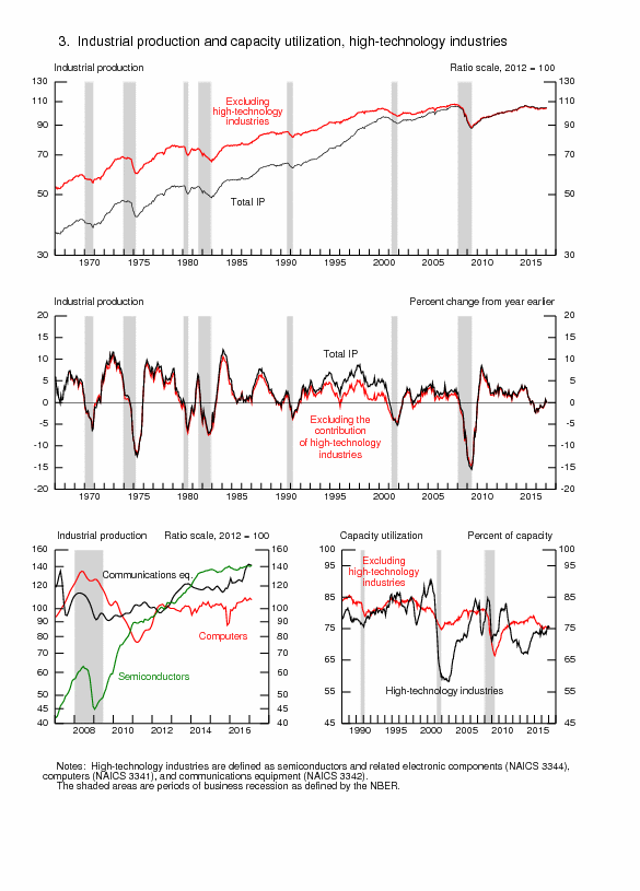
© Carlos M. Pelaez, 2009, 2010, 2011, 2012, 2013, 2014
No comments:
Post a Comment