
Dollar Revaluation, Twenty-One Million Unemployed or Underemployed in the Lost Economic Cycle of the Global Recession with Economic Growth Underperforming Below Trend Worldwide, Job Creation, Cyclically Stagnating Real Wages, Cyclically Stagnating Real Disposable Income per Capita, Financial Repression, United States Housing, United States International Trade, Decline of United States Homeownership, World Cyclical Slow Growth, Government Intervention in Globalization, and Global Recession Risk
© Carlos M. Pelaez, 2009, 2010, 2011, 2012, 2013, 2014, 2015, 2016, 2017, 2018, 2019
I Twenty-One Million Unemployed or Underemployed
IA1 Summary of the Employment Situation
IA2 Number of People in Job Stress
IA3 Long-term and Cyclical Comparison of Employment
IA4 Job Creation
II Stagnating Real Disposable Income and Consumption Expenditures
IIB1 Stagnating Real Disposable Income and Consumption Expenditures
IB2 Financial Repression
IIA United States Housing Collapse
IIA1 Sales of New Houses
IIA2 United States House Prices
IIC United States International Trade
IID Decline of United States Homeownership
III World Financial Turbulence
IV Global Inflation
V World Economic Slowdown
VA United States
VB Japan
VC China
VD Euro Area
VE Germany
VF France
VG Italy
VH United Kingdom
VI Valuation of Risk Financial Assets
VII Economic Indicators
VIII Interest Rates
IX Conclusion
References
Appendixes
Appendix I The Great Inflation
IIIB Appendix on Safe Haven Currencies
IIIC Appendix on Fiscal Compact
IIID Appendix on European Central Bank Large Scale Lender of Last Resort
IIIG Appendix on Deficit Financing of Growth and the Debt Crisis
II I United States Housing Collapse. Data and other information continue to provide depressed conditions in the US housing market in a longer perspective, with recent improvement at the margin. Table IIB-1 shows sales of new houses in the US at seasonally adjusted annual equivalent rate (SAAR). The US Census Bureau revised all seasonally-adjusted new house sales from 2013 to 2018 with the report for Apr 2018 on May 23, 2018 (https://www.census.gov/construction/nrs/pdf/newressales.pdf). House sales fell in 39 of 96 months from Jan 2011 to Dec 2018 with monthly declines of 5 in 2011, 4 in 2012, 5 in 2013, 6 in 2014, 3 in 2015, 6 in 2016, 4 in 2017 and 6 in 2018. In Jan-Apr 2012, house sales increased at the annual equivalent rate of 11.8 percent and at 22.3 percent in May-Sep 2012. There was significant strength in Sep-Dec 2011 with annual equivalent rate of 48.4 percent. Sales of new houses fell at 7.0 percent in Oct 2012 with increase of 9.5 percent in Nov 2012. Sales of new houses rebounded 11.8 percent in Jan 2013 with annual equivalent rate of 55.7 percent from Oct 2012 to Jan 2013 because of the increase at 11.8 percent in Jan 2013. New house sales decreased at annual equivalent 3.0 percent in Feb-Mar 2013. New house sales weakened, decreasing at 3.1 percent in annual equivalent from Apr to Dec 2013 with significant volatility illustrated by decline of 20.2 percent in Jul 2013 and increase of 10.2 percent in Oct 2013. New house sales fell 2.9 percent in Dec 2013. New house sales increased 2.8 percent in Jan 2014 and fell 3.6 percent in Feb 2014, decreasing 4.7 percent in Mar 2014. New house sales decreased 2.2 percent in Apr 2014 and increased 13.0 percent in May 2014. New house sales fell 8.0 percent in Jun 2014 and decreased 3.4 percent in Jul 2014. New house sales jumped 13.2 percent in Aug 2014 and increased 2.4 percent in Sep 2014. New House sales increased 1.3 percent in Oct 2014 and fell 5.9 percent in Nov 2014. House sales fell at the annual equivalent rate of 9.2 percent in Sep-Nov 2014. New house sales increased 9.9 percent in Dec 2014 and increased 7.0 percent in Jan 2015. Sales of new houses increased 6.5 percent in Feb
2015 and fell 12.8 percent in Mar 2015. House sales increased 3.7 percent in Apr 2015. The annual equivalent rate in Dec 2014-Apr 2015 was 34.8 percent. New house sales increased 0.2 percent in May 2015 and fell 6.0 percent in Jun 2015, increasing 5.1 percent in Jul 2015. New house sales fell at annual equivalent 4.0 percent in May-Jul 2015. New house sales increased 3.4 percent in Aug 2015 and fell 11.5 percent in Sep 2015. New house sales decreased at annual equivalent 41.3 percent in Aug-Sep 2015. New house sales increased 4.4 percent in Oct 2015 and increased 5.9 percent in Nov 2015, increasing 6.0 percent in Dec 2015. New house sales increased at the annual equivalent rate of 88.6 percent in Oct-Dec 2015. New house sales decreased 2.8 percent in Jan 2016 at the annual equivalent rate of minus 28.9 percent. New house sales increased 1.5 percent in Feb 2016 and increased 2.1 percent in Mar 2016. New house sales jumped at 5.2 percent in Apr 2016. New house sales increased at the annual equivalent rate of 41.3 percent in Feb-Apr 2016. New house sales decreased 1.4 percent in May 2016 and increased 0.4 percent in Jun 2016. New house sales jumped 12.9 percent in Jul 2016. New house sales increased at the annual equivalent rate of 56.0 percent in May-Jul 2016. New house sales fell 9.5 percent in Aug 2016 and decreased 1.0 percent in Sep 2016, increasing 1.2 percent in Oct 2016. New house sales fell at the annual equivalent rate of minus 32.4 percent in Aug-Oct 2016. New house sales decreased at 0.9 percent in Nov 2016 and fell at 3.9 percent in Dec 2016. New house sales fell at 25.4 percent annual equivalent in Nov-Dec 2016. New house sales increased at 9.2 percent in Jan 2017 and increased at 3.7 percent in Feb 2017. New house sales increased at 100.9 percent in Jan-Feb 2017. New house sales increased at 4.0 percent in Mar 2017 and fell at 7.8 percent in Apr 2017. New house sales decreased at annual equivalent 22.3 percent in Mar-Apr 2017. New house sales increased at 1.9 percent in May 2017 and increased at 2.0 percent in Jun 2017. New house sales increased at annual equivalent 26.1 percent in May-Jun 2017. New house sales decreased at 9.7 percent in Jul 2017 and increased at 0.4 percent in Aug 2017, increasing at 14.2 percent in Sep 2017. New house sales increased at annual equivalent 14.9 percent in Jul-Sep 2017. New house sales decreased at 3.0 percent in Oct 2017. New house sales increased at 15.2 percent in Nov 2017. New house sales increased at annual equivalent 94.7 percent in Oct-Nov 2017. New house sales decreased at 10.7 percent in Dec 2017 and decreased at 0.5 percent in Jan 2018. New house sales decreased at annual equivalent 50.8 percent in Dec 2017-Jan 2018. New house sales increased at 4.7 percent in Feb 2018, increasing at 1.4 percent in Mar 2018. New house sales increased at 43.2 percent in Feb-Mar 2018. New house sales decreased at 5.8 percent in Apr 2018 and increased at 3.2 percent in May 2018. New House sales decreased at annual equivalent 15.6 percent in Apr-May 2018. New house sales decreased at 6.3 percent in Jun 2018 and decreased at 1.0 percent in Jul 2018. New House sales decreased at annual equivalent 36.3 percent in Jun-Jul 2018. New house sales decreased at 0.8 percent in Aug 2018 and increased at 1.3 percent in Sep 2018. New house sales increased at annual equivalent 3.0 percent in Aug-Sep 2018. New house sales fell at 9.9 percent in Oct 2018 and increased at 9.1 percent in Nov 2018, increasing at 3.7 percent in Dec 2018. New house sales increased at annual equivalent 8.0 percent in Oct-Dec 2018. There are wide monthly oscillations. Robbie Whelan and Conor Dougherty, writing on “Builders fuel home sale rise,” on Feb 26, 2013, published in the Wall Street Journal (http://professional.wsj.com/article/SB10001424127887324338604578327982067761860.html), analyze how builders have provided financial assistance to home buyers, including those short of cash and with weaker credit background, explaining the rise in new home sales and the highest gap between prices of new and existing houses. The 30-year conventional mortgage rate increased from 3.40 on Apr 25, 2013 to 4.58 percent on Aug 22, 2013 (http://www.federalreserve.gov/releases/h15/data.htm), which could also be a factor in recent weakness with improvement after the rate fell to 4.26 in Nov 2013. The conventional mortgage rate rose to 4.48 percent on Dec 26, 2013 and fell to 4.32 percent on Jan 30, 2014. The conventional mortgage rate increased to 4.37 percent on Feb 26, 2014 and 4.40 percent on Mar 27, 2014. The conventional mortgage rate fell to 4.14 percent on Apr 22, 2014, stabilizing at 4.14 on Jun 26, 2014. The conventional mortgage rate stood at 3.93 percent on Aug 20, 2015 and at 3.91 percent on Sep 17, 2015. The conventional mortgage rate was at 3.79 percent on Oct 22, 2015. The conventional mortgage rate was 3.97 percent on Nov 20, 2015. The conventional mortgage rate was 3.97 percent on Dec 18, 2015, and 3.92 percent on Jan 14, 2016. The conventional mortgage rate was 3.65 percent on Feb 19, 2016. The commercial mortgage rate was 3.73 percent on Mar 17, 2016 and 3.59 percent on Apr 21, 2016. The conventional mortgage rate was 3.58 on May 19, 2016. The conventional mortgage rate was 3.54 percent on Jun 19, 2016 and 3.45 percent on Jul 21, 2016. The conventional mortgage rate was 3.43 percent on Aug 18, 2016 and 3.48 percent on Sep 22, 2016. The conventional mortgage rate was 3.94 on Nov 17, 2016 and 4.30 percent on Dec 22. The conventional mortgage rate was 4.19 percent on Jan 26, 2017 and 4.15 percent on Feb 17, 2017. The conventional mortgage rate was 4.1 percent on Mar 16, 2017. The conventional mortgage rate was 3.97 percent on Apr 20, 2017. The conventional mortgage rate was 4.05 percent on May 18, 2017. The conventional mortgage rate was 3.90 percent on Jun 22, 2017. The conventional mortgage rate was 3.96 percent on Jul 20, 2017. The conventional mortgage rate was 3.90 percent on Aug 18, 2017. The conventional mortgage rate was 3.83 percent on Sep 21, 2017. The conventional mortgage rate was 3.88 percent on Oct 20, 2017. The conventional mortgage rate was 3.92 percent on Nov 22, 2017 and 3.94 on Dec 21, 2017. The conventional mortgage rate was 4.04 percent on Jan 18, 2018. The conventional mortgage rate was 4.40 percent on Feb 22, 2018. The conventional rate was 4.43 percent on Mar 1, 2018. The conventional mortgage rate was 4.45 percent on Mar 22, 2018. The conventional mortgage rate was 4.47 on Apr 19, 2018. The conventional mortgage rate was 4.87 percent in May 31, 2018. The conventional mortgage rate was 4.57 percent on Jun 21, 2018. The conventional mortgage rate was 4.52 percent on Jul 19, 2018. The conventional mortgage rate was 4.53 percent on Aug 16, 2018. The conventional mortgage rate was 4.65 percent on Sep 20, 2018. The conventional mortgage rate was 4.85 percent on Oct 18, 2018. The conventional mortgage rate was 4.81 percent on Nov 21, 2018. The conventional mortgage rate was 4.35 percent in Feb 2019. The conventional mortgage rate measured in a survey by Freddie Mac (http://www.freddiemac.com/pmms/ http://www.freddiemac.com/pmms/abtpmms.htm) is the “interest rate a lender would charge to lend mortgage money to a qualified borrower.
| SA Annual Rate | ∆% | |
| Dec 2018 | 621 | 3.7 |
| Nov | 599 | 9.1 |
| Oct | 549 | -9.9 |
| AE ∆% Oct-Dec | 8.0 | |
| Sep | 609 | 1.3 |
| Aug | 601 | -0.8 |
| AE ∆% Aug-Sep | 3.0 | |
| Jul | 606 | -1.0 |
| Jun | 612 | -6.3 |
| AE ∆% Jun-Jul | -36.3 | |
| May | 653 | 3.2 |
| Apr | 633 | -5.8 |
| AE ∆% Apr-May | -15.6 | |
| Mar | 672 | 1.4 |
| Feb | 663 | 4.7 |
| AE ∆% Feb-Mar | 43.2 | |
| Jan | 633 | -0.5 |
| Dec 2017 | 636 | -10.7 |
| AE ∆% Dec-Jan | -50.8 | |
| Nov | 712 | 15.2 |
| Oct | 618 | -3.0 |
| AE ∆% Oct-Nov | 94.7 | |
| Sep | 637 | 14.2 |
| Aug | 558 | 0.4 |
| Jul | 556 | -9.7 |
| AE ∆% Jul-Sep | 14.9 | |
| Jun | 616 | 2.0 |
| May | 604 | 1.9 |
| AE ∆% May -Jun | 26.1 | |
| Apr | 593 | -7.8 |
| Mar | 643 | 4.0 |
| AE ∆% Mar-Apr | -22.3 | |
| Feb | 618 | 3.7 |
| Jan | 596 | 9.2 |
| AE ∆% Jan-Feb | 100.9 | |
| Dec 2016 | 546 | -3.9 |
| Nov | 568 | -0.9 |
| AE ∆% Nov-Dec | -25.4 | |
| Oct | 573 | 1.2 |
| Sep | 566 | -1.0 |
| Aug | 572 | -9.5 |
| AE ∆% Aug-Oct | -32.4 | |
| Jul | 632 | 12.9 |
| Jun | 560 | 0.4 |
| May | 558 | -1.4 |
| AE ∆% May-Jul | 56.0 | |
| Apr | 566 | 5.2 |
| Mar | 538 | 2.1 |
| Feb | 527 | 1.5 |
| AE ∆% Feb-Apr | 41.3 | |
| Jan | 519 | -2.8 |
| AE ∆% Jan | -28.9 | |
| Dec 2015 | 534 | 6.0 |
| Nov | 504 | 5.9 |
| Oct | 476 | 4.4 |
| AE ∆% Oct-Dec | 88.6 | |
| Sep | 456 | -11.5 |
| Aug | 515 | 3.4 |
| AE ∆% Aug-Sep | -41.3 | |
| Jul | 498 | 5.1 |
| Jun | 474 | -6.0 |
| May | 504 | 0.2 |
| AE ∆% May-Jul | -4.0 | |
| Apr | 503 | 3.7 |
| Mar | 485 | -12.8 |
| Feb | 556 | 6.5 |
| Jan | 522 | 7.0 |
| Dec 2014 | 488 | 9.9 |
| AE ∆% Dec-Apr | 34.8 | |
| Nov | 444 | -5.9 |
| Oct | 472 | 1.3 |
| Sep | 466 | 2.4 |
| AE ∆% Sep-Nov | -9.2 | |
| Aug | 455 | 13.2 |
| Jul | 402 | -3.4 |
| Jun | 416 | -8.0 |
| May | 452 | 13.0 |
| Apr | 400 | -2.2 |
| Mar | 409 | -4.7 |
| Feb | 429 | -3.6 |
| Jan | 445 | 2.8 |
| AE ∆% Jan-Aug | 7.6 | |
| Dec 2013 | 433 | -2.9 |
| Nov | 446 | 0.5 |
| Oct | 444 | 10.2 |
| Sep | 403 | 5.8 |
| Aug | 381 | 1.6 |
| Jul | 375 | -20.2 |
| Jun | 470 | 9.8 |
| May | 428 | -2.9 |
| Apr | 441 | -0.7 |
| AE ∆% Apr-Dec | -3.1 | |
| Mar | 444 | -0.7 |
| Feb | 447 | 0.2 |
| AE ∆% Feb-Mar | -3.0 | |
| Jan | 446 | 11.8 |
| Dec 2012 | 399 | 1.8 |
| Nov | 392 | 9.5 |
| Oct | 358 | -7.0 |
| AE ∆% Oct-Jan | 55.7 | |
| Sep | 385 | 2.7 |
| Aug | 375 | 1.6 |
| Jul | 369 | 2.5 |
| Jun | 360 | -2.7 |
| May | 370 | 4.5 |
| AE ∆% May-Sep | 22.3 | |
| Apr | 354 | 0.0 |
| Mar | 354 | -3.3 |
| Feb | 366 | 9.3 |
| Jan | 335 | -1.8 |
| AE ∆% Jan-Apr | 11.8 | |
| Dec 2011 | 341 | 4.0 |
| Nov | 328 | 3.8 |
| Oct | 316 | 3.9 |
| Sep | 304 | 1.7 |
| AE ∆% Sep-Dec | 48.4 | |
| Aug | 299 | 1.0 |
| Jul | 296 | -1.7 |
| Jun | 301 | -1.3 |
| May | 305 | -1.6 |
| AE ∆% May-Aug | -10.3 | |
| Apr | 310 | 3.3 |
| Mar | 300 | 11.1 |
| Feb | 270 | -12.1 |
| Jan | 307 | -5.8 |
| AE ∆% Jan-Apr | -14.2 | |
| Dec 2010 | 326 | 13.6 |
AE: Annual Equivalent
Source: US Census Bureau
http://www.census.gov/construction/nrs/
There is additional information of the report of new house sales in Table IIB-2. The stock of unsold houses fell from rates of 6 to 8 percent of sales in 2011 to 4 to 5 percent in 2013 and 6.6 percent in Dec 2018. Robbie Whelan and Conor Dougherty, writing on “Builders fuel home sale rise,” on Feb 26, 2013, published in the Wall Street Journal (http://professional.wsj.com/article/SB10001424127887324338604578327982067761860.html), find that inventories of houses have declined as investors acquire distressed houses of higher quality. Median and average house prices oscillate. In Dec 2018, median prices of new houses sold not seasonally adjusted (NSA) increased 5.0 percent after decreasing 6.5 percent in
Nov 2018. Average prices increased 5.4 percent in Dec 2018 and decreased 9.1 percent in Nov 2018. Between Dec 2010 and Dec 2018, median prices increased 32.1 percent, with increases of 6.0 percent in Feb 2016, 4.9 percent in Nov 2015, 2.2 percent in Sep 2015, 13.6 percent in Oct 2014, 4.0 percent in Aug 2014, 4.0 percent in May 2014 and 5.2 percent in Mar 2014. Average prices increased 29.2 percent between Dec 2010 and Dec 2018, with increases of 5.1 percent in Mar 2016, 4.0 percent in Sep 2015, 4.4 percent in Jul 2015 and 18.3 percent in Oct 2014. Between Dec 2010 and Dec 2012, median prices increased 7.1 percent and average prices increased 2.6 percent. Price increases concentrated in 2012 with increase of median prices of 18.2 percent from Dec 2011 to Dec 2012 and of average prices of 13.8 percent. Median prices increased 16.7 percent from Dec 2012 to Dec 2014, with increase of 13.6 percent in Oct 2014, while average prices increased 24.7 percent, with increase of 18.3 percent in Oct 2014. Median prices decreased 1.5 percent from Dec 2014 to Dec 2015 while average prices fell 5.5 percent. Median prices increased 10.1 percent from Dec 2015 to Dec 2016 while average prices increased 8.5 percent. Median prices increased 5.0 percent from Dec 2016 to Dec 2017 while average prices increased 5.3 percent. Median prices decreased 7.2 percent from Dec 2017 to Dec 2018 while average prices decreased 6.4 percent. Robbie Whelan, writing on “New homes hit record as builders cap supply,” on May 24, 2013, published in the Wall Street Journal (http://online.wsj.com/article/SB10001424127887323475304578500973445311276.html?mod=WSJ_economy_LeftTopHighlights), finds that homebuilders are continuing to restrict the number of new homes for sale. Restriction of available new homes for sale increases prices paid by buyers.
Table IIB-2, US, New House Stocks and Median and Average New Homes Sales Price
| Unsold* | Median | Month | Average New House Sales Price USD | Month | |
| Dec 2018 | 6.6 | 318,600 | 5.0 | 377,000 | 5.4 |
| Nov | 6.7 | 303,500 | -6.5 | 357,600 | -9.1 |
| Oct | 7.2 | 324,700 | -1.1 | 393,300 | 1.8 |
| Sep | 6.3 | 328,300 | 2.1 | 386,400 | 1.4 |
| Aug | 6.3 | 321,400 | -1.9 | 380,900 | -2.9 |
| Jul | 6.2 | 327,500 | 5.5 | 392,300 | 6.0 |
| Jun | 6.0 | 310,500 | -2.0 | 370,100 | -0.7 |
| May | 5.5 | 316,700 | 0.7 | 372,600 | -3.2 |
| Apr | 5.7 | 314,400 | -6.3 | 385,100 | 4.3 |
| Mar | 5.3 | 335,400 | 2.5 | 369,200 | -1.2 |
| Feb | 5.4 | 327,200 | -0.7 | 373,600 | -1.1 |
| Jan | 5.6 | 329,600 | -4.0 | 377,800 | -6.2 |
| Dec 2017 | 5.5 | 343,300 | 0.0 | 402,900 | 3.7 |
| Nov | 4.9 | 343,400 | 7.5 | 388,500 | -1.4 |
| Oct | 5.6 | 319,500 | -3.6 | 394,000 | 3.9 |
| Sep | 5.3 | 331,500 | 5.5 | 379,300 | 2.7 |
| Aug | 6.0 | 314,200 | -2.7 | 369,200 | -0.9 |
| Jul | 6.0 | 322,900 | 2.4 | 372,400 | 0.5 |
| Jun | 5.3 | 315,200 | -2.6 | 370,600 | -2.1 |
| May | 5.4 | 323,600 | 4.0 | 378,400 | 3.4 |
| Apr | 5.4 | 311,100 | -3.3 | 365,800 | -4.8 |
| Mar | 5.0 | 321,700 | 8.0 | 384,400 | 3.8 |
| Feb | 5.1 | 298,000 | -5.5 | 370,500 | 3.6 |
| Jan | 5.3 | 315,200 | -3.6 | 357,700 | -6.5 |
| Dec 2016 | 5.6 | 327,000 | 3.8 | 382,500 | 5.3 |
| Nov | 5.3 | 315,000 | 4.0 | 363,400 | 3.2 |
| Oct | 5.2 | 302,800 | -3.8 | 352,200 | -3.8 |
| Sep | 5.2 | 314,800 | 5.3 | 366,100 | 3.1 |
| Aug | 5.0 | 298,900 | 0.5 | 355,100 | 0.6 |
| Jul | 4.5 | 297,400 | -4.4 | 353,000 | -1.3 |
| Jun | 5.2 | 311,200 | 5.4 | 357,800 | 2.3 |
| May | 5.2 | 295,200 | -7.3 | 349,700 | -5.3 |
| Apr | 5.1 | 318,300 | 5.0 | 369,300 | 2.9 |
| Mar | 5.4 | 303,200 | -0.9 | 359,000 | 5.1 |
| Feb | 5.4 | 305,800 | 6.0 | 341,700 | -5.4 |
| Jan | 5.5 | 288,400 | -2.9 | 361,200 | 2.5 |
| Dec 2015 | 5.2 | 297,100 | -5.0 | 352,500 | -5.5 |
| Nov | 5.5 | 312,600 | 4.9 | 373,200 | 1.2 |
| Oct | 5.7 | 298,000 | -0.5 | 368,900 | 3.3 |
| Sep | 5.9 | 299,500 | 2.2 | 357,200 | 4.0 |
| Aug | 5.1 | 293,000 | 0.2 | 343,300 | 0.6 |
| Jul | 5.2 | 292,300 | 2.5 | 341,200 | 4.4 |
| Jun | 5.5 | 285,100 | -0.8 | 326,900 | -2.8 |
| May | 5.0 | 287,500 | -2.4 | 336,200 | -1.2 |
| Apr | 4.9 | 294,500 | 2.8 | 340,400 | -2.5 |
| Mar | 5.1 | 286,600 | 0.0 | 349,300 | 0.9 |
| Feb | 4.4 | 286,600 | -1.8 | 346,300 | -0.6 |
| Jan | 4.8 | 292,000 | -3.2 | 348,300 | -6.7 |
| Dec 2014 | 5.2 | 301,500 | 1.1 | 373,200 | 7.0 |
| Nov | 5.7 | 298,300 | 0.4 | 348,900 | -7.6 |
| Oct | 5.3 | 297,000 | 13.6 | 377,500 | 18.3 |
| Sep | 5.4 | 261,500 | -10.4 | 319,100 | -10.4 |
| Aug | 5.5 | 291,700 | 4.0 | 356,200 | 3.2 |
| Jul | 6.1 | 280,400 | -2.3 | 345,200 | 2.1 |
| Jun | 5.7 | 287,000 | 0.5 | 338,100 | 4.5 |
| May | 5.2 | 285,600 | 4.0 | 323,500 | -0.5 |
| Apr | 5.7 | 274,500 | -2.8 | 325,100 | -1.9 |
| Mar | 5.6 | 282,300 | 5.2 | 331,500 | 1.7 |
| Feb | 5.2 | 268,400 | -0.5 | 325,900 | -3.4 |
| Jan | 5.1 | 269,800 | -2.1 | 337,300 | 5.0 |
| Dec 2013 | 5.2 | 275,500 | -0.6 | 321,200 | -4.3 |
| Nov | 5.0 | 277,100 | 4.8 | 335,600 | 0.0 |
| Oct | 4.9 | 264,300 | -2.0 | 335,700 | 4.4 |
| Sep | 5.4 | 269,800 | 5.7 | 321,400 | 3.4 |
| Aug | 5.5 | 255,300 | -2.6 | 310,800 | -5.8 |
| Jul | 5.5 | 262,200 | 0.9 | 329,900 | 7.8 |
| Jun | 4.1 | 259,800 | -1.5 | 306,100 | -2.5 |
| May | 4.6 | 263,700 | -5.6 | 314,000 | -6.8 |
| Apr | 4.4 | 279,300 | 8.5 | 337,000 | 12.3 |
| Mar | 4.2 | 257,500 | -2.9 | 300,200 | -3.9 |
| Feb | 4.1 | 265,100 | 5.4 | 312,500 | 1.8 |
| Jan | 4.0 | 251,500 | -2.6 | 306,900 | 2.6 |
| Dec 2012 | 4.5 | 258,300 | 5.4 | 299,200 | 2.9 |
| Nov | 4.6 | 245,000 | -0.9 | 290,700 | 1.9 |
| Oct | 4.9 | 247,200 | -2.9 | 285,400 | -4.1 |
| Sep | 4.5 | 254,600 | 0.6 | 297,700 | -2.6 |
| Aug | 4.6 | 253,200 | 6.7 | 305,500 | 8.2 |
| Jul | 4.6 | 237,400 | 2.1 | 282,300 | 3.9 |
| Jun | 4.8 | 232,600 | -2.8 | 271,800 | -3.2 |
| May | 4.7 | 239,200 | 1.2 | 280,900 | -2.4 |
| Apr | 4.9 | 236,400 | -1.4 | 287,900 | 1.5 |
| Mar | 4.9 | 239,800 | 0.0 | 283,600 | 3.5 |
| Feb | 4.8 | 239,900 | 8.2 | 274,000 | 3.1 |
| Jan | 5.3 | 221,700 | 1.4 | 265,700 | 1.1 |
| Dec 2011 | 5.3 | 218,600 | 2.0 | 262,900 | 5.2 |
| Nov | 5.7 | 214,300 | -4.7 | 250,000 | -3.2 |
| Oct | 6.0 | 224,800 | 3.6 | 258,300 | 1.1 |
| Sep | 6.3 | 217,000 | -1.2 | 255,400 | -1.5 |
| Aug | 6.5 | 219,600 | -4.5 | 259,300 | -4.1 |
| Jul | 6.7 | 229,900 | -4.3 | 270,300 | -1.0 |
| Jun | 6.6 | 240,200 | 8.2 | 273,100 | 4.0 |
| May | 6.6 | 222,000 | -1.2 | 262,700 | -2.3 |
| Apr | 6.7 | 224,700 | 1.9 | 268,900 | 3.1 |
| Mar | 7.2 | 220,500 | 0.2 | 260,800 | -0.8 |
| Feb | 8.1 | 220,100 | -8.3 | 262,800 | -4.7 |
| Jan | 7.3 | 240,100 | -0.5 | 275,700 | -5.5 |
| Dec 2010 | 7.0 | 241,200 | 9.8 | 291,700 | 3.5 |
*Percent of new houses for sale relative to houses sold
Source: US Census Bureau
http://www.census.gov/construction/nrs/
The depressed level of residential construction and new house sales in the US is evident in Table IIB-3 providing new house sales not seasonally adjusted in Jan-Dec of various years. New house sales increased 1.5 percent from Jan-Dec 2017 to Jan-Dec 2018. Sales of new houses are higher in Jan-Dec 2018 relative to Jan-Dec 2016 with increase of 10.9 percent. Sales of new houses are higher in Jan-Dec 2018 relative to Jan-Dec 2015 with increase of 24.2 percent. Sales of new houses in Jan-Dec 2018 are substantially lower than in many years between 1971 and 2018 except for the years from 2008 to 2017. There are several other increases of 41.7 percent relative to 2014, 45.0 percent relative to Jan-Dec 2013, 68.6 percent relative to Jan-Dec 2012, 103.9 percent relative to Jan-Dec 2011, 93.2 percent relative to Jan-Dec 2010 and 66.3 percent relative to Jan-Dec 2009. New house sales in Jan-Dec 2018 are 28.2 percent higher than in Jan-Dec 2008. Sales of new houses in Jan-Dec 2018 are lower by 19.8 percent relative to Jan-Dec 2007, 40.9 percent relative to 2006, 51.5 percent relative to 2005 and 48.3 percent relative to 2004. The housing boom peaked in 2005 and 2006 when increases in fed funds rates to 5.25 percent in Jun 2006 from 1.0 percent in Jun 2004 affected subprime mortgages that were programmed for refinancing in two or three years on the expectation that price increases forever would raise home equity. Higher home equity would permit refinancing under feasible mortgages incorporating full payment of principal and interest (Gorton 2009EFM; see other references in http://cmpassocregulationblog.blogspot.com/2011/07/causes-of-2007-creditdollar-crisis.html). Sales of new houses in Jan-Dec 2018 relative to the same period in 2003 fell 42.8 percent and 36.0 percent relative to the same period in 2002. Similar percentage declines are also for 2018 relative to years from 2000 to 2004. Sales of new houses in Jan-Dec 2018 decreased 6.5 per cent relative to the same period in 1995. The population of the US was 179.3 million in 1960 and 281.4 million in 2000 (Hobbs and Stoops 2002, 16). Detailed historical census reports are available from the US Census Bureau at (http://www.census.gov/population/www/censusdata/hiscendata.html). The estimate of the US population is 418.8 million in 2015. The US population increased by 133.6 percent from 1960 to 2015. The final row of Table IIB-3 reveals catastrophic data: sales of new houses in Jan-Dec 2018 of 622 thousand units are lower by 13.4 percent relative to 718 thousand units of houses sold in Jan-Dec 1972, which is the ninth year when data become available in 1963. The civilian noninstitutional population increased from 122.416 million in 1963 to 257.791 million in 2018, or 110.6 percent (http://www.bls.gov/data/). The Bureau of Labor Statistics (BLS) defines the civilian noninstitutional population (http://www.bls.gov/lau/rdscnp16.htm#cnp): “The civilian noninstitutional population consists of persons 16 years of age and older residing in the 50 States and the District of Columbia who are not inmates of institutions (for example, penal and mental facilities and homes for the aged) and who are not on active duty in the Armed Forces.”
Table IIB-3, US, Sales of New Houses Not Seasonally Adjusted, Thousands and %
| Jan-Dec 2018 | 622 |
| Jan-Dec 2017 | 613 |
| Jan-Dec 2018/Jan-Dec 2017 | 1.5 |
| Jan-Dec 2016 | 561 |
| ∆% Jan-Dec 2018/Jan-Dec 2016 | 10.9 |
| Jan-Dec 2015 | 501 |
| ∆% Jan-Dec 2018/Jan-Dec 2015 | 24.2 |
| Jan-Dec 2014 | 439 |
| ∆% Jan-Dec 2018/Jan-Dec 2014 | 41.7 |
| Jan-Dec 2013 | 429 |
| ∆% Jan-Dec 2018/Jan-Dec 2013 | 45.0 |
| Jan-Dec 2012 | 369 |
| ∆% Jan-Dec 2018/Jan-Dec 2012 | 68.6 |
| Jan-Dec 2011 | 305 |
| ∆% Jan-Dec 2018/ | 103.9 |
| Jan-Dec 2010 | 322 |
| ∆% Jan-Dec 2018/ | 93.2 |
| Jan-Dec 2009 | 374 |
| ∆% Jan-Dec 2018/ | 66.3 |
| Jan-Dec 2008 | 485 |
| ∆% Jan-Dec 2018/ | 28.2 |
| Jan-Dec 2007 | 776 |
| ∆% Jan-Dec 2018/Jan-Dec 2007 | -19.8 |
| Jan-Dec 2006 | 1052 |
| ∆% Jan-Dec 2018/Jan-Dec 2006 | -40.9 |
| Jan-Dec 2005 | 1283 |
| ∆% Jan-Dec 2018/Jan-Dec 2005 | -51.5 |
| Jan-Dec 2004 | 1203 |
| ∆% Jan-Dec 2018/ | -48.3 |
| Jan-Dec 2003 | 1088 |
| ∆% Jan-Dec 2018/ | -42.8 |
| Jan-Dec 2002 | 972 |
| ∆% Jan-Dec 2018/ | -36.0 |
| Jan-Dec 2001 | 909 |
| ∆% Jan-Dec 2018/ | -31.6 |
| Jan-Dec 2000 | 877 |
| ∆% Jan-Dec 2018/Jan-Dec 2000 | -29.1 |
| Jan-Dec 1995 | 665 |
| ∆% Jan-Dec 2018/ | -6.5 |
| Jan-Dec 1972 | 671 |
| ∆% Jan-Dec 2018/ | -13.4 |
*Computed using unrounded data
Source: US Census Bureau
http://www.census.gov/construction/nrs/
The revised level of 306 thousand new houses sold in 2011 is the lowest since 560 thousand in 1963 in the 53 years of available data while the level of 368 thousand in 2012 is only higher than 323 thousand in 2010. The level of sales of new houses of 437 thousand in 2014 is the lowest from 1963 to 2009 with exception of 412 thousand in 1982 and 436 thousand in 1981. The population of the US increased 129.4 million from 179.3 million in 1960 to 308.7 million in 2010, or 72.2 percent. The estimate of the US population is 418.8 million in 2015. The US population increased 133.6 percent from 1960 to 2015. The civilian noninstitutional population increased from 122.416 million in 1963 to 257.791 million in 2018, or 110.6 percent (http://www.bls.gov/data/). The Bureau of Labor Statistics (BLS) defines the civilian noninstitutional population (http://www.bls.gov/lau/rdscnp16.htm#cnp): “The civilian noninstitutional population consists of persons 16 years of age and older residing in the 50 States and the District of Columbia who are not inmates of institutions (for example, penal and mental facilities and homes for the aged) and who are not on active duty in the Armed Forces.”
The civilian noninstitutional population is the universe of the labor force. In fact, there is no year from 1963 to 2013 in Table IIA-4 with sales of new houses below 400 thousand except for the immediately preceding years of 2009, 2010, 2011 and 2012.
Table IIB-4, US, New Houses Sold, NSA Thousands
| Period | Sold During Period |
| 1963 | 560 |
| 1964 | 565 |
| 1965 | 575 |
| 1966 | 461 |
| 1967 | 487 |
| 1968 | 490 |
| 1969 | 448 |
| 1970 | 485 |
| 1971 | 656 |
| 1972 | 718 |
| 1973 | 634 |
| 1974 | 519 |
| 1975 | 549 |
| 1976 | 646 |
| 1977 | 819 |
| 1978 | 817 |
| 1979 | 709 |
| 1980 | 545 |
| 1981 | 436 |
| 1982 | 412 |
| 1983 | 623 |
| 1984 | 639 |
| 1985 | 688 |
| 1986 | 750 |
| 1987 | 671 |
| 1988 | 676 |
| 1989 | 650 |
| 1990 | 534 |
| 1991 | 509 |
| 1992 | 610 |
| 1993 | 666 |
| 1994 | 670 |
| 1995 | 667 |
| 1996 | 757 |
| 1997 | 804 |
| 1998 | 886 |
| 1999 | 880 |
| 2000 | 877 |
| 2001 | 908 |
| 2002 | 973 |
| 2003 | 1,086 |
| 2004 | 1,203 |
| 2005 | 1,283 |
| 2006 | 1,051 |
| 2007 | 776 |
| 2008 | 485 |
| 2009 | 375 |
| 2010 | 323 |
| 2011 | 306 |
| 2012 | 368 |
| 2013 | 429 |
| 2014 | 437 |
| 2015 | 501 |
| 2016 | 561 |
| 2017 | 613 |
| 2018 | 622 |
http://www.census.gov/construction/nrs/
Chart IIB-1 of the US Bureau of the Census shows the sharp decline of sales of new houses in the US. Sales rose temporarily until about mid 2010 but then declined to a lower plateau followed by increase, stability and new oscillating increase. There is decrease in the final segment.

Chart IIB-1, US, New One-Family Houses Sold in the US, SAAR (Seasonally Adjusted Annual Rate)
Source: US Census Bureau
https://www.census.gov/construction/nrs/img/c25_curr.gif
Between 1991 and 2001, sales of new houses rose 78.4 percent at the average yearly rate of 6.0 percent, as shown in Table IB-5. Between 1995 and 2005 sales of new houses increased 92.4 percent at the yearly rate of 6.8 percent. There are similar rates in all years from 2000 to 2005. The boom in housing construction and sales began in the 1980s and 1990s. The collapse of real estate culminated several decades of housing subsidies and policies to lower mortgage rates and borrowing terms (Pelaez and Pelaez, Financial Regulation after the Global Recession (2009b), 42-8). Sales of new houses sold in 2018 fell 6.7 percent relative to the same period in 1995 and 51.5 percent relative to 2005.
| ∆% | Average Yearly % Rate | |
| 1963-2018 | 11.1 | 0.2 |
| 1991-2001 | 78.4 | 6.0 |
| 1995-2005 | 92.4 | 6.8 |
| 2000-2005 | 46.3 | 7.9 |
| 1995-2018 | -6.7 | NA |
| 2000-2018 | -29.1 | NA |
| 2005-2018 | -51.5 | NA |
NA: Not Applicable
Source: US Census Bureau
http://www.census.gov/construction/nrs/
Chart IIB-2 of the US Bureau of the Census provides the entire monthly sample of new houses sold in the US between Jan 1963 and Dec 2018 without seasonal adjustment. The series is almost stationary until the 1990s. There is sharp upward trend from the early 1990s to 2005-2006 after which new single-family houses sold collapse to levels below those in the beginning of the series.

Chart IIB-2, US, New Single-family Houses Sold, NSA, 1963-2018
Source: US Census Bureau
http://www.census.gov/construction/nrs/
The available historical annual data of median and average prices of new houses sold in the US between 1963 and 2018 is in Table IIB-6. On a yearly basis, median and average prices reached a peak in 2007 and then fell substantially. There is recovery in 2012-2017.
Table IIB-6, US, Median and Average Prices of New Houses Sold, Annual Data
| Period | Median | Average |
| 1963 | $18,000 | $19,300 |
| 1964 | $18,900 | $20,500 |
| 1965 | $20,000 | $21,500 |
| 1966 | $21,400 | $23,300 |
| 1967 | $22,700 | $24,600 |
| 1968 | $24,700 | $26,600 |
| 1969 | $25,600 | $27,900 |
| 1970 | $23,400 | $26,600 |
| 1971 | $25,200 | $28,300 |
| 1972 | $27,600 | $30,500 |
| 1973 | $32,500 | $35,500 |
| 1974 | $35,900 | $38,900 |
| 1975 | $39,300 | $42,600 |
| 1976 | $44,200 | $48,000 |
| 1977 | $48,800 | $54,200 |
| 1978 | $55,700 | $62,500 |
| 1979 | $62,900 | $71,800 |
| 1980 | $64,600 | $76,400 |
| 1981 | $68,900 | $83,000 |
| 1982 | $69,300 | $83,900 |
| 1983 | $75,300 | $89,800 |
| 1984 | $79,900 | $97,600 |
| 1985 | $84,300 | $100,800 |
| 1986 | $92,000 | $111,900 |
| 1987 | $104,500 | $127,200 |
| 1988 | $112,500 | $138,300 |
| 1989 | $120,000 | $148,800 |
| 1990 | $122,900 | $149,800 |
| 1991 | $120,000 | $147,200 |
| 1992 | $121,500 | $144,100 |
| 1993 | $126,500 | $147,700 |
| 1994 | $130,000 | $154,500 |
| 1995 | $133,900 | $158,700 |
| 1996 | $140,000 | $166,400 |
| 1997 | $146,000 | $176,200 |
| 1998 | $152,500 | $181,900 |
| 1999 | $161,000 | $195,600 |
| 2000 | $169,000 | $207,000 |
| 2001 | $175,200 | $213,200 |
| 2002 | $187,600 | $228,700 |
| 2003 | $195,000 | $246,300 |
| 2004 | $221,000 | $274,500 |
| 2005 | $240,900 | $297,000 |
| 2006 | $246,500 | $305,900 |
| 2007 | $247,900 | $313,600 |
| 2008 | $232,100 | $292,600 |
| 2009 | $216,700 | $270,900 |
| 2010 | $221,800 | $272,900 |
| 2011 | $227,200 | $267,900 |
| 2012 | $245,200 | $292,200 |
| 2013 | $268,900 | $324,500 |
| 2014 | $288,500 | $347,700 |
| 2015 | $294,200 | $352,700 |
| 2016 | $307,800 | $360,900 |
| 2017 | $323,100 | $384,900 |
| 2018 | $324,800 | $383,500 |
Source: US Census Bureau
http://www.census.gov/construction/nrs/
Prices rose sharply between 2000 and 2005 as shown in Table IIB-7. In fact, prices in 2018 are higher than in 2000. Between 2006 and 2018, median prices of new houses sold increased 31.8 percent and average prices increased 25.4 percent. Between 2017 and 2018, median prices increased 0.5 percent and average prices decreased 0.4 percent.
Table IIB-7, US, Percentage Change of New Houses Median and Average Prices, NSA, ∆%
| Median New | Average New Home Sales Prices ∆% | |
| ∆% 2000 to 2003 | 15.4 | 19.0 |
| ∆% 2000 to 2005 | 42.5 | 43.5 |
| ∆% 2000 to 2018 | 92.2 | 85.3 |
| ∆% 2005 to 2018 | 34.8 | 29.1 |
| ∆% 2000 to 2006 | 45.9 | 47.8 |
| ∆% 2006 to 2018 | 31.8 | 25.4 |
| ∆% 2009 to 2018 | 49.9 | 41.6 |
| ∆% 2010 to 2018 | 46.4 | 40.5 |
| ∆% 2011 to 2018 | 43.0 | 43.2 |
| ∆% 2012 to 2018 | 32.5 | 31.2 |
| ∆% 2013 to 2018 | 20.8 | 18.2 |
| ∆% 2014 to 2018 | 12.6 | 10.3 |
| ∆% 2015 to 2018 | 10.4 | 8.7 |
| ∆% 2016 to 2018 | 5.5 | 6.3 |
| ∆% 2017 to 2018 | 0.5 | -0.4 |
Source: US Census Bureau
http://www.census.gov/construction/nrs/
Chart IIB-3 of the US Census Bureau provides the entire series of new single-family sales median prices from Jan 1963 to Dec 2018. There is long-term sharp upward trend with few declines until the current collapse. Median prices increased sharply during the Great Inflation of the 1960s and 1970s and paused during the savings and loans crisis of the late 1980s and the recession of 1991. Housing subsidies throughout the 1990s caused sharp upward trend of median new house prices that accelerated after the fed funds rate of 1 percent from 2003 to 2004. There was sharp reduction of prices after 2006 with recovery recently above earlier prices.

Chart IIB-3, US, Median Sales Price of New Single-family Houses Sold, US Dollars, NSA, 1963-2018
Source: US Census Bureau
http://www.census.gov/construction/nrs/
Chart IIB-4 of the US Census Bureau provides average prices of new houses sold from the mid-1970s to Dec 2018. There is similar behavior as with median prices of new houses sold in Chart IIB-3. The only stress occurred in price pauses during the savings and loans crisis of the late 1980s and the collapse after 2006 with recent recovery.

Chart IIB-4, US, Average Sales Price of New Single-family Houses Sold, US Dollars, NSA, 1975-2018
Source: US Census Bureau
http://www.census.gov/construction/nrs/
Chart IIB-5 of the Board of Governors of the Federal Reserve System provides the rate for the 30-year conventional mortgage, the yield of the 30-year Treasury bond and the rate of the overnight federal funds rate, monthly, from 1954 to 2016. All rates decline throughout the period from the Great Inflation of the 1970s through the following Great Moderation and until currently. In Apr 1971, the fed funds rate was 4.15 percent and the conventional mortgage rate 7.31 percent. In November 2012, the fed funds rate was 0.16 percent, the yield of the 30-year Treasury 2.80 percent and the conventional mortgage rate 3.35. The final segment shows an increase in the yield of the 30-year Treasury to 3.61 percent in July 2013 with the fed funds rate at 0.09 percent and the conventional mortgage at 4.37 percent. The final data point shows marginal decrease of the conventional mortgage rate to 3.60 percent in May 2016 with the yield of the 30-year Treasury bond at 2.63 percent and overnight rate on fed funds at 0.37 percent. The recent increase in interest rates if sustained could affect the US real estate market. Shayndi Raice and Nick Timiraos, writing on “Banks cut as mortgage boom ends,” on Jan 9, 2014, published in the Wall Street Journal (http://online.wsj.com/news/articles/SB10001424052702303754404579310940019239208), analyze the drop in mortgage applications to a 13-year low, as measured by the Mortgage Bankers Association. Nick Timiraos, writing on “Demand for home loans plunges,” on Apr 24, 2014, published in the Wall Street Journal (http://online.wsj.com/news/articles/SB10001424052702304788404579522051733228402?mg=reno64-wsj), analyzes data in Inside Mortgage Finance that mortgage lending of $235 billion in IQ2014 is 58 percent lower than a year earlier and 23 percent below IVQ2013. Mortgage lending collapsed to the lowest level in 14 years. In testimony before the Committee on the Budget of the US Senate on May 8, 2004, Chair Yellen provides analysis of the current economic situation and outlook (http://www.federalreserve.gov/newsevents/testimony/yellen20140507a.htm): “One cautionary note, though, is that readings on housing activity--a sector that has been recovering since 2011--have remained disappointing so far this year and will bear watching.”

Chart IIB-5, US, Thirty-year Conventional Mortgage, Thirty-year Treasury Bond and Overnight Federal Funds Rate, Monthly, 1954-2016
Source: Board of Governors of the Federal Reserve System
http://www.federalreserve.gov/releases/H15/default.htm
Chart IIB-5A of the Board of Governors of the Federal Reserve System provides the yield of the 30-year Treasury bond and the rate of the overnight federal funds rate, monthly, from 2001 to 2019. The Board of Governors of the Federal Reserve System discontinued the conventional mortgage rate in its data bank. The final data point is 2.40 percent for the fed funds rate in Feb 2019 and 3.02 percent for the thirty-year Treasury bond. The conventional mortgage rate stood at 4.37 percent in Feb 2019.

Chart IIB-5A, US, Thirty-year Treasury Bond and Overnight Federal Funds Rate, Monthly, 1977-2019
Source: Board of Governors of the Federal Reserve System
http://www.federalreserve.gov/releases/H15/default.htm
Table IIB-8, US, Fed Funds Rate, Thirty Year Treasury Bond and Conventional Mortgage Rate, Monthly, Percent per Year, Dec 2012 to Mar 2018
| Fed Funds Rate | Yield of Thirty Year Constant Maturity | Conventional Mortgage Rate | |
| 2012-12 | 0.16 | 2.88 | 3.35 |
| 2013-01 | 0.14 | 3.08 | 3.41 |
| 2013-02 | 0.15 | 3.17 | 3.53 |
| 2013-03 | 0.14 | 3.16 | 3.57 |
| 2013-04 | 0.15 | 2.93 | 3.45 |
| 2013-05 | 0.11 | 3.11 | 3.54 |
| 2013-06 | 0.09 | 3.40 | 4.07 |
| 2013-07 | 0.09 | 3.61 | 4.37 |
| 2013-08 | 0.08 | 3.76 | 4.46 |
| 2013-09 | 0.08 | 3.79 | 4.49 |
| 2013-10 | 0.09 | 3.68 | 4.19 |
| 2013-11 | 0.08 | 3.80 | 4.26 |
| 2013-12 | 0.09 | 3.89 | 4.46 |
| 2014-01 | 0.07 | 3.77 | 4.43 |
| 2014-02 | 0.07 | 3.66 | 4.30 |
| 2014-03 | 0.08 | 3.62 | 4.34 |
| 2014-04 | 0.09 | 3.52 | 4.34 |
| 2014-05 | 0.09 | 3.39 | 4.19 |
| 2014-06 | 0.10 | 3.42 | 4.16 |
| 2014-07 | 0.09 | 3.33 | 4.13 |
| 2014-08 | 0.09 | 3.2 | 4.12 |
| 2014-09 | 0.09 | 3.26 | 4.16 |
| 2014-10 | 0.09 | 3.04 | 4.04 |
| 2014-11 | 0.09 | 3.04 | 4.00 |
| 2014-12 | 0.12 | 2.83 | 3.86 |
| 2015-01 | 0.11 | 2.46 | 3.67 |
| 2015-02 | 0.11 | 2.57 | 3.71 |
| 2015-03 | 0.11 | 2.63 | 3.77 |
| 2015-04 | 0.12 | 2.59 | 3.67 |
| 2015-05 | 0.12 | 2.96 | 3.84 |
| 2015-06 | 0.13 | 3.11 | 3.98 |
| 2015-07 | 0.13 | 3.07 | 4.05 |
| 2015-08 | 0.14 | 2.86 | 3.91 |
| 2015-09 | 0.14 | 2.95 | 3.89 |
| 2015-10 | 0.12 | 2.89 | 3.80 |
| 2015-11 | 0.12 | 3.03 | 3.94 |
| 2015-12 | 0.24 | 2.97 | 3.96 |
| 2016-01 | 0.34 | 2.86 | 3.87 |
| 2016-02 | 0.38 | 2.62 | 3.66 |
| 2016-03 | 0.36 | 2.68 | 3.69 |
| 2016-04 | 0.37 | 2.62 | 3.61 |
| 2016-05 | 0.37 | 2.63 | 3.60 |
| 2016-06 | 0.38 | 2.45 | 3.57 |
| 2016-07 | 0.39 | 2.23 | 3.44 |
| 2016-08 | 0.40 | 2.26 | 3.44 |
| 2016-09 | 0.40 | 2.35 | 3.46 |
| 2016-10 | 0.40 | 2.50 | 3.47 |
| 2016-11 | 0.41 | 2.86 | 3.77 |
| 2016-12 | 0.54 | 3.11 | 4.20 |
| 2017-01 | 0.65 | 3.02 | 4.15 |
| 2017-02 | 0.66 | 3.03 | 4.17 |
| 2017-03 | 0.79 | 3.08 | 4.20 |
| 2017-04 | 0.90 | 2.94 | 4.05 |
| 2017-05 | 0.91 | 2.96 | 4.01 |
| 2017-06 | 1.04 | 2.80 | 3.90 |
| 2017-07 | 1.15 | 2.88 | 3.97 |
| 2017-08 | 1.16 | 2.80 | 3.88 |
| 2017-09 | 1.15 | 2.78 | 3.81 |
| 2017-10 | 1.15 | 2.88 | 3.90 |
| 2017-11 | 1.16 | 2.80 | 3.92 |
| 2017-12 | 1.30 | 2.77 | 3.95 |
| 2018-01 | 1.41 | 2.88 | 4.03 |
| 2018-02 | 1.42 | 3.13 | 4.33 |
| 2018-03 | 1.51 | 3.09 | 4.44 |
| 2018-04 | 1.69 | 3.07 | 4.47 |
| 2018-05 | 1.70 | 3.13 | 4.59 |
| 2018-06 | 1.82 | 3.05 | 4.57 |
| 2018-07 | 1.91 | 3.01 | 4.53 |
| 2018-08 | 1.91 | 3.04 | 4.55 |
| 2018-09 | 1.95 | 3.15 | 4.63 |
| 2018-10 | 2.19 | 3.34 | 4.83 |
| 2018-11 | 2.20 | 3.36 | 4.87 |
| 2018-12 | 2.27 | 3.10 | 4.64 |
| 2019-01 | 2.40 | 3.04 | 4.46 |
| 2019-02 | 2.40 | 3.02 | 4.37 |
Source: Board of Governors of the Federal Reserve System
http://www.federalreserve.gov/releases/H15/default.htm
http://www.freddiemac.com/pmms/pmms30.htm
IIB2 United States House Prices. The Federal Housing Finance Agency (FHFA), which regulates Fannie Mae and Freddie Mac, provides the FHFA House Price Index (HPI) that “is calculated using home sales price information from Fannie Mae and Freddie Mac-acquired mortgages” (http://fhfa.gov/webfiles/24216/q22012hpi.pdf 1). The Federal Housing Finance Agency (FHFA), which regulates Fannie Mae and Freddie Mac, provides the FHFA House Price Index (HPI) that “is calculated using home sales price information from Fannie Mae and Freddie Mac-acquired mortgages” (http://fhfa.gov/webfiles/24216/q22012hpi.pdf 1). Table IIA2-1 provides the FHFA HPI for purchases only, which shows behavior similar to that of the Case-Shiller index but with lower magnitudes. House prices catapulted from 2000 to 2003, 2005 and 2006. From IVQ2000 to IVQ2006, the index for the US as a whole rose 55.0 percent, with 62.1 percent for New England, 72.0 percent for Middle Atlantic, 71.2 percent for South Atlantic but only by 33.1 percent for East South Central. Prices fell relative to 2014 for the US and all regions from 2006 with exception of increase of 2.6 percent for East South Central. Prices for the US increased 4.9 percent in IVQ2014 relative to IVQ2013 and 12.9 percent from IVQ2012 to IVQ2014. From IVQ2000 to IVQ2014, prices rose for the US and the four regions in Table IIA2-1.
Table IIA2-1, US, FHFA House Price Index Purchases Only NSA ∆%
| United States | New England | Middle Atlantic | South Atlantic | East South Central | |
| IVQ2000 | 24.0 | 40.6 | 35.8 | 25.9 | 11.0 |
| IVQ2000 | 50.5 | 65.0 | 67.6 | 62.9 | 25.4 |
| IVQ2000 to | 55.0 | 62.1 | 72.0 | 71.2 | 33.1 |
| IVQ2005 to | -1.5 | -8.7 | -2.3 | -7.4 | 8.9 |
| IVQ2006 | -4.4 | -7.1 | -4.8 | -11.9 | 2.6 |
| IVQ2007 to | -1.9 | -5.1 | -5.0 | -8.6 | 0.7 |
| IVQ2011 to | 18.9 | 7.3 | 6.9 | 19.9 | 11.8 |
| IVQ2012 to | 12.9 | 6.8 | 5.7 | 13.8 | 8.6 |
| IVQ2013 to IVQ2014 | 4.9 | 2.5 | 2.2 | 5.1 | 4.2 |
| IVQ2000 to | 48.3 144.27 | 50.6 138.40 | 63.7 127.30 | 50.9 140.28 | 36.6 146.07 |
Source: Federal Housing Finance Agency
http://www.fhfa.gov/KeyTopics/Pages/House-Price-Index.aspx
Data of the FHFA HPI for the remaining US regions are in Table IIA2-2. Behavior is not very different from that in Table IIA2-1 with the exception of East North Central. House prices in the Pacific region doubled between 2000 and 2006. Although prices of houses declined sharply from 2005 and 2006 to 2014 with exception of West South Central and West North Central, there was still appreciation relative to 2000.
Table IIA2-2, US, FHFA House Price Index Purchases Only NSA ∆%
| West South Central | West North Central | East North Central | Mountain | Pacific | |
| IVQ2000 | 11.1 | 18.3 | 14.7 | 18.9 | 44.6 |
| IVQ2000 | 23.9 | 31.0 | 23.8 | 58.0 | 107.7 |
| IVQ2000 to IVQ2006 | 31.6 | 33.7 | 23.7 | 68.6 | 108.7 |
| IVQ2005 to | 26.6 | 4.7 | -5.4 | -2.6 | -14.7 |
| IVQ2006 | 19.1 | 2.6 | -5.4 | -8.7 | -15.1 |
| IVQ2007 to | 15.2 | 3.2 | -2.1 | -5.6 | -6.0 |
| IVQ2011 to | 18.1 | 13.5 | 14.2 | 32.9 | 37.6 |
| IVQ2012 to | 12.1 | 8.9 | 11.1 | 17.9 | 24.4 |
| IVQ2013 to IVQ2014 | 5.9 | 4.0 | 4.6 | 5.5 | 7.3 |
| IVQ2000 to IVQ2014 | 56.8 145.53 | 37.1 158.59 | 17.1 155.13 | 53.9 172.46 | 77.1 132.21 |
Source: Federal Housing Finance Agency
http://www.fhfa.gov/KeyTopics/Pages/House-Price-Index.aspx
Monthly and 12-month percentage changes of the FHFA House Price Index are in Table IIA2-3. Percentage monthly increases of the FHFA index were positive from Apr to Jul 2011 with exception of declines in May and Aug 2011 while 12-month percentage changes improved steadily from around minus 6.0 percent in Mar to May 2011 to minus 4.5 percent in Jun 2011. The FHFA house price index fell 0.6 percent in Oct 2011 and fell 3.3 percent in the 12 months ending in Oct 2011. There was significant recovery in Nov 2011 with increase in the house price index of 0.5 percent and reduction of the 12-month rate of decline to 2.4 percent. The house price index rose 0.3 percent in Dec 2011 and the 12-month percentage change improved to minus 1.4 percent. There was further improvement with revised change of minus 0.3 percent in Jan 2012 and decline of the 12-month percentage change to minus 1.3 percent. The index improved to positive change of 0.2 percent in Feb 2012 and decrease of 0.1 percent in the 12 months ending in Feb 2012. There was strong improvement in Mar 2012 with gain in prices of 0.8 percent and 1.9 percent in 12 months. The house price index of FHFA increased 0.6 percent in Apr 2012 and 2.3 percent in 12 months and improvement continued with increase of 0.7 percent in May 2012 and 3.2 percent in the 12 months ending in May 2012. Improvement consolidated with increase of 0.4 percent in Jun 2012 and 3.3 percent in 12 months. In Jul 2012, the house price index increased 0.2 percent and 3.3 percent in 12 months. Strong increase of 0.6 percent in Aug 2012 pulled the 12-month change to 4.1 percent. There was another increase of 0.5 percent in Oct 2012 and 4.9 percent in 12 months followed by increase of 0.5 percent in Nov 2012 and 4.9 percent in 12 months. The FHFA house price index increased 0.8 percent in Jan 2013 and 6.3 percent in 12 months. Improvement continued with increase of 1.0 percent in Apr 2013 and 7.1 percent in 12 months. In May 2013, the house price indexed increased 0.6 percent and 7.2 percent in 12 months. The FHFA house price index increased 0.6 percent in Jun 2013 and 7.5 percent in 12 months. In Jul 2013, the FHFA house price index increased 0.6 percent and 7.8 percent in 12 months. Improvement continued with increase of 0.3 percent in Aug 2013 and 7.5 percent in 12 months. In Sep 2013, the house price index increased 0.5 percent and 7.6 percent in 12 months. The house price index increased 0.3 percent in Oct 2013 and 7.3 percent in 12 months. In Nov 2013, the house price index increased 0.1 percent and increased 6.9 percent in 12 months. The house price index rose 0.5 percent in Dec 2013 and 6.9 percent in 12 months. Improvement continued with increase of 0.5 percent in Jan 2014 and 6.6 percent in 12 months. In Feb 2014, the house price index increased 0.5 percent and 6.5 percent in 12 months. The house price index increased 0.3 percent in Mar 2014 and 5.9 percent in 12 months. In Apr 2014, the house price index increased 0.3 percent and increased 5.5 percent in 12 months. The house price index increased 0.2 percent in May 2014 and 4.8 percent in 12 months. In Jun 2014, the house price index increased 0.5 percent and 4.7 percent in 12 months. The house price index increased 0.4 percent in Jul 2014 and 4.5 percent in 12 months. In Sep 2014, the house price index increased 0.1 percent and increased 4.2 percent in 12 months. The house price index increased 0.6 percent in Oct 2014 and 4.5 percent in 12 months. In Nov 2014, the house price index increased 0.4 percent and 4.9 percent in 12 months. The house price index increased 0.7 percent in Dec 2014 and increased 5.2 percent in 12 months. In Mar 2015, the house price index increased 0.3 percent and increased 5.2 percent in 12 months. In Apr 2015, the house price index increased 0.3 percent and 5.2 percent in 12 months. The house price index increased 0.6 percent in May 2015 and 5.5 percent in 12 months. House prices increased 0.5 percent in Jun 2015 and 5.4 percent in 12 months. The house price index increased 0.4 percent in Jul 2015 and increased 5.4 percent in 12 months. House prices increased 0.2 percent in Aug 2015 and increased 5.1 percent in 12 months. In Sep 2015, the house price index increased 0.7 percent and increased 5.8 percent in 12 months. The house price index increased 0.5 percent in Oct 2015 and increased 5.6 percent in 12 months. House prices increased 0.6 percent in Nov 2015 and increased 5.8 percent in 12 months. The house price index increased 0.4 percent in Dec 2015 and increased 5.6 percent in 12 months. House prices increased 0.6 percent in Jan 2016 and increased 6.1 percent in 12 months. The house price index increased 0.2 percent in Feb 2016 and increased 5.6 percent in 12 months. House prices increased 0.7 percent in Mar 2016 and increased 6.0 percent in 12 months. The house price index increased 0.4 percent in Apr 2016 and increased 6.0 percent in 12 months. House prices increased 0.4 percent in May 2016 and increased 5.8 percent in 12 months. The house price index increased 0.5 percent in Jun 2016 and increased 5.7 percent in 12 months. House prices increased 0.6 percent in Jul 2016 and increased 5.9 percent in 12 months. The house price index increased 0.5 percent in Aug 2016 and increased 6.2 percent in 12 months. House prices increased 0.7 percent in Sep 2016 and increased 6.3 percent in 12 months. The house price index increased 0.5 percent in Oct 2016 and increased 6.3 percent in 12 months. House prices increased 0.6 percent in Nov 2016 and increased 6.4 percent in 12 months. The house price index increased 0.4 percent in Dec 2016 and increased 6.4 percent in 12 months. House prices increased 0.2 percent in Jan 2017 and increased 5.9 percent in 12 months. In Feb 2017, the house price index increased 0.9 percent and increased 6.7 percent in 12 months. House prices increased 0.5 percent in Mar 2017 and increased 6.5 percent in 12 months. In Apr 2017, the house price index increased 0.7 percent and increased 6.9 percent in 12 months. House prices increased 0.4 percent in May 2017 and increased 6.8 percent in 12 months. The house price index increased 0.3 percent in Jun 2017 and increased 6.5 percent in 12 months. House prices increased 0.6 percent in Jul 2017 and increased 6.6 percent in 12 months. The house price index increased 0.8 percent in Aug 2017 and increased 6.9 percent in 12 months. House prices increased 0.5 percent in Sep 2017 and increased 6.7 percent in 12 months. The house price index increased 0.8 percent in Oct 2017 and increased 6.9 percent in 12 months. House prices increased 0.5 percent in Nov 2017 and increased 6.8 percent in 12 months. The house price index increased 0.5 percent in Dec 2017 and increased 6.9 percent in 12 months. The house price index increased 0.8 percent in Jan 2018 and increased 7.6 percent in 12 months. House prices increased 1.0 percent in Feb 2018 and increased 7.8 percent in 12 months. The house price index increased 0.1 percent in Mar 2018 and increased 7.3 percent in 12 months. House prices increased 0.3 percent in Apr 2018 and increased 6.9 percent in 12 months. The house price index increased 0.4 percent in May 2018 and increased 6.9 percent in 12 months ending in May 2018. House prices increased 0.4 percent in Jun 2016 and increased 6.9 percent in 12 months. The house price index increased 0.4 percent in July 2018 and increased 6.8 percent in 12 months. House prices increased 0.5 percent in Aug 2018 and increased 6.5 percent in 12 months. The house price index increased 0.3 percent in Sep 2018 and increased 6.3 percent in 12 months. House prices increased 0.4 percent in Oct 2018 and increased 5.9 percent in 12 months. The house price index increased 0.4 percent in Nov 2018 and increased 5.9 percent in 12 months. House prices increased 0.3 percent in Dec 2018 and increased 5.6 percent in 12 months.
Table IIA2-3, US, FHFA House Price Index Purchases Only SA. Month and NSA 12-Month ∆%
| Month ∆% SA | 12 Month ∆% NSA | |||
| 12/1/2018 | 0.3 | 5.6 | ||
| 11/1/2018 | 0.4 | 5.9 | ||
| 10/1/2018 | 0.4 | 5.9 | ||
| 9/1/2018 | 0.3 | 6.3 | ||
| 8/1/2018 | 0.5 | 6.5 | ||
| 7/1/2018 | 0.4 | 6.8 | ||
| 6/1/2018 | 0.4 | 6.9 | ||
| 5/1/2018 | 0.4 | 6.9 | ||
| 4/1/2018 | 0.3 | 6.9 | ||
| 3/1/2018 | 0.1 | 7.3 | ||
| 2/1/2018 | 1.0 | 7.8 | ||
| 1/1/2018 | 0.8 | 7.6 | ||
| 12/1/2017 | 0.5 | 6.9 | ||
| 11/1/2017 | 0.5 | 6.8 | ||
| 10/1/2017 | 0.8 | 6.9 | ||
| 9/1/2017 | 0.5 | 6.7 | ||
| 8/1/2017 | 0.8 | 6.9 | ||
| 7/1/2017 | 0.6 | 6.6 | ||
| 6/1/2017 | 0.3 | 6.5 | ||
| 5/1/2017 | 0.4 | 6.8 | ||
| 4/1/2017 | 0.7 | 6.9 | ||
| 3/1/2017 | 0.5 | 6.5 | ||
| 2/1/2017 | 0.9 | 6.7 | ||
| 1/1/2017 | 0.2 | 5.9 | ||
| 12/1/2016 | 0.4 | 6.4 | ||
| 11/1/2016 | 0.6 | 6.4 | ||
| 10/1/2016 | 0.5 | 6.3 | ||
| 9/1/2016 | 0.7 | 6.3 | ||
| 8/1/2016 | 0.5 | 6.2 | ||
| 7/1/2016 | 0.6 | 5.9 | ||
| 6/1/2016 | 0.5 | 5.7 | ||
| 5/1/2016 | 0.4 | 5.8 | ||
| 4/1/2016 | 0.4 | 6.0 | ||
| 3/1/2016 | 0.7 | 6.0 | ||
| 2/1/2016 | 0.2 | 5.6 | ||
| 1/1/2016 | 0.6 | 6.1 | ||
| 12/1/2015 | 0.4 | 5.6 | ||
| 11/1/2015 | 0.6 | 5.8 | ||
| 10/1/2015 | 0.5 | 5.6 | ||
| 9/1/2015 | 0.7 | 5.8 | ||
| 8/1/2015 | 0.2 | 5.1 | ||
| 7/1/2015 | 0.4 | 5.4 | ||
| 6/1/2015 | 0.5 | 5.4 | ||
| 5/1/2015 | 0.6 | 5.5 | ||
| 4/1/2015 | 0.3 | 5.2 | ||
| 3/1/2015 | 0.3 | 5.2 | ||
| 2/1/2015 | 0.8 | 5.1 | ||
| 1/1/2015 | 0.1 | 4.8 | ||
| 12/1/2014 | 0.7 | 5.2 | ||
| 11/1/2014 | 0.4 | 4.9 | ||
| 10/1/2014 | 0.6 | 4.5 | ||
| 9/1/2014 | 0.1 | 4.2 | ||
| 8/1/2014 | 0.5 | 4.6 | ||
| 7/1/2014 | 0.4 | 4.5 | ||
| 6/1/2014 | 0.5 | 4.7 | ||
| 5/1/2014 | 0.2 | 4.8 | ||
| 4/1/2014 | 0.3 | 5.5 | ||
| 3/1/2014 | 0.3 | 5.9 | ||
| 2/1/2014 | 0.5 | 6.5 | ||
| 1/1/2014 | 0.5 | 6.6 | ||
| 12/1/2013 | 0.5 | 6.9 | ||
| 11/1/2013 | 0.1 | 6.9 | ||
| 10/1/2013 | 0.3 | 7.3 | ||
| 9/1/2013 | 0.5 | 7.6 | ||
| 8/1/2013 | 0.3 | 7.5 | ||
| 7/1/2013 | 0.6 | 7.8 | ||
| 6/1/2013 | 0.6 | 7.5 | ||
| 5/1/2013 | 0.8 | 7.2 | ||
| 4/1/2013 | 0.6 | 7.1 | ||
| 3/1/2013 | 1.0 | 7.1 | ||
| 2/1/2013 | 0.6 | 6.8 | ||
| 1/1/2013 | 0.8 | 6.3 | ||
| 12/1/2012 | 0.5 | 5.2 | ||
| 11/1/2012 | 0.5 | 4.9 | ||
| 10/1/2012 | 0.5 | 4.9 | ||
| 9/1/2012 | 0.4 | 3.8 | ||
| 8/1/2012 | 0.6 | 4.1 | ||
| 7/1/2012 | 0.2 | 3.3 | ||
| 6/1/2012 | 0.4 | 3.3 | ||
| 5/1/2012 | 0.7 | 3.2 | ||
| 4/1/2012 | 0.6 | 2.3 | ||
| 3/1/2012 | 0.8 | 1.9 | ||
| 2/1/2012 | 0.2 | -0.1 | ||
| 1/1/2012 | -0.3 | -1.3 | ||
| 12/1/2011 | 0.3 | -1.4 | ||
| 11/1/2011 | 0.5 | -2.4 | ||
| 10/1/2011 | -0.6 | -3.3 | ||
| 9/1/2011 | 0.6 | -2.5 | ||
| 8/1/2011 | -0.3 | -4.0 | ||
| 7/1/2011 | 0.3 | -3.6 | ||
| 6/1/2011 | 0.4 | -4.5 | ||
| 5/1/2011 | -0.2 | -5.9 | ||
| 4/1/2011 | 0.2 | -5.8 | ||
| 3/1/2011 | -1.0 | -5.9 | ||
| 2/1/2011 | -1.0 | -5.2 | ||
| 1/1/2011 | -0.4 | -4.5 | ||
| 12/1/2010 | -0.8 | -3.9 | ||
| 12/1/2009 | -1.0 | -2.0 | ||
| 12/1/2008 | -0.3 | -10.4 | ||
| 12/1/2007 | -0.5 | -3.4 | ||
| 12/1/2006 | 0.1 | 2.4 | ||
| 12/1/2005 | 0.6 | 9.8 | ||
| 12/1/2004 | 0.9 | 10.2 | ||
| 12/1/2003 | 0.9 | 8.0 | ||
| 12/1/2002 | 0.7 | 7.8 | ||
| 12/1/2001 | 0.6 | 6.7 | ||
| 12/1/2000 | 0.6 | 7.1 | ||
| 12/1/1999 | 0.5 | 6.1 | ||
| 12/1/1998 | 0.4 | 5.9 | ||
| 12/1/1997 | 0.3 | 3.4 | ||
| 12/1/1996 | 0.3 | 2.7 | ||
| 12/1/1995 | 0.4 | 3.0 | ||
| 12/1/1994 | 0.0 | 2.5 | ||
| 12/1/1993 | 0.5 | 3.1 | ||
| 12/1/1992 | -0.1 | 2.4 |
Source: Federal Housing Finance Agency
The bottom part of Table IIA2-3 provides 12-month percentage changes of the FHFA house price index since 1992 when data become available for 1991. Table IIA2-4 provides percentage changes and average rates of percent change per year for various periods. Between 1992 and 2018, the FHFA house price index increased 157.9 percent at the yearly average rate of 3.7 percent. In the period 1992-2000, the FHFA house price index increased 39.2 percent at the average yearly rate of 4.2 percent. The average yearly rate of price increase accelerated to 7.5 percent in the period 2000-2003, 8.5 percent in 2000-2005 and 7.4 percent in 2000-2006. At the margin, the average rate jumped to 10.0 percent in 2003-2005 and 7.4 percent in 2003-2006. House prices measured by the FHFA house price index increased 20.5 percent at the average yearly rate of 1.6 percent between 2006 and 2018 and 23.3 percent between 2005 and 2018 at the average yearly rate of 1.6 percent.
| Dec | ∆% | Average ∆% per Year |
| 1992-2018 | 157.9 | 3.7 |
| 1992-2000 | 39.2 | 4.2 |
| 2000-2003 | 24.2 | 7.5 |
| 2000-2005 | 50.2 | 8.5 |
| 2003-2005 | 21.0 | 10.0 |
| 2005-2018 | 23.3 | 1.6 |
| 2000-2006 | 53.8 | 7.4 |
| 2003-2006 | 23.8 | 7.4 |
| 2006-2018 | 20.5 | 1.6 |
Source: Federal Housing Finance Agency
The explanation of the sharp contraction of household wealth can probably be found in the origins of the financial crisis and global recession. Let V(T) represent the value of the firm’s equity at time T and B stand for the promised debt of the firm to bondholders and assume that corporate management, elected by equity owners, is acting on the interests of equity owners. Robert C. Merton (1974, 453) states:
“On the maturity date T, the firm must either pay the promised payment of B to the debtholders or else the current equity will be valueless. Clearly, if at time T, V(T) > B, the firm should pay the bondholders because the value of equity will be V(T) – B > 0 whereas if they do not, the value of equity would be zero. If V(T) ≤ B, then the firm will not make the payment and default the firm to the bondholders because otherwise the equity holders would have to pay in additional money and the (formal) value of equity prior to such payments would be (V(T)- B) < 0.”
Pelaez and Pelaez (The Global Recession Risk (2007), 208-9) apply this analysis to the US housing market in 2005-2006 concluding:
“The house market [in 2006] is probably operating with low historical levels of individual equity. There is an application of structural models [Duffie and Singleton 2003] to the individual decisions on whether or not to continue paying a mortgage. The costs of sale would include realtor and legal fees. There could be a point where the expected net sale value of the real estate may be just lower than the value of the mortgage. At that point, there would be an incentive to default. The default vulnerability of securitization is unknown.”
There are multiple important determinants of the interest rate: “aggregate wealth, the distribution of wealth among investors, expected rate of return on physical investment, taxes, government policy and inflation” (Ingersoll 1987, 405). Aggregate wealth is a major driver of interest rates (Ibid, 406). Unconventional monetary policy, with zero fed funds rates and flattening of long-term yields by quantitative easing, causes uncontrollable effects on risk taking that can have profound undesirable effects on financial stability. Excessively aggressive and exotic monetary policy is the main culprit and not the inadequacy of financial management and risk controls.
The net worth of the economy depends on interest rates. In theory, “income is generally defined as the amount a consumer unit could consume (or believe that it could) while maintaining its wealth intact” (Friedman 1957, 10). Income, Y, is a flow that is obtained by applying a rate of return, r, to a stock of wealth, W, or Y = rW (Ibid). According to a subsequent restatement: “The basic idea is simply that individuals live for many years and that therefore the appropriate constraint for consumption decisions is the long-run expected yield from wealth r*W. This yield was named permanent income: Y* = r*W” (Darby 1974, 229), where * denotes permanent. The simplified relation of income and wealth can be restated as:
W = Y/r (1)
Equation (1) shows that as r goes to zero, r →0, W grows without bound, W→∞.
Lowering the interest rate near the zero bound in 2003-2004 caused the illusion of permanent increases in wealth or net worth in the balance sheets of borrowers and also of lending institutions, securitized banking and every financial institution and investor in the world. The discipline of calculating risks and returns was seriously impaired. The objective of monetary policy was to encourage borrowing, consumption and investment but the exaggerated stimulus resulted in a financial crisis of major proportions as the securitization that had worked for a long period was shocked with policy-induced excessive risk, imprudent credit, high leverage and low liquidity by the incentive to finance everything overnight at close to zero interest rates, from adjustable rate mortgages (ARMS) to asset-backed commercial paper of structured investment vehicles (SIV).
The consequences of inflating liquidity and net worth of borrowers were a global hunt for yields to protect own investments and money under management from the zero interest rates and unattractive long-term yields of Treasuries and other securities. Monetary policy distorted the calculations of risks and returns by households, business and government by providing central bank cheap money. Short-term zero interest rates encourage financing of everything with short-dated funds, explaining the SIVs created off-balance sheet to issue short-term commercial paper to purchase default-prone mortgages that were financed in overnight or short-dated sale and repurchase agreements (Pelaez and Pelaez, Financial Regulation after the Global Recession, 50-1, Regulation of Banks and Finance, 59-60, Globalization and the State Vol. I, 89-92, Globalization and the State Vol. II, 198-9, Government Intervention in Globalization, 62-3, International Financial Architecture, 144-9). ARMS were created to lower monthly mortgage payments by benefitting from lower short-dated reference rates. Financial institutions economized in liquidity that was penalized with near zero interest rates. There was no perception of risk because the monetary authority guaranteed a minimum or floor price of all assets by maintaining low interest rates forever or equivalent to writing an illusory put option on wealth. Subprime mortgages were part of the put on wealth by an illusory put on house prices. The housing subsidy of $221 billion per year created the impression of ever increasing house prices. The suspension of auctions of 30-year Treasuries was designed to increase demand for mortgage-backed securities, lowering their yield, which was equivalent to lowering the costs of housing finance and refinancing. Fannie and Freddie purchased or guaranteed $1.6 trillion of nonprime mortgages and worked with leverage of 75:1 under Congress-provided charters and lax oversight. The combination of these policies resulted in high risks because of the put option on wealth by near zero interest rates, excessive leverage because of cheap rates, low liquidity because of the penalty in the form of low interest rates and unsound credit decisions because the put option on wealth by monetary policy created the illusion that nothing could ever go wrong, causing the credit/dollar crisis and global recession (Pelaez and Pelaez, Financial Regulation after the Global Recession, 157-66, Regulation of Banks, and Finance, 217-27, International Financial Architecture, 15-18, The Global Recession Risk, 221-5, Globalization and the State Vol. II, 197-213, Government Intervention in Globalization, 182-4).
There are significant elements of the theory of bank financial fragility of Diamond and Dybvig (1983) and Diamond and Rajan (2000, 2001a, 2001b) that help to explain the financial fragility of banks during the credit/dollar crisis (see also Diamond 2007). The theory of Diamond and Dybvig (1983) as exposed by Diamond (2007) is that banks funding with demand deposits have a mismatch of liquidity (see Pelaez and Pelaez, Regulation of Banks and Finance (2009b), 58-66). A run occurs when too many depositors attempt to withdraw cash at the same time. All that is needed is an expectation of failure of the bank. Three important functions of banks are providing evaluation, monitoring and liquidity transformation. Banks invest in human capital to evaluate projects of borrowers in deciding if they merit credit. The evaluation function reduces adverse selection or financing projects with low present value. Banks also provide important monitoring services of following the implementation of projects, avoiding moral hazard that funds be used for, say, real estate speculation instead of the original project of factory construction. The transformation function of banks involves both assets and liabilities of bank balance sheets. Banks convert an illiquid asset or loan for a project with cash flows in the distant future into a liquid liability in the form of demand deposits that can be withdrawn immediately.
In the theory of banking of Diamond and Rajan (2000, 2001a, 2001b), the bank creates liquidity by tying human assets to capital. The collection skills of the relationship banker convert an illiquid project of an entrepreneur into liquid demand deposits that are immediately available for withdrawal. The deposit/capital structure is fragile because of the threat of bank runs. In these days of online banking, the run on Washington Mutual was through withdrawals online. A bank run can be triggered by the decline of the value of bank assets below the value of demand deposits.
Pelaez and Pelaez (Regulation of Banks and Finance 2009b, 60, 64-5) find immediate application of the theories of banking of Diamond, Dybvig and Rajan to the credit/dollar crisis after 2007. It is a credit crisis because the main issue was the deterioration of the credit portfolios of securitized banks as a result of default of subprime mortgages. It is a dollar crisis because of the weakening dollar resulting from relatively low interest rate policies of the US. It caused systemic effects that converted into a global recession not only because of the huge weight of the US economy in the world economy but also because the credit crisis transferred to the UK and Europe. Management skills or human capital of banks are illustrated by the financial engineering of complex products. The increasing importance of human relative to inanimate capital (Rajan and Zingales 2000) is revolutionizing the theory of the firm (Zingales 2000) and corporate governance (Rajan and Zingales 2001). Finance is one of the most important examples of this transformation. Profits were derived from the charter in the original banking institution. Pricing and structuring financial instruments was revolutionized with option pricing formulas developed by Black and Scholes (1973) and Merton (1973, 1974, 1998) that permitted the development of complex products with fair pricing. The successful financial company must attract and retain finance professionals who have invested in human capital, which is a sunk cost to them and not of the institution where they work.
The complex financial products created for securitized banking with high investments in human capital are based on houses, which are as illiquid as the projects of entrepreneurs in the theory of banking. The liquidity fragility of the securitized bank is equivalent to that of the commercial bank in the theory of banking (Pelaez and Pelaez, Regulation of Banks and Finance (2009b), 65). Banks created off-balance sheet structured investment vehicles (SIV) that issued commercial paper receiving AAA rating because of letters of liquidity guarantee by the banks. The commercial paper was converted into liquidity by its use as collateral in SRPs at the lowest rates and minimal haircuts because of the AAA rating of the guarantor bank. In the theory of banking, default can be triggered when the value of assets is perceived as lower than the value of the deposits. Commercial paper issued by SIVs, securitized mortgages and derivatives all obtained SRP liquidity on the basis of illiquid home mortgage loans at the bottom of the pyramid. The run on the securitized bank had a clear origin (Pelaez and Pelaez, Regulation of Banks and Finance (2009b), 65):
“The increasing default of mortgages resulted in an increase in counterparty risk. Banks were hit by the liquidity demands of their counterparties. The liquidity shock extended to many segments of the financial markets—interbank loans, asset-backed commercial paper (ABCP), high-yield bonds and many others—when counterparties preferred lower returns of highly liquid safe havens, such as Treasury securities, than the risk of having to sell the collateral in SRPs at deep discounts or holding an illiquid asset. The price of an illiquid asset is near zero.”
Gorton and Metrick (2010H, 507) provide a revealing quote to the work in 1908 of Edwin R. A. Seligman, professor of political economy at Columbia University, founding member of the American Economic Association and one of its presidents and successful advocate of progressive income taxation. The intention of the quote is to bring forth the important argument that financial crises are explained in terms of “confidence” but as Professor Seligman states in reference to historical banking crises in the US, the important task is to explain what caused the lack of confidence. It is instructive to repeat the more extended quote of Seligman (1908, xi) on the explanations of banking crises:
“The current explanations may be divided into two categories. Of these the first includes what might be termed the superficial theories. Thus it is commonly stated that the outbreak of a crisis is due to lack of confidence,--as if the lack of confidence was not in itself the very thing which needs to be explained. Of still slighter value is the attempt to associate a crisis with some particular governmental policy, or with some action of a country’s executive. Such puerile interpretations have commonly been confined to countries like the United States, where the political passions of democracy have had the fullest way. Thus the crisis of 1893 was ascribed by the Republicans to the impending Democratic tariff of 1894; and the crisis of 1907 has by some been termed the ‘[Theodore] Roosevelt panic,” utterly oblivious of the fact that from the time of President Jackson, who was held responsible for the troubles of 1837, every successive crisis had had its presidential scapegoat, and has been followed by a political revulsion. Opposed to these popular, but wholly unfounded interpretations, is the second class of explanations, which seek to burrow beneath the surface and to discover the more occult and fundamental causes of the periodicity of crises.”
Scholars ignore superficial explanations in the effort to seek good and truth. The problem of economic analysis of the credit/dollar crisis is the lack of a structural model with which to attempt empirical determination of causes (Gorton and Metrick 2010SB). There would still be doubts even with a well-specified structural model because samples of economic events do not typically permit separating causes and effects. There is also confusion is separating the why of the crisis and how it started and propagated, all of which are extremely important.
In true heritage of the principles of Seligman (1908), Gorton (2009EFM) discovers a prime causal driver of the credit/dollar crisis. The objective of subprime and Alt-A mortgages was to facilitate loans to populations with modest means so that they could acquire a home. These borrowers would not receive credit because of (1) lack of funds for down payments; (2) low credit rating and information; (3) lack of information on income; and (4) errors or lack of other information. Subprime mortgage “engineering” was based on the belief that both lender and borrower could benefit from increases in house prices over the short run. The initial mortgage would be refinanced in two or three years depending on the increase of the price of the house. According to Gorton (2009EFM, 13, 16):
“The outstanding amounts of Subprime and Alt-A [mortgages] combined amounted to about one quarter of the $6 trillion mortgage market in 2004-2007Q1. Over the period 2000-2007, the outstanding amount of agency mortgages doubled, but subprime grew 800%! Issuance in 2005 and 2006 of Subprime and Alt-A mortgages was almost 30% of the mortgage market. Since 2000 the Subprime and Alt-A segments of the market grew at the expense of the Agency (i.e., the government sponsored entities of Fannie Mae and Freddie Mac) share, which fell from almost 80% (by outstanding or issuance) to about half by issuance and 67% by outstanding amount. The lender’s option to rollover the mortgage after an initial period is implicit in the subprime mortgage. The key design features of a subprime mortgage are: (1) it is short term, making refinancing important; (2) there is a step-up mortgage rate that applies at the end of the first period, creating a strong incentive to refinance; and (3) there is a prepayment penalty, creating an incentive not to refinance early.”
The prime objective of successive administrations in the US during the past 20 years and actually since the times of Roosevelt in the 1930s has been to provide “affordable” financing for the “American dream” of home ownership. The US housing finance system is mixed with public, public/private and purely private entities. The Federal Home Loan Bank (FHLB) system was established by Congress in 1932 that also created the Federal Housing Administration in 1934 with the objective of insuring homes against default. In 1938, the government created the Federal National Mortgage Association, or Fannie Mae, to foster a market for FHA-insured mortgages. Government-insured mortgages were transferred from Fannie Mae to the Government National Mortgage Association, or Ginnie Mae, to permit Fannie Mae to become a publicly-owned company. Securitization of mortgages began in 1970 with the government charter to the Federal Home Loan Mortgage Corporation, or Freddie Mac, with the objective of bundling mortgages created by thrift institutions that would be marketed as bonds with guarantees by Freddie Mac (see Pelaez and Pelaez, Financial Regulation after the Global Recession (2009a), 42-8). In the third quarter of 2008, total mortgages in the US were $12,057 billion of which 43.5 percent, or $5423 billion, were retained or guaranteed by Fannie Mae and Freddie Mac (Pelaez and Pelaez, Financial Regulation after the Global Recession (2009a), 45). In 1990, Fannie Mae and Freddie Mac had a share of only 25.4 percent of total mortgages in the US. Mortgages in the US increased from $6922 billion in 2002 to $12,088 billion in 2007, or by 74.6 percent, while the retained or guaranteed portfolio of Fannie and Freddie rose from $3180 billion in 2002 to $4934 billion in 2007, or by 55.2 percent.
According to Pinto (2008) in testimony to Congress:
“There are approximately 25 million subprime and Alt-A loans outstanding, with an unpaid principal amount of over $4.5 trillion, about half of them held or guaranteed by Fannie and Freddie. Their high risk activities were allowed to operate at 75:1 leverage ratio. While they may deny it, there can be no doubt that Fannie and Freddie now own or guarantee $1.6 trillion in subprime, Alt-A and other default prone loans and securities. This comprises over 1/3 of their risk portfolios and amounts to 34% of all the subprime loans and 60% of all Alt-A loans outstanding. These 10.5 million unsustainable, nonprime loans are experiencing a default rate 8 times the level of the GSEs’ 20 million traditional quality loans. The GSEs will be responsible for a large percentage of an estimated 8.8 million foreclosures expected over the next 4 years, accounting for the failure of about 1 in 6 home mortgages. Fannie and Freddie have subprimed America.”
In perceptive analysis of growth and macroeconomics in the past six decades, Rajan (2012FA) argues that “the West can’t borrow and spend its way to recovery.” The Keynesian paradigm is not applicable in current conditions. Advanced economies in the West could be divided into those that reformed regulatory structures to encourage productivity and others that retained older structures. In the period from 1950 to 2000, Cobet and Wilson (2002) find that US productivity, measured as output/hour, grew at the average yearly rate of 2.9 percent while Japan grew at 6.3 percent and Germany at 4.7 percent (see Pelaez and Pelaez, The Global Recession Risk (2007), 135-44). In the period from 1995 to 2000, output/hour grew at the average yearly rate of 4.6 percent in the US but at lower rates of 3.9 percent in Japan and 2.6 percent in the US. Rajan (2012FA) argues that the differential in productivity growth was accomplished by deregulation in the US at the end of the 1970s and during the 1980s. In contrast, Europe did not engage in reform with the exception of Germany in the early 2000s that empowered the German economy with significant productivity advantage. At the same time, technology and globalization increased relative remunerations in highly-skilled, educated workers relative to those without skills for the new economy. It was then politically appealing to improve the fortunes of those left behind by the technological revolution by means of increasing cheap credit. As Rajan (2012FA) argues:
“In 1992, Congress passed the Federal Housing Enterprises Financial Safety and Soundness Act, partly to gain more control over Fannie Mae and Freddie Mac, the giant private mortgage agencies, and partly to promote affordable homeownership for low-income groups. Such policies helped money flow to lower-middle-class households and raised their spending—so much so that consumption inequality rose much less than income inequality in the years before the crisis. These policies were also politically popular. Unlike when it came to an expansion in government welfare transfers, few groups opposed expanding credit to the lower-middle class—not the politicians who wanted more growth and happy constituents, not the bankers and brokers who profited from the mortgage fees, not the borrowers who could now buy their dream houses with virtually no money down, and not the laissez-faire bank regulators who thought they could pick up the pieces if the housing market collapsed. The Federal Reserve abetted these shortsighted policies. In 2001, in response to the dot-com bust, the Fed cut short-term interest rates to the bone. Even though the overstretched corporations that were meant to be stimulated were not interested in investing, artificially low interest rates acted as a tremendous subsidy to the parts of the economy that relied on debt, such as housing and finance. This led to an expansion in housing construction (and related services, such as real estate brokerage and mortgage lending), which created jobs, especially for the unskilled. Progressive economists applauded this process, arguing that the housing boom would lift the economy out of the doldrums. But the Fed-supported bubble proved unsustainable. Many construction workers have lost their jobs and are now in deeper trouble than before, having also borrowed to buy unaffordable houses. Bankers obviously deserve a large share of the blame for the crisis. Some of the financial sector’s activities were clearly predatory, if not outright criminal. But the role that the politically induced expansion of credit played cannot be ignored; it is the main reason the usual checks and balances on financial risk taking broke down.”
In fact, Raghuram G. Rajan (2005) anticipated low liquidity in financial markets resulting from low interest rates before the financial crisis that caused distortions of risk/return decisions provoking the credit/dollar crisis and global recession from IVQ2007 to IIQ2009. Near zero interest rates of unconventional monetary policy induced excessive risks and low liquidity in financial decisions that were critical as a cause of the credit/dollar crisis after 2007. Rajan (2012FA) argues that it is not feasible to return to the employment and income levels before the credit/dollar crisis because of the bloated construction sector, financial system and government budgets.
Table IIA-1 shows the euphoria of prices during the housing boom and the subsequent decline. House prices rose 95.4 percent in the 10-city composite of the Case-Shiller home price index, 81.0 percent in the 20-city composite and 65.6 percent in the US national home price index between Dec 2000 and Dec 2005. Prices rose around 100 percent from Dec 2000 to Dec 2006, increasing 95.8 percent for the 10-city composite, 82.2 percent for the 20-city composite and 68.4 percent in the US national index. House prices rose 37.6 percent between Dec 2003 and Dec 2005 for the 10-city composite, 34.2 percent for the 20-city composite and 29.0 percent for the US national propelled by low fed funds rates of 1.0 percent between Jul 2003 and Jun 2004. Fed funds rates increased by 0.25 basis points at every meeting of the Federal Open Market Committee (FOMC) from Jun 2004 until Jun 2006, reaching 5.25 percent. Simultaneously, the suspension of auctions of the 30-year Treasury bond caused decline of yields of mortgage-backed securities with intended decrease in mortgage rates. Similarly, between Dec 2003 and Dec 2006, the 10-city index gained 37.9 percent; the 20-city index increased 35.1 percent; and the US national 31.2 percent. House prices have increased from Dec 2006 to Dec 2018 by 1.9 percent for the 10-city composite, increasing 4.4 percent for the 20-city composite and increasing 12.1 percent for the US national. Measuring house prices is quite difficult because of the lack of homogeneity that is typical of standardized commodities. In the 12 months ending in Dec 2018, house prices increased 3.8 percent in the 10-city composite, increasing 4.2 percent in the 20-city composite and 4.7 percent in the US national. Table IIA-1 also shows that house prices increased 99.6 percent between Dec 2000 and Dec 2018 for the 10-city composite, increasing 90.9 percent for the 20-city composite and 88.8 percent for the US national. House prices are close to the lowest level since peaks during the boom before the financial crisis and global recession. The 10-city composite increased 0.1 percent from the peak in Jun 2006 to Dec 2018 and the 20-city composite increased 3.1 percent from the peak in Jul 2006 to Dec 2018. The US national increased 11.3 percent in Dec 2018 from the peak of the 10-city composite in Jun 2006 and increased 11.2 percent from the peak of the 20-city composite in Jul 2006. The final part of Table II-2 provides average annual percentage rates of growth of the house price indexes of Standard & Poor’s Case-Shiller. The average annual growth rate between Dec 1987 and Dec 2018 for the 10-city composite was 3.9 percent and 3.6 percent for the US national. Data for the 20-city composite are available only beginning in Jan 2000. House prices accelerated in the 1990s with the average rate of the 10-city composite of 5.0 percent between Dec 1992 and Dec 2000 while the average rate for the period Dec 1987 to Dec 2000 was 3.8 percent. The average rate for the US national was 3.6 percent from Dec 1987 to Dec 2018 and 3.6 percent from Dec 1987 to Dec 2000. Although the global recession affecting the US between IVQ2007 (Dec) and IIQ2009 (Jun) caused decline of house prices of slightly above 30 percent, the average annual growth rate of the 10-city composite between Dec 2000 and Dec 2018 was 3.9 percent while the rate of the 20-city composite was 3.7 percent and 3.6 percent for the US national.
Table IIA-1, US, Percentage Changes of Standard & Poor’s Case-Shiller Home Price Indices, Not Seasonally Adjusted, ∆%
| 10-City Composite | 20-City Composite | US National | |
| ∆% Dec 2000 to Dec 2003 | 42.0 | 34.9 | 28.3 |
| ∆% Dec 2000 to Dec 2005 | 95.4 | 81.0 | 65.6 |
| ∆% Dec 2003 to Dec 2005 | 37.6 | 34.2 | 29.0 |
| ∆% Dec 2000 to Dec 2006 | 95.8 | 82.2 | 68.4 |
| ∆% Dec 2003 to Dec 2006 | 37.9 | 35.1 | 31.2 |
| ∆% Dec 2005 to Dec 2018 | 2.1 | 5.4 | 14.0 |
| ∆% Dec 2006 to Dec 2018 | 1.9 | 4.7 | 12.1 |
| ∆% Dec 2009 to Dec 2018 | 43.3 | 46.0 | 40.0 |
| ∆% Dec 2010 to Dec 2018 | 45.2 | 49.6 | 46.0 |
| ∆% Dec 2011 to Dec 2018 | 51.5 | 55.9 | 51.9 |
| ∆% Dec 2012 to Dec 2018 | 42.9 | 45.8 | 42.7 |
| ∆% Dec 2013 to Dec 2018 | 25.8 | 28.6 | 28.9 |
| ∆% Dec 2014 to Dec 2018 | 20.8 | 23.2 | 23.3 |
| ∆% Dec 2015 to Dec 2018 | 15.1 | 16.7 | 17.2 |
| ∆% Dec 2016 to Dec 2018 | 10.0 | 10.7 | 11.3 |
| ∆% Dec 2017 to Dec 2018 | 3.8 | 4.2 | 4.7 |
| ∆% Dec 2000 to Dec 2018 | 99.6 | 90.9 | 88.8 |
| ∆% Peak Jun 2006 Dec 2018 | 0.1 | 11.3 | |
| ∆% Peak Jul 2006 to Dec 2018 | 3.1 | 11.2 | |
| Average ∆% Dec 1987-Dec 2018 | 3.9 | NA | 3.6 |
| Average ∆% Dec 1987-Dec 2000 | 3.8 | NA | 3.6 |
| Average ∆% Dec 1992-Dec 2000 | 5.0 | NA | 4.5 |
| Average ∆% Dec 2000-Dec 2018 | 3.9 | 3.7 | 3.6 |
Source: https://us.spindices.com/index-family/real-estate/sp-corelogic-case-shiller
Price increases measured by the Case-Shiller house price indices show in data for Dec 2018 that “the rate of home price increases across the U.S. has continued to slow” (https://www.spice-indices.com/idpfiles/spice-assets/resources/public/documents/880361_cshomeprice-release-0226.pdf?force_download=true ). Monthly house prices increased sharply from Feb 2013 to Jan 2014 for both the 10- and 20-city composites, as shown in Table IIA-2. In Jan 2013, the seasonally adjusted 10-city composite increased 0.8 percent and the 20-city increased 0.8 percent while the 10-city not seasonally adjusted changed 0.0 percent and the 20-city changed 0.0 percent. House prices increased at high monthly percentage rates from Feb to Nov 2013. House prices seasonally adjusted declined in most months for both the 10-city and 20-city Case-Shiller composites from Dec 2010 to Jan 2012, as shown in Table IIA-2. The most important seasonal factor in house prices is school changes for wealthier homeowners with more expensive houses. Without seasonal adjustment, house prices fell from Dec 2010 throughout Mar 2011 and then increased in every month from Apr to Aug 2011 but fell in every month from Sep 2011 to Feb 2012. The not seasonally adjusted index registers decline in Mar 2012 of 0.1 percent for the 10-city composite and is flat for the 20-city composite. Not seasonally adjusted house prices increased 1.4 percent in Apr 2012 and at high monthly percentage rates until Sep 2012. House prices not seasonally adjusted stalled from Oct 2012 to Jan 2013 and surged from Feb to Sep 2013, decelerating in Oct 2013-Feb 2014. House prices grew at fast rates in Mar 2014. The 10-city NSA index changed minus 0.2 percent in Dec 2018 and the 20-city changed minus 0.2 percent. The 10-city SA increased 0.2 percent in Dec 2018 and the 20-city composite SA increased 0.2 percent. Declining house prices cause multiple adverse effects of which two are quite evident. (1) There is a disincentive to buy houses in continuing price declines. (2) More mortgages could be losing fair market value relative to mortgage debt. Another possibility is a wealth effect that consumers restrain purchases because of the decline of their net worth in houses.
Table IIA-2, US, Monthly Percentage Change of S&P Corelogic Case-Shiller Home Price Indices, Seasonally Adjusted and Not Seasonally Adjusted, ∆%
| 10 City Composite SA | 10 City Composite NSA | 20 City Composite SA | 20 City Composite NSA | ||||
| December 2018 | 0.2 | -0.2 | 0.2 | -0.2 | |||
| November 2018 | 0.2 | -0.2 | 0.3 | -0.1 | |||
| October 2018 | 0.4 | 0.0 | 0.4 | 0.0 | |||
| September 2018 | 0.6 | 0.0 | 0.7 | 0.0 | |||
| August 2018 | -0.1 | 0.1 | -0.2 | 0.0 | |||
| July 2018 | 0.1 | 0.3 | 0.1 | 0.3 | |||
| June 2018 | 0.2 | 0.5 | 0.2 | 0.6 | |||
| May 2018 | 0.1 | 0.6 | 0.2 | 0.7 | |||
| April 2018 | -0.3 | 0.7 | -0.2 | 0.9 | |||
| March 2018 | 0.7 | 0.9 | 0.8 | 1.0 | |||
| February 2018 | 0.8 | 0.7 | 0.9 | 0.7 | |||
| January 2018 | 0.6 | 0.3 | 0.7 | 0.3 | |||
| December 2017 | 0.6 | 0.2 | 0.6 | 0.2 | |||
| November 2017 | 0.7 | 0.3 | 0.7 | 0.2 | |||
| October 2017 | 0.6 | 0.2 | 0.6 | 0.2 | |||
| September 2017 | 1.0 | 0.4 | 1.1 | 0.3 | |||
| August 2017 | 0.2 | 0.4 | 0.1 | 0.4 | |||
| July 2017 | 0.5 | 0.8 | 0.5 | 0.7 | |||
| June 2017 | 0.3 | 0.7 | 0.3 | 0.7 | |||
| May 2017 | 0.3 | 0.8 | 0.3 | 0.9 | |||
| April 2017 | -0.2 | 0.8 | -0.1 | 1.0 | |||
| March 2017 | 0.7 | 0.8 | 0.7 | 1.0 | |||
| February 2017 | 0.4 | 0.3 | 0.6 | 0.4 | |||
| January 2017 | 0.7 | 0.3 | 0.6 | 0.2 | |||
| December 2016 | 0.7 | 0.2 | 0.7 | 0.2 | |||
| November 2016 | 0.6 | 0.2 | 0.7 | 0.2 | |||
| October 2016 | 0.4 | -0.1 | 0.5 | 0.0 | |||
| September 2016 | 0.6 | 0.0 | 0.7 | 0.1 | |||
| August 2016 | 0.2 | 0.3 | 0.1 | 0.3 | |||
| July 2016 | 0.3 | 0.5 | 0.3 | 0.6 | |||
| June 2016 | 0.2 | 0.7 | 0.3 | 0.8 | |||
| May 2016 | 0.2 | 0.8 | 0.2 | 0.9 | |||
| April 2016 | 0.1 | 1.0 | 0.1 | 1.1 | |||
| March 2016 | 0.7 | 0.9 | 0.7 | 1.0 | |||
| February 2016 | 0.4 | 0.2 | 0.4 | 0.2 | |||
| January 2016 | 0.4 | -0.1 | 0.5 | 0.0 | |||
| December 2015 | 0.4 | -0.1 | 0.5 | 0.0 | |||
| November 2015 | 0.5 | 0.0 | 0.6 | 0.0 | |||
| October 2015 | 0.5 | -0.1 | 0.6 | 0.0 | |||
| September 2015 | 0.6 | 0.1 | 0.7 | 0.1 | |||
| August 2015 | 0.2 | 0.2 | 0.1 | 0.3 | |||
| July 2015 | 0.2 | 0.6 | 0.3 | 0.7 | |||
| June 2015 | 0.2 | 0.9 | 0.3 | 1.0 | |||
| May 2015 | 0.3 | 1.0 | 0.3 | 1.1 | |||
| April 2015 | 0.2 | 1.1 | 0.2 | 1.1 | |||
| March 2015 | 0.5 | 0.8 | 0.6 | 0.9 | |||
| February 2015 | 0.8 | 0.5 | 0.8 | 0.5 | |||
| January 2015 | 0.4 | -0.1 | 0.5 | -0.1 | |||
| December 2014 | 0.6 | 0.0 | 0.6 | 0.0 | |||
| November 2014 | 0.4 | -0.3 | 0.4 | -0.2 | |||
| October 2014 | 0.5 | -0.1 | 0.5 | -0.1 | |||
| September 2014 | 0.3 | -0.1 | 0.4 | -0.1 | |||
| August 2014 | 0.1 | 0.2 | 0.1 | 0.2 | |||
| July 2014 | 0.1 | 0.6 | 0.1 | 0.6 | |||
| June 2014 | 0.2 | 1.0 | 0.2 | 1.0 | |||
| May 2014 | 0.1 | 1.1 | 0.2 | 1.1 | |||
| April 2014 | 0.3 | 1.1 | 0.3 | 1.2 | |||
| March 2014 | 0.5 | 0.8 | 0.5 | 0.9 | |||
| February 2014 | 0.4 | 0.0 | 0.4 | 0.0 | |||
| January 2014 | 0.6 | -0.1 | 0.6 | -0.1 | |||
| December 2013 | 0.5 | -0.1 | 0.5 | -0.1 | |||
| November 2013 | 0.7 | 0.0 | 0.7 | -0.1 | |||
| October 2013 | 0.9 | 0.2 | 0.9 | 0.2 | |||
| September 2013 | 1.1 | 0.7 | 1.1 | 0.7 | |||
| August 2013 | 1.2 | 1.3 | 1.2 | 1.3 | |||
| July 2013 | 1.2 | 1.9 | 1.1 | 1.8 | |||
| June 2013 | 1.2 | 2.2 | 1.2 | 2.2 | |||
| May 2013 | 1.4 | 2.5 | 1.4 | 2.5 | |||
| April 2013 | 1.9 | 2.6 | 1.9 | 2.6 | |||
| March 2013 | 1.0 | 1.3 | 1.0 | 1.3 | |||
| February 2013 | 0.9 | 0.3 | 0.9 | 0.2 | |||
| January 2013 | 0.8 | 0.0 | 0.8 | 0.0 | |||
| December 2012 | 0.9 | 0.2 | 0.9 | 0.2 | |||
| November 2012 | 0.6 | -0.3 | 0.7 | -0.2 | |||
| October 2012 | 0.6 | -0.2 | 0.7 | -0.1 | |||
| September 2012 | 0.6 | 0.3 | 0.6 | 0.3 | |||
| August 2012 | 0.6 | 0.8 | 0.7 | 0.9 | |||
| July 2012 | 0.6 | 1.5 | 0.7 | 1.6 | |||
| June 2012 | 1.0 | 2.1 | 1.1 | 2.3 | |||
| May 2012 | 1.0 | 2.2 | 1.1 | 2.4 | |||
| April 2012 | 0.8 | 1.4 | 0.9 | 1.4 | |||
| March 2012 | -0.2 | -0.1 | -0.3 | 0.0 | |||
| February 2012 | -0.2 | -0.9 | -0.1 | -0.8 | |||
| January 2012 | -0.3 | -1.1 | -0.2 | -1.0 | |||
| December 2011 | -0.5 | -1.2 | -0.4 | -1.1 | |||
| November 2011 | -0.6 | -1.4 | -0.5 | -1.3 | |||
| October 2011 | -0.5 | -1.3 | -0.5 | -1.4 | |||
| September 2011 | -0.3 | -0.6 | -0.4 | -0.7 | |||
| August 2011 | -0.2 | 0.1 | -0.2 | 0.1 | |||
| July 2011 | 0.0 | 0.9 | 0.0 | 1.0 | |||
| June 2011 | -0.1 | 1.0 | 0.0 | 1.2 | |||
| May 2011 | -0.2 | 1.0 | -0.2 | 1.0 | |||
| April 2011 | 0.1 | 0.6 | 0.2 | 0.6 | |||
| March 2011 | -0.9 | -1.0 | -1.1 | -1.0 | |||
| February 2011 | -0.5 | -1.3 | -0.4 | -1.2 | |||
| January 2011 | -0.3 | -1.1 | -0.3 | -1.1 | |||
| December 2010 | -0.2 | -0.9 | -0.2 | -1.0 |
Source: https://us.spindices.com/index-family/real-estate/sp-corelogic-case-shiller
Table IIA-4 summarizes the brutal drops in assets and net worth of US households and nonprofit organizations from 2007 to 2008 and 2009. Total assets fell $9.6 trillion or 11.6 percent from 2007 to 2008 and $8.1 trillion or 9.8 percent to 2009. Net worth fell $9.5 trillion from 2007 to 2008 or 13.9 percent and $7.9 trillion to 2009 or 11.6 percent. Subsidies to housing prolonged over decades together with interest rates at 1.0 percent from Jun 2003 to Jun 2004 inflated valuations of real estate and risk financial assets such as equities. The increase of fed funds rates by 25 basis points until 5.25 percent in Jun 2006 reversed carry trades through exotic vehicles such as subprime adjustable rate mortgages (ARM) and world financial markets. Short-term zero interest rates encourage financing of everything with short-dated funds, explaining the SIVs created off-balance sheet to issue short-term commercial paper to purchase default-prone mortgages that were financed in overnight or short-dated sale and repurchase agreements (Pelaez and Pelaez, Financial Regulation after the Global Recession, 50-1, Regulation of Banks and Finance, 59-60, Globalization and the State Vol. I, 89-92, Globalization and the State Vol. II, 198-9, Government Intervention in Globalization, 62-3, International Financial Architecture, 144-9).
Table IIA-4, Difference of Balance Sheet of Households and Nonprofit Organizations, Billions of Dollars from 2007 to 2008 and 2009
| 2007 | 2008 | Change to 2008 | 2009 | Change to 2009 | |
| A | 82,929.2 | 73,344.8 | -9,584.4 | 74,800.4 | -8,128.8 |
| Non | 27,989.1 | 24,354.7 | -3,634.4 | 23,456.0 | -4,533.1 |
| RE | 23,192.4 | 19,435.0 | -3,757.4 | 18,519.5 | -4,672.9 |
| FIN | 54,940.1 | 48,990.1 | -5,950.0 | 51,344.4 | -3,595.7 |
| LIAB | 14,522.0 | 14,436.4 | -85.6 | 14,310.4 | -211.6 |
| NW | 68,407.2 | 58,908.4 | -9,498.8 | 60,490.0 | -7,917.2 |
A: Assets; Non FIN: Nonfinancial Assets; RE: Real Estate; FIN: Financial Assets; LIAB: Liabilities; NW: Net Worth
Source: Board of Governors of the Federal Reserve System. 2018. Flow of funds, balance sheets and integrated macroeconomic accounts: second quarter 2018. Washington, DC, Federal Reserve System, Sep 20. https://www.federalreserve.gov/releases/z1/current/default.htm
IIA United States International Trade. Table IIA-1 provides the trade balance of the US and monthly growth of exports and imports seasonally adjusted with the latest release and revisions (https://www.census.gov/foreign-trade/index.html). Because of heavy dependence on imported oil, fluctuations in the US trade account originate largely in fluctuations of commodity futures prices caused by carry trades from zero interest rates into commodity futures exposures in a process similar to world inflation waves (https://cmpassocregulationblog.blogspot.com/2019/02/revaluation-of-yuanus-dollar-exchange.html and earlier https://cmpassocregulationblog.blogspot.com/2019/01/world-inflation-waves-world-financial_24.html). The Census Bureau revised data for 2018, 2017, 2016, 2015, 2014 and 2013. Exports decreased 1.9 percent in Dec 2018 while imports increased 2.1 percent. The trade deficit increased from $50,297 million in Nov 2018 to $56,769 million in Dec 2018. The trade deficit deteriorated to $45,695 million in Feb 2016, improving to $37,350 million in Mar 2016. The trade deficit deteriorated to $38,192 million in Apr 2016, deteriorating to $40,170 million in May 2016 and $43,737 million in Jun 2016. The trade deficit improved to $41,136 million in Jul 2016, moving to $41,635 million in Aug 2016. The trade deficit improved to $39,000 million in Sep 2016, deteriorating to $42,644 million in Oct 2016. The trade deficit deteriorated to $46,127 million in Nov 2016, improving to $44,100 million in Dec 2016. The trade deficit deteriorated to $46,879 million in Jan 2017, improving to $44,171 million in Feb 2017. The trade deficit deteriorated to $43,909 million in Mar 2017 and $46,074 million in Apr 2017, improving to $45,823 million in May 2017. The trade deficit improved to $44,803 million in Jun 2017 and to $44,221 million in Jul 2017. The trade deficit improved to $44,163 million in Aug 2017, deteriorating to $44,407 million in Sep 2017. The trade deficit deteriorated to $46,986 million in Oct 2017, deteriorating to $48,952 million in Nov 2017. The trade deficit deteriorated to 51,889 million in Dec 2017, deteriorating to $53,158 million in Jan 2018. The trade deficit deteriorated to $55,787 million in Feb 2018, improving to $47,517 million in Mar 2018. The trade deficit improved to $46,521 million in Apr 2018, improving to $43,578 million in May 2018. The trade deficit deteriorated to $46,978 million in Jun 2018, deteriorating to $51,420 million in Jul 2018. The trade deficit deteriorated to $54,509 million in Aug 2018 and deteriorated to $55,379 million in Sep 2018. The trade deficit deteriorated to $56,304 million in Oct 2018 and improved to $50,297 million in Nov 2018. The trade deficit deteriorated to $59,769 million in Dec 2018.
Table IIA-1, US, Trade Balance of Goods and Services Seasonally Adjusted Millions of Dollars and ∆%
| Trade Balance | Exports | Month ∆% | Imports | Month ∆% | |||
| Jan-2016 | -42,217 | 179,028 | -2.0 | 221,245 | -1.3 | ||
| Feb-2016 | -45,695 | 180,853 | 1.0 | 226,547 | 2.4 | ||
| Mar-2016 | -37,350 | 180,354 | -0.3 | 217,704 | -3.9 | ||
| Apr-2016 | -38,192 | 182,472 | 1.2 | 220,664 | 1.4 | ||
| May-2016 | -40,170 | 183,487 | 0.6 | 223,657 | 1.4 | ||
| Jun-2016 | -43,737 | 184,317 | 0.5 | 228,054 | 2.0 | ||
| Jul-2016 | -41,136 | 186,188 | 1.0 | 227,324 | -0.3 | ||
| Aug-2016 | -41,635 | 187,987 | 1.0 | 229,622 | 1.0 | ||
| Sep-2016 | -39,000 | 188,868 | 0.5 | 227,868 | -0.8 | ||
| Oct-2016 | -42,644 | 186,780 | -1.1 | 229,424 | 0.7 | ||
| Nov-2016 | -46,127 | 185,378 | -0.8 | 231,505 | 0.9 | ||
| Dec-2016 | -44,100 | 190,132 | 2.6 | 234,232 | 1.2 | ||
| Jan-2017 | -46,879 | 191,430 | 0.7 | 238,309 | 1.7 | ||
| Feb-2017 | -44,171 | 192,340 | 0.5 | 236,510 | -0.8 | ||
| Mar-2017 | -43,909 | 192,536 | 0.1 | 236,446 | 0.0 | ||
| Apr-2017 | -46,074 | 192,194 | -0.2 | 238,268 | 0.8 | ||
| May-2017 | -45,823 | 192,772 | 0.3 | 238,595 | 0.1 | ||
| Jun-2017 | -44,803 | 194,778 | 1.0 | 239,580 | 0.4 | ||
| Jul-2017 | -44,221 | 195,160 | 0.2 | 239,382 | -0.1 | ||
| Aug-2017 | -44,163 | 195,594 | 0.2 | 239,757 | 0.2 | ||
| Sep-2017 | -44,407 | 198,352 | 1.4 | 242,760 | 1.3 | ||
| Oct-2017 | -46,986 | 198,629 | 0.1 | 245,615 | 1.2 | ||
| Nov-2017 | -48,952 | 202,295 | 1.8 | 251,246 | 2.3 | ||
| Dec-2017 | -51,889 | 204,992 | 1.3 | 256,881 | 2.2 | ||
| Jan-2018 | -53,158 | 201,267 | -1.8 | 254,425 | -1.0 | ||
| Feb-2018 | -55,787 | 204,704 | 1.7 | 260,491 | 2.4 | ||
| Mar-2018 | -47,517 | 209,224 | 2.2 | 256,740 | -1.4 | ||
| Apr-2018 | -46,521 | 209,093 | -0.1 | 255,614 | -0.4 | ||
| May-2018 | -43,578 | 212,846 | 1.8 | 256,425 | 0.3 | ||
| Jun-2018 | -46,978 | 211,068 | -0.8 | 258,045 | 0.6 | ||
| Jul-2018 | -51,240 | 209,047 | -1.0 | 260,286 | 0.9 | ||
| Aug-2018 | -54,509 | 207,499 | -0.7 | 262,008 | 0.7 | ||
| Sep-2018 | -55,379 | 210,611 | 1.5 | 265,990 | 1.5 | ||
| Oct-2018 | -56,304 | 210,434 | -0.1 | 266,738 | 0.3 | ||
| Nov-2018 | -50,297 | 209,062 | -0.7 | 259,359 | -2.8 | ||
| Dec-2018 | -59,769 | 205,116 | -1.9 | 264,885 | 2.1 |
Source: US Census Bureau
http://www.census.gov/foreign-trade
Table IIA-1B provides US exports, imports and the trade balance of goods. The US has not shown a trade surplus in trade of goods since 1976. The deficit of trade in goods deteriorated sharply during the boom years from 2000 to 2007. The deficit improved during the contraction in 2009 but deteriorated in the expansion after 2009. The deficit could deteriorate sharply with growth at full employment.
Table IIA-1B, US, International Trade Balance of Goods, Exports and Imports of Goods, Millions of Dollars, Census Basis
| Balance | ∆% | Exports | ∆% | Imports | ∆% | |
| 1960 | 4,608 | (X) | 19,626 | (X) | 15,018 | (X) |
| 1961 | 5,476 | 18.8 | 20,190 | 2.9 | 14,714 | -2.0 |
| 1962 | 4,583 | -16.3 | 20,973 | 3.9 | 16,390 | 11.4 |
| 1963 | 5,289 | 15.4 | 22,427 | 6.9 | 17,138 | 4.6 |
| 1964 | 7,006 | 32.5 | 25,690 | 14.5 | 18,684 | 9.0 |
| 1965 | 5,333 | -23.9 | 26,699 | 3.9 | 21,366 | 14.4 |
| 1966 | 3,837 | -28.1 | 29,379 | 10.0 | 25,542 | 19.5 |
| 1967 | 4,122 | 7.4 | 30,934 | 5.3 | 26,812 | 5.0 |
| 1968 | 837 | -79.7 | 34,063 | 10.1 | 33,226 | 23.9 |
| 1969 | 1,289 | 54.0 | 37,332 | 9.6 | 36,043 | 8.5 |
| 1970 | 3,224 | 150.1 | 43,176 | 15.7 | 39,952 | 10.8 |
| 1971 | -1,476 | -145.8 | 44,087 | 2.1 | 45,563 | 14.0 |
| 1972 | -5,729 | 288.1 | 49,854 | 13.1 | 55,583 | 22.0 |
| 1973 | 2,389 | -141.7 | 71,865 | 44.2 | 69,476 | 25.0 |
| 1974 | -3,884 | -262.6 | 99,437 | 38.4 | 103,321 | 48.7 |
| 1975 | 9,551 | -345.9 | 108,856 | 9.5 | 99,305 | -3.9 |
| 1976 | -7,820 | -181.9 | 116,794 | 7.3 | 124,614 | 25.5 |
| 1977 | -28,352 | 262.6 | 123,182 | 5.5 | 151,534 | 21.6 |
| 1978 | -30,205 | 6.5 | 145,847 | 18.4 | 176,052 | 16.2 |
| 1979 | -23,922 | -20.8 | 186,363 | 27.8 | 210,285 | 19.4 |
| 1980 | -19,696 | -17.7 | 225,566 | 21.0 | 245,262 | 16.6 |
| 1981 | -22,267 | 13.1 | 238,715 | 5.8 | 260,982 | 6.4 |
| 1982 | -27,510 | 23.5 | 216,442 | -9.3 | 243,952 | -6.5 |
| 1983 | -52,409 | 90.5 | 205,639 | -5.0 | 258,048 | 5.8 |
| 1984 | -106,702 | 103.6 | 223,976 | 8.9 | 330,678 | 28.1 |
| 1985 | -117,711 | 10.3 | 218,815 | -2.3 | 336,526 | 1.8 |
| 1986 | -138,279 | 17.5 | 227,159 | 3.8 | 365,438 | 8.6 |
| 1987 | -152,119 | 10.0 | 254,122 | 11.9 | 406,241 | 11.2 |
| 1988 | -118,526 | -22.1 | 322,426 | 26.9 | 440,952 | 8.5 |
| 1989 | -109,399 | -7.7 | 363,812 | 12.8 | 473,211 | 7.3 |
| 1990 | -101,719 | -7.0 | 393,592 | 8.2 | 495,311 | 4.7 |
| 1991 | -66,723 | -34.4 | 421,730 | 7.1 | 488,453 | -1.4 |
| 1992 | -84,501 | 26.6 | 448,164 | 6.3 | 532,665 | 9.1 |
| 1993 | -115,568 | 36.8 | 465,091 | 3.8 | 580,659 | 9.0 |
| 1994 | -150,630 | 30.3 | 512,626 | 10.2 | 663,256 | 14.2 |
| 1995 | -158,801 | 5.4 | 584,742 | 14.1 | 743,543 | 12.1 |
| 1996 | -170,214 | 7.2 | 625,075 | 6.9 | 795,289 | 7.0 |
| 1997 | -180,522 | 6.1 | 689,182 | 10.3 | 869,704 | 9.4 |
| 1998 | -229,758 | 27.3 | 682,138 | -1.0 | 911,896 | 4.9 |
| 1999 | -328,821 | 43.1 | 695,797 | 2.0 | 1,024,618 | 12.4 |
| 2000 | -436,104 | 32.6 | 781,918 | 12.4 | 1,218,022 | 18.9 |
| 2001 | -411,899 | -5.6 | 729,100 | -6.8 | 1,140,999 | -6.3 |
| 2002 | -468,262 | 13.7 | 693,104 | -4.9 | 1,161,366 | 1.8 |
| 2003 | -532,350 | 13.7 | 724,771 | 4.6 | 1,257,121 | 8.2 |
| 2004 | -654,829 | 23.0 | 814,875 | 12.4 | 1,469,703 | 16.9 |
| 2005 | -772,374 | 18.0 | 901,082 | 10.6 | 1,673,456 | 13.9 |
| 2006 | -827,970 | 7.2 | 1,025,969 | 13.9 | 1,853,939 | 10.8 |
| 2007 | -808,765 | -2.3 | 1,148,197 | 11.9 | 1,956,962 | 5.6 |
| 2008 | -816,200 | 0.9 | 1,287,441 | 12.1 | 2,103,641 | 7.5 |
| 2009 | -503,583 | -38.3 | 1,056,042 | -18.0 | 1,559,625 | -25.9 |
| 2010 | -635,365 | 26.2 | 1,278,493 | 21.1 | 1,913,858 | 22.7 |
| 2011 | -725,447 | 14.2 | 1,482,507 | 16.0 | 2,207,954 | 15.4 |
| 2012 | -730,446 | 0.7 | 1,545,821 | 4.3 | 2,276,267 | 3.1 |
| 2013 | -689,470 | -5.6 | 1,578,517 | 2.1 | 2,267,987 | -0.4 |
| 2014 | -734,482 | 6.5 | 1,621,874 | 2.7 | 2,356,356 | 3.9 |
| 2015 | -745,483 | 1.5 | 1,503,328 | -7.3 | 2,248,811 | -4.6 |
| 2016 | -736,577 | -1.2 | 1,451,024 | -3.5 | 2,187,600 | -2.7 |
| 2017 | -795,690 | 8.0 | 1,546,273 | 6.6 | 2,341,963 | 7.1 |
| 2018 | -878,702 | 10.4 | 1,664,085 | 7.6 | 2,542,788 | 8.6 |
Source: US Census Bureau
http://www.census.gov/foreign-trade/
There is recent sharp deterioration of the US trade balance and the three-month moving average in Chart IIA-1 of the US Census Bureau with further deterioration in Dec 2018.

Chart IIA-1A, US, International Trade Balance, Exports and Imports of Goods and Services and Three-Month Moving Average, USD Billions
Source: US Census Bureau
https://www.census.gov/foreign-trade/data/ustrade.jpg
Chart IIA-1A of the US Census Bureau of the Department of Commerce shows that the trade deficit (gap between exports and imports) fell during the economic contraction after 2007 but has grown again during the expansion. The low average rate of growth of GDP of 2.3 percent during the expansion beginning since IIIQ2009 does not deteriorate further the trade balance. Higher rates of growth may cause sharper deterioration.

Chart IIA-1, US, International Trade Balance, Exports and Imports of Goods and Services USD Billions
Source: US Census Bureau
https://www.census.gov/foreign-trade/data/ustrade.jpg
Table IIA-2B provides the US international trade balance, exports and imports of goods and services on an annual basis from 1960 to 2018. The trade balance deteriorated sharply over the long term. The US has a large deficit in goods or exports less imports of goods but it has a surplus in services that helps to reduce the trade account deficit or exports less imports of goods and services. The current account deficit seasonally adjusted at 2.1 percent in IIIQ2017 increases to 2.3 percent in IVQ2017. The current account deficit increased to 2.4 percent in IQ2018. The current account deficit decreased to 2.0 percent in IIQ2018. The current account deficit increases to 2.4 percent in IIIQ2018. The absolute value of the net international investment position decreases from minus $7.9 trillion in IIQ2017 to minus $7.6 trillion in IIIQ2017. The absolute value of the net international investment position increased to $7.7 trillion in IVQ2017. The absolute value of the net international investment position stabilizes at $7.7 trillion in IQ2018. The absolute value of the net international investment position deteriorates to $8.8 trillion in IIQ2018. The absolute value of the net international investment position deteriorates to $9.6 trillion in IIIQ2018. The ratio of the current account deficit to GDP has stabilized below 3 percent of GDP compared with much higher percentages before the recession but is combined now with much higher imbalance in the Treasury budget (see Pelaez and Pelaez, The Global Recession Risk (2007), Globalization and the State, Vol. II (2008b), 183-94, Government Intervention in Globalization (2008c), 167-71). There is still a major challenge in the combined deficits in current account and in federal budgets. The final rows of Table IIA-2B show marginal improvement of the trade deficit from $548,626 million in 2011 to lower $537,408 million in 2012 with exports growing 4.3 percent and imports 3.0 percent. The trade balance improved further to deficit of $461,135 million in 2013 with growth of exports of 3.4 percent while imports virtually stagnated. The trade deficit deteriorated in 2014 to $489,584 million with growth of exports of 3.6 percent and of imports of 4.0 percent. The trade deficit deteriorated in 2015 to $498,525 million with decrease of exports of 4.6 percent and decrease of imports of 3.5 percent. The trade deficit deteriorated in 2016 to $502,001 million with decrease of exports of 2.2 percent and decrease of imports of 1.7 percent. The trade deficit deteriorated in 2017 to $552,277 million with growth of exports of 6.1 percent and of imports of 6.8 percent. The trade deficit deteriorated in 2018 to $621,036 million with growth of exports of 6.3 percent and of imports of 7.5 percent. Growth and commodity shocks under alternating inflation waves (https://cmpassocregulationblog.blogspot.com/2019/02/revaluation-of-yuanus-dollar-exchange.html) have deteriorated the trade deficit from the low of $383,776 million in 2009.
Table IIA-2B, US, International Trade Balance of Goods and Services, Exports and Imports of Goods and Services, SA, Millions of Dollars, Balance of Payments Basis
| Balance | Exports | ∆% | Imports | ∆% | |
| 1960 | 3,508 | 25,940 | 22,432 | ||
| 1961 | 4,195 | 26,403 | 1.8 | 22,208 | -1.0 |
| 1962 | 3,370 | 27,722 | 5.0 | 24,352 | 9.7 |
| 1963 | 4,210 | 29,620 | 6.8 | 25,410 | 4.3 |
| 1964 | 6,022 | 33,341 | 12.6 | 27,319 | 7.5 |
| 1965 | 4,664 | 35,285 | 5.8 | 30,621 | 12.1 |
| 1966 | 2,939 | 38,926 | 10.3 | 35,987 | 17.5 |
| 1967 | 2,604 | 41,333 | 6.2 | 38,729 | 7.6 |
| 1968 | 250 | 45,543 | 10.2 | 45,293 | 16.9 |
| 1969 | 91 | 49,220 | 8.1 | 49,129 | 8.5 |
| 1970 | 2,254 | 56,640 | 15.1 | 54,386 | 10.7 |
| 1971 | -1,302 | 59,677 | 5.4 | 60,979 | 12.1 |
| 1972 | -5,443 | 67,222 | 12.6 | 72,665 | 19.2 |
| 1973 | 1,900 | 91,242 | 35.7 | 89,342 | 23.0 |
| 1974 | -4,293 | 120,897 | 32.5 | 125,190 | 40.1 |
| 1975 | 12,404 | 132,585 | 9.7 | 120,181 | -4.0 |
| 1976 | -6,082 | 142,716 | 7.6 | 148,798 | 23.8 |
| 1977 | -27,246 | 152,301 | 6.7 | 179,547 | 20.7 |
| 1978 | -29,763 | 178,428 | 17.2 | 208,191 | 16.0 |
| 1979 | -24,565 | 224,131 | 25.6 | 248,696 | 19.5 |
| 1980 | -19,407 | 271,834 | 21.3 | 291,241 | 17.1 |
| 1981 | -16,172 | 294,398 | 8.3 | 310,570 | 6.6 |
| 1982 | -24,156 | 275,236 | -6.5 | 299,391 | -3.6 |
| 1983 | -57,767 | 266,106 | -3.3 | 323,874 | 8.2 |
| 1984 | -109,072 | 291,094 | 9.4 | 400,166 | 23.6 |
| 1985 | -121,880 | 289,070 | -0.7 | 410,950 | 2.7 |
| 1986 | -138,538 | 310,033 | 7.3 | 448,572 | 9.2 |
| 1987 | -151,684 | 348,869 | 12.5 | 500,552 | 11.6 |
| 1988 | -114,566 | 431,149 | 23.6 | 545,715 | 9.0 |
| 1989 | -93,141 | 487,003 | 13.0 | 580,144 | 6.3 |
| 1990 | -80,864 | 535,233 | 9.9 | 616,097 | 6.2 |
| 1991 | -31,135 | 578,344 | 8.1 | 609,479 | -1.1 |
| 1992 | -39,212 | 616,882 | 6.7 | 656,094 | 7.6 |
| 1993 | -70,311 | 642,863 | 4.2 | 713,174 | 8.7 |
| 1994 | -98,493 | 703,254 | 9.4 | 801,747 | 12.4 |
| 1995 | -96,384 | 794,387 | 13.0 | 890,771 | 11.1 |
| 1996 | -104,065 | 851,602 | 7.2 | 955,667 | 7.3 |
| 1997 | -108,273 | 934,453 | 9.7 | 1,042,726 | 9.1 |
| 1998 | -166,140 | 933,174 | -0.1 | 1,099,314 | 5.4 |
| 1999 | -258,617 | 969,867 | 3.9 | 1,228,485 | 11.8 |
| 2000 | -372,517 | 1,075,321 | 10.9 | 1,447,837 | 17.9 |
| 2001 | -361,509 | 1,005,653 | -6.5 | 1,367,162 | -5.6 |
| 2002 | -418,955 | 978,705 | -2.7 | 1,397,659 | 2.2 |
| 2003 | -493,890 | 1,020,419 | 4.3 | 1,514,309 | 8.3 |
| 2004 | -609,885 | 1,161,549 | 13.8 | 1,771,434 | 17.0 |
| 2005 | -714,247 | 1,286,023 | 10.7 | 2,000,270 | 12.9 |
| 2006 | -761,714 | 1,457,644 | 13.3 | 2,219,358 | 11.0 |
| 2007 | -705,376 | 1,653,547 | 13.4 | 2,358,922 | 6.3 |
| 2008 | -708,727 | 1,841,611 | 11.4 | 2,550,339 | 8.1 |
| 2009 | -383,776 | 1,583,051 | -14.0 | 1,966,827 | -22.9 |
| 2010 | -494,661 | 1,853,603 | 17.1 | 2,348,265 | 19.4 |
| 2011 | -548,626 | 2,127,020 | 14.8 | 2,675,646 | 13.9 |
| 2012 | -537,408 | 2,218,354 | 4.3 | 2,755,762 | 3.0 |
| 2013 | -461,135 | 2,294,199 | 3.4 | 2,755,334 | 0.0 |
| 2014 | -489,584 | 2,376,657 | 3.6 | 2,866,241 | 4.0 |
| 2015 | -498,525 | 2,266,691 | -4.6 | 2,765,216 | -3.5 |
| 2016 | -502,001 | 2,215,844 | -2.2 | 2,717,846 | -1.7 |
| 2017 | -552,277 | 2,351,072 | 6.1 | 2,903,349 | 6.8 |
| 2018 | -621,036 | 2,499,970 | 6.3 | 3,121,006 | 7.5 |
Source: US Census Bureau
http://www.census.gov/foreign-trade/
Chart IIA-2 of the US Census Bureau provides the US trade account in goods and services SA from Jan 1992 to Dec 2018. There is long-term trend of deterioration of the US trade deficit shown vividly by Chart IIA-2. The global recession from IVQ2007 to IIQ2009 reversed the trend of deterioration. Deterioration resumed together with incomplete recovery and was influenced significantly by the carry trade from zero interest rates to commodity futures exposures (these arguments are elaborated in Pelaez and Pelaez, Financial Regulation after the Global Recession (2009a), 157-66, Regulation of Banks and Finance (2009b), 217-27, International Financial Architecture (2005), 15-18, The Global Recession Risk (2007), 221-5, Globalization and the State Vol. II (2008b), 197-213, Government Intervention in Globalization (2008c), 182-4 http://cmpassocregulationblog.blogspot.com/2011/07/causes-of-2007-creditdollar-crisis.html http://cmpassocregulationblog.blogspot.com/2011/01/professor-mckinnons-bubble-economy.html http://cmpassocregulationblog.blogspot.com/2011/01/world-inflation-quantitative-easing.html http://cmpassocregulationblog.blogspot.com/2011/01/treasury-yields-valuation-of-risk.html http://cmpassocregulationblog.blogspot.com/2010/11/quantitative-easing-theory-evidence-and.html http://cmpassocregulationblog.blogspot.com/2010/12/is-fed-printing-money-what-are.html). Earlier research focused on the long-term external imbalance of the US in the form of trade and current account deficits (Pelaez and Pelaez, The Global Recession Risk (2007), Globalization and the State Vol. II (2008b) 183-94, Government Intervention in Globalization (2008c), 167-71). US external imbalances have not been fully resolved and tend to widen together with improving world economic activity and commodity price shocks. There are additional effects for revaluation of the dollar with the Fed orienting interest rate increases while the European Central Bank and the Bank of Japan determine negative nominal interest rates.

Chart IIA-2, US, Balance of Trade SA, Monthly, Millions of Dollars, Jan 1992-Dec 2018
Source: US Census Bureau
http://www.census.gov/foreign-trade/
Chart IIA-3 of the US Census Bureau provides US exports SA from Jan 1992 to Dec 2018. There was sharp acceleration from 2003 to 2007 during worldwide economic boom and increasing inflation. Exports fell sharply during the financial crisis and global recession from IVQ2007 to IIQ2009. Growth picked up again together with world trade and inflation but stalled in the final segment with less rapid global growth and inflation.

Chart IIA-3, US, Exports SA, Monthly, Millions of Dollars Jan 1992-Dec 2018
Source: US Census Bureau
http://www.census.gov/foreign-trade/
Chart IIA-4 of the US Census Bureau provides US imports SA from Jan 1992 to Dec 2018. Growth was stronger between 2003 and 2007 with worldwide economic boom and inflation. There was sharp drop during the financial crisis and global recession. There is stalling import levels in the final segment resulting from weaker world economic growth and diminishing inflation because of risk aversion and portfolio reallocations from commodity exposures to equities.

Chart IIA-4, US, Imports SA, Monthly, Millions of Dollars Jan 1992-Dec 2018
Source: US Census Bureau
http://www.census.gov/foreign-trade/
There is deterioration of the US trade balance in goods in Table IIA-3 from deficit of $73,319 million in Dec 2017 to deficit of $81,541 million in Dec 2018. The nonpetroleum deficit increased $10,412 million while the petroleum deficit decreased $2,466 million. Total exports of goods decreased 0.8 percent in Dec 2018 relative to a year earlier while total imports increased 3.4 percent. Nonpetroleum exports decreased 2.0 percent from Dec 2017 to Dec 2018 while nonpetroleum imports increased 4.1 percent. Petroleum imports decreased 5.6 percent.
Table IIA-3, US, International Trade in Goods Balance, Exports and Imports $ Millions and ∆% SA
| Dec 2018 | Dec 2017 | ∆% | |
| Total Balance | -81,541 | -73,319 | |
| Petroleum | -1,267 | -3,733 | |
| Non-Petroleum | -79,120 | -68,708 | |
| Total Exports | 135,624 | 136,759 | -0.8 |
| Petroleum | 14,098 | 12,549 | 12.3 |
| Non-Petroleum | 121,065 | 123,532 | -2.0 |
| Total Imports | 217,166 | 210,078 | 3.4 |
| Petroleum | 15,365 | 16,282 | -5.6 |
| Non-Petroleum | 200,185 | 192,240 | 4.1 |
Details may not add because of rounding and seasonal adjustment
Source: US Census Bureau
http://www.census.gov/foreign-trade/
US exports and imports of goods not seasonally adjusted in Jan-Dec 2018 and Jan-Dec 2017 are in Table IIA-4. The rate of growth of exports was 7.6 percent and 8.6 percent for imports. The US has partial hedge of commodity price increases in exports of agricultural commodities that increased 1.1 percent and of mineral fuels that increased 36.6 percent both because prices of raw materials and commodities increase and fall recurrently because of shocks of risk aversion and portfolio reallocations. The US exports a growing amount of crude oil, increasing 40.2 percent in cumulative Jan-Dec 2018 relative to a year earlier. US exports and imports consist mostly of manufactured products, with less rapidly increasing prices. US manufactured exports increased 5.6 percent while manufactured imports increased 8.1 percent. Significant part of the US trade imbalance originates in imports of mineral fuels increasing 19.4 percent and petroleum increasing 21.0 percent with wide oscillations in oil prices. The limited hedge in exports of agricultural commodities and mineral fuels compared with substantial imports of mineral fuels and crude oil results in waves of deterioration of the terms of trade of the US, or export prices relative to import prices, originating in commodity price increases caused by carry trades from zero interest rates. These waves are similar to those in worldwide inflation.
Table IIA-4, US, Exports and Imports of Goods, Not Seasonally Adjusted Millions of Dollars and %, Census Basis
| Jan-Dec 2018 $ Millions | Jan-Dec 2017 $ Millions | ∆% | |
| Exports | 1,664,085 | 1,546,273 | 7.6 |
| Manufactured | 1,156,549 | 1,095,425 | 5.6 |
| Agricultural | 139,686 | 138,166 | 1.1 |
| Mineral Fuels | 187,619 | 137,374 | 36.6 |
| Petroleum | 146,555 | 104,525 | 40.2 |
| Imports | 2,542,788 | 2,341,963 | 8.6 |
| Manufactured | 2,184,416 | 2,021,560 | 8.1 |
| Agricultural | 128,853 | 120,984 | 6.5 |
| Mineral Fuels | 232,520 | 194,784 | 19.4 |
| Petroleum | 219,845 | 181,662 | 21.0 |
Source: US Census Bureau
http://www.census.gov/foreign-trade/
The current account of the US balance of payments is in Table VI-3A for IIIQ2017 and IIIQ2018. The Bureau of Economic Analysis analyzes as follows (https://www.bea.gov/system/files/2018-12/trans318.pdf):
“The U.S. current-account deficit increased to $124.8 billion (preliminary) in the third quarter of 2018 from $101.2 billion (revised) in the second quarter of 2018. As a percentage of U.S. GDP, the deficit increased to 2.4 percent from 2.0 percent. The previously published current-account deficit for the second quarter was $101.5 billion.”
The US has a large deficit in goods or exports less imports of goods but it has a surplus in services that helps to reduce the trade account deficit or exports less imports of goods and services. The current account deficit of the US not seasonally adjusted increased from $114.2 billion in IIIQ2017 to $138.6 billion in IIIQ2018. The current account deficit seasonally adjusted at annual rate decreased from 2.1 percent of GDP in IIIQ2017 to 2.0 percent of GDP in IIQ2018, increasing to 2.4 percent of GDP in IIIQ2018. The ratio of the current account deficit to GDP has stabilized below 3 percent of GDP compared with much higher percentages before the recession but is combined now with much higher imbalance in the Treasury budget (see Pelaez and Pelaez, The Global Recession Risk (2007), Globalization and the State, Vol. II (2008b), 183-94, Government Intervention in Globalization (2008c), 167-71). There is still a major challenge in the combined deficits in current account and in federal budgets.
Table VI-3A, US, Balance of Payments, Millions of Dollars NSA
| IIIQ2017 | IIIQ2018 | Difference | |
| Goods Balance | -209,928 | -242,235 | -32,307 |
| X Goods | 383,385 | 414,365 | 8.1 ∆% |
| M Goods | -593,313 | -656,599 | 10.7 ∆% |
| Services Balance | 67,357 | 71,581 | 4,224 |
| X Services | 207,898 | 214,409 | 3.1 ∆% |
| M Services | -140,542 | -142,828 | 1.6 ∆% |
| Balance Goods and Services | -142,571 | -170,653 | -28,082 |
| Exports of Goods and Services and Income Receipts | 873,165 | 931,549 | 58,384 |
| Imports of Goods and Services and Income Payments | -987,354 | -1,070,150 | -82,796 |
| Current Account Balance | -114,189 | -138,601 | 24,412 |
| % GDP | IIIQ2017 | IIIQ2018 | IIQ2018 |
| 2.1 | 2.4 | 2.0 |
X: exports; M: imports
Balance on Current Account = Exports of Goods and Services – Imports of Goods and Services and Income Payments
Source: Bureau of Economic Analysis
http://www.bea.gov/international/index.htm#bop

Chart VI-3B1, US, Current Account and Components Balances, Quarterly SA
Source: https://www.bea.gov/news/2018/us-international-transactions-third-quarter-2018
The Bureau of Economic Analysis (BEA) provides analytical insight and data on the 2017 Tax Cuts and Job Act:
“In the international transactions accounts, income on equity, or earnings, of foreign affiliates of U.S. multinational enterprises in a period consists of a portion that is repatriated to the parent company in the United States in the form of dividends and a portion that is reinvested in foreign affiliates. At times, repatriation of dividends exceeds current-period earnings, resulting in negative values being recorded for reinvested earnings. For the first half of 2018, dividends exceeded earnings, reflecting the repatriation of accumulated prior earnings by foreign affiliates of U.S. multinational enterprises to their parent companies in the United States in response to the 2017 Tax Cuts and Jobs Act (TCJA), which generally eliminates taxes on repatriated earnings. The negative reinvested earnings in the first half of 2018 reflect the fact that U.S. parent companies withdrew accumulated prior earnings from their foreign affiliates. Preliminary statistics for the third quarter show positive reinvested earnings and lower dividends (see table below). The reinvested earnings are also reflected in the net acquisition of direct investment assets in the financial account, which was $76.8 billion in the third quarter and −$207.4 billion in the first half of 2018 (table 6).”

Chart VI-3B, US, Direct Investment Earnings Receipts and Components
Source: https://www.bea.gov/news/2018/us-international-transactions-third-quarter-2018
In their classic work on “unpleasant monetarist arithmetic,” Sargent and Wallace (1981, 2) consider a regime of domination of monetary policy by fiscal policy (emphasis added):
“Imagine that fiscal policy dominates monetary policy. The fiscal authority independently sets its budgets, announcing all current and future deficits and surpluses and thus determining the amount of revenue that must be raised through bond sales and seignorage. Under this second coordination scheme, the monetary authority faces the constraints imposed by the demand for government bonds, for it must try to finance with seignorage any discrepancy between the revenue demanded by the fiscal authority and the amount of bonds that can be sold to the public. Suppose that the demand for government bonds implies an interest rate on bonds greater than the economy’s rate of growth. Then if the fiscal authority runs deficits, the monetary authority is unable to control either the growth rate of the monetary base or inflation forever. If the principal and interest due on these additional bonds are raised by selling still more bonds, so as to continue to hold down the growth of base money, then, because the interest rate on bonds is greater than the economy’s growth rate, the real stock of bonds will growth faster than the size of the economy. This cannot go on forever, since the demand for bonds places an upper limit on the stock of bonds relative to the size of the economy. Once that limit is reached, the principal and interest due on the bonds already sold to fight inflation must be financed, at least in part, by seignorage, requiring the creation of additional base money.”
The alternative fiscal scenario of the CBO (2012NovCDR, 2013Sep17) resembles an economic world in which eventually the placement of debt reaches a limit of what is proportionately desired of US debt in investment portfolios. This unpleasant environment is occurring in various European countries.
The current real value of government debt plus monetary liabilities depends on the expected discounted values of future primary surpluses or difference between tax revenue and government expenditure excluding interest payments (Cochrane 2011Jan, 27, equation (16)). There is a point when adverse expectations about the capacity of the government to generate primary surpluses to honor its obligations can result in increases in interest rates on government debt.
First, Unpleasant Monetarist Arithmetic. Fiscal policy is described by Sargent and Wallace (1981, 3, equation 1) as a time sequence of D(t), t = 1, 2,…t, …, where D is real government expenditures, excluding interest on government debt, less real tax receipts. D(t) is the real deficit excluding real interest payments measured in real time t goods. Monetary policy is described by a time sequence of H(t), t=1,2,…t, …, with H(t) being the stock of base money at time t. In order to simplify analysis, all government debt is considered as being only for one time period, in the form of a one-period bond B(t), issued at time t-1 and maturing at time t. Denote by R(t-1) the real rate of interest on the one-period bond B(t) between t-1 and t. The measurement of B(t-1) is in terms of t-1 goods and [1+R(t-1)] “is measured in time t goods per unit of time t-1 goods” (Sargent and Wallace 1981, 3). Thus, B(t-1)[1+R(t-1)] brings B(t-1) to maturing time t. B(t) represents borrowing by the government from the private sector from t to t+1 in terms of time t goods. The price level at t is denoted by p(t). The budget constraint of Sargent and Wallace (1981, 3, equation 1) is:
D(t) = {[H(t) – H(t-1)]/p(t)} + {B(t) – B(t-1)[1 + R(t-1)]} (1)
Equation (1) states that the government finances its real deficits into two portions. The first portion, {[H(t) – H(t-1)]/p(t)}, is seigniorage, or “printing money.” The second part,
{B(t) – B(t-1)[1 + R(t-1)]}, is borrowing from the public by issue of interest-bearing securities. Denote population at time t by N(t) and growing by assumption at the constant rate of n, such that:
N(t+1) = (1+n)N(t), n>-1 (2)
The per capita form of the budget constraint is obtained by dividing (1) by N(t) and rearranging:
B(t)/N(t) = {[1+R(t-1)]/(1+n)}x[B(t-1)/N(t-1)]+[D(t)/N(t)] – {[H(t)-H(t-1)]/[N(t)p(t)]} (3)
On the basis of the assumptions of equal constant rate of growth of population and real income, n, constant real rate of return on government securities exceeding growth of economic activity and quantity theory equation of demand for base money, Sargent and Wallace (1981) find that “tighter current monetary policy implies higher future inflation” under fiscal policy dominance of monetary policy. That is, the monetary authority does not permanently influence inflation, lowering inflation now with tighter policy but experiencing higher inflation in the future.
Second, Unpleasant Fiscal Arithmetic. The tool of analysis of Cochrane (2011Jan, 27, equation (16)) is the government debt valuation equation:
(Mt + Bt)/Pt = Et∫(1/Rt, t+τ)st+τdτ (4)
Equation (4) expresses the monetary, Mt, and debt, Bt, liabilities of the government, divided by the price level, Pt, in terms of the expected value discounted by the ex-post rate on government debt, Rt, t+τ, of the future primary surpluses st+τ, which are equal to Tt+τ – Gt+τ or difference between taxes, T, and government expenditures, G. Cochrane (2010A) provides the link to a web appendix demonstrating that it is possible to discount by the ex post Rt, t+τ. The second equation of Cochrane (2011Jan, 5) is:
MtV(it, ·) = PtYt (5)
Conventional analysis of monetary policy contends that fiscal authorities simply adjust primary surpluses, s, to sanction the price level determined by the monetary authority through equation (5), which deprives the debt valuation equation (4) of any role in price level determination. The simple explanation is (Cochrane 2011Jan, 5):
“We are here to think about what happens when [4] exerts more force on the price level. This change may happen by force, when debt, deficits and distorting taxes become large so the Treasury is unable or refuses to follow. Then [4] determines the price level; monetary policy must follow the fiscal lead and ‘passively’ adjust M to satisfy [5]. This change may also happen by choice; monetary policies may be deliberately passive, in which case there is nothing for the Treasury to follow and [4] determines the price level.”
An intuitive interpretation by Cochrane (2011Jan 4) is that when the current real value of government debt exceeds expected future surpluses, economic agents unload government debt to purchase private assets and goods, resulting in inflation. If the risk premium on government debt declines, government debt becomes more valuable, causing a deflationary effect. If the risk premium on government debt increases, government debt becomes less valuable, causing an inflationary effect.
There are multiple conclusions by Cochrane (2011Jan) on the debt/dollar crisis and Global recession, among which the following three:
(1) The flight to quality that magnified the recession was not from goods into money but from private-sector securities into government debt because of the risk premium on private-sector securities; monetary policy consisted of providing liquidity in private-sector markets suffering stress
(2) Increases in liquidity by open-market operations with short-term securities have no impact; quantitative easing can affect the timing but not the rate of inflation; and purchase of private debt can reverse part of the flight to quality
(3) The debt valuation equation has a similar role as the expectation shifting the Phillips curve such that a fiscal inflation can generate stagflation effects similar to those occurring from a loss of anchoring expectations.
This analysis suggests that there may be a point of saturation of demand for United States financial liabilities without an increase in interest rates on Treasury securities. A risk premium may develop on US debt. Such premium is not apparent currently because of distressed conditions in the world economy and international financial system. Risk premiums are observed in the spread of bonds of highly indebted countries in Europe relative to bonds of the government of Germany.
The issue of global imbalances centered on the possibility of a disorderly correction (Pelaez and Pelaez, The Global Recession Risk (2007), Globalization and the State Vol. II (2008b) 183-94, Government Intervention in Globalization (2008c), 167-71). Such a correction has not occurred historically but there is no argument proving that it could not occur. The need for a correction would originate in unsustainable large and growing United States current account deficits (CAD) and net international investment position (NIIP) or excess of financial liabilities of the US held by foreigners net relative to financial liabilities of foreigners held by US residents. The IMF estimated that the US could maintain a CAD of two to three percent of GDP without major problems (Rajan 2004). The threat of disorderly correction is summarized by Pelaez and Pelaez, The Global Recession Risk (2007), 15):
“It is possible that foreigners may be unwilling to increase their positions in US financial assets at prevailing interest rates. An exit out of the dollar could cause major devaluation of the dollar. The depreciation of the dollar would cause inflation in the US, leading to increases in American interest rates. There would be an increase in mortgage rates followed by deterioration of real estate values. The IMF has simulated that such an adjustment would cause a decline in the rate of growth of US GDP to 0.5 percent over several years. The decline of demand in the US by four percentage points over several years would result in a world recession because the weakness in Europe and Japan could not compensate for the collapse of American demand. The probability of occurrence of an abrupt adjustment is unknown. However, the adverse effects are quite high, at least hypothetically, to warrant concern.”
The United States could be moving toward a situation typical of heavily indebted countries, requiring fiscal adjustment and increases in productivity to become more competitive internationally. The CAD and NIIP of the United States are not observed in full deterioration because the economy is well below trend. There are two complications in the current environment relative to the concern with disorderly correction in the first half of the past decade. In the release of Jun 14, 2013, the Bureau of Economic Analysis (http://www.bea.gov/newsreleases/international/transactions/2013/pdf/trans113.pdf) informs of revisions of US data on US international transactions since 1999:
“The statistics of the U.S. international transactions accounts released today have been revised for the first quarter of 1999 to the fourth quarter of 2012 to incorporate newly available and revised source data, updated seasonal adjustments, changes in definitions and classifications, and improved estimating methodologies.”
The BEA introduced new concepts and methods (http://www.bea.gov/international/concepts_methods.htm) in comprehensive restructuring on Jun 18, 2014 (http://www.bea.gov/international/modern.htm):
“BEA introduced a new presentation of the International Transactions Accounts on June 18, 2014 and will introduce a new presentation of the International Investment Position on June 30, 2014. These new presentations reflect a comprehensive restructuring of the international accounts that enhances the quality and usefulness of the accounts for customers and bring the accounts into closer alignment with international guidelines.”
Table IIA2-3 provides data on the US fiscal and balance of payments imbalances incorporating all revisions and methods. In 2007, the federal deficit of the US was $161 billion corresponding to 1.1 percent of GDP while the Congressional Budget Office estimates the federal deficit in 2012 at $1087 billion or 6.8 percent of GDP. The estimate of the deficit for 2013 is $680 billion or 4.1 percent of GDP. The combined record federal deficits of the US from 2009 to 2012 are $5094 billion or 31.6 percent of the estimate of GDP for fiscal year 2012 implicit in the CBO (CBO 2013Sep11) estimate of debt/GDP. The deficits from 2009 to 2012 exceed one trillion dollars per year, adding to $5.094 trillion in four years, using the fiscal year deficit of $1087 billion for fiscal year 2012, which is the worst fiscal performance since World War II. Federal debt in 2007 was $5035 billion, slightly less than the combined deficits from 2009 to 2012 of $5094 billion. Federal debt in 2012 was 70.4 percent of GDP (CBO 2015Jan26) and 72.6 percent of GDP in 2013 (http://www.cbo.gov/). This situation may worsen in the future (CBO 2013Sep17):
“Between 2009 and 2012, the federal government recorded the largest budget deficits relative to the size of the economy since 1946, causing federal debt to soar. Federal debt held by the public is now about 73 percent of the economy’s annual output, or gross domestic product (GDP). That percentage is higher than at any point in U.S. history except a brief period around World War II, and it is twice the percentage at the end of 2007. If current laws generally remained in place, federal debt held by the public would decline slightly relative to GDP over the next several years, CBO projects. After that, however, growing deficits would ultimately push debt back above its current high level. CBO projects that federal debt held by the public would reach 100 percent of GDP in 2038, 25 years from now, even without accounting for the harmful effects that growing debt would have on the economy. Moreover, debt would be on an upward path relative to the size of the economy, a trend that could not be sustained indefinitely.
The gap between federal spending and revenues would widen steadily after 2015 under the assumptions of the extended baseline, CBO projects. By 2038, the deficit would be 6½ percent of GDP, larger than in any year between 1947 and 2008, and federal debt held by the public would reach 100 percent of GDP, more than in any year except 1945 and 1946. With such large deficits, federal debt would be growing faster than GDP, a path that would ultimately be unsustainable.
Incorporating the economic effects of the federal policies that underlie the extended baseline worsens the long-term budget outlook. The increase in debt relative to the size of the economy, combined with an increase in marginal tax rates (the rates that would apply to an additional dollar of income), would reduce output and raise interest rates relative to the benchmark economic projections that CBO used in producing the extended baseline. Those economic differences would lead to lower federal revenues and higher interest payments. With those effects included, debt under the extended baseline would rise to 108 percent of GDP in 2038.”
The most recent CBO long-term budget on Jun 26, 2018 projects US federal debt at 152.0 percent of GDP in 2048 (Congressional Budget Office, The 2018 long-term budget outlook. Washington, DC, Jun 26 https://www.cbo.gov/publication/53919).
Table VI-3B, US, Current Account, NIIP, Fiscal Balance, Nominal GDP, Federal Debt and Direct Investment, Dollar Billions and %
| 2007 | 2008 | 2009 | 2010 | 2011 | |
| Goods & | -705 | -709 | -384 | -495 | -549 |
| Primary Income | 85 | 130 | 115 | 168 | 211 |
| Secondary Income | -91 | -102 | -104 | -104 | -107 |
| Current Account | -711 | -681 | -373 | -431 | -445 |
| NGDP | 14452 | 14713 | 14449 | 14992 | 15543 |
| Current Account % GDP | -4.9 | -4.6 | -2.6 | -2.9 | -2.9 |
| NIIP | -1279 | -3995 | -2628 | -2512 | -4455 |
| US Owned Assets Abroad | 20705 | 19423 | 19426 | 21767 | 22209 |
| Foreign Owned Assets in US | 21984 | 23418 | 22054 | 24279 | 26664 |
| NIIP % GDP | -8.8 | -27.1 | -18.2 | -16.8 | -28.7 |
| Exports | 2559 | 2742 | 2283 | 2625 | 2983 |
| NIIP % | -50 | -145 | -115 | -95 | -149 |
| DIA MV | 5858 | 3707 | 4945 | 5486 | 5215 |
| DIUS MV | 4134 | 3091 | 3619 | 4099 | 4199 |
| Fiscal Balance | -161 | -459 | -1413 | -1294 | -1300 |
| Fiscal Balance % GDP | -1.1 | -3.1 | -9.8 | -8.7 | -8.5 |
| Federal Debt | 5035 | 5803 | 7545 | 9019 | 10128 |
| Federal Debt % GDP | 35.2 | 39.3 | 52.3 | 60.9 | 65.9 |
| Federal Outlays | 2729 | 2983 | 3518 | 3457 | 3603 |
| ∆% | 2.8 | 9.3 | 17.9 | -1.7 | 4.2 |
| % GDP | 19.1 | 20.2 | 24.4 | 23.4 | 23.4 |
| Federal Revenue | 2568 | 2524 | 2105 | 2163 | 2303 |
| ∆% | 6.7 | -1.7 | -16.6 | 2.7 | 6.5 |
| % GDP | 17.9 | 17.1 | 14.6 | 14.6 | 15.0 |
| 2012 | 2013 | 2014 | 2015 | 2016 | |
| Goods & | -537 | -462 | -490 | -500 | -505 |
| Primary Income | 207 | 206 | 210 | 181 | 173 |
| Secondary Income | -97 | -94 | -94 | -115 | -120 |
| Current Account | -426 | -350 | -374 | -434 | -452 |
| NGDP | 16197 | 16785 | 17522 | 18219 | 18707 |
| Current Account % GDP | -2.6 | -2.1 | -2.1 | -2.4 | -2.4 |
| NIIP | -4518 | -5369 | -6945 | -7462 | -8182 |
| US Owned Assets Abroad | 22562 | 24145 | 24883 | 23431 | 24061 |
| Foreign Owned Assets in US | 27080 | 29513 | 31828 | 30892 | 32242 |
| NIIP % GDP | -27.9 | -32.0 | -39.6 | -41.0 | -43.7 |
| Exports | 3096 | 3212 | 3333 | 3173 | 3157 |
| NIIP % | -146 | -167 | -208 | -235 | -259 |
| DIA MV | 5969 | 7121 | 72421 | 7057 | 7422 |
| DIUS MV | 4662 | 5815 | 6370 | 6729 | 7596 |
| Fiscal Balance | -1087 | -680 | -485 | -439 | -585 |
| Fiscal Balance % GDP | -6.8 | -4.1 | -2.8 | -2.4 | -3.2 |
| Federal Debt | 11281 | 11983 | 12780 | 13117 | 14168 |
| Federal Debt % GDP | 70.4 | 72.6 | 74.1 | 72.9 | 76.7 |
| Federal Outlays | 3537 | 3455 | 3506 | 3688 | 3853 |
| ∆% | -1.8 | -2.3 | 1.5 | 5.2 | 4.5 |
| % GDP | 22.1 | 20.9 | 20.3 | 20.5 | 20.9 |
| Federal Revenue | 2450 | 2775 | 3022 | 3250 | 3268 |
| ∆% | 6.4 | 13.3 | 8.9 | 7.6 | 0.6 |
| % GDP | 15.3 | 16.8 | 17.5 | 18.1 | 17.7 |
| 2017 | |||||
| Goods & | -568 | ||||
| Primary Income | 217 | ||||
| Secondary Income | -115 | ||||
| Current Account | -466 | ||||
| NGDP | 19485 | ||||
| Current Account % GDP | 2.4 | ||||
| NIIP | -7725 | ||||
| US Owned Assets Abroad | 27799 | ||||
| Foreign Owned Assets in US | 35524 | ||||
| NIIP % GDP | -39.6 | ||||
| Exports | 3408 | ||||
| NIIP % | -227 | ||||
| DIA MV | 8910 | ||||
| DIUS MV | 8925 | ||||
| Fiscal Balance | -665 | ||||
| Fiscal Balance % GDP | -3.5 | ||||
| Federal Debt | 14666 | ||||
| Federal Debt % GDP | 76.5 | ||||
| Federal Outlays | 3982 | ||||
| ∆% | 3.3 | ||||
| % GDP | 20.8 | ||||
| Federal Revenue | 3316 | ||||
| ∆% | 1.5 | ||||
| % GDP | 17.3 |
Sources:
Notes: NGDP: nominal GDP or in current dollars; NIIP: Net International Investment Position; DIA MV: US Direct Investment Abroad at Market Value; DIUS MV: Direct Investment in the US at Market Value. There are minor discrepancies in the decimal point of percentages of GDP between the balance of payments data and federal debt, outlays, revenue and deficits in which the original number of the CBO source is maintained. See Bureau of Economic Analysis, US International Economic Accounts: Concepts and Methods. 2014. Washington, DC: BEA, Department of Commerce, Jun 2014 http://www.bea.gov/international/concepts_methods.htm These discrepancies do not alter conclusions. Budget http://www.cbo.gov/
https://www.cbo.gov/about/products/budget-economic-data#6
https://www.cbo.gov/about/products/budget_economic_data#3
https://www.cbo.gov/about/products/budget-economic-data#2
https://www.cbo.gov/about/products/budget_economic_data#2 Balance of Payments and NIIP http://www.bea.gov/international/index.htm#bop Gross Domestic Product, , Bureau of Economic Analysis (BEA) http://www.bea.gov/iTable/index_nipa.cfm
Table VI-3C provides quarterly estimates NSA of the external imbalance of the United States. The current account deficit seasonally adjusted at 2.1 percent in IIIQ2017 increases to 2.3 percent in IVQ2017. The current account deficit increased to 2.4 percent in IQ2018. The current account deficit decreased to 2.0 percent in IIQ2018. The current account deficit increases to 2.4 percent in IIIQ2018. The absolute value of the net international investment position decreases from minus $7.9 trillion in IIQ2017 to minus $7.6 trillion in IIIQ2017. The absolute value of the net international investment position increased to $7.7 trillion in IVQ2017. The absolute value of the net international investment position stabilizes at $7.7 trillion in IQ2018. The absolute value of the net international investment position deteriorates to $8.8 trillion in IIQ2018. The absolute value of the net international investment position deteriorates to $9.6 trillion in IIIQ2018. The BEA explains as follows (https://www.bea.gov/system/files/2019-01/intinv318.pdf):
“The U.S. net international investment position decreased to −$9,627.2 billion (preliminary) at the end of the third quarter of 2018 from −$8,845.1 billion (revised) at the end of the second quarter, according to statistics released by the Bureau of Economic Analysis (BEA). The $782.1 billion decrease reflected a $135.5 billion increase in U.S. assets and a $917.6 billion increase in U.S. liabilities (table 1).”
The BEA explains further (https://www.bea.gov/system/files/2019-01/intinv318.pdf):
o Financial transactions mostly reflected net U.S. acquisition of direct investment assets and net U.S. purchases of foreign securities. The net U.S. acquisition of direct investment assets followed two quarters of net U.S. withdrawal of assets. For more information, see the box “Effects of the 2017 Tax Cuts and Jobs Act on U.S. Direct Investment Assets.”
o Other changes in position reflected foreign stock price increases that raised the equity value of portfolio investment and direct investment assets. These price increases were partly offset by decreases from exchange-rate changes, as several major foreign currencies depreciated against the U.S. dollar, lowering the value of foreign-currency denominated assets in dollar terms.
• Financial derivatives decreased $79.3 billion to $1,499.2 billion, reflecting decreases in singlecurrency interest rate contracts and foreign exchange contracts.”
Table VI-3C, US, Current Account, Net International Investment Position and Direct Investment, Dollar Billions, NSA
| IIIQ2017 | IVQ2017 | IQ2018 | IIQ2018 | IIIQ2018 | |
| Goods & | -142 | -149 | -126 | -152 | -170 |
| Primary Income | 58 | 63 | 62 | 61 | 59 |
| Secondary Income | -30 | -30 | -29 | -27 | -27 |
| Current Account | -114 | -116 | -94 | -119 | -139 |
| Current Account % GDP SA | -2.1 | -2.3 | -2.4 | -2.0 | -2.4 |
| NIIP | -7625 | -7725 | -7747 | -8845 | -9627 |
| US Owned Assets Abroad | 27124 | 27799 | 27651 | 27015 | 27151 |
| Foreign Owned Assets in US | -34749 | -35524 | -35399 | -35860 | -36778 |
| DIA MV | 8657 | 8910 | 8519 | 8380 | 8469 |
| DIA MV Equity | 7381 | 7646 | 7238 | 7132 | 7209 |
| DIUS MV | 8531 | 8925 | 8834 | 9012 | 9591 |
| DIUS MV Equity | 6714 | 7133 | 7067 | 7271 | 7850 |
Notes: NIIP: Net International Investment Position; DIA MV: US Direct Investment Abroad at Market Value; DIUS MV: Direct Investment in the US at Market Value. See Bureau of Economic Analysis, US International Economic Accounts: Concepts and Methods. 2014. Washington, DC: BEA, Department of Commerce, Jun 2014 http://www.bea.gov/international/concepts_methods.htm
Chart VI-3C of the US Bureau of Economic Analysis provides the quarterly and annual US net international investment position (NIIP) NSA in billion dollars. The NIIP deteriorated in 2008, improving in 2009-2011 followed by deterioration after 2012. There is improvement in 2017 and deterioration in IQ2018.

Chart VI-3C, US Net International Investment Position, NSA, Billion US Dollars
Source: Bureau of Economic Analysis
http://www.bea.gov/newsreleases/international/intinv/intinvnewsrelease.htm
Chart VI-3C1 provides the quarterly NSA NIIP.

Chart VI-3C1, US Net International Investment Position, NSA, Billion US Dollars
Source: Bureau of Economic Analysis
http://www.bea.gov/newsreleases/international/intinv/intinvnewsrelease.htm
Chart VI-10 of the Board of Governors of the Federal Reserve System provides the overnight Fed funds rate on business days from Jul 1, 1954 at 1.13 percent through Jan 10, 1979, at 9.91 percent per year, to Mar 7, 2019, at 2.40 percent per year. US recessions are in shaded areas according to the reference dates of the NBER (http://www.nber.org/cycles.html). In the Fed effort to control the “Great Inflation” of the 1970s (http://cmpassocregulationblog.blogspot.com/2011/05/slowing-growth-global-inflation-great.html http://cmpassocregulationblog.blogspot.com/2011/04/new-economics-of-rose-garden-turned.html http://cmpassocregulationblog.blogspot.com/2011/03/is-there-second-act-of-us-great.html and Appendix I The Great Inflation; see Taylor 1993, 1997, 1998LB, 1999, 2012FP, 2012Mar27, 2012Mar28, 2012JMCB and http://cmpassocregulationblog.blogspot.com/2017/01/rules-versus-discretionary-authorities.html http://cmpassocregulationblog.blogspot.com/2012/06/rules-versus-discretionary-authorities.html), the fed funds rate increased from 8.34 percent on Jan 3, 1979 to a high in Chart VI-10 of 22.36 percent per year on Jul 22, 1981 with collateral adverse effects in the form of impaired savings and loans associations in the United States, emerging market debt and money-center banks (see Pelaez and Pelaez, Regulation of Banks and Finance (2009b), 72-7; Pelaez 1986, 1987). Another episode in Chart VI-10 is the increase in the fed funds rate from 3.15 percent on Jan 3, 1994, to 6.56 percent on Dec 21, 1994, which also had collateral effects in impairing emerging market debt in Mexico and Argentina and bank balance sheets in a world bust of fixed income markets during pursuit by central banks of non-existing inflation (Pelaez and Pelaez, International Financial Architecture (2005), 113-5). Another interesting policy impulse is the reduction of the fed funds rate from 7.03 percent on Jul 3, 2000, to 1.00 percent on Jun 22, 2004, in pursuit of equally non-existing deflation (Pelaez and Pelaez, International Financial Architecture (2005), 18-28, The Global Recession Risk (2007), 83-85), followed by increments of 25 basis points from Jun 2004 to Jun 2006, raising the fed funds rate to 5.25 percent on Jul 3, 2006 in Chart VI-10. Central bank commitment to maintain the fed funds rate at 1.00 percent induced adjustable-rate mortgages (ARMS) linked to the fed funds rate. Lowering the interest rate near the zero bound in 2003-2004 caused the illusion of permanent increases in wealth or net worth in the balance sheets of borrowers and also of lending institutions, securitized banking and every financial institution and investor in the world. The discipline of calculating risks and returns was seriously impaired. The objective of monetary policy was to encourage borrowing, consumption and investment but the exaggerated stimulus resulted in a financial crisis of major proportions as the securitization that had worked for a long period was shocked with policy-induced excessive risk, imprudent credit, high leverage and low liquidity by the incentive to finance everything overnight at interest rates close to zero, from adjustable rate mortgages (ARMS) to asset-backed commercial paper of structured investment vehicles (SIV).
The consequences of inflating liquidity and net worth of borrowers were a global hunt for yields to protect own investments and money under management from the zero interest rates and unattractive long-term yields of Treasuries and other securities. Monetary policy distorted the calculations of risks and returns by households, business and government by providing central bank cheap money. Short-term zero interest rates encourage financing of everything with short-dated funds, explaining the SIVs created off-balance sheet to issue short-term commercial paper with the objective of purchasing default-prone mortgages that were financed in overnight or short-dated sale and repurchase agreements (Pelaez and Pelaez, Financial Regulation after the Global Recession, 50-1, Regulation of Banks and Finance, 59-60, Globalization and the State Vol. I, 89-92, Globalization and the State Vol. II, 198-9, Government Intervention in Globalization, 62-3, International Financial Architecture, 144-9). ARMS were created to lower monthly mortgage payments by benefitting from lower short-dated reference rates. Financial institutions economized in liquidity that was penalized with near zero interest rates. There was no perception of risk because the monetary authority guaranteed a minimum or floor price of all assets by maintaining low interest rates forever or equivalent to writing an illusory put option on wealth. Subprime mortgages were part of the put on wealth by an illusory put on house prices. The housing subsidy of $221 billion per year created the impression of ever-increasing house prices. The suspension of auctions of 30-year Treasuries was designed to increase demand for mortgage-backed securities, lowering their yield, which was equivalent to lowering the costs of housing finance and refinancing. Fannie and Freddie purchased or guaranteed $1.6 trillion of nonprime mortgages and worked with leverage of 75:1 under Congress-provided charters and lax oversight. The combination of these policies resulted in high risks because of the put option on wealth by near zero interest rates, excessive leverage because of cheap rates, low liquidity because of the penalty in the form of low interest rates and unsound credit decisions because the put option on wealth by monetary policy created the illusion that nothing could ever go wrong, causing the credit/dollar crisis and global recession (Pelaez and Pelaez, Financial Regulation after the Global Recession, 157-66, Regulation of Banks, and Finance, 217-27, International Financial Architecture, 15-18, The Global Recession Risk, 221-5, Globalization and the State Vol. II, 197-213, Government Intervention in Globalization, 182-4). A final episode in Chart VI-10 is the reduction of the fed funds rate from 5.41 percent on Aug 9, 2007, to 2.97 percent on October 7, 2008, to 0.12 percent on Dec 5, 2008 and close to zero throughout a long period with the final point at 2.40 percent on Mar 7, 2019. Evidently, this behavior of policy would not have occurred had there been theory, measurements and forecasts to avoid these violent oscillations that are clearly detrimental to economic growth and prosperity without inflation. The Chair of the Board of Governors of the Federal Reserve System, Janet L. Yellen, stated on Jul 10, 2015 that (http://www.federalreserve.gov/newsevents/speech/yellen20150710a.htm):
“Based on my outlook, I expect that it will be appropriate at some point later this year to take the first step to raise the federal funds rate and thus begin normalizing monetary policy. But I want to emphasize that the course of the economy and inflation remains highly uncertain, and unanticipated developments could delay or accelerate this first step. I currently anticipate that the appropriate pace of normalization will be gradual, and that monetary policy will need to be highly supportive of economic activity for quite some time. The projections of most of my FOMC colleagues indicate that they have similar expectations for the likely path of the federal funds rate. But, again, both the course of the economy and inflation are uncertain. If progress toward our employment and inflation goals is more rapid than expected, it may be appropriate to remove monetary policy accommodation more quickly. However, if progress toward our goals is slower than anticipated, then the Committee may move more slowly in normalizing policy.”
There is essentially the same view in the Testimony of Chair Yellen in delivering the Semiannual Monetary Policy Report to the Congress on Jul 15, 2015 (http://www.federalreserve.gov/newsevents/testimony/yellen20150715a.htm). The FOMC (Federal Open Market Committee) raised the fed funds rate to ¼ to ½ percent at its meeting on Dec 16, 2015 (http://www.federalreserve.gov/newsevents/press/monetary/20151216a.htm).
It is a forecast mandate because of the lags in effect of monetary policy impulses on income and prices (Romer and Romer 2004). The intention is to reduce unemployment close to the “natural rate” (Friedman 1968, Phelps 1968) of around 5 percent and inflation at or below 2.0 percent. If forecasts were reasonably accurate, there would not be policy errors. A commonly analyzed risk of zero interest rates is the occurrence of unintended inflation that could precipitate an increase in interest rates similar to the Himalayan rise of the fed funds rate from 9.91 percent on Jan 10, 1979, at the beginning in Chart VI-10, to 22.36 percent on Jul 22, 1981. There is a less commonly analyzed risk of the development of a risk premium on Treasury securities because of the unsustainable Treasury deficit/debt of the United States (https://cmpassocregulationblog.blogspot.com/2018/10/global-contraction-of-valuations-of.html and earlier https://cmpassocregulationblog.blogspot.com/2017/04/mediocre-cyclical-economic-growth-with.html and earlier http://cmpassocregulationblog.blogspot.com/2017/01/twenty-four-million-unemployed-or.html and earlier and earlier http://cmpassocregulationblog.blogspot.com/2016/12/rising-yields-and-dollar-revaluation.html http://cmpassocregulationblog.blogspot.com/2016/07/unresolved-us-balance-of-payments.html and earlier http://cmpassocregulationblog.blogspot.com/2016/04/proceeding-cautiously-in-reducing.html and earlier http://cmpassocregulationblog.blogspot.com/2016/01/weakening-equities-and-dollar.html and earlier http://cmpassocregulationblog.blogspot.com/2015/09/monetary-policy-designed-on-measurable.html and earlier http://cmpassocregulationblog.blogspot.com/2015/06/fluctuating-financial-asset-valuations.html and earlier (http://cmpassocregulationblog.blogspot.com/2015/03/irrational-exuberance-mediocre-cyclical.html and earlier http://cmpassocregulationblog.blogspot.com/2014/12/patience-on-interest-rate-increases.html
and earlier http://cmpassocregulationblog.blogspot.com/2014/09/world-inflation-waves-squeeze-of.html and earlier (http://cmpassocregulationblog.blogspot.com/2014/02/theory-and-reality-of-cyclical-slow.html and earlier (http://cmpassocregulationblog.blogspot.com/2013/02/united-states-unsustainable-fiscal.html). There is not a fiscal cliff or debt limit issue ahead but rather free fall into a fiscal abyss. The combination of the fiscal abyss with zero interest rates could trigger the risk premium on Treasury debt or Himalayan hike in interest rates.

Chart VI-10, US, Fed Funds Rate, Business Days, Jul 1, 1954 to Mar 7, 2019, Percent per Year
Source: Board of Governors of the Federal Reserve System
https://www.federalreserve.gov/datadownload/Choose.aspx?rel=H15
There is a false impression of the existence of a monetary policy “science,” measurements and forecasting with which to steer the economy into “prosperity without inflation.” Market participants are remembering the Great Bond Crash of 1994 shown in Table VI-7G when monetary policy pursued nonexistent inflation, causing trillions of dollars of losses in fixed income worldwide while increasing the fed funds rate from 3 percent in Jan 1994 to 6 percent in Dec. The exercise in Table VI-7G shows a drop of the price of the 30-year bond by 18.1 percent and of the 10-year bond by 14.1 percent. CPI inflation remained almost the same and there is no valid counterfactual that inflation would have been higher without monetary policy tightening because of the long lag in effect of monetary policy on inflation (see Culbertson 1960, 1961, Friedman 1961, Batini and Nelson 2002, Romer and Romer 2004). The pursuit of nonexistent deflation during the past ten years has resulted in the largest monetary policy accommodation in history that created the 2007 financial market crash and global recession and is currently preventing smoother recovery while creating another financial crash in the future. The issue is not whether there should be a central bank and monetary policy but rather whether policy accommodation in doses from zero interest rates to trillions of dollars in the fed balance sheet endangers economic stability.
Table VI-7G, Fed Funds Rates, Thirty and Ten Year Treasury Yields and Prices, 30-Year Mortgage Rates and 12-month CPI Inflation 1994
| 1994 | FF | 30Y | 30P | 10Y | 10P | MOR | CPI |
| Jan | 3.00 | 6.29 | 100 | 5.75 | 100 | 7.06 | 2.52 |
| Feb | 3.25 | 6.49 | 97.37 | 5.97 | 98.36 | 7.15 | 2.51 |
| Mar | 3.50 | 6.91 | 92.19 | 6.48 | 94.69 | 7.68 | 2.51 |
| Apr | 3.75 | 7.27 | 88.10 | 6.97 | 91.32 | 8.32 | 2.36 |
| May | 4.25 | 7.41 | 86.59 | 7.18 | 88.93 | 8.60 | 2.29 |
| Jun | 4.25 | 7.40 | 86.69 | 7.10 | 90.45 | 8.40 | 2.49 |
| Jul | 4.25 | 7.58 | 84.81 | 7.30 | 89.14 | 8.61 | 2.77 |
| Aug | 4.75 | 7.49 | 85.74 | 7.24 | 89.53 | 8.51 | 2.69 |
| Sep | 4.75 | 7.71 | 83.49 | 7.46 | 88.10 | 8.64 | 2.96 |
| Oct | 4.75 | 7.94 | 81.23 | 7.74 | 86.33 | 8.93 | 2.61 |
| Nov | 5.50 | 8.08 | 79.90 | 7.96 | 84.96 | 9.17 | 2.67 |
| Dec | 6.00 | 7.87 | 81.91 | 7.81 | 85.89 | 9.20 | 2.67 |
Notes: FF: fed funds rate; 30Y: yield of 30-year Treasury; 30P: price of 30-year Treasury assuming coupon equal to 6.29 percent and maturity in exactly 30 years; 10Y: yield of 10-year Treasury; 10P: price of 10-year Treasury assuming coupon equal to 5.75 percent and maturity in exactly 10 years; MOR: 30-year mortgage; CPI: percent change of CPI in 12 months
Sources: yields and mortgage rates http://www.federalreserve.gov/releases/h15/data.htm CPI ftp://ftp.bls.gov/pub/special.requests/cpi/cpiai.t
Chart VI-14 provides the overnight fed funds rate, the yield of the 10-year Treasury constant maturity bond, the yield of the 30-year constant maturity bond and the conventional mortgage rate from Jan 1991 to Dec 1996. In Jan 1991, the fed funds rate was 6.91 percent, the 10-year Treasury yield 8.09 percent, the 30-year Treasury yield 8.27 percent and the conventional mortgage rate 9.64 percent. Before monetary policy tightening in Oct 1993, the rates and yields were 2.99 percent for the fed funds, 5.33 percent for the 10-year Treasury, 5.94 for the 30-year Treasury and 6.83 percent for the conventional mortgage rate. After tightening in Nov 1994, the rates and yields were 5.29 percent for the fed funds rate, 7.96 percent for the 10-year Treasury, 8.08 percent for the 30-year Treasury and 9.17 percent for the conventional mortgage rate.

Chart VI-14, US, Overnight Fed Funds Rate, 10-Year Treasury Constant Maturity, 30-Year Treasury Constant Maturity and Conventional Mortgage Rate, Monthly, Jan 1991 to Dec 1996
Source: Board of Governors of the Federal Reserve System
http://www.federalreserve.gov/releases/h15/update/
Chart VI-15 of the Bureau of Labor Statistics provides the all items consumer price index from Jan 1991 to Dec 1996. There does not appear acceleration of consumer prices requiring aggressive tightening.

Chart VI-15, US, Consumer Price Index All Items, Jan 1991 to Dec 1996
Source: Bureau of Labor Statistics
http://www.bls.gov/cpi/data.htm
Chart IV-16 of the Bureau of Labor Statistics provides 12-month percentage changes of the all items consumer price index from Jan 1991 to Dec 1996. Inflation collapsed during the recession from Jul 1990 (III) and Mar 1991 (I) and the end of the Kuwait War on Feb 25, 1991 that stabilized world oil markets. CPI inflation remained almost the same and there is no valid counterfactual that inflation would have been higher without monetary policy tightening because of the long lag in effect of monetary policy on inflation (see Culbertson 1960, 1961, Friedman 1961, Batini and Nelson 2002, Romer and Romer 2004). Policy tightening had adverse collateral effects in the form of emerging market crises in Mexico and Argentina and fixed income markets worldwide.

Chart VI-16, US, Consumer Price Index All Items, Twelve-Month Percentage Change, Jan 1991 to Dec 1996
Source: Bureau of Labor Statistics
http://www.bls.gov/cpi/data.htm
The Congressional Budget Office estimates potential GDP, potential labor force and potential labor productivity provided in Table IB-3. The CBO estimates average rate of growth of potential GDP from 1950 to 2017 at 3.2 percent per year. The projected path is significantly lower at 1.4 percent per year from 2018 to 2028. The legacy of the economic cycle expansion from IIIQ2009 to IVQ2018 at 2.3 percent on average is in contrast with 3.7 percent on average in the expansion from IQ1983 to IIQ1992 (https://cmpassocregulationblog.blogspot.com/2019/03/mediocre-cyclical-united-states.html and earlier https://cmpassocregulationblog.blogspot.com/2018/12/mediocre-cyclical-united-states.html). Subpar economic growth may perpetuate unemployment and underemployment estimated at 20.9 million or 12.2 percent of the effective labor force in Jan 2019 (Section I and earlier https://cmpassocregulationblog.blogspot.com/2019/02/wait-and-see-patient-forecast-dependent.html) with much lower hiring than in the period before the current cycle (https://cmpassocregulationblog.blogspot.com/2019/02/dollar-revaluation-with-increases-in.html and earlier https://cmpassocregulationblog.blogspot.com/2019/01/recovery-without-hiring-labor.html).
Table IB-3, US, Congressional Budget Office History and Projections of Potential GDP of US Overall Economy, ∆%
| Potential GDP | Potential Labor Force | Potential Labor Productivity* | |
| Average Annual ∆% | |||
| 1950-1973 | 4.0 | 1.6 | 2.4 |
| 1974-1981 | 3.2 | 2.5 | 0.7 |
| 1982-1990 | 3.4 | 1.7 | 1.7 |
| 1991-2001 | 3.2 | 1.2 | 2.0 |
| 2002-2007 | 2.5 | 1.0 | 1.5 |
| 2008-2017 | 1.5 | 0.5 | 0.9 |
| Total 1950-2017 | 3.2 | 1.4 | 1.7 |
| Projected Average Annual ∆% | |||
| 2018-2022 | 2.0 | 0.6 | 1.4 |
| 2023-2028 | 1.8 | 0.4 | 1.4 |
| 2018-2028 | 1.9 | 0.5 | 1.4 |
*Ratio of potential GDP to potential labor force
Source: CBO, The budget and economic outlook: 2018-2028. Washington, DC, Apr 9, 2018 https://www.cbo.gov/publication/53651 CBO (2014BEOFeb4), CBO, Key assumptions in projecting potential GDP—February 2014 baseline. Washington, DC, Congressional Budget Office, Feb 4, 2014. CBO, The budget and economic outlook: 2015 to 2025. Washington, DC, Congressional Budget Office, Jan 26, 2015. Aug 2016
Chart IB1-BEO2818 of the Congressional Budget Office provides historical and projected annual growth of United States potential GDP. The projection is of faster growth of real potential GDP.

Chart IB1-BEO2818, CBO Economic Forecast
Source: CBO, The budget and economic outlook: 2018-2028. Washington, DC, Apr 9, 2018 https://www.cbo.gov/publication/53651 CBO (2014BEOFeb4).
Chart IB1-A1 of the Congressional Budget Office provides historical and projected annual growth of United States potential GDP. There is sharp decline of growth of United States potential GDP.

Chart IB-1A1, Congressional Budget Office, Projections of Annual Growth of United States Potential GDP
Source: CBO, The budget and economic outlook: 2017-2027. Washington, DC, Jan 24, 2017 https://www.cbo.gov/publication/52370
https://www.cbo.gov/about/products/budget-economic-data#6
Chart IB-1A of the Congressional Budget Office provides historical and projected potential and actual US GDP. The gap between actual and potential output closes by 2017. Potential output expands at a lower rate than historically. Growth is even weaker relative to trend.

Chart IB-1A, Congressional Budget Office, Estimate of Potential GDP and Gap
Source: Congressional Budget Office
https://www.cbo.gov/publication/49890
Chart IB-1 of the Congressional Budget Office (CBO 2013BEOFeb5) provides actual and potential GDP of the United States from 2000 to 2011 and projected to 2024. Lucas (2011May) estimates trend of United States real GDP of 3.0 percent from 1870 to 2010 and 2.2 percent for per capita GDP. The United States successfully returned to trend growth of GDP by higher rates of growth during cyclical expansion as analyzed by Bordo (2012Sep27, 2012Oct21) and Bordo and Haubrich (2012DR). Growth in expansions following deeper contractions and financial crises was much higher in agreement with the plucking model of Friedman (1964, 1988). The unusual weakness of growth at 2.3 percent on average from IIIQ2009 to IVQ2018 during the current economic expansion in contrast with 3.7 percent on average in the cyclical expansion from IQ1983 to IIQ1992 (https://cmpassocregulationblog.blogspot.com/2019/03/mediocre-cyclical-united-states.html and earlier https://cmpassocregulationblog.blogspot.com/2018/12/mediocre-cyclical-united-states.html) cannot be explained by the contraction of 4.0 percent of GDP from IVQ2007 to IIQ2009 and the financial crisis. Weakness of growth in the expansion is perpetuating unemployment and underemployment of 20.9 million or 12.2 percent of the labor force as estimated for Feb 2019 (Section I and earlier https://cmpassocregulationblog.blogspot.com/2019/02/wait-and-see-patient-forecast-dependent.html). There is no exit from unemployment/underemployment and stagnating real wages because of the collapse of hiring (https://cmpassocregulationblog.blogspot.com/2019/02/dollar-revaluation-with-increases-in.html and earlier https://cmpassocregulationblog.blogspot.com/2019/01/recovery-without-hiring-labor.html). The US economy and labor markets collapsed without recovery. Abrupt collapse of economic conditions can be explained only with cyclic factors (Lazear and Spletzer 2012Jul22) and not by secular stagnation (Hansen 1938, 1939, 1941 with early dissent by Simons 1942).

Chart IB-1, US, Congressional Budget Office, Actual and Projections of Potential GDP, 2000-2024, Trillions of Dollars
Source: Congressional Budget Office, CBO (2013BEOFeb5). The last year in common in both projections is 2017. The revision lowers potential output in 2017 by 7.3 percent relative to the projection in 2007.
Chart IB-2 provides differences in the projections of potential output by the CBO in 2007 and more recently on Feb 4, 2014, which the CBO explains in CBO (2014Feb28).

Chart IB-2, Congressional Budget Office, Revisions of Potential GDP
Source: Congressional Budget Office, 2014Feb 28. Revisions to CBO’s Projection of Potential Output since 2007. Washington, DC, CBO, Feb 28, 2014.
Chart IB-3 provides actual and projected potential GDP from 2000 to 2024. The gap between actual and potential GDP disappears at the end of 2017 (CBO2014Feb4). GDP increases in the projection at 2.5 percent per year.

Chart IB-3, Congressional Budget Office, GDP and Potential GDP
Source: CBO (2013BEOFeb5), CBO, Key assumptions in projecting potential GDP—February 2014 baseline. Washington, DC, Congressional Budget Office, Feb 4, 2014.
Chart IIA2-3 of the Bureau of Economic Analysis of the Department of Commerce shows on the lower negative panel the sharp increase in the deficit in goods and the deficits in goods and services from 1960 to 2012. The upper panel shows the increase in the surplus in services that was insufficient to contain the increase of the deficit in goods and services. The adjustment during the global recession has been in the form of contraction of economic activity that reduced demand for goods.

Chart IIA2-3, US, Balance of Goods, Balance on Services and Balance on Goods and Services, 1960-2013, Millions of Dollars
Source: Bureau of Economic Analysis http://www.bea.gov/iTable/index_ita.cfm
Chart IIA2-4 of the Bureau of Economic Analysis shows exports and imports of goods and services from 1960 to 2012. Exports of goods and services in the upper positive panel have been quite dynamic but have not compensated for the sharp increase in imports of goods. The US economy apparently has become less competitive in goods than in services.

Chart IIA2-4, US, Exports and Imports of Goods and Services, 1960-2013, Millions of Dollars
Source: Bureau of Economic Analysis http://www.bea.gov/iTable/index_ita.cfm
Chart IIA2-5 of the Bureau of Economic Analysis shows the US balance on current account from 1960 to 2012. The sharp devaluation of the dollar resulting from unconventional monetary policy of zero interest rates and elimination of auctions of 30-year Treasury bonds did not adjust the US balance of payments. Adjustment only occurred after the contraction of economic activity during the global recession.

Chart IIA2-5, US, Balance on Current Account, 1960-2013, Millions of Dollars
Source: Bureau of Economic Analysis http://www.bea.gov/iTable/index_ita.cfm
Chart IIA2-6 of the Bureau of Economic Analysis provides real GDP in the US from 1960 to 2017. The contraction of economic activity during the global recession was a major factor in the reduction of the current account deficit as percent of GDP.

Chart IIA2-6, US, Real GDP, 1960-2017, Billions of Chained 2009 Dollars
Source: Bureau of Economic Analysis
http://www.bea.gov/iTable/index_nipa.cfm
Chart IIA-7 provides the US current account deficit on a quarterly basis from 1980 to 2011. The deficit is at a lower level because of growth below potential not only in the US but worldwide. The combination of high government debt and deficit with external imbalance restricts potential prosperity in the US.

Chart IIA-7, US, Balance on Current Account, Quarterly, 1980-2013
Source: Bureau of Economic Analysis
http://www.bea.gov/iTable/index_nipa.cfm
Risk aversion channels funds toward US long-term and short-term securities that finance the US balance of payments and fiscal deficits benefitting from risk flight to US dollar denominated assets. There are now temporary interruptions because of fear of rising interest rates that erode prices of US government securities because of mixed signals on monetary policy and exit from the Fed balance sheet of four trillion dollars of securities held outright. Net foreign purchases of US long-term securities (row C in Table VA-4) strengthened from minus $17.3 billion in Oct 2018 to 25.3 billion in Nov
2018. Foreign residents’ purchases minus sales of US long-term securities (row A in Table VA-4) in Oct 2018 of minus $6.5 billion strengthened to $1.2 billion in Nov 2018. Net US (residents) purchases of long-term foreign securities (row B in Table VA-4) weakened from $38.4 billion in Oct 2018 to $36.4 billion in Nov 2018. Other transactions (row C2 in Table VA-4) changed from minus $49.2 billion in Oct 2018 to minus $12.3 billion in Nov 2018. In Nov 2018,
C = A + B + C2 = $1.2 billion + $36.4 billion - $12.3 billion = $25.3 billion
There are minor rounding errors. There is strengthening demand in Table VA-4 in Nov 2018 in A1 private purchases by residents overseas of US long-term securities of $29.8 billion of which weakening in A11 Treasury securities of $24.0 billion, strengthening in A12 of $14.4 billion in agency securities, weakening of minus $3.6 billion of corporate bonds and strengthening of minus $4.9 billion in equities. Worldwide risk aversion causes flight into US Treasury obligations with significant oscillations. Official purchases of securities in row A2 decreased $28.6 billion with decrease of Treasury securities of $33.3 billion in Nov 2018. Official purchases of agency securities increased $5.2 billion in Nov 2018. Row D shows increase in Nov 2018 of $24.7 billion in purchases of short-term dollar denominated obligations. Foreign holdings of US Treasury bills increased $19.8 billion (row D11) with foreign official holdings decreasing $5.2 billion while the category “other” increased $4.9 billion. Foreign private holdings of US Treasury bills increased $14.7 billion in what could be arbitrage of duration exposures and international risks. Risk aversion of default losses in foreign securities dominates decisions to accept zero interest rates in Treasury securities with no perception of principal losses. In the case of long-term securities, investors prefer to sacrifice inflation and possible duration risk to avoid principal losses with significant oscillations
in risk perceptions.
Table VA-4, Net Cross-Borders Flows of US Long-Term Securities, Billion Dollars, NSA
| Oct 2017 12 Months | Oct 2018 12 Months | Oct 2018 | Nov 2018 | |
| A Foreign Purchases less Sales of | 361.3 | 281.5 | -6.5 | 1.2 |
| A1 Private | 441.1 | 367.3 | 29.7 | 29.8 |
| A11 Treasury | 139.0 | 227.7 | 44.4 | 24.0 |
| A12 Agency | 92.4 | 139.3 | 6.9 | 14.4 |
| A13 Corporate Bonds | 135.8 | 66.7 | 4.4 | -3.6 |
| A14 Equities | 73.9 | -66.4 | -26.0 | -4.9 |
| A2 Official | -79.8 | -85.8 | -36.2 | -28.6 |
| A21 Treasury | -125.5 | -160.7 | -42.6 | -33.3 |
| A22 Agency | 38.9 | 92.3 | 4.7 | 5.2 |
| A23 Corporate Bonds | 1.5 | -4.2 | -2.0 | 0.2 |
| A24 Equities | 5.3 | -13.1 | 3.8 | -0.7 |
| B Net US Purchases of LT Foreign Securities | 138.7 | 318.5 | 38.4 | 36.4 |
| B1 Foreign Bonds | 251.1 | 295.7 | 32.6 | 27.1 |
| B2 Foreign Equities | -112.4 | 22.8 | 5.9 | 9.3 |
| C1 Net Transactions | 500.0 | 600.0 | 31.9 | 37.6 |
| C2 Other | -227.0 | -111.0 | -49.2 | -12.3 |
| C Net Foreign Purchases of US LT Securities | 273.0 | 489.0 | -17.3 | 25.3 |
| D Increase in Foreign Holdings of Dollar Denominated Short-term | ||||
| US Securities & Other Liab | 83.3 | 442.2 | 20.7 | 24.7 |
| D1 US Treasury Bills | 48.0 | 33.0 | 8.3 | 19.8 |
| D11 Private | 4.0 | 60.8 | 18.3 | 14.7 |
| D12 Official | 44.0 | -27.8 | -10.0 | 5.2 |
| D2 Other | 35.3 | 409.2 | 12.4 | 4.9 |
C1 = A + B; C = C1+C2
A = A1 + A2
A1 = A11 + A12 + A13 + A14
A2 = A21 + A22 + A23 + A24
B = B1 + B2
D = D1 + D2
Sources: United States Treasury
https://www.treasury.gov/resource-center/data-chart-center/tic/Pages/ticpress.aspx
http://www.treasury.gov/press-center/press-releases/Pages/jl2609.aspx
Table VA-5 provides major foreign holders of US Treasury securities. China is the largest holder with $1121.4 billion in Nov 2018, decreasing 1.5 percent from $1138.9 billion in Oct 2018 while decreasing $55.2 billion from Nov 2017 or 4.7 percent. The United States Treasury estimates US government debt held by private investors at $12,530 billion in Jun 2018 (Fiscal Year 2018). China’s holding of US Treasury securities represents 9.0 percent of US government marketable interest-bearing debt held by private investors (https://www.fiscal.treasury.gov/fsreports/rpt/treasBulletin/treasBulletin_home.htm). Min Zeng, writing on “China plays a big role as US Treasury yields fall,” on Jul 16, 2014, published in the Wall Street Journal (http://online.wsj.com/articles/china-plays-a-big-role-as-u-s-treasury-yields-fall-1405545034?tesla=y&mg=reno64-wsj), finds that acceleration in purchases of US Treasury securities by China has been an important factor in the decline of Treasury yields in 2014. Japan decreased its holdings from $1084.1 billion in Nov 2017 to $1036.6 billion in Nov 2018 or 4.4 percent. The combined holdings of China and Japan in Nov 2018 add to $2158.0 billion, which is equivalent to 17.2 percent of US government marketable interest-bearing securities held by investors of $12,530 billion in Jun 2018 (Fiscal Year 2018) (https://www.fiscal.treasury.gov/fsreports/rpt/treasBulletin/treasBulletin_home.htm). Total foreign holdings of Treasury securities decreased from $6306.2 billion in Nov 2017 to $6204.1 billion in Nov 2018, or 1.6 percent. The US continues to finance its fiscal and balance of payments deficits with foreign savings (see Pelaez and Pelaez, The Global Recession Risk (2007)). A point of saturation of holdings of US Treasury debt may be reached as foreign holders evaluate the threat of reduction of principal by dollar devaluation and reduction of prices by increases in yield, including possibly risk premium. Shultz et al (2012) find that the Fed financed three-quarters of the US deficit in fiscal year 2011, with foreign governments financing significant part of the remainder of the US deficit while the Fed owns one in six dollars of US national debt. Concentrations of debt in few holders are perilous because of sudden exodus in fear of devaluation and yield increases and the limit of refinancing old debt and placing new debt. In their classic work on “unpleasant monetarist arithmetic,” Sargent and Wallace (1981, 2) consider a regime of domination of monetary policy by fiscal policy (emphasis added):
“Imagine that fiscal policy dominates monetary policy. The fiscal authority independently sets its budgets, announcing all current and future deficits and surpluses and thus determining the amount of revenue that must be raised through bond sales and seignorage. Under this second coordination scheme, the monetary authority faces the constraints imposed by the demand for government bonds, for it must try to finance with seignorage any discrepancy between the revenue demanded by the fiscal authority and the amount of bonds that can be sold to the public. Suppose that the demand for government bonds implies an interest rate on bonds greater than the economy’s rate of growth. Then if the fiscal authority runs deficits, the monetary authority is unable to control either the growth rate of the monetary base or inflation forever. If the principal and interest due on these additional bonds are raised by selling still more bonds, so as to continue to hold down the growth of base money, then, because the interest rate on bonds is greater than the economy’s growth rate, the real stock of bonds will growth faster than the size of the economy. This cannot go on forever, since the demand for bonds places an upper limit on the stock of bonds relative to the size of the economy. Once that limit is reached, the principal and interest due on the bonds already sold to fight inflation must be financed, at least in part, by seignorage, requiring the creation of additional base money.”
Table VA-5, US, Major Foreign Holders of Treasury Securities $ Billions at End of Period
| Nov 2018 | Oct 2018 | Nov 2017 | |
| Total | 6204.1 | 6200.1 | 6306.2 |
| China | 1121.4 | 1138.9 | 1176.6 |
| Japan | 1036.6 | 1018.5 | 1084.1 |
| Brazil | 311.4 | 313.9 | 265.3 |
| Ireland | 279.6 | 287.3 | 324.3 |
| United Kingdom | 258.6 | 263.9 | 237.5 |
| Switzerland | 227.5 | 225.2 | 250.9 |
| Luzembourg | 225.7 | 225.4 | 218.3 |
| Cayman Islands | 207.5 | 208.2 | 240.4 |
| Hong Kong | 189.2 | 185.0 | 194.9 |
| Belgium | 173.0 | 169.7 | 115.3 |
| Saudi Arabia | 169.9 | 171.3 | 147.6 |
| Taiwan | 155.4 | 162.4 | 179.9 |
| India | 138.5 | 138.2 | 140.8 |
| France | 131.6 | 109.4 | 76.6 |
| Foreign Official Holdings | 3901.2 | 3947.1 | 4054.7 |
| A. Treasury Bills | 311.8 | 306.6 | 339.6 |
| B. Treasury Bonds and Notes | 3589.4 | 3640.5 | 3715.1 |
Source: United States Treasury
http://www.treasury.gov/resource-center/data-chart-center/tic/Pages/ticpress.aspx
http://www.treasury.gov/resource-center/data-chart-center/tic/Pages/index.aspx
http://ticdata.treasury.gov/Publish/mfh.txt
IIC Decline of United States Homeownership. The US Census Bureau measures the homeownership rate by “dividing the number of owner-occupied housing units by the number of occupied housing units or households” (http://quickfacts.census.gov/qfd/meta/long_HSG445213.htm). The rate of homeownership of the US quarterly from 1965 to 2018 is in Table IIA-3. The rate of homeownership increased from 63.5 in IQ1966 to 64.4 in IVQ1969. The rate of homeownership rose from 64.0 in IVQ1970 to 65.5 in IVQ1980, declining to 63.8 in IVQ1989. The rate of homeownership increased to 66.9 in IVQ1999, reaching 69.0 in IVQ2005. The rate of homeownership fell to 64.8 in IVQ2018.
Table IIA-3, US, Home Ownership Rate, 1965-2018, NSA, %
| Year | 1st Quarter | 2nd Quarter | 3rd Quarter | 4th Quarter |
| 1956 | NA | NA | NA | NA |
| 1957 | NA | NA | NA | NA |
| 1958 | NA | NA | NA | NA |
| 1959 | NA | NA | NA | NA |
| 1960 | NA | NA | NA | NA |
| 1961 | NA | NA | NA | NA |
| 1962 | NA | NA | NA | NA |
| 1963 | NA | NA | NA | NA |
| 1964 | NA | NA | NA | NA |
| 1965 | 62.9 | 62.9 | 62.9 | 63.4 |
| 1966 | 63.5 | 63.2 | 63.3 | 63.8 |
| 1967 | 63.3 | 63.9 | 63.8 | 63.5 |
| 1968 | 63.6 | 64.1 | 64.1 | 63.6 |
| 1969 | 64.1 | 64.4 | 64.4 | 64.4 |
| 1970 | 64.3 | 64 | 64.4 | 64 |
| 1971 | 64 | 64.1 | 64.4 | 64.5 |
| 1972 | 64.3 | 64.5 | 64.3 | 64.4 |
| 1973 | 64.9 | 64.4 | 64.4 | 64.4 |
| 1974 | 64.8 | 64.8 | 64.6 | 64.4 |
| 1975 | 64.4 | 64.9 | 64.6 | 64.5 |
| 1976 | 64.6 | 64.6 | 64.9 | 64.8 |
| 1977 | 64.8 | 64.5 | 65 | 64.9 |
| 1978 | 64.8 | 64.4 | 65.2 | 65.4 |
| 1979 | 64.8 | 64.9 | 65.8 | 65.4 |
| 1980 | 65.5 | 65.5 | 65.8 | 65.5 |
| 1981 | 65.6 | 65.3 | 65.6 | 65.2 |
| 1982 | 64.8 | 64.9 | 64.9 | 64.5 |
| 1983 | 64.7 | 64.7 | 64.8 | 64.4 |
| 1984 | 64.6 | 64.6 | 64.6 | 64.1 |
| 1985 | 64.1 | 64.1 | 63.9 | 63.5 |
| 1986 | 63.6 | 63.8 | 63.8 | 63.9 |
| 1987 | 63.8 | 63.8 | 64.2 | 64.1 |
| 1988 | 63.7 | 63.7 | 64 | 63.8 |
| 1989 | 63.9 | 63.8 | 64.1 | 63.8 |
| 1990 | 64 | 63.7 | 64 | 64.1 |
| 1991 | 63.9 | 63.9 | 64.2 | 64.2 |
| 1992 | 64 | 63.9 | 64.3 | 64.4 |
| 1993 | 64.2 | 64.4 | 64.7 | 64.6 |
| 1994 | 63.8 | 63.8 | 64.1 | 64.2 |
| 1995 | 64.2 | 64.7 | 65 | 65.1 |
| 1996 | 65.1 | 65.4 | 65.6 | 65.4 |
| 1997 | 65.4 | 65.7 | 66 | 65.7 |
| 1998 | 65.9 | 66 | 66.8 | 66.4 |
| 1999 | 66.7 | 66.6 | 67 | 66.9 |
| 2000 | 67.1 | 67.2 | 67.7 | 67.5 |
| 2001 | 67.5 | 67.7 | 68.1 | 68 |
| 2002 | 67.8 | 67.6 | 68 | 68.3 |
| 2003 | 68 | 68 | 68.4 | 68.6 |
| 2004 | 68.6 | 69.2 | 69 | 69.2 |
| 2005 | 69.1 | 68.6 | 68.8 | 69 |
| 2006 | 68.5 | 68.7 | 69 | 68.9 |
| 2007 | 68.4 | 68.2 | 68.2 | 67.8 |
| 2008 | 67.8 | 68.1 | 67.9 | 67.5 |
| 2009 | 67.3 | 67.4 | 67.6 | 67.2 |
| 2010 | 67.1 | 66.9 | 66.9 | 66.5 |
| 2011 | 66.4 | 65.9 | 66.3 | 66 |
| 2012 | 65.4 | 65.5 | 65.5 | 65.4 |
| 2013 | 65 | 65 | 65.3 | 65.2 |
| 2014 | 64.8 | 64.7 | 64.4 | 64 |
| 2015 | 63.7 | 63.4 | 63.7 | 63.8 |
| 2016 | 63.5 | 62.9 | 63.5 | 63.7 |
| 2017 | 63.6 | 63.7 | 63.9 | 64.2 |
| 2018 | 64.2 | 64.3 | 64.4 | 64.8 |
Source: US Census Bureau
http://www.census.gov/housing/hvs/index.html
Chart IIA-1 of the US Census Bureau provides the rate of homeownership of the US from 1965 to 2018. There are four periods in US homeownership. The rate of homeownership increased in an upward trend from 1965 to 1980. The rate fell in the 1980s and stabilized until 1995. The rate then increased sharply from 1996 to 2005. In the current period, the rate of homeownership shows the sharpest downward trend in available data from 2005 to 2017 with recent improvement.

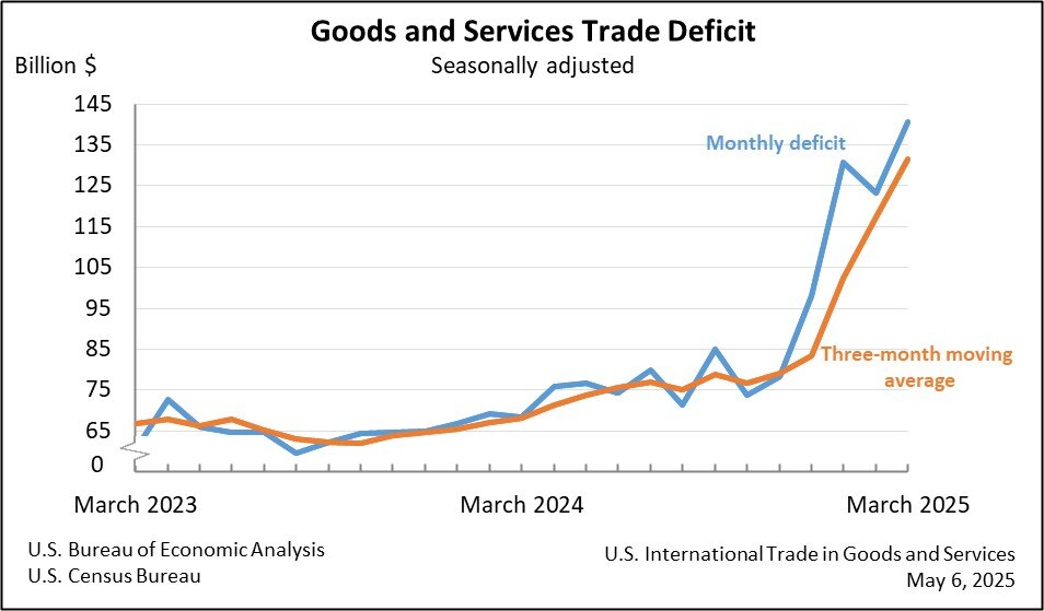
Chart IIA-1, US Home Ownership Rate, Quarterly, 1964-2018, %
Source: US Bureau of the Census
http://www.census.gov/housing/hvs/index.html
© Carlos M. Pelaez, 2009, 2010, 2011, 2012, 2013, 2014, 2015, 2016, 2017, 2018, 2019.
No comments:
Post a Comment