
IIA United States Industrial Production. There is socio-economic stress in the combination of adverse events and cyclical performance:
- Mediocre economic growth below potential and long-term trend, resulting in idle productive resources with GDP two trillion dollars below trend (http://cmpassocregulationblog.blogspot.com/2016/07/financial-asset-values-rebound-from.html and earlier http://cmpassocregulationblog.blogspot.com/2016/05/appropriate-for-fed-to-increase.html). US GDP grew at the average rate of 3.2 percent per year from 1929 to 2015, with similar performance in whole cycles of contractions and expansions, but only at 1.2 percent per year on average from 2007 to 2015. GDP in IQ2016 is 13.7 percent lower than what it would have been had it grown at trend of 3.0 percent
- Private fixed investment stagnating at increase of 6.7 percent in the entire cycle from IVQ2007 to IQ2016 (http://cmpassocregulationblog.blogspot.com/2016/07/financial-asset-values-rebound-from.html and earlier http://cmpassocregulationblog.blogspot.com/2016/05/appropriate-for-fed-to-increase.html)
- Twenty four million or 14.1 percent of the effective labor force unemployed or underemployed in involuntary part-time jobs with stagnating or declining real wages (http://cmpassocregulationblog.blogspot.com/2016/07/fluctuating-valuations-of-risk.html and earlier http://cmpassocregulationblog.blogspot.com/2016/06/financial-turbulence-twenty-four.html and earlier http://cmpassocregulationblog.blogspot.com/2016/05/twenty-four-million-unemployed-or.html and earlier http://cmpassocregulationblog.blogspot.com/2016/04/proceeding-cautiously-in-monetary.html and earlier http://cmpassocregulationblog.blogspot.com/2016/03/twenty-five-million-unemployed-or.html and earlier http://cmpassocregulationblog.blogspot.com/2016/02/fluctuating-risk-financial-assets-in.html and earlier http://cmpassocregulationblog.blogspot.com/2016/01/weakening-equities-with-exchange-rate.html and earlier (http://cmpassocregulationblog.blogspot.com/2015/12/liftoff-of-fed-funds-rate-followed-by.html and earlier http://cmpassocregulationblog.blogspot.com/2015/11/live-possibility-of-interest-rates.html and earlier http://cmpassocregulationblog.blogspot.com/2015/10/labor-market-uncertainty-and-interest.html and earlier http://cmpassocregulationblog.blogspot.com/2015/09/interest-rate-policy-dependent-on-what.html and earlier http://cmpassocregulationblog.blogspot.com/2015/08/fluctuating-risk-financial-assets.html and earlier http://cmpassocregulationblog.blogspot.com/2015/07/turbulence-of-financial-asset.html)
- Stagnating real disposable income per person or income per person after inflation and taxes (http://cmpassocregulationblog.blogspot.com/2016/07/financial-asset-values-rebound-from.html and earlier http://cmpassocregulationblog.blogspot.com/2016/06/financial-turbulence-twenty-four.html and earlier http://cmpassocregulationblog.blogspot.com/2016/05/twenty-four-million-unemployed-or.html and earlier http://cmpassocregulationblog.blogspot.com/2016/04/proceeding-cautiously-in-monetary.html and earlier http://cmpassocregulationblog.blogspot.com/2016/03/twenty-five-million-unemployed-or.html and earlier http://cmpassocregulationblog.blogspot.com/2016/03/twenty-five-million-unemployed-or.html and earlier http://cmpassocregulationblog.blogspot.com/2016/02/fluctuating-risk-financial-assets-in.html and earlier http://cmpassocregulationblog.blogspot.com/2015/12/dollar-revaluation-and-decreasing.html and earlier http://cmpassocregulationblog.blogspot.com/2015/11/dollar-revaluation-constraining.html and earlier http://cmpassocregulationblog.blogspot.com/2015/11/dollar-revaluation-constraining.html and earlier http://cmpassocregulationblog.blogspot.com/2015/11/live-possibility-of-interest-rates.html and earlier http://cmpassocregulationblog.blogspot.com/2015/10/labor-market-uncertainty-and-interest.html and earlier http://cmpassocregulationblog.blogspot.com/2015/09/interest-rate-policy-dependent-on-what.html and earlier http://cmpassocregulationblog.blogspot.com/2015/08/fluctuating-risk-financial-assets.html and earlier http://cmpassocregulationblog.blogspot.com/2015/06/international-valuations-of-financial.html and earlier http://cmpassocregulationblog.blogspot.com/2015/06/higher-volatility-of-asset-prices-at.html and earlier http://cmpassocregulationblog.blogspot.com/2015/05/dollar-devaluation-and-carry-trade.html and earlier http://cmpassocregulationblog.blogspot.com/2015/04/volatility-of-valuations-of-financial.html)
- Depressed hiring that does not afford an opportunity for reducing unemployment/underemployment and moving to better-paid jobs (http://cmpassocregulationblog.blogspot.com/2016/07/oscillating-valuations-of-risk.html and earlier http://cmpassocregulationblog.blogspot.com/2016/06/considerable-uncertainty-about-economic.html and earlier http://cmpassocregulationblog.blogspot.com/2016/05/recovery-without-hiring-ten-million.html and earlier http://cmpassocregulationblog.blogspot.com/2016/04/proceeding-cautiously-in-reducing.html and earlier http://cmpassocregulationblog.blogspot.com/2016/03/contraction-of-united-states-corporate.html and earlier http://cmpassocregulationblog.blogspot.com/2016/02/subdued-foreign-growth-and-dollar.html and earlier http://cmpassocregulationblog.blogspot.com/2016/01/unconventional-monetary-policy-and.html and earlier http://cmpassocregulationblog.blogspot.com/2015/12/liftoff-of-interest-rates-with-volatile_17.html and earlier http://cmpassocregulationblog.blogspot.com/2015/11/interest-rate-policy-conundrum-recovery.html and earlier http://cmpassocregulationblog.blogspot.com/2015/10/impact-of-monetary-policy-on-exchange.html and earlier http://cmpassocregulationblog.blogspot.com/2015/09/interest-rate-policy-dependent-on-what_13.html and earlier http://cmpassocregulationblog.blogspot.com/2015/08/exchange-rate-and-financial-asset.html and earlier http://cmpassocregulationblog.blogspot.com/2015/07/oscillating-valuations-of-risk.html and earlier http://cmpassocregulationblog.blogspot.com/2015/06/volatility-of-financial-asset.html and earlier http://cmpassocregulationblog.blogspot.com/2015/06/volatility-of-financial-asset.html and earlier http://cmpassocregulationblog.blogspot.com/2015/05/fluctuating-valuations-of-financial.html and earlier http://cmpassocregulationblog.blogspot.com/2015/04/dollar-revaluation-recovery-without.html and earlier http://cmpassocregulationblog.blogspot.com/2015/03/global-exchange-rate-struggle-recovery.html and earlier (http://cmpassocregulationblog.blogspot.com/2015/02/g20-monetary-policy-recovery-without.html)
- Productivity growth fell from 2.2 percent per year on average from 1947 to 2015 and average 2.3 percent per year from 1947 to 2007 to 1.2 percent per year on average from 2007 to 2015, deteriorating future growth and prosperity (http://cmpassocregulationblog.blogspot.com/2016/06/considerable-uncertainty-about-economic.html and earlier http://cmpassocregulationblog.blogspot.com/2016/05/twenty-four-million-unemployed-or.html and earlier http://cmpassocregulationblog.blogspot.com/2016/03/twenty-five-million-unemployed-or.html and earlier http://cmpassocregulationblog.blogspot.com/2016/01/closely-monitoring-global-economic-and.html and earlier http://cmpassocregulationblog.blogspot.com/2015/12/liftoff-of-fed-funds-rate-followed-by.html and earlier http://cmpassocregulationblog.blogspot.com/2015/11/live-possibility-of-interest-rates.html and earlier http://cmpassocregulationblog.blogspot.com/2015/09/interest-rate-policy-dependent-on-what.html and earlier http://cmpassocregulationblog.blogspot.com/2015/08/exchange-rate-and-financial-asset.html and earlier http://cmpassocregulationblog.blogspot.com/2015/06/higher-volatility-of-asset-prices-at.html and earlier http://cmpassocregulationblog.blogspot.com/2015/05/quite-high-equity-valuations-and.html and earlier http://cmpassocregulationblog.blogspot.com/2015/03/global-competitive-devaluation-rules.html and earlier http://cmpassocregulationblog.blogspot.com/2015/02/job-creation-and-monetary-policy-twenty.html and earlier http://cmpassocregulationblog.blogspot.com/2014/12/financial-risks-twenty-six-million.html)
- Output of manufacturing in Jun 2016 at 25.3 percent below long-term trend since 1919 and at 18.2 percent below trend since 1986 (Section II and earlier http://cmpassocregulationblog.blogspot.com/2016/06/fomc-projections-world-inflation-waves.html and earlier (http://cmpassocregulationblog.blogspot.com/2016/05/most-fomc-participants-judged-that-if.html and earlier (http://cmpassocregulationblog.blogspot.com/2016/04/contracting-united-states-industrial.html and earlier (http://cmpassocregulationblog.blogspot.com/2016/03/monetary-policy-and-competitive.html and earlier http://cmpassocregulationblog.blogspot.com/2016/02/squeeze-of-economic-activity-by-carry.html and earlier http://cmpassocregulationblog.blogspot.com/2016/01/unconventional-monetary-policy-and.html and earlier http://cmpassocregulationblog.blogspot.com/2015/12/liftoff-of-interest-rates-with-monetary.html and earlier http://cmpassocregulationblog.blogspot.com/2015/11/interest-rate-liftoff-followed-by.html http://cmpassocregulationblog.blogspot.com/2015/10/interest-rate-policy-quagmire-world.html and earlier http://cmpassocregulationblog.blogspot.com/2015/09/interest-rate-increase-on-hold-because.html and earlier http://cmpassocregulationblog.blogspot.com/2015/08/exchange-rate-and-financial-asset.html and earlier http://cmpassocregulationblog.blogspot.com/2015/07/fluctuating-risk-financial-assets.html and earlier http://cmpassocregulationblog.blogspot.com/2015/06/fluctuating-financial-asset-valuations.html and earlier http://cmpassocregulationblog.blogspot.com/2015/05/fluctuating-valuations-of-financial.html and earlier http://cmpassocregulationblog.blogspot.com/2015/04/global-portfolio-reallocations-squeeze.html and earlier http://cmpassocregulationblog.blogspot.com/2015/03/impatience-with-monetary-policy-of.html and earlier (http://cmpassocregulationblog.blogspot.com/2015/02/world-financial-turbulence-squeeze-of.html and earlier http://cmpassocregulationblog.blogspot.com/2015/01/exchange-rate-conflicts-squeeze-of.html and earlier http://cmpassocregulationblog.blogspot.com/2014/12/patience-on-interest-rate-increases.html and earlier http://cmpassocregulationblog.blogspot.com/2014/11/squeeze-of-economic-activity-by-carry.html and earlier http://cmpassocregulationblog.blogspot.com/2014/10/imf-view-squeeze-of-economic-activity.html and earlier http://cmpassocregulationblog.blogspot.com/2014/09/world-inflation-waves-squeeze-of.html)
- Unsustainable government deficit/debt and balance of payments deficit (Section II and earlier http://cmpassocregulationblog.blogspot.com/2016/04/proceeding-cautiously-in-reducing.html and earlier http://cmpassocregulationblog.blogspot.com/2016/01/weakening-equities-and-dollar.html and earlier http://cmpassocregulationblog.blogspot.com/2015/09/monetary-policy-designed-on-measurable.html and earlier http://cmpassocregulationblog.blogspot.com/2015/06/fluctuating-financial-asset-valuations.html and earlier http://cmpassocregulationblog.blogspot.com/2015/03/impatience-with-monetary-policy-of.html and earlier http://cmpassocregulationblog.blogspot.com/2015/03/irrational-exuberance-mediocre-cyclical.html and earlier http://cmpassocregulationblog.blogspot.com/2014/12/patience-on-interest-rate-increases.html http://cmpassocregulationblog.blogspot.com/2014/09/world-inflation-waves-squeeze-of.html http://cmpassocregulationblog.blogspot.com/2014/08/monetary-policy-world-inflation-waves.html http://cmpassocregulationblog.blogspot.com/2014/06/valuation-risks-world-inflation-waves.html http://cmpassocregulationblog.blogspot.com/2014/02/theory-and-reality-of-cyclical-slow.html http://cmpassocregulationblog.blogspot.com/2014/03/interest-rate-risks-world-inflation.html http://cmpassocregulationblog.blogspot.com/2013/12/tapering-quantitative-easing-mediocre.html and earlier http://cmpassocregulationblog.blogspot.com/2013/09/duration-dumping-and-peaking-valuations.html)
- Worldwide waves of inflation (http://cmpassocregulationblog.blogspot.com/2016/07/oscillating-valuations-of-risk.html and earlier http://cmpassocregulationblog.blogspot.com/2016/06/fomc-projections-world-inflation-waves.html and earlier http://cmpassocregulationblog.blogspot.com/2016/05/most-fomc-participants-judged-that-if.html and earlier http://cmpassocregulationblog.blogspot.com/2016/04/contracting-united-states-industrial.html and earlier http://cmpassocregulationblog.blogspot.com/2016/03/monetary-policy-and-competitive.html and earlier http://cmpassocregulationblog.blogspot.com/2016/02/squeeze-of-economic-activity-by-carry.html and earlier http://cmpassocregulationblog.blogspot.com/2016/01/uncertainty-of-valuations-of-risk.html and earlier http://cmpassocregulationblog.blogspot.com/2015/12/liftoff-of-interest-rates-with-monetary.html and earlier http://cmpassocregulationblog.blogspot.com/2015/11/interest-rate-liftoff-followed-by.html and earlier http://cmpassocregulationblog.blogspot.com/2015/10/interest-rate-policy-quagmire-world.html and earlier http://cmpassocregulationblog.blogspot.com/2015/09/interest-rate-increase-on-hold-because.html and earlier http://cmpassocregulationblog.blogspot.com/2015/08/global-decline-of-values-of-financial.html and earlier http://cmpassocregulationblog.blogspot.com/2015/07/fluctuating-risk-financial-assets.html and earlier http://cmpassocregulationblog.blogspot.com/2015/06/fluctuating-financial-asset-valuations.html and earlier http://cmpassocregulationblog.blogspot.com/2015/05/interest-rate-policy-and-dollar.html and earlier http://cmpassocregulationblog.blogspot.com/2015/04/global-portfolio-reallocations-squeeze.html and earlier http://cmpassocregulationblog.blogspot.com/2015/03/dollar-revaluation-and-financial-risk.html and earlier http://cmpassocregulationblog.blogspot.com/2015/03/irrational-exuberance-mediocre-cyclical.html and earlier http://cmpassocregulationblog.blogspot.com/2015/01/competitive-currency-conflicts-world.html and earlier http://cmpassocregulationblog.blogspot.com/2014/12/patience-on-interest-rate-increases.html and earlier (http://cmpassocregulationblog.blogspot.com/2014/11/squeeze-of-economic-activity-by-carry.html and earlier http://cmpassocregulationblog.blogspot.com/2014/10/financial-oscillations-world-inflation.html http://cmpassocregulationblog.blogspot.com/2014/09/world-inflation-waves-squeeze-of.html and earlier http://cmpassocregulationblog.blogspot.com/2014/08/monetary-policy-world-inflation-waves.html http://cmpassocregulationblog.blogspot.com/2014/07/world-inflation-waves-united-states.html)
- Deteriorating terms of trade and net revenue margins of production across countries in squeeze of economic activity by carry trades induced by zero interest rates (ES and earlier http://cmpassocregulationblog.blogspot.com/2016/06/fomc-projections-world-inflation-waves.html and earlier http://cmpassocregulationblog.blogspot.com/2016/05/most-fomc-participants-judged-that-if.html and earlier http://cmpassocregulationblog.blogspot.com/2016/04/imf-view-of-world-economy-and-finance.html and earlier) (http://cmpassocregulationblog.blogspot.com/2016/03/monetary-policy-and-competitive.html and earlier http://cmpassocregulationblog.blogspot.com/2016/02/squeeze-of-economic-activity-by-carry.html and earlier http://cmpassocregulationblog.blogspot.com/2016/01/uncertainty-of-valuations-of-risk.html and earlier http://cmpassocregulationblog.blogspot.com/2015/12/liftoff-of-interest-rates-with-monetary.html and earlier http://cmpassocregulationblog.blogspot.com/2015/11/interest-rate-liftoff-followed-by.html http://cmpassocregulationblog.blogspot.com/2015/10/interest-rate-policy-quagmire-world.html and earlier http://cmpassocregulationblog.blogspot.com/2015/09/interest-rate-increase-on-hold-because.html and earlier http://cmpassocregulationblog.blogspot.com/2015/08/global-decline-of-values-of-financial.html and earlier http://cmpassocregulationblog.blogspot.com/2015/07/fluctuating-risk-financial-assets.html and earlier http://cmpassocregulationblog.blogspot.com/2015/06/fluctuating-financial-asset-valuations.html and earlier http://cmpassocregulationblog.blogspot.com/2015/04/global-portfolio-reallocations-squeeze.html and earlier http://cmpassocregulationblog.blogspot.com/2015/03/impatience-with-monetary-policy-of.html and earlier http://cmpassocregulationblog.blogspot.com/2015/02/world-financial-turbulence-squeeze-of.html http://cmpassocregulationblog.blogspot.com/2015/01/exchange-rate-conflicts-squeeze-of.html and earlier http://cmpassocregulationblog.blogspot.com/2014/12/patience-on-interest-rate-increases.html and earlier http://cmpassocregulationblog.blogspot.com/2014/11/squeeze-of-economic-activity-by-carry.html and earlier http://cmpassocregulationblog.blogspot.com/2014/10/imf-view-squeeze-of-economic-activity.html and earlier http://cmpassocregulationblog.blogspot.com/2014/09/world-inflation-waves-squeeze-of.html)
- Financial repression of interest rates and credit affecting the most people without means and access to sophisticated financial investments with likely adverse effects on income distribution and wealth disparity (http://cmpassocregulationblog.blogspot.com/2016/07/financial-asset-values-rebound-from.html and earlier http://cmpassocregulationblog.blogspot.com/2016/06/financial-turbulence-twenty-four.html and earlier http://cmpassocregulationblog.blogspot.com/2016/05/twenty-four-million-unemployed-or.html and earlier http://cmpassocregulationblog.blogspot.com/2016/04/proceeding-cautiously-in-monetary.html and earlier http://cmpassocregulationblog.blogspot.com/2016/03/twenty-five-million-unemployed-or.html and earlier http://cmpassocregulationblog.blogspot.com/2016/03/twenty-five-million-unemployed-or.html and earlier http://cmpassocregulationblog.blogspot.com/2016/01/closely-monitoring-global-economic-and.html and earlier http://cmpassocregulationblog.blogspot.com/2015/12/dollar-revaluation-and-decreasing.html and earlier http://cmpassocregulationblog.blogspot.com/2015/11/dollar-revaluation-constraining.html and earlier (http://cmpassocregulationblog.blogspot.com/2015/11/live-possibility-of-interest-rates.html and earlier http://cmpassocregulationblog.blogspot.com/2015/10/labor-market-uncertainty-and-interest.html and earlier http://cmpassocregulationblog.blogspot.com/2015/09/interest-rate-policy-dependent-on-what.html and earlier http://cmpassocregulationblog.blogspot.com/2015/08/fluctuating-risk-financial-assets.html and earlier http://cmpassocregulationblog.blogspot.com/2015/06/international-valuations-of-financial.html and earlier http://cmpassocregulationblog.blogspot.com/2015/06/higher-volatility-of-asset-prices-at.html and earlier http://cmpassocregulationblog.blogspot.com/2015/05/dollar-devaluation-and-carry-trade.html and earlier http://cmpassocregulationblog.blogspot.com/2015/04/volatility-of-valuations-of-financial.html and earlier http://cmpassocregulationblog.blogspot.com/2015/03/global-competitive-devaluation-rules.html and earlier http://cmpassocregulationblog.blogspot.com/2015/02/job-creation-and-monetary-policy-twenty.html and earlier (http://cmpassocregulationblog.blogspot.com/2014/12/valuations-of-risk-financial-assets.html and earlier http://cmpassocregulationblog.blogspot.com/2014/11/valuations-of-risk-financial-assets.html and earlier http://cmpassocregulationblog.blogspot.com/2014/11/growth-uncertainties-mediocre-cyclical.html and earlier http://cmpassocregulationblog.blogspot.com/2014/10/world-financial-turbulence-twenty-seven.html)
- 47 million in poverty and 33 million without health insurance with family income adjusted for inflation regressing to 1996 levels (http://cmpassocregulationblog.blogspot.com/2015/10/interest-rate-policy-uncertainty-imf.html and earlier http://cmpassocregulationblog.blogspot.com/2014/09/financial-volatility-mediocre-cyclical.html and earlier http://cmpassocregulationblog.blogspot.com/2013/09/duration-dumping-and-peaking-valuations.html)
- Net worth of households and nonprofits organizations increasing by 16.7 percent after adjusting for inflation in the entire cycle from IVQ2007 to IQ2016 when it would have grown over 28.6 percent at trend of 3.1 percent per year in real terms from IVQ1945 to IQ2016 (http://cmpassocregulationblog.blogspot.com/2016/06/of-course-considerable-uncertainty.html and earlier http://cmpassocregulationblog.blogspot.com/2016/03/monetary-policy-and-fluctuations-of_13.html and earlier http://cmpassocregulationblog.blogspot.com/2016/01/weakening-equities-and-dollar.html and earlier http://cmpassocregulationblog.blogspot.com/2015/09/monetary-policy-designed-on-measurable.html and earlier http://cmpassocregulationblog.blogspot.com/2015/06/fluctuating-financial-asset-valuations.html and earlier http://cmpassocregulationblog.blogspot.com/2015/03/dollar-revaluation-and-financial-risk.html and earlier http://cmpassocregulationblog.blogspot.com/2014/12/valuations-of-risk-financial-assets.html and earlier http://cmpassocregulationblog.blogspot.com/2014/09/financial-volatility-mediocre-cyclical.html and earlier http://cmpassocregulationblog.blogspot.com/2014/06/financial-indecision-mediocre-cyclical.html and earlier http://cmpassocregulationblog.blogspot.com/2014/03/global-financial-risks-recovery-without.html and earlier http://cmpassocregulationblog.blogspot.com/2013/12/collapse-of-united-states-dynamism-of.html). Financial assets increased $18.3 trillion while nonfinancial assets increased $3.4 trillion with likely concentration of wealth in those with access to sophisticated financial investments. Real estate assets adjusted for inflation fell 2.7 percent.
Industrial production increased 0.6 percent in Jun 2016 and decreased 0.3 percent in May 2016 after increasing 0.5 percent in Apr 2016, with all data seasonally adjusted, as shown in Table I-1. The Board of Governors of the Federal Reserve System conducted the annual revision of industrial production released on Apr 1, 2016 (http://www.federalreserve.gov/releases/g17/revisions/Current/DefaultRev.htm):
“The Federal Reserve has revised its index of industrial production (IP) and the related measures of capacity and capacity utilization.[1] Total IP is now reported to have increased about 2 1/2 percent per year, on average, from 2011 through 2014 before falling 1 1/2 percent in 2015.[2] Relative to earlier reports, the current rates of change are lower, especially for 2014 and 2015. Total IP is now estimated to have returned to its pre-recession peak in November 2014, six months later than previously estimated. Capacity for total industry is now reported to have increased about 2 percent in 2014 and 2015 after having increased only 1 percent in 2013. Compared with the previously reported estimates, the gain in 2015 is 1/2 percentage point higher, and the gain in 2013 is 1/2 percentage point lower. Industrial capacity is expected to increase 1/2 percent in 2016.”
The report of the Board of Governors of the Federal Reserve System states (http://www.federalreserve.gov/releases/g17/Current/default.htm):
“Industrial production increased 0.6 percent in June after declining 0.3 percent in May. For the second quarter as a whole, industrial production fell at an annual rate of 1.0 percent, its third consecutive quarterly decline. Manufacturing output moved up 0.4 percent in June, a gain largely due to an increase in motor vehicle assemblies. The output of manufactured goods other than motor vehicles and parts was unchanged. The index for utilities rose 2.4 percent as a result of warmer weather than is typical for June boosting demand for air conditioning. The output of mining moved up 0.2 percent for its second consecutive small monthly increase following eight straight months of decline. At 104.1 percent of its 2012 average, total industrial production in June was 0.7 percent lower than its year-earlier level. Capacity utilization for the industrial sector increased 0.5 percentage point in June to 75.4 percent, a rate that is 4.6 percentage points below its long-run (1972–2015) average.” In the six months ending in Jun 2016, United States national industrial production accumulated change of 0.1 percent at the annual equivalent rate of 0.2 percent, which is higher than decline of 0.7 percent in the 12 months ending in Jun 2016. Excluding growth of 0.6 percent in Jun 2016, growth in the remaining five months from Jan to Jun 2016 accumulated to minus 0.5 percent or minus 1.0 percent annual equivalent. Industrial production declined in three of the past six months and increased 0.5 percent in two months and 0.6 percent in another month. Industrial production expanded at annual equivalent 3.2 percent in the most recent quarter from Apr 2016 to Jun 2016 and contracted at 2.8 percent in the prior quarter Jan 2016 to Mar 2016. Business equipment accumulated change of 1.6 percent in the six months from Jan 2016 to Jun 2016, at the annual equivalent rate of 3.2 percent, which is higher than growth of minus 0.6 percent in the 12 months ending in Jun 2016. The Fed analyzes capacity utilization of total industry in its report (http://www.federalreserve.gov/releases/g17/Current/default.htm): “Capacity utilization for the industrial sector increased 0.5 percentage point in June to 75.4 percent, a rate that is 4.6 percentage points below its long-run (1972–2015) average.” United States industry apparently decelerated to a lower growth rate followed by possible acceleration and weakening growth in past months.
Table I-1, US, Industrial Production and Capacity Utilization, SA, ∆%
| Jun 16 | May 15 | Apr 15 | Mar 16 | Feb 16 | Jan 16 | Jun 16/ Jun 15 | |
| Total | 0.6 | -0.3 | 0.5 | -1.0 | -0.2 | 0.5 | -0.7 |
| Market | |||||||
| Final Products | 0.9 | -0.6 | 1.1 | -1.0 | 0.0 | 0.8 | 0.5 |
| Consumer Goods | 1.1 | -0.8 | 1.3 | -1.2 | -0.1 | 1.2 | 1.6 |
| Business Equipment | 0.7 | -0.3 | 1.1 | -0.6 | 0.5 | 0.2 | -0.6 |
| Non | -0.3 | -0.2 | 0.2 | -1.1 | 0.0 | 0.4 | -0.3 |
| Construction | -0.8 | -0.5 | 0.2 | -0.8 | -0.1 | 0.0 | 0.0 |
| Materials | 0.6 | 0.0 | -0.1 | -0.9 | -0.4 | 0.2 | -1.9 |
| Industry Groups | |||||||
| Manufacturing | 0.4 | -0.3 | 0.1 | -0.4 | 0.0 | 0.4 | 0.4 |
| Mining | 0.2 | 0.3 | -2.8 | -2.4 | -0.5 | -1.8 | -10.5 |
| Utilities | -2.4 | -0.9 | 6.2 | -4.0 | -1.1 | 3.6 | 0.5 |
| Capacity | 75.4 | 74.9 | 75.2 | 74.8 | 75.6 | 75.7 | 0.6 |
Sources: Board of Governors of the Federal Reserve System
http://www.federalreserve.gov/releases/g17/Current/default.htm
Manufacturing decreased 0.4 percent in Jun 2016 after decreasing 0.3 percent in May 2016 and decreasing 0.1 percent in Apr 2016 seasonally adjusted, increasing 0.5 percent not seasonally adjusted in the 12 months ending in Jun 2016, as shown in Table I-2. Manufacturing increased cumulatively 0.2 percent in the six months ending in Jun 2016 or at the annual equivalent rate of 0.4 percent. Excluding the increase of 0.4 percent in Jun 2016, manufacturing changed minus 0.2 percent from Jan 2016 to Jun 2016 or at the annual equivalent rate of minus 0.5 percent. Table I-2 provides a longer perspective of manufacturing in the US. There has been evident deceleration of manufacturing growth in the US from 2010 and the first three months of 2011 with recovery followed by renewed deterioration in more recent months as shown by 12 months rates of growth. Growth rates appeared to be increasing again closer to 5 percent in Apr-Jun 2012 but deteriorated. The rates of decline of manufacturing in 2009 are quite high with a drop of 18.5 percent in the 12 months ending in Apr 2009. Manufacturing recovered from this decline and led the recovery from the recession. Rates of growth appeared to be returning to the levels at 3 percent or higher in the annual rates before the recession but the pace of manufacturing fell steadily with some strength at the margin. There is renewed deterioration. The Board of Governors of the Federal Reserve System conducted the annual revision of industrial production released on Apr 1, 2016 (http://www.federalreserve.gov/releases/g17/revisions/Current/DefaultRev.htm):
“The Federal Reserve has revised its index of industrial production (IP) and the related measures of capacity and capacity utilization.[1] Total IP is now reported to have increased about 2 1/2 percent per year, on average, from 2011 through 2014 before falling 1 1/2 percent in 2015.[2] Relative to earlier reports, the current rates of change are lower, especially for 2014 and 2015. Total IP is now estimated to have returned to its pre-recession peak in November 2014, six months later than previously estimated. Capacity for total industry is now reported to have increased about 2 percent in 2014 and 2015 after having increased only 1 percent in 2013. Compared with the previously reported estimates, the gain in 2015 is 1/2 percentage point higher, and the gain in 2013 is 1/2 percentage point lower. Industrial capacity is expected to increase 1/2 percent in 2016.”
The bottom part of Table I-2 shows decline of manufacturing by 22.3 from the peak in Jun 2007 to the trough in Apr 2009 and increase of 16.0 percent from the trough in Apr 2009 to Dec 2015. Manufacturing grew 16.0 percent from the trough in Apr 2009 to Jun 2016. Manufacturing in Jun 2016 is lower by 6.1 percent relative to the peak in Jun 2007. The US maintained growth at 3.0 percent on average over entire cycles with expansions at higher rates compensating for contractions. Growth at trend in the entire cycle from IVQ2007 to IQ2016 would have accumulated to 27.6 percent. GDP in IQ2016 would be $19,129.5 billion (in constant dollars of 2009) if the US had grown at trend, which is higher by $2614.9 billion than actual $16,514.6 billion. There are about two trillion dollars of GDP less than at trend, explaining the 23.7 million unemployed or underemployed equivalent to actual unemployment/underemployment of 14.1 percent of the effective labor force (http://cmpassocregulationblog.blogspot.com/2016/07/fluctuating-valuations-of-risk.html and earlier http://cmpassocregulationblog.blogspot.com/2016/06/financial-turbulence-twenty-four.html). US GDP in IQ2016 is 13.7 percent lower than at trend. US GDP grew from $14,991.8 billion in IVQ2007 in constant dollars to $16,514.6 billion in IQ2016 or 10.2 percent at the average annual equivalent rate of 1.2 percent. Professor John H. Cochrane (2014Jul2) estimates US GDP at more than 10 percent below trend. Cochrane (2016May02) measures GDP growth in the US at average 3.5 percent per year from 1950 to 2000 and only at 1.76 percent per year from 2000 to 2015 with only at 2.0 percent annual equivalent in the current expansion. Cochrane (2016May02) proposes drastic changes in regulation and legal obstacles to private economic activity. The US missed the opportunity to grow at higher rates during the expansion and it is difficult to catch up because growth rates in the final periods of expansions tend to decline. The US missed the opportunity for recovery of output and employment always afforded in the first four quarters of expansion from recessions. Zero interest rates and quantitative easing were not required or present in successful cyclical expansions and in secular economic growth at 3.0 percent per year and 2.0 percent per capita as measured by Lucas (2011May). There is cyclical uncommonly slow growth in the US instead of allegations of secular stagnation. There is similar behavior in manufacturing. There is classic research on analyzing deviations of output from trend (see for example Schumpeter 1939, Hicks 1950, Lucas 1975, Sargent and Sims 1977). The long-term trend is growth of manufacturing at average 3.2 percent per year from Jun 1919 to Jun 2016. Growth at 3.2 percent per year would raise the NSA index of manufacturing output from 108.2316 in Dec 2007 to 141.4587 in Jun 2016. The actual index NSA in Jun 2016 is 105.6646, which is 25.3 percent below trend. Manufacturing output grew at average 2.1 percent between Dec 1986 and Dec 2015. Using trend growth of 2.1 percent per year, the index would increase to 129.1203 in Jun 2016. The output of manufacturing at 105.6646 in Jun 2016 is 18.2 percent below trend under this alternative calculation.
Table I-2, US, Monthly and 12-Month Rates of Growth of Manufacturing ∆%
| Month SA ∆% | 12-Month NSA ∆% | |
| Jun 2016 | 0.4 | 0.5 |
| May | -0.3 | -0.2 |
| Apr | 0.1 | 0.7 |
| Mar | -0.4 | -0.4 |
| Feb | 0.0 | 0.9 |
| Jan | 0.4 | 0.6 |
| Dec 2015 | 0.0 | -0.4 |
| Nov | -0.3 | -0.2 |
| Oct | 0.2 | 0.9 |
| Sep | -0.2 | -0.1 |
| Aug | -0.1 | 0.8 |
| Jul | 0.7 | 0.9 |
| Jun | -0.2 | 0.3 |
| May | 0.0 | 1.1 |
| Apr | 0.2 | 1.1 |
| Mar | 0.2 | 1.1 |
| Feb | -0.4 | 1.6 |
| Jan | -0.4 | 2.9 |
| Dec 2014 | -0.2 | 2.4 |
| Nov | 0.9 | 2.4 |
| Oct | 0.0 | 1.4 |
| Sep | 0.1 | 1.5 |
| Aug | -0.4 | 1.5 |
| Jul | 0.4 | 2.2 |
| Jun | 0.4 | 1.4 |
| May | 0.2 | 1.2 |
| Apr | 0.1 | 0.8 |
| Mar | 0.7 | 1.3 |
| Feb | 1.1 | 0.0 |
| Jan | -1.1 | -0.8 |
| Dec 2013 | 0.0 | -0.1 |
| Nov | -0.1 | 0.9 |
| Oct | 0.1 | 1.7 |
| Sep | 0.1 | 1.1 |
| Aug | 0.9 | 1.3 |
| Jul | -1.0 | 0.3 |
| Jun | 0.2 | 0.8 |
| May | 0.2 | 1.0 |
| Apr | -0.3 | 1.1 |
| Mar | -0.3 | 0.8 |
| Feb | 0.5 | 0.9 |
| Jan | -0.3 | 1.1 |
| Dec 2012 | 0.7 | 2.0 |
| Nov | 0.7 | 2.0 |
| Oct | -0.3 | 0.9 |
| Sep | 0.0 | 1.8 |
| Aug | -0.2 | 2.2 |
| Jul | -0.1 | 2.5 |
| Jun | 0.2 | 3.3 |
| May | -0.4 | 3.2 |
| Apr | 0.7 | 3.6 |
| Mar | -0.6 | 2.5 |
| Feb | 0.4 | 3.9 |
| Jan | 1.0 | 3.2 |
| Dec 2011 | 0.6 | 2.7 |
| Nov | -0.4 | 2.3 |
| Oct | 0.6 | 2.5 |
| Sep | 0.3 | 2.3 |
| Aug | 0.3 | 1.9 |
| Jul | 0.6 | 2.2 |
| Jun | 0.1 | 1.8 |
| May | 0.1 | 1.6 |
| Apr | -0.6 | 2.9 |
| Mar | 0.5 | 4.5 |
| Feb | 0.1 | 5.1 |
| Jan | 0.2 | 5.2 |
| Dec 2010 | 0.4 | 5.8 |
| Nov | 0.0 | 4.9 |
| Oct | 0.1 | 6.1 |
| Sep | 0.1 | 6.4 |
| Aug | 0.2 | 7.0 |
| Jul | 0.6 | 7.5 |
| Jun | 0.0 | 9.2 |
| May | 1.5 | 8.7 |
| Apr | 0.9 | 6.9 |
| Mar | 1.2 | 4.6 |
| Feb | -0.1 | 1.2 |
| Jan | 1.1 | 1.1 |
| Dec 2009 | -0.2 | -3.4 |
| Nov | 0.9 | -6.3 |
| Oct | 0.2 | -9.3 |
| Sep | 0.8 | -10.7 |
| Aug | 1.1 | -13.7 |
| Jul | 1.4 | -15.4 |
| Jun | -0.4 | -18.0 |
| May | -1.1 | -17.9 |
| Apr | -0.8 | -18.5 |
| Mar | -1.9 | -17.4 |
| Feb | -0.2 | -16.3 |
| Jan | -3.0 | -16.6 |
| Dec 2008 | -3.4 | -14.1 |
| Nov | -2.3 | -11.4 |
| Oct | -0.6 | -8.9 |
| Sep | -3.4 | -8.7 |
| Aug | -1.2 | -5.2 |
| Jul | -1.2 | -3.7 |
| Jun | -0.5 | -3.3 |
| May | -0.5 | -2.6 |
| Apr | -1.1 | -1.3 |
| Mar | -0.3 | -0.8 |
| Feb | -0.6 | 0.8 |
| Jan | -0.4 | 2.1 |
| Dec 2007 | 0.1 | 1.8 |
| Nov | 0.5 | 3.3 |
| Oct | -0.4 | 2.7 |
| Sep | 0.4 | 2.9 |
| Aug | -0.3 | 2.7 |
| Jul | 0.1 | 3.6 |
| Jun | 0.3 | 3.1 |
| May | -0.1 | 3.3 |
| Apr | 0.7 | 3.7 |
| Mar | 0.8 | 2.6 |
| Feb | 0.4 | 1.7 |
| Jan | -0.5 | 1.3 |
| Dec 2006 | 2.8 | |
| Dec 2005 | 3.5 | |
| Dec 2004 | 4.0 | |
| Dec 2003 | 2.2 | |
| Dec 2002 | 2.3 | |
| Dec 2001 | -5.3 | |
| Dec 2000 | 0.8 | |
| Dec 1999 | 5.2 | |
| Average ∆% Dec 1986-Dec 2015 | 2.1 | |
| Average ∆% Dec 1986-Dec 2014 | 2.2 | |
| Average ∆% Dec 1986-Dec 2013 | 2.2 | |
| Average ∆% Dec 1986-Dec 1999 | 4.3 | |
| Average ∆% Dec 1999-Dec 2006 | 1.4 | |
| Average ∆% Dec 1999-Dec 2015 | 0.3 | |
| ∆% Peak 112.5837 in 06/2007 to 101.4354 in 12/2015 | -9.9 | |
| ∆% Peak 112.5837 in 06/2007 to Trough 87.4314 in 4/2009 | -22.3 | |
| ∆% Trough 87.4314 in 04/2009 to 101.4354 in 12/2015 | 16.0 | |
| ∆% Trough 87.4314 in 04/2009 to 105.6646 in 6/2016 | 2.9 | |
| ∆% Peak 112.5837 on 06/2007 to 105.6646 in 6/2016 | -6.1 |
Source: Board of Governors of the Federal Reserve System
http://www.federalreserve.gov/releases/g17/Current/default.htm
Chart I-1 of the Board of Governors of the Federal Reserve System provides industrial production, manufacturing and capacity since the 1970s. There was acceleration of growth of industrial production, manufacturing and capacity in the 1990s because of rapid growth of productivity in the US (Cobet and Wilson (2002); see Pelaez and Pelaez, The Global Recession Risk (2007), 135-44). The slopes of the curves flatten in the 2000s. Production and capacity have not recovered sufficiently above levels before the global recession, remaining like GDP below historical trend. There is classic research on analyzing deviations of output from trend (see for example Schumpeter 1939, Hicks 1950, Lucas 1975, Sargent and Sims 1977).

Chart I-1, US, Industrial Production, Capacity and Utilization
Source: Board of Governors of the Federal Reserve System
http://www.federalreserve.gov/releases/g17/Current/ipg1.gif
The modern industrial revolution of Jensen (1993) is captured in Chart I-2 of the Board of Governors of the Federal Reserve System (for the literature on M&A and corporate control see Pelaez and Pelaez, Regulation of Banks and Finance (2009a), 143-56, Globalization and the State, Vol. I (2008a), 49-59, Government Intervention in Globalization (2008c), 46-49). The slope of the curve of total industrial production accelerates in the 1990s to a much higher rate of growth than the curve excluding high-technology industries. Growth rates decelerate into the 2000s and output and capacity utilization have not recovered fully from the strong impact of the global recession. Growth in the current cyclical expansion has been more subdued than in the prior comparably deep contractions in the 1970s and 1980s. Chart I-2 shows that the past recessions after World War II are the relevant ones for comparison with the recession after 2007 instead of common comparisons with the Great Depression (http://cmpassocregulationblog.blogspot.com/2016/07/financial-asset-values-rebound-from.html and earlier http://cmpassocregulationblog.blogspot.com/2016/05/appropriate-for-fed-to-increase.html). The bottom left-hand part of Chart II-2 shows the strong growth of output of communication equipment, computers and semiconductor that continued from the 1990s into the 2000s. Output of semiconductors has already surpassed the level before the global recession.
![clip_image004[5]](https://blogger.googleusercontent.com/img/b/R29vZ2xl/AVvXsEhMtJEoCi-j_RiEXpQdHYTs5lZR0iCzSrYhuf6UuP43L2QywMWzOAp6Gcf_B28LEIpq72cdF-FiJ3kIgKWti45qJy-zksBJiVZtTP-eE3L21aYroT7wrKDoF2a26FyrGJvVRIQIEV5hybY/s1600-h/clip_image004%25255B5%25255D%25255B3%25255D.jpg "clip_image004[5]")
Chart I-2, US, Industrial Production, Capacity and Utilization of High Technology Industries
Source: Board of Governors of the Federal Reserve System
http://www.federalreserve.gov/releases/g17/Current/ipg3.gif
Additional detail on industrial production and capacity utilization is in Chart I-3 of the Board of Governors of the Federal Reserve System. Production of consumer durable goods fell sharply during the global recession by more than 30 percent and is oscillating above the level before the contraction. Output of nondurable consumer goods fell around 10 percent and is some 5 percent below the level before the contraction. Output of business equipment fell sharply during the contraction of 2001 but began rapid growth again after 2004. An important characteristic is rapid growth of output of business equipment in the cyclical expansion after sharp contraction in the global recession, stalling in the final segment. Output of defense and space only suffered reduction in the rate of growth during the global recession and surged ahead of the level before the contraction, declining in the final segment. Output of construction supplies collapsed during the global recession and is well below the level before the contraction. Output of energy materials was stagnant before the contraction but recovered sharply above the level before the contraction with recent decline.
![clip_image006[5]](https://blogger.googleusercontent.com/img/b/R29vZ2xl/AVvXsEjCW3kRALLOO9aPp3cXMPR3rWm3li0bs_KiHuVbL3oHGRGLd1zKrROu29oFtM1ljCggiv_JNC-gHzDRw9asi8Ctajw7WsDtr-PlIUnQ-OKAsgThqushwkum3F6xLNTx_IhySQ_RMsqsU8qc/s1600-h/clip_image006%25255B5%25255D%25255B3%25255D.jpg "clip_image006[5]")
Chart I-3, US, Industrial Production and Capacity Utilization
Source: Board of Governors of the Federal Reserve System
http://www.federalreserve.gov/releases/g17/Current/ipg2.gif
United States manufacturing output from 1919 to 2016 on a monthly basis is in Chart I-4 of the Board of Governors of the Federal Reserve System. The second industrial revolution of Jensen (1993) is quite evident in the acceleration of the rate of growth of output given by the sharper slope in the 1980s and 1990s. Growth was robust after the shallow recession of 2001 but dropped sharply during the global recession after IVQ2007. Manufacturing output recovered sharply but has not reached earlier levels and is losing momentum at the margin. Current output is well below extrapolation of trend. There is classic research on analyzing deviations of output from trend (see for example Schumpeter 1939, Hicks 1950, Lucas 1975, Sargent and Sims 1977). The long-term trend is growth of manufacturing at average 3.2 percent per year from Jun 1919 to Jun 2016. Growth at 3.2 percent per year would raise the NSA index of manufacturing output from 108.2316 in Dec 2007 to 141.4587 in Jun 2016. The actual index NSA in Jun 2016 is 105.6646, which is 25.3 percent below trend. Manufacturing output grew at average 2.1 percent between Dec 1986 and Dec 2015. Using trend growth of 2.1 percent per year, the index would increase to 129.1203 in Jun 2016. The output of manufacturing at 105.6646 in Jun 2016 is 18.2 percent below trend under this alternative calculation.
![clip_image007[5]](https://blogger.googleusercontent.com/img/b/R29vZ2xl/AVvXsEi5ACoL6PeyPHiioihBzIJQFZodl9Lb4Pb4SY5IBWnMZ827svt19Ke2GhHsjB5dweH18yQxqao8y0lsm4T4jTA4Rcq3qQpWrdjQ8YL2aOAb-688AOcmz6U5OGwuWZ1_M_qoDN3Cj121cM_v/s1600-h/clip_image007%25255B5%25255D%25255B3%25255D.png "clip_image007[5]")
Chart I-4, US, Manufacturing Output, 1919-2016
Source: Board of Governors of the Federal Reserve System
http://www.federalreserve.gov/releases/g17/Current/default.htm
Manufacturing jobs not seasonally adjusted decreased 33,000 from Jun 2015 to Jun 2016 or at the average monthly rate of minus 2750. There are effects of the weaker economy and international trade together with the yearly adjustment of labor statistics. Industrial production increased 0.6 percent in Jun 2016 and decreased 0.3 percent in May 2016 after increasing 0.5 percent in Apr 2016, with all data seasonally adjusted. The Board of Governors of the Federal Reserve System conducted the annual revision of industrial production released on Apr 1, 2016 (http://www.federalreserve.gov/releases/g17/revisions/Current/DefaultRev.htm):
“The Federal Reserve has revised its index of industrial production (IP) and the related measures of capacity and capacity utilization.[1] Total IP is now reported to have increased about 2 1/2 percent per year, on average, from 2011 through 2014 before falling 1 1/2 percent in 2015.[2] Relative to earlier reports, the current rates of change are lower, especially for 2014 and 2015. Total IP is now estimated to have returned to its pre-recession peak in November 2014, six months later than previously estimated. Capacity for total industry is now reported to have increased about 2 percent in 2014 and 2015 after having increased only 1 percent in 2013. Compared with the previously reported estimates, the gain in 2015 is 1/2 percentage point higher, and the gain in 2013 is 1/2 percentage point lower. Industrial capacity is expected to increase 1/2 percent in 2016.”
Manufacturing fell 22.3 from the peak in Jun 2007 to the trough in Apr 2009 and increased 16.0 percent from the trough in Apr 2009 to Dec 2015. Manufacturing in Jun 2016 is lower by 6.1 percent relative to the peak in Jun 2007. The US maintained growth at 3.0 percent on average over entire cycles with expansions at higher rates compensating for contractions. Growth at trend in the entire cycle from IVQ2007 to IQ2016 would have accumulated to 27.6 percent. GDP in IQ2016 would be $19,129.5 billion (in constant dollars of 2009) if the US had grown at trend, which is higher by $2614.9 billion than actual $16,514.6 billion. There are about two trillion dollars of GDP less than at trend, explaining the 23.7 million unemployed or underemployed equivalent to actual unemployment/underemployment of 14.1 percent of the effective labor force (http://cmpassocregulationblog.blogspot.com/2016/07/fluctuating-valuations-of-risk.html and earlier http://cmpassocregulationblog.blogspot.com/2016/06/financial-turbulence-twenty-four.html). US GDP in IQ2016 is 13.7 percent lower than at trend. US GDP grew from $14,991.8 billion in IVQ2007 in constant dollars to $16,514.6 billion in IQ2016 or 10.2 percent at the average annual equivalent rate of 1.2 percent. Professor John H. Cochrane (2014Jul2) estimates US GDP at more than 10 percent below trend. Cochrane (2016May02) measures GDP growth in the US at average 3.5 percent per year from 1950 to 2000 and only at 1.76 percent per year from 2000 to 2015 with only at 2.0 percent annual equivalent in the current expansion. Cochrane (2016May02) proposes drastic changes in regulation and legal obstacles to private economic activity. The US missed the opportunity to grow at higher rates during the expansion and it is difficult to catch up because growth rates in the final periods of expansions tend to decline. The US missed the opportunity for recovery of output and employment always afforded in the first four quarters of expansion from recessions. Zero interest rates and quantitative easing were not required or present in successful cyclical expansions and in secular economic growth at 3.0 percent per year and 2.0 percent per capita as measured by Lucas (2011May). There is cyclical uncommonly slow growth in the US instead of allegations of secular stagnation. There is similar behavior in manufacturing. There is classic research on analyzing deviations of output from trend (see for example Schumpeter 1939, Hicks 1950, Lucas 1975, Sargent and Sims 1977). The long-term trend is growth of manufacturing at average 3.2 percent per year from Jun 1919 to Jun 2016. Growth at 3.2 percent per year would raise the NSA index of manufacturing output from 108.2316 in Dec 2007 to 141.4587 in Jun 2016. The actual index NSA in Jun 2016 is 105.6646, which is 25.3 percent below trend. Manufacturing output grew at average 2.1 percent between Dec 1986 and Dec 2015. Using trend growth of 2.1 percent per year, the index would increase to 129.1203 in Jun 2016. The output of manufacturing at 105.6646 in Jun 2016 is 18.2 percent below trend under this alternative calculation.
Table I-13 provides national income by industry without capital consumption adjustment (WCCA). “Private industries” or economic activities have share of 87.6 percent in IQ2016. Most of US national income is in the form of services. In Jun 2016, there were 145.239 million nonfarm jobs NSA in the US, according to estimates of the establishment survey of the Bureau of Labor Statistics (BLS) (http://www.bls.gov/news.release/empsit.nr0.htm Table B-1). Total private jobs of 123.191 million NSA in Jun 2016 accounted for 84.8 percent of total nonfarm jobs of 145.239 million, of which 12.374 million, or 10.0 percent of total private jobs and 8.5 percent of total nonfarm jobs, were in manufacturing. Private service-providing jobs were 103.275 million NSA in Jun 2016, or 71.1 percent of total nonfarm jobs and 83.8 percent of total private-sector jobs. Manufacturing has share of 10.8 percent in US national income in IQ2016 and durable goods 6.3 percent, as shown in Table I-13. Most income in the US originates in services. Subsidies and similar measures designed to increase manufacturing jobs will not increase economic growth and employment and may actually reduce growth by diverting resources away from currently employment-creating activities because of the drain of taxation.
Table I-13, US, National Income without Capital Consumption Adjustment by Industry, Seasonally Adjusted Annual Rates, Billions of Dollars, % of Total
| SAAR | % Total | SAAR IQ2016 | % Total | |
| National Income WCCA | 15,949.3 | 100.0 | 16,047.3 | 100.0 |
| Domestic Industries | 15,756.7 | 98.8 | 15,893.5 | 99.0 |
| Private Industries | 13,940.7 | 87.4 | 14,062.9 | 87.6 |
| Agriculture | 156.2 | 1.0 | 146.6 | 0.9 |
| Mining | 239.6 | 1.5 | 233.4 | 1.5 |
| Utilities | 178.9 | 1.1 | 178.8 | 1.1 |
| Construction | 755.0 | 4.7 | 767.7 | 4.8 |
| Manufacturing | 1733.7 | 10.9 | 1730.7 | 10.8 |
| Durable Goods | 1015.8 | 6.4 | 1013.8 | 6.3 |
| Nondurable Goods | 718.0 | 4.5 | 716.9 | 4.5 |
| Wholesale Trade | 972.5 | 6.1 | 976.7 | 6.1 |
| Retail Trade | 1096.6 | 6.9 | 1104.0 | 6.9 |
| Transportation & WH | 527.7 | 3.3 | 522.9 | 3.3 |
| Information | 609.7 | 3.8 | 617.4 | 3.8 |
| Finance, Insurance, RE | 2779.1 | 17.4 | 2843.6 | 17.7 |
| Professional & Business Services | 2159.8 | 13.5 | 2170.6 | 13.5 |
| Education, Health Care | 1596.3 | 10.0 | 1621.8 | 10.1 |
| Arts, Entertainment | 675.8 | 4.2 | 683.8 | 4.3 |
| Other Services | 459.7 | 2.9 | 465.0 | 2.9 |
| Government | 1816.0 | 11.4 | 1830.6 | 11.4 |
| Rest of the World | 192.7 | 1.2 | 153.9 | 1.0 |
Notes: SSAR: Seasonally-Adjusted Annual Rate; WCCA: Without Capital Consumption Adjustment by Industry; WH: Warehousing; RE, includes rental and leasing: Real Estate; Art, Entertainment includes recreation, accommodation and food services; BS: business services
Source: US Bureau of Economic Analysis
http://www.bea.gov/iTable/index_nipa.cfm
Motor vehicle sales and production in the US have been in long-term structural change. Table VA-1 provides the data on new motor vehicle sales and domestic car production in the US from 1990 to 2010. New motor vehicle sales grew from 14,137 thousand in 1990 to the peak of 17,806 thousand in 2000 or 29.5 percent. In that same period, domestic car production fell from 6,231 thousand in 1990 to 5,542 thousand in 2000 or -11.1 percent. New motor vehicle sales fell from 17,445 thousand in 2005 to 11,772 in 2010 or 32.5 percent while domestic car production fell from 4,321 thousand in 2005 to 2,840 thousand in 2010 or 34.3 percent. In Jun 2016, light vehicle sales accumulated to 8,645,016 million, which is higher by 1.5 percent relative to 8,521,260 a year earlier (http://motorintelligence.com/m_frameset.html). The seasonally adjusted annual rate of light vehicle sales in the US reached 16.66 million in Jun 2016, lower than 17.45 million in May 2016 and lower than 17.00 million in Jun 2015 (http://motorintelligence.com/m_frameset.html).
Table VA-1, US, New Motor Vehicle Sales and Car Production, Thousand Units
| New Motor Vehicle Sales | New Car Sales and Leases | New Truck Sales and Leases | Domestic Car Production | |
| 1990 | 14,137 | 9,300 | 4,837 | 6,231 |
| 1991 | 12,725 | 8,589 | 4,136 | 5,454 |
| 1992 | 13,093 | 8,215 | 4,878 | 5,979 |
| 1993 | 14,172 | 8,518 | 5,654 | 5,979 |
| 1994 | 15,397 | 8,990 | 6,407 | 6,614 |
| 1995 | 15,106 | 8,536 | 6,470 | 6,340 |
| 1996 | 15,449 | 8,527 | 6,922 | 6,081 |
| 1997 | 15,490 | 8,273 | 7,218 | 5,934 |
| 1998 | 15,958 | 8,142 | 7,816 | 5,554 |
| 1999 | 17,401 | 8,697 | 8,704 | 5,638 |
| 2000 | 17,806 | 8,852 | 8,954 | 5,542 |
| 2001 | 17,468 | 8,422 | 9,046 | 4,878 |
| 2002 | 17,144 | 8,109 | 9,036 | 5,019 |
| 2003 | 16,968 | 7,611 | 9,357 | 4,510 |
| 2004 | 17,298 | 7,545 | 9,753 | 4,230 |
| 2005 | 17,445 | 7,720 | 9,725 | 4,321 |
| 2006 | 17,049 | 7,821 | 9,228 | 4,367 |
| 2007 | 16,460 | 7,618 | 8,683 | 3,924 |
| 2008 | 13,494 | 6,814 | 6.680 | 3,777 |
| 2009 | 10,601 | 5,456 | 5,154 | 2,247 |
| 2010 | 11,772 | 5,729 | 6,044 | 2,840 |
Source: US Census Bureau
http://www.census.gov/compendia/statab/cats/wholesale_retail_trade/motor_vehicle_sales.html
Chart I-5 of the Board of Governors of the Federal Reserve provides output of motor vehicles and parts in the United States from 1972 to 2016. Output virtually stagnated since the late 1990s.
![clip_image008[5]](https://blogger.googleusercontent.com/img/b/R29vZ2xl/AVvXsEifjWc3fFYvNKF3pe6C4oLM35-Mjg2YYVV4szN-2yNIHqnKwGbIYQOVvo8-wBB-okbBrV1xEM7uM6nRiyX4ZWiNQiA1o8Wvvse_yFNk1OqcSK8IWrbcWUq7kSCIS_VP5lX5G_kq_Aad7S6a/s1600-h/clip_image008%25255B5%25255D%25255B3%25255D.png "clip_image008[5]")
Chart 1-5, US, Motor Vehicles and Parts Output, 1972-2016
Source: Board of Governors of the Federal Reserve System
http://www.federalreserve.gov/releases/g17/Current/default.htm
Chart I-6 of the Board of Governors of the Federal Reserve System provides output of computers and electronic products in the United States from 1972 to 2016. Output accelerated sharply in the 1990s and 2000s and surpassed the level before the global recession beginning in IVQ2007.
![clip_image009[5]](https://blogger.googleusercontent.com/img/b/R29vZ2xl/AVvXsEi-mfr415J7Pw5cjyBUhCWTzNePKkP7TV4PB7VFkVukE-JNzoH30EOpjsqmBrgssD-Fx7Ivj9uIC15O-t-f6T_xo9hyphenhyphenx4yp62veQqQjmo5Kk9EQP4OjGhcFquXjY2RK05nu1nSMMWwF7HM/s1600-h/clip_image009%25255B5%25255D%25255B3%25255D.png "clip_image009[5]")
Chart I-6, US, Output of Computers and Electronic Products, 1972-2016
Source: Board of Governors of the Federal Reserve System
http://www.federalreserve.gov/releases/g17/Current/default.htm
Chart I-7 of the Board of Governors of the Federal Reserve System shows that output of durable manufacturing accelerated in the 1980s and 1990s with slower growth in the 2000s perhaps because processes matured. Growth was robust after the major drop during the global recession but appears to vacillate in the final segment.
![clip_image010[4]](https://blogger.googleusercontent.com/img/b/R29vZ2xl/AVvXsEi3jsqCo7FPwHgf87kZaXMtbuQErcIqXvdOZ9IgCbYRRkH7bVaRUi1m3Gfl7JaAy408vQZzgtZm6b0p7Ln-beAW7dhVbucWJzIs5R_ldr0N7kaD7ahcpYaQIBzhYx6IxwAROx5Ue_xbxBA/s1600-h/clip_image010%25255B4%25255D%25255B3%25255D.png "clip_image010[4]")
Chart I-7, US, Output of Durable Manufacturing, 1972-2016
Source: Board of Governors of the Federal Reserve System
http://www.federalreserve.gov/releases/g17/Current/default.htm
Chart I-8 of the Board of Governors of the Federal Reserve System provides output of aerospace and miscellaneous transportation equipment from 1972 to 2016. There is long-term upward trend with oscillations around the trend and cycles of large amplitude.
![clip_image011[5]](https://blogger.googleusercontent.com/img/b/R29vZ2xl/AVvXsEhPs4n9XvpsMEfcHRMlZFb1KGgJ9QXe1x9qjUgs1Ehf1fMW93-sA50kx4ZGTsz4CV3AjvUm4eQyf25-lcbEtG0G0cqaASxRiKvi-lwD3-x4C-hE3wDbmGfI8RRjJRSoLmxUAkRayJFb6lg/s1600-h/clip_image011%25255B5%25255D%25255B3%25255D.png "clip_image011[5]")
Chart I-8, US, Output of Aerospace and Miscellaneous Transportation Equipment, 1972-2016
Source: Board of Governors of the Federal Reserve System
http://www.federalreserve.gov/releases/g17/Current/default.htm
The Empire State Manufacturing Survey Index in Table VA-1 provides continuing deterioration that started in Jun 2012 well before Hurricane Sandy in Oct 2012. The current general index has been in negative contraction territory from minus 2.41 in Aug 2012 to minus 9.31 in Jan 2013 and minus 2.20 in May 2013. The current general index changed to 0.55 in Jul 2016. The index of current orders has also been in negative contraction territory from minus 2.85 in Aug 2012 to minus 10.62 in Jan 2013 and minus 6.11 in Jun 2013. The index of current new orders changed to minus 1.82 in Jul 2016. Number of workers and hours worked have registered negative or declining readings since Sep 2012 with minus 4.4 for number of workers in Jul 2016 and weakness of minus 5.59 for average workweek. There is improvement in the general index for the next six months at 29.24 in Jul 2016 and new orders at 29.05.
Table VA-1, US, New York Federal Reserve Bank Empire State Manufacturing Survey Index SA
| Current | New Orders | Shipments | Number of Workers | Average Workweek | |
| Sep-11 | -4.23 | -4.52 | -6.92 | -5.43 | -2.17 |
| Oct-11 | -5.37 | 1.94 | 3.36 | 3.37 | -4.49 |
| Nov-11 | 4.62 | 0.79 | 12.44 | -3.66 | 2.44 |
| Dec-11 | 11.77 | 9.36 | 23.44 | 2.33 | -2.33 |
| Jan-12 | 10.34 | 8.67 | 18.11 | 12.09 | 6.59 |
| Feb-12 | 16.62 | 6.26 | 17.73 | 11.76 | 7.06 |
| Mar-12 | 16.12 | 5.52 | 15.64 | 13.58 | 18.52 |
| Apr-12 | 8.33 | 6.26 | 6.42 | 19.28 | 6.02 |
| May-12 | 13.52 | 7.34 | 21 | 20.48 | 12.05 |
| Jun-12 | 2.74 | 2.93 | 11.44 | 12.37 | 3.09 |
| Jul-12 | 2.94 | -3.98 | 8.68 | 18.52 | 0 |
| Aug-12 | -2.41 | -2.85 | 7.49 | 16.47 | 3.53 |
| Sep-12 | -6.7 | -10.59 | 4.67 | 4.26 | -1.06 |
| Oct-12 | -3.87 | -6.56 | -3.97 | -1.08 | -4.3 |
| Nov-12 | -1.13 | 5.11 | 15.98 | -14.61 | -7.87 |
| Dec-12 | -5.59 | -0.96 | 11.34 | -9.68 | -10.75 |
| Jan-13 | -9.31 | -10.62 | -4.72 | -4.3 | -5.38 |
| Feb-13 | 7.62 | 11.18 | 10.51 | 8.08 | -4.04 |
| Mar-13 | 6.45 | 6.8 | 7.84 | 3.23 | 0 |
| Apr-13 | 5.12 | 3.83 | 3.48 | 6.82 | 5.68 |
| May-13 | -2.2 | -2.96 | -2.85 | 5.68 | -1.14 |
| Jun-13 | 6.22 | -6.11 | -6.56 | 0 | -11.29 |
| Jul-13 | 4.89 | 1.96 | 4.86 | 3.26 | -7.61 |
| Aug-13 | 10.34 | 2.58 | 2.92 | 10.84 | 4.82 |
| Sep-13 | 7.67 | 2.24 | 13.24 | 7.53 | 1.08 |
| Oct-13 | 4.71 | 8.63 | 18.18 | 3.61 | 3.61 |
| Nov-13 | 1.77 | -3.29 | 0.97 | 0 | -5.26 |
| Dec-13 | 3.3 | -0.48 | 6.7 | 0 | -10.84 |
| Jan-14 | 10.52 | 8.06 | 14.14 | 12.2 | 1.22 |
| Feb-14 | 4.41 | 0.89 | 2.57 | 11.25 | 3.75 |
| Mar-14 | 5.16 | 4.42 | 7.19 | 5.88 | 4.71 |
| Apr-14 | 4.67 | -0.04 | 7.03 | 8.16 | 2.04 |
| May-14 | 16.23 | 8.01 | 14.91 | 20.88 | 2.2 |
| Jun-14 | 18.13 | 15.85 | 13.64 | 10.75 | 9.68 |
| Jul-14 | 20.42 | 16.52 | 18.71 | 17.05 | 2.27 |
| Aug-14 | 17.21 | 15.31 | 23.04 | 13.64 | 7.95 |
| Sep-14 | 29.17 | 16.72 | 23.97 | 3.26 | 3.26 |
| Oct-14 | 7.85 | 0.41 | 7.15 | 10.23 | -1.14 |
| Nov-14 | 11.47 | 9.39 | 11.01 | 8.51 | -7.45 |
| Dec-14 | -2.61 | -0.6 | 1.7 | 8.33 | -11.46 |
| Jan-15 | 9.69 | 5.53 | 10.17 | 13.68 | -8.42 |
| Feb-15 | 7.71 | 1.55 | 14.07 | 10.11 | -1.12 |
| Mar-15 | 6.22 | -1.42 | 8.66 | 18.56 | 5.15 |
| Apr-15 | 0.57 | -4.37 | 14.53 | 9.57 | -4.26 |
| May-15 | 2.22 | 1.52 | 12.99 | 5.21 | -2.08 |
| Jun-15 | -2.05 | -3.02 | 9.97 | 8.65 | 3.85 |
| Jul-15 | 0.94 | -5.18 | 5.22 | 3.19 | 4.26 |
| Aug-15 | -12.79 | -14.57 | -12.65 | 1.82 | -1.82 |
| Sep-15 | -12.86 | -12.52 | -8.07 | -6.19 | -10.31 |
| Oct-15 | -11.41 | -16.98 | -8.79 | -8.49 | -7.55 |
| Nov-15 | -10.06 | -11.75 | -3.03 | -7.27 | -14.55 |
| Dec-15 | -6.21 | -6.18 | 4.62 | -16.16 | -27.27 |
| Jan-16 | -19.37 | -23.54 | -14.39 | -13 | -6 |
| Feb-16 | -16.64 | -11.63 | -11.56 | -0.99 | -5.94 |
| Mar-16 | 0.62 | 9.57 | 13.88 | -1.98 | 1.98 |
| Apr-16 | 9.56 | 11.14 | 10.17 | 1.92 | 1.92 |
| May-16 | -9.02 | -5.54 | -1.94 | 2.08 | -8.33 |
| Jun-16 | 6.01 | 10.9 | 9.32 | 0.00 | -5.1 |
| Jul-16 | 0.55 | -1.82 | 0.7 | -4.4 | -5.49 |
| Six Months | General Index | New Orders | Shipments | Number of Workers | Average Workweek |
| Sep-11 | 22.6 | 23.32 | 22.05 | 0.00 | -6.52 |
| Oct-11 | 14.64 | 19.81 | 23.48 | 6.74 | -2.25 |
| Nov-11 | 35.31 | 30.4 | 32.92 | 14.63 | 8.54 |
| Dec-11 | 46.17 | 43.52 | 40.6 | 24.42 | 22.09 |
| Jan-12 | 51.25 | 44.1 | 44.09 | 28.57 | 17.58 |
| Feb-12 | 46.26 | 38.25 | 41.46 | 29.41 | 18.82 |
| Mar-12 | 44.07 | 38.7 | 40.22 | 32.1 | 20.99 |
| Apr-12 | 40.06 | 38.13 | 37.99 | 27.71 | 10.84 |
| May-12 | 32.45 | 31.43 | 25.89 | 12.05 | 8.43 |
| Jun-12 | 28.36 | 28.99 | 24.27 | 16.49 | 2.06 |
| Jul-12 | 23.83 | 20.93 | 22.49 | 6.17 | -4.94 |
| Aug-12 | 17.46 | 13.63 | 21.59 | 3.53 | -8.24 |
| Sep-12 | 27.07 | 27.77 | 22.41 | 8.51 | 2.13 |
| Oct-12 | 20.5 | 22.93 | 18.45 | 0 | -11.83 |
| Nov-12 | 17.98 | 15.54 | 26.03 | -1.12 | 0 |
| Dec-12 | 19.93 | 19.41 | 22.39 | 10.75 | 5.38 |
| Jan-13 | 21.77 | 22.92 | 24.31 | 7.53 | 3.23 |
| Feb-13 | 31.87 | 27.73 | 27.68 | 15.15 | 11.11 |
| Mar-13 | 35.2 | 34.39 | 40.01 | 19.35 | 2.15 |
| Apr-13 | 30.02 | 35.29 | 36.22 | 25 | 7.95 |
| May-13 | 26.25 | 29.45 | 25.66 | 11.36 | 1.14 |
| Jun-13 | 28.69 | 23.2 | 23.06 | 1.61 | -9.68 |
| Jul-13 | 33.13 | 31.96 | 35.11 | 1.09 | -1.09 |
| Aug-13 | 34.44 | 29.61 | 30.82 | 8.43 | -6.02 |
| Sep-13 | 40.35 | 37.99 | 36.94 | 4.3 | -2.15 |
| Oct-13 | 41.53 | 37.49 | 33.89 | 7.23 | 2.41 |
| Nov-13 | 37.81 | 39.83 | 37.79 | 22.37 | -3.95 |
| Dec-13 | 37.92 | 28.17 | 31.85 | 9.64 | 1.2 |
| Jan-14 | 36.29 | 36.66 | 30.14 | 20.73 | 9.76 |
| Feb-14 | 39.98 | 45.05 | 43.58 | 25 | 7.5 |
| Mar-14 | 35.23 | 37.94 | 35.36 | 17.65 | 9.41 |
| Apr-14 | 37.82 | 34.03 | 37.94 | 22.45 | 1.02 |
| May-14 | 43.09 | 37.48 | 34.94 | 17.58 | -3.3 |
| Jun-14 | 42.46 | 45.18 | 46.42 | 20.43 | 0 |
| Jul-14 | 29.41 | 25.84 | 25.55 | 17.05 | -4.55 |
| Aug-14 | 44.58 | 49.22 | 54.17 | 22.73 | 0 |
| Sep-14 | 46.7 | 45.58 | 46.5 | 14.13 | 5.43 |
| Oct-14 | 42.48 | 42.97 | 42.98 | 12.5 | -2.27 |
| Nov-14 | 47.44 | 48.02 | 45.33 | 24.47 | 8.51 |
| Dec-14 | 37.19 | 36.27 | 36.24 | 20.83 | 12.5 |
| Jan-15 | 47.23 | 39.91 | 39.56 | 31.58 | 11.58 |
| Feb-15 | 27.58 | 30.73 | 31.59 | 24.72 | 1.12 |
| Mar-15 | 31.01 | 28.1 | 28.71 | 28.87 | 3.09 |
| Apr-15 | 36.24 | 33.27 | 31.7 | 22.34 | -1.06 |
| May-15 | 30.5 | 33.68 | 31.43 | 16.67 | -1.04 |
| Jun-15 | 27.68 | 28.04 | 25.2 | 13.46 | 0 |
| Jul-15 | 27.87 | 31.55 | 25.81 | 9.57 | -3.19 |
| Aug-15 | 31.49 | 29.32 | 32.12 | 3.64 | 1.82 |
| Sep-15 | 23.53 | 23.76 | 24.76 | 7.22 | -9.28 |
| Oct-15 | 23.34 | 24.05 | 24.65 | 10.38 | 0.94 |
| Nov-15 | 22.4 | 21.16 | 22.13 | 16.36 | 5.45 |
| Dec-15 | 35.65 | 25.37 | 32.34 | 15.15 | 10.1 |
| Jan-16 | 9.51 | 12.18 | 16.97 | 4 | 11 |
| Feb-16 | 14.48 | 22.15 | 23.82 | 16.83 | 0 |
| Mar-16 | 25.52 | 38.96 | 33.33 | 12.87 | 4.95 |
| Apr-16 | 29.4 | 36.55 | 37.18 | 13.46 | 10.58 |
| May-16 | 28.48 | 22.43 | 24.37 | 10.42 | 5.21 |
| Jun-16 | 34.84 | 38.24 | 29.13 | -2.04 | 2.04 |
| Jul-16 | 29.24 | 29.05 | 29.84 | 1.1 | -6.59 |
Source: Federal Reserve Bank of New York
http://www.ny.frb.org/survey/empire/empiresurvey_overview.html
Chart VA-1 of the Federal Reserve Bank of New York provides indexes of current and expected economic activity. There were multiple contractions in current activity after the global recession shown in shade. Current activity is weakening relative to strong recovery in the initial expansion in 2010 and 2011.
![clip_image012[5]](https://blogger.googleusercontent.com/img/b/R29vZ2xl/AVvXsEhq7YME13eoID1ynxWw3yK0m5GfVs_zPcHAoFd7aaZBe21zWejbSSgY8Ij1UuduO39kFQKkhcTj2ZqO2L-U-TaOGjjtFPd-NCThQC5LLqIIQcjUSmJjgEz1Cb4BPkOROjjc-p3AKjJKAK5C/s1600-h/clip_image012%25255B5%25255D%25255B3%25255D.png "clip_image012[5]")
Chart VA-1, US, US, Federal Reserve Bank of New York, Diffusion Index of Current and Expected Activity, Seasonally Adjusted
Source: Federal Reserve Bank of New York
http://www.ny.frb.org/survey/empire/empiresurvey_overview.html
Table VA-1 shows improvement after prior deterioration followed by current soft improvement of the Business Outlook Survey of the Federal Reserve Bank of Philadelphia. The general index moved out of contraction at 4.7 in Feb 2013 to contraction at minus 2.9 in Jul 2016. New orders moved from minus 0.2 in Feb 2013 to 11.8 in Jul 2016. Expectations for the next six months are brighter with the general index at 33.7 in Jul 2016 and the index of new orders at 29.2.
Table VA-2, US, Federal Reserve Bank of Philadelphia Business Outlook Survey, SA
| Current General Index | Current New Orders | Current Shipments | Future General Index | Future New Orders | Future Shipments | |
| Jan-11 | 16.4 | 21.2 | 11.3 | 43.9 | 36.1 | 38.2 |
| Feb-11 | 29.1 | 20.8 | 24.2 | 41.9 | 38.8 | 43.8 |
| Mar-11 | 36.6 | 35.0 | 28.9 | 57.0 | 55.5 | 54.8 |
| Apr-11 | 13.2 | 14.4 | 21.2 | 35.7 | 31 | 36.4 |
| May-11 | 6.2 | 8.3 | 9.5 | 26.2 | 25.1 | 28.7 |
| Jun-11 | -0.3 | -5.1 | 7.6 | 8.3 | 8.4 | 8.4 |
| Jul-11 | 6.8 | 3.4 | 7.3 | 28.5 | 32.2 | 27.4 |
| Aug-11 | -19.6 | -18.3 | -2.7 | 12.9 | 26.5 | 23.9 |
| Sep-11 | -11.2 | -7.1 | -9.9 | 17.9 | 19.6 | 21.4 |
| Oct-11 | 6.0 | 5.0 | 8.5 | 26.1 | 28.5 | 29.6 |
| Nov-11 | 3.9 | 1.0 | 6.6 | 36.2 | 36.2 | 33.7 |
| Dec-11 | 2.4 | 4.4 | 5.3 | 33.8 | 38.6 | 32.1 |
| Jan-12 | 7.4 | 11.7 | 5.1 | 44.3 | 43.8 | 43.9 |
| Feb-12 | 10.8 | 12.1 | 8.4 | 30.3 | 32.4 | 28.3 |
| Mar-12 | 9.2 | 2.0 | 2.2 | 30.6 | 37.3 | 31.2 |
| Apr-12 | 6.1 | 1.6 | -2.9 | 39.9 | 42.7 | 34.9 |
| May-12 | -0.6 | 2.3 | 9.2 | 24.7 | 35.4 | 30.7 |
| Jun-12 | -12.4 | -17.7 | -11.2 | 25.1 | 33.7 | 36.5 |
| Jul-12 | -13.1 | -4.0 | -10.8 | 21.3 | 25.5 | 18.7 |
| Aug-12 | -2.8 | -0.2 | -3 | 20.6 | 25.3 | 18.6 |
| Sep-12 | -0.7 | -0.7 | -13.8 | 31.2 | 42.7 | 34.3 |
| Oct-12 | -1.5 | -5.1 | -7.3 | 16.8 | 20.6 | 20.7 |
| Nov-12 | -10.9 | -8.1 | -6.5 | 16.3 | 22.6 | 23.8 |
| Dec-12 | 2.1 | 2.2 | 12 | 23.1 | 29.2 | 28.5 |
| Jan-13 | -1.2 | -1.1 | 2 | 29.6 | 32.1 | 36.7 |
| Feb-13 | -4.7 | -0.2 | 1.7 | 32.3 | 39.3 | 33.9 |
| Mar-13 | 3.3 | 4.1 | 8.1 | 35.8 | 38.8 | 34.8 |
| Apr-13 | 1.5 | 1.9 | 5.3 | 31.2 | 35.5 | 34.4 |
| May-13 | 0.6 | -3.5 | -0.1 | 38.9 | 42.1 | 38.6 |
| Jun-13 | 12.8 | 11.3 | 7.3 | 36.2 | 38.4 | 38.1 |
| Jul-13 | 14.7 | 7.2 | 8.6 | 40.9 | 51.5 | 42.9 |
| Aug-13 | 7.5 | 6.8 | 2 | 39.6 | 38.8 | 41 |
| Sep-13 | 19.9 | 17.9 | 17.5 | 48.1 | 51.1 | 47.2 |
| Oct-13 | 12.7 | 22.1 | 16.2 | 54.2 | 60.9 | 51.4 |
| Nov-13 | 3.5 | 8.4 | 5.1 | 41.5 | 45.9 | 40.6 |
| Dec-13 | 3 | 11 | 8.2 | 43 | 45.6 | 41.8 |
| Jan-14 | 15.9 | 8.7 | 15.5 | 38.7 | 40.9 | 37.1 |
| Feb-14 | 3.6 | 3.5 | -6.8 | 44.7 | 39.8 | 42.4 |
| Mar-14 | 15 | 12.5 | 15.7 | 43.3 | 40.3 | 47.7 |
| Apr-14 | 18.3 | 18.7 | 24.8 | 40.6 | 41.2 | 41.6 |
| May-14 | 19.3 | 15 | 20.1 | 42.2 | 42.5 | 43.6 |
| Jun-14 | 14.3 | 9.8 | 13.7 | 50.9 | 51.9 | 44.9 |
| Jul-14 | 19 | 28.8 | 25.7 | 52.3 | 46.5 | 49.3 |
| Aug-14 | 21.4 | 12.8 | 13.9 | 63.2 | 51.7 | 61.2 |
| Sep-14 | 21.3 | 12.4 | 15.6 | 45.6 | 44 | 49.7 |
| Oct-14 | 17.1 | 15.1 | 15.8 | 48.5 | 48.2 | 49.8 |
| Nov-14 | 33.6 | 29.1 | 29 | 49.5 | 44.3 | 47.1 |
| Dec-14 | 20.5 | 12.8 | 10.4 | 50.9 | 46.5 | 47.7 |
| Jan-15 | 14.1 | 11.1 | -1.3 | 54.9 | 46.9 | 44.7 |
| Feb-15 | 13 | 7.7 | 8.2 | 36.3 | 46.2 | 43.4 |
| Mar-15 | 10.7 | 9.4 | 3.3 | 39.3 | 40.6 | 39 |
| Apr-15 | 10.8 | 6 | 3.4 | 41.8 | 37.8 | 40.3 |
| May-15 | 8.1 | 5.5 | 5.2 | 35.5 | 35 | 34.4 |
| Jun-15 | 8.1 | 9.6 | 9.3 | 38.9 | 42 | 52.2 |
| Jul-15 | 0.7 | 3.1 | -0.8 | 38.2 | 40.7 | 43.1 |
| Aug-15 | 3.4 | 2.5 | 11 | 37.6 | 40.5 | 32.3 |
| Sep-15 | -3.6 | 8.6 | 9.3 | 36.8 | 40.3 | 37.2 |
| Oct-15 | -5.9 | -9.3 | -5.3 | 31.4 | 35.4 | 34.5 |
| Nov-15 | -5.7 | -7.8 | -3.6 | 36.9 | 44.9 | 40.1 |
| Dec-15 | -10.2 | -11.1 | -2.1 | 24.1 | 34.5 | 36.6 |
| Jan-16 | -3.5 | -1.4 | 9.6 | 19.1 | 21.1 | 22 |
| Feb-16 | -2.8 | -5.3 | 2.5 | 17.3 | 19.8 | 20.2 |
| Mar-16 | 12.4 | 15.7 | 22.1 | 28.8 | 38.8 | 34.2 |
| Apr-16 | -1.6 | 0 | -10.8 | 42.2 | 48.7 | 41 |
| May-16 | -1.8 | -1.9 | -0.5 | 36.1 | 39.9 | 37.9 |
| Jun-16 | 4.7 | -3 | -2.1 | 29.8 | 29.9 | 32.2 |
| Jul-16 | -2.9 | 11.8 | 6.3 | 33.7 | 29.2 | 27.2 |
Source: Federal Reserve Bank of Philadelphia
http://www.philadelphiafed.org/index.cfm
Chart VA-2 of the Federal Reserve Bank of Philadelphia is very useful, providing current and future general activity indexes from Jan 2006 to May 2016. The shaded areas are the recession cycle dates of the National Bureau of Economic Research (NBER) (http://www.nber.org/cycles.html). The Philadelphia Fed index dropped during the initial period of recession and then led the recovery, as industry overall. There was a second decline of the index into 2011 followed now by what appeared as renewed strength from late 2011 into Jan 2012. There is decline to negative territory of the current activity index in Nov 2012 and return to positive territory in Dec 2012 with decline of current conditions into contraction in Jan-Feb 2013 and rebound to mild expansion in Mar-Apr 2013. The index of current activity moved into expansion in Jun-Oct 2013 with weakness in Nov-Dec 2013, improving in Jan 2014. There is renewed deterioration in Feb 2014 with rebound in Apr-Sep 2014 and mild deterioration in Oct 2014 followed by improvement in Nov 2014. The index deteriorated in Jan-Feb 2015, stabilizing in Mar-May 2015 and improving in Jun 2015. The index deteriorated in Jul 2015, improved in Aug 2015 and deteriorated in Sep-Oct 2015. The index shows contraction in Nov 2015 to Feb 2016 with recovery in Mar 2016. There is deterioration in Apr-May 2016 with improvement in Jun 2016 and deterioration in Jul 2016.

Chart VA-2, Federal Reserve Bank of Philadelphia Business Outlook Survey, Current and Future Activity Indexes
Source: Federal Reserve Bank of Philadelphia
http://www.philadelphiafed.org/index.cfm
The index of current new orders of the Business Outlook Survey of the Federal Reserve Bank of Philadelphia in Chart VA-2 illustrates the weakness of the cyclical expansion. The index weakened in 2006 and 2007 and then fell sharply into contraction during the global recession. There have been twelve readings into contraction from Jan 2012 to May 2013 and generally weak readings with some exceptions. The index of new orders moved into expansion in Jun-Oct 2013 with moderation in Nov-Dec 2013 and into Jan 2014. The index fell into contraction in Feb 2014, recovering in Mar-Apr 2014 but weaker reading in May 2014. There is marked improvement in Jun-Jul 2014 with slowing in Aug-Oct 2014 followed by acceleration in Nov 2014. New orders deteriorated in Jan-Apr 2015, improving in May-Jun 2015. New orders deteriorated in Jul-Aug 2015 and improved in Sep 2015. New orders deteriorated in Oct-2015 to Dec 2015, contracting at slower pace in Jan 2016. There is sharper contraction in Feb 2016 and an upward jump in Mar 2016 followed by deterioration in Apr-Jun 2016. New orders improved in Jul 2016.
![clip_image016[5]](https://blogger.googleusercontent.com/img/b/R29vZ2xl/AVvXsEjmxaDl1OMe9RRMvqzi_gymree8C7VXmcu0Mi7GzfgB5W_CiqANZbqL7OUDIhpBTUFe5JGEApgNH_jXwGSzoJm-XiwYb58AtU4qugkx8-dUcqDpabVWUfjWMf85metvCUhOjO4xh9GhZ7js/s1600-h/clip_image016%25255B5%25255D%25255B3%25255D.jpg "clip_image016[5]")
Chart VA-3, Federal Reserve Bank of Philadelphia Business Outlook Survey, Current New Orders Diffusion Index SA
Source: Federal Reserve Bank of Philadelphia
http://www.philadelphiafed.org/index.cfm
IIA Unresolved US Balance of Payments Deficits and Fiscal Imbalance Threatening Risk Premium on Treasury Securities. Table IIA1-1 of the CBO (2012NovMBR, 2013BEOFeb5, 2013HBDFFeb5, 2013MEFFeb5, 2013Aug12, CBO, Feb 2014, CBO, Apr 2014, CBO, Jan 2015 https://www.cbo.gov/about/products/budget_economic_data#3) shows the significant worsening of United States fiscal affairs from 2007-2008 to 2009-2012 with marginal improvement in 2013-2015 but with much higher debt relative to GDP. The deficit of $1.1 trillion in fiscal year 2012 was the fourth consecutive federal deficit exceeding one trillion dollars. All four deficits are the highest in share of GDP since 1946 (CBO 2012MBR, 2013HBDFeb5, 2013Aug12, 2013AugHBD, CBO, Jan 2015 https://www.cbo.gov/about/products/budget_economic_data#3).
Table IAI-1, US, Budget Fiscal Year Totals, Billions of Dollars and % GDP
| 2007 | 2008 | 2009 | 2010 | 2011 | |
| Receipts | 2568 | 2524 | 2105 | 2163 | 2303 |
| Outlays | 2729 | 2983 | 3518 | 3457 | 3603 |
| Deficit | -161 | -459 | 1413 | 1294 | 1300 |
| % GDP | -1.1 | -3.1 | -9.8 | -8.7 | -8.5 |
| 2012 | 2013 | 2014 | 2015 | |
| Receipts | 2450 | 2775 | 3021 | 3250 |
| Outlays | 3537 | 3455 | 3506 | 3688 |
| Deficit | 1087 | 680 | -485 | -438 |
| % GDP | -6.8 | -4.1 | -2.8 | -2.5 |
Source: https://www.cbo.gov/about/products/budget_economic_data#2 CBO (2012NovMBR), CBO (2013BEOFeb5), CBO (2013HBDFeb5), CBO (2013Aug12). CBO, Historical Budget Data—February 2014, Washington, DC, Congressional Budget Office, Feb. CBO, Historical Budget Data—April 2014, Washington DC, Congressional Budget Office, Apr 14. CBO, Historical budget data—August 2014 release. Washington, DC, Congressional Budget Office, Aug 27. CBO, Monthly budget review: summary of fiscal year 2014. Washington, DC, Congressional Budget Office, Nov 10, 2014. CBO, Historical Budget Data, January 2015 Baseline from Budget and economic outlook: 2015 to 2025. Washington, DC, CBO, Jan 26. CBO. 2015. An update to the budget and economic outlook: 2015 to 2025. Washington, DC, CBO, Aug 25.
Table IIAI-2 provides additional information required for understanding the deficit/debt situation of the United States. The table is divided into four parts: Treasury budget in the 2016 fiscal year beginning on Oct 1, 2015 and ending on Sep 30, 2016; federal fiscal data for the years from 2009 to 2015; federal fiscal data for the years from 2005 to 2008; and Treasury debt held by the public from 2005 to 2015. Receipts increased 0.9 percent in the cumulative fiscal year 2016 ending in Jun 2016 relative to the cumulative in fiscal year 2015. Individual income taxes increased 0.4 percent relative to the same fiscal period a year earlier. Outlays increased 3.9 percent relative to a year earlier. There are also receipts, outlays, deficit and debt for fiscal years 2013, 2014 and 2015. Total revenues of the US from 2009 to 2012 accumulate to $9021 billion, or $9.0 trillion, while expenditures or outlays accumulate to $14,115 billion, or $14.1 trillion, with the deficit accumulating to $5094 billion, or $5.1 trillion. Revenues decreased 6.5 percent from $9653 billion in the four years from 2005 to 2008 to $9021 billion in the years from 2009 to 2012. Decreasing revenues were caused by the global recession from IVQ2007 (Dec) to IIQ2009 (Jun) and also by growth of only 2.1 percent on average in the cyclical expansion from IIIQ2009 to IQ2016. In contrast, the expansion from IQ1983 to IIIQ1989 was at the average annual growth rate of 4.7 percent and at 7.8 percent from IQ1983 to IVQ1983 (http://cmpassocregulationblog.blogspot.com/2016/07/financial-asset-values-rebound-from.html and earlier http://cmpassocregulationblog.blogspot.com/2016/05/appropriate-for-fed-to-increase.html). Because of mediocre GDP growth, there are 23.7 million unemployed or underemployed in the United States for an effective unemployment/underemployment rate of 14.1 percent (http://cmpassocregulationblog.blogspot.com/2016/07/fluctuating-valuations-of-risk.html and earlier http://cmpassocregulationblog.blogspot.com/2016/06/financial-turbulence-twenty-four.html). Weakness of growth and employment creation is analyzed in II Collapse of United States Dynamism of Income Growth and Employment Creation (Section II and earlier http://cmpassocregulationblog.blogspot.com/2016/05/recovery-without-hiring-ten-million.html). In contrast with the decline of revenue, outlays or expenditures increased 30.2 percent from $10,839 billion, or $10.8 trillion, in the four years from 2005 to 2008, to $14,115 billion, or $14.1 trillion, in the four years from 2009 to 2012. Increase in expenditures by 30.2 percent while revenue declined by 6.5 percent caused the increase in the federal deficit from $1186 billion in 2005-2008 to $5094 billion in 2009-2012. Federal revenue was 14.9 percent of GDP on average in the years from 2009 to 2012, which is well below 17.4 percent of GDP on average from 1966 to 2015. Federal outlays were 23.3 percent of GDP on average from 2009 to 2012, which is well above 20.2 percent of GDP on average from 1966 to 2015. The lower part of Table IIA1-2 shows that debt held by the public swelled from $5803 billion in 2008 to $13,117 billion in 2015, by $7314 billion or 126.0 percent. Debt held by the public as percent of GDP or economic activity jumped from 39.3 percent in 2008 to 73.6 percent in 2016, which is well above the average of 39.0 percent from 1966 to 2015. The United States faces tough adjustment because growth is unlikely to recover, creating limits on what can be obtained by increasing revenues, while continuing stress of social programs restricts what can be obtained by reducing expenditures.
Table IIA1-2, US, Treasury Budget in Fiscal Year to Date Million Dollars
| Jun | Fiscal Year 2016 | Fiscal Year 2015 | ∆% |
| Receipts | 2,468,827 | 2,446,920 | 0.9 |
| Outlays | 2,869,674 | 2,763,281 | 3.9 |
| Deficit | -400,847 | -316,361 | |
| Individual Income Tax | 1,171,623 | 1,167,500 | 0.4 |
| Corporation Income Tax | 223,388 | 255,453 | -12.6 |
| Social Insurance | 616,441 | 588,659 | 4.7 |
| Receipts | Outlays | Deficit (-), Surplus (+) | |
| $ Billions | |||
| Fiscal Year 2015 | 3,250 | 3,688 | -438 |
| % GDP | 18.2 | 20.7 | 2.5 |
| Fiscal Year 2014 | 3,021 | 3,506 | -485 |
| % GDP | 17.6 | 20.4 | 2.8 |
| Fiscal Year 2013 | 2,775 | 3,455 | -680 |
| % GDP | 16.8 | 20.9 | -4.1 |
| Fiscal Year 2012 | 2,450 | 3,537 | -1,087 |
| % GDP | 15.3 | 22.1 | -6.8 |
| Fiscal Year 2011 | 2,303 | 3,603 | -1,300 |
| % GDP | 15.0 | 23.4 | -8.5 |
| Fiscal Year 2010 | 2,163 | 3,457 | -1,294 |
| % GDP | 14.6 | 23.4 | -8.7 |
| Fiscal Year 2009 | 2,105 | 3,518 | -1,413 |
| % GDP | 14.6 | 24.4 | -9.8 |
| Total 2009-2012 | 9,021 | 14,115 | -5,094 |
| Average % GDP 2009-2012 | 14.9 | 23.3 | -8.5 |
| Fiscal Year 2008 | 2,524 | 2,983 | -459 |
| % GDP | 17.1 | 20.2 | -3.1 |
| Fiscal Year 2007 | 2,568 | 2,729 | -161 |
| % GDP | 17.9 | 19.1 | -1.1 |
| Fiscal Year 2006 | 2,407 | 2,655 | -248 |
| % GDP | 17.6 | 19.4 | -1.8 |
| Fiscal Year 2005 | 2,154 | 2,472 | -318 |
| % GDP | 16.7 | 19.2 | -2.5 |
| Total 2005-2008 | 9,653 | 10,839 | -1,186 |
| Average % GDP 2005-2008 | 17.3 | 19.5 | -2.1 |
| Debt Held by the Public | Billions of Dollars | Percent of GDP | |
| 2005 | 4,592 | 35.6 | |
| 2006 | 4,829 | 35.3 | |
| 2007 | 5,035 | 35.2 | |
| 2008 | 5,803 | 39.3 | |
| 2009 | 7,545 | 52.3 | |
| 2010 | 9,019 | 60.9 | |
| 2011 | 10,128 | 65.9 | |
| 2012 | 11,281 | 70.4 | |
| 2013 | 11,983 | 72.6 | |
| 2014 | 12,780 | 74.4 | |
| 2015 | 13,117 | 73.6 |
Source: http://www.fiscal.treasury.gov/fsreports/rpt/mthTreasStmt/mthTreasStmt_home.htm
CBO (2012NovMBR). CBO (2011AugBEO); Office of Management and Budget 2011. Historical Tables. Budget of the US Government Fiscal Year 2011. Washington, DC: OMB; CBO. 2011JanBEO. Budget and Economic Outlook. Washington, DC, Jan. CBO. 2012AugBEO. Budget and Economic Outlook. Washington, DC, Aug 22. CBO. 2012Jan31. Historical budget data. Washington, DC, Jan 31. CBO. 2012NovCDR. Choices for deficit reduction. Washington, DC. Nov. CBO. 2013HBDFeb5. Historical budget data—February 2013 baseline projections. Washington, DC, Congressional Budget Office, Feb 5. CBO. 2013HBDFeb5. Historical budget data—February 2013 baseline projections. Washington, DC, Congressional Budget Office, Feb 5. CBO (2013Aug12). 2013AugHBD. Historical budget data—August 2013. Washington, DC, Congressional Budget Office, Aug. CBO, Historical Budget Data—February 2014, Washington, DC, Congressional Budget Office, Feb. CBO, Historical budget data—April 2014 release. Washington, DC, Congressional Budget Office, Apr. Congressional Budget Office, August 2014 baseline: an update to the budget and economic outlook: 2014 to 2024. Washington, DC, CBO, Aug 27, 2014. CBO, Monthly budget review: summary of fiscal year 2014. Washington, DC, Congressional Budget Office, Nov 10, 2014. CBO, The budget and economic outlook: 2015 to 2025. Washington, DC, Congressional Budget Office, Jan 26, 2015. https://www.cbo.gov/about/products/budget_economic_data#3 https://www.cbo.gov/about/products/budget_economic_data#2
Total outlays of the federal government of the United States have grown to extremely high levels. Table IIA1-4 of the CBO (2014Feb, Apr 2014, CBO, Jan 2015 https://www.cbo.gov/about/products/budget_economic_data#3) provides total outlays in 2006 and 2015. Total outlays of $3688.3 billion in 2015, or $3.7 trillion, are higher by $1033.2 billion, or $1.0 trillion, relative to $2655.1 billion in 2006, or $2.7 trillion. Outlays have grown from 19.4 percent of GDP in 2006 to 20.7 percent of GDP in 2015. Outlays as percent of GDP were on average 20.2 percent from 1966 to 2015 and receipts as percent of GDP were on average 17.4 percent of GDP. It has proved extremely difficult to increase receipts above 19 percent of GDP. Mandatory outlays increased from $1411.8 billion in 2006 to $2297.2 billion in 2015, by $885.4 billion. The first to the final row shows that the total of social security, Medicare, Medicaid, Income Security, net interest and defense absorbs 80.6 percent of US total outlays, which is equal to 17.6 percent of GDP. There has been no meaningful constraint of spending, which is quite difficult because of the rigid structure of social programs.
Table IIA1-4, US, Central Government Total Revenue and Outlays, Billions of Dollars and Percent
| 2006 | % Total | 2015 | % Total | |
| I TOTAL REVENUE $B | 2406.9 | 100.0 | 3249.9 | 100.0 |
| % GDP | 17.6 | 18.2 | ||
| Individual Income Taxes $B | 1043.9 | 1540.8 | ||
| % GDP | 7.6 | 8.7 | ||
| Corporate Income Taxes $B | 353.9 | 343.8 | ||
| % GDP | 2.6 | 1.9 | ||
| Social Insurance Taxes | 837.8 | 1065.3 | ||
| % GDP | 6.1 | 6.0 | ||
| II TOTAL OUTLAYS | 2655.1 | 3688.3 | ||
| % GDP | 19.4 | 20.7 | ||
| Discretionary | 1016.6 | 1167.9 | ||
| % GDP | 7.4 | 6.6 | ||
| Defense | 520.0 | 583.3 | ||
| % GDP | 3.8 | 3.3 | ||
| Nondefense | 496.7 | 584.7 | ||
| % GDP | 3.6 | 3.3 | ||
| Mandatory | 1411.8 | 2297.2 | ||
| % GDP | 10.3 | 12.9 | ||
| Social Security | 543.9 | 881.9 | ||
| % GDP | 4.0 | 5.0 | ||
| Medicare | 376.8 | 634.1 | ||
| % GDP | 2.8 | 3.6 | ||
| Medicaid | 180.6 | 349.8 | ||
| % GDP | 1.3 | 2.0 | ||
| Income Security | 200.0 | 300.4 | ||
| % GDP | 1.5 | 1.7 | ||
| Offsetting Receipts | -144.3 | -257.5 | ||
| % GDP | -1.1 | -1.4 | ||
| Net Interest | 226.6 | 223.2 | ||
| % GDP | 1.7 | 1.3 | ||
| Defense +Medicare | 2047.9 | 77.1* | 2972.7 | 80.6* |
| % GDP | 15.1 | 17.6 |
*Percent of Total Outlays
Source: https://www.cbo.gov/about/products/budget_economic_data#3 https://www.cbo.gov/about/products/budget_economic_data#2 CBO (2013Aug12). 2013AugHBD. Historical budget data—August 2013. Washington, DC, Congressional Budget Office, Aug. CBO, Historical Budget Data—February 2014, Washington, DC, Congressional Budget Office, Feb. CBO, Historical budget data—April 2014 release. Washington, DC, Congressional Budget Office, Apr. CBO, Historical budget data—August 2014 release. Washington, DC, Congressional Budget Office, Aug 27. CBO, Historical budget data—August 2014 release. Washington, DC, Congressional Budget Office, Aug 27. CBO, The budget and economic outlook: 2015 to 2025. Washington, DC, Congressional Budget Office, Jan 26, 2015.
The US is facing a major fiscal challenge. Table IIA1-5 provides federal revenues, expenditures, deficit and debt as percent of GDP and the yearly change in GDP in the more than eight decades from 1930 to 2015. The most recent period of debt exceeding 90 percent of GDP based on yearly observations in Table IIA1-5 is between 1944 and 1948. The data in Table IIA-15 use the earlier GDP estimates of the Bureau of Economic Analysis (BEA) until 1972 for the ratios to GDP of revenue, expenditures, deficit and debt and the revised CBO (https://www.cbo.gov/about/products/budget_economic_data#3) after 1973 that incorporate the new BEA GDP estimates (http://www.bea.gov/iTable/index_nipa.cfm). The percentage change of GDP is based on the new BEA estimates for all years. The debt/GDP ratio actually rose to 106.2 percent of GDP in 1945 and to 108.7 percent of GDP in 1946. GDP fell revised 11.6 percent in 1946, which is only matched in Table I-5 by the decline of revised 12.9 percent in 1932. Part of the decline is explained by the bloated US economy during World War II, growing at revised 17.7 percent in 1941, 18.9 percent in 1942 and 17.0 percent in 1943. Expenditures as a share of GDP rose to their highest in the series: 43.6 percent in 1943, 43.6 percent in 1944 and 41.9 percent in 1945. The repetition of 43.6 percent in 1943 and 1944 is in the original source of Table IIA1-5. During the Truman administration from Apr 1945 to Jan 1953, the federal debt held by the public fell systematically from the peak of 108.7 percent of GDP in 1946 to 61.6 percent of GDP in 1952. During the Eisenhower administration from Jan 1953 to Jan 1961, the federal debt held by the public fell from 58.6 percent of GDP in 1953 to 45.6 percent of GDP in 1960. The Truman and Eisenhower debt reductions were facilitated by diverse factors such as low interest rates, lower expenditure/GDP ratios that could be attained again after lowering war outlays and less rigid structure of mandatory expenditures than currently. There is no subsequent jump of debt as the one from revised 39.3 percent of GDP in 2008 to 65.9 percent of GDP in 2011, 70.4 percent in 2012, 72.6 percent in 2013 and 74.4 percent in 2014.The debt/GDP ratio eased slightly to 73.6 percent in 2015.
Table IIA1-5, United States Central Government Revenue, Expenditure, Deficit, Debt and GDP Growth 1930-2015
| Rev | Exp | Deficit | Debt | GDP | |
| 1930 | 4.2 | 3.4 | 0.8 | -8.5 | |
| 1931 | 3.7 | 4.3 | -0.6 | -6.4 | |
| 1932 | 2.8 | 6.9 | -4.0 | -12.9 | |
| 1933 | 3.5 | 8.0 | -4.5 | -1.3 | |
| 1934 | 4.8 | 10.7 | -5.9 | 10.8 | |
| 1935 | 5.2 | 9.2 | -4.0 | 8.9 | |
| 1936 | 5.0 | 10.5 | -5.5 | 12.9 | |
| 1937 | 6.1 | 8.6 | -2.5 | 5.1 | |
| 1938 | 7.6 | 7.7 | -0.1 | -3.3 | |
| 1939 | 7.1 | 10.3 | -3.2 | 8.0 | |
| 1940s | |||||
| 1940 | 6.8 | 9.8 | -3.0 | 44.2 | 8.8 |
| 1941 | 7.6 | 12.0 | -4.3 | 42.3 | 17.7 |
| 1942 | 10.1 | 24.3 | -14.2 | 47.0 | 18.9 |
| 1943 | 13.3 | 43.6 | -30.3 | 70.9 | 17.0 |
| 1944 | 20.9 | 43.6 | -22.7 | 88.3 | 8.0 |
| 1945 | 20.4 | 41.9 | -21.5 | 106.2 | -1.0 |
| 1946 | 17.7 | 24.8 | -7.2 | 108.7 | -11.6 |
| 1947 | 16.5 | 14.8 | 1.7 | 96.2 | -1.1 |
| 1948 | 16.2 | 11.6 | 4.6 | 84.3 | 4.1 |
| 1949 | 14.5 | 14.3 | 0.2 | 79.0 | -0.5 |
| 1950s | |||||
| 1950 | 14.4 | 15.6 | -1.1 | 80.2 | 8.7 |
| 1951 | 16.1 | 14.2 | 1.9 | 66.9 | 8.1 |
| 1952 | 19.0 | 19.4 | -0.4 | 61.6 | 4.1 |
| 1953 | 18.7 | 20.4 | -1.7 | 58.6 | 4.7 |
| 1954 | 18.5 | 18.8 | -0.3 | 59.5 | -0.6 |
| 1955 | 16.5 | 17.3 | -0.8 | 57.2 | 7.1 |
| 1956 | 17.5 | 16.5 | 0.9 | 52.0 | 2.1 |
| 1957 | 17.7 | 17.0 | 0.8 | 48.6 | 2.1 |
| 1958 | 17.3 | 17.9 | -0.6 | 49.2 | -0.7 |
| 1959 | 16.2 | 18.8 | -2.6 | 47.9 | 6.9 |
| 1960s | |||||
| 1960 | 17.8 | 17.8 | 0.1 | 45.6 | 2.6 |
| 1961 | 17.8 | 18.4 | -0.6 | 45.0 | 2.6 |
| 1962 | 17.6 | 18.8 | -1.3 | 43.7 | 6.1 |
| 1963 | 17.8 | 18.6 | -0.8 | 42.4 | 4.4 |
| 1964 | 17.6 | 18.5 | -0.9 | 40.0 | 5.8 |
| 1965 | 16.4 | 16.6 | -0.2 | 36.7 | 6.5 |
| 1966 | 16.7 | 17.2 | -0.5 | 33.7 | 6.6 |
| 1967 | 17.8 | 18.8 | -1.0 | 31.8 | 2.7 |
| 1968 | 17.0 | 19.8 | -2.8 | 32.2 | 4.9 |
| 1969 | 19.0 | 18.7 | 0.3 | 28.3 | 3.1 |
| 1970s | |||||
| 1970 | 18.4 | 18.7 | -0.3 | 27.0 | 0.2 |
| 1971 | 16.7 | 18.8 | -2.1 | 27.1 | 3.3 |
| 1972 | 17.0 | 18.9 | -1.9 | 26.4 | 5.2 |
| 1973 | 17.0 | 18.1 | -1.1 | 25.1 | 5.6 |
| 1974 | 17.7 | 18.1 | -0.4 | 23.1 | -0.5 |
| 1975 | 17.3 | 20.6 | -3.3 | 24.5 | -0.2 |
| 1976 | 16.6 | 20.8 | -4.1 | 26.7 | 5.4 |
| 1977 | 17.5 | 20.2 | -2.6 | 27.1 | 4.6 |
| 1978 | 17.5 | 20.1 | -2.6 | 26.6 | 5.6 |
| 1979 | 18.0 | 19.6 | -1.6 | 24.9 | 3.2 |
| 1980s | |||||
| 1980 | 18.5 | 21.1 | -2.6 | 25.5 | -0.2 |
| 1981 | 19.1 | 21.6 | -2.5 | 25.2 | 2.6 |
| 1982 | 18.6 | 22.5 | -3.9 | 27.9 | -1.9 |
| 1983 | 17.0 | 22.8 | -5.9 | 32.1 | 4.6 |
| 1984 | 16.9 | 21.5 | -4.7 | 33.1 | 7.3 |
| 1985 | 17.2 | 22.2 | -5.0 | 35.3 | 4.2 |
| 1986 | 17.0 | 21.8 | -4.9 | 38.4 | 3.5 |
| 1987 | 17.9 | 21.0 | -3.1 | 39.5 | 3.5 |
| 1988 | 17.6 | 20.6 | -3.0 | 39.8 | 4.2 |
| 1989 | 17.8 | 20.5 | -2.7 | 39.3 | 3.7 |
| 1990s | |||||
| 1990 | 17.4 | 21.2 | -3.7 | 40.8 | 1.9 |
| 1991 | 17.3 | 21.7 | -4.4 | 44.0 | -0.1 |
| 1992 | 17.0 | 21.5 | -4.5 | 46.6 | 3.6 |
| 1993 | 17.0 | 20.7 | -3.8 | 47.8 | 2.7 |
| 1994 | 17.5 | 20.3 | -2.8 | 47.7 | 4.0 |
| 1995 | 17.8 | 20.0 | -2.2 | 47.5 | 2.7 |
| 1996 | 18.2 | 19.6 | -1.3 | 46.8 | 3.8 |
| 1997 | 18.6 | 18.9 | -0.3 | 44.5 | 4.5 |
| 1998 | 19.2 | 18.5 | 0.8 | 41.6 | 4.5 |
| 1999 | 19.2 | 17.9 | 1.3 | 38.2 | 4.7 |
| 2000s | |||||
| 2000 | 20.0 | 17.6 | 2.3 | 33.6 | 4.1 |
| 2001 | 18.8 | 17.6 | 1.2 | 31.4 | 1.0 |
| 2002 | 17.0 | 18.5 | -1.5 | 32.6 | 1.8 |
| 2003 | 15.7 | 19.1 | -3.3 | 34.5 | 2.8 |
| 2004 | 15.6 | 19.0 | -3.4 | 35.5 | 3.8 |
| 2005 | 16.7 | 19.2 | -2.5 | 35.6 | 3.3 |
| 2006 | 17.6 | 19.4 | -1.8 | 35.3 | 2.7 |
| 2007 | 17.9 | 19.1 | -1.1 | 35.2 | 1.8 |
| 2008 | 17.1 | 20.2 | -3.1 | 39.3 | -0.3 |
| 2009 | 14.6 | 24.4 | -9.8 | 52.3 | -2.8 |
| 2010s | |||||
| 2010 | 14.6 | 23.4 | -8.7 | 60.9 | 2.5 |
| 2011 | 15.0 | 23.4 | -8.5 | 65.9 | 1.6 |
| 2012 | 15.3 | 22.1 | -6.8 | 70.4 | 2.2 |
| 2013 | 16.8 | 20.9 | -4.1 | 72.6 | 1.5 |
| 2014 | 17.6 | 20.4 | -2.8 | 74.4 | 2.4 |
| 2015 | 18.2 | 20.7 | -2.5 | 73.6 | 2.4 |
Sources:
Office of Management and Budget. 2011. https://www.cbo.gov/about/products/budget_economic_data#3 https://www.cbo.gov/about/products/budget_economic_data#2 Historical Tables. Budget of the US Government Fiscal Year 2011. Washington, DC: OMB. CBO (2012JanBEO). CBO (2012Jan31). CBO (2012AugBEO). CBO (2013BEOFeb5). CBO2013HBDFeb5), CBO (2013Aug12). CBO, Historical Budget Data—February 2014, Washington, DC, Congressional Budget Office, Feb. CBO, Historical budget data—April 2014 release. Washington, DC, Congressional Budget Office, Apr 14, 2014. Congressional Budget Office, August 2014 baseline: an update to the budget and economic outlook: 2014 to 2024. Washington, DC, CBO, Aug 27, 2014. CBO, Historical Budget Data, January 2015 Baseline from Budget and economic outlook: 2015 to 2025. Washington, DC, CBO, Jan 26. CBO, Updated budget projections: 2016 to 2026. Washington, DC, Mar 2016.
Table IIA1-6 of the US, Congressional Budget Office, provides 40-Year averages of revenues and outlays before and after revision of the US National Income Accounts by the Bureau of Economic Analysis.
Table IIA1-6, US, Congressional Budget Office, 40-Year Averages of Revenues and Outlays Before and After Update of the US National Income Accounts by the Bureau of Economic Analysis, % of GDP
| Before Update | After Update | |
| Revenues | ||
| Individual Income Taxes | 8.2 | 7.9 |
| Social Insurance Taxes | 6.2 | 6.0 |
| Corporate Income Taxes | 1.9 | 1.9 |
| Other | 1.6 | 1.6 |
| Total Revenues | 17.9 | 17.4 |
| Outlays | ||
| Mandatory | 10.2 | 9.9 |
| Discretionary | 8.6 | 8.4 |
| Net Interest | 2.2 | 2.2 |
| Total Outlays | 21.0 | 20.4 |
| Deficit | -3.1 | -3.0 |
| Debt Held by the Public | 39.2 | 38.0 |
Source: CBO (2013Aug12Av). Kim Kowaleski and Amber Marcellino.
Table IIA1-7 provides the latest exercise by the CBO (2013BEOFeb5, 2012AugBEO, CBO2012NovCDR, 2013Sep11, CBO Feb2014, CBO Apr2014, CBOAug2014, CBO Jan 26, 2015, CBO Aug 25, 2015 https://www.cbo.gov/about/products/budget_economic_data#3) of projecting the fiscal accounts of the US. Table IIA1-7 extends data back to 1995 with the projections of the CBO from 2016 to 2026, using the new estimates of the Bureau of Economic Analysis of US GDP (http://www.bea.gov/iTable/index_nipa.cfm). Budget analysis in the US uses a ten-year horizon. The significant event in the data before 2011 is the budget surpluses from 1998 to 2001, from 0.8 percent of GDP in 1998 to 2.3 percent of GDP in 2000 and 1.2 percent of GDP in 2001. Debt held by the public fell from 47.5 percent of GDP in 1995 to 31.4 percent of GDP in 2001.
Table IIA1-7, US, CBO Baseline Budget Outlook 2016-2026
| Out | Out | Deficit | Deficit | Debt | Debt | |
| 1995 | 1,516 | 20.0 | -164 | -2.2 | 3,604 | 47.5 |
| 1996 | 1,560 | 19.6 | -107 | -1.3 | 3,734 | 46.8 |
| 1997 | 1,601 | 18.9 | -22 | -0.3 | 3,772 | 44.5 |
| 1998 | 1,652 | 18.5 | +69 | +0.8 | 3,721 | 41.6 |
| 1999 | 1,702 | 17.9 | +126 | +1.3 | 3,632 | 38.2 |
| 2000 | 1,789 | 17.6 | +236 | +2.3 | 3,410 | 33.6 |
| 2001 | 1,863 | 17.6 | +128 | +1.2 | 3,320 | 31.4 |
| 2002 | 2,011 | 18.5 | -158 | -1.5 | 3,540 | 32.6 |
| 2003 | 2,159 | 19.1 | -378 | -3.3 | 3,913 | 34.5 |
| 2004 | 2,293 | 19.0 | -413 | -3.4 | 4,295 | 35.5 |
| 2005 | 2,472 | 19.2 | -318 | -2.5 | 4,592 | 35.6 |
| 2006 | 2,655 | 19.4 | -248 | -1.8 | 4,829 | 35.3 |
| 2007 | 2,729 | 19.1 | -161 | -1.1 | 5,035 | 35.2 |
| 2008 | 2,983 | 20.2 | -459 | -3.1 | 5,803 | 39.3 |
| 2009 | 3,518 | 24.4 | -1,413 | -9.8 | 7,545 | 52.3 |
| 2010 | 3,457 | 23.4 | -1,294 | -8.7 | 9,019 | 60.9 |
| 2011 | 3,603 | 23.4 | -1,300 | -8.5 | 10,128 | 65.9 |
| 2012 | 3,537 | 22.1 | -1,087 | -6.8 | 11,281 | 70.4 |
| 2013 | 3,455 | 20.9 | -680 | -4.1 | 11,983 | 72.6 |
| 2014 | 3,506 | 20.4 | -485 | -2.8 | 12,780 | 74.4 |
| 2015 | 3,688 | 20.7 | -438 | -2.5 | 13,117 | 73.6 |
| 2016 | 3,897 | 21.1 | -534 | -2.9 | 13,951 | 75.4 |
| 2017 | 4,058 | 21.0 | -550 | -2.8 | 14,572 | 75.5 |
| 2018 | 4,194 | 20.8 | -549 | -2.7 | 15,177 | 75.4 |
| 2019 | 4,482 | 21.4 | -710 | -3.4 | 15,934 | 76.2 |
| 2020 | 4,729 | 21.8 | -798 | -3.7 | 16,771 | 77.2 |
| 2021 | 4,972 | 22.0 | -890 | -3.9 | 17,692 | 78.3 |
| 2022 | 5,290 | 22.5 | -1,043 | -4.4 | 18,766 | 79.8 |
| 2023 | 5,504 | 22.5 | -1,080 | -4.4 | 19,880 | 81.2 |
| 2024 | 5,709 | 22.4 | -1,094 | -4.3 | 21,012 | 82.4 |
| 2025 | 6,051 | 22.8 | -1,226 | -4.6 | 22,280 | 83.9 |
| 2026 | 6,385 | 23.1 | -1,343 | -4.9 | 23,672 | 85.6 |
| 2017 to 2021 | 22,434 | 21.4 | -3,497 | -3.3 | NA | NA |
| 2017 | 51,373 | 22.1 | -9,283 | -4.0 | NA | NA |
Note: Out = outlays
Sources: CBO (2011AugBEO); Office of Management and Budget. 2011. Historical Tables. Budget of the US Government Fiscal Year 2011. Washington, DC: OMB; CBO. 2011JanBEO. Budget and Economic Outlook. Washington, DC, Jan. CBO. 2012AugBEO. Budget and Economic Outlook. Washington, DC, Aug 22. CBO. 2012Jan31. Historical budget data. Washington, DC, Jan 31. CBO. 2012NovCDR. Choices for deficit reduction. Washington, DC. Nov. CBO. 2013HBDFeb5. Historical budget data—February 2013 baseline projections. Washington, DC, Congressional Budget Office, Feb 5. CBO. 2013HBDFeb5. Historical budget data—February 2013 baseline projections. Washington, DC, Congressional Budget Office, Feb 5. CBO (2013Sep11). CBO, Historical Budget Data—February 2014, Washington, DC, Congressional Budget Office, Feb. CBO, The Budget and Economic Outlook 2014 to 2024. Washington, DC, Congressional Budget Office, Feb 2014. CBO, Historical budget data—April 2014 release. Washington, DC, Congressional Budget Office, Apr 14, 2014. CBO, Updated Budget Projections: 2014 to 2024. Washington, DC, Congressional Budget Office, Apr 14, 2014.
Congressional Budget Office, August 2014 baseline: an update to the budget and economic outlook: 2014 to 2024. Washington, DC, CBO, Aug 27, 2014. CBO, The budget and economic outlook: 2015 to 2025. Washington, DC, Congressional Budget Office, Jan 26, 2015. CBO. 2015. An update to the budget and economic outlook: 2015 to 2025. Washington, DC, CBO, Aug 25. CBO, Updated budget projections: 2016 to 2026. Washington, DC, Mar 2016. https://www.cbo.gov/about/products/budget_economic_data#3 https://www.cbo.gov/about/products/budget_economic_data#2
Chart IIA1-1 of the Congressional Budget Office (CBO) provides the deficits of the US as percent of GDP from 1965 to 2014 followed on the right with the projections of the CBO in Jan 2015. Large deficits from 2009 to 2013, all above the average from 1965 to 2014, doubled the debt held by the public. Fiscal adjustment is now more challenging with rigidities in revenues and expenditures. The projections of the CBO in Jan 2015 for the years from 2015 to 2025 show lower deficits in proportion of GDP in the initial years that eventually become larger than the average in the second half of the ten-year window.

Chart IIA1-1, US, Actual, Average and Projected Revenues and Outlays
Source: Congressional Budget Office
The budget and economic outlook: 2015 to 2025. Washington, DC, Congressional Budget Office, Jan 26, 2015.
http://www.cbo.gov/publication/49892
Table IIA1-8 provides baseline CBO projections of federal revenues, outlays, deficit and debt as percent of GDP. The adjustment depends on increasing revenues from 15.0 percent of GDP in 2011 and 18.2 percent in 2015 to 18.1 percent of GDP in 2026, which is above the average of 17.4 percent of GDP from 1966 to 2015. Outlays fall from 23.4 percent of GDP in 2011 and 20.7 percent of GDP in 2015 to 23.1 percent of GDP in 2026, which is much higher than 20.2 percent on average from 1966 to 2015. The last row of Table IIA1-8 provides the CBO estimates of averages for 1966 to 2015 of 17.4 percent for revenues/GDP, 20.2 percent for outlays/GDP and 39.0 percent for debt/GDP. The debt/GDP ratio increases to 85.6 percent of GDP in 2026. The United States faces tough adjustment of its fiscal accounts. There is an additional source of pressure on financing the current account deficit of the balance of payments.
Table IIA1-8, US, Baseline CBO Projections of Federal Government Revenues, Outlays, Deficit and Debt as Percent of GDP
| Revenues | Outlays | Deficit | Debt | |
| 2011 | 15.0 | 23.4 | -8.5 | 65.9 |
| 2012 | 15.3 | 22.1 | -6.8 | 70.4 |
| 2013 | 16.8 | 20.9 | -4.1 | 72.6 |
| 2014 | 17.6 | 20.4 | -2.8 | 74.4 |
| 2015 | 18.2 | 20.7 | -2.5 | 73.6 |
| 2016 | 18.2 | 21.1 | -2.9 | 75.4 |
| 2017 | 18.2 | 21.0 | -2.8 | 75.5 |
| 2018 | 18.1 | 20.8 | -2.7 | 75.4 |
| 2019 | 18.0 | 21.4 | -3.4 | 76.2 |
| 2020 | 18.1 | 21.8 | -3.7 | 77.2 |
| 2021 | 18.1 | 22.0 | -3.9 | 78.3 |
| 2022 | 18.1 | 22.5 | -4.4 | 79.8 |
| 2023 | 18.1 | 22.5 | -4.4 | 81.2 |
| 2024 | 18.1 | 22.4 | -4.3 | 82.4 |
| 2025 | 18.2 | 22.8 | -4.6 | 83.9 |
| 2026 | 18.1 | 23.1 | -4.9 | 85.6 |
| Total 2017-2021 | 18.1 | 21.4 | -3.3 | NA |
| Total 2017-2026 | 18.1 | 22.1 | -4.0 | NA |
| Average | 17.4 | 20.2 | -2.8 | 39.0 |
Source: CBO (2012AugBEO). CBO (2012NovCDR). CBO (2013BEOFeb5). CBO 2013HBDFeb5), CBO (2013Sep11), CBO (2013Aug12Av). Kim Kowaleski and Amber Marcellino. CBO, Historical Budget Data—February 2014, Washington, DC, Congressional Budget Office, Feb. CBO, The Budget and Economic Outlook 2014 to 2024. Washington, DC, Congressional Budget Office, Feb 2014. CBO, Historical budget data—April 2014 release. Washington, DC, Congressional Budget Office, Apr 14, 2014. CBO, Updated Budget Projections: 2014 to 2024. Washington, DC, Congressional Budget Office, Apr 14, 2014. CBO, The budget and economic outlook: 2015 to 2025. Washington, DC, Congressional Budget Office, Jan 26, 2015. CBO. 2015. An update to the budget and economic outlook: 2015 to 2025. Washington, DC, CBO, Aug 25. CBO, Updated budget projections: 2016 to 2026. Washington, DC, Mar 2016. https://www.cbo.gov/about/products/budget_economic_data#3 https://www.cbo.gov/about/products/budget_economic_data#2
Chart IA1-1A of the Congressional Budget Office provides the surpluses or deficit of the US federal government as percent of GDP from 1966 to the forecast for 2016. The huge relative deficits from 2009 to 2013 are the highest in the series since 1965.

Chart IA1-1A, Congressional Budget Office, Total Deficits of Surpluses, Percent of GDP
Source: CBO, The 2016 long-term budget outlook. Washington, DC, Jul 12 https://www.cbo.gov/publication/51580
Table IIA1-9 provides the long-term budget outlook of the CBO for 2016, 2026 and 2046. Revenues increase from 18.2 percent of GDP in 2016 to 19.4 percent in 2046. The growing stock of debt raises net interest spending from 1.4 percent of GDP in 2016 to 3.0 percent in 2026 and 5.8 percent 2046. Total spending increases from 21.1 percent of GDP in 2016 to 23.1 percent in 2026 and 28.2 percent in 2046. Federal debt held by the public rises to 141.1 percent of GDP in 2046. US fiscal
Table IIA1-9, Congressional Budget Office, Long-term Budget Outlook, % of GDP
| 2016 | 2026 | 2046 | |
| Revenues | 18.2 | 18.2 | 19.4 |
| Total Noninterest Spending | 19.7 | 20.1 | 22.4 |
| Social Security | 4.9 | 5.9 | 6.3 |
| Medicare | 3.2 | 3.9 | 5.7 |
| Medicaid, CHIP and Exchange Subsidies | 2.3 | 2.6 | 3.1 |
| Other | 9.2 | 7.7 | 7.3 |
| Net Interest | 1.4 | 3.0 | 5.8 |
| Total Spending | 21.1 | 23.1 | 28.2 |
| Revenues Minus Total Noninterest Spending | -1.5 | -1.8 | -3.0 |
| Revenues Minus Total Spending | -2.9 | -4.9 | -8.8 |
| Federal Debt Held by the Public | 75.4 | 85.7 | 141.1 |
Source: CBO, The 2016 long-term budget outlook. Washington, DC, Jul 12 https://www.cbo.gov/publication/51580
Chart IIA1-3 provides actual federal debt held by the public as percent of GDP from 1790 to 2015 and projected by the CBO from 2016 to 2046. The ratio of debt to GDP climbed from 42.3 percent in 1941 to a peak of 108.7 percent in 1946 because of the Second World War. The ratio of debt to GDP declined to 80.2 percent in 1950 and 66.9 percent in 1951 because of unwinding war effort, economy growing to capacity and less rigid mandatory expenditures. The ratio of debt to GDP of 75.4 percent projected in 2016 is the highest in the United States since 1950. The CBO (2015BEOJun17) projects the ratio of debt of GDP of the United States to reach 141.1 percent in 2046, which will be more than double the average ratio of 39.0 percent in 1966-2015. The misleading debate on the so-called “fiscal cliff” has disguised the unsustainable path of United States fiscal affairs.

Chart IIA1-3, Congressional Budget Office, Federal Debt Held by the Public, Extended Baseline Projection, % of GDP
Source: CBO, The 2016 long-term budget outlook. Washington, DC, Jul 12 https://www.cbo.gov/publication/51580
Chart IIIA1-4 of the Congressional Budget Office provides actual and extended baseline projections of federal debt held by the public, spending and revenues. The excess of spending over revenues increases from 2.7 percent in 2015 to 3.8 percent in 2025 and 5.9 percent in 2040. Federal debt held by the public rises from 74.0 percent of GDP in 2015 to 78.0 percent of GDP in 2025 and 103 percent of GDP in 2040.

Chart IIA1-4, Congressional Budget Office, Federal Debt Held by the Public, % of GDP
Source: Source: CBO (2015Jun15). The 2015 long-term budget outlook. Washington, DC, Congressional Budget Office, Jun 16.
Chart IIA1-5 of the Congressional Budget Office provides actual and baseline projections of components of federal spending, illustrating the rigidity of US federal government spending. The combined spending in social security, Medicare and Medicaid increases from 10.1 percent of GDP in 2015 to 14.2 percent of GDP in 2040. Interest spending on a rising federal debt increases from 1.3 percent of GDP in 2015 to 4.3 percent of GDP in 2040.

Chart IIA1-5, Congressional Budget Office, Actual and Extended Baseline Projections of Components of Total Spending, % of GDP
Source: CBO (2014Jul25). The 2014 long-term budget outlook. Washington, DC, Congressional Budget Office, Jul 25.
Chart IIA1-6 of the Congressional Budget Office provides similar rigidity in the components of federal revenues. Individual income taxes increase from 8.0 percent of GDP in 2014 to 10.5 percent of GDP in 2039. Corporate income taxes decrease from 2.0 percent of GDP in 2014 to 1.8 percent of GDP in 2039. Payroll (social insurance) taxes decrease from 6.0 percent of GDP in 2014 to 5.7 percent of GDP in 2039. Other revenue sources decrease from 1.5 percent of GDP in 2014 to 1.4 percent of GDP in 2039. There is limited space for reduction of expenditures and increases of revenue.

Chart IIA1-6, Congressional Budget Office, Actual and Extended Baseline Projections of Components of Total Revenue, % of GDP
Source: CBO (2014Jul25). The 2014 long-term budget outlook. Washington, DC, Congressional Budget Office, Jul 25.
Chart IIA1-7 of the Congressional Budget Office provides alternative paths of the federal debt as percent of GDP according to assumptions on rates of borrowing for the Federal debt, growth of productivity, participation of the population in the labor force and growth of excess cost for Federal spending on Medicare and Medicaid. The extended baseline is debt to GDP ratio of 141.1 percent in 2046. The upper curve shows that the debt/GDP ratio could rise to 196 percent in 2046 with different assumptions of rates that increase projected deficits or could be as low as 93 percent with rates that lower projected deficits. There are tough policy choices in managing the fiscal affairs of the United States.

Chart IIA1-7, Congressional Budget Office, Paths of Federal Debt under Alternatives
Source: Congressional Budget Office, The 2016 long-term budget outlook. Washington, DC, Jul 12 https://www.cbo.gov/publication/51580
Recovery of growth rates of US economy are critical to resolving is fiscal sustainability. The revealing Chart IA1-8 of the Congressional Budget Office (CBO) provides alternative paths of the debt/GDP ratio according to assumptions on the growth of productivity. The extended baseline projects debt/GDP of 141.1 percent in 2046. With lower rate of growth of productivity, the debt/GDP ratio would increase to 173 percent in 2046. The debt/GDP ratio would be much lower at 112 percent in 2046 with higher rate of productivity growth.

Chart IIA1-8, Congressional Budget Office, Paths of Federal Debt under Alternative Rates of Productivity Growth,
Source: Congressional Budget Office, The 2016 long-term budget outlook. Washington, DC, Jul 12 https://www.cbo.gov/publication/51580
Table IA1-10 of the Congressional Budget Office (CBO) provides the data in Chart IIA1-8. Economy policy must focus intensively on stimulating productivity growth that would recover the high rates of economic growth of the US over the long-term.
Table IIA1-10, Congressional Budget Office, Long-term Budget Outlook, % of GDP, Alternative Paths of Federal Debt According to the Rate of Productivity Growth
| Extended Baseline | Given a Lower Rate | Given a Higher Rate |
| 34 | ||
| 31 | ||
| 33 | ||
| 35 | ||
| 36 | ||
| 36 | ||
| 35 | ||
| 35 | ||
| 39 | ||
| 52 | ||
| 61 | ||
| 66 | ||
| 70 | ||
| 73 | ||
| 74 | ||
| 74 | ||
| 75 | 75 | 75 |
| 76 | 76 | 75 |
| 75 | 76 | 75 |
| 76 | 77 | 75 |
| 77 | 79 | 76 |
| 78 | 80 | 77 |
| 80 | 82 | 78 |
| 81 | 84 | 79 |
| 82 | 86 | 79 |
| 84 | 88 | 80 |
| 86 | 90 | 81 |
| 88 | 93 | 82 |
| 90 | 96 | 83 |
| 92 | 99 | 85 |
| 94 | 102 | 86 |
| 97 | 106 | 88 |
| 99 | 109 | 89 |
| 102 | 113 | 91 |
| 105 | 117 | 92 |
| 107 | 121 | 94 |
| 110 | 125 | 96 |
| 113 | 129 | 98 |
| 116 | 134 | 99 |
| 119 | 138 | 101 |
| 122 | 143 | 103 |
| 125 | 148 | 104 |
| 129 | 153 | 106 |
| 132 | 158 | 107 |
| 135 | 163 | 109 |
| 138 | 168 | 110 |
| 141 | 173 | 112 |
Source: Congressional Budget Office, The 2016 long-term budget outlook. Washington, DC, Jul 12 https://www.cbo.gov/publication/51580
The current account of the US balance of payments is in Table IIA2-1 for IQ2015 and IQ2016. The Bureau of Economic Analysis analyzes as follows (http://www.bea.gov/newsreleases/international/transactions/2016/pdf/trans116.pdf):
“The U.S. current-account deficit—a net measure of transactions between the United States and the rest of the world in goods, services, primary income, and secondary income—increased to $124.7 billion (preliminary) in the first quarter of 2016 from $113.4 billion (revised) in the fourth quarter of 2015, according to statistics released by the Bureau of Economic Analysis (BEA). The deficit increased to 2.7 percent of current-dollar gross domestic product (GDP) from 2.5 percent in the fourth quarter.
The $11.3 billion increase reflected a $9.6 billion decrease in the surplus on primary income to $37.5 billion and a $4.0 billion increase in the deficit on secondary income to $40.3 billion. These changes were partly offset by a $2.0 billion decrease in the deficit on goods to $186.4 billion and a $0.4 billion increase in the surplus on services to $64.6 billion.”
The US has a large deficit in goods or exports less imports of goods but it has a surplus in services that helps to reduce the trade account deficit or exports less imports of goods and services. The current account deficit of the US not seasonally adjusted increased from $92.1 billion in IQ2015 to $103.1 billion in IQ2016. The current account deficit seasonally adjusted at annual rate decreased from 2.6 percent of GDP in IQ2015 to 2.5 percent of GDP in IVQ2015, increasing to 2.7 percent of GDP in IQ2016. The ratio of the current account deficit to GDP has stabilized below 3 percent of GDP compared with much higher percentages before the recession but is combined now with much higher imbalance in the Treasury budget (see Pelaez and Pelaez, The Global Recession Risk (2007), Globalization and the State, Vol. II (2008b), 183-94, Government Intervention in Globalization (2008c), 167-71).
Table IIA2-1, US, Balance of Payments, Millions of Dollars NSA
| IQ2015 | IQ2016 | Difference | |
| Goods Balance | -173,428 | -169,044 | -4,384 |
| X Goods | 375,070 | 348,639 | -7.0 ∆% |
| M Goods | -548,498 | -517,683 | -5.6 ∆% |
| Services Balance | 70,311 | 69,299 | -1,012 |
| X Services | 185,005 | 185,944 | 0.5 ∆% |
| M Services | -114,694 | -116,645 | 1.7 ∆% |
| Balance Goods and Services | -103,117 | -99,745 | -3,372 |
| Exports of Goods and Services and Income Receipts | 783,881 | 757,604 | |
| Imports of Goods and Services and Income Payments | -876,027 | -860,739 | |
| Current Account Balance | -92,146 | -103,135 | 10,989 |
| % GDP | IQ2015 | IQ2016 | IVQ2015 |
| 2.3 | 2.8 | 2.9 |
X: exports; M: imports
Balance on Current Account = Exports of Goods and Services – Imports of Goods and Services and Income Payments
Source: Bureau of Economic Analysis
http://www.bea.gov/international/index.htm#bop https://www.cbo.gov/about/products/budget_economic_data#2
In their classic work on “unpleasant monetarist arithmetic,” Sargent and Wallace (1981, 2) consider a regime of domination of monetary policy by fiscal policy (emphasis added):
“Imagine that fiscal policy dominates monetary policy. The fiscal authority independently sets its budgets, announcing all current and future deficits and surpluses and thus determining the amount of revenue that must be raised through bond sales and seignorage. Under this second coordination scheme, the monetary authority faces the constraints imposed by the demand for government bonds, for it must try to finance with seignorage any discrepancy between the revenue demanded by the fiscal authority and the amount of bonds that can be sold to the public. Suppose that the demand for government bonds implies an interest rate on bonds greater than the economy’s rate of growth. Then if the fiscal authority runs deficits, the monetary authority is unable to control either the growth rate of the monetary base or inflation forever. If the principal and interest due on these additional bonds are raised by selling still more bonds, so as to continue to hold down the growth of base money, then, because the interest rate on bonds is greater than the economy’s growth rate, the real stock of bonds will growth faster than the size of the economy. This cannot go on forever, since the demand for bonds places an upper limit on the stock of bonds relative to the size of the economy. Once that limit is reached, the principal and interest due on the bonds already sold to fight inflation must be financed, at least in part, by seignorage, requiring the creation of additional base money.”
The alternative fiscal scenario of the CBO (2012NovCDR, 2013Sep17) resembles an economic world in which eventually the placement of debt reaches a limit of what is proportionately desired of US debt in investment portfolios. This unpleasant environment is occurring in various European countries.
The current real value of government debt plus monetary liabilities depends on the expected discounted values of future primary surpluses or difference between tax revenue and government expenditure excluding interest payments (Cochrane 2011Jan, 27, equation (16)). There is a point when adverse expectations about the capacity of the government to generate primary surpluses to honor its obligations can result in increases in interest rates on government debt.
First, Unpleasant Monetarist Arithmetic. Fiscal policy is described by Sargent and Wallace (1981, 3, equation 1) as a time sequence of D(t), t = 1, 2,…t, …, where D is real government expenditures, excluding interest on government debt, less real tax receipts. D(t) is the real deficit excluding real interest payments measured in real time t goods. Monetary policy is described by a time sequence of H(t), t=1,2,…t, …, with H(t) being the stock of base money at time t. In order to simplify analysis, all government debt is considered as being only for one time period, in the form of a one-period bond B(t), issued at time t-1 and maturing at time t. Denote by R(t-1) the real rate of interest on the one-period bond B(t) between t-1 and t. The measurement of B(t-1) is in terms of t-1 goods and [1+R(t-1)] “is measured in time t goods per unit of time t-1 goods” (Sargent and Wallace 1981, 3). Thus, B(t-1)[1+R(t-1)] brings B(t-1) to maturing time t. B(t) represents borrowing by the government from the private sector from t to t+1 in terms of time t goods. The price level at t is denoted by p(t). The budget constraint of Sargent and Wallace (1981, 3, equation 1) is:
D(t) = {[H(t) – H(t-1)]/p(t)} + {B(t) – B(t-1)[1 + R(t-1)]} (1)
Equation (1) states that the government finances its real deficits into two portions. The first portion, {[H(t) – H(t-1)]/p(t)}, is seigniorage, or “printing money.” The second part,
{B(t) – B(t-1)[1 + R(t-1)]}, is borrowing from the public by issue of interest-bearing securities. Denote population at time t by N(t) and growing by assumption at the constant rate of n, such that:
N(t+1) = (1+n)N(t), n>-1 (2)
The per capita form of the budget constraint is obtained by dividing (1) by N(t) and rearranging:
B(t)/N(t) = {[1+R(t-1)]/(1+n)}x[B(t-1)/N(t-1)]+[D(t)/N(t)] – {[H(t)-H(t-1)]/[N(t)p(t)]} (3)
On the basis of the assumptions of equal constant rate of growth of population and real income, n, constant real rate of return on government securities exceeding growth of economic activity and quantity theory equation of demand for base money, Sargent and Wallace (1981) find that “tighter current monetary policy implies higher future inflation” under fiscal policy dominance of monetary policy. That is, the monetary authority does not permanently influence inflation, lowering inflation now with tighter policy but experiencing higher inflation in the future.
Second, Unpleasant Fiscal Arithmetic. The tool of analysis of Cochrane (2011Jan, 27, equation (16)) is the government debt valuation equation:
(Mt + Bt)/Pt = Et∫(1/Rt, t+τ)st+τdτ (4)
Equation (4) expresses the monetary, Mt, and debt, Bt, liabilities of the government, divided by the price level, Pt, in terms of the expected value discounted by the ex-post rate on government debt, Rt, t+τ, of the future primary surpluses st+τ, which are equal to Tt+τ – Gt+τ or difference between taxes, T, and government expenditures, G. Cochrane (2010A) provides the link to a web appendix demonstrating that it is possible to discount by the ex post Rt, t+τ. The second equation of Cochrane (2011Jan, 5) is:
MtV(it, ·) = PtYt (5)
Conventional analysis of monetary policy contends that fiscal authorities simply adjust primary surpluses, s, to sanction the price level determined by the monetary authority through equation (5), which deprives the debt valuation equation (4) of any role in price level determination. The simple explanation is (Cochrane 2011Jan, 5):
“We are here to think about what happens when [4] exerts more force on the price level. This change may happen by force, when debt, deficits and distorting taxes become large so the Treasury is unable or refuses to follow. Then [4] determines the price level; monetary policy must follow the fiscal lead and ‘passively’ adjust M to satisfy [5]. This change may also happen by choice; monetary policies may be deliberately passive, in which case there is nothing for the Treasury to follow and [4] determines the price level.”
An intuitive interpretation by Cochrane (2011Jan 4) is that when the current real value of government debt exceeds expected future surpluses, economic agents unload government debt to purchase private assets and goods, resulting in inflation. If the risk premium on government debt declines, government debt becomes more valuable, causing a deflationary effect. If the risk premium on government debt increases, government debt becomes less valuable, causing an inflationary effect.
There are multiple conclusions by Cochrane (2011Jan) on the debt/dollar crisis and Global recession, among which the following three:
(1) The flight to quality that magnified the recession was not from goods into money but from private-sector securities into government debt because of the risk premium on private-sector securities; monetary policy consisted of providing liquidity in private-sector markets suffering stress
(2) Increases in liquidity by open-market operations with short-term securities have no impact; quantitative easing can affect the timing but not the rate of inflation; and purchase of private debt can reverse part of the flight to quality
(3) The debt valuation equation has a similar role as the expectation shifting the Phillips curve such that a fiscal inflation can generate stagflation effects similar to those occurring from a loss of anchoring expectations.
This analysis suggests that there may be a point of saturation of demand for United States financial liabilities without an increase in interest rates on Treasury securities. A risk premium may develop on US debt. Such premium is not apparent currently because of distressed conditions in the world economy and international financial system. Risk premiums are observed in the spread of bonds of highly indebted countries in Europe relative to bonds of the government of Germany.
The issue of global imbalances centered on the possibility of a disorderly correction (Pelaez and Pelaez, The Global Recession Risk (2007), Globalization and the State Vol. II (2008b) 183-94, Government Intervention in Globalization (2008c), 167-71). Such a correction has not occurred historically but there is no argument proving that it could not occur. The need for a correction would originate in unsustainable large and growing United States current account deficits (CAD) and net international investment position (NIIP) or excess of financial liabilities of the US held by foreigners net relative to financial liabilities of foreigners held by US residents. The IMF estimated that the US could maintain a CAD of two to three percent of GDP without major problems (Rajan 2004). The threat of disorderly correction is summarized by Pelaez and Pelaez, The Global Recession Risk (2007), 15):
“It is possible that foreigners may be unwilling to increase their positions in US financial assets at prevailing interest rates. An exit out of the dollar could cause major devaluation of the dollar. The depreciation of the dollar would cause inflation in the US, leading to increases in American interest rates. There would be an increase in mortgage rates followed by deterioration of real estate values. The IMF has simulated that such an adjustment would cause a decline in the rate of growth of US GDP to 0.5 percent over several years. The decline of demand in the US by four percentage points over several years would result in a world recession because the weakness in Europe and Japan could not compensate for the collapse of American demand. The probability of occurrence of an abrupt adjustment is unknown. However, the adverse effects are quite high, at least hypothetically, to warrant concern.”
The United States could be moving toward a situation typical of heavily indebted countries, requiring fiscal adjustment and increases in productivity to become more competitive internationally. The CAD and NIIP of the United States are not observed in full deterioration because the economy is well below trend. There are two complications in the current environment relative to the concern with disorderly correction in the first half of the past decade. In the release of Jun 14, 2013, the Bureau of Economic Analysis (http://www.bea.gov/newsreleases/international/transactions/2013/pdf/trans113.pdf) informs of revisions of US data on US international transactions since 1999:
“The statistics of the U.S. international transactions accounts released today have been revised for the first quarter of 1999 to the fourth quarter of 2012 to incorporate newly available and revised source data, updated seasonal adjustments, changes in definitions and classifications, and improved estimating methodologies.”
The BEA introduced new concepts and methods (http://www.bea.gov/international/concepts_methods.htm) in comprehensive restructuring on Jun 18, 2014 (http://www.bea.gov/international/modern.htm):
“BEA introduced a new presentation of the International Transactions Accounts on June 18, 2014 and will introduce a new presentation of the International Investment Position on June 30, 2014. These new presentations reflect a comprehensive restructuring of the international accounts that enhances the quality and usefulness of the accounts for customers and bring the accounts into closer alignment with international guidelines.”
Table IIA2-3 provides data on the US fiscal and balance of payments imbalances incorporating all revisions and methods. In 2007, the federal deficit of the US was $161 billion corresponding to 1.1 percent of GDP while the Congressional Budget Office estimates the federal deficit in 2012 at $1087 billion or 6.8 percent of GDP. The estimate of the deficit for 2013 is $680 billion or 4.1 percent of GDP. The combined record federal deficits of the US from 2009 to 2012 are $5094 billion or 31.6 percent of the estimate of GDP for fiscal year 2012 implicit in the CBO (CBO 2013Sep11) estimate of debt/GDP. The deficits from 2009 to 2012 exceed one trillion dollars per year, adding to $5.094 trillion in four years, using the fiscal year deficit of $1087 billion for fiscal year 2012, which is the worst fiscal performance since World War II. Federal debt in 2007 was $5035 billion, slightly less than the combined deficits from 2009 to 2012 of $5094 billion. Federal debt in 2012 was 70.4 percent of GDP (CBO 2015Jan26) and 72.6 percent of GDP in 2013 (http://www.cbo.gov/). This situation may worsen in the future (CBO 2013Sep17):
“Between 2009 and 2012, the federal government recorded the largest budget deficits relative to the size of the economy since 1946, causing federal debt to soar. Federal debt held by the public is now about 73 percent of the economy’s annual output, or gross domestic product (GDP). That percentage is higher than at any point in U.S. history except a brief period around World War II, and it is twice the percentage at the end of 2007. If current laws generally remained in place, federal debt held by the public would decline slightly relative to GDP over the next several years, CBO projects. After that, however, growing deficits would ultimately push debt back above its current high level. CBO projects that federal debt held by the public would reach 100 percent of GDP in 2038, 25 years from now, even without accounting for the harmful effects that growing debt would have on the economy. Moreover, debt would be on an upward path relative to the size of the economy, a trend that could not be sustained indefinitely.
The gap between federal spending and revenues would widen steadily after 2015 under the assumptions of the extended baseline, CBO projects. By 2038, the deficit would be 6½ percent of GDP, larger than in any year between 1947 and 2008, and federal debt held by the public would reach 100 percent of GDP, more than in any year except 1945 and 1946. With such large deficits, federal debt would be growing faster than GDP, a path that would ultimately be unsustainable.
Incorporating the economic effects of the federal policies that underlie the extended baseline worsens the long-term budget outlook. The increase in debt relative to the size of the economy, combined with an increase in marginal tax rates (the rates that would apply to an additional dollar of income), would reduce output and raise interest rates relative to the benchmark economic projections that CBO used in producing the extended baseline. Those economic differences would lead to lower federal revenues and higher interest payments. With those effects included, debt under the extended baseline would rise to 108 percent of GDP in 2038.”
The most recent CBO long-term budget on Jul 12, 2016, projects US federal debt at 141.1 percent of GDP in 2046 (Congressional Budget Office, The 2016 long-term budget outlook. Washington, DC, Jul 12 https://www.cbo.gov/publication/51580).
Table VI-3B, US, Current Account, NIIP, Fiscal Balance, Nominal GDP, Federal Debt and Direct Investment, Dollar Billions and %
| 2007 | 2008 | 2009 | 2010 | 2011 | |
| Goods & | -705 | -709 | -384 | -495 | -549 |
| Primary Income | 101 | 146 | 124 | 178 | 221 |
| Secondary Income | -114 | -128 | -124 | -125 | -133 |
| Current Account | -719 | -691 | -384 | -442 | -460 |
| NGDP | 14478 | 14719 | 14419 | 14964 | 15518 |
| Current Account % GDP | -5.0 | -4.7 | -2.7 | -3.0 | -3.0 |
| NIIP | -1279 | -3995 | -2628 | -2512 | -4455 |
| US Owned Assets Abroad | 20705 | 19423 | 19426 | 21767 | 22209 |
| Foreign Owned Assets in US | 21984 | 23418 | 22054 | 24279 | 26664 |
| NIIP % GDP | -8.8 | -27.1 | -18.2 | -16.8 | -28.7 |
| Exports | 2569 | 2751 | 2286 | 2631 | 2988 |
| NIIP % | -50 | -145 | -115 | -95 | -149 |
| DIA MV | 5858 | 3707 | 4945 | 5486 | 5215 |
| DIUS MV | 4134 | 3091 | 3619 | 4099 | 4199 |
| Fiscal Balance | -161 | -459 | -1413 | -1294 | -1300 |
| Fiscal Balance % GDP | -1.1 | -3.1 | -9.8 | -8.7 | -8.5 |
| Federal Debt | 5035 | 5803 | 7545 | 9019 | 10128 |
| Federal Debt % GDP | 35.2 | 39.3 | 52.3 | 60.9 | 65.9 |
| Federal Outlays | 2729 | 2983 | 3518 | 3457 | 3603 |
| ∆% | 2.8 | 9.3 | 17.9 | -1.7 | 4.2 |
| % GDP | 19.1 | 20.2 | 24.4 | 23.4 | 23.4 |
| Federal Revenue | 2568 | 2524 | 2105 | 2163 | 2303 |
| ∆% | 6.7 | -1.7 | -16.6 | 2.7 | 6.5 |
| % GDP | 17.9 | 17.1 | 14.6 | 14.6 | 15.0 |
| 2012 | 2013 | 2014 | 2015 | |
| Goods & | -538 | -462 | -490 | -500 |
| Primary Income | 216 | 219 | 224 | 182 |
| Secondary Income | -126 | -124 | -126 | -145 |
| Current Account | -447 | -366 | -392 | -463 |
| NGDP | 16155 | 16663 | 17348 | 17947 |
| Current Account % GDP | -2.8 | -2.2 | -2.3 | 2.6 |
| NIIP | -4518 | -5373 | -7046 | -7281 |
| US Owned Assets Abroad | 22562 | 24145 | 24718 | 23341 |
| Foreign Owned Assets in US | 27080 | 29517 | 31764 | 30621 |
| NIIP % GDP | -28.0 | -32.2 | -40.6 | -40.6 |
| Exports | 3097 | 3215 | 3339 | 3173 |
| NIIP % | -146 | -167 | -211 | -229 |
| DIA MV | 5969 | 7121 | 7133 | 6978 |
| DIUS MV | 4662 | 5815 | 6350 | 6544 |
| Fiscal Balance | -1087 | -680 | -485 | -438 |
| Fiscal Balance % GDP | -6.8 | -4.1 | -2.8 | -2.5 |
| Federal Debt | 11281 | 11983 | 12780 | 13117 |
| Federal Debt % GDP | 70.4 | 72.6 | 74.4 | 73.6 |
| Federal Outlays | 3537 | 3455 | 3506 | 3688 |
| ∆% | -1.8 | -2.3 | 1.5 | 5.2 |
| % GDP | 22.1 | 20.9 | 20.4 | 20.7 |
| Federal Revenue | 2450 | 2775 | 3022 | 3250 |
| ∆% | 6.4 | 13.3 | 8.9 | 7.6 |
| % GDP | 15.3 | 16.8 | 17.6 | 18.2 |
Sources:
Notes: NGDP: nominal GDP or in current dollars; NIIP: Net International Investment Position; DIA MV: US Direct Investment Abroad at Market Value; DIUS MV: Direct Investment in the US at Market Value. There are minor discrepancies in the decimal point of percentages of GDP between the balance of payments data and federal debt, outlays, revenue and deficits in which the original number of the CBO source is maintained. See Bureau of Economic Analysis, US International Economic Accounts: Concepts and Methods. 2014. Washington, DC: BEA, Department of Commerce, Jun 2014 http://www.bea.gov/international/concepts_methods.htm These discrepancies do not alter conclusions. Budget http://www.cbo.gov/ https://www.cbo.gov/about/products/budget_economic_data#3 https://www.cbo.gov/about/products/budget_economic_data#2 Balance of Payments and NIIP http://www.bea.gov/international/index.htm#bop Gross Domestic Product, Bureau of Economic Analysis (BEA) http://www.bea.gov/iTable/index_nipa.cfm
Table VI-3C provides quarterly estimates NSA of the external imbalance of the United States. The current account deficit seasonally adjusted decreases from 2.6 percent of GDP in IQ2015 to 2.5 percent in IIQ2015. The current account deficit increases to 2.7 percent of GDP in IIIQ2015. The deficit decreases to 2.5 percent in IVQ2015 and increases to 2.7 percent in IQ2016. The net international investment position decreases from minus $6.8 trillion in IQ2015 to minus $6.7 trillion in IIQ2015, increasing at minus $7.2 trillion in IIIQ2015. The net international investment position increases to minus $7.3 trillion in IVQ2015 and increases to minus $7.5 trillion in IQ2016. The BEA explains as follows (http://www.bea.gov/newsreleases/international/intinv/2016/pdf/intinv116.pdf):
“The U.S. net international investment position at the end of the first quarter of 2016 was −$7,525.6 billion (preliminary) as the value of U.S. liabilities exceeded the value of U.S. assets. At the end of the fourth quarter of 2015, the net investment position was −$7,280.6 billion. The U.S. net international investment position was −$7,280.6 billion (revised) at the end of 2015 compared with −$7,046.1 billion (revised) at the end of 2014 (table 2). The $234.5 billion decrease in the net investment position was mostly due to net financial transactions—net U.S. acquisition of assets excluding financial derivatives less net U.S. incurrence of liabilities excluding financial derivatives plus net transactions in financial derivatives. Other changes in position, which include price changes, exchange-rate changes, and changes in volume and valuation n.i.e., also contributed to the decrease.”
The BEA explains further (http://www.bea.gov/newsreleases/international/intinv/2016/pdf/intinv116.pdf): “U.S. assets decreased $1,376.8 billion to $23,340.8 billion at the end of 2015. Financial derivatives with a gross positive fair value decreased $818.8 billion, and assets excluding financial derivatives decreased $558.0 billion. The decrease in assets excluding financial derivatives reflected exchange rate changes of −$1,141.5 billion that were partly offset by financial transactions of $225.4 billion, price changes of $220.4 billion, and changes in volume and valuation n.i.e. of $137.7 billion. Net exchange-rate changes of −$1,051.5 billion reflected the depreciation of major foreign currencies against the U.S. dollar that lowered the dollar value of U.S. assets significantly more than the decline in the dollar value of U.S. liabilities.”
Table VI-3C, US, Current Account, NIIP, Fiscal Balance, Nominal GDP, Federal Debt and Direct Investment, Dollar Billions and % NSA
| IQ2015 | IIQ2015 | IIIQ2015 | IVQ2015 | IQ2016 | |
| Goods & | -103 | -131 | -139 | -127 | -100 |
| Primary Income | 48 | 44 | 43 | 48 | 38 |
| Secondary Income | -37 | -31 | -41 | -36 | -41 |
| Current Account | -92 | -119 | -137 | -114 | -103 |
| Current Account % GDP | -2.6 | -2.5 | -2.7 | -2.5 | -2.7 |
| NIIP | -6838 | -6701 | -7240 | -7281 | -7526 |
| US Owned Assets Abroad | 25495 | 24696 | 23478 | 23341 | 24083 |
| Foreign Owned Assets in US | -32333 | -31397 | -30718 | -30621 | -31609 |
| DIA MV | 7332 | 7384 | 6785 | 6978 | 7012 |
| DIA MV Equity | 6195 | 6213 | 5640 | 5811 | 5833 |
| DIUS MV | 6536 | 6589 | 6260 | 6544 | 6638 |
| DIUS MV Equity | 5022 | 5024 | 4682 | 4979 | 5045 |
Notes: NIIP: Net International Investment Position; DIA MV: US Direct Investment Abroad at Market Value; DIUS MV: Direct Investment in the US at Market Value. See Bureau of Economic Analysis, US International Economic Accounts: Concepts and Methods. 2014. Washington, DC: BEA, Department of Commerce, Jun 2014 http://www.bea.gov/international/concepts_methods.htm
Chart VI-10 of the Board of Governors of the Federal Reserve System provides the overnight Fed funds rate on business days from Jul 1, 1954 at 1.13 percent through Jan 10, 1979, at 9.91 percent per year, to Jul 21, 2016, at 0.40 percent per year. US recessions are in shaded areas according to the reference dates of the NBER (http://www.nber.org/cycles.html). In the Fed effort to control the “Great Inflation” of the 1930s (see http://cmpassocregulationblog.blogspot.com/2011/05/slowing-growth-global-inflation-great.html http://cmpassocregulationblog.blogspot.com/2011/04/new-economics-of-rose-garden-turned.html http://cmpassocregulationblog.blogspot.com/2011/03/is-there-second-act-of-us-great.html and Appendix I The Great Inflation; see Taylor 1993, 1997, 1998LB, 1999, 2012FP, 2012Mar27, 2012Mar28, 2012JMCB and http://cmpassocregulationblog.blogspot.com/2012/06/rules-versus-discretionary-authorities.html), the fed funds rate increased from 8.34 percent on Jan 3, 1979 to a high in Chart VI-10 of 22.36 percent per year on Jul 22, 1981 with collateral adverse effects in the form of impaired savings and loans associations in the United States, emerging market debt and money-center banks (see Pelaez and Pelaez, Regulation of Banks and Finance (2009b), 72-7; Pelaez 1986, 1987). Another episode in Chart VI-10 is the increase in the fed funds rate from 3.15 percent on Jan 3, 1994, to 6.56 percent on Dec 21, 1994, which also had collateral effects in impairing emerging market debt in Mexico and Argentina and bank balance sheets in a world bust of fixed income markets during pursuit by central banks of non-existing inflation (Pelaez and Pelaez, International Financial Architecture (2005), 113-5). Another interesting policy impulse is the reduction of the fed funds rate from 7.03 percent on Jul 3, 2000, to 1.00 percent on Jun 22, 2004, in pursuit of equally non-existing deflation (Pelaez and Pelaez, International Financial Architecture (2005), 18-28, The Global Recession Risk (2007), 83-85), followed by increments of 25 basis points from Jun 2004 to Jun 2006, raising the fed funds rate to 5.25 percent on Jul 3, 2006 in Chart VI-10. Central bank commitment to maintain the fed funds rate at 1.00 percent induced adjustable-rate mortgages (ARMS) linked to the fed funds rate. Lowering the interest rate near the zero bound in 2003-2004 caused the illusion of permanent increases in wealth or net worth in the balance sheets of borrowers and also of lending institutions, securitized banking and every financial institution and investor in the world. The discipline of calculating risks and returns was seriously impaired. The objective of monetary policy was to encourage borrowing, consumption and investment but the exaggerated stimulus resulted in a financial crisis of major proportions as the securitization that had worked for a long period was shocked with policy-induced excessive risk, imprudent credit, high leverage and low liquidity by the incentive to finance everything overnight at interest rates close to zero, from adjustable rate mortgages (ARMS) to asset-backed commercial paper of structured investment vehicles (SIV).
The consequences of inflating liquidity and net worth of borrowers were a global hunt for yields to protect own investments and money under management from the zero interest rates and unattractive long-term yields of Treasuries and other securities. Monetary policy distorted the calculations of risks and returns by households, business and government by providing central bank cheap money. Short-term zero interest rates encourage financing of everything with short-dated funds, explaining the SIVs created off-balance sheet to issue short-term commercial paper with the objective of purchasing default-prone mortgages that were financed in overnight or short-dated sale and repurchase agreements (Pelaez and Pelaez, Financial Regulation after the Global Recession, 50-1, Regulation of Banks and Finance, 59-60, Globalization and the State Vol. I, 89-92, Globalization and the State Vol. II, 198-9, Government Intervention in Globalization, 62-3, International Financial Architecture, 144-9). ARMS were created to lower monthly mortgage payments by benefitting from lower short-dated reference rates. Financial institutions economized in liquidity that was penalized with near zero interest rates. There was no perception of risk because the monetary authority guaranteed a minimum or floor price of all assets by maintaining low interest rates forever or equivalent to writing an illusory put option on wealth. Subprime mortgages were part of the put on wealth by an illusory put on house prices. The housing subsidy of $221 billion per year created the impression of ever-increasing house prices. The suspension of auctions of 30-year Treasuries was designed to increase demand for mortgage-backed securities, lowering their yield, which was equivalent to lowering the costs of housing finance and refinancing. Fannie and Freddie purchased or guaranteed $1.6 trillion of nonprime mortgages and worked with leverage of 75:1 under Congress-provided charters and lax oversight. The combination of these policies resulted in high risks because of the put option on wealth by near zero interest rates, excessive leverage because of cheap rates, low liquidity because of the penalty in the form of low interest rates and unsound credit decisions because the put option on wealth by monetary policy created the illusion that nothing could ever go wrong, causing the credit/dollar crisis and global recession (Pelaez and Pelaez, Financial Regulation after the Global Recession, 157-66, Regulation of Banks, and Finance, 217-27, International Financial Architecture, 15-18, The Global Recession Risk, 221-5, Globalization and the State Vol. II, 197-213, Government Intervention in Globalization, 182-4). A final episode in Chart VI-10 is the reduction of the fed funds rate from 5.41 percent on Aug 9, 2007, to 2.97 percent on October 7, 2008, to 0.12 percent on Dec 5, 2008 and close to zero throughout a long period with the final point at 0.40 percent on Jul 21, 2016. Evidently, this behavior of policy would not have occurred had there been theory, measurements and forecasts to avoid these violent oscillations that are clearly detrimental to economic growth and prosperity without inflation. The Chair of the Board of Governors of the Federal Reserve System, Janet L. Yellen, stated on Jul 10, 2015 that (http://www.federalreserve.gov/newsevents/speech/yellen20150710a.htm):
“Based on my outlook, I expect that it will be appropriate at some point later this year to take the first step to raise the federal funds rate and thus begin normalizing monetary policy. But I want to emphasize that the course of the economy and inflation remains highly uncertain, and unanticipated developments could delay or accelerate this first step. I currently anticipate that the appropriate pace of normalization will be gradual, and that monetary policy will need to be highly supportive of economic activity for quite some time. The projections of most of my FOMC colleagues indicate that they have similar expectations for the likely path of the federal funds rate. But, again, both the course of the economy and inflation are uncertain. If progress toward our employment and inflation goals is more rapid than expected, it may be appropriate to remove monetary policy accommodation more quickly. However, if progress toward our goals is slower than anticipated, then the Committee may move more slowly in normalizing policy.”
There is essentially the same view in the Testimony of Chair Yellen in delivering the Semiannual Monetary Policy Report to the Congress on Jul 15, 2015 (http://www.federalreserve.gov/newsevents/testimony/yellen20150715a.htm). The FOMC (Federal Open Market Committee) raised the fed funds rate to ¼ to ½ percent at its meeting on Dec 16, 2015 (http://www.federalreserve.gov/newsevents/press/monetary/20151216a.htm).
It is a forecast mandate because of the lags in effect of monetary policy impulses on income and prices (Romer and Romer 2004). The intention is to reduce unemployment close to the “natural rate” (Friedman 1968, Phelps 1968) of around 5 percent and inflation at or below 2.0 percent. If forecasts were reasonably accurate, there would not be policy errors. A commonly analyzed risk of zero interest rates is the occurrence of unintended inflation that could precipitate an increase in interest rates similar to the Himalayan rise of the fed funds rate from 9.91 percent on Jan 10, 1979, at the beginning in Chart VI-10, to 22.36 percent on Jul 22, 1981. There is a less commonly analyzed risk of the development of a risk premium on Treasury securities because of the unsustainable Treasury deficit/debt of the United States (Section II and earlier (http://cmpassocregulationblog.blogspot.com/2016/04/proceeding-cautiously-in-reducing.html and earlier http://cmpassocregulationblog.blogspot.com/2016/01/weakening-equities-and-dollar.html and earlier http://cmpassocregulationblog.blogspot.com/2015/09/monetary-policy-designed-on-measurable.html and earlier http://cmpassocregulationblog.blogspot.com/2015/06/fluctuating-financial-asset-valuations.html and earlier (http://cmpassocregulationblog.blogspot.com/2015/03/irrational-exuberance-mediocre-cyclical.html and earlier http://cmpassocregulationblog.blogspot.com/2014/12/patience-on-interest-rate-increases.html
and earlier http://cmpassocregulationblog.blogspot.com/2014/09/world-inflation-waves-squeeze-of.html and earlier (http://cmpassocregulationblog.blogspot.com/2014/02/theory-and-reality-of-cyclical-slow.html and earlier (http://cmpassocregulationblog.blogspot.com/2013/02/united-states-unsustainable-fiscal.html). There is not a fiscal cliff or debt limit issue ahead but rather free fall into a fiscal abyss. The combination of the fiscal abyss with zero interest rates could trigger the risk premium on Treasury debt or Himalayan hike in interest rates.

Chart VI-10, US, Fed Funds Rate, Business Days, Jul 1, 1954 to Jul 21, 2016, Percent per Year
Source: Board of Governors of the Federal Reserve System
http://www.federalreserve.gov/releases/h15/update/
There is a false impression of the existence of a monetary policy “science,” measurements and forecasting with which to steer the economy into “prosperity without inflation.” Market participants are remembering the Great Bond Crash of 1994 shown in Table VI-7G when monetary policy pursued nonexistent inflation, causing trillions of dollars of losses in fixed income worldwide while increasing the fed funds rate from 3 percent in Jan 1994 to 6 percent in Dec. The exercise in Table VI-7G shows a drop of the price of the 30-year bond by 18.1 percent and of the 10-year bond by 14.1 percent. CPI inflation remained almost the same and there is no valid counterfactual that inflation would have been higher without monetary policy tightening because of the long lag in effect of monetary policy on inflation (see Culbertson 1960, 1961, Friedman 1961, Batini and Nelson 2002, Romer and Romer 2004). The pursuit of nonexistent deflation during the past ten years has resulted in the largest monetary policy accommodation in history that created the 2007 financial market crash and global recession and is currently preventing smoother recovery while creating another financial crash in the future. The issue is not whether there should be a central bank and monetary policy but rather whether policy accommodation in doses from zero interest rates to trillions of dollars in the fed balance sheet endangers economic stability.
Table VI-7G, Fed Funds Rates, Thirty and Ten Year Treasury Yields and Prices, 30-Year Mortgage Rates and 12-month CPI Inflation 1994
| 1994 | FF | 30Y | 30P | 10Y | 10P | MOR | CPI |
| Jan | 3.00 | 6.29 | 100 | 5.75 | 100 | 7.06 | 2.52 |
| Feb | 3.25 | 6.49 | 97.37 | 5.97 | 98.36 | 7.15 | 2.51 |
| Mar | 3.50 | 6.91 | 92.19 | 6.48 | 94.69 | 7.68 | 2.51 |
| Apr | 3.75 | 7.27 | 88.10 | 6.97 | 91.32 | 8.32 | 2.36 |
| May | 4.25 | 7.41 | 86.59 | 7.18 | 88.93 | 8.60 | 2.29 |
| Jun | 4.25 | 7.40 | 86.69 | 7.10 | 90.45 | 8.40 | 2.49 |
| Jul | 4.25 | 7.58 | 84.81 | 7.30 | 89.14 | 8.61 | 2.77 |
| Aug | 4.75 | 7.49 | 85.74 | 7.24 | 89.53 | 8.51 | 2.69 |
| Sep | 4.75 | 7.71 | 83.49 | 7.46 | 88.10 | 8.64 | 2.96 |
| Oct | 4.75 | 7.94 | 81.23 | 7.74 | 86.33 | 8.93 | 2.61 |
| Nov | 5.50 | 8.08 | 79.90 | 7.96 | 84.96 | 9.17 | 2.67 |
| Dec | 6.00 | 7.87 | 81.91 | 7.81 | 85.89 | 9.20 | 2.67 |
Notes: FF: fed funds rate; 30Y: yield of 30-year Treasury; 30P: price of 30-year Treasury assuming coupon equal to 6.29 percent and maturity in exactly 30 years; 10Y: yield of 10-year Treasury; 10P: price of 10-year Treasury assuming coupon equal to 5.75 percent and maturity in exactly 10 years; MOR: 30-year mortgage; CPI: percent change of CPI in 12 months
Sources: yields and mortgage rates http://www.federalreserve.gov/releases/h15/data.htm CPI ftp://ftp.bls.gov/pub/special.requests/cpi/cpiai.t
Chart VI-14 provides the overnight fed funds rate, the yield of the 10-year Treasury constant maturity bond, the yield of the 30-year constant maturity bond and the conventional mortgage rate from Jan 1991 to Dec 1996. In Jan 1991, the fed funds rate was 6.91 percent, the 10-year Treasury yield 8.09 percent, the 30-year Treasury yield 8.27 percent and the conventional mortgage rate 9.64 percent. Before monetary policy tightening in Oct 1993, the rates and yields were 2.99 percent for the fed funds, 5.33 percent for the 10-year Treasury, 5.94 for the 30-year Treasury and 6.83 percent for the conventional mortgage rate. After tightening in Nov 1994, the rates and yields were 5.29 percent for the fed funds rate, 7.96 percent for the 10-year Treasury, 8.08 percent for the 30-year Treasury and 9.17 percent for the conventional mortgage rate.

Chart VI-14, US, Overnight Fed Funds Rate, 10-Year Treasury Constant Maturity, 30-Year Treasury Constant Maturity and Conventional Mortgage Rate, Monthly, Jan 1991 to Dec 1996
Source: Board of Governors of the Federal Reserve System
http://www.federalreserve.gov/releases/h15/update/
Chart VI-15 of the Bureau of Labor Statistics provides the all items consumer price index from Jan 1991 to Dec 1996. There does not appear acceleration of consumer prices requiring aggressive tightening.

Chart VI-15, US, Consumer Price Index All Items, Jan 1991 to Dec 1996
Source: Bureau of Labor Statistics
http://www.bls.gov/cpi/data.htm
Chart IV-16 of the Bureau of Labor Statistics provides 12-month percentage changes of the all items consumer price index from Jan 1991 to Dec 1996. Inflation collapsed during the recession from Jul 1990 (III) and Mar 1991 (I) and the end of the Kuwait War on Feb 25, 1991 that stabilized world oil markets. CPI inflation remained almost the same and there is no valid counterfactual that inflation would have been higher without monetary policy tightening because of the long lag in effect of monetary policy on inflation (see Culbertson 1960, 1961, Friedman 1961, Batini and Nelson 2002, Romer and Romer 2004). Policy tightening had adverse collateral effects in the form of emerging market crises in Mexico and Argentina and fixed income markets worldwide.

Chart VI-16, US, Consumer Price Index All Items, Twelve-Month Percentage Change, Jan 1991 to Dec 1996
Source: Bureau of Labor Statistics
http://www.bls.gov/cpi/data.htm
The Congressional Budget Office (CBO 2014BEOFeb4) estimates potential GDP, potential labor force and potential labor productivity provided in Table IB-3. The CBO estimates average rate of growth of potential GDP from 1950 to 2015 at 3.2 percent per year. The projected path is significantly lower at 2.0 percent per year from 2016 to 2026. The legacy of the economic cycle expansion from IIIQ2009 to IQ2016 at 2.1 percent on average is in contrast with 4.7 percent on average in the expansion from IQ1983 to IIIQ1989 (http://cmpassocregulationblog.blogspot.com/2016/07/financial-asset-values-rebound-from.html and earlier http://cmpassocregulationblog.blogspot.com/2016/05/appropriate-for-fed-to-increase.html). Subpar economic growth may perpetuate unemployment and underemployment estimated at 23.7 million or 14.1 percent of the effective labor force in Jun 2016 (http://cmpassocregulationblog.blogspot.com/2016/07/fluctuating-valuations-of-risk.html and earlier http://cmpassocregulationblog.blogspot.com/2016/06/financial-turbulence-twenty-four.html) with much lower hiring than in the period before the current cycle (http://cmpassocregulationblog.blogspot.com/2016/07/oscillating-valuations-of-risk.html and earlier http://cmpassocregulationblog.blogspot.com/2016/06/considerable-uncertainty-about-economic.html).
Table IB-3, US, Congressional Budget Office History and Projections of Potential GDP of US Overall Economy, ∆%
| Potential GDP | Potential Labor Force | Potential Labor Productivity* | |
| Average Annual ∆% | |||
| 1950-1973 | 4.0 | 1.6 | 2.4 |
| 1974-1981 | 3.2 | 2.5 | 0.7 |
| 1982-1990 | 3.2 | 1.6 | 1.5 |
| 1991-2001 | 3.3 | 1.3 | 2.0 |
| 2002-2007 | 2.7 | 1.1 | 1.6 |
| 2008-2015 | 1.4 | 0.5 | 0.9 |
| Total 1950-2015 | 3.2 | 1.5 | 1.7 |
| Projected Average Annual ∆% | |||
| 2016-2020 | 1.8 | 0.4 | 1.4 |
| 2021-2026 | 2.1 | 0.6 | 1.5 |
| 2016-2026 | 2.0 | 0.5 | 1.4 |
*Ratio of potential GDP to potential labor force
Source: CBO (2014BEOFeb4), CBO, Key assumptions in projecting potential GDP—February 2014 baseline. Washington, DC, Congressional Budget Office, Feb 4, 2014. CBO, The budget and economic outlook: 2015 to 2025. Washington, DC, Congressional Budget Office, Jan 26, 2015. https://www.cbo.gov/about/products/budget_economic_data#3
Chart IB-1A of the Congressional Budget Office provides historical and projected potential and actual US GDP. The gap between actual and potential output closes by 2017. Potential output expands at a lower rate than historically. Growth is even weaker relative to trend.

Chart IB-1A, Congressional Budget Office, Estimate of Potential GDP and Gap
Source: Congressional Budget Office
https://www.cbo.gov/publication/49890
Chart IB-1 of the Congressional Budget Office (CBO 2013BEOFeb5) provides actual and potential GDP of the United States from 2000 to 2011 and projected to 2024. Lucas (2011May) estimates trend of United States real GDP of 3.0 percent from 1870 to 2010 and 2.2 percent for per capita GDP. The United States successfully returned to trend growth of GDP by higher rates of growth during cyclical expansion as analyzed by Bordo (2012Sep27, 2012Oct21) and Bordo and Haubrich (2012DR). Growth in expansions following deeper contractions and financial crises was much higher in agreement with the plucking model of Friedman (1964, 1988). The unusual weakness of growth at 2.1 percent on average from IIIQ2009 to IQ2016 during the current economic expansion in contrast with 4.7 percent on average in the cyclical expansion from IQ1983 to IIIQ1989 (http://cmpassocregulationblog.blogspot.com/2016/07/financial-asset-values-rebound-from.html and earlier http://cmpassocregulationblog.blogspot.com/2016/05/appropriate-for-fed-to-increase.html) cannot be explained by the contraction of 4.2 percent of GDP from IVQ2007 to IIQ2009 and the financial crisis. Weakness of growth in the expansion is perpetuating unemployment and underemployment of 23.7 million or 14.1 percent of the labor force as estimated for Jun 2016 (http://cmpassocregulationblog.blogspot.com/2016/07/fluctuating-valuations-of-risk.html and earlier http://cmpassocregulationblog.blogspot.com/2016/06/financial-turbulence-twenty-four.html). There is no exit from unemployment/underemployment and stagnating real wages because of the collapse of hiring (http://cmpassocregulationblog.blogspot.com/2016/07/oscillating-valuations-of-risk.html and earlier http://cmpassocregulationblog.blogspot.com/2016/06/considerable-uncertainty-about-economic.html). The US economy and labor markets collapsed without recovery. Abrupt collapse of economic conditions can be explained only with cyclic factors (Lazear and Spletzer 2012Jul22) and not by secular stagnation (Hansen 1938, 1939, 1941 with early dissent by Simons 1942).

Chart IB-1, US, Congressional Budget Office, Actual and Projections of Potential GDP, 2000-2024, Trillions of Dollars
Source: Congressional Budget Office, CBO (2013BEOFeb5). The last year in common in both projections is 2017. The revision lowers potential output in 2017 by 7.3 percent relative to the projection in 2007.
Chart IB-2 provides differences in the projections of potential output by the CBO in 2007 and more recently on Feb 4, 2014, which the CBO explains in CBO (2014Feb28).

Chart IB-2, Congressional Budget Office, Revisions of Potential GDP
Source: Congressional Budget Office, 2014Feb 28. Revisions to CBO’s Projection of Potential Output since 2007. Washington, DC, CBO, Feb 28, 2014.
Chart IB-3 provides actual and projected potential GDP from 2000 to 2024. The gap between actual and potential GDP disappears at the end of 2017 (CBO2014Feb4). GDP increases in the projection at 2.5 percent per year.

Chart IB-3, Congressional Budget Office, GDP and Potential GDP
Source: CBO (2013BEOFeb5), CBO, Key assumptions in projecting potential GDP—February 2014 baseline. Washington, DC, Congressional Budget Office, Feb 4, 2014.
Chart IIA2-3 of the Bureau of Economic Analysis of the Department of Commerce shows on the lower negative panel the sharp increase in the deficit in goods and the deficits in goods and services from 1960 to 2012. The upper panel shows the increase in the surplus in services that was insufficient to contain the increase of the deficit in goods and services. The adjustment during the global recession has been in the form of contraction of economic activity that reduced demand for goods.

Chart IIA2-3, US, Balance of Goods, Balance on Services and Balance on Goods and Services, 1960-2013, Millions of Dollars
Source: Bureau of Economic Analysis http://www.bea.gov/iTable/index_ita.cfm
Chart IIA2-4 of the Bureau of Economic Analysis shows exports and imports of goods and services from 1960 to 2012. Exports of goods and services in the upper positive panel have been quite dynamic but have not compensated for the sharp increase in imports of goods. The US economy apparently has become less competitive in goods than in services.

Chart IIA2-4, US, Exports and Imports of Goods and Services, 1960-2013, Millions of Dollars
Source: Bureau of Economic Analysis http://www.bea.gov/iTable/index_ita.cfm
Chart IIA2-5 of the Bureau of Economic Analysis shows the US balance on current account from 1960 to 2012. The sharp devaluation of the dollar resulting from unconventional monetary policy of zero interest rates and elimination of auctions of 30-year Treasury bonds did not adjust the US balance of payments. Adjustment only occurred after the contraction of economic activity during the global recession.

Chart IIA2-5, US, Balance on Current Account, 1960-2013, Millions of Dollars
Source: Bureau of Economic Analysis http://www.bea.gov/iTable/index_ita.cfm
Chart IIA2-6 of the Bureau of Economic Analysis provides real GDP in the US from 1960 to 2015. The contraction of economic activity during the global recession was a major factor in the reduction of the current account deficit as percent of GDP.

Chart IIA2-6, US, Real GDP, 1960-2015, Billions of Chained 2009 Dollars
Source: Bureau of Economic Analysis
http://www.bea.gov/iTable/index_nipa.cfm
Chart IIA-7 provides the US current account deficit on a quarterly basis from 1980 to IQ1983. The deficit is at a lower level because of growth below potential not only in the US but worldwide. The combination of high government debt and deficit with external imbalance restricts potential prosperity in the US.

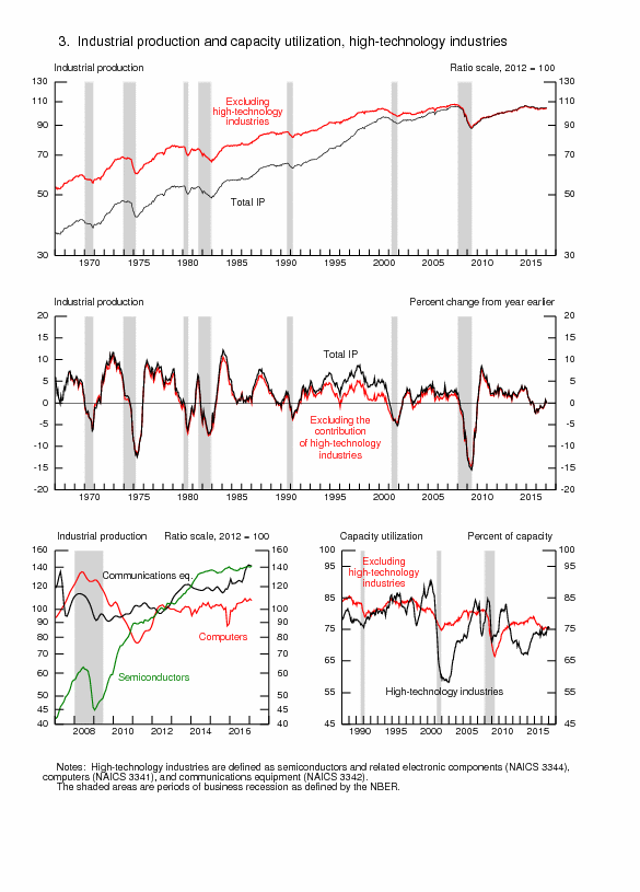
Chart IIA-7, US, Balance on Current Account, Quarterly, 1980-2013
Source: Bureau of Economic Analysis
http://www.bea.gov/iTable/index_nipa.cfm
Risk aversion channels funds toward US long-term and short-term securities that finance the US balance of payments and fiscal deficits benefitting from risk flight to US dollar denominated assets. There are now temporary interruptions because of fear of rising interest rates that erode prices of US government securities because of mixed signals on monetary policy and exit from the Fed balance sheet of four trillion dollars of securities held outright. Net foreign purchases of US long-term securities (row C in Table VA-4) strengthened from minus $80.2 billion in Apr 2016 to $25.8 billion in May 2016. Foreign residents’ purchases minus sales of US long-term securities (row A in Table VA-4) in Apr 2016 of minus $53.5 billion strengthened to $11.5 billion in May 2016. Net US (residents) purchases of long-term foreign securities (row B in Table VA-4) strengthened from minus $13.9 billion in Apr 2016 to $29.6 billion in May 2016. Other transactions (row C2 in Table VA-4) changed from minus $12.8 billion in Apr 2016 to minus $15.3 billion in May 2016. In May 2016,
C = A + B + C2 = $11.5 billion + $29.6 billion -$15.3 billion = $25.8 billion
There are minor rounding errors. There improving demand in Table VA-4 in May 2016 in A1 private purchases by residents overseas of US long-term securities of $32.4 billion of which strengthening in A11 Treasury securities of minus $5.1 billion, weakening in A12 of $24.7 billion in agency securities, strengthening of $12.1 billion of corporate bonds and weakening of $9.5 billion in equities. Worldwide risk aversion causes flight into US Treasury obligations with significant oscillations. Official purchases of securities in row A2 decreased $20.9 billion with decrease of Treasury securities of $23.4 billion in May 2016. Official purchases of agency securities increased $0.7 billion in May 2016. Row D shows decrease in May 2016 of $11.5 billion in purchases of short-term dollar denominated obligations. Foreign private holdings of US Treasury bills decreased $5.8 billion (row D11) with foreign official holdings decreasing $3.3 billion while the category “other” shrank $2.4 billion. Foreign private holdings of US Treasury bills decreased $5.8 billion in what could be arbitrage of duration exposures. Risk aversion of default losses in foreign securities dominates decisions to accept zero interest rates in Treasury securities with no perception of principal losses. In the case of long-term securities, investors prefer to sacrifice inflation and possible duration risk to avoid principal losses with significant oscillations in risk perceptions.
Table VA-4, Net Cross-Borders Flows of US Long-Term Securities, Billion Dollars, NSA
| May 2015 12 Months | May 2016 12 Months | Apr 2016 | May 2016 | |
| A Foreign Purchases less Sales of | 266.5 | 47.2 | -53.5 | 11.5 |
| A1 Private | 292.5 | 349.9 | -45.2 | 32.4 |
| A11 Treasury | 116.6 | 175.8 | -62.3 | 5.1 |
| A12 Agency | 115.9 | 157.6 | 25.0 | 24.7 |
| A13 Corporate Bonds | 87.8 | 138.3 | -3.9 | 12.1 |
| A14 Equities | -27.9 | -121.8 | -4.0 | -9.5 |
| A2 Official | -26.0 | -302.8 | -8.2 | -20.9 |
| A21 Treasury | -77.5 | -312.5 | -12.3 | -23.4 |
| A22 Agency | 45.2 | 30.5 | 4.4 | 0.7 |
| A23 Corporate Bonds | 8.6 | -8.5 | -1.6 | 0.6 |
| A24 Equities | -2.3 | -12.3 | 1.3 | 1.1 |
| B Net US Purchases of LT Foreign Securities | 146.6 | 215.6 | -13.9 | 29.6 |
| B1 Foreign Bonds | 202.7 | 297.5 | 3.8 | 26.0 |
| B2 Foreign Equities | -56.1 | -81.9 | -17.7 | 3.6 |
| C1 Net Transactions | 413.1 | 262.7 | -67.4 | 41.1 |
| C2 Other | -281.8 | -180.5 | -12.8 | -15.3 |
| C Net Foreign Purchases of US LT Securities | 131.3 | 82.3 | -80.2 | 25.8 |
| D Increase in Foreign Holdings of Dollar Denominated Short-term | 56.4 | -10.9 | -15.0 | -11.5 |
| D1 US Treasury Bills | 58.5 | -11.7 | -26.2 | -9.1 |
| D11 Private | 42.8 | 83.7 | -8.1 | -5.8 |
| D12 Official | 15.7 | -95.4 | -18.2 | -3.3 |
| D2 Other | -2.2 | 0.8 | 11.3 | -2.4 |
C1 = A + B; C = C1+C2
A = A1 + A2
A1 = A11 + A12 + A13 + A14
A2 = A21 + A22 + A23 + A24
B = B1 + B2
D = D1 + D2
Sources: United States Treasury
http://www.treasury.gov/resource-center/data-chart-center/tic/Pages/ticpress.aspx
http://www.treasury.gov/press-center/press-releases/Pages/jl2609.aspx
Table VA-5 provides major foreign holders of US Treasury securities. China is the largest holder with $1244.0 billion in May 2016, increasing 0.1 percent from $1242.8 billion in Apr 2016 while decreasing $26.3 billion from May 2015 or 2.1 percent. The United States Treasury estimates US government debt held by private investors at $10,970 billion in Mar 2016. China’s holding of US Treasury securities represent 11.3 percent of US government marketable interest-bearing debt held by private investors (http://www.fms.treas.gov/bulletin/index.html). Min Zeng, writing on “China plays a big role as US Treasury yields fall,” on Jul 16, 2004, published in the Wall Street Journal (http://online.wsj.com/articles/china-plays-a-big-role-as-u-s-treasury-yields-fall-1405545034?tesla=y&mg=reno64-wsj), finds that acceleration in purchases of US Treasury securities by China has been an important factor in the decline of Treasury yields in 2014. Japan decreased its holdings from $1214.9 billion in May 2015 to $1133.2 billion in May 2016 or 6.7 percent. The combined holdings of China and Japan in May 2016 add to $2377.2 billion, which is equivalent to 21.7 percent of US government marketable interest-bearing securities held by investors of $10,970 billion in Mar 2016 (http://www.fms.treas.gov/bulletin/index.html). Total foreign holdings of Treasury securities increased from $6134.8 billion in May 2015 to $6208.3 billion in May 2016, or 1.2 percent. The US continues to finance its fiscal and balance of payments deficits with foreign savings (see Pelaez and Pelaez, The Global Recession Risk (2007)). A point of saturation of holdings of US Treasury debt may be reached as foreign holders evaluate the threat of reduction of principal by dollar devaluation and reduction of prices by increases in yield, including possibly risk premium. Shultz et al (2012) find that the Fed financed three-quarters of the US deficit in fiscal year 2011, with foreign governments financing significant part of the remainder of the US deficit while the Fed owns one in six dollars of US national debt. Concentrations of debt in few holders are perilous because of sudden exodus in fear of devaluation and yield increases and the limit of refinancing old debt and placing new debt. In their classic work on “unpleasant monetarist arithmetic,” Sargent and Wallace (1981, 2) consider a regime of domination of monetary policy by fiscal policy (emphasis added):
“Imagine that fiscal policy dominates monetary policy. The fiscal authority independently sets its budgets, announcing all current and future deficits and surpluses and thus determining the amount of revenue that must be raised through bond sales and seignorage. Under this second coordination scheme, the monetary authority faces the constraints imposed by the demand for government bonds, for it must try to finance with seignorage any discrepancy between the revenue demanded by the fiscal authority and the amount of bonds that can be sold to the public. Suppose that the demand for government bonds implies an interest rate on bonds greater than the economy’s rate of growth. Then if the fiscal authority runs deficits, the monetary authority is unable to control either the growth rate of the monetary base or inflation forever. If the principal and interest due on these additional bonds are raised by selling still more bonds, so as to continue to hold down the growth of base money, then, because the interest rate on bonds is greater than the economy’s growth rate, the real stock of bonds will growth faster than the size of the economy. This cannot go on forever, since the demand for bonds places an upper limit on the stock of bonds relative to the size of the economy. Once that limit is reached, the principal and interest due on the bonds already sold to fight inflation must be financed, at least in part, by seignorage, requiring the creation of additional base money.”
Table VA-5, US, Major Foreign Holders of Treasury Securities $ Billions at End of Period
| May 2016 | Apr 2016 | May 2015 | |
| Total | 6208.3 | 6238.5 | 6134.8 |
| China | 1244.0 | 1242.8 | 1270.3 |
| Japan | 1133.2 | 1142.8 | 1214.9 |
| Cayman Islands | 260.2 | 258.5 | 216.1 |
| Ireland | 259.8 | 257.9 | 209.0 |
| Brazil | 249.5 | 249.1 | 258.5 |
| Switzerland | 228.7 | 229.6 | 222.7 |
| Luxembourg | 221.8 | 221.4 | 177.0 |
| United Kingdom | 216.5 | 217.1 | 190.2 |
| Hong Kong | 192.7 | 195.2 | 186.3 |
| Taiwan | 181.5 | 185.2 | 174.2 |
| Belgium | 151.7 | 153.6 | 202.8 |
| India | 118.0 | 121.6 | 114.0 |
| Singapore | 109.2 | 109.3 | 110.3 |
| Foreign Official Holdings | 4024.5 | 4046.2 | 4173.3 |
| A. Treasury Bills | 281.6 | 294.9 | 376.9 |
| B. Treasury Bonds and Notes | 3742.9 | 3761.3 | 3796.4 |
Source: United States Treasury
http://www.treasury.gov/resource-center/data-chart-center/tic/Pages/ticpress.aspx
http://www.treasury.gov/resource-center/data-chart-center/tic/Pages/index.aspx
http://ticdata.treasury.gov/Publish/mfh.txt
© Carlos M. Pelaez, 2009, 2010, 2011, 2012, 2013, 2014, 2015, 2016.
No comments:
Post a Comment