
Collapse of Household Income and Wealth, 46 Million in Poverty and 50 Million without Health Insurance and “Let’s Twist Again” Monetary Policy
Carlos M. Pelaez
© Carlos M. Pelaez, 2010, 2011
Executive Summary
I Collapse of Household Income and Wealth, 46 Million in Poverty and 50 Million without Health Insurance
II “Let’s Twist Again” Monetary Policy
IIA Appendix: Analysis, Measurement and Evaluation of Operation Twist and Quantitative Easing
III World Financial Turbulence
IV Global Inflation
IVA US Inflation
IVB Inflation in the Rest of the World
V World Economic Slowdown
VA United States
VB Japan
VC China
VD Euro Area
VE Germany
VF France
VG Italy
VH United Kingdom
VI Valuation of Risk Financial Assets
VII Economic Indicators
VIII Interest Rates
IX Conclusion
References
Executive Summary
Newly released data by the US Census Bureau on income, poverty and health insurance (DeNavas-Walt, Proctor and Smith 2011) and the flow of funds report of the Federal Reserve System for IIQ2011 (http://www.federalreserve.gov/releases/z1/Current/z1.pdf) are summarized in Table ES 1. These reports depict 2010 household income of the US in constant 2010 dollars regressing to the level of 1996 and wealth of households and nonprofit organizations of the US in IIQ2011 falling $5.8 trillion below the level of 2007. The number of people in poverty in the US in 2010 is 46.180 million, equivalent to 15.1 percent of the population, which is the same as in 1993 and higher or equal than any percentage since 17.3 percent in 1965. The number of people without health insurance in 2010 is 49.904 million, which is 16.3 percent of the population. Although the economy recovered throughout 2010, income, wealth, poverty and lack of health insurance deteriorated. Increasing poverty and lack of health insurance suggest strengthening the social and health safety. Evidence provided in the text below shows that part of the explanation of the dramatically poor socio-economic indicators of the US could be explained by the sharp economic contraction from IV2007 to IIQ2009 but part originates in the worst recovery in a cyclical expansion during the postwar period.
Table ES 1, Summary of Social and Economic Indicators
| People in Poverty | 46.180 million 15.1% of population Among three highest since 1966 |
| People without Health Insurance | 49.985 million 16.1% of population |
| Median Household Income | $49,445 Worst since 1996 |
| People in Job Stress | 29.9 million unemployed or underemployed |
| Household Loss of Net Worth | -$5.8 trillion since 2007 |
| Household Loss of Real Estate | -$5.1 trillion since 2007 |
| Household Loss of Assets | -$6.3 trillion since 2007 |
Sources: DeNavas-Walt, Proctor and Smith (2011)
http://www.federalreserve.gov/releases/z1/Current/z1.pdf
Bureau of Labor Statistics
The term “operation twist” grew out of the dance “twist” popularized by successful musical performer Chubby Chekker (http://www.youtube.com/watch?v=aWaJ0s0-E1o). Financial markets are widely anticipating the return of Chubby Chekker’s “twisting time” or “let’s twist again” monetary policy perhaps even during the two-day meeting of the FOMC scheduled for Sep 20 to Sep 21 (http://www.federalreserve.gov/monetarypolicy/fomccalendars.htm#9662).
The limited effects of operation twist were analyzed by Modigliani and Stuch (1966, 1967) with empirical estimation methods of their time in the 1960s. Swanson (2011Mar) provides analysis and measurement using current state of the art estimation methods.
Swanson (2011Mar) analyzes the policy mechanics of operation twist. President Kennedy faced two policy challenges after assuming office in Jan 1961: (1) international financial funds flowed in pursuit of higher short-term interest rates in Europe relative to those in the US that were restricted by prohibition of payment of interest on demand deposits and ceilings of interest on time deposits as provided by the Banking Act of 1933 and implemented by Regulation Q (for Regulation Q see Pelaez and Pelaez, Regulation of Banks and Finance (2009b), 74-5); and (2) the US was recovering from strong recession that lasted from IIQ1960 (Apr) to IQ1961 (Feb) (http://www.nber.org/cycles/cyclesmain.html). The objective of operation twist was maintaining stable or increasing short-term interest rates to prevent financial funds from flowing away from the US into Europe while simultaneously reducing long-term interest rates to stimulate investment and consumption, or aggregate demand. President Kennedy announced coordination of Treasury and FOMC policy as follows:
1. Treasury. The US Treasury would increase the issuance of short term securities while at the same time reduce the issuance of long-term securities. The desired effects of this policy would be in two forms:
i. The increase in the issuance of short-term Treasury securities would displace the supply curve of short-term securities downward and to the right. Assuming stable demand, the price of short-term Treasury securities would fall, which is equivalent to an increase in short-term interest rates that would prevent net outflows of capital from the US. There is a critical assumption here that capital flows among nations are determined by short-term interest rate differentials
ii. The reduction in the supply of long-term Treasury securities would cause displacement of the supply curve upward and to the left. Assuming stable demand, the price of long-term securities increases, which is equivalent to reducing yields of long-term securities
2. Federal Open Market Committee (FOMC). The FOMC would decide to sell short-term securities and buy long-term securities with the following desired effects:
i. The sale of short-term Treasury securities could displace the supply curve downwardly and to the right. Assuming stable demand, the price of short-term Treasury securities would fall, which is equivalent to an increase in short-term rates of Treasury securities designed to prevent net outflows of international capital from the US
ii. The purchase of long-term Treasury securities would displace demand for long-term Treasury securities upward and to the right. The price of long-term Treasury securities would increase, which is equivalent to a reduction of yields of long-term Treasury securities
There is another operational factor of the “let’s twist again” monetary policy. Swanson (2011Mar) also reminds that lowering long-term yields in a new twist of the yield curve does not require increasing short-term rates as in the part of operation twist policy designed to prevent net capital outflows of the US. The desk of the Federal Reserve Bank of New York can continue to implement the target of fed funds rate of 0 to ¼ percent.
The crucial issue here is if lowering the yields of long-term Treasury securities would have any impact on investment and consumption or aggregate demand. The decline of long-term yields of Treasury securities would have to cause decline of yields of asset-backed securities used to securitize loans for investment by firms and purchase of durable goods by consumers. The decline in costs of investment and consumption of durable goods would ultimately have to result in higher investment and consumption.
I Collapse of Household Income and Wealth, 46 Million in Poverty and 50 Million without Health Insurance. The objective of this section is to analyze newly released data by the US Census Bureau on income, poverty and health insurance (DeNavas-Walt, Proctor and Smith 2011) and the flow of funds report of the Federal Reserve System for IIQ2011 (http://www.federalreserve.gov/releases/z1/Current/z1.pdf). These reports depict 2010 household income of the US in constant 2010 dollars regressing to the level of 1996 and wealth of households and nonprofit organizations of the US in IIQ2011 falling $5.8 trillion below the level of 2007. The number of people in poverty in the US in 2010 is 46.180 million, equivalent to 15.1 percent of the population, which is the same as in 1993 and higher than any percentage since 17.3 percent in 1965. The number of people without health insurance in 2010 is 49.904 million, which is 16.3 percent of the population. Although the economy recovered throughout 2010, income, wealth, poverty and lack of health insurance deteriorated. Increasing poverty and lack of health insurance pose urgent strengthening of the social and health safety net both on the basis of ethical considerations and on the economic need to increase labor input and maintain health of the stock of human capital. The final part of this section shows that part of the explanation of the dramatically poor socio-economic indicators of the US could be explained by the sharp economic contraction from IV2007 to IIQ2009 but part originates in the worst recovery in a cyclical expansion during the postwar period.
The report of the US Bureau of the Census on Income, poverty and health insurance coverage in the United States: 2010 provides highly valuable socio-economic information and analysis (DeNavas-Walt, Proctor and Smith 2011). Table 1 provides years of high percentage of people below poverty in the US. Data for 2006 to 2009 are included to provide a framework of reference for the current deterioration. The series has two high points of 15.1 percent of the population in poverty in 2010 and 1993 exceeded only by 15.2 percent in 1983. The prior high numbers of poverty are found in 1960 to 1965 with 17.3 percent in 1965 and higher numbers going to 22.4 percent in 1959. The number of people in poverty in the US in 2010 was 46.180 million, which has increased by 9.720 million from 36.460 million in 2006. The fractured job market with 29.6 million unemployed or underemployed because they cannot find full-time jobs (http://cmpassocregulationblog.blogspot.com/2011/09/global-growth-standstill-recession.html) and decline of hiring by 17 million (http://cmpassocregulationblog.blogspot.com/2011/09/financial-turbulence-wriston-doctrine.html) prevents exit from poverty. Inflation-adjusted average weekly wages are declining throughout 2011.
Table 1, US, Historical High Percentage of People below Poverty, Thousands and Percent
| Total Population | Number Below Poverty | Percent Below Poverty | |
| 2010 | 305,688 | 46,180 | 15.1 |
| 2009 | 303,820 | 43,569 | 14.3 |
| 1993 | 259,278 | 39,265 | 15.1 |
| 1983 | 231,700 | 35,303 | 15.2 |
| 1982 | 229,412 | 34,398 | 15.0 |
| 1965 | 191,413 | 33,185 | 17.3 |
| 1964 | 189,710 | 36,055 | 19.0 |
| 1963 | 187,258 | 36,436 | 19.5 |
| 1962 | 184,276 | 38,625 | 21.0 |
| 1961 | 181,277 | 39,628 | 21.9 |
| 1960 | 179,503 | 39,851 | 22.2 |
| 1959 | 176,557 | 39,490 | 22.4 |
| Memo | |||
| 2009 | 303,820 | 46,180 | 14.3 |
| 2008 | 301,041 | 38,829 | 13.2 |
| 2007 | 298,699 | 37,276 | 12.5 |
| 2006 | 296,450 | 36,460 | 12.3 |
Source: DeNavas-Walt, Proctor and Smith 2011, 62.
Millions in poverty in the calendar year in which the recession ended and in the first calendar year after the recession are provided in Table 2. There have been increases in the number of people in poverty in the first calendar years after the recessions since 1980. The brief recession of Jan to Jul 1980 experienced the highest increase in the first calendar year of 1.0 percent and 2.550 million more in poverty. In the three recessions before 1980 shown in Table 2, the number of people in poverty fell in the first calendar year after the end of the recession.
Table 2, US, Millions in Poverty in the Calendar Year in which Recession Ended and in the First Calendar Year after Recession, Millions and ∆%
| Millions | % | Millions | % | Change Millions | ∆% | |
| Dec 2007 to Jun 2009 | ||||||
| 2009 | 43.569 | 14.3 | ||||
| 2010 | 46.180 | 15.1 | 2.611 | 0.8 | ||
| Mar 2001 to Nov 2001 | ||||||
| 2001 | 32.907 | 11.7 | ||||
| 2002 | 34.570 | 12.1 | 1.663 | 0.4 | ||
| Jul 1990 to Mar 1991 | ||||||
| 1991 | 35.708 | 14.2 | ||||
| 1992 | 38.014 | 14.8 | 2.306 | 0.6 | ||
| Jul 1981 to Nove 1982 | ||||||
| 1982 | 34.398 | 15.0 | ||||
| 1983 | 35.303 | 15.2 | 0.905 | 0.2 | ||
| Jan 1980 to July 1980 | ||||||
| 1980 | 29.272 | 13.0 | ||||
| 1981 | 31.382 | 14.0 | 2.550 | 1.0 | ||
| Nov 1973 to Mar 1975 | ||||||
| 1975 | 25.887 | 12.3 | ||||
| 1976 | 24,975 | 11.8 | -0.902 | -0.5 | ||
| Dec 1960 to Nov 1970 | ||||||
| 1970 | 25.420 | 12.6 | ||||
| 1971 | 25.559 | 12.5 | -0.139 | -0.1 | ||
| Apr 1960 to Feb 1961 | ||||||
| 1961 | 39.628 | 21.9 | ||||
| 1962 | 38.625 | 21.0 | -1.003 | -0.9 |
Source: DeNavas-Walt, Proctor and Smith 2011, 16.
Another dramatic fact revealed by DeNavas-Walt, Proctor and Smith (2011) is the increase in the number people without health insurance shown in Table 3 at 49.904 million for 2010. Approximately 16.3 percent of the US population does not have health insurance.
Table 3, US, People without Health Insurance in the Final Year of Recession and in the First Calendar Year after Recession Ended, Millions and Percent
| Millions Without Health Insurance | Percent of Population | |
| Recession Dec 2007 to Jun 2009 | ||
| 2009 | 49.985 | 16.1 |
| 2010 | 49.904 | 16.3 |
| Change | 0.919 | 0.2 |
| Recession Mar 2001 to Nov 2001 | ||
| 2001 | 38.023 | 13.5 |
| 2002 | 39.776 | 13.9 |
| Change | 1.753 | 0.4 |
| Recession Jul 1990 to Mar 1991 | ||
| 1991 | 35.445 | 14.1 |
| 1992 | 38.641 | 15.0 |
| Change | 3.196 | 0.9 |
Source: DeNavas-Walt, Proctor and Smith 2011, 28.
Although US GDP expanded during six consecutive quarter from IIIQ2009 to IVQ2010, US median household income dropped by 2.3 percent from $50,599 in 2009 to $49,445 in 2010. Table 4 shows that US median household income has declined from $52,823 million in 2007 to $49,445 million in 2010 or by 6.4 percent. The data are adjusted for inflation and expressed in constant 2010 dollars.
Table 4, US, Median Household Income, Dollars and ∆%
| 2010 | 2009 | 2007 | |
| Total Number of Households | 118,682 | 117,538 | 116,783 |
| Median Income Dollars | 49,445 | 50,599 | 52,823 |
| ∆% 2010/2009 | -2.3 | ||
| ∆% 2010/2007 | -6.4 |
Source: DeNavas-Walt, Proctor and Smith 2011, 6, 33.
Numbers of households in the US, median income in constant 2010 dollars and mean income 2010 dollars are provided in Table 5. There is a dramatic fact in Table 5: inflation-adjusted median household income in the US is higher in all years from 1997 to 2010 than the $49,445 of 2010. The contraction and low rate of growth in the expansion have resulted in the destruction of the progress in household income accomplished in 13 years of technological advance and use of humans, machines and natural resources in economic activity. The median measures the center of the middle class of the US that is no better off after 13 years of efforts. There is sharp contrast with the 1980s. Rapid economic growth after the contraction from Jul 1981 to Nov 1982 (http://www.nber.org/cycles.html) resulted in an increase of household median income from $43,453 in 1983 to $49,076 in 1989, or by 12.9 percent. Another fact of Table 5 is that household income in 2010 of $49,455 is virtually the same as $49,076 in 1989. The typical household in the US is not better off than in 1989, which is separated from the present by 21 years of efforts.
Table 5, Median and Mean Household Income in 2010 Constant Dollars
| Year | # Households | Median Income 2010 Dollars | Mean Income 2010 Dollars |
| 2010 | 118,682 | 49,445 | 67,530 |
| 2009 | 117,538 | 50,599 | 69,098 |
| 2008 | 117,181 | 50,939 | 69,290 |
| 2007 | 116,783 | 52,823 | 71,095 |
| 2006 | 116,011 | 52,124 | 71,988 |
| 2005 | 114,384 | 51,739 | 70,746 |
| 2004 | 113,343 | 51,174 | 69,795 |
| 2003 | 112,000 | 51,353 | 70,023 |
| 2002 | 111,278 | 51,398 | 70,114 |
| 2001 | 109,297 | 52,005 | 71,685 |
| 2000 | 108,209 | 53,164 | 72,339 |
| 1999 | 106,434 | 53,252 | 71,626 |
| 1998 | 103,874 | 51,944 | 69,270 |
| 1997 | 102,528 | 50,123 | 67,307 |
| 1996 | 101,018 | 49,112 | 65,207 |
| 1995 | 99,627 | 48,408 | 63,838 |
| 1994 | 98,990 | 46,937 | 62,750 |
| 1993 | 97,107 | 46,419 | 61,556 |
| 1992 | 96,426 | 46,646 | 59,137 |
| 1991 | 95,669 | 47,032 | 59,203 |
| 1990 | 94,312 | 48,423 | 60,487 |
| 1989 | 93,347 | 49,076 | 62,003 |
| 1988 | 92,830 | 48,216 | 60,245 |
| 1987 | 91,124 | 47,848 | 59,505 |
| 1986 | 89,479 | 47,256 | 58,382 |
| 1985 | 88,458 | 45,640 | 56,167 |
| 1984 | 86,789 | 44,802 | 54,849 |
| 1983 | 85,407 | 43,453 | 52,849 |
| 1982 | 83,918 | 43,758 | 52,735 |
| 1981 | 82,527 | 43,876 | 52,417 |
| 1980 | 82,368 | 44,616 | 53,064 |
Source: DeNavas-Walt, Proctor and Smith 2011, 34.
The percentage change in median household income and the change in number of workers with earnings in the first calendar years after recessions are provided in Table 6. The first calendar year after the end of recession in 2010 is by far the worst of any such year in recessions since 1970. Household median income fell 2.3 percent from 2009 to 2010 and the number of workers with earnings fell by 1.608 million. The first calendar year 2010 after the end of recession in 2009 is the only in the recessions back to 1970 in which there was decline of the number of workers with earnings and the only one also with negative change in full-time year-round workers.
Table 6, Percentage Change in Median Household Income and Change in Number of Workers with Earnings in First Calendar Years after Recessions, ∆% and Thousands
| Median Household Income ∆% | Change in Number of Workers with Earnings Thousands | Change in Full-time Year-round Workers Thousands | |
| Recession Dec 2007 to June 2009 | |||
| 2010 | -2.3 | -1,608 | -24 |
| Recession Mar 2001 to Nov 2001 | |||
| 2002 | -1.2 | 470 | 286 |
| Recession Jul 1990 to Mar 1991 | |||
| 1992 | -0.8 | 1,692 | 1,468 |
| Recession Jul 1981 to Nov 1982 | |||
| 1983 | -0.7 | 1,696 | 2,887 |
| Recession Jan 1980 to Jul 1980 | |||
| 1981 | -1.7 | 995 | 362 |
| Recession Nov 1973 to Mar 1975 | |||
| 1976 | 1.7 | 2,821 | 1,538 |
| Recession Dec 1960 to Nov 1970 | |||
| 1971 | -1.0 | 1,277 | 1,213 |
Source: DeNavas-Walt, Proctor and Smith 2011, 7.
Characteristics of four cyclical contractions are provided in Table 7 with the first column showing the number of quarter of contraction, the second column the cumulative percentage contraction and the final column the average quarterly rate of contraction in annual equivalent rate. There were two contractions from IQ1980 to IIIQ1980 and IIIQ1981 to IVQ1982 separated by three quarters of expansion. The drop of output combining the declines in these two contractions is 4.8 percent, which is almost equal to the decline of 5.1 percent in the contraction from IVQ2007 to IIQ2009. In contrast, during the Great Depression in the four years of 1930 to 1933, GDP in constant dollars fell 26.5 percent cumulatively and fell 45.6 percent in current dollars (Pelaez and Pelaez, Financial Regulation after the Global Recession (2009a), 150-2, Pelaez and Pelaez, Globalization and the State, Vol. II (2009b), 205-7). The comparison of the global recession after 2007 with the Great Depression is common but entirely misleading
Table 7, US, Number of Quarters, Cumulative Percentage Contraction and Average Percentage Annual Equivalent Rate in Cyclical Contractions
| Number of Quarters | Cumulative Percentage Contraction | Average Percentage Annual Equivalent Rate | |
| IIQ1953 to IIQ1954 | 4 | -2.5 | -0.63 |
| IIIQ1957 to IIQ1958 | 3 | -3.1 | -9.0 |
| IQ1980 to IIIQ1980 | 2 | -2.2 | -1.1 |
| IIIQ1981 to IVQ1982 | 4 | -2.7 | -0.67 |
| IVQ2007 to IIQ2009 | 6 | -5.1 | -0.87 |
Source: Business Cycle Reference Dates: http://www.nber.org/cycles/cyclesmain.html
Data: http://www.bea.gov/iTable/index_nipa.cfm
Table 8 shows the extraordinary contrast between the mediocre average annual equivalent growth rate of 2.4 percent of the US economy in the eight quarters of the current cyclical expansion and the average of 6.2 percent in the four earlier cyclical expansions. The BEA data for the two quarters of 2011 show the economy in standstill with annual equivalent growth of 0.7 percent. The expansion of IQ1983 to IV1985 was at the average annual growth rate of 5.7 percent.
Table 8, US, Number of Quarters, Cumulative Growth and Average Annual Equivalent Growth Rate in Cyclical Expansions
| Number | Cumulative Growth ∆% | Average Annual Equivalent Growth Rate | |
| IIIQ 1954 to IQ1957 | 11 | 12.6 | 4.4 |
| IIQ1958 to IIQ1959 | 5 | 10.2 | 8.1 |
| IIQ1975 to IVQ1976 | 8 | 9.5 | 4.6 |
| IQ1983 to IV1985 | 13 | 19.6 | 5.7 |
| Average Four Above Expansions | 6.2 | ||
| IIIQ2009 to IIQ2011 | 8 | 4.9 | 2.4 |
Source: http://www.bea.gov/iTable/index_nipa.cfm
Chart 1 shows US real quarterly GDP growth from 1980 to 1989. The economy contracted during the recession and then expanded vigorously throughout the 1980s, rapidly eliminating the unemployment caused by the contraction.

Chart 1, US, Real GDP, 1980-1989
Source: http://www.bea.gov/iTable/index_nipa.cfm
Chart 2 shows the entirely different situation of the real quarterly GDP in the US between 2007 and 2011. The economy has underperformed during the first eight quarters of expansion for the first time in the comparable contractions since the 1950s. The US economy now is in a dangerous standstill.
![clip_image002[6]](file:///C:\Users\cmpelaez\AppData\Local\Temp\WindowsLiveWriter1264636800\supfiles256EB15\ChGDP20072011chart6.png "clip_image002[6]")
Source: http://www.bea.gov/iTable/index_nipa.cfm
As shown in Tables 7 and 8 above the loss of real GDP in the US during the contraction was 5.1 percent but the gain in the cyclical expansion has been only 4.9 percent. As a result, the level of real GDP in IIQ2011 is lower by 0.5 percent than the level of real GDP in IVQ2007. Table 9 provides in the first column real GDP in billions of chained 2005 dollars. The second column provides the percentage change of the quarter relative to IVQ2007; the third column provides the percentage change relative to the prior quarter; and the final column provides the percentage change relative to the same quarter a year earlier. The contraction actually concentrated in two quarters: decline of 2.3 percent in IVQ2008 relative to the prior quarter and decline of 1.7 percent in IQ2009 relative to IVQ2008. The combined fall of GDP in IVQ2008 and IQ2009 was 4 percent (1.023 x 1.017). Those two quarters coincided with the worst effects of the financial crisis. GDP fell 0.2 percent in IIQ2009 but grew 0.4 percent in IIIQ2009, which is the beginning of recovery in the cyclical dates of the NBER. Most of the recovery occurred in three successive quarters from IVQ2009 to IIQ2010 of equal growth at 0.9 percent for cumulative growth in those three quarters of 2.7 percent. The economy lost momentum already in IIIQ2010 and IVQ2010 growing at 0.6 percent in each quarter. The economy then stalled during the first half of 2011 with growth of 0.1 percent in IQ2011 and 0.25 percent in IIQ2011. Growth in a quarter relative to a year earlier in Table 9 slows from over 3 percent during three consecutive quarters from IIQ2010 to IVQ2010 to 2.2 percent in IQ2011 and 1.5 percent in IIQ2011. The critical question for which there is not yet definitive solution is whether what lies ahead is growth recession with the economy crawling and unemployment/underemployment at extremely high levels or another contraction.
Table 9, US, Real GDP and Percentage Change Relative to IVQ2007 and Prior Quarter, Billions Chained 2005 Dollars and ∆%
| Real GDP, Billions Chained 2005 Dollars | ∆% Relative to IVQ2007 | ∆% Relative to Prior Quarter | ∆% | |
| IVQ2007 | 13,326.0 | NA | NA | 2.2 |
| IQ2008 | 13,266.8 | -0.4 | -0.4 | 1.6 |
| IIQ2008 | 13,310.5 | -0.1 | 0.3 | 1.0 |
| IIIQ2008 | 13,186.9 | -1.0 | -0.9 | -0.6 |
| IVQ2008 | 12,883.5 | -3.3 | -2.3 | -3.3 |
| IQ2009 | 12,663.2 | -4.9 | -1.7 | -4.5 |
| IIQ2009 | 12,641.3 | -5.1 | -0.2 | -5.0 |
| IIIQ2009 | 12,694.5 | -4.7 | 0.4 | -3.7 |
| IV2009 | 12,813.5 | -3.8 | 0.9 | -0.5 |
| IQ2010 | 12,937.7 | -2.9 | 0.9 | 2.2 |
| IIQ2010 | 13,058.5 | -1.8 | 0.9 | 3.3 |
| IIIQ2010 | 13,139.6 | -1.4 | 0.6 | 3.5 |
| IVQ2010 | 13,216.1 | -0.8 | 0.6 | 3.1 |
| IQ2011 | 13,227.9 | -0.7 | 0.1 | 2.2 |
| IIQ2011 | 13,260.5 | -0.5 | 0.25 | 1.5 |
Source: http://www.bea.gov/iTable/iTable.cfm?ReqID=9&step=1
Some common explanations for the current slump are not valid. Negative effects of weak housing currently are inferior compared with negative exports in the 1980s that gave the pejorative name of “rust belt” to the US industrial corridor. Growth originates in aggregate demand consisting of investment and consumption. Taylor (2011Jul21) finds that real GDP growth currently is 60 to 70 percent lower than in the recovery of the 1980s, which is also the case of consumption and investment. Another common misperception is that there has been a systemic financial crisis with many ignoring the debt crisis of 1982 when US money-center banks had more than 40 percent of their capital in loans to emerging countries in default or near default. Several countries that had borrowed for financing balance of payments deficits declared moratoriums on their foreign debts, impairing balance sheets of money-center banks (see, for example, in vast literature, Krugman 1994, Pelaez 1986, 1987). The increase in interest rates to deal with stagflation caught the banking industry with short-dated funding and long-term fixed-rate assets. In a parallel of what could happen when monetary policy abandons its near zero interest rates, 1150 US commercial banks, close to 8 percent of the industry, failed, almost twice the number of banks that failed since establishment of the FDIC in 1934 until 1983 (Benston and Kaufman 1997, 139; see Pelaez and Pelaez, Regulation of Banks and Finance (2009b), 72-7). More than 900 savings and loans associations, equivalent to around 25 percent of the industry, had to be closed, merged or placed in conservatorship (Ibid). Taxpayer funds in the value of $150 billion were used in the resolution of failed savings and loans institutions. In terms of relative dimensions, $150 billion was equivalent to 2.6 percent of GDP of $5800 billion in 1990 and 3.6 percent of GDP of $4217 billion in 1985 (http://www.bea.gov/national/nipaweb/TableView.asp?SelectedTable=5&ViewSeries=NO&Java=no&Request3Place=N&3Place=N&FromView=YES&Freq=Year&FirstYear=1980&LastYear=1990&3Place=N&Update=Update&JavaBox=no). The equivalent in terms of 2.6 to 3.6 percent of US GDP in 2010 of $14,657 billion would be $381 billion to $528 billion (data from Ibid). Wide swings in interest rates resulting from aggressive monetary policy can wreck the balance sheets of families, financial institutions and companies while posing another recession risk. While it is true that monetary policy can increase interest rates instantaneously, the increase from zero percent toward much higher levels to contain inflation can have devastating effects on the world economy.
The Flow of Funds Accounts of the United States provided by the Federal Reserve (http://www.federalreserve.gov/releases/z1/Current/z1.pdf) is rich in valuable information. Table 10, updated in this blog for every new quarterly release, shows the balance sheet of US households combined with nonprofit organizations in 2007, IQ2011 and IIQ2011. The data show the strong shock to US wealth during the contraction. Assets fells from $78.6 trillion in 2007 to $72.5 trillion in IQ2011 even after six consecutive quarters of growth, that is, by about $6.1 trillion or 7.8 percent. Assets continued to fall in IIQ2011 to $72.3 trillion, by an additional drop of $153 billion equivalent to a loss of 0.2 percent. The cumulative loss between 2007 and IIQ2011 is $6.3 trillion or a drop of 8.0 percent, even after eight consecutive quarter of GDP growth. Liabilities declined from $14.4 trillion in 2007 to $13.9 trillion in IIQ2011 or by $509 billion equivalent to decline by $3.5 trillion. Net worth shrank from $64.3 trillion in 2007 to $58.5 trillion in IIQ2011, that is, $5.8 trillion equivalent to decline of 9.0 percent. There was a brutal decline from 2007 to IIQ2011 of $5.1 trillion in real estate assets or by 21.9 percent. The National Association of Realtors estimated that the gains in net worth in homes by Americans were about $4 trillion between 2000 and 2005 (quoted in Pelaez and Pelaez, The Global Recession Risk (2007), 224-5).
Table 10, US, Balance Sheet of Households and Nonprofit Organizations, Billions of Dollars Outstanding End of Period, NSA
| 2007 | IQ2011 | IIQ2011 | |
| Assets | 78,637.6 | 72,479.3 | 72,326.2 |
| Nonfinancial | 28,002.6 | 23,195.4 | 23,181.6 |
| Real Estate | 23,272.3 | 18,251.1 | 18,160.7 |
| Durable Goods | 4,468.3 | 4,629.1 | 4,698.8 |
| Financial | 50,635.0 | 49,283.8 | 49,144.6 |
| Deposits | 7,406.0 | 7,913.3 | 8,053.7 |
| Credit Market | 4,072.3 | 4,369.6 | 4,130.1 |
| Mutual Fund | 4,596.8 | 5,091.6 | 5,108.7 |
| Equities Corporate | 9,633.2 | 8,991.5 | 8,946.3 |
| Equity Noncorporate | 8,755.8 | 6,586.8 | 6,578.8 |
| Pension | 13,390.7 | 13,498.0 | 13,423.9 |
| Liabilities | 14,371.5 | 13,866.8 | 13,862.7 |
| Home Mortgages | 10,542.1 | 9,982.0 | 9,934.9 |
| Consumer C | 2,555.3 | 2,401.9 | 2,423.5 |
| Net Worth | 64,266.1 | 58,612.5 | 58,463.5 |
Net Worth = Assets - Liabilities
Source: http://www.federalreserve.gov/releases/z1/Current/z1.pdf
Let V(T) represent the value of the firm’s equity at time T and B stand for the promised debt of the firm to bondholders and assume that corporate management, elected by equity owners, is acting on the interests of equity owners. Robert C. Merton (1974, 453) states:
“On the maturity date T, the firm must either pay the promised payment of B to the debtholders or else the current equity will be valueless. Clearly, if at time T, V(T) > B, the firm should pay the bondholders because the value of equity will be V(T) – B > 0 whereas if they do not, the value of equity would be zero. If V(T) ≤ B, then the firm will not make the payment and default the firm to the bondholders because otherwise the equity holders would have to pay in additional money and the (formal) value of equity prior to such payments would be (V(T)- B) < 0.”
Pelaez and Pelaez (The Global Recession Risk (2007), 208-9) apply this analysis to the US housing market in 2005-2006 concluding:
“The house market [in 2006] is probably operating with low historical levels of individual equity. There is an application of structural models [Duffie and Singleton 2003] to the individual decisions on whether or not to continue paying a mortgage. The costs of sale would include realtor and legal fees. There could be a point where the expected net sale value of the real estate may be just lower than the value of the mortgage. At that point, there would be an incentive to default. The default vulnerability of securitization is unknown.”
There are multiple important determinants of the interest rate: “aggregate wealth, the distribution of wealth among investors, expected rate of return on physical investment, taxes, government policy and inflation” (Ingersoll 1987, 405). Aggregate wealth is a major driver of interest rates (Ibid, 406). Unconventional monetary policy, with zero fed funds rates and flattening of long-term yields by quantitative easing, causes uncontrollable effects on risk taking that can have profound undesirable effects on financial stability. Excessively aggressive and exotic monetary policy is the main culprit and not the inadequacy of financial management and risk controls.
The net worth of the economy depends on interest rates. In theory, “income is generally defined as the amount a consumer unit could consume (or believe that it could) while maintaining its wealth intact” (Friedman 1957, 10). Income, Y, is a flow that is obtained by applying a rate of return, r, to a stock of wealth, W, or Y = rW (Ibid). According to a subsequent restatement: “The basic idea is simply that individuals live for many years and that therefore the appropriate constraint for consumption decisions is the long-run expected yield from wealth r*W. This yield was named permanent income: Y* = r*W” (Darby 1974, 229), where * denotes permanent. The simplified relation of income and wealth can be restated as:
W = Y/r (1)
Equation (1) shows that as r goes to zero, r →0, W grows without bound, W→∞.
Lowering the interest rate near the zero bound in 2003-2004 caused the illusion of permanent increases in wealth or net worth in the balance sheets of borrowers and also of lending institutions, securitized banking and every financial institution and investor in the world. The discipline of calculating risks and returns was seriously impaired. The objective of monetary policy was to encourage borrowing, consumption and investment but the exaggerated stimulus resulted in a financial crisis of major proportions as the securitization that had worked for a long period was shocked with policy-induced excessive risk, imprudent credit, high leverage and low liquidity by the incentive to finance everything overnight at close to zero interest rates, from adjustable rate mortgages (ARMS) to asset-backed commercial paper of structured investment vehicles (SIV) (see http://cmpassocregulationblog.blogspot.com/2011/07/causes-of-2007-creditdollar-crisis.html).
The consequences of inflating liquidity and net worth of borrowers were a global hunt for yields to protect own investments and money under management from the zero interest rates and unattractive long-term yields of Treasuries and other securities. Monetary policy distorted the calculations of risks and returns by households, business and government by providing central bank cheap money. Short-term zero interest rates encourage financing of everything with short-dated funds, explaining the SIVs created off-balance sheet to issue short-term commercial paper to purchase default-prone mortgages that were financed in overnight or short-dated sale and repurchase agreements (Pelaez and Pelaez, Financial Regulation after the Global Recession, 50-1, Regulation of Banks and Finance, 59-60, Globalization and the State Vol. I, 89-92, Globalization and the State Vol. II, 198-9, Government Intervention in Globalization, 62-3, International Financial Architecture, 144-9). ARMS were created to lower monthly mortgage payments by benefitting from lower short-dated reference rates. Financial institutions economized in liquidity that was penalized with near zero interest rates. There was no perception of risk because the monetary authority guaranteed a minimum or floor price of all assets by maintaining low interest rates forever or equivalent to writing an illusory put option on wealth. Subprime mortgages were part of the put on wealth by an illusory put on house prices. The housing subsidy of $221 billion per year created the impression of ever increasing house prices. The suspension of auctions of 30-year Treasuries was designed to increase demand for mortgage-backed securities, lowering their yield, which was equivalent to lowering the costs of housing finance and refinancing. Fannie and Freddie purchased or guaranteed $1.6 trillion of nonprime mortgages and operated with leverage of 75:1 under Congress-provided charters and lax oversight. The combination of these policies resulted in high risks because of the put option on wealth by near zero interest rates, excessive leverage because of cheap rates, low liquidity because of the penalty in the form of low interest rates and unsound credit decisions because the put option on wealth by monetary policy created the illusion that nothing could ever go wrong, causing the credit/dollar crisis and global recession (Pelaez and Pelaez, Financial Regulation after the Global Recession, 157-66, Regulation of Banks, and Finance, 217-27, International Financial Architecture, 15-18, The Global Recession Risk, 221-5, Globalization and the State Vol. II, 197-213, Government Intervention in Globalization, 182-4).
Table 11 summarizes the brutal drops in assets and net worth of US households and nonprofit organizations from 2007 to IQ2011 and IIQ2011. Between 2007 and IIQ2011, real estate fell in value by $5.1 trillion and financial assets by $1.5 trillion, explaining most of the drop in net worth of $6.3 trillion. The near standstill of the US economy growing in the first half of 2011 at the annual equivalent rate of 0.7 percent is accompanied by a drop of net worth of households and nonprofit organizations of $$5.8 trillion.
Table 11, US, Difference of Balance Sheet of Households and Nonprofit Organizations in Millions of Dollars from 2007 to IQ2011 and IIQ2011
| IQ2011 | IIQ2011 | |
| Assets | -6,6158.3 | -6,311.4 |
| Nonfinancial | -4,807.2 | -4,821.0 |
| Real Estate | -5,012.2 | -5,111.6 |
| Financial | -1,315.2 | -1,490.4 |
| Liabilities | -504.7 | -508.8 |
| Net Worth | -5,653.6 | -5,802.6 |
Source: http://www.federalreserve.gov/releases/z1/Current/z1.pdf
The report on the Flow of Funds Accounts of the United States also provides the value and change in debt of the nonfinancial sector, shown in Table 12. Households increased debt by 10 percent in 2006 but have been reducing their debt continuously. Business had not been as exuberant in acquiring debt and has been moderately increasing debt benefitting from historically low costs while increasing cash holdings to around $2 trillion because of the uncertainty of capital budgeting. States and local government were forced into increasing debt by the decline in revenues but began to contract in IQ2011, reducing debt even further in IIQ2011. Opposite behavior is found for the federal government that has been rapidly accumulating debt but without success in the self-assigned goal of promoting economic growth.
Table 12, US, Percentage Change of Nonfinancial Domestic Sector Debt
| Total | House -holds | Business | State & Local Govern-ment | Federal | |
| IIQ 2011 | 3.0 | -0.6 | 4.0 | -3.2 | 8.6 |
| IQ 2011 | 1.9 | -2.0 | 2.8 | -4.2 | 7.9 |
| IVQ 2010 | 5.1 | -0.8 | 2.2 | 8.9 | 16.4 |
| IIIQ 2010 | 3.9 | -2.1 | 1.4 | 4.8 | 16.0 |
| IIQ 2010 | 3.9 | -2.1 | -1.7 | -0.3 | 22.5 |
| IQ 2010 | 3.5 | -3.1 | -0.5 | 4.5 | 20.6 |
| 2010 | 4.2 | -2.0 | 0.4 | 4.5 | 20.2 |
| 2009 | 3.1 | -1.6 | -2.7 | 4.9 | 22.7 |
| 2008 | 6.0 | 0.2 | 5.5 | 2.3 | 24.2 |
| 2007 | 8.6 | 6.7 | 13.1 | 9.5 | 4.9 |
| 2006 | 9.0 | 10.0 | 10.6 | 8.3 | 3.9 |
| 2005 | 9.5 | 11.1 | 8.6 | 10.2 | 7.0 |
| 2004 | 8.9 | 11.1 | 6.2 | 7.3 | 9.0 |
| 2003 | 8.1 | 11.9 | 2.2 | 8.3 | 10.9 |
| 2002 | 7.4 | 10.8 | 2.8 | 11.1 | 7.6 |
| 2001 | 6.3 | 9.6 | 5.7 | 8.8 | -0.2 |
Source: http://www.federalreserve.gov/releases/z1/Current/z1.pdf
II “Let’s Twist Again” Monetary Policy. Meulendyke (1998, 39) describes the coordination of policy by Treasury and the FOMC in the beginning of the Kennedy administration in 1961:
“In 1961, several developments led the FOMC to abandon its “bills only” restrictions. The new Kennedy administration was concerned about gold outflows and balance of payments deficits and, at the same time, it wanted to encourage a rapid recovery from the recent recession. Higher rates seemed desirable to limit the gold outflows and help the balance of payments, while lower rates were wanted to speed up economic growth.
To deal with these problems simultaneously, the Treasury and the FOMC attempted to encourage lower long-term rates without pushing down short-term rates. The policy was referred to in internal Federal Reserve documents as “operation nudge” and elsewhere as “operation twist.” For a few months, the Treasury engaged in maturity exchanges with trust accounts and concentrated its cash offerings in shorter maturities.
The Federal Reserve participated with some reluctance and skepticism, but it did not see any great danger in experimenting with the new procedure.
It attempted to flatten the yield curve by purchasing Treasury notes and bonds while selling short-term Treasury securities. The domestic portfolio grew by $1.7 billion over the course of 1961. Note and bond holdings increased by a substantial $8.8 billion, while certificate of indebtedness holdings fell by almost $7.4 billion (Table 2). The extent to which these actions changed the yield curve or modified investment decisions is a source of dispute, although the predominant view is that the impact on yields was minimal. The Federal Reserve continued to buy coupon issues thereafter, but its efforts were not very aggressive. Reference to the efforts disappeared once short-term rates rose in 1963. The Treasury did not press for continued Fed purchases of long-term debt. Indeed, in the second half of the decade, the Treasury faced an unwanted shortening of its portfolio. Bonds could not carry a coupon with a rate above 4 1/4 percent, and market rates persistently exceeded that level. Notes—which were not subject to interest rate restrictions—had a maximum maturity of five years; it was extended to seven years in 1967.”
The term “operation twist” grew out of the dance “twist” popularized by successful musical performer Chubby Chekker (http://www.youtube.com/watch?v=aWaJ0s0-E1o). Financial markets are widely anticipating the return of Chubby Chekker’s “twisting time” or “let’s twist again” monetary policy perhaps even during the two-day meeting of the FOMC scheduled for Sep 20 to Sep 21 (http://www.federalreserve.gov/monetarypolicy/fomccalendars.htm#9662). Operation twist is discussed in this section. More technical analysis, references and its relation to quantitative easing are provided for readers interested in more quantitative analysis in IIA Appendix: Analysis, Measurement and Evaluation of Operation Twist and Quantitative Easing.
The limited effects of operation twist were analyzed by Modigliani and Stuch (1966, 1967) with empirical estimation methods of their time in the 1960s. Swanson (2011Mar) provides analysis and measurement using current state of the art estimation methods.
Swanson (2011Mar) analyzes the policy mechanics of operation twist. President Kennedy faced two policy challenges after assuming office in Jan 1961: (1) international financial funds flowed in pursuit of higher short-term interest rates in Europe relative to those in the US that were restricted by prohibition of payment of interest on demand deposits and ceilings of interest on time deposits as provided by the Banking Act of 1933 and implemented by Regulation Q (for Regulation Q see Pelaez and Pelaez, Regulation of Banks and Finance (2009b), 74-5); and (2) the US was recovering from strong recession that lasted from IIQ1960 (Apr) to IQ1961 (Feb) (http://www.nber.org/cycles/cyclesmain.html). The objective of operation twist was maintaining stable or increasing short-term interest rates to prevent financial funds from flowing away from the US into Europe while simultaneously reducing long-term interest rates to stimulate investment and consumption, or aggregate demand. President Kennedy announced coordination of Treasury and FOMC policy as follows:
1. Treasury. The US Treasury would increase the issuance of short term securities while at the same time reduce the issuance of long-term securities. The desired effects of this policy would be in two forms:
i. The increase in the issuance of short-term Treasury securities would displace the supply curve of short-term securities downward and to the right. Assuming stable demand, the price of short-term Treasury securities would fall, which is equivalent to an increase in short-term interest rates that would prevent net outflows of capital from the US. There is a critical assumption here that capital flows among nations are determined by short-term interest rate differentials
ii. The reduction in the supply of long-term Treasury securities would cause displacement of the supply curve upward and to the left. Assuming stable demand, the price of long-term securities increases, which is equivalent to reducing yields of long-term securities
2. Federal Open Market Committee (FOMC). The FOMC would decide to sell short-term securities and buy long-term securities with the following desired effects:
i. The sale of short-term Treasury securities could displace the supply curve downwardly and to the right. Assuming stable demand, the price of short-term Treasury securities would fall, which is equivalent to an increase in short-term rates of Treasury securities designed to prevent net outflows of international capital from the US
ii. The purchase of long-term Treasury securities would displace demand for long-term Treasury securities upward and to the right. The price of long-term Treasury securities would increase, which is equivalent to a reduction of yields of long-term Treasury securities
A widely prevailing view of the limited scope and lack of effects on real economic activity of operation twist is provided by Blinder (2000, 1097):
“If the overnight (nominal) interest rate is zero, but other interest rates are not, the central bank can use open market operations in longer-dated securities to try to drive down longer-term interest rates. But here we encounter a problem analogous to the one that bedevils foreign exchange intervention: If the pure expectations theory of the term structure holds and short rates are expected to remain (approximately) zero for a while, then intermediate-term rates will be (approximately) zero, too. And, to bring down truly long rates, the bank would have to convince the market that the zero-interest-rate period would last many years!
Fortunately, the pure expectations theory does not hold. At a minimum, long rates include a variable term premium (often called a risk premium) which is potentially manipulable by changing the relative supplies of longs and shorts. But note that open market purchases of long bonds by the central bank are equivalent to open market purchases of bills plus a "twist" operation that sells bills and buys bonds. Most of us are skeptical that such twist operations have dramatic effects on the yield curve, much less on economic activity. America's "Operation Twist" of the 1960s is widely remembered as a failure, but that may be because the scale of the operation was so small. Once again, the message may be: Think big.”
Swanson (2011Mar, 5) provides evidence that operation twist was comparable in size to quantitative easing two (QE2). Operation twist was on the order of $8.8 billion while QE2 was $600 billion but nominal values are misleading as operation twist was equivalent to 1.7 percent of GDP, which is not insignificant relative to 4.1 percent of GDP for QE2. Operation twist was equivalent to 4.7 percent of US Treasury debt, which is not insignificant relative to 7.0 percent for QE2. Operation twist was equivalent to 4.5 percent of US agency-guaranteed debt, which is higher than 3.7 percent for QE2. Finally, operation twist was coordinated with Treasury whereas this was not the case of QE2.
The limited size of operation twist is related to the findings of Modigliani and Sutch (1966, 196) that:
“1. The expectation model can account remarkably well for the relation between short- and long-term rates in the United States. Furthermore, the prevailing expectations of long-term rates involve a blending of extrapolation of very recent changes and regression toward a long term normal level.
2. There is no evidence that the maturity structure of the federal debt, or changes in this structure, exert a significant, lasting or transient, influence on the relation between the two rates.
3. The spread between long and short rates in the government market since the inception of Operation Twist was on the average some twelve base points below what one might infer from the pre-Operation Twist relation. This discrepancy seems to be largely attributable to the successive increase in the ceiling rate under Regulation Q which enabled the newly invented CD's to exercise their maximum influence.
4. Any effects, direct or indirect, of Operation Twist in narrowing the spread which further study might establish, are most unlikely to exceed some ten to twenty base points a reduction that can be considered moderate at best.”
Swanson (2011Mar, 31-2) finds with modern state of the art estimation methods operation twist reduced yields of long-term US treasury securities by 15 basis points:
“The present paper has reexamined Operation Twist using a modern high-frequency event-study approach, which avoids the problems with lower-frequency methods discussed above. In contrast to Modigliani and Sutch, we find that Operation Twist had a highly statistically significant impact on longer-term Treasury yields. However, consistent with those authors, we find that the size of the effect was moderate, amounting to about 15 basis points. This estimate is also consistent with the lower end of the range of estimates of Treasury supply effects in the literature.”
The effects of quantitative easing or operation twist of 15 basis points are comparable to those of tightening of the fed funds rate by 100 basis points, as measured by Gürkaynak, Sack and Swanson (2005, 84):
“In particular, we estimate that a 1 percentage point surprise tightening in the federal funds rate leads, on average, to a 4.3 percent decline in the S&P 500 and increases of 49, 28, and 13 bp in two-, five-, and ten-year Treasury yields, respectively.”
There is another operational factors of the “let’s twist again” monetary policy. Swanson (2011Mar) also reminds that lowering long-term yields in a new twist of the yield curve does not require increasing short-term rates as in the part of operation twist policy designed to prevent net capital outflows of the US. The desk of the Federal Reserve Bank of New York can continue to implement the target of fed funds rate of 0 to ¼ percent.
The crucial issue here is if lowering the yields of long-term Treasury securities would have any impact on investment and consumption or aggregate demand. The decline of long-term yields Treasury securities would have to cause decline of yields of asset-backed securities used to securitize loans for investment by firms and purchase of durable goods by consumers. The decline in costs of investment and consumption of durable goods would ultimately have to result in higher investment and consumption.
IIA Appendix: Analysis, Measurement and Evaluation of Operation Twist and Quantitative Easing. This appendix is divided into two subsections: IIA1 Operation Twist that reviews the analysis of lowering long-term yields; and IIA2 that reviews the analysis of quantitative easing.
IIA1 Operation Twist. Swanson finds three disadvantages in the time series approach of Modigliani and Sutch who relied on estimation methods available in the mid 1960s. (1) Treasury yields are very sensitive to expectations of inflation and the future path of fed funds rates that are not captured by quarterly data but are isolated in high-frequency observations. (2) The magnitudes of changes in yields by small numbers of basis points would have to be statistically insignificant relative to high standard errors of regressions. (3) There are multiple macroeconomic factors affecting Treasury yields preventing identification of the effects of policy that may not be present in high-frequency observations.
The method used by Swanson is that of event studies popularized by the efficient market hypothesis. Under rational expectations, asset prices incorporate all available information after the announcement (Samuelson 1965; Fama 1970). Swanson identifies six events of which five provide the information to reject the null hypothesis that changes in net supply of long-term bonds do not have effects on Treasury yields of any maturity. The alternative hypothesis is that changes in supply affect yields of Treasury securities.
IIA2 Transmission of Quantitative Easing. Janet L. Yellen, Vice Chair of the Board of Governors of the Federal Reserve System, provides analysis of the policy of purchasing large amounts of long-term securities for the Fed’s balance sheet. The new analysis provides now three channels of transmission of quantitative easing to the ultimate objectives of increasing growth and employment and increasing inflation to “levels of 2 percent or a bit less that most Committee participants judge to be consistent, over the long run, with the FOMC’s dual mandate” (Yellen 2011AS, 4, 7):
“There are several distinct channels through which these purchases tend to influence aggregate demand, including a reduced cost of credit to consumers and businesses, a rise in asset prices that boost household wealth and spending, and a moderate change in the foreign exchange value of the dollar that provides support to net exports.”
The new analysis by Yellen (2011AS) is considered below in four separate subsections: IIA2i Theory; IIA2ii Policy; IIA2iii Evidence; and IIA2iv Unwinding Strategy.
IIA2i Theory. The transmission mechanism of quantitative easing can be analyzed in three different forms. (1) Portfolio choice theory. General equilibrium value theory was proposed by Hicks (1935) in analyzing the balance sheets of individuals and institutions with assets in the capital segment consisting of money, debts, stocks and productive equipment. Net worth or wealth would be comparable to income in value theory. Expected yield and risk would be the constraint comparable to income in value theory. Markowitz (1952) considers a portfolio of individual securities with mean μp and variance σp. The Markowitz (1952, 82) rule states that “investors would (or should” want to choose a portfolio of combinations of (μp, that are efficient, which are those with minimum variance or risk for given expected return μp or more and maximum expected μp for given variance or risk or less. The more complete model of Tobin (1958) consists of portfolio choice of monetary assets by maximizing a utility function subject to a budget constraint. Tobin (1961, 28) proposes general equilibrium analysis of the capital account to derive choices of capital assets in balance sheets of economic units with the determination of yields in markets for capital assets with the constraint of net worth. A general equilibrium model of choice of portfolios was developed simultaneously by various authors (Hicks 1962; Treynor 1962; Sharpe 1964; Lintner 1965; Mossin 1966). If shocks such as by quantitative easing displace investors from the efficient frontier, there would be reallocations of portfolios among assets until another efficient point is reached. Investors would bid up the prices or lower the returns (interest plus capital gains) of long-term assets targeted by quantitative easing, causing the desired effect of lowering long-term costs of investment and consumption.
(2) General Equilibrium Theory. Bernanke and Reinhart (2004, 88) argue that “the possibility monetary policy works through portfolio substitution effects, even in normal times, has a long intellectual history, having been espoused by both Keynesians (James Tobin 1969) and monetarists (Karl Brunner and Allan Meltzer 1973).” Andres et al. (2004) explain the Tobin (1969) contribution by optimizing agents in a general-equilibrium model. Both Tobin (1969) and Brunner and Meltzer (1973) consider capital assets to be gross instead of perfect substitutes with positive partial derivatives of own rates of return and negative partial derivatives of cross rates in the vector of asset returns (interest plus principal gain or loss) as argument in portfolio balancing equations (see Pelaez and Suzigan 1978, 113-23). Tobin (1969, 26) explains portfolio substitution after monetary policy:
“When the supply of any asset is increased, the structure of rates of return, on this and other assets, must change in a way that induces the public to hold the new supply. When the asset’s own rate can rise, a large part of the necessary adjustment can occur in this way. But if the rate is fixed, the whole adjustment must take place through reductions in other rates or increases in prices of other assets. This is the secret of the special role of money; it is a secret that would be shared by any other asset with a fixed interest rate.”
Andrés et al. (2004, 682) find that in their multiple-channels model “base money expansion now matters for the deviations of long rates from the expected path of short rates. Monetary policy operates by both the expectations channel (the path of current and expected future short rates) and this additional channel. As in Tobin’s framework, interest rates spreads (specifically, the deviations from the pure expectations theory of the term structure) are an endogenous function of the relative quantities of assets supplied.”
The interrelation among yields of default-free securities is measured by the term structure of interest rates. This schedule of interest rates along time incorporates expectations of investors. (Cox, Ingersoll and Ross 1985). The expectations hypothesis postulates that the expectations of investors about the level of future spot rates influence the level of current long-term rates. The normal channel of transmission of monetary policy in a recession is to lower the target of the fed funds rate that will lower future spot rates through the term structure and also the yields of long-term securities. The expectations hypothesis is consistent with term premiums (Cox, Ingersoll and Ross 1981, 774-7) such as liquidity to compensate for risk or uncertainty about future events that can cause changes in prices or yields of long-term securities (Hicks 1939; see Cox, Ingersoll and Ross 1981, 784; Chung et al. 2011, 22).
(3) Preferred Habitat. Another approach is by the preferred-habitat models proposed by Culbertson (1957, 1963) and Modigliani and Sutch (1966). This approach is formalized by Vayanos and Vila (2009). The model considers investors or “clientele” who do not abandon their segment of operations unless there are extremely high potential returns and arbitrageurs who take positions to profit from discrepancies. Pension funds matching benefit liabilities would operate in segments above 15 years; life insurance companies operate around 15 years or more; and asset managers and bank treasury managers are active in maturities of less than 10 years (Ibid, 1). Hedge funds, proprietary trading desks and bank maturity transformation activities are examples of potential arbitrageurs. The role of arbitrageurs is to incorporate “information about current and future short rates into bond prices” (Ibid, 12). Suppose monetary policy raises the short-term rate above a certain level. Clientele would not trade on this information, but arbitrageurs would engage in carry trade, shorting bonds and investing at the short-term rate, in a “roll-up” trade, resulting in decline of bond prices or equivalently increases in yields. This is a situation of an upward-sloping yield curve. If the short-term rate were lowered, arbitrageurs would engage in carry trade borrowing at the short-term rate and going long bonds, resulting in an increase in bond prices or equivalently decline in yields, or “roll-down” trade. The carry trade is the mechanism by which bond yields adjust to changes in current and expected short-term interest rates. The risk premiums of bonds are positively associated with the slope of the term structure (Ibid, 13). Fama and Bliss (1987, 689) find with data for 1964-85 that “1-year expected returns for US Treasury maturities to 5 years, measured net of the interest rate on a 1-year bond, vary through time. Expected term premiums are mostly positive during good times but mostly negative during recessions.” Vayanos and Vila (2009) develop a model with two-factors, the short-term rate and demand or quantity. The term structure moves because of shocks of short-term rates and demand. An important finding is that demand or quantity shocks are largest for intermediate and long maturities while short-rate shocks are largest for short-term maturities.
IIA2ii Policy. A simplified analysis could consider the portfolio balance equations Aij = f(r, x) where Aij is the demand for i = 1,2,∙∙∙n assets from j = 1,2, ∙∙∙m sectors, r the 1xn vector of rates of return, ri, of n assets and x a vector of other relevant variables. Tobin (1969) and Brunner and Meltzer (1973) assume imperfect substitution among capital assets such that the own first derivatives of Aij are positive, demand for an asset increases if its rate of return (interest plus capital gains) is higher, and cross first derivatives are negative, demand for an asset decreases if the rate of return of alternative assets increases. Theoretical purity would require the estimation of the complete model with all rates of return. In practice, it may be impossible to observe all rates of return such as in the critique of Roll (1976). Policy proposals by the Fed have been focused on the likely impact of withdrawals of stocks of securities in specific segments, that is, of effects of one or several specific rates of return among the n possible rates. There have been six approaches on the role of monetary policy in purchasing long-term securities that have increased the classes of rates of return targeted by the Fed:
i. Suspension of Auctions of 30-year Treasury Bonds. Auctions of 30-year Treasury bonds were suspended between 2001 and 2005. This was Treasury policy not Fed policy. The effects were similar to those of quantitative easing: withdrawal of supply from the segment of 30-year bonds would result in higher prices or lower yields for close-substitute mortgage-backed securities with resulting lower mortgage rates. The objective was to encourage refinancing of house loans that would increase family income and consumption by freeing income from reducing monthly mortgage payments.
ii. Purchase of Long-term Securities by the Fed. Between Nov 2008 and Mar 2009 the Fed announced the intention of purchasing $1750 billion of long-term securities: $600 billion of agency mortgage-backed securities and agency debt announced on Nov 25 and $850 billion of agency mortgaged-backed securities and agency debt plus $300 billion of Treasury securities announced on Mar 18, 2009 (Yellen 2011AS, 5-6). The objective of buying mortgage-backed securities was to lower mortgage rates that would “support the housing sector” (Bernanke 2009SL). The FOMC statement on Dec 16, 2008 informs that: “over the next few quarters the Federal Reserve will purchase large quantities of agency debt and mortgage-backed securities to provide support to the mortgage and housing markets, and its stands ready to expand its purchases of agency debt and mortgage-backed securities as conditions warrant” (http://www.federalreserve.gov/newsevents/press/monetary/20081216b.htm). The Mar 18 statement of the FOMC explained that: “to provide greater support to mortgage lending and housing markets, the Committee decided today to increase the size of the Federal Reserve’s balance sheet further by purchasing up to an additional $750 billion of agency mortgage-backed securities, bringing its total purchases of these securities up to $1.25 trillion this year, and to increase its purchase of agency debt this year by up to $100 billion to a total of up to $200 billion. Moreover, to help improve conditions in private credit markets, the Committee decided to purchase up to $300 billion of longer-term Treasury securities over the next six months” (http://www.federalreserve.gov/newsevents/press/monetary/20090318a.htm). Policy changed to increase prices or reduce yields of mortgage-backed securities and Treasury securities with the objective of supporting housing markets and private credit markets by lowering costs of housing and long-term private credit.
iii. Portfolio Reinvestment. On Aug 10, 2010, the FOMC statement explains the reinvestment policy: “to help support the economic recovery in a context of price stability, the Committee will keep constant the Federal Reserve’s holdings of securities at their current level by reinvesting principal payments from agency debt and agency mortgage-backed securities in long-term Treasury securities. The Committee will continue to roll over the Federal Reserve’s holdings of Treasury securities as they mature” (http://www.federalreserve.gov/newsevents/press/monetary/20100810a.htm). The objective of policy appears to be supporting conditions in housing and mortgage markets with slow transfer of the portfolio to Treasury securities that would support private-sector markets.
iv. Increasing Portfolio. As widely anticipated, the FOMC decided on Dec 3, 2010: “to promote a stronger pace of economic recovery and to help ensure that inflation, over time, is at levels consistent with its mandate, the Committee decided today to expand its holdings of securities. The Committee will maintain its existing policy of reinvesting principal payments from its securities holdings. In addition, the Committee intends to purchase a further $600 billion of longer-term Treasury securities by the end of the second quarter of 2011, a pace of about $75 billion per month” (http://www.federalreserve.gov/newsevents/press/monetary/20101103a.htm). The emphasis appears to shift from housing markets and private-sector credit markets to the general economy, employment and preventing deflation.
v. Increasing Stock Market Valuations. Chairman Bernanke (2010WP) explained on Nov 4 the objectives of purchasing an additional $600 billion of long-term Treasury securities and reinvesting maturing principal and interest in the Fed portfolio. Long-term interest rates fell and stock prices rose when investors anticipated the new round of quantitative easing. Growth would be promoted by easier lending such as for refinancing of home mortgages and more investment by lower corporate bond yields. Consumers would experience higher confidence as their wealth in stocks rose, increasing outlays. Income and profits would rise and, in a “virtuous circle,” support higher economic growth. Bernanke (2000) analyzes the role of stock markets in central bank policy (see Pelaez and Pelaez, Regulation of Banks and Finance (2009b), 99-100). Fed policy in 1929 increased interest rates to avert a gold outflow and failed to prevent the deepening of the banking crisis without which the Great Depression may not have occurred. In the crisis of Oct 19, 1987, Fed policy supported stock and futures markets by persuading banks to extend credit to brokerages. Collapse of stock markets would slow consumer spending.
vi. Devaluing the Dollar. Yellen (2011AS, 6) broadens the effects of quantitative easing by adding dollar devaluation: “there are several distinct channels through which these purchases tend to influence aggregate demand, including a reduced cost of credit to consumers and businesses, a rise in asset prices that boosts household wealth and spending, and a moderate change in the foreign exchange value of the dollar that provides support to net exports.”
IIA2iii Evidence. There are multiple empirical studies on the effectiveness of quantitative easing that have been covered in past posts such as (Andrés et al. 2004, D’Amico and King 2010, Doh 2010, Gagnon et al. 2010, Hamilton and Wu 2010). On the basis of simulations of quantitative easing with the FRB/US econometric model, Chung et al (2011, 28-9) find that:
”Lower long-term interest rates, coupled with higher stock market valuations and a lower foreign exchange value of the dollar, provide a considerable stimulus to real activity over time. Phase 1 of the program by itself is estimated to boost the level of real GDP almost 2 percent above baseline by early 2012, while the full program raises the level of real GDP almost 3 percent by the second half of 2012. This boost to real output in turn helps to keep labor market conditions noticeably better than they would have been without large scale asset purchases. In particular, the model simulations suggest that private payroll employment is currently 1.8 million higher, and the unemployment rate ¾ percentage point lower, that would otherwise be the case. These benefits are predicted to grow further over time; by 2012, the incremental contribution of the full program is estimated to be 3 million jobs, with an additional 700,000 jobs provided by the most recent phase of the program alone.”
An additional conclusion of these simulations is that quantitative easing may have prevented actual deflation. Empirical research is continuing.
IIA2iv Unwinding Strategy. Fed Vice-Chair Yellen (2011AS) considers four concerns on quantitative easing discussed below in turn. First, Excessive Inflation. Yellen (2011AS, 9-12) considers concerns that quantitative easing could result in excessive inflation because fast increases in aggregate demand from quantitative easing could raise the rate of inflation, posing another problem of adjustment with tighter monetary policy or higher interest rates. The Fed estimates significant slack of resources in the economy as measured by the difference of four percentage points between the high current rate of unemployment above 9 percent and the NAIRU (non-accelerating rate of unemployment) of 5.75 percent (Ibid, 2). Thus, faster economic growth resulting from quantitative easing would not likely result in upward rise of costs as resources are bid up competitively. The Fed monitors frequently slack indicators and is committed to maintaining inflation at a “level of 2 percent or a bit less than that” (Ibid, 13), say, in the narrow open interval (1.9, 2.1).
Second, Inflation and Bank Reserves. On Jan 12, the line “Reserve Bank credit” in the Fed balance sheet stood at $2450,6 billion, or $2.5 trillion, with the portfolio of long-term securities of $2175.7 billion, or $2.2 trillion, composed of $987.6 billion of notes and bonds, $49.7 billion of inflation-adjusted notes and bonds, $146.3 billion of Federal agency debt securities, and $992.1 billion of mortgage-backed securities; reserves balances with Federal Reserve Banks stood at $1095.5 billion, or $1.1 trillion (http://federalreserve.gov/releases/h41/current/h41.htm#h41tab1). The concern addressed by Yellen (2011AS, 12-4) is that this high level of reserves could eventually result in demand growth that could accelerate inflation. Reserves would be excessively high relative to the levels before the recession. Reserves of depository institutions at the Federal Reserve Banks rose from $45.6 billion in Aug 2008 to $1084.8 billion in Aug 2010, not seasonally adjusted, multiplying by 23.8 times, or to $1038.2 billion in Nov 2010, multiplying by 22.8 times. The monetary base consists of the monetary liabilities of the government, composed largely of currency held by the public plus reserves of depository institutions at the Federal Reserve Banks. The monetary base not seasonally adjusted, or issue of money by the government, rose from $841.1 billion in Aug 2008 to $1991.1 billion or by 136.7 percent and to $1968.1 billion in Nov 2010 or by 133.9 percent (http://federalreserve.gov/releases/h3/hist/h3hist1.pdf). Policy can be viewed as creating government monetary liabilities that ended mostly in reserves of banks deposited at the Fed to purchase $2.1 trillion of long-term securities or assets, which in nontechnical language would be “printing money” (http://cmpassocregulationblog.blogspot.com/2010/12/is-fed-printing-money-what-are.html). The marketable debt of the US government in Treasury securities held by the public stood at $8.7 trillion on Nov 30, 2010 (http://www.treasurydirect.gov/govt/reports/pd/mspd/2010/opds112010.pdf). The current holdings of long-term securities by the Fed of $2.1 trillion, in the process of converting fully into Treasury securities, are equivalent to 24 percent of US government debt held by the public, and would represent 29.9 percent with the new round of quantitative easing if all the portfolio of the Fed, as intended, were in Treasury securities. Debt in Treasury securities held by the public on Dec 31, 2009, stood at $7.2 trillion (http://www.treasurydirect.gov/govt/reports/pd/mspd/2009/opds122009.pdf), growing to Nov 30, 2010, by $1.5 trillion or by 20.8 percent. In spite of this growth of bank reserves, “the 12-month change in core PCE [personal consumption expenditures] prices dropped from about 2 ½ percent in mid-2008 to around 1 ½ percent in 2009 and declined further to less than 1 percent by late 2010” (Yellen 2011AS, 3). The PCE price index, excluding food and energy, is around 0.8 percent in the past 12 months, which could be, in the Fed’s view, too close for comfort to negative inflation or deflation. Yellen (2011AS, 12) agrees “that an accommodative monetary policy left in place too long can cause inflation to rise to undesirable levels” that would be true whether policy was constrained or not by “the zero bound on interest rates.” The FOMC is monitoring and reviewing the “asset purchase program regularly in light of incoming information” and will “adjust the program as needed to meet its objectives” (Ibid, 12). That is, the FOMC would withdraw the stimulus once the economy is closer to full capacity to maintain inflation around 2 percent. In testimony at the Senate Committee on the Budget, Chairman Bernanke stated that “the Federal Reserve has all the tools its needs to ensure that it will be able to smoothly and effectively exit from this program at the appropriate time” (http://federalreserve.gov/newsevents/testimony/bernanke20110107a.htm). The large quantity of reserves would not be an obstacle in attaining the 2 percent inflation level. Yellen (2011A, 13-4) enumerates Fed tools that would be deployed to withdraw reserves as desired: (1) increasing the interest rate paid on reserves deposited at the Fed currently at 0.25 percent per year; (2) withdrawing reserves with reverse sale and repurchase agreement in addition to those with primary dealers by using mortgage-backed securities; (3) offering a Term Deposit Facility similar to term certificates of deposit for member institutions; and (4) sale or redemption of all or parts of the portfolio of long-term securities. The Fed would be able to increase interest rates and withdraw reserves as required to attain its mandates of maximum employment and price stability.
Third, Financial Imbalances. Fed policy intends to lower costs to business and households with the objective of stimulating investment and consumption generating higher growth and employment. Yellen (2011A, 14-7) considers a possible consequence of excessively reducing interest rates: “a reasonable fear is that this process could go too far, encouraging potential borrowers to employ excessive leverage to take advantage of low financing costs and leading investors to accept less compensation for bearing risks as they seek to enhance their rates of return in an environment of very low yields. This concern deserves to be taken seriously, and the Federal Reserve is carefully monitoring financial indicators for signs of potential threats to financial stability.” Regulation and supervision would be the “first line of defense” against imbalances threatening financial stability but the Fed would also use monetary policy to check imbalances (Yellen 2011AS, 17).
Fourth, Adverse Effects on Foreign Economies. The issue is whether the now recognized dollar devaluation would promote higher growth and employment in the US at the expense of lower growth and employment in other countries. The first three concerns are considered below in (IIE) Alternative Interpretations and the fourth in (IIF) World Devaluation Wars.
III World Financial Turbulence. The past three months have been characterized by financial turbulence, attaining unusual magnitude in the past month. Table 13, updated with every comment in this blog, provides beginning values on Sep 12 and daily values throughout the week ending on Fr Sep 16 of several financial assets. Section VI Valuation of Risk Financial Assets provides a set of more complete values. All data are for New York time at 5 PM. The first column provides the value on Fri Sep 9 and the percentage change in that prior week below the label of the financial risk asset. The first five asset rows provide five key exchange rates versus the dollar and the percentage cumulative appreciation (positive change or no sign) or depreciation (negative change or negative sign). Positive changes constitute appreciation of the relevant exchange rate and negative changes depreciation. Financial turbulence has been dominated by reactions to the new program for Greece (see section IB in http://cmpassocregulationblog.blogspot.com/2011/07/debt-and-financial-risk-aversion-and.html), doubts on the larger countries in the euro zone with sovereign risks such as Spain and Italy, the growth standstill recession and long-term unsustainable government debt in the US, worldwide deceleration of economic growth and continuing inflation. The dollar/euro rate is quoted as number of US dollars USD per one euro EUR, USD 1.366/EUR in the first row, column 1 in the block for currencies in Table 13 for Fri Sep 9, depreciating to USD 1.3680/EUR on Mon Sep 12, or by 0.1 percent. Table 13 defines a country’s exchange rate as number of units of domestic currency per unit of foreign currency. USD/EUR would be the definition of the exchange rate of the US and the inverse [1/(USD/EUR)] is the definition in this convention of the rate of exchange of the euro zone, EUR/USD. A convention is required to maintain consistency in characterizing movements of the exchange rate in Table 13 as appreciation and depreciation. The first row for each of the currencies shows the exchange rate at 5 PM New York time, such as USD 1.3680/EUR on Sep 12; the second row provides the cumulative percentage appreciation or depreciation of the exchange rate from the rate on the last business day of the prior week, in this case Fri Sep 9, to the last business day of the current week, in this case Fri Sep 16, such as depreciation of 0.9 percent for the dollar to USD 1.3790/EUR by Sep 16; and the third row provides the percentage change from the prior business day to the current business day. For example, the USD depreciated (negative sign) by 0.9 percent from the rate of USD 1.366/EUR on Fri Sep 9 to the rate of USD 1.3790 on Fri Sep 16 {[1.3790/1.366 – 1]100 = 0.9%} and appreciated by 0.7 percent from the rate of USD 1.3883 on Thu Sep 15 to USD 1.3790 on Fri Sep 16 {[1.3790/1.3983 -1]100 = -0.7%}. The dollar depreciated during the week because more dollars $1.3790 were required to buy one euro on Fri Sep 16 than $1.366 required to buy one euro on Fri Sep 2.
Table 13, Weekly Financial Risk Assets Sep 12 to Sep 16, 2011
| Sep 9, 2011 | Sep 12 | Sep 13 | Sep 14 | Sep 15 | Sep 16 |
| USD/ 1.366 3.8% | 1.3680 -0.1% -0.1% | 1.3683 -0.2% 0.0% | 1.3752 -0.7% -0.5% | 1.3883 -1.6% -0.9% | 1.3790 -0.9% 0.7% |
| JPY/ 77.581 -1.0% | 77.2495 0.4% 0.4% | 76.8648 0.9% 0.5% | 76.6510 1.2% 0.3% | 76.6868 1.2% 0.0% | 76.76 1.1% -0.1% |
| CHF/ 0.8837 -12.9% | 0.8804 0.4% 0.4% | 0.8799 0.4% 0.0% | 0.8762 0.8% 0.4% | 0.8694 1.6% 0.8% | 0.875 0.9% -0.6% |
| CHF/EUR 1.2075 -7.8% | 1.2043 0.3% 0.3% | 1.2039 0.3% 0.0% | 1.2050 0.2% -0.1% | 1.2070 0.0% -0.2% | 1.2088 -0.1% -0.1% |
| USD/ 1.0469 0.9552 -1.6% | 1.0350 0.9662 -1.1% -1.1% | 1.0321 0.9689 -1.4% -0.3% | 1.0269 0.9738 -1.9% -0.5% | 1.0329 0.9681 -1.3% 0.6% | 1.0360 0.9653 -1.1% 0.3% |
| 10 Year 1.918 | 1.95 | 1.99 | 2.00 | 2.08 | 2.053 |
| 2 Year T Note | 0.21 | 0.20 | 0.18 | 0.19 | 0.17 |
| Year German Bond 2Y 0.39 10Y 1.77 | 2Y 0.43 10Y 1.74 | 2Y 0.50 10Y 1.79 | 2Y 0.56 10Y 1.88 | 2Y 0.60 10Y 1.93 | 2Y 0.51 10Y 1.86 |
| DJIA 10992.13 -2.2% | 0.6% 0.6% | 1.0% 0.4% | 2.3% 1.3% | 4.0% 1.7% | 4.7% 0.7% |
| DJ Global 1784.76 -3.9% | -1.3% -1.3% | -0.2% 1.1% | 0.6% 0.8% | 2.6% 2.0% | 3.1% 0.5% |
| DJ Asia Pacific 1246.31 -2.6% | -2.2% -2.2% | -2.0% 0.2% | -3.6% -1.6% | -2.3% 1.3% | -0.4% 1.9% |
| Nikkei -2.4% | -2.3 -2.3% | -1.4 0.9% | -2.5 -1.1% | -0.8 1.8% | 1.4% 2.3% |
| Shanghai 2497.75 -1.2% | 0.0% 0.0% | -1.1% -1.1% | -0.5% 0.6% | -0.7% -0.2 | -0.6% 0.1% |
| DAX -6.3% | -2.3% -2.3% | -0.4% 1.9% | 2.9% 3.4% | 6.1% 3.2% | 7.4% 1.2% |
| DJ UBS Comm. 160.60 -1.2% | -0.5 -0.5% | -0.2 0.3% | -0.6% -0.3% | -1.4 -0.9% | -1.9 -0.5% |
| WTI $ B -2.3% | 88.82 1.8% 1.8% | 89.780 2.9% 1.1% | 88.54 1.5% -1.4% | 89.19 2.2% 0.7% | 87.85 0.7% -1.5% |
| Brent $/B 112.650 0.3% | 112.73 0.1% 0.1% | 111.66 -0.9% -0.9% | 112.2 -0.4% 0.5% | 112.22 -0.4% 0.0% | 111.98 -0.6% -0.2% |
| Gold $/oz 1861.60 -0.8% | 1819.1 -2.3% -2.3% | 1837.1 -1.3% -0.9% | 1823.1 -2.1% -0.8% | 1790.2 -3.8% -1.8% | 1812.1 -2.6% 1.2% |
Note: USD: US dollar; JPY: Japanese Yen; CHF: Swiss
Franc; AUD: Australian dollar; Comm.: commodities; oz: ounce
Sources:
http://www.bloomberg.com/markets/
http://professional.wsj.com/mdc/page/marketsdata.html?mod=WSJ_hps_marketdata
There are three factors dominating valuations of risk financial assets that are systematically discussed in this blog.
1. Euro zone survival risk. The fundamental issue of sovereign risks in the euro zone is whether the group of countries with euro as common currency and unified monetary policy through the European Central Bank will (i) continue to exist; (ii) downsize to a limited number of countries with the same currency; or (iii) revert to the prior system of individual national currencies. This issue is discussed in the following Section II Euro Zone Survival Risk
2. United Growth, Employment and Fiscal Soundness. The President of the United States addressed Congress on Sep 8, proposing the American Jobs Act (http://www.whitehouse.gov/the-press-office/2011/09/08/fact-sheet-american-jobs-act). The financing proposal will be released on Sep 19 when it will be possible to assess the intention of stimulating growth and jobs in the short run with commitment to fiscal soundness in the long run.
3. World Economic Slowdown. Careful, detailed analysis of the slowdown of the world economy is provided in Section V World Economic Slowdown. Data and analysis are provided for regions and countries that jointly account for about three quarters of world output
The exchange rate translates the price of foreign-originated goods and services into domestic currency that determines the competitiveness of foreign-originated goods and services with domestic-originated goods and services. The exchange rate also translates domestic-originated goods and services into other currencies that determine the competitiveness of domestic-originated goods and services in international markets. Consider the example from Pelaez and Pelaez (Government Intervention in Globalization (2008c), 71).
· The exchange rate on Apr 2, 2007, was USD 1.3374/EUR. An export of a US good of USD 10,000 to Europe translated into EUR 7477 obtained by dividing USD 10,000 by USD 1.3374/EUR
· The exchange rate on Apr 2, 2008 was USD 1.5618/EUR. After one year that USD 10,000 export of the US good to Europe would equal EUR 6403 obtained by dividing USD 10,000 by USD1.5618/EUR
· The consequence of the depreciation of the dollar by 14.4 percent [(1.3374/1.5618)-1)100] is that US goods exported to the euro zone would be cheaper by 14.4 percent. US monetary policy during almost a decade has been devaluing the dollar relative to most currencies of the world to increase the competitiveness of US goods in the US market and the competitiveness of US goods into foreign markets. Section VI Valuation of Risk Financial Assets analyzes this policy. Zero interest rates and quantitative easing are designed to promote economic growth mainly by devaluing the dollar to increase US exports net of imports that adds to economic growth and employment creation. Pelaez and Pelaez (Government Intervention in Globalization (2008a), 70-4) also analyze the effects on investment of relative changes of exchange rates, which is also the background theme in Pelaez and Pelaez (The Global Recession Risk (2007)). The analytical issues are more complex than this simple arithmetic with technical debate on the analytical and empirical effectiveness of changes in exchange rates in altering foreign trade and investment.
Risk aversion softened during the week as shown by the depreciation of the dollar as investors partially abandoned safe-haven in the USD and ventured into taking exposures in risk financial assets. Yields of government bonds also provide indications of risk aversion. The yield of the US Treasury 10-year note rose from 1.95 percent on Sep 12 to 2.053 percent on Sep 16 while the yield of the 2-year Treasury note ended more or less unchanged during the week. Risk aversion causes investors to close positions in risk financial assets and buy Treasury securities with resulting increase in their prices that is equivalent to decrease in their yields. German government bonds provide the same safe haven in Europe. Diminished risk aversion causes closing of positions on German government bonds to buy risk financial assets with resulting increase in prices of German government bonds that is equivalent to lower yields. Most stock indexes in Table 13 experienced substantial gains, especially the German DAX that rose 7.4 percent in the week. The DJIA gained 4.7 percent and the DJ Global index rose 3.1 percent.
There were three events that calmed markets and stimulated risk positions. First, a deciding turning point was the show of support for Greece and thus the euro by France and Germany. Kerin Hope and Joshua Chaffin, writing on Sep 15 on “Paris and Berlin show support for Greece,” published by the Financial Times (http://www.ft.com/intl/cms/s/0/0116d0a4-dee4-11e0-9130-00144feabdc0.html#axzz1Xq1ICaf1), inform on the declaration of support by the leaders of France and Germany on Greece and thus the permanence of the euro zone. Second, major central banks provided liquidity to banks, demonstrating the determination to prevent liquidity squeeze in financial institutions. Liquidity assistance was provided by: the European Central Bank (http://www.ecb.int/press/pr/date/2011/html/pr110915.en.html), Bank of England (http://www.bankofengland.co.uk/publications/news/2011/084.htm), Swiss National Bank (http://www.snb.ch/en/mmr/reference/pre_20110915_2/source/pre_20110915_2.en.pdf) and Bank of Japan (http://www.boj.or.jp/en/announcements/release_2011/rel110915a.pdf). Third, finance ministers of the European Union met to discuss the situation of Greece and the euro, including the US Secretary of the Treasury. However, Matthew Dalton, Bernd Radowitz and William Horobin, writing on Sep 18 on “EU ends talks with little progress in overcoming divisions,” published by the Wall Street Journal (http://professional.wsj.com/article/SB10001424053111903927204576576633002950972.html?mod=WSJPRO_hpp_LEFTTopStories), inform that the differences by members countries on the resolution of the crisis were not conciliated during that meeting.
The column “Net Debt USD Billions” in Table 4 is generated by applying the percentage in the IMF World Economic Outlook database “General Government Net Debt % GDP 2010” to the value of “GDP USD Billions.” The total debt of France and Germany in 2010 is $3710.3 billion, as shown in the column “Net Debt USD Billions.” The sum of the debt of Italy, Spain, Portugal, Greece and Ireland is $3491.8 billion. There is some simple “unpleasant bond arithmetic” in the two final columns of Table 4. Suppose the entire debt burdens of the five countries with debt lacking credibility on future service of interest and principal were to be guaranteed by France and Germany, which de facto would be required by continuing the euro zone or in the issue of a euro zone bond. The sum of the total debt of these five countries and the debt of France and Germany is shown in column “Debt as % of Germany plus France GDP” to reach $7202.1 billion, which would be equivalent to 122.1 percent of their combined GDP in 2010. Under this arrangement the entire debt of the euro zone including those of France and Germany would lack sovereign credibility in the sense of service of future interest and principal obligations. The final column provides “Debt as % of Germany GDP” that would exceed 217 percent if including debt of France and 159 percent of GDP if excluding French debt. The unpleasant bond arithmetic illustrates that there is a limit as to how far Germany and France can go in bailing out the countries with unsustainable sovereign debt without incurring severe pains of their own. A central bank is not typically engaged in direct credit because of remembrance of inflation and abuse in the past. There is also a limit to operations of the European Central Bank in doubtful credit obligations. Wriston (1982) would prove to be wrong again that countries do not bankrupt but would have a consolation prize that similar to LBOs the sum of the individual wealth of euro members without the euro agreement could exceed the value of the whole wealth of the euro zone under the continuing euro agreement.
Table 14, Guarantees of Debt of Sovereigns in Euro Area as Percent of GDP of Germany and France, USD Billions and %
| Net Debt USD Billions | Debt as % of Germany Plus France GDP | Debt as % of Germany GDP | |
| A Euro Area | 7,839.9 | ||
| B Germany | 1,783.8 | $7202.5 as % of $3315.6 =217% $5276.0 as % of $3315.6 =159% | |
| C France | 1,926.5 | ||
| B+C | 3,710.3 | GDP $5898.1 Total Debt $7,202.1 Debt/GDP: 122.1% | |
| D Italy | 2,046.9 | ||
| E Spain | 688.0 | ||
| F Portugal | 181.4 | ||
| G Greece | 433.7 | ||
| H Ireland | 141.8 | ||
| Subtotal D+E+F+G+H | 3,491.8 |
Source: calculation with IMF data http://www.imf.org/external/pubs/ft/weo/2011/01/weodata/index.aspx
IV Global Inflation. There is inflation everywhere in the world economy, with slow growth and persistently high unemployment in advanced economies. Table 15 updated with every post, provides the latest annual data for GDP, consumer price index (CPI) inflation, producer price index (PPI) inflation and unemployment (UNE) for the advanced economies, China and the highly-indebted European countries with sovereign risk issues. The table now includes the Netherlands and Finland that with Germany make up the set of northern countries in the euro zone that hold key votes in the enhancement of the mechanism for solution of the sovereign risk issues (http://www.ft.com/cms/s/0/55eaf350-4a8b-11e0-82ab-00144feab49a.html#axzz1G67TzFqs). Newly available data on inflation is considered below in this section. The data in Table 15 for the euro zone and its members is updated from information provided by Eurostat but individual country information is provided in this section as soon as available, following Table 15. Data for other countries in Table 15 is also updated with reports from their statistical agencies. Economic data for major regions and countries is considered in Section V World Economic Slowdown following individual country and regional data tables.
Table 15, GDP Growth, Inflation and Unemployment in Selected Countries, Percentage Annual Rates
| GDP | CPI | PPI | UNE | |
| US | 2.9 | 3.8 | 6.5 | 9.1 |
| Japan | -1.1 | 0.2 | 2.6 | 4.6 |
| China | 9.6 | 6.2 | 7.3 | |
| UK | 1.8 | 4.5* | 6.1* output | 7.7 |
| Euro Zone | 1.6 | 2.5 | 6.1 | 10.0 |
| Germany | 2.8 | 2.5 | 5.7 | 6.1 |
| France | 1.6 | 2.4 | 6.1 | 9.9 |
| Nether-lands | 1.5 | 2.8 | 8.2 | 4.3 |
| Finland | 2.7 | 3.5 | 7.3 | 7.9 |
| Belgium | 2.5 | 3.4 | 8.4 | 7.5 |
| Portugal | -0.9 | 2.8 | 5.7 | 12.3 |
| Ireland | -1.0 | 1.0 | 5.0 | 14.5 |
| Italy | 0.8 | 2.3 | 4.9 | 8.0 |
| Greece | -4.8 | 1.4 | 8.7 | 15.1 |
| Spain | 0.7 | 2.7 | 7.4 | 21.2 |
Notes: GDP: rate of growth of GDP; CPI: change in consumer price inflation; PPI: producer price inflation; UNE: rate of unemployment; all rates relative to year earlier
*Office for National Statistics
PPI http://www.ons.gov.uk/ons/dcp171778_230822.pdf
CPI http://www.statistics.gov.uk/pdfdir/cpi0611.pdf
** Excluding food, beverage, tobacco and petroleum
Source: EUROSTAT; country statistical sources http://www.census.gov/aboutus/stat_int.html
Stagflation is still an unknown event but the risk is sufficiently high to be worthy of consideration (see http://cmpassocregulationblog.blogspot.com/2011/06/risk-aversion-and-stagflation.html). The analysis of stagflation also permits the identification of important policy issues in solving vulnerabilities that have high impact on global financial risks. There are six key interrelated vulnerabilities in the world economy that have been causing global financial turbulence: (1) sovereign risk issues in Europe resulting from countries in need of fiscal consolidation and enhancement of their sovereign risk ratings (see Section III World Financial Turbulence in this post, http://cmpassocregulationblog.blogspot.com/2011/09/financial-turbulence-wriston-doctrine.html http://cmpassocregulationblog.blogspot.com/2011/09/global-growth-standstill-recession.html http://cmpassocregulationblog.blogspot.com/2011/08/united-states-gdp-growth-standstill.html http://cmpassocregulationblog.blogspot.com/2011/08/world-financial-turbulence-global.html http://cmpassocregulationblog.blogspot.com/2011/08/global-growth-recession-25-to-30.html section II in http://cmpassocregulationblog.blogspot.com/2011/08/global-growth-recession-25-to-30.html http://cmpassocregulationblog.blogspot.com/2011/07/twenty-five-to-thirty-million.html http://cmpassocregulationblog.blogspot.com/2011/06/risk-aversion-and-stagflation.html and Section I Increasing Risk Aversion in http://cmpassocregulationblog.blogspot.com/2011/06/increasing-risk-aversion-analysis-of.html and section IV in http://cmpassocregulationblog.blogspot.com/2011/04/budget-quagmire-fed-commodities_10.html); (2) the tradeoff of growth and inflation in China; (3) slow growth (see http://cmpassocregulationblog.blogspot.com/2011/09/global-growth-standstill-recession.html http://cmpassocregulationblog.blogspot.com/2011/08/united-states-gdp-growth-standstill.html http://cmpassocregulationblog.blogspot.com/2011/08/global-growth-recession-25-to-30.html http://cmpassocregulationblog.blogspot.com/2011/07/growth-recession-debt-financial-risk.html http://cmpassocregulationblog.blogspot.com/2011/06/financial-risk-aversion-slow-growth.html http://cmpassocregulationblog.blogspot.com/2011/05/slowing-growth-global-inflation-great.html http://cmpassocregulationblog.blogspot.com/2011/05/mediocre-growth-world-inflation.html http://cmpassocregulationblog.blogspot.com/2011_03_01_archive.html http://cmpassocregulationblog.blogspot.com/2011/02/mediocre-growth-raw-materials-shock-and.html), weak hiring (see Section III Hiring Collapse in http://cmpassocregulationblog.blogspot.com/2011/09/financial-turbulence-wriston-doctrine.html http://cmpassocregulationblog.blogspot.com/2011/08/world-financial-turbulence-global.html and section III Hiring Collapse in http://cmpassocregulationblog.blogspot.com/2011/04/fed-commodities-price-shocks-global.html ) and continuing job stress of 24 to 30 million people in the US and stagnant wages in a fractured job market (see section I Stalled Job Creation with 30 Million in Job Stress in http://cmpassocregulationblog.blogspot.com/2011/09/global-growth-standstill-recession.html http://cmpassocregulationblog.blogspot.com/2011/07/twenty-five-to-thirty-million.html http://cmpassocregulationblog.blogspot.com/2011/05/job-stress-of-24-to-30-million-falling.html http://cmpassocregulationblog.blogspot.com/2011/04/twenty-four-to-thirty-million-in-job_03.html http://cmpassocregulationblog.blogspot.com/2011/03/unemployment-and-undermployment.html); (4) the timing, dose, impact and instruments of normalizing monetary and fiscal policies (see II Budget/Debt Quagmire in http://cmpassocregulationblog.blogspot.com/2011/08/united-states-gdp-growth-standstill.html http://cmpassocregulationblog.blogspot.com/2011/03/is-there-second-act-of-us-great.html http://cmpassocregulationblog.blogspot.com/2011/03/global-financial-risks-and-fed.html http://cmpassocregulationblog.blogspot.com/2011/02/policy-inflation-growth-unemployment.html) in advanced and emerging economies; (5) the earthquake and tsunami affecting Japan that is having repercussions throughout the world economy because of Japan’s share of about 9 percent in world output, role as entry point for business in Asia, key supplier of advanced components and other inputs as well as major role in finance and multiple economic activities (http://professional.wsj.com/article/SB10001424052748704461304576216950927404360.html?mod=WSJ_business_AsiaNewsBucket&mg=reno-wsj); and (6) the geopolitical events in the Middle East.
IVA US Inflation. This subsection considers inflation in the US that is critically important to monetary policy. The following subsection IVB Rest of the World Inflation discusses inflation on other countries and regions on the basis of information released during the week.
Table 16 provides the forecasts of the Federal Reserve Board Members and Federal Reserve Bank Presidents for the FOMC meeting in Jun. There are lags in effect of monetary policy (Batini and Nelson 2002, Culbertson 1960, 1961, Friedman 1961, Romer and Romer 2004). Central banks forecast inflation in the effort to program monetary policy to attain effects at the correct timing of need by taking into account lags in effects of policy (Pelaez and Pelaez, Regulation of Banks and Finance (2009b), 99-116). Inflation by the price index of personal consumption expenditures (PCE) was forecast for 2011 in the Apr meeting of the FOMC between 2.1 to 2.8 percent. Table 16 shows that the interval has narrowed to PCE (personal consumption expenditures) headline inflation of between 2.3 and 2.5 percent. The FOMC focuses on core PCE inflation, which excludes food and energy. The Apr forecast of core PCE inflation was an interval between 1.3 and 1.6 percent. Table 16 shows the revision of this forecast in Jun to a higher interval between 1.5 and 1.8 percent. A new forecast with significant changes will be provided in Nov.
Table 16, Forecasts of PCE Inflation and Core PCE Inflation by the FOMC, %
| PCE Inflation | Core PCE Inflation | |
| 2011 | 2.3 to 2.5 | 1.5 to 1.8 |
| 2012 | 1.5 to 2.0 | 1.4 to 2.0 |
| 2013 | 1.5 to 2.0 | 1.4 to 2.0 |
| Longer Run | 1.7 to 2.0 |
Source: http://www.federalreserve.gov/monetarypolicy/files/fomcprojtabl20110622.pdf
The discussion of the FOMC on the statement of the Aug 9 meeting, revealed in the FOMC minutes released on Aug 30 (http://www.federalreserve.gov/newsevents/press/monetary/fomcminutes20110809.pdf 8), provides some information on the view of the members of the committee:
“The Committee agreed to keep the target range for the federal funds rate at 0 to ¼ percent and to state that economic conditions are likely to warrant exceptionally low levels for the federal funds rate at least through mid-2013. That anticipated path for the federal funds rate was viewed both as appropriate in light of most members’ outlook for the economy and as generally consistent with some prescriptions for monetary policy based on historical and model-based analysis. In choosing to phrase the outlook for policy in terms of a time horizon, members also considered conditioning the outlook for the level of the federal funds rate on explicit numerical values for the unemployment rate or the inflation rate. Some members argued that doing so would establish greater clarity regarding the Committee’s intentions and its likely reaction to future economic developments, while others raised questions about how an appropriate numerical value might be chosen. No such references were included in the statement for this meeting. One member expressed concern that the use of a specific date in the forward guidance would be seen by the public as an unconditional commitment, and it could undermine Committee credibility if a change in timing subsequently became appropriate.
Most members, however, agreed that stating a conditional expectation for the level of the federal funds rate through mid-2013 provided useful guidance to the public, with some noting that such an indication did not remove the Committee’s flexibility to adjust the policy rate earlier or later if economic conditions do not evolve as the Committee currently expects.”
Unconventional monetary policy of zero interest rates and quantitative easing has been inspired by fear of deflation (see Pelaez and Pelaez, International Financial Architecture (2005), 18-28 The Global Recession Risk (2007), 83-95). Key percentage average yearly rates of the US economy on growth and inflation are provided in Table 17. The choice of dates prevents the measurement of long-term potential economic growth because of two recessions in 2001 and the drop in GDP of 5.1 percent followed with unusually low economic growth for an expansion phase after recession (http://cmpassocregulationblog.blogspot.com/2011_07_01_archive.html). Between 2000 and 2010, real GDP grew at the average rate of 1.6 percent per year, nominal GDP at 3.9 percent and the implicit deflator at 2.5 percent. The average rate of CPI inflation was 2.4 percent per year and 2.5 percent excluding food and energy. PPI inflation increased at 2.6 percent per year on average and at 1.6 percent excluding food and energy. There is also inflation in international trade. Import prices grew at 2.2 percent per year between 2000 and 2010 and 3.3 percent between 2000 and 2011. The commodity price shock is revealed by inflation of import prices of petroleum at10.4 percent per year between 2000 and 2010 and at 13.4 percent between 2000 and 2011. The average growth rates of imports excluding fuels are much lower at 1.7 percent for 2000 to 2010 and 2.1 percent for 2000 to 2011. Export prices rose at the average rate of 2.2 percent between 2000 and 2010 and at 2.9 percent in 2000 to 2011. What spared the US of a decade long deterioration of the terms of trade, (export prices)/(import prices), was its diversification and competitiveness in agriculture. Agricultural export prices grew at the average yearly rate of 5.1 percent in 2000 to 2010 and at 6.8 percent in 2000 to 2011. US nonagricultural export prices rose at 1.7 percent per year in 2000 to 2010 and at 2.3 percent in 2000 to 2011. These dynamic growth rates are not similar to those for the economy of Japan where inflation was negative in seven of the 10 years in the 2000s.
Table 17, US, Average Growth Rates of Real and Nominal GDP, Consumer Price Index, Producer Price Index and Import and Export Prices, Percent per Year
| Real GDP | 2000-2010: 1.6% |
| Nominal GDP | 2000-2010: 3.9% |
| Implicit Price Deflator | 2000-2010: 2.5% |
| CPI | 2000-2010: 2.4% |
| CPI ex Food and Energy | 2000-2010: 2.0% |
| PPI | 2000-2010: 2.6% |
| PPI ex Food and Energy | 2000-2010: 1.6% |
| Import Prices | 2000-2010: 2.2% |
| Import Prices of Petroleum and Petroleum Products | 2000-2010: 10.4% |
| Import Prices Excluding Fuels | 2000-2010: 1.7% |
| Export Prices | 2000-2010: 2.2% |
| Agricultural Export Prices | 2000-2010: 5.1% |
| Nonagricultural Export Prices | 2000-2010: 1.7% |
Note:rates for price indexes in the row beginning with “CPI” and ending in the row “Nonagricultural Export Prices” are for Jul 2000 to Jul 2010 and and for Jul 2010 to Jul 2011. Import prices excluding fuels are not available before 2002.
Sources:
http://www.bea.gov/iTable/index_nipa.cfm http://www.bls.gov/ppi/data.htm
http://www.bls.gov/mxp/data.htm http://www.bls.gov/cpi/data.htm
Unconventional monetary policy of zero interest rates and large-scale purchases of long-term securities for the balance sheet of the central bank is proposed to prevent deflation. The data of CPI inflation of all gods and CPI inflation excluding food and energy for the past six decades show only one negative change by 0.4 percent in the CPI all goods annual index in 2009 but not one year of negative annual yearly change in the CPI excluding food and energy annual inflation (http://cmpassocregulationblog.blogspot.com/2011/08/world-financial-turbulence-global.html). Zero interest rates and quantitative easing are designed to lower costs of borrowing for investment and consumption, increase stock market valuations and devalue the dollar. In practice, the carry trade is from zero interest rates to a large variety of risk financial assets including commodities. Resulting commodity price inflation squeezes family budgets and deteriorates the terms of trade with negative effects on aggregate demand and employment. Excessive valuations of risk financial assets eventually result in crashes of financial markets with possible adverse effects on economic activity and employment.
Producer price inflation history in the past five decades does not provide evidence of deflation. The finished core PPI does not register even one single year of decline. The headline PPI experienced only six isolated cases of decline (http://cmpassocregulationblog.blogspot.com/2011/08/world-financial-turbulence-global.html):
-0.3 percent in 1963,
-1.4 percent in 1986,
-0.8 percent in 1986,
-0.8 percent in 1998,
-1.3 percent in 2001
-2.6 percent in 2009.
Deflation should show persistent cases of decline of prices and not isolated events. Fear of deflation in the US has caused a distraction of monetary policy. Symmetric inflation targets around 2 percent in the presence of multiple lags in effect of monetary policy and imperfect knowledge and forecasting are mostly unfeasible and likely to cause instability instead of desired price stability.
Chart 3 provides US nominal GDP from 1980 to 2010. The only major bump in the chart occurred in the recession of IV2007 to IIQ2009. Tendency for deflation would be reflected in persistent bumps. In contrast, during the Great Depression in the four years of 1930 to 1933, GDP in constant dollars fell 26.5 percent cumulatively and fell 45.6 percent in current dollars (Pelaez and Pelaez, Financial Regulation after the Global Recession (2009a), 150-2, Pelaez and Pelaez, Globalization and the State, Vol. II (2009b), 205-7). The comparison of the global recession after 2007 with the Great Depression is entirely misleading.

Chart 3, US, Nominal GDP 1980-2010
Source: http://www.bea.gov/iTable/index_nipa.cfm
Chart 4 provides US real GDP from 1980 to 2010. Persistent deflation threatening real economic activity would also be reflected in the series of long-term growth of GDP. There is no such behavior in Chart 4 except for the periodic recessions in the US economy.

Chart 4, US, Real GDP 1980-2010
Source: http://www.bea.gov/iTable/index_nipa.cfm
Deflation would also be in evidence in long-term series of prices in the form of bumps. The GDP implicit deflator series in Chart 5 from 1980 to 2010 shows rather dynamic behavior over time. The US economy is not plagued by deflation but by long-run inflation.

Chart 5, US, GDP Implicit Price Deflator 1980-2010
Source: http://www.bea.gov/iTable/index_nipa.cfm
The producer price index of the US from 1960 to 2011 in Chart 6 shows various periods of more rapid or less rapid inflation but no bumps. The major event is the decline in 2008 when risk aversion because of the global recession caused the collapse of oil prices from $148/barrel to less than $80/barrel with most other commodity prices also collapsing. The event had nothing in common with explanations of deflation but rather with the concentration of risk exposures in commodities after the decline of stock market indexes. Eventually, there was a flight to cash because of the fears of insolvency of banks caused by proposals for withdrawal of toxic assets from bank balance sheets in the Troubled Asset Relief Program (TARP), as explained by Cochrane and Zingales (2009).
Chart 6, US, Producer Price Index, 1960-2011
Source: http://www.bls.gov/ppi/data.htm

The producer price index excluding food and energy from 1973, the first historical data of availability in the dataset of the Bureau of Labor Statistics (BLS), to 2011, shows even more dynamic behavior than the overall index, as shown in Chart 7. There is no evidence of deflation in the US PPI.
Chart 7, US, Producer Price Index, Excluding Food and Energy, 1973-2011
Source: http://www.bls.gov/ppi/data.htm

The consumer price index of the US is shown in Chart 8 from 1960 to 2010. There is only the bump in the series during the flight out of risk financial assets into cash after TARP in 2008 but no suggestion of persistence of deflation episodes.
Chart 8, US, CPI, 1960-2011
Sources: http://www.bls.gov/cpi/data.htm


Source: http://www.bls.gov/cpi/data.htm
The series for the CPI excluding food and energy are shown in Chart 9 from 1960 to 2011. Deflation does not appear in the core CPI.
Table 18 provides the12-month rate of inflation of the consumer price index and its major components and the annual equivalent inflation rate in the first eight months of 2011. The all items CPI rose 3.8 percent in the 12 months ending in Aug 2011 and the annual equivalent rate is 4.1 percent for the first eight months of 2011. The CPI ex food and energy increased 2.0 percent in Aug 2011 relative to Aug 2010 and at the annual equivalent rate of 2.6 percent in the first eight months of 2011. There are relatively high 12 months rates of inflation for most components of the index.
Table 18, US, Consumer Price Index Percentage Changes 12 months NSA and Annual Equivalent ∆%
| ∆% 12 Months Aug 2011/Aug | ∆% Annual Equivalent Jan-Aug 2011 SA | |
| CPI All Items | 3.8 | 4.1 |
| CPI ex Food and Energy | 2.0 | 2.6 |
| Food | 4.6 | 5.9 |
| Food at Home | 6.0 | 7.8 |
| Food Away from Home | 2.7 | 3.2 |
| Energy | 18.4 | 15.3 |
| Gasoline | 32.4 | 23.6 |
| Fuel Oil | 35.4 | 27.6 |
| New Vehicles | 3.8 | 6.2 |
| Used Cars and Trucks | 5.4 | 9.5 |
| Medical Care Commodities | 3.0 | 3.4 |
| Services Less Energy Services | 1.9 | 1.9 |
| Apparel | 3.1 | 6.4 |
| Shelter | 1.6 | 1.8 |
| Transportation Services | 3.1 | 2.6 |
| Medical Care Services | 3.3 | 2.9 |
Source: http://www.bls.gov/news.release/pdf/cpi.pdf
The rate of CPI inflation in the months of Jun to Aug 2011 and the annual equivalent rate are shown in Table 19. Inflation appears to have increased in Jul and in more generalized form in Aug. The increase occurs throughout most components.
Table 19, US, Monthly Percentage Change of Consumer Price Index SA and Annual Equivalent 2011
| 2011 | Aug | Jul | Jun | Jun-Aug AE ∆% |
| CPI All Items | 0.4 | 0.5 | -0.2 | 2.8 |
| CPI ex Food and Energy | 0.2 | 0.2 | 0.3 | 2.8 |
| Food | 0.5 | 0.4 | 0.2 | 4.5 |
| Food at Home | 0.6 | 0.6 | 0.2 | 5.7 |
| Food Away from Home | 0.4 | 0.2 | 0.3 | 3.7 |
| Energy | 1.2 | 2.8 | -4.4 | -2.2 |
| Gasoline | 1.9 | 4.7 | -6.8 | -2.2 |
| Fuel Oil | -0.4 | -1.7 | -2.2 | -15.9 |
| New Vehicles | 0.0 | 0.0 | 0.6 | 2.4 |
| Used Cars and Trucks | 0.9 | 0.7 | 1.6 | 13.6 |
| Medical Care Commodities | 0.1 | 0.0 | -0.1 | 0.0 |
| Services Less Energy Services | 0.2 | 0.2 | 0.1 | 2.0 |
| Apparel | 1.1 | 1.2 | 1.4 | 15.9 |
| Shelter | 0.2 | 0.3 | 0.2 | 2.8 |
| Transport-ation Services | 0.2 | -0.1 | -0.3 | -0.8 |
| Medical Care Services | 0.3 | 0.3 | 0.3 | 3.7 |
Source: http://www.bls.gov/news.release/pdf/cpi.pdf
The weights of the CPI, US city average, are shown in Table 20. Housing has a weight of 41.460 percent. The combined weight of housing and transportation is 58.768 percent or more than one half. The combined weight of housing, transportation and food and beverages is 73.56 percent of the US CPI.
Table 20, US, Relative Importance, 2007-2008 Weights, of Components in the Consumer Price Index, US City Average, Dec 2010
| All Items | 100.000 |
| Food and Beverages | 14.792 |
| Food | 13.742 |
| Food at home | 7.816 |
| Food away from home | 5.926 |
| Housing | 41.460 |
| Shelter | 31.955 |
| Rent of primary residence | 5.925 |
| Owners’ equivalent rent | 24.905 |
| Apparel | 3.601 |
| Transportation | 17.308 |
| Private Transportation | 16.082 |
| New vehicles | 3.513 |
| Used cars and trucks | 2.055 |
| Motor fuel | 5.079 |
| Gasoline | 4.865 |
| Medical Care | 6.627 |
| Medical care commodities | 1.633 |
| Medical care services | 4.994 |
| Recreation | 6.293 |
| Education and Communication | 6.421 |
| Other Goods and Services | 3.497 |
Source: ftp://ftp.bls.gov/pub/special.requests/cpi/cpiri2010.txt
The reason for restrained CPI inflation in the recession and early recovery is found in the housing CPI in Chart 10. After increasing sharply during most of the years from 2001 through 2007, the CPI trended down, stabilized and has been rising again. There is no generalized deflation argument or evidence in this behavior of the housing CPI.
Chart 10, US, Housing CPI, 2001-2011
Source:

Table 21, US, Consumer Price Index ∆%
| CPI All Goods SA ∆% | CPI Excluding Food and Energy SA ∆% | |
| SA | ||
| Aug | 0.4 | 0.2 |
| Jul | 0.5 | 0.2 |
| Jun | -0.2 | 0.3 |
| May | 0.2 | 0.3 |
| Apr | 0.4 | 0.2 |
| Mar | 0.5 | 0.1 |
| Feb | 0.5 | 0.2 |
| Jan | 0.4 | 0.2 |
| Dec 2010 | 0.4 | 0.1 |
| Annual Equivalent | 4.1 | 2.6 |
| NSA 12 Months Aug 2011 | 3.8 | 2.0 |
| NSA 12 Months Jul | 3.6 | 1.8 |
| NSA 12 Months Jun | 3.6 | 1.6 |
| NSA 12 Months | 3.6 | 1.5 |
| NSA 12 Months Apr | 3.2 | 1.3 |
| NSA 12 Months Mar | 2.7 | 1.2 |
| NSA 12 Months Feb | 2.1 | 1.1 |
| NSA 12 Months Jan | 1.6 | 1.0 |
| NSA 12 Months Dec 2010 | 1.5 | 0.8 |
Source: http://www.bls.gov/cpi/data.htm
Chart 11 shows the US CPI all items NSA from 2001 to 2011 with the bump of the global recession. The decline in the early part of the decade in 2001 has much to do with the rare collapse of oil prices during the recession but cannot be attributed to generalized deflation.
Chart 11, US, CPI NSA 2001-2011
Source: http://www.bls.gov/cpi/data.htm


Source: http://www.bls.gov/cpi/data.htm
The CPI NSA excluding food and energy in Chart 12 also exhibits an upward trend with fluctuations. There is no evidence of persistent deflation in that index.
The producer price index in Table 22 shows opposite behavior relative to the CPI: PPI inflation softened from Jun to Aug, both for the total and the index excluding food and energy, after the commodity shock in the earlier part of the year. The 12 month rates of PPI inflation also softened in Aug to 6.5 percent.
Table 22, US, Producer Price Index ∆%
| Total SA ∆% | Excluding Food and Energy SA ∆% | |
| SA | ||
| Aug 2011 | 0.0 | 0.1 |
| Jul | 0.2 | 0.4 |
| Jun | -0.4 | 0.3 |
| May | 0.4 | 0.1 |
| Apr | 0.8 | 0.3 |
| Mar | 0.7 | 0.3 |
| Feb | 1.5 | 0.2 |
| Jan | 1.0 | 0.5 |
| Dec 2010 | 0.9 | 0.2 |
| Annual Equivalent | 6.5 | 3.4 |
| NSA 12 Months Aug | 6.5 | 2.5 |
| NSA 12 Months Jul | 7.2 | 2.5 |
| NSA 12 Months Jun | 7.0 | 2.4 |
| NSA 12 Months May | 7.0 | 2.1 |
| NSA 12 Months | 6.5 | 2.3 |
Source: http://www.bls.gov/ppi/data.htm
Monthly and 12 months rates of PPI inflation for both the headline index and the core are shown in Table 23. PPI inflation accelerated from Oct 2010 to May 2011 and has softened from Jun to Aug. Risk aversion originating in the European sovereign risk was a major determinant of the exit from exposures in risk financial assets especially in commodities.
Table 23, US, Headline and Core PPI Inflation Monthly SA and 12 Months NSA ∆%
| Finished | Finished | Finished Core SA | Finished Core NSA | |
| Aug 2011 | 0.0 | 6.5 | 0.1 | 2.5 |
| Jul | 0.2 | 7.2 | 0.4 | 2.5 |
| Jun | -0.4 | 7.0 | 0.3 | 2.3 |
| May | 0.4 | 7.0 | 0.1 | 2.1 |
| Apr | 0.8 | 6.5 | 0.3 | 2.2 |
| Mar | 0.7 | 5.6 | 0.3 | 2.0 |
| Feb | 1.5 | 5.6 | 0.2 | 1.9 |
| Jan | 1.0 | 3.7 | 0.5 | 1.6 |
| Dec 2010 | 0.9 | 3.8 | 0.2 | 1.4 |
| Nov | 0.5 | 3.3 | 0.0 | 1.2 |
| Oct | 0.6 | 4.2 | -0.3 | 1.6 |
| Sep | 0.3 | 3.9 | 0.2 | 1.6 |
| Aug | 0.6 | 3.2 | 0.1 | 1.3 |
| Jul | 0.1 | 4.0 | 0.2 | 1.5 |
| Jun | -0.3 | 2.6 | 0.1 | 1.0 |
| May | -0.2 | 5.0 | 0.2 | 1.3 |
| Apr | -0.1 | 5.3 | 0.1 | 0.9 |
| Mar | 0.7 | 6.0 | 0.2 | 0.9 |
| Feb | -0.4 | 4.4 | 0.0 | 0.9 |
| Jan | 1.1 | 4.7 | 0.3 | 1.0 |
Core: excluding food and energy
Source: http://www.bls.gov/ppi/data.htm
The US producer price index NSA from 2001 to 2011 is shown in Chart 13. There are two episodes of decline of the PPI during recessions in 2001 and in 2008. Barky and Kilian (2004) consider the 2001 episode as one in which real oil prices were declining when recession began. Recession and the fall of commodity prices instead of generalized deflation explain the behavior of US inflation in 2001.
Chart 13, US, Producer Price Index, NSA, 2001-2011
Source: http://www.bls.gov/ppi/data.htm

The US PPI excluding food and energy from 2001 to 2001 is shown in Chart 14. There is here again a smooth trend of inflation instead of prolonged deflation as in Japan.
Chart 14, US, Producer Price Index Excluding Food and Energy, 2001-2011
Source: http://www.bls.gov/ppi/data.htm

US prices of exports and imports and their relative weights in the index are provided in Table 24. The 12 month rates of inflation for imports of 13.0 percent and 41.1 for fuels and lubricants imports are extremely high but the annual equivalent rate is negative in the months of Jun to Aug. The US inferiority in fuels and lubricants is shown by the high weight of 27.3 percent in total imports. There is hardly any inflation in durable manufactured goods worldwide and also in the index of US imports with inflation of 1.2 percent in 12 months ending in Aug and flat in annual equivalent in the months of Jun to Aug. Inflation of imports has been driven by fuels and lubricants. The US has partial hedge of increases of prices of imported energy in that 11.4 percent of its exports are agricultural goods that rose 23.9 percent in the 12 months ending in Aug but show high negative rate of price decrease of 16.1 in annual equivalent for the months of Jun to Aug.
Table 24, US, Prices of Exports and Imports 12 Months and Annual Equivalent %
| 12 Month ∆% Aug 2011 | Annual ∆%Equivalent Jun-Aug 2011 | % Total | |
| Imports | 13.0 | -3.2 | 100.0 |
| Fuels & Lubricants | 41.1 | -13.9 | 27.3 |
| Nonfuel | 5.3 | 1.6 | 72.7 |
| Capital Goods | 1.4 | 0.8 | 20.7 |
| Automotive vehicles, parts & engines | 3.4 | 0.0 | 9.1 |
| Consumer Goods | 2.0 | 2.8 | 24.0 |
| Nondurable Manufactured | 2.1 | 5.3 | 11.8 |
| Durables Manufactured | 1.2 | 0.0 | 11.2 |
| Non-Manufactured | 10.6 | 17.6 | 1.0 |
| Exports | 9.6 | 0.8 | 100.0 |
| Agricultural | 23.9 | -16.1 | 11.4 |
| Non-Agricultural | 8.1 | 3.3 | 88.6 |
| Industrial Supplies and Materials | 19.2 | -1.6 | 35.2 |
| Capital Goods | 1.3 | 1.2 | 34.4 |
| Automotive vehicles, parts & engines | 2.3 | 3.7 | 6.7 |
| Consumer Goods Excluding Autos | 5.9 | 8.3 | 13.4 |
| Nondurable Manufactured | 2.3 | 2.4 | 6.7 |
| Durables Manufactured | 4.5 | 6.6 | 5.3 |
Source: http://www.bls.gov/news.release/pdf/ximpim.pdf
US prices of total imports from 2001 to 2011 are shown in Chart 15. The bumps are during the decline of oil prices in the 2001 recession and in the 2008 flight to safety of commodity futures exposures. The bump has been followed by an upward trend that in turn has stabilized recently.
Chart 15, US, Prices of Total US Imports 2001-2011
Source: http://www.bls.gov/mxp/data.htm

Prices of US total exports from 2001 to 2011 are shown in Chart 16. The same bumps in the recessions in 2001 and 2011 occur but much softer because of the lower commodity content of US exports mainly in agricultural products.
Chart 16, US, Prices of Total US Exports 2001-2011
Source: http://www.bls.gov/mxp/data.htm

There is further evidence on the lack of persistent deflation in the 12 months rates of change of imports, imports ex fuels, exports and nonagricultural exports shown in Table 25. The two shocks of declines are shown for 2001 and 2002 and for 2009 with a lag from the collapse of commodity prices in 2008. The decline of prices of imports excluding fuels of 5.1 percent is much lower in magnitude than the decline of prices of total imports including oil of 15.3 percent. The same behavior is observed for prices of exports of nonagricultural good, falling by 5.3 percent compared with a drop of total exports of 6.2 percent.
Table, 25, US, Twelve Months Percentage Rates of Change of Prices of Exports and Imports
| Imports | Imports Ex Fuels | Exports | Exports Non-Ag | |
| Aug 2011 | 13.0 | 5.3 | 9.6 | 8.1 |
| Aug 2010 | 3.8 | 2.7 | 4.1 | 3.9 |
| Aug 2009 | -15.3 | -5.1 | -6.2 | -5.3 |
| Aug 2008 | 18.1 | 6.6 | 8.3 | 6.8 |
| Aug 2007 | 1.9 | 2.4 | 3.7 | 2.5 |
| Aug 2006 | 6.0 | 2.9 | 5.2 | 5.3 |
| Aug 2005 | 8.2 | 1.3 | 3.1 | 2.8 |
| Aug 2004 | 7.1 | 2.8 | 4.0 | 3.9 |
| Aug 2003 | 2.0 | 0.3 | 0.9 | 0.8 |
| Aug 2002 | -1.3 | NA | -0.3 | -0.6 |
| Aug 2001 | -4.4 | -2.4 | -1.0 | -1.6 |
Source: http://www.bls.gov/mxp/data.htm#
Enhanced detail is provided by Chart 17 with the prices of imported petroleum into the US from 2001 to 2011. The decline of imported petroleum prices during the recession of 2001 is one of the shocks analyzed by Barsky and Kilian (2004). The big bump from 2008 into 2009 was caused by the decline in oil prices from $148/barrel to less than $80/barrel but was followed by a sharp upward trend that has stalled in the past few months.
Chart 17, US, Import Prices of Petroleum and Petroleum Products 2001-2011
Source: http://www.bls.gov/mxp/data.htm

Chart 18 of the Energy Information Administration (EIA) provides the daily price of crude oil futures contract from the 1980s to the present. There is no explanation for the increase of oil prices in 2008 in the middle of a major global recession other than the carry trade from zero interest rates into commodity futures and other risk financial assets. The collapse of oil prices occurred as a result of the flight into cash and government securities because of the fear of toxic assets in banks created by TARP as analyzed by Cochrane and Zingales (2009).

Chart 18, Daily Crude Oil Cushing OK Future Contract 1
Source: http://www.eia.gov/dnav/pet/hist/LeafHandler.ashx?n=PET&s=RCLC1&f=D
US prices of agricultural exports from 2001 to 2011 are provided in Chart 19. Unconventional monetary policy of zero interest rates tend to deteriorate the terms of trade of the US through the carry trade from zero interest rates to leveraged positions in oil futures. There is partial compensation of the adverse effect on the US terms of trade by much lower exports of agricultural goods that benefit from the upward trends of the carry trade.
Chart 19, US, Prices of Agricultural Exports
Source: http://www.bls.gov/mxp/data.htm

Table 26 provides the 12 months rates of change of petroleum imports and agricultural exports of the US from 2001 to 2011. The fear of deflation in 2001 was largely inexistent and provoked by the decline of oil prices as shown by the fall of 15.0 percent of prices of petroleum imports. The US benefitted from an increase of prices of agricultural exports of 6.7 percent but prices of petroleum imports rose by high two-digit rates from 2003 to 2006 while prices of agricultural exports remained subdued.
Table 26, US, Twelve Months Percentage Rates of Price Increases of Petroleum Imports and Agricultural Exports
| Petroleum Imports | Agricultural Exports | |
| Aug 2011 | 43.5 | 23.9 |
| Aug 2010 | 7.5 | 6.4 |
| Aug 2009 | -39.5 | -14.1 |
| Aug 2008 | 63.6 | 25.0 |
| Aug 2007 | 1.1 | 17.9 |
| Aug 2006 | 20.9 | 3.7 |
| Aug 2005 | 45.4 | 6.7 |
| Aug 2004 | 39.9 | 6.2 |
| Aug 2003 | 12.4 | 3.4 |
| Aug 2002 | 6.6 | 2.3 |
| Aug 2001 | -15.0 | 6.7 |
Source: http://www.bls.gov/mxp/data.htm#
The price indexes of the Business Outlook Survey of the Federal Reserve Bank of Philadelphia are shown in Table 27. Current prices paid and prices received had been moderating since May but in Sep the index of prices paid rose from 12.8 to 23.3 and the index of prices received moved from minus 9.0, indicating contraction of prices, to 0.9, indicating minor increase. There is also milder increase in the indexes of price changes in the next six months with prices paid rising from 34.6 to 36.3 and prices received increasing from 16.5 to 18.2.
Table 27, US, FRB of Philadelphia Business Outlook Survey, Prices Paid and Prices Received, SA
| Increase | No Change | Decrease | Index | |
| Current | ||||
| Prices Paid | ||||
| Sep | 28.9 | 58.1 | 5.7.7 | 23.2 |
| Aug | 26.1 | 59.4 | 13.3 | 12.8 |
| Jul | 32.6 | 59.9 | 7.5 | 25.1 |
| Jun | 36.6 | 49.6 | 9.8 | 26.8 |
| May | 56.3 | 35.6 | 8.0 | 48.3 |
| Prices Received | ||||
| Sep | 17.5 | 61.6 | 16.7 | 0.9 |
| Aug | 10.1 | 69.9 | 19.1 | -9.0 |
| Jul | 17.7 | 65.1 | 16.6 | 1.1 |
| Jun | 16.8 | 66.5 | 12.4 | 4.4 |
| May | 19.7 | 76.2 | 2.9 | 16.8 |
| Six Months | ||||
| Prices Paid | ||||
| Sep | 44.2 | 44.8 | 7.9 | 36.3 |
| Aug | 42.6 | 48.7 | 8.0 | 34.6 |
| Jul | 44.6 | 43.4 | 5.9 | 38.7 |
| Jun | 40.4 | 40.0 | 12.9 | 27.5 |
| May | 59.1 | 33.1 | 6.7 | 52.4 |
| Prices Received | ||||
| Sep | 27.6 | 56.5 | 9.4 | 18.2 |
| Aug | 30.1 | 54.6 | 13.6 | 16.5 |
| Jul | 22.5 | 61.4 | 14.2 | 8.3 |
| Jun | 19.3 | 56.0 | 16.7 | 2.5 |
| May | 34.9 | 53.2 | 7.6 | 27.3 |
Source: http://www.phil.frb.org/research-and-data/regional-economy/business-outlook-survey/2011/bos0911.pdf
The price indexes in Table 28 of the Empire State Manufacturing Survey of the Federal Reserve Bank of New York also show increases for prices paid and received for both current conditions and expectations for the next six months. There are not enough data yet to assess if this is just a temporary increase or the beginning of a new trend.
Table 28, US, FRBNY Empire State Manufacturing Survey, Prices Paid and Prices Received, SA
| Higher | Same | Lower | Index | |
| Current | ||||
| Prices Paid | ||||
| May | 69.89 | 30.11 | 0.00 | 69.89 |
| Jun | 58.16 | 39.80 | 2.04 | 56.12 |
| Jul | 47.78 | 47.78 | 4.44 | 43.33 |
| Aug | 34.78 | 58.70 | 6.52 | 28.26 |
| Sep | 34.78 | 63.04 | 2.17 | 32.61 |
| Prices Received | ||||
| May | 33.33 | 61.29 | 5.38 | 27.96 |
| Jun | 17.35 | 76.53 | 6.12 | 11.22 |
| Jul | 14.44 | 76.67 | 8.89 | 5.56 |
| Aug | 15.22 | 71.74 | 13.04 | 2.17 |
| Sep | 17.39 | 73.91 | 8.70 | 8.70 |
| Six Months | ||||
| Prices Paid | ||||
| May | 70.97 | 26.88 | 2.15 | 68.82 |
| Jun | 58.16 | 38.78 | 3.06 | 55.10 |
| Jul | 56.67 | 37.78 | 5.56 | 51.11 |
| Aug | 46.74 | 48.91 | 4.35 | 42.39 |
| Sep | 54.35 | 44.57 | 1.09 | 53.26 |
| Prices Received | ||||
| May | 40.86 | 53.76 | 5.38 | 35.48 |
| Jun | 30.61 | 58.16 | 11.22 | 19.39 |
| Jul | 38.89 | 52.22 | 8.89 | 30.00 |
| Aug | 23.91 | 67.39 | 8.70 | 15.22 |
| Sep | 33.70 | 55.43 | 10.87 | 22.83 |
Source: http://www.newyorkfed.org/survey/empire/sep2011.pdf
http://www.newyorkfed.org/survey/empire/july2011.pdf
http://www.newyorkfed.org/survey/empire/aug2011.pdf
IVB Inflation in the Rest of the World. The corporate goods price index of Japan in Table 29 shows some deceleration in Aug with declined by 0.2 percent in the month and reduction of the rate of increase relative to a year earlier from 2.9 percent in Jul to 2.6 percent in Aug. Inflation in this indicator began to trend downward on a monthly basis in May and is gradually pulling down the 12 month rate of increase.
Table 29, Japan Corporate Goods Price Index (CGPI) ∆%
| Jul 2011 | Month | Year |
| Aug | -0.2 | 2.6 |
| Jul | 0.3 | 2.9 |
| Jun | 0.0 | 2.5 |
| May | -0.2 | 2.1 |
| Apr | 0.9 | 2.5 |
| Mar | 0.6 | 2.0 |
| Feb | 0.2 | 1.7 |
| Jan | 0.5 | 1.5 |
| AE ∆% | 3.2 | |
| Dec 2010 | 0.4 | 1.2 |
| Nov | 0.0 | 0.9 |
| Oct | 0.3 | 0.9 |
| Sep | -0.1 | -0.2 |
| Aug | 0.1 | 0.0 |
| Jul | -0.1 | -0.2 |
AE: annual equivalent
Source: http://www.boj.or.jp/en/statistics/pi/cgpi_release/cgpi1108.pdf
The weight of components, monthly and 12 months rate of change of the corporate goods price index of Japan are shown in Table 30. High inflation is shown in commodity-rich segments such as petroleum and coal, 18 percent, chemicals, 5.3 percent, public utilities 4.3 percent and iron and steel 3.9 percent. Japan combines human capital and plant and equipment in an economy that is dependent on imports of raw materials and thus vulnerable to increases in prices of commodities and raw materials.
Table 30, Japan, Corporate Goods Prices and Selected Components, % Weights, Month and 12 Months ∆%
| Weight | Month ∆% | 12 Month ∆% | |
| Total | 100.0 | -0.2 | 2.6 |
| Mfg | 92.8 | -0.3 | 2.5 |
| Processed Food | 11.5 | 0.0 | 4.0 |
| Petroleum & Coal | 5.4 | -1.5 | 18.0 |
| Machinery & Equipment | 10.8 | -0.1 | 0.0 |
| Electric & Electronic | 12.9 | -0.3 | -3.7 |
| Electric Power, Gas & Water | 4.7 | 1.5 | 4.3 |
| Iron & Steel | 5.3 | 0.0 | 3.9 |
| Chemicals | 8.5 | 0.2 | 5.3 |
| Transport Equipment | 12.5 | -0.1 | 0.2 |
http://www.boj.or.jp/en/statistics/pi/cgpi_release/cgpi1108.pdf
The weights, 12 month rate of change for Aug and impact in percentage points of components of the euro area harmonized index of consumer prices are shown in Table 31. The major impact of price increases in the 12 months ending in Aug originates in the energy complex of fuel for transport, heating oil, electricity and gas. As many advanced economies, the euro area is rich in human capital and physical capital but requires imports of raw materials and commodities.
Table 31, Euro Area, Harmonized Index of Consumer Prices Sub-Indices with Most Important Impact %
| Aug/2011/ | Weight 2011 % | Rate ∆% | Impact |
| Positive Contribution | |||
| Fuel for Transport | 46.9 | 13.4 | 0.52 |
| Heating Oil | 9.5 | 22.6 | 0.18 |
| Electricity | 24.5 | 8.0 | 0.14 |
| Gas | 16.7 | 8.3 | 0.10 |
| Tobacco | 24.8 | 4.4 | 0.05 |
| Jewelry & Watches | 5.3 | 10.8 | 0.04 |
| Negative Contribution | |||
| Cars | 39.3 | 0.8 | -0.07 |
| Footwear | 13.8 | -3.1 | -0.07 |
| IT Equipment | 5.0 | -12.2 | -0.08 |
| Vegetables | 15.8 | -3.2 | -0.09 |
| Telecom | 30.1 | -2.0 | -0.14 |
| Garments | 49.5 | -3.1 | -0.27 |
PP: percentage points
Source: http://epp.eurostat.ec.europa.eu/cache/ITY_PUBLIC/2-15092011-BP/EN/2-15092011-BP-EN.PDF
Weights, rate of change from Jul 2011 to Aug 2011 and impact in percentage points contributions of the euro area harmonized index of consumer prices are shown in Table 32. There are a large number of increases in prices because of summer holidays and, fortunately, energy prices fell.
Table 32, Euro Area, Harmonized Index of Consumer Prices Sub-Indices with Most Important Impact %
| Aug 2011/ | Weight 2011 % | Rate ∆% | Impact Percentage Points |
| Positive | |||
| Garments | 49.5 | 2.2 | 0.09 |
| Package Holidays | 15.1 | 2.1 | 0.03 |
| Air Transport | 5.8 | 3.7 | 0.02 |
| Medical & Paramedical Services | 10.5 | 2.4 | 0.02 |
| Jewelry & Watches | 5.3 | 2.4 | 0.01 |
| Sea Transport | 0.8 | 10.1 | 0.01 |
| Negative | |||
| Cars | 39.3 | -0.2 | -0.02 |
| Heating Oil | 9.5 | -1.4 | -0.02 |
| Transport Related Insurance | 9.2 | -1.8 | -0.02 |
| Fuels for Transport | 46.9 | -0.5 | -0.03 |
| Fruit | 11.7 | -3.4 | -0.04 |
| Vegetables | 15.8 | -2.9 | -0.05 |
Acomm: accommodation
Source: http://epp.eurostat.ec.europa.eu/cache/ITY_PUBLIC/2-15092011-BP/EN/2-15092011-BP-EN.PDF
The month and 12 months rates of change of the harmonized index of consumer prices of the euro zone are shown in Table 33. Inflation has been dormant since May with 0 percent in both May and Jun, decline by 0.6 percent in Jul and increase by 0.2 percent in Aug. The lack of inflation at the margin is pulling down the 12 months rates of inflation.
Table 33, Euro Area Harmonized Index of Consumer Prices Month and 12 Months ∆%
| Month ∆% | 12 Months ∆% | |
| Aug 2011 | 0.2 | 2.5 |
| Jul | -0.6 | 2.5 |
| Jun | 0.0 | 2.7 |
| May | 0.0 | 2.7 |
| Apr | 0.6 | 2.8 |
| Mar | 1.4 | 2.7 |
| Feb | 0.4 | 2.4 |
| Jan | -0.7 | 2.3 |
| AE ∆% | 1.9 | |
| Dec 2010 | 0.6 | 2.2 |
AE: annual equivalent
Inflation has been much less agile in France than in the euro zone as shown in Table 34. The consumer price index of France rose 0.5 percent in Aug but after falling 0.5 percent in Jul and increasing only 0.1 percent in both Jun and May. Price increases in France during the commodity surge in the first few months of 2011 were relatively subdued.
Table 34, France, Consumer Price Index, Month and 12 Months ∆%
| Month | 12 Months | |
| Aug 2011 | 0.5 | 2.2 |
| Jul | -0.5 | 1.9 |
| Jun | 0.1 | 2.1 |
| May | 0.1 | 2.0 |
| Apr | 0.3 | 2.1 |
| Mar | 0.8 | 2.0 |
| Feb | 0.5 | 1.6 |
| Jan | -0.2 | 1.8 |
| Dec 2010 | 0.4 | 1.8 |
| Nov | 0.1 | 1.6 |
| Oct | 0.1 | 1.6 |
| Sep | -0.1 | 1.5 |
| Aug | 0.2 | 1.4 |
| Jul | -0.3 | 1.7 |
| Jun | 0.0 | 1.5 |
| May | 0.1 | 1.6 |
| Apr | 0.3 | 1.7 |
| Mar | 0.5 | 1.6 |
| Feb | 0.6 | 1.3 |
| Jan | -0.3 | 1.1 |
Source: http://www.insee.fr/en/themes/info-rapide.asp?id=29&date=20110913
Chart 21 of Institut National de la Statistique et des Études Économiques (INSEE) of France shows the sharp increase of inflation during the commodity surge in 2008, subsequent decline and return to around 2 percent for the headline CPI and slightly over 1 percent for the core CPI. There is no trend of the CPI in 2010 and 2011.

Chart 21, France, Consumer Price Index (IPC) and Core Consumer Price Index (ISJ) 12 Months Rates of Change
Source: http://www.insee.fr/en/themes/info-rapide.asp?id=29&date=20110913
The annual change in the CPI of France from 1999 to 2010 in Table 35 shows that inflation has been subdued in France for a long period. The only major jump of 2.8 percent occurred in 2008 as a result of the sharp increase in oil prices but was followed by only 0.1 percent in 2009.
Table 35, France, Consumer Price Index, ∆%
| CPI ∆% | |
| 2010 | 1.5 |
| 2009 | 0.1 |
| 2008 | 2.8 |
| 2007 | 1.5 |
| 2006 | 1.6 |
| 2005 | 1.8 |
| 2004 | 2.1 |
| 2003 | 2.1 |
| 2002 | 1.9 |
| 2001 | 1.7 |
| 2000 | 1.7 |
| 1999 | 0.5 |
Source: http://www.insee.fr/en/themes/info-rapide.asp?id=29&date=20110913
Inflation has been relatively more agile in Italy as shown by the consumer price index in Table 36. The monthly rate fell to 0.1 percent in both May and Jun but then increased by 0.3 percent in both Jul and Aug. The 12 month rate of 2.8 percent in Aug is much higher than 1.9 percent in Dec 2010.
Table 36, Italy, Consumer Price Index, ∆%
| Month ∆% | 12 Months ∆% | |
| Aug 2011 | 0.3 | 2.8 |
| Jul | 03 | 2.7 |
| Jun | 0.1 | 2.7 |
| May | 0.1 | 2.6 |
| Apr | 0.5 | 2.6 |
| Mar | 0.4 | 2.5 |
| Feb | 0.3 | 2.4 |
| Jan | 0.4 | 2.1 |
| AE ∆% | 3.7 | |
| Dec 2010 | 0.4 | 1.9 |
Source: http://www.istat.it/en/archive/38592
http://www.istat.it/en/archive/37218
Chart 22 of Istituto Nazionale di Statistica (ISTAT) of Italy show an evident trend of 12 months rates of inflation. The trend accelerated with the commodity price surge but remained with some vigor.

Chart 22, Italy, Consumer Price Index
Source: http://www.istat.it/en/
Month and 12 months rates of change of Italy’s CPI by major components are shown in Table 37. Energy and transportation have been the most important drivers of inflation.
Table 37, Italy, Consumer Price Index by Components, ∆%
| Month ∆% | 12 Months ∆% | |
| All Items | 0.3 | 2.8 |
| Food and Non-alcoholic Beverages | -0.1 | 2.2 |
| Alcoholic Beverages | 0.9 | 3.8 |
| Clothing & Footwear | 0.0 | 1.4 |
| Residential Water, Electricity, Gas | 0.1 | 5.1 |
| Household Goods | 0.1 | 1.7 |
| Health | 0.1 | 0.5 |
| Transport | 1.6 | 7.0 |
| Communications | 0.3 | -2.6 |
| Recreation & Culture | 0.3 | 0.2 |
| Education | 0.0 | 2.5 |
| Hotels, Cafes and Restaurants | -0.4 | 1.8 |
| Miscellaneous | 0.0 | 3.1 |
Source: http://www.istat.it/en/archive/38592
The United Kingdom’s rate of consumer price inflation in Aug is 0.6 percent and 4.5 percent in the 12 months ending in Aug, as shown in Table 38. The rate of inflation in 12 months has risen sharply from 3.1 percent in Aug 2010 to 4.5 percent in Aug 2011. As in other countries, inflation was high in Aug at 0.6 percent. There is the same flattening of inflation in May to Jul and then another increase in Aug but not enough information to assess the durability of the new increase in CPI inflation.
Table 38, UK, Consumer Price Index, Month and 12 Months ∆%
| 12 Months ∆% | Month ∆% | |
| Aug 2011 | 0.6 | 4.5 |
| Jul | 0.0 | 4.4 |
| Jun | -0.1 | 4.2 |
| May | 0.2 | 4.5 |
| Apr | 1.0 | 4.5 |
| Mar | 0.3 | 4.0 |
| Feb | 0.7 | 4.4 |
| Jan | 0.1 | 4.0 |
| Dec 2010 | 1.0 | 3.7 |
| Nov | 0.4 | 3.3 |
| Oct | 0.3 | 3.2 |
| Sep | 0.0 | 3.1 |
| Aug | 0.5 | 3.1 |
Source: http://www.ons.gov.uk/ons/dcp171778_231780.pdf
Table 39 shows components of the CPI of the UK and contributions in percentage points. Aug inflation has a strong seasonal component of summer holidays shown in clothing and footwear, increasing 3.7 percent, and furniture and household goods, increasing 2.0 percent.
Table 39, UK, Consumer Price Index Month ∆% and Percentage Point Contribution by Components
| Aug 2011 | Month ∆% | Percentage Point Contribution |
| CPI All Items | 0.6 | |
| Food & Non-Alcoholic Beverages | 0.1 | 0.02 |
| Alcohol & Tobacco | -0.6 | -0.02 |
| Clothing & Footwear | 3.7 | 0.23 |
| Housing & Household Services | 0.5 | 0.07 |
| Furniture & Household Goods | 2.0 | 0.12 |
| Health | 0.4 | 0.01 |
| Transport | 1.0 | 0.16 |
| Communication | 0.1 | 0.0 |
| Recreation & Culture | -0.4 | -0.06 |
| Education | 0.0 | 0.00 |
| Restaurants & Hotels | 0.2 | 0.03 |
| Miscellaneous Goods & Services | 0.4 | 0.04 |
Source: http://www.ons.gov.uk/ons/dcp171778_231780.pdf
UK consumer price inflation in 12 months and percentage point contributions of components is shown in Table 40. The single most important contribution is 1.19 percentage points by transportation. Food and nonalcoholic beverages contributed 0.60 percentage points and restaurants and hotels 0.55 percentage points.
Table 40, UK, Consumer Price 12 Months ∆% and Percentage Point Contribution by Components
| Aug 2011 | 12 Month ∆% | Percentage Point Contribution |
| CPI All Items | 4.5 | |
| Food & Non-Alcoholic Beverages | 6.2 | 0.69 |
| Alcohol & Tobacco | 9.8 | 0.41 |
| Clothing & Footwear | 4.0 | 0.23 |
| Housing & Household Services | 5.1 | 0.65 |
| Furniture & Household Goods | 5.8 | 0.37 |
| Health | 3.4 | 0.08 |
| Transport | 7.4 | 1.19 |
| Communication | 3.4 | 0.09 |
| Recreation & Culture | -0.8 | -0.12 |
| Education | 5.3 | 0.10 |
| Restaurants & Hotels | 4.6 | 0.55 |
| Miscellaneous Goods & Services | 2.8 | 0.26 |
Source: http://www.ons.gov.uk/ons/dcp171778_231780.pdf
The average annual change in the consumer price index of the UK rose sharply to 3.8 percent in 2008 and 3.4 percent in 2009, as shown in Table 41. Inflation was much lower between 2004 and 2007. UK CPI inflation is influenced by commodity prices as elsewhere in the world.
Table 41, UK, Annual Average Consumer Price Index ∆%
| Annual Average ∆% | |
| 2010 | 1.7 |
| 2009 | 3.4 |
| 2008 | 3.8 |
| 2007 | 2.4 |
| 2006 | 2.5 |
| 2005 | 2.2 |
| 2004 | 1.3 |
Source: http://www.ons.gov.uk/ons/publications/re-reference-tables.html?edition=tcm%3A77-223807
The food price index of the Food and Agriculture Organization (FAO) of the United Nations in Table 42 rose sharply to high two-digit levels since 2007 with decline of 21.5 percent in 2009. Between 2000 and 2010 the food price index rose at the average annual rate of 7.5 percent. The second part of Table 42 shows that food prices have moderated since May with negative increases in three out of four months.
Table 42, Food Price Index of the Food and Agriculture Organization ∆%
| ∆% Year | ||
| 2001 | 3.3 | |
| 2002 | -3.2 | |
| 2003 | 8.9 | |
| 2004 | 14.3 | |
| 2005 | 4.5 | |
| 2006 | 8.5 | |
| 2007 | 25.2 | |
| 2008 | 25.8 | |
| 2009 | -21.5 | |
| 2010 | 17.8 | |
| 2010/2000 | 105.6 | |
| Average Yearly Percentage Rate 2000-2010 | 7.5 | |
| ∆% 12 months 2011 | ∆% Month | |
| Jan | 32.4 | 6.7 |
| Feb | 39.1 | 2.9 |
| Mar | 41.7 | -2.5 |
| Apr | 42.1 | 1.3 |
| May | 40.5 | -1.4 |
| Jun | 42.8 | 0.8 |
| Jul | 38.4 | -0.5 |
| Aug | 30.2 | -0.3 |
| ∆% AE Jan-Aug | 10.2 | |
| ∆% AE May-Aug | -2.2 |
Source: http://www.fao.org/worldfoodsituation/wfs-home/foodpricesindex/en/
Chart 23 of the Food and Agriculture Organization (FAO) shows the sharp rise and decline of world food prices during the carry trade of zero interest rates in 2008. Risk aversion caused the drop in commodity prices. A new upward trend occurred until risk aversion caused stabilization of the index.

Source: http://www.fao.org/worldfoodsituation/wfs-home/foodpricesindex/en/
V World Economic Slowdown. The JP Morgan Global Manufacturing & Services PMI™ produced by JP Morgan and Markit jointly with ISM and IFPSM finds slowing global growth with contraction of manufacturing (http://www.markiteconomics.com/MarkitFiles/Pages/ViewPressRelease.aspx?ID=8544). The JP Morgan all-industry PMI seasonally adjusted diffusion index is closely associated with the seasonally-adjusted annual equivalent rate of global GDP. The headline index of 52.0 with available information for IIIQ2011 is lower than 52.3 in IIQ2011 and much lower than 57.3 in IQ2011. The slowdown is widespread with the index for the euro zone at the slowest pace in two years, the UK at the slowest since May 2009, India at a 27-month low, China flat from Jul and Brazil with the first decline in more than two years (http://www.markiteconomics.com/MarkitFiles/Pages/ViewPressRelease.aspx?ID=8544). The Director of Global Economics Coordination at JP Morgan, David Hensley, finds that world output has fallen to the slowest pace in the recovery from the global recession. Slowing world output was mainly caused by manufacturing but the services sector was only marginally better.
This section considers seven countries and the euro zone in separate subsections, each of which is preceded by a regional or country data table. The subsections update economic indicators released during the week ending on Aug 16. The earliest released indicators are the diffusion indexes of purchasing managers provided by Markit in association with multiple institutions. The subsections follow on the purchasing managers’ indexes with high-frequency data and analysis.
VA United States. The nonmanufacturing PMI of the Institute for Supply Management rose 0.6 percentage points from 52.7 in Jul to 53.3 in Aug, indicating faster growth, while the manufacturing purchasing managers’ index fell 0.3 percentage points from 50.9 in Jul to 50.6 in Aug, indicating slower growth (http://www.ism.ws/ISMReport/NonMfgROB.cfm). Business activity fell 0.5 percentage points for the nonmanufacturing index from 56.1 in Jul to 55.6, indicating slower growth, but fell 3.7 percentage points in manufacturing, from 52.3 in Jul to 48.6 in Aug, now indicating contraction. New orders rose 1.1 percentage points for the nonmanufacturing survey from 51.7 in Jul to 52.8 in Aug, indicating faster growth, and increased 0.4 points from 49.2 in Jul to 49.6 in Aug, which remains in contraction territory.
Table USA provides the summary indicators of the US economy and where to locate them in the blog. Indicators released in the week of Sep 16 are discussed after Table USA.
Table USA, US Economic Indicators
| Consumer Price Index | Aug 12 months NSA ∆%: 3.8; ex food and energy ∆%: 2.0 |
| Producer Price Index | Jun 12 months NSA ∆%: 6.5; ex food and energy ∆% 2.4 |
| PCE Inflation | Jul 12 months NSA ∆%: headline 2.8; ex food and energy ∆% 1.6 |
| Employment Situation | Household Survey: Jul Unemployment Rate SA 9.1% |
| Nonfarm Hiring | Nonfarm Hiring fell from 64.9 million in 2006 to 47.2 million in 2010 or by 17.7 million |
| GDP Growth | BEA Revised National Income Accounts back to 2003 First semester 2011 AE ∆% 0.7 |
| Personal Income and Consumption | Jul month ∆% SA Real Disposable Personal Income (RDPI) -0.1 |
| Quarterly Services Report | IIQ11/IQII SA ∆%: |
| Employment Cost Index | IIQ2011 SA ∆%: 0.7 |
| Industrial Production | Aug month SA ∆%: 0.2 |
| Productivity and Costs | Nonfarm Business Productivity IIQ2011∆% SAAE -0.7; IIQ2011/IIQ2010 ∆% minus 0.7; Unit Labor Costs IIQ2011 ∆% 3.3; IIQ2011/IIQ2010 ∆%: 1.9 Blog 09/04/11 |
| New York Fed Manufacturing Index | General Business Conditions From -7.72 Aug to Sep: –8.82 |
| Philadelphia Fed Business Outlook Index | General Index from -30.7 Aug to -17.5 Sep |
| Manufacturing Shipments and Orders | Jul/Jun New Orders SA ∆%: 2.4; ex transport ∆%: 0.9 |
| Durable Goods | Jul New Orders SA ∆%: 4.0; ex transport ∆%: 0.7 |
| Sales of Merchant Wholesalers | Jan-Jul 2011/2010 ∆%: Total 14.5; Durable Goods: 11.4; Nondurable |
| Sales and Inventories of Manufacturers, Retailers and Merchant Wholesalers | Jul 11/Jul 10 NSA ∆%: Total Business 9.8; Manufacturers 11.8 |
| Sales for Retail and Food Services | Aug 12 months ∆%: Retail and Food Services: 7.9; Retail ∆% 8.3 |
| Value of Construction Put in Place | Jun SAAR month SA ∆%: -1.3 |
| Case-Shiller Home Prices | Jun 2011/Jun 2010 ∆% NSA: 10 Cities –3.8; 20 Cities: –4.5 |
| FHFA House Price Index Purchases Only | Jul SA ∆% 0.9; |
| New House Sales | Jul month SAAR ∆%: |
| Housing Starts and Permits | Jul Starts month SA ∆%: -1.5; Permits ∆%: -3.2 |
| Trade Balance | Balance Jul SA -$44,808 million versus Jun -$51,570 million |
| Export and Import Prices | Aug 12 months NSA ∆%: Imports 13.0; Exports 9.6 |
| Consumer Credit | Jul ∆% annual rate: 5.9% |
| Net Foreign Purchases of Long-term Treasury Securities | Jul Net Foreign Purchases of Long-term Treasury Securities: $9.5 billion Jul versus Jun $3.4 billion |
| Treasury Budget | Fiscal Year to Aug 2011/2010 ∆%: Receipts 7.6; Outlays 3.8; Deficit -2.0; Individual Income Taxes 23.5 |
| Flow of Funds | IIQ2011 ∆ since 2007 Assets -$6311B Real estate -$5111B Financial -$1490 Net Worth -$5802 Blog 09/18/11 |
| Current Account Balance of Payments | IIQ2011 -121B %GDP 3.2 Blog 09/18/11 |
Links to blog comments in Table USA:
09/11/11 http://cmpassocregulationblog.blogspot.com/2011/09/financial-turbulence-wriston-doctrine.html
09/05/11 http://cmpassocregulationblog.blogspot.com/2011/09/global-growth-standstill-recession.html
08/28/11 http://cmpassocregulationblog.blogspot.com/2011/08/united-states-gdp-growth-standstill.html
08/21/11 http://cmpassocregulationblog.blogspot.com/2011/08/world-financial-turbulence-global.html
08/14/11 (08/9): http://cmpassocregulationblog.blogspot.com/2011/08/turbulence-in-world-financial-markets.html
08/07/11: http://cmpassocregulationblog.blogspot.com/2011/08/global-growth-recession-25-to-30.html
Table 43A provides the report on industrial production by the Federal Reserve System. US industrial production has recovered from the interruption of supplies caused by the earthquake/tsunami in Japan. Total industrial production grew 0.9 percent in Jul and 0.2 percent in Aug while manufacturing grew 0.7 percent in Aug and 0.6 percent in Jun. Relative to a year earlier, industrial production grew 3.4 percent and manufacturing 3.8 percent. Capacity increased marginally to 77.4 in Aug from 77.3 in Jul and 0.9 percent relative to a year earlier.
Table 43A, US, Industrial Production and Capacity Utilization, SA %
| Aug | Jul | Jun | May | Aug 2011/ Aug 2010 | |
| Total | 0.2 | 0.9 | 0.1 | 0.3 | 3.4 |
| Market | |||||
| Final Products | 0.4 | 0.9 | -0.3 | 0.6 | 3.3 |
| Consu-mer Goods | 0.2 | 0.9 | -0.4 | 0.3 | 1.2 |
| Business Equip-ment | 0.7 | 1.1 | 0.1 | 1.4 | 9.4 |
| Non | -0.4 | 0.9 | -0.2 | 0.7 | 1.9 |
| Cons- | -0.2 | 0.9 | 0.2 | 1.4 | 4.2 |
| Mat- | 0.1 | 0.9 | 0.6 | -0.2 | 3.9 |
| Groups | |||||
| Manu- | 0.5 | 0.6 | 0.0 | 0.1 | 3.8 |
| Mining | 1.2 | 1.1 | 0.5 | 0.5 | 5.6 |
| Utilities | -3.0 | 2.8 | -0.1 | 0.8 | -2.4 |
| Capacity | 77.4 | 77.3 | 76.7 | 76.6 | 0.9 |
Sources: http://www.federalreserve.gov/releases/g17/current/
A longer perspective of manufacturing in the US is provided by Table 43B. There has been evident deceleration of manufacturing growth in the US from 2010 and the first three months of 2011 as shown by 12 months rates of growth. The rates of decline of manufacturing in 2009 are quite high with a drop of 18.1 percent in the 12 months ending in Apr 2009. Manufacturing recovered from this decline and led the recovery from the recession. Rates of growth appear to be returning to the levels around 3 percent in the annual rates before the recession.
Table 43B, US, Monthly and 12 Months Rates of Growth of Manufacturing ∆%
| Month SA ∆% | 12 Months NSA ∆% | |
| Aug 2011 | 0.5 | 3.8 |
| Jul | 0.6 | 3.4 |
| Jun | 0.0 | 3.7 |
| May | 0.1 | 3.5 |
| Apr | -0.5 | 4.6 |
| Mar | 0.7 | 5.9 |
| Feb | 0.1 | 6.2 |
| Jan | 0.7 | 6.1 |
| Dec 2010 | 1.0 | 6.4 |
| Nov | 0.2 | 5.5 |
| Oct | 0.2 | 6.2 |
| Sep | 0.2 | 5.9 |
| Aug | 0.1 | 6.6 |
| Jul | 0.8 | 7.6 |
| Jun | -0.1 | 8.1 |
| May | 1.1 | 7.8 |
| Apr | 0.7 | 6.1 |
| Mar | 0.9 | 5.9 |
| Feb | 0.1 | 0.6 |
| Jan | 1.0 | 6.2 |
| Dec 2009 | 0.2 | -3.2 |
| Nov | 0.8 | -5.9 |
| Oct | -0.04 | -8.9 |
| Sep | 0.8 | -10.3 |
| Aug | 1.0 | -13.3 |
| Jul | 1.3 | -14.9 |
| Jun | -0.3 | -17.4 |
| May | -1.2 | -17.4 |
| Apr | -0.8 | -18.1 |
| Mar | -2.0 | -17.1 |
| Feb | 0.1 | -16.0 |
| Jan | -2.7 | -16.5 |
| Dec 2008 | -3.1 | -14.1 |
| Nov | -2.4 | -11.5 |
| Oct | -0.6 | -9.2 |
| Sep | -3.4 | -9.0 |
| Aug | -1.4 | -5.5 |
| Jul | -1.1 | -4.1 |
| Jun | -0.6 | -3.5 |
| May | -0.6 | -2.8 |
| Apr | -1.2 | -1.5 |
| Mar | -0.4 | -0.9 |
| Feb | -0.5 | 0.6 |
| Jan | -0.3 | 1.9 |
| Dec 2007 | 0.3 | 1.8 |
| Nov | 0.3 | 3.2 |
| Oct | -0.5 | 2.8 |
| Sep | 0.5 | 3.2 |
| Aug | -0.5 | 2.9 |
| Jul | 0.3 | 3.8 |
| Jun | 0.3 | 3.3 |
| May | -0.2 | 3.5 |
| Apr | 0.7 | 4.0 |
| Mar | 0.7 | 2.8 |
| Feb | 0.5 | 2.0 |
| Jan | -0.3 | 1.8 |
| Dec 2006 | 3.2 | |
| Dec 2005 | 1.4 | |
| Dec 2004 | 2.8 | |
| Dec 2003 | 1.7 |
Source: http://www.federalreserve.gov/releases/g17/table1_2.htm
Chart 24 of the Board of Governors of the Federal Reserve System provides industrial production, manufacturing and capacity since the 1970s. There was acceleration of growth of industrial production, manufacturing and capacity in the 1990s because of rapid growth of productivity in the US (see Pelaez and Pelaez, The Global Recession Risk (2007), 135-44). The slopes of the curves flatten in the 2000s.

Chart 24, Industrial Production, Capacity and Utilization
Source: http://www.federalreserve.gov/releases/g17/current/ipg1.gif
There is marginal deterioration in the Empire State Manufacturing Survey in Table 44. The index of general business fell from minus 7.72 in Aug to minus 8.82 in Sep. New orders also deteriorated marginal from minus 7.82 in Aug to -8.0 in Sep. The expectations for the next six months are of improvement and positive number that indicate faster growth.
Table 44, US, New York Federal Reserve Bank Empire State Manufacturing Survey Index
| Jun | Jul | Aug | Sep | |
| Current Conditions | ||||
| General Business | -7.79 | -3.76 | -7.72 | -8.82 |
| New Orders | -3.61 | -5.45 | -7.82 | -8.0 |
| Shipments | -8.02 | 2.22 | 3.01 | -12.88 |
| Unfilled Orders | 0.00 | -12.22 | -15.22 | -7.61 |
| Inventories | 1.02 | -5.56 | -7.61 | -11.96 |
| # Employees | 10.20 | 1.11 | 3.26 | -5.43 |
| Average Employee Workweek | -2.04 | -15.56 | -2.17 | -2.17 |
| Expectations Six | ||||
| General Business Conditions | 22.45 | 32.22 | 8.70 | 13.04 |
| New Orders | 15.31 | 25.56 | 6.52 | 13.04 |
| Shipments | 17.35 | 30.00 | 7.61 | 13.04 |
| Unfilled Orders | -9.18 | 5.56 | -6.52 | -6.52 |
| Inventories | -9.18 | 1.1 | 7.61 | -2.17 |
| # Employees | 6.12 | 17.78 | 6.52 | 0.00 |
| Average Employee Workweek | -2.04 | 2.22 | -4.35 | -6.52 |
Source: http://www.newyorkfed.org/survey/empire/sep2011.pdf
The Philadelphia Business Outlook Survey in Table 45 shows significant improvement in the general index from minus 30.75 in Aug to minus 17.5 in Sep and of new orders from minus 26.8 in Aug to minus 11.3 in Sep. Expectations are excellent with a jump in the general index from 1.4 in Aug to 21.4 in Sep and in new orders from 16.3 in Aug to 21.6 in Sep.
Table 45, FRB of Philadelphia Business Outlook Survey Diffusion Index SA
| Jun | Jul | Aug | Sep | |
| Current Jun/May | ||||
| General Index | -7.7 | 3.2 | -30.7 | -17.5 |
| New Orders | -7.6 | 0.1 | -26.8 | -11.3 |
| Shipments | 4.0 | 4.3 | -13.9 | -22.8 |
| Unfilled Orders | -16.3 | -16.3 | -20.9 | -10.4 |
| Number Employees | 4.1 | 8.9 | -5.2 | 5.8 |
| Average Employee Workweek | 1.9 | -5.4 | -14.4 | -13.7 |
| Expectation Six Months | ||||
| General Index | 2.5 | 23.7 | 1.4 | 21.4 |
| New Orders | 7.9 | 27.8 | 16.3 | 21.6 |
| Shipments | 6.6 | 23.0 | 12.6 | 25.2 |
| Unfilled Orders | -9.6 | 2.9 | -3.5 | 4.7 |
| Number Employees | 5.5 | 10.1 | 7.8 | 11.2 |
| Average Employee Workweek | -1.6 | 4.1 | -5.3 | 7.4 |
Sources: http://www.phil.frb.org/research-and-data/regional-economy/business-outlook-survey/2011/bos0911.pdf
Sales of retail and food services in Table 46 were flat in Aug and grew 7.9 first in the eight months of 2011 relative to a year earlier. Excluding motor vehicles and parts, sales rose 0.1 percent and 7.4 percent in the first eight months of 2011 relative to a year earlier. The data are not adjusted for price change that explains the increase of 19.1 percent in sales of gasoline stations.
Table 46, US, Percentage Change in Monthly Sales for Retail and Food Services, ∆%
| Aug/Jul ∆% SA | Jul/Jun ∆% SA | 12 Months Jan to Aug 2011 to Jan to Aug 2010 ∆% NSA | |
| Retail and Food Services | 0.0 | 0.3 | 7.9 |
| Excluding Motor Vehicles and Parts | 0.1 | 0.3 | 7.4 |
| Motor Vehicles & Parts | -0.3 | 0.2 | 10.7 |
| Retail | 0.1 | 0.3 | 8.3 |
| Building Materials | 0.2 | -0.5 | 5.6 |
| Food and Beverage | 0.3 | 0.5 | 5.6 |
| Grocery | 0.6 | 0.4 | 8.2 |
| Health & Personal Care Stores | 0.1 | 0.5 | 5.1 |
| Clothing & Clothing Accessories Stores | -0.7 | -0.3 | 5.6 |
| Gasoline Stations | 0.3 | 0.9 | 19.1 |
Source: http://www.census.gov/retail/marts/www/marts_current.pdf
Chart 25 of the US Bureau of the Census shows sales of motor vehicles and parts declining by 0.3 percent in Aug but increasing by more than 6 percent from 2010. Vehicles production in the US continues to recover.

Chart 25, US, Advance Monthly Retail Sales Report
Source: http://www2.census.gov/retail/releases/historical/marts/img/martsbrf.gif
A longer perspective of sales of retail and food services is provided in Table 47. Data are not adjusted for price changes. Sales are returning to the levels before the recession but price variations may obscure actual real growth.
Table 47, US, Percentage Change in 12 Months Sales for Retail and Food Services, ∆% NSA
| Aug | 12 Months ∆% |
| 2011 | 8.4 |
| 2010 | 3.8 |
| 2009 | -7.4 |
| 2008 | -1.2 |
| 2007 | 3.3 |
| 2006 | 5.7 |
| 2005 | 8.9 |
| 2004 | 2.9 |
| 2003 | 3.1 |
| 2002 | 4.2 |
| 2001 | 3.9 |
| 2000 | 7.1 |
Source: http://www.census.gov/retail/
Table 48 provides sales of manufacturers, retailers and merchant wholesalers. Total business sales rose 0.7 percent in Jul and 9.8 percent relative to a year earlier. Manufacturers’ sales rose 1.6 percent in Jul and 11.8 percent relative to a year earlier. Retailers show weaker growth of 0.3 percent in Jul and 6.5 on the year while merchant wholesalers had flat sales and 10.8 percent relative to a year earlier.
Table 48, US, Percentage Changes for Sales of Manufacturers, Retailers and Merchant Wholesalers
| Jul 11/ Jun 11 | Jun 11/ | Jul 11/ | |
| Total Business | 0.7 | 0.5 | 9.8 |
| Manu- | 1.6 | 0.6 | 11.8 |
| Retailers | 0.3 | 0.2 | 6.5 |
| Merchant Whole- | 0.0 | 0.6 | 10.8 |
Source: http://www.census.gov/mtis/www/data/pdf/mtis_current.pdf
Business has been managing inventories to avoid the opportunity cost of unsold stocks. Table 49 shows growth of inventories of manufacturers, retailers and merchant wholesalers. Inventories have grown in accordance with sales to avoid waste of unsold merchandise.
Table 49, US, Percentage Changes for Inventories of Manufacturers, Retailers and Merchant Wholesalers and Inventory/Sales Ratios
| Inventory Change | Jul 11/ | Jun 11/ | Jul 11/ |
| Total Business | 0.4 | 0.4 | 10.7 |
| Manu- | 0.5 | 0.4 | 13.0 |
| Retailers | 0.0 | 0.2 | 4.0 |
| Merchant | 0.8 | 0.6 | 14.8 |
| Inventory/ | Jul 2011 | Jun 2011 | Jul 2010 |
| Total Business | 1.27 | 1.28 | 1.29 |
| Manu- | 1.32 | 1.33 | 1.32 |
| Retailers | 1.34 | 1.34 | 1.40 |
| Merchant Wholesalers | 1.17 | 1.16 | 1.16 |
Source: http://www.census.gov/mtis/www/data/pdf/mtis_current.pdf
Chart 26 of the US Bureau of the Census shows the total business inventories/sales ratios from 2002 to 2011. These ratios are cyclical, rising in recessions because of unsold merchandise. The ratio rose toward 1.50 during the recession and declined during the recovery. It has been oscillating between 1.25 and 1.39 in 2010 and 2011.

Chart 26, Total Business Inventories/Sales Ratios 2002 to 2011
Source: http://www2.census.gov/retail/releases/historical/mtis/img/mtisbrf.gif
The US balance of payments is provided in Table 50 for IIQ2010 and IIQ2011. The US has a large deficit in goods or exports less imports of goods but it has a surplus in services that helps to reduce the trade account deficit or exports less imports of goods and services. The current account deficit of the US stabilized from $122 billion in IIQ2010 to $121 billion in IIQ2011. The current account deficit to GDP ratio has stabilized around 3 percent of GDP compared with much higher percentages before the recession (see Pelaez and Pelaez, The Global Recession Risk (2007), Globalization and the State, Vol. II (2008b), 183-94, Government Intervention in Globalization (2008c), 167-71). The current account deficit reached 6.1 percent of GDP in 2006.
Table 50, US Balance of Payments, Millions of Dollars NSA
| IIQ2010 | IIQ2011 | Difference | |
| Goods Balance | -164,817 | -190,910 | -26,093 |
| X Goods | 317,945 | 375,318 | 18.0 ∆% |
| M Goods | -482,761 | -566,229 | 17.3 ∆% |
| Services Balance | 30,066* | 40,036 | 9,970 |
| X Services | 135,572 | 147,984 | 9.2 ∆% |
| M Services | -102,506 | -107,948 | 5.3 ∆% |
| Balance Goods and Services | -134,751 | -150,875 | -16,124 |
| Balance Income | 43,950 | 62,148 | 18,198 |
| Unilateral Transfers | -31,283 | -32,617 | -1,335 |
| Current Account Balance | -122,085 | -121,344 | |
| % GDP | 3.2 | 3.2 |
X: exports; M: imports
Balance on Current Account = Balance on Goods and Services + Balance on Income + Unilateral Transfers
*Number in Excel spreadsheet is $30,066 but balance of exports and imports of services in the same spreadsheet is $33,066 = $135,572 - $102,506.
Source: http://www.bea.gov/international/index.htm#bop
The Treasury monthly report on the budget is shown in Table 51. The deficit in the fiscal year to Aug 2011 reached $1.234 trillion for a minor decline of 2.0 percent relative to $1.259 trillion in the same period in 2010. Receipts grew by 7.6 percent and outlays by 3.8 percent with individual income taxes increasing 23.5 percent.
Table 51, US, Treasury Budget in Fiscal Year to Date Millions Dollars
| Aug 2011 | Aug 2010 | ∆% | |
| Receipts | 2,062,347 | 1,916,539 | 7.6 |
| Outlays | 3,296,399 | 3,176,136 | 3.8 |
| Deficit | -1,234,052 | -1,259,597 | -2.0 |
| Individual Income Taxes | 977,092 | 791,222 | 23.5 |
Source: http://www.fms.treas.gov/mts/mts0711.pdf
Major foreign holdings of US Treasury securities are shown in Table 52. All top five major holders have increased their holdings from Dec 2010 to Jul 2011. China holds $1173.5 billion of Treasury securities and Japan $914.8 billion.
Table 52, US, Major Foreign Holders of Treasury Securities $ Billions at End of Period
| Jul 2011 | Jun 2011 | Dec 2010 | |
| China | 1173.5 | 1165.5 | 1160.1 |
| Japan | 914.8 | 911.0 | 882.3 |
| United Kingdom | 352.5 | 347.8 | 270.4 |
| Oil Exporters | 234.3 | 229.6 | 211.9 |
| Brazil | 210.0 | 207.1 | 186.1 |
| Taiwan | 154.3 | 153.4 | 155.1 |
| Caribbean Banking Centers | 124.5 | 141.7 | 168.4 |
| Hong Kong | 111.9 | 118.4 | 134.2 |
| Switzerland | 108.4 | 108.0 | 106.8 |
| Russia | 100.2 | 109.8 | 151.0 |
Source: http://www.treasury.gov/resource-center/data-chart-center/tic/Documents/mfh.txt
Net cross-borders of US long-term securities are shown in Table 53. Line C shows net foreign purchases of securities. There was a decline from $22.5 billion in May to $3.4 billion in Jun. Net foreign purchases recovered in Jul with $9.5 billion. Risk aversion throughout the world is increasing the attractiveness of holding dollar assets.
Table 53, Net Cross-Borders Flows of US Long-Term Securities, Billion Dollars, NSA
| May 2011 | Jun 2011 | Jul 2011 | |
| A Foreign Purchases less Sales of | 42.9 | -11.7 | 24.6 |
| A1 Private | 19.7 | -23.3 | 10.4 |
| A11 Treasury | 14.8 | -18.4 | 2.3 |
| A12 Agency | -9.0 | 2.1 | 6.9 |
| A13 Corporate Bonds | 6.0 | -10.0 | 1.6 |
| A14 Equities | 7.9 | 2.9 | -0.4 |
| A2 Official | 23.2 | 11.5 | 14.2 |
| A21 Treasury | 21.5 | 13.8 | 13.9 |
| A22 Agency | 0.7 | -2.4 | 1.3 |
| A23 Corporate Bonds | -0.4 | -0.7 | -0.4 |
| A24 Equities | 1.4 | 0.8 | -0.6 |
| B Net US Purchases of LT Foreign Securities | -20.4 | 15.1 | -15.1 |
| B1 Foreign Bonds | -14.1 | 13.4 | 0.5 |
| B2 Foreign Equities | -6.4 | 1.7 | -15.6 |
| C Net Foreign Purchases of US LT Securities | 22.5 | 3.4 | 9.5 |
C = A + B;
A = A1 + A2
A1 = A11 + A12 + A13 + A14
A2 = A21 + A22 + A23 + A24
B = B1 + B2
Sources: http://www.treasury.gov/press-center/press-releases/Pages/tg1299.aspx
VB Japan. The Markit Japan Services PMI™ report with composite PMI data shows the sharpest rate of decline of activity in the sector service which combined with the slowest pace of growth of manufacturing in three months results in combined manufacturing/services output index of 46.7 in Aug that is the lowest in three months (http://www.markiteconomics.com/MarkitFiles/Pages/ViewPressRelease.aspx?ID=8455). A worrisome aspect of the report is growth driven by domestic demand as new export business declined in a tough environment of world economic activity. Table JPY provides the country data table for Japan followed with indicators released in the week of Sep 16.
Table JPY, Japan, Economic Indicators
| Historical GDP and CPI | 1981-2010 Real GDP Growth and CPI Inflation 1981-2010 |
| Corporate Goods Prices | Aug ∆% -0.2 |
| Consumer Price Index | Jul SA ∆% 0.0 |
| Real GDP Growth | IIQ2011 ∆%: –0.5 on IQ2011; |
| Employment Report | Jul Unemployed 2.92 million Change in unemployed since last year: minus 360 thousand |
| All Industry Index | Jun month SA ∆% 2.3 |
| Industrial Production | Jul SA month ∆%: 0.6 |
| Machine Orders | Total Jul ∆% –11.3 Private Jul ∆%: -15.9 |
| Tertiary Index | Jul month SA ∆% -0.1 |
| Wholesale and Retail Sales | Jul 12 months: |
| Family Income and Expenditure Survey | Jul 12 months ∆% total nominal consumption minus 1.8, real minus 2.1 Blog 09/04/11 |
| Trade Balance | Exports Jul 12 months ∆%: -3.3 Imports Jul 12 months ∆% 9.9 Blog 08/21/11 |
Links to blog comments in Table JPY:
09/11/11 http://cmpassocregulationblog.blogspot.com/2011/09/financial-turbulence-wriston-doctrine.html
09/04/11 http://cmpassocregulationblog.blogspot.com/2011/09/global-growth-standstill-recession.html
08/28/11 http://cmpassocregulationblog.blogspot.com/2011/08/united-states-gdp-growth-standstill.html
08/14/11 (08/9): http://cmpassocregulationblog.blogspot.com/2011/08/turbulence-in-world-financial-markets.html
08/07/11: http://cmpassocregulationblog.blogspot.com/2011/08/global-growth-recession-25-to-30.html
07/31/11: http://cmpassocregulationblog.blogspot.com/2011/07/growth-recession-debt-financial-risk.html
There was an interruption in Jul of the recovery of Japan’s tertiary activity index in Table 54. The index fell 0.1 percent in Jul and declined 0.2 percent relative to a year earlier. The index rose 1.8 percent in Jun and 0.8 percent relative to a year earlier. The impact of the earthquake/tsunami in Mar is shown in the form a decline by 5.9 percent in the month and 3.1 percent relative to a year earlier.
Table 54, Japan, Tertiary Activity Index ∆%
| Month ∆% SA | 12 Months ∆% NSA | |
| Jul 2011 | -0.1 | -0.2 |
| Jun | 1.8 | 0.8 |
| May | 0.9 | -0.2 |
| Apr | 2.7 | -2.3 |
| Mar | -5.9 | -3.1 |
| Feb | 0.8 | 2.0 |
| Jan | -0.1 | 1.1 |
| Dec 2010 | -0.2 | 1.8 |
| Nov | 0.6 | 2.5 |
| Oct | 0.2 | 0.5 |
| Sep | -0.4 | 1.3 |
| Aug | 0.1 | 2.3 |
| Jul | 0.7 | 1.6 |
| Jun | 0.1 | 1.0 |
| May | -0.3 | 1.2 |
Source: http://www.meti.go.jp/statistics/tyo/sanzi/result/pdf/hv37903_201107j.pdf
Table 55 shows weakness in most segments in the tertiary index of Japan in Jul. Growth occurred in wholesale and retail trade rising 0.4 percent in the month and 2.0 percent in 12 months and in finance and insurance that rose 2.1 percent in the month and 0.6 percent relative to a year earlier.
Table 55, Japan, Tertiary Index and Components, Month and 12 Months Rates of Change ∆%
| Jul 2011 | 12 Months ∆% | Month ∆% |
| Tertiary Index | -0.2 | -0.1 |
| Electricity, Gas, & Water | -6.4 | -0.9 |
| Transport, Postal | -1.9 | -0.7 |
| Information & Communications | -0.9 | -0.6 |
| Wholesale & Retail Trade | 2.0 | 0.4 |
| Finance & Insurance | 0.6 | 2.1 |
| Real Estate & Goods Rental & Leasing | 1.6 | -0.1 |
| Scientific Research, Professional & Technical Services | -3.7 | -2.6 |
| Accommodations, Eating, Drinking | 0.2 | 1.7 |
| Living-Related, Personal, Amusement Services | -0.5 | 0.6 |
| Learning Support | -2.7 | 0.4 |
| Medical, Health Care, Welfare | 0.9 | 0.1 |
| Compound Services | -11.3 | 4.1 |
| Miscellaneous ex Government | 1.1 | -0.2 |
Source: http://www.meti.go.jp/statistics/tyo/sanzi/result/pdf/hv37903_201107j.pdf
Total, wholesale and retail sales have recovered from the earthquake/tsunami in Mar, as shown in Table 56. The worst impact was on retail sales that fell 8.3 percent in the 12 months ending in Mar. Wholesale sales recovered more rapidly but are still growing at rates lower than in the first two months of 2011. Retail sales are weak throughout the advanced economies. However, the impact of the recession in 2009 was milder on retail sales that fell 2.3 percent while wholesale sales declined 25.6 percent.
Table 56, Japan, Total, Wholesale and Retail Sales 12 Months ∆%
| Total | Wholesale | Retail | |
| Jul 2011 | 2.3 | 3.0 | 0.6 |
| Jun | 3.1 | 3.8 | 1.2 |
| May | 1.3 | 2.3 | -1.3 |
| Apr | -2.6 | -1.7 | -4.8 |
| Mar | -1.3 | 1.2 | -8.3 |
| Feb | 5.3 | 7.2 | 0.1 |
| Jan | 3.3 | 4.6 | 0.1 |
| Dec 2010 | 3.5 | 5.7 | -2.1 |
| Nov | 5.2 | 6.6 | 1.5 |
| Oct | 0.3 | 0.4 | -0.2 |
| Sep | 1.5 | 1.5 | 1.4 |
| Aug | 2.1 | 1.2 | 4.3 |
| Jul | 0.9 | -0.1 | 3.8 |
| Jun | 1.3 | 0.6 | 3.3 |
| May | 1.3 | 0.7 | 2.9 |
| Calendar Year | |||
| 2010 | 1.5 | 1.5 | 2.5 |
| 2009 | -20.5 | -25.6 | -2.3 |
| 2008 | 1.2 | 1.5 | 0.3 |
Source: http://www.meti.go.jp/english/statistics/tyo/syoudou_kakuho/index.html
VC China. The HSBC China Services PMI™ with composite PMI data compiled by Markit shows that the composite output index registered 50.4 in Aug, flat relative to the low of 28 months registered in Jul (http://www.markiteconomics.com/MarkitFiles/Pages/ViewPressRelease.aspx?ID=8453). The Business Activity segment registered 50.6, suggesting muted growth of services. New orders for the private sector in China have stagnated. Table CNY provides the country data table for China.
Table CNY, China, Economic Indicators
| Price Indexes for Industry | Aug 12 months ∆%: 7.3 Aug month ∆%: 0.1 |
| Consumer Price Index | Aug month ∆%: 0.3 |
| Value Added of Industry | Aug 12 month ∆%: 13.5 Jan-Aug 2011/Jan-Aug 2010 ∆%: 14.2 |
| GDP Growth Rate | Year IIQ2011 ∆%: 9.6 |
| Investment in Fixed Assets | Total Jan-Aug ∆%: 25.0 Jan-Aug ∆% real estate development: 33.2 |
| Retail Sales | Aug month ∆%: 1.4 Jan-Aug ∆%: 16.9 |
| Trade Balance | Aug balance $17.9 billion |
Links to blog comments in Table CNY:
09/11/11 http://cmpassocregulationblog.blogspot.com/2011/09/financial-turbulence-wriston-doctrine.html
09/04/11 http://cmpassocregulationblog.blogspot.com/2011/09/global-growth-standstill-recession.html
08/14/11 (08/9): http://cmpassocregulationblog.blogspot.com/2011/08/turbulence-in-world-financial-markets.html
VD Euro Area. The Markit Eurozone Composite output PMI® registered 50.7 in Aug, lower than 51.1 in Jul, which is the second weakest rate since Aug 2009 when recovery began (http://www.markiteconomics.com/MarkitFiles/Pages/ViewPressRelease.aspx?ID=8486). Chris Williamson, Chief Economist at Markit, finds that growth is the slowest in two years with recovery almost dropping to standstill. New business fell for the first in two years when recovery began. Weakness is across all member states. Table EUR provides the data table for the euro zone.
Table EUR, Euro Area Economic Indicators
| GDP | IIQ2011 ∆% 0.2; IIQ2011/IIQ2010 ∆% 1.6 Blog 09/11/11 |
| Unemployment | Jul 2011: 10.0% unemployment rate Jul 2011: 15.757 million unemployed Blog 09/04/11 |
| HICP | Aug month ∆%: 0.2 12 months Aug ∆%: 2.5 |
| Producer Prices | Euro Zone industrial producer prices |
| Industrial Production | Jul month ∆%: 1.0 |
| Industrial New Orders | May month ∆%: 3.6 |
| Construction Output | May month ∆%: –1.1 |
| Retail Sales | Jul month ∆%: 0.2 |
| Confidence and Economic Sentiment Indicator | Sentiment 98.3 Aug 2011 down from 107 in Dec 2010 Confidence minus 16.5 Aug 2011 down from 11 in Dec 2010 Blog 09/04/11 |
| Trade | Jan-Jul 2011/2010 Exports ∆%: 15.0 |
| HICP, Rate of Unemployment and GDP | Historical from 1999 to 2011 Blog 09/04/11 |
Links to blog comments in Table EUR:
09/11/11 http://cmpassocregulationblog.blogspot.com/2011/09/financial-turbulence-wriston-doctrine.html
09/04/11 http://cmpassocregulationblog.blogspot.com/2011/09/global-growth-standstill-recession.html
08/21/11 http://cmpassocregulationblog.blogspot.com/2011/08/world-financial-turbulence-global.html
08/14/11 (08/9): http://cmpassocregulationblog.blogspot.com/2011/08/turbulence-in-world-financial-markets.html
08/07/11: http://cmpassocregulationblog.blogspot.com/2011/08/global-growth-recession-25-to-30.html
07/31/11: http://cmpassocregulationblog.blogspot.com/2011/07/growth-recession-debt-financial-risk.html
07/24/11: http://cmpassocregulationblog.blogspot.com/2011/07/debt-and-financial-risk-aversion-and.html
Euro zone industrial production grew 1.0 percent in Jul after falling 0.8 percent in Jun. Monthly percentage changes in Table 57 have been week in the first seven months of 2011. There is weakness in monthly percentage changes throughout all segments with alternations of negative changes, weak changes and occasional good performance.
Table 57, Euro Zone, Industrial Production Month ∆%
| 2011 | Jul | Jun | May | Apr | Mar | Feb | Jan |
| Total | 1.0 | -0.8 | 0.2 | 0.2 | -0.1 | 0.5 | 0.1 |
| Inter-mediate | 0.8 | -0.8 | 0.0 | -0.1 | -0.1 | 0.5 | 2.3 |
| Energy | -0.8 | 1.0 | 0.3 | -3.7 | -0.3 | -1.3 | -4.7 |
| Capital | 3.0 | -1.5 | 1.2 | 0.7 | -0.7 | 2.2 | -1.8 |
| Durable | 2.9 | -2.5 | -0.5 | 0.9 | -0.1 | 0.9 | 1.1 |
| Non | -0.6 | -0.8 | -0.1 | 0.4 | 0.4 | 0.9 | -0.1 |
Source: http://epp.eurostat.ec.europa.eu/cache/ITY_PUBLIC/4-12082011-AP/EN/4-12082011-AP-EN.PDF
Twelve months rate of growth of industrial production in Table 58 show deceleration since earlier in the year for the total index and for components. Performance improved in Jul relative to weakness in Jun. Capital goods still show two-digit growth rates but durables are struggling.
Table 58, Euro Zone, Industrial Production 12 Months ∆%
| 2011 | Jul | Jun | May | Apr | Mar | Feb | Jan |
| Total | 4.2 | 2.6 | 4.3 | 5.2 | 5.7 | 7.8 | 6.2 |
| Inter-mediate | 4.1 | 2.8 | 4.4 | 5.2 | 7.5 | 10.0 | 9.5 |
| Energy | -5.3 | -3.7 | -7.3 | -5.4 | -2.1 | -2.8 | -1.9 |
| Capital | 11.7 | 6.9 | 10.7 | 10.5 | 11.5 | 15.1 | 13.0 |
| Durable | 3.0 | -2.6 | 1.2 | 4.6 | 2.5 | 3.5 | 2.0 |
| Non | -0.9 | 0.6 | 2.7 | 3.7 | 0.7 | 2.6 | 0.5 |
Source: http://epp.eurostat.ec.europa.eu/cache/ITY_PUBLIC/4-12082011-AP/EN/4-12082011-AP-EN.PDF
Exports grew 15.0 percent in the euro zone in Jan-Jul 2011 relative to Jan-Jul 2010 while imports rose 16.0 percent, as shown in Table 59. At the margin, performance was weaker with exports in Jul 2011 increasing 5.4 percent relative to Jul 2010 and imports growing by 5.8 percent. The trade account worsened from deficit of €8.6 billion in Jan-Jul 2010 to deficit of €18.3 in Jan-Jul 2011.
Table 59, Euro Zone, Exports, Imports and Trade Balance, Billions of Euros and Percent, NSA
| Exports | Imports | |
| Jan-Jul 2011 | 992.9 | 1011.2 |
| Jan-Jul 2010 | 863.2 | 871.8 |
| ∆% | 15.0 | 16.0 |
| Jul 2011 | 145.5 | 141.2 |
| Jul 2010 | 138.1 | 133.4 |
| ∆% | 5.4 | 5.8 |
| Trade Balance | Jan-Jul 2011 | Jan-Jul 2010 |
| € Billions | -18.3 | -8.6 |
Source: http://epp.eurostat.ec.europa.eu/cache/ITY_PUBLIC/6-16092011-AP/EN/6-16092011-AP-EN.PDF
The structure of exports and imports of the euro zone is provided in Table 60. In Jan-Jun 2011 exports of manufactured products grew 15.5 percent relative to the same period in 2010 while imports of manufactured products grew 14.0 percent. The euro zone has a surplus in trade of manufactured products of €144 billion in Jan-Jun 2011.
Table 60, Euro Zone, Structure of Exports, Imports and Trade Balance, € Billions, ∆%
| Primary | Manu- factured | Other | Total | |
| Exports | ||||
| Jan-Jun 2011 € B | 128.1 | 697.0 | 22.4 | 847.4 |
| Jan-Jun 2010 € B | 101.0 | 603.5 | 20.6 | 725.1 |
| ∆% | 26.7 | 15.5 | 8.7 | 17.0 |
| Imports Jan-Jun 2011 € B | 303.6 | 553.0 | 13.4 | 870.0 |
| Imports Jan-Jun 2010 € B | 237.8 | 485.0 | 14.9 | 738.4 |
| ∆% | 27.7 | 14.0 | -10.0 | 18.0 |
| Trade Balance Jan-Jun 2011 | -175.5 | 144.0 | 9.0 | -22.6 |
| Trade Balance Jan-Jun 2010 | -136.7 | 117.7 | 5.7 | -13.3 |
Source: http://epp.eurostat.ec.europa.eu/cache/ITY_PUBLIC/6-16092011-AP/EN/6-16092011-AP-EN.PDF
VE Germany. The Markit Germany Services PMI® with Composite PMI® data for manufacturing and services exhibits high association with German GDP since 1997. The composite output index registered 51.3 in Aug, lower than 52.5 in Jul, indicating the slowest expansion of Germany’s private sector out in the 25 months of recovery (http://www.markiteconomics.com/MarkitFiles/Pages/ViewPressRelease.aspx?ID=8460). The information shows weakness in both manufacturing and services. The favorable events are reduced pressure in inflation of inputs. Table DE provides the data table for Germany.
Table DE, Germany, Economic Indicators
| GDP | IIQ2011 0.1 ∆%; II/Q2011/IIQ2010 ∆% 2.7 |
| Consumer Price Index | Aug month SA ∆%: 0.0 |
| Wholesale Price Index | Aug month ∆%: 0.1 |
| Industrial Production | Jul month SA ∆%: 4.0 |
| Machine Orders | Jul month ∆%: -2.8 |
| Retail Sales | Jul Month ∆% 0.0 12 Months ∆% minus 1.6 Blog 09/04/11 |
| Employment Report | Employment Accounts: |
| Trade Balance | Exports Jul 12 month NSA ∆%: 4.4 (versus ∆% 3.1 Jun and 19.9 May) |
Links to blog comments in Table DE:
09/11/11 http://cmpassocregulationblog.blogspot.com/2011/09/financial-turbulence-wriston-doctrine.html
09/04/11 http://cmpassocregulationblog.blogspot.com/2011/09/global-growth-standstill-recession.html
08/21/11 http://cmpassocregulationblog.blogspot.com/2011/08/world-financial-turbulence-global.html
08/14/11 (08/9): http://cmpassocregulationblog.blogspot.com/2011/08/turbulence-in-world-financial-markets.html
08/07/11: http://cmpassocregulationblog.blogspot.com/2011/08/global-growth-recession-25-to-30.html
07/31/11: http://cmpassocregulationblog.blogspot.com/2011/07/growth-recession-debt-financial-risk.html
07/24/11: http://cmpassocregulationblog.blogspot.com/2011/07/debt-and-financial-risk-aversion-and.html
VF France. The Markit France Services PMI® with Composite PMI® finds dynamism in services that compensated for the first decline of manufacturing output in 26 month. The result is a composite output index of 53.7 that is slightly higher than 53.2 in Jul (http://www.markiteconomics.com/MarkitFiles/Pages/ViewPressRelease.aspx?ID=8533). Table FR provides the data table for France.
Table FR, France, Economic Indicators
| CPI | Aug month ∆% 0.5 |
| PPI | Jun month ∆%: –0.1 |
| GDP Growth | IIQ2011/IQ2011 ∆%: 0.0 |
| Industrial Production | Jul/Jun SA ∆%: |
| Consumer Spending | Jun Manufactured Goods |
| Employment | IIQ2011 Unemployed 2.580 million |
| Trade Balance | Jul Exports ∆%: month 0.3, 12 months 2.4 Jul Imports ∆%: month 2.9, 12 months 8.6 Blog 09/11/11 |
Links to blog comments in Table FR:
09/11/11 http://cmpassocregulationblog.blogspot.com/2011/09/financial-turbulence-wriston-doctrine.html
09/04/11 http://cmpassocregulationblog.blogspot.com/2011/09/global-growth-standstill-recession.html
08/14/11 (08/9): http://cmpassocregulationblog.blogspot.com/2011/08/turbulence-in-world-financial-markets.html
08/07/11: http://cmpassocregulationblog.blogspot.com/2011/08/global-growth-recession-25-to-30.html
VG Italy. The Markit/ADACI Italy Services PMI® finds contraction of business activity in services in Italy at moderate pace (http://www.markiteconomics.com/MarkitFiles/Pages/ViewPressRelease.aspx?ID=8528). The index fell to 48.4 in Aug from 48.6 in Jul, indicating moderate contraction as in manufacturing.
Table IT provides the country data table for Italy.
Table IT, Italy, Economic Indicators
| Consumer Price Index | Aug month ∆%: 0.3 |
| Producer Price Index | Jul month ∆%: 0.3 Blog 09/04/11 |
| GDP Growth | IIQ2011/IIQ2010 SA ∆%: 0.8 |
| Labor Report | Jul 2011 Participation rate 62% Employment ratio 56.9% Unemployment rate 8.0% Blog 09/04/11 |
| Industrial Production | Jul month ∆%: –0.7 |
| Retail Sales | Jun month ∆%: -0.2 Jun 12 months ∆%: -1.2 Blog 09/04/11 |
| Business Confidence | Mfg Aug 99.9, Apr 102.6 Construction Jul 75.8, Apr 73.1 Blog 09/04/11 |
| Consumer Confidence | Consumer Confidence Aug 100.3, Apr 103.7 Economy Aug 70.0, Apr 72.8 Blog 09/04/11 |
| Trade Balance | Balance Jul SA -€ 2196 million versus Jul -€ 1985 |
Links to blog comments in Table IT:
09/11/11 http://cmpassocregulationblog.blogspot.com/2011/09/financial-turbulence-wriston-doctrine.html
09/04/11 http://cmpassocregulationblog.blogspot.com/2011/09/global-growth-standstill-recession.html
08/14/11 (08/9): http://cmpassocregulationblog.blogspot.com/2011/08/turbulence-in-world-financial-markets.html
08/07/11: http://cmpassocregulationblog.blogspot.com/2011/08/global-growth-recession-25-to-30.html
Italy’s industrial production fell 18.8 percent in 2009 after falling 3.5 percent in 2008, as shown in Table 61. Recovery has been relatively weak with some good months such as grow of 1.2 in Aug 2010 and 11.0 percent relative to a year earlier. Industrial production has been falling in three consecutive months in 2011: 0.7 percent in Jul, 0.8 percent in Jun and 0.6 percent in May. The 12 month rate of growth in Jul 2011 is minus 1.6 percent.
Table 61, Italy, Industrial Production ∆%
| Month ∆% | 12 Months ∆% | |
| Jul 2011 | -0.7 | -1.6 |
| Jun | -0.8 | 0.1 |
| May | -0.6 | 1.9 |
| Apr | 1.1 | 3.9 |
| Mar | 0.6 | 3.4 |
| Feb | 1.4 | 2.4 |
| Jan | -1.7 | 0.2 |
| Jan-Jun Annual Equivalent | 0.5 | |
| Dec 2010 | -0.1 | 6.3 |
| Nov | 1.2 | 5.2 |
| Oct | -0.3 | 3.8 |
| Sep | -2.6 | 5.5 |
| Aug | 1.2 | 11.0 |
| Jul | 0.8 | 7.0 |
| Jun | 0.9 | 9.6 |
| May | 1.3 | 8.6 |
| Apr | 0.8 | 9.1 |
| Mar | -0.3 | 7.9 |
| Feb | -0.3 | 4.2 |
| Jan | 3.9 | 0.7 |
| Dec 2009 | -1.3 | -6.5 |
| Year | ||
| 2010 | 6.4 | |
| 2009 | -18.8 | |
| 2008 | -3.5 |
Source: http://www.istat.it/it/archivio/37968
Chart 27 of the Istituto Nazionale di Statistica (ISTAT) of Italy shows the downward trade of 12 months rate of industrial growth in Italy until becoming negative in Jul.

Chart 27, Italy, Industrial Production
Source: http://www.istat.it/en/
Industrial production growth rates in the month of Jul and in 12 months in Table 62 show negative rates for the total and all the segments with the exception of construction. Italy has some strong fundamentals in industry and services but has been under stress to grow more rapidly.
Table 62, Italy, Industrial Production Rate of Change ∆%
| Jul 2011 | Month ∆% | 12 Months ∆% |
| Total | -0.7 | -1.6 |
| Consumer Goods | -3.2 | -7.0 |
| Durable | -0.8 | -3.1 |
| Nondurable | -3.6 | -7.8 |
| Construction Goods | 1.8 | 4.8 |
| Intermediate Goods | -0.4 | -1.4 |
| Energy | -0.6 | -4.5 |
Source: http://www.istat.it/it/archivio/37968
Exports and imports of Italy rebounded in Jul after weakness in May and Jun, as shown in Table 63. Exports grew 1.0 percent and imports 1.6 percent. Italy has a trade deficit that shrank somewhat in Jun and Jul.
Table 63, Italy, Exports, Imports and Trade Balance SA Million Euros and Month ∆%
| Exports € M | Exports | Imports € M | Imports | Balance € M | |
| Jul | 31,368 | 1.0 | 33,564 | 1.6 | -2,196 |
| Jun | 31,044 | -0.8 | 33,029 | -4.2 | -1,985 |
| May | 31,296 | 0.0 | 34,479 | -0.9 | -3,183 |
| Apr | 31,301 | 0.7 | 34,808 | -0.3 | -3,507 |
| Mar | 31,096 | 1.6 | 34,908 | 3.4 | -3,812 |
| Feb | 30,621 | -1.5 | 33,768 | -0.6 | -3,147 |
| Jan | 31,095 | 4.2 | 33,974 | 2.4 | -2,879 |
| AE ∆% | |||||
| Dec 2010 | 29,848 | 0.6 | 33,169 | 0.3 | -3,321 |
AE: annual equivalent
Source: http://www.istat.it/it/archivio/38756
Italy’s exports and imports grew at high double-digit rates until May when both declined to growth of single digit rates in Jun and Jul, as shown in Table 64. Deceleration may have been the result of lower prices.
Table 64, Italy, Exports, Imports and Trade Balance NSA Million Euros and 12 Month ∆%
| Exports € M | Exports | Imports € M | Imports | Balance € M | |
| Jul | 35,132 | 5.4 | 33,694 | 6.1 | 1,438 |
| Jun | 32,696 | 8.1 | 34,445 | 3.0 | -1,749 |
| May | 33,612 | 19.9 | 36,014 | 18.9 | -2,402 |
| Apr | 31,220 | 12.8 | 34,987 | 20.7 | -3,767 |
| Mar | 34,454 | 14.1 | 38,392 | 20.4 | -3,938 |
| Feb | 29,825 | 18.4 | 33,467 | 19.4 | -3,642 |
| Jan | 26,163 | 24.5 | 32,762 | 30.6 | -6,599 |
| Dec 2010 | 29,792 | 20.5 | 32,511 | 30.8 | -2,719 |
Source: http://www.istat.it/it/archivio/38756
VH United Kingdom. The Markit/CIPS UK Services PMI® finds activity in the UK service sector at its slowest rate in 2011. The Business Activity Index fell 4.3 points in Aug to 51.1, which is the second steepest decline in the history of the index excluding the market crash following Lehman Brothers (http://www.markiteconomics.com/MarkitFiles/Pages/ViewPressRelease.aspx?ID=8536). The UK private sector is experiencing weakness in manufacturing, services and construction.
Table UK provides the country data table for the United Kingdom.
Table UK, UK Economic Indicators
| CPI | Aug month ∆%: 0.6 |
| Output/Input Prices | Output Prices: |
| GDP Growth | IIQ2011 prior quarter ∆% 02; year earlier same quarter ∆%: 0.7 |
| Industrial Production | Jul 2011/Jul 2010 NSA ∆%: Industrial Production -0.7; Manufacturing 1.9 Jul/Jun 2011 ∆%: Industrial Production -0.2 Manufacturing 0.1 |
| Retail Sales | Aug month SA ∆%: 0.0 |
| Labor Market | May-Jul Unemployment Rate: 7.9% |
| Trade Balance | Balance Jul -₤4,450 billion |
Links to blog comments in Table UK:
09/11/11 http://cmpassocregulationblog.blogspot.com/2011/09/financial-turbulence-wriston-doctrine.html
09/04/11 http://cmpassocregulationblog.blogspot.com/2011/09/global-growth-standstill-recession.html
08/28/11 http://cmpassocregulationblog.blogspot.com/2011/08/united-states-gdp-growth-standstill.html
08/21/11 http://cmpassocregulationblog.blogspot.com/2011/08/world-financial-turbulence-global.html
08/14/11 (08/9): http://cmpassocregulationblog.blogspot.com/2011/08/turbulence-in-world-financial-markets.html
08/07/11: http://cmpassocregulationblog.blogspot.com/2011/08/global-growth-recession-25-to-30.html
07/31/11: http://cmpassocregulationblog.blogspot.com/2011/07/growth-recession-debt-financial-risk.html
07/24/11: http://cmpassocregulationblog.blogspot.com/2011/07/debt-and-financial-risk-aversion-and.html
The UK’s report of labor market statistics is provided in Table 65. In the quarter May/Jul 2011 the number of unemployed rose 80,000, reaching 2.51 million. The number unemployed for more than one year reached 849,000 and the number unemployed for more than two years reached 415,000. Both numbers continued to increase in the quarter May/Jul. The number employed fell 69,000 in May/Jul, reaching 29.17 million, which is still lower than the peak of 29.57 million employed in Mar-May 2008. Earnings including bonuses rose 2.8 percent relative to a year earlier. As in the US, there are many workers in part-time jobs because they cannot find another job, reaching 1.28 million in May/Jul, which is the highest number since 1992. The claimant count of people claiming unemployment benefits rose 114,800 relative to a year earlier.
Table 65, UK, Labor Market Statistics
| Quarter May/Jul 2011 | |
| Unemployment Rate | 7.9% |
| Number Unemployed | +80,000 (2.51 million) |
| Number Unemployed | Number unemployed over one year: 849,000, +20,000 in May/Jul Number unemployed over two years: 415,000, +30,000 in May/Jul |
| Inactivity Rate 16-64 Years of Age | 23.3% Economically inactive +11,000 in May/Jul 9.38 million inactive people |
| Employment Rate | 70.5% |
| Number Employed | -69,00 in May-Jul, +24,00 in year to reach 29.17 million, lower than peak of 29.57 million in Mar-May 2008 |
| Earnings Growth Rates Year on Year | Total 2.8% (including bonuses) Regular 2.1% (excluding bonuses) |
| Part-Time Because No Other Job Available | +70,000 in May/Jul (1.28 million, highest since 1992) |
| Aug 2011 | |
| Claimant Count | Latest estimate: 1,58 million in Aug; +20,300 since Jul, +114,800 from prior year (rate: 4.9% +0.4 percentage points from year earlier) |
Source: http://www.ons.gov.uk/ons/dcp171778_232238.pdf
Growth of the volume of retail sales of the UK shown in Table 66 has been weak. Retail sales volume grew 0.2 percent in Jul 2011 and was flat relative to a year earlier.
Table 66, UK, Volume of Retail Sales ∆%
| Month SA ∆% | 12 Months ∆% | |
| Jul 2011 | 0.2 | 0.0 |
| Jun | 0.8 | 0.4 |
| May | -1.3 | -0.1 |
| Apr | 1.1 | 2.3 |
| Mar | 0.0 | 0.7 |
| Feb | -1.2 | 0.9 |
| Jan | 1.4 | 5.0 |
| AE ∆% | 1.7 | |
| Dec 2010 | -0.9 | -0.8 |
Source: http://www.ons.gov.uk/ons/publications/re-reference-tables.html?edition=tcm%3A77-231496
Twelve months growth rates of the volume of retail sales in the UK by component groups are shown in Table 67. With the exception of auto fuel, all components groups are negative in Aug and total retail sales are flat. Prior months are also weak.
Table 67, UK, 12 Months Rates of Growth of Volume of Retail Sales by Component Groups ∆%
| All Retail | Ex Auto | Food | Non- | Auto | |
| Aug 2011 | 0.0 | -0.1 | -0.8 | -1.2 | 1.6 |
| Jul | 0.2 | 0.0 | -0.9 | -1.3 | 2.3 |
| Jun | 0.5 | 0.3 | -3.3 | 0.5 | 3.4 |
| May | 0.2 | 0.0 | -2.9 | 0.2 | 2.4 |
| Apr | 2.3 | 2.2 | 1.1 | 1.4 | 3.7 |
| Mar | 0.7 | 0.3 | -1.1 | 0.3 | 4.2 |
| Feb | 0.9 | 0.6 | -1.9 | 0.8 | 4.6 |
| Jan | 5.0 | 4.8 | -2.0 | 8.7 | 7.1 |
| Dec 2010 | -0.8 | 0.1 | -3.7 | 1.6 | -9.7 |
Source: http://www.ons.gov.uk/ons/publications/re-reference-tables.html?edition=tcm%3A77-231496
Twelve months rates of change of the implied deflator of UK retail sales and components are provided in Table 68. There is inflation throughout all segments of retail sales in the UK with the exception of the nonfood component.
Table 68, UK, 12 Months Rates Implied Deflator of Retail Sales ∆%
| All Retail | Ex Auto | Food | Non- | Auto | |
| Aug 2011 | 4.7 | 3.3 | 5.7 | 1.5 | 16.2 |
| Jul | 4.4 | 3.1 | 5.7 | 1.4 | 14.5 |
| Jun | 3.8 | 2.4 | 5.8 | 0.3 | 14.5 |
| May | 3.9 | 2.6 | 5.3 | 0.8 | 13.1 |
| Apr | 3.7 | 2.7 | 4.6 | 1.0 | 12.2 |
| Mar | 3.4 | 1.9 | 4.1 | 0.6 | 14.9 |
| Feb | 4.0 | 2.6 | 5.3 | 0.6 | 15.0 |
| Jan | 2.7 | 1.4 | 5.2 | -0.5 | 14.4 |
| Dec 2010 | 2.1 | 1.4 | 4.9 | -0.5 | 12.4 |
Source: http://www.ons.gov.uk/ons/publications/re-reference-tables.html?edition=tcm%3A77-231496
Chart 28 of the UK Office for National Statistics shows the virtual stagnation of retail sales in the year ending in Aug 2011.

Chart 28, UK, Retail Sales Index SA
Source: http://www.ons.gov.uk/ons/rel/rsi/retail-sales/august-2011/sum.html
The monthly rate of change of retails sales and components groups in the UK is shown in Table 69. Aug was flat for most segments except for growth of 0.3 percent in auto fuel. There are high fluctuations from month to month with multiple months of decline.
Table 69, UK, Growth of Retail Sales by Component Groups Month ∆%
| All Retail | Ex Auto | Food | Non- | Auto | |
| Aug 2011 | 0.0 | 0.0 | 0.0 | -0.1 | 0.3 |
| Jul | 0.8 | 0.9 | 1.5 | 0.5 | 0.0 |
| Jun | 0.3 | 0.6 | 0.5 | 0.2 | -2.0 |
| May | -1.1 | -1.4 | -2.3 | -0.8 | 1.2 |
| Apr | 1.5 | 1.7 | 2.8 | 0.6 | -0.6 |
| Mar | 0.0 | 0.0 | 0.4 | -0.3 | 0.6 |
| Feb | -0.3 | -0.7 | -0.4 | -1.2 | 2.7 |
| Jan | 2.7 | 1.6 | 1.0 | 2.4 | 12.0 |
| Dec 2010 | -1.0 | -0.6 | -0.9 | -1.1 | -4.7 |
Source: http://www.ons.gov.uk/ons/publications/re-reference-tables.html?edition=tcm%3A77-231496
Weights, 12 month rate of change and percentage point contributions by sectors of UK retail sales in Aug 2011 are provided in Table 70. Value increased by 4.7 percent in the 12 months ending in Aug 2011. Sales of predominantly food stores, accounting for 42.00 percent, grew by 5.0 percent in 12 months and contributed 2.1 percentage points. Automotive fuel sales, accounting for 10.2 percent, rose 18.2 percent, contributing 1.9 percentage points.
Table 70, UK, Volume of Retail Sales 12-month ∆% and Percentage Points Contributions by Sectors
| Aug 2011 | Weight | Value SA | PP Contribution |
| All Retailing | 100.00 | 4.7 | |
| Mostly | 42.0 | 5.0 | 2.1 |
| Mostly Nonfood Stores | |||
| Total | 43.3 | 0.3 | 0.1 |
| Non- | 7.6 | 2.4 | 0.2 |
| Textile, Clothing & Footwear | 12.1 | 4.6 | 0.6 |
| Household Goods Stores | 10.2 | -4.6 | -0.5 |
| Other | 13.4 | -1.4 | -0.2 |
| Non-store Retailing | 4.5 | 13.2 | 0.6 |
| Automotive Fuel | 10.2 | 18.2 | 1.9 |
Source: http://www.ons.gov.uk/ons/publications/re-reference-tables.html?edition=tcm%3A77-231496
The UK trade account is shown in Table 71. In Jul 2011, the UK ran a deficit in trade of ₤4450 million. The deficit in trade of goods was ₤8922 million and ₤7709 in goods excluding oil. A surplus in services of ₤4472 billion contributed to the smaller overall deficit in goods and services (₤8922 billion less ₤4472 equal to ₤4450).
Table 71, Value of UK Trade in Goods and Services, Balance of Payments Basis, ₤ Million and ∆%
| ₤ Million SA | Month ∆% | May to Jul 2011 ∆% May to Jul 2010 | |
| Total Trade | |||
| Exports | 39,256 | 3.2 | 8.1 |
| Imports | 43,706 | 2.8 | 8.1 |
| Balance | -4,450 | ||
| Trade in Goods | |||
| Exports | 25,373 | 5.6 | 11.3 |
| Imports | 34,295 | 4.3 | 11.1 |
| Balance | -8,922 | ||
| Trade in Goods Excluding Oil | |||
| Exports | 22,018 | 4.2 | 10.2 |
| Imports | 29,727 | 4.1 | 7.7 |
| Balance | -7,709 | ||
| Trade in Services | |||
| Exports | 13,883 | 0.8 | 3.6 |
| Imports | 9,411 | 2.8 | -1.3 |
| Balance | 4,472 |
Source: http://www.ons.gov.uk/ons/publications/re-reference-tables.html?edition=tcm%3A77-229300
VI Valuation of Risk Financial Assets. The financial crisis and global recession were caused by interest rate and housing subsidies and affordability policies that encouraged high leverage and risks, low liquidity and unsound credit (Pelaez and Pelaez, Financial Regulation after the Global Recession (2009a), 157-66, Regulation of Banks and Finance (2009b), 217-27, International Financial Architecture (2005), 15-18, The Global Recession Risk (2007), 221-5, Globalization and the State Vol. II (2008b), 197-213, Government Intervention in Globalization (2008c), 182-4). Several past comments of this blog elaborate on these arguments, among which: http://cmpassocregulationblog.blogspot.com/2011/07/causes-of-2007-creditdollar-crisis.html http://cmpassocregulationblog.blogspot.com/2011/07/causes-of-2007-creditdollar-crisis.html http://cmpassocregulationblog.blogspot.com/2011/01/professor-mckinnons-bubble-economy.html http://cmpassocregulationblog.blogspot.com/2011/01/world-inflation-quantitative-easing.html http://cmpassocregulationblog.blogspot.com/2011/01/treasury-yields-valuation-of-risk.html http://cmpassocregulationblog.blogspot.com/2010/11/quantitative-easing-theory-evidence-and.html http://cmpassocregulationblog.blogspot.com/2010/12/is-fed-printing-money-what-are.html
Table 72 shows the phenomenal impulse to valuations of risk financial assets originating in the initial shock of near zero interest rates in 2003-2004 with the fed funds rate at 1 percent, in fear of deflation that never materialized, and quantitative easing in the form of suspension of the auction of 30-year Treasury bonds to lower mortgage rates. World financial markets were dominated by monetary and housing policies in the US. Between 2002 and 2008, the DJ UBS Commodity Index rose 165.5 percent largely because of the unconventional monetary policy encouraging carry trade from low US interest rates to long leveraged positions in commodities, exchange rates and other risk financial assets. The charts of risk financial assets show sharp increase in valuations leading to the financial crisis and then profound drops that are captured in Table 72 by percentage changes of peaks and troughs. The first round of quantitative easing and near zero interest rates depreciated the dollar relative to the euro by 39.3 percent between 2003 and 2008, with revaluation of the dollar by 25.1 percent from 2008 to 2010 in the flight to dollar-denominated assets in fear of world financial risks and then devaluation of the dollar by 15.7 percent by Fri Sep 16, 2011. Dollar devaluation is a major vehicle of monetary policy in reducing the output gap that is implemented in the probably erroneous belief that devaluation will not accelerate inflation and cause misallocation of resources toward less productive economic activities. The last row of Table 72 shows CPI inflation in the US rising from 1.9 percent in 2003 to 4.1 percent in 2007 even as monetary policy increased the fed funds rate from 1 percent in Jun 2004 to 5.25 percent in Jun 2006.
Table 72, Volatility of Assets
| DJIA | 10/08/02-10/01/07 | 10/01/07-3/4/09 | 3/4/09- 4/6/10 | |
| ∆% | 87.8 | -51.2 | 60.3 | |
| NYSE Financial | 1/15/04- 6/13/07 | 6/13/07- 3/4/09 | 3/4/09- 4/16/07 | |
| ∆% | 42.3 | -75.9 | 121.1 | |
| Shanghai Composite | 6/10/05- 10/15/07 | 10/15/07- 10/30/08 | 10/30/08- 7/30/09 | |
| ∆% | 444.2 | -70.8 | 85.3 | |
| STOXX EUROPE 50 | 3/10/03- 7/25/07 | 7/25/07- 3/9/09 | 3/9/09- 4/21/10 | |
| ∆% | 93.5 | -57.9 | 64.3 | |
| UBS Com. | 1/23/02- 7/1/08 | 7/1/08- 2/23/09 | 2/23/09- 1/6/10 | |
| ∆% | 165.5 | -56.4 | 41.4 | |
| 10-Year Treasury | 6/10/03 | 6/12/07 | 12/31/08 | 4/5/10 |
| % | 3.112 | 5.297 | 2.247 | 3.986 |
| USD/EUR | 6/26/03 | 7/14/08 | 6/07/10 | 09/16 |
| Rate | 1.1423 | 1.5914 | 1.192 | 1.379 |
| CNY/USD | 01/03 | 07/21 | 7/15 | 09/16 2011 |
| Rate | 8.2798 | 8.2765 | 6.8211 | 6.383 |
| New House | 1963 | 1977 | 2005 | 2009 |
| Sales 1000s | 560 | 819 | 1283 | 375 |
| New House | 2000 | 2007 | 2009 | 2010 |
| Median Price $1000 | 169 | 247 | 217 | 203 |
| 2003 | 2005 | 2007 | 2010 | |
| CPI | 1.9 | 3.4 | 4.1 | 1.5 |
Sources: http://professional.wsj.com/mdc/page/marketsdata.html?mod=WSJ_hps_marketdata
http://www.census.gov/const/www/newressalesindex_excel.html
http://federalreserve.gov/releases/h10/Hist/dat00_eu.htm
ftp://ftp.bls.gov/pub/special.requests/cpi/cpiai.txt
http://federalreserve.gov/releases/h10/Hist/dat00_ch.htm
Table 73 extracts four rows of Table 72 with the Dollar/Euro (USD/EUR) exchange rate and Chinese Yuan/Dollar (CNY/USD) exchange rate that reveal pursuit of exchange rate policies resulting from monetary policy in the US and capital control/exchange rate policy in China. The ultimate intentions are the same: promoting internal economic activity at the expense of the rest of the world. The easy money policy of the US was deliberately or not but effectively to devalue the dollar from USD 1.1423/EUR on Jun 26, 2003 to USD 1.5914/EUR on Jul 14, 2008, or by 39.3 percent. The flight into dollar assets after the global recession caused revaluation to USD 1.192/EUR on Jun 7, 2010, or by 25.1 percent. After the temporary interruption of the sovereign risk issues in Europe from Apr to Jul, 2010, shown in Table 75 below, the dollar has devalued again to USD 1.379/EUR or by 15.7 percent. Yellen (2011AS, 6) admits that Fed monetary policy results in dollar devaluation with the objective of increasing net exports, which was the policy that Joan Robinson (1947) labeled as “beggar-my-neighbor” remedies for unemployment. China fixed the CNY to the dollar for a long period at a highly undervalued level of around CNY 8.2765/USD until it revalued to CNY 6.8211/USD until Jun 7, 2010, or by 17.6 percent and after fixing it again to the dollar, revalued to CNY 6.383/USD on Fri Sep 6, 2011, or by an additional 6.4 percent, for cumulative revaluation of 22.9 percent.
Table 73, Dollar/Euro (USD/EUR) Exchange Rate and Chinese Yuan/Dollar (CNY/USD) Exchange Rate
| USD/EUR | 6/26/03 | 7/14/08 | 6/07/10 | 09/16 |
| Rate | 1.1423 | 1.5914 | 1.192 | 1.379 |
| CNY/USD | 01/03 | 07/21 | 7/15 | 09/16 2011 |
| Rate | 8.2798 | 8.2765 | 6.8211 | 6.383 |
Source: Table 72.
Dollar devaluation did not eliminate the US current account deficit, which is projected by the International Monetary Fund (IMF) at 3.2 percent of GDP in 2011 and also in 2012, as shown in Table 74. Revaluation of the CNY has not reduced the current account surplus of China, which is projected by the IMF to increase from 5.7 percent of GDP in 2011 to 6.3 percent of GDP in 2012.
Table 74, Fiscal Deficit, Current Account Deficit and Government Debt as % of GDP and 2011 Dollar GDP
| GDP | FD | CAD | Debt | FD%GDP | CAD%GDP | Debt | |
| US | 15227 | -10.6 | -3.2 | 64.8 | -10.8 | -3.2 | 72.4 |
| Japan | 5821 | -9.9 | 2.3 | 127.8 | -8.4 | 2.3 | 135.1 |
| UK | 2471 | -8.6 | -2.4 | 75.1 | -6.9 | -1.9 | 78.6 |
| Euro | 12939 | -4.4 | 0.03 | 66.9 | -3.6 | 0.05 | 68.2 |
| Ger | 3519 | -2.3 | 5.1 | 54.7 | -1.5 | 4.6 | 54.7 |
| France | 2751 | -6.0 | -2.8 | 77.9 | -5.0 | -2.7 | 79.9 |
| Italy | 2181 | -4.3 | -3.4 | 100.6 | -3.5 | -2.9 | 100.4 |
| Can | 1737 | -4.6 | -2.8 | 35.1 | -2.8 | -2.6 | 36.3 |
| China | 6516 | -1.6 | 5.7 | 17.1 | -0.9 | 6.3 | 16.3 |
| Brazil | 2090 | -2.4 | -2.6 | 39.9 | -2.6 | -2.9 | 39.4 |
Note: GER = Germany; Can = Canada; FD = fiscal deficit; CAD = current account deficit
Source: http://www.imf.org/external/pubs/ft/weo/2011/01/weodata/index.aspx
There is a new carry trade that learned from the losses after the crisis of 2007 or learned from the crisis how to avoid losses. The sharp rise in valuations of risk financial assets shown in Table 72 above after the first policy round of near zero fed funds and quantitative easing by the equivalent of withdrawing supply with the suspension of the 30-year Treasury auction was on a smooth trend with relatively subdued fluctuations. The credit crisis and global recession have been followed by significant fluctuations originating in sovereign risk issues in Europe, doubts of continuing high growth and accelerating inflation in China, events such as in the Middle East and Japan and legislative restructuring, regulation, insufficient growth, falling real wages, depressed hiring and high job stress of unemployment and underemployment in the US now with realization of growth standstill recession. The “trend is your friend” motto of traders has been replaced with a “hit and realize profit” approach of managing positions to realize profits without sitting on positions. There is a trend of valuation of risk financial assets driven by the carry trade from zero interest rates with fluctuations provoked by events of risk aversion. Table 75, which is updated for every comment of this blog, shows the deep contraction of valuations of risk financial assets after the Apr 2010 sovereign risk issues in the fourth column “∆% to Trough.” There was sharp recovery after around Jul 2010 in the last column “∆% Trough to 09/16/11,” which has been recently stalling or reversing amidst profound risk aversion. Recovering risk financial assets are in the range from 4.2 percent for the Shanghai Composite and 27.0 percent for the DJ UBS Commodity Index. The carry trade from zero interest rates to leveraged positions in risk financial assets has proved strongest for commodity exposures. Before the current round of risk aversion, all assets in the column “∆% Trough to 09/16/11” had double digit gains relative to the trough around Jul 2, 2010. There are now several valuations lower than those at the trough around Jul 2: European stocks index STOXX 50 is now 5.8 percent below the trough on Jul 2, 2010; the NYSE Financial Index is 3.4 percent below the trough on Jul 2, 2010; Germany’s DAX index is 1.7 percent below; and Japan’s Nikkei is 0.5 below the trough on Aug 31, 2010 and 22.2 percent below the peak on Apr 5, 2010. The Nikkei Average closed at 8864.16 on Fri Sep 16, which is 13.6 percent below 10,254.43 on Mar 11 on the date of the earthquake. Global risk aversion erased the earlier gains of the Nikkei. The dollar depreciated by 15.7 percent relative to the euro and even higher before the new bout of sovereign risk issues in Europe. The column “∆% week to 09/16/2011” shows gains for all risk financial assets in Table 75 with the exception of losses of 0.4 percent for DJ Asia Pacific and 0.6 for Shanghai Composite. There were losses of nearly all in the prior week of Apr 9. There are still high uncertainties on European sovereign risks, US and world growth recession and China’s growth and inflation tradeoff. Sovereign problems in the “periphery” of Europe and fears of slower growth in Asia and the US cause risk aversion with trading caution instead of more aggressive risk exposures. There is a fundamental change in Table 75 from the relatively upward trend with oscillations since the sovereign risk event of Apr-Jul 2010. Performance is best assessed in the column “∆% Peak to 9/16/11” that provides the percentage from the peak in Apr 2010 before the sovereign risk event to Jul 29. Most financial risk assets had gained not only relative to the trough as shown in column “∆% Trough to 9/16/11” but also relative to the peak in column “∆% Peak to 9/16/11.” Only two indexes are now above the peak, DJ UBS Commodity Index by 8.6 percent and DJIA by 2.7 percent. There are several indexes well below the peak: NYSE Financial Index (http://www.nyse.com/about/listed/nykid.shtml) by 23.0 percent, Nikkei Average by 22.2 percent, Shanghai Composite by 21.6 percent, STOXX 50 by 20.2 percent and Dow Global by 11.8 percent. S&P 500 is lower relative to the peak by 0.1 percent, DJ Asia Pacific is lower by 5.1 percent. The factors of risk aversion have adversely affected the performance of financial risk assets. The performance relative to the peak in Apr is more important than the performance relative to the trough around early Jul because improvement could signal that conditions have returned to normal levels before European sovereign doubts in Apr 2010. The situation of risk financial assets has worsened.
Table 75, Stock Indexes, Commodities, Dollar and 10-Year Treasury
| Peak | Trough | ∆% to Trough | ∆% Peak to 9/ 16/11 | ∆% Week 9/ | ∆% Trough to 9/ | |
| DJIA | 4/26/ | 7/2/10 | -13.6 | 2.7 | 4.7 | 18.8 |
| S&P 500 | 4/23/ | 7/20/ | -16.0 | -0.1 | 5.4 | 18.9 |
| NYSE Finance | 4/15/ | 7/2/10 | -20.3 | -23.0 | 4.9 | -3.4 |
| Dow Global | 4/15/ | 7/2/10 | -18.4 | -11.8 | 3.1 | 8.1 |
| Asia Pacific | 4/15/ | 7/2/10 | -12.5 | -5.1 | -0.4 | 8.4 |
| Japan Nikkei Aver. | 4/05/ | 8/31/ | -22.5 | -22.2 | 1.4 | 0.5 |
| China Shang. | 4/15/ | 7/02 | -24.7 | -21.6 | -0.6 | 4.2 |
| STOXX 50 | 4/15/10 | 7/2/10 | -15.3 | -20.2 | 2.6 | -5.8 |
| DAX | 4/26/ | 5/25/ | -10.5 | -11.9 | 7.4 | -1.7 |
| Dollar | 11/25 2009 | 6/7 | 21.2 | 8.9 | -0.9 | -15.7 |
| DJ UBS Comm. | 1/6/ | 7/2/10 | -14.5 | 8.6 | -1.9 | 27.0 |
| 10-Year Tre. | 4/5/ | 4/6/10 | 3.986 | 2.053 |
T: trough; Dollar: positive sign appreciation relative to euro (less dollars paid per euro), negative sign depreciation relative to euro (more dollars paid per euro)
Source: http://professional.wsj.com/mdc/page/marketsdata.html?mod=WSJ_hps_marketdata
Bernanke (2010WP) and Yellen (2011AS) reveal the emphasis of monetary policy on the impact of the rise of stock market valuations in stimulating consumption by wealth effects on household confidence. Table 76 shows a gain by Apr 29, 2011 in the DJIA of 14.3 percent and of the S&P 500 of 12.5 percent since Apr 26, 2010, around the time when sovereign risk issues in Europe began to be acknowledged in financial risk asset valuations. The last row of Table 76 for Sep 16 shows that the S&P 500 is now 0.3 percent above the Apr 26, 2010 level and the DJIA is 2.7 percent below the level on Apr 26, 2010. Multiple rounds of risk aversion eroded the earlier gains, showing that risk aversion can destroy market value even with zero interest rates. Much the same zero interest rates and quantitative easing have not had any effects in recovering economic activity while distorting financial markets and resource allocation.
Table 76, Percentage Changes of DJIA and S&P 500 in Selected Dates
| 2010 | ∆% DJIA from prior date | ∆% DJIA from | ∆% S&P 500 from prior date | ∆% S&P 500 from |
| Apr 26 | ||||
| May 6 | -6.1 | -6.1 | -6.9 | -6.9 |
| May 26 | -5.2 | -10.9 | -5.4 | -11.9 |
| Jun 8 | -1.2 | -11.3 | 2.1 | -12.4 |
| Jul 2 | -2.6 | -13.6 | -3.8 | -15.7 |
| Aug 9 | 10.5 | -4.3 | 10.3 | -7.0 |
| Aug 31 | -6.4 | -10.6 | -6.9 | -13.4 |
| Nov 5 | 14.2 | 2.1 | 16.8 | 1.0 |
| Nov 30 | -3.8 | -3.8 | -3.7 | -2.6 |
| Dec 17 | 4.4 | 2.5 | 5.3 | 2.6 |
| Dec 23 | 0.7 | 3.3 | 1.0 | 3.7 |
| Dec 31 | 0.03 | 3.3 | 0.07 | 3.8 |
| Jan 7 | 0.8 | 4.2 | 1.1 | 4.9 |
| Jan 14 | 0.9 | 5.2 | 1.7 | 6.7 |
| Jan 21 | 0.7 | 5.9 | -0.8 | 5.9 |
| Jan 28 | -0.4 | 5.5 | -0.5 | 5.3 |
| Feb 4 | 2.3 | 7.9 | 2.7 | 8.1 |
| Feb 11 | 1.5 | 9.5 | 1.4 | 9.7 |
| Feb 18 | 0.9 | 10.6 | 1.0 | 10.8 |
| Feb 25 | -2.1 | 8.3 | -1.7 | 8.9 |
| Mar 4 | 0.3 | 8.6 | 0.1 | 9.0 |
| Mar 11 | -1.0 | 7.5 | -1.3 | 7.6 |
| Mar 18 | -1.5 | 5.8 | -1.9 | 5.5 |
| Mar 25 | 3.1 | 9.1 | 2.7 | 8.4 |
| Apr 1 | 1.3 | 10.5 | 1.4 | 9.9 |
| Apr 8 | 0.03 | 10.5 | -0.3 | 9.6 |
| Apr 15 | -0.3 | 10.1 | -0.6 | 8.9 |
| Apr 22 | 1.3 | 11.6 | 1.3 | 10.3 |
| Apr 29 | 2.4 | 14.3 | 1.9 | 12.5 |
| May 6 | -1.3 | 12.8 | -1.7 | 10.6 |
| May 13 | -0.3 | 12.4 | -0.2 | 10.4 |
| May 20 | -0.7 | 11.7 | -0.3 | 10.0 |
| May 27 | -0.6 | 11.0 | -0.2 | 9.8 |
| Jun 3 | -2.3 | 8.4 | -2.3 | 7.3 |
| Jun 10 | -1.6 | 6.7 | -2.2 | 4.9 |
| Jun 17 | 0.4 | 7.1 | 0.04 | 4.9 |
| Jun 24 | -0.6 | 6.5 | -0.2 | 4.6 |
| Jul 1 | 5.4 | 12.3 | 5.6 | 10.5 |
| Jul 8 | 0.6 | 12.9 | 0.3 | 10.9 |
| Jul 15 | -1.4 | 11.4 | -2.1 | 8.6 |
| Jul 22 | 1.6 | 13.2 | 2.2 | 10.9 |
| Jul 29 | -4.2 | 8.4 | -3.9 | 6.6 |
| Aug 05 | -5.8 | 2.1 | -7.2 | -1.0 |
| Aug 12 | -1.5 | 0.6 | -1.7 | -2.7 |
| Aug 19 | -4.0 | -3.5 | -4.7 | -7.3 |
| Aug 26 | 4.3 | 0.7 | 4.7 | -2.9 |
| Sep 02 | -0.4 | 0.3 | -0.2 | -3.1 |
| Sep 09 | -2.2 | -1.9 | -1.7 | -4.8 |
| Sep 16 | 4.7 | 2.7 | 5.4 | 0.3 |
Source: http://professional.wsj.com/mdc/public/page/mdc_us_stocks.html?mod=mdc_topnav_2_3014
Table 77, updated with every post, shows that exchange rate valuations affect a large variety of countries, in fact, almost the entire world, in magnitudes that cause major problems for domestic monetary policy and trade flows. Dollar devaluation is expected to continue because of zero fed funds rate, expectations of rising inflation, the large budget deficit of the federal government (http://professional.wsj.com/article/SB10001424052748703907004576279321350926848.html?mod=WSJ_hp_LEFTWhatsNewsCollection) and zero interest rates indefinitely but with interruptions caused by risk aversion events.
Table 77, Exchange Rates
| Peak | Trough | ∆% P/T | Sep 16, 2011 | ∆T Sep 16 2011 | ∆P Sep 16 2011 | |
| EUR USD | 7/15 | 6/7 2010 | 9/16 2011 | |||
| Rate | 1.59 | 1.192 | 1.379 | |||
| ∆% | -33.4 | 13.5 | -15.3 | |||
| JPY USD | 8/18 | 9/15 | 9/16 2011 | |||
| Rate | 110.19 | 83.07 | 76.76 | |||
| ∆% | 24.6 | 7.6 | 30.3 | |||
| CHF USD | 11/21 2008 | 12/8 2009 | 9/16 2011 | |||
| Rate | 1.225 | 1.025 | 0.875 | |||
| ∆% | 16.3 | 14.6 | 28.6 | |||
| USD GBP | 7/15 | 1/2/ 2009 | 9/16 2011 | |||
| Rate | 2.006 | 1.388 | 1.579 | |||
| ∆% | -44.5 | 12.1 | -27.0 | |||
| USD AUD | 7/15 2008 | 10/27 2008 | 9/16 | |||
| Rate | 1.0215 | 1.6639 | 1.036 | |||
| ∆% | -62.9 | 41.9 | 5.5 | |||
| ZAR USD | 10/22 2008 | 8/15 | 9/16 2011 | |||
| Rate | 11.578 | 7.238 | 7.458 | |||
| ∆% | 37.5 | -3.0 | 35.6 | |||
| SGD USD | 3/3 | 8/9 | 9/16 | |||
| Rate | 1.553 | 1.348 | 1.24 | |||
| ∆% | 13.2 | 8.0 | 20.2 | |||
| HKD USD | 8/15 2008 | 12/14 2009 | 9/16 | |||
| Rate | 7.813 | 7.752 | 7.796 | |||
| ∆% | 0.8 | -0.6 | 0.2 | |||
| BRL USD | 12/5 2008 | 4/30 2010 | 9/16 2011 | |||
| Rate | 2.43 | 1.737 | 1.737 | |||
| ∆% | 28.5 | 0.0 | 28.5 | |||
| CZK USD | 2/13 2009 | 8/6 2010 | 9/16 | |||
| Rate | 22.19 | 18.693 | 17.663 | |||
| ∆% | 15.7 | 5.5 | 20.4 | |||
| SEK USD | 3/4 2009 | 8/9 2010 | 9/16 2011 | |||
| Rate | 9.313 | 7.108 | 6.609 | |||
| ∆% | 23.7 | 7.0 | 29.0 | |||
| CNY USD | 7/20 2005 | 7/15 | 9/16 | |||
| Rate | 8.2765 | 6.8211 | 6.383 | |||
| ∆% | 17.6 | 6.4 | 22.9 |
Symbols: USD: US dollar; EUR: euro; JPY: Japanese yen; CHF: Swiss franc; GBP: UK pound; AUD: Australian dollar; ZAR: South African rand; SGD: Singapore dollar; HKD: Hong Kong dollar; BRL: Brazil real; CZK: Czech koruna; SEK: Swedish krona; CNY: Chinese yuan; P: peak; T: trough
Note: percentages calculated with currencies expressed in units of domestic currency per dollar; negative sign means devaluation and no sign appreciation
Source: http://professional.wsj.com/mdc/public/page/mdc_currencies.html?mod=mdc_topnav_2_3000
http://federalreserve.gov/releases/h10/Hist/dat00_ch.htm
Table 78, updated with every blog comment, provides in the second column the yield at the close of market of the 10-year Treasury note on the date in the first column. The price in the third column is calculated with the coupon of 2.625 percent of the 10-year note current at the time of the second round of quantitative easing after Nov 3, 2010 and the final column “∆% 11/04/10” calculates the percentage change of the price on the date relative to that of 101.2573 at the close of market on Nov 4, 2010, one day after the decision on quantitative easing by the Fed on Nov 3, 2010. Prices with new coupons such as 3.63 percent in recent auctions (http://www.treasurydirect.gov/instit/annceresult/press/preanre/2011/2011.htm) are not comparable to prices in Table 78. The highest yield in the decade was 5.510 percent on May 1, 2001 that would result in a loss of principal of 22.9 percent relative to the price on Nov 4. The Fed has created a “duration trap” of bond prices. Duration is the percentage change in bond price resulting from a percentage change in yield or what economists call the yield elasticity of bond price. Duration is higher the lower the bond coupon and yield, all other things constant. This means that the price loss in a yield rise from low coupons and yields is much higher than with high coupons and yields. Intuitively, the higher coupon payments offset part of the price loss. Prices/yields of Treasury securities were affected by the combination of Fed purchases for its program of quantitative easing and also by the flight to dollar-denominated assets because of geopolitical risks in the Middle East, subsequently by the tragic earthquake and tsunami in Japan and now again by the sovereign risk doubts in Europe and the growth recession in the US and the world. The yield of 2.053 percent at the close of market on Fr Sep 16, 2011 would be equivalent to price of 101.5434 in a hypothetical bond maturing in 10 years with coupon of 2.625 percent for price gain of 0.3 percent relative to the price on Nov 4, 2010, one day after the decision on the second program of quantitative easing. If inflation accelerates, yields of Treasury securities may rise sharply. Yields are not observed without special yield-lowering effects such as the flight into dollars caused by the events in the Middle East, continuing purchases of Treasury securities by the Fed, the tragic earthquake and tsunami affecting Japan and recurring fears on European sovereign credit issues. The realization of a growth standstill recession is also influencing yields. Important causes of the rise in yields shown in Table 78 are expectations of rising inflation and US government debt estimated to exceed 70 percent of GDP in 2012 (http://cmpassocregulationblog.blogspot.com/2011/08/united-states-gdp-growth-standstill.html http://cmpassocregulationblog.blogspot.com/2011/02/policy-inflation-growth-unemployment.html http://cmpassocregulationblog.blogspot.com/2011/04/budget-quagmire-fed-commodities_10.html), rising from 40.8 percent of GDP in 2008, 53.5 percent in 2009 (Table 2 in http://cmpassocregulationblog.blogspot.com/2011/04/budget-quagmire-fed-commodities_10.html) and 69 percent in 2011. On Sep 14, 2011, the line “Reserve Bank credit” in the Fed balance sheet stood at $2847 billion, or $2.8 trillion, with portfolio of long-term securities of $2626 billion, or $2.6 trillion, consisting of $1564 billion Treasury nominal notes and bonds, $67 billion of notes and bonds inflation-indexed, $110 billion Federal agency debt securities and $885 billion mortgage-backed securities; reserve balances deposited with Federal Reserve Banks reached $1618 billion or $1.6 trillion (http://www.federalreserve.gov/releases/h41/current/h41.htm#h41tab1). There is no simple exit of this trap created by the highest monetary policy accommodation in US history together with the highest deficits and debt in percent of GDP since World War II. Risk aversion from various sources, discussed in section III World Financial Turbulence, has been affecting financial markets for several weeks. The risk is that in a reversal of risk aversion that has been typical in this cyclical expansion of the economy yields of Treasury securities may back up sharply.
Table 78, Yield, Price and Percentage Change to November 4, 2010 of Ten-Year Treasury Note
| Date | Yield | Price | ∆% 11/04/10 |
| 05/01/01 | 5.510 | 78.0582 | -22.9 |
| 06/10/03 | 3.112 | 95.8452 | -5.3 |
| 06/12/07 | 5.297 | 79.4747 | -21.5 |
| 12/19/08 | 2.213 | 104.4981 | 3.2 |
| 12/31/08 | 2.240 | 103.4295 | 2.1 |
| 03/19/09 | 2.605 | 100.1748 | -1.1 |
| 06/09/09 | 3.862 | 89.8257 | -11.3 |
| 10/07/09 | 3.182 | 95.2643 | -5.9 |
| 11/27/09 | 3.197 | 95.1403 | -6.0 |
| 12/31/09 | 3.835 | 90.0347 | -11.1 |
| 02/09/10 | 3.646 | 91.5239 | -9.6 |
| 03/04/10 | 3.605 | 91.8384 | -9.3 |
| 04/05/10 | 3.986 | 88.8726 | -12.2 |
| 08/31/10 | 2.473 | 101.3338 | 0.08 |
| 10/07/10 | 2.385 | 102.1224 | 0.8 |
| 10/28/10 | 2.658 | 99.7119 | -1.5 |
| 11/04/10 | 2.481 | 101.2573 | - |
| 11/15/10 | 2.964 | 97.0867 | -4.1 |
| 11/26/10 | 2.869 | 97.8932 | -3.3 |
| 12/03/10 | 3.007 | 96.7241 | -4.5 |
| 12/10/10 | 3.324 | 94.0982 | -7.1 |
| 12/15/10 | 3.517 | 92.5427 | -8.6 |
| 12/17/10 | 3.338 | 93.9842 | -7.2 |
| 12/23/10 | 3.397 | 93.5051 | -7.7 |
| 12/31/10 | 3.228 | 94.3923 | -6.7 |
| 01/07/11 | 3.322 | 94.1146 | -7.1 |
| 01/14/11 | 3.323 | 94.1064 | -7.1 |
| 01/21/11 | 3.414 | 93.4687 | -7.7 |
| 01/28/11 | 3.323 | 94.1064 | -7.1 |
| 02/04/11 | 3.640 | 91.750 | -9.4 |
| 02/11/11 | 3.643 | 91.5319 | -9.6 |
| 02/18/11 | 3.582 | 92.0157 | -9.1 |
| 02/25/11 | 3.414 | 93.3676 | -7.8 |
| 03/04/11 | 3.494 | 92.7235 | -8.4 |
| 03/11/11 | 3.401 | 93.4727 | -7.7 |
| 03/18/11 | 3.273 | 94.5115 | -6.7 |
| 03/25/11 | 3.435 | 93.1935 | -7.9 |
| 04/01/11 | 3.445 | 93.1129 | -8.0 |
| 04/08/11 | 3.576 | 92.0635 | -9.1 |
| 04/15/11 | 3.411 | 93.3874 | -7.8 |
| 04/22/11 | 3.402 | 93.4646 | -7.7 |
| 04/29/11 | 3.290 | 94.3759 | -6.8 |
| 05/06/11 | 3.147 | 95.5542 | -5.6 |
| 05/13/11 | 3.173 | 95.3387 | -5.8 |
| 05/20/11 | 3.146 | 95.5625 | -5.6 |
| 05/27/11 | 3.068 | 96.2089 | -4.9 |
| 06/03/11 | 2.990 | 96.8672 | -4.3 |
| 06/10/11 | 2.973 | 97.0106 | -4.2 |
| 06/17/11 | 2.937 | 97.3134 | -3.9 |
| 06/24/11 | 2.872 | 97.8662 | -3.3 |
| 07/01/11 | 3.186 | 95.2281 | -5.9 |
| 07/08/11 | 3.022 | 96.5957 | -4.6 |
| 07/15/11 | 2.905 | 97.5851 | -3.6 |
| 07/22/11 | 2.964 | 97.0847 | -4.1 |
| 07/29/11 | 2.795 | 98.5258 | -2.7 |
| 08/05/11 | 2.566 | 100.5175 | -0.7 |
| 08/12/11 | 2.249 | 103.3504 | 2.1 |
| 08/19/11 | 2.066 | 105.270 | 3.7 |
| 08/26/11 | 2.202 | 103.7781 | 2.5 |
| 09/02/11 | 1.992 | 105.7137 | 4.4 |
| 09/09/11 | 1.918 | 106.4055 | 5.1 |
| 09/16/11 | 2.053 | 101.5434 | 0.3 |
Note: price is calculated for an artificial 10-year note paying semi-annual coupon and maturing in ten years using the actual yields traded on the dates and the coupon of 2.625% on 11/04/10
Source:
http://professional.wsj.com/mdc/public/page/mdc_bonds.html?mod=mdc_topnav_2_3000
VII Economic Indicators. Crude oil input in refineries fell to 15,395 thousand barrels per day on average in the four weeks ending on Sep 9 from 15,494 thousand barrels per day in the four weeks ending on Sep 9, as shown in Table 79. The rate of capacity utilization in refineries continues at a high level close to 89.9 percent. Imports of crude oil rose slightly from 9,353 thousand barrels per day on average to 9,361 thousand barrels per day. Decreasing utilization with decreasing imports resulted in decrease of commercial crude oil stocks by 6.7 million barrels from 353.1 million barrels on Sep 2 to 346.4 million on Sep 9. Gasoline stocks rose 2.0 million barrels and stocks of fuel oil increased 1.7 million barrels. The most worrisome fact is that supply of gasoline fell from 9,399 thousand barrels per day on Sep 10, 2010, to 9,011 thousand barrels per day on Sep 9, 2011, or by 2.7 percent, while fuel oil supply rose 0.8 percent. Part of the fall in consumption of gasoline is due to higher prices and part to the growth recession. Table 79 also shows increase in the world oil price by 16.6 percent from Sep 10, 2010 to Sep 9, 2011. Gasoline prices rose by 34.5 percent from Sep 13, 2010 to Sep 12, 2011.
Table 79, US, Energy Information Administration Weekly Petroleum Status Report
| Four Weeks Ending Thousand Barrels/Day | 09/09/11 | 09/02/11 | 09/10/10 |
| Crude Oil Refineries Input | 15,395 | 15,494 | 14,908 |
| Refinery Capacity Utilization % | 88.9 | 89.4 | 87.6 |
| Motor Gasoline Production | 9,361 | 9,353 | 9,399 |
| Distillate Fuel Oil Production | 4,607 | 4,621 | 4,341 |
| Crude Oil Imports | 8,846 | 9,031 | 9,336 |
| Motor Gasoline Supplied | 9,011 ∆% 2011/2010= –2.7% | 9,097 | 9,261 |
| Distillate Fuel Oil Supplied | 3,862 ∆% 2011/2010 = 0.8% | 3,836 | 3,832 |
| 09/09/11 | 09/02/11 | 09/10/10 | |
| Crude Oil Stocks | 346.4 | 353.1 | 357.4 |
| Motor Gasoline Million B | 210.8 | 208.8 | 224.5 |
| Distillate Fuel Oil Million B | 158.5 | 156.8 | 174.5 |
| WTI Crude Oil Price $/B | 89.05 ∆% 2011/2010 16.6 | 88.93 | 76.40 |
| 09/12/11 | 09/05/11 | 09/13/10 | |
| Regular Motor Gasoline $/G | 3.661 ∆% 2011/2010 | 3.674 | 2.721 |
B: barrels; G: gallon
Chart 29 of the US Energy Information Administration (EIA) provides the weekly ending stocks of crude oil in the US excluding strategic reserves. There has been an upward trend since 2005.

Chart 29, US Energy Information Administration Stocks of Crude Oil
Source: http://www.eia.gov/dnav/pet/hist/LeafHandler.ashx?n=PET&s=WCESTUS1&f=W
Initial claims for unemployment insurance seasonally adjusted rose 11,000 to reach 428,000 in the week of Sep 10 from 417,000 in the week of Sep 3, as shown in Table 80. Claims not seasonally adjusted, or the actual estimate, fell 22,495 to reach 325.999 in the week of Sep 10 from 348,494 in the week of Aug 27.
Table 80, US, Initial Claims for Unemployment Insurance
| 2011 | SA | NSA | 4-week MA SA |
| Sep 10 | 428,000 | 325,999 | 419,500 |
| Sep 3 | 417,000 | 348,494 | 415,500 |
| Change | +11,000 | -22,495 | +4,000 |
| Aug 207 | 412,000 | 336,761 | 411,000 |
| Prior Year | 450,000 | 341,791 | 460,500 |
Note: SA: seasonally adjusted; NSA: not seasonally adjusted; MA: moving average
Source: http://www.dol.gov/opa/media/press/eta/ui/current.htm
VIII Interest Rates. It is quite difficult to measure inflationary expectations because they tend to break abruptly from past inflation. There could still be an influence of past and current inflation in the calculation of future inflation by economic agents. Table 81 provides inflation of the CPI. In Jan-Aug 2011, CPI inflation for all items seasonally adjusted was 4.1 percent in annual equivalent, that is, compounding inflation in the first eight months and assuming it would be repeated during the remainder of 2011. In the 12 months ending in Aug, CPI inflation of all items not seasonally adjusted was 3.8 percent. The second row provides the same measurements for the CPI of all items excluding food and energy: 2.6 percent annual equivalent in Jan-Aug and 2.0 percent in 12 months. Bloomberg provides the yield curve of US Treasury securities (http://www.bloomberg.com/markets/rates-bonds/government-bonds/us/). The lowest yield is 0.00 percent for three months or zero, 0.02 percent for six months, 0.07 percent for 12 months, 0.17 percent for two years, 0.33 percent for three years, 0.91 percent for five years, 1.47 percent for seven years, 2.05 percent for ten years and 3.31 percent for 30 years. The Irving Fisher definition of real interest rates is approximately the difference between nominal interest rates, which are those estimated by Bloomberg, and the rate of inflation expected in the term of the security, which could behave as in Table 81. Real interest rates in the US have been negative during substantial periods in the past decade while monetary policy pursues a policy of attaining its “dual mandate” of (http://www.federalreserve.gov/aboutthefed/mission.htm):
“Conducting the nation's monetary policy by influencing the monetary and credit conditions in the economy in pursuit of maximum employment, stable prices, and moderate long-term interest rates”
Negative real rates of interest distort calculations of risk and returns from capital budgeting by firms, through lending by financial intermediaries to decisions on savings, housing and purchases of households. Inflation on near zero interest rates misallocates resources away from their most productive uses and creates uncertainty of the future path of adjustment to higher interest rates that inhibit sound decisions.
Table 81, Consumer Price Index Percentage Changes 12 months NSA and Annual Equivalent ∆%
| ∆% 12 Months Aug 2011/Aug | ∆% Annual Equivalent Jan-Aug 2011 SA | |
| CPI All Items | 3.8 | 4.1 |
| CPI ex Food and Energy | 2.0 | 2.6 |
Source: http://www.bls.gov/news.release/pdf/cpi.pdf
References
Andrés, Javier, J. David López-Salido and Edward Nelson. 2004. Tobin’s imperfect asset substitution in optimizing equilibrium. Journal of Money, Credit and Banking 36 (4, Aug): 665-90.
Barky, Robert B. and Lutz Kilian. 2004. Oil and the macroeconomy since the 1970s. Journal of Economic Perspectives 18 (4, Autumn): 115-134.
Batini, Nicoletta and Edward Nelson. 2002. The lag from monetary policy actions to inflation: Friedman revisited. London, Bank of England, External MPC Unit Discussion Paper No. 6, Jan.
Benston, George J. and George G. Kaufman. 1997. The FDICA after five years. Journal of Economic Perspectives 11 (3, Summer): 139-58.
Bernanke, Ben S. 2000. A crash course for central bankers. Foreign Policy 120 (Sep/Oct): 49.
Bernanke, Ben S. 2010WP. What the Fed did and why: supporting the recovery and sustaining price stability. Washington Post, Nov 4. http://www.washingtonpost.com/wp-dyn/content/article/2010/11/03/AR2010110307372_pf.html
Bernanke, Ben S. and Vincent R. Reinhart. 2004. Conducting monetary policy at very low short-term interest rates. American Economic Review 94 (2): 85-90.
Blinder, Alan S. 2000. Monetary policy at the zero lower bound: balancing the risks. Journal of Money, Credit and Banking 32 (4, Nov): 1093-1099.
Brunner, Karl and Allan H. Meltzer. 1973. Mr. Hicks and the “monetarists.” Economica NS 40 (157, Feb): 44-59.
Cochrane, John H. 2011Jan. Understanding policy in the great recession: some unpleasant fiscal arithmetic. European Economic Review 55 (1, Jan): 2-30.
Cochrane, John H. and Luigi Zingales. 2009. Lehman and the financial crisis. Wall Street Journal, Sep 15.
Chung, Hess, Jean-Philippe Laforte, David Reifschneider and John C. Williams. 2011. Have we underestimated the likelihood and severity of zero lower bound events? San Francisco, FRBSF, WP 2011-01 http://www.frbsf.org/publications/economics/papers/2011/wp11-01bk.pdf
Cox, John C., Jonathan E. Ingersoll, Jr. and Stephen A. Ross. 1981. A re-examination of traditional hypotheses about the term structure of interest rates. Journal of Finance 36 (4, Sep): 769-99.
Cox, John C., Jonathan E. Ingersoll, Jr. and Stephen A. Ross. 1985. A theory of the term structure of interest rates. Econometrica 53 (2, Mar): 385-407.
Culbertson, J. M. 1960. Friedman on the lag in effect of monetary policy. Journal of Political Economy 68 (6, Dec): 617-21.
Culbertson, John M. 1957. The term structure of interest rates. Quarterly Journal of Economics 71 (4, Nov): 485-517.
Culbertson, J. M. 1961. The lag in effect of monetary policy: reply. Journal of Political Economy 69 (5, Oct): 467-77.
Culbertson, John M. 1963. The term structure of interest rates: reply. Quarterly Journal of Economics 77 (4, Nov): 691-6.
D’Amico Stefania and Thomas B. King. 2010. Flow and stock effects of large-sale Treasury purchases. Washington, DC, Federal Reserve board, Sep.
Darby, Michael R. Darby. 1974. The permanent income theory of consumption—a restatement. Quarterly Journal of Economics (88, 2): 228-50.
De Long, J. Bradford. 1997. America’s peacetime inflation: the 1970s. In Christina D. Romer and David H. Romer, eds. Reducing inflation: motivation and strategy. Chicago: University of Chicago Press, 1997.
DeNavas-Walt, Carmen, Bernadette D. Proctor and Jessica C. Smith. 2011. Income, poverty and health insurance coverage in the United States: 2010. Washington, DC, Current Population Reports, P60-239, US Government Printing Office, Sep http://www.census.gov/prod/2011pubs/p60-239.pdf
Doh, Taeyoung. 2010. The efficacy of large-scale asset purchases at the zero lower bound. Federal Reserve Bank of Kansas City Economic Review Second Quarter 2010: 5-34 http://www.kansascityfed.org/Publicat/EconRev/PDF/10q2Doh.pdf
Duffie, Darell and Kenneth J. Singleton. 2003. Credit risk: pricing, measurement and management. Princeton: Princeton University Press.
Fama, Eugene F. 1970. Efficient capital markets: a review of theory and empirical work. Journal of Finance 25 (2): 383-417.
Fama, Eugene F. and Robert R. Bliss. 1987. The information in long-maturity forward rates. American Economic Review 77 (4, Sep): 680-92.
Friedman, Milton. 1957. A Theory of the Consumption Function. Princeton: Princeton University Press.
Friedman, Milton. 1961. The lag in effect of monetary policy. Journal of Political Economy 69 (5, Oct): 447-66.
Gagnon, Joseph, Matthew Raskin, Julie Remache and Brian Sack. 2010. Large-scale asset purchases by the Federal Reserve: did they work. New York, FRBNY Staff Report no. 441, Mar http://data.newyorkfed.org/research/staff_reports/sr441.pdf
Gürkaynak, Refet S., Brian Sack and Eric T. Swanson. 2005. Do actions speak louder than words? The response of asset prices to monetary policy actions and statements. International Journal of Central Banking 1 (May): 55-93.
Hamilton, James D. and Jing Wu. 2010. The effectiveness of alternative monetary policy tools in a zero lower bound environment. San Diego, University of California San Diego, Nov 3 http://dss.ucsd.edu/~jhamilto/zlb.pdf
Hicks, John R. 1935. A suggestion for simplifying the theory of money. Economica NS 2 (5, Feb): 1-19.
John R. Hicks. 1939. Value and capital. Oxford: Oxford University Press.
Hicks, John R. 1962. Liquidity. Economic Journal 72 (288, Dec): 787-802.
Ingersoll, Jonathan. 1987. Theory of Financial Decision Making. New Jersey: Rowman.
Krugman, Paul. 1994. US policy on developing-country debt. In Martin Feldstein, ed. American economic policy in the 1980s. Chicago: University of Chicago Press.
Lintner, John. 1965. The valuation of risk assets and the selection of risky investments in stock portfolios and capital budgets. Review of Economics and Statistics 47 (1, Feb): 12-37.
Markowitz, Harry. 1952. Portfolio selection. Journal of Finance 7 (1, Mar): 77-91.
Meltzer, Allan H. 2005. Origins of the Great Inflation. Federal Reserve Bank of St. Louis Review 87 (2, Part 2, Mar/Apr): 145-72.
Meltzer, Allan H. 2010a. A history of the Federal Reserve, Volume 2, Book 1, 1951-1969. Chicago: University of Chicago Press.
Meltzer, Allan H. 2010b. A history of the Federal Reserve, Volume 2, Book 2, 1970-1986. Chicago: University of Chicago Press.
Merton, Robert C. 1974. On the pricing of corporate debt: the risk structure of interest rates. Journal of Finance 29 (2, May): 449-70.
Meulendyke, Ann-Marie. 1998. U.S. monetary policy and financial markets. New York: Federal Reserve Bank of New York http://www.newyorkfed.org/education/addpub/monpol/
Modigliani, Franco and Richard Sutch. 1966. Innovations in interest rate policy. American Economic Review 56 (1/2, Mar): 178-97.
Modigliani, Franco and Richard Sutch. 1967. Debt management and the term structure of interest rates: an empirical analysis of recent experience. Journal of Political Economy 75 (4, Aug): 569-89.
Mossin, Jan. 1966. 1966. Equilibrium in a capital asset market. Econometrica 34 (4, Oct): 768-83.
Pelaez, Carlos M. and Carlos A. Pelaez. 2005. International Financial Architecture. Basingstoke: Palgrave Macmillan. http://us.macmillan.com/QuickSearchResults.aspx?search=pelaez%2C+carlos&ctl00%24ctl00%24cphContent%24ucAdvSearch%24imgGo.x=26&ctl00%24ctl00%24cphContent%24ucAdvSearch%24imgGo.y=14 http://www.amazon.com/Carlos-Manuel-Pel%C3%A1ez/e/B001HCUT10
Pelaez, Carlos M. and Carlos A. Pelaez. 2007. The Global Recession Risk. Basingstoke: Palgrave Macmillan. http://www.amazon.com/Carlos-Manuel-Pel%C3%A1ez/e/B001HCUT10
Pelaez, Carlos M. and Carlos A. Pelaez. 2008a. Globalization and the State: Vol. I. Basingstoke: Palgrave Macmillan. http://www.amazon.com/Carlos-Manuel-Pel%C3%A1ez/e/B001HCUT10
Pelaez, Carlos M. and Carlos A. Pelaez. 2008b. Globalization and the State: Vol. II. Basingstoke: Palgrave Macmillan.
Pelaez, Carlos M. and Carlos A. Pelaez. 2008c. Government Intervention in Globalization. Basingstoke: Palgrave Macmillan. http://www.amazon.com/Carlos-Manuel-Pel%C3%A1ez/e/B001HCUT10
Pelaez, Carlos M. and Carlos A. Pelaez. 2009a. Financial Regulation after the Global Recession. Basingstoke: Palgrave Macmillan. http://www.amazon.com/Carlos-Manuel-Pel%C3%A1ez/e/B001HCUT10
Pelaez, Carlos M. and Carlos A. Pelaez. 2009b. Regulation of Banks and Finance. Basingstoke: Palgrave Macmillan.http://www.amazon.com/Carlos-Manuel-Pel%C3%A1ez/e/B001HCUT10
Pelaez, Carlos Manuel. 1986. O Cruzado e o Austral. São Paulo: Editora Atlas.
Pelaez, Carlos Manuel. 1987. Economia Brasileira Contemporânea. São Paulo: Editora Atlas.
Pelaez, Carlos Manuel and Wilson Suzigan. 1978. Economia Monetária. São Paulo, Atlas.
Reinhart, Carmen M. and Kenneth Rogoff. 2010GTD. Growth in a time of debt. American Economic Review 100 (2): 1-9.
Robinson, Joan. 1947. Beggar-my-neighbour remedies for unemployment. In Joan Robinson, Essays in the Theory of Employment, Oxford, Basil Blackwell, 1947.
Roll, Richard. 1977. A critique of the asset pricing theory’s tests. Part I: on past and potential testability of the theory. Journal of Financial Economics 4 (2, Mar): 129-76.
Romer, Christina D. and David H. Romer. 2004. A new measure of monetary shocks: derivation and implications. American Economic Review 94 (4, Sep): 1055-84.
Samuelson, Paul A. 1965. Proof that properly anticipated stock prices fluctuate randomly. Industrial Management Review 6 (2): 41-9.
Sharpe, William F. 1964. Capital asset prices: a theory of market equilibrium under conditions of risk. Journal of Finance 19 (3, Sep): 425-42.
Swanson, Eric T. 2011Mar. Let’s twist again: a high-frequency event-study analysis of operation twist and its implication for QE2. Forthcoming in Brookings Papers on Economic Activity http://www.brookings.edu/~/media/Files/Programs/ES/BPEA/2011_spring_bpea_papers/2011_spring_bpea_conference_swanson.pdf
Tobin, James. 1958. Liquidity preference as behavior toward risk. Review of Economic Studies 26 (Feb): 65-86.
Taylor, John B. 1997. Comment. In Christina Romer and David Romer, eds. Reducing inflation: motivation and strategy. Chicago: University of Chicago Press.
Taylor, John B. 2011Jul21. The end of the growth consensus. Wall Street Journal, Jul 21 http://professional.wsj.com/article/SB10001424053111903554904576457752586269450.html?mod=WSJPRO_hpp_LEFTTopStories
Tobin, James. 1958. Liquidity preference as behavior towards risk. Review of Economic Studies 25 (2): 65-86.
Tobin, James. 1961. Money, capital, and other stores of value. American Economic Review 51 (2, May): 26-37.
Tobin, James. 1969. A general equilibrium approach to monetary theory. Journal of Money Credit and Banking 1 (1, Feb): 15-29.
Treynor, Jack L. 1962. Toward a theory of market value of risky assets, unpublished manuscript, 1962, provided by Craig W. French, http://papers.ssrn.com/sol3/papers.cfm?abstract_id=628187
Vayanos, Dimitri and Jean-Luc Vila. 2009. A preferred-habitat model of the term structure of interest rates. New Orleans, AFA Meetings Paper, Nov 1. http://papers.ssrn.com/sol3/papers.cfm?abstract_id=971439
Wriston, Walter B. 1982. Banking against disaster. New York Times, Sep 14.
Yellen, Janet L. 2011AS. The Federal’s Reserve’s asset purchase program. Denver, Colorado, Allied Social Science Association Annual Meeting, Jan 8 http://federalreserve.gov/newsevents/speech/yellen20110108a.pdf
© Carlos M. Pelaez, 2010, 2011
Appendix I. The Great Inflation
Inflation and unemployment in the period 1966 to 1985 is analyzed by Cochrane (2011Jan, 23) by means of a Phillips circuit joining points of inflation and unemployment. Chart I1 for Brazil in Pelaez (1986, 94-5) was reprinted in The Economist in the issue of Jan 17-23, 1987 as updated by the author. Cochrane (2011Jan, 23) argues that the Phillips circuit shows the weakness in Phillips curve correlation. The explanation is by a shift in aggregate supply, rise in inflation expectations or loss of anchoring. The case of Brazil in Chart I1 cannot be explained without taking into account the increase in the fed funds rate that reached 22.36 percent on Jul 22, 1981 (http://www.federalreserve.gov/releases/h15/data.htm) in the Volcker Fed that precipitated the stress on a foreign debt bloated by financing balance of payments deficits with bank loans in the 1970s; the loans were used in projects, many of state-owned enterprises with low present value in long gestation. The combination of the insolvency of the country because of debt higher than its ability of repayment and the huge government deficit with declining revenue as the economy contracted caused adverse expectations on inflation and the economy. This interpretation is consistent with the case of the 24 emerging market economies analyzed by Reinhart and Rogoff (2010GTD, 4), concluding that “higher debt levels are associated with significantly higher levels of inflation in emerging markets. Median inflation more than doubles (from less than seven percent to 16 percent) as debt rises from the low (0 to 30 percent) range to above 90 percent. Fiscal dominance is a plausible interpretation of this pattern.”
The reading of the Phillips circuits of the 1970s by Cochrane (2011Jan, 25) is doubtful about the output gap and inflation expectations:
“So, inflation is caused by ‘tightness’ and deflation by ‘slack’ in the economy. This is not just a cause and forecasting variable, it is the cause, because given ‘slack’ we apparently do not have to worry about inflation from other sources, notwithstanding the weak correlation of [Phillips circuits]. These statements [by the Fed] do mention ‘stable inflation expectations. How does the Fed know expectations are ‘stable’ and would not come unglued once people look at deficit numbers? As I read Fed statements, almost all confidence in ‘stable’ or ‘anchored’ expectations comes from the fact that we have experienced a long period of low inflation (adaptive expectations). All these analyses ignore the stagflation experience in the 1970s, in which inflation was high even with ‘slack’ markets and little ‘demand, and ‘expectations’ moved quickly. They ignore the experience of hyperinflations and currency collapses, which happen in economies well below potential.”
Chart I1, Brazil, Phillips Circuit 1963-1987

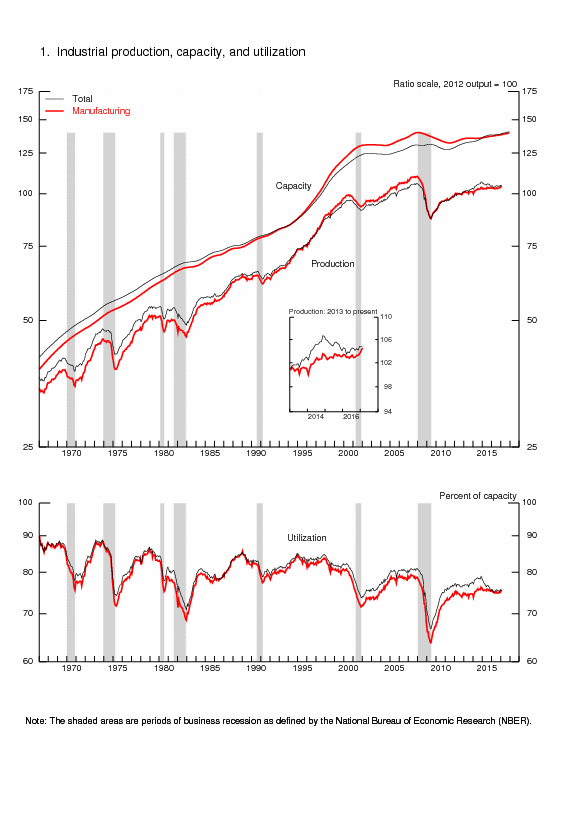
©Carlos Manuel Pelaez, O cruzado e o austral. São Paulo: Editora Atlas, 1986, pages 94-5. Reprinted in: Brazil. Tomorrow’s Italy, The Economist, 17-23 January 1987, page 25.
DeLong (1997, 247-8) shows that the 1970s were the only peacetime period of inflation in the US without parallel in the prior century. The price level in the US drifted upward since 1896 with jumps resulting from the two world wars: “on this scale, the inflation of the 1970s was as large an increase in the price level relative to drift as either of this century’s major wars” (DeLong, 1997, 248). Monetary policy focused on accommodating higher inflation, with emphasis solely on the mandate of promoting employment, has been blamed as deliberate or because of model error or imperfect measurement for creating the Great Inflation (http://cmpassocregulationblog.blogspot.com/2011/05/slowing-growth-global-inflation-great.html http://cmpassocregulationblog.blogspot.com/2011/04/new-economics-of-rose-garden-turned.html http://cmpassocregulationblog.blogspot.com/2011/03/is-there-second-act-of-us-great.html). As DeLong (1997) shows, the Great Inflation began in the mid 1960s, well before the oil shocks of the 1970s (see also the comment to DeLong 1997 by Taylor 1997, 276-7). TableI1 provides the change in GDP, CPI and the rate of unemployment from 1960 to 1990. There are three waves of inflation (1) in the second half of the 1960s; (2) from 1973 to 1975; and (3) from 1978 to 1981. In one of his multiple important contributions to understanding the Great Inflation, Meltzer (2005) distinguishes between one-time price jumps, such as by oil shocks, and a “maintained” inflation rate. Meltzer (2005) uses a dummy variable to extract the one-time oil price changes, resulting in a maintained inflation rate that was never higher than 8 to 10 percent in the 1970s. There is revealing analysis of the Great Inflation and its reversal by Meltzer (2005, 2010a, 2010b).
Table I1, US Annual Rate of Growth of GDP and CPI and Unemployment Rate 1960-1982
| ∆% GDP | ∆% CPI | UNE | |
| 1960 | 2.5 | 1.4 | 6.6 |
| 1961 | 2.3 | 0.7 | 6.0 |
| 1962 | 6.1 | 1.3 | 5.5 |
| 1963 | 4.4 | 1.6 | 5.5 |
| 1964 | 5.8 | 1.0 | 5.0 |
| 1965 | 6.4 | 1.9 | 4.0 |
| 1966 | 6.5 | 3.5 | 3.8 |
| 1967 | 2.5 | 3.0 | 3.8 |
| 1968 | 4.8 | 4.7 | 3.4 |
| 1969 | 3.1 | 6.2 | 3.5 |
| 1970 | 0.2 | 5.6 | 6.1 |
| 1971 | 3.4 | 3.3 | 6.0 |
| 1972 | 5.3 | 3.4 | 5.2 |
| 1973 | 5.8 | 8.7 | 4.9 |
| 1974 | -0.6 | 12.3 | 7.2 |
| 1975 | -0.2 | 6.9 | 8.2 |
| 1976 | 5.4 | 4.9 | 7.8 |
| 1977 | 4.6 | 6.7 | 6.4 |
| 1978 | 5.6 | 9.0 | 6.0 |
| 1979 | 3.1 | 13.3 | 6.0 |
| 1980 | -0.3 | 12.5 | 7.2 |
| 1981 | 2.5 | 8.9 | 8.5 |
| 1982 | -1.9 | 3.8 | 10.8 |
| 1983 | 4.5 | 3.8 | 8.3 |
| 1984 | 7.2 | 3.9 | 7.3 |
| 1985 | 4.1 | 3.8 | 7.0 |
| 1986 | 3.5 | 1.1 | 6.6 |
| 1987 | 3.2 | 4.4 | 5.7 |
| 1988 | 4.1 | 4.4 | 5,3 |
| 1989 | 3.6 | 4.6 | 5.4 |
| 1990 | 1.9 | 6.1 | 6.3 |
Note: GDP: Gross Domestic Product; CPI: consumer price index; UNE: rate of unemployment; CPI and UNE are at year end instead of average to obtain a complete series
Source: ftp://ftp.bls.gov/pub/special.requests/cpi/cpiai.txt
http://www.bls.gov/web/empsit/cpseea01.htm
http://data.bls.gov/pdq/SurveyOutputServlet
There is a false impression of the existence of a monetary policy “science,” measurements and forecasting with which to steer the economy into “prosperity without inflation.” Market participants are remembering the Great Bond Crash of 1994 shown in Table I2 when monetary policy pursued nonexistent inflation, causing trillions of dollars of losses in fixed income worldwide while increasing the fed funds rate from 3 percent in Jan 1994 to 6 percent in Dec. The exercise in Table I2 shows a drop of the price of the 30-year bond by 18.1 percent and of the 10-year bond by 14.1 percent. CPI inflation remained almost the same and there is no valid counterfactual that inflation would have been higher without monetary policy tightening because of the long lag in effect of monetary policy on inflation (see Culbertson 1960, 1961, Friedman 1961, Batini and Nelson 2002, Romer and Romer 2004). The pursuit of nonexistent deflation during the past ten years has resulted in the largest monetary policy accommodation in history that created the 2007 financial market crash and global recession and is currently preventing smoother recovery while creating another financial crash in the future. The issue is not whether there should be a central bank and monetary policy but rather whether policy accommodation in doses from zero interest rates to trillions of dollars in the fed balance sheet endangers economic stability.
Table I2, Fed Funds Rates, Thirty and Ten Year Treasury Yields and Prices, 30-Year Mortgage Rates and 12-month CPI Inflation 1994
| 1994 | FF | 30Y | 30P | 10Y | 10P | MOR | CPI |
| Jan | 3.00 | 6.29 | 100 | 5.75 | 100 | 7.06 | 2.52 |
| Feb | 3.25 | 6.49 | 97.37 | 5.97 | 98.36 | 7.15 | 2.51 |
| Mar | 3.50 | 6.91 | 92.19 | 6.48 | 94.69 | 7.68 | 2.51 |
| Apr | 3.75 | 7.27 | 88.10 | 6.97 | 91.32 | 8.32 | 2.36 |
| May | 4.25 | 7.41 | 86.59 | 7.18 | 88.93 | 8.60 | 2.29 |
| Jun | 4.25 | 7.40 | 86.69 | 7.10 | 90.45 | 8.40 | 2.49 |
| Jul | 4.25 | 7.58 | 84.81 | 7.30 | 89.14 | 8.61 | 2.77 |
| Aug | 4.75 | 7.49 | 85.74 | 7.24 | 89.53 | 8.51 | 2.69 |
| Sep | 4.75 | 7.71 | 83.49 | 7.46 | 88.10 | 8.64 | 2.96 |
| Oct | 4.75 | 7.94 | 81.23 | 7.74 | 86.33 | 8.93 | 2.61 |
| Nov | 5.50 | 8.08 | 79.90 | 7.96 | 84.96 | 9.17 | 2.67 |
| Dec | 6.00 | 7.87 | 81.91 | 7.81 | 85.89 | 9.20 | 2.67 |
Notes: FF: fed funds rate; 30Y: yield of 30-year Treasury; 30P: price of 30-year Treasury assuming coupon equal to 6.29 percent and maturity in exactly 30 years; 10Y: yield of 10-year Treasury; 10P: price of 10-year Treasury assuming coupon equal to 5.75 percent and maturity in exactly 10 years; MOR: 30-year mortgage; CPI: percent change of CPI in 12 months
Sources: yields and mortgage rates http://www.federalreserve.gov/releases/h15/data.htm CPI ftp://ftp.bls.gov/pub/special.requests/cpi/cpiai.t
© Carlos M. Pelaez, 2010, 2011
No comments:
Post a Comment