
Risk Aversion and Stagflation
Carlos M. Pelaez
© Carlos M. Pelaez, 2010, 2011
Executive Summary
I Risk Aversion
II Stagflation
IIA Unpleasant Monetarist Arithmetic
IIB Unpleasant Fiscal Arithmetic
III Global Inflation
IV Valuation of Risk Financial Assets
V Economic Indicators
VI Interest Rates
VII Conclusion
References
Executive Summary
The International Monetary Fund (IMF) finds increasing financial risks originating in three factors (IMF 2011GFSRJun17). (1) There are downside risks to growth in the world economy, particularly because of the multiple financial and economic consequences of deterioration in the fiscal situation and external borrowing capacity of sovereigns in Europe’s “periphery.” Slower growth in the first two quarters of 2011 in the US has been accompanied by six weeks of continued declines of stock markets, with a break in the week of Jun 17, while the volatility of commodity prices has increased and investors have exited equities in favor of bonds. (2) Political conflicts are raising doubts on the credibility and effectiveness of policies to face challenges of fiscal consolidation in several advanced economies especially the US and Japan (IMF 2010FMJun17). Credit default swap (CDS) spreads for sovereigns and financial institutions have significantly increased because of the sovereign risks in the European periphery. There are also challenges to the credit ratings of Japan and the US because of doubts about fiscal consolidation. (3) Prolonged interest rates near zero are causing another hunt for yields that may create future vulnerabilities. Monetary policy pegging interest rates close to zero encourages excessive positions in risk financial assets that may be reversed in a stronger bout of risk aversion that could cause another financial crisis
The report on The Flow Funds Accounts of the United States estimates that the net worth of household and nonprofit organizations in the US fell by $6111.6 billion, or $6.1 trillion, from 2007 to the first quarter of 2011 or by 9.5 percent. Industrial production, which has been the driver of the recovery, appears to have reached a pause from the latter part of IQ2010 into IIQ2011. If deceleration is caused by supply interruptions resulting from the earthquake and tsunami in Japan, production may recover later in the year. The pause is caught by the Fed’s national index of industrial production and the regional indexes of the Federal Reserve Banks of New York and Philadelphia. US manufacturing rose by 0.4 percent in May after falling by an upwardly revised 0.5 percent in Apr. Manufacturing rose by 3.7 percent in the first five months of 2011 relative to the first five months of 2010 but the annual equivalent rate of extrapolating the Feb-May cumulative increase for a full year is 1.8 percent. Manufacturing had increased during nine consecutive months before the decline in Apr. Vehicle assembly fell from the annual equivalent rate of 9.0 million units in Mar to 7.9 million in Apr because of the lack of parts originating in the earthquake/tsunami of Japan. Excluding motor vehicles and parts, manufacturing rose 0.6 percent in May and 0.1 percent in Apr. Tornados in the South also adversely influenced manufacturing in late Apr. Business sales are also showing the pause. The Treasury report on international capital shows improvement that could have been interrupted by the decline in equity values but may resume in recovery. The current account deficit deteriorated in IQ2011, creating external financing pressures. The housing sector continues to operate at very depressed level with some improvements at the margin. The US labor market is not recovering as required to alleviate job stress of 25 to 30 million people (http://cmpassocregulationblog.blogspot.com/2011/06/unemployment-and-underemployment-of-24.html). The US economy could still overcome the pause and grow in the second half of 2011.
The advanced economies are experiencing slow growth, labor market weakness with significant unemployment and rising inflation. The combination of inflation with unemployment has been termed stagflation. Stagflation is still an unknown event but the risk is sufficiently high to be worthy of consideration. The analysis of stagflation also permits the identification of important policy issues in solving vulnerabilities that have high impact on global financial risks. There are six key interrelated vulnerabilities in the world economy in addition to stagflation that have been causing global financial turbulence: (1) sovereign risk doubts in Europe resulting from countries in need of fiscal consolidation and enhancement of their sovereign risk ratings; (2) the tradeoff of growth and inflation in China; (3) slow growth and continuing job stress of 24 to 30 million people in the US and stagnant wages in a fractured job market; (4) the timing, dose, impact and instruments of normalizing monetary and fiscal policies in advanced and emerging economies; (5) the earthquake and tsunami affecting Japan that is having repercussions throughout the world economy because of Japan’s share of about 9 percent in world output, role as entry point for business in Asia, key supplier of advanced components and other inputs as well as major role in finance and multiple economic activities; and (6) the geopolitical events in the Middle East. The combination of sovereign risk doubts in Europe with some of these other risk factors can generate significant and unpredictable financial turbulence.
I Risk Aversion. The IMF (2011WEOJun17) estimates world output growth of 4.3 percent in 2011 and 4.5 percent in 2012. World output fell 0.5 percent in 2009 but rose 5.1 percent in 2010. The global recession had a stronger impact on the advanced economies with output falling 3.4 percent in 2009 and growing by only 3.0 percent in 2010. The impact of the recession was stronger in the euro area, with output falling 4.1 percent in 2009 and increasing only 1.8 percent in 2010, Japan, with output declining 6.3 percent in 2009 but increasing 4.0 percent in 2010, and the UK, with output declining 4.9 percent in 2009 and growing only 1.3 percent in 2010, than in the US with output declining 2.6 percent in 2009 and growing 2.9 percent in 2010. In contrast, output rose 2.8 percent in emerging and developing economies in 2009 and rose 7.4 percent in 2010. Recovery continues in “two-speed” fashion. (1) Emerging economies and developing economies are projected by the IMF (2011WEOJun17) to grow at 6.6 percent in 2011. (2) Advanced economies are projected to growth at a much lower rate of 2.2 percent in 2011 with the euro area at 2.0 percent, US at 2.5 percent, UK at 1.5 percent and Japan falling 0.7 percent as a result of the earthquake/tsunami of Mar 11, 2011. The IMF (2011WEOJun17) finds that “growth in many advanced economies is still weak, considering the depth of the recession” and that “the mild slowdown observed in the second quarter of 2011 is not reassuring.” The earthquake/tsunami in Japan was an important unfavorable event in IQ2011. There are various downside risks analyzed by the IMF (2011WEOJun17): (1) slower than expected growth in the US; (2) recurring financial turbulence originating in the fiscal situation and external borrowing constraints of the “periphery” of Europe; (3) “fiscal and financial sector imbalances in many advanced economies”; and (4) symptoms of excessive growth with fiscal and monetary policy challenges in various emerging and developing economies. The policy recommendations of the IMF (2011WEOJun17) to ensure growth and employment creation consist of: (1) in advanced economies there is need of financial sector recovery and reforms together with credible fiscal consolidation: and (2) in emerging and developing economies macroeconomic policy should be tightened while rebalancing internal demand.
The IMF (2011GFSRJun17) finds increasing financial risks originating in three factors. (1) There are downside risks to growth in the world economy, particularly because of the multiple financial and economic consequences of deterioration in the fiscal situation and external borrowing capacity of sovereigns in Europe’s “periphery.” Slower growth in the first two quarters of 2011 in the US has been accompanied by six weeks of continued declines of stock markets while the volatility of commodity prices has increased and investors have exited equities in favor of bonds. (2) Political conflicts are raising doubts on the credibility and effectiveness of policies to face challenges of fiscal consolidation in several advanced economies especially the US and Japan. Credit default swap (CDS) spreads for sovereigns and financial institutions have significantly increased because of the sovereign risks in the European periphery. There are also challenges to the credit ratings of Japan and the US because of doubts about fiscal consolidation. (3) Prolonged interest rates near zero are causing another hunt for yields that may create future vulnerabilities. Monetary policy pegging interest rates close to zero encourages excessive positions in risk financial assets that may be reversed in a stronger bout of risk aversion that could cause another financial crisis
The past six weeks have been characterized by unusual financial turbulence. Table 1, updated with every comment in this blog, provides beginning values on Jun 13 and daily values throughout the week ending on Jun 17. All data are for New York time at 5 PM. The first three rows provide three key exchange rates versus the dollar and the percentage cumulative appreciation (positive change or no sign) or depreciation (negative change or negative sign). Positive changes constitute appreciation of the relevant exchange rate and negative changes depreciation. The dollar appreciated by 0.3 percent relative to the euro with cumulative appreciation occurring mostly on Wed Jun 15 by 1.2 percent because of the fears of default in Greece with adverse repercussions in sovereign debts of other countries in Europe’s “periphery” as well as in “core countries” through exposures of banks. Risk aversion diminished by Fri Jun 17 when a compromise was reached with Germany on avoiding at least involuntary loss of principal of private bondholders of periphery debt. The Japanese yen fluctuated during the week finally appreciating to JPY 80.00/USD by Fri Jun 17 as the currency is used as safe haven from world risks while fears of another Japanese and G7 intervention subsided. The Swiss franc depreciated 0.80 percent during the week and even 1.3 percent by Wed Jun 15 with the strength of the dollar but the strong level of CHF 0.8485/USD could be a signal of risk aversion by funds fleeing temporarily to safe haven in a strong deposit and investment market.
Table 1, Daily Valuation of Risk Financial Assets
| Jun 13 | Jun 14 | Jun 15 | Jun 16 | Jun 17 | |
| USD/ | 1.4420 -0.5% | 1.4441 -0.6% | 1.4179 1.2% | 1.4192 1.1% | 1.4307 0.3% |
| JPY/ | 80.280 0.04% | 80.4545 -0.2% | 80.970 -0.8% | 80.622 -0.4% | 80.00 0.4% |
| CHF/ | 0.8373 0.6% | 0.8452 -0.4% | 0.8526 -1.3% | 0.8492 -0.9% | 0.8485 -0.8% |
| 10 Year Yield | 2.98 | 3.10 | 2.96 | 2.92 | 2.937 |
| 2 Year Yield | 0.39 | 0.44 | 0.38 | 0.38 | 0.376 |
| 10 Year | 2.96 | 3.01 | 2.95 | 2.92 | 2.96 |
| DJIA | 0.01% 0.01% | 1.05% 1.03% | -0.45% -1.48% | 0.086% 0.54% | 0.44% 0.36% |
| DJ Global | 0.015% 0.015% | 1.17% 1.16% | -0.57% -1.72% | -1.43% -0.86% | -1.07% 0.36% |
| DAX | 0.22% 0.22% | 1.91% 1.69% | 0.64% -1.25% | 0.57% -0.07% | 1.33% 0.76% |
| WTI $/b | 97.00 -3.2% -3.2% | 99.320 -0.9% 2.4% | 95.190 -5.0% -4.2% | 94.910 -5.3% -0.3% | 93.080 -7.1% -1.9% |
| Brent $/b | 118.78 2.8% 2.8% | 120.30 4.2% 1.3% | 113.660 -1.6% -5.5 | 114.090 -1.2% 0.4% | 113.220 -1.9% -0.8% |
| Gold $/ounce | 1516.80 -1.7% -1.7% | 1525.80 -1.1% 0.6% | 1531.10 -0.7% 0.3% | 1529.60 -0.8% -0.1% | 1539.60 -0.2% 0.6% |
Note: For the exchange rate appreciation is a positive percentage and depreciation a negative percentage; USD: US dollar; JPY: Japanese Yen; CHF: Swiss Franc; AUD: Australian dollar; B: barrel; for the three stock indexes the upper line is the percentage change since the past week and the lower line the percentage change from the prior day;
Source: http://noir.bloomberg.com/intro_markets.html
http://professional.wsj.com/mdc/page/marketsdata.html?mod=WSJ_hps_marketdata
The three sovereign bond yields in Table 1 capture risk aversion in the flight to the safety of US Treasury securities and German securities. The 2-year US Treasury note is highly attractive because of minimal duration or sensitivity to price change and its yield continued declining for a sustained period to 0.376 percent per year on Fri Jun 17. Much the same is true of the 10-year Treasury note and the 10-year bond of the government of Germany, falling to 2.937 percent for the 10-year Treasury note and to 2.96 percent for the 10-year government bond of Germany. Serena Ng and Matt Wirz, writing on Jun 10 in the Wall Street Journal on “As ‘junk’ bonds fall, some blame the Fed” (http://professional.wsj.com/article/SB10001424052702304259304576375233556859772.html?mod=WSJ_hp_LEFTWhatsNewsCollection), find declines in prices of subprime mortgage securities of 15 to 20 percent since Mar, with concern by traders that New York Fed sales of its portfolio of subprime securities acquired in the corporate rescue of 2008 may be causing the decline. The sales of subprime mortgages by the New York Fed may be also affecting the market for high-yield corporate securities that absorbed the issue of $114 billion by Jun 2, 2011, which is higher by 27 percent than in the comparable period in 2010. The Fed has sold about $10 billion of the portfolio it acquired in the rescue of AIG in 2008. Although the prices of high-yield corporate bonds have declined after the sales of the Fed portfolio of subprime mortgages, Ng and Wirz inform that the JP Morgan Domestic High Yield Index has increased 5.7 percent this year. The financial crisis was precipitated by a flight to quality from private-sector debt to government debt (see Cochrane 2011Jan, Duffie 2010JEP). The recent rise in yield of Treasury securities could be partly the result of the injection of subprime securities.
All three stock market indexes in Table 1 accumulated modest increases during the week, recovering from the losses on Wed Jun 15. The upper line in the stock indexes in Table 1 measures the percentage cumulative change since the closing level in the prior week on Jun 3 and the lower line measures the daily percentage change. E. S. Browning, writing on Jun 11 in the Wall Street Journal on “Stocks swoon, worry rises” (http://professional.wsj.com/article/SB10001424052702304259304576377970959834268.html?mod=WSJ_hp_LEFTWhatsNewsCollection), correctly attributes the new round of risk aversion to concerns about slowing growth in the US, doubts on European sovereign risks and slowing growth in Asia. The DJIA had accumulated a decline of 6.7 percent in six weeks, or 1.1 percent on average, from the high level in Apr to Jun 10. Section IV Valuation of Risk Financial Assets tracks financial risk and opportunities with emphasis on the European sovereign risk issues that developed between Apr and Jul 2010 and recurred in Nov 2010 with Ireland and now after Mar with Portugal followed by a showdown with Greece. The revealing chart in the WSJ Browning article (http://professional.wsj.com/article/SB10001424052702304259304576377970959834268.html?mod=WSJ_hp_LEFTWhatsNewsCollection) shows that the DJIA last declined during six consecutive weeks in 2002. The DJIA gained 0.36 percent in the week of Jun 17 in Table 1, interrupting the six-week decline.
The IMF (2011GFSRJun17) finds increasing financial risks originating in three factors. (1) There are downside risks to growth in the world economy, particularly because of the multiple financial and economic consequences of deterioration in the fiscal situation and external borrowing capacity of sovereigns in Europe’s “periphery.” Slower growth in the first two quarters of 2011 in the US has been accompanied by six weeks of continued declines of stock markets while the volatility of commodity prices has increased and investors have exited equities in favor of bonds. (2) Political conflicts are raising doubts on the credibility and effectiveness of policies to face challenges of fiscal consolidation in several advanced economies especially the US and Japan. Credit default swap (CDS) spreads for sovereigns and financial institutions have increased significantly because of the sovereign risks in the European periphery. There are also challenges to the credit ratings of Japan and the US because of doubts about fiscal consolidation. (3) Prolonged interest rates near zero are causing another hunt for yields that may create future vulnerabilities. Monetary policy pegging interest rates close to zero encourages excessive positions in risk financial assets that may be reversed in a stronger bout of risk aversion that could cause another financial crisis.
The final block of Table 1 shows the prices of oil, WTI and Brent, and gold. The first row shows price in dollars per barrel and dollars per ounce, and the two other two rows show the cumulative percentage change from Fri Jun 10 and the percentage daily change from the prior day. The price of WTI oil experienced stronger decline of 7.1 percent in the week of Jun 17 relative to the price on Jun 10 than 1.9 percent for the price of Brent oil. Perceptions in markets that there could not be an agreement on a Greek rescue program together with fears of slower global economic growth caused a decline of WTI by 5.0 percent on Wed Jun 15 an of Brent by 5.5 percent. Oil prices fell again on Thu and Fri. The column for Wed Jun 15 shows how valuations of risk financial assets drop almost simultaneously during episodes of risk aversion and rise also almost simultaneously during higher risk appetite. Near zero interest rates have not caused rapid economic growth and employment creation but have instead stimulated the carry trade of taking short positions at near zero interest rates, equivalent to borrowing, shorting the dollar and going long on highly leveraged derivatives of risk financial assets. This carry trade was an important factor, together with housing subsidies, of the financial crisis and global recession after 2007 (Pelaez and Pelaez, Financial Regulation after the Global Recession (2009a), 157-66, Regulation of Banks and Finance (2009b), 217-27, International Financial Architecture (2005), 15-18, The Global Recession Risk (2007), 221-5, Globalization and the State Vol. II (2008b), 197-213, Government Intervention in Globalization (2008c), 182-4). Several past comments of this blog elaborate on these arguments, among which: http://cmpassocregulationblog.blogspot.com/2011/01/professor-mckinnons-bubble-economy.html http://cmpassocregulationblog.blogspot.com/2011/01/world-inflation-quantitative-easing.html http://cmpassocregulationblog.blogspot.com/2011/01/treasury-yields-valuation-of-risk.html http://cmpassocregulationblog.blogspot.com/2010/11/quantitative-easing-theory-evidence-and.html http://cmpassocregulationblog.blogspot.com/2010/12/is-fed-printing-money-what-are.html.
The European Union, IMF and European Central Bank (ECB) are engaged in rescuing Greece to avoid the impact of default on the economies of Germany and France through the exposures of their banks to Greek debt, which the Bank for International Settlements (BIFD) estimated at the end of 2010 at $22.7 billion for German banks and $15 billion for French banks (Marcus Walker and Alman Granitsas, “Greek crisis eases for now,” Wall Street Journal, Jun 18 http://professional.wsj.com/article/SB10001424052702303823104576391230909900732.html?mod=WSJ_hp_LEFTWhatsNewsCollection). The immediate issue is approving payment of €12 billion from 2010’s €110 billion program. The prime minister of Greece reshuffled the cabinet to obtain political support to implement additional reductions of expenses and revenue increases. The original 2010 program was based on the assumption that Greece could return to international debt markets in 2012, which does not appear likely at the moment. On Jun 13, Standard & Poor’s lowered the rating on Greece’s sovereign debt from B to CCC, which is the lowest rating assigned to any sovereign (Wall Street Journal Roundup, “S&P slashes Greece rating,” Jun 13 http://professional.wsj.com/article/SB10001424052702303848104576383660422679124.html?mod=WSJPRO_hpp_LEFTTopStories).The rise in risk aversion on Wed Jun 15 was caused by two events, as analyzed by Alan Crawford and Natalie Week, “Greece aid talks deadlock as pressure on Papandreou builds,” Bloomberg, Jun 15 (http://noir.bloomberg.com/apps/news?pid=20601087&sid=aKHlVG1Zaq8I&pos=1). (1) The emergency meeting of finance ministers of the European Union in Brussels on Jun 14 failed to solve the discrepancies on the role of private bondholders in the rescue package; and (2) the prime minister of Greece found difficulties in approving the new measures while protests erupted in the country. Markets were calmer on Jun 17 after the announcement that Germany agreed that the rescue package for Greece would not include an exchange of all debt with extended maturities but rather voluntary extensions of maturity (see “Germany concedes on Greek debt deal,” by Quentin Peel, Kerin Hope and Robin Wigglesworth, Financial Times, Jun 17 http://www.ft.com/intl/cms/s/0/df98d0aa-98dc-11e0-bd66-00144feab49a.html#axzz1Pf3hoFQW). The complexity of the international financial system with links extending over geography and activities is illustrated by Michael Corkery, “Euro jitters ricochet across US,” Wall Street Journal, Jun 18 (http://professional.wsj.com/article/SB10001424052702303635604576391882144021882.html?mod=WSJ_hp_LEFTWhatsNewsCollection). A European bank guaranteed municipal bonds with its investment grade rating. Interest costs in the municipal bond market are “remarketed” daily or in short-period intervals. The guarantee requires the European bank to acquire the bonds of the guaranteed municipality if there are no other investors. Money markets funds have ceased bond deals with banks in threat of rating cuts because of their exposures to sovereigns in the European “periphery.” At the frequent remarketing intervals, the European bank demands higher interest rates for taking the debt those municipalities cannot place. Interest costs have risen to the highest level since a similar episode during the financial crisis when municipal bond guarantors faced stress because of their guarantees to collateralized debt obligations (CDO) and also because of the rise in interest costs to highly indebted municipal governments.
II Stagflation. The advanced economies are experiencing slow growth, labor market weakness with significant unemployment and rising inflation. The combination of inflation with unemployment has been termed stagflation. Stagflation analysis is covered in various earlier comments of this blog (see section III Great Inflation and Unemployment Analysis in http://cmpassocregulationblog.blogspot.com/2011/05/slowing-growth-global-inflation-great.html http://cmpassocregulationblog.blogspot.com/2011/04/new-economics-of-rose-garden-turned.html http://cmpassocregulationblog.blogspot.com/2011/03/is-there-second-act-of-us-great.html). There are two strands of thought considered below in turn: IIA Unpleasant Monetarist Arithmetic and IIB Unpleasant Fiscal Arithmetic. More extended discussion is in an earlier comment (http://cmpassocregulationblog.blogspot.com/2011/06/increasing-risk-aversion-analysis-of.html).
IIA Unpleasant Monetarist Arithmetic. The assumptions of the monetarist economy of Sargent and Wallace (1981, 1) are:
(1) There is a close connection between the monetary base, or monetary liabilities of the government (consisting of currency held by the public and reserves of depository institutions at the central bank), and the price level
(2) The monetary authority can obtain seigniorage, defined as creating money
There are two constraints of government finance in the monetary economy of Sargent and Wallace (1981, 1) imposed by the demand for issuing interest-bearing securities or, say, bonds, as debt:
(1) The demand for bonds by the public sets a limit on the ratio of the real stock of government bonds and the size of the economy
(2) The demand for bonds affects the interest rate paid by the government on its bonds
These two constraints affect the effectiveness of the government on permanently controlling inflation depending on coordination of alternative arrangements of fiscal and monetary policy. There are two polar extremes of coordination arrangement analyzed by Sargent and Wallace (1981).
First, monetary policy dominates fiscal policy. The monetary authority has the choice of the amount of seigniorage that it will supply to the fiscal authority. Thus, the monetary authority has complete freedom in setting the path of base money, such as by announcing its rate of growth in the current and future periods. Under this coordination arrangement, monetary policy can permanently influence inflation.
Second, fiscal policy dominates monetary policy. The monetary authority divides government debt between government bonds and monetary base. The only form of controlling inflation is by holding on the rate of growth of base money. The demand by the public for government bonds constrains the effectiveness of inflation policy by the monetary authority. If the real rate of interest of the government bonds exceeds the rate of growth of the economy, the growth of the stock of real bonds will exceed the rate of growth of the size of the economy. The public’s demand for government bonds sets a limit on the ratio of the stock of bonds to the size of the economy. After reaching that limit, seigniorage must provide part of financing for maturing principal and interest, that is, additional base money must be printed. In a monetarist economy there is inflation after some point in time.
The model of “unadulterated monetarism” used by Sargent and Wallace (1981) includes the assumption of a natural rate of unemployment or growth of real income that monetary policy cannot affect and a real rate of interest on securities that monetary policy cannot influence. Specifically, there are three assumptions:
(1) An equal constant rate of growth of real income and population, denoted by n
(2) A constant real rate of government securities exceeding n
(3) The analysis includes two different specifications of the demand for money: (a) a quantity theory demand function for base money with constant income velocity; and (b) specification of the demand for base money including expected inflation.
Fiscal policy is described by Sargent and Wallace (1981, 3, equation 1) as a time sequence of D(t), t = 1, 2,…t, …, where D is real government expenditures, excluding interest on government debt, less real tax receipts. D(t) is the real deficit excluding real interest payments measured in real time t goods. Monetary policy is described by a time sequence of H(t), t=1,2,…t, …, with H(t) being the stock of base money at time t. In order to simplify analysis, all government debt is considered as being only for one time period, in the form of a one-period bond B(t), issued at time t-1 and maturing at time t. Denote by R(t-1) the real rate of interest on the one-period bond B(t) between t-1 and t. The measurement of B(t-1) is in terms of t-1 goods and [1+R(t-1)] “is measured in time t goods per unit of time t-1 goods” (Sargent and Wallace 1981, 3). Thus, B(t-1)[1+R(t-1)] brings B(t-1) to maturing time t. B(t) represents borrowing by the government from the private sector from t to t+1 in terms of time t goods. The price level at t is denoted by p(t). The budget constraint of Sargent and Wallace (1981, 3, equation 1) is:
D(t) = {[H(t) – H(t-1)]/p(t)} + {B(t) – B(t-1)[1 + R(t-1)]} (1)
Equation (1) states that the government finances its real deficits into two portions. The first portion, {[H(t) – H(t-1)]/p(t)}, is seigniorage, or “printing money.” The second part,
{B(t) – B(t-1)[1 + R(t-1)]}, is borrowing from the public by issue of interest-bearing securities. Denote population at time t by N(t) and growing by assumption at the constant rate of n, such that:
N(t+1) = (1+n)N(t), n>-1 (2)
The per capita form of the budget constraint is obtained by dividing (1) by N(t) and rearranging:
B(t)/N(t) = {[1+R(t-1)]/(1+n)}x[B(t-1)/N(t-1)]+[D(t)/N(t)] – {[H(t)-H(t-1)]/[N(t)p(t)]} (3)
On the basis of the assumptions of equal constant rate of growth of population and real income, n, constant real rate of return on government securities exceeding growth of economic activity and quantity theory equation of demand for base money, Sargent and Wallace (1981) find that “tighter current monetary policy implies higher future inflation” under fiscal policy dominance of monetary policy. That is, the monetary authority does not permanently influence inflation, lowering inflation now with tighter policy but experiencing higher inflation in the future.
If the demand for base money depends on inflation expectations together with the other assumptions, loser monetary policy can result in higher inflation now and also in the future. Sargent and Wallace (1973, 1046) show that if the demand for real cash balances depends on the expected rate of inflation, “the equilibrium value of the price level at the current moment is seen to depend on the (expected) path of the money supply from now until forever.” The anticipation of high rates of base money growth in the future may increase the rate of inflation now. Sargent and Wallace (1981) show that currently tight monetary policy may not be potent to even lower the current rate of inflation. If fiscal policy dominates monetary policy with a sequence of deficits D(t), monetary policy has to adapt within the budget constraint of equation (1). If the sequence D(t) is “too big for too long,” under the assumptions of the model, “the monetary authority can make money tighter now only by making it looser later” (Sargent and Wallace 1981, 7). In the analysis of the hyperinflations in Europe, Sargent (1983, 89-90) concludes:
“The essential measures that ended hyperinflations in each of Germany, Austria, Hungary, and Poland were, first, the creation of an independent central bank that was legally committed to refuse the government’s demand for additional unsecured credit and, second, a simultaneous alteration in the fiscal policy regime. These measures were interrelated and coordinated. They had the effect of binding the government to place its debt with private parties and foreign governments which would value that debt according to whether it was backed by sufficiently large prospective taxes relative to public expenditures. In each case that we have studied, once it became widely understood that the government would not rely on the central bank for its finance, the inflation terminated and the exchanges stabilized. The four incidents we have studied are akin to laboratory experiments in which the elemental forces that cause and can be used to stop inflation are easiest to spot. I believe that these incidents are full of lessons about our own, less drastic predicament with inflation, if only we interpret them correctly.”
The fiscal imbalance of the US from 2009 to 2012 appears to be the highest in peacetime US history. Table 2 provides the outlays, revenue, deficit and debt held by the public in billions of dollars and as percent of GDP for the federal government as provided by the Congressional Budget Office (CBO) and for the general government as provided by the International Monetary Fund (IMF). The deficits from 2009 to 2012 exceed $1 trillion every year and add to $5287 billion, or $5.3 trillion, corresponding to 36.4 percent of GDP of $14,513 in 2010 (CBO http://www.cbo.gov/ftpdocs/120xx/doc12085/03-10-ReducingTheDeficit.pdf Table 1.1, 4). The deficits of the general government calculated by the IMF add to $6090 billion, corresponding to 41.9 percent of 2010 GDP. Federal debt held by the public as percent of GDP rises by 33.6 percentage points from 40.3 percent of GDP in 2008 to 73.9 percent of GDP in 2012 and by 28.2 percentage points for the general government from 48.4 percent in 2008 to 76.6 percent in 2012. The projections for 2016 are for federal debt held by the public of 75.0 percent of GDP and of general government debt of 85.7 percent of GDP. The concern is whether there is a “tipping point” or “debt explosion point” when investors require a risk premium on US debt
Table 2 Government Outlays, Revenue, Deficit and Debt As Percent of GDP 2010 %
| Gvt Outlays | Gvt Revenue | Govt Balance | Govt Debt | |
| Euro Area | 50.4 | 44.4 | -6.0 | 85.1 |
| European Union | 50.3 | 44.0 | -6.4 | 80.0 |
| Germany | 46.6 | 43.3 | -3.3 | 83.2 |
| France | 56.2 | 49.2 | -7.0 | 81.7 |
| Nether- lands | 51.2 | 45.9 | -5.4 | 62.7 |
| Finland | 55.1 | 52.3 | -2.5 | 48.4 |
| Belgium | 53.1 | 48.9 | -4.1 | 96.8 |
| Portugal | 50.7 | 41.5 | -9.1 | 93.0 |
| Ireland | 67.0 | 34.6 | -32.4 | 96.2 |
| Italy | 50.5 | 46.0 | -4.6 | 119.0 |
| Greece | 49.5 | 39.1 | -10.5 | 142.8 |
| Spain | 45.0 | 35.7 | -9.2 | 60.1 |
| UK | 50.9 | 40.6 | -10.4 | 80.0 |
| US Federal Govt 2010 | 23.8 | 14.9 | -8.9 | 62.1 |
| US Federal Govt 2012 | 23.3 | 16.3 | -7.0 | 73.9 |
| US 2010 General Govt (IMF) | 43.5 | 30.8 | -10.6 | 64.8 |
| US 2011 General Govt 2011 (IMF) | 41.2 | 30.5 | -10.8 | 72.4 |
Note: Govt: government
Source: http://epp.eurostat.ec.europa.eu/cache/ITY_PUBLIC/2-26042011-AP/EN/2-26042011-AP-EN.PDF
http://www.cbo.gov/ftpdocs/120xx/doc12085/03-10-ReducingTheDeficit.pdf
http://www.imf.org/external/pubs/ft/weo/2011/01/weodata/index.aspx
An important fact of Table 2 is that outlays remain above 20 percent of GDP indefinitely. The only similar episode in the past four decades is in the 1980s. Table 3 provides federal government outlays, revenue, deficit and debt as percent of GDP from 1980 to 1989. The concern arises from the fact that the highest revenue to GDP ratio in the past four decades was 20.6 percent of GDP in 2000. Federal outlays above 20 percent of GDP cannot be effectively taxed as shown by US historical statistics. The major difference of the experience in the 1980s with that after 2009 is the much higher rate of economic growth in the 1980s (http://cmpassocregulationblog.blogspot.com/2011/05/mediocre-growth-world-inflation.html) that maintained revenues closer to 20 percent of GDP. Nevertheless, debt as percent of GDP rose by 14.5 percentage points from 26.1 percent of GDP in 1980 to 40.6 percent of GDP in 1989. The ratio of federal debt to GDP rose to a peak of 49.1 percent of GDP in 1994, declining to 34.7 percent of GDP in 2000 and staying below the peak of 36.9 percent of GDP in 2001 to 2007.
Table 3 Federal Government Outlays, Revenue, Deficit and Debt as Percent of GDP 1980-1989
| Outlays % GDP | Revenue % GDP | Deficit % GDP | Debt % GDP | |
| 1980 | 21.7 | 19.0 | -2.7 | 26.1 |
| 1981 | 22.2 | 19.6 | -2.6 | 25.8 |
| 1982 | 23.1 | 19.2 | -4.0 | 28.7 |
| 1983 | 23.5 | 17.5 | -6.0 | 33.1 |
| 1984 | 22.2 | 17.3 | -4.8 | 34.0 |
| 1985 | 22.8 | 17.7 | -5.1 | 36.4 |
| 1986 | 22.5 | 17.5 | -5.0 | 39.5 |
| 1987 | 21.6 | 18.4 | -3.2 | 40.6 |
| 1988 | 21.3 | 18.2 | -3.1 | 41.0 |
| 1989 | 21.2 | 18.4 | -2.8 | 40.6 |
Source: http://www.cbo.gov/ftpdocs/120xx/doc12039/HistoricalTables[1].pdf
The unparalleled fiscal imbalance has been accompanied by the highest monetary policy accommodation in US history. As shown in Table 4, base money has swollen from $829 billion in Dec 2007 to $2494 billion in Apr 2011, by $1665 billion, for an increase of a multiple of 3 or 200.8 percent. At least de facto, monetary policy has been coordinated with fiscal policy.
Table 4 Total Reserves of Depository Institutions (R) and Base Money (B) (Dollar Billions Not Seasonally Adjusted)
| R | ∆% | B | ∆% | |
| D-2003 | 42 | 752 | ||
| D-2004 | 46 | 9.5 | 765 | 1.7 |
| D-2005 | 45 | -2.2 | 793 | 3.7 |
| D-2006 | 43 | -4.4 | 818 | 3.2 |
| D-2007 | 43 | 0 | 829 | 1.3 |
| D-2008 | 820 | 1806.9 | 1659 | 100.1 |
| D-2009 | 1139 | 38.9 | 2022 | 21.9 |
| D-2010 | 1078 | -5.3 | 2014 | -0.4 |
| Apr 2011 | 1528 | 41.7 | 2494 | 23.8 |
Source: http://www.federalreserve.gov/releases/h3/hist/h3hist1.pdf
Neumann (1992, 33, 36) states:
“If the security dealers do not hold but resell the Treasury securities to Reserve Banks after a short duration, it is, in fact, the Fed that supplies the borrowed funds to the Treasury. At the same time, these transactions permit the security dealers to buy another load of new debt from the Treasury…The dominating source component of fiscal seigniorage is the outright acquisition of government securities by the Fed…The seigniorage flow to government must not be identified with the Fed’s payment of ‘interest on Federal Reserve notes.’ In servicing the debt held by the Fed, the Treasury makes interest payments of roughly the same order of magnitude as the Fed pays to the Treasury. Indeed, the Fed’s portfolio of US government securities can be interpreted as an interest-free loan to the Treasury.”
Another form of viewing this issue is that to the extent that monetary policy of issuing $1.7 trillion of base money to acquire a portfolio of securities of $2.5 trillion was successful in lowering the rate paid on government securities, the government collected seigniorage from holders of government securities at home and abroad by the difference on what interest rates would have been without the target on fed funds rate of zero percent and quantitative easing. An issue of the exit strategy of the Fed is the impact of higher interest costs of Treasury debt that may affect the sustainability of the federal debt or the capacity to continue financing the US government with the “exorbitant privilege” deriving from use of the dollar as international reserve that allows the US to fund internationally at cheaper rates in its own dollar-denominated liabilities (Gourinchas and Rey 2005, Eichengreen 2011; see Pelaez and Pelaez, The Global Recession Risk (2007), 14, 44-7).
Is there a “tipping” or “explosion” point of that “exorbitant privilege”? The coordination deliberate or de facto of monetary and fiscal policy does resemble that during the Great Inflation (Meltzer 2005, 2010a, 2010b; see http://cmpassocregulationblog.blogspot.com/2011/04/new-economics-of-rose-garden-turned.html). Sargent and Wallace (1981, 6) show how such coordination can result in a perverse example:
“This example is spectacular in that the easier, or looser, monetary policy is uniformly better than the tighter policy. In this example, the tighter current monetary policy fails to even temporarily reduce inflation below the level it would be under the looser policy.”
Monetary and fiscal policy coordination has occurred in multiple historical episodes. Table 5 provides average yearly rates of growth of two definitions of the money stock, M1, and M2 that adds also interest-paying deposits. Chart 1 shows in semi-logarithmic scale from 1861 to 1970 in descending order two definitions of income velocity, money income, M1, M2, an indicator of prices and real income. The data were part of a research project on the monetary history of Brazil using the NBER framework of Friedman and Schwartz (1963, 1970) and Cagan (1965) as well as the institutional framework of Rondo E. Cameron (1967, 1972) who inspired the research (Pelaez 1974, 1975, 1976a,b, 1977, 1979, Pelaez and Suzigan 1978, 1981). The data were also used to test the correct specification of money and income following Sims (1972; see also Williams et al. 1976) as well as another test of orthogonality of money demand and supply using covariance analysis. The average yearly rates of inflation are high for almost any period in 1861-1970, even when prices were declining at 1 percent in 19th century England, and accelerated to 27.1 percent per year in 1945-1970. There may be concern of an uncontrolled fiscal deficit monetized by sharp increases in base money. The Fed may have desired to control inflation at 2 percent after lowering the fed funds rate to 1 percent in 2003 but inflation rose to 4.1 percent in 2007. There is not “one hundred percent” confidence in controlling inflation because of the lags in effects of monetary policy impulses and the equally important lags in realization of the need for action and taking of action and also the inability to forecast any economic variable (Friedman 1953). Romer and Romer (2004) find that a one percentage point tightening of monetary policy is associated with a 4.3 percent decline in industrial production. There is no change in inflation in the first 22 months after monetary policy tightening when it begins to decline steadily, with decrease by 6 percent after 48 months (see Pelaez and Pelaez, Regulation of Banks and Finance (2009b), 102). Even if there were one hundred percent confidence in reducing inflation by monetary policy, it could take a prolonged period with adverse effects on economic activity. Certainty does not occur in economic policy, which is characterized by costs that cannot be anticipated.
Table 5, Brazil, Yearly Growth Rates of M1, M2, Nominal Income (Y), Real Income (y), Real Income per Capita (y/n) and Prices (P)
| M1 | M2 | Y | y | y/N | P | |
| 1861-1970 | 9.3 | 6.2 | 10.2 | 4.6 | 2.4 | 5.8 |
| 1861-1900 | 5.4 | 5.9 | 5.9 | 4.4 | 2.6 | 1.6 |
| 1861-1913 | 4.7 | 4.7 | 5.3 | 4.4 | 2.4 | 0.1 |
| 1861-1929 | 5.5 | 5.6 | 6.4 | 4.3 | 2.3 | 2.1 |
| 1900-1970 | 13.9 | 13.9 | 15.2 | 4.9 | 2.6 | 10.3 |
| 1900-1929 | 8.9 | 8.9 | 10.8 | 4.2 | 2.1 | 6.6 |
| 1900-1945 | 8.6 | 9.1 | 9.2 | 4.3 | 2.2 | 4.9 |
| 1920-1970 | 17.8 | 17.3 | 19.4 | 5.3 | 2.8 | 14.1 |
| 1920-1945 | 8.3 | 8.7 | 7.5 | 4.3 | 2.2 | 3.2 |
| 1920-1929 | 5.4 | 6.9 | 11.1 | 5.3 | 3.3 | 5.8 |
| 1929-1939 | 8.9 | 8.1 | 11.7 | 6.3 | 4.1 | 5.4 |
| 1945-1970 | 30.3 | 29.2 | 33.2 | 6.1 | 3.1 | 27.1 |
Note: growth rates are obtained by regressions of the natural logarithms on time.
Source: See Pelaez and Suzigan (1978), 143; M1 and M2 from Pelaez and Suzigan (1981); money income and real income from Contador and Haddad (1975) and Haddad (1974); prices by the exchange rate adjusted by British wholesale prices until 1906 and then from Villela and Suzigan (1973); national accounts after 1947 from Fundação Getúlio Vargas.
Chart 1, Brazil, Money, Income and Prices 1861-1970.

Source: © Carlos Manuel Pelaez and Wilson Suzigan. 1981. História Monetária do Brasil Segunda Edição. Coleção Temas Brasileiros. Brasília: Universidade de Brasília, 21.
IIA2 Unpleasant Fiscal Arithmetic. The tool of analysis of Cochrane (2011Jan, 27, equation (16)) is the government debt valuation equation:
(Mt + Bt)/Pt = Et∫(1/Rt, t+τ)st+τdτ (4)
Equation (4) expresses the monetary, Mt, and debt, Bt, liabilities of the government, divided by the price level, Pt, in terms of the expected value discounted by the ex-post rate on government debt, Rt, t+τ, of the future primary surpluses st+τ, which are equal to Tt+τ – Gt+τ or difference between taxes, T, and government expenditures, G. Cochrane (2010A) provides the link to a web appendix demonstrating that it is possible to discount by the ex post Rt, t+τ. The second equation of Cochrane (2011Jan, 5) is:
MtV(it, ·) = PtYt (5)
Conventional analysis of monetary policy contends that fiscal authorities simply adjust primary surpluses, s, to sanction the price level determined by the monetary authority through equation (5), which deprives the debt valuation equation (4) of any role in price level determination. The simple explanation is (Cochrane 2011Jan, 5):
“We are here to think about what happens when [4] exerts more force on the price level. This change may happen by force, when debt, deficits and distorting taxes become large so the Treasury is unable or refuses to follow. Then [4] determines the price level; monetary policy must follow the fiscal lead and ‘passively’ adjust M to satisfy [5]. This change may also happen by choice; monetary policies may be deliberately passive, in which case there is nothing for the Treasury to follow and [4] determines the price level.”
An intuitive interpretation by Cochrane (2011Jan 4) is that when the current real value of government debt exceeds expected future surpluses, economic agents unload government debt to purchase private assets and goods, resulting in inflation. If the risk premium on government debt declines, government debt becomes more valuable, causing a deflationary effect. If the risk premium on government debt increases, government debt becomes less valuable, causing an inflationary effect.
There are multiple conclusions by Cochrane (2011Jan) on the debt/dollar crisis and Global recession, among which the following three:
(1) The flight to quality that magnified the recession was not from goods into money but from private-sector securities into government debt because of the risk premium on private-sector securities; monetary policy consisted of providing liquidity in private-sector markets suffering stress
(2) Increases in liquidity by open-market operations with short-term securities have no impact; quantitative easing can affect the timing but not the rate of inflation; and purchase of private debt can reverse part of the flight to quality
(3) The debt valuation equation has a similar role as the expectation shifting the Phillips curve such that a fiscal inflation can generate stagflation effects similar to those occurring from a loss of anchoring expectations
Inflation and unemployment in the period 1966 to 1985 is analyzed by Cochrane (2011Jan, 23) by means of a Phillips circuit joining points of inflation and unemployment. Chart 2 for Brazil in Pelaez (1986, 94-5) was reprinted in The Economist in the issue of Jan 17-23, 1987 as updated by the author. Cochrane (2011Jan, 23) argues that the Phillips circuit shows the weakness in Phillips curve correlation. The explanation is by a shift in aggregate supply, rise in inflation expectations or loss of anchoring. The case of Brazil in Chart 2 cannot be explained without taking into account that the increase in the fed funds rate to 22 percent in 1981 in the Volcker Fed precipitated the stress on a foreign debt bloated by financing balance of payments deficits with bank loans in the 1970s; the loans were used in projects, many of state-owned enterprises with low present value in long gestation. The combination of the insolvency of the country because of debt higher than its ability of repayment and the huge government deficit with declining revenue as the economy contracted caused adverse expectations on inflation and the economy. Gordon (1985) provides an expectational Phillips curve to analyze the experience of the 1970s and early 1980s incorporating the supply shocks of that period. The reading of the Phillips circuits of the 1970s by Cochrane (2011Jan, 25) is doubtful about the output gap and inflation expectations:
“So, inflation is caused by ‘tightness’ and deflation by ‘slack’ in the economy. This is not just a cause and forecasting variable, it is the cause, because given ‘slack’ we apparently do not have to worry about inflation from other sources, notwithstanding the weak correlation of [Phillips circuits]. These statements [by the Fed] do mention ‘stable inflation expectations. How does the Fed know expectations are ‘stable’ and would not come unglued once people look at deficit numbers? As I read Fed statements, almost all confidence in ‘stable’ or ‘anchored’ expectations comes from the fact that we have experienced a long period of low inflation (adaptive expectations). All these analyses ignore the stagflation experience in the 1970s, in which inflation was high even with ‘slack’ markets and little ‘demand, and ‘expectations’ moved quickly. They ignore the experience of hyperinflations and currency collapses, which happen in economies well below potential.”
Chart 2, Brazil, Phillips Circuit 1963-1987

©Carlos Manuel Pelaez, O cruzado e o austral. São Paulo: Editora Atlas, 1986, pages 94-5. Reprinted in: Brazil. Tomorrow’s Italy, The Economist, 17-23 January 1987, page 25.
Professor Cochrane (2011Jan) does not provide a forecast but rather a scenario. In this scenario, the environment for inflation begins with slow growth, increasing taxes and uncertainty on economic policy. As it was true in the debt crisis of 1982, government budgets are squeezed by slow growth and a fortiori by economic contraction that prevents increasing government revenue. The government would face calls on its credit guarantees. Anticipations by investors would result in fire sales of government debt and assets denominated in dollars. A risk premium on US government debt could magnify the decline on that debt caused by inflation. Unpredictability of forecasting economic policy prevents forecasting economic and financial variables even if there were a true model of the economy and financial markets.
III Global Inflation. There is inflation everywhere in the world economy, with slow growth and persistently high unemployment in advanced economies. Table 6 updated with every post, provides the latest yearly data for GDP, consumer price index (CPI) inflation, producer price index (PPI) inflation and unemployment (UNE) for the advanced economies, China and the highly-indebted European countries with sovereign risk issues. The table now includes the Netherlands and Finland that with Germany make up the set of northern countries in the euro zone that hold key votes in the enhancement of the mechanism for solution of the sovereign risk issues (http://www.ft.com/cms/s/0/55eaf350-4a8b-11e0-82ab-00144feab49a.html#axzz1G67TzFqs). CPI inflation stabilized in China at 5.3 percent in the 12 months ending in Apr relative to 5.4 percent in the 12 months ending in Mar. Food prices in China soared by 11.7 percent in Mar after 11.0 percent in Feb, 10.3 percent in Jan and 9.6 percent in Dec (http://www.ft.com/cms/s/0/69aa5fcc-670d-11e0-8d88-00144feab49a.html#axzz1J7CmnPhC). Food prices rose 11.5 percent in China in the 12 months ending in Apr relative to 11 percent in the first quarter of 2011 relative to 2010 as analyzed by Jamil Anderlini in the Financial Times (“China inflation edges lower to 5.3%” http://www.ft.com/cms/s/0/09a22246-7b75-11e0-ae56-00144feabdc0.html#axzz1LqpStZfj). Jamil Anderlini writing in the Financial Times (“Inflation in China hits 34-month high,” Jun 14 http://www.ft.com/intl/cms/s/0/dda66798-9630-11e0-8256-00144feab49a.html#axzz1P401vEUE) informs that food prices rose 11.7 percent in May 2011 relative to a year earlier, exceeding 11.5 percent in the 12 months ending in Apr. Jason Dean in the Wall Street Journal (“Chinese inflation speeds up,” WSJ Jun 14 http://professional.wsj.com/article/SB10001424052702303714704576382593374669206.html?mod=WSJPRO_hpp_LEFTTopStories) finds that CPI inflation of 5.5 percent in the 12 months ending in May 2011 is the highest rate since 6.3 percent in Jul 2008. Industrial output rose 13.3 percent in China in May 2011 relative to May 2010, almost equal to 13.4 percent in Apr while fixed investment rose 25.8 percent in the first five months of 2011 relative to the same period in 2010 compared with 25.4 percent in Jan-Apr. The money stock M2 rose 15.1 percent in May relative to a year earlier. New loans in local currency rose CNY (Chinese yuan) 740 billion in Apr (http://noir.bloomberg.com/apps/news?pid=20601087&sid=aolyrQHuzo4o&pos=4) but new loans in local currency rose only CNY 551.6 billion in May 2011 relative to Apr 2010 (Jamil Anderlini writing in the Financial Times (“Inflation in China hits 34-month high,” Jun 14 http://www.ft.com/intl/cms/s/0/dda66798-9630-11e0-8256-00144feab49a.html#axzz1P401vEUE). The People’s Bank of China increased the reserve requirement by 0.5 percent to 21.5 percent effective Jun 20 (Bloomberg News, “China raises bank reserve requirements as inflation quickens,” http://noir.bloomberg.com/apps/news?pid=20601087&sid=aae70h91sWhY&pos=3). China has raised interest rates four times since Sep, raising the reserve requirements on banks and appreciating the CNY relative to the USD by 1.6 percent in 2011. Authorities in China are highly concerned about inflation because of its impact on social stability and fears of a forced landing of the economy.
Table 6, GDP Growth, Inflation and Unemployment in Selected Countries, Percentage Annual Rates
| GDP | CPI | PPI | UNE | |
| US | 2.9 | 3.6 | 7.3 | 9.1 |
| Japan | -0.7*** | 0.3 | 2.2 | 4.7 |
| China | 9.7 | 5.5 | 6.8 | |
| UK | 1.8 | 4.5* | 5.3* output | 7.7 |
| Euro Zone | 2.5 | 2.7 | 6.7 | 9.9 |
| Germany | 4.8 | 2.4 | 6.4 | 6.1 |
| France | 2.2 | 2.2 | 6.4 | 9.4 |
| Nether-lands | 3.2 | 2.4 | 11.7 | 4.2 |
| Finland | 5.8 | 3.4 | 8.5 | 8.0 |
| Belgium | 3.0 | 3.1 | 10.6 | 7.7 |
| Portugal | -0.7 | 3.7 | 6.5 | 12.6 |
| Ireland | -1.0 | 1.2 | 5.0 | 14.7 |
| Italy | 1.0 | 3.0 | 5.5 | 8.1 |
| Greece | -4.8 | 3.1 | 7.9 | 15.1 |
| Spain | 0.8 | 3.4 | 7.3 | 20.7 |
Notes: GDP: rate of growth of GDP; CPI: change in consumer price inflation; PPI: producer price inflation; UNE: rate of unemployment; all rates relative to year earlier
*Office for National Statistics
PPI http://www.statistics.gov.uk/pdfdir/ppi0611.pdf
CPI http://www.statistics.gov.uk/pdfdir/cpi0611.pdf
** Excluding food, beverage, tobacco and petroleum
http://epp.eurostat.ec.europa.eu/cache/ITY_PUBLIC/4-04042011-AP/EN/4-04042011-AP-EN.PDF
***Change from IQ2011 relative to IQ2010 http://www.esri.cao.go.jp/jp/sna/sokuhou/kekka/gaiyou/main_1.pdf
Source: EUROSTAT; country statistical sources http://www.census.gov/aboutus/stat_int.html
Stagflation is still an unknown event but the risk is sufficiently high to be worthy of consideration. The analysis of stagflation also permits the identification of important policy issues in solving vulnerabilities that have high impact on global financial risks. There are six key interrelated vulnerabilities in the world economy that have been causing global financial turbulence: (1) sovereign risk issues in Europe resulting from countries in need of fiscal consolidation and enhancement of their sovereign risk ratings (see Section I Risk Aversion in this post and Section I Increasing Risk Aversion in http://cmpassocregulationblog.blogspot.com/2011/06/increasing-risk-aversion-analysis-of.html and section IV in http://cmpassocregulationblog.blogspot.com/2011/04/budget-quagmire-fed-commodities_10.html); (2) the tradeoff of growth and inflation in China; (3) slow growth (see http://cmpassocregulationblog.blogspot.com/2011/05/slowing-growth-global-inflation-great.html http://cmpassocregulationblog.blogspot.com/2011/05/mediocre-growth-world-inflation.html http://cmpassocregulationblog.blogspot.com/2011_03_01_archive.html http://cmpassocregulationblog.blogspot.com/2011/02/mediocre-growth-raw-materials-shock-and.html), weak hiring (http://cmpassocregulationblog.blogspot.com/2011/03/slow-growth-inflation-unemployment-and.html and section III Hiring Collapse in http://cmpassocregulationblog.blogspot.com/2011/04/fed-commodities-price-shocks-global.html ) and continuing job stress of 24 to 30 million people in the US and stagnant wages in a fractured job market (http://cmpassocregulationblog.blogspot.com/2011/05/job-stress-of-24-to-30-million-falling.html http://cmpassocregulationblog.blogspot.com/2011/04/twenty-four-to-thirty-million-in-job_03.html http://cmpassocregulationblog.blogspot.com/2011/03/unemployment-and-undermployment.html); (4) the timing, dose, impact and instruments of normalizing monetary and fiscal policies (see http://cmpassocregulationblog.blogspot.com/2011/03/is-there-second-act-of-us-great.html http://cmpassocregulationblog.blogspot.com/2011/03/global-financial-risks-and-fed.html http://cmpassocregulationblog.blogspot.com/2011/02/policy-inflation-growth-unemployment.html) in advanced and emerging economies; (5) the earthquake and tsunami affecting Japan that is having repercussions throughout the world economy because of Japan’s share of about 9 percent in world output, role as entry point for business in Asia, key supplier of advanced components and other inputs as well as major role in finance and multiple economic activities (http://professional.wsj.com/article/SB10001424052748704461304576216950927404360.html?mod=WSJ_business_AsiaNewsBucket&mg=reno-wsj); and (6) the geopolitical events in the Middle East.
The IMF (WEOJun17) estimates an increase in global inflation from 3.5 percent in IVQ2010 to 4 percent in IQ2011, exceeding by 0.25 percentage points the projection made in Apr 2011. The rise is inflation is attributed to the increase in commodity prices. Core inflation also increased in various economies. The IMF (2011WEOJun17) finds core inflation to be subdued in the US and Japan while rising moderately in the euro area. Because of the higher weight of food and fuel, emerging and developing economies are experiencing high overall inflation.
Table 7 shows the final estimate of the euro area’s harmonized index of consumer prices (HIPC). The change in May 2011 relative to May 2010 is confirmed at 2.7 percent. HIPC inflation has stabilized around 2.7 to 2.8 percent in the months of Mar to May 2011 relative to a year earlier. Core inflation, excluding energy, food, alcohol and tobacco, is 1.5 percent for May and has been in a relatively tight range of 1.3 to 1.6 percent in the months of Mar to May 2011 relative to a year earlier. Energy prices have been rising much faster in the consumption basket of the HIPC, moderating slightly to 11.1 percent in May compared with 12.5 percent in Apr and 13.0 percent in Mar. Housing and transportation have been experiencing higher inflation for consumers than food.
Table 7, Euro Area Harmonized Index of Consumer Prices 12 Months ∆%
| May11 /May10 | Apr 11 /Apr 10 | Mar 11 /Mar 10 | |
| All | 2.7 | 2.8 | 2.7 |
| Ex Energy, Food, Alcohol and Tobacco | 1.5 | 1.6 | 1.3 |
| Energy | 11.1 | 12.5 | 13.0 |
| Food | 2.7 | 2.0 | 2.0 |
| Housing | 4.7 | 5.0 | 5.1 |
| Transport | 5.3 | 5.9 | 5.7 |
Source: http://epp.eurostat.ec.europa.eu/cache/ITY_PUBLIC/2-16062011-BP/EN/2-16062011-BP-EN.PDF
Table 8 provides consumer price index inflation in the UK. Inflation has also stabilized at 4.5 percent in the 12 months ending in Apr and May 2011, somewhat higher than 4.0 percent in the 12 months ending in Jan. The annual equivalent inflation in Jan-May, or what inflation would be in a full year if the cumulative rate in the first five months were repeated, is 5.7 percent, higher than past 12 month inflation. The monthly rate dropped significantly from 1.0 percent in Apr to 0.2 percent in May.
Table 8, UK Consumer Price Index ∆%
| Month | 12 Months | |
| May | 0.2 | 4.5 |
| Apr | 1.0 | 4.5 |
| Mar | 0.3 | 4.0 |
| Feb | 0.7 | 4.4 |
| Jan | 0.1 | 4.0 |
| Jan-May AE | 5.7 |
AE: annual equivalent
Surce: http://www.statistics.gov.uk/pdfdir/cpi0611.pdf
CPI inflation is accelerating in the US as suggested by data in Table 9. The 12-month rate of increase of the CPI was 3.6 percent in May compared with an annual equivalent of 4.9 percent in the first five months of 2011. The CPI excluding food and energy is rising less rapidly at 1.5 percent in 12 months but 2.4 percent annual equivalent in the first five months of 2011. The 12 months rates of increases are quite high for numerous items showing that commodity shocks have not been transitory but have occurred on a trend for nearly a year. The lowest increases are for apparel, 1.0 percent, shelter, 1.1 percent, and services less energy 1.0 percent. With the exception of medical care services, annual equivalent rates for the first five months of 2011 exceed 12 months rates of increase. Motor vehicles and parts are experiencing increases in prices partly because of the impact of the Japanese earthquake/tsunami.
Table 9, Consumer Price Index Percentage Changes 12 months NSA and Annual Equivalent Jan-May 2011 ∆%
| ∆% 12 Months May 2011/May 2010 NSA | ∆% Annual Equivalent Jan-May 2011 SA | |
| CPI All Items | 3.6 | 4.9 |
| CPI ex Food and Energy | 1.5 | 2.4 |
| Food | 3.5 | 6.7 |
| Food at Home | 4.4 | 8.9 |
| Food Away from Home | 2.2 | 2.9 |
| Energy | 21.5 | 27.2 |
| Gasoline | 36.9 | 42.3 |
| Fuel Oil | 36.0 | 63.9 |
| New Vehicles | 3.4 | 8.5 |
| Used Cars and Trucks | 4.1 | 7.2 |
| Medical Care Commodities | 3.0 | 5.4 |
| Services Less Energy Services | 1.6 | 1.9 |
| Apparel | 1.0 | 2.1 |
| Shelter | 1.1 | 1.4 |
| Transportation Services | 3.3 | 4.4 |
| Medical Care Services | 3.0 | 2.4 |
Source: http://www.bls.gov/news.release/pdf/cpi.pdf
An important feature of the May CPI of the US is the decline in fuel and energy prices shown in Table 10. Gasoline prices, with heavy impact on budgets of the middle class, fell 2.0 percent in May relative to Apr, energy declined 1.0 percent and fuel oil fell 0.8 percent. Normalization of refineries and lower prices of oil explain the decline in fuels and energy prices. The overall CPI rose only 0.2 percent in May compared with 0.4 percent in Apr and 0.5 percent in Mar. The annual equivalent rates of increase of the CPI and its components in the quarter Mar to May 2011 are still quite high.
Table 10, Monthly Percentage Change of Consumer Price Index SA and Annual Equivalent Mar-May 2011
| May | Apr | Mar | Mar-May AE | |
| CPI All Items | 0.2 | 0.4 | 0.5 | 4.5 |
| CPI ex Food and Energy | 0.3 | 0.2 | 0.1 | 2.4 |
| Food | 0.4 | 0.4 | 0.8 | 6.6 |
| Food at Home | 0.5 | 0.5 | 1.1 | 8.7 |
| Food Away from Home | 0.2 | 0.3 | 0.3 | 3.2 |
| Energy | -1.0 | 2.2 | 3.5 | 20.3 |
| Gasoline | -2.0 | 3.3 | 5.6 | 30.6 |
| Fuel Oil | -0.8 | 3.2 | 6.2 | 39.7 |
| New Vehicles | 1.1 | 0.7 | 0.7 | 10.5 |
| Used Cars and Trucks | 1.1 | 1.2 | 0.8 | 13.1 |
| Medical Care Commodities | 0.0 | 0.5 | 0.5 | 4.1 |
| Services Less Energy Services | 0.2 | 0.1 | 0.2 | 2.0 |
| Apparel | 1.2 | 0.2 | -0.5 | 3.6 |
| Shelter | 0.2 | 0.1 | 0.1 | 1.6 |
| Transport-ation Services | 0.1 | 0.2 | 0.5 | 3.2 |
| Medical Care Services | 0.3 | 0.3 | 0.1 | 2.8 |
Source: http://www.bls.gov/news.release/pdf/cpi.pdf
The relative importance or weights of items in the CPI are shown in Table 11. Food and transportation account for 32.1 percent of consumer expenditures and housing for 41.460 percent such that food, transportation and housing account for 73.56 percent of consumer expenditures. Housing is still in recession conditions and a significant part, 24.9 percent, consists of “owners’ equivalent rent,” which is a calculation of what owners would pay if they would rent their own house. The major categories are shown in relief. Motor fuel has risen sharply with gasoline increasing 42.3 percent in the 12 months ending in May but accounts for only 5.079 percent of CPI expenditures. Lower income families experience more stress from increases in food and fuel, which represent a higher proportion of their expenses.
Table 11, Relative Importance, 2007-2008 Weights, of Components in the Consumer Price Index, US City Average, Dec 2010
| All Items | 100.000 |
| Food and Beverages | 14.792 |
| Food | 13.742 |
| Food at home | 7.816 |
| Food away from home | 5.926 |
| Housing | 41.460 |
| Shelter | 31.955 |
| Rent of primary residence | 5.925 |
| Owners’ equivalent rent | 24.905 |
| Apparel | 3.601 |
| Transportation | 17.308 |
| Private Transportation | 16.082 |
| New vehicles | 3.513 |
| Used cars and trucks | 2.055 |
| Motor fuel | 5.079 |
| Gasoline | 4.865 |
| Medical Care | 6.627 |
| Medical care commodities | 1.633 |
| Medical care services | 4.994 |
| Recreation | 6.293 |
| Education and Communication | 6.421 |
| Other Goods and Services | 3.497 |
Source: ftp://ftp.bls.gov/pub/special.requests/cpi/cpiri2010.txt
The 12-month rates of increase of PCE price indexes are shown in Table 12. These data are released at the end of the month and are considered here to compare them with the CPI and PPI released in mid month. Headline 12-month PCE inflation (PCE) has accelerated from slightly over 1 percent in the latter part of 2010 to 2.2 percent in Apr. Monetary policy uses PCE inflation excluding food and energy (PCEX) on the basis of research showing that current PCEX is a better indicator of headline PCE a year ahead than current headline PCE inflation. The explanation is that commodity price shocks are “mean reverting,” returning to their long-term means after spiking during shortages caused by climatic factors, geopolitical events and the like. Inflation of PCE goods (PCEG) has accelerated sharply, in spite of 12-month declining inflation of PCE durable goods (PCEG-D) while PCE services inflation (PCES) has remained around 1.2 to 1.3 percent. The last two columns of Table 12 show PCE food inflation (PCEF) and PCE energy inflation (PCEE) that have been rising sharply, especially for energy. Monetary policy expects these increases to revert with its indicator PCEX returning to levels that are acceptable for continuing monetary accommodation.
Table 12, Percentage Change in 12 Months of Prices of Personal Consumption Expenditures ∆%
| PCE | PCEG | PCEG -D | PCES | PCEX | PCEF | PCEE | |
| 2011 | |||||||
| Apr | 2.2 | 4.0 | -1.1 | 1.3 | 1.0 | 3.2 | 19.6 |
| Mar | 1.8 | 3.0 | -1.6 | 1.2 | 0.9 | 2.9 | 15.3 |
| Feb | 1.6 | 2.1 | -1.4 | 1.3 | 0.9 | 2.4 | 11.1 |
| Jan | 1.2 | 1.2 | -1.9 | 1.2 | 0.8 | 1.7 | 6.7 |
| 2010 | |||||||
| Dec | 1.1 | 1.0 | -2.2 | 1.2 | 0.7 | 1.2 | 7.4 |
| Nov | 1.0 | 0.6 | -2.0 | 1.3 | 0.8 | 1.3 | 4.0 |
| Oct | 1.2 | 0.8 | -1.8 | 1.4 | 0.9 | 1.3 | 6.3 |
| Sep | 1.3 | 0.5 | -1.4 | 1.7 | 1.1 | 1.3 | 4.2 |
| Aug | 1.4 | 0.6 | -1.0 | 1.7 | 1.2 | 0.7 | 4.0 |
Notes: percentage changes in price index relative to the same month a year earlier of PCE: personal consumption expenditures; PCEG: PCE goods; PCEG-D: PCE durable goods; PCEX: PCE excluding food and energy; PCEF: PCE food; PCEE: PCE energy goods and services
Source: http://www.bea.gov/newsreleases/national/pi/2011/pdf/pi0311.pdf
http://www.bea.gov/newsreleases/national/pi/2011/pdf/pi0411.pdf
The role of devil’s advocate is played by data in Table 13. Headline PCE inflation (PCE) has jumped to 1.4 percent cumulative in the first four months of 2011, which is equivalent to 4.3 percent annual, with PCEG jumping to 3.0 percent cumulative and 9.4 percent annual equivalent, PCEG-D rising 0.6 percent cumulative or 1.8 percent annual, and PCES and PCEX rising to 0.7 percent or 2.7 percent annual. PCEF has increased by 2.7 percent cumulative, which is equivalent in a full year to 8.4 percent. PCEE has risen to 12.3 percent cumulative or 41.7 percent annual equivalent.
Table 13, Monthly and Jan-May PCE Inflation and Annual Equivalent Jan-May 2011 and Sep-Dec 2010 ∆%
| PCE | PCEG | PCEG -D | PCES | PCEX | PCEF | PCEE | |
| 2011 | |||||||
| Jan-Apr 2011 | 1.4 | 3.0 | 0.6 | 0.7 | 0.7 | 2.7 | 12.3 |
| Jan-Apr 2011 AE | 4.3 | 9.4 | 1.8 | 2.1 | 2.1 | 8.4 | 41.7 |
| Apr | 0.3 | 0.6 | 0.3 | 0.2 | 0.2 | 0.4 | 2.3 |
| Mar | 0.4 | 0.8 | 0.0 | 0.2 | 0.1 | 0.8 | 3.7 |
| Feb | 0.4 | 0.8 | 0.2 | 0.2 | 0.2 | 0.8 | 3.5 |
| Jan | 0.3 | 0.8 | 0.1 | 0.1 | 0.2 | 0.7 | 2.3 |
| Sep-Dec 2010 | 0.7 | 1.1 | -0.9 | 0.9 | 0.1 | 0.5 | 7.9 |
| Sep-Dec 2010 AE | 2.1 | 3.3 | -2.7 | 2.7 | 0.3 | 1.5 | 25.5 |
| Dec | 0.3 | 0.6 | -0.3 | 0.1 | 0.0 | 0.1 | 4.1 |
| Nov | 0.1 | 0.0 | -0.3 | 0.1 | 0.1 | 0.0 | 0.1 |
| Oct | 0.2 | 0.4 | -0.2 | 0.1 | 0.0 | 0.1 | 2.7 |
| Sep | 0.1 | 0.1 | -0.1 | 0.0 | 0.0 | 0.3 | 0.8 |
Notes:AE: annual equivalent; percentage changes in a month relative to the same month for the same symbols as in Table.
Source: http://www.bea.gov/newsreleases/national/pi/2011/pdf/pi0311.pdf
http://www.bea.gov/newsreleases/national/pi/2011/pdf/pi0411.pdf
The producer price index (PPI) rose 7.3 percent in the 12 months ending in May and 2.1 percent excluding food and energy, as shown in Table 14. The monthly rate of the index was 0.2 percent in May, falling significantly from 0.7 percent in Mar and 0.8 percent in Apr but the index excluding food and energy stabilized at 0.3 percent. The annual equivalent PPI index in the first five months of 2011 was 7.0 percent, slightly lower than 7.3 percent for the 12 month change, but the annualized rate of the index excluding food and energy, 3.2 percent, exceeded the 12-month rate of 2.1 percent.
Table 14, Producer Price Index ∆%
| Total | Excluding Food and Energy | |
| SA | ||
| Mar | 0.7 | 0.3 |
| Apr | 0.8 | 0.3 |
| May | 0.2 | 0.3 |
| Annual Equivalent Mar-Apr | 7.0 | 3.2 |
| NSA 12 Months May | 7.3 | 2.1 |
Source: http://www.bls.gov/news.release/ppi.nr0.htm
Price increases from May into June and the expectation for the next six months fell significantly in the Empire State Manufacturing Survey of the Federal Reserve Bank of New York shown in Table 15. Indexes for prices paid or inputs and prices received or sales, current or expected in six months, and percentages of responses of higher prices are significantly lower in Jun compared with May. The indexes are still relatively high but the rhythm of price increases is moderating.
Table 15, FRBNY Empire State Manufacturing Survey, Prices Paid and Prices Received, SA
| Higher | Same | Lower | Index | |
| Current | ||||
| Prices Paid | ||||
| May | 69.89 | 30.11 | 0.00 | 69.89 |
| Jun | 58.16 | 39.80 | 2.04 | 56.12 |
| Prices Received | ||||
| May | 33.33 | 61.29 | 5.38 | 27.96 |
| Jun | 17.35 | 76.53 | 6.12 | 11.22 |
| Six Months | ||||
| Prices Paid | ||||
| May | 70.97 | 26.88 | 2.15 | 68.82 |
| Jun | 58.16 | 38.78 | 3.06 | 55.10 |
| Prices Received | ||||
| May | 40.86 | 53.76 | 5.38 | 35.48 |
| Jun | 30.61 | 58.16 | 11.22 | 19.39 |
Source:http://www.newyorkfed.org/survey/empire/june2011.pdf
The Business Outlook Survey of the Federal Reserve Bank of Philadelphia also captures moderation in the rate of price increase. Table 16 also shows significant declines in both prices paid or inputs and prices received or sales in current and expected indexes and percentage replies.
Table 16, FRB of Philadelphia Business Outlook Survey, Prices Paid and Prices Received, SA
| Higher | Same | Lower | Index | |
| Current | ||||
| Prices Paid | ||||
| Jun | 36.6 | 49.6 | 9.8 | 26.8 |
| May | 56.3 | 35.6 | 8.0 | 48.3 |
| Prices Received | ||||
| Jun | 16.8 | 66.5 | 12.4 | 4.4 |
| May | 19.7 | 76.2 | 2.9 | 16.8 |
| Six Months | ||||
| Prices Paid | ||||
| Jun | 40.4 | 40.0 | 12.9 | 27.5 |
| May | 59.1 | 33.1 | 6.7 | 52.4 |
| Prices Received | ||||
| Jun | 19.3 | 56.0 | 16.7 | 2.5 |
| May | 34.9 | 53.2 | 7.6 | 27.3 |
Exports of the euro area rose 19.5 percent in the first four months of 2011 relative to the first four months of 2010, as shown in Table 17, while imports rose 22.4 percent. Exports in Apr 2011 rose by 15.0 percent relative to Apr 2010 and imports increased by 17.6 percent. High nominal growth rates of international trade reflect high rates of world inflation.
Table 17, Exports and Imports of the Euro Area, Billions of Euros and Percent, NSA
| Exports | Imports | |
| Jan-Apr 2011 | 556.1 | 577.9 |
| Jan-Apr 2010 | 465.2 | 472.2 |
| ∆% | 19.5 | 22.4 |
| Apr 2011 | 139.4 | 143.4 |
| Apr 2010 | 121.2 | 121.9 |
| ∆% | 15.0 | 17.6 |
Source: http://epp.eurostat.ec.europa.eu/cache/ITY_PUBLIC/6-17062011-AP/EN/6-17062011-AP-EN.PDF
A similar influence of inflation is found in the advance estimate of monthly sales for retails and food services in Table 18 with data not adjusted for seasonality or price movements. Part of the high increases in nominal values of sales in Jan-May 2011 relative to Jan-May 2010 constitutes increases in prices while only part constitutes increases in volumes. Inflation is working through the entire production and distribution chain.
Table 18, Monthly Sales for Retail and Food Services NSA ∆% Jan-May 2011/Jan-May 2010
| Jan-May 2011/Jan-May 2010 ∆% | |
| Retail and Food Services | 8.0 |
| Excluding Motor Vehicles and Parts | 7.1 |
| Motor Vehicles & Parts | 12.4 |
| Retail | 8.4 |
| Building Materials | 5.1 |
| Food and Beverage | 5.1 |
| Grocery | 4.9 |
| Health & Personal Care Stores | 5.5 |
| Clothing | 5.1 |
| Gasoline Stations | 17.5 |
Source: http://www.census.gov/retail/marts/www/marts_current.pdf
The percentage changes of sales of manufacturers, retailers and merchant wholesalers in Table 19 are not adjusted for price change. Total business sales rose 10.1 percent in Apr 2011 relative to Apr 2010 not adjusting for seasonality or price changes with sales of manufacturers increasing by 10.4 percent, sales of retailers growing by 7.8 percent and those of merchant wholesalers increasing by 11.8 percent. Here again is the presence of inflation as part of the increases is due to prices and part to volumes. All nominal values are rising with inflation.
Table 19, Percentage Changes for Sales of Manufacturers, Retailers and Merchant Wholesalers
| Apr 11/ Mar 11 ∆% SA | Mar 11/ Feb 11 ∆% SA | Apr 11/ Apr 10 ∆% NSA | |
| Total Business | 0.1 | 2.4 | 10.1 |
| Manu- facturers | -0.2 | 3.1 | 10.4 |
| Retailers | 0.4 | 0.7 | 7.8 |
| Merchant Whole- salers | 0.3 | 3.0 | 11.8 |
Source: http://www.census.gov/mtis/www/data/pdf/mtis_current.pdf
Table 20 shows decline of the UK unemployment rate to 7.7 percent in the quarter Feb-Apr 2011, which is lower than 8.0 percent in the earlier quarter. The number of claimant counts rose 19,000 in May. The rate of earnings growth slowed to 1.8 percent relative to a year earlier.
Table 20 UK Labor Market Statistics
| Quarter Feb-Apr 2011 | |
| Unemployment Rate | 7.7% |
| Number Unemployed | -88,000 |
| Inactivity Rate 16-64 Years of Age | 23.3% |
| Employment Rate | 70.6% |
| Number Employed | +88,000 |
| Earnings Growth Rates Year on Year | 1.8% |
| May 2011 | |
| Claimant Count | +19,000 |
Source: http://www.statistics.gov.uk/pdfdir/lmsuk0611.pdf
DeLong (1997, 247-8) shows that the 1970s were the only peacetime period of inflation in the US without parallel in the prior century. The price level in the US drifted upward since 1896 with jumps resulting from the two world wars: “on this scale, the inflation of the 1970s was as large an increase in the price level relative to drift as either of this century’s major wars” (DeLong, 1997, 248). Monetary policy focused on accommodating higher inflation, with emphasis solely on the mandate of promoting employment, has been blamed as deliberate or because of model error or imperfect measurement for creating the Great Inflation (http://cmpassocregulationblog.blogspot.com/2011/05/slowing-growth-global-inflation-great.html http://cmpassocregulationblog.blogspot.com/2011/04/new-economics-of-rose-garden-turned.html http://cmpassocregulationblog.blogspot.com/2011/03/is-there-second-act-of-us-great.html). As DeLong (1997) shows, the Great Inflation began in the mid 1960s, well before the oil shocks of the 1970s (see also the comment to DeLong 1997 by Taylor 1997, 276-7). Table 21 provides the change in GDP, CPI and the rate of unemployment from 1960 to 1990. There are three waves of inflation (1) in the second half of the 1960s; (2) from 1973 to 1975; and (3) from 1978 to 1981. In one of his multiple important contributions to understanding the Great Inflation, Meltzer (2005) distinguishes between one-time price jumps, such as by oil shocks, and a “maintained” inflation rate. Meltzer (2005) uses a dummy variable to extract the one-time oil price changes, resulting in a maintained inflation rate that was never higher than 8 to 10 percent in the 1970s. There is revealing analysis of the Great Inflation and its reversal by Meltzer (2005, 2010a, 2010b).
Table 21 US Annual Rate of Growth of GDP and CPI and Unemployment Rate 1960-1982
| ∆% GDP | ∆% CPI | UNE | |
| 1960 | 2.5 | 1.4 | 6.6 |
| 1961 | 2.3 | 0.7 | 6.0 |
| 1962 | 6.1 | 1.3 | 5.5 |
| 1963 | 4.4 | 1.6 | 5.5 |
| 1964 | 5.8 | 1.0 | 5.0 |
| 1965 | 6.4 | 1.9 | 4.0 |
| 1966 | 6.5 | 3.5 | 3.8 |
| 1967 | 2.5 | 3.0 | 3.8 |
| 1968 | 4.8 | 4.7 | 3.4 |
| 1969 | 3.1 | 6.2 | 3.5 |
| 1970 | 0.2 | 5.6 | 6.1 |
| 1971 | 3.4 | 3.3 | 6.0 |
| 1972 | 5.3 | 3.4 | 5.2 |
| 1973 | 5.8 | 8.7 | 4.9 |
| 1974 | -0.6 | 12.3 | 7.2 |
| 1975 | -0.2 | 6.9 | 8.2 |
| 1976 | 5.4 | 4.9 | 7.8 |
| 1977 | 4.6 | 6.7 | 6.4 |
| 1978 | 5.6 | 9.0 | 6.0 |
| 1979 | 3.1 | 13.3 | 6.0 |
| 1980 | -0.3 | 12.5 | 7.2 |
| 1981 | 2.5 | 8.9 | 8.5 |
| 1982 | -1.9 | 3.8 | 10.8 |
| 1983 | 4.5 | 3.8 | 8.3 |
| 1984 | 7.2 | 3.9 | 7.3 |
| 1985 | 4.1 | 3.8 | 7.0 |
| 1986 | 3.5 | 1.1 | 6.6 |
| 1987 | 3.2 | 4.4 | 5.7 |
| 1988 | 4.1 | 4.4 | 5,3 |
| 1989 | 3.6 | 4.6 | 5.4 |
| 1990 | 1.9 | 6.1 | 6.3 |
Note: GDP: Gross Domestic Product; CPI: consumer price index; UNE: rate of unemployment; CPI and UNE are at year end instead of average to obtain a complete series
Source: ftp://ftp.bls.gov/pub/special.requests/cpi/cpiai.txt
http://www.bls.gov/web/empsit/cpseea01.htm
http://data.bls.gov/pdq/SurveyOutputServlet
There is a false impression of the existence of a monetary policy “science,” measurements and forecasting with which to steer the economy into “prosperity without inflation.” Market participants are remembering the Great Bond Crash of 1994 shown in Table 22 when monetary policy pursued nonexistent inflation, causing trillions of dollars of losses in fixed income worldwide while increasing the fed funds rate from 3 percent in Jan 1994 to 6 percent in Dec. The exercise in Table 22 shows a drop of the price of the 30-year bond by 18.1 percent and of the 10-year bond by 14.1 percent. CPI inflation remained almost the same and there is no valid counterfactual that inflation would have been higher without Fed tightening because of the long lag in effect of monetary policy on inflation (see Culbertson 1960, 1961, Friedman 1961, Batini and Nelson 2002, Romer and Romer 2004). The pursuit of nonexistent deflation during the past ten years has resulted in the largest monetary policy accommodation in history that created the 2007 financial market crash and global recession and is currently preventing smoother recovery while creating another financial crash in the future. The issue is not whether there should be a central bank and monetary policy but rather whether policy accommodation in doses from zero interest rates to trillions of dollars in the fed balance sheet endangers economic stability.
Table 22 Fed Funds Rates, Thirty and Ten Year Treasury Yields and Prices, 30-Year Mortgage Rates and 12-month CPI Inflation 1994
| 1994 | FF | 30Y | 30P | 10Y | 10P | MOR | CPI |
| Jan | 3.00 | 6.29 | 100 | 5.75 | 100 | 7.06 | 2.52 |
| Feb | 3.25 | 6.49 | 97.37 | 5.97 | 98.36 | 7.15 | 2.51 |
| Mar | 3.50 | 6.91 | 92.19 | 6.48 | 94.69 | 7.68 | 2.51 |
| Apr | 3.75 | 7.27 | 88.10 | 6.97 | 91.32 | 8.32 | 2.36 |
| May | 4.25 | 7.41 | 86.59 | 7.18 | 88.93 | 8.60 | 2.29 |
| Jun | 4.25 | 7.40 | 86.69 | 7.10 | 90.45 | 8.40 | 2.49 |
| Jul | 4.25 | 7.58 | 84.81 | 7.30 | 89.14 | 8.61 | 2.77 |
| Aug | 4.75 | 7.49 | 85.74 | 7.24 | 89.53 | 8.51 | 2.69 |
| Sep | 4.75 | 7.71 | 83.49 | 7.46 | 88.10 | 8.64 | 2.96 |
| Oct | 4.75 | 7.94 | 81.23 | 7.74 | 86.33 | 8.93 | 2.61 |
| Nov | 5.50 | 8.08 | 79.90 | 7.96 | 84.96 | 9.17 | 2.67 |
| Dec | 6.00 | 7.87 | 81.91 | 7.81 | 85.89 | 9.20 | 2.67 |
Notes: FF: fed funds rate; 30Y: yield of 30-year Treasury; 30P: price of 30-year Treasury assuming coupon equal to 6.29 percent and maturity in exactly 30 years; 10Y: yield of 10-year Treasury; 10P: price of 10-year Treasury assuming coupon equal to 5.75 percent and maturity in exactly 10 years; MOR: 30-year mortgage; CPI: percent change of CPI in 12 months
Sources: yields and mortgage rates http://www.federalreserve.gov/releases/h15/data.htm CPI ftp://ftp.bls.gov/pub/special.requests/cpi/cpiai.t
Table 23, updated with every blog comment, provides in the second column the yield at the close of market of the 10-year Treasury note on the date in the first column. The price in the third column is calculated with the coupon of 2.625 percent of the 10-year note current at the time of the second round of quantitative easing after Nov 3, 2010 and the final column “∆% 11/04/10” calculates the percentage change of the price on the date relative to that of 101.2573 at the close of market on Nov 4, 2010, one day after the decision on quantitative easing by the Fed on Nov 3, 2010. Prices with the new coupon of 3.63 percent in recent auctions (http://www.treasurydirect.gov/instit/annceresult/press/preanre/2011/2011.htm) are not comparable to prices in Table 23. The highest yield in the decade was 5.510 percent on May 1, 2001 that would result in a loss of principal of 22.9 percent relative to the price on Nov 4. The Fed has created a “duration trap” of bond prices. Duration is the percentage change in bond price resulting from a percentage change in yield or what economists call the yield elasticity of bond price. Duration is higher the lower the bond coupon and yield, all other things constant. This means that the price loss in a yield rise from low coupons and yields is much higher than with high coupons and yields. Intuitively, the higher coupon payments offset part of the price loss. Prices/yields of Treasury securities were affected by the combination of Fed purchases for its program of quantitative easing and also by the flight to dollar-denominated assets because of geopolitical risks in the Middle East, subsequently by the tragic earthquake and tsunami in Japan and now again by the sovereign risk doubts in Europe. The yield of 2.937 percent at the close of market on Fr Jun 17, 2011, would be equivalent to price of 97.3134 in a hypothetical bond maturing in 10 years with coupon of 2.625 percent for price loss of 3.9 percent relative to the price on Nov 4, 2010, one day after the decision on the second program of quantitative easing. If inflation accelerates, yields of Treasury securities may rise sharply. Yields are not observed without special yield-lowering effects such as the flight into dollars caused by the events in the Middle East, continuing purchases of Treasury securities by the Fed, the tragic earthquake and tsunami affecting Japan and recurring fears on European sovereign credit issues. Important causes of the rise in yields shown in Table 23 are expectations of rising inflation and US government debt estimated to exceed 70 percent of GDP in 2012 (http://cmpassocregulationblog.blogspot.com/2011/02/policy-inflation-growth-unemployment.html http://cmpassocregulationblog.blogspot.com/2011/04/budget-quagmire-fed-commodities_10.html), rising from 40.8 percent of GDP in 2008 and 53.5 percent in 2009 (Table 2 in http://cmpassocregulationblog.blogspot.com/2011/04/budget-quagmire-fed-commodities_10.html). On Jun 15, 2011, the line “Reserve Bank credit” in the Fed balance sheet stood at $2811 billion, or $2.8 trillion, with portfolio of long-term securities of $2582 billion, or $2.6 trillion, consisting of $1486 billion Treasury nominal notes and bonds, $63 billion of notes and bonds inflation-indexed, $118 billion Federal agency debt securities and $915 billion mortgage-backed securities; reserve balances deposited with Federal Reserve Banks reached $1567 billion or $1.6 trillion (http://www.federalreserve.gov/releases/h41/current/h41.htm#h41tab1). There is no simple exit of this trap created by the highest monetary policy accommodation in US history together with the highest deficits and debt in percent of GDP since World War II. The yield of the 10-year Treasury note fluctuated during the week from 3.00 percent on Mon Jun 6 to 2.937 percent on Fri Jun 17 while the yield of the 10-year German government bond fell from 3.07 percent on Tue May 24 to 2.96 percent on Fri Jun 17 (http://noir.bloomberg.com/markets/rates/germany.html). Risk aversion from various sources, discussed in section I, has been affecting financial markets for several weeks. The risk is that in a reversal of risk aversion that has been typical in this cyclical expansion of the economy yields of Treasury securities may back up sharply.
Table 23 Yield, Price and Percentage Change to November 4, 2010 of Ten-Year Treasury Note
| Date | Yield | Price | ∆% 11/04/10 |
| 05/01/01 | 5.510 | 78.0582 | -22.9 |
| 06/10/03 | 3.112 | 95.8452 | -5.3 |
| 06/12/07 | 5.297 | 79.4747 | -21.5 |
| 12/19/08 | 2.213 | 104.4981 | 3.2 |
| 12/31/08 | 2.240 | 103.4295 | 2.1 |
| 03/19/09 | 2.605 | 100.1748 | -1.1 |
| 06/09/09 | 3.862 | 89.8257 | -11.3 |
| 10/07/09 | 3.182 | 95.2643 | -5.9 |
| 11/27/09 | 3.197 | 95.1403 | -6.0 |
| 12/31/09 | 3.835 | 90.0347 | -11.1 |
| 02/09/10 | 3.646 | 91.5239 | -9.6 |
| 03/04/10 | 3.605 | 91.8384 | -9.3 |
| 04/05/10 | 3.986 | 88.8726 | -12.2 |
| 08/31/10 | 2.473 | 101.3338 | 0.08 |
| 10/07/10 | 2.385 | 102.1224 | 0.8 |
| 10/28/10 | 2.658 | 99.7119 | -1.5 |
| 11/04/10 | 2.481 | 101.2573 | - |
| 11/15/10 | 2.964 | 97.0867 | -4.1 |
| 11/26/10 | 2.869 | 97.8932 | -3.3 |
| 12/03/10 | 3.007 | 96.7241 | -4.5 |
| 12/10/10 | 3.324 | 94.0982 | -7.1 |
| 12/15/10 | 3.517 | 92.5427 | -8.6 |
| 12/17/10 | 3.338 | 93.9842 | -7.2 |
| 12/23/10 | 3.397 | 93.5051 | -7.7 |
| 12/31/10 | 3.228 | 94.3923 | -6.7 |
| 01/07/11 | 3.322 | 94.1146 | -7.1 |
| 01/14/11 | 3.323 | 94.1064 | -7.1 |
| 01/21/11 | 3.414 | 93.4687 | -7.7 |
| 01/28/11 | 3.323 | 94.1064 | -7.1 |
| 02/04/11 | 3.640 | 91.750 | -9.4 |
| 02/11/11 | 3.643 | 91.5319 | -9.6 |
| 02/18/11 | 3.582 | 92.0157 | -9.1 |
| 02/25/11 | 3.414 | 93.3676 | -7.8 |
| 03/04/11 | 3.494 | 92.7235 | -8.4 |
| 03/11/11 | 3.401 | 93.4727 | -7.7 |
| 03/18/11 | 3.273 | 94.5115 | -6.7 |
| 03/25/11 | 3.435 | 93.1935 | -7.9 |
| 04/01/11 | 3.445 | 93.1129 | -8.0 |
| 04/08/11 | 3.576 | 92.0635 | -9.1 |
| 04/15/11 | 3.411 | 93.3874 | -7.8 |
| 04/22/11 | 3.402 | 93.4646 | -7.7 |
| 04/29/11 | 3.290 | 94.3759 | -6.8 |
| 05/06/11 | 3.147 | 95.5542 | -5.6 |
| 05/13/11 | 3.173 | 95.3387 | -5.8 |
| 05/20/11 | 3.146 | 95.5625 | -5.6 |
| 05/27/11 | 3.068 | 96.2089 | -4.9 |
| 06/03/11 | 2.990 | 96.8672 | -4.3 |
| 06/10/11 | 2.973 | 97.0106 | -4.2 |
| 06/17/11 | 2.937 | 97.3134 | -3.9 |
Note: price is calculated for an artificial 10-year note paying semi-annual coupon and maturing in ten years using the actual yields traded on the dates and the coupon of 2.625% on 11/04/10
Source:
http://online.wsj.com/mdc/public/page/mdc_bonds.html?mod=mdc_topnav_2_3020
IV. Valuation of Risk Financial Assets. The financial crisis and global recession were caused by interest rate and housing subsidies and affordability policies that encouraged high leverage and risks, low liquidity and unsound credit (Pelaez and Pelaez, Financial Regulation after the Global Recession (2009a), 157-66, Regulation of Banks and Finance (2009b), 217-27, International Financial Architecture (2005), 15-18, The Global Recession Risk (2007), 221-5, Globalization and the State Vol. II (2008b), 197-213, Government Intervention in Globalization (2008c), 182-4). Several past comments of this blog elaborate on these arguments, among which: http://cmpassocregulationblog.blogspot.com/2011/01/professor-mckinnons-bubble-economy.html http://cmpassocregulationblog.blogspot.com/2011/01/world-inflation-quantitative-easing.html http://cmpassocregulationblog.blogspot.com/2011/01/treasury-yields-valuation-of-risk.html http://cmpassocregulationblog.blogspot.com/2010/11/quantitative-easing-theory-evidence-and.html http://cmpassocregulationblog.blogspot.com/2010/12/is-fed-printing-money-what-are.html
Table 24 shows the phenomenal impulse to valuations of risk financial assets originating in the initial shock of near zero interest rates in 2003-2004 with the fed funds rate at 1 percent, in fear of deflation that never materialized, and quantitative easing in the form of suspension of the auction of 30-year Treasury bonds to lower mortgage rates. World financial markets were dominated by monetary and housing policies in the US. Between 2002 and 2008, the DJ UBS Commodity Index rose 165.5 percent largely because of the unconventional monetary policy encouraging carry trade from low US interest rates to long leveraged positions in commodities, exchange rates and other risk financial assets. The charts of risk financial assets show sharp increase in valuations leading to the financial crisis and then profound drops that are captured in Table 25 by percentage changes of peaks and troughs. The first round of quantitative easing and near zero interest rates depreciated the dollar relative to the euro by 39.3 percent between 2003 and 2008, with revaluation of the dollar by 25.1 percent from 2008 to 2010 in the flight to dollar-denominated assets in fear of world financial risks and then devaluation of the dollar by 20.1 percent by Fri Jun 17, 2011. Dollar devaluation is a major vehicle of monetary policy in reducing the output gap that is implemented in the probably erroneous belief that devaluation will not accelerate inflation. The last row of Table 24 shows CPI inflation in the US rising from 1.9 percent in 2003 to 4.1 percent in 2007 even as monetary policy increased the fed funds rate from 1 percent in Jun 2004 to 5.25 percent in Jun 2006.
Table 24 Volatility of Assets
| DJIA | 10/08/02-10/01/07 | 10/01/07-3/4/09 | 3/4/09- 4/6/10 | |
| ∆% | 87.8 | -51.2 | 60.3 | |
| NYSE Financial | 1/15/04- 6/13/07 | 6/13/07- 3/4/09 | 3/4/09- 4/16/07 | |
| ∆% | 42.3 | -75.9 | 121.1 | |
| Shanghai Composite | 6/10/05- 10/15/07 | 10/15/07- 10/30/08 | 10/30/08- 7/30/09 | |
| ∆% | 444.2 | -70.8 | 85.3 | |
| STOXX EUROPE 50 | 3/10/03- 7/25/07 | 7/25/07- 3/9/09 | 3/9/09- 4/21/10 | |
| ∆% | 93.5 | -57.9 | 64.3 | |
| UBS Com. | 1/23/02- 7/1/08 | 7/1/08- 2/23/09 | 2/23/09- 1/6/10 | |
| ∆% | 165.5 | -56.4 | 41.4 | |
| 10-Year Treasury | 6/10/03 | 6/12/07 | 12/31/08 | 4/5/10 |
| % | 3.112 | 5.297 | 2.247 | 3.986 |
| USD/EUR | 6/26/03 | 7/14/08 | 6/07/10 | 06/17 |
| Rate | 1.1423 | 1.5914 | 1.192 | 1.431 |
| CNY/USD | 01/03 | 07/21 | 7/15 | 06/17 2011 |
| Rate | 8.2798 | 8.2765 | 6.8211 | 6.4710 |
| New House | 1963 | 1977 | 2005 | 2009 |
| Sales 1000s | 560 | 819 | 1283 | 375 |
| New House | 2000 | 2007 | 2009 | 2010 |
| Median Price $1000 | 169 | 247 | 217 | 203 |
| 2003 | 2005 | 2007 | 2010 | |
| CPI | 1.9 | 3.4 | 4.1 | 1.5 |
Sources: http://online.wsj.com/mdc/page/marketsdata.html
http://www.census.gov/const/www/newressalesindex_excel.html
http://federalreserve.gov/releases/h10/Hist/dat00_eu.htm
ftp://ftp.bls.gov/pub/special.requests/cpi/cpiai.txt
http://federalreserve.gov/releases/h10/Hist/dat00_ch.htm
Table 24A extracts four rows of Table 24 with the Dollar/Euro (USD/EUR) exchange rate and Chinese Yuan/Dollar (CNY/USD) exchange rate that reveal pursuit of exchange rate policies resulting from monetary policy in the US and capital control/exchange rate policy in China. The ultimate intentions are the same: promoting internal economic activity at the expense of the rest of the world. The easy money policy of the US was deliberately or not but effectively to devalue the dollar from USD 1.1423/EUR on Jun 26, 2003 to USD 1.5914/EUR on Jul 14, 2008, or by 39.3 percent. The flight into dollar assets after the global recession caused revaluation to USD 1.192/EUR on Jun 7, 2010, or by 25.1 percent. After the temporary interruption of the sovereign risk issues in Europe from Apr to Jul, 2010, shown in Table 26 below, the dollar has devalued again to USD 1.431/EUR or by 20.1 percent. Yellen (2011AS, 6) admits that Fed monetary policy results in dollar devaluation with the objective of increasing net exports, which was the policy that Joan Robinson (1947) labeled as “beggar-my-neighbor” remedies for unemployment. China fixed the CNY to the dollar for a long period at a highly undervalued level of around CNY 8.2765/USD until it revalued to CNY 6.8211/USD until Jun 7, 2010, or by 17.6 percent and after fixing it again to the dollar, revalued to CNY 6.4710/USD on Fri Jun 17, 2011, or by an additional 5.1 percent, for cumulative revaluation of 21.8 percent.
Table 24A, Dollar/Euro (USD/EUR) Exchange Rate and Chinese Yuan/Dollar (CNY/USD) Exchange Rate
| USD/EUR | 6/26/03 | 7/14/08 | 6/07/10 | 06/17 |
| Rate | 1.1423 | 1.5914 | 1.192 | 1.435 |
| CNY/USD | 01/03 | 07/21 | 7/15 | 06/17 2011 |
| Rate | 8.2798 | 8.2765 | 6.8211 | 6.4804 |
Source: Table 24
Dollar devaluation did not eliminate the US current account deficit, which is projected by the International Monetary Fund (IMF) at 3.2 percent of GDP in 2011 and also in 2012, as shown in Table 25. Revaluation of the CNY has not reduced the current account surplus of China, which is projected by the IMF to increase from 5.7 percent of GDP in 2011 to 6.3 percent of GDP in 2012.
Table 25 Fiscal Deficit, Current Account Deficit and Government Debt as % of GDP and 2011 Dollar GDP
| GDP $B | FD %GDP 2011 | CAD %GDP 2011 | Debt %GDP 2011 | FD%GDP 2012 | CAD%GDP 2012 | Debt %GDP 2012 | |
| US | 15227 | -10.6 | -3.2 | 64.8 | -10.8 | -3.2 | 72.4 |
| Japan | 5821 | -9.9 | 2.3 | 127.8 | -8.4 | 2.3 | 135.1 |
| UK | 2471 | -8.6 | -2.4 | 75.1 | -6.9 | -1.9 | 78.6 |
| Euro | 12939 | -4.4 | 0.03 | 66.9 | -3.6 | 0.05 | 68.2 |
| Ger | 3519 | -2.3 | 5.1 | 54.7 | -1.5 | 4.6 | 54.7 |
| France | 2751 | -6.0 | -2.8 | 77.9 | -5.0 | -2.7 | 79.9 |
| Italy | 2181 | -4.3 | -3.4 | 100.6 | -3.5 | -2.9 | 100.4 |
| Can | 1737 | -4.6 | -2.8 | 35.1 | -2.8 | -2.6 | 36.3 |
| China | 6516 | -1.6 | 5.7 | 17.1 | -0.9 | 6.3 | 16.3 |
| Brazil | 2090 | -2.4 | -2.6 | 39.9 | -2.6 | -2.9 | 39.4 |
Note: GER = Germany; Can = Canada; FD = fiscal deficit; CAD = current account deficit
Source: http://www.imf.org/external/pubs/ft/weo/2011/01/weodata/index.aspx
There is a new carry trade that learned from the losses after the crisis of 2007 or learned from the crisis how to avoid losses. The sharp rise in valuations of risk financial assets shown in Table 24 above after the first policy round of near zero fed funds and quantitative easing by the equivalent of withdrawing supply with the suspension of the 30-year Treasury auction was on a smooth trend with relatively subdued fluctuations. The credit crisis and global recession have been followed by significant fluctuations originating in sovereign risk issues in Europe, doubts of continuing high growth and accelerating inflation in China, events such as in the Middle East and Japan and legislative restructuring, regulation, insufficient growth, falling real wages, depressed hiring and high job stress of unemployment and underemployment in the US. The “trend is your friend” motto of traders has been replaced with a “hit and realize profit” approach of managing positions to realize profits without sitting on positions. There is a trend of valuation of risk financial assets with fluctuations provoked by events of risk aversion. Table 26, which is updated for every comment of this blog, shows the deep contraction of valuations of risk financial assets after the Apr 2010 sovereign risk issues in the fourth column “∆% to Trough” and the sharp recovery after around Jul 2010 in the last column “∆% Trough to 06/17/11” with all risk financial assets in the range from 9.5 percent for European stocks to 28.2 percent for the DJ UBS Commodities Index, excluding Japan that has currently weaker performance of 5.9 percent because of the earthquake/tsunami, while the dollar devalued by 20.1 percent and even higher before the new bout of sovereign risk issues in Europe. The column “∆% week to 6/17/2011” shows the sharp fall of many risk financial assets, with the exception of increase by 1.3 percent of the DAX stock index of Germany, gain of 0.4 percent by the DJIA, side movements of the S&P 500 by 0.04 percent and STOXX 50 by 0.2 percent. The Dow Global lost 1.1 percent because of the fall by 1.8 percent of Asia Pacific that was the result of decline by 1.7 percent of the Nikkei Average and fall by 2.3 percent of the Shanghai Composite. The DJ UBS Commodity Index lost 3.9 percent in the week. Sovereign problems in the “periphery” of Europe and fears of slower growth in Asia and the US caused risk aversion with caution instead of more aggressive risk exposures. There is a fundamental change in Table 26 from the relatively upward trend with oscillations since the sovereign risk event of Apr-Jul 2011. That change is best perceived in the column “∆% Peak to 6/17/11” that provides the percentage change from the peak in Apr 2010 before the sovereign risk event. Most financial risk assets had gained not only relative to the trough as shown in column “∆% Trough to 6/17/11” but also relative to the peak in column “∆% Peak to 6/17/11.” There are multiple indexes below the peak: NYSE Finance by 10.6 percent, Dow Global by 1.8 percent, Nikkei Average by 17.9 percent but mostly because of the earthquake/tsunami, Shanghai Composite by 16.5 percent and STOXX 50 by 7.3 percent. The only gainers relative to the peak in Apr 2010 are: DAX by 13.1 percent, Asia Pacific by 1.6 percent, S&P 500 by 4.5 percent, DJIA by 7.1 percent and the DJ UBS Commodities Index by 9.6 percent. The factors of risk aversion have adversely affected the performance of financial risk assets. The performance relative to the peak is more important than the performance relative to the trough because improvement could signal that conditions have returned to normal levels before European sovereign doubts in Apr 2010. Aggressive tightening of monetary policy to maintain the credibility of inflation not rising above 2 percent—in contrast with timid “measured” policy during the adjustment in Jun 2004 to Jun 2006 after the earlier round of near zero interest rates—may cause another credit/dollar crisis and stress on the overall world economy. The choices may prove tough and will magnify effects on financial variables because of the corner in which policy has been driven by aggressive impulses that have resulted in the fed funds rate of 0 to ¼ percent and holdings of long-term securities close to 30 percent of Treasury securities in circulation.
Table 26, Stock Indexes, Commodities, Dollar and 10-Year Treasury
| Peak | Trough | ∆% to Trough | ∆% Peak to 6/ 17/11 | ∆% Week 6/ | ∆% Trough to 6/ | |
| DJIA | 4/26/ | 7/2/10 | -13.6 | 7.1 | 0.4 | 23.9 |
| S&P 500 | 4/23/ | 7/20/ | -16.0 | 4.5 | 0.04 | 24.3 |
| NYSE Finance | 4/15/ | 7/2/10 | -20.3 | -10.6 | -0.3 | 12.3 |
| Dow Global | 4/15/ | 7/2/10 | -18.4 | -1.8 | -1.1 | 20.3 |
| Asia Pacific | 4/15/ | 7/2/10 | -12.5 | 1.6 | -1.8 | 16.1 |
| Japan Nikkei Aver. | 4/05/ | 8/31/ | -22.5 | -17.9 | -1.7 | 5.9 |
| China Shang. | 4/15/ | 7/02 | -24.7 | -16.5 | -2.3 | 10.9 |
| STOXX 50 | 4/15/10 | 7/2/10 | -15.3 | -7.3 | 0.2 | 9.5 |
| DAX | 4/26/ | 5/25/ | -10.5 | 13.1 | 1.3 | 26.3 |
| Dollar | 11/25 2009 | 6/7 | 21.2 | 5.4 | 0.3 | -20.1 |
| DJ UBS Comm. | 1/6/ | 7/2/10 | -14.5 | 9.6 | -3.9 | 28.2 |
| 10-Year Tre. | 4/5/ | 4/6/10 | 3.986 | 2.937 |
T: trough; Dollar: positive sign appreciation relative to euro (less dollars paid per euro), negative sign depreciation relative to euro (more dollars paid per euro)
Source: http://online.wsj.com/mdc/page/marketsdata.html.
Bernanke (2010WP) and Yellen (2011AS) reveal the emphasis of monetary policy on the impact of the rise of stock market valuations in stimulating consumption by wealth effects on household confidence. Table 27 shows a gain by Apr 29, 2011 in the DJIA of 14.3 percent and of the S&P 500 of 12.5 percent since Apr 26, 2010, around the time when sovereign risk issues in Europe began to be acknowledged in financial risk asset valuations. There were still fluctuations. Reversals of valuations are possible during aggressive changes in interest rate policy. The stock market of the US then entered a period of six consecutive weekly declines. In the week of May 6, return of risk aversion, resulted in moderation of the valuation of the DJIA to 12.8 percent and that of the S&P 500 to 10.6 percent. There was further loss of dynamism in the week of May 13 with the DJIA reducing its gain to 12.4 percent and the S&P 500 to 10.4 percent. Further declines lowered the gain to 11.7 percent in the DJIA and to 10.0 in the S&P 500 by Fri May 20. By Fri May 27 the gains were further reduced to 11.0 percent for the DJIA and 9.8 percent for the S&P 500. In the fifth consecutive week of declines in the week of Fri June 3, the DJIA fell 2.3 percent, reducing the cumulative gain to 8.4 percent, and the S&P 500 also lost 2.3 percent, resulting in cumulative gain of 7.3 percent. The DJIA lost another 1.6 percent and the S&P 500 also 2.2 percent in the week of Jun 10, reducing the cumulative gain to 6.7 percent for the DJIA and of 4.9 percent for the S&P 500. The DJIA has lost 6.7 percent between Apr 29 and Jun 10, 2011, and the S&P 500 lost 6.8 percent. The DJIA gained 0.4 percent in the week of Jun 17, to break the round of six consecutive weekly declines, rising 7.1 percent relative to Apr 26, 2010, while the S&P moved sideways by 0.04 percent, with gain of 4.9 percent relative to Apr 26, 2010.
Table 27 Percentage Changes of DJIA and S&P 500 in Selected Dates
| 2010 | ∆% DJIA from earlier date | ∆% DJIA from | ∆% S&P 500 from earlier date | ∆% S&P 500 from |
| Apr 26 | ||||
| May 6 | -6.1 | -6.1 | -6.9 | -6.9 |
| May 26 | -5.2 | -10.9 | -5.4 | -11.9 |
| Jun 8 | -1.2 | -11.3 | 2.1 | -12.4 |
| Jul 2 | -2.6 | -13.6 | -3.8 | -15.7 |
| Aug 9 | 10.5 | -4.3 | 10.3 | -7.0 |
| Aug 31 | -6.4 | -10.6 | -6.9 | -13.4 |
| Nov 5 | 14.2 | 2.1 | 16.8 | 1.0 |
| Nov 30 | -3.8 | -3.8 | -3.7 | -2.6 |
| Dec 17 | 4.4 | 2.5 | 5.3 | 2.6 |
| Dec 23 | 0.7 | 3.3 | 1.0 | 3.7 |
| Dec 31 | 0.03 | 3.3 | 0.07 | 3.8 |
| Jan 7 | 0.8 | 4.2 | 1.1 | 4.9 |
| Jan 14 | 0.9 | 5.2 | 1.7 | 6.7 |
| Jan 21 | 0.7 | 5.9 | -0.8 | 5.9 |
| Jan 28 | -0.4 | 5.5 | -0.5 | 5.3 |
| Feb 4 | 2.3 | 7.9 | 2.7 | 8.1 |
| Feb 11 | 1.5 | 9.5 | 1.4 | 9.7 |
| Feb 18 | 0.9 | 10.6 | 1.0 | 10.8 |
| Feb 25 | -2.1 | 8.3 | -1.7 | 8.9 |
| Mar 4 | 0.3 | 8.6 | 0.1 | 9.0 |
| Mar 11 | -1.0 | 7.5 | -1.3 | 7.6 |
| Mar 18 | -1.5 | 5.8 | -1.9 | 5.5 |
| Mar 25 | 3.1 | 9.1 | 2.7 | 8.4 |
| Apr 1 | 1.3 | 10.5 | 1.4 | 9.9 |
| Apr 8 | 0.03 | 10.5 | -0.3 | 9.6 |
| Apr 15 | -0.3 | 10.1 | -0.6 | 8.9 |
| Apr 22 | 1.3 | 11.6 | 1.3 | 10.3 |
| Apr 29 | 2.4 | 14.3 | 1.9 | 12.5 |
| May 6 | -1.3 | 12.8 | -1.7 | 10.6 |
| May 13 | -0.3 | 12.4 | -0.2 | 10.4 |
| May 20 | -0.7 | 11.7 | -0.3 | 10.0 |
| May 27 | -0.6 | 11.0 | -0.2 | 9.8 |
| Jun 3 | -2.3 | 8.4 | -2.3 | 7.3 |
| Jun 10 | -1.6 | 6.7 | -2.2 | 4.9 |
| Jun 17 | 0.4 | 7.1 | 0.04 | 4.9 |
Source: http://online.wsj.com/mdc/public/page/mdc_us_stocks.html?mod=mdc_topnav_2_3004
Table 28, updated with every post, shows that exchange rate valuations affect a large variety of countries, in fact, almost the entire world, in magnitudes that cause major problems for domestic monetary policy and trade flows. Dollar devaluation is expected to continue because of zero fed funds rate, expectations of rising inflation and the large budget deficit of the federal government (http://professional.wsj.com/article/SB10001424052748703907004576279321350926848.html?mod=WSJ_hp_LEFTWhatsNewsCollection) but with interruptions caused by risk aversion events.
Table 28 Exchange Rates
| Peak | Trough | ∆% P/T | Jun 17 2011 | ∆% T Jun 17 2011 | ∆% P Jun 17 2011 | |
| EUR USD | 7/15 | 6/7 2010 | 6/17 2011 | |||
| Rate | 1.59 | 1.192 | 1.431 | |||
| ∆% | -33.4 | 16.7 | -11.1 | |||
| JPY USD | 8/18 | 9/15 | 6/17 2011 | |||
| Rate | 110.19 | 83.07 | 80.00 | |||
| ∆% | 24.6 | 3.7 | 27.4 | |||
| CHF USD | 11/21 2008 | 12/8 2009 | 6/17 2011 | |||
| Rate | 1.225 | 1.025 | 0.847 | |||
| ∆% | 16.3 | 17.4 | 30.9 | |||
| USD GBP | 7/15 | 1/2/ 2009 | 6/17 2011 | |||
| Rate | 2.006 | 1.388 | 1.619 | |||
| ∆% | -44.5 | 15.1 | -22.7 | |||
| USD AUD | 7/15 2008 | 10/27 2008 | 6/17 | |||
| Rate | 1.0215 | 1.6639 | 1.062 | |||
| ∆% | -62.9 | 43.4 | 7.8 | |||
| ZAR USD | 10/22 2008 | 8/15 | 6/17 2011 | |||
| Rate | 11.578 | 7.238 | 6.757 | |||
| ∆% | 37.5 | 6.6 | 41.6 | |||
| SGD USD | 3/3 | 8/9 | 6/17 | |||
| Rate | 1.553 | 1.348 | 1.234 | |||
| ∆% | 13.2 | 8.5 | 20.5 | |||
| HKD USD | 8/15 2008 | 12/14 2009 | 6/17 | |||
| Rate | 7.813 | 7.752 | 7.79 | |||
| ∆% | 0.8 | -0.5 | 0.3 | |||
| BRL USD | 12/5 2008 | 4/30 2010 | 6/17 2011 | |||
| Rate | 2.43 | 1.737 | 1.596 | |||
| ∆% | 28.5 | 8.1 | 34.3 | |||
| CZK USD | 2/13 2009 | 8/6 2010 | 6/17 | |||
| Rate | 22.19 | 18.693 | 16.805 | |||
| ∆% | 15.7 | 10.1 | 24.3 | |||
| SEK USD | 3/4 2009 | 8/9 2010 | 6/17 2011 | |||
| Rate | 9.313 | 7.108 | 6.408 | |||
| ∆% | 23.7 | 9.8 | 31.1 | |||
| CNY USD | 7/20 2005 | 7/15 | 6/17 | |||
| Rate | 8.2765 | 6.8211 | 6.4710 | |||
| ∆% | 17.6 | 5.1 | 21.8 |
Symbols: USD: US dollar; EUR: euro; JPY: Japanese yen; CHF: Swiss franc; GBP: UK pound; AUD: Australian dollar; ZAR: South African rand; SGD: Singapore dollar; HKD: Hong Kong dollar; BRL: Brazil real; CZK: Czech koruna; SEK: Swedish krona; CNY: Chinese yuan; P: peak; T: trough
Note: percentages calculated with currencies expressed in units of domestic currency per dollar; negative sign means devaluation and no sign appreciation
Source: http://online.wsj.com/mdc/public/page/mdc_currencies.html?mod=mdc_topnav_2_3000
http://federalreserve.gov/releases/h10/Hist/dat00_ch.htm
http://markets.ft.com/ft/markets/currencies.asp
V Economic Indicators. Industrial production appears to have reached a pause in the latter part of IQ2010 into IIQ2011. If deceleration is caused by supply interruptions resulting from the earthquake and tsunami in Japan, production may recover later in the year. The pause is caught by the Fed’s national index and the regional indexes of the Federal Reserve Banks of New York and Philadelphia. Business sales are also showing the pause. The Treasury report on international capital shows improvement that could have been interrupted by the decline in equity values but may resume in recovery. The current account deficit deteriorated in the IQ2011, creating external financing pressures. The housing sector continues to operate at very depressed level with some improvements at the margin. The balance sheet of households and nonprofit organizations shows major declines during the recession in real estate and financial values that provoked a contraction of $6.1 trillion of net worth. The US labor market is not recovering as required to alleviate job stress of 25 to 30 million people (http://cmpassocregulationblog.blogspot.com/2011/06/unemployment-and-underemployment-of-24.html).
US industrial production and capacity utilization in the Fed report (http://www.federalreserve.gov/releases/g17/current/) in the first five months of 2011 and relative to the same period in 2010 are shown in Table 29. The excellent charts provided by the Fed allow comparisons with earlier cycles. The sharp acceleration of industrial production and capacity in the Fed’s Chart 1 (http://www.federalreserve.gov/releases/g17/current/ipg1.gif) appears to be significantly explained by the high-technology revolution in Chart 2 (http://www.federalreserve.gov/releases/g17/current/ipg3.gif). There is an evident deceleration of industry and capacity after 2000. The NBER cyclical reference dates permit the conclusion that the best comparison in terms of intensity is with the recessions in the 1970s and 1980s instead of the meaningless appeal to comparison with the Great Depression of what was a different economy with much sharper and prolonged contraction. Industrial production rose only 0.1 percent in May and did not change in Apr after increasing 0.6 percent in Mar. The Feb estimate was revised from an increase of 0.1 percent to decline by 0.3 percent. Total industrial production rose 3.4 percent in Jan/May 2011 relative to Jan/May 2010 but the annual equivalent growth rate in four months of Feb-May 2011 is 1.2 percent. At the margin, industry, which is the driver of the recovery, appears to be decelerating. Manufacturing rose by 0.4 percent in May after falling by an upwardly revised 0.5 percent in Apr. Manufacturing rose by 3.7 percent in the first five months of 2011 relative to the first five months of 2010 but the annual equivalent rate of extrapolating the Feb-May cumulative increase for a full year is 1.8 percent. Manufacturing had increased during nine consecutive months before the decline in Apr. Vehicle assembly fell from the annual equivalent rate of 9.0 million units in Mar to 7.9 million in Apr because of the lack of parts originating in the earthquake/tsunami of Japan. Excluding motor vehicles and parts, manufacturing rose 0.6 percent in May and 0.1 percent in Apr. Tornados in the South also adversely influenced manufacturing in late Apr. The rate of capacity utilization of industry fell 0.1 percentage points from 76.8 percent in Mar to 76.7 percent in both Apr and May, which is 3.7 percentage points less than the average from 1972 to 2010.
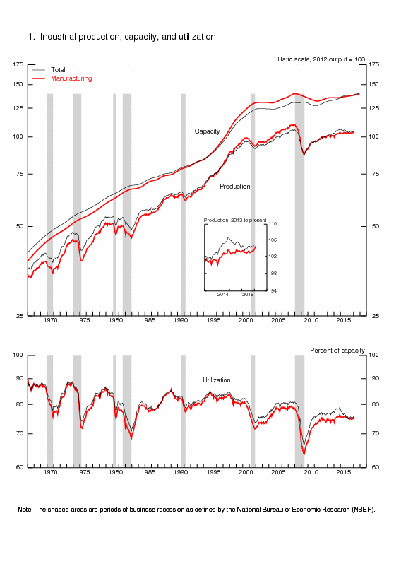
Table 29¸ Industrial Production and Capacity Utilization, SA %
| Feb | Mar | Apr | May | Jan-May 2011/ 2010 | |
| Total | -0.3 | 0.6 | 0.0 | 0.1 | 3.4 |
| Markets | |||||
| Final Products | -0.3 | 0.1 | 0.0 | 0.3 | 3.6 |
| Consu-mer Goods | -0.7 | 0.2 | 0.0 | -0.1 | 1.7 |
| Business Equip-ment | 0.8 | -0.3 | -0.3 | 1.2 | 9.2 |
| Non Industry Supplies | -0.3 | 0.9 | 0.0 | 0.2 | 1.5 |
| Cons- truction | -0.6 | 1.2 | 0.1 | 1.4 | 4.0 |
| Mat- erials | -0.4 | 1.0 | -0.1 | -0.1 | 3.9 |
| Groups | |||||
| Manu- facturing | 0.1 | 0.6 | -0.5 | 0.4 | 3.7 |
| Mining | -1.2 | 1.5 | 0.8 | 0.5 | 5.2 |
| Utilities | -2.3 | -0.4 | 2.4 | -2.8 | -0.4 |
| Capacity | 76.5 | 76.8 | 76.7 | 76.7 | 0.2 |
Sources:
http://www.federalreserve.gov/releases/g17/current/
The change from May into Jun, or current, in the Empire State Manufacturing Survey of the Federal Reserve Bank of New York in Table 30, shows deterioration in all segments. The general index fell from 11.9 in May to minus 7.8 in Jun, for the first negative reading since Nov 2010. New orders declined from 17.2 in May to minus 3.6 in Jun. Expectations in six months also fell but not by as much as the change from May into Jun, suggesting that activity may pick up again.
Table 30, FRB of New York Empire State Manufacturing Survey, Diffusion Index SA
| Jun | May | |
| Current | ||
| General Index | -7.8 | 11.9 |
| New Orders | -3.6 | 17.2 |
| Shipments | -8.0 | 25.6 |
| Unfilled Orders | 0.0 | 9.7 |
| Number Employees | 10.2 | 24.7 |
| Average Employee Workweek | -2.0 | 23.4 |
| Expectation Six Months | ||
| General Index | 47.4 | 52.7 |
| New Orders | 43.6 | 47.3 |
| Shipments | 37.2 | 41.9 |
| Unfilled Orders | 7.7 | 19.3 |
| Number Employees | 32.1 | 20.4 |
| Average Employee Workweek | 6.4 | 12.9 |
Source: http://www.newyorkfed.org/survey/empire/may2011.pdf
The Business Outlook Survey of the Federal Reserve Bank of Philadelphia in Table 31 provides similar weakening of activity from May into Jun. The general index fell from 3.9 to minus 7.7, which is the first negative reading since Sep 2010. New orders also fell from 5.4 to minus 7.6. Both the New York and Philadelphia Fed find substantial declines in number of employees. As with the New York survey, the Philadelphia survey finds deterioration of expectations for the next six month but some hope that the readings are not negative in the future.
Table 31,FRB of Philadelphia Business Outlook Survey Diffusion Index SA
| Jun | May | |
| Current Jun/May | ||
| General Index | -7.7 | 3.9 |
| New Orders | -7.6 | 5.4 |
| Shipments | 4.0 | 6.5 |
| Unfilled Orders | -16.3 | -7.8 |
| Number Employees | 4.1 | 22.1 |
| Average Employee Workweek | 1.9 | 3.9 |
| Expectation Six Months | ||
| General Index | 2.5 | 16.6 |
| New Orders | 7.9 | 16.8 |
| Shipments | 6.6 | 20.4 |
| Unfilled Orders | -9.6 | -1.0 |
| Number Employees | 5.5 | 22.3 |
| Average Employee Workweek | -1.6 | 9.8 |
The residential construction report of the US Bureau of the Census in Table 32 shows monthly improvement. Housing starts seasonally adjusted at an annual rate rose by 3.7 percent in May 2011 relative to Apr. Housing permits increased 8.7 in May 2011 relative to Apr.
Table 32 Housing Starts and Permits Seasonally Adjusted Annual Equivalent Rates, Thousands of Units, %
| Housing Starts | Housing Permits | |
| May 2011 | 419 | 612 |
| Apr 2011 | 404 | 563 |
| ∆% May/Apr 2011 | 3.7 | 8.7 |
Source: http://www.census.gov/const/newresconst.pdf
Housing starts, not seasonally adjusted, fell 9.1 percent in Jan-May 2011 relative to Jan-May 2010 and new permits fell 8.7 percent, as shown in Table 33. Housing starts fell 71.8 percent in Jan-May 2011 relative to the same period in 2006 and 72.4 percent relative to the same period in 2005. New permits fell 72.6 percent relative to Jan-May 2006 and 73.1 percent relative to Jan-Apr 2005.
Table 33 Housing Starts and New Permits, Thousands of Units, NSA, and %
| Housing Starts | New Permits | |
| Jan-May 2011 | 229.5 | 233.3 |
| Jan-May 2010 | 252.5 | 255.5 |
| ∆%/ Jan-May 2011 | -9.1 | -8.7 |
| Jan-May 2006 | 814.7 | 852.5 |
| ∆%/Jan-May 2011 | -71.8 | -72.6 |
| Jan-May 2005 | 830.8 | 868.3 |
| ∆%/ Jan-May 2011 | -72.4 | -73.1 |
Source: http://www.census.gov/const/newresconst.pdf
http://www.census.gov/const/newresconst_200705.pdf
http://www.census.gov/const/newresconst_200605.pdf
The contraction of motor vehicles and parts by 2.9 percent from Apr into May and by 0.7 percent from Mar into Apr in Table 34 provides further evidence of the heavy impact on motor vehicles and parts of the earthquake/tsunami in Japan. Higher prices motivated potential buyers to wait for improved conditions. Hopefully, renewed buying in a restored supply chain could propel industrial growth later in the year. The impact of declining gasoline prices is shown in the reduction of monthly sales growth from 1.4 percent in Apr to 0.3 percent in May. A good sign is shown in growth of building material by 0.5 percent in Apr and 1.2 percent in May. The data are adjusted for seasonality but not for prices.
Table 34 Percentage Change in Monthly Sales for Retail and Food Services SA
| May/Apr | Apr/Mar | |
| Retail and Food Services | -0.2 | 0.3 |
| Excluding Motor Vehicles and Parts | 0.3 | 0.5 |
| Motor Vehicles & Parts | -2.9 | -0.7 |
| Retail | -0.3 | 0.4 |
| Building Materials | 1.2 | 0.5 |
| Food and Beverage | -0.5 | 1.2 |
| Grocery | -0.4 | 1.2 |
| Health & Personal Care Stores | 0.8 | -1.0 |
| Clothing | 0.2 | 0.1 |
| Gasoline Stations | 0.3 | 1.4 |
Source: http://www.census.gov/retail/marts/www/marts_current.pdf
Treasury’s international capital report in Table 35 shows significant improvement with net foreign purchases of long-term securities increasing from $24 billion in Mar 2011 to 30.6 billion in Apr. Net foreign purchases of US long-term securities fell from 54.7 billion in Mar to $44.8 billion in Apr 2 with the private portion falling from $44.9 billion in Mar to $18.6 billion in Apr. Official purchases, including foreign central banks, rose from $9.9 billion to $26.2 billion, consisting mostly of an increase in Treasury purchases from $6.8 billion in Mar to $24.4 billion in Apr. The combination of current account deficits and government deficits will require much stronger foreign financing. The main doubt is whether expectations of continuing devaluation of the dollar and increases in government debt will reach a point of satiation of US securities at which a discount premium on US government debt may force abrupt adjustment. The fiscal theory of the price level also argues that inflation would rise. High economic growth over more than a century and relatively sound fiscal management has allowed the US to avoid distrust of its debt obligations. There is no past experience of debt disruption but current circumstances are worrisome.
Table 35 Net Cross-Borders Flows of US Long-Term Securities, Billion Dollars, NSA
| Apr 2011 | Mar 2011 | |
| Net Foreign Purchases of US LT Securities | 44.8 | 54.7 |
| Private | 18.6 | 44.9 |
| Treasury | -1.0 | 19.9 |
| Agency | -5.8 | 6.9 |
| Official | 26.2 | 9.9 |
| Treasury | 24.4 | 6.8 |
| Agency | 1.7 | 2.6 |
| Net US Purchases of LT Foreign Securities | -14.2 | -30.7 |
| Net Foreign Purchases of US LT Securities | 30.6 | 24.0 |
Source: http://www.treasury.gov/press-center/press-releases/Pages/tg1209.aspx
http://www.treasury.gov/resource-center/data-chart-center/tic/Pages/ticpress.aspx
The US current account deficit, consisting of the combined balance on international trade in goods and services, income and net unilateral current transfers, rose from $112 billion in IVQ2010 to $119.3 billion in IQ2011. The goods deficit explains the increase with oil imports at a higher price being a main driver. Table 36 shows the US balance of payments in IQ2011 and IQ2010. The current account balance actually declined from a deficit of $97.3 billion in IQ2010 to $95.1 billion in IQ2011. The US generates a surplus in the services balance selling high-price services abroad and importing lower-priced services, which has generated a debate on outsourcing services overseas (see Pelaez and Pelaez, Globalization and the State, Vol. I (2009a), 192-8). The US current account deficit began to deteriorate rapidly after 1998 when it reached 2.5 percent of GDP (see Pelaez and Pelaez, The Global Recession Risk (2007), Pelaez and Pelaez, Globalization and the States, Vol. II (2009b), 182-94). The deficit in the current account of the US is financed with borrowings from abroad (see Pelaez and Pelaez, Globalization and the State, Vol. II (2009b), 90-2).
Table 36 US Balance of Payments, Millions of Dollars NSA
| 1Q2010 | 1Q2011 | Difference | |
| Goods Balance | -133,818 | -159,707 | -25,889 |
| X Goods | 299,461 | 355,432 | 18.7 ∆% |
| M Goods | -433,279 | -515,139 | 19.2 ∆% |
| Services Balance | 35,265 | 43,159 | 7,894 |
| X Services | 129,255 | 142,010 | 9.9 ∆% |
| M Services | -93,990 | -98,851 | 5.2 ∆% |
| Balance Goods and Services | -98,553 | -116,548 | -17,955 |
| Balance Income | 37,468 | 55,155 | 17,687 |
| Unilateral Transfers | -36,235 | -33,716 | |
| Current Account Balance | -97,320 | -95,109 |
X: exports; M: imports
Balance on Current Account = Balance on Goods and Services + Balance on Income + Unilateral Transfers
Source: http://www.bea.gov/international/index.htm#bop
The Flow of Funds Accounts of the United States provided by the Federal Reserve (http://www.federalreserve.gov/releases/z1/Current/z1.pdf) is rich in valuable information. Table 37 shows the balance sheet of US households combined with nonprofit organizations in 2007, IV2010 and IQ2011. The data show the strong shock to US wealth during the contraction. Assets fells from $78.5 trillion in 2007 to $71.9 trillion in IQ2011 even after six consecutive quarters of growth, that is, by about $7 trillion or 8.4 percent. Liabilities declined by about $0.5 trillion. Net worth shrank from $64.2 trillion in 2007 to $58.1 trillion in IQ2011, that is, $6.1 trillion equivalent to decline of 9.5 percent. There was a brutal decline of $5.2 trillion in real estate assets or by 17.5 percent. The National Association of Realtors estimated that the gains in net worth in homes by Americans were about $4 trillion between 2000 and 2005 (quoted in Pelaez and Pelaez, The Global Recession Risk (2007), 224-5).
Table 37 Balance Sheet of Households and Nonprofit Organizations, Billions of Dollars Outstanding End of Period, NSA
| 2007 | IV2010 | IQ2011 | |
| Assets | 78,538.9 | 71,062.7 | 71,932.4 |
| Nonfinancial | 27,972.4 | 23,379.8 | 23,085.3 |
| Real Estate | 23,297.4 | 18,465.8 | 18,117.0 |
| Durable Goods | 4,434.6 | 4,618.1 | 4,664.9 |
| Financial | 50,566.5 | 47,682.9 | 48,847.1 |
| Deposits | 7,406.1 | 7,933.9 | 8,038.1 |
| Credit Market | 4,072.8 | 4,254.7 | 4,128.8 |
| Mutual Fund | 4,596.8 | 4,717.2 | 5,050.4 |
| Equities Corporate | 9,627.0 | 8,239,9 | 8,791,9 |
| Equity Noncorporate | 8,692.9 | 6,642.2 | 6,595.3 |
| Pension | 13,390.7 | 13,092.4 | 13,419.2 |
| Liabilities | 14,369.6 | 13,948.4 | 13,874.7 |
| Home Mortgages | 10,540.2 | 10,055.4 | 9,987.9 |
| Consumer C | 2,555.3 | 2,434.7 | 2,404.0 |
| Net Worth | 64,169.3 | 57,114.3 | 58,057.7 |
Net Worth = Assets - Liabilities
Source: http://www.federalreserve.gov/releases/z1/Current/z1.pdf
Let V(T) represent the value of the firm’s equity at time T and B stand for the promised debt of the firm to bondholders and assume that corporate management, elected by equity owners, is acting on the interests of equity owners. Robert C. Merton (1974, 453) states:
“On the maturity date T, the firm must either pay the promised payment of B to the debtholders or else the current equity will be valueless. Clearly, if at time T, V(T) > B, the firm should pay the bondholders because the value of equity will be V(T) – B > 0 whereas if they do not, the value of equity would be zero. If V(T) ≤ B, then the firm will not make the payment and default the firm to the bondholders because otherwise the equity holders would have to pay in additional money and the (formal) value of equity prior to such payments would be (V(T)- B) < 0.”
Pelaez and Pelaez (The Global Recession Risk (2007), 208-9) apply this analysis to the US housing market in 2005-2006 concluding:
“The house market [in 2006] is probably operating with low historical levels of individual equity. There is an application of structural models [Duffie and Singleton 2003] to the individual decisions on whether or not to continue paying a mortgage. The costs of sale would include realtor and legal fees. There could be a point where the expected net sale value of the real estate may be just lower than the value of the mortgage. At that point, there would be an incentive to default. The default vulnerability of securitization is unknown.”
Table 38 summarizes the brutal drops in assets and net worth of US households and nonprofit organizations from 2007 to IQ2011. Real estate fell in value by $5.2 trillion and financial assets by $1.7 trillion, explaining most of the drop in net worth of $6.1 trillion.
Table 38 Difference in Millions of Dollars from 2007 to IQ2011
| Assets | -6,606.5 |
| Nonfinancial | -4,887.1 |
| Real Estate | -5,180.4 |
| Financial | -1,719.4 |
| Liabilities | 494.9 |
| Net Worth | -6,111.6 |
Source: http://www.federalreserve.gov/releases/z1/Current/z1.pdf
The report on the Flow of Funds Accounts of the United States also provides the value and change in debt of the nonfinancial sector, shown in Table 39. Households increased debt by 10 percent in 2006 but have been reducing their debt continuously. Business had not been as exuberant in acquiring debt and has been moderately increasing debt. States and local government were forced into increasing debt by the decline in revenues but began to contract in IQ2011. Opposite behavior is found for the federal government that has been rapidly accumulating debt.
Table 39, Percentage Change of Nonfinancial Domestic Sector Debt
| 2006 | 2010 | IVQ2010 SA | IQ2011 SA | |
| Total | 9.0 | 4.2 | 4.6 | 2.3 |
| House- holds | 10.0 | -1.9 | -0.6 | -2.0 |
| Business | 10.6 | 0.3 | 1.9 | 4.0 |
| States/ Local Gov | 8.3 | 4.4 | 7.9 | -2.9 |
| Federal | 3.9 | 20.2 | 14.6 | 7.8 |
Source: http://www.federalreserve.gov/releases/z1/Current/z1.pdf
The Treasury budget in the fiscal year to Apr in Table 40 shows mildly improving diverging trends: receipts increased by 10.3 percent in the fiscal year to Apr in 2011 relative to the same period in 2010 while outlays grew less rapidly at 5.7 percent. As a result the deficit is lower by 0.9 percent in the fiscal year to Apr relative to the same period in 2010. Individual income taxes increased by 28.5 percent in the same period.
Table 40, Treasury Budget in Fiscal Year to Apr Millions Dollars
| 2011 | 2010 | ∆% | |
| Receipts | 1,484,350 | 1,345,947 | 10.3 |
| Outlays | 2,411,794 | 2,281,553 | 5.7 |
| Deficit | -927,444 | -935,606 | -0.9 |
| Individual Income Taxes | 701,825 | 546,369 | 28.5 |
Source: http://www.fms.treas.gov/mts/mts0511.pdf
A summary of the Weekly Petroleum Status Report of the Energy Information Administration of the US is provided in Table 41. Crude oil imports stabilized at around 8.9 million barrels per day on average in the week ending on Jun 6 and crude oil stocks were lower by 3.4 million barrels to reach 365.6 million barrels. The price of regular motor gasoline rose from $2.701/gallon on Jun 14, 2010 to $3.713/gallon on Jun 10, 2011, for an increase of 37.5 percent.
Table 41, Energy Information Administration Weekly Petroleum Status Report
| Week Ending 06/10/11 | Week Ending 06/03/11 | Week Ending 06/11/10 | |
| Crude Oil Stocks Million B | 365.6 | 369.0 | 363.1 |
| Crude Oil Imports Thousand Barrels/Day | 8,963 | 8,946 | 9,620 |
| Motor Gasoline Million B | 215.1 | 214.5 | 218.3 |
| Distillate Fuel Oil Million B | 140.8 | 140.9 | 156.6 |
| World Crude Oil Price $/B | - | 111.44 | 70.68 |
| 06/13/11 | 06/06/11 | 06/14/10 | |
| Regular Motor Gasoline $/G | 3.713 | 3.781 | 2.701 |
B: barrels; G: gallon
Initial claims for unemployment insurance in Table 42 fell seasonally adjusted by 16,000 from 430,000 in the week of Jun 4 to 414,000 in the week of Jun 11. The strong seasonal factor results in an increase of not seasonally adjusted claims by 28,094 from 366,816 in the week of Jun 4 to 394,910 in the week of Jun 11. These are the actual numbers before adjustments such that actual dismissals or “redundancies” are close to 400,000. The labor market has not significantly recovered from the recession.
Table 42, Initial Claims for Unemployment Insurance
| SA | NSA | 4-week MA SA | |
| Jun 11 | 414,000 | 394,910 | 424,750 |
| Jun 4 | 430,000 | 366,816 | 424,750 |
| Change | -16,000 | 28,094 | 0 |
| May 28 | 426,000 | 381,497 | 426,750 |
| Prior Year | 474,000 | 448,305 | 467,250 |
Note: SA: seasonally adjusted; NSA: not seasonally adjusted; MA: moving average
Source: http://www.dol.gov/opa/media/press/eta/ui/current.htm
V Interest Rates. The US yield curve is showing negative interest rates for all maturities. Percentage yields are an aberration of monetary policy: 0.03 three months, 0.09 six months, 0.16 twelve months, 0.37 two years, 1.53 five years, 2.23 seven years, 2.94 ten years and 4.20 thirty years. This is not unlike past episodes of financial repression and restraint (Pelaez and Pelaez, Globalization and the State, Vol. II (2009b), 81-6). The main compass of interest rates for allocation of resources on the basis of sound risk/return decisions of capital budgeting has been distorted by monetary impulses for nearly a decade. Monetary policy shocks required or perceived as required in the presence of inflation and output surprises that are impossible to anticipate, in doses that cannot be precisely calibrated and with long lags in effect have increased instability in the international financial system.
VI Conclusion. Financial turbulence is driven by major vulnerabilities including the sovereign risk doubts in Europe, slowing growth that may hopefully be temporary, challenges of fiscal consolidation in advanced economies, stagflation, fractured job markets in the US and the difficult trade-off of growth and inflation in China. (Go to http://cmpassocregulationblog.blogspot.com/ http://sites.google.com/site/economicregulation/carlos-m-pelaez)
http://www.amazon.com/Carlos-Manuel-Pel%C3%A1ez/e/B001HCUT10 )
References
Batini, Nicoletta and Edward Nelson. 2002. The lag from monetary policy actions to inflation: Friedman revisited. London, Bank of England, External MPC Unit Discussion Paper No. 6, Jan.
Bernanke, Ben S. 2010WP. What the Fed did and why: supporting the recovery and sustaining price stability. Washington Post, Nov 4. http://www.washingtonpost.com/wp-dyn/content/article/2010/11/03/AR2010110307372_pf.html
Cameron, Rondo E. 1967. Banking in the early stages of industrialization. Oxford: Oxford University Press.
Cameron, Rondo E. 1972. Banking and economic development. Oxford: Oxford University Press.
Cochrane, John H. 2010A. The government debt valuation equation. An appendix to ‘Understanding Policy.’ http://faculty.chicagobooth.edu/john.cochrane/research/Papers/
Cochrane, John H. 2011Jan. Understanding policy in the great recession: some unpleasant fiscal arithmetic. European Economic Review 55 (1, Jan): 2-30.
Contador, Cláudio R. and Haddad, Cláudio L. 1975. Produto real, moeda e preços. Revista Brasileira de Estatística. 36 (143, jul/set): 407-40.
Culbertson, J. M. 1960. Friedman on the lag in effect of monetary policy. Journal of Political Economy 68 (6, Dec): 617-21.
Culbertson, J. M. 1961. The lag in effect of monetary policy: reply. Journal of Political Economy 69 (5, Oct): 467-77.
De Long, J. Bradford. 1997. America’s peacetime inflation: the 1970s. In Christina D. Romer and David H. Romer, eds. Reducing inflation: motivation and strategy. Chicago: University of Chicago Press, 1997.
Duffie, Darrell. 2010JEP. The failure mechanics of dealer banks. Journal of Economic Perspectives 24 (1, Winter): 51-72.
Duffie, Darell and Kenneth J. Singleton. 2003. Credit risk: pricing, measurement and management. Princeton: Princeton University Press.
Eichengreen, Barry. 2011. Exorbitant privilege: the rise and fall of the dollar and the future of the international monetary system. New York and London: Oxford University Press. http://www.oup.com/us/catalog/general/subject/Economics/International/?view=usa&ci=9780199753789 http://www.amazon.com/Exorbitant-Privilege-Dollar-International-Monetary/dp/0199753784/ref=sr_1_1?s=books&ie=UTF8&qid=1306068072&sr=1-1
Friedman, Milton. 1953. The Effects of a Full-Employment Policy on Economic Stability: A Formal Analysis. In Milton Friedman, Essays in positive economics. Chicago: University of Chicago Press.
Friedman, Milton. 1961. The lag in effect of monetary policy. Journal of Political Economy 69 (5, Oct): 447-66.
Friedman, Milton and Anna Jacobson Schwartz. 1963. A monetary history of the United States, 1867-1960. Princeton: Princeton University Press.
Friedman, Milton and Anna Jacobson Schwartz. 1970. Monetary statistics of the United States: estimates, sources, and methods. New York: Columbia University Press.
Gourinchas, Pierre-Olivier and Hélène Rey. 2005. From world bankers to world venture capitalists: US external adjustment and the exorbitant privilege. Cambridge, MA, NBER, Aug.
Haddad, Cláudio L. 1974. Growth of Brazilian real output. Chicago, Ph.D. Dissertation, University of Chicago, Jun.
IMF. 2011FMJun17. Fiscal monitor update: staying the course on fiscal adjustment. Washington, DC, IMF http://www.imf.org/external/pubs/ft/fm/2011/02/update/fmindex.htm
IMF. 2011GFSR2011Jun17. Global financial stability report: GFSR market update. Washington, DC, IMF http://www.imf.org/external/pubs/ft/fmu/eng/2011/02/index.htm
IMF. 2011WEOJun17. World economic outlook update: mild slowdown of the global expansion and increasing risks. Washington, DC, IMF Jun 17 http://www.imf.org/external/pubs/ft/weo/2011/update/02/index.htm
Meltzer, Allan H. 2005. Origins of the Great Inflation. Federal Reserve Bank of St. Louis Review 87 (2, Part 2, Mar/Apr): 145-72.
Meltzer, Allan H. 2010a. A history of the Federal Reserve, Volume 2, Book 1, 1951-1969. Chicago: University of Chicago Press.
Meltzer, Allan H. 2010b. A history of the Federal Reserve, Volume 2, Book 2, 1970-1986. Chicago: University of Chicago Press.
Merton, Robert C. 1974. On the pricing of corporate debt: the risk structure of interest rates. Journal of Finance 29 (2, May): 449-70.
Neumann, Manfred J. M. 1992. Seigniorage in the United States: how much does the U.S. government make from money production? Federal Reserve Bank of St. Louis Review Mar: 29-40.
Pelaez, Carlos M. and Carlos A. Pelaez. 2005. International Financial Architecture. Basingstoke: Palgrave Macmillan. http://us.macmillan.com/QuickSearchResults.aspx?search=pelaez%2C+carlos&ctl00%24ctl00%24cphContent%24ucAdvSearch%24imgGo.x=26&ctl00%24ctl00%24cphContent%24ucAdvSearch%24imgGo.y=14 http://www.amazon.com/Carlos-Manuel-Pel%C3%A1ez/e/B001HCUT10
Pelaez, Carlos M. and Carlos A. Pelaez. 2007. The Global Recession Risk. Basingstoke: Palgrave Macmillan. http://www.amazon.com/Carlos-Manuel-Pel%C3%A1ez/e/B001HCUT10
Pelaez, Carlos M. and Carlos A. Pelaez. 2008a. Globalization and the State: Vol. I. Basingstoke: Palgrave Macmillan. http://www.amazon.com/Carlos-Manuel-Pel%C3%A1ez/e/B001HCUT10
Pelaez, Carlos M. and Carlos A. Pelaez. 2008b. Globalization and the State: Vol. II. Basingstoke: Palgrave Macmillan.
Pelaez, Carlos M. and Carlos A. Pelaez. 2008c. Government Intervention in Globalization. Basingstoke: Palgrave Macmillan. http://www.amazon.com/Carlos-Manuel-Pel%C3%A1ez/e/B001HCUT10
Pelaez, Carlos M. and Carlos A. Pelaez. 2009a. Financial Regulation after the Global Recession. Basingstoke: Palgrave Macmillan. http://www.amazon.com/Carlos-Manuel-Pel%C3%A1ez/e/B001HCUT10
Pelaez, Carlos M. and Carlos A. Pelaez. 2009b. Regulation of Banks and Finance. Basingstoke: Palgrave Macmillan.http://www.amazon.com/Carlos-Manuel-Pel%C3%A1ez/e/B001HCUT10
Pelaez, Carlos Manuel. 1974. Long-run Monetary Behavior and Institutions in an Underdeveloped Economy, 1800-1971. Copenhaguen, Paper Presented at the VI International Congress on Economic History, Session on Monetary Inflation in Historical Perspective, International Economic History Association, Aug 22.
Pelaez, Carlos Manuel. 1975. The Establishment of Banking Institutions in a Backward Economy: Brazil, 1800-1851. Business History Review 49 (4, Winter): 446-472.
Pelaez, Carlos Manuel. 1976a. The Theory and Reality of Imperialism in the Coffee Economy of Nineteenth-Century Brazil. Economic History Review 29, Second Series (May): 276-294.
Pelaez, Carlos Manuel. 1976b. A Comparison of Long-term Monetary Behavior and Institutions in Brazil, Europe and the United States. Journal of European Economic History 5 (2, Fall): 439-450.
Pelaez, Carlos Manuel. 1977. World War I and the Economy of Brazil: Some Evidence from Monetary Statistics. Journal of Interdisciplinary History (7, Apr): 683-680.
Pelaez, Carlos Manuel. 1979. História Econômica do Brasil. São Paulo: Editora Atlas.
Pelaez, Carlos Manuel. 1986. O Cruzado e o Austral. São Paulo: Editora Atlas.
Pelaez, Carlos Manuel and Wilson Suzigan. 1978. Economia Monetária. São Paulo, Atlas.
Pelaez, Carlos Manuel and Wilson Suzigan. 1981. História Monetária do Brasil Segunda Edição. Coleção Temas Brasileiros. Brasília: Universidade de Brasília.
Robinson, Joan. 1947. Beggar-my-neighbour remedies for unemployment. In Joan Robinson, Essays in the Theory of Employment, Oxford, Basil Blackwell, 1947.
Romer, Christina D. and David H. Romer. 2004. A new measure of monetary shocks: derivation and implications. American Economic Review 94 (4, Sep): 1055-84.
Sargent, Thomas J. 1983. The ends of four big inflations. In Robert E. Hall, ed. Inflation: causes and effects. Chicago: Chicago University Press.
Sargent, Thomas J. and Neil Wallace. 1973. The stability of models of money and growth with perfect foresight. Econometrica 41 (6, Nov): 1043-8.
Sargent, Thomas J. and Neil Wallace. 1981. Some unpleasant monetarist arithmetic. Federal Reserve Bank of Minneapolis Quarterly Review 5 (3, Fall): 1-17.
Sims, Christopher A. 1972. Money, income and causality. American Economic Review 62 (4, Sep): 540-52.
Taylor, John B. 1997. Comment. In Chrstina Romer and David Romer, eds. Reducing inflation: motivation and strategy. Chicago: University of Chicago Press.
Villela, Annibal V. and Wilson Suzigan. 1973. Politica do governo e crescimento da economia brasileira. Rio de Janeiro: IPEA/INPES.
Williams, David, C. A. E. Goodhart and D. H. Gowland. 1976. Money, income and causality: the UK experience. American Economic Review 66 (3, Jun): 417-23.
Yellen, Janet L. 2011AS. The Federal’s Reserve’s asset purchase program. Denver, Colorado, Allied Social Science Association Annual Meeting, Jan 8 http://federalreserve.gov/newsevents/speech/yellen20110108a.pdf
© Carlos M. Pelaez, 2010, 2011
No comments:
Post a Comment