
Recovery without Hiring, United States Industrial Production, Contraction of GDP in Europe and Japan, World Devaluation Wars, Collapse of United States Dynamism of Income Growth and Employment Creation, World Economic Slowdown and Global Recession Risk
Carlos M. Pelaez
© Carlos M. Pelaez, 2010, 2011, 2012, 2013
Executive Summary
I Recovery without Hiring
IA1 Hiring Collapse
IA2 Labor Underutilization
IA3 Ten Million Fewer Full-time Job
IA4 Youth and Middle-Aged Unemployment
IB Collapse of United States Dynamism of Income Growth and Employment Creation
II United States Industrial Production
III World Financial Turbulence
IIIA Financial Risks
IIIE Appendix Euro Zone Survival Risk
IIIF Appendix on Sovereign Bond Valuation
IV Global Inflation
V World Economic Slowdown
VA United States
VB Japan
VC China
VD Euro Area
VE Germany
VF France
VG Italy
VH United Kingdom
VI Valuation of Risk Financial Assets
VII Economic Indicators
VIII Interest Rates
IX Conclusion
References
Appendixes
Appendix I The Great Inflation
IIIB Appendix on Safe Haven Currencies
IIIC Appendix on Fiscal Compact
IIID Appendix on European Central Bank Large Scale Lender of Last Resort
IIIG Appendix on Deficit Financing of Growth and the Debt Crisis
IIIGA Monetary Policy with Deficit Financing of Economic Growth
IIIGB Adjustment during the Debt Crisis of the 1980s
Executive Summary
ESI Recovery without Hiring. Professor Edward P. Lazear (2012Jan19) at Stanford University finds that recovery of hiring in the US to peaks attained in 2007 requires an increase of hiring by 30 percent while hiring levels have increased by only 4 percent since Jan 2009. The high level of unemployment with low level of hiring reduces the statistical probability that the unemployed will find a job. According to Lazear (2012Jan19), the probability of finding a new job currently is about one third of the probability of finding a job in 2007. Improvements in labor markets have not increased the probability of finding a new job. Lazear (2012Jan19) quotes an essay coauthored with James R. Spletzer in the American Economic Review (Lazear and Spletzer 2012Mar, 2012May) on the concept of churn. A dynamic labor market occurs when a similar amount of workers is hired as those who are separated. This replacement of separated workers is called churn, which explains about two-thirds of total hiring. Typically, wage increases received in a new job are higher by 8 percent. Lazear (2012Jan19) argues that churn has declined 35 percent from the level before the recession in IVQ2007. Because of the collapse of churn there are no opportunities in escaping falling real wages by moving to another job. As this blog argues, there are meager chances of escaping unemployment because of the collapse of hiring and those employed cannot escape falling real wages by moving to another job (http://cmpassocregulationblog.blogspot.com/2013/02/thirty-one-million-unemployed-or.html). Lazear and Spletzer (2012Mar, 1) argue that reductions of churn reduce the operational effectiveness of labor markets. Churn is part of the allocation of resources or in this case labor to occupations of higher marginal returns. The decline in churn can harm static and dynamic economic efficiency. Losses from decline of churn during recessions can affect an economy over the long-term by preventing optimal growth trajectories because resources are not used in the occupations where they provide highest marginal returns. Lazear and Spletzer (2012Mar 7-8) conclude that: “under a number of assumptions, we estimate that the loss in output during the recession [of 2007 to 2009] and its aftermath resulting from reduced churn equaled $208 billion. On an annual basis, this amounts to about .4% of GDP for a period of 3½ years.”
There are two additional facts discussed below: (1) there are about ten million fewer full-time jobs currently than before the recession of 2008 and 2009; and (2) the extremely high and rigid rate of youth unemployment is denying an early start to young people ages 16 to 24 years while unemployment of ages 45 years or over has swelled.
An important characteristic of the current fractured labor market of the US is the closing of the avenue for exiting unemployment and underemployment normally available through dynamic hiring. Another avenue that is closed is the opportunity for advancement in moving to new jobs that pay better salaries and benefits again because of the collapse of hiring in the United States. Those who are unemployed or underemployed cannot find a new job even accepting lower wages and no benefits. The employed cannot escape declining inflation-adjusted earnings because there is no hiring. The objective of this section is to analyze hiring and labor underutilization in the United States.
An appropriate measure of job stress is considered by Blanchard and Katz (1997, 53):
“The right measure of the state of the labor market is the exit rate from unemployment, defined as the number of hires divided by the number unemployed, rather than the unemployment rate itself. What matters to the unemployed is not how many of them there are, but how many of them there are in relation to the number of hires by firms.”
The natural rate of unemployment and the similar NAIRU are quite difficult to estimate in practice (Ibid; see Ball and Mankiw 2002).
The Bureau of Labor Statistics (BLS) created the Job Openings and Labor Turnover Survey (JOLTS) with the purpose that (http://www.bls.gov/jlt/jltover.htm#purpose):
“These data serve as demand-side indicators of labor shortages at the national level. Prior to JOLTS, there was no economic indicator of the unmet demand for labor with which to assess the presence or extent of labor shortages in the United States. The availability of unfilled jobs—the jobs opening rate—is an important measure of tightness of job markets, parallel to existing measures of unemployment.”
The BLS collects data from about 16,000 US business establishments in nonagricultural industries through the 50 states and DC. The data are released monthly and constitute an important complement to other data provided by the BLS (see also Lazear and Spletzer 2012Mar, 6-7).
Hiring in the nonfarm sector (HNF) has declined from 63.8 million in 2006 to 50.1 million in 2011 or by 13.7 million while hiring in the private sector (HP) has declined from 59.5 million in 2006 to 46.9 million in 2011 or by 12.6 million, as shown in Table ESI-1. The ratio of nonfarm hiring to employment (RNF) has fallen from 47.2 in 2005 to 38.1 in 2011 and in the private sector (RHP) from 52.1 in 2006 to 42.9 in 2011. The collapse of hiring in the US has not been followed by dynamic labor markets because of the low rate of economic growth of 2.1 percent in the first thirteen quarters of expansion from IIIQ2009 to IVQ2012 compared with 6.2 percent in prior cyclical expansions (see table I-5 in http://cmpassocregulationblog.blogspot.com/2013/02/thirty-one-million-unemployed-or.html).
Table ESI-1, US, Annual Total Nonfarm Hiring (HNF) and Total Private Hiring (HP) in the US and Percentage of Total Employment
| HNF | Rate RNF | HP | Rate HP | |
| 2001 | 62,948 | 47.8 | 58,825 | 53.1 |
| 2002 | 58,583 | 44.9 | 54,759 | 50.3 |
| 2003 | 56,451 | 43.4 | 53,056 | 48.9 |
| 2004 | 60,367 | 45.9 | 56,617 | 51.6 |
| 2005 | 63,150 | 47.2 | 59,372 | 53.1 |
| 2006 | 63,773 | 46.9 | 59,494 | 52.1 |
| 2007 | 62,421 | 45.4 | 58,035 | 50.3 |
| 2008 | 55,166 | 40.3 | 51,606 | 45.2 |
| 2009 | 46,398 | 35.5 | 43,052 | 39.8 |
| 2010 | 48,647 | 37.5 | 44,826 | 41.7 |
| 2011 | 50,083 | 38.1 | 46,869 | 42.9 |
Source: Bureau of Labor Statistics
Chart ESI-1 shows the annual level of total nonfarm hiring (HNF) that collapsed during the global recession after 2007 in contrast with milder decline in the shallow recession of 2001. Nonfarm hiring has not been recovered, remaining at a depressed level

Chart ESI-1, US, Level Total Nonfarm Hiring (HNF), Annual, 2001-2011
Source: US Bureau of Labor Statistics
Chart ESI-2 shows the ratio or rate of nonfarm hiring to employment (RNF) that also fell much more in the recession of 2007 to 2009 than in the shallow recession of 2001. Recovery is weak.

Chart ESI-2, US, Rate Total Nonfarm Hiring (HNF), Annual, 2001-2011
Source: US Bureau of Labor Statistics
Yearly percentage changes of total nonfarm hiring (HNF) are provided in Table ESI-2. There were much milder declines in 2002 of 6.9 percent and 3.6 percent in 2003 followed by strong rebounds of 6.9 percent in 2004 and 4.6 percent in 2005. In contrast, the contractions of nonfarm hiring in the recession after 2007 were much sharper in percentage points: 2.1 in 2007, 11.6 in 2008 and 15.9 percent in 2009. On a yearly basis, nonfarm hiring grew 4.8 percent in 2010 relative to 2009 and 3.0 percent in 2011.
Table ESI-2, US, Annual Total Nonfarm Hiring (HNF), Annual Percentage Change, 2001-2011
| Year | Annual |
| 2002 | -6.9 |
| 2003 | -3.6 |
| 2004 | 6.9 |
| 2005 | 4.6 |
| 2006 | 1.0 |
| 2007 | -2.1 |
| 2008 | -11.6 |
| 2009 | -15.9 |
| 2010 | 4.8 |
| 2011 | 3.0 |
Source: Bureau of Labor Statistics
Chart ESI-3 plots yearly percentage changes of nonfarm hiring. Percentage declines after 2007 were quite sharp.

Chart ESI-3, US, Annual Total Nonfarm Hiring (HNF), Annual Percentage Change, 2001-2011
Source: Bureau of Labor Statistics
Total private hiring (HP) yearly data are provided in Chart ESI-4. There has been sharp contraction of total private hiring in the US and only milder recovery in 2011 than in 2010.

Chart ESI-4, US, Total Private Hiring Level, Annual, 2001-2011
Source: Bureau of Labor Statistics
Chart ESI-5 plots the rate of total private hiring relative to employment (RHP). The rate collapsed during the global recession after 2007 with insufficient recovery.

Chart ESI-5, US, Rate Total Private Hiring, Annual, 2001-2011
Source: Bureau of Labor Statistics
Total nonfarm hiring (HNF), total private hiring (HP) and their respective rates are provided for the month of Dec in the years from 2001 to 2012 in Table ESI-3. Hiring numbers are in thousands. There is some recovery in HNF from 2775 thousand (or 2.8 million) in Dec 2009 to 3038 thousand in Dec 2011 and 3017 thousand in Dec 2012 for cumulative gain of 8.7 percent. HP rose from 2630 thousand in Dec 2009 to 2856 thousand in Dec 2011 and 2845 thousand in Dec 2012 for cumulative gain of 8.2 percent. HNF has fallen from 3835 in Dec 2006 to 3017 in Dec 2012 or by 21.3 percent. HP has fallen from 3635 in Dec 2006 to 2845 in Dec 2012 or by 21.7 percent. The labor market continues to be fractured, failing to provide an opportunity to exit from unemployment/underemployment or to find an opportunity for advancement away from declining inflation-adjusted earnings.
Table ESI-3, US, Total Nonfarm Hiring (HNF) and Total Private Hiring (HP) in the US in Thousands and in Percentage of Total Employment Not Seasonally Adjusted
| HNF | Rate RNF | HP | Rate HP | |
| 2001 Dec | 3541 | 2.7 | 3317 | 3.0 |
| 2002 Dec | 3698 | 2.8 | 3493 | 3.2 |
| 2003 Dec | 3697 | 2.8 | 3490 | 3.2 |
| 2004 Dec | 3859 | 2.9 | 3643 | 3.3 |
| 2005 Dec | 3777 | 2.8 | 3568 | 3.1 |
| 2006 Dec | 3835 | 2.8 | 3635 | 3.2 |
| 2007 Dec | 3610 | 2.6 | 3393 | 2.9 |
| 2008 Dec | 3021 | 2.2 | 2860 | 2.5 |
| 2009 Dec | 2775 | 2.1 | 2630 | 2.5 |
| 2010 Dec | 2968 | 2.3 | 2803 | 2.6 |
| 2011 Dec | 3038 | 2.3 | 2856 | 2.6 |
| 2012 Dec | 3017 | 2.2 | 2845 | 2.5 |
Source: Bureau of Labor Statistics http://www.bls.gov/jlt/
Chart ESI-6 provides total nonfarm hiring on a monthly basis from 2001 to 2012. Nonfarm hiring rebounded in early 2010 but then fell and stabilized at a lower level than the early peak not-seasonally adjusted (NSA) of 4786 in May 2010 until it surpassed it with 4869 in Jun 2011 but declined to 3017 in Dec 2012. Nonfarm hiring fell again in Dec 2011 to 3038 from 3844 in Nov and to revised 3633 in Feb 2012, increasing to 4127 in Mar 2012, 4490 in Apr 2012, 4926 in May 2012, 4988 in Jun 2012, 4732 in Jul 2012, 4962 in Aug 2012, 4380 in Sep 2012, 4589 in Oct 2012, 3986 in Nov 2012 and 3017 in Dec 2012. Chart ESI-6 provides seasonally-adjusted (SA) monthly data. The number of seasonally-adjusted hires in Aug 2011 was 4221 thousand, increasing to revised 4444 thousand in Feb 2012, or 5.3 percent, but falling to revised 4335 thousand in Mar 2012 and 4213 in Apr 2012, or cumulative decline of 0.2 percent relative to Aug 2011, moving to 4194 in Dec 2012 for cumulative increase of 0.1 percent from 4188 in Dec 2011 and decrease of 4.7 percent relative to 4403 in Nov 2012. The number of hires not seasonally adjusted was 4655 in Aug 2011, falling to 3038 in Dec 2011 but increasing to 4072 in Jan 2012 and declining to 3017 in Dec 2012. The number of nonfarm hiring not seasonally adjusted fell by 37.6 percent from 4869 in Aug 2011 to 3038 in Dec 2011 and fell 39.5 from 4988 in Jun 2012 to 3017 in Dec 2012 in a yearly-repeated seasonal pattern.

Chart ESI-6, US, Total Nonfarm Hiring (HNF), 2001-2012 Month SA
Source: Bureau of Labor Statistics
Similar behavior occurs in the rate of nonfarm hiring in Chart ESI-7. Recovery in early 2010 was followed by decline and stabilization at a lower level but with stability in monthly SA estimates of 3.2 in Sep 2011 to 3.2 in Jan 2012, increasing to 3.4 in May 2012 and falling to 3.2 in both Jun and Jul 2012, increasing to 3.3 in Aug 2012 but falling to 3.1 in Sep 2012 and then 3.2 in Oct, 3.3 in Nov and 3.1 in Dec 2012. The rate not seasonally adjusted fell from 3.7 in Jun 2011 to 2.3 in Dec, climbing to 3.1 in Jan 2012, 3.7 in both May and Jun 2012 and falling to 3,6 in Jul, increasing to 3.7 in Aug and falling to 3.3 in Sep 2012, 3.4 in Oct 2012, 3.0 in Nov 2012 and 2.2 in Dec 2012. Rates of nonfarm hiring NSA were in the range of 2.8 (Dec) to 4.5 (Jun) in 2006.

Chart ESI-7, US, Rate Total Nonfarm Hiring, Month SA 2001-2012
Source: Bureau of Labor Statistics
There is only milder improvement in total private hiring shown in Chart ESI-8. Hiring private (HP) rose in 2010 with stability and renewed increase in 2011 followed by almost stationary series in 2012. The number of private hiring seasonally adjusted fell from 4002 thousand in Sep 2011 to 3889 in Dec 2011 or by 2.8 percent, increasing to 3945 in Jan 2012 or decline by 1.4 relative to the level in Sep 2011 but decreasing to 3922 in Sep 2012 or lower by 2.0 percent relative to Sep 2011 and decreasing to 3915 in Dec 2012 for decrease of 0.8 percent relative to 3945 in Jan 2012. The number of private hiring not seasonally adjusted fell from 4513 in Jun 2011 to 2856 in Dec or by 3.7 percent, reaching 3782 in Jan 2012 or decline of 16.2 percent relative to Jun 2011 and moving to 2845 in Dec 2012 or 36.9 percent lower relative to Jun 2011. Companies do not hire in the latter part of the year that explains the high seasonality in year-end employment data. For example, NSA private hiring fell from 5661 in Jun 2006 to 3635 in Dec 2006 or by 35.8 percent. Private hiring NSA data are useful in showing the huge declines from the period before the global recession. In Jul 2006 private hiring NSA was 5555, declining to 4293 in Jul 2011 or by 22.7 percent and to 4403 in Jul 2012 or lower by 20.7 percent relative to Jul 2006. Private hiring NSA fell from 5215 in Sep 2005 to 3999 in Sep 2012 or 23.3 percent and fell from 3635 in Dec 2006 to 2845 in Dec 2012 or 21.7 percent. The conclusion is that private hiring in the US is around 20 percent below the hiring before the global recession. The main problem in recovery of the US labor market has been the low rate of growth of 2.1 percent in the thirteen quarters of expansion of the economy from IIIQ2009 to IVQ2012 compared with average 6.2 percent in prior expansions from contractions (see table I-5 in http://cmpassocregulationblog.blogspot.com/2013/02/thirty-one-million-unemployed-or.html). The US missed the opportunity to recover employment as in past cyclical expansions from contractions.

Chart ESI-8, US, Total Private Hiring Month SA 2001-2012
Source: Bureau of Labor Statistics
Chart ESI-9 shows similar behavior in the rate of private hiring. The rate in 2011 in monthly SA data did not rise significantly above the peak in 2010. The rate seasonally adjusted fell from 3.6 in Sep 2011 to 3.5 in Dec 2011 and reached 3.5 in Dec 2012. The rate not seasonally adjusted (NSA) fell from 3.8 in Sep 2011 to 2.6 in Dec 2011, increasing to 3.9 in Oct 2012 but falling to 3.3 in Nov 2012 and 2.5 in Dec 2012. The NSA rate of private hiring fell from 4.8 in Jul 2006 to 3.4 in Aug 2009 but recovery was insufficient to only 3.9 in Aug 2012 and 2.5 in Dec 2012.

Chart ESI-9, US, Rate Total Private Hiring Month SA 2001-2012
Source: Bureau of Labor Statistics
ESII Involuntary Part-time Employment and Ten Million Fewer Full-time Jobs. There is strong seasonality in US labor markets around the end of the year. The number employed part-time for economic reasons because they could not find full-time employment fell from 9.101 million in Sep 2011 to 8.043 million in Aug 2012, seasonally adjusted, or decline of 1.058 million in nine months, as shown in Table ESII-1, but then rebounded to 8.607 million in Sep 2012 for increase of 564,000 in one month from Aug to Sep 2012, declining to 8.286 million in Oct 2012 or by 321,000 again in one month, further declining to 8.138 million in Nov 2012 for another major one-month decline of 148,000 and 7.918 million in Dec 2012 or fewer 220,000 in just one month. The number employed part-time for economic reasons increased to 7.973 million in Jan 2013 or 55,000 more than in Dec 2012. There is an increase of 243,000 in part-time for economic reasons from Aug 2012 to Oct 2012 and of 95,000 from Aug 2012 to Nov 2012. The number employed full-time increased from 112.871 million in Oct 2011 to 115.145 million in Mar 2012 or 2.274 million but then fell to 114.300 million in May 2012 or 0.845 million fewer full-time employed than in Mar 2012. The number employed full-time increased from 114.492 million in Aug 2012 to 115.469 million in Oct 2012 or increase of 0.977 million full-time jobs in two months and further to 115.918 million in Jan 2013 or increase of 1.426 million more full-time jobs in four months from Aug 2012 to Jan 2013. Benchmark and seasonality-factors adjustments at the turn of every year could affect comparability of labor market indicators (http://cmpassocregulationblog.blogspot.com/2013/02/thirty-one-million-unemployed-or.html). The number of employed part-time for economic reasons actually increased without seasonal adjustment from 8.271 million in Nov 2011 to 8.428 million in Dec 2011 or by 157,000 and then to 8.918 million in Jan 2012 or by an additional 490,000 for cumulative increase from Nov 2011 to Jan 2012 of 647,000. The level of employed part-time for economic reasons then fell from 8.918 million in Jan 2012 to 7.867 million in Mar 2012 or by 1.0151 million and to 7.694 million in Apr 2012 or 1.224 million fewer relative to Jan 2012. In Aug 2012, the number employed part-time for economic reasons reached 7.842 million NSA or 148,000 more than in Apr 2012. The number employed part-time for economic reasons increased from 7.842 million in Aug 2012 to 8.110 million in Sep 2012 or by 3.4 percent. The number part-time for economic reasons fell from 8.110 million in Sep 2012 to 7.870 million in Oct 2012 or by 240.000 in one month. The number employed part-time for economic reasons NSA increased to 8.628 million in Jan 2013 or 758,000 more than in Oct 2012. The number employed full time without seasonal adjustment fell from 113.138 million in Nov 2011 to 113.050 million in Dec 2011 or by 88,000 and fell further to 111.879 in Jan 2012 for cumulative decrease of 1.259 million. The number employed full-time not seasonally adjusted fell from 113.138 million in Nov 2011 to 112.587 million in Feb 2012 or by 551.000 but increased to 116.214 million in Aug 2012 or 3.076 million more full-time jobs than in Nov 2011. The number employed full-time not seasonally adjusted decreased from 116.214 million in Aug 2012 to 115.678 million in Sep 2012 for loss of 536,000 full-time jobs and rose to 116.045 million in Oct 2012 or by 367,000 full-time jobs in one month relative to Sep 2012. The number employed full-time NSA fell from 116.045 million in Oct 2012 to 115.515 million in Nov 2012 or decline of 530.000 in one month. The number employed full-time fell from 115.515 in Nov 2012 to 115.079 million in Dec 2012 or decline by 436,000 in one month. The number employed full time fell from 115.079 million in Dec 2012 to 113.868 million in Jan 2013 or decline of 1.211 million in one month. Comparisons over long periods require use of NSA data. The number with full-time jobs fell from a high of 123.219 million in Jul 2007 to 108.777 million in Jan 2010 or by 14.442 million. The number with full-time jobs in Jan 2013 is 113.868 million, which is lower by 9.351 million relative to the peak of 123.219 million in Jul 2007. There appear to be around 10 million fewer full-time jobs in the US than before the global recession. Growth at 2.1 percent on average in the thirteen quarters of expansion from IIIQ2009 to IVQ2012 compared with 6.2 percent on average in expansions from postwar cyclical contractions is the main culprit of the fractured US labor market (see table I-5 in http://cmpassocregulationblog.blogspot.com/2013/02/thirty-one-million-unemployed-or.html).
Table ESII-1, US, Employed Part-time for Economic Reasons, Thousands, and Full-time, Millions
| Part-time Thousands | Full-time Millions | |
| Seasonally Adjusted | ||
| Jan 2013 | 7,973 | 115.918 |
| Dec 2012 | 7,918 | 115.868 |
| Nov 2012 | 8,138 | 115.665 |
| Oct 2012 | 8,286 | 115.469 |
| Sep 2012 | 8,607 | 115.259 |
| Aug 2012 | 8,043 | 114.492 |
| Jul 2012 | 8,245 | 114.478 |
| Jun 2012 | 8,210 | 114.606 |
| May 2012 | 8,116 | 114.300 |
| Apr 2012 | 7,896 | 114.441 |
| Mar 2012 | 7,664 | 115.145 |
| Feb 2012 | 8,127 | 114.263 |
| Jan 2012 | 8,220 | 113.833 |
| Dec 2011 | 8,168 | 113.820 |
| Nov 2011 | 8,436 | 113.217 |
| Oct 2011 | 8,726 | 112.871 |
| Sep 2011 | 9,101 | 112.541 |
| Aug 2011 | 8,816 | 112.255 |
| Jul 2011 | 8,416 | 112.141 |
| Not Seasonally Adjusted | ||
| Jan 2013 | 8,628 | 113.868 |
| Dec 2012 | 8,116 | 115.079 |
| Nov 2012 | 7,994 | 115.515 |
| Oct 2012 | 7,870 | 116.045 |
| Sep 2012 | 8,110 | 115.678 |
| Aug 2012 | 7,842 | 116.214 |
| Jul 2012 | 8,316 | 116.131 |
| Jun 2012 | 8,394 | 116.024 |
| May 2012 | 7,837 | 114.634 |
| Apr 2012 | 7,694 | 113.999 |
| Mar 2012 | 7,867 | 113.916 |
| Feb 2012 | 8,455 | 112.587 |
| Jan 2012 | 8,918 | 111.879 |
| Dec 2011 | 8,428 | 113.050 |
| Nov 2011 | 8,271 | 113.138 |
| Oct 2011 | 8,258 | 113.456 |
| Sep 2011 | 8,541 | 112.980 |
| Aug 2011 | 8,604 | 114.286 |
| Jul 2011 | 8,514 | 113.759 |
| Jun 2011 | 8,738 | 113.255 |
| May 2011 | 8,270 | 112.618 |
| Apr 2011 | 8,425 | 111.844 |
| Mar 2011 | 8,737 | 111.186 |
| Feb 2011 | 8,749 | 110.731 |
| Jan 2011 | 9,187 | 110.373 |
| Dec 2010 | 9,205 | 111.207 |
| Nov 2010 | 8,670 | 111.348 |
| Oct 2010 | 8,408 | 112.342 |
| Sep 2010 | 8,628 | 112.385 |
| Aug 2010 | 8,628 | 113.508 |
| Jul 2010 | 8,737 | 113.974 |
| Jun 2010 | 8,867 | 113.856 |
| May 2010 | 8,513 | 112.809 |
| Apr 2010 | 8,921 | 111.391 |
| Mar 2010 | 9,343 | 109.877 |
| Feb 2010 | 9,282 | 109.100 |
| Jan 2010 | 9,290 | 108.777 (low) |
| Dec 2009 | 9,354 (high) | 109.875 |
| Nov 2009 | 8,894 | 111.274 |
| Oct 2009 | 8,474 | 111.599 |
| Sep 2009 | 8,255 | 111.991 |
| Aug 2009 | 8,835 | 113.863 |
| Jul 2009 | 9,103 | 114.184 |
| Jun 2009 | 9,301 | 114.014 |
| May 2009 | 8,785 | 113.083 |
| Apr 2009 | 8,648 | 112.746 |
| Mar 2009 | 9,305 | 112.215 |
| Feb 2009 | 9,170 | 112.947 |
| Jan 2009 | 8,829 | 113.815 |
| Dec 2008 | 8,250 | 116.422 |
| Nov 2008 | 7,135 | 118.432 |
| Oct 2008 | 6,267 | 120.020 |
| Sep 2008 | 5,701 | 120.213 |
| Aug 2008 | 5,736 | 121.556 |
| Jul 2008 | 6,054 | 122.378 |
| Jun 2008 | 5,697 | 121.845 |
| May 2008 | 5,096 | 120.809 |
| Apr 2008 | 5,071 | 120.027 |
| Mar 2008 | 5,038 | 119.875 |
| Feb 2008 | 5,114 | 119.452 |
| Jan 2008 | 5,340 | 119.332 |
| Dec 2007 | 4,750 | 121.042 |
| Nov 2007 | 4,374 | 121.846 |
| Oct 2007 | 4,028 | 122.006 |
| Sep 2007 | 4,137 | 121.728 |
| Aug 2007 | 4,494 | 122.870 |
| Jul 2007 | 4,516 | 123.219 (high) |
| Jun 2007 | 4,469 | 122.150 |
| May 2007 | 4,315 | 120.846 |
| Apr 2007 | 4,205 | 119.609 |
| Mar 2007 | 4,384 | 119.640 |
| Feb 2007 | 4,417 | 119.041 |
| Jan 2007 | 4,726 | 119.094 |
| Dec 2006 | 4,281 | 120.371 |
| Nov 2006 | 4,054 | 120.507 |
| Oct 2006 | 4,010 | 121.199 |
| Sep 2006 | 3,735 (low) | 120.780 |
| Aug 2006 | 4,104 | 121.979 |
| Jul 2006 | 4,450 | 121.951 |
| Jun 2006 | 4,456 | 121.070 |
| May 2006 | 3,968 | 118.925 |
| Apr 2006 | 3,787 | 118.559 |
| Mar 2006 | 4,097 | 117.693 |
| Feb 2006 | 4,403 | 116.823 |
| Jan 2006 | 4,597 | 116.395 |
Source: US Bureau of Labor Statistics http://www.bls.gov/data/
Chart ESII-1 provides the number employed part-time for economic reasons or who cannot find full-time employment. There are sharp declines at the end of 2009, 2010 and 2011 but an increase in 2012.

Chart ESII-1, US, Working Part-time for Economic Reasons
Thousands, Month SA 2001-2013
Sources: US Bureau of Labor Statistics
http://www.bls.gov/cps/data.htm
People lose their marketable job skills after prolonged unemployment and find increasing difficulty in finding another job. Chart ESII-2 shows the sharp rise in unemployed over 27 weeks and stabilization at an extremely high level.

Chart ESII-2, US, Number Unemployed for 27 Weeks or Over, Thousands SA Month 2001-2013
Sources: US Bureau of Labor Statistics
Another segment of U6 consists of people marginally attached to the labor force who continue to seek employment but less frequently on the frustration there may not be a job for them. Chart ESII-3 shows the sharp rise in people marginally attached to the labor force after 2007 and subsequent stabilization.

Chart ESII-3, US, Marginally Attached to the Labor Force, NSA Month 2001-2013
Sources: US Bureau of Labor Statistics
Chart ESII-4 reveals the fracture in the US labor market. The number of workers with full-time jobs not-seasonally-adjusted rose with fluctuations from 2002 to a peak in 2007, collapsing during the global recession. The terrible state of the job market is shown in the segment from 2009 to 2013 with fluctuations around the typical behavior of a stationary series: there is no improvement in the United States in creating full-time jobs.

Chart ESII-4, US, Full-time Employed, Thousands, NSA, 2001-2013
Sources: US Bureau of Labor Statistics
ESIII Youth Unemployment and Middle-Aged Unemployment. The United States is experiencing high youth unemployment as in European economies. Table ESIII-1 provides the employment level for ages 16 to 24 years of age estimated by the Bureau of Labor Statistics. On an annual basis, youth employment fell from 20.041 million in 2006 to 17.362 million in 2011 or 2.679 million fewer youth jobs and to 17.834 million in 2012 or 2.207 million fewer jobs. During the seasonal peak months of youth employment in the summer from Jun to Aug, youth employment has fallen by more than two million jobs relative to 21.914 million in Jul 2006 with 19.461 million in Jul 2012 for 2.453 fewer youth jobs. There are two hardships behind these data. First, young people cannot find employment after finishing high-school and college, reducing prospects for achievement in older age. Second, students with more modest means cannot find employment to keep them in college.
Table ESIII-1, US, Employment Level 16-24 Years, Thousands, NSA
| Year | Jan | Feb | Mar | Dec | Annual |
| 2001 | 19678 | 19745 | 19800 | 19547 | 20088 |
| 2003 | 18811 | 18880 | 18709 | 19136 | 19351 |
| 2004 | 18852 | 18841 | 18752 | 19619 | 19630 |
| 2005 | 18858 | 18670 | 18989 | 19733 | 19770 |
| 2006 | 19003 | 19182 | 19291 | 20129 | 20041 |
| 2007 | 19407 | 19415 | 19538 | 19361 | 19875 |
| 2008 | 18724 | 18546 | 18745 | 18378 | 19202 |
| 2009 | 17467 | 17606 | 17564 | 16615 | 17601 |
| 2010 | 16166 | 16412 | 16587 | 16727 | 17077 |
| 2011 | 16512 | 16638 | 16898 | 17234 | 17362 |
| 2012 | 16944 | 17150 | 17301 | 17604 | 17834 |
| 2013 | 17183 |
Source: US Bureau of Labor Statistics
Chart ESIII-1 provides US employment level ages 16 to 24 years from 2002 to 2013. Employment level is sharply lower in Jun 2012 relative to the peak in 2007.

Chart ESIII-1, US, Employment Level 16-24 Years, Thousands SA, 2001-2013
Sources: US Bureau of Labor Statistics
Table ESIII-2 provides US unemployment level ages 16 to 24 years. The number unemployed ages 16 to 24 years increased from 2342 thousand in 2007 to 3634 thousand in 2011 or by 1.292 million and 3451 thousand in 2012 or by 1.109 million. This situation may persist for many years.
Table ESIII-2, US, Unemployment Level 16-24 Years, Thousands NSA
| Year | Jan | Feb | Mar | Apr | Dec | Annual |
| 2001 | 2250 | 2258 | 2253 | 2095 | 2412 | 2371 |
| 2002 | 2754 | 2731 | 2822 | 2515 | 2374 | 2683 |
| 2003 | 2748 | 2740 | 2601 | 2572 | 2248 | 2746 |
| 2004 | 2767 | 2631 | 2588 | 2387 | 2294 | 2638 |
| 2005 | 2661 | 2787 | 2520 | 2398 | 2055 | 2521 |
| 2006 | 2366 | 2433 | 2216 | 2092 | 2007 | 2353 |
| 2007 | 2363 | 2230 | 2096 | 2074 | 2323 | 2342 |
| 2008 | 2633 | 2480 | 2347 | 2196 | 2928 | 2830 |
| 2009 | 3278 | 3457 | 3371 | 3321 | 3532 | 3760 |
| 2010 | 3983 | 3888 | 3748 | 3803 | 3352 | 3857 |
| 2011 | 3851 | 3696 | 3520 | 3365 | 3161 | 3634 |
| 2012 | 3416 | 3507 | 3294 | 3175 | 3153 | 3451 |
| 2013 | 3674 |
Source: US Bureau of Labor Statistics
Chart ESIII-2 provides the unemployment level ages 16 to 24 from 2002 to 2012. The level rose sharply from 2007 to 2010 with tepid improvement into 2012 and deterioration into 2013.

Chart ESIII-2, US, Unemployment Level 16-24 Years, Thousands SA, 2001-2013
Sources: US Bureau of Labor Statistics
Table ESIII-3 provides the rate of unemployment of young peoples in ages 16 to 24 years. The annual rate jumped from 10.5 percent in 2007 to 18.4 percent in 2010, 17.3 percent in 2011 and 16.2 percent in 2012. During the seasonal peak in Jul 2011 the rate of youth unemployed was 18.1 percent in Jul 2011 and 17.1 percent in Jul 2012 compared with 10.8 percent in Jul 2007.
Table ESIII-3, US, Unemployment Rate 16-24 Years, Thousands, NSA
| Year | Jan | Feb | Mar | Apr | May | Jun | Nov | Dec | Annual |
| 2001 | 10.3 | 10.3 | 10.2 | 9.6 | 10.0 | 11.6 | 11.2 | 11.0 | 10.6 |
| 2002 | 12.9 | 12.5 | 12.9 | 11.6 | 11.6 | 13.2 | 11.7 | 10.9 | 12.0 |
| 2003 | 12.7 | 12.7 | 12.2 | 12.0 | 13.0 | 14.8 | 11.6 | 10.5 | 12.4 |
| 2004 | 12.8 | 12.3 | 12.1 | 11.1 | 12.2 | 13.4 | 11.1 | 10.5 | 11.8 |
| 2005 | 12.4 | 13.0 | 11.7 | 11.2 | 11.9 | 12.6 | 10.7 | 9.4 | 11.3 |
| 2006 | 11.1 | 11.3 | 10.3 | 9.7 | 10.2 | 11.9 | 10.1 | 9.1 | 10.5 |
| 2007 | 10.9 | 10.3 | 9.7 | 9.7 | 10.2 | 12.0 | 10.3 | 10.7 | 10.5 |
| 2008 | 12.3 | 11.8 | 11.1 | 10.3 | 13.3 | 14.4 | 13.3 | 13.7 | 12.8 |
| 2009 | 15.8 | 16.4 | 16.1 | 15.8 | 18.0 | 19.9 | 18.1 | 17.5 | 17.6 |
| 2010 | 19.8 | 19.2 | 18.4 | 18.5 | 18.4 | 20.0 | 17.4 | 16.7 | 18.4 |
| 2011 | 18.9 | 18.2 | 17.2 | 16.5 | 17.5 | 18.9 | 15.9 | 15.5 | 17.3 |
| 2012 | 16.8 | 17.0 | 16.0 | 15.4 | 16.3 | 18.1 | 14.8 | 15.2 | 16.2 |
| 2013 | 17.6 |
Source: US Bureau of Labor Statistics
Chart ESIII-3 provides the BLS estimate of the not-seasonally-adjusted rate of youth unemployment for ages 16 to 24 years from 2002 to 2012. The rate of youth unemployment increased sharply during the global recession of 2008 and 2009 but has failed to drop to earlier lower levels during the fourteen consecutive quarters of expansion of the economy since IIIQ2009 because of much lower growth at 2.1 percent annual equivalent on average compared with 6.2 percent on average in cyclical expansions since World War II (Table I -5 http://cmpassocregulationblog.blogspot.com/2013/02/thirty-one-million-unemployed-or.html).

Chart ESIII-3, US, Unemployment Rate 16-24 Years, Percent, NSA, 2001-2013
Sources: US Bureau of Labor Statistics
Chart ESIII-4 provides longer perspective with the rate of youth unemployment in ages 16 to 24 years from 1948 to 2013. The rate of youth unemployment rose to 20 percent during the contractions of the early 1980s and also during the contraction of the global recession in 2008 and 2009. The data illustrate again the claim in this blog that the contractions of the early 1980s are the valid framework for comparison with the global recession of 2008 and 2009 instead of misleading comparisons with the 1930s. During the initial phase of recovery, the rate of youth unemployment 16 to 24 years NSA fell from 18.9 percent in Jun 1983 to 14.5 percent in Jun 1984 while the rate of youth unemployment 16 to 24 years was nearly the same during the expansion after IIIQ2009: 17.5 percent in Dec 2009, 16.7 percent in Dec 2010, 15.5 percent in Dec 2011 and 15.2 percent in Dec 2012. In Jul 2007, the rate of youth unemployment was 10.8 percent, increasing to 17.1 percent in Jul 2012. The difference originates in the vigorous seasonally-adjusted annual equivalent average rate of GDP growth of 5.7 percent during the recovery from IQ1983 to IVQ1985 compared with 2.2 percent on average during the first fourteen quarters of expansion from IIIQ2009 to IVQ2012 (see table I-5 in http://cmpassocregulationblog.blogspot.com/2013/02/thirty-one-million-unemployed-or.html). The fractured US labor market denies an early start for young people.

Chart ESIII-4, US, Unemployment Rate 16-24 Years, Percent NSA, 1948-2013
Source: US Bureau of Labor Statistics
It is more difficult to move to other jobs after a certain age because of fewer available opportunities for matured individuals than for new entrants into the labor force. Middle-aged unemployed are less likely to find another job. Table ESIII-4 provides the unemployment level ages 45 years and over. The number unemployed ages 45 years and over rose from 1.985 million in Jul 2006 to 4.821 million in July 2010 or by 142.9 percent. The number of unemployed ages 45 years and over declined to 4.405 million in Jul 2012 that is still higher by 121.9 percent than in Jul 2006. The number unemployed age 45 and over jumped from 1.794 million in Dec 2006 to 4.762 million in Dec 2010 or 165.4 percent and at 3.927 million in Dec 2012 is higher by 2.133 million or 118.9 percent higher than 1.794 million in Nov 2006. The level of unemployment of those aged 45 year or more of 4.394 million in Jan 2013 is higher by 2.268 million than 2.126 million in Jan 2006 or higher by 106.7 percent.
Table ESIII-4, US, Unemployment Level 45 Years and Over, Thousands NSA
| Year | Jan | Feb | Mar | Apr | Dec | Annual |
| 2000 | 1498 | 1392 | 1291 | 1062 | 1217 | 1249 |
| 2001 | 1572 | 1587 | 1533 | 1421 | 1901 | 1576 |
| 2002 | 2235 | 2280 | 2138 | 2101 | 2210 | 2114 |
| 2003 | 2495 | 2415 | 2485 | 2287 | 2130 | 2253 |
| 2004 | 2453 | 2397 | 2354 | 2160 | 2086 | 2149 |
| 2005 | 2286 | 2286 | 2126 | 1939 | 1963 | 2009 |
| 2006 | 2126 | 2056 | 1881 | 1843 | 1794 | 1848 |
| 2007 | 2155 | 2138 | 2031 | 1871 | 2120 | 1966 |
| 2008 | 2336 | 2336 | 2326 | 2104 | 3485 | 2540 |
| 2009 | 4138 | 4380 | 4518 | 4172 | 4960 | 4500 |
| 2010 | 5314 | 5307 | 5194 | 4770 | 4762 | 4879 |
| 2011 | 5027 | 4837 | 4748 | 4373 | 4182 | 4537 |
| 2012 | 4458 | 4472 | 4390 | 4037 | 3927 | 4133 |
| 2013 | 4394 |
Source: US Bureau of Labor Statistics
Chart ESIII-5 provides the level unemployed ages 45 years and over. There was sharp increase during the global recession and inadequate decline. There was an increase during the 2001 recession and then stability. The US is facing a major challenge of reemploying middle-aged workers.

Chart ESIII-55, US, Unemployment Level Ages 45 Years and Over, Thousands, NSA, 1976-2013
Source: US Bureau of Labor Statistics
ESIV World Economic Slowdown. Table ESIV-1 provides the latest available estimates of GDP for the regions and countries followed in this blog for IQ2012, IIQ2012 and IVQ2012 available now for all countries. Growth is weak throughout most of the world. Japan’s GDP increased 1.5 percent in IQ2012 and 3.4 percent relative to a year earlier but part of the jump could be the low level a year earlier because of the Tōhoku or Great East Earthquake and Tsunami of Mar 11, 2011. Japan is experiencing difficulties with the overvalued yen because of worldwide capital flight originating in zero interest rates with risk aversion in an environment of softer growth of world trade. Japan’s GDP fell 0.2 percent in IIQ2012 at the seasonally adjusted annual rate (SAAR) of minus 1.0 percent, which is much lower than 6.0 percent in IQ2012. Growth of 3.8 percent in IIQ2012 in Japan relative to IIQ2011 has effects of the low level of output because of Tōhoku or Great East Earthquake and Tsunami of Mar 11, 2011. Japan’s GDP contracted 1.0 percent in IIIQ2012 at the SAAR of minus 3.8 percent and increased 0.4 percent relative to a year earlier. Japan’s GDP contracted 0.1 percent in IVQ2012 at the SAAR of minus 0.4 percent and increased 0.3 percent relative to a year earlier. China grew at 1.8 percent in IIQ2012, which annualizes to 7.4 percent relative to a year earlier. China grew at 2.2 percent in IIIQ2012, which annualizes at 9.1 percent and 7.4 percent relative to a year earlier. In IVQ2012, China grew at 2.0 percent, which annualizes at 8.2 percent, and 7.9 percent in IVQ2012 relative to IVQ2011. Xinhuanet informs that Premier Wen Jiabao considers the need for macroeconomic stimulus, arguing that “we should continue to implement proactive fiscal policy and a prudent monetary policy, while giving more priority to maintaining growth” (http://news.xinhuanet.com/english/china/2012-05/20/c_131599662.htm). Premier Wen elaborates that “the country should properly handle the relationship between maintaining growth, adjusting economic structures and managing inflationary expectations” (http://news.xinhuanet.com/english/china/2012-05/20/c_131599662.htm). There is decennial change in leadership in China (http://www.xinhuanet.com/english/special/18cpcnc/index.htm). China’s GDP grew 7.9 percent in IVQ2012 relative to IVQ2011. Growth rates of GDP of China in a quarter relative to the same quarter a year earlier have been declining from 2011 to 2012. China’s GDP grew 8.1 percent in IQ2012 relative to a year earlier but only 7.6 percent in IIQ2012 relative to a year earlier, 7.4 percent in IIIQ2012 relative to IIIQ2011 and 7.9 percent in IVQ2012 relative to year earlier. GDP was flat in the euro area in IQ2012 and fell 0.1 in IQ2012 relative to a year earlier. Euro area GDP contracted 0.2 percent IIQ2012 and fell 0.5 percent relative to a year earlier. In IIIQ2012, euro area GDP fell 0.1 percent and declined 0.6 percent relative to a year earlier. In IVQ2012, euro area GDP fell 0.6 percent relative to the prior quarter and fell 0.9 percent relative to a year earlier. Germany’s GDP increased 0.5 percent in IQ2012 and 1.7 percent relative to a year earlier. In IIQ2012, Germany’s GDP increased 0.3 percent and 0.5 percent relative to a year earlier but 1.0 percent relative to a year earlier when adjusted for calendar (CA) effects. In IIIQ2012, Germany’s GDP increased 0.2 percent and 0.4 percent relative to a year earlier. Germany’s GDP contracted 0.9 percent in IVQ2012 and fell 0.9 percent relative to a year earlier. Growth of US GDP in IQ2012 was 0.5 percent, at SAAR of 2.0 percent and higher by 2.4 percent relative to IQ2011. US GDP increased 0.5 percent in IQ2012 at the SAAR of 2.0 percent and grew 5.4 percent relative to a year earlier. US GDP increased 0.3 percent in IIQ2012, 1.3 percent at SAAR and 2.1 percent relative to a year earlier. In IIIQ2012, GDP grew 0.8 percent, 3.1 percent at SAAR and 2.6 percent relative to IIIQ2011. In IVQ2012, GDP grew 0.0 percent,
-0.1 percent at SAAR and 1.5 percent relative to IVQ2011 (http://cmpassocregulationblog.blogspot.com/2013/02/thirty-one-million-unemployed-or.html and earlier http://cmpassocregulationblog.blogspot.com/2012/12/mediocre-and-decelerating-united-states_24.html) but with substantial unemployment and underemployment (http://cmpassocregulationblog.blogspot.com/2013/02/thirty-one-million-unemployed-or.html and earlier at http://cmpassocregulationblog.blogspot.com/2013/01/thirty-million-unemployed-or.html) and weak hiring (http://cmpassocregulationblog.blogspot.com/2013/01/recovery-without-hiring-world-inflation.html). In IQ2012, UK GDP fell 0.2 percent, increasing 0.2 percent relative to a year earlier. UK GDP fell 0.4 percent in IIQ2012 and decreased 0.3 percent relative to a year earlier. UK GDP increased 0.9 percent in IIIQ2012 and fell 0.0 percent relative to a year earlier. UK GDP fell 0.3 percent in IVQ2012 relative to IIIQ2012 and was flat relative to a year earlier. Italy has experienced decline of GDP in six consecutive quarters from IIIQ2011 to IVQ2012. Italy’s GDP fell 0.8 percent in IQ2012 and declined 1.3 percent relative to IQ2011. Italy’s GDP fell 0.7 percent in IIQ2012 and declined 2.3 percent relative to a year earlier. In IIIQ2012, Italy’s GDP fell 0.2 percent and declined 2.4 percent relative to a year earlier. The GDP of Italy contracted 0.9 percent in IVQ2012 and fell 2.7 percent relative to a year earlier. France’s GDP stagnated in IQ2012 and increased 0.2 percent relative to a year earlier. France’s GDP decreased 0.1 percent in IIQ2012 and increased 0.1 percent relative to a year earlier. In IIIQ2012, France’s GDP increased 0.1 percent and increased 0.0 percent relative to a year earlier. France’s GDP fell 0.3 percent in IVQ2012 and declined 0.3 percent relative to a year earlier.
Table ESIV-1, Percentage Changes of GDP Quarter on Prior Quarter and on Same Quarter Year Earlier, ∆%
| IQ2012/IVQ2011 | IQ2012/IQ2011 | |
| United States | QOQ: 0.5 SAAR: 2.0 | 2.4 |
| Japan | QOQ: 1.5 SAAR: 6.0 | 3.4 |
| China | 1.8 | 8.1 |
| Euro Area | 0.0 | -0.1 |
| Germany | 0.5 | 1.7 |
| France | 0.0 | 0.2 |
| Italy | -0.8 | -1.3 |
| United Kingdom | -0.2 | 0.2 |
| IIQ2012/IQ2012 | IIQ2012/IIQ2011 | |
| United States | QOQ: 0.3 SAAR: 1.3 | 2.1 |
| Japan | QOQ: -0.2 | 3.8 |
| China | 1.8 | 7.6 |
| Euro Area | -0.2 | -0.5 |
| Germany | 0.3 | 0.5 1.0 CA |
| France | -0.1 | 0.1 |
| Italy | -0.7 | -2.3 |
| United Kingdom | -0.4 | -0.3 |
| IIIQ2012/ IIQ2012 | IIIQ2012/ IIIQ2011 | |
| United States | QOQ: 0.8 | 2.6 |
| Japan | QOQ: –1.0 | 0.4 |
| China | 2.2 | 7.4 |
| Euro Area | -0.1 | -0.6 |
| Germany | 0.2 | 0.4 |
| France | 0.1 | 0.0 |
| Italy | -0.2 | -2.4 |
| United Kingdom | 0.9 | 0.0 |
| IVQ2012/IIIQ2012 | IVQ2012/IVQ2011 | |
| United States | QOQ: 0.0 | 1.5 |
| Japan | QOQ: -0.1 SAAR: -0.4 | 0.3 |
| China | 2.0 | 7.9 |
| Euro Area | -0.6 | -0.9 |
| Germany | -0.6 | 0.1 |
| France | -0.3 | -0.3 |
| Italy | -0.9 | -2.7 |
| United Kingdom | -0.3 | 0.0 |
QOQ: Quarter relative to prior quarter; SAAR: seasonally adjusted annual rate
Source: Country Statistical Agencies http://www.bea.gov/national/index.htm#gdp
ESV World Devaluation Wars. Exchange rate struggles continue as zero interest rates in advanced economies induce devaluation of their currencies. After deep global recession, regulation, trade and devaluation wars were to be expected (Pelaez and Pelaez, Government Intervention in Globalization: Regulation, Trade and Devaluation Wars (2008c), 181):
“There are significant grounds for concern on the basis of this experience. International economic cooperation and the international financial framework can collapse during extreme events. It is unlikely that there will be a repetition of the disaster of the Great Depression. However, a milder contraction can trigger regulatory, trade and exchange wars”
The Communiqué of Meeting of G20 Finance Ministers and Central Bank Governors in Moscow on February 16, 2013, available at the University of Toronto G20 Information Center (http://www.g8.utoronto.ca/g20/2013/2013-0216-finance.html), appears to rule out currency wars:
“Global Economy and G20 Framework for Strong, Sustainable and Balanced Growth
2. Thanks to the important policy actions in Europe, the US, Japan, and the resilience of the Chinese economy, tail risks to the global economy have receded and financial market conditions have improved. However, we recognize that important risks remain and global growth is still too weak, with unemployment remaining unacceptably high in many countries. We agree that the weak global performance derives from policy uncertainty, private deleveraging, fiscal drag, and impaired credit intermediation, as well as incomplete rebalancing of global demand. Under these circumstances, a sustained effort is required to continue building a stronger economic and monetary union in the euro area and to resolve uncertainties related to the fiscal situation in the United States and Japan, as well as to boost domestic sources of growth in surplus economies, taking into account special circumstances of large commodity producers.
3. To address the weakness of the global economy, ambitious reforms and coordinated policies are key to achieving strong, sustainable and balanced growth and restoring confidence. We will continue to implement our previous commitments, including on the financial reform agenda to build a more resilient financial system and on ambitious structural reforms to lift growth. We are committed to ensuring sustainable public finances. Advanced economies will develop credible medium-term fiscal strategies in line with the commitments made by our Leaders in Los Cabos by the St Petersburg Summit. Credible medium-term fiscal consolidation plans will be put in place, and implemented taking into account near-term economic conditions and fiscal space where available. We support action to improve the flow of credit to the economy, where necessary. Monetary policy should be directed toward domestic price stability and continuing to support economic recovery according to the respective mandates. We commit to monitor and minimize the negative spillovers on other countries of policies implemented for domestic purposes. We look forward to the results of the ongoing work on spillovers in the Framework Working Group.
4. We have adopted an assessment process on the implementation of our structural reform commitments, which will inform the direction of our future structural policies.
5. We reaffirm our commitment to cooperate for achieving a lasting reduction in global imbalances, and pursue structural reforms affecting domestic savings and improving productivity. We reiterate our commitments to move more rapidly toward more market-determined exchange rate systems and exchange rate flexibility to reflect underlying fundamentals, and avoid persistent exchange rate misalignments and in this regard, work more closely with one another so we can grow together. We reiterate that excess volatility of financial flows and disorderly movements in exchange rates have adverse implications for economic and financial stability. We will refrain from competitive devaluation. We will not target our exchange rates for competitive purposes, will resist all forms of protectionism and keep our markets open.”
The final phrases rule out “competitive devaluation” and the use of “exchange rates for competitive purposes.” What is seriously absent in this statement of intentions is monetary policy, which is precisely the mechanism by which competitive devaluations are currently implemented.
In the restatement of the liquidity trap and large-scale policies of monetary/fiscal stimulus, Krugman (1998, 162) finds:
“In the traditional open economy IS-LM model developed by Robert Mundell [1963] and Marcus Fleming [1962], and also in large-scale econometric models, monetary expansion unambiguously leads to currency depreciation. But there are two offsetting effects on the current account balance. On one side, the currency depreciation tends to increase net exports; on the other side, the expansion of the domestic economy tends to increase imports. For what it is worth, policy experiments on such models seem to suggest that these effects very nearly cancel each other out.
Krugman (1998) uses a different dynamic model with expectations that leads to similar conclusions.
The central bank could also be pursuing competitive devaluation of the national currency in the belief that it could increase inflation to a higher level and promote domestic growth and employment at the expense of growth and unemployment in the rest of the world. An essay by Chairman Bernanke in 1999 on Japanese monetary policy received attention in the press, stating that (Bernanke 2000, 165):
“Roosevelt’s specific policy actions were, I think, less important than his willingness to be aggressive and experiment—in short, to do whatever it took to get the country moving again. Many of his policies did not work as intended, but in the end FDR deserves great credit for having the courage to abandon failed paradigms and to do what needed to be done”
Quantitative easing has never been proposed by Chairman Bernanke or other economists as certain science without adverse effects. What has not been mentioned in the press is another suggestion to the Bank of Japan (BOJ) by Chairman Bernanke in the same essay that is very relevant to current events and the contentious issue of ongoing devaluation wars (Bernanke 2000, 161):
“The BOJ could probably undertake yen depreciation unilaterally; because the BOJ has a legal mandate to pursue price stability, it certainly could make a good argument that, with interest rates at zero, depreciation of the yen is the best available tool for achieving its mandated objective. Defenders of inaction on the yen claim that a large yen depreciation would therefore create serious international tensions. Whatever validity this political argument may have had at various times, it is of no relevance at the moment, for Japan has recently been urged by its most powerful allies and trading partners to weaken the yen—and refused! Moreover, the economic validity of the beggar-thy-neighbor thesis is doubtful, as depreciation creates trade—by raising home-country income—as well as diverting it. Perhaps not all those who cite the beggar-thy-neighbor thesis are aware that it had its origins in the Great Depression, when it was used as an argument against the very devaluations that ultimately proved crucial to world economic recovery. A yen trading at 100 to the dollar or less is in no one’s interest.”
Chairman Bernanke is referring to the argument by Joan Robinson based on the experience of the Great Depression that: “in times of general unemployment a game of beggar-my-neighbour is played between the nations, each one endeavouring to throw a larger share of the burden upon the others” (Robinson 1947, 156). Devaluation is one of the tools used in these policies (Robinson 1947, 157). Banking crises dominated the experience of the United States, but countries that recovered were those devaluing early such that competitive devaluations rescued many countries from a recession as strong as that in the US (see references to Ehsan Choudhri, Levis Kochin and Barry Eichengreen in Pelaez and Pelaez, Regulation of Banks and Finance (2009b), 205-9; for the case of Brazil that devalued early in the Great Depression recovering with an increasing trade balance see Pelaez, 1968, 1968b, 1972; Brazil devalued and abandoned the gold standard during crises in the historical period as shown by Pelaez 1976, Pelaez and Suzigan 1981). Beggar-my-neighbor policies did work for individual countries but the criticism of Joan Robinson was that it was not optimal for the world as a whole.
Is depreciation of the dollar the best available tool currently for achieving the dual mandate of higher inflation and lower unemployment? Bernanke (2002) finds dollar devaluation against gold to have been important in preventing further deflation in the 1930s (http://www.federalreserve.gov/boarddocs/speeches/2002/20021121/default.htm):
“Although a policy of intervening to affect the exchange value of the dollar is nowhere on the horizon today, it's worth noting that there have been times when exchange rate policy has been an effective weapon against deflation. A striking example from U.S. history is Franklin Roosevelt's 40 percent devaluation of the dollar against gold in 1933-34, enforced by a program of gold purchases and domestic money creation. The devaluation and the rapid increase in money supply it permitted ended the U.S. deflation remarkably quickly. Indeed, consumer price inflation in the United States, year on year, went from -10.3 percent in 1932 to -5.1 percent in 1933 to 3.4 percent in 1934.17 The economy grew strongly, and by the way, 1934 was one of the best years of the century for the stock market. If nothing else, the episode illustrates that monetary actions can have powerful effects on the economy, even when the nominal interest rate is at or near zero, as was the case at the time of Roosevelt's devaluation.”
Should the US devalue following Roosevelt? Or has monetary policy intended devaluation? Fed policy is seeking, deliberately or as a side effect, what Irving Fisher proposed “that great depressions are curable and preventable through reflation and stabilization” (Fisher, 1933, 350). The Fed has created not only high volatility of assets but also what many countries are regarding as a competitive devaluation similar to those criticized by Nurkse (1944). Yellen (2011AS, 6) admits that Fed monetary policy results in dollar devaluation with the objective of increasing net exports, which was the policy that Joan Robinson (1947) labeled as “beggar-my-neighbor” remedies for unemployment. There is increasing unrest within the G20 and worldwide about the appreciation of exchange rates of most countries while the dollar devalues. Global coordination of policies with free riders in an institution of diverse interests such as the G20 is unlikely. Distortions of financial markets in the US and worldwide depend only on more sober evaluation of risks of unconventional policies at a body without free riders, such as the Federal Open Market Committee (FOMC).
Table ESV-1, updated with every blog comment, shows that exchange rate valuations affect a large variety of countries, in fact, almost the entire world, in magnitudes that cause major problems for domestic monetary policy and trade flows. Dollar devaluation is expected to continue because of zero fed funds rate, expectations of rising inflation, large budget deficit of the federal government (http://professional.wsj.com/article/SB10001424052748703907004576279321350926848.html?mod=WSJ_hp_LEFTWhatsNewsCollection) and now zero interest rates indefinitely but with interruptions caused by risk aversion events. Such an event actually occurred in the week of Sep 23, 2011 reversing the devaluation of the dollar in the form of sharp appreciation of the dollar relative to other currencies from all over the world including the offshore Chinese yuan market. Column “Peak” in Table ESV-1 shows exchange rates during the crisis year of 2008. There was a flight to safety in dollar-denominated government assets as a result of the arguments in favor of TARP (Cochrane and Zingales 2009). This is evident in various exchange rates that depreciated sharply against the dollar such as the South African rand (ZAR) at the peak of depreciation of ZAR 11.578/USD on Oct 22, 2008, subsequently appreciating to the trough of ZAR 7.238/USD by Aug 15, 2010 but now depreciating by 22.3 percent to ZAR 8.8542/USD on Feb 15, 2013, which is still 23.5 percent stronger than on Oct 22, 2008. An example from Asia is the Singapore Dollar (SGD) highly depreciated at the peak of SGD 1.553/USD on Mar 3, 2009 but subsequently appreciating by 13.2 percent to the trough of SGD 1.348/USD on Aug 9, 2010 but is now only 8.2 percent stronger at SGD 1.2371/USD on Feb 15, 2013 relative to the trough of depreciation but still stronger by 20.3 percent relative to the peak of depreciation on Mar 3, 2009. Another example is the Brazilian real (BRL) that depreciated at the peak to BRL 2.43/USD on Dec 5, 2008 but appreciated 28.5 percent to the trough at BRL 1.737/USD on Apr 30, 2010, showing depreciation of 13.3 percent relative to the trough to BRL 1.9685/USD on Feb 15, 2013 but still stronger by 19.0 percent relative to the peak on Dec 5, 2008. At one point in 2011 the Brazilian real traded at BRL 1.55/USD and in the week of Sep 23 surpassed BRL 1.90/USD in intraday trading for depreciation of more than 20 percent. The Banco Central do Brasil, Brazil’s central bank, lowered its policy rate SELIC for nine consecutive meeting (http://www.bcb.gov.br/?INTEREST) of its monetary policy committee, COPOM, but made no changes in its most recent meeting (http://www.bcb.gov.br/textonoticia.asp?codigo=3705&IDPAI=NEWS):
“Copom maintains the Selic rate at 7.25 percent
28/11/2012 8:07:00 PM
Brasília - The Copom unanimously decided to maintain the Selic rate at 7.25 percent.”
The Selic rate has been lowered from 12.50 percent on Jul 20, 2011 to 7.25 percent on Oct 11, 2012 (http://www.bcb.gov.br/?INTEREST). Jeffrey T. Lewis, writing on “Brazil steps up battle to curb real’s rise,” on Mar 1, 2012, published in the Wall Street Journal (http://professional.wsj.com/article/SB10001424052970203986604577255793224099580.html?mod=WSJ_hp_LEFTWhatsNewsCollection), analyzes new measures by Brazil to prevent further appreciation of its currency, including the extension of the tax on foreign capital for three years terms, subsequently broadened to five years, and intervention in the foreign exchange market by the central bank. Unconventional monetary policy of zero interest rates and quantitative easing creates trends such as the depreciation of the dollar followed by Table ESV-1 but with abrupt reversals during risk aversion. The main effects of unconventional monetary policy are on valuations of risk financial assets and not necessarily on consumption and investment or aggregate demand.
Table ESV-1, Exchange Rates
| Peak | Trough | ∆% P/T | Feb 15, 2013 | ∆% T Feb 15, 2013 | ∆% P Feb 15, 2013 | |
| EUR USD | 7/15 | 6/7 2010 | 2/15/ 2013 | |||
| Rate | 1.59 | 1.192 | 1.3362 | |||
| ∆% | -33.4 | 10.8 | -19.0 | |||
| JPY USD | 8/18 | 9/15 | 2/15/ 2013 | |||
| Rate | 110.19 | 83.07 | 93.51 | |||
| ∆% | 24.6 | -12.6 | 15.1 | |||
| CHF USD | 11/21 2008 | 12/8 2009 | 2/15/ 2013 | |||
| Rate | 1.225 | 1.025 | 0.9218 | |||
| ∆% | 16.3 | 10.1 | 24.8 | |||
| USD GBP | 7/15 | 1/2/ 2009 | 2/15/ 2013 | |||
| Rate | 2.006 | 1.388 | 1.5516 | |||
| ∆% | -44.5 | 10.5 | -29.3 | |||
| USD AUD | 7/15 2008 | 10/27 2008 | 2/15/ | |||
| Rate | 1.0215 | 1.6639 | 1.0305 | |||
| ∆% | -62.9 | 41.7 | 5.0 | |||
| ZAR USD | 10/22 2008 | 8/15 | 2/15/ 2013 | |||
| Rate | 11.578 | 7.238 | 8.8542 | |||
| ∆% | 37.5 | -22.3 | 23.5 | |||
| SGD USD | 3/3 | 8/9 | 2/15/ | |||
| Rate | 1.553 | 1.348 | 1.2371 | |||
| ∆% | 13.2 | 8.2 | 20.3 | |||
| HKD USD | 8/15 2008 | 12/14 2009 | 2/15/ | |||
| Rate | 7.813 | 7.752 | 7.7546 | |||
| ∆% | 0.8 | 0.0 | 0.7 | |||
| BRL USD | 12/5 2008 | 4/30 2010 | 2/15/ 2013 | |||
| Rate | 2.43 | 1.737 | 1.9685 | |||
| ∆% | 28.5 | -13.3 | 19.0 | |||
| CZK USD | 2/13 2009 | 8/6 2010 | 2/15/ | |||
| Rate | 22.19 | 18.693 | 19.028 | |||
| ∆% | 15.7 | -1.8 | 14.2 | |||
| SEK USD | 3/4 2009 | 8/9 2010 | 2/15/ 2013 | |||
| Rate | 9.313 | 7.108 | 6.3192 | |||
| ∆% | 23.7 | 11.1 | 32.1 | |||
| CNY USD | 7/20 2005 | 7/15 | 2/15/ | |||
| Rate | 8.2765 | 6.8211 | 6.2328 | |||
| ∆% | 17.6 | 8.6 | 24.7 |
Symbols: USD: US dollar; EUR: euro; JPY: Japanese yen; CHF: Swiss franc; GBP: UK pound; AUD: Australian dollar; ZAR: South African rand; SGD: Singapore dollar; HKD: Hong Kong dollar; BRL: Brazil real; CZK: Czech koruna; SEK: Swedish krona; CNY: Chinese yuan; P: peak; T: trough
Note: percentages calculated with currencies expressed in units of domestic currency per dollar; negative sign means devaluation and no sign appreciation
Source:
http://professional.wsj.com/mdc/public/page/mdc_currencies.html?mod=mdc_topnav_2_3000
There are major ongoing and unresolved realignments of exchange rates in the international financial system as countries and regions seek parities that can optimize their productive structures. Seeking exchange rate parity or exchange rate optimizing internal economic activities is complex in a world of unconventional monetary policy of zero interest rates and even negative nominal interest rates of government obligations such as negative yields for the two-year government bond of Germany. Regulation, trade and devaluation conflicts should have been expected from a global recession (Pelaez and Pelaez (2007), The Global Recession Risk, Pelaez and Pelaez, Government Intervention in Globalization: Regulation, Trade and Devaluation Wars (2008a)): “There are significant grounds for concern on the basis of this experience. International economic cooperation and the international financial framework can collapse during extreme events. It is unlikely that there will be a repetition of the disaster of the Great Depression. However, a milder contraction can trigger regulatory, trade and exchange wars” (Pelaez and Pelaez, Government Intervention in Globalization: Regulation, Trade and Devaluation Wars (2008c), 181). Chart ESV-1 of the Board of Governors of the Federal Reserve System provides the key exchange rate of US dollars (USD) per euro (EUR) from Jan 4, 1999 to Feb 8, 2012. US recession dates are in shaded areas. The rate on Jan 4, 1999 was USD 1.1812/EUR, declining to USD 0.8279/EUR on Oct 25, 2000, or appreciation of the USD by 29.9 percent. The rate depreciated 21.9 percent to USD 1.0098/EUR on Jul 22, 2002. There was sharp devaluation of the USD of 34.9 percent to USD 1.3625/EUR on Dec 27, 2004 largely because of the 1 percent interest rate between Jun 2003 and Jun 2004 together with a form of quantitative easing by suspension of auctions of the 30-year Treasury, which was equivalent to withdrawing supply from markets. Another depreciation of 17.5 percent took the rate to USD 1.6010/EUR on Apr 22, 2008, already inside the shaded area of the global recession. The flight to the USD and obligations of the US Treasury appreciated the dollar by 22.3 percent to USD 1.2446/EUR on Oct 27, 2008. In the return of the carry trade after stress tests showed sound US bank balance sheets, the rate depreciated 21.2 percent to USD 1.5085/EUR on Nov 25, 2009. The sovereign debt crisis of Europe in the spring of 2010 caused sharp appreciation of 20.7 percent to USD 1.1959/EUR on Jun 6, 2010. Renewed risk appetite depreciated the rate 24.4 percent to USD 1.4875/EUR on May 3, 2011. The rate appreciated 10.1 percent to USD 1.3366/EUR on Feb 15, 2013, which is the last point in Chart ESV-1. The data in Table ESV-1 is obtained from closing dates in New York published by the Wall Street Journal (http://professional.wsj.com/mdc/public/page/marketsdata.html?mod=WSJ_PRO_hps_marketdata).

Chart ESV-1, US Dollars (USD) per Euro (EUR), Jan 4, 1999 to Feb 8, 2013
Note: US Recessions in Shaded Areas
Source: Board of Governors of the Federal Reserve System
http://www.federalreserve.gov/releases/H10/default.htm
Chart ESV-2 of the Board of Governors of the Federal Reserve System provides the rate of Japanese yen (JPY) per US dollar (USD) from Jan 1971 to Feb 2013. The first data point on the extreme left is JPY 358.0200/USD for Jan 1971. The JPY has appreciated over the long term relative to the USD with fluctuations along an evident long-term appreciation. Before the global recession, the JPY stood at JPY 124.0900/USD on Jun 22, 2007. The use of the JPY as safe haven is evident by sharp appreciation during the global recession to JPY 110.48/USD on Aug 15, 2008, and to JPY 87.8000/USD on Jan 21, 2009. The final data point in Chart ESV-2 is JPY 92.9950/USD in Feb 2013 for appreciation of 25.1 percent relative to JPY 124.0900/USD on Jun 22, 2007 before the global recession and expansion characterized by recurring bouts of risk aversion. Takashi Nakamichi and Eleanor Warnock, writing on “Japan lashes out over dollar, euro,” on Dec 29, 2012, published in the Wall Street Journal (http://professional.wsj.com/article/SB10001424127887323530404578207440474874604.html?mod=WSJ_markets_liveupdate&mg=reno64-wsj), analyze the “war of words” launched by Japan’s new Prime Minister Shinzo Abe and his finance minister Taro Aso, arguing of deliberate devaluations of the USD and EUR relative to the JPY, which are hurting Japan’s economic activity. The data in Table VI-6 is obtained from closing dates in New York published by the Wall Street Journal (http://professional.wsj.com/mdc/public/page/marketsdata.html?mod=WSJ_PRO_hps_marketdata).

Chart ESV-2, Japanese Yen JPY per US Dollars USD, Monthly, Jan 1971-Feb 2013
Note: US Recessions in Shaded Areas
Source: Board of Governors of the Federal Reserve System
http://www.federalreserve.gov/releases/H10/default.htm
The financial crisis and global recession were caused by interest rate and housing subsidies and affordability policies that encouraged high leverage and risks, low liquidity and unsound credit (Pelaez and Pelaez, Financial Regulation after the Global Recession (2009a), 157-66, Regulation of Banks and Finance (2009b), 217-27, International Financial Architecture (2005), 15-18, The Global Recession Risk (2007), 221-5, Globalization and the State Vol. II (2008b), 197-213, Government Intervention in Globalization (2008c), 182-4). Several past comments of this blog elaborate on these arguments, among which: http://cmpassocregulationblog.blogspot.com/2011/07/causes-of-2007-creditdollar-crisis.html http://cmpassocregulationblog.blogspot.com/2011/01/professor-mckinnons-bubble-economy.html http://cmpassocregulationblog.blogspot.com/2011/01/world-inflation-quantitative-easing.html http://cmpassocregulationblog.blogspot.com/2011/01/treasury-yields-valuation-of-risk.html http://cmpassocregulationblog.blogspot.com/2010/11/quantitative-easing-theory-evidence-and.html http://cmpassocregulationblog.blogspot.com/2010/12/is-fed-printing-money-what-are.html
Zero interest rates in the United States forever tend to depreciate the dollar against every other currency if there is no risk aversion preventing portfolio rebalancing toward risk financial assets, which include the capital markets and exchange rates of emerging-market economies. The objective of unconventional monetary policy as argued by Yellen 2011AS) is to devalue the dollar to increase net exports that increase US economic growth. Increasing net exports and internal economic activity in the US is equivalent to decreasing net exports and internal economic activity in other countries.
Continental territory, rich endowment of natural resources, investment in human capital, teaching and research universities, motivated labor force and entrepreneurial initiative provide Brazil with comparative advantages in multiple economic opportunities. Exchange rate parity is critical in achieving Brazil’s potential but is difficult in a world of zero interest rates. Chart ESV-3 of the Board of Governors of the Federal Reserve System provides the rate of Brazilian real (BRL) per US dollar (USD) from BRL 1.2074/USD on Jan 4, 1999 to BRL 1.9725/USD on Feb 8, 2013. The rate reached BRL 3.9450/USD on Oct 10, 2002 appreciating 60.5 percent to BRL 1.5580/USD on Aug 1, 2008. The rate depreciated 68.1 percent to BRL 2.6187/USD on Dec 5, 2008 during worldwide flight from risk. The rate appreciated again by 41.3 percent to BRL 1.5375/USD on Jul 26, 2011. The final data point in Chart ESV-3 is BRL 1.9725/USD on Feb 8, 2013 for depreciation of 28.3 percent. The data in Table ESV-1 is obtained from closing dates in New York published by the Wall Street Journal (http://professional.wsj.com/mdc/public/page/marketsdata.html?mod=WSJ_PRO_hps_marketdata).

Chart ESV-3, Brazilian Real (BRL) per US Dollar (USD) Jan 4, 1999 to Feb 8, 2013
Note: US Recessions in Shaded Areas
Source: Board of Governors of the Federal Reserve System
http://www.federalreserve.gov/releases/H10/default.htm
I Recovery without Hiring. Professor Edward P. Lazear (2012Jan19) at Stanford University finds that recovery of hiring in the US to peaks attained in 2007 requires an increase of hiring by 30 percent while hiring levels have increased by only 4 percent since Jan 2009. The high level of unemployment with low level of hiring reduces the statistical probability that the unemployed will find a job. According to Lazear (2012Jan19), the probability of finding a new job currently is about one third of the probability of finding a job in 2007. Improvements in labor markets have not increased the probability of finding a new job. Lazear (2012Jan19) quotes an essay coauthored with James R. Spletzer in the American Economic Review (Lazear and Spletzer 2012Mar, 2012May) on the concept of churn. A dynamic labor market occurs when a similar amount of workers is hired as those who are separated. This replacement of separated workers is called churn, which explains about two-thirds of total hiring. Typically, wage increases received in a new job are higher by 8 percent. Lazear (2012Jan19) argues that churn has declined 35 percent from the level before the recession in IVQ2007. Because of the collapse of churn there are no opportunities in escaping falling real wages by moving to another job. As this blog argues, there are meager chances of escaping unemployment because of the collapse of hiring and those employed cannot escape falling real wages by moving to another job (http://cmpassocregulationblog.blogspot.com/2013/02/thirty-one-million-unemployed-or.html). Lazear and Spletzer (2012Mar, 1) argue that reductions of churn reduce the operational effectiveness of labor markets. Churn is part of the allocation of resources or in this case labor to occupations of higher marginal returns. The decline in churn can harm static and dynamic economic efficiency. Losses from decline of churn during recessions can affect an economy over the long-term by preventing optimal growth trajectories because resources are not used in the occupations where they provide highest marginal returns. Lazear and Spletzer (2012Mar 7-8) conclude that: “under a number of assumptions, we estimate that the loss in output during the recession [of 2007 to 2009] and its aftermath resulting from reduced churn equaled $208 billion. On an annual basis, this amounts to about .4% of GDP for a period of 3½ years.”
There are two additional facts discussed below: (1) there are about ten million fewer full-time jobs currently than before the recession of 2008 and 2009; and (2) the extremely high and rigid rate of youth unemployment is denying an early start to young people ages 16 to 24 years while unemployment of ages 45 years or over has swelled. There are four subsections. IA1 Hiring Collapse provides the data and analysis on the weakness of hiring in the United States economy. IA2 Labor Underutilization provides the measures of labor underutilization of the Bureau of Labor Statistics (BLS). Statistics on the decline of full-time employment are in IA3 Ten Million Fewer Full-time Jobs. IA4 Youth and Middle-Age Unemployment provides the data on high unemployment of ages 16 to 24 years and of ages 45 years or over.
IA1 Hiring Collapse. An important characteristic of the current fractured labor market of the US is the closing of the avenue for exiting unemployment and underemployment normally available through dynamic hiring. Another avenue that is closed is the opportunity for advancement in moving to new jobs that pay better salaries and benefits again because of the collapse of hiring in the United States. Those who are unemployed or underemployed cannot find a new job even accepting lower wages and no benefits. The employed cannot escape declining inflation-adjusted earnings because there is no hiring. The objective of this section is to analyze hiring and labor underutilization in the United States.
An appropriate measure of job stress is considered by Blanchard and Katz (1997, 53):
“The right measure of the state of the labor market is the exit rate from unemployment, defined as the number of hires divided by the number unemployed, rather than the unemployment rate itself. What matters to the unemployed is not how many of them there are, but how many of them there are in relation to the number of hires by firms.”
The natural rate of unemployment and the similar NAIRU are quite difficult to estimate in practice (Ibid; see Ball and Mankiw 2002).
The Bureau of Labor Statistics (BLS) created the Job Openings and Labor Turnover Survey (JOLTS) with the purpose that (http://www.bls.gov/jlt/jltover.htm#purpose):
“These data serve as demand-side indicators of labor shortages at the national level. Prior to JOLTS, there was no economic indicator of the unmet demand for labor with which to assess the presence or extent of labor shortages in the United States. The availability of unfilled jobs—the jobs opening rate—is an important measure of tightness of job markets, parallel to existing measures of unemployment.”
The BLS collects data from about 16,000 US business establishments in nonagricultural industries through the 50 states and DC. The data are released monthly and constitute an important complement to other data provided by the BLS (see also Lazear and Spletzer 2012Mar, 6-7).
Hiring in the nonfarm sector (HNF) has declined from 63.8 million in 2006 to 50.1 million in 2011 or by 13.7 million while hiring in the private sector (HP) has declined from 59.5 million in 2006 to 46.9 million in 2011 or by 12.6 million, as shown in Table I-1. The ratio of nonfarm hiring to employment (RNF) has fallen from 47.2 in 2005 to 38.1 in 2011 and in the private sector (RHP) from 52.1 in 2006 to 42.9 in 2011. The collapse of hiring in the US has not been followed by dynamic labor markets because of the low rate of economic growth of 2.1 percent in the first thirteen quarters of expansion from IIIQ2009 to IVQ2012 compared with 6.2 percent in prior cyclical expansions (see table I-5 in http://cmpassocregulationblog.blogspot.com/2013/02/thirty-one-million-unemployed-or.html).
Table I-1, US, Annual Total Nonfarm Hiring (HNF) and Total Private Hiring (HP) in the US and Percentage of Total Employment
| HNF | Rate RNF | HP | Rate HP | |
| 2001 | 62,948 | 47.8 | 58,825 | 53.1 |
| 2002 | 58,583 | 44.9 | 54,759 | 50.3 |
| 2003 | 56,451 | 43.4 | 53,056 | 48.9 |
| 2004 | 60,367 | 45.9 | 56,617 | 51.6 |
| 2005 | 63,150 | 47.2 | 59,372 | 53.1 |
| 2006 | 63,773 | 46.9 | 59,494 | 52.1 |
| 2007 | 62,421 | 45.4 | 58,035 | 50.3 |
| 2008 | 55,166 | 40.3 | 51,606 | 45.2 |
| 2009 | 46,398 | 35.5 | 43,052 | 39.8 |
| 2010 | 48,647 | 37.5 | 44,826 | 41.7 |
| 2011 | 50,083 | 38.1 | 46,869 | 42.9 |
Source: Bureau of Labor Statistics
Chart I-1 shows the annual level of total nonfarm hiring (HNF) that collapsed during the global recession after 2007 in contrast with milder decline in the shallow recession of 2001. Nonfarm hiring has not been recovered, remaining at a depressed level
Chart I-1, US, Level Total Nonfarm Hiring (HNF), Annual, 2001-2011
Source: US Bureau of Labor Statistics
Chart I-2 shows the ratio or rate of nonfarm hiring to employment (RNF) that also fell much more in the recession of 2007 to 2009 than in the shallow recession of 2001. Recovery is weak.
Chart I-2, US, Rate Total Nonfarm Hiring (HNF), Annual, 2001-2011
Source: US Bureau of Labor Statistics
Yearly percentage changes of total nonfarm hiring (HNF) are provided in Table I-2. There were much milder declines in 2002 of 6.9 percent and 3.6 percent in 2003 followed by strong rebounds of 6.9 percent in 2004 and 4.6 percent in 2005. In contrast, the contractions of nonfarm hiring in the recession after 2007 were much sharper in percentage points: 2.1 in 2007, 11.6 in 2008 and 15.9 percent in 2009. On a yearly basis, nonfarm hiring grew 4.8 percent in 2010 relative to 2009 and 3.0 percent in 2011.
Table I-2, US, Annual Total Nonfarm Hiring (HNF), Annual Percentage Change, 2001-2011
| Year | Annual |
| 2002 | -6.9 |
| 2003 | -3.6 |
| 2004 | 6.9 |
| 2005 | 4.6 |
| 2006 | 1.0 |
| 2007 | -2.1 |
| 2008 | -11.6 |
| 2009 | -15.9 |
| 2010 | 4.8 |
| 2011 | 3.0 |
Source: Bureau of Labor Statistics
Chart I-3 plots yearly percentage changes of nonfarm hiring. Percentage declines after 2007 were quite sharp.
Chart I-3, US, Annual Total Nonfarm Hiring (HNF), Annual Percentage Change, 2001-2011
Source: Bureau of Labor Statistics
Total private hiring (HP) yearly data are provided in Chart I-4. There has been sharp contraction of total private hiring in the US and only milder recovery in 2011 than in 2010.
Chart I-4, US, Total Private Hiring Level, Annual, 2001-2011
Source: Bureau of Labor Statistics
Chart I-5 plots the rate of total private hiring relative to employment (RHP). The rate collapsed during the global recession after 2007 with insufficient recovery.
Chart I-5, US, Rate Total Private Hiring, Annual, 2001-2011
Source: Bureau of Labor Statistics
Total nonfarm hiring (HNF), total private hiring (HP) and their respective rates are provided for the month of Dec in the years from 2001 to 2012 in Table I-3. Hiring numbers are in thousands. There is some recovery in HNF from 2775 thousand (or 2.8 million) in Dec 2009 to 3038 thousand in Dec 2011 and 3017 thousand in Dec 2012 for cumulative gain of 8.7 percent. HP rose from 2630 thousand in Dec 2009 to 2856 thousand in Dec 2011 and 2845 thousand in Dec 2012 for cumulative gain of 8.2 percent. HNF has fallen from 3835 in Dec 2006 to 3017 in Dec 2012 or by 21.3 percent. HP has fallen from 3635 in Dec 2006 to 2845 in Dec 2012 or by 21.7 percent. The labor market continues to be fractured, failing to provide an opportunity to exit from unemployment/underemployment or to find an opportunity for advancement away from declining inflation-adjusted earnings.
Table I-3, US, Total Nonfarm Hiring (HNF) and Total Private Hiring (HP) in the US in Thousands and in Percentage of Total Employment Not Seasonally Adjusted
| HNF | Rate RNF | HP | Rate HP | |
| 2001 Dec | 3541 | 2.7 | 3317 | 3.0 |
| 2002 Dec | 3698 | 2.8 | 3493 | 3.2 |
| 2003 Dec | 3697 | 2.8 | 3490 | 3.2 |
| 2004 Dec | 3859 | 2.9 | 3643 | 3.3 |
| 2005 Dec | 3777 | 2.8 | 3568 | 3.1 |
| 2006 Dec | 3835 | 2.8 | 3635 | 3.2 |
| 2007 Dec | 3610 | 2.6 | 3393 | 2.9 |
| 2008 Dec | 3021 | 2.2 | 2860 | 2.5 |
| 2009 Dec | 2775 | 2.1 | 2630 | 2.5 |
| 2010 Dec | 2968 | 2.3 | 2803 | 2.6 |
| 2011 Dec | 3038 | 2.3 | 2856 | 2.6 |
| 2012 Dec | 3017 | 2.2 | 2845 | 2.5 |
Source: Bureau of Labor Statistics http://www.bls.gov/jlt/
Chart I-6 provides total nonfarm hiring on a monthly basis from 2001 to 2012. Nonfarm hiring rebounded in early 2010 but then fell and stabilized at a lower level than the early peak not-seasonally adjusted (NSA) of 4786 in May 2010 until it surpassed it with 4869 in Jun 2011 but declined to 3017 in Dec 2012. Nonfarm hiring fell again in Dec 2011 to 3038 from 3844 in Nov and to revised 3633 in Feb 2012, increasing to 4127 in Mar 2012, 4490 in Apr 2012, 4926 in May 2012, 4988 in Jun 2012, 4732 in Jul 2012, 4962 in Aug 2012, 4380 in Sep 2012, 4589 in Oct 2012, 3986 in Nov 2012 and 3017 in Dec 2012. Chart I-6 provides seasonally-adjusted (SA) monthly data. The number of seasonally-adjusted hires in Aug 2011 was 4221 thousand, increasing to revised 4444 thousand in Feb 2012, or 5.3 percent, but falling to revised 4335 thousand in Mar 2012 and 4213 in Apr 2012, or cumulative decline of 0.2 percent relative to Aug 2011, moving to 4194 in Dec 2012 for cumulative increase of 0.1 percent from 4188 in Dec 2011 and decrease of 4.7 percent relative to 4403 in Nov 2012. The number of hires not seasonally adjusted was 4655 in Aug 2011, falling to 3038 in Dec 2011 but increasing to 4072 in Jan 2012 and declining to 3017 in Dec 2012. The number of nonfarm hiring not seasonally adjusted fell by 37.6 percent from 4869 in Aug 2011 to 3038 in Dec 2011 and fell 39.5 from 4988 in Jun 2012 to 3017 in Dec 2012 in a yearly-repeated seasonal pattern.
Chart I-6, US, Total Nonfarm Hiring (HNF), 2001-2012 Month SA
Source: Bureau of Labor Statistics
Similar behavior occurs in the rate of nonfarm hiring in Chart I-7. Recovery in early 2010 was followed by decline and stabilization at a lower level but with stability in monthly SA estimates of 3.2 in Sep 2011 to 3.2 in Jan 2012, increasing to 3.4 in May 2012 and falling to 3.2 in both Jun and Jul 2012, increasing to 3.3 in Aug 2012 but falling to 3.1 in Sep 2012 and then 3.2 in Oct, 3.3 in Nov and 3.1 in Dec 2012. The rate not seasonally adjusted fell from 3.7 in Jun 2011 to 2.3 in Dec, climbing to 3.1 in Jan 2012, 3.7 in both May and Jun 2012 and falling to 3,6 in Jul, increasing to 3.7 in Aug and falling to 3.3 in Sep 2012, 3.4 in Oct 2012, 3.0 in Nov 2012 and 2.2 in Dec 2012. Rates of nonfarm hiring NSA were in the range of 2.8 (Dec) to 4.5 (Jun) in 2006.
Chart I-7, US, Rate Total Nonfarm Hiring, Month SA 2001-2012
Source: Bureau of Labor Statistics
There is only milder improvement in total private hiring shown in Chart I-8. Hiring private (HP) rose in 2010 with stability and renewed increase in 2011 followed by almost stationary series in 2012. The number of private hiring seasonally adjusted fell from 4002 thousand in Sep 2011 to 3889 in Dec 2011 or by 2.8 percent, increasing to 3945 in Jan 2012 or decline by 1.4 relative to the level in Sep 2011 but decreasing to 3922 in Sep 2012 or lower by 2.0 percent relative to Sep 2011 and decreasing to 3915 in Dec 2012 for decrease of 0.8 percent relative to 3945 in Jan 2012. The number of private hiring not seasonally adjusted fell from 4513 in Jun 2011 to 2856 in Dec or by 3.7 percent, reaching 3782 in Jan 2012 or decline of 16.2 percent relative to Jun 2011 and moving to 2845 in Dec 2012 or 36.9 percent lower relative to Jun 2011. Companies do not hire in the latter part of the year that explains the high seasonality in year-end employment data. For example, NSA private hiring fell from 5661 in Jun 2006 to 3635 in Dec 2006 or by 35.8 percent. Private hiring NSA data are useful in showing the huge declines from the period before the global recession. In Jul 2006 private hiring NSA was 5555, declining to 4293 in Jul 2011 or by 22.7 percent and to 4403 in Jul 2012 or lower by 20.7 percent relative to Jul 2006. Private hiring NSA fell from 5215 in Sep 2005 to 3999 in Sep 2012 or 23.3 percent and fell from 3635 in Dec 2006 to 2845 in Dec 2012 or 21.7 percent. The conclusion is that private hiring in the US is around 20 percent below the hiring before the global recession. The main problem in recovery of the US labor market has been the low rate of growth of 2.1 percent in the thirteen quarters of expansion of the economy from IIIQ2009 to IVQ2012 compared with average 6.2 percent in prior expansions from contractions (see table I-5 in http://cmpassocregulationblog.blogspot.com/2013/02/thirty-one-million-unemployed-or.html). The US missed the opportunity to recover employment as in past cyclical expansions from contractions.
Chart I-8, US, Total Private Hiring Month SA 2001-2012
Source: Bureau of Labor Statistics
Chart I-9 shows similar behavior in the rate of private hiring. The rate in 2011 in monthly SA data did not rise significantly above the peak in 2010. The rate seasonally adjusted fell from 3.6 in Sep 2011 to 3.5 in Dec 2011 and reached 3.5 in Dec 2012. The rate not seasonally adjusted (NSA) fell from 3.8 in Sep 2011 to 2.6 in Dec 2011, increasing to 3.9 in Oct 2012 but falling to 3.3 in Nov 2012 and 2.5 in Dec 2012. The NSA rate of private hiring fell from 4.8 in Jul 2006 to 3.4 in Aug 2009 but recovery was insufficient to only 3.9 in Aug 2012 and 2.5 in Dec 2012.
Chart I-9, US, Rate Total Private Hiring Month SA 2001-2012
Source: Bureau of Labor Statistics
The JOLTS report of the Bureau of Labor Statistics also provides total nonfarm job openings (TNF JOB), TNF JOB rate and TNF LD (layoffs and discharges) shown in Table I-4 for the month of Dec from 2001 to 2012. The final column provides annual TNF LD for the years from 2001 to 2011. Nonfarm job openings (TNF JOB) fell from a peak of 4036 in Dec 2006 to 3131 in Dec 2012 or by 22.4 percent while the rate dropped from 2.8 to 2.3. Nonfarm layoffs and discharges (TNF LD) rose from 1939 in Dec 2005 to 2755 in Dec 2008 or by 42.1 percent. The annual data show layoffs and discharges rising from 21.2 million in 2006 to 26.8 million in 2009 or by 26.4 percent. Business pruned payroll jobs to survive the global recession but there has not been hiring because of the weak recovery in the form of growth of 2.1 percent on average in the thirteen quarters of expansion from IIIQ2009 to IVQ2012 in contrast with 6.2 percent on average in cyclical expansions in the United States (see Table I-5 at http://cmpassocregulationblog.blogspot.com/2013/02/thirty-one-million-unemployed-or.html).
Table I-4, US, Job Openings and Total Separations, Thousands NSA
| TNF JOB | TNF JOB | TNF LD | TNF LD | |
| Dec 2001 | 3012 | 2.2 | 2030 | 24499 |
| Dec 2002 | 2629 | 2.0 | 2169 | 22922 |
| Dec 2003 | 2790 | 2.1 | 2186 | 23294 |
| Dec 2004 | 3312 | 2.4 | 2180 | 22802 |
| Dec 2005 | 3762 | 2.7 | 1939 | 22185 |
| Dec 2006 | 4036 | 2.8 | 1973 | 21157 |
| Dec 2007 | 3793 | 2.7 | 2012 | 22142 |
| Dec 2008 | 2660 | 1.9 | 2755 | 24166 |
| Dec 2009 | 2183 | 1.6 | 2262 | 26783 |
| Dec 2010 | 2579 | 1.9 | 2046 | 21784 |
| Dec 2011 | 3118 | 2.3 | 1937 | 20718 |
| Dec 2012 | 3131 | 2.3 | 1791 |
Notes: TNF JOB: Total Nonfarm Job Openings; LD: Layoffs and Discharges
Source: Bureau of Labor Statistics http://www.bls.gov/jlt/
Chart I-10 shows monthly job openings rising from the trough in 2009 to a high in the beginning of 2010. Job openings then stabilized into 2011 but have surpassed the peak of 3057 seasonally adjusted in Nov 2010 with 3617 seasonally adjusted in Dec 2012, which is higher by 18.3 percent relative to Nov 2010 but lower by 4.6 percent than 3790 in Nov 2012 and lower than 3741 in Mar 2012 by 3.3 percent. The high of job openings not seasonally adjusted in 2010 was 3221 in Oct 2010 that was surpassed by 3659 in Oct 2011, increasing to 3934 in Oct 2012 but declining to 3131 in Dec 2012. The level of job openings not seasonally adjusted fell to 2912 in Nov 2011 or by 17.9 percent relative to 3546 in Sep 2011. There is here again the strong seasonality of year-end labor data. Job openings NSA fell from 4678 in Oct 2006 to 2547 in Oct 2009 or by 45.6 percent, recovering to 3221 in Oct 2010 or by 26.5 percent, which is still 21.8 percent lower at 3659 in Oct 2011 relative to Oct 2006. The level of job openings of 3131 in Dec 2012 NSA is lower by 22.4 percent relative to 4036 in Dec 2006. Again, the main problem in recovery of the US labor market has been the low rate of growth of 2.1 percent in the fourteen quarters of expansion of the economy since IIIQ2009 compared with average 6.2 percent in prior expansions from contractions (see table I-5 at http://cmpassocregulationblog.blogspot.com/2013/02/thirty-one-million-unemployed-or.html). The US missed the opportunity to recover employment as in past cyclical expansions from contractions.

Chart I-10, US Job Openings, Thousands NSA, 2001-2012
Source: US Bureau of Labor Statistics
The rate of job openings in Chart I-11 shows similar behavior. The rate seasonally adjusted rose from 2.1 percent in Jan 2011 to 2.6 percent in Dec 2011 and 2.6 in Dec 2012. The rate not seasonally adjusted rose from the high of 2.6 in Apr 2010 to 2.7 in Jul 2011 and 2.7 in all months from Jan to Jun 2012 with exception of 2.5 in Feb 2012 and then to 2.9 in Jul 2012 but back to 2.7 in Aug 2012, 2.6 in Sep 2012, 2.8 in Oct 2012, 2.4 in Nov 2012 and 2.3 in Dec 2012. The rate of job openings NSA fell from 3.0 in Sep 2005 to 1.9 in Sep 2009, recovering insufficiently to 2.3 in Dec 2012.

Chart I-11, US, Rate of Job Openings, NSA, 2001-2012
Source: US Bureau of Labor Statistics
Total separations are shown in Chart I-12. Separations are much lower in 2012 than before the global recession but hiring has not recovered.

Chart I-12, US, Total Nonfarm Separations, Month SA, 2001-2012
Source: US Bureau of Labor Statistics
Annual total separations are shown in Chart I-13. Separations are much lower in 2011 than before the global recession but without recovery in hiring.

Chart I-13, US, Total Separations, Annual, 2001-2011
Source: US Bureau of Labor Statistics
Table I-5 provides total nonfarm total separations from 2001 to 2011. Separations fell from 61.6 million in 2006 to 47.6 million in 2010 or by 14.0 million and 48.2 million in 2011 or by 13.4 million.
Table I-5, US, Total Nonfarm Total Separations, Thousands, 2001-2011
| Year | Annual |
| 2001 | 64765 |
| 2002 | 59190 |
| 2003 | 56487 |
| 2004 | 58340 |
| 2005 | 60733 |
| 2006 | 61565 |
| 2007 | 61162 |
| 2008 | 58601 |
| 2009 | 51527 |
| 2010 | 47641 |
| 2011 | 48242 |
Source: US Bureau of Labor Statistics
Monthly data of layoffs and discharges reach a peak in early 2009, as shown in Chart I-14. Layoffs and discharges dropped sharply with the recovery of the economy in 2010 and 2011 once employers reduced their job count to what was required for cost reductions and loss of business. Weak rates of growth of 2.1 percent of GDP on average from IIIQ2009 to IVQ2012 compared with 6.2 percent on average in cyclical expansions (http://cmpassocregulationblog.blogspot.com/2013/02/thirty-one-million-unemployed-or.html) frustrated employment recovery.

Chart I-14, US, Total Nonfarm Layoffs and Discharges, Monthly SA, 2011-2012
Source: US Bureau of Labor Statistics
Layoffs and discharges in Chart I-15 rose sharply to a peak in 2009. There was pronounced drop into 2010 and 2011.

Chart I-15, US, Total Nonfarm Layoffs and Discharges, Annual, 2001-2011
Source: US Bureau of Labor Statistics
Table I-6 provides annual nonfarm layoffs and discharges from 2001 to 2011. Layoffs and discharges peaked at 26.8 million in 2009 and then fell to 20.7 million in 2011, by 6.1 million, or 22.8 percent.
Table I-6, US, Total Nonfarm Layoffs and Discharges, 2001-2011
| Year | Annual |
| 2001 | 24499 |
| 2002 | 22922 |
| 2003 | 23294 |
| 2004 | 22802 |
| 2005 | 22185 |
| 2006 | 21157 |
| 2007 | 22142 |
| 2008 | 24166 |
| 2009 | 26783 |
| 2010 | 21784 |
| 2011 | 20718 |
Source: US Bureau of Labor Statistics
IA2 Labor Underutilization. The Bureau of Labor Statistics also provides alternative measures of labor underutilization shown in Table I-7. The most comprehensive measure is U6 that consists of total unemployed plus total employed part time for economic reasons plus all marginally attached workers as percent of the labor force. U6 not seasonally annualized has risen from 8.2 percent in 2006 to 15.4 percent in Jan 2013.
Table I-7, US, Alternative Measures of Labor Underutilization NSA %
| U1 | U2 | U3 | U4 | U5 | U6 | |
| 2013 | ||||||
| Jan | 4.3 | 4.9 | 8.5 | 9.0 | 9.9 | 15.4 |
| 2012 | ||||||
| Dec | 4.2 | 4.3 | 7.6 | 8.3 | 9.2 | 14.4 |
| Nov | 4.2 | 3.9 | 7.4 | 7.9 | 8.8 | 13.9 |
| Oct | 4.3 | 3.9 | 7.5 | 8.0 | 9.0 | 13.9 |
| Sep | 4.2 | 4.0 | 7.6 | 8.0 | 9.0 | 14.2 |
| Aug | 4.3 | 4.4 | 8.2 | 8.7 | 9.7 | 14.6 |
| Jul | 4.3 | 4.6 | 8.6 | 9.1 | 10.0 | 15.2 |
| Jun | 4.5 | 4.4 | 8.4 | 8.9 | 9.9 | 15.1 |
| May | 4.7 | 4.3 | 7.9 | 8.4 | 9.3 | 14.3 |
| Apr | 4.8 | 4.3 | 7.7 | 8.3 | 9.1 | 14.1 |
| Mar | 4.9 | 4.8 | 8.4 | 8.9 | 9.7 | 14.8 |
| Feb | 4.9 | 5.1 | 8.7 | 9.3 | 10.2 | 15.6 |
| Jan | 4.9 | 5.4 | 8.8 | 9.4 | 10.5 | 16.2 |
| 2011 | ||||||
| Dec | 4.8 | 5.0 | 8.3 | 8.8 | 9.8 | 15.2 |
| Nov | 4.9 | 4.7 | 8.2 | 8.9 | 9.7 | 15.0 |
| Oct | 5.0 | 4.8 | 8.5 | 9.1 | 10.0 | 15.3 |
| Sep | 5.2 | 5.0 | 8.8 | 9.4 | 10.2 | 15.7 |
| Aug | 5.2 | 5.1 | 9.1 | 9.6 | 10.6 | 16.1 |
| Jul | 5.2 | 5.2 | 9.3 | 10.0 | 10.9 | 16.3 |
| Jun | 5.1 | 5.1 | 9.3 | 9.9 | 10.9 | 16.4 |
| May | 5.5 | 5.1 | 8.7 | 9.2 | 10.0 | 15.4 |
| Apr | 5.5 | 5.2 | 8.7 | 9.2 | 10.1 | 15.5 |
| Mar | 5.7 | 5.8 | 9.2 | 9.7 | 10.6 | 16.2 |
| Feb | 5.6 | 6.0 | 9.5 | 10.1 | 11.1 | 16.7 |
| Jan | 5.6 | 6.2 | 9.8 | 10.4 | 11.4 | 17.3 |
| Dec 2010 | 5.4 | 5.9 | 9.1 | 9.9 | 10.7 | 16.6 |
| Annual | ||||||
| 2012 | 4.5 | 4.4 | 8.1 | 8.6 | 9.5 | 14.7 |
| 2011 | 5.3 | 5.3 | 8.9 | 9.5 | 10.4 | 15.9 |
| 2010 | 5.7 | 6.0 | 9.6 | 10.3 | 11.1 | 16.7 |
| 2009 | 4.7 | 5.9 | 9.3 | 9.7 | 10.5 | 16.2 |
| 2008 | 2.1 | 3.1 | 5.8 | 6.1 | 6.8 | 10.5 |
| 2007 | 1.5 | 2.3 | 4.6 | 4.9 | 5.5 | 8.3 |
| 2006 | 1.5 | 2.2 | 4.6 | 4.9 | 5.5 | 8.2 |
| 2005 | 1.8 | 2.5 | 5.1 | 5.4 | 6.1 | 8.9 |
| 2004 | 2.1 | 2.8 | 5.5 | 5.8 | 6.5 | 9.6 |
| 2003 | 2.3 | 3.3 | 6.0 | 6.3 | 7.0 | 10.1 |
| 2002 | 2.0 | 3.2 | 5.8 | 6.0 | 6.7 | 9.6 |
| 2001 | 1.2 | 2.4 | 4.7 | 4.9 | 5.6 | 8.1 |
| 2000 | 0.9 | 1.8 | 4.0 | 4.2 | 4.8 | 7.0 |
Note: LF: labor force; U1, persons unemployed 15 weeks % LF; U2, job losers and persons who completed temporary jobs %LF; U3, total unemployed % LF; U4, total unemployed plus discouraged workers, plus all other marginally attached workers; % LF plus discouraged workers; U5, total unemployed, plus discouraged workers, plus all other marginally attached workers % LF plus all marginally attached workers; U6, total unemployed, plus all marginally attached workers, plus total employed part time for economic reasons % LF plus all marginally attached workers
Source: US Bureau of Labor Statistics
Monthly seasonally adjusted measures of labor underutilization are provided in Table I-8. U6 climbed from 16.1 percent in Aug 2011 to 16.3 percent in Sep 2011 and then fell to 14.5 percent in Apr 2012, increasing to 14.9 percent in Jul 2012, 14.7 percent in both Aug and Sep 2012, 14.5 percent in Oct 2012, 14.4 percent in Nov 2012, 14.4 percent in Dec 2012 and 14.4 percent in Jan 2013. Unemployment is an incomplete measure of the stress in US job markets. A different calculation in this blog is provided by using the participation rate in the labor force before the global recession. This calculation shows 31.4 million in job stress of unemployment/underemployment in Jan 2013, not seasonally adjusted, corresponding to 18.4 percent of the labor force (Table I-4 http://cmpassocregulationblog.blogspot.com/2013/02/thirty-one-million-unemployed-or.html).
Table I-8, US, Alternative Measures of Labor Underutilization SA %
| U1 | U2 | U3 | U4 | U5 | U6 | |
| Jan 2013 | 4.2 | 4.3 | 7.9 | 8.4 | 9.3 | 14.4 |
| Dec 2012 | 4.3 | 4.1 | 7.8 | 8.5 | 9.4 | 14.4 |
| Nov | 4.3 | 4.1 | 7.8 | 8.3 | 9.2 | 14.4 |
| Oct | 4.4 | 4.2 | 7.9 | 8.4 | 9.3 | 14.5 |
| Sep | 4.3 | 4.2 | 7.8 | 8.3 | 9.3 | 14.7 |
| Aug | 4.4 | 4.5 | 8.1 | 8.6 | 9.6 | 14.7 |
| Jul | 4.5 | 4.6 | 8.2 | 8.7 | 9.7 | 14.9 |
| Jun | 4.6 | 4.6 | 8.2 | 8.7 | 9.6 | 14.8 |
| May | 4.6 | 4.5 | 8.2 | 8.7 | 9.6 | 14.8 |
| Apr | 4.5 | 4.5 | 8.1 | 8.7 | 9.5 | 14.5 |
| Mar | 4.6 | 4.5 | 8.2 | 8.7 | 9.6 | 14.5 |
| Feb | 4.8 | 4.6 | 8.3 | 8.9 | 9.8 | 15.0 |
| Jan | 4.8 | 4.7 | 8.3 | 8.9 | 9.9 | 15.1 |
| Dec 2011 | 4.9 | 4.9 | 8.5 | 9.0 | 10.0 | 15.2 |
| Nov | 5.0 | 4.9 | 8.6 | 9.3 | 10.2 | 15.5 |
| Oct | 5.1 | 5.1 | 8.9 | 9.5 | 10.4 | 16.0 |
| Sep | 5.4 | 5.2 | 9.0 | 9.6 | 10.5 | 16.3 |
| Aug | 5.3 | 5.2 | 9.0 | 9.6 | 10.5 | 16.1 |
| Jul | 5.3 | 5.3 | 9.0 | 9.7 | 10.6 | 16.0 |
| Jun | 5.3 | 5.3 | 9.1 | 9.7 | 10.7 | 16.1 |
| May | 5.3 | 5.4 | 9.0 | 9.5 | 10.3 | 15.8 |
| Apr | 5.2 | 5.4 | 9.0 | 9.6 | 10.5 | 16.0 |
| Mar | 5.3 | 5.4 | 8.9 | 9.5 | 10.4 | 15.8 |
| Feb | 5.4 | 5.5 | 9.0 | 9.6 | 10.6 | 16.0 |
| Jan | 5.5 | 5.5 | 9.1 | 9.7 | 10.8 | 16.2 |
Note: LF: labor force; U1, persons unemployed 15 weeks % LF; U2, job losers and persons who completed temporary jobs %LF; U3, total unemployed % LF; U4, total unemployed plus discouraged workers, plus all other marginally attached workers; % LF plus discouraged workers; U5, total unemployed, plus discouraged workers, plus all other marginally attached workers % LF plus all marginally attached workers; U6, total unemployed, plus all marginally attached workers, plus total employed part time for economic reasons % LF plus all marginally attached workers
Source: US Bureau of Labor Statistics
Chart I-16 provides U1 on a monthly basis from 2001 to 2013. There was a steep climb from 2007 into 2009 and then this measure of unemployment and underemployment stabilized at that high level but declined into 2012. The low of U6 SA was 7.9 percent in Dec 2006 and the peak was 17.1 percent in Oct-Dec 2009. The low NSA was 7.6 percent in Oct 2006 and the peak was 18.0 percent in Jan 2010.

Chart I-16, US, U6, total unemployed, plus all marginally attached workers, plus total employed Part-Time for Economic Reasons, Month, SA, 2001-2013
Source: US Bureau of Labor Statistics
http://www.bls.gov/cps/data.htm
Chart I-17 provides the number employed part-time for economic reasons or who cannot find full-time employment. There are sharp declines at the end of 2009, 2010 and 2011 but an increase in 2012.
Chart I-17, US, Working Part-time for Economic Reasons
Thousands, Month SA 2001-2013
Sources: US Bureau of Labor Statistics
http://www.bls.gov/cps/data.htm
There is strong seasonality in US labor markets around the end of the year. The number employed part-time for economic reasons because they could not find full-time employment fell from 9.101 million in Sep 2011 to 8.043 million in Aug 2012, seasonally adjusted, or decline of 1.058 million in nine months, as shown in Table I-9, but then rebounded to 8.607 million in Sep 2012 for increase of 564,000 in one month from Aug to Sep 2012, declining to 8.286 million in Oct 2012 or by 321,000 again in one month, further declining to 8.138 million in Nov 2012 for another major one-month decline of 148,000 and 7.918 million in Dec 2012 or fewer 220,000 in just one month. The number employed part-time for economic reasons increased to 7.973 million in Jan 2013 or 55,000 more than in Dec 2012. There is an increase of 243,000 in part-time for economic reasons from Aug 2012 to Oct 2012 and of 95,000 from Aug 2012 to Nov 2012. The number employed full-time increased from 112.871 million in Oct 2011 to 115.145 million in Mar 2012 or 2.274 million but then fell to 114.300 million in May 2012 or 0.845 million fewer full-time employed than in Mar 2012. The number employed full-time increased from 114.492 million in Aug 2012 to 115.469 million in Oct 2012 or increase of 0.977 million full-time jobs in two months and further to 115.918 million in Jan 2013 or increase of 1.426 million more full-time jobs in four months from Aug 2012 to Jan 2013. Benchmark and seasonality-factors adjustments at the turn of every year could affect comparability of labor market indicators (http://cmpassocregulationblog.blogspot.com/2013/02/thirty-one-million-unemployed-or.html). The number of employed part-time for economic reasons actually increased without seasonal adjustment from 8.271 million in Nov 2011 to 8.428 million in Dec 2011 or by 157,000 and then to 8.918 million in Jan 2012 or by an additional 490,000 for cumulative increase from Nov 2011 to Jan 2012 of 647,000. The level of employed part-time for economic reasons then fell from 8.918 million in Jan 2012 to 7.867 million in Mar 2012 or by 1.0151 million and to 7.694 million in Apr 2012 or 1.224 million fewer relative to Jan 2012. In Aug 2012, the number employed part-time for economic reasons reached 7.842 million NSA or 148,000 more than in Apr 2012. The number employed part-time for economic reasons increased from 7.842 million in Aug 2012 to 8.110 million in Sep 2012 or by 3.4 percent. The number part-time for economic reasons fell from 8.110 million in Sep 2012 to 7.870 million in Oct 2012 or by 240.000 in one month. The number employed part-time for economic reasons NSA increased to 8.628 million in Jan 2013 or 758,000 more than in Oct 2012. The number employed full time without seasonal adjustment fell from 113.138 million in Nov 2011 to 113.050 million in Dec 2011 or by 88,000 and fell further to 111.879 in Jan 2012 for cumulative decrease of 1.259 million. The number employed full-time not seasonally adjusted fell from 113.138 million in Nov 2011 to 112.587 million in Feb 2012 or by 551.000 but increased to 116.214 million in Aug 2012 or 3.076 million more full-time jobs than in Nov 2011. The number employed full-time not seasonally adjusted decreased from 116.214 million in Aug 2012 to 115.678 million in Sep 2012 for loss of 536,000 full-time jobs and rose to 116.045 million in Oct 2012 or by 367,000 full-time jobs in one month relative to Sep 2012. The number employed full-time NSA fell from 116.045 million in Oct 2012 to 115.515 million in Nov 2012 or decline of 530.000 in one month. The number employed full-time fell from 115.515 in Nov 2012 to 115.079 million in Dec 2012 or decline by 436,000 in one month. The number employed full time fell from 115.079 million in Dec 2012 to 113.868 million in Jan 2013 or decline of 1.211 million in one month. Comparisons over long periods require use of NSA data. The number with full-time jobs fell from a high of 123.219 million in Jul 2007 to 108.777 million in Jan 2010 or by 14.442 million. The number with full-time jobs in Jan 2013 is 113.868 million, which is lower by 9.351 million relative to the peak of 123.219 million in Jul 2007. There appear to be around 10 million fewer full-time jobs in the US than before the global recession. Growth at 2.1 percent on average in the thirteen quarters of expansion from IIIQ2009 to IVQ2012 compared with 6.2 percent on average in expansions from postwar cyclical contractions is the main culprit of the fractured US labor market (see table I-5 in http://cmpassocregulationblog.blogspot.com/2013/02/thirty-one-million-unemployed-or.html).
Table I-9, US, Employed Part-time for Economic Reasons, Thousands, and Full-time, Millions
| Part-time Thousands | Full-time Millions | |
| Seasonally Adjusted | ||
| Jan 2013 | 7,973 | 115.918 |
| Dec 2012 | 7,918 | 115.868 |
| Nov 2012 | 8,138 | 115.665 |
| Oct 2012 | 8,286 | 115.469 |
| Sep 2012 | 8,607 | 115.259 |
| Aug 2012 | 8,043 | 114.492 |
| Jul 2012 | 8,245 | 114.478 |
| Jun 2012 | 8,210 | 114.606 |
| May 2012 | 8,116 | 114.300 |
| Apr 2012 | 7,896 | 114.441 |
| Mar 2012 | 7,664 | 115.145 |
| Feb 2012 | 8,127 | 114.263 |
| Jan 2012 | 8,220 | 113.833 |
| Dec 2011 | 8,168 | 113.820 |
| Nov 2011 | 8,436 | 113.217 |
| Oct 2011 | 8,726 | 112.871 |
| Sep 2011 | 9,101 | 112.541 |
| Aug 2011 | 8,816 | 112.255 |
| Jul 2011 | 8,416 | 112.141 |
| Not Seasonally Adjusted | ||
| Jan 2013 | 8,628 | 113.868 |
| Dec 2012 | 8,116 | 115.079 |
| Nov 2012 | 7,994 | 115.515 |
| Oct 2012 | 7,870 | 116.045 |
| Sep 2012 | 8,110 | 115.678 |
| Aug 2012 | 7,842 | 116.214 |
| Jul 2012 | 8,316 | 116.131 |
| Jun 2012 | 8,394 | 116.024 |
| May 2012 | 7,837 | 114.634 |
| Apr 2012 | 7,694 | 113.999 |
| Mar 2012 | 7,867 | 113.916 |
| Feb 2012 | 8,455 | 112.587 |
| Jan 2012 | 8,918 | 111.879 |
| Dec 2011 | 8,428 | 113.050 |
| Nov 2011 | 8,271 | 113.138 |
| Oct 2011 | 8,258 | 113.456 |
| Sep 2011 | 8,541 | 112.980 |
| Aug 2011 | 8,604 | 114.286 |
| Jul 2011 | 8,514 | 113.759 |
| Jun 2011 | 8,738 | 113.255 |
| May 2011 | 8,270 | 112.618 |
| Apr 2011 | 8,425 | 111.844 |
| Mar 2011 | 8,737 | 111.186 |
| Feb 2011 | 8,749 | 110.731 |
| Jan 2011 | 9,187 | 110.373 |
| Dec 2010 | 9,205 | 111.207 |
| Nov 2010 | 8,670 | 111.348 |
| Oct 2010 | 8,408 | 112.342 |
| Sep 2010 | 8,628 | 112.385 |
| Aug 2010 | 8,628 | 113.508 |
| Jul 2010 | 8,737 | 113.974 |
| Jun 2010 | 8,867 | 113.856 |
| May 2010 | 8,513 | 112.809 |
| Apr 2010 | 8,921 | 111.391 |
| Mar 2010 | 9,343 | 109.877 |
| Feb 2010 | 9,282 | 109.100 |
| Jan 2010 | 9,290 | 108.777 (low) |
| Dec 2009 | 9,354 (high) | 109.875 |
| Nov 2009 | 8,894 | 111.274 |
| Oct 2009 | 8,474 | 111.599 |
| Sep 2009 | 8,255 | 111.991 |
| Aug 2009 | 8,835 | 113.863 |
| Jul 2009 | 9,103 | 114.184 |
| Jun 2009 | 9,301 | 114.014 |
| May 2009 | 8,785 | 113.083 |
| Apr 2009 | 8,648 | 112.746 |
| Mar 2009 | 9,305 | 112.215 |
| Feb 2009 | 9,170 | 112.947 |
| Jan 2009 | 8,829 | 113.815 |
| Dec 2008 | 8,250 | 116.422 |
| Nov 2008 | 7,135 | 118.432 |
| Oct 2008 | 6,267 | 120.020 |
| Sep 2008 | 5,701 | 120.213 |
| Aug 2008 | 5,736 | 121.556 |
| Jul 2008 | 6,054 | 122.378 |
| Jun 2008 | 5,697 | 121.845 |
| May 2008 | 5,096 | 120.809 |
| Apr 2008 | 5,071 | 120.027 |
| Mar 2008 | 5,038 | 119.875 |
| Feb 2008 | 5,114 | 119.452 |
| Jan 2008 | 5,340 | 119.332 |
| Dec 2007 | 4,750 | 121.042 |
| Nov 2007 | 4,374 | 121.846 |
| Oct 2007 | 4,028 | 122.006 |
| Sep 2007 | 4,137 | 121.728 |
| Aug 2007 | 4,494 | 122.870 |
| Jul 2007 | 4,516 | 123.219 (high) |
| Jun 2007 | 4,469 | 122.150 |
| May 2007 | 4,315 | 120.846 |
| Apr 2007 | 4,205 | 119.609 |
| Mar 2007 | 4,384 | 119.640 |
| Feb 2007 | 4,417 | 119.041 |
| Jan 2007 | 4,726 | 119.094 |
| Dec 2006 | 4,281 | 120.371 |
| Nov 2006 | 4,054 | 120.507 |
| Oct 2006 | 4,010 | 121.199 |
| Sep 2006 | 3,735 (low) | 120.780 |
| Aug 2006 | 4,104 | 121.979 |
| Jul 2006 | 4,450 | 121.951 |
| Jun 2006 | 4,456 | 121.070 |
| May 2006 | 3,968 | 118.925 |
| Apr 2006 | 3,787 | 118.559 |
| Mar 2006 | 4,097 | 117.693 |
| Feb 2006 | 4,403 | 116.823 |
| Jan 2006 | 4,597 | 116.395 |
Source: US Bureau of Labor Statistics http://www.bls.gov/data/
People lose their marketable job skills after prolonged unemployment and find increasing difficulty in finding another job. Chart I-18 shows the sharp rise in unemployed over 27 weeks and stabilization at an extremely high level.
Chart I-18, US, Number Unemployed for 27 Weeks or Over, Thousands SA Month 2001-2013
Sources: US Bureau of Labor Statistics
Another segment of U6 consists of people marginally attached to the labor force who continue to seek employment but less frequently on the frustration there may not be a job for them. Chart I-19 shows the sharp rise in people marginally attached to the labor force after 2007 and subsequent stabilization.
Chart I-19, US, Marginally Attached to the Labor Force, NSA Month 2001-2013
Sources: US Bureau of Labor Statistics
IA3 Ten Million Fewer Full-time Jobs. Chart I-20 reveals the fracture in the US labor market. The number of workers with full-time jobs not-seasonally-adjusted rose with fluctuations from 2002 to a peak in 2007, collapsing during the global recession. The terrible state of the job market is shown in the segment from 2009 to 2013 with fluctuations around the typical behavior of a stationary series: there is no improvement in the United States in creating full-time jobs.
Chart I-20, US, Full-time Employed, Thousands, NSA, 2001-2013
Sources: US Bureau of Labor Statistics
IA4 Youth Unemployment and Middle-Aged Unemployment. The United States is experiencing high youth unemployment as in European economies. Table I-10 provides the employment level for ages 16 to 24 years of age estimated by the Bureau of Labor Statistics. On an annual basis, youth employment fell from 20.041 million in 2006 to 17.362 million in 2011 or 2.679 million fewer youth jobs and to 17.834 million in 2012 or 2.207 million fewer jobs. During the seasonal peak months of youth employment in the summer from Jun to Aug, youth employment has fallen by more than two million jobs relative to 21.914 million in Jul 2006 with 19.461 million in Jul 2012 for 2.453 fewer youth jobs. There are two hardships behind these data. First, young people cannot find employment after finishing high-school and college, reducing prospects for achievement in older age. Second, students with more modest means cannot find employment to keep them in college.
Table I-10, US, Employment Level 16-24 Years, Thousands, NSA
| Year | Jan | Feb | Mar | Dec | Annual |
| 2001 | 19678 | 19745 | 19800 | 19547 | 20088 |
| 2003 | 18811 | 18880 | 18709 | 19136 | 19351 |
| 2004 | 18852 | 18841 | 18752 | 19619 | 19630 |
| 2005 | 18858 | 18670 | 18989 | 19733 | 19770 |
| 2006 | 19003 | 19182 | 19291 | 20129 | 20041 |
| 2007 | 19407 | 19415 | 19538 | 19361 | 19875 |
| 2008 | 18724 | 18546 | 18745 | 18378 | 19202 |
| 2009 | 17467 | 17606 | 17564 | 16615 | 17601 |
| 2010 | 16166 | 16412 | 16587 | 16727 | 17077 |
| 2011 | 16512 | 16638 | 16898 | 17234 | 17362 |
| 2012 | 16944 | 17150 | 17301 | 17604 | 17834 |
| 2013 | 17183 |
Source: US Bureau of Labor Statistics
Chart I-21 provides US employment level ages 16 to 24 years from 2002 to 2013. Employment level is sharply lower in Jun 2012 relative to the peak in 2007.
Chart I-21, US, Employment Level 16-24 Years, Thousands SA, 2001-2013
Sources: US Bureau of Labor Statistics
Table I-11 provides US unemployment level ages 16 to 24 years. The number unemployed ages 16 to 24 years increased from 2342 thousand in 2007 to 3634 thousand in 2011 or by 1.292 million and 3451 thousand in 2012 or by 1.109 million. This situation may persist for many years.
Table I-11, US, Unemployment Level 16-24 Years, Thousands NSA
| Year | Jan | Feb | Mar | Apr | Dec | Annual |
| 2001 | 2250 | 2258 | 2253 | 2095 | 2412 | 2371 |
| 2002 | 2754 | 2731 | 2822 | 2515 | 2374 | 2683 |
| 2003 | 2748 | 2740 | 2601 | 2572 | 2248 | 2746 |
| 2004 | 2767 | 2631 | 2588 | 2387 | 2294 | 2638 |
| 2005 | 2661 | 2787 | 2520 | 2398 | 2055 | 2521 |
| 2006 | 2366 | 2433 | 2216 | 2092 | 2007 | 2353 |
| 2007 | 2363 | 2230 | 2096 | 2074 | 2323 | 2342 |
| 2008 | 2633 | 2480 | 2347 | 2196 | 2928 | 2830 |
| 2009 | 3278 | 3457 | 3371 | 3321 | 3532 | 3760 |
| 2010 | 3983 | 3888 | 3748 | 3803 | 3352 | 3857 |
| 2011 | 3851 | 3696 | 3520 | 3365 | 3161 | 3634 |
| 2012 | 3416 | 3507 | 3294 | 3175 | 3153 | 3451 |
| 2013 | 3674 |
Source: US Bureau of Labor Statistics
Chart I-22 provides the unemployment level ages 16 to 24 from 2002 to 2012. The level rose sharply from 2007 to 2010 with tepid improvement into 2012 and deterioration into 2013.
Chart I-22, US, Unemployment Level 16-24 Years, Thousands SA, 2001-2013
Sources: US Bureau of Labor Statistics
Table I-12 provides the rate of unemployment of young peoples in ages 16 to 24 years. The annual rate jumped from 10.5 percent in 2007 to 18.4 percent in 2010, 17.3 percent in 2011 and 16.2 percent in 2012. During the seasonal peak in Jul 2011 the rate of youth unemployed was 18.1 percent in Jul 2011 and 17.1 percent in Jul 2012 compared with 10.8 percent in Jul 2007.
Table I-12, US, Unemployment Rate 16-24 Years, Thousands, NSA
| Year | Jan | Feb | Mar | Apr | May | Jun | Nov | Dec | Annual |
| 2001 | 10.3 | 10.3 | 10.2 | 9.6 | 10.0 | 11.6 | 11.2 | 11.0 | 10.6 |
| 2002 | 12.9 | 12.5 | 12.9 | 11.6 | 11.6 | 13.2 | 11.7 | 10.9 | 12.0 |
| 2003 | 12.7 | 12.7 | 12.2 | 12.0 | 13.0 | 14.8 | 11.6 | 10.5 | 12.4 |
| 2004 | 12.8 | 12.3 | 12.1 | 11.1 | 12.2 | 13.4 | 11.1 | 10.5 | 11.8 |
| 2005 | 12.4 | 13.0 | 11.7 | 11.2 | 11.9 | 12.6 | 10.7 | 9.4 | 11.3 |
| 2006 | 11.1 | 11.3 | 10.3 | 9.7 | 10.2 | 11.9 | 10.1 | 9.1 | 10.5 |
| 2007 | 10.9 | 10.3 | 9.7 | 9.7 | 10.2 | 12.0 | 10.3 | 10.7 | 10.5 |
| 2008 | 12.3 | 11.8 | 11.1 | 10.3 | 13.3 | 14.4 | 13.3 | 13.7 | 12.8 |
| 2009 | 15.8 | 16.4 | 16.1 | 15.8 | 18.0 | 19.9 | 18.1 | 17.5 | 17.6 |
| 2010 | 19.8 | 19.2 | 18.4 | 18.5 | 18.4 | 20.0 | 17.4 | 16.7 | 18.4 |
| 2011 | 18.9 | 18.2 | 17.2 | 16.5 | 17.5 | 18.9 | 15.9 | 15.5 | 17.3 |
| 2012 | 16.8 | 17.0 | 16.0 | 15.4 | 16.3 | 18.1 | 14.8 | 15.2 | 16.2 |
| 2013 | 17.6 |
Source: US Bureau of Labor Statistics
Chart I-23 provides the BLS estimate of the not-seasonally-adjusted rate of youth unemployment for ages 16 to 24 years from 2002 to 2012. The rate of youth unemployment increased sharply during the global recession of 2008 and 2009 but has failed to drop to earlier lower levels during the fourteen consecutive quarters of expansion of the economy since IIIQ2009 because of much lower growth at 2.1 percent annual equivalent on average compared with 6.2 percent on average in cyclical expansions since World War II (Table I -5 http://cmpassocregulationblog.blogspot.com/2013/02/thirty-one-million-unemployed-or.html).
Chart I-23, US, Unemployment Rate 16-24 Years, Percent, NSA, 2001-2013
Sources: US Bureau of Labor Statistics
Chart I-24 provides longer perspective with the rate of youth unemployment in ages 16 to 24 years from 1948 to 2013. The rate of youth unemployment rose to 20 percent during the contractions of the early 1980s and also during the contraction of the global recession in 2008 and 2009. The data illustrate again the claim in this blog that the contractions of the early 1980s are the valid framework for comparison with the global recession of 2008 and 2009 instead of misleading comparisons with the 1930s. During the initial phase of recovery, the rate of youth unemployment 16 to 24 years NSA fell from 18.9 percent in Jun 1983 to 14.5 percent in Jun 1984 while the rate of youth unemployment 16 to 24 years was nearly the same during the expansion after IIIQ2009: 17.5 percent in Dec 2009, 16.7 percent in Dec 2010, 15.5 percent in Dec 2011 and 15.2 percent in Dec 2012. In Jul 2007, the rate of youth unemployment was 10.8 percent, increasing to 17.1 percent in Jul 2012. The difference originates in the vigorous seasonally-adjusted annual equivalent average rate of GDP growth of 5.7 percent during the recovery from IQ1983 to IVQ1985 compared with 2.2 percent on average during the first fourteen quarters of expansion from IIIQ2009 to IVQ2012 (see table I-5 in http://cmpassocregulationblog.blogspot.com/2013/02/thirty-one-million-unemployed-or.html). The fractured US labor market denies an early start for young people.
Chart I-24, US, Unemployment Rate 16-24 Years, Percent NSA, 1948-2013
Source: US Bureau of Labor Statistics
It is more difficult to move to other jobs after a certain age because of fewer available opportunities for matured individuals than for new entrants into the labor force. Middle-aged unemployed are less likely to find another job. Table I-13 provides the unemployment level ages 45 years and over. The number unemployed ages 45 years and over rose from 1.985 million in Jul 2006 to 4.821 million in July 2010 or by 142.9 percent. The number of unemployed ages 45 years and over declined to 4.405 million in Jul 2012 that is still higher by 121.9 percent than in Jul 2006. The number unemployed age 45 and over jumped from 1.794 million in Dec 2006 to 4.762 million in Dec 2010 or 165.4 percent and at 3.927 million in Dec 2012 is higher by 2.133 million or 118.9 percent higher than 1.794 million in Nov 2006. The level of unemployment of those aged 45 year or more of 4.394 million in Jan 2013 is higher by 2.268 million than 2.126 million in Jan 2006 or higher by 106.7 percent.
Table I-13, US, Unemployment Level 45 Years and Over, Thousands NSA
| Year | Jan | Feb | Mar | Apr | Dec | Annual |
| 2000 | 1498 | 1392 | 1291 | 1062 | 1217 | 1249 |
| 2001 | 1572 | 1587 | 1533 | 1421 | 1901 | 1576 |
| 2002 | 2235 | 2280 | 2138 | 2101 | 2210 | 2114 |
| 2003 | 2495 | 2415 | 2485 | 2287 | 2130 | 2253 |
| 2004 | 2453 | 2397 | 2354 | 2160 | 2086 | 2149 |
| 2005 | 2286 | 2286 | 2126 | 1939 | 1963 | 2009 |
| 2006 | 2126 | 2056 | 1881 | 1843 | 1794 | 1848 |
| 2007 | 2155 | 2138 | 2031 | 1871 | 2120 | 1966 |
| 2008 | 2336 | 2336 | 2326 | 2104 | 3485 | 2540 |
| 2009 | 4138 | 4380 | 4518 | 4172 | 4960 | 4500 |
| 2010 | 5314 | 5307 | 5194 | 4770 | 4762 | 4879 |
| 2011 | 5027 | 4837 | 4748 | 4373 | 4182 | 4537 |
| 2012 | 4458 | 4472 | 4390 | 4037 | 3927 | 4133 |
| 2013 | 4394 |
Source: US Bureau of Labor Statistics
Chart I-25 provides the level unemployed ages 45 years and over. There was sharp increase during the global recession and inadequate decline. There was an increase during the 2001 recession and then stability. The US is facing a major challenge of reemploying middle-aged workers.
Chart I-25, US, Unemployment Level Ages 45 Years and Over, Thousands, NSA, 1976-2013
Source: US Bureau of Labor Statistics
IB Collapse of United States Dynamism of Income Growth and Employment Creation. There are four major approaches to the analysis of the depth of the financial crisis and global recession from IVQ2007 (Dec) to IIQ2009 (Jun) and the subpar recovery from IIIQ2009 (Jul) to the present IIIQ2012: (1) deeper contraction and slower recovery in recessions with financial crises; (2) counterfactual of avoiding deeper contraction by fiscal and monetary policies; (3) counterfactual that the financial crises and global recession would have been avoided had economic policies been different; and (4) evidence that growth rates are higher after deeper recessions with financial crises. A counterfactual consists of theory and measurements of what would have occurred otherwise if economic policies or institutional arrangements had been different. This task is quite difficult because economic data are observed with all effects as they actually occurred while the counterfactual attempts to evaluate how data would differ had policies and institutional arrangements been different (see Pelaez and Pelaez, Globalization and the State, Vol. I (2008b), 125, 136; Pelaez 1979, 26-8). Counterfactual data are unobserved and must be calculated using theory and measurement methods. The measurement of costs and benefits of projects or applied welfare economics (Harberger 1971, 1997) specifies and attempts to measure projects such as what would be economic welfare with or without a bridge or whether markets would be more or less competitive in the absence of antitrust and regulation laws (Winston 2006). Counterfactuals were used in the “new economic history” of the United States to measure the economy with or without railroads (Fishlow 1965, Fogel 1964) and also in analyzing slavery (Fogel and Engerman 1974). A critical counterfactual in economic history is how Britain surged ahead of France (North and Weingast 1989). These four approaches are discussed below in turn followed with comparison of the two recessions of the 1980s from IQ1980 (Jan) to IIIQ1980 (Jul) and from IIIQ1981 (Jul) to IVQ1982 (Nov) as dated by the National Bureau of Economic Research (NBER http://www.nber.org/cycles.html). These comparisons are not idle exercises, defining the interpretation of history and even possibly critical policies and institutional arrangements. There is active debate on these issues (Bordo 2012Oct 21 http://www.bloomberg.com/news/2012-10-21/why-this-u-s-recovery-is-weaker.html Reinhart and Rogoff, 2012Oct14 http://www.economics.harvard.edu/faculty/rogoff/files/Is_US_Different_RR_3.pdf Taylor 2012Oct 25 http://www.johnbtaylorsblog.blogspot.co.uk/2012/10/an-unusually-weak-recovery-as-usually.html, Wolf 2012Oct23 http://www.ft.com/intl/cms/s/0/791fc13a-1c57-11e2-a63b-00144feabdc0.html#axzz2AotsUk1q).
(1) Lower Growth Rates in Recessions with Financial Crises. A monumental effort of data gathering, calculation and analysis by Professors Carmen M. Reinhart and Kenneth Rogoff at Harvard University is highly relevant to banking crises, financial crash, debt crises and economic growth (Reinhart 2010CB; Reinhart and Rogoff 2011AF, 2011Jul14, 2011EJ, 2011CEPR, 2010FCDC, 2010GTD, 2009TD, 2009AFC, 2008TDPV; see also Reinhart and Reinhart 2011Feb, 2010AF and Reinhart and Sbrancia 2011). See http://cmpassocregulationblog.blogspot.com/2011/07/debt-and-financial-risk-aversion-and.html. The dataset of Reinhart and Rogoff (2010GTD, 1) is quite unique in breadth of countries and over time periods:
“Our results incorporate data on 44 countries spanning about 200 years. Taken together, the data incorporate over 3,700 annual observations covering a wide range of political systems, institutions, exchange rate and monetary arrangements and historic circumstances. We also employ more recent data on external debt, including debt owed by government and by private entities.”
Reinhart and Rogoff (2010GTD, 2011CEPR) classify the dataset of 2317 observations into 20 advanced economies and 24 emerging market economies. In each of the advanced and emerging categories, the data for countries is divided into buckets according to the ratio of gross central government debt to GDP: below 30, 30 to 60, 60 to 90 and higher than 90 (Reinhart and Rogoff 2010GTD, Table 1, 4). Median and average yearly percentage growth rates of GDP are calculated for each of the buckets for advanced economies. There does not appear to be any relation for debt/GDP ratios below 90. The highest growth rates are for debt/GDP ratios below 30: 3.7 percent for the average and 3.9 for the median. Growth is significantly lower for debt/GDP ratios above 90: 1.7 for the average and 1.9 percent for the median. GDP growth rates for the intermediate buckets are in a range around 3 percent: the highest 3.4 percent average is for the bucket 60 to 90 and 3.1 percent median for 30 to 60. There is even sharper contrast for the United States: 4.0 percent growth for debt/GDP ratio below 30; 3.4 percent growth for debt/GDP ratio of 30 to 60; 3.3 percent growth for debt/GDP ratio of 60 to 90; and minus 1.8 percent, contraction, of GDP for debt/GDP ratio above 90.
For the five countries with systemic financial crises—Iceland, Ireland, UK, Spain and the US—real average debt levels have increased by 75 percent between 2007 and 2009 (Reinhart and Rogoff 2010GTD, Figure 1). The cumulative increase in public debt in the three years after systemic banking crisis in a group of episodes after World War II is 86 percent (Reinhart and Rogoff 2011CEPR, Figure 2, 10).
An important concept is “this time is different syndrome,” which “is rooted in the firmly-held belief that financial crises are something that happens to other people in other countries at other times; crises do not happen here and now to us” (Reinhart and Rogoff 2010FCDC, 9). There is both an arrogance and ignorance in “this time is different” syndrome, as explained by Reinhart and Rogoff (2010FCDC, 34):
“The ignorance, of course, stems from the belief that financial crises happen to other people at other time in other places. Outside a small number of experts, few people fully appreciate the universality of financial crises. The arrogance is of those who believe they have figured out how to do things better and smarter so that the boom can long continue without a crisis.”
There is sober warning by Reinhart and Rogoff (2011CEPR, 42) on the basis of the momentous effort of their scholarly data gathering, calculation and analysis:
“Despite considerable deleveraging by the private financial sector, total debt remains near its historic high in 2008. Total public sector debt during the first quarter of 2010 is 117 percent of GDP. It has only been higher during a one-year sting at 119 percent in 1945. Perhaps soaring US debt levels will not prove to be a drag on growth in the decades to come. However, if history is any guide, that is a risky proposition and over-reliance on US exceptionalism may only be one more example of the “This Time is Different” syndrome.”
As both sides of the Atlantic economy maneuver around defaults the experience on debt and growth deserves significant emphasis in research and policy. The world economy is slowing with high levels of unemployment in advanced economies. Countries do not grow themselves out of unsustainable debts but rather through de facto defaults by means of financial repression and in some cases through inflation. The conclusion is that this time is not different.
Professor Alan M. Taylor (2012) at the University of Virginia analyzes own and collaborative research on 140 years of history with data from 14 advanced economies in the effort to elucidate experience preciding, during and after financial crises. The conclusion is (Allan M. Taylor 2012, 8):
“Recessions might be painful, but they tend to be even more painful when combined with financial crises or (worse) global crises, and we already know that post-2008 experience will not overturn this conclusion. The impact on credit is also very strong: financial crises lead to strong setbacks in the rate of growth of loans as compared to what happens in normal recessions, and this effect is strong for global crises. Finally, inflation generally falls in recessions, but the downdraft is stronger in financial crisis times.”
Alan M. Taylor (2012) also finds that advanced economies entered the global recession with the largest financial sector in history. There was doubling after 1980 of the ratio of loans to GDP and tripling of the size of bank balance sheets. In contrast, in the period from 1950 to 1970 there was high investment, savings and growth in advanced economies with firm regulation of finance and controls of foreign capital flows.
(2) Counterfactual of the Global Recession. There is a difficult decision on when to withdraw the fiscal stimulus that could have adverse consequences on current growth and employment analyzed by Krugman (2011Jun18). CBO (2011JunLTBO, Chapter 2) considers the timing of withdrawal as well as the equally tough problems that result from not taking prompt action to prevent a possible debt crisis in the future. Krugman (2011Jun18) refers to Eggertsson and Krugman (2010) on the possible contractive effects of debt. The world does not become poorer as a result of debt because an individual’s asset is another’s liability. Past levels of credit may become unacceptable by credit tightening, such as during a financial crisis. Debtors are forced into deleveraging, which results in expenditure reduction, but there may not be compensatory effects by creditors who may not be in need of increasing expenditures. The economy could be pushed toward the lower bound of zero interest rates, or liquidity trap, remaining in that threshold of deflation and high unemployment.
Analysis of debt can lead to the solution of the timing of when to cease stimulus by fiscal spending (Krugman 2011Jun18). Excessive debt caused the financial crisis and global recession and it is difficult to understand how more debt can recover the economy. Krugman (2011Jun18) argues that the level of debt is not important because one individual’s asset is another individual’s liability. The distribution of debt is important when economic agents with high debt levels are encountering different constraints than economic agents with low debt levels. The opportunity for recovery may exist in borrowing by some agents that can adjust the adverse effects of past excessive borrowing by other agents. As Krugman (2011Jun18, 20) states:
“Suppose, in particular, that the government can borrow for a while, using the borrowed money to buy useful things like infrastructure. The true social cost of these things will be very low, because the spending will be putting resources that would otherwise be unemployed to work. And government spending will also make it easier for highly indebted players to pay down their debt; if the spending is sufficiently sustained, it can bring the debtors to the point where they’re no longer so severely balance-sheet constrained, and further deficit spending is no longer required to achieve full employment. Yes, private debt will in part have been replaced by public debt – but the point is that debt will have been shifted away from severely balance-sheet-constrained players, so that the economy’s problems will have been reduced even if the overall level of debt hasn’t fallen. The bottom line, then, is that the plausible-sounding argument that debt can’t cure debt is just wrong. On the contrary, it can – and the alternative is a prolonged period of economic weakness that actually makes the debt problem harder to resolve.”
Besides operational issues, the consideration of this argument would require specifying and measuring two types of gains and losses from this policy: (1) the benefits in terms of growth and employment currently; and (2) the costs of postponing the adjustment such as in the exercise by CBO (2011JunLTO, 28-31) in Table 11. It may be easier to analyze the costs and benefits than actual measurement.
An analytical and empirical approach is followed by Blinder and Zandi (2010), using the Moody’s Analytics model of the US economy with four different scenarios: (1) baseline with all policies used; (2) counterfactual including all fiscal stimulus policies but excluding financial stimulus policies; (3) counterfactual including all financial stimulus policies but excluding fiscal stimulus; and (4) a scenario excluding all policies. The scenario excluding all policies is an important reference or the counterfactual of what would have happened if the government had been entirely inactive. A salient feature of the work by Blinder and Zandi (2010) is the consideration of both fiscal and financial policies. There was probably more activity with financial policies than with fiscal policies. Financial policies included the Fed balance sheet, 11 facilities of direct credit to illiquid segments of financial markets, interest rate policy, the Financial Stability Plan including stress tests of banks, the Troubled Asset Relief Program (TARP) and others (see Pelaez and Pelaez, Financial Regulation after the Global Recession (2009b), 157-67; Regulation of Banks and Finance (2009a), 224-7).
Blinder and Zandi (2010, 4) find that:
“In the scenario that excludes all the extraordinary policies, the downturn continues into 2011. Real GDP falls a stunning 7.4% in 2009 and another 3.7% in 2010 (see Table 3). The peak-to-trough decline in GDP is therefore close to 12%, compared to an actual decline of about 4%. By the time employment hits bottom, some 16.6 million jobs are lost in this scenario—about twice as many as actually were lost. The unemployment rate peaks at 16.5%, and although not determined in this analysis, it would not be surprising if the underemployment rate approached one-fourth of the labor force. The federal budget deficit surges to over $2 trillion in fiscal year 2010, $2.6 trillion in fiscal year 2011, and $2.25 trillion in FY 2012. Remember, this is with no policy response. With outright deflation in prices and wages in 2009-2011, this dark scenario constitutes a 1930s-like depression.”
The conclusion by Blinder and Zandi (2010) is that if the US had not taken massive fiscal and financial measures the economy could have suffered far more during a prolonged period. There are still a multitude of questions that cloud understanding of the impact of the recession and what would have happened without massive policy impulses. Some effects are quite difficult to measure. An important argument by Blinder and Zandi (2010) is that this evaluation of counterfactuals is relevant to the need of stimulus if economic conditions worsened again.
(3) Counterfactual of Policies Causing the Financial Crisis and Global Recession. The counterfactual of avoidance of deeper and more prolonged contraction by fiscal and monetary policies is not the critical issue. As Professor John B. Taylor (2012Oct25) argues the critically important counterfactual is that the financial crisis and global recessions would have not occurred in the first place if different economic policies had been followed. The counterfactual intends to verify that a combination of housing policies and discretionary monetary policies instead of rules (Taylor 1993) caused, deepened and prolonged the financial crisis (Taylor 2007, 2008Nov, 2009, 2012FP, 2012Mar27, 2012Mar28, 2012JMCB; see http://cmpassocregulationblog.blogspot.com/2012/06/rules-versus-discretionary-authorities.html) and that the experience resembles that of the Great Inflation of the 1960s and 1970s with stop-and-go growth/inflation that coined the term stagflation (http://cmpassocregulationblog.blogspot.com/2012/06/rules-versus-discretionary-authorities.html http://cmpassocregulationblog.blogspot.com/2011/05/slowing-growth-global-inflation-great.html http://cmpassocregulationblog.blogspot.com/2011/04/new-economics-of-rose-garden-turned.html http://cmpassocregulationblog.blogspot.com/2011/03/is-there-second-act-of-us-great.html and Appendix I).
The explanation of the sharp contraction of United States housing can probably be found in the origins of the financial crisis and global recession. Let V(T) represent the value of the firm’s equity at time T and B stand for the promised debt of the firm to bondholders and assume that corporate management, elected by equity owners, is acting on the interests of equity owners. Robert C. Merton (1974, 453) states:
“On the maturity date T, the firm must either pay the promised payment of B to the debtholders or else the current equity will be valueless. Clearly, if at time T, V(T) > B, the firm should pay the bondholders because the value of equity will be V(T) – B > 0 whereas if they do not, the value of equity would be zero. If V(T) ≤ B, then the firm will not make the payment and default the firm to the bondholders because otherwise the equity holders would have to pay in additional money and the (formal) value of equity prior to such payments would be (V(T)- B) < 0.”
Pelaez and Pelaez (The Global Recession Risk (2007), 208-9) apply this analysis to the US housing market in 2005-2006 concluding:
“The house market [in 2006] is probably operating with low historical levels of individual equity. There is an application of structural models [Duffie and Singleton 2003] to the individual decisions on whether or not to continue paying a mortgage. The costs of sale would include realtor and legal fees. There could be a point where the expected net sale value of the real estate may be just lower than the value of the mortgage. At that point, there would be an incentive to default. The default vulnerability of securitization is unknown.”
There are multiple important determinants of the interest rate: “aggregate wealth, the distribution of wealth among investors, expected rate of return on physical investment, taxes, government policy and inflation” (Ingersoll 1987, 405). Aggregate wealth is a major driver of interest rates (Ibid, 406). Unconventional monetary policy, with zero fed funds rates and flattening of long-term yields by quantitative easing, causes uncontrollable effects on risk taking that can have profound undesirable effects on financial stability. Excessively aggressive and exotic monetary policy is the main culprit and not the inadequacy of financial management and risk controls.
The net worth of the economy depends on interest rates. In theory, “income is generally defined as the amount a consumer unit could consume (or believe that it could) while maintaining its wealth intact” (Friedman 1957, 10). Income, Y, is a flow that is obtained by applying a rate of return, r, to a stock of wealth, W, or Y = rW (Ibid). According to a subsequent restatement: “The basic idea is simply that individuals live for many years and that therefore the appropriate constraint for consumption decisions is the long-run expected yield from wealth r*W. This yield was named permanent income: Y* = r*W” (Darby 1974, 229), where * denotes permanent. The simplified relation of income and wealth can be restated as:
W = Y/r (1)
Equation (1) shows that as r goes to zero, r →0, W grows without bound, W→∞.
Lowering the interest rate near the zero bound in 2003-2004 caused the illusion of permanent increases in wealth or net worth in the balance sheets of borrowers and also of lending institutions, securitized banking and every financial institution and investor in the world. The discipline of calculating risks and returns was seriously impaired. The objective of monetary policy was to encourage borrowing, consumption and investment but the exaggerated stimulus resulted in a financial crisis of major proportions as the securitization that had worked for a long period was shocked with policy-induced excessive risk, imprudent credit, high leverage and low liquidity by the incentive to finance everything overnight at close to zero interest rates, from adjustable rate mortgages (ARMS) to asset-backed commercial paper of structured investment vehicles (SIV).
The consequences of inflating liquidity and net worth of borrowers were a global hunt for yields to protect own investments and money under management from the zero interest rates and unattractive long-term yields of Treasuries and other securities. Monetary policy distorted the calculations of risks and returns by households, business and government by providing central bank cheap money. Short-term zero interest rates encourage financing of everything with short-dated funds, explaining the SIVs created off-balance sheet to issue short-term commercial paper to purchase default-prone mortgages that were financed in overnight or short-dated sale and repurchase agreements (Pelaez and Pelaez, Financial Regulation after the Global Recession, 50-1, Regulation of Banks and Finance, 59-60, Globalization and the State Vol. I, 89-92, Globalization and the State Vol. II, 198-9, Government Intervention in Globalization, 62-3, International Financial Architecture, 144-9). ARMS were created to lower monthly mortgage payments by benefitting from lower short-dated reference rates. Financial institutions economized in liquidity that was penalized with near zero interest rates. There was no perception of risk because the monetary authority guaranteed a minimum or floor price of all assets by maintaining low interest rates forever or equivalent to writing an illusory put option on wealth. Subprime mortgages were part of the put on wealth by an illusory put on house prices. The housing subsidy of $221 billion per year created the impression of ever increasing house prices. The suspension of auctions of 30-year Treasuries was designed to increase demand for mortgage-backed securities, lowering their yield, which was equivalent to lowering the costs of housing finance and refinancing. Fannie and Freddie purchased or guaranteed $1.6 trillion of nonprime mortgages and worked with leverage of 75:1 under Congress-provided charters and lax oversight. The combination of these policies resulted in high risks because of the put option on wealth by near zero interest rates, excessive leverage because of cheap rates, low liquidity because of the penalty in the form of low interest rates and unsound credit decisions because the put option on wealth by monetary policy created the illusion that nothing could ever go wrong, causing the credit/dollar crisis and global recession (Pelaez and Pelaez, Financial Regulation after the Global Recession, 157-66, Regulation of Banks, and Finance, 217-27, International Financial Architecture, 15-18, The Global Recession Risk, 221-5, Globalization and the State Vol. II, 197-213, Government Intervention in Globalization, 182-4).
There are significant elements of the theory of bank financial fragility of Diamond and Dybvig (1983) and Diamond and Rajan (2000, 2001a, 2001b) that help to explain the financial fragility of banks during the credit/dollar crisis (see also Diamond 2007). The theory of Diamond and Dybvig (1983) as exposed by Diamond (2007) is that banks funding with demand deposits have a mismatch of liquidity (see Pelaez and Pelaez, Regulation of Banks and Finance (2009b), 58-66). A run occurs when too many depositors attempt to withdraw cash at the same time. All that is needed is an expectation of failure of the bank. Three important functions of banks are providing evaluation, monitoring and liquidity transformation. Banks invest in human capital to evaluate projects of borrowers in deciding if they merit credit. The evaluation function reduces adverse selection or financing projects with low present value. Banks also provide important monitoring services of following the implementation of projects, avoiding moral hazard that funds be used for, say, real estate speculation instead of the original project of factory construction. The transformation function of banks involves both assets and liabilities of bank balance sheets. Banks convert an illiquid asset or loan for a project with cash flows in the distant future into a liquid liability in the form of demand deposits that can be withdrawn immediately.
In the theory of banking of Diamond and Rajan (2000, 2001a, 2001b), the bank creates liquidity by tying human assets to capital. The collection of skills of the relationship banker converts an illiquid project of an entrepreneur into liquid demand deposits that are immediately available for withdrawal. The deposit/capital structure is fragile because of the threat of bank runs. In these days of online banking, the run on Washington Mutual was through withdrawals online. A bank run can be triggered by the decline of the value of bank assets below the value of demand deposits.
Pelaez and Pelaez (Regulation of Banks and Finance 2009b, 60, 64-5) find immediate application of the theories of banking of Diamond, Dybvig and Rajan to the credit/dollar crisis after 2007. It is a credit crisis because the main issue was the deterioration of the credit portfolios of securitized banks as a result of default of subprime mortgages. It is a dollar crisis because of the weakening dollar resulting from relatively low interest rate policies of the US. It caused systemic effects that converted into a global recession not only because of the huge weight of the US economy in the world economy but also because the credit crisis transferred to the UK and Europe. Management skills or human capital of banks are illustrated by financial engineering of complex products. The increasing importance of human relative to inanimate capital (Rajan and Zingales 2000) is revolutionizing the theory of the firm (Zingales 2000) and corporate governance (Rajan and Zingales 2001). Finance is one of the most important examples of this transformation. Profits were derived from the charter in the original banking institution. Pricing and structuring financial instruments was revolutionized with option pricing formulas developed by Black and Scholes (1973) and Merton (1973, 1974, 1998) that permitted the development of complex products with fair pricing. The successful financial company must attract and retain finance professionals who have invested in human capital, which is a sunk cost to them and not of the institution where they work.
The complex financial products created for securitized banking with high investments in human capital are based on houses, which are as illiquid as the projects of entrepreneurs in the theory of banking. The liquidity fragility of the securitized bank is equivalent to that of the commercial bank in the theory of banking (Pelaez and Pelaez, Regulation of Banks and Finance (2009b), 65). Banks created off-balance sheet structured investment vehicles (SIV) that issued commercial paper receiving AAA rating because of letters of liquidity guarantee by the banks. The commercial paper was converted into liquidity by its use as collateral in SRPs at the lowest rates and minimal haircuts because of the AAA rating of the guarantor bank. In the theory of banking, default can be triggered when the value of assets is perceived as lower than the value of the deposits. Commercial paper issued by SIVs, securitized mortgages and derivatives all obtained SRP liquidity on the basis of illiquid home mortgage loans at the bottom of the pyramid. The run on the securitized bank had a clear origin (Pelaez and Pelaez, Regulation of Banks and Finance (2009b), 65):
“The increasing default of mortgages resulted in an increase in counterparty risk. Banks were hit by the liquidity demands of their counterparties. The liquidity shock extended to many segments of the financial markets—interbank loans, asset-backed commercial paper (ABCP), high-yield bonds and many others—when counterparties preferred lower returns of highly liquid safe havens, such as Treasury securities, than the risk of having to sell the collateral in SRPs at deep discounts or holding an illiquid asset. The price of an illiquid asset is near zero.”
Gorton and Metrick (2010H, 507) provide a revealing quote to the work in 1908 of Edwin R. A. Seligman, professor of political economy at Columbia University, founding member of the American Economic Association and one of its presidents and successful advocate of progressive income taxation. The intention of the quote is to bring forth the important argument that financial crises are explained in terms of “confidence” but as Professor Seligman states in reference to historical banking crises in the US the important task is to explain what caused the lack of confidence. It is instructive to repeat the more extended quote of Seligman (1908, xi) on the explanations of banking crises:
“The current explanations may be divided into two categories. Of these the first includes what might be termed the superficial theories. Thus it is commonly stated that the outbreak of a crisis is due to lack of confidence,--as if the lack of confidence was not in itself the very thing which needs to be explained. Of still slighter value is the attempt to associate a crisis with some particular governmental policy, or with some action of a country’s executive. Such puerile interpretations have commonly been confined to countries like the United States, where the political passions of democracy have had the fullest way. Thus the crisis of 1893 was ascribed by the Republicans to the impending Democratic tariff of 1894; and the crisis of 1907 has by some been termed the ‘[Theodore] Roosevelt panic,” utterly oblivious of the fact that from the time of President Jackson, who was held responsible for the troubles of 1837, every successive crisis had had its presidential scapegoat, and has been followed by a political revulsion. Opposed to these popular, but wholly unfounded interpretations, is the second class of explanations, which seek to burrow beneath the surface and to discover the more occult and fundamental causes of the periodicity of crises.”
Scholars ignore superficial explanations in the effort to seek good and truth. The problem of economic analysis of the credit/dollar crisis is the lack of a structural model with which to attempt empirical determination of causes (Gorton and Metrick 2010SB). There would still be doubts even with a well-specified structural model because samples of economic events do not typically permit separating causes and effects. There is also confusion is separating the why of the crisis and how it started and propagated, all of which are extremely important.
In true heritage of the principles of Seligman (1908), Gorton (2009EFM) discovers a prime causal driver of the credit/dollar crisis. The objective of subprime and Alt-A mortgages was to facilitate loans to populations with modest means so that they could acquire a home. These borrowers would not receive credit because of (1) lack of funds for down payments; (2) low credit rating and information; (3) lack of information on income; and (4) errors or lack of other information. Subprime mortgage “engineering” was based on the belief that both lender and borrower could benefit from increases in house prices over the short run. The initial mortgage would be refinanced in two or three years depending on the increase of the price of the house. According to Gorton (2009EFM, 13, 16):
“The outstanding amounts of Subprime and Alt-A [mortgages] combined amounted to about one quarter of the $6 trillion mortgage market in 2004-2007Q1. Over the period 2000-2007, the outstanding amount of agency mortgages doubled, but subprime grew 800%! Issuance in 2005 and 2006 of Subprime and Alt-A mortgages was almost 30% of the mortgage market. Since 2000 the Subprime and Alt-A segments of the market grew at the expense of the Agency (i.e., the government sponsored entities of Fannie Mae and Freddie Mac) share, which fell from almost 80% (by outstanding or issuance) to about half by issuance and 67% by outstanding amount. The lender’s option to rollover the mortgage after an initial period is implicit in the subprime mortgage. The key design features of a subprime mortgage are: (1) it is short term, making refinancing important; (2) there is a step-up mortgage rate that applies at the end of the first period, creating a strong incentive to refinance; and (3) there is a prepayment penalty, creating an incentive not to refinance early.”
The prime objective of successive administrations in the US during the past 20 years and actually since the times of Roosevelt in the 1930s has been to provide “affordable” financing for the “American dream” of home ownership. The US housing finance system is mixed with public, public/private and purely private entities. The Federal Home Loan Bank (FHLB) system was established by Congress in 1932 that also created the Federal Housing Administration in 1934 with the objective of insuring homes against default. In 1938, the government created the Federal National Mortgage Association, or Fannie Mae, to foster a market for FHA-insured mortgages. Government-insured mortgages were transferred from Fannie Mae to the Government National Mortgage Association, or Ginnie Mae, to permit Fannie Mae to become a publicly-owned company. Securitization of mortgages began in 1970 with the government charter to the Federal Home Loan Mortgage Corporation, or Freddie Mac, with the objective of bundling mortgages created by thrift institutions that would be marketed as bonds with guarantees by Freddie Mac (see Pelaez and Pelaez, Financial Regulation after the Global Recession (2009a), 42-8). In the third quarter of 2008, total mortgages in the US were $12,057 billion of which 43.5 percent, or $5423 billion, were retained or guaranteed by Fannie Mae and Freddie Mac (Pelaez and Pelaez, Financial Regulation after the Global Recession (2009a), 45). In 1990, Fannie Mae and Freddie Mac had a share of only 25.4 percent of total mortgages in the US. Mortgages in the US increased from $6922 billion in 2002 to $12,088 billion in 2007, or by 74.6 percent, while the retained or guaranteed portfolio of Fannie and Freddie rose from $3180 billion in 2002 to $4934 billion in 2007, or by 55.2 percent.
According to Pinto (2008) in testimony to Congress:
“There are approximately 25 million subprime and Alt-A loans outstanding, with an unpaid principal amount of over $4.5 trillion, about half of them held or guaranteed by Fannie and Freddie. Their high risk activities were allowed to operate at 75:1 leverage ratio. While they may deny it, there can be no doubt that Fannie and Freddie now own or guarantee $1.6 trillion in subprime, Alt-A and other default prone loans and securities. This comprises over 1/3 of their risk portfolios and amounts to 34% of all the subprime loans and 60% of all Alt-A loans outstanding. These 10.5 million unsustainable, nonprime loans are experiencing a default rate 8 times the level of the GSEs’ 20 million traditional quality loans. The GSEs will be responsible for a large percentage of an estimated 8.8 million foreclosures expected over the next 4 years, accounting for the failure of about 1 in 6 home mortgages. Fannie and Freddie have subprimed America.”
In perceptive analysis of growth and macroeconomics in the past six decades, Rajan (2012FA) argues that “the West can’t borrow and spend its way to recovery.” The Keynesian paradigm is not applicable in current conditions. Advanced economies in the West could be divided into those that reformed regulatory structures to encourage productivity and others that retained older structures. In the period from 1950 to 2000, Cobet and Wilson (2002) find that US productivity, measured as output/hour, grew at the average yearly rate of 2.9 percent while Japan grew at 6.3 percent and Germany at 4.7 percent (see Pelaez and Pelaez, The Global Recession Risk (2007), 135-44). In the period from 1995 to 2000, output/hour grew at the average yearly rate of 4.6 percent in the US but at lower rates of 3.9 percent in Japan and 2.6 percent in Germany. Rajan (2012FA) argues that the differential in productivity growth was accomplished by deregulation in the US at the end of the 1970s and during the 1980s. In contrast, Europe did not engage in reform with the exception of Germany in the early 2000s that empowered the German economy with significant productivity advantage. At the same time, technology and globalization increased relative remunerations in highly-skilled, educated workers relative to those without skills for the new economy. It was then politically appealing to improve the fortunes of those left behind by the technological revolution by means of increasing cheap credit. As Rajan (2012FA) argues:
“In 1992, Congress passed the Federal Housing Enterprises Financial Safety and Soundness Act, partly to gain more control over Fannie Mae and Freddie Mac, the giant private mortgage agencies, and partly to promote affordable homeownership for low-income groups. Such policies helped money flow to lower-middle-class households and raised their spending—so much so that consumption inequality rose much less than income inequality in the years before the crisis. These policies were also politically popular. Unlike when it came to an expansion in government welfare transfers, few groups opposed expanding credit to the lower-middle class—not the politicians who wanted more growth and happy constituents, not the bankers and brokers who profited from the mortgage fees, not the borrowers who could now buy their dream houses with virtually no money down, and not the laissez-faire bank regulators who thought they could pick up the pieces if the housing market collapsed. The Federal Reserve abetted these shortsighted policies. In 2001, in response to the dot-com bust, the Fed cut short-term interest rates to the bone. Even though the overstretched corporations that were meant to be stimulated were not interested in investing, artificially low interest rates acted as a tremendous subsidy to the parts of the economy that relied on debt, such as housing and finance. This led to an expansion in housing construction (and related services, such as real estate brokerage and mortgage lending), which created jobs, especially for the unskilled. Progressive economists applauded this process, arguing that the housing boom would lift the economy out of the doldrums. But the Fed-supported bubble proved unsustainable. Many construction workers have lost their jobs and are now in deeper trouble than before, having also borrowed to buy unaffordable houses. Bankers obviously deserve a large share of the blame for the crisis. Some of the financial sector’s activities were clearly predatory, if not outright criminal. But the role that the politically induced expansion of credit played cannot be ignored; it is the main reason the usual checks and balances on financial risk taking broke down.”
In fact, Raghuram G. Rajan (2005) anticipated low liquidity in financial markets resulting from low interest rates before the financial crisis that caused distortions of risk/return decisions provoking the credit/dollar crisis and global recession from IVQ2007 to IIQ2009. Near zero interest rates of unconventional monetary policy induced excessive risks and low liquidity in financial decisions that were critical as a cause of the credit/dollar crisis after 2007. Rajan (2012FA) argues that it is not feasible to return to the employment and income levels before the credit/dollar crisis because of the bloated construction sector, financial system and government budgets.
(4) Historically Sharper Recoveries from Deeper Contractions and Financial Crises. Professor Michael D. Bordo (2012Sep27), at Rutgers University, is providing clear thought on the correct comparison of the current business cycles in the United States with those in United States history. There are two issues raised by Professor Bordo: (1) lumping together countries with different institutions, economic policies and financial systems; and (2) the conclusion that growth is mediocre after financial crises and deep recessions, which is repeated daily in the media, but that Bordo and Haubrich (2012DR) persuasively demonstrate to be inconsistent with United States experience.
Depriving economic history of institutions is perilous as is illustrated by the economic history of Brazil. Douglass C. North (1994) emphasized the key role of institutions in explaining economic history. Rondo E. Cameron (1961, 1967, 1972) applied institutional analysis to banking history. Friedman and Schwartz (1963) analyzed the relation of money, income and prices in the business cycle and related the monetary policy of an important institution, the Federal Reserve System, to the Great Depression. Bordo, Choudhri and Schwartz (1995) analyze the counterfactual of what would have been economic performance if the Fed had used during the Great Depression the Friedman (1960) monetary policy rule of constant growth of money(for analysis of the Great Depression see Pelaez and Pelaez, Regulation of Banks and Finance (2009b), 198-217). Alan Meltzer (2004, 2010a,b) analyzed the Federal Reserve System over its history. The reader would be intrigued by Figure 5 in Reinhart and Rogoff (2010FCDC, 15) in which Brazil is classified in external default for seven years between 1828 and 1834 but not again until 64 years later in 1989, above the 50 years of incidence for “serial default”. This void has been filled in scholarly research on nineteenth-century Brazil by William R. Summerhill, Jr. (2007SC, 2007IR). There are important conclusions by Summerhill on the exceptional sample of institutional change or actually lack of change, public finance and financial repression in Brazil between 1822 an 1899, combining tools of economics, political science and history. During seven continuous decades, Brazil did not miss a single interest payment with government borrowing without repudiation of debt or default. What is really surprising is that Brazil borrowed by means of long-term bonds and even more surprising interest rates fell over time. The external debt of Brazil in 1870 was ₤41,275,961 and the domestic debt in the internal market was ₤25,708,711, or 62.3 percent of the total (Summerhill 2007IR, 73).
The experience of Brazil differed from that of Latin America (Summerhill 2007IR). During the six decades when Brazil borrowed without difficulty, Latin American countries becoming independent after 1820 engaged in total defaults, suffering hardship in borrowing abroad. The countries that borrowed again fell again in default during the nineteenth century. Venezuela defaulted in four occasions. Mexico defaulted in 1827, rescheduling its debt eight different times and servicing the debt sporadically. About 44 percent of Latin America’s sovereign debt was in default in 1855 and approximately 86 percent of total government loans defaulted in London originated in Spanish American borrowing countries.
External economies of commitment to secure private rights in sovereign credit would encourage development of private financial institutions, as postulated in classic work by North and Weingast (1989), Summerhill 2007IR, 22). This is how banking institutions critical to the Industrial Revolution were developed in England (Cameron 1967). The obstacle in Brazil found by Summerhill (2007IR) is that sovereign debt credibility was combined with financial repression. There was a break in Brazil of the chain of effects from protecting public borrowing, as in North and Weingast (1989), to development of private financial institutions. According to Pelaez 1976, 283) following Cameron:
“The banking law of 1860 placed severe restrictions on two basic modern economic institutions—the corporation and the commercial bank. The growth of the volume of bank credit was one of the most significant factors of financial intermediation and economic growth in the major trading countries of the gold standard group. But Brazil placed strong restrictions on the development of banking and intermediation functions, preventing the channeling of coffee savings into domestic industry at an earlier date.”
Brazil actually abandoned the gold standard during multiple financial crises in the nineteenth century, as it should have to protect domestic economic activity. Pelaez (1975, 447) finds similar experience in the first half of nineteenth-century Brazil:
“Brazil’s experience is particularly interesting in that in the period 1808-1851 there were three types of monetary systems. Between 1808 and 1829, there was only one government-related Bank of Brazil, enjoying a perfect monopoly of banking services. No new banks were established in the 1830s after the liquidation of the Bank of Brazil in 1829. During the coffee boom in the late 1830s and 1840s, a system of banks of issue, patterned after similar institutions in the industrial countries [Cameron 1967], supplied the financial services required in the first stage of modernization of the export economy.”
Financial crises in the advanced economies were transmitted to nineteenth-century Brazil by the arrival of a ship (Pelaez and Suzigan 1981). The explanation of those crises and the economy of Brazil requires knowledge and roles of institutions, economic policies and the financial system chosen by Brazil, in agreement with Bordo (2012Sep27).
The departing theoretical framework of Bordo and Haubrich (2012DR) is the plucking model of Friedman (1964, 1988). Friedman (1988, 1) recalls “I was led to the model in the course of investigating the direction of influence between money and income. Did the common cyclical fluctuation in money and income reflect primarily the influence of money on income or of income on money?” Friedman (1964, 1988) finds useful for this purpose to analyze the relation between expansions and contractions. Analyzing the business cycle in the United States between 1870 and 1961, Friedman (1964, 15) found that “a large contraction in output tends to be followed on the average by a large business expansion; a mild contraction, by a mild expansion.” The depth of the contraction opens up more room in the movement toward full employment (Friedman 1964, 17):
“Output is viewed as bumping along the ceiling of maximum feasible output except that every now and then it is plucked down by a cyclical contraction. Given institutional rigidities and prices, the contraction takes in considerable measure the form of a decline in output. Since there is no physical limit to the decline short of zero output, the size of the decline in output can vary widely. When subsequent recovery sets in, it tends to return output to the ceiling; it cannot go beyond, so there is an upper limit to output and the amplitude of the expansion tends to be correlated with the amplitude of the contraction.”
Kim and Nelson (1999) test the asymmetric plucking model of Friedman (1964, 1988) relative to a symmetric model using reference cycles of the NBER and find evidence supporting the Friedman model. Bordo and Haubrich (2012DR) analyze 27 cycles beginning in 1872, using various measures of financial crises while considering different regulatory and monetary regimes. The revealing conclusion of Bordo and Haubrich (2012DR, 2) is that:
“Our analysis of the data shows that steep expansions tend to follow deep contractions, though this depends heavily on when the recovery is measured. In contrast to much conventional wisdom, the stylized fact that deep contractions breed strong recoveries is particularly true when there is a financial crisis. In fact, on average, it is cycles without a financial crisis that show the weakest relation between contraction depth and recovery strength. For many configurations, the evidence for a robust bounce-back is stronger for cycles with financial crises than those without.”
The average rate of growth of real GDP in expansions after recessions with financial crises was 8 percent but only 6.9 percent on average for recessions without financial crises (Bordo 2012Sep27). Real GDP declined 12 percent in the Panic of 1907 and increased 13 percent in the recovery, consistent with the plucking model of Friedman (Bordo 2012Sep27). Bordo (2012Sep27) finds two probable explanations for the weak recovery during the current economic cycle: (1) collapse of United States housing; and (2) uncertainty originating in fiscal policy, regulation and structural changes. There are serious doubts if monetary policy is adequate to recover the economy under these conditions.
Lucas (2011May) estimates US economic growth in the long-term at 3 percent per year and about 2 percent per year in per capita terms. There are displacements from this trend caused by events such as wars and recessions but the economy then returns to trend. Historical US GDP data exhibit remarkable growth: Lucas (2011May) estimates an increase of US real income per person by a factor of 12 in the period from 1870 to 2010. The explanation by Lucas (2011May) of this remarkable growth experience is that government provided stability and education while elements of “free-market capitalism” were an important driver of long-term growth and prosperity. The analysis is sharpened by comparison with the long-term growth experience of G7 countries (US, UK, France, Germany, Canada, Italy and Japan) and Spain from 1870 to 2010. Countries benefitted from “common civilization” and “technology” to “catch up” with the early growth leaders of the US and UK, eventually growing at a faster rate. Significant part of this catch up occurred after World War II. Lucas (2011May) finds that the catch up stalled in the 1970s. The analysis of Lucas (2011May) is that the 20-40 percent gap that developed originated in differences in relative taxation and regulation that discouraged savings and work incentives in comparison with the US. A larger welfare and regulatory state, according to Lucas (2011May), could be the cause of the 20-40 percent gap. Cobet and Wilson (2002) provide estimates of output per hour and unit labor costs in national currency and US dollars for the US, Japan and Germany from 1950 to 2000 (see Pelaez and Pelaez, The Global Recession Risk (2007), 137-44). The average yearly rate of productivity change from 1950 to 2000 was 2.9 percent in the US, 6.3 percent for Japan and 4.7 percent for Germany while unit labor costs in USD increased at 2.6 percent in the US, 4.7 percent in Japan and 4.3 percent in Germany. From 1995 to 2000, output per hour increased at the average yearly rate of 4.6 percent in the US, 3.9 percent in Japan and 2.6 percent in Germany while unit labor costs in USD fell at minus 0.7 percent in the US, 4.3 percent in Japan and 7.5 percent in Germany. There was increase in productivity growth in Japan and France within the G7 in the second half of the 1990s but significantly lower than the acceleration of 1.3 percentage points per year in the US. Long-term economic growth and prosperity are measured by the key indicators of growth of real income per capita, or what is earned per person after inflation. A refined concept would include real disposable income per capita, or what is earned per person after inflation and taxes.
Table IB-1 provides the data required for broader comparison of the cyclical expansions of IQ1983 to IVQ1985 and the current one from 2009 to 2012. First, in the 13 quarters from IQ1983 to IQ1986, GDP increased 19.6 percent at the annual equivalent rate of 5.7 percent; real disposable personal income (RDPI) increased 14.9 percent at the annual equivalent rate of 4.4 percent; RDPI per capita increased 11.9 percent at the annual equivalent rate of 3.5 percent; and population increased 2.7 percent at the annual equivalent rate of 0.8 percent. Second, in the 14 quarters of the current cyclical expansion from IIIQ2009 to IVQ2012, GDP increased 7.5 percent at the annual equivalent rate of 2.1 percent. In the 13 quarters of cyclical expansion real disposable personal income (RDPI) increased 4.5 percent at the annual equivalent rate of 1.3 percent; RDPI per capita increased 4.5 percent at the annual equivalent rate of 1.3 percent; and population increased 2.5 percent at the annual equivalent rate of 0.7 percent. Third, since the beginning of the recession in IVQ2007 to IVQ2012, GDP increased 2.4 percent, or barely above the level before the recession. Since the beginning of the recession in IVQ2007 to IVQ2012, real disposable personal income increased 5.1 percent at the annual equivalent rate of 0.9 percent; population increased 4.1 percent at the annual equivalent rate of 0.8 percent; and real disposable personal income per capita is 1.0 percent higher than the level before the recession. Real disposable personal income is the actual take home pay after inflation and taxes and real disposable income per capita is what is left per inhabitant. The current cyclical expansion is the worst in the period after World War II in terms of growth of economic activity and income. The United States grew during its history at high rates of per capita income that made its economy the largest in the world. That dynamism is disappearing. Bordo (2012 Sep27) and Bordo and Haubrich (2012DR) provide strong evidence that recoveries have been faster after deeper recessions and recessions with financial crises, casting serious doubts on the conventional explanation of weak growth during the current expansion allegedly because of the depth of the contraction from IVQ2007 to IIQ2009 of 4.7 percent and the financial crisis.
Table IB-1, US, GDP, Real Disposable Personal Income, Real Disposable Income per Capita and Population in 1983-85 and 2007-2011, %
| # Quarters | ∆% | ∆% Annual Equivalent | |
| IQ1983 to IVQ1986 | 13 | ||
| GDP | 19.6 | 5.7 | |
| RDPI | 14.9 | 4.4 | |
| RDPI Per Capita | 11.9 | 3.5 | |
| Population | 2.7 | 0.8 | |
| IIIQ2009 to IVQ2012 | 14 | ||
| GDP | 7.5 | 2.1 | |
| RDPI | 7.1 | 2.0 | |
| RDPI per Capita | 4.5 | 1.3 | |
| Population | 2.5 | 0.7 | |
| IVQ2007 to IVQ2012 | 21 | ||
| GDP | 2.4 | 0.5 | |
| RDPI | 5.1 | 0.9 | |
| RDPI per Capita | 1.0 | 0.2 | |
| Population | 4.1 | 0.8 |
RDPI: Real Disposable Personal Income
Source: US Bureau of Economic Analysis http://www.bea.gov/iTable/index_nipa.cfm
There are seven basic facts illustrating the current economic disaster of the United States: (1) GDP maintained trend growth in the entire business cycle from IQ1980 to IV1985 and IQ1986, including contractions and expansions, but is well below trend in the entire business cycle from IVQ2007 to IVQ2012, including contractions and expansions; (2) per capita real disposable income exceeded trend growth in the 1980s but is substantially below trend in IVQ2012; (3) the number of employed persons increased in the 1980s but declined into IVQ2012; (4) the number of full-time employed persons increased in the 1980s but declined into IVQ2012; (5) the number unemployed, unemployment rate and number employed part-time for economic reasons fell in the recovery from the recessions of the 1980s but not substantially in the recovery after IIQ2009; (6) wealth of households and nonprofit organizations soared in the 1980s but declined into IVQ2012; and (7) gross private domestic investment increased sharply from IQ1980 to IVQ1985 but gross private domestic investment and private fixed investment have fallen sharply from IVQ2007 to IVQ2012. There is a critical issue of whether the United States economy will be able in the future to attain again the level of activity and prosperity of projected trend growth. Growth at trend during the entire business cycles built the largest economy in the world but there may be an adverse, permanent weakness in United States economic performance and prosperity. Table IB-2 provides data for analysis of these five basic facts. The six blocks of Table IB-2 are separated initially after individual discussion of each one followed by the full Table IB-2.
1. Trend Growth.
i. As shown in Table IB-2, actual GDP grew cumulatively 18.9 percent from IQ1980 to IQ1986, which is relatively close to what trend growth would have been at 20.3 percent. Rapid growth at 5.7 percent annual rate on average per quarter during the expansion from IQ1983 to IQ1986 erased the loss of GDP of 4.8 percent during the contraction and maintained trend growth at 3 percent over the entire cycle.
ii. In contrast, cumulative growth from IVQ2007 to IVQ2012 was 2.4 percent while trend growth would have been 16.8 percent. GDP in IVQ2012 at seasonally adjusted annual rate is estimated at $13,647.6 billion by the Bureau of Economic Analysis (BEA) (http://www.bea.gov/iTable/index_nipa.cfm) and would have been $15,564.8 billion, or $1,917.2 billion higher, had the economy grown at trend over the entire business cycle as it happened during the 1980s and throughout most of US history. There is $1.9 trillion of foregone GDP that would have been created as it occurred during past cyclical expansions, which explains why employment has not rebounded to even higher than before. There would not be recovery of full employment even with growth of 3 percent per year beginning immediately because the opportunity was lost to grow faster during the expansion from IIIQ2009 to IVQ2012 after the recession from IVQ2007 to IIQ2009. The United States has acquired a heavy social burden of unemployment and underemployment of 31.4 million people or 19.4 percent of the effective labor force (Section II, Table II-4 and earlier http://cmpassocregulationblog.blogspot.com/2013/01/thirty-million-unemployed-or.html) that will not be significantly diminished even with return to growth of GDP of 3 percent per year because of growth of the labor force by new entrants. The US labor force grew from 142.583 million in 2000 to 153.124 million in 2007 or by 7.4 percent at the average yearly rate of 1.0 percent per year. The civilian noninstitutional population increased from 212.577 million in 2000 to 231.867 million in 2007 or 9.1 percent at the average yearly rate of 1.3 percent per year (data from http://www.bls.gov/data/). Data for the past five years cloud accuracy because of the number of people discouraged from seeking employment. The noninstitutional population of the United States increased from 231.867 million in 2007 to 243.284 million in 2012 or by 4.9 percent while the labor force increased from 153.124 million in 2007 to 154.975 million in 2012 or by 1.2 percent and only by 0.3 percent to 153.617 million in 2011 while population increased 3.3 percent from 231.867 million in 2007 to 239.618 million in 2011 (data from http://www.bls.gov/data/). People ceased to seek jobs because they do not believe that there is a job available for them (Section II and earlier http://cmpassocregulationblog.blogspot.com/2013/01/thirty-million-unemployed-or.html). Structural change in demography occurs over relatively long periods and not suddenly as shown by Edward P. Lazear and James R. Spletzer (2012JHJul22).
| Period IQ1980 to IQ1986 | |
| GDP SAAR USD Billions | |
| IQ1980 | 5,903.4 |
| IQ1986 | 7,016.8 |
| ∆% IQ1980 to IQ1986 (19.6 percent from IVQ1982 $5866.0 billion) | 18.9 |
| ∆% Trend Growth IQ1980 to IQ1986 | 20.3 |
| Period IVQ2007 to IVQ2012 | |
| GDP SAAR USD Billions | |
| IVQ2007 | 13,326.0 |
| IVQ2012 | 13,647.6 |
| ∆% IVQ2007 to IVQ2012 Actual | 2.4 |
| ∆% IVQ2007 to IVQ2012 Trend | 16.8 |
2. Decline of Per Capita Real Disposable Income
i. In the entire business cycle from IQ1980 to IQ1986, as shown in Table IB-2 trend growth of per capita real disposable income, or what is left per person after inflation and taxes, grew cumulatively 15.7 percent, which is close to what would have been trend growth of 13.2 percent.
ii. In contrast, in the entire business cycle from IVQ2007 to IVQ2012, per capita real disposable income grew 1.0 percent while trend growth would have been 10.9 percent. Income available after inflation and taxes is about the same as before the contraction after 14 consecutive quarters of GDP growth at mediocre rates relative to those prevailing during historical cyclical expansions. In IVQ2012, real disposable income grew at seasonally adjusted annual rate (SAAR) of 6.8 percent and real personal income at 7.8 percent, which the BEA explains as: Personal income in November and December [2012] was boosted by accelerated and special dividend payments to persons and by accelerated bonus payments and other irregular pay in private wages and salaries in anticipation of changes in individual income tax rates. Personal income in December was also boosted by lump-sum social security benefit payments” (page 2 at http://www.bea.gov/newsreleases/national/pi/2013/pdf/pi1212.pdf). Without these exceptional increases of realization of incomes in anticipation of higher taxes in Jan 2013, per capita disposable real income would likely not be higher in IVQ2012 relative to IVQ2007.
| Period IQ1980 to IQ1986 |
| Real Disposable Personal Income per Capita IQ1980 Chained 2005 USD | 18,938 |
| Real Disposable Personal Income per Capita IQ1986 Chained 2005 USD | 21,902 |
| ∆% IQ1980 to IQ1986 | 15.7 |
| ∆% Trend Growth | 13.2 |
| Period IVQ2007 to IVQ2012 |
| Real Disposable Personal Income per Capita IVQ2007 Chained 2005USD | 32,837 |
| Real Disposable Personal Income per Capita IVQ2012 Chained 2005 USD | 33,173 |
| ∆% IVQ2007 to IVQ2012 | 1.0 |
| ∆% Trend Growth | 10.9 |
3. Number of Employed Persons
i. As shown in Table IB-2, the number of employed persons increased over the entire business cycle from 98.527 million not seasonally adjusted (NSA) in IQ1980 to 107.819 million NSA in IVQ1985 or by 9.7 percent.
ii. In contrast, during the entire business cycle the number employed fell from 146.334 million in IVQ2007 to 143.060 million in IVQ2012 or by 2.2 percent. There are 31.4 million persons unemployed or underemployed, which is 19.4 percent of the effective labor force (Section II, Table II-4 and earlier http://cmpassocregulationblog.blogspot.com/2013/01/thirty-million-unemployed-or.html).
| Period IQ1980 to IVQ1985 |
| Employed Millions IQ1980 NSA End of Quarter | 98.527 |
| Employed Millions IVQ1985 NSA End of Quarter | 108.063 |
| ∆% Employed IQ1980 to IVQ1985 | 9.7 |
| Period IVQ2007 to IVQ2012 |
| Employed Millions IVQ2007 NSA End of Quarter | 146.334 |
| Employed Millions IVQ2012 NSA End of Quarter | 143.060 |
| ∆% Employed IVQ2007 to IVQ2012 | -2.2 |
4. Number of Full-Time Employed Persons
i. As shown in Table IB-2, during the entire business cycle in the 1980s, including contractions and expansion, the number of employed full-time rose from 81.280 million NSA in IQ1980 to 88.757 million NSA in IVQ1985 or 9.2 percent.
ii. In contrast, during the entire current business cycle, including contraction and expansion, the number of persons employed full-time fell from 121.042 million in IVQ2007 to 115.079 million in IVQ2012 or by minus 4.9 percent.
| Period IQ1980 to IVQ1985 |
| Employed Full-time Millions IQ1980 NSA End of Quarter | 81.280 |
| Employed Full-time Millions IV1985 NSA End of Quarter | 88.757 |
| ∆% Full-time Employed IQ1980 to IV1985 | 9.2 |
| Period IVQ2007 to IVQ2012 |
| Employed Full-time Millions IVQ2007 NSA End of Quarter | 121.042 |
| Employed Full-time Millions IVQ2012 NSA End of Quarter | 115.079 |
| ∆% Full-time Employed IVQ2007 to IVQ2012 | -4.9 |
5. Unemployed, Unemployment Rate and Employed Part-time for Economic Reasons.
i. As shown in Table IIB-2 and in the following block, in the cycle from IQ1980 to IVQ1985: (a) the rate of unemployment was virtually the same at 6.7 percent in IQ1985 relative to 6.6 percent in IQ1980; (b) the number unemployed increased from 6.983 million in IQ1980 to 7.717 million in IVQ1985 or 10.5 percent; and (c) the number employed part-time for economic reasons increased 49.1 percent from 3.624 million in IQ1980 to 5.402 million in IVQ1985.
ii. In contrast, in the economic cycle from IVQ2007 to IVQ2012: (a) the rate of unemployment increased from 4.8 percent in IVQ2007 to 7.6 percent in IVQ2012; (b) the number unemployed increased 60.7 percent from 7.371 million in IVQ2007 to 11.844 million in IVQ2012; (c) the number employed part-time for economic reasons increased 71.9 percent from 4.750 million in IVQ2007 to 8.166 million in IVQ2012; and (d) U6 Total Unemployed plus all marginally attached workers plus total employed part time for economic reasons as percent of all civilian labor force plus all marginally attached workers NSA increased from 8.7 percent in IVQ2007 to 14.4 percent in IVQ2012.
| Period IQ1980 to IVQ1985 |
| Unemployment Rate IQ1980 NSA End of Quarter | 6.6 |
| Unemployment Rate IVQ1985 NSA End of Quarter | 6.7 |
| Unemployed IQ1980 Millions End of Quarter | 6.983 |
| Unemployed IVQ1985 Millions End of Quarter | 7.717 |
| Employed Part-time Economic Reasons Millions IQ1980 End of Quarter | 3.624 |
| Employed Part-time Economic Reasons Millions IVQ1985 End of Quarter | 5.402 |
| ∆% | 49.1 |
| Period IVQ2007 to IVQ2012 |
| Unemployment Rate IVQ2007 NSA End of Quarter | 4.8 |
| Unemployment Rate IVQ2012 NSA End of Quarter | 7.6 |
| Unemployed IVQ2007 Millions End of Quarter | 7.371 |
| Unemployed IVQ2012 Millions End of Quarter | 11.844 |
| ∆% | 60.7 |
| Employed Part-time Economic Reasons IVQ2007 Millions End of Quarter | 4.750 |
| Employed Part-time Economic Reasons Millions IVQ2012 End of Quarter | 8.166 |
| ∆% | 71.9 |
| U6 Total Unemployed plus all marginally attached workers plus total employed part time for economic reasons as percent of all civilian labor force plus all marginally attached workers NSA | |
| IVQ2007 | 8.7 |
| IVQ2012 | 14.4 |
6. Wealth of Households and Nonprofit Organizations.
i. The comparison of net worth of households and nonprofit organizations in the entire economic cycle from IQ1980 (and also from IVQ1979) to IVQ1985 and from IVQ2007 to IIIQ2012 is provided in the following block and in Table IB-2. Net worth of households and nonprofit organizations increased from $8,326.4 billion in IVQ1979 to $14,395.2 billion in IVQ1985 or 72.9 percent or 69.3 percent from $8,502.9 billion in IQ1980. The starting quarter does not bias the results. The US consumer price index not seasonally adjusted increased from 76.7 in Dec 1979 to 109.3 in Dec 1985 or 42.5 percent or 36.5 percent from 80.1 in Mar 1980 (using consumer price index data from the US Bureau of Labor Statistics at http://www.bls.gov/cpi/data.htm). In terms of purchasing power measured by the consumer price index, real wealth of households and nonprofit organizations increased 21.3 percent in constant purchasing power from IVQ1979 to IVQ1985 or 24.0 percent from IQ1980.
ii. In contrast, as shown in Table IB-2, net worth of households and nonprofit organizations fell from $66,000.6 billion in IVQ2007 to $64,768.8 billion in IIIQ2012 by $1,231.8 billion or 1.9 percent. The US consumer price index was 210.036 in Dec 2007 and 231.407 in Sep 2012 for increase of 10.2 percent. In purchasing power of Dec 2007, wealth of households and nonprofit organizations is lower by 10.9 percent in Sep 2012 after 13 consecutive quarters of expansion from IIIQ2009 to IIIQ2012 relative to IVQ2007 when the recession began. The explanation is partly in the sharp decline of wealth of households and nonprofit organizations and partly in the mediocre growth rates of the cyclical expansion beginning in IIIQ2009. The average growth rate from IIIQ2009 to IIQ2012 has been 2.2 percent, which is substantially lower than the average of 6.2 percent in cyclical expansions after World War II and 5.7 percent in the expansion from IQ1983 to IVQ1985 (http://cmpassocregulationblog.blogspot.com/2012/12/mediocre-and-decelerating-united-states.html). The US missed the opportunity of high growth rates that has been available in past cyclical expansions. US wealth of households and nonprofit organizations grew from IVQ1945 at $710,125.9 million to IIIQ2009 at $64,768,835.3 million or increase of 9,020.8 percent. The consumer price index not seasonally adjusted was 18.2 in Dec 1945 jumping to 231.407 in Sep 2012 or 1,171.5 percent. There was a gigantic increase of US net worth of households and nonprofit organizations over 67 years with inflation adjusted increase of 617.3 percent. The combination of collapse of values of real estate and financial assets during the global recession of IVQ2007 to IIQ2009 caused sharp contraction of US household and nonprofit net worth. Recovery has been in stop-and-go fashion during the worst cyclical expansion in the 67 years when US GDP grew at 2.2 percent on average in 13 quarters between IIIQ2009 and IIIQ2012 in contrast with average 5.7 percent from IQ1983 to IVQ1985 and average 6.2 percent during cyclical expansions in those 67 years.
| Period IQ1980 to IVQ1985 | |
| Net Worth of Households and Nonprofit Organizations USD Billions | |
| IVQ1979 | 8,326.4 |
| IVQ1985 | 14,395.2 |
| ∆ USD Billions | +6,068.8 |
| Period IVQ2007 to IIIQ2012 | |
| Net Worth of Households and Nonprofit Organizations USD Billions | |
| IVQ2007 | 66,000.6 |
| IIIQ2012 | 64,768.8 |
| ∆ USD Billions | -1,231.8 |
7. Gross Private Domestic Investment.
i. The comparison of gross private domestic investment in the entire economic cycles from IQ1980 to IVQ1985 and from IVQ2007 to IVQ2012 is provided in the following block and in Table IB-2. Gross private domestic investment increased from $778.3 billion in IQ1980 to $965.9 billion in IVQ1985 or by 24.1 percent.
ii In the current cycle, gross private domestic investment decreased from $2,123.6 billion in IVQ2007 to $1,925.8 billion in IVQ2012, or decline by 9.3 percent. Private fixed investment fell from $2,111.5 billion in IVQ2007 to $1888.0 billion in IVQ2012, or decline by 10.6 percent.
| Period IQ1980 to IVQ1985 | |
| Gross Private Domestic Investment USD 2005 Billions | |
| IQ1980 | 778.3 |
| IVQ1985 | 965.9 |
| ∆% | 24.1 |
| Period IVQ2007 to IVQ2012 | |
| Gross Private Domestic Investment USD Billions | |
| IVQ2007 | 2,123.6 |
| IVQ2012 | 1,925.8 |
| ∆% | -9.3 |
| Private Fixed Investment USD 2005 Billions | |
| IVQ2007 | 2,111.5 |
| IVQ2012 | 1,888.0 |
| ∆% | -10.6 |
Table IB-2, US, GDP and Real Disposable Personal Income per Capita Actual and Trend Growth and Employment, 1980-1985 and 2007-2012, SAAR USD Billions, Millions of Persons and ∆%
| Period IQ1980 to IQ1986 | |
| GDP SAAR USD Billions | |
| IQ1980 | 5,903.4 |
| IQ1986 | 7,016.8 |
| ∆% IQ1980 to IQ1986 (19.6 percent from IVQ1982 $5866.0 billion) | 18.9 |
| ∆% Trend Growth IQ1980 to IQ1986 | 20.3 |
| Real Disposable Personal Income per Capita IQ1980 Chained 2005 USD | 18,938 |
| Real Disposable Personal Income per Capita IQ1986 Chained 2005 USD | 21,902 |
| ∆% IQ1980 to IQ1986 | 15.7 |
| ∆% Trend Growth | 13.2 |
| Employed Millions IQ1980 NSA End of Quarter | 98.527 |
| Employed Millions IV1985 NSA End of Quarter | 108.063 |
| ∆% Employed IQ1980 to IVQ1985 | 9.7 |
| Employed Full-time Millions IQ1980 NSA End of Quarter | 81.280 |
| Employed Full-time Millions IVQ1985 NSA End of Quarter | 88.757 |
| ∆% Full-time Employed IQ1980 to IVQ1985 | 9.2 |
| Unemployment Rate IQ1980 NSA End of Quarter | 6.6 |
| Unemployment Rate IVQ1985 NSA End of Quarter | 6.7 |
| Unemployed IQ1980 Millions NSA End of Quarter | 6.983 |
| Unemployed IVQ1985 Millions NSA End of Quarter | 7.717 |
| ∆% | 10.5 |
| Employed Part-time Economic Reasons IQ1980 Millions NSA End of Quarter | 3.624 |
| Employed Part-time Economic Reasons Millions IVQ1985 NSA End of Quarter | 5.402 |
| ∆% | 49.1 |
| Net Worth of Households and Nonprofit Organizations USD Billions | |
| IVQ1979 | 8,326.4 |
| IVQ1985 | 14,395.2 |
| ∆ USD Billions | +6,068.8 |
| Gross Private Domestic Investment USD 2005 Billions | |
| IQ1980 | 778.3 |
| IVQ1985 | 965.9 |
| ∆% | 24.1 |
| Period IVQ2007 to IVQ2012 | |
| GDP SAAR USD Billions | |
| IVQ2007 | 13,326.0 |
| IVQ2012 | 13,647.6 |
| ∆% IVQ2007 to IVQ2012 | 2.4 |
| ∆% IVQ2007 to IVQ2012 Trend Growth | 16.8 |
| Real Disposable Personal Income per Capita IVQ2007 Chained 2005USD | 32,837 |
| Real Disposable Personal Income per Capita IVQ2012 Chained 2005 USD | 33,173 |
| ∆% IVQ2007 to IVQ2012 | 1.0 |
| ∆% Trend Growth | 10.9 |
| Employed Millions IVQ2007 NSA End of Quarter | 146.334 |
| Employed Millions IVQ2012 NSA End of Quarter | 143.060 |
| ∆% Employed IVQ2007 to IVQ2012 | -2.2 |
| Employed Full-time Millions IVQ2007 NSA End of Quarter | 121.042 |
| Employed Full-time Millions IVQ2012 NSA End of Quarter | 115.079 |
| ∆% Full-time Employed IVQ2007 to IVQ2012 | -4.9 |
| Unemployment Rate IVQ2007 NSA End of Quarter | 4.8 |
| Unemployment Rate IVQ2012 NSA End of Quarter | 7.6 |
| Unemployed IVQ2007 Millions NSA End of Quarter | 7.371 |
| Unemployed IVQ2012 Millions NSA End of Quarter | 11.742 |
| ∆% | 59.3 |
| Employed Part-time Economic Reasons IVQ2007 Millions NSA End of Quarter | 4.750 |
| Employed Part-time Economic Reasons Millions IVQ2012 NSA End of Quarter | 8.166 |
| ∆% | 71.9 |
| U6 Total Unemployed plus all marginally attached workers plus total employed part time for economic reasons as percent of all civilian labor force plus all marginally attached workers NSA | |
| IVQ2007 | 8.7 |
| IVQ2012 | 14.4 |
| Net Worth of Households and Nonprofit Organizations USD Billions | |
| IVQ2007 | 66,000.6 |
| IVQ2012 | 64,768.8 |
| ∆ USD Billions | -1,231.8 |
| Gross Private Domestic Investment USD Billions | |
| IVQ2007 | 2,123.6 |
| IVQ2012 | 1,925.8 |
| ∆% | -9.3 |
| Private Fixed Investment USD 2005 Billions | |
| IVQ2007 | 2,111.5 |
| IVQ2012 | 1,888.0 |
| ∆% | -10.6 |
Note: GDP trend growth used is 3.0 percent per year and GDP per capita is 2.0 percent per year as estimated by Lucas (2011May) on data from 1870 to 2010.
Source: US Bureau of Economic Analysis http://www.bea.gov/iTable/index_nipa.cfm US Bureau of Labor Statistics http://www.bls.gov/data/. Board of Governors of the Federal Reserve System. 2012Sep20. Flow of funds accounts of the United States. Washington, DC, Federal Reserve System.
The Congressional Budget Office (CBO 2013BEOFeb5) estimates potential GDP, potential labor force and potential labor productivity provided in Table IB-3. The average rate of growth of potential GDP from 1950 to 2012 is estimated at 3.3 percent per year. The projected path is significantly lower at 2.2 percent per year from 2012 to 2023. The legacy of the economic cycle with expansion from IIIQ2009 to IVQ2012 at 2.1 percent on average in contrast with 6.2 percent in prior expansions of the economic cycle in the postwar (http://cmpassocregulationblog.blogspot.com/2013/02/thirty-one-million-unemployed-or.html) may perpetuate unemployment and underemployment estimated at 31.4 million or 19.4 percent of the effective labor force in Jan 2013 (http://cmpassocregulationblog.blogspot.com/2013/02/thirty-one-million-unemployed-or.html) with much lower hiring than in the period before the current cycle (http://cmpassocregulationblog.blogspot.com/2013/01/recovery-without-hiring-world-inflation.html).
Table IB-3, US, Congressional Budget Office History and Projections of Potential GDP of US Overall Economy, ∆%
| Potential GDP | Potential Labor Force | Potential Labor Productivity* | |
| Average Annual ∆% | |||
| 1950-1973 | 3.9 | 1.6 | 2.3 |
| 1974-1981 | 3.3 | 2.5 | 0.8 |
| 1982-1990 | 3.1 | 1.6 | 1.5 |
| 1991-2001 | 3.1 | 1.3 | 1.8 |
| 2002-2012 | 2.2 | 0.8 | 1.4 |
| Total 1950-2012 | 3.3 | 1.5 | 1.7 |
| Projected Average Annual ∆% | |||
| 2013-2018 | 2.2 | 0.6 | 1.6 |
| 2019-2023 | 2.3 | 0.5 | 1.8 |
| 2012-2023 | 2.2 | 0.5 | 1.7 |
*Ratio of potential GDP to potential labor force
Source: CBO (2013BEOFeb5).
Chart IB-1 of the Congressional Budget Office (CBO 2013BEOFeb5) provides actual and potential GDP of the United States from 2000 to 2011 and projected to 2024. Lucas (2011May) estimates trend of United States real GDP of 3.0 percent from 1870 to 2010 and 2.2 percent for per capita GDP. The United States successfully returned to trend growth of GDP by higher rates of growth during cyclical expansion as analyzed by Bordo (2012Sep27, 2012Oct21) and Bordo and Haubrich (2012DR). Growth in expansions following deeper contractions and financial crises was much higher in agreement with the plucking model of Friedman (1964, 1988). The unusual weakness of growth at 2.1 percent on average from IIIQ2009 to IVQ2012 during the current economic expansion in contrast with 6.2 percent on average in postwar cyclical expansions (http://cmpassocregulationblog.blogspot.com/2013/02/thirty-one-million-unemployed-or.html) cannot be explained by the contraction of 4.7 of GDP from IVQ2007 to IIQ2009 and the financial crisis. Weakness of growth in the expansion is perpetuating unemployment and underemployment of 31.4 million or 19.4 percent of the labor as estimated for Jan 2013 (http://cmpassocregulationblog.blogspot.com/2013/02/thirty-one-million-unemployed-or.html) and the collapse of hiring (http://cmpassocregulationblog.blogspot.com/2013/01/recovery-without-hiring-world-inflation.html).

Chart IB-1, US, Congressional Budget Office, Actual and Projections of Potential GDP, 2000-2024, Trillions of Dollars
Source: Congressional Budget Office, CBO (2013BEOFeb5
II United States Industrial Production. Industrial production decreased 0.9 percent in Aug 2012, increased 0.2 percent in Sep, fell 0.3 percent in Oct, rebounded 1.4 percent in Nov, increased 0.4 percent in Dec and fell 0.1 percent in Jan 2012, as shown in Table II-1, with all data seasonally adjusted. The report of the Board of Governors of the Federal Reserve System states (http://www.federalreserve.gov/releases/g17/current/):
“Industrial production edged down 0.1 percent in January after having risen 0.4 percent in December. In January, manufacturing output decreased 0.4 percent following upwardly revised gains of 1.1 percent in December and 1.7 percent in November. For the fourth quarter as a whole, manufacturing production is now estimated to have advanced 1.9 percent at an annual rate; previously, the increase was reported to have been 0.2 percent. In January, the output of utilities rose 3.5 percent, as demand for heating was boosted by temperatures that fell closer to their seasonal norms; the production at mines declined 1.0 percent. At 98.6 percent of its 2007 average, total industrial production in January was 2.1 percent above its level of a year earlier. “
In the six months ending in Jan 2013, United States national industrial production accumulated increase of 0.7 percent at the annual equivalent rate of 1.4 percent, which is lower than 2.1 percent growth in 12 months. Business equipment fell 0.7 percent in Aug 2012, decreased 0.2 percent in Sep, decreased 1.2 percent in Oct, increased 3.1 percent in Nov, increased 1.3 percent in Dec and 0.1 percent in Jan 2013, growing 6.9 percent in the 12 months ending in Jan 2013 and at the annual equivalent rate of 2.7 percent in the six months ending in Jan 2013. Capacity utilization of total industry is analyzed by the Fed in its report (http://www.federalreserve.gov/releases/g17/current/): “The capacity utilization rate for total industry decreased in January to 79.1 percent, a rate that is 1.1 percentage points below its long-run (1972--2012) average.” United States industry is apparently decelerating.
Table II-1, US, Industrial Production and Capacity Utilization, SA, ∆%, %
| 2012 | Jan 13 | Dec 12 | Nov | Oct | Sep | Aug | Jan 13/ Jan 12 |
| Total | -0.1 | 0.4 | 1.4 | -0.3 | 0.2 | -0.9 | 2.1 |
| Market | |||||||
| Final Products | -0.1 | 0.3 | 1.9 | -0.9 | 0.2 | -0.8 | 2.7 |
| Consumer Goods | -0.2 | 0.4 | 1.5 | -0.7 | 0.3 | -0.9 | 1.4 |
| Business Equipment | 0.1 | 0.3 | 3.1 | -1.2 | -0.2 | -0.7 | 6.9 |
| Non | 0.3 | 0.1 | 1.6 | -0.5 | -0.1 | -0.5 | 1.8 |
| Construction | -0.1 | 1.0 | 2.5 | -0.1 | 0.3 | -0.1 | 2.1 |
| Materials | -0.2 | 0.5 | 1.0 | 0.3 | 0.3 | -1.2 | 1.7 |
| Industry Groups | |||||||
| Manufacturing | -0.4 | 1.1 | 1.7 | -0.8 | 0.1 | -0.8 | 1.7 |
| Mining | -1.0 | 0.0 | 0.9 | 1.2 | 1.8 | -1.0 | 1.8 |
| Utilities | 3.5 | -4.5 | 0.6 | 1.3 | -0.8 | -2.2 | 5.9 |
| Capacity | 79.1 | 79.3 | 79.1 | 78.1 | 78.4 | 78.3 | 1.6 |
Sources: Board of Governors of the Federal Reserve System http://www.federalreserve.gov/releases/g17/current/
Manufacturing decreased 0.4 percent in Jan 2013 seasonally adjusted, increasing 2.0 percent not seasonally adjusted in 12 months, and increased 0.9 percent in the six months ending in Jan 2013 or at the annual equivalent rate of 1.8 percent. A longer perspective of manufacturing in the US is provided by Table II-2. There has been evident deceleration of manufacturing growth in the US from 2010 and the first three months of 2011 into more recent months as shown by 12 months rates of growth. Growth rates appeared to be increasing again closer to 5 percent in Apr-Jun 2012 but deteriorated. The rates of decline of manufacturing in 2009 are quite high with a drop of 18.4 percent in the 12 months ending in Apr 2009. Manufacturing recovered from this decline and led the recovery from the recession. Rates of growth appeared to be returning to the levels at 3 percent or higher in the annual rates before the recession but the pace of manufacturing fell steadily in the past six months.
Table II-2, US, Monthly and 12-Month Rates of Growth of Manufacturing ∆%
| Month SA ∆% | 12-Month NSA ∆% | |
| Jan 2013 | -0.4 | 2.0 |
| Dec | 1.1 | 2.5 |
| Nov | 1.7 | 3.2 |
| Oct | -0.8 | 1.9 |
| Sep | 0.1 | 3.1 |
| Aug | -0.8 | 3.7 |
| Jul | 0.3 | 4.3 |
| Jun | 0.3 | 5.1 |
| May | -0.8 | 5.1 |
| Apr | 0.8 | 5.7 |
| Mar | -0.7 | 4.3 |
| Feb | 0.8 | 5.9 |
| Jan | 1.2 | 4.9 |
| Dec 2011 | 1.6 | 4.4 |
| Nov | 0.0 | 4.0 |
| Oct | 0.6 | 4.3 |
| Sep | 0.5 | 4.0 |
| Aug | 0.1 | 3.4 |
| Jul | 0.8 | 3.2 |
| Jun | -0.1 | 3.1 |
| May | 0.3 | 2.9 |
| Apr | -0.5 | 4.1 |
| Mar | 0.6 | 6.0 |
| Feb | 0.1 | 6.3 |
| Jan | 0.6 | 6.3 |
| Dec 2010 | 0.9 | 6.6 |
| Nov | 0.1 | 5.5 |
| Oct | 0.1 | 6.6 |
| Sep | 0.2 | 6.7 |
| Aug | 0.1 | 7.1 |
| Jul | 0.8 | 7.3 |
| Jun | 0.0 | 9.0 |
| May | 1.4 | 8.3 |
| Apr | 1.0 | 6.5 |
| Mar | 1.1 | 4.2 |
| Feb | 0.0 | 0.6 |
| Jan | 1.2 | 0.5 |
| Dec 2009 | -0.1 | -3.7 |
| Nov | 1.1 | -6.6 |
| Oct | -0.1 | -9.4 |
| Sep | 0.6 | -10.7 |
| Aug | 1.2 | -13.7 |
| Jul | 1.2 | -15.3 |
| Jun | -0.3 | -17.8 |
| May | -1.2 | -17.8 |
| Apr | -0.9 | -18.4 |
| Mar | -2.1 | -17.5 |
| Feb | -0.1 | -16.3 |
| Jan | -2.9 | -16.6 |
| Dec 2008 | -3.5 | -14.1 |
| Nov | -2.3 | -11.4 |
| Oct | -1.1 | -9.1 |
| Sep | -3.1 | -8.8 |
| Aug | -1.5 | -5.3 |
| Jul | -1.1 | -3.8 |
| Jun | -0.5 | -3.2 |
| May | -0.6 | -2.5 |
| Apr | -1.2 | -1.3 |
| Mar | -0.4 | -0.7 |
| Feb | -0.4 | 0.8 |
| Jan | -0.6 | 2.1 |
| Dec 2007 | 0.4 | 1.9 |
| Nov | 0.5 | 3.2 |
| Oct | -0.6 | 2.7 |
| Sep | 0.6 | 2.9 |
| Aug | -0.5 | 2.6 |
| Jul | 0.2 | 3.4 |
| Jun | 0.3 | 2.9 |
| May | -0.3 | 3.1 |
| Apr | 0.9 | 3.6 |
| Mar | 0.6 | 2.5 |
| Feb | 0.7 | 1.7 |
| Jan | -0.8 | 1.4 |
| Dec 2006 | 2.8 | |
| Dec 2005 | 3.4 | |
| Dec 2004 | 4.0 | |
| Dec 2003 | 1.8 | |
| Dec 2002 | 2.3 | |
| Dec 2001 | -5.5 | |
| Dec 2000 | 0.4 | |
| Dec 1999 | 5.4 | |
| Average ∆% Dec 1986-Dec 2012 | 2.3 | |
| Average ∆% Dec 1986-Dec 1999 | 4.3 | |
| Average ∆% Dec 1999-Dec 2006 | 1.3 | |
| Average ∆% Dec 1999-Dec 2012 | 0.4 | |
| ∆% Peak 102.9843 in 06/2007 to 93.9784 in 12/2012 | -9.1 | |
| ∆% Peak 102.9843 on 06/2007 to Trough 80.2365 in 4/2009 | -22.1 | |
| ∆% Trough 80.2365 in 04/2009 to 93.5784 in 12/2012 | 16.6 |
Source: Board of Governors of the Federal Reserve System http://www.federalreserve.gov/releases/g17/current/
Chart II-1 of the Board of Governors of the Federal Reserve System provides industrial production, manufacturing and capacity since the 1970s. There was acceleration of growth of industrial production, manufacturing and capacity in the 1990s because of rapid growth of productivity in the US (Cobet and Wilson (2002); see Pelaez and Pelaez, The Global Recession Risk (2007), 135-44). The slopes of the curves flatten in the 2000s. Production and capacity have not recovered to the levels before the global recession.

Chart II-1, US, Industrial Production, Capacity and Utilization
Source: Board of Governors of the Federal Reserve System
http://www.federalreserve.gov/releases/g17/current/ipg1.gif
The modern industrial revolution of Jensen (1993) is captured in Chart II-2 of the Board of Governors of the Federal Reserve System (for the literature on M&A and corporate control see Pelaez and Pelaez, Regulation of Banks and Finance (2009a), 143-56, Globalization and the State, Vol. I (2008a), 49-59, Government Intervention in Globalization (2008c), 46-49). The slope of the curve of total industrial production accelerates in the 1990s to a much higher rate of growth than the curve excluding high-technology industries. Growth rates decelerate into the 2000s and output and capacity utilization have not recovered fully from the strong impact of the global recession. Growth in the current cyclical expansion has been more subdued than in the prior comparably deep contractions in the 1970s and 1980s. Chart II-2 shows that the past recessions after World War II are the relevant ones for comparison with the recession after 2007 instead of common comparisons with the Great Depression (http://cmpassocregulationblog.blogspot.com/2013/02/thirty-one-million-unemployed-or.html). The bottom left-hand part of Chart II-2 shows the strong growth of output of communication equipment, computers and semiconductor that continued from the 1990s into the 2000s. Output of semiconductors has already surpassed the level before the global recession.

Chart II-2, US, Industrial Production, Capacity and Utilization of High Technology Industries
Source: Board of Governors of the Federal Reserve System
http://www.federalreserve.gov/releases/g17/current/ipg3.gif
Additional detail on industrial production and capacity utilization is provided in Chart II-3 of the Board of Governors of the Federal Reserve System. Production of consumer durable goods fell sharply during the global recession by more than 30 percent and is still around 5 percent below the level before the contraction. Output of nondurable consumer goods fell around 10 percent and is some 5 percent below the level before the contraction. Output of business equipment fell sharply during the contraction of 2001 but began rapid growth again after 2004. An important characteristic is rapid growth of output of business equipment in the cyclical expansion after sharp contraction in the global recession. Output of defense and space only suffered reduction in the rate of growth during the global recession and surged ahead of the level before the contraction. Output of construction supplies collapsed during the global recession and is well below the level before the contraction. Output of energy materials was stagnant before the contraction but has recovered sharply above the level before the contraction.

Chart II-3, US, Industrial Production and Capacity Utilization
Source: Board of Governors of the Federal Reserve System
http://www.federalreserve.gov/releases/g17/current/ipg2.gif
United States manufacturing output from 1919 to 2012 on a monthly basis is provided by Chart II-4 of the Board of Governors of the Federal Reserve System. The second industrial revolution of Jensen (1993) is quite evident in the acceleration of the rate of growth of output given by the sharper slope in the 1980s and 1990s. Growth was robust after the shallow recession of 2001 but dropped sharply during the global recession after IVQ2007. Manufacturing output recovered sharply but has not reached earlier levels and is losing momentum at the margin.

Chart II-4, US, Manufacturing Output, 1919-2013
Source: Board of Governors of the Federal Reserve System
http://www.federalreserve.gov/releases/g17/current/
Manufacturing jobs increased 4,000 in Jan 2013 relative to Dec 2012, seasonally adjusted but decreased 90,000 in Jan 2013 relative to Dec 2012, not seasonally adjusted because of the weaker economy and international trade together with the yearly adjustment of labor statistics. In the six months ending in Jan 2013, United States national industrial production accumulated increase of 0.7 percent at the annual equivalent rate of 1.4 percent, which is lower than 2.1 percent growth in 12 months. Capacity utilization for total industry in the United States decreased 0.2 percentage points in Jan 2013 to 79.1 percent from 79.3 percent in Dec, which is 1.1 percentage points lower than the long-run average from 1972 to 2012. Manufacturing decreased 0.4 percent in Jan 2013 seasonally adjusted, increasing 2.0 percent not seasonally adjusted in 12 months, and increased 0.9 percent in the six months ending in Jan 2013 or at the annual equivalent rate of 1.8 percent. Table II-3 provides national income by industry without capital consumption adjustment (WCCA). “Private industries” or economic activities have share of 86.3 percent in US national income in IIQ2012 and 86.4 percent in IIIQ2012. Most of US national income is in the form of services. In Jan 2013, there were 132.705 million nonfarm jobs NSA in the US, according to estimates of the establishment survey of the Bureau of Labor Statistics (BLS) (http://www.bls.gov/news.release/empsit.nr0.htm Table B-1 http://cmpassocregulationblog.blogspot.com/2013/02/thirty-one-million-unemployed-or.html). Total private jobs of 110.965 million NSA in Jan 2013 accounted for 82.6 percent of total nonfarm jobs of 132.705 million, of which 11.846 million, or 10.7 percent of total private jobs and 8.9 percent of total nonfarm jobs, were in manufacturing. Private service-producing jobs were 92.929 million NSA in Jan 2013, or 70.0 percent of total nonfarm jobs and 83.8 percent of total private-sector jobs. Manufacturing has share of 11.2 percent in US national income in IIQ2011 and 11.1 percent in IIIQ2012, as shown in Table II-3. Most income in the US originates in services. Subsidies and similar measures designed to increase manufacturing jobs will not increase economic growth and employment and may actually reduce growth by diverting resources away from currently employment-creating activities because of the drain of taxation.
Table II-3, US, National Income without Capital Consumption Adjustment by Industry, Seasonally Adjusted Annual Rates, Billions of Dollars, % of Total
| SAAR | % Total | SAAR IIIQ2012 | % Total | |
| National Income WCCA | 13,833.6 | 100.0 | 13,969.4 | 100.0 |
| Domestic Industries | 13,586.3 | 98.2 | 13,726.2 | 98.3 |
| Private Industries | 11,933.2 | 86.3 | 12,067.6 | 86.4 |
| Agriculture | 131.7 | 0.9 | 138.7 | 1.0 |
| Mining | 208.3 | 1.5 | 203.2 | 1.5% |
| Utilities | 214.6 | 1.6 | 216.8 | 1.6 |
| Construction | 583.7 | 4.2 | 592.7 | 4.2 |
| Manufacturing | 1548.1 | 11.2 | 1552.5 | 11.1 |
| Durable Goods | 894.3 | 6.5 | 895.6 | 6.4 |
| Nondurable Goods | 653.8 | 4.7 | 656.9 | 4.7 |
| Wholesale Trade | 853.5 | 6.2 | 837.9 | 6.0 |
| Retail Trade | 951.9 | 6.9 | 959.8 | 6.9 |
| Transportation & WH | 414.5 | 3.0 | 414.9 | 3.0 |
| Information | 499.1 | 3.6 | 499.6 | 3.6 |
| Finance, Insurance, RE | 2237.5 | 16.2 | 2324.6 | 16.6 |
| Professional, BS | 1971.7 | 14.3 | 1997.2 | 14.3 |
| Education, Health Care | 1378.1 | 10.0 | 1385.7 | 9.9 |
| Arts, Entertainment | 540.4 | 3.9 | 540.5 | 3.9 |
| Other Services | 400.0 | 2.9 | 403.6 | 2.9 |
| Government | 1653.0 | 11.9 | 1658.6 | 11.9 |
| Rest of the World | 247.3 | 1.8 | 243.1 | 1.7 |
Notes: SSAR: Seasonally-Adjusted Annual Rate; WCCA: Without Capital Consumption Adjustment by Industry; WH: Warehousing; RE, includes rental and leasing: Real Estate; Art, Entertainment includes recreation, accommodation and food services; BS: business services
Source: US Bureau of Economic Analysis http://www.bea.gov/iTable/index_nipa.cfm
Chart II-5 of the Board of Governors of the Federal Reserve provides output of motor vehicles and parts in the United States from 1972 to 2012. Output has stagnated since the late 1990s.

Chart II-5, US, Motor Vehicles and Parts Output, 1972-2013
http://www.federalreserve.gov/releases/g17/current/
Motor vehicle sales and production in the US have been in long-term structural change. Table II-4 provides the data on new motor vehicle sales and domestic car production in the US from 1990 to 2010. New motor vehicle sales grew from 14,137 thousand in 1990 to the peak of 17,806 thousand in 2000 or 29.5 percent. In that same period, domestic car production fell from 6,231 thousand in 1990 to 5,542 thousand in 2000 or -11.1 percent. New motor vehicle sales fell from 17,445 thousand in 2005 to 11,772 in 2010 or 32.5 percent while domestic car production fell from 4,321 thousand in 2005 to 2,840 thousand in 2010 or 34.3 percent. In Jan 2013, light vehicle sales accumulated to 1,043,103, which is higher by 14.2 percent relative to 913,287 a year earlier (http://motorintelligence.com/m_frameset.html). The seasonally-adjusted annual rate of light vehicle sales in the US reached 15.29 million in Jan 2013, lower than 15.37 million in Dec 2012 and higher than 13.98 million in Jan 2012 (http://motorintelligence.com/m_frameset.html).
Table II-4, US, New Motor Vehicle Sales and Car Production, Thousand Units
| New Motor Vehicle Sales | New Car Sales and Leases | New Truck Sales and Leases | Domestic Car Production | |
| 1990 | 14,137 | 9,300 | 4,837 | 6,231 |
| 1991 | 12,725 | 8,589 | 4,136 | 5,454 |
| 1992 | 13,093 | 8,215 | 4,878 | 5,979 |
| 1993 | 14,172 | 8,518 | 5,654 | 5,979 |
| 1994 | 15,397 | 8,990 | 6,407 | 6,614 |
| 1995 | 15,106 | 8,536 | 6,470 | 6,340 |
| 1996 | 15,449 | 8,527 | 6,922 | 6,081 |
| 1997 | 15,490 | 8,273 | 7,218 | 5,934 |
| 1998 | 15,958 | 8,142 | 7,816 | 5,554 |
| 1999 | 17,401 | 8,697 | 8,704 | 5,638 |
| 2000 | 17,806 | 8,852 | 8,954 | 5,542 |
| 2001 | 17,468 | 8,422 | 9,046 | 4,878 |
| 2002 | 17,144 | 8,109 | 9,036 | 5,019 |
| 2003 | 16,968 | 7,611 | 9,357 | 4,510 |
| 2004 | 17,298 | 7,545 | 9,753 | 4,230 |
| 2005 | 17,445 | 7,720 | 9,725 | 4,321 |
| 2006 | 17,049 | 7,821 | 9,228 | 4,367 |
| 2007 | 16,460 | 7,618 | 8,683 | 3,924 |
| 2008 | 13,494 | 6,814 | 6.680 | 3,777 |
| 2009 | 10,601 | 5,456 | 5,154 | 2,247 |
| 2010 | 11,772 | 5,729 | 6,044 | 2,840 |
Source: US Census Bureau http://www.census.gov/compendia/statab/cats/wholesale_retail_trade/motor_vehicle_sales.html
Chart II-6 of the Board of Governors of the Federal Reserve System provides output of computers and electronic products in the United States from 1972 to 2013. Output accelerated sharply in the 1990s and 2000s and has surpassed the level before the global recession beginning in IVQ2007.

Chart II-6, US, Output of Computers and Electronic Products, 1972-2013
http://www.federalreserve.gov/releases/g17/current/
Chart II-7 of the Board of Governors of the Federal Reserve System shows that output accelerated in the 1980s and 1990s with slower growth in the 2000s perhaps because processes matured. Growth was robust after the major drop during the global recession but appears to vacillate in the final segment.

Chart II-7, US, Output of Durable Manufacturing, 1972-2013
http://www.federalreserve.gov/releases/g17/current/
Chart II-8 of the Board of Governors of the Federal Reserve System provides output of aerospace and miscellaneous transportation equipment from 1972 to 2013. There is long-term upward trend with oscillations around the trend and cycles of large amplitude.

Chart II-8, US, Output of Aerospace and Miscellaneous Transportation Equipment, 1972-2013
http://www.federalreserve.gov/releases/g17/current/
The Empire State Manufacturing Survey Index in Table II-5 provides continuing deterioration that started in Jun 2012 well before Hurricane Sandy in Oct 2012. The current general index has been in negative contraction territory from minus 3.78 in Aug 2012 to minus 7.78 in Jan 2012. There was a jump from contraction in Jan 2013 to expansion at 10.04 in Feb 2013. The index of current orders has also been in negative contraction territory from minus 4.63 in Aug 2012 to minus 7.18 in Jan 2013 with exception of 2.93 in Nov 2012 but jumped to expansion at 13.31 in Feb 2013. Number of workers and hours worked have registered negative or declining readings since Sep 2012 but with increase to 8.08 in expansion territory for number of workers in Feb 2013. There is improvement in the general index for the next six months to 10.75 in Jan 2013 from 1.08 in Dec 2012 but marginal decline to 8.08 in Feb 2012 and in new orders to 25.11 in Jan 2013 from 17.19 in Dec 2012 with further improvement to 29.11 in Feb 2013.
Table II-5, US, New York Federal Reserve Bank Empire State Manufacturing Survey Index SA
| General | New Orders | Shipments | # Workers | Average Work-week | |
| Current | |||||
| Feb 2013 | 10.04 | 13.31 | 13.08 | 8.08 | -4.04 |
| Jan | -7.78 | -7.18 | -3.08 | -4.30 | -5.38 |
| Dec 2012 | -7.30 | -3.44 | 11.93 | -9.68 | -10.75 |
| Nov | -4.31 | 2.93 | 14.18 | -14.61 | -7.87 |
| Oct | -6.75 | -7.21 | -6.48 | -1.08 | -4.30 |
| Sep | -7.54 | -10.60 | 7.30 | 4.26 | -1.06 |
| Aug | -3.78 | -4.63 | 6.37 | 16.47 | 3.53 |
| Jul | 7.08 | -2.27 | 11.52 | 18.52 | 0.00 |
| Jun | 4.15 | 2.28 | 6.34 | 12.37 | 3.09 |
| May | 14.52 | 8.99 | 23.11 | 20.48 | 12.05 |
| Apr | 6.40 | 4.81 | 4.51 | 19.28 | 6.02 |
| Mar | 18.00 | 6.55 | 15.97 | 13.58 | 18.52 |
| Feb | 18.31 | 7.93 | 19.90 | 11.76 | 7.06 |
| Jan | 12.12 | 11.21 | 21.69 | 12.09 | 6.59 |
| Dec 2011 | 9.6 | 6.35 | 18.94 | 2.33 | -2.33 |
| Nov | 1.82 | -0.97 | 23.77 | -3.66 | 2.44 |
| Oct | -7.39 | 1.51 | 11.34 | 3.37 | -4.49 |
| Sep | -4.75 | -4.31 | 2.46 | -5.43 | -2.17 |
| Six Months | |||||
| Feb 2013 | 8.08 | 29.11 | 26.82 | 15.15 | 11.11 |
| Jan | 10.75 | 25.11 | 23.86 | 7.53 | 3.23 |
| Dec 2012 | 1.08 | 17.19 | 22.46 | 10.75 | 5.38 |
| Nov | 5.62 | 15.96 | 25.67 | -1.12 | 0.00 |
| Oct | 4.30 | 22.79 | 17.39 | 0.00 | -11.83 |
| Sep | 5.32 | 27.85 | 23.35 | 8.51 | 2.13 |
| Aug | 2.35 | 14.34 | 21.16 | 3.53 | -8.24 |
| Jul | 3.70 | 19.85 | 21.60 | 6.17 | -4.94 |
| Jun | 1.03 | 26.02 | 22.18 | 16.49 | 2.06 |
| May | 12.05 | 31.26 | 26.00 | 12.05 | 8.43 |
| Apr | 19.28 | 38.95 | 40.75 | 27.71 | 10.84 |
| Mar | 13.58 | 39.18 | 41.64 | 32.10 | 20.99 |
| Feb | 15.29 | 39.25 | 40.92 | 29.41 | 18.82 |
| Jan | 23.08 | 45.70 | 44.12 | 28.57 | 17.58 |
| Dec 2011 | 3.49 | 42.20 | 40.36 | 24.42 | 22.09 |
| Nov | 6.10 | 30.89 | 33.01 | 14.63 | 8.54 |
| Oct | 4.49 | 19.71 | 22.65 | 6.74 | -2.25 |
| Sep | 8.70 | 23.52 | 22.89 | 0.00 | -6.52 |
Source: http://www.newyorkfed.org/survey/empire/empiresurvey_overview.html
III World Financial Turbulence. Financial markets are being shocked by multiple factors including (1) world economic slowdown; (2) slowing growth in China with political development and slowing growth in Japan and world trade; (3) slow growth propelled by savings/investment reduction in the US with high unemployment/underemployment, falling wages, hiring collapse, contraction of real private fixed investment, decline of wealth of households over the business cycle by 10.9 percent adjusted for inflation while growing 617.2 percent adjusted for inflation from IVQ1945 to IIIQ2012 and unsustainable fiscal deficit/debt threatening prosperity that can cause risk premium on Treasury debt with Himalayan interest rate hikes; and (3) the outcome of the sovereign debt crisis in Europe. This section provides current data and analysis. Subsection IIIA Financial Risks provides analysis of the evolution of valuations of risk financial assets during the week. There are various appendixes for convenience of reference of material related to the euro area debt crisis. Some of this material is updated in Subsection IIIA when new data are available and then maintained in the appendixes for future reference until updated again in Subsection IIIA. Subsection IIIB Appendix on Safe Haven Currencies discusses arguments and measures of currency intervention and is available in the Appendixes section at the end of the blog comment. Subsection IIIC Appendix on Fiscal Compact provides analysis of the restructuring of the fiscal affairs of the European Union in the agreement of European leaders reached on Dec 9, 2011 and is available in the Appendixes section at the end of the blog comment. Subsection IIID Appendix on European Central Bank Large Scale Lender of Last Resort considers the policies of the European Central Bank and is available in the Appendixes section at the end of the blog comment. Appendix IIIE Euro Zone Survival Risk analyzes the threats to survival of the European Monetary Union and is available following Subsection IIIA. Subsection IIIF Appendix on Sovereign Bond Valuation provides more technical analysis and is available following Subsection IIIA. Subsection IIIG Appendix on Deficit Financing of Growth and the Debt Crisis provides analysis of proposals to finance growth with budget deficits together with experience of the economic history of Brazil and is available in the Appendixes section at the end of the blog comment.
IIIA Financial Risks. The past half year has been characterized by financial turbulence, attaining unusual magnitude in recent months. Table III-1, updated with every comment in this blog, provides beginning values on Fr Feb 8 and daily values throughout the week ending on Feb 15 2013 of various financial assets. Section VI Valuation of Risk Financial Assets provides a set of more complete values. All data are for New York time at 5 PM. The first column provides the value on Fri Feb 8 and the percentage change in that prior week below the label of the financial risk asset. For example, the first column “Fri Feb 8, 2012”, first row “USD/EUR 1.3365 2.0%,” provides the information that the US dollar (USD) appreciated 2.0 percent to USD 1.3365/EUR in the week ending on Fri Feb 8 relative to the exchange rate on Fri Feb 1. The first five asset rows provide five key exchange rates versus the dollar and the percentage cumulative appreciation (positive change or no sign) or depreciation (negative change or negative sign). Positive changes constitute appreciation of the relevant exchange rate and negative changes depreciation. Financial turbulence has been dominated by reactions to the new program for Greece (see section IB in http://cmpassocregulationblog.blogspot.com/2011/07/debt-and-financial-risk-aversion-and.html), modifications and new approach adopted in the Euro Summit of Oct 26 (European Commission 2011Oct26SS, 2011Oct26MRES), doubts on the larger countries in the euro zone with sovereign risks such as Spain and Italy but expanding into possibly France and Germany, the growth standstill recession and long-term unsustainable government debt in the US, worldwide deceleration of economic growth and continuing waves of inflation. The most important current shock is that resulting from the agreement by European leaders at their meeting on Dec 9 (European Council 2911Dec9), which is analyzed in IIIC Appendix on Fiscal Compact. European leaders reached a new agreement on Jan 30 (http://www.consilium.europa.eu/uedocs/cms_data/docs/pressdata/en/ec/127631.pdf) and another agreement on Jun 29, 2012 (http://www.consilium.europa.eu/uedocs/cms_data/docs/pressdata/en/ec/131388.pdf).
The dollar/euro rate is quoted as number of US dollars USD per one euro EUR, USD 1.3365/EUR in the first row, first column in the block for currencies in Table III-1 for Fri Feb 8, depreciating to USD 1.3405/EUR on Mon Feb 11, 2013, or by 0.3 percent. The dollar depreciated because more dollars, $1.3405, were required on Mon Feb 11 to buy one euro than $1.3365 on Feb 8. Table III-1 defines a country’s exchange rate as number of units of domestic currency per unit of foreign currency. USD/EUR would be the definition of the exchange rate of the US and the inverse [1/(USD/EUR)] is the definition in this convention of the rate of exchange of the euro zone, EUR/USD. A convention used throughout this blog is required to maintain consistency in characterizing movements of the exchange rate such as in Table III-1 as appreciation and depreciation. The first row for each of the currencies shows the exchange rate at 5 PM New York time, such as USD 1.3365/EUR on Feb 8; the second row provides the cumulative percentage appreciation or depreciation of the exchange rate from the rate on the last business day of the prior week, in this case Fri Feb 8, to the last business day of the current week, in this case Fri Feb 15, such as virtually no change to USD 1.3362/EUR by Feb 15; and the third row provides the percentage change from the prior business day to the current business day. For example, the USD depreciated (denoted by negative sign) by 0.7 percent from the rate of USD 1.3365/EUR on Fri Feb 8 to the rate of USD 1.3454/EUR on Tue Feb 12 {[(1.3405/1.3365) – 1]100 = 0.7%} and depreciated (denoted by negative sign) by 0.4 percent from the rate of USD 1.3405 on Mon Feb 11 to USD 1.3454/EUR on Tue Feb 12 {[(1.3454/1.3405) -1]100 = 0.4%}. Other factors constant, appreciation of the dollar relative to the euro is caused by increasing risk aversion, with rising uncertainty on European sovereign risks increasing dollar-denominated assets with sales of risk financial investments. Funds move away from higher yielding risk financial assets to the safety of dollar investments. When risk aversion declines, funds have been moving away from safe assets in dollars to risk financial assets, depreciating the dollar.
Table III-I, Weekly Financial Risk Assets Feb 11 to Feb 15, 2013
| Fri Feb 8, 2013 | M 11 | Tue 12 | W 13 | Thu 14 | Fr 15 |
| USD/EUR 1.3365 2.0% | 1.3405 -0.3% -0.3% | 1.3454 -0.7% -0.4% | 1.3453 -0.7% 0.0% | 1.3362 0.0% 0.7% | 1.3362 0.0% 0.0% |
| JPY/ USD 92.69 0.1% | 94.32 -1.8% -1.8% | 93.48 -0.9% 0.9% | 93.42 -0.8% 0.1% | 92.87 -0.2% 0.6% | 93.51 -0.9% -0.7% |
| CHF/ USD 0.9174 1.0% | 0.9202 -0.3% -0.3% | 0.9171 -0.0% -0.4% | 0.9170 0.0% 0.0% | 0.9212 -0.4% -0.5% | 0.9218 -0.5% -0.1% |
| CHF/ EUR 1.2265 1.0% | 1.2324 -0.5% -0.5% | 1.2339 -0.6% -0.1% | 1.2337 -0.6% 0.0% | 1.2308 -0.4% 0.2% | 1.2316 -0.4% -0.1% |
| USD/ AUD 1.0318 0.9692 -0.9% | 1.0255 0.9751 -0.6% -0.6% | 1.0307 0.9702 -0.1% 0.5% | 1.0362 0.9651 0.4% 0.5% | 1.0359 0.9653 0.4% 0.0% | 1.0305 0.9704 -0.1% -0.5% |
| 10 Year T Note 1.949 | 1.964 | 1.975 | 2.02 | 1.997 | 2.007 |
| 2 Year T Note 0.252 | 0.26 | 0.264 | 0.276 | 0.26 | 0.268 |
| German Bond 2Y 0.18 10Y 1.61 | 2Y 0.18 10Y 1.61 | 2Y 0.19 10Y 1.63 | 2Y 0.22 10Y 1.67 | 2Y 0.18 10Y 1.64 | 2Y 0.19 10Y 1.65 |
| DJIA 13992.97 -0.1% | 13971.24 -0.2% -0.2% | 14018.70 -0.2% 0.3% | 13982.91 -0.1% -0.3% | 13973.39 -0.1% -0.1% | 13981.76 -0.1% 0.1% |
| DJ Global 2111.51 -0.8% | 2103.52 -0.4% -0.4% | 2119.66 0.4% 0.8% | 2114.08 0.1% -0.3% | 2106.88 -0.2% -0.3% | 2097.77 -0.7% -0.4% |
| DJ Asia Pacific 1353.66 0.1% | 1347.89 -0.4% -0.4% | 1356.68 0.2% 0.7% | 1354.94 0.1% -0.1% | 1360.51 0.5% 0.4% | 1349.95 -0.3% -0.8% |
| Nikkei 11153.16 -0.3% | 11153.16 0.0% -1.8% | 11369.12 1.9% 1.9% | 11251.41 0.9% -1.0% | 11307.28 1.4% 0.5% | 11173.83 0.2% -1.2% |
| Shanghai 2432.40 0.6% | 2432.40 0.0% 0.6% | 2432.40 0.0% 0.6% | 2432.40 0.0% 0.6% | 2432.40 0.0% 0.6% | 2432.40 0.0% 0.6% |
| DAX 7652.14 -2.3 | 7633.74 -0.2% -0.2% | 7660.19 0.1% 0.3% | 7711.89 0.8% 0.7% | 7631.19 -0.3% -1.1% | 7593.51 -0.8% -0.5% |
| DJ UBS Comm. 141.21 -1.2% | 140.51 -0.5% -0.5% | 140.26 -0.7% -0.2% | 140.49 -0.6% 0.2% | 139.61 -1.1% -0.6% | 139.20 -1.4% -0.3% |
| WTI $ B 95.72 1.9% | 96.99 1.3% 1.3% | 97.53 1.9% 0.6% | 97.11 1.5% -0.4% | 97.32 1.7% 0.2% | 95.94 0.2% -1.4% |
| Brent $/B 118.89 2.0% | 118.21 -0.6% -0.6% | 118.65 -0.2% 0.4% | 117.90 -0.8% -0.6% | 118.03 -0.7% 0.1% | 117.85 -0.9% -0.2% |
| Gold $/OZ 1666.9 -0.1% | 1649.3 -1.1% -1.1% | 1651.5 -0.9% -0.1% | 1642.8 -1.4% -0.5% | 1634.4 -1.9% -0.5% | 1608.1 -3.5% -1.6% |
Note: USD: US dollar; JPY: Japanese Yen; CHF: Swiss
Franc; AUD: Australian dollar; Comm.: commodities; OZ: ounce
Sources: http://www.bloomberg.com/markets/
http://professional.wsj.com/mdc/page/marketsdata.html?mod=WSJ_hps_marketdata
Discussion of current and recent risk-determining events is followed below by analysis of risk-measuring yields of the US and Germany and the USD/EUR rate. The overwhelming risk factor is the unsustainable Treasury deficit/debt of the United States (http://cmpassocregulationblog.blogspot.com/2013/02/united-states-unsustainable-fiscal.html). A competing event is the high level of valuations of risk financial assets (http://cmpassocregulationblog.blogspot.com/2013/01/peaking-valuation-of-risk-financial.html). The DJIA closed at 14,018.70 on Tue Feb 12 and at 13981.76 on Fri Feb 15. The DJIA closed at 14009.79 on Fri Feb 1, which is the first valuation above 14,000 since Oct 2007 when the DJIA reached historical highs. The DJIA closed at 14,018.70 on Tue Feb 12, which is only 0.9 percent from the value of 14,157.38 reached on Oct 15, 2007.
Matt Jarzemsky, writing on “S&P 500 closes above 1500,” on Jan 25, 2012, published in the Wall Street Journal (http://professional.wsj.com/article/SB10001424127887323539804578263331715973390.html?mod=WSJ_hp_LEFTWhatsNewsCollection), finds that the DJIA closed on Fri Jun 25, 2013 at 13,895.98, or 1.9 percent below its record high of 14,164.53 in Oct 2007 while S&P 500 closed at 1502.96. DJIA closed at 13,984.80 on Oct 15, 2007, or only 0.6 percent higher than 13,895.98 at the close of markets on Jan 25, 2013, reaching a high of 14,157.38 on Oct 15, 2007, which is only 1.9 percent higher than 13,895.98 at the close on Jan 25, 2013 (using interactive chart data at http://professional.wsj.com/mdc/public/page/marketsdata.html?mod=WSJ_PRO_hps_marketdata). The S&P 500 closed at 1502.96 on Jan 25, 2013, which is only 3.0 percent from the close at 1458.71 on Oct 15, 2007, and 4.1 percent from the high at 1564.74 on Oct 15, 2007 (http://professional.wsj.com/mdc/public/page/marketsdata.html?mod=WSJ_PRO_hps_marketdata). Rita Nazareth and Sarah Pringle, writing on “Dow Average rises to 5-year high amid debt-ceiling talks,” on Jan 18, 2012, published in Bloomberg (http://www.bloomberg.com/news/2013-01-18/u-s-stock-futures-little-changed-before-earnings-data.html), find that the DJIA reached on Jan 18, 2012, the highest level in five years at 13,649.70 with volume of 6.6 billion shares in US exchanges, which is higher by 6.9 percent than the average in three months. Vito J. Bacanelli, writing on “GOP proposal lifts Dow to five-year high,” on Jan 19, 2013, published by Barron’s (http://online.barrons.com/article/SB50001424052748703596604578235762819811322.html?mod=BOL_hpp_mag#articleTabs_article%3D1), finds that the closing level of 13,649.70 on Jan 18, 2013, is the highest close since Dec 10, 2007, only 4 percent lower than the all-time high and the best start for a year since 1997. The Wall Street Journal finds a 52-week high of 13661.87 on Oct 5, 2012 (http://professional.wsj.com/mdc/public/page/marketsdata.html?mod=WSJ_PRO_hps_marketdata). The S&P 500 at 1485.98 is 5 percent below its all time high of 1565 in 2007. An important risk event is the reduction of growth prospects in the euro zone discussed by European Central Bank President Mario Draghi in “Introductory statement to the press conference,” on Dec 6, 2012 (http://www.ecb.int/press/pressconf/2012/html/is121206.en.html):
“This assessment is reflected in the December 2012 Eurosystem staff macroeconomic projections for the euro area, which foresee annual real GDP growth in a range between -0.6% and -0.4% for 2012, between -0.9% and 0.3% for 2013 and between 0.2% and 2.2% for 2014. Compared with the September 2012 ECB staff macroeconomic projections, the ranges for 2012 and 2013 have been revised downwards.
The Governing Council continues to see downside risks to the economic outlook for the euro area. These are mainly related to uncertainties about the resolution of sovereign debt and governance issues in the euro area, geopolitical issues and fiscal policy decisions in the United States possibly dampening sentiment for longer than currently assumed and delaying further the recovery of private investment, employment and consumption.”
Reuters, writing on “Bundesbank cuts German growth forecast,” on Dec 7, 2012, published in the Financial Times (http://www.ft.com/intl/cms/s/0/8e845114-4045-11e2-8f90-00144feabdc0.html#axzz2EMQxzs3u), informs that the central bank of Germany, Deutsche Bundesbank reduced its forecast of growth for the economy of Germany to 0.7 percent in 2012 from an earlier forecast of 1.0 percent in Jun and to 0.4 percent in 2012 from an earlier forecast of 1.6 percent while the forecast for 2014 is at 1.9 percent.
The major risk event during earlier weeks was sharp decline of sovereign yields with the yield on the ten-year bond of Spain falling to 5.309 percent and that of the ten-year bond of Italy falling to 4.473 percent on Fri Nov 30, 2012 and 5.366 percent for the ten-year of Spain and 4.527 percent for the ten-year of Italy on Fri Nov 14, 2012 (http://professional.wsj.com/mdc/public/page/marketsdata.html?mod=WSJ_PRO_hps_marketdata). Vanessa Mock and Frances Robinson, writing on “EU approves Spanish bank’s restructuring plans,” on Nov 28, published in the Wall Street Journal (http://professional.wsj.com/article/SB10001424127887323751104578146520774638316.html?mod=WSJ_hp_LEFTWhatsNewsCollection), inform that the European Union regulators approved restructuring of four Spanish banks (Bankia, NCG Banco, Catalunya Banc and Banco de Valencia), which helped to calm sovereign debt markets. Harriet Torry and James Angelo, writing on “Germany approves Greek aid,” on Nov 30, 2012, published in the Wall Street Journal (http://professional.wsj.com/article/SB10001424127887323751104578150532603095790.html?mod=WSJ_hp_LEFTWhatsNewsCollection), inform that the German parliament approved the plan to provide Greece a tranche of €44 billion in promised financial support, which is subject to sustainability analysis of the bond repurchase program later in Dec 2012. A hurdle for sustainability of repurchasing debt is that Greece’s sovereign bonds have appreciated significantly from around 24 percent for the bond maturing in 21 years and 20 percent for the bond maturing in 31 years in Aug 2012 to around 17 percent for the 21-year maturity and 15 percent for the 31-year maturing in Nov 2012. Declining years are equivalent to increasing prices, making the repurchase more expensive. Debt repurchase is intended to reduce bonds in circulation, turning Greek debt more manageable. Ben McLannahan, writing on “Japan unveils $11bn stimulus package,” on Nov 30, 2012, published in the Financial Times (http://www.ft.com/intl/cms/s/0/adc0569a-3aa5-11e2-baac-00144feabdc0.html#axzz2DibFFquN
), informs that the cabinet in Japan approved another stimulus program of $11 billion, which is twice larger than another stimulus plan in late Oct and close to elections in Dec. Henry Sender, writing on “Tokyo faces weak yen and high bond yields,” published on Nov 29, 2012 in the Financial Times (http://www.ft.com/intl/cms/s/0/9a7178d0-393d-11e2-afa8-00144feabdc0.html#axzz2DibFFquN), analyzes concerns of regulators on duration of bond holdings in an environment of likelihood of increasing yields and yen depreciation.
First, Risk-Determining Events. The European Council statement on Nov 23, 2012 asked the President of the European Commission “to continue the work and pursue consultations in the coming weeks to find a consensus among the 27 over the Union’s Multiannual Financial Framework for the period 2014-2020” (http://www.consilium.europa.eu/uedocs/cms_Data/docs/pressdata/en/ec/133723.pdf) Discussions will continue in the effort to reach agreement on a budget: “A European budget is important for the cohesion of the Union and for jobs and growth in all our countries” (http://www.consilium.europa.eu/uedocs/cms_Data/docs/pressdata/en/ec/133723.pdf). There is disagreement between the group of countries requiring financial assistance and those providing bailout funds. Gabrielle Steinhauser and Costas Paris, writing on “Greek bond rally puts buyback in doubt,” on Nov 23, 2012, published in the Wall Street Journal (http://professional.wsj.com/article/SB10001424127887324352004578136362599130992.html?mg=reno64-wsj) find a new hurdle in rising prices of Greek sovereign debt that may make more difficult buybacks of debt held by investors. European finance ministers continue their efforts to reach an agreement for Greece that meets with approval of the European Central Bank and the IMF. The European Council (2012Oct19 http://www.consilium.europa.eu/uedocs/cms_data/docs/pressdata/en/ec/133004.pdf ) reached conclusions on strengthening the euro area and providing unified financial supervision:
“The European Council called for work to proceed on the proposals on the Single Supervisory Mechanism as a matter of priority with the objective of agreeing on the legislative framework by 1st January 2013 and agreed on a number of orientations to that end. It also took note of issues relating to the integrated budgetary and economic policy frameworks and democratic legitimacy and accountability which should be further explored. It agreed that the process towards deeper economic and monetary union should build on the EU's institutional and legal framework and be characterised by openness and transparency towards non-euro area Member States and respect for the integrity of the Single Market. It looked forward to a specific and time-bound roadmap to be presented at its December 2012 meeting, so that it can move ahead on all essential building blocks on which a genuine EMU should be based.”
Buiter (2012Oct15) finds that resolution of the euro crisis requires full banking union together with restructuring the sovereign debt of at least four and possibly total seven European countries. The Bank of Spain released new data on doubtful debtors in Spain’s credit institutions (http://www.bde.es/bde/en/secciones/prensa/Agenda/Datos_de_credit_a6cd708c59cf931.html). In 2006, the value of doubtful credits reached €10,859 million or 0.7 percent of total credit of €1,508,626 million. In Aug 2012, doubtful credit reached €178,579 million or 10.5 percent of total credit of €1,698,714 million.
There are three critical factors influencing world financial markets. (1) Spain could request formal bailout from the European Stability Mechanism (ESM) that may also affect Italy’s international borrowing. David Roman and Jonathan House, writing on “Spain risks backlash with budget plan,” on Sep 27, 2012, published in the Wall Street Journal (http://professional.wsj.com/article/SB10000872396390443916104578021692765950384.html?mod=WSJ_hp_LEFTWhatsNewsCollection) analyze Spain’s proposal of reducing government expenditures by €13 billion, or around $16.7 billion, increasing taxes in 2013, establishing limits on early retirement and cutting the deficit by €65 billion through 2014. Banco de España, Bank of Spain, contracted consulting company Oliver Wyman to conduct rigorous stress tests of the resilience of its banking system. (Stress tests and their use are analyzed by Pelaez and Pelaez Globalization and the State Vol. I (2008b), 95-100, International Financial Architecture (2005) 112-6, 123-4, 130-3).) The results are available from Banco de España (http://www.bde.es/bde/en/secciones/prensa/infointeres/reestructuracion/ http://www.bde.es/f/webbde/SSICOM/20120928/informe_ow280912e.pdf). The assumptions of the adverse scenario used by Oliver Wyman are quite tough for the three-year period from 2012 to 2014: “6.5 percent cumulative decline of GDP, unemployment rising to 27.2 percent and further declines of 25 percent of house prices and 60 percent of land prices (http://www.bde.es/f/webbde/SSICOM/20120928/informe_ow280912e.pdf). Fourteen banks were stress tested with capital needs estimates of seven banks totaling €59.3 billion. The three largest banks of Spain, Banco Santander (http://www.santander.com/csgs/Satellite/CFWCSancomQP01/es_ES/Corporativo.html), BBVA (http://www.bbva.com/TLBB/tlbb/jsp/ing/home/index.jsp) and Caixabank (http://www.caixabank.com/index_en.html), with 43 percent of exposure under analysis, have excess capital of €37 billion in the adverse scenario in contradiction with theories that large, international banks are necessarily riskier. Jonathan House, writing on “Spain expects wider deficit on bank aid,” on Sep 30, 2012, published in the Wall Street Journal (http://professional.wsj.com/article/SB10000872396390444138104578028484168511130.html?mod=WSJPRO_hpp_LEFTTopStories), analyzes the 2013 budget plan of Spain that will increase the deficit of 7.4 percent of GDP in 2012, which is above the target of 6.3 percent under commitment with the European Union. The ratio of debt to GDP will increase to 85.3 percent in 2012 and 90.5 percent in 2013 while the 27 members of the European Union have an average debt/GDP ratio of 83 percent at the end of IIQ2012. (2) Symmetric inflation targets appear to have been abandoned in favor of a self-imposed single jobs mandate of easing monetary policy even after the economy grows again at or close to potential output. Monetary easing by unconventional measures is now apparently open ended in perpetuity as provided in the statement of the meeting of the Federal Open Market Committee (FOMC) on Sep 13, 2012 (http://www.federalreserve.gov/newsevents/press/monetary/20120913a.htm):
“To support a stronger economic recovery and to help ensure that inflation, over time, is at the rate most consistent with its dual mandate, the Committee agreed today to increase policy accommodation by purchasing additional agency mortgage-backed securities at a pace of $40 billion per month. The Committee also will continue through the end of the year its program to extend the average maturity of its holdings of securities as announced in June, and it is maintaining its existing policy of reinvesting principal payments from its holdings of agency debt and agency mortgage-backed securities in agency mortgage-backed securities. These actions, which together will increase the Committee’s holdings of longer-term securities by about $85 billion each month through the end of the year, should put downward pressure on longer-term interest rates, support mortgage markets, and help to make broader financial conditions more accommodative.
To support continued progress toward maximum employment and price stability, the Committee expects that a highly accommodative stance of monetary policy will remain appropriate for a considerable time after the economic recovery strengthens.”
In fact, it is evident to the public that this policy will be abandoned if inflation costs rise. There is the concern of the production and employment costs of controlling future inflation.
(2) The European Central Bank (ECB) approved a new program of bond purchases under the name “Outright Monetary Transactions” (OMT). The ECB will purchase sovereign bonds of euro zone member countries that have a program of conditionality under the European Financial Stability Facility (EFSF) that is converting into the European Stability Mechanism (ESM). These programs provide enhancing the solvency of member countries in a transition period of structural reforms and fiscal adjustment. The purchase of bonds by the ECB would maintain debt costs of sovereigns at sufficiently low levels to permit adjustment under the EFSF/ESM programs. Purchases of bonds are not limited quantitatively with discretion by the ECB as to how much is necessary to support countries with adjustment programs. Another feature of the OMT of the ECB is sterilization of bond purchases: funds injected to pay for the bonds would be withdrawn or sterilized by ECB transactions. The statement by the European Central Bank on the program of OTM is as follows (http://www.ecb.int/press/pr/date/2012/html/pr120906_1.en.html):
“6 September 2012 - Technical features of Outright Monetary Transactions
As announced on 2 August 2012, the Governing Council of the European Central Bank (ECB) has today taken decisions on a number of technical features regarding the Eurosystem’s outright transactions in secondary sovereign bond markets that aim at safeguarding an appropriate monetary policy transmission and the singleness of the monetary policy. These will be known as Outright Monetary Transactions (OMTs) and will be conducted within the following framework:
Conditionality
A necessary condition for Outright Monetary Transactions is strict and effective conditionality attached to an appropriate European Financial Stability Facility/European Stability Mechanism (EFSF/ESM) programme. Such programmes can take the form of a full EFSF/ESM macroeconomic adjustment programme or a precautionary programme (Enhanced Conditions Credit Line), provided that they include the possibility of EFSF/ESM primary market purchases. The involvement of the IMF shall also be sought for the design of the country-specific conditionality and the monitoring of such a programme.
The Governing Council will consider Outright Monetary Transactions to the extent that they are warranted from a monetary policy perspective as long as programme conditionality is fully respected, and terminate them once their objectives are achieved or when there is non-compliance with the macroeconomic adjustment or precautionary programme.
Following a thorough assessment, the Governing Council will decide on the start, continuation and suspension of Outright Monetary Transactions in full discretion and acting in accordance with its monetary policy mandate.
Coverage
Outright Monetary Transactions will be considered for future cases of EFSF/ESM macroeconomic adjustment programmes or precautionary programmes as specified above. They may also be considered for Member States currently under a macroeconomic adjustment programme when they will be regaining bond market access.
Transactions will be focused on the shorter part of the yield curve, and in particular on sovereign bonds with a maturity of between one and three years.
No ex ante quantitative limits are set on the size of Outright Monetary Transactions.
Creditor treatment
The Eurosystem intends to clarify in the legal act concerning Outright Monetary Transactions that it accepts the same (pari passu) treatment as private or other creditors with respect to bonds issued by euro area countries and purchased by the Eurosystem through Outright Monetary Transactions, in accordance with the terms of such bonds.
Sterilisation
The liquidity created through Outright Monetary Transactions will be fully sterilised.
Transparency
Aggregate Outright Monetary Transaction holdings and their market values will be published on a weekly basis. Publication of the average duration of Outright Monetary Transaction holdings and the breakdown by country will take place on a monthly basis.
Securities Markets Programme
Following today’s decision on Outright Monetary Transactions, the Securities Markets Programme (SMP) is herewith terminated. The liquidity injected through the SMP will continue to be absorbed as in the past, and the existing securities in the SMP portfolio will be held to maturity.”
Jon Hilsenrath, writing on “Fed sets stage for stimulus,” on Aug 31, 2012, published in the Wall Street Journal (http://professional.wsj.com/article/SB10000872396390443864204577623220212805132.html?mod=WSJ_hp_LEFTWhatsNewsCollection), analyzes the essay presented by Chairman Bernanke at the Jackson Hole meeting of central bankers, as defending past stimulus with unconventional measures of monetary policy that could be used to reduce extremely high unemployment. Chairman Bernanke (2012JHAug31, 18-9) does support further unconventional monetary policy impulses if required by economic conditions (http://www.federalreserve.gov/newsevents/speech/bernanke20120831a.htm):
“Over the past five years, the Federal Reserve has acted to support economic growth and foster job creation, and it is important to achieve further progress, particularly in the labor market. Taking due account of the uncertainties and limits of its policy tools, the Federal Reserve will provide additional policy accommodation as needed to promote a stronger economic recovery and sustained improvement in labor market conditions in a context of price stability.”
Professor John H Cochrane (2012Aug31), at the University of Chicago Booth School of Business, writing on “The Federal Reserve: from central bank to central planner,” on Aug 31, 2012, published in the Wall Street Journal (http://professional.wsj.com/article/SB10000872396390444812704577609384030304936.html?mod=WSJ_hps_sections_opinion), analyzes that the departure of central banks from open market operations into purchase of assets with risks to taxpayers and direct allocation of credit subject to political influence has caused them to abandon their political independence and accountability. Cochrane (2012Aug31) finds a return to the proposition of Milton Friedman in the 1960s that central banks can cause inflation and macroeconomic instability.
Mario Draghi (2012Aug29), President of the European Central Bank, also reiterated the need of exceptional and unconventional central bank policies (http://www.ecb.int/press/key/date/2012/html/sp120829.en.html):
“Yet it should be understood that fulfilling our mandate sometimes requires us to go beyond standard monetary policy tools. When markets are fragmented or influenced by irrational fears, our monetary policy signals do not reach citizens evenly across the euro area. We have to fix such blockages to ensure a single monetary policy and therefore price stability for all euro area citizens. This may at times require exceptional measures. But this is our responsibility as the central bank of the euro area as a whole.
The ECB is not a political institution. But it is committed to its responsibilities as an institution of the European Union. As such, we never lose sight of our mission to guarantee a strong and stable currency. The banknotes that we issue bear the European flag and are a powerful symbol of European identity.”
Buiter (2011Oct31) analyzes that the European Financial Stability Fund (EFSF) would need a “bigger bazooka” to bail out euro members in difficulties that could possibly be provided by the ECB. Buiter (2012Oct15) finds that resolution of the euro crisis requires full banking union together with restructuring the sovereign debt of at least four and possibly total seven European countries. Table III-7 in IIIE Appendix Euro Zone Survival Risk below provides the combined GDP in 2012 of the highly indebted euro zone members estimated in the latest World Economic Outlook of the IMF at $4167 billion or 33.1 percent of total euro zone GDP of $12,586 billion. Using the WEO of the IMF, Table III-8 in IIIE Appendix Euro Zone Survival Risk below provides debt of the highly indebted euro zone members at $3927.8 billion in 2012 that increases to $5809.9 billion when adding Germany’s debt, corresponding to 167.0 percent of Germany’s GDP. There are additional sources of debt in bailing out banks. The dimensions of the problem may require more firepower than a bazooka perhaps that of the largest conventional bomb of all times of 44,000 pounds experimentally detonated only once by the US in 1948 (http://www.airpower.au.af.mil/airchronicles/aureview/1967/mar-apr/coker.html).
Second, Risk-Measuring Yields and Exchange Rate. The ten-year government bond of Spain was quoted at 6.868 percent on Aug 10, 2012, declining to 6.447 percent on Aug 17 and 6.403 percent on Aug 24, 2012, and the ten-year government bond of Italy fell from 5.894 percent on Aug 10, 2012 to 5.709 percent on Aug 17 and 5.618 percent on Aug 24, 2012. The yield of the ten-year sovereign bond of Spain traded at 5.173 percent on Feb 15, 2012 and that of the ten-year sovereign bond of Italy at 4.326 percent. (http://professional.wsj.com/mdc/public/page/marketsdata.html?mod=WSJ_PRO_hps_marketdata). Risk aversion is captured by flight of investors from risk financial assets to the government securities of the US and Germany. Diminishing aversion is captured by increase of the yield of the two- and ten-year Treasury notes and the two- and ten-year government bonds of Germany. Table III-1A provides yields of US and German governments bonds and the rate of USD/EUR. Yields of US and German government bonds decline during shocks of risk aversion and the dollar strengthens in the form of fewer dollars required to buy one euro. The yield of the US ten-year Treasury note fell from 2.202 percent on Aug 26, 2011 to 1.459 percent on Jul 20, 2012, reminiscent of experience during the Treasury-Fed accord of the 1940s that placed a ceiling on long-term Treasury debt (Hetzel and Leach 2001), while the yield of the ten-year government bond of Germany fell from 2.16 percent to 1.17 percent. In the week of Feb 15, 2013, the yield of the two-year Treasury increased to 0.268 percent and that of the ten-year Treasury decreased to 2.007 percent while the two-year bond of Germany increased to 0.19 percent and the ten-year increased to 1.65; and the dollar appreciated to USD 1.3362/EUR. The zero interest rates for the monetary policy rate of the US, or fed funds rate, carry trades ensure devaluation of the dollar if there is no risk aversion but the dollar appreciates in flight to safe haven during episodes of risk aversion. Unconventional monetary policy induces significant global financial instability, excessive risks and low liquidity. The ten-year Treasury yield is about equal to consumer price inflation of 1.7 percent in the 12 months ending in Dec 2012 (http://cmpassocregulationblog.blogspot.com/2013/01/recovery-without-hiring-world-inflation.html) and the expectation of higher inflation if risk aversion diminishes. Treasury securities continue to be safe haven for investors fearing risk but with concentration in shorter maturities such as the two-year Treasury. The lower part of Table III-1A provides the same flight to government securities of the US and Germany and the USD during the financial crisis and global recession and the beginning of the European debt crisis in the spring of 2010 with the USD trading at USD 1.192/EUR on Jun 7, 2010.
Table III-1A, Two- and Ten-Year Yields of Government Bonds of the US and Germany and US Dollar/EUR Exchange rate
| US 2Y | US 10Y | DE 2Y | DE 10Y | USD/ EUR | |
| 2/15/13 | 0.268 | 2.007 | 0.19 | 1.65 | 1.3362 |
| 2/8/13 | 0.252 | 1.949 | 0.18 | 1.61 | 1.3365 |
| 2/1/13 | 0.26 | 2.024 | 0.25 | 1.67 | 1.3642 |
| 1/25/13 | 0.278 | 1.947 | 0.26 | 1.64 | 1.3459 |
| 1/18/13 | 0.252 | 1.84 | 0.18 | 1.56 | 1.3321 |
| 1/11/13 | 0.247 | 1.862 | 0.13 | 1.58 | 1.3343 |
| 1/4/13 | 0.262 | 1.898 | 0.08 | 1.54 | 1.3069 |
| 12/28/12 | 0.252 | 1.699 | -0.01 | 1.31 | 1.3218 |
| 12/21/12 | 0.272 | 1.77 | -0.01 | 1.38 | 1.3189 |
| 12/14/12 | 0.232 | 1.704 | -0.04 | 1.35 | 1.3162 |
| 12/7/12 | 0.256 | 1.625 | -0.08 | 1.30 | 1.2926 |
| 11/30/12 | 0.248 | 1.612 | 0.01 | 1.39 | 1.2987 |
| 11/23/12 | 0.273 | 1.691 | 0.00 | 1.44 | 1.2975 |
| 11/16/12 | 0.24 | 1.584 | -0.03 | 1.33 | 1.2743 |
| 11/9/12 | 0.256 | 1.614 | -0.03 | 1.35 | 1.2711 |
| 11/2/12 | 0.274 | 1.715 | 0.01 | 1.45 | 1.2838 |
| 10/26/12 | 0.299 | 1.748 | 0.05 | 1.54 | 1.2942 |
| 10/19/12 | 0.296 | 1.766 | 0.11 | 1.59 | 1.3023 |
| 10/12/12 | 0.264 | 1.663 | 0.04 | 1.45 | 1.2953 |
| 10/5/12 | 0.26 | 1.737 | 0.06 | 1.52 | 1.3036 |
| 9/28/12 | 0.236 | 1.631 | 0.02 | 1.44 | 1.2859 |
| 9/21/12 | 0.26 | 1.753 | 0.04 | 1.60 | 1.2981 |
| 9/14/12 | 0.252 | 1.863 | 0.10 | 1.71 | 1.3130 |
| 9/7/12 | 0.252 | 1.668 | 0.03 | 1.52 | 1.2816 |
| 8/31/12 | 0.225 | 1.543 | -0.03 | 1.33 | 1.2575 |
| 8/24/12 | 0.266 | 1.684 | -0.01 | 1.35 | 1.2512 |
| 8/17/12 | 0.288 | 1.814 | -0.04 | 1.50 | 1.2335 |
| 8/10/12 | 0.267 | 1.658 | -0.07 | 1.38 | 1.2290 |
| 8/3/12 | 0.242 | 1.569 | -0.02 | 1.42 | 1.2387 |
| 7/27/12 | 0.244 | 1.544 | -0.03 | 1.40 | 1.2320 |
| 7/20/12 | 0.207 | 1.459 | -0.07 | 1.17 | 1.2158 |
| 7/13/12 | 0.24 | 1.49 | -0.04 | 1.26 | 1.2248 |
| 7/6/12 | 0.272 | 1.548 | -0.01 | 1.33 | 1.2288 |
| 6/29/12 | 0.305 | 1.648 | 0.12 | 1.58 | 1.2661 |
| 6/22/12 | 0.309 | 1.676 | 0.14 | 1.58 | 1.2570 |
| 6/15/12 | 0.272 | 1.584 | 0.07 | 1.44 | 1.2640 |
| 6/8/12 | 0.268 | 1.635 | 0.04 | 1.33 | 1.2517 |
| 6/1/12 | 0.248 | 1.454 | 0.01 | 1.17 | 1.2435 |
| 5/25/12 | 0.291 | 1.738 | 0.05 | 1.37 | 1.2518 |
| 5/18/12 | 0.292 | 1.714 | 0.05 | 1.43 | 1.2780 |
| 5/11/12 | 0.248 | 1.845 | 0.09 | 1.52 | 1.2917 |
| 5/4/12 | 0.256 | 1.876 | 0.08 | 1.58 | 1.3084 |
| 4/6/12 | 0.31 | 2.058 | 0.14 | 1.74 | 1.3096 |
| 3/30/12 | 0.335 | 2.214 | 0.21 | 1.79 | 1.3340 |
| 3/2/12 | 0.29 | 1.977 | 0.16 | 1.80 | 1.3190 |
| 2/24/12 | 0.307 | 1.977 | 0.24 | 1.88 | 1.3449 |
| 1/6/12 | 0.256 | 1.957 | 0.17 | 1.85 | 1.2720 |
| 12/30/11 | 0.239 | 1.871 | 0.14 | 1.83 | 1.2944 |
| 8/26/11 | 0.20 | 2.202 | 0.65 | 2.16 | 1.450 |
| 8/19/11 | 0.192 | 2.066 | 0.65 | 2.11 | 1.4390 |
| 6/7/10 | 0.74 | 3.17 | 0.49 | 2.56 | 1.192 |
| 3/5/09 | 0.89 | 2.83 | 1.19 | 3.01 | 1.254 |
| 12/17/08 | 0.73 | 2.20 | 1.94 | 3.00 | 1.442 |
| 10/27/08 | 1.57 | 3.79 | 2.61 | 3.76 | 1.246 |
| 7/14/08 | 2.47 | 3.88 | 4.38 | 4.40 | 1.5914 |
| 6/26/03 | 1.41 | 3.55 | NA | 3.62 | 1.1423 |
Note: DE: Germany
Source:
http://www.bloomberg.com/markets/
http://professional.wsj.com/mdc/page/marketsdata.html?mod=WSJ_hps_marketdata
http://www.federalreserve.gov/releases/h15/data.htm
http://www.ecb.int/stats/money/long/html/index.en.html
Chart III-1A of the Board of Governors of the Federal Reserve System provides the ten-year, two-year and one-month Treasury constant maturity yields. The beginning yields in Chart III-1A for July 31, 2001, are 3.67 percent for one month, 3.79 percent for two years and 5.07 percent for ten years. On July 31, 2007, yields inverted with the one month at 5.13 percent, the two-year at 4.56 percent and the ten year at 5.13 percent. During the beginning of the flight from risk financial assets to US government securities (see Cochrane and Zingales 2009), the one-month yield was 0.07 percent, the two-year yield 1.64 percent and the ten-year yield 3.41. The combination of zero fed funds rate and quantitative easing caused sharp decline of the yields from 2008 and 2009. Yield declines have also occurred during periods of financial risk aversion, including the current one of stress of financial markets in Europe. The final point of Chart III1-A is for Feb 14, 2013, with the one-month yield at 0.10 percent, the two-year at 0.27 percent and the ten-year at 2.00 percent.

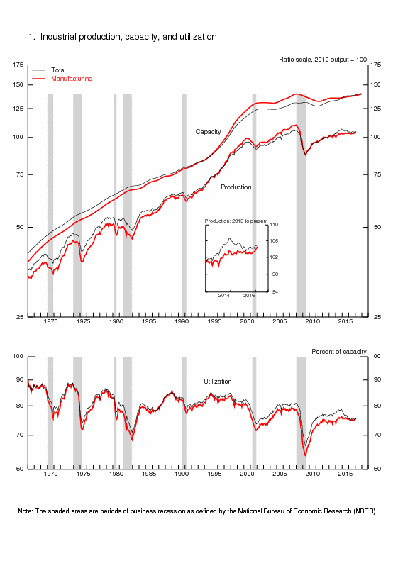
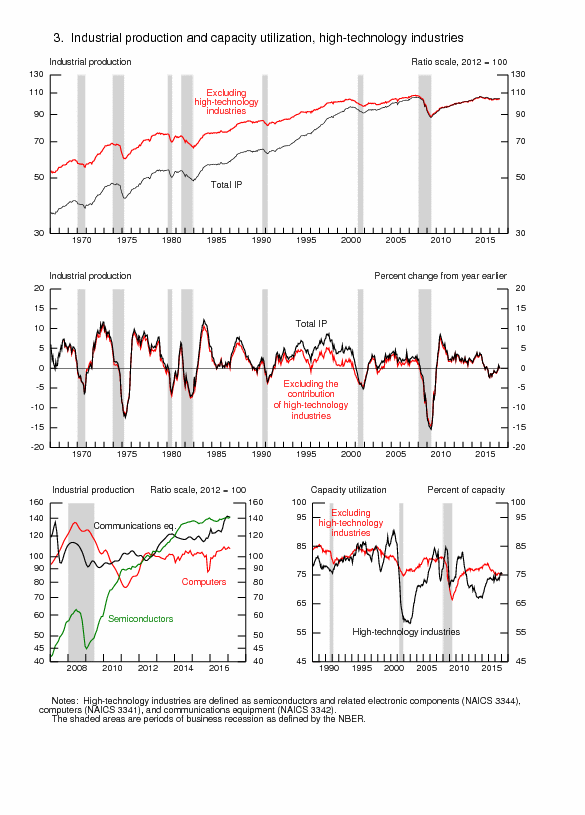
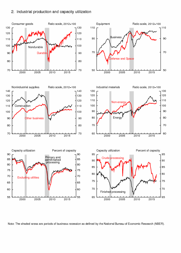
Chart III-1A, US, Ten-Year, Two-Year and One-Month Treasury Constant Maturity Yields Jul 31, 2001-Feb 14, 2013
Note: US Recessions in shaded areas
Source: Board of Governors of the Federal Reserve System
http://www.federalreserve.gov/releases/h15/update/
Kate Linebaugh, writing on “Falling revenue dings stocks,” on Oct 20, 2012, published in the Wall Street Journal (http://professional.wsj.com/article/SB10000872396390444592704578066933466076070.html?mod=WSJPRO_hpp_LEFTTopStories), identifies a key financial vulnerability: falling revenues across markets for United States reporting companies. Global economic slowdown is reducing corporate sales and squeezing corporate strategies. Linebaugh quotes data from Thomson Reuters that 100 companies of the S&P 500 index have reported declining revenue only 1 percent higher in Jun-Sep 2012 relative to Jun-Sep 2011 but about 60 percent of the companies are reporting lower sales than expected by analysts with expectation that revenue for the S&P 500 will be lower in Jun-Sep 2012 for the entities represented in the index. Results of US companies are likely repeated worldwide. The basic valuation equation that is also used in capital budgeting postulates that the value of stocks or of an investment project is given by:
Where Rτ is expected revenue in the time horizon from τ =1 to T; Cτ denotes costs; and ρ is an appropriate rate of discount. In words, the value today of a stock or investment project is the net revenue, or revenue less costs, in the investment period from τ =1 to T discounted to the present by an appropriate rate of discount. In the current weak economy, revenues have been increasing more slowly than anticipated in investment plans. An increase in interest rates would affect discount rates used in calculations of present value, resulting in frustration of investment decisions. If V represents value of the stock or investment project, as ρ → ∞, meaning that interest rates increase without bound, then V → 0, or
declines.
There was weakening performance in equity indexes in Table III-1 in the week ending on Feb 15, 2013. Stagnating revenues are causing reevaluation of discounted net earnings with deteriorating views on the world economy and United States fiscal sustainability but investors have been driving indexes higher. DJIA increased 0.1 percent on Feb 15, decreasing 0.1 percent in the week. Germany’s Dax decreased 0.5 percent on Fri Feb 15 and decreased 0.8 percent in the week. Dow Global decreased 0.4 percent on Feb 15 and decreased 0.7 percent in the week. Japan’s Nikkei Average decreased 1.2 percent on Fri Jan Feb 15 and increased 0.2 percent in the week as the yen continues to be oscillating but relatively weaker and the stock market gains in expectations of fiscal stimulus by a new administration. Dow Asia Pacific TSM decreased 0.8 percent on Feb 15 and decreased 0.3 percent in the week while Shanghai Composite was closed in the week of Feb 15, 2013 because of the Chinese New Year and had increased 0.6 percent on Feb 8 and increased 0.6 percent in the week of Feb 8 supported by stronger GDP and economic data, falling below 2000 to close at 1980.13 on Fri Nov 30 but closing at 2432.40 on Fri Feb 8. There is evident trend of deceleration of the world economy that could affect corporate revenue and equity valuations, causing oscillation in equity markets with increases during favorable risk appetite.
Commodities were mostly weaker in the week of Feb 15, 2013. The DJ UBS Commodities Index decreased 0.3 percent on Fri Feb 15 and decreased 1.4 percent in the week, as shown in Table III-1. WTI increased 0.2 percent in the week of Feb 15 while Brent decreased 0.9 percent in the week. Gold decreased 1.6 percent on Fri Feb 15 and decreased 3.5 percent in the week.
Table III-2 provides an update of the consolidated financial statement of the Eurosystem. The balance sheet has swollen with the long-term refinancing operations (LTROs). Line 5 “Lending to Euro Area Credit Institutions Related to Monetary Policy” increased from €546,747 million on Dec 31, 2010, to €879,130 million on Dec 28, 2011 and €1,017,150 million on Feb 8, 2013. The sum of line 5 and line 7 (“Securities of Euro Area Residents Denominated in Euro”) has increased to €1,593,945 million in the statement of Feb 8, 2013. There is high credit risk in these transactions with capital of only €85,557 million as analyzed by Cochrane (2012Aug31).
Table III-2, Consolidated Financial Statement of the Eurosystem, Million EUR
| Dec 31, 2010 | Dec 28, 2011 | Feb 8, 2013 | |
| 1 Gold and other Receivables | 367,402 | 419,822 | 438,688 |
| 2 Claims on Non Euro Area Residents Denominated in Foreign Currency | 223,995 | 236,826 | 253,271 |
| 3 Claims on Euro Area Residents Denominated in Foreign Currency | 26,941 | 95,355 | 28,191 |
| 4 Claims on Non-Euro Area Residents Denominated in Euro | 22,592 | 25,982 | 21,299 |
| 5 Lending to Euro Area Credit Institutions Related to Monetary Policy Operations Denominated in Euro | 546,747 | 879,130 | 1,017,150 |
| 6 Other Claims on Euro Area Credit Institutions Denominated in Euro | 45,654 | 94,989 | 87,170 |
| 7 Securities of Euro Area Residents Denominated in Euro | 457,427 | 610,629 | 576,795 |
| 8 General Government Debt Denominated in Euro | 34,954 | 33,928 | 29,912 |
| 9 Other Assets | 278,719 | 336,574 | 315,095 |
| TOTAL ASSETS | 2,004, 432 | 2,733,235 | 2,767,571 |
| Memo Items | |||
| Sum of 5 and 7 | 1,004,174 | 1,489,759 | 1,593,945 |
| Capital and Reserves | 78,143 | 85,748 | 85,557 |
Source: European Central Bank
http://www.ecb.int/press/pr/wfs/2011/html/fs110105.en.html
http://www.ecb.int/press/pr/wfs/2011/html/fs111228.en.html
http://www.ecb.int/press/pr/wfs/2013/html/fs130212.en.html
IIIE Appendix Euro Zone survival risk. Professors Ricardo Caballero and Francesco Giavazzi (2012Jan15) find that the resolution of the European sovereign crisis with survival of the euro area would require success in the restructuring of Italy. That success would be assured with growth of the Italian economy. A critical problem is that the common euro currency prevents Italy from devaluing the exchange rate to parity or the exchange rate that would permit export growth to promote internal economic activity, which could generate fiscal revenues for primary fiscal surplus that ensure creditworthiness. Fiscal consolidation and restructuring are important but of long-term gestation. Immediate growth of the Italian economy would consolidate the resolution of the sovereign debt crisis. Caballero and Giavazzi (2012Jan15) argue that 55 percent of the exports of Italy are to countries outside the euro area such that devaluation of 15 percent would be effective in increasing export revenue. Newly available data in Table III-3 providing Italy’s trade with regions and countries supports the argument of Caballero and Giavazzi (2012Jan15). Italy’s exports to the European Monetary Union (EMU), or euro area, are only 42.6 percent of the total. Exports to the non-European Union area with share of 44.0 percent in Italy’s total exports are growing at 9.2 percent in Jan-Dec 2012 relative to Jan-Dec 2011 while those to EMU are falling at 1.5 percent.
Table III-3, Italy, Exports and Imports by Regions and Countries, % Share and 12-Month ∆%
| Dec 2012 | Exports | ∆% Jan-Dec 2012/ Jan-Dec 2011 | Imports | Imports |
| EU | 56.0 | -0.7 | 53.7 | -7.2 |
| EMU 17 | 42.6 | -1.5 | 43.4 | -7.1 |
| France | 11.6 | -1.0 | 8.4 | -6.8 |
| Germany | 13.1 | -1.1 | 15.5 | -11.5 |
| Spain | 5.3 | -8.1 | 4.5 | -7.0 |
| UK | 4.7 | 8.0 | 2.7 | -12.8 |
| Non EU | 44.0 | 9.2 | 46.3 | -3.9 |
| Europe non EU | 13.3 | 8.4 | 10.8 | -1.0 |
| USA | 6.1 | 16.8 | 3.2 | -2.8 |
| China | 2.7 | -9.9 | 7.4 | -16.5 |
| OPEC | 4.7 | 24.6 | 8.5 | 19.7 |
| Total | 100.0 | 3.7 | 100.0 | -5.7 |
Notes: EU: European Union; EMU: European Monetary Union (euro zone)
Source: Istituto Nazionale di Statistica http://www.istat.it/it/archivio/82327
Table III-4 provides Italy’s trade balance by regions and countries. Italy had trade deficit of €1722 million with the 17 countries of the euro zone (EMU 17) in Dec 2012 and deficit of €3915 million in Jan-Dec 2012. Depreciation to parity could permit greater competitiveness in improving the trade surpluses of €11,495 million in Jan-Dec 2012 with Europe non European Union and of €13,990 million with the US and with non European Union of €2066 million in Jan-Dec 2012. There is significant rigidity in the trade deficits in Jan-Dec of €15,692 million with China and €19,003 million with members of the Organization of Petroleum Exporting Countries (OPEC). Higher exports could drive economic growth in the economy of Italy that would permit less onerous adjustment of the country’s fiscal imbalances, raising the country’s credit rating.
Table III-4, Italy, Trade Balance by Regions and Countries, Millions of Euro
| Regions and Countries | Trade Balance Dec 2012 Millions of Euro | Trade Balance Cumulative Jan-Dec 2012 Millions of Euro |
| EU | -1,155 | 8,956 |
| EMU 17 | -1,722 | -3,915 |
| France | 582 | 11,845 |
| Germany | -1,029 | -6,501 |
| Spain | -71 | 1,443 |
| UK | 562 | 9,404 |
| Non EU | 3,317 | 2,066 |
| Europe non EU | 908 | 11,495 |
| USA | 1,275 | 13,990 |
| China | -687 | -15,692 |
| OPEC | -795 | -19,003 |
| Total | 2,162 | 11,022 |
Notes: EU: European Union; EMU: European Monetary Union (euro zone)
Source: Istituto Nazionale di Statistica http://www.istat.it/it/archivio/82327
Growth rates of Italy’s trade and major products are provided in Table III-5 for the period Jan-Dec 2012 relative to Jan-Dec 2011. Growth rates in 12 months of imports are negative with the exception of 7.1 percent for energy. The higher rate of growth of exports of 3.7 percent in Jan-Dec 2012/Jan-Dec 2011 relative to imports of minus 5.7 percent may reflect weak demand in Italy with GDP declining during six consecutive quarters from IIIQ2011 through IVQ2012.
Table III-5, Italy, Exports and Imports % Share of Products in Total and ∆%
| Exports | Exports | Imports | Imports | |
| Consumer | 28.9 | 5.1 | 25.0 | -3.3 |
| Durable | 5.9 | 2.6 | 3.0 | -7.1 |
| Non | 23.0 | 5.8 | 22.0 | -2.7 |
| Capital Goods | 32.3 | 1.5 | 21.1 | -12.9 |
| Inter- | 34.2 | 1.9 | 34.3 | -10.3 |
| Energy | 4.7 | 21.9 | 19.6 | 7.1 |
| Total ex Energy | 95.3 | 2.8 | 80.4 | -8.8 |
| Total | 100.0 | 3.7 | 100.0 | -5.7 |
Note: % Share for Jan-Nov 2012.
Source: Istituto Nazionale di Statistica http://www.istat.it/it/archivio/82327
Table III-6 provides Italy’s trade balance by product categories in Dec 2012 and cumulative Jan-Dec 2012. Italy’s trade balance excluding energy generated surplus of €6814 million in Dec 2012 and €74,016 million in Jan-Dec 2012 but the energy trade balance created deficit of €4653 million in Dec 2012 and €62,994 million in Jan-Dec 2012. The overall surplus in Dec 2012 was €2162 million with surplus of €11,022 million in Jan-Dec 2012. Italy has significant competitiveness in various economic activities in contrast with some other countries with debt difficulties.
Table III-6, Italy, Trade Balance by Product Categories, € Millions
| Dec 2012 | Cumulative Jan-Dec 2012 | |
| Consumer Goods | 1,694 | 17,197 |
| Durable | 1,038 | 11,623 |
| Nondurable | 656 | 5,574 |
| Capital Goods | 4,454 | 49,327 |
| Intermediate Goods | 665 | 7,492 |
| Energy | -4,653 | -62,994 |
| Total ex Energy | 6,814 | 74,016 |
| Total | 2,162 | 11,022 |
Source: Istituto Nazionale di Statistica http://www.istat.it/it/archivio/82327
Brazil faced in the debt crisis of 1982 a more complex policy mix. Between 1977 and 1983, Brazil’s terms of trade, export prices relative to import prices, deteriorated 47 percent and 36 percent excluding oil (Pelaez 1987, 176-79; Pelaez 1986, 37-66; see Pelaez and Pelaez, The Global Recession Risk (2007), 178-87). Brazil had accumulated unsustainable foreign debt by borrowing to finance balance of payments deficits during the 1970s. Foreign lending virtually stopped. The German mark devalued strongly relative to the dollar such that Brazil’s products lost competitiveness in Germany and in multiple markets in competition with Germany. The resolution of the crisis was devaluation of the Brazilian currency by 30 percent relative to the dollar and subsequent maintenance of parity by monthly devaluation equal to inflation and indexing that resulted in financial stability by parity in external and internal interest rates avoiding capital flight. With a combination of declining imports, domestic import substitution and export growth, Brazil followed rapid growth in the US and grew out of the crisis with surprising GDP growth of 4.5 percent in 1984.
The euro zone faces a critical survival risk because several of its members may default on their sovereign obligations if not bailed out by the other members. The valuation equation of bonds is essential to understanding the stability of the euro area. An explanation is provided in this paragraph and readers interested in technical details are referred to the Subsection IIIF Appendix on Sovereign Bond Valuation. Contrary to the Wriston doctrine, investing in sovereign obligations is a credit decision. The value of a bond today is equal to the discounted value of future obligations of interest and principal until maturity. On Dec 30 the yield of the 2-year bond of the government of Greece was quoted around 100 percent. In contrast, the 2-year US Treasury note traded at 0.239 percent and the 10-year at 2.871 percent while the comparable 2-year government bond of Germany traded at 0.14 percent and the 10-year government bond of Germany traded at 1.83 percent. There is no need for sovereign ratings: the perceptions of investors are of relatively higher probability of default by Greece, defying Wriston (1982), and nil probability of default of the US Treasury and the German government. The essence of the sovereign credit decision is whether the sovereign will be able to finance new debt and refinance existing debt without interrupting service of interest and principal. Prices of sovereign bonds incorporate multiple anticipations such as inflation and liquidity premiums of long-term relative to short-term debt but also risk premiums on whether the sovereign’s debt can be managed as it increases without bound. The austerity measures of Italy are designed to increase the primary surplus, or government revenues less expenditures excluding interest, to ensure investors that Italy will have the fiscal strength to manage its debt of 120 percent of GDP, which is the third largest in the world after the US and Japan. Appendix IIIE links the expectations on the primary surplus to the real current value of government monetary and fiscal obligations. As Blanchard (2011SepWEO) analyzes, fiscal consolidation to increase the primary surplus is facilitated by growth of the economy. Italy and the other indebted sovereigns in Europe face the dual challenge of increasing primary surpluses while maintaining growth of the economy (for the experience of Brazil in the debt crisis of 1982 see Pelaez 1986, 1987).
Much of the analysis and concern over the euro zone centers on the lack of credibility of the debt of a few countries while there is credibility of the debt of the euro zone as a whole. In practice, there is convergence in valuations and concerns toward the fact that there may not be credibility of the euro zone as a whole. The fluctuations of financial risk assets of members of the euro zone move together with risk aversion toward the countries with lack of debt credibility. This movement raises the need to consider analytically sovereign debt valuation of the euro zone as a whole in the essential analysis of whether the single-currency will survive without major changes.
Welfare economics considers the desirability of alternative states, which in this case would be evaluating the “value” of Germany (1) within and (2) outside the euro zone. Is the sum of the wealth of euro zone countries outside of the euro zone higher than the wealth of these countries maintaining the euro zone? On the choice of indicator of welfare, Hicks (1975, 324) argues:
“Partly as a result of the Keynesian revolution, but more (perhaps) because of statistical labours that were initially quite independent of it, the Social Product has now come right back into its old place. Modern economics—especially modern applied economics—is centered upon the Social Product, the Wealth of Nations, as it was in the days of Smith and Ricardo, but as it was not in the time that came between. So if modern theory is to be effective, if it is to deal with the questions which we in our time want to have answered, the size and growth of the Social Product are among the chief things with which it must concern itself. It is of course the objective Social Product on which attention must be fixed. We have indexes of production; we do not have—it is clear we cannot have—an Index of Welfare.”
If the burden of the debt of the euro zone falls on Germany and France or only on Germany, is the wealth of Germany and France or only Germany higher after breakup of the euro zone or if maintaining the euro zone? In practice, political realities will determine the decision through elections.
The prospects of survival of the euro zone are dire. Table III-7 is constructed with IMF World Economic Outlook database (http://www.imf.org/external/datamapper/index.php?db=WEO) for GDP in USD billions, primary net lending/borrowing as percent of GDP and general government debt as percent of GDP for selected regions and countries in 2010.
Table III-7, World and Selected Regional and Country GDP and Fiscal Situation
| GDP 2012 | Primary Net Lending Borrowing | General Government Net Debt | |
| World | 71,277 | ||
| Euro Zone | 12,065 | -0.5 | 73.4 |
| Portugal | 211 | -0.7 | 110.9 |
| Ireland | 205 | -4.4 | 103.0 |
| Greece | 255 | -1.7 | 170.7 |
| Spain | 1,340 | -4.5 | 78.6 |
| Major Advanced Economies G7 | 33,769 | -5.1 | 89.0 |
| United States | 15,653 | -6.5 | 83.8 |
| UK | 2,434 | -5.6 | 83.7 |
| Germany | 3,367 | 1.4 | 58.4 |
| France | 2,580 | -2.2 | 83.7 |
| Japan | 5,984 | -9.1 | 135.4 |
| Canada | 1,770 | -3.2 | 35.8 |
| Italy | 1,980 | 2.6 | 103.1 |
| China | 8,250 | -1.3* | 22.2** |
*Net Lending/borrowing**Gross Debt
Source: IMF World Economic Outlook databank http://www.imf.org/external/datamapper/index.php?db=WEO
The data in Table III-7 are used for some very simple calculations in Table III-8. The column “Net Debt USD Billions” in Table III-8 is generated by applying the percentage in Table III-7 column “General Government Net Debt % GDP 2010” to the column “GDP USD Billions.” The total debt of France and Germany in 2012 is $4155.8 billion, as shown in row “B+C” in column “Net Debt USD Billions” The sum of the debt of Italy, Spain, Portugal, Greece and Ireland is $3975.1 billion, adding rows D+E+F+G+H in column “Net Debt USD billions.” There is some simple “unpleasant bond arithmetic” in the two final columns of Table III-8. Suppose the entire debt burdens of the five countries with probability of default were to be guaranteed by France and Germany, which de facto would be required by continuing the euro zone. The sum of the total debt of these five countries and the debt of France and Germany is shown in column “Debt as % of Germany plus France GDP” to reach $8130.8 billion, which would be equivalent to 136.7 percent of their combined GDP in 2012. Under this arrangement the entire debt of the euro zone including debt of France and Germany would not have nil probability of default. The final column provides “Debt as % of Germany GDP” that would exceed 241.5 percent if including debt of France and 177.4 percent of German GDP if excluding French debt. The unpleasant bond arithmetic illustrates that there is a limit as to how far Germany and France can go in bailing out the countries with unsustainable sovereign debt without incurring severe pains of their own such as downgrades of their sovereign credit ratings. A central bank is not typically engaged in direct credit because of remembrance of inflation and abuse in the past. There is also a limit to operations of the European Central Bank in doubtful credit obligations. Wriston (1982) would prove to be wrong again that countries do not bankrupt but would have a consolation prize that similar to LBOs the sum of the individual values of euro zone members outside the current agreement exceeds the value of the whole euro zone. Internal rescues of French and German banks may be less costly than bailing out other euro zone countries so that they do not default on French and German banks.
Table III-8, Guarantees of Debt of Sovereigns in Euro Area as Percent of GDP of Germany and France, USD Billions and %
| Net Debt USD Billions | Debt as % of Germany Plus France GDP | Debt as % of Germany GDP | |
| A Euro Area | 8,855.7 | ||
| B Germany | 1,996.3 | $8130.9 as % of $3367 =241.5% $5971.4 as % of $3367 =177.4% | |
| C France | 2,159.5 | ||
| B+C | 4,155.8 | GDP $5,947.0 Total Debt $8130.9 Debt/GDP: 136.7% | |
| D Italy | 2,041.4 | ||
| E Spain | 1,053.2 | ||
| F Portugal | 234.0 | ||
| G Greece | 435.3 | ||
| H Ireland | 211.2 | ||
| Subtotal D+E+F+G+H | 3,975.1 |
Source: calculation with IMF data http://www.imf.org/external/datamapper/index.php?db=WEO
There is extremely important information in Table III-9 for the current sovereign risk crisis in the euro zone. Table III-9 provides the structure of regional and country relations of Germany’s exports and imports with newly available data for Dec 2012. German exports to other European Union (EU) members are 55.9 percent of total exports in Dec 2012 and 57.1 percent in Jan-Dec 2012. Exports to the euro area are 37.1 percent in Dec and 37.5 percent in Jan-Dec. Exports to third countries are 44.1 percent of the total in Dec and 43.0 percent in Jan-Dec. There is similar distribution for imports. Exports to non-euro countries are decreasing 4.5 percent in Dec 2012 and increasing 3.3 percent in Jan-Dec 2012 while exports to the euro area are decreasing 7.3 percent in Dec and decreasing 2.1 percent in Jan-Dec 2012. Exports to third countries, accounting for 44.1 percent of the total in Dec 2012, are decreasing 7.5 percent in Dec and increasing 8.8 percent in Jan-Dec, accounting for 43.0 percent of the cumulative total in Jan-Dec 2012. Price competitiveness through devaluation could improve export performance and growth. Economic performance in Germany is closely related to its high competitiveness in world markets. Weakness in the euro zone and the European Union in general could affect the German economy. This may be the major reason for choosing the “fiscal abuse” of the European Central Bank considered by Buiter (2011Oct31) over the breakdown of the euro zone. There is a tough analytical, empirical and forecasting doubt of growth and trade in the euro zone and the world with or without maintenance of the European Monetary Union (EMU) or euro zone. Germany could benefit from depreciation of the euro because of high share in its exports to countries not in the euro zone but breakdown of the euro zone raises doubts on the region’s economic growth that could affect German exports to other member states.
Table III-9, Germany, Structure of Exports and Imports by Region, € Billions and ∆%
| Dec 2012 | Dec 12-Month | Jan–Dec 2012 € Billions | Jan-Dec 2012/ | |
| Total | 79.0 | -6.9 | 1,097.4 | 3.4 |
| A. EU | 44.2 % 55.9 | -6.4 | 625.7 % 57.0 | -0.3 |
| Euro Area | 29.3 % 37.1 | -7.3 | 411.9 % 37.5 | -2.1 |
| Non-euro Area | 14.9 % 18.9 | -4.5 | 213.8 % 19.5 | 3.3 |
| B. Third Countries | 34.8 % 44.1 | -7.5 | 471.7 % 43.0 | 8.8 |
| Total Imports | 67.0 | -7.3 | 909.2 | 0.7 |
| C. EU Members | 42.6 % 63.6 | -7.1 | 577.1 % 63.5 | 0.9 |
| Euro Area | 29.9 % 44.6 | -6.8 | 402.4 % 44.3 | 0.7 |
| Non-euro Area | 12.8 % 19.1 | -7.9 | 172.9 % 19.0 | 1.4 |
| D. Third Countries | 24.4 % 36.4 | -7.6 | 332.1 % 36.5 | 0.4 |
Notes: Total Exports = A+B; Total Imports = C+D
Source: Statistisches Bundesamt Deutschland https://www.destatis.de/EN/PressServices/Press/pr/2013/02/PE13_050_51.html
IIIF Appendix on Sovereign Bond Valuation. There are two approaches to government finance and their implications: (1) simple unpleasant monetarist arithmetic; and (2) simple unpleasant fiscal arithmetic. Both approaches illustrate how sovereign debt can be perceived riskier under profligacy.
First, Unpleasant Monetarist Arithmetic. Fiscal policy is described by Sargent and Wallace (1981, 3, equation 1) as a time sequence of D(t), t = 1, 2,…t, …, where D is real government expenditures, excluding interest on government debt, less real tax receipts. D(t) is the real deficit excluding real interest payments measured in real time t goods. Monetary policy is described by a time sequence of H(t), t=1,2,…t, …, with H(t) being the stock of base money at time t. In order to simplify analysis, all government debt is considered as being only for one time period, in the form of a one-period bond B(t), issued at time t-1 and maturing at time t. Denote by R(t-1) the real rate of interest on the one-period bond B(t) between t-1 and t. The measurement of B(t-1) is in terms of t-1 goods and [1+R(t-1)] “is measured in time t goods per unit of time t-1 goods” (Sargent and Wallace 1981, 3). Thus, B(t-1)[1+R(t-1)] brings B(t-1) to maturing time t. B(t) represents borrowing by the government from the private sector from t to t+1 in terms of time t goods. The price level at t is denoted by p(t). The budget constraint of Sargent and Wallace (1981, 3, equation 1) is:
D(t) = {[H(t) – H(t-1)]/p(t)} + {B(t) – B(t-1)[1 + R(t-1)]} (1)
Equation (1) states that the government finances its real deficits into two portions. The first portion, {[H(t) – H(t-1)]/p(t)}, is seigniorage, or “printing money.” The second part,
{B(t) – B(t-1)[1 + R(t-1)]}, is borrowing from the public by issue of interest-bearing securities. Denote population at time t by N(t) and growing by assumption at the constant rate of n, such that:
N(t+1) = (1+n)N(t), n>-1 (2)
The per capita form of the budget constraint is obtained by dividing (1) by N(t) and rearranging:
B(t)/N(t) = {[1+R(t-1)]/(1+n)}x[B(t-1)/N(t-1)]+[D(t)/N(t)] – {[H(t)-H(t-1)]/[N(t)p(t)]} (3)
On the basis of the assumptions of equal constant rate of growth of population and real income, n, constant real rate of return on government securities exceeding growth of economic activity and quantity theory equation of demand for base money, Sargent and Wallace (1981) find that “tighter current monetary policy implies higher future inflation” under fiscal policy dominance of monetary policy. That is, the monetary authority does not permanently influence inflation, lowering inflation now with tighter policy but experiencing higher inflation in the future.
Second, Unpleasant Fiscal Arithmetic. The tool of analysis of Cochrane (2011Jan, 27, equation (16)) is the government debt valuation equation:
(Mt + Bt)/Pt = Et∫(1/Rt, t+τ)st+τdτ (4)
Equation (4) expresses the monetary, Mt, and debt, Bt, liabilities of the government, divided by the price level, Pt, in terms of the expected value discounted by the ex-post rate on government debt, Rt, t+τ, of the future primary surpluses st+τ, which are equal to Tt+τ – Gt+τ or difference between taxes, T, and government expenditures, G. Cochrane (2010A) provides the link to a web appendix demonstrating that it is possible to discount by the ex post Rt, t+τ. The second equation of Cochrane (2011Jan, 5) is:
MtV(it, ·) = PtYt (5)
Conventional analysis of monetary policy contends that fiscal authorities simply adjust primary surpluses, s, to sanction the price level determined by the monetary authority through equation (5), which deprives the debt valuation equation (4) of any role in price level determination. The simple explanation is (Cochrane 2011Jan, 5):
“We are here to think about what happens when [4] exerts more force on the price level. This change may happen by force, when debt, deficits and distorting taxes become large so the Treasury is unable or refuses to follow. Then [4] determines the price level; monetary policy must follow the fiscal lead and ‘passively’ adjust M to satisfy [5]. This change may also happen by choice; monetary policies may be deliberately passive, in which case there is nothing for the Treasury to follow and [4] determines the price level.”
An intuitive interpretation by Cochrane (2011Jan 4) is that when the current real value of government debt exceeds expected future surpluses, economic agents unload government debt to purchase private assets and goods, resulting in inflation. If the risk premium on government debt declines, government debt becomes more valuable, causing a deflationary effect. If the risk premium on government debt increases, government debt becomes less valuable, causing an inflationary effect.
There are multiple conclusions by Cochrane (2011Jan) on the debt/dollar crisis and Global recession, among which the following three:
(1) The flight to quality that magnified the recession was not from goods into money but from private-sector securities into government debt because of the risk premium on private-sector securities; monetary policy consisted of providing liquidity in private-sector markets suffering stress
(2) Increases in liquidity by open-market operations with short-term securities have no impact; quantitative easing can affect the timing but not the rate of inflation; and purchase of private debt can reverse part of the flight to quality
(3) The debt valuation equation has a similar role as the expectation shifting the Phillips curve such that a fiscal inflation can generate stagflation effects similar to those occurring from a loss of anchoring expectations.
© Carlos M. Pelaez, 2010, 2011, 2012, 2013
No comments:
Post a Comment